#Don Norman
Explore tagged Tumblr posts
Text
Reading a book about industrial/process design and a point that is repeatedly brought up is that 'whose fault is this/who can we blame' is the single most useless question when investigating the causes of an accident/mishap - if 'human error' is a major problem, that means the systems have not been designed properly.
I feel like this is a point that a lot of people on here could stand to generalize and take to heart.
338 notes
·
View notes
Text
Design Rules Based on Analyses of Human Error
This older paper (1983) from Don Norman is pretty interesting – exploring design approaches to performance variability. There’s MUCH newer and …Design Rules Based on Analyses of Human Error

View On WordPress
0 notes
Text
Don Norman: Hardest part of design
“The hardest part of design is keeping features out.” —Don Norman.
View On WordPress
0 notes
Text
Summary #6
These texts talk about how designs, especially in technology and voting, often don't consider the needs of the elderly. Even though people are living longer, designs can be hard for the elderly, with small writing and complicated features. Designs that work for everyone, or “inclusive designs”, are hard to find, and the few that exist are considered ugly. Other text mentions problems with voting, like confusing layouts on ballots. It suggests that we need more people to know about the effects of bad design, and organizations like the American Institute of Graphic Arts should promote better design, especially for important things like ballots. The example of a redesigned Florida ballot shows how changing the design can make things clearer and prevent mistakes.
REAL WORLD EXAMPLE:

Last summer I went to Los Angeles with my family, and we got an “accessibility-friendly” room in the hotel, but the shower was placed inside a bathtub. The problem was that the tub was really high, so if someone who needed a wheelchair tried to use it, it would be hard for them to shower. (I couldn’t find the picture I had, but this one from “agonda.com” is the closest one I could find)
I would improve the room by putting a regular shower with a big door to make it more accessible for those who need a wheelchair.
Take-aways:
Design challenges for the elderly
Importance of inclusive design
Issues in voting systems
We Need Better Designs
Impact of redesign
0 notes
Text

finally digging into this one, been looking forward to it
1 note
·
View note
Text
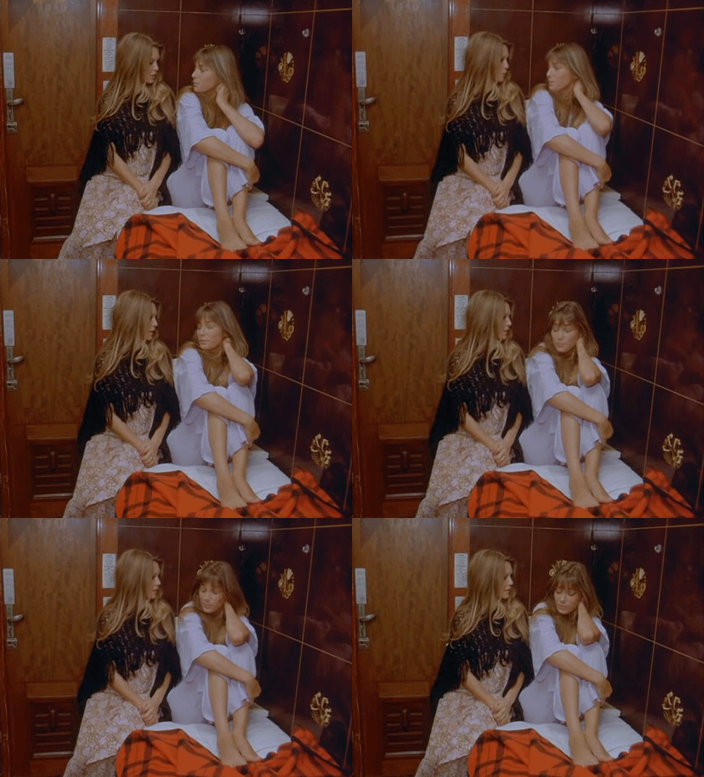
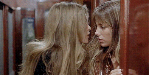


Brigitte Bardot And Jane Birkin in, "Don Juan, or If Don Juan Were a Woman", 1973.
#lana del rey#this is a girlblog#girlblogging#vintage aesthetic#vintage fashion#1960s movies#1967#girlblog#norman fucking rockwell#don juan#1960s model#1960s fashion#1960s#1960s music#1960s history#1970s#1970s history#1970s fashion#1970s music#1970s movies#70s#seventies#1962
2K notes
·
View notes
Text
What could be the benefit of telling the person what they can't do? If I'm told to "Pull" then I'll know to pull not push?

And, aside from all that, I'm sure we've heard of the Norman Door.
"A Norman door is a poorly designed door that confuses or fails to give you an idea whether to push or pull. It was named after Don Norman, the author of The Design of Everyday Things which explored the phenomenon." [link] (There's a video of Don Norman talking about his door in that article.)
This, of course, applies to more than just doors.

This sign shouldn't need to exist at all, I should be able to visibly tell from the design of the door how to use it (and my assumption should be correct).

#The Design of Everyday Things is essential UX reading I highly recommend it#bad ux#bad design#design#intuitive design#uxuidesign#a-ux-person#user experience#uxui#user interface#ux design#norman door#don norman#the design of everyday things
1 note
·
View note
Text

HAPPY BIRTHDAY TO THE SERIES THAT RUINED MY LIFE <3<3<3
#skye's doodles#YAAAY SKYE EVENT PIECE DONE ON TIME COLORING THIS IS ALL I HAVE BEEN DOING TODAY. WIN#worth it though this was really fun. not the best w angled perspectives but i wanted to try something different and. i like this a lot#waaauuu i miss these guys every day ofmy fuckind LIFE i need to draw them more again. the mental illness persists but so do i <3#the promised neverland#tpn#yakusoku no neverland#tpn emma#tpn norman#tpn ray#tpn don#tpn gilda#tpn phil#tpn conny
155 notes
·
View notes
Text
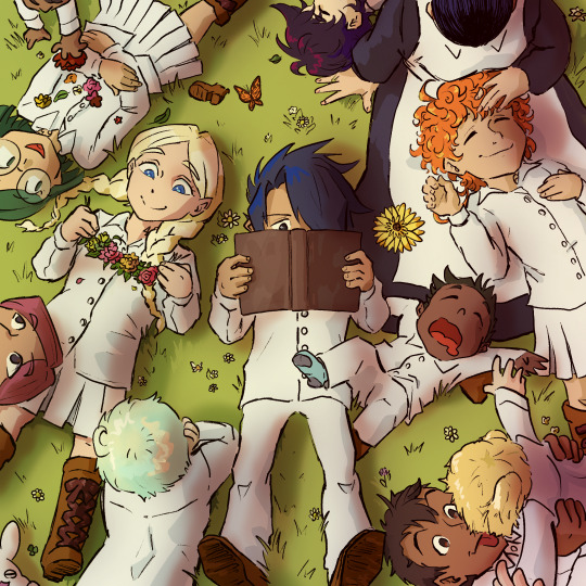
Afternoon nap
#tpn#tpn fanart#the promised neverland#digital art#anime#anime fanart#the promised neverland fanart#Raspbrry’s art#Raspbrry’s fanart#tpn ray#tpn emma#tpn Anna#tpn Norman#tpn don#tpn isabella#tpn Gilda#tpn Phil#tpn conny
342 notes
·
View notes
Text
in honor of Valentine’s Day coming up soon and me wanting to write for other fandoms besides phighting, here’s a treat for the zombie of a fandom we call yakusoku no neverland <3
(of course, this is after escaping to the human world!)
Emma would 100% be the type to take you out on a picnic date. she planned out everything, the scenery with the fairy lights wrapped around the trees, the sunset looks perfect, the food tastes delicious, but it also looks so cute and you feel bad for eating it. she reassured you, and she also just has the cutest little smile on her face while you eat peacefully, she’s just really happy to be spending time with you. you guys end up snuggling as you watch the sunset and just talk about your random thoughts together.
Norman would either take you out on a library or a fancy dinner date, he wants the date to be casual, but also not enough to where he looks like he didn’t put much thought into it. throughout the whole date, he’s happily listening to you ramble about your interests and he makes mental notes so he knows what to buy for you later during the date. though, he’s also very shy and nervous, he doesn’t talk that much throughout it all because he just wants to listen to you, and shaking every time you guys touch even the slightest bit.
Ray on the other hand, is much more comfortable with the idea of having the date be as comfy as possible. he decided a nice date at home on a rainy day was his favorite way to spend Valentine’s Day. he doesn’t really make this occasion a big thing, but he does his best to show his affection. he reads to you with a soothing tone as he plays some soft lofi music in the background, but he’s not actually all that interested in the book, he’s more interested in seeing your reactions, especially as the rain helps lull you to sleep, and he smiles softly. you guys end up falling asleep together all cuddled up with each other.
Don would take you to a big theme park, and you guys go on as many rides as possible before the night rolls around. if you’re afraid of heights, then he’ll take you to an arcade instead, and he actually ends up winning you a lot of prizes and gifts, which is exactly what he wanted, because he wanted to impress you, but you reassure him that spending time with him was more than enough, and he swore he felt butterflies in his stomach for the rest of the night. (he ended up not getting any sleep, he just thought about the date the whole night)
Gilda would most definitely take you out shopping, buying clothes and plushies, and overall just having a fun time. she helps you look for outfits and accessories she knows you’ll love, and has you try them on like you’re on a runaway as she’s complimenting you and cheering you on endlessly! if you’re more self-conscious, she’ll hug you and let you know that you’re absolutely gorgeous, and that nothing could ever change that..
(bonus if Gilda almost gets into a fight with a Karen for being “too loud” while she’s cheering you on)
#emma x reader#emma tpn#emma x reader tpn#norman x reader#norman tpn#norman x reader tpn#ray x reader#ray tpn#ray x reader tpn#don x reader#don tpn#don x reader tpn#gilda x reader#gilda tpn#gilda x reader tpn#tpn x reader#ynn x reader#fluff
228 notes
·
View notes
Text
little guys….

81 notes
·
View notes
Text
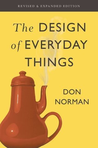
2024 Book Review #54 – The Design of Everyday Things by Don Norman
I try to read a piece of somewhat respectable nonfiction every month or so, which means I’m always vaguely on the lookout for titles that seem interesting and which aren’t either inspiration porn or just some random New Yorker’s collection of personal essays. I first heard of Design in an editorial in a local paper, which described it as a ‘seminal read’ – the basic conceit and title both seemed interesting so I through it on the list and, however many months later, finally got around to read with it. It was interesting, but altogether a more dense and technical read than I was at all prepared for when I picked it up.
The book is about what it says on the tin – looking at the processes and practices of industrial design and how it can be best applied to create useful, pleasurable tools. It is very much written for an assumed audience of at least interested amateurs or casual practitioners, with lots of specific practical tips and guidelines for the working designer to apply to their own projects. For the same reason it isn’t at all shy about the jargon or business-school models and charts.
Design, from the book’s perspective, covers an extremely broad field – everything from the physical structure of a tool to the systems and procedures that should be followed for its safe operation to the aesthetics and layout that give the most enjoyable and frictionless user experience handling it. The book considers its principles equally applicable to designing physical products and bureaucratic systems, and is mostly even convincing as it says so. That said, it absolutely assume that whatever is being designed is being designed by a large, multi-team project with budgets and stakeholders, and designed for sale on the private market, both of which do shape the advice given quite clearly (the entire final part of the book is about ‘designing in the real world’ and about these exact conditions).
The prose is written with the precise tone and cadence of an above-average but not great professor giving a long, rambling lecture that illustrates every single point with a tangential personal anecdote – though my mind may only jump to that comparison because that’s basically what this is in book form. It is not, being honest, ever exactly gripping or a page-turner; this was probably the book whose reading felt most like homework of any I’ve opened so far these year. Something not at all helped by the fact that the field of industrial design does the same thing as every other slice of academia and redefines a bunch of very common nouns to be very precise and occasionally very counterintuitive terms of art (though in fairness the book could have been much worse about this).
That aside, I did find the jargon mostly helpful, in terms of clarifying and separating out concepts. The distinction between capabilities (what a given device can be used for) and signifiers (the implicit or explicit ways a device presents itself to be used) is useful and pretty easy to keep in my head, for example.
The initial chapters of the book are primarily about the theory and best practices of designing specific, physical things – for example, how it represents a shameful failure for a door to ever require a sign or instructions on how it should be opened. This was probably the roughest part for me to get through, just because I felt like I should be taking quizzes or filling out worksheets to make sure I remembered everything correctly as I went – the sections get dense. It was fascinating reading to bludgeon through though, if only as a collection of the most practical insights yet provided by the study of human psychology. None of the best practices and recommendations given – never require the user to input more than a few commands without feedback or guidance, map the layout of controls to correspond to the physical ordering of the things they control, mechanical commands should feel like they have some sort of intuitive relationship to their effect, that sort of thing – exactly blew my mind, but it was helpful to see them laid out. Also interesting how much a lot of them contrast so strongly with the minimalist, ‘clean’ aesthetic which actually governs the design of so much these days.
The sections on mistakes and accidents were probably the most interesting and compelling in their own right. Maybe because I found the examples more intuitive, or maybe just because industrial accidents and airline disasters are more attention-grabbing examples than confusing and inefficient light switch layouts. In any case, the typology of mistakes versus errors (basically: whether you are trying to do the wrong thing, or trying to do the right thing and just failing in execution) and their subcategories seem genuinely quite useful, as do the various meditations on how to make both types less common.
This is also the section that has stuck with me in the most detail, if probably just because it seems like it might have some direct relevance to day-to-day life. Most especially the idea that focusing on how to assign fault or blame is the most useless possible thing to do when trying to investigate an accident – it only makes everyone motivated to hide any involvement they might have had, and lets you stop thinking about it as soon as you decide who is responsible without ever digging into the actual causes of the mistake. ‘Human error’ is, in Norman’s view, a mirage – if people are making dangerous or expensive mistakes at any appreciable rate, then that is axiomatically a failure of the systems which should be supporting and guiding them.
The fact that airline disasters are drastically overrepresented in the case studies used because the investigative infrastructure for them is uncommonly (almost bizarrely, really) well-designed and diligently maintained in the US is also just a fun bit of a trivia.
The third part of the book is about the actual process of designing something in a large organization. Perhaps unsurprisingly, this is mostly about bureaucratic politics and navigating frictions between, say, the design and marketing teams – the offered distinction that design is about making things that are useful and good whereas marketing’s input on the process is ensuring it is something that people will be willing to buy is pithy and memorable, if perhaps one that people on the marketing team might not be entirely happy with. This, along with terms like ‘the double-diamond design process’ and the oft-repeated saying that ‘the day a project starts it’s behind schedule and under budget’, and the gratuitous use of Japanese, all left me with the uncanny feeling of walking into an MBA seminar.
This is in fact an extremely famous and successful book – I know, because this is a heavily revised second edition, and the new material never missed a chance to say so. Having come out in 2013, the updated material – overwhelmingly about software UX, the internet, and smartphone design, because of course it is – is already somewhat charmingly outdated. The additions did include a long and very interesting section on changing standards, standardization, and when it is or isn’t worth the massive disruption involved (including a fascinating if probably not entirely trustworthy digression into the history of the QWERTY keyboard), so on the whole I’m happy I got this edition rather than the original from the ‘80s.
Overall, not a book I’m likely to open again anytime soon unless I end up making a dramatic change of careers, but interesting enough that I don’t regret reading it.
53 notes
·
View notes
Text
Joni Mitchell "Black Crow" featuring Chaka Khan—Hejira demo, March 1976.

Chaka Khan, 1977 © Norman Seeff.
I love the song "Dreamland" that you sing on, in her 1977 jazz-heavy album Don Juan's Reckless Daughter. Chaka: "Oh please! You know what? She called me at 4 o'clock in the morning and said [in a deep, Canadian accent imitating Mitchell], "Chaka...come down to the studio right now! You have to come down here!" So I said, finally! Joni and I are going to get to work together I was so happy! Until I got down to the studio and it changed. It was me singing no words at all (referring to the tones and textures she warbles on the world music influenced track). Not a word! Just "Aye aye aye.." and all that shit." —An interview with Chaka Khan: Life, career, and her ongoing love affair with music
#Joni Mitchell#Black Crow#Hejira Demos#Hejira#1976#1970s#Youtube#Chaka Khan#Interview#Quote#Norman Seeff#Archives: Volume 4#2024#Dreamland#Don Juan's Reckless Daughter
77 notes
·
View notes
Text
tpn artbook things I noticed!

MATCHING YUUGO AND RAY VEST IM GOING TO EXPLODEEEEEE

Norman with a gun is so funny to me. He is trying so hard to look cool but he is a bird with hollow bones, the recoil from that lil thing would send him to the floor faster than Ray slapping him

stop pretending ur helping Norman, Don is literally doing all the work behind u

he is so scared to be next to ashye even in the poster (rip zack's nose scar)

the fact that norman looks so much like Nat in the concept art XD is that a cowlick or a halo???!?!!

(CHARLIE BROWN????) I regret pointing this out to my sister because now it's my pfp in her phone

vincent's sense of style will never be anything less than amazing. Look at Cislo he is SO READY for game night :D (JEMIMA AND ZAZIE WITH STUFFED ANIMALS AUGHHHHH)

HES IN HIS COMA EVEN IN THE ART IM- jail. jail for a thousand years. right next to his dead dads too IM DONE

have a Dominic it will make you feel better

Paula not knowing how party poppers work is adorable.

what they deserve (im embarrassed to have andrew's face in my camera roll)


look at Ray and Gilda pretending not to care about their little brothers (they love them more than life itself)

HE IS CARRYING THEIR THINGS JUST LIKE A DAD SHOULDDDDDD (upgraded from old man to walking coat rack :D)

why does phil get a father figure that hasn't died D:/ (jk love that for him more stronk phil plz)


YELLOW EYED VIOLET AND BROWN EYED PHIL JUMPSCARE
(my sister: gillian is dying in the bg
me: this ani't about her)


Barbra 🤝 Gillian stealing demon masks and keeping them as souvenirs


EMMAS LOST SHOE!!!!!!!


.......i'm not gonna say anything here........


there was no Don glow up he was always beautiful to me

little bunny revenge arc

he slept in the dining room???? because he didn't wanna go in the old rooms of his siblings where he wrote poachers DDDD:::::::


the ominous messages behind them!!!!!!
#my dribble drabbles#the promised neverland#yakusoku no neverland#tpn manga#ray tpn#norman tpn#zack tpn#don tpn#isabella tpn#emma tpn#yuugo tpn#anna tpn#Dominic tpn#zazie tpn#vincent tpn#little bunny#chris tpn#barbra tpn#gillian tpn
69 notes
·
View notes
Text
Shirai and Posuka's answers to fan questions are here!
Here's the first batch! Part 2 will be released next week.
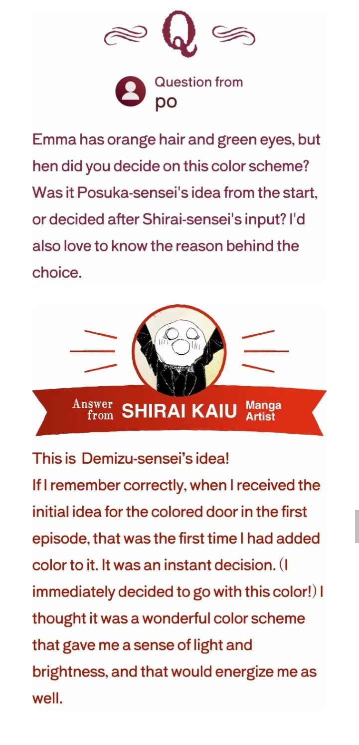


(the missing question asked which character Shirai sensei sees himself resembling to)
("colored door" implied the colored chapter cover pages. In japanese they're called "tobirae"/扉絵 which literally reads door art)
#SENSEI NOTICED ME#tbh if 20% of total questions are yours there's chance to have one or two answered PFF#a lot of good questions remain unanswered but looking forward to the next batch#the promised neverland#tpn Emma#tpn norman#tpn ray#tpn Anna#tpn Paula#tpn Dominic#tpn Don#tpn Adam#mine#kaiu shirai#posuka demizu
60 notes
·
View notes
Text

yakuneba_staff's special wallpaper to commemorate the series' 8th anniversary, incorporating the covers of the second and fourth light novels.
#me when Gilda's and Don's importance is recognized :'')#The Promised Neverland#Yakusoku no Neverland#TPN#YnN#約束のネバーランド#約ネバ#Posuka Demizu#TPN Light Novels#Moms' Song of Remembrance#Films of Memories#Full Score Trio#TPN Emma#TPN Norman#TPN Ray#TPN Don#TPN Gilda#TPN Isabella#TPN Krone#Sister Krone#Pre-Canon#Post-Canon#Isabella#Krone#Don#Gilda#fourth light novel cover is my favorite of the covers catering to me specifically#they all look so good and so grown up 🤧#the promised queueland
108 notes
·
View notes