#DataVisio
Explore tagged Tumblr posts
Text
Visualizing Multidimensional Covid-19 Data
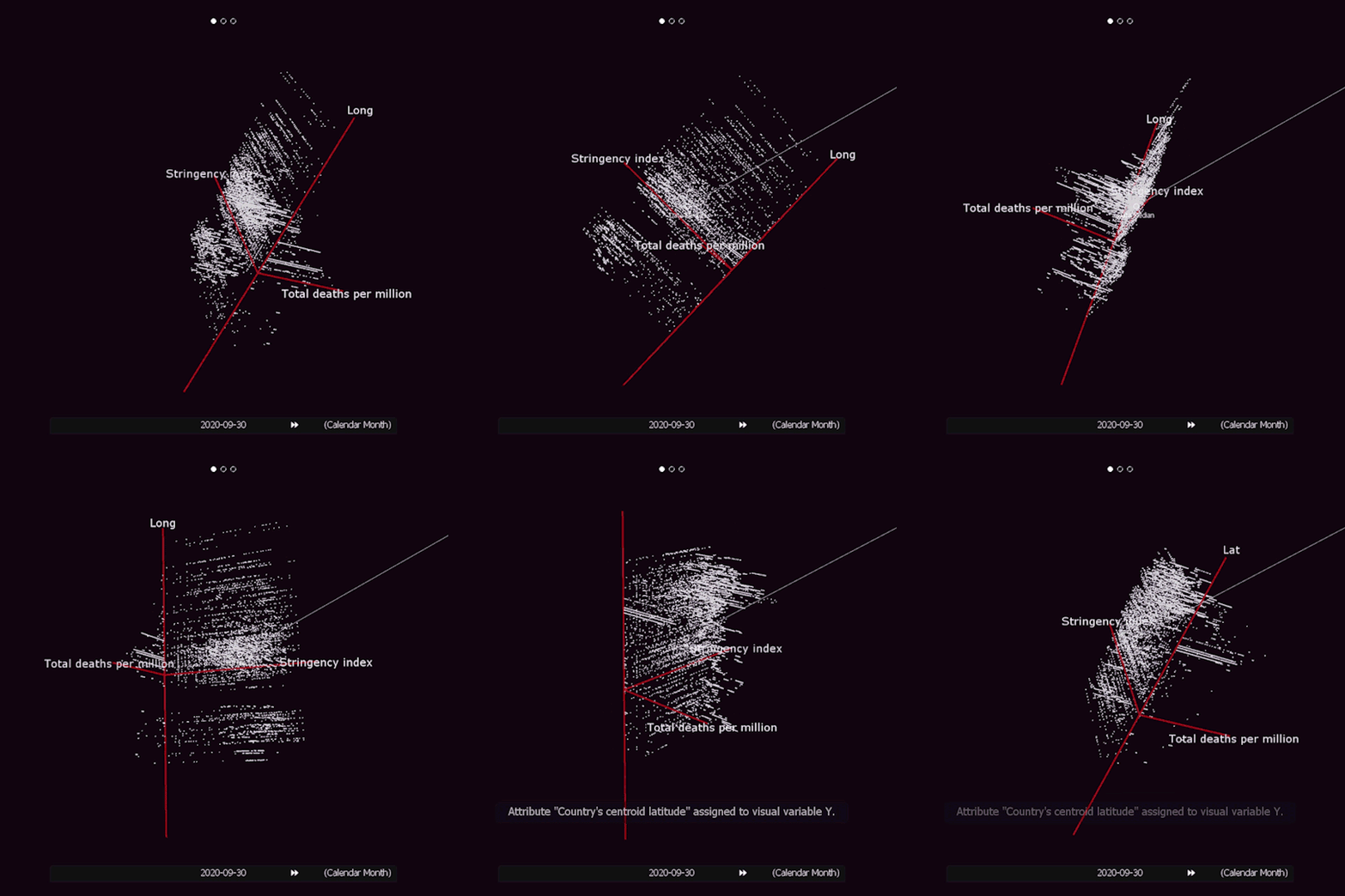
DataVisio is a 3D software engine for immersive and interactive complex data visualizations on big screens, designed to generate a Data Experience. It is a B2B platform aimed at presenting specific business logic to customers, or deep abstract knowledge insights to educate the general public. Its main power is the capability of mapping complex data schemas to abstract visual nodes, edges and surfaces in 3D space, and the easy, "game" like, navigation into that space.
Covid-19 data (from the beginning of 2020) are rendered on different spaces, an abstract 3D space, over 2D Earth maps and a simulated 3D Earth environment. All data are projected on one, or more big immersive screens in front of a computer base station which contains the computer running the software. Covid-19 data -in geographic, temporal or a multitude of other dimensions- are displayed as points, or graph bars over locations. The exhibition visitor can fly in any of those spaces in real time performance using a gamepad controller on the base station. This allows him to navigate freely to any location of interest, examining at the same time the data displayed. Using the same gamepad it is also possible to change the time period of the rendered data and so explore, or even animate, their evolution in time. Additional information in the specified time can be retrieved by looking at a specific data point (an action which "selects" it).
Alternative modes of navigation using a Leap Motion Controller or a Kinect Sensor are possible, and more projector screens to increase the field of view and the immersion experience can be installed. A proposed large installation uses the detection of position and movement of exhibition visitors' faces as an input interface for navigation. Multiple detected faces and the "social distance" between them, behave similarity to multi-touch screen interfaces, changing the zoom factor of the current view.
Multidimensional abstract 3D projections
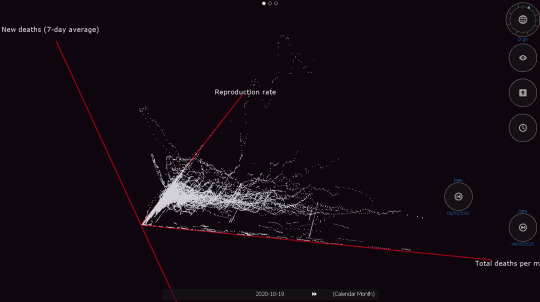
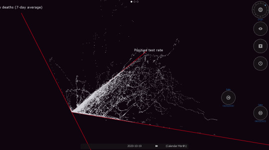

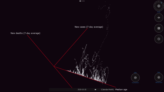
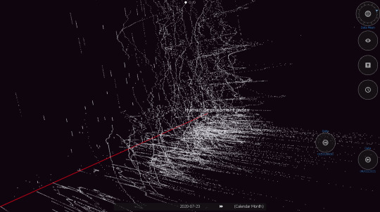
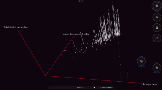
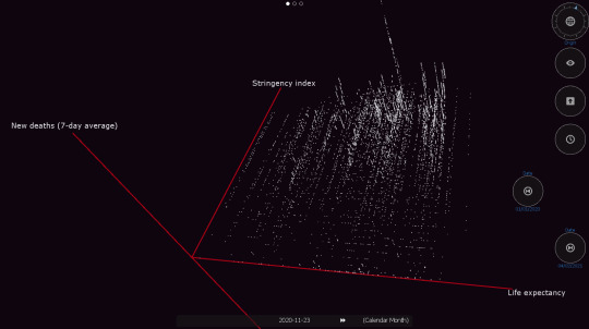
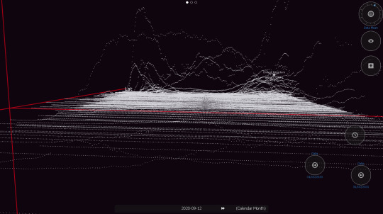
Visualizing the two waves of Covid-19 per country, arranged according to Geographic Latitude.
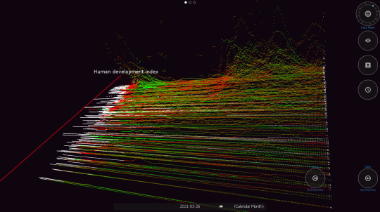
Visualizing multiple waves of Covid-19 represented in new deaths (7-day average) per million per country. The colors represent the effective reproduction rate (red R > 1.4, green R < 0.6). World data, till 26 March, 2021.
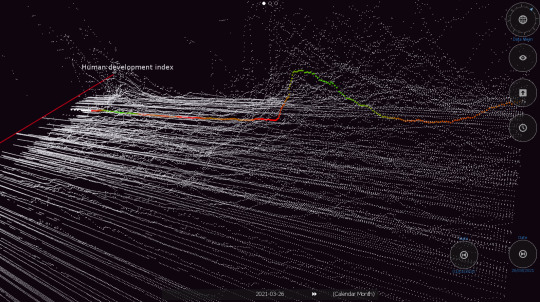
Visualizing multiple waves of Covid-19 represented in new deaths (7-day average) per million per country. The colorful datapoints refer to Greece as it enters a third wave and represent the effective reproduction rate (red R > 1.4, green R < 0.6). World data, till 26 March, 2021.
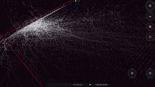
vimeo
Projecting various dimensions on the abstract Cartesian space and using a slider to filter time evolution.
vimeo
The datapoints from the 2 waves of Covid-19 evolving through time slices, represented in new deaths (7-day average) per million per country.
Geo map projections
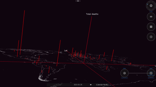
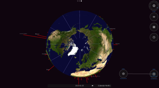
Total deaths per country (World, 25 January 2021).
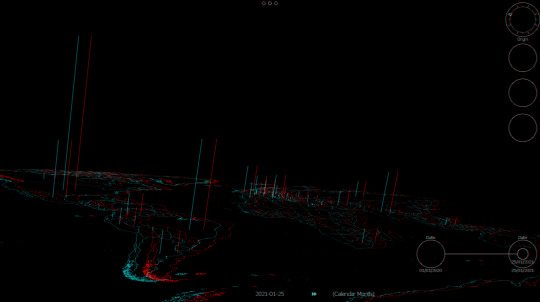
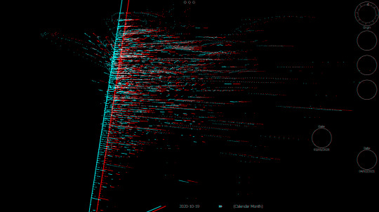
Total deaths per country. Stereo red/cyan anaglyph view (World, 25 January 2021).
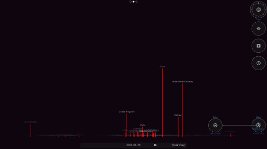
People vaccinated per hundred (World, 28 January 2021).

Total vaccinations per hundred per country (World, 22 January 2021).
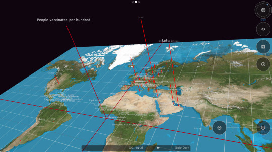
People vaccinated per hundred per country (World, 28 January 2021).
vimeo
The 2 waves of Covid-19 evolving through time, represented in new deaths (7-day average) per million per country.
Geo globe projections
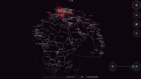
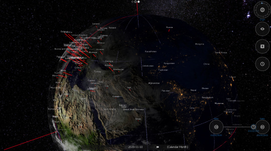


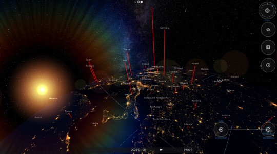
vimeo
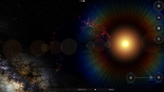
Seasonal variation of the 2 waves of Covid-19, represented in new cases (7-day average) per million, per country and the varying Sun illumination angle as the seasons progress (Winter is darker in the Northern Hemisphere because the Sun is lower on the horizon).
vimeo
Seasonal variation of the 2 waves of Covid-19 in Europe, represented in new deaths (7-day average) per country and the varying Sun illumination angle as the seasons progress (Winter is darker when the Sun is lower).
Data Sources for this project downloaded from "Our World in Data", Coronavirus Pandemic (COVID-19). https://ourworldindata.org/coronavirus/
Software written in Processing. Processing is an open source programming language and environment, originally built in the Aesthetics and Computation Group at the MIT Media Lab as a domain-specific extension to Java, targeted towards artists and designers. http://www.processing.org/ http://www.processing.org/exhibition/
"There is a magic in graphs. The profile of a curve reveals in a flash a whole situation - the life history of an epidemic, a panic, or an era of prosperity. The curve informs the mind, awakens the imagination, convinces." Henry D. Hubbard.
#data#data visualization#data art#cultural analytics#population#countries#creative coding#interactive#DataVisio#processing#coronavirus#covidー19#life#microorganisms#maps
4 notes
·
View notes
Text
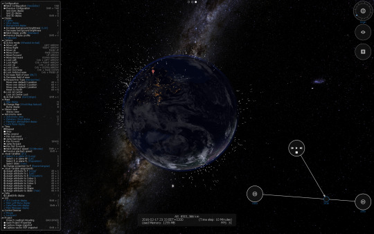
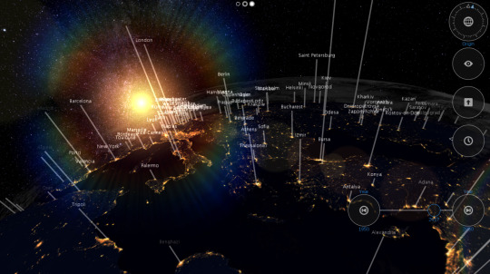
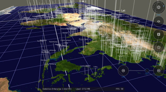
Visualizing population data for world cities

DataVisio is a 3D software engine for immersive and interactive complex data visualizations on big screens, designed to generate a Data Experience. It is a B2B platform aimed at presenting specific business logic to customers, or deep abstract knowledge insights to educate the general public. Its main power is the capability of mapping complex data schemas to abstract visual nodes, edges and surfaces in 3D space, and the easy, “game” like, navigation into that space.
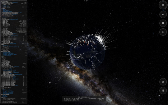
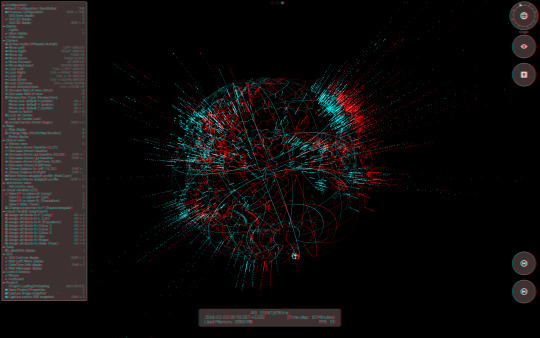
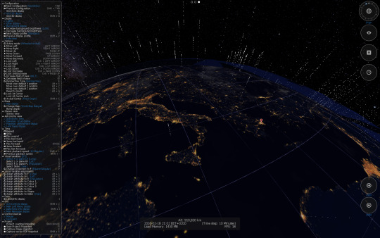
Urban population data (from 1950 up to 2050 estimations) are rendered on a simulated 3D Earth. All data are projected on one, or more big immersive screens in front of a computer base station which contains the computer running the software. Population data -in geographic and temporal dimensions- are displayed as graph bars over each urban location. The exhibition visitor can fly over the realistic planet representation in real time performance using a gamepad controller on the base station. This allows him to navigate freely in space to any location of interest, examining at the same time the data displayed. Using the same gamepad it is also possible to change the time period of the rendered data and so explore, or even animate, their evolution in time. Additional information for each urban area in the specified time can be retrieved by looking at a specific data point (an action which “selects” it).
Alternative modes of navigation using a Leap Motion Controller or a Kinect Sensor are possible, and more projector screens to increase the field of view and the immersion experience can be installed.


vimeo
vimeo
Software written in Processing. Processing is an open source programming language and environment, originally built in the Aesthetics and Computation Group at the MIT Media Lab as a domain-specific extension to Java, targeted towards artists and designers. http://www.processing.org/ http://www.processing.org/exhibition/
"Visualizations act as a campfire around which we gather to tell stories" Al Shalloway.
#data#data visualization#data art#cities#population#creative coding#interactive#DataVisio#processing#maps#countries
2 notes
·
View notes
Text
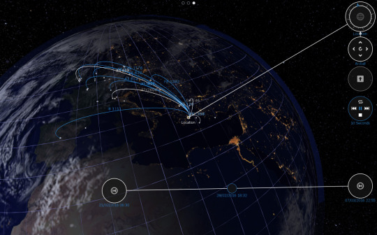
Visualizing air flights from Athens Eleftherios Venizelos International Airport (ATH)

DataVisio is a 3D software engine for immersive and interactive complex data visualizations on big screens, designed to generate a Data Experience. It is a B2B platform aimed at presenting specific business logic to customers, or deep abstract knowledge insights to educate the general public. Its main power is the capability of mapping complex data schemas to abstract visual nodes, edges and surfaces in 3D space, and the easy, “game” like, navigation into that space.
Real time 3D flight information is projected on one, or more big immersive screens in front of a computer base station which contains the computer running the software. All flights of interest -in geographic and temporal dimensions- are displayed. The airport visitor can fly over a realistic planet representation in real time using a gamepad controller on the base station. This allows him to navigate freely in space to any destination of interest, examining at the same time the flights displayed. Using the same gamepad it is also possible to change the time period of the rendered data and so explore, or even animate, their evolution in time. Additional information for each flight in the specified time can be retrieved by looking at a specific data point (an action which “selects” it).
Alternative modes of navigation using a Leap Motion Controller or a Kinect Sensor are possible, and more projector screens to increase the field of view and the immersion experience can be installed.

vimeo
vimeo
vimeo
vimeo
Software written in Processing. Processing is an open source programming language and environment, originally built in the Aesthetics and Computation Group at the MIT Media Lab as a domain-specific extension to Java, targeted towards artists and designers. http://www.processing.org/ http://www.processing.org/exhibition/
"Let the dataset change your mindset" Hans Rosling.
#data visualization#data#data art#air flights#creative coding#interactive#DataVisio#processing#graphs#maps#countries
1 note
·
View note