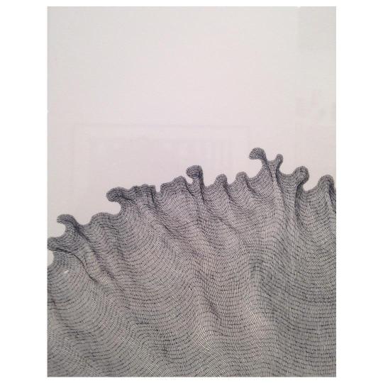
#DanielZeller
Explore tagged Tumblr posts
mtaartsdesign · 3 years ago
Text
Tumblr media Tumblr media Tumblr media Tumblr media Tumblr media Tumblr media Tumblr media
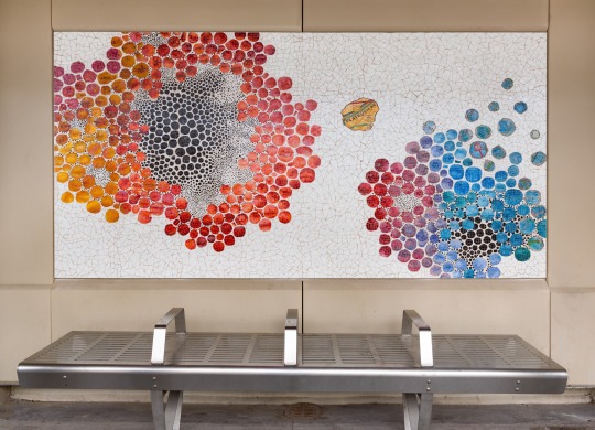
Karen Margolis’ “Cerebration” (2018) at 86 St (N) station in #Brooklyn visualizes thought patterns in circular clusters of color  ̶  at times bursting like fireworks. Fabricated by @mvmstudiosmx, colors within the mosaic artwork flow abstractly from one panel to the next, connecting a narrative of travelers’ thoughts and memories. 
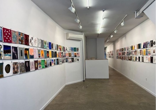
A paper-based piece by Margolis’ is currently on view in the @among_friends_show, alongside fellow #MTAarts artists @maureen_mcquillan, @danhzeller, @lindaganjian, @triciawrightart & @peterdrakeart, a group show organized by Alexandra Rutsch Brock, Beth Dary and Patricia Fabricant, at @equitygallery. “Among Friends” takes its inspiration from #RobertRauschenberg’s “Hiccups” (1978), wherein Rauschenberg zipped together ninety-seven sheets of handmade paper each with an unique composition, and “reflects and responds to the strength and illumination we find through art, friendship and community.” Let’s all celebrate being back #AmongFriends! On view through May 22.
#permanentart #mosaic #laminatedglass #KarenMargolis #MaureenMcQuillan #DanielZeller #LindaGanjian #TriciaWright #PeterDrake
35 notes · View notes
moma-prints · 3 years ago
Photo
Tumblr media
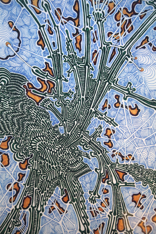
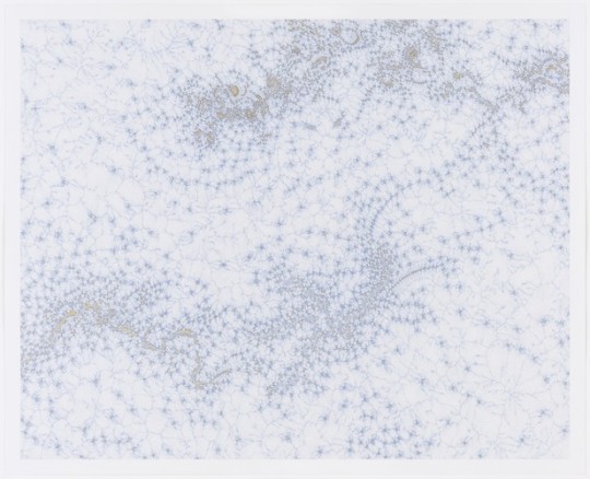
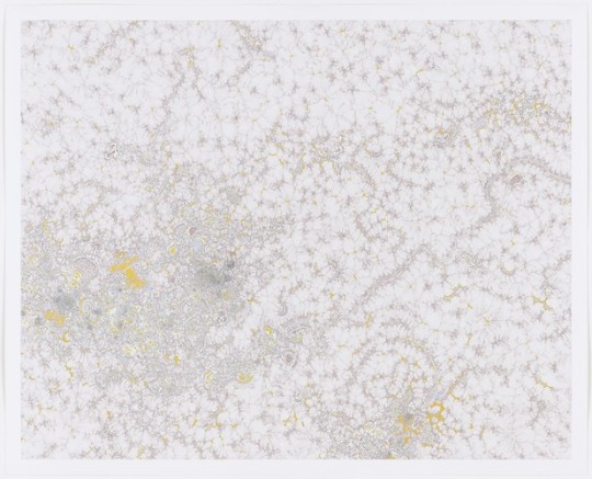
Amorphous Cohesion, Daniel Zeller, (2003), MoMA: Drawings and Prints
The Judith Rothschild Foundation Contemporary Drawings Collection Gift Size: 30 x 37" (76.2 x 94 cm) Medium: Ink and colored ink on paper
http://www.moma.org/collection/works/97806
6 notes · View notes
vicsterhao · 6 years ago
Photo
Tumblr media
#danielzeller #instaartist #artist #instaart #art #instadaily #gallery #galleryhopping #latergram #nofilter #vicsterinnyc @pierogigallery (at Pierogi)
1 note · View note
thedarkhawx-blog · 8 years ago
Text
GameDev#14 - Expansion of the Time Shift Mechanic - Part 1
So this I am focusing mainly on expanding the Time Shift mechanic ready for the presentation in two weeks. The mechanic already interacts with objects and has a little ring displaying the radius. But it’s not great. The ring doesn’t properly display over objects and since it’s a projector it ends up overlaying on everything and producing some weird artefacts at times. 
So I decided that the look needed an overhaul. Unfortunately shaders and graphics are not my strong point, so some heavy research and testing needed to be undergone before I would achieve something I was happy with.
Before I get started I wanted to have one last look into the shadow bug with my time shift shader. A quick bit of research with the right keywords later and I found my solution. 
SImply put all I needed to add was ‘addshadow’ to my pragma directive. This simply makes the shader do a shadow pass after any vertex modification.
Tumblr media
[1] https://docs.unity3d.com/Manual/SL-SurfaceShaders.html
To start off I had a look around at the type of effect I wanted and how I wanted to achieve this.
My first thought on one of the effects I wanted to apply to the sphere was to distort the area behind the sphere To give it a warble effect as objects pass through it. Like a heat wave.
youtube
[2] http://kostiantyn-dvornik.blogspot.com.au/2014/10/unity-3d-anoxemia-heat-distort-tutorial.html
I found a tutorial on distorting and it seemed like a good place to start. However the tutorial was for a 2D game. And since our game is in 3D I needed to find a better solution; also the tutorial was a bit out of date and even when I updated some lines the distortion effect never rendered. But I learnt a few things from this and about the use of _GrabTexture and uv’s to modify what gets rendered.
I realised that part of the effect is similar to water reflections as they grab an image of the world combine that with whats underneath the water and then distort accordingly. After some researching and a bit more exploring I found a better example of the shader that I needed.
youtube
[3] https://docs.unity3d.com/Manual/HOWTO-Water.html [4] https://forum.unity3d.com/threads/horizontal-wave-distortion.295769/
In this example they use a texture’s rgb channels to determine which way to distort and how much distortion to apply and then apply that distortion to the _GrabPassTexture. It produces the kind of desired effect I was looking for and works in three dimensions. To get this to work with my current setup I simply had add ‘Cull Front’ to the shader since we don’t want the player to be blurred when the camera is outside of the sphere.
youtube
By lowering the xy value I achieved a pretty good effect. I may lower this further if needed. The texture can also be changed to further refine the effect if needed.
Before I moved onto further effects I wanted to try and turn the ability into an actual ability. With a cast time, a use time, a UI indicator, etc.
To begin with I wanted to create the effect of the sphere expanding outwards on use, and inwards when not in use. This was easy enough to reproduce. Simply put I expand/contract the transform’s localScale between 0 and the maxSize by a small increment. That way we go from 0 to maxSize in castTime seconds.
Tumblr media
With this in place and similar code to decrease the size (although I doubled the increment when decreasing) and clamp it to a range the ability sphere would quickly expand inwards and outwards when I activated it.
From here I needed to turn it into an ability. To do this I needed to think about how the ability worked.
When the player starts pressing the button, the ability should first check if they have enough ‘resource’ to use the ability, and if so then start the activation and slowly lower their resource to 0. While the player is not pressing the button (and when they are pressing it but there is no resource left) we should perform a countdown until we start recharging their resource. That way we make the player carefully use their resource lest they run out since it will not start recharging instantly. Then once that cooldown is over and the player isn’t pressing the button we should start recharging their resource (fairly quickly I might add, in my case recharged it at 4 times its use rate).
This wasn’t too hard to implement and worked quite well. But as of right now the player has no way to tell how long they have left. In the final version I want to have a small indicator on the player themselves to show how much ability they have left, but we do also need a clear UI element that tells the player how much resource they have left.
[5] http://www.unityrealm.com/how-to-make-a-circular-progress-bar-in-unity-ui/
To do this I’m simply going to create a circular image to place in the UI and display a sector of this image depending on how much. I also want to have the indicator fade out when the ability is not in use to remove clutter from the screen.
Tumblr media
This was quite simple to implement. UnityEngine.UI.Image.fillamount takes a value between [0, 1] (representing [0, 360] degrees) and indicatorLeft is a small coolDown time for after the ability is recharged but before the indicator starts fading out.
youtube
Next I wanted to add a sort of highlighter for objects that enter the sphere. My first thoughts on how to implement this was to create particles emitting from the point where the object intersects with the sphere in the direction of the faces normals.
To do this I would have to find the exact collision points of the object and the sphere. Which can be found in the ContactPoints of the Collision object. And a collision object can be obtained by using OnCollisionStay.
[6] https://docs.unity3d.com/ScriptReference/Collider.OnCollisionStay.html
Except there is a catch. At least on of the objects needs to have a non-kinmeatic rigidbody attached AND the collider cannot be a trigger. Which means this isn’t going to work for us as we need the object to be a trigger otherwise the player and the sphere will collide with each other and wacky stuff will happen. I tried exploring additional options in regards to this and trying to create a trigger collider that isn’t a trigger, but didn’t get anywhere. 
So that’s a bust and a waste of a few hours of work. Moving on I thought that maybe creating a shader to produce the effect would work. Water shaders seem to do a similar trick when rendering foam when the water intersects with land or objects. Also silhouette outliners produce (what I thought was) a similar effect to what I’m looking for.
[7] http://wiki.unity3d.com/index.php/Silhouette-Outlined_Diffuse [8] https://forum.unity3d.com/attachments/image-jpeg.183077/
With this in mind I started my research.
I found many interesting articles, shaders and tidbits about intersection effects and how to achieve them. For example the developer of Flotsam was trying to achieve a foam effect on objects in water and has a good article on their thought process and solutions.
Tumblr media
[9] https://madewith.unity.com/en/stories/the-stylized-water-of-flotsam [10] https://github.com/danielzeller/Lowpoly-Water-Unity
After a few hours of research I stumbled upon a response on the unity forums describing how the effect could be reproduced with the use of depth buffers and to search in google “fun with shaders and the depth buffers”. Upon doing so I was greeted with this tutorial describing exactly what I wanted to do.
youtube
[11] https://chrismflynn.wordpress.com/2012/09/06/fun-with-shaders-and-the-depth-buffer/
The effect is called an ‘intersection highlighter’ and can be obtained by rendering the depth buffer, reading from this and highlighting intersections. Intersections are found when comparing the distance to the camera from the depth buffer and the actual distance to the camera. If these are close then we have our intersection!
Perfect. Well except that the tutorial was posted in 2012 and is out of date. Nevertheless I had my starting point and knew where to go forward.
Continued in GameDev#15
0 notes
agmesnyc · 9 years ago
Photo
Tumblr media
Daniel Zeller, 2015 #armoryshow #danielzeller (at The Armory Show)
1 note · View note
jevindornic · 10 years ago
Photo
Tumblr media
#pierogiXX #DanielZeller #Quagmirical #Dispersion
0 notes
moma-prints · 4 years ago
Photo
Tumblr media
Sporadic Distribution, Daniel Zeller, (2003), MoMA: Drawings and Prints
The Judith Rothschild Foundation Contemporary Drawings Collection Gift Size: 30 x 37" (76.2 x 94 cm) Medium: Ink and colored ink on paper
http://www.moma.org/collection/works/97809
0 notes
mtaartsdesign · 8 years ago
Photo
Tumblr media
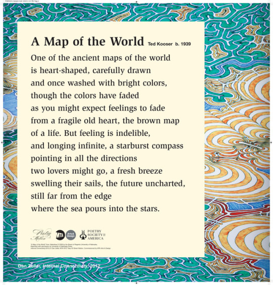
Celebrating #EarthDay during #NationalPoetryMonth with a new #PoetryInMotion card. “A Map of the World” by Ted Kooser featuring artwork from Daniel Zeller’s “Internal Connectivity” (2012) installed at Bay 50th Street in Brooklyn. With Poetry Society of America. 
75 notes · View notes
mtaartsdesign · 8 years ago
Photo
Tumblr media
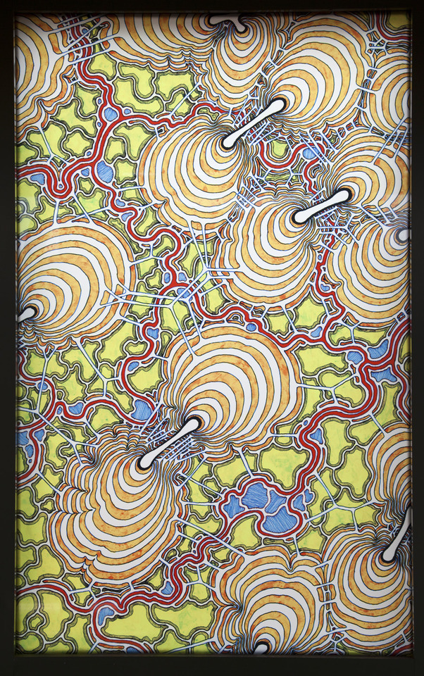
If your heading to the art fairs this weekend keep your eyes out for Daniel Zeller’s intricate drawings at The Armory Show in the Pierogi Gallery Booth. 
Image:  Daniel Zeller, “Internal Connectivity” (2012) at Bay 50th Street.
45 notes · View notes
mtaartsdesign · 9 years ago
Photo
Tumblr media Tumblr media Tumblr media
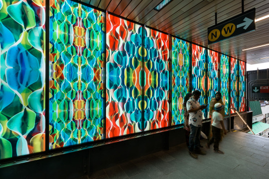
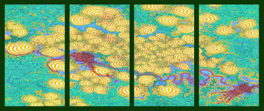
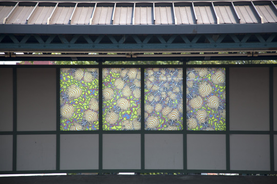
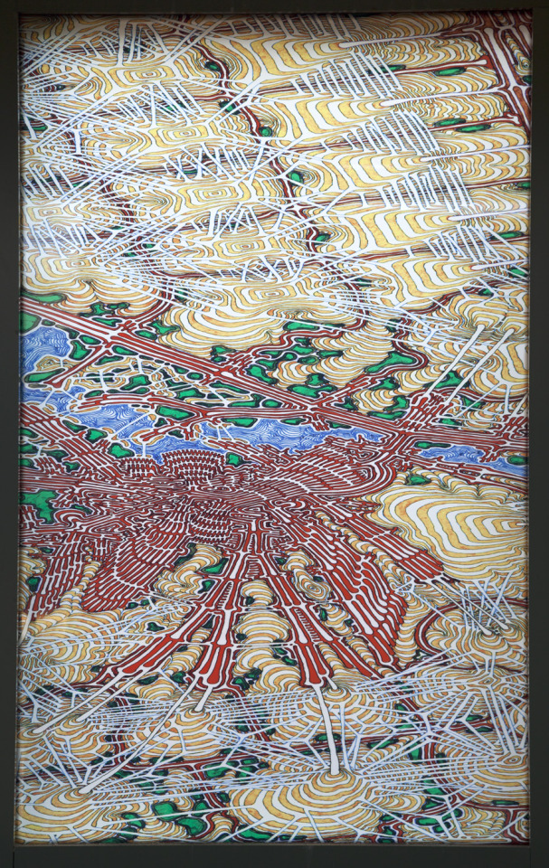
Dan Zeller was inspired by satellite imagery of the local streets in Brooklyn in his colorful laminated glass panels whose intricately abstract patterns illuminate the Bay 50th Street D station. These organic images closely reflect the green space next to the station and the connectivity of lives in an urban environment. Zeller highlights the ways in which infrastructure, nature, and human activity interact and evolve. You can see Daniel Zeller’s new work on exhibit at Pierogi Gallery opening tomorrow, October 16, 7-9pm.
79 notes · View notes