#Could super use a grid overlay though
Explore tagged Tumblr posts
Text
one of the ps+ games this month is a jurassic world zoo building game. I haven't played it too much yet, but so far it is scratching the zoo tycoon itch i've had for ages.
Plus dinosaurs!
#Thoughts from the fire escape#I miss the happy and frowny face icons from actual zoo tycoon#And this one has a driving minigame i already hate#But otherwise it's been fun#Not quite as micromanagy as planet zoo#Could super use a grid overlay though#None of my stuff lines up neatly and i hate it
2 notes
·
View notes
Text
Hi! @velvetcloak asked me to do some kind of lineart tutorial/step-by-step, I'm by no means an expert so don't hesitate to ask if you need some things clarified! Always glad to help.
I use three different methods that are pretty much trial and error, depending on what works best for the artwork but I'll do my best to explain with screenshots - these were taken on photoshop, I draw with procreate, but I'm guessing the layer modes are similar on other softwares. (Also mine are set in french, sorry in advance for the confusion.)
If you're already familiar with digital lineart and softwares, this probably won't be of much use, it's very basic stuff.
Otherwise, more below the cut! (It got a bit long.)
I. Solid black lineart, with this illustration used as reference.
I used the basic gesinski ink brush in procreate, 100% opacity in normal mode to get pure black. Very basic, it's set on top of the colour layers, everything above that is just additional effects and filters + textures. Note that I always draw separate elements on different layers and fuse them later, it's easier to deal with details this way. The isolated layer looks like this (I changed the colour of a disappearing hair lock, more on this later):
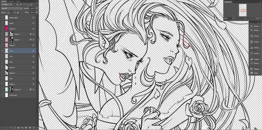
And the colours without it, like this (my style relies heavily on lineart, lol):
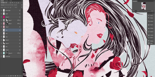
Both:
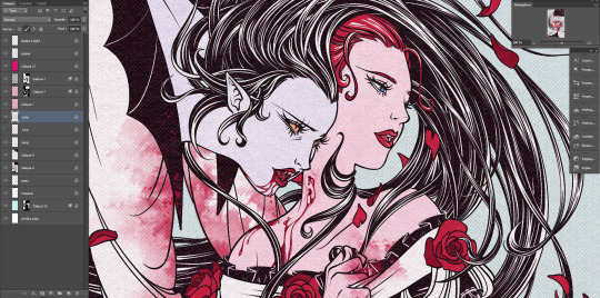
Good! It's a bit harsh though, I like to add a second layer to soften things up, set in 45% opacity multiply mode right under that. I duplicate the main lineart, and add a gaussian blur to the copied layer (between 3 and 5px, values vary from one artwork to another, same with the layer modes.)
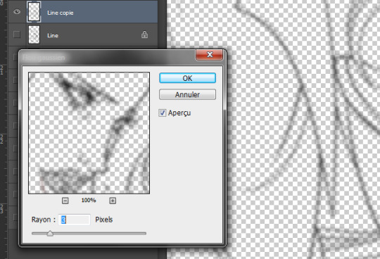
Not done yet! I use the blured lineart as a colour filter by locking it to pixels only and filling it with the tone I want. In this case, red. Isolated layer:
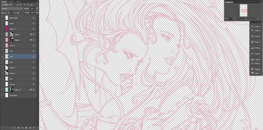
And the end result:
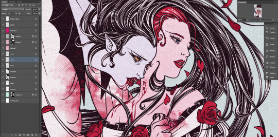
The second method, I tend to use more on sketches and loose drawings to get a better blend of lineart and colours:
II. Semi-transparent lineart, with one of these sketches.
Basic 6B brush in procreate (my fav), quite thin here but you can get great results with a larger brush. It's not really obvious looking at this scale, so here's a comparison between a black solid lineart (1 layer, normal 100% - the scars are on a separate layer because of the colour, otherwise it's the same setting) and a semi-transparent one (2 layers), especially visible in lighter areas, note how the second one lets hues show through. I find this to look a bit less stiff.
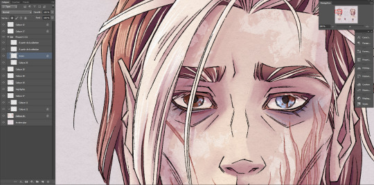
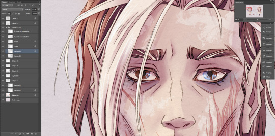
Now for the method! Since this relies on the layers underneath, you want your colours to a bit more precise than the previous example. Without lineart:
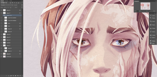
TBH it's also a two layers solution, super easy. Once you're statisfied with your basic lineart, set the layer to overlay 100%. You'll get something like this:
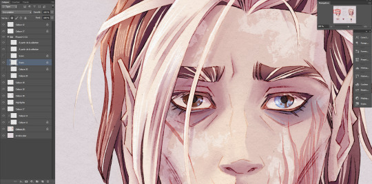
Then duplicate this layer, put the copied layer above the overlay one and set it to normal 70% (or whatever looks best, this is 67%) and you'll get the final result as previously shown! In this particuliar case, I erased the black circle around the iris in the normal mode layer to keep the blue of the overlay one. You could also skip step two depending on the desired rendering.
The third method is a blend of the other two result-wise:
III. Coloured lineart, with this illustration. (tw: a bit of gore and blood in the full artwork, I'll crop it out of the screenshots. Poor guy can't get a break. It's the only file in this style with a semblant of organization, don't be like me, rename your layers and use folders.)
Fountain pen toothy brush, from the MaxPack watercolor set. It has a bit of a texture to it, and isn't entirely opaque so it blends nicely with the layers below. The lineart is set to normal 100%, for this method it's preferable to have separate layers for each elements, since you'll be recolouring them individually. Here, the hands, skull and additional details are all on individual layers.
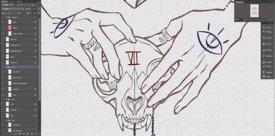
Just like the blurred layer in the first method, you need to lock your pixels (the little grid to the left on photoshop):

And either fill you layer with colour, or paint on it with an opaque round brush/a soft one depending on the desired outcome. (Some zones might need a gradient, or various colours.) You can also use another normal layer on top of a black lineart and set it as a clipping mask, same result, different method. But I prefer to keep the layers count to a minimum when possible. With the layers below, it will look like this:
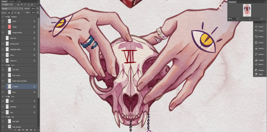
You can notice a bit of lineart transparency over the skull colour layer, cool stuff. (The shading of the skin is set on top for some reason, I don't remember why but surely there was a reason.) However! In this illustration, I need a yellow glow for the fire so let's create yet another layer, shall we? This affects the whole rendering. I painted a diffuse light source using a soft gradient brush, and set the layer to hard light. Isolated layer:
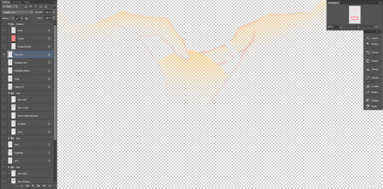
End result:
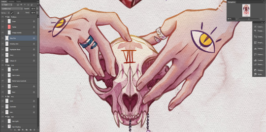
All done!
Now go create!
9 notes
·
View notes
Photo

The scene here is two close characters going for a walk, and the human, Beryl, gets tired and takes a small powernap while Illanipi-the deer-provides a comfy back prop and lookout.
For this piece, I focused on the composition, coloring and background, so I would like to know if there is any way I can improve that, especially since this is the first nature background that I have put effort into. (I’m especially not sure how I did with the human’s posing and if I did the deer alright since I never drew one from the front before.)
While its not something you have to do, could you also tell me how I did on the character design? The human is supposed to be a child of 12 and the deer-creature isn’t a full deer, it’s a deer-shifter which are pretty huge compared to average deer and have a wider range of color.
Thank you so much ^^
This is very charming! I’ll compliment you right away from having two characters interacting in a diegetic environment, it already reads like a scene which can be difficult to pierce together.

First things first, colour. Since you’re working on a pretty limited colour pallette ( what with the deer being close to exclusively white or tan colours, and the human’s pallette being a triadic pallette from what i can see, i’d like to take a moment to give the overal piece a tiny bit of love. And that can be done pretty easily with an overlaying colour layer. Or by mastering your colours so that they all have undertones of one specific colour.
My only comment for the character designs is that perhaps the girl’s outfit could be simplified down even more to match the detail level of the deer. Though that is really nitpicky and speaks moreso into the overall visual language of the universe than the designs on their own. They’re just fine.
For this winter scene, i gave everything a blueish colour to let the temperature of the scene soak the atmosphere of the whole piece. Now this colour layer is a little rough and doesn’t look super integrated, but im sure you can apply it much better since you have the original file ( and know what kind of mood you want to push with the image ).

To look at some composition, i will be pulling out my trusty rule of thirds grid ( more about composition here: https://theredlinestation.tumblr.com/post/623115556175888384/can-you-explain-the-rule-of-thirdsthe-golden#notes )
Perhaps you already considered the grid, since it seems the deer aligns somewhat perfectly with the two rows of focal points on the left. I’ll be keeping this disposition but turn the camera around just a bit to reveal a bit more of our characters.

Like this. This angle gives us more context as to how the girl is leaning against the deer. In overal, the angle also gives us a little more to look at, as the original angle of the deer gave us mostly the very front of it, which didn’t describe much about the creature as a whole. I’ve also added a snippet of a tree in front, just to give us a little bit more sense of depth in the planes of the image ( background, midground and foreground ). You can also add more trees to the background to further enhance the feeling of depth, but that all depends on what kind of environment / forest composition you were looking to do, as the original image shows that there can be quite a bit of distance between the trees, which leads to a bunch of open spaces in their surroundings.

- Mod Wackart ( Ko-fi )
85 notes
·
View notes
Text
I wonder...
How does Rex live in his day to day life, and does he have like a permanent digital kind of overlay in his vision..? Idk what other words to use to describe it rn as it’s like, midnight and I can barely form a coherent thought but bear with me.
See, we don’t really see much through his own eyes, but in the paddle episode we’re given a little glimpse into the way he can see ... well, I guess math problems irl? The teacher calls out a very complicated math formula which basically has a super simple answer. But as he says this we’re shown how Rex is mapping and gridding it out with precise measurements -- it’s like his nanites are making it an overlay or something of sorts in his vision! Evidently, he compares it to what it’s like aiming his slam canon -- so.. does this mean he sees this kind of thing regularly? Does he aim using that nanite vision or whatever the fuck this is?
And more importantly... If so, how can I expand upon it? See, DBH got me thinking -- what if his vision were more ... filled with stuff like the androids from cyberlife or whatever? I just think it’d be neat if he could calculate stuff like probability of success -- which he does anyways with the slam canon -- or keep up with the positive / negative reactions. I mean what we were shown low key reminds me of how thorough markus’ preconstruction can be ... so maybe, he is a bit more like them in terms of what he sees daily?
Maybe it’s food for thought, or maybe I’m just bonkers, but i just think that’d be a NEAT thing to expand upon with my Rex. I might experiment with writing this kind of HUD display in more, though it certainly pushes the boundaries of his humanity vs his roboticism. Roboticism? I think that’s the right word, but... as I’ve said time and time again, he’s pretty much a living computer now. He can manipulate technology, he’s CRAZY good with super precision maths -- well good at just about anything but basketball really -- and we don’t know how much of his insides are metal and how much is flesh. Does he have gears whirring in his chest? Is his skin tougher / harder than an average human, like that of metal or something? Can he actually see that HUD display gridding / mapping in shit like that, or was it a gag?
well, time will tell. but for now, lmk what you guys think!
#◀ Well my heart is gold and my hands are cold ▶ ( character study )#I guess??#sorry if it got a bit rambly but like. i hope it makes sense#i'll refine this in the morning
2 notes
·
View notes
Photo

12 Best WordPress Slider & Carousel Plugins of 2020
Whether you want to show off customer testimonials, your latest blog posts, your best images, or just celebrate the members of your team, there is a WordPress slider plugin or WordPress carousel slider plugin out there that’s right for you.
But before we share the ten best WordPress sliders and carousels to be found at the Envato Market this year, maybe we should clarify the difference (or the lack thereof) between a slider and a carousel plugin. Some say that there’s little difference between the two because they both do a variation of the same thing: display a number of images in a slideshow format while offering some controls like previous and next arrows, thumbnail navigation, and sometimes transition effects between the slides.
Others insist that though this may be true, the important distinction between a WordPress slider plugin and a WordPress carousel plugin is that a slider slides the images horizontally or vertically while a carousel rotates the images on an axis with the image always facing the viewer. While the jury is still out on which is right, for the purpose of this article we’ll treat the two terms as interchangeable and get on with the business of revealing the ten best WordPress sliders and WordPress carousel plugins of 2019.
1. RoyalSlider
RoyalSlider
The single most downloaded slider at CodeCanyon, RoyalSlider for WordPress is packed with irresistible features. Used by companies as diverse as Coca Cola, Ralph Lauren, and Land Rover, this plugin does just about everything you could possibly want from a slider.
The most appealing feature is the fullscreen feature with native HTML5 fullscreen support. Perfect for showing high-resolution photography!
Other standout features include:
multiple sliders per page are allowed, even with different skins
touch swipe navigation support
responsive design
vertical or horizontal thumbnails, bullets or tabs for navigation
RoyalSlider will definitely wow your visitors with its clean design and professional functionality.
User frctech says:
"I have used RoyalSlider since 2011. It is reliable, well-designed, well-maintained, and well-supported. On the handful of occasions that I've needed support, answers have been prompt (freaky fast even), intelligent (no crappy canned responses), and have solved my issue."
2. Slider Pro
Slider Pro
Slider Pro provides a clean and intuitive user interface in the admin area with a smooth navigation experience for the end users.
Slider Pro avoids unnecessary fanciness, which many times is an obstacle for end users in getting the information they need, and instead focuses on simplicity and performance, while still providing a wide range of customisation possibilities.
My favourite feature is the deep linking feature, where each slide change will update the URL in the browser's navigation bar with the appropriate URL hash. That means users can copy and share links directly to individual slides!
Standout features include:
optimised image loading
easy customisation
smooth animations
multiple layouts
Slider Pro, as the name suggests, is the professional solution you need.
User LWWCRHI says:
"David was excellent in helping me get my slider to work with special effects. This is not your average slider and can do a lot more. Feature rich and support is really great giving it a 5 star rating."
3. Logos Showcase
Logos Showcase
The Logos Showcase plugin is specifically created for users who want to make a grid of images with external or internal links or need to display a list of clients' or sponsors' logos.
The standout feature with Logos Showcase is the ability to display logos in a grayscale version with the option to display with original colours by hovering if desired.
Standout features include:
choice of three different ways to display images
control of transition speed and auto scroll is enabled
control of default size of logo images
option to set URLs to each logo which can open on the same page or in a new page
Logos Showcase is the slider to choose if your priority is to display logos and lists most effectively.
User cross5 says:
"More than incredible cutomer support. The plugin is really easy to use, all needed features are available. Highly reccomended!"
4. All Around
All Around
All Around, as the name suggests, is a really well-rounded slider. It gives you a clean, responsive design, a number of predefined styling options, and support for swipe gestures. Use one of the six layouts or customise the plugin manually as needed.
Standout features include:
six premade styles
support for videos
vertical or horizontal sliders
supports multiple sliders on one page
autoplay mode
The All Around slider isn't all-around by name only. If this is your first WordPress slider and carousel plugin, it just might also be the last one you'll ever need.
5. Super Bundle
Super Bundle
One of the best slider plugins for WordPress, Super Bundle is a collection of terrific elements, settings and tools that are designed to take your WPBakery Page Builder site to the next level with the ability to turn any content into a carousel, add a video light box, animate text, etc.
Standout features include:
parallax background and video background options
over 70 customisable, high-quality SVG row separator designs
13 entrance animations and 14 exit animations
6 unique text effects
video or image thumbnails that when clicked open a large video lightbox popup
What's great about Super Bundle is that apart from creating great carousels, it allows you to add a ton of other cool features to your WordPress site. A great multipurpose plugin.
User alienflaky says:
"There are more than one reason I gave this product 5 stars. From an awesome product to a solid back-end support, it is definitely a must if you want to customize your WordPress beyond a purchased theme."
6. Global Gallery
Global Gallery
Global Gallery is a WordPress image slider that helps you to create awesome galleries from a variety of image sources including Flickr, Facebook or other social media platforms, WordPress custom elements, and any RSS feed. The plugin offers four gallery layouts and also includes both a responsive image slider and a full-featured carousel.
Standout features include:
four gallery layouts
drag-and-drop gallery builder
image tags filter
images slider with fixed or responsive sizing
images carousel with multi-column layouts
With its fast, one-click setup, the Global Gallery plugin will help you create filterable, fully responsive and adaptive galleries on your website in no time.
User mkknop says:
"I am so happy with getting Global Gallery! It is really easy to set up and especially together with the Overlay Manager add-on, I was getting the 'really slow zoom-in' effect I was looking for. Also notable: The perfect customer support from the author, with same-day feedback / solutions. Very recommendable and worth the price."
7. Carousel Anything
Carousel Anything
If you’re in the market for a highly versatile WordPress image carousel, Carousel Anything is for you. With Carousel Anything, you can create carousels for any of your content: blog posts, image sliders, video showcases, testimonials, team members, and more. The plugin comes with two designs: one displays your posts in a simple and clean layout, while the other offers a few more design features.
Standout features include:
works great with touch devices
create carousels from your post types
lightweight
works with any theme
This WordPress carousel slider plugin gives you one of the easiest and quickest ways to create carousels for your website.
User Pixelschiebr says:
"I really love this add on. I am not even halfway through all the ways I could use it. But so far I use it for Sliders on news pages as well as video Galleries on my pages. It works very well with Visual Composer and I love that I can have all the seetings for background colors etc. Carousel Anything is way simpler and gives me all the options that I need."
8. Progress Map
Progress Map
Progress Map is unique among the WordPress plugins listed here in that it combines carousel slider features with a Google Maps feature. The plugin’s aim is to help users create WordPress sites that provide listings for hotels, real estate, restaurants, job posts, etc. With this plugin, you can plot your listings on Google Maps using markers and then feature the same listings in photos on a carousel—with connections between them! When an item is selected on the carousel, its location on the map is indicated. Likewise, when the marker on the map is clicked, it activates the image carousel.
Standout features include:
carousel can be positioned to the right, to the left, over or under the map
provides clustered map markers for a map with a large number of locations
carousel items are fully resizable and fully customisable
connect plugin with any custom post type
If you’re looking for a visually powerful way to display a number of different locations on a map using an image carousel, the Progress Map plugin is a great solution.
User GiulioNF says:
"Insane plugin! Everything you need using maps and front-end, Really easy to customize as well!"
9. Viba Portfolio
Viba Portfolio
Viba Portfolio is all about showcasing your latest blog posts, portfolio, customer testimonials, etc. to their best advantage. This WordPress gallery slider provides you with four different gallery types, as well as 60 skins to change the looks of your slider easily and quickly. It also offers full control of all customisation features, from layouts to font size to colour and overlays.
Standout features include:
60 skins
4 gallery types
3 filter types
responsive grid and responsive carousel layouts
Use Viba Portfolio as a WordPress testimonial slider, WordPress post slider, or any other kind of slider you need. It's that versatile!
User galiabrener says:
"This is the best plugin ever! Not only does it look very beautiful, but the customer support is so amazing! Thank you dear Harun for your excellent work and outstanding support! I would recommend everyone to get this beautiful plugin!
10. Ultra Portfolio
Ultra Portfolio
Ultra Portfolio will primarily appeal to users who are interested in building portfolios with slider features included. It offers a large number of layout options and really delivers on flexibility and functionality. The most appealing feature of this slider is the ability to control animation effects and animation speed.
Standout features include:
unlimited layouts
WooCommerce integration
Google Font integration
responsive layout lets you control the number of columns for different screens
Ultra Portfolio should be your choice if you want to combine slider functions with a wide range of portfolio options.
User iRoland says:
"Very good and easy to use plug-in for overall portfolio presentations."
11. Supreme Shortcodes
Supreme Shortcodes
Supreme Shortcodes WordPress Plugin allows you to build exceptional pages easily by presenting you with a number of page snippets that you can use as a base to build your pages. It works with Visual Composer Page Builder but doesn't rely on it. The plugin adds over 100 extra functions to your website from static elements like boxes to animated elements like 3D buttons and popovers.
Standout features include:
parallax sections
3D buttons and icons
responsive pricing tables
contact and captcha
Google Charts and Docs
Built on Twitter Bootstrap framework for a responsive design, Supreme Shortcodes gives you 100% accurate fitting on any screen resolution.
User Lightwriter says:
"The pride and enthusiasm SupremeFactory has in their products as well as their care for the customer is evident. The prompt and courteous way my support request was handled has earned SupremeFactory a loyal customer."
12. Before & After Image Slider for WPBakery Page Builder
Before & After Image Slider for WPBakery Page Builder
This easy-to-use short code that works with WPBakery Page Builder allows you to build a rather nifty slider to showcase your before and after photos. Your website guests will be able to trigger the before and after slider either on a mouse hover, by click and drag or by the use of a scroll bar. The plugin in adjusts to your screen size.
Standout features include:
horizontal, vertical and diagonal splits
responsive and touch enabled
customiseable border and arrow colours
scrollbars are available in the settings
Before & After Image Slider for WPBakery Page Builder is great for before and after shots of website redesigns, photo edits, make over sessions and more.
User robCODE says:
"Super. Does what it says on the tin. Compatible, easy to install and looks good."
Choose Your WordPress Slider and Carousel Plugins
That's it for our ten best WordPress sliders and best WordPress carousel plugins of 2019. This is just a small selection of the WordPress carousel plugins and WordPress slider plugins available in the Envato Marketplace. If you don't find what you're looking for here, why not look at what else is available?
Looking for more great WordPress Gallery Plugings? Then check out these great articles featuring all the terrific plugins to be found at Envato Marketplace.
WordPress Plugins
8 Best and Most Beautiful WordPress Gallery Plugins
Nona Blackman
WordPress Plugins
10 Best WordPress Gallery Plugins of 2019
Lorca Lokassa Sa
WordPress
17 Best WordPress Gallery Plugins
Jane Baker
WordPress Plugins
7 Best WordPress Video Gallery Plugins
Kyle Sloka-Frey
Furthermore, if you're interested in getting more into WordPress development, don't hesitate to review the many tutorials we have available.
Learn How to Use WordPress
Are you new to using WordPress? Learn how to use WordPress in our complete guide. This guide will take you through the full process, from the basics of creating posts and pages right through to installing and customising your first WordPress theme and setting up plugins for security and performance.
by Nona Blackman via Envato Tuts+ Code https://ift.tt/2r3XQH0
0 notes
Note
Hi
hey! thanks for asking. the instructions in this thing are all made in accordance with photoshop cs5. it’s also photo-heavy. i also don’t use apple, so all the keyboard commands in the tutorial are according to windows 10. you will need to know how to make a gif if you want to use this tutorial. you’ll always need to know how to use some basic tools in photoshop, like the quick selection tool. if you don’t know how to make a gif, here’s a link to a tutorial: click here!
this is the post the ask is referring to. here’s an example of the final product:

also, two things to note before we get started:
1. my theme stretches out all inline images to 100% of the post width and i haven’t been able to figure out how to Stop That from happening yet. so if something appears super blown up under the “keep reading” cut (for instance, the gif in step 3), that’s because of…that. yeah. :| you can circumvent this if you have xkit and you have that extension that allows you to read stuff below a keep reading cut right on your dashboard, so that’s a thing, too.)
2. jsyk, i wrote this in chunks through the past month, and i changed some of my settings in that time span, so some screenshots have a gray background and others have a blue background. that doesn’t mean anything, it’s just that i changed the color of the background in photoshop.
STEP 1. find your “big picture,” the one that’ll be overlaying all of the small gifs. open up your image in photoshop and crop it to around 540px in width (or 500px, depending on what dimensions you’re using), so that the picture doesn’t cover up all the gifs in your final product. you should note that you should make the height of your picture to two times as large as the height of the final gif you plan on making. in this case, the final gif i planned on making was 270px in height, so i made sure the height of my cropped photo was 540px.
then, use the quick selection tool (shown below) to cut out any part of the background you don’t want.
if you want, you could then sharpen/add coloring to that photo any way you like to make it more pretty or something. (i colored all of the big pictures, in this case.) your photo should look like this now (these dimensions are 540x540, fyi):

next, i cropped this picture into two separate 540x270 pictures, because i can’t exactly put a 540x540 picture on top of my final 540x270 gif. here’s what one of them looks like now:

you can blur the edges of the photo if you want, to get rid of the sharp-ish uneven edges (if…you know what i mean lol), but it isn’t really visible in the final product anyway. i didn’t do that in this gif. your call completely.
you’re about done with the big picture (for now), so set it aside.
STEP 2. make a new file (???), its dimensions being the size of the final gif you want. calculate the dimensions of the small gifs you want to make so that they all can fit into your final gif. in this case, following what dimensions i wanted my final gif size to be and the number of gifs i wanted in each final gif, my small gifs are 86x86, leaving a space for around 6px between each of the small gifs. i’d also definitely suggest laying out guidelines for where your small gifs will be:

or, if you wanted to make “bigger” smaller gifs — like if you only wanted four small gifs per final gif — your guidelines may look something like this (assuming small gifs are 268x133):

anyway, whatever dimensions you want to use, just lay out guidelines for them. it will make your life so much easier when you put all your small gifs into the final gif, because they’ll snap right into place. here’s a link to the psd i used for this gifset, by the way, if you want to make a gif exactly according to the dimensions i’ve used here. (it’s unfinished, because i wasn’t continuously saving while i made these gifs — file size got too big and it took too long — but you can figure out the rest after you’ve read this tutorial, i hope :P).
STEP 3. copy your big picture onto the document you laid the gridlines out, so that your doc now looks like this.
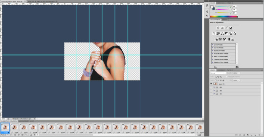
you see how some of the squares are completely filled in by the big picture? note which squares those are and forego making any gifs for those locations, because the process gets really tedious later on and you don’t want to be stuck making gifs and highlighting its layers and moving them to a place that no one will even see in the end product. in this case, i’ve highlighted the squares that i will not be using, and you can see that below.
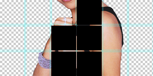
anyway, once you’ve taken note of the places you won’t need a gif, delete the big picture from the file for now, and make sure that your doc is completely empty save for the guidelines grid, so that step 5 won’t get messed up.
STEP 4. make your small gifs, but make sure that they all have the same number of frames! crop each of your gifs to the dimensions you previously calculated in step 2, and color it any way you want. here’s the final product of one of my gifs, after cropping and sharpening and coloring:

STEP 5. okay, so now, you’ve made your small gifs and set the dimensions on your final gif. what you want to do now is open the first small gif you want placed in the final gif in photoshop, like this:
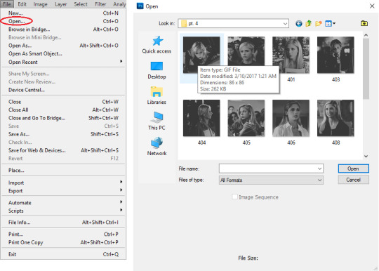
once you double click on it, it should bring up a screen like this:

click on the three horizontal bars thing on the upper right corner of the frame animation, and then click select all frames.

the frames should then all be highlighted. then, click on the same button and select copy frames from the menu.

now go back to the doc file you made in step 2, the one with all the guidelines and stuff. make sure that you’re in frame animation, NOT timeline animation. if you’re in timeline animation, click on the icon that looks like the one below (it should be placed on the bottom right corner of the screen), and it’ll convert to frame animation.

once you’ve done that, click on the three bars button again and this time, click paste frames. when you click it, this following window should pop up:
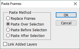
the default for this “paste frames” window is for the circle next to “paste after selection” to be selected. select the circle next to “paste over selection,” like the example above shows. this is important, so make sure you Do That!!! after that, your final gif file should now look like this:

now, these next few steps are theoretically optional (??? honestly i don’t even know if they are lol, it’s more organization than anything but organization is also really important in making these gifs, in case you couldn’t tell :P), and also super annoying to finish, but if you don’t do them, you’ll have a hell of a time moving all the gifs into place later on. go to the layers panel. right-click on a random layer and then click on select similar layers.

all of the layers should now be highlighted. press ctrl + g to move them all to a group. now, all the layers that belong to that gif, and only that gif, will be all grouped together nicely.
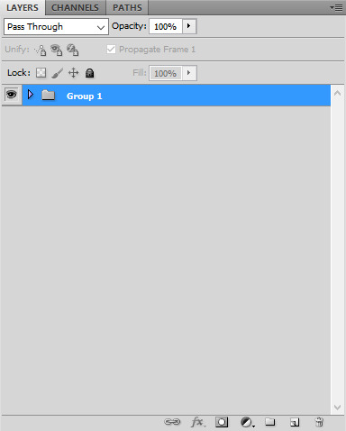
i’d also rename the group to something that identifies the gif for what it is, so in case you need to do something with that particular gif later on in the process, you can easily identify it. in this case, since this gif is buffy from s3e21, i later named the group “321”.
STEP 6. so, now that you’ve put your first gif on, you’ll want to put all the other ones too. open the second gif that you want to use, and copy and paste the frames onto the same document, exactly like you did with the first gif. however, while pasting your second gif’s frames onto the document, when the window prompting you to select your paste method appears, not only do you want to make sure that the circle next to “paste over selection” is, but also check the link layers box at the bottom of the window. (note that checking the link layers only applies when pasting this particular gif.)
after you’ve done all of that, your doc should now look something like this:

yes, the second gif has overlayed the first gif. don’t worry; we can fix that easily. right-click on any one of the layers in the layers panel. then, select select linked layers from the menu that appears:

this should select all the frames in your second gif, and only those frames, because you linked them together while pasting them over the first gif. press ctrl + g again so that you can group these gifs together. after you’ve done that, click on the group you’ve just made so that it’s highlighted.
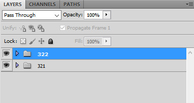
then, go to the main body of your document, and then click and drag the second gif (which, again, is placed on top of the first gif) to the second placement on your guidelines grid:
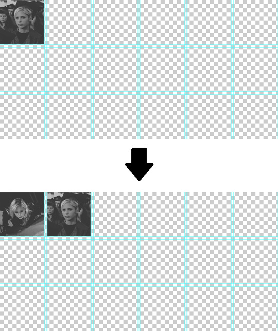
STEP 7. so now, you’ve got two gifs. to add all your gifs from this point on, it gets a little bit different than what you’ve been doing for the first two. (it’s also a lot more tedious, but at least for me, i haven’t been able to find a better way to do it. so.) anyway: open, copy, and paste your third gif like you did for the past two gifs (make sure that this time, though, the link layers box in the window prompting you to select what paste method you want isn’t checked!). your doc should now look like this:

note that the third gif is overlaying the first gif, just like how when you initially pasted the second gif, it was overlaying the first gif as well.
now, what you want to do is manually highlight all the layers of the third gif in the layers panel. you can’t use any of the “select similar layers” or “select linked layers” options that you used to select all the layers that belonged to either the first/second gif anymore, because if you do that, you’ll end up highlighting all similar layers (that is, every single layer in the panel) or all linked layers, and you won’t be able to move your gif properly. you can do this by holding down the ctrl button on your keyboard, and then clicking on each layer in the panel until they’re all highlighted.

once again, press ctrl + g to group them together after they’re all highlighted. after that, move the third gif to the third placement on the grid guidelines, exactly like how you did moving the second gif.

STEP 8. repeat step 7 until you’ve fit in all the gifs you want. remember that you don’t have to fill in the doc completely with gifs, because the big picture you made in step 1 will cover some spaces completely.
your gif file should now look something like this (just…imagine that the bottom line is filled with gifs that are actually from episodes 10 - 15 lmao i just copied the 409 gif onto there to fill the rest of the space; i’m using the same psd i linked somewhere in the second step of this post and it isn’t complete):

STEP 9. finally, copy the big picture you made in step 1 onto your doc, complete with all the compiled gifs. your doc should now look something like this:

it’s basically finished by this point. just make sure that the delay time between frames is what you want it to be (i usually gif buffy with a delay of 0.05 seconds). then, save your gif! make sure it’s under the 3.00 mb limit; if it isn’t, convert the frame animation back to timeline animation and get rid of some frames.

voilà, you’re done!
anyway, i hope this wasn’t too hard to follow.
#not buffy#inbox#spnjensenlove02#sct#sct.tutorials#add. tags#lmao hell i hope i haven't forgotten anything and that this is clear enough??#anyway good luck <3
14 notes
·
View notes
Photo

Semifinal western shock UConn and injuries Womens Phil Esposito Jersey
For 12 of his 13 seasons with the Maple Leafs, Sundin led Toronto in scoring. In such an event, you shall have no further right to use the App or the content provided therein, however, the restrictions on your use of the App in Paragraph 3 shall survive such termination, and Wholesale Jerseys NBA Jerseys Wholesale Cheap you agree to be bound by those terms. One, is a lot of them love New York. That doesn’t really help the Silver & Black loyalists who still support the team in the Bay Area, though, as the Raiders have spent 20 of their 24 Cheap NFL Jerseys From China years since moving back to Oakland at home in the postseason. It was the defenceman’s first goal of the season. Ringo was selected for seven Pro Bowls during his time with the Packers and also was named Associated Press All-Pro six times. It’s the 181st postseason game of his NHL career. With the Senior Bowl being played today, the personnel staff will all reconvene back at the Colts’ facility this upcoming week to spend about a week pouring over the 2018 season and what the team wants to do moving forward with its current players , and then, the following week, Womens Phil Esposito Jersey they will begin almost three weeks of nothing but draft meetings, which is where the board is initially formed. Joannes’ last year as an active director was 1980 before he became a director emeritus until his death in 1982. finished with 49 starts in 50 games played during his four-year career. It’s an ensemble cast that could lead to high jinks. We can’t Wholesale Jerseys Cheap respond because of the NBA rules, but that doesn’t stop them from telling us and they do. I’ve got a coaching contract with Curly and from now on that’s what I’m going to do. There are some cupcakes on this month’s schedule, though, including trips to Sacramento and Phoenix and a home game against the Hawks. 20, and with a full schedule of events it saw a docket of seven fast-paced and high-scoring games in front of packed stands. They all dressed NBA Jerseys Wholesale up and they had a good time. His duties will include working closely with Thorn in preparing for the 2008 NBA Draft and in the evaluation of current and future player personnel.?We are very pleased to welcome Kiki to the Nets,? At the start of NBA Jerseys Wholesale training camp we had no idea what we had, Blake said. http://www.clevelandbrownsauthorizedstore.com/austin-corbett-jersey-elite If Lyles really pops, Denver might consider Millsap expendable. Garnett Says He’s Womens Austin Corbett Jersey OK After Fall Dec 26 10 PM Celtics forward Kevin Garnett took a nasty fall Cheap NFL Jerseys From China in the final moments of the team’s victory over the Magic on Friday. Big left arrow icon Big right arrow icon Close icon Copy Url Three dots icon Down arrow icon Email icon Email icon Exit Fullscreen icon External link icon Facebook logo Football icon Facebook logo Instagram logo Snapchat logo YouTube logo Grid icon Key icon Left arrow icon Link icon Location icon Mail icon Menu icon Open icon Phone icon Play icon Radio icon Rewind icon Right arrow icon Search icon Select icon Selected icon TV icon Twitter logo Twitter logo Up arrow icon User icon Audio icon Tickets iconAdd to calendar iconNFC icon http://www.footballpanthershops.com/Ian_Thomas_Jersey_Cheap AFC icon NFL icon Carousel IconList ViewWebsite InstagramTwitterFacebookSnapchatShop IconProfile Overlay AvatarAddAirplayArrow LeftArrow RightArrow UpArrow DownAudioBack 5sBack 10sBack 30sCalendarChartCheckDownLeftRightUpChromecast OffChromecast OnCloseClosed CaptionsBench OffBench OnBroad OffBroad OnVertical OffVertical OnCommentDockDoneDownloadDraftFantasyFilterForward 5sForward 10sForward 30sFull Screen OffFull Screen OnGamepassGamesInsightsKeyLeaveLiveCombineDraftFantasyMenu GamesMenu NetworkMenu NewsMenu PlayoffsMenu Pro BowlMenu ShopMenu StandingsMenu StatsMenu Super BowlMenu TeamsMenu TicketsMenuMore HorizontalMore VerticalMy LocationNetworkNewsPauseplayMultiple PlayersSingle PlayerPlaylistPlayoffsPro BowlPurgeRefreshRemoveReplaySearchSettingsShare AndroidShare Copy URLShare EmailShare FacebookShare InstagramShare iOSShare SnapchatShare TwitterSkip Wholesale Jerseys Cheap NextSkip PreviousStandingsStarStatsSwapTeamsTicketsVideoVisibility OffVisibility OnVolume HiVolume LowVolume MediumVolume MuteWarningWebsite. Mar 9 12 PM Cheap NFL Jerseys From China Kyrie Irving Wholesale Jerseys China said that criticism towards LeBron James this season was unfair due to the lack of playoff experience on the Los Angeles Lakers roster. Using the Wholesale Jerseys China With or Without You measurement and looking at Nashville’s control of shots, goals, and high danger scoring chances at five-on-five, Josi improves Ellis in control of shots and high danger chances while Ellis has the higher metric in goal control. But to think Subban’s not as good as Roman Josi, Ryan Ellis, or Ekholm is http://www.bruinsofficialauthenticshops.com/Phil_Esposito_Jersey_Adidas wrong. But as Williams began to consider their 2018 driver line-up options, the team ran Kubica in what was seen as a ‘shootout’ with reserve driver Paul Wholesale Jerseys China Di Resta at the Hungaroring in October. I’m more enthused when teaching players Womens Ian Thomas Jersey who want it versus when I have to. We were all of the opinion that George Halas did that on purpose. Walker: Jacksonville? An injury to Mets veteran Todd Frazier has opened the door for slugging Peter Alonso – the No. What are their names and what do they look like? I was anyway.
cheap jerseys cheap jerseys cheap jerseys cheap jerseys cheap jerseys cheap jerseys cheap jerseys cheap jerseys http://ddhekangra.in/2019/04/18/game-day-defensive-window-is-week-to-gather-wholesale-jerseys/ http://sippung.com/born-in-december-first-1985-calais-campbell-womens-jersey/
La entrada Semifinal western shock UConn and injuries Womens Phil Esposito Jersey se publicó primero en PROTIERRAS S.A.S.
http://bit.ly/2PJkcWy
0 notes
Text
Pogue: Here's what Snapchat is all about
Today is a big day: The company that created Snapchat, that baffling (to parents) smash hit (among teens), is going public. It’s expected to be a huge stock offering, offered at $17 a share, making the company worth $24 billion.
This, you understand, is for a company whose growth stalled last year, whose software features have been copied by Instagram, and whose losses keep growing—It lost $515 million last year, and $373 the year before.
All of which might make you wonder more than ever: What the hell is SnapChat?
Here’s an explainer.
Meet Snapchat
Every year, there’s another app that everyone talks about, that gets bought for a billion dollars, whose name gets tossed around in articles as though we’re all familiar. It’s enough to give you app-hype fatigue.
I don’t use Snapchat. And no wonder: Most people who use it are under 25, and 70% of them are female. I’m neither.
At the same time, I’ve been dying to understand Snapchat. I mean, it’s a major cultural force. Somewhere between 100 million and 200 million people are using it every day. They send 20,000 photos a second, and watch 8 billion videos a day.
So I decided to dive in, to talk to people, to pound on this app until I finally understood its absolutely baffling layout.
Here, for the benefit of people who don’t understand Snapchat, is what I discovered.
Lesson one: Snapchat is really three apps crammed in one.
Function 1: Self-destructing messages
First, Snapchat’s most famous purpose is to let you send self-erasing photos to people.
To be more precise, it lets you snap a picture or record a 10-second video, dress it up with funny overlays, type and format a caption, draw on it with your finger and then send it to specified friends. Once they’ve seen your snap once, it disappears.
Or you can post them publicly to your time line (here called your Story), just as on Facebook or Instagram. The difference is that whatever you post vanishes after 24 hours.
For non-teenagers, the whole concept is a little bizarre. Why would you take photos and videos knowing that they’ll disappear after one viewing? Isn’t the whole purpose of photos and videos to capture cherished memories to be viewed years from now?
Here’s my theory: Deep down, Snapchat’s appeal has to do with teenage angst and insecurity.
Usually, what you post online is there forever. It can come back to haunt you. Everything on Facebook, Twitter, Instagram, the Web, text messages, email—it will always be there for people to judge you. Your parents might see it. A college admissions officer. A prospective employer.
But Snapchat takes the pressure off. If your snap is goofy or badly framed or embarrassing or incriminating—you don’t care! Post it anyway. No employer or principal or parent will ever find it and disapprove.
Furthermore, there are no comments, no Like buttons, no counts of how many friends you have. No judgment.
All of this gives Snapchat an honesty, an authenticity, and an immediacy that the other social media apps lack—and that millennials love.
The screenshot loophole
It is true, by the way, that if someone sends you a Snapchat photo, you can take a screenshot of it before it disappears, thereby preserving it forever and defeating the whole purpose of Snapchat. (To take a screenshot, you press sleep button+Home on the iPhone, volume-down + Home on most Android phones.)
The app does notify the sender that you screenshot the image before it disappeared. But still: Who would risk sending naughty stuff, knowing that it could be captured?
One good answer came from a respondent on Quora: “If you don’t trust someone to not take advantage of you, don’t send them that snap—it’s really that easy.”
Another came from a high-schooler I interviewed: “Nobody really thinks that the point of Snapchat is to send messages that will delete…unless it’s something secret or embarrassing, I guess. Anyway, I don’t think people care if you screenshot something.”
Either way, the screenshot loophole doesn’t seem to bother anyone.
One more exception: Once a day, you can watch one snap one more time in case you missed it. Incredibly, you can also pay money for the ability to view snaps again (three replays for a dollar). Mostly, nobody bothers. (“I did not even know that was feature. Neither did my cousins—noted avid Snapchat users,” said my high-school source.)
Function 2: Standard chat program
Many teenagers use Snapchat constantly. They send many, many snaps. They live in the app.
The Snapchat folks only have fanned that flame by adding text, voice, and video chat capabilities to the app. You can have a conversation by typing, by talking, or by video calling.
These communications also disappear, once both parties have read them.
Function 3: A news app
The third face of Snapchat’s personality is its recent incarnation as a news app. Online publications can post their own stuff for you to read: ESPN, Comedy Central, BuzzFeed, People, National Geographic, CNN, and many others.
What does any of this publishing stuff have to do with chatting with friends or sending self-destructing photos?
Beats the heck out of me. Probably has something to do with Snapchat trying to make money.
How to use Snapchat
Snapchat wins no awards for ease of use. In fact, it’s incredibly hard to figure out, filled with unlabeled icons and confusingly arrayed screens.
(Maybe that, too, is part of the appeal to teenagers. Every generation of teens has its secret, proprietary culture—slang, music, rituals—deliberately designed to shut out or mystify their parents. Maybe mastering Snapchat’s bizarre layout makes its fans feel like insiders in an exclusive club.)
In any case, Functions 2 and 3 are easy to use. To read the articles posted by media organizations, tap the menu button (lower right) to see the names of the magazines and Web sites, and tap your way in to start reading.
And it’s easy to use the chat feature. Tap the lower-left corner of the camera screen to access your list of contacts, and then tap one to start typing or calling.
That leaves us with only the Big One, the primary Snapchat feature, the really fun one: Sending self-deleting photos and videos.
Here’s how it goes.
When you first open the app, its camera screen appears. It works just like your phone’s regular camera app. Tap the upper-right camera button to use the phone’s front-facing camera to take a selfie, which is usually the point. Touch the big round shutter button to take the photo. (Or hold it down for up to 10 seconds to record a video.)
All Snapchat photos and videos are vertical, by the way; nobody turns the phone 90 degrees to take or view them.
Once you’ve snapped a shot, the real fun begins: Dressing it up.
* Apply a filter. Swipe horizontally to apply a color filter—to impose a blue or green tint to the whole thing, for example.
* Stamp some stickers. At the top right, the square icon shown here opens a page of emoji-like faces. Tap to stamp one on your photo. At that point, you can drag the “sticker” around to move it or pinch/spread with two fingers to enlarge it or shrink it.
* Type some text. When you tap the Text icon, the keyboard opens. Type a caption and then Done. Now you can drag with your finger to slide the caption up or down the photo.
Or maybe you’d prefer giant lettering. To do that, tap the T to make the text huge. Once it’s huge, tap the text itself to open a page with a color slider, so you can change its color.
* Draw on the photo. Tap the pencil icon to draw or write on the shot with your finger. Once again, a slider appears so you can specify the color.
* Put on a virtual mask. You’d never in a million years stumble onto this feature without being told, but it’s hilarious and fun: Snapchat can turn you into a gorilla or a Viking or a bobblehead, either as a still or a video.
To see these software “masks,” the trick is to hold your finger down on your own face in the live camera view. After a moment, a grid out of a sci-fi movie appears on your face, and icons for virtual masks fills the bottom of the screen. Tap one to try it out. (They change all the time, for variety.) Some come with instructions, like “open your mouth,” which triggers a funny animation.
When you’ve got a look you like, snap it as a photo or video just as you normally would—by touching or holding your finger down on the round button on the screen.
(I would have written that these virtual masks are so witty, new, and interesting, it’s worth installing Snapchat just to try them out—except that MSQRD is a free app that does exactly the same thing, with even better animations and smarts and without all the extra clutter of Snapchat. If you have a child and an upcoming car ride, you must download MSQRD.)
Finally, you’re ready to post your masterpiece. For this, you use the icons in the lower-left corner of the screen:
* Seconds. The lower-left icon specifies how many seconds your recipients will have to view your masterpiece before it disappears.
* Save. Your friends aren’t supposed to keep copies of your photos, but it’s OK for you to keep them. Tap the Save button to preserve it in your phone’s photo collection.
* Post to your Story. Story is Snapchat’s name for your time line or newsfeed, much like your Facebook wall or your Instagram feed. It’s a way for you to make your snaps viewable to your entire social circle (which you specify in settings)—although anything on your Story page disappears after 24 hours. This is Snapchat, after all.
Now you get it?
As you now know, the first Snapchat mystery—how do you use it?—is easily solved, once you have a cheat sheet.
As for the second mystery—why do people use it?—it helps to be a teenager. But if you’re not, your answer lies in the same qualities that have made hits out of any super-hyped app in recent years: convenience, delight, popularity among your friends, and—in Snapchat’s case—a sense that whatever you do, you won’t someday regret what you’ve sent into the electronic ether.
David Pogue, tech columnist for Yahoo Finance, welcomes non-toxic comments in the Comments below. On the Web, he’s davidpogue.com. On Twitter, he’s @pogue. On email, he’s [email protected]. You can read all his articles here (http://finance.yahoo.com/news/david-pogue/), or you can sign up to get his columns by email (http://j.mp/P4Qgnh).
#_lmsid:a077000000BAh3wAAD#_revsp:yahoofinance.com#_uuid:05df926b-9050-3db1-8fe3-d76b422a692a#$SNAP#_author:David Pogue#Snapchat
7 notes
·
View notes
Text
Campus | Multipurpose WordPress Theme
https://opix.pk/blog/campus-multipurpose-wordpress-theme/ Campus | Multipurpose WordPress Theme https://opix.pk/blog/campus-multipurpose-wordpress-theme/ Opix.pk LIVE PREVIEWBUY FOR $49 Campus | Premium Multipurpose WordPress Theme is the best new theme for education and business. We Based on our new Super Skeleton 2 Framework; Over 6 months in the making, we’ve re-coded our entire “Super Skeleton” framework from the ground up to leverage the best, cleanest, fastest features that WordPress has to offer. Latest Update: December 3rd, 2017Version 3.2.3 Now Available Check out the update log provided below for more information. Quite simply, this is the best, easiest, most flexible theme that we have ever created (and we’ve been doing this for 5 years)… and it’s the foundation for what we truly believe will be some amazing websites by you guys & gals! To celebrate our new Super Skeleton 2 Framework, we’re unrolling a brand new theme options panel that’s unlike anything we’ve released to date. Gone are the cumbersome, complex options of the past – The new SS2 theme panel features simple visual cues, nested inline documentation, and the option to preload one of our hand-crafted skins, or build your own using our professional Skin Builder. The entire Google Fonts library is embedded as well… you can even preview the fonts LIVE in the admin panel before selecting them. Also gone are the 20+ page templates that we used to use. Why? Because with the new Drag & Drop Layout Builder, you won’t need them anymore… a veritable world of possibilities is at your fingertips with just ONE template. No more memorizing which template does what… What you see is, literally, what you get. That’s all fine and well… but what we’re really geeked out about is that it’s all based on rock solid, compliant SEO friendly code that passes every “WordPress Theme Review” test that we could throw at it. Let’s dig in, shall we? The Full List of Theme Features Recently Added: WooCommerce Support! Sell anything, beautifully! It’s all possible Integrate your own shop or campus bookstore Utilize the most popular eCommerce plugin Did we mention, it’s free Latest WP Ready! Be ready for the new WP update before it even comes out! Rich new blog content features! Play music, video, or slideshows with the touch of a finger. New Admin UI Enhancements Playlists from Spotify or Radio Local audio/video files or use any major service (YouTube, Vimeo, SoundCloud, etc.) Tophat Dropdown Area Use your own custom widgets, or ones included with the theme! Choose from 1, 2, 3, or 4 columns. Customize the trigger image. Added: Customize the trigger function. Dual Sidebars Now available for blog and page templates! Choose from full width (no sidebar), one sidebar right (primary or secondary), one sidebar left (primary or secondary), and now dual sidebars! Use your own custom widgets, or ones included with the theme! The Super Skeleton 2 Options Panel Use the Skin Builder to color just about anything on the theme. Customize individual pages with highlight colors for visual content binding. Integrate easy social options. Build your own header layout design. Page-Sensitive options for easy customizing. The Layout Premium Builder – Leveraging the Drag & Drop Visual Composer plugin, featuring the ability to not only build your own layouts, but to also drop in one of 50+ content modules – including image sliders, tabbed content, text blocks, pricing tables, buttons, notes, quotes, and more! #1 best selling front end and back end drag and drop page builder Version 4 lets you now create amazing pages with a front end editor Powerful and easy to use, this is a must have Unique “Touch Slide” navigation menu for mobile devices Localized and ready for translation Advanced Responsive Design. These templates scale down intelligently to any device… from mobile phones to tablets to big wide-screen monitors. Look good everywhere! Designer Quality Typography Over 650 Fonts – preview them live in the dashboard and pick them without looking at a single line of code. Easy Typekit Integration if you want even more. SEO / Semantic type elements. Pure “REM” sizing & unitless scaling (fancy words for “it’s easy to customize”). Intelligent Documentation In-Dash, context-appropriate documentation. No need to open any PDF files. Discover how to use the theme features in the actual admin panel. Quick Start Checklist. Developer-friendly code documentation. Multiple Sliders WP Slider Revolution (the top selling CodeCanyon plugin!) 2D / 3D Effects – Fixed or Full Width – Images, Video, or Text. Simple Sliders (using an easy visual builder UI) Tabbed Content Sliders (slide anything from text to videos!). JetPack Carousel for WP Galleries. Professional Grade Lightbox Mobile-friendly. Optional Social Sharing for EACH image/video (great for pinning!) Pick one of 10 custom overlay effects. JetPack Carousel for WP Galleries. The New Skeleton Grid Template Discover over 100 unique configurations (with more on the way!). Perhaps the easiest “Sortable Grid” system ever. Link to Posts or to a Lightbox. Perfect for Images, Video, or even Audio! Visual Shortcodes – Add Buttons, Sliders, Pricing tables, and so many more! Add a touch-friendly Blog-Carousel at the footer of any page to keep readers on your site. Ultra High Resolution Retina Graphics. Free Lifetime Theme Support & Updates. SEO (Search Engine Optimization) – Get ready to be discovered. Safe, Standards friendly jQuery Effects Build your own contact forms with the incredible CF7 plugin Plugin Friendly! GB passes some of the strictest theme rules out there… so if your plugin meets the standards, it’ll work with our theme. Feature Requests: Shopping / eCommerce | Now Available | Ask and you shall receive! Events Calendar Pro | Coming Soon | TBD Front End Skin Builder | Coming Soon | TBD Theme Support Got a question about how to use the theme? We’ve got answers. Our small team is serious about customer support – check out our dedicated support site built on the easy-to-use Ticksy platform. Keep your ticket private for one-to-one assistance, or open your ticket up to the public and other theme users can help out as well as our expert support staff. You’ll have access to this support site for life. No expirations. The Extras We’ve pre-packaged lots of goodies into our theme so you don’t have to. Note that all of these deserve the full credit for their own plugins/features/etc. – we’ve done the work integrating these awesome tools into our theme – they actually built the tools though. Here’s the list: WP Slider Revolution (Premium – Included) The Visual Composer: Page Builder for WordPress Plugin (Premium – Included) WP JackBox – Lightbox (Premium – Only Supporting Scripts) Foundation Icons (GPL/GNU) Responsive, Touch Friendly Advanced Scroller Responsive Multi-level Mobile Menu (GPL/GNU) Google Web Fonts The Update Log /* ================================= */ /* Update Log - Campus */ /* ================================= */ Version 3.2.3 12/03/17 General Changes/Fixes Done: - UPDATED: WPBakery Visual Composer 5.4.5 - UPDATED: Revolution Slider 5.4.6.4 Version 3.2.2 03/12/17 General Changes/Fixes Done: - UPDATED: WPBakery Visual Composer 5.1 - UPDATED: Revolution Slider 5.4.1 - FIXED: Mobile Accordion Styles - FIXED: Ajaxy Search Form plugin installation Version 3.2.1 1/16/17 General Changes/Fixes Done: - FIXED: Variable check Version 3.2.0 1/14/17 General Changes/Fixes Done: - UPDATED: WPBakery Visual Composer 5.0.1 - UPDATED: Revolution Slider 5.3.1.5 - UPDATED: Revolution Slider module via Visual Composer (display on mobile) - ADDED: Option to control default single post sidebar visibility - UPDATED: 404 if no sidebar widgets are found, remove sidebar and make full width Version 3.1.9 09/08/16 General Changes/Fixes Done: - UPDATED: WPBakery Visual Composer 4.12.1 - UPDATED: Revolution Slider 5.2.6 - UPDATED: Section-Slider - ADDED: New Style Options - FIXED: Height and Width settings - ADDED/FIXED: Responsive support for added footer column widths (ie. one-fifth, one-sixth) - UPDATED: Section-Page-Caption - ADDED: Template: Fallback for page_image set if no page_caption is found - ADDED: Load User Styles: Conditionals set for for page_image & page_caption - NOTES: These will set the height of this area based on the aspect ratio of the image used (not the min height option) - DEPRECATED: Custom Page Image Height (now falls back to image aspect ratio) - NOTES: This provide better responsive support for various viewport sizes - UPDATED: Sf-menu delay from 0 to 300(ms) Version 3.1.8 06/08/16 General Changes/Fixes Done: - FIXED: Full Width v. Fix Width, Header/Slider option toggle - FIXED: Revslider-wrapper height issues (unset) - UPDATED: WPBakery Visual Composer 4.12 - UPDATED: Revolution Slider 5.2.5.3 - UPDATED: Child Theme 2.0 Version 3.1.7 05/24/16 General Changes/Fixes Done: - UPDATED: WPBakery Visual Composer 4.11.2.1 - UPDATED: Revolution Slider 5.2.5 - ADDED: Additional footer columns/widget areas Version 3.1.6 04/14/16 General Changes/Fixes Done: - UPDATED: WPBakery Visual Composer 4.11.2 - UPDATED: Revolution Slider 5.2.4.1 Version 3.1.5 04/05/16 General Changes/Fixes Done: - UPDATED: WPBakery Visual Composer 4.11.1 - UPDATED: Revolution Slider 5.2.4 - UPDATED: Styles for Revolution Slider 5.2.4 - ADDED: Skin Builder - Visual Composer Tabs - ADDED: VC Tab - BG Color - ADDED: VC Tab - Font Color - ADDED: VC Tab:Hover - BG Color - ADDED: VC Tab:Hover - Font Color - ADDED: VC Tab:Active - BG Color - ADDED: VC Tab:Active - Font Color - ADDED: VC Tab Panel - BG Color - ADDED: VC Tab Panel - Highlight Border Color Version 3.1.4 03/02/2016 General Changes/Fixes Done: - VERSION BUMP - UPDATED: WPBakery Visual Composer 4.10 - UPDATED: Typography - CHANGE: Mueso Slab (Typekit) to Roboto Slab (Google Font) - MORE INFORMATION: It's been brought to my attention that Typekit has resently removed Mueso Slab from their list of included/free fonts on a single install. Because of this, we are now using the Google Font "Roboto Slab" which we are really happy with. This also removes the need for an extra step (originally included in the documentation). - UPDATED: Documentation to version .7 to coincide with this change. - UPDATED: OptionTree-Options.txt file updated for new typography usage - FIXED: Header Slider Shortcode option now accepts alias="" (old versions will continue to work also) (Thanks @Patrick) - FIXED: Tags for single posts & posts on Blog page template (Thanks @DAnte) - FEATURE REQUEST(S): - ADDED: Post Tags Options On/Off (Single) - ADDED: Post Tags Options On/Off (Blog) Version 3.1.3.5 01/11/2016 General Changes/Fixes Done: - UPDATED: WPBakery Visual Composer 4.9.1 - UPDATED: Revolution Slider 5.1.6 - UPDATED: Theme styles for new VC Tabs/Tour - FIXED: Removed array_key_exsists check in ot-google-fonts.php line 251 - UPDATED: Easy Theme & Plugin Upgrades plugin removed from Recommended Plugin list - ADDED: Bonus Sidebar: Facebook Feed - UPDATED: Resources > Theme Demo Data - UPDATED: Demo-Content.xml - UPDATED: OptionTree-Options.txt - UPDATED: Widgets.wie Version 3.1.3.4 12/01/2015 General Changes/Fixes Done: - UPDATED: Styles for left align image/icons (ie. Home Page) - UPDATED: WPBakery Visual Composer 4.8.1 - UPDATED: Revolution Slider 5.1.4 - UPDATED: Mobile_Walker function updated for compatibility with strict standards - FIXED: Undefined variable db_font_array in ot-google-fonts Version 3.1.3.3 10/08/2015 General Changes/Fixes Done: - FIXED - XSS Vulnerabilities: - UPDATED: WPBakery Visual Composer 4.7.4 - UPDATED: Revolution Slider 5.0.9 Version 3.1.3.2 08/08/2015 General Changes/Fixes Done: - FIXED: Overlapping content-inner/container v. Revolution Sliderfor Chrome (viewports below 767px) Version 3.1.3.1 08/01/2015 - UPDATED: WPBakery Visual Composer 4.6.2 - FIXED: Styles for inline sliders (mix up with new VC columns) - UPDATED: Importing plugins updated to "Recommended" status Version 3.1.3.0 06/30/2015 - UPDATED: WPBakery Visual Composer 4.5.3 - prettyPhoto XSS fix - UPDATED: Default std for mdnw-dynamic-css updated for menu li strong scenarios - FIXED: template-post-grid v. pre-scripts lightbox function - ADDED: Fallback for VC Separators on Mobile (theme.css 461) Version 3.1.2.9 06.04.15 General Changes/Fixes Done: - UPDATED: WPBakery Visual Composer 4.5.2 - ADDED: New Theme Options > Post Options panel to help manage global post options across the site: - Single: Post Options - Show the Title? - Show the Title HR? - Show the Featured Image? - **Show the Post Meta Row? - Show the Post Format Icon? - Show the Author? - Show the Date? - Show the Categories? - Show the Comments Count? - Show the Sub Meta HR? - **Show the Post Footer? - Show the Author Box? - Show the Comments? - Blog: Post Options - Show the Title? - Show the Title HR? - Show the Featured Image? - **Show the Post Meta Row? - Show the Post Format Icon? - Show the Author? - Show the Date? - Show the Categories? - Show the Comments Count? - Show the Sub Meta HR? - UPDATED: Single.php now gets format-single.php template - ADDED: New format-single.php to handle single post specific options - UPDATED: Template-blog.php - UPDATED: Format.php updated to handle global blog post specific options - UPDATED: Candy-admin-simple.css _notes hook added for multiple ot-theme-options Note sections - UDPATED: Cross browser support for header/logo image styling when larger than container (FF) - ADDED: New Theme Options > Header Options - Custom Promotional Banner Functionality - Tophat Dropdown Trigger (default) - Custom Link/URL - New Window - Same Window - No Action - UPDATED: Header.php tophat dropdown markup - UPDATED: Load-user-styles.php updates promotional banner css Version 3.1.2.8 05.11.15 General Changes/Fixes Done: - UPDATED - OptionTree-Options.txt (now includes the updated std for the new Typography panel) - ADDED - Responsive fallback styling for VC single image - UPDATED: Mythology Core 1.1.3: - WPBakery Visual Composer 4.5.1 - Revolution Slider 4.6.93 - OptionTree 2.5.5 Version 3.1.2.7 04.30.2015 General Changes/Fixes Done: - FIXED - XSS Vulnerability: - UPDATED: Mythology Core 1.1.2: - WPBakery Visual Composer 4.5 - Revolution Slider 4.6.9 - OptionTree 2.5.4 - TGM-Plugin-Activation 2.4.1 - Plugin sources updated from http to https - Plugin sources updated to use "latest-stable" UPDATED: VC align-left for single-images with titles ADDED: Fallback styles for VC Progress Bar FIXED: Theme Option descriptions z-index FIXED: Typography Font-Replacement z-index Version 3.1.2.6 02.11.2015 General Changes/Fixes Done: Plugin Update: WPBakery Visual Composer to 4.4.2 UPDATE: Functions.php OptionTree loading, removed docs and options ui from view to limit confusion UPDATE: OptionTree to 4.5.0 UPDATE: Typography panel options extendend and updated UPDATE: Candy-admin-simple.css styles for new typography panel UPDATE: Update_log.txt moved to theme files. UPDATE: Load-user-styles.php inclusion of new typography options UPDATE: Skeleton-theme-options.php inclusion of new typography options ADDED: Simplified typography options for font family replacement ADDED: Advanced typography options for font property replacement ADDED: Advanced beta custom typography options for font replacement Version 3.1.2.5 01.21.2015 General Changes/Fixes Done: - Plugin Update: WPBakery Visual Composer to 4.4.1 - Plugin Update: WP Revolution Slider to 4.6.5 - FIXED: Footer font color - FIXED: Header navigation & modile menu z-index v. footer - FIXED: Responsive menu scrolling - UPDATE: Small footer style tweaks - UPDATE: Revolution Slider content module style tweaks - UPDATE: Responsive menu style tweaks - UPDATE: List styles for WooCommerce Version 3.1.2.4 10.16.2014 General Changes/Fixes Done: - Ot-google-fonts patched - Child theme support fixed Version 3.1.2.3 09.5.2014 General Changes/Fixes Done: - Plugin Update: WPBakery Visual Composer - Version 4.2.3 to 4.3.3 - Plugin Update: WP Revolution Slider - Version 4.3.8 to 4.6.0 - Recommended plugins are now provided via the plugins promp - OptionTree-Options.txt file updated - Widgets.wie file updated - OptionTree Import options updated. Removed advanced/un-needed options to limit confusion - Theme Sliders re-exported to Resourses folder to make importing easier - Example Sliders now included in Resources folder - Revolution Slider documentation updated in Resources folder - Mobile styles updated for latest version of Visual Composer - Responsive menu styles updated - dl-menu animation lag fix and style update. This speeds up the load time and animation for this on mobile devices - Fix included for VC Google Map Module not showing up - Fixed font color for tophat and subfooter not overriding body font color option - Added font color options for Tophat Dropdown section - Post Author Box options updated. Select "No" to remove all Author Boxes globally from posts. Select "Yes" to display the author box at the bottom of blog posts and/or want to control this from individual posts Version 3.1.2.2 07.18.2014 General Changes/Fixes: - Theme Option Added: Responsive Mode option (On/Off) - Mythology/ot-google-fonts.php updated. This fixes the error produced in the admin panel. - Plugin Update: Contact Form 7 now included as recommended. - All premium plugins are now included as required, force_activate, and force_deactivate. This "cleans up" included plugins when theme is deactivated. These can still be used after deactivating this theme, but will need to be re-activated. Version 3.1.2.1 07.04.2014 General Changes/Fixes: - Plugin Update: WPBakery Visual Composer - Version 4.2.1 to 4.2.3 (includes fix for tabbed content sections) Version 3.1.2.0 07.01.2014 General Changes/Fixes: - Responsive Layout Update Version 3.1.1.9 06.13.2014 General Changes/Fixes: - OptionTree theme version now baked in - New styles and updates to Theme Options panels - Footer color option updated Version 3.1.1.8 05.06.2014 General Changes/Fixes: - Plugin Update: WPBakery Visual Composer - Version 4.1.1 to 4.2.1 - Plugin Update: WP Revolution Slider - Version 4.3.6 to 4.3.8 Version 3.1.1.7 05.06.2014 General Changes/Fixes: - OT-Google Fonts Updated - Font styles now available - Mythology Core now included Version 3.1.1.6 4.18.2014 General Changes/Fixes: - WooCommerce now supported - Plugin Update: WPBakery Visual Composer - Version 4.0.4 to 4.1.1 - Plugin Update: WP Revolution Slider - Version 4.3.3 to 4.3.6 - Google Fonts Connection Updated - Visual Composer .wpb_wrapper margins updated - Full Start Guide documentation updated Version 3.1.1.5 3.28.2014 General Changes/Fixes: - Plugin Update: WPBakery Visual Composer - Version 3.6.14.1 to 4.0.4 - Plugin Update: WP Revolution Slider - Version 4.1.4 to 4.3.3 - Update functions.php with new OptionTree version patch (setting theme mode to false) (removed VC update) - Fix Post Slider option - Post Option "Slider Shortcode for Page Header" fixed, skeleton-meta-boxes.php line 843. Version 3.1.1.4 01.08.2014 General Changes/Fixes: - New Visual Composer "Carousel" module supported and styled - Update Header Alignment option (this no longer manages the menu alignment) - Feature Added: Number of footer columns option - Widgets.wie file updated Version 3.1.1.3 01.07.2014 General Changes/Fixes: - Plugin Update: WPBakery Visual Composer - Version 3.6.14.1 to Version: 3.7.3 - Plugin Update: WP Revolution Slider - Version: 3.0.95 to Version: 4.1.4 - Bug fix: ot-google-fonts.php file (https://github.com/doitmax/option-tree-google-fonts). The function/add action (line 106) for notice_no_connection_possible v. msg_no_connection_possible. Reference: https://github.com/doitmax/option-tree-google-fonts/issues/13 by Momekh. - Pulled mobile support for parent item self generation within child list. - Updated speed parameters for supersubs dropdown menu (fixes menu flickering). - Demo Content XML updated for new su_ default prefix. - Styling Updates: - OptionTree/ThemeOptions Styling fix for WP 3.8. Fixes panel from getting kicked down, increases width of panel, and other small tweeks. Also added styling to remove the depreciated XML option to decrease confusion. - WP3.8 Current Menu Item Color - Added dynamic menu list item strong (Theme Specific for font family read) - Option is to manually add this font style: .sf-menu > li > a { font-family: "museo-slab"; } - Added Flagdropdown BG color and image background options - Linked Secondary Color option to Tabs, Touring, and Highlight Row. Version 3.1.1.2 12.09.2013 General Changes/Fixes: - OptionTree is now baked in. - Added new code to functions.php to initiate OptionTree. - OT Google Fonts is updated to the latest version. - Added a fallback for WALKER menu - basically, if a menu has not been set yet, it just lists the Pages rather than throwing errors for undefined variables. - Removed OptionTree ZIP from the tgm-plugin-activation folder. Version 3.1.0.3 10.22.2013 General Changes/Fixes: Full Start Guide and How to Update Plugins Updated. Demo widgets included. Flag styles updated for IE and Safari. Premium Plugins Updated: - Visual Composer Version: 3.6.14.1 - Revolution Slider Version: 3.0.95 Version 3.1.0.2 10.11.2013 General Changes/Fixes: First Release. Source
0 notes
Text
20 Best New Portfolios, June 2018
Welcome back, Readers. It’s June, and if I got paid extra for every instance of the word “minimalist” in this article, I could probably afford to vacation in Canada. Well, my point is that minimalism is the general theme of this month, because that’s what it has all come down to: various forms of minimalism.
Still, within that descriptor, there’s a fair amount of variety to be had here. Enjoy.
Note: I’m judging these sites by how good they look to me. If they’re creative and original, or classic but really well-done, it’s all good to me. Sometimes, UX and accessibility suffer. For example, many of these sites depend on JavaScript to display their content at all; this is a Bad Idea, kids. If you find an idea you like and want to adapt to your own site, remember to implement it responsibly.
Bruno Ferdinand
Bruno Ferdinand is a designer with strong type skills and the nearly-obligatory hipsterish tendencies we see a lot of nowadays. The guy does simple, beautiful, and kind of rustic design rather well.
Platform: JS app
Yumpic
Yumpic is a portfolio site featuring — and you might have guessed this — photos and videos of food. They specialize in food-related digital content for anyone who wants to make the perfect Instagram account, and also (read: actually mostly) for people who make money off their food. The actual portfolio work is artfully interspersed with illustration and playful touches, which definitely sets the right mood,in my opinion.
Platform: WordPress
Duane Dalton
Duane Dalton’s portfolio pretty strongly reflects his print-focused work, being minimalist and asymmetrical. It’s one of the simpler sites on this list, but no less visually pleasing for that.
Platform: Static Site
Kenta Toshikura
Kenta Toshikura’s website is one of those minimalist-looking presentation-style sites. As is par for the course in cases like these, I’d not look too closely at the usability, but the visuals and general aesthetic style are just plain pretty, darnit. In particular, there’s this touch of 3D-feeling typography that catches my eye.
Platform: Static Site
Ellen Mandemaker
I’m not precisely sure what Ellen Mandemaker makes, precisely, but my best guess is art. And art is what you get from the get go: you’ll see a collage of it to begin with, and then a simple and orderly portfolio that promptly and efficiently throws you into the deep end. It’s one of those portfolios that made me think “I’m not entirely sure what I’m looking at, but I like it.”
Platform: Static Site
No Plans
No Plans is a one-page portfolio that keeps things fairly simple, preferring a clean design and a decidedly serif-friendly way of doing things. Also, they indent some of their paragraphs. I know, right? You hardly ever see that these days.
Platform: WordPress
Lab101
I’ll never be a fan of sites that change your cursor, but everything else about Lab101 is pretty solid. The overall aesthetic is minimalist and modern, with some interesting touches of 3D animation on the “Contact” page.
Platform: WordPress
Studio Bjørk
Studio Bjørk has a thing for monochromatic palettes, diagonal lines, and horizontal layouts. And you know what? It works out pretty darned well for them. There’s also a significant bit of animation, great type, and some background video here and there, all combining to make a site that a marketer would call dynamic. Oh,
[Sighs.] Fine, I’ll call it dynamic, too. It just sounds so much like marketer-speak that I didn’t want to say it.
Platform: Static Site
Juul Hondius
I often make reference to magazine-style designs ion this article series, but Juul Hondius’ portfolio is one of the more interesting examples I’ve seen lately. It looks like an old, ooold magazine, complete with small spacing issues and slightly cramped text, combined with beautiful and striking photography.
Those might technically be “issues”, but the design as a whole hits me with a very specific sense of nostalgia that just sells the imagery to me. Besides, it’s a photographer’s site. How badly do you want to read the text anyway?
Platform: Static Site
Thu-Van Tran
Thu-Van Tran’s website has one main theme that makes it visually interesting: layers. Every page is loaded on top of the home page like one piece of paper overlaying another. It’s like a paper prototype come to life. Combined with the sheer simplicity of layout, and strong typographic choices, it stands out.
Platform: Static Site
Aristide Benoist
Aristide Benoist’s portfolio combines a grid-based aesthetic with warping animations to striking effect. While most of the text could and certainly should be bigger, the visual theme of this site is enough to make you look, at least. Whether it’s interesting enough to make you grab your glasses will greatly depend on the user.
Platform: Static Site
Datagif
Datagif love their sans-serif type, and apparently spicing up standard layouts with geometric flourishes and animation. This one’s not going to blow your mind, but it looks good, even kind of playful for all the corporate aesthetic it has. Give it a look.
Platform: Static Site (I think)
Handsome
Oh, Handsome takes me back maybe five years or so. The large serif type, the darkened photos as backdrops, all those barely visible straight lines. Did we just go back to the early days of flat design? Well, it’s both nostalgic, nearly perfectly executed, and a pleasure to browse.
Platform: Static Site
Sister
Sister’s agency site is living proof that any design style, even the once super-artsy minimalism-with-asymmetry trend, can be given an almost corporate flair. And that’s not a criticism. Corporate-feeling front end design tends to be modern and devastatingly effective in its simplicity, and the same is true here.
Not a fan of those occasional modal pop-ups, though. That’s a corporate trend that can go straight to hell.
Platform: WordPress
Makers and Allies
Makers and Allies is a branding studio in the finest tradition of hipster design studios, but with a lot more motion design added to the mix. It evokes just the right balance of rustic aesthetics with the modern technical competence we expect. Or at least the animation we expect. Whatever, it looks good, even if some of the text could use more contrast.
Platform: WordPress
Bipolar Studio
Bipolar Studio combines motion graphics with a pretty modernist aesthetic style, and good old fashioned big type. Their work basically is video, so it’s they use a lot of it in their design. I do like the little “stats” section at the end of each project page, detailing what it took to complete each project.
It’s just that, and I can’t believe I’m saying this, but the logo could be bigger. With type that thin, it should be.
Platform: Static Site and/or JS App
Akins Parker
Akins Parker���s agency site wasn’t made with Powerpoint, but it’s presentational design in its purest form. You go to see this one for the graphics, not for the usability.
Platform: Static Site
Ian Jones
Ian Jones’ portfolio is another site to embrace the visual grid theme. But unlike many other sites, the visual representation of the grid is only visible when his work is on the page. It’s a dead-simple approach, but it looks calm and professional, and I can’t fault that.
Platform: Static Site
Michael Uloth
Michael Uloth is a rare talent indeed. When he’s not literally singing opera, he builds minimalist-yet-beautiful websites for artsy people. His own site is no exception.
Platform: Static Site and/or JS App
Lasse Fløde
Lasse Fløde is a photography studio with a striking one-page portfolio. Lovers of white space should definitely enjoy this one, as it employs that asymmetrical almost collage-style so favored by many photography portfolios these days. Simple and effective.
Platform: Static Site
Add Realistic Chalk and Sketch Lettering Effects with Sketch’it – only $5!
Source from Webdesigner Depot https://ift.tt/2sMnC0b from Blogger https://ift.tt/2JJXo8f
0 notes
Text
20 Best New Portfolios, June 2018
Welcome back, Readers. It’s June, and if I got paid extra for every instance of the word “minimalist” in this article, I could probably afford to vacation in Canada. Well, my point is that minimalism is the general theme of this month, because that’s what it has all come down to: various forms of minimalism.
Still, within that descriptor, there’s a fair amount of variety to be had here. Enjoy.
Note: I’m judging these sites by how good they look to me. If they’re creative and original, or classic but really well-done, it’s all good to me. Sometimes, UX and accessibility suffer. For example, many of these sites depend on JavaScript to display their content at all; this is a Bad Idea, kids. If you find an idea you like and want to adapt to your own site, remember to implement it responsibly.
Bruno Ferdinand
Bruno Ferdinand is a designer with strong type skills and the nearly-obligatory hipsterish tendencies we see a lot of nowadays. The guy does simple, beautiful, and kind of rustic design rather well.
Platform: JS app
Yumpic
Yumpic is a portfolio site featuring — and you might have guessed this — photos and videos of food. They specialize in food-related digital content for anyone who wants to make the perfect Instagram account, and also (read: actually mostly) for people who make money off their food. The actual portfolio work is artfully interspersed with illustration and playful touches, which definitely sets the right mood,in my opinion.
Platform: WordPress
Duane Dalton
Duane Dalton’s portfolio pretty strongly reflects his print-focused work, being minimalist and asymmetrical. It’s one of the simpler sites on this list, but no less visually pleasing for that.
Platform: Static Site
Kenta Toshikura
Kenta Toshikura’s website is one of those minimalist-looking presentation-style sites. As is par for the course in cases like these, I’d not look too closely at the usability, but the visuals and general aesthetic style are just plain pretty, darnit. In particular, there’s this touch of 3D-feeling typography that catches my eye.
Platform: Static Site
Ellen Mandemaker
I’m not precisely sure what Ellen Mandemaker makes, precisely, but my best guess is art. And art is what you get from the get go: you’ll see a collage of it to begin with, and then a simple and orderly portfolio that promptly and efficiently throws you into the deep end. It’s one of those portfolios that made me think “I’m not entirely sure what I’m looking at, but I like it.”
Platform: Static Site
No Plans
No Plans is a one-page portfolio that keeps things fairly simple, preferring a clean design and a decidedly serif-friendly way of doing things. Also, they indent some of their paragraphs. I know, right? You hardly ever see that these days.
Platform: WordPress
Lab101
I’ll never be a fan of sites that change your cursor, but everything else about Lab101 is pretty solid. The overall aesthetic is minimalist and modern, with some interesting touches of 3D animation on the “Contact” page.
Platform: WordPress
Studio Bjørk
Studio Bjørk has a thing for monochromatic palettes, diagonal lines, and horizontal layouts. And you know what? It works out pretty darned well for them. There’s also a significant bit of animation, great type, and some background video here and there, all combining to make a site that a marketer would call dynamic. Oh,
[Sighs.] Fine, I’ll call it dynamic, too. It just sounds so much like marketer-speak that I didn’t want to say it.
Platform: Static Site
Juul Hondius
I often make reference to magazine-style designs ion this article series, but Juul Hondius’ portfolio is one of the more interesting examples I’ve seen lately. It looks like an old, ooold magazine, complete with small spacing issues and slightly cramped text, combined with beautiful and striking photography.
Those might technically be “issues”, but the design as a whole hits me with a very specific sense of nostalgia that just sells the imagery to me. Besides, it’s a photographer’s site. How badly do you want to read the text anyway?
Platform: Static Site
Thu-Van Tran
Thu-Van Tran’s website has one main theme that makes it visually interesting: layers. Every page is loaded on top of the home page like one piece of paper overlaying another. It’s like a paper prototype come to life. Combined with the sheer simplicity of layout, and strong typographic choices, it stands out.
Platform: Static Site
Aristide Benoist
Aristide Benoist’s portfolio combines a grid-based aesthetic with warping animations to striking effect. While most of the text could and certainly should be bigger, the visual theme of this site is enough to make you look, at least. Whether it’s interesting enough to make you grab your glasses will greatly depend on the user.
Platform: Static Site
Datagif
Datagif love their sans-serif type, and apparently spicing up standard layouts with geometric flourishes and animation. This one’s not going to blow your mind, but it looks good, even kind of playful for all the corporate aesthetic it has. Give it a look.
Platform: Static Site (I think)
Handsome
Oh, Handsome takes me back maybe five years or so. The large serif type, the darkened photos as backdrops, all those barely visible straight lines. Did we just go back to the early days of flat design? Well, it’s both nostalgic, nearly perfectly executed, and a pleasure to browse.
Platform: Static Site
Sister
Sister’s agency site is living proof that any design style, even the once super-artsy minimalism-with-asymmetry trend, can be given an almost corporate flair. And that’s not a criticism. Corporate-feeling front end design tends to be modern and devastatingly effective in its simplicity, and the same is true here.
Not a fan of those occasional modal pop-ups, though. That’s a corporate trend that can go straight to hell.
Platform: WordPress
Makers and Allies
Makers and Allies is a branding studio in the finest tradition of hipster design studios, but with a lot more motion design added to the mix. It evokes just the right balance of rustic aesthetics with the modern technical competence we expect. Or at least the animation we expect. Whatever, it looks good, even if some of the text could use more contrast.
Platform: WordPress
Bipolar Studio
Bipolar Studio combines motion graphics with a pretty modernist aesthetic style, and good old fashioned big type. Their work basically is video, so it’s they use a lot of it in their design. I do like the little “stats” section at the end of each project page, detailing what it took to complete each project.
It’s just that, and I can’t believe I’m saying this, but the logo could be bigger. With type that thin, it should be.
Platform: Static Site and/or JS App
Akins Parker
Akins Parker’s agency site wasn’t made with Powerpoint, but it’s presentational design in its purest form. You go to see this one for the graphics, not for the usability.
Platform: Static Site
Ian Jones
Ian Jones’ portfolio is another site to embrace the visual grid theme. But unlike many other sites, the visual representation of the grid is only visible when his work is on the page. It’s a dead-simple approach, but it looks calm and professional, and I can’t fault that.
Platform: Static Site
Michael Uloth
Michael Uloth is a rare talent indeed. When he’s not literally singing opera, he builds minimalist-yet-beautiful websites for artsy people. His own site is no exception.
Platform: Static Site and/or JS App
Lasse Fløde
Lasse Fløde is a photography studio with a striking one-page portfolio. Lovers of white space should definitely enjoy this one, as it employs that asymmetrical almost collage-style so favored by many photography portfolios these days. Simple and effective.
Platform: Static Site
Add Realistic Chalk and Sketch Lettering Effects with Sketch’it – only $5!
Source p img {display:inline-block; margin-right:10px;} .alignleft {float:left;} p.showcase {clear:both;} body#browserfriendly p, body#podcast p, div#emailbody p{margin:0;}
https://www.webdesignerdepot.com
The post 20 Best New Portfolios, June 2018 appeared first on Unix Commerce.
from WordPress https://ift.tt/2HDF4bT via IFTTT
0 notes
Text
space
WEEK TWO 🚀
1. (Spotify) To get started, we played around with the hammer.js gestures and brainstormed how certain gestures help with linking spaces. We decided to use Spotify as an example. We explored how gestures can add to interactions and the user’s experience in moving through the space. We made a user flow grid where the user navigates through the app through a series of swipes in hopes of creating a continuous and fluid movement and space as the user moves through the features. We added a home button because Spotify was such a big app and if the user was to move through it fluidly, they would have to be able to go back to home.
Map of our grid:

How to navigate to playlist:
We came across some problems with the code, in loading the next playlist.f. Upon further discussion and reflection, we weren’t too sure what we were doing with it and thought it needed to be scoped down. We decided to move on from the Spotify app and put it on hold for a bit since we became too fixated on the way it looked instead of the interaction itself and the way it explored space.

2. (Threats to Dwelling) Me and Adam decided to go back to brainstorming about space and how the user may feel at home in a digital space. How do we, as designers, provide the user a place to dwell? How do we provide them security? What are the threats? We started off by listing the threats and understanding what may hinder an experience in hopes of creating a space where users can feel safe to dwell.
Main threats we came up with:
The user feeling disoriented, not knowing where to go within the app
Example scenario: when a user wants to buy a t-shirt through an e-commerce site, hits the back button to edit their address, instead of taking the user back to the address, it restarts the whole buying process creating a frustrating and undesirable experience
Example scenario: the user accidentally hits the back button and loses the place they were scrolling to resulting in having to scroll through all the content again to access unseen content, can hinder the user experience if the user has already scrolled through a good chunk of the content and have to restart the process again
ie. using tap as zoom
ie. using swipe to go back, but also using swipe to pan in a different feature of an app
Must be consistent and uninformed to not feel a disconnect within the space
Keeping interactions and apps sustainable over time
An exception we talked about was Snapchat, how its inconsistencies in design somehow manages to help keep the app sustainable to its users. From last module, Clint asked how to make an interaction sustainable. Snapchat’s success lies in its users discovering something new every time they open it. It monopolizes on hidden features for the users to explore. There is a thin line between where inconsistencies in interactions can be interesting and engaging to the user and where it can be frustrating and hinder the user experience. Snapchat is a playful app that allows the user to discover new things. Which made me question: Snapchat, depth or distance? Snapchat, the main feature of sending an image to someone could be going the distance whereas discovering new features, like Shazam and news, is going in depth.
3. (Continuous Space) Is it possible to create an intuitive sense of continuity between linked spaces? We took a look at how to link spaces within one big space through animations, gestures, and visuals. How do we create a sense and understanding of movement and change in space, yet feel connected
Animations are a combination of space and time. Speed is a super important factor to consider when designing animations since it can add to the experience or hinder it drastically. We decided to review the following animations: obscuration, parallax, easing, overlay, and dimensionality.
Example: when on the iPhone you click into a folder and it obscures the home page
If it attracts users to stay on the page, does it make it sustainable though? Would users eventually get over the fun factor of parallax?
Can be disorienting
Not completely necessary, it is fun and cool, but isn’t essential
Can be visually distracting, taking away from the content of the page

Gestures vary from phone and desktop. We took a look at how the MacBook uses the trackpad and force touch to navigate around the interface versus how the iPhone uses swiping and tapping gestures. We concluded that the iPhone had a more tactile approach and felt like the user was actually using their fingers to move through the space because of how tangible a phone is.
We also talked about how important visuals can be when tying together space. Visuals such as colour palette, hierarchy, and icons must be consistent when moving from one space to another for uniformity.
4. (Hypebeast App) After discussing about gestures and the way they add to the interaction, we decided to go back to the Spotify grid navigation and scope it down to a news site that only includes top ten articles. We chose to use Hypebeast content so we have something to design around.
How does this change the screen space?
Makes it more consistent
Creates a uniformed space by linking them together
Could be disorienting if there are more pages linked together
Strips down the app to the basics, simpler
Feels like a bigger space when the articles are “connected”
More tangible
Continuity
Gesture of dragging connects the spaces together
Easy to understand what you’re doing
Reflecting on it, we came to the conclusion that this design is only suitable for a phone sized screen because of its simplicity. On a tablet or desktop there would be too much empty and dead space. The gestures and the interaction of dragging/ swiping does not have the same experience on a desktop as on a phone. Using a phone and touch makes the interaction more direct by removing the extra barrier of the tool/mouse.
5. (Personalizing digital space) How can we more easily move things around in digital space? How can we furnish a digital workplace so things we are working on and with are ‘at hand’ and ‘in view’? After the accelerator workshop, we played around a bit with perspectives and how they add to personalized space by connecting it back to the text.
What is personalize space?
Macbook desktops
Smartphones
Photoshop
Messenger
Tumblr, blogs, etc.

We wanted to create something where the user can personalize and edit text. The box follows the perspective and point of view of the user around as they edit a document. We weren’t too invested in this example as we reflected on what we were doing, we weren’t really sure how it uses the space practically. I think if we were to further develop this idea it would have been interesting to see if we could use perspective in a way where it gives the user everything they need at hand.
0 notes
Text
Digital Mockup
The digital mockup I designed flows through the previous tasks: Updating an ingredient in an existing recipe and adding an ingredient and step to an existing recipe. The implementation also focuses on the updated user interaction flows from previous feedback (prompts to auto-update recipes when ingredients change, clarification on buttons/where to start, and extra information about what items need to change).
One of the goals in the visual design was to follow the grouping section of gestalt principles. Proximity and similarity were key elements in this. When many things were editable (such as in the item below) the setup would be similar for each of them (title followed by input). We also kept them in sub separate groups through the use of horizontal dividers.

In some of the other cases I used minor color contrast in order to indicate that things were clickable or active. This was especially useful for the text boxes (above and below). The blue outline here helps indicate that it is an active prompt ready to be used.

There was also lots of consistency preserved around icons. All edit icons remained the same and all save icons remained the same in cases. Places with number inputs always had a ticker to increase through arrow clicks instead of just typing.
Additionally, the layouts of each page aligned to a grid. This grid preserved a small amount of whitespace on the sides to ensure that the space was well utilized. In the Ingredients list above, you can see that all edit/save icons are aligned and the text is separate. Additionally the inputs are aligned into a 3 wide column grid for adjusting time/difficulty/health.This can be also seen throughout the rest of the application. They also fall into a proper hierarchy. Titles and sub-titles are center aligned and shrink in font; however, details lists are left justified. All groups are not directly aligned against each other but preserve some space to keep a continuous non-cluttered flow. More examples of these pages are below:


In general, there was very little feedback around the UI. Ann, who was previously interviewed had very few comments around what currently existed but was more curious about what else could be expanded on in future iterations. Below is the feedback detailed by page: - Main Page: - It would be nice to have an indicator about whether or not a recipe had pictures with it or not (or how popular the recipe was) - Really liked that favorites was first, followed by recommendations but that search was at the top (even though it was disabled in this release) - Wanted to have a way to get to the details page without editing (Didn’t get that was the cook this now button)
Edit Page: - Appreciated that the edit page had something to indicate the context had changed - Wasn’t entirely sure what the two page button was, but correctly guess it was copy the recipe
Update Ingredient flow: - Super clear about what to do on this page Post-Update Ingredient flow: - Really happy that it would guess what needed to be updated in order to make the recipe work - Really liked the recommendations for updated times etc
Add ingredient flow: - Felt the flow was a little clunky to get there, but liked that you could update all sections at the same time (and it prompted you to do so so you don’t forget) - Wanted there to be a feature to add multiple steps, or prompt it to ask if you wanted to also update any other steps.
In general made comments that she really liked the overlay prompts instead of having to go to a new menu, this helped her retain context about what she was doing in the app.
The full PDF version of the mockup (with links!) can be found here:
https://1drv.ms/b/s!AozQnqbgClPajOo1qDv2cF8ZSw6pOg
0 notes
Text
20 Best New Portfolios, June 2018
Welcome back, Readers. It’s June, and if I got paid extra for every instance of the word “minimalist” in this article, I could probably afford to vacation in Canada. Well, my point is that minimalism is the general theme of this month, because that’s what it has all come down to: various forms of minimalism.
Still, within that descriptor, there’s a fair amount of variety to be had here. Enjoy.
Note: I’m judging these sites by how good they look to me. If they’re creative and original, or classic but really well-done, it’s all good to me. Sometimes, UX and accessibility suffer. For example, many of these sites depend on JavaScript to display their content at all; this is a Bad Idea, kids. If you find an idea you like and want to adapt to your own site, remember to implement it responsibly.
Bruno Ferdinand
Bruno Ferdinand is a designer with strong type skills and the nearly-obligatory hipsterish tendencies we see a lot of nowadays. The guy does simple, beautiful, and kind of rustic design rather well.
Platform: JS app
Yumpic
Yumpic is a portfolio site featuring — and you might have guessed this — photos and videos of food. They specialize in food-related digital content for anyone who wants to make the perfect Instagram account, and also (read: actually mostly) for people who make money off their food. The actual portfolio work is artfully interspersed with illustration and playful touches, which definitely sets the right mood,in my opinion.
Platform: WordPress
Duane Dalton
Duane Dalton’s portfolio pretty strongly reflects his print-focused work, being minimalist and asymmetrical. It’s one of the simpler sites on this list, but no less visually pleasing for that.
Platform: Static Site
Kenta Toshikura
Kenta Toshikura’s website is one of those minimalist-looking presentation-style sites. As is par for the course in cases like these, I’d not look too closely at the usability, but the visuals and general aesthetic style are just plain pretty, darnit. In particular, there’s this touch of 3D-feeling typography that catches my eye.
Platform: Static Site
Ellen Mandemaker
I’m not precisely sure what Ellen Mandemaker makes, precisely, but my best guess is art. And art is what you get from the get go: you’ll see a collage of it to begin with, and then a simple and orderly portfolio that promptly and efficiently throws you into the deep end. It’s one of those portfolios that made me think “I’m not entirely sure what I’m looking at, but I like it.”
Platform: Static Site
No Plans
No Plans is a one-page portfolio that keeps things fairly simple, preferring a clean design and a decidedly serif-friendly way of doing things. Also, they indent some of their paragraphs. I know, right? You hardly ever see that these days.
Platform: WordPress
Lab101
I’ll never be a fan of sites that change your cursor, but everything else about Lab101 is pretty solid. The overall aesthetic is minimalist and modern, with some interesting touches of 3D animation on the “Contact” page.
Platform: WordPress
Studio Bjørk
Studio Bjørk has a thing for monochromatic palettes, diagonal lines, and horizontal layouts. And you know what? It works out pretty darned well for them. There’s also a significant bit of animation, great type, and some background video here and there, all combining to make a site that a marketer would call dynamic. Oh,
[Sighs.] Fine, I’ll call it dynamic, too. It just sounds so much like marketer-speak that I didn’t want to say it.
Platform: Static Site
Juul Hondius
I often make reference to magazine-style designs ion this article series, but Juul Hondius’ portfolio is one of the more interesting examples I’ve seen lately. It looks like an old, ooold magazine, complete with small spacing issues and slightly cramped text, combined with beautiful and striking photography.
Those might technically be “issues”, but the design as a whole hits me with a very specific sense of nostalgia that just sells the imagery to me. Besides, it’s a photographer’s site. How badly do you want to read the text anyway?
Platform: Static Site
Thu-Van Tran
Thu-Van Tran’s website has one main theme that makes it visually interesting: layers. Every page is loaded on top of the home page like one piece of paper overlaying another. It’s like a paper prototype come to life. Combined with the sheer simplicity of layout, and strong typographic choices, it stands out.
Platform: Static Site
Aristide Benoist
Aristide Benoist’s portfolio combines a grid-based aesthetic with warping animations to striking effect. While most of the text could and certainly should be bigger, the visual theme of this site is enough to make you look, at least. Whether it’s interesting enough to make you grab your glasses will greatly depend on the user.
Platform: Static Site
Datagif
Datagif love their sans-serif type, and apparently spicing up standard layouts with geometric flourishes and animation. This one’s not going to blow your mind, but it looks good, even kind of playful for all the corporate aesthetic it has. Give it a look.
Platform: Static Site (I think)
Handsome
Oh, Handsome takes me back maybe five years or so. The large serif type, the darkened photos as backdrops, all those barely visible straight lines. Did we just go back to the early days of flat design? Well, it’s both nostalgic, nearly perfectly executed, and a pleasure to browse.
Platform: Static Site
Sister
Sister’s agency site is living proof that any design style, even the once super-artsy minimalism-with-asymmetry trend, can be given an almost corporate flair. And that’s not a criticism. Corporate-feeling front end design tends to be modern and devastatingly effective in its simplicity, and the same is true here.
Not a fan of those occasional modal pop-ups, though. That’s a corporate trend that can go straight to hell.
Platform: WordPress
Makers and Allies
Makers and Allies is a branding studio in the finest tradition of hipster design studios, but with a lot more motion design added to the mix. It evokes just the right balance of rustic aesthetics with the modern technical competence we expect. Or at least the animation we expect. Whatever, it looks good, even if some of the text could use more contrast.
Platform: WordPress
Bipolar Studio
Bipolar Studio combines motion graphics with a pretty modernist aesthetic style, and good old fashioned big type. Their work basically is video, so it’s they use a lot of it in their design. I do like the little “stats” section at the end of each project page, detailing what it took to complete each project.
It’s just that, and I can’t believe I’m saying this, but the logo could be bigger. With type that thin, it should be.
Platform: Static Site and/or JS App
Akins Parker
Akins Parker’s agency site wasn’t made with Powerpoint, but it’s presentational design in its purest form. You go to see this one for the graphics, not for the usability.
Platform: Static Site
Ian Jones
Ian Jones’ portfolio is another site to embrace the visual grid theme. But unlike many other sites, the visual representation of the grid is only visible when his work is on the page. It’s a dead-simple approach, but it looks calm and professional, and I can’t fault that.
Platform: Static Site
Michael Uloth
Michael Uloth is a rare talent indeed. When he’s not literally singing opera, he builds minimalist-yet-beautiful websites for artsy people. His own site is no exception.
Platform: Static Site and/or JS App
Lasse Fløde
Lasse Fløde is a photography studio with a striking one-page portfolio. Lovers of white space should definitely enjoy this one, as it employs that asymmetrical almost collage-style so favored by many photography portfolios these days. Simple and effective.
Platform: Static Site
Add Realistic Chalk and Sketch Lettering Effects with Sketch’it – only $5!
Source p img {display:inline-block; margin-right:10px;} .alignleft {float:left;} p.showcase {clear:both;} body#browserfriendly p, body#podcast p, div#emailbody p{margin:0;}
https://www.webdesignerdepot.com
The post 20 Best New Portfolios, June 2018 appeared first on Unix Commerce.
from WordPress https://ift.tt/2HDF4bT via IFTTT
0 notes