#Cedric Chivers
Explore tagged Tumblr posts
Text
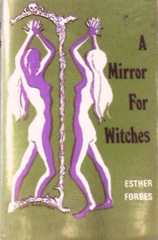
Esther Forbes - A Mirror for Witches - Cedric Chivers - 1973
#witches#mirrors#occult#vintage#a mirror for witches#speculum#cedric chivers#esther forbes#don bowman#1973
30 notes
·
View notes
Text
the qualities of which, with some remarks


Fig. VII. Transverse section of a paper folded once. Fig. VIII. Transverse section of paper after once folding.
cropped from border ex Cedric Chivers (1854-1929). The paper of lending library books, with some remarks on their bindings, illustrated by diagrams and photomicrographs. / A summary of two lectures... (Bath and London, 1909) U Michigan copy, via hathitrust : link
other/more about Chivers : link
0 notes
Text
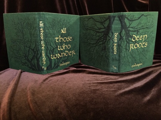


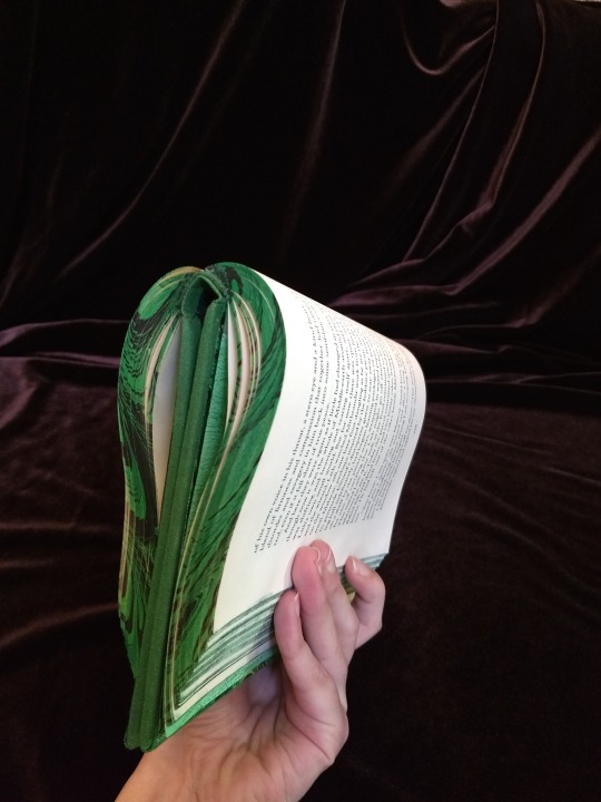
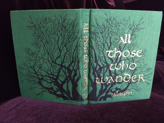
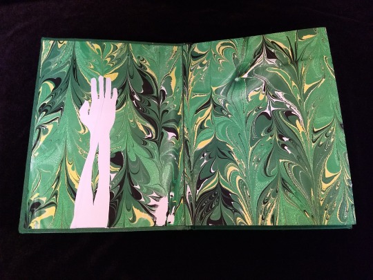
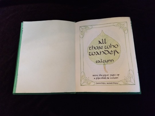
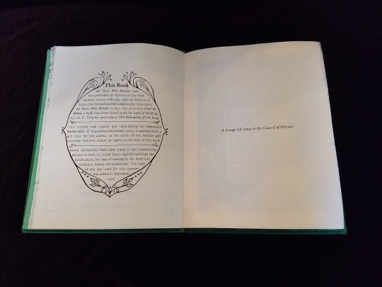

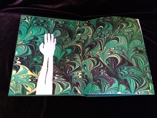
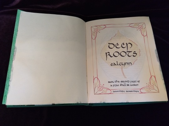
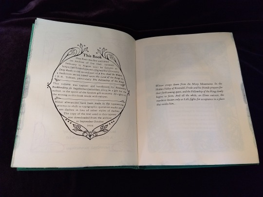
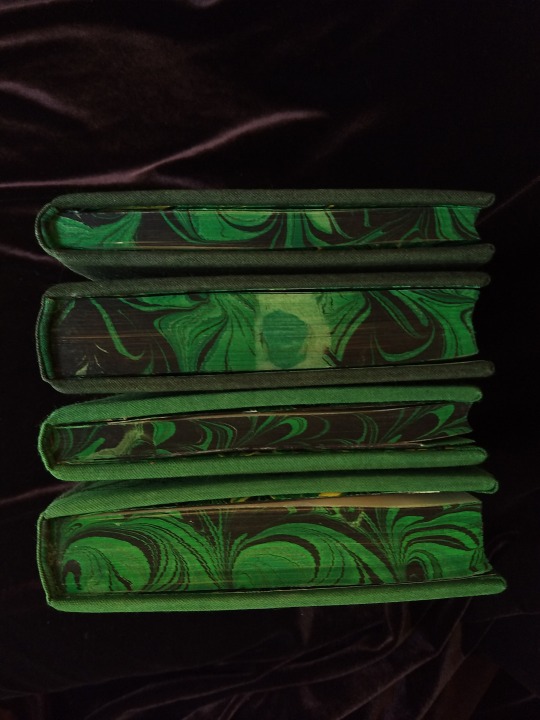


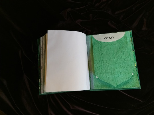

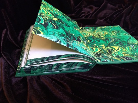

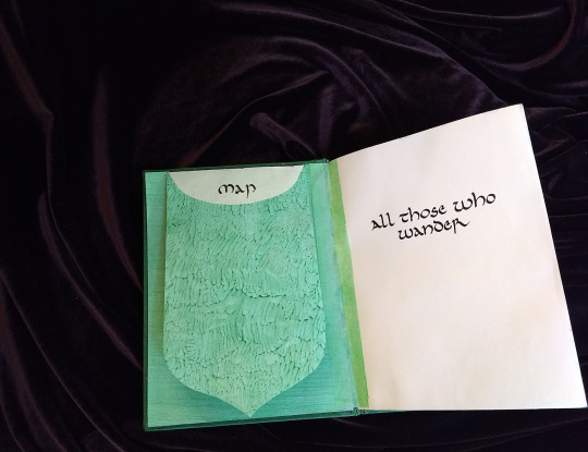

A Fire Shall Be Woken, by Ealcynn. A pair of bindings using the K118 structure, one as a gift for the author and one to keep.
Chapter page illustrations are by Alphonse Mucha, all other illustrations are hand-drawn.
I hope to make a long post later explaining the process in more depth & another to document all my mistakes, but here's the basics.
New techniques learned: Paper marbling, edge marbling, uncial calligraphy, making paste papers, drawing on bookcloth, making paste-filled cloth, fold-out maps
I began work on this project in early September and am completing the finishing touches this week.
Structures:
Binding: K118 tightback
Endpapers: Simple cloth-joined endpapers
Map fold: Turkish map fold
Materials:
Sewing supports: linen tapes
Thread: 30/3 linen thread
Spine lining: Medium weight kozo tissue bonded to linen fabric
Interior paper: Hammermill Ivory, 11x17, hand-cut to 8.5x11
Endpapers: Blick sulphite paper hand-marbled, with masked stenciled silhouettes created with freezer paper
Adhesives: Jade PVA, wheat starch paste, wheat flour paste
Covers: Davey board, laminated full thickness to half thickness
Cover fabric: Studio E shot cottons in Jungle and Emerald; filled with wheat starch paste
Cover decorations: Speedball india ink and Dr. Ph. Martin's calligraphy ink in Copperplate Gold
Inks for maps and illustrations: Speedball black india ink and a selection of watercolors thickened with gum arabic
Dip pens used for calligraphy: Combination of Brause calligraphy nibs and Leonardt tape nibs
Dip pens used for illustration: Nikko G pointed pen nib
Typesetting:
Typesetting program: Scribus 1.5.5
Body font: Coelacanth in 10 pt caption weight
Headings, titles, chapter titles, drop caps: Hand lettered uncial calligraphy, scanned
Illustrations and References:
Frames on colophon, copyright, author's notes and title page: Hand drawn, with inspiration taken from the vellucent bindings of Cedric Chivers
Frames that illustrate each chapter start: Alphonse Mucha from Cloches de Noël et de Pâques
Cover illustrations: Referenced from a photograph of an European beech tree found on iNaturalist.org
Maps of Imladris: Hand drafted with inspiration from the maps of Barbara Strachey, and Daniel Reeve
Map of Eriador: Traced from a map by Karen Wynn Fonstad, with edits made to coordinate with the geography of the fic
Frames on maps: Referenced from a drawing by Alphonse Mucha that @zhalfirin found for me
Special Thank Yous:
To the tightback council of problem-solvers in the Renegade server: Zhalfirin, Eka, @spockandawe who helped figure out many issues with the structure and technique
To the marbling experts in the Renegade server: Marissa, Aether, AGlance, Jenny, Catz, Badgertide, Rhi, and everyone else who helped me figure out beginnner marbling
To Spock for finding the K118 structure and introducing it to the server!
And to Bruce Levy, who discovered the method and shared his discoveries freely with the bookbinding and conservation world.
#bookbinding#Fanbinding#mine#bookbinding adventures#thank you to everyone i consider this a group effort#it has been 10000 years and I have loved every step#except for sanding. nasty nasty sanding. ew.#fic recs
242 notes
·
View notes
Text
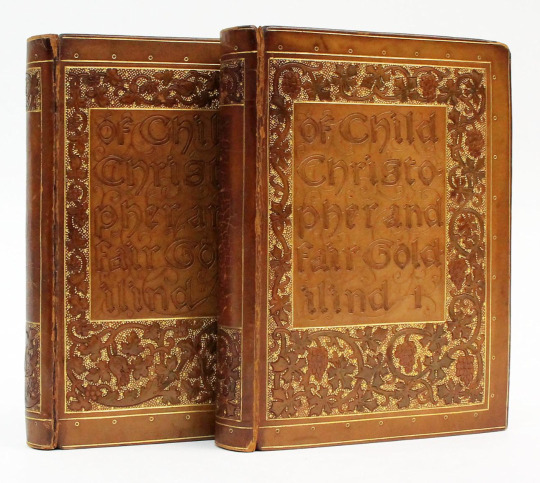
OF CHILD CHRISTOPHER AND GOLDILIND THE FAIR by William Morris (Hammersmith: Kelmscott Press, 1895)
Contemporary full brown calf by Cedric Chivers of Bath finely decorated in relief and gilt. Hand decorated floral endpapers. Top edge gilt. Woodcut title, decorative borders, and woodcut initials designed by William Morris. Chaucer type printed in red and black on handmade paper. 600 copies printed on paper; 12 copies printed on vellum.
Child Christopher and Goldilind the Fair is a fantasy novel by William Morris, perhaps the first modern fantasy writer to unite an imaginary world with the element of the supernatural, and thus the precursor of much of present-day fantasy literature.
#beautiful books#book blog#books books books#book cover#books#vintage books#victorian era#fantasy#william morris#book design#art binding#book binding#bibliophile
33 notes
·
View notes
Photo
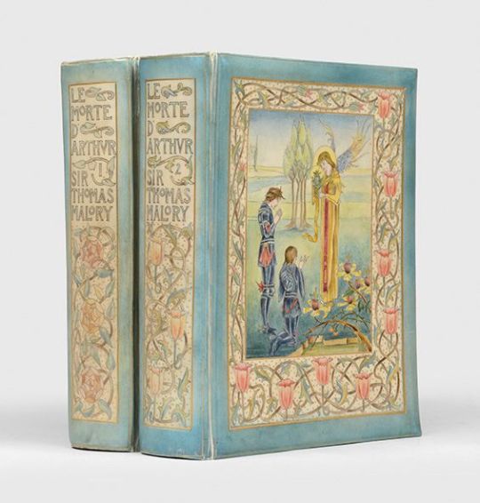


BEARDSLEY, Aubrey (illus.); MALORY, Sir Thomas
The Birth, Life, and Acts of King Arthur, of his noble knights of the round table, their marvellous enquests and adventures, the achieving of the San Greal and in the end Le Morte Darthur, with the dolorous death and departing out of this world of them all. The text as written by Sir Thomas Malory and imprinted by William Caxton... now spelled in modern style. With an introduction by Professor Rhys and embellished with many original designs by Aubrey Beardsley.
London: J. M. Dent, 1893
2 volumes, large square octavo (240 × 192 mm)
First Beardsley edition of Malory's Arthurian epic in a stunning example of Cedric Chivers's "vellucent" bindings, hand-painted after Beardsley's own artwork within. This copy presents Beardsley's decadent version of Malory's Chivalric romance, noted for illustrations "shockingly overt in their sexuality and eroticism", as a thoroughly luxurious whole. Only a handful of sets were bound in this manner. This is one of the 1,500 copies of Beardsley's edition printed on ordinary paper, aside from 300 produced on handmade paper.
Chivers's binding style is produced by hand-painting the backing sheet of the binding, which is subsequently covered in vellum that has been shaved to transparency, and then tooled in gilt. Chivers patented his vellucent method in 1898 and used it to create some of the most beautiful books of the turn of the century. This style influenced, and became closely associated with, the arts and crafts movement.
288 notes
·
View notes
Text

CHIVERS, Cedric, binder; SHAKESPEARE, William; BELL, Robert Anning, illustrator
A Midsummer Night's Dream
23 notes
·
View notes
Text

Here's a little library history: the end papers in the Chemists' Club copy of the 1924 American Dyestuff Reporter has a print design that says Chivers Patent Binding and Duro Flexile. Cedric Chivers (1854-1929) was a book binder in Bath, England. He is most famous for his "vellucent"
#chemists club#chemistry#journals#dyestuffs#dyestuff industry#dyes and dyeing#bookbinding#library history#library#othmeralia
50 notes
·
View notes
Text

Back cover of a pocket Book of Common Prayer, vellucent binding by Cedric Chivers, published by Oxford University Press, 1901
6 notes
·
View notes
Text
Vellucent bindings
Vellucent binding: “A method of decorating (and protecting) a bookbinding utilizing transparent vellum. The technique was developed by Cedric Chivers sometime around 1903, and is designed not only for the protection of leather bindings, but also to protect covers bearing colored designs (usually pictorial in nature) painted on paper, attached to the boards, and then covered with the vellum. The…
View On WordPress
0 notes
Photo


This beautiful 1901 Book of Common Prayer is an example of what’s called a vellucent binding. The method involves painting a design on vellum (and, in this case, adding mother of pearl inlays to the painting), then stretching a very thin, transparent layer of vellum over the painting to protect it. Gold tooling was then added to this outer layer.
The method was developed by a man named Cedric Chivers sometime around 1898, when he first began exhibiting his bindings. Chivers is known to have employed women to create the paintings themselves.
Although vellucent bindings are beautiful, it seems they were not especially profitable for Chivers; eventually, he gave up the endeavor, and instead pursued a career in commercial library binding.
91 notes
·
View notes
Photo
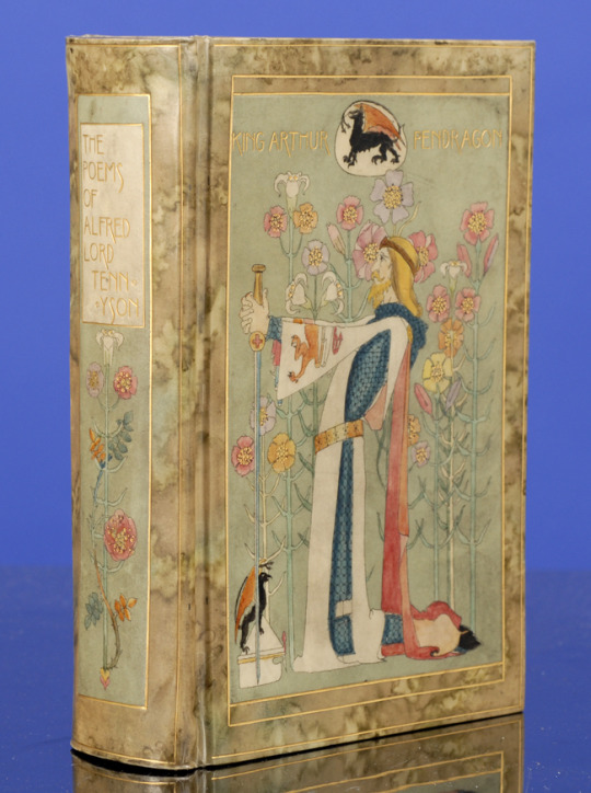
The Works of Alfred Lord Tennyson. Superb "Vellucent" Binding by Cedric Chivers. Hand-Painted By Dorothy Carleton Smyth. London: Macmillan and Co., 1899.
Inserted engraved frontispiece of Tennyson by G. J. Stodart. Chivers invented the "vellucent" binding. Full transparent vellum over paper boards with two fine pen-and-ink and watercolor designed panels by Smyth. The front cover with gilt title "King Arthur Pendragon" depicts King Arthur in armor kneeling, holding his sword. The back cover with gilt title "Guinevere His Queen" depicts Guinevere kneeling, praying and leaning on a Book of Hours.
42 notes
·
View notes
Text
Part IV: I Finished the Typesets While You Weren't Looking
As you could probably guess from the absence of updates for several months, I steamed on ahead without updating y'all 😅
Let's cover the important details I might want to remember later:
General approach: I used the same workflow I usually do (set up as much as possible in the HTML source document prior to importing to Scribus), with the difference that this time I split out each chapter. That allowed me to easily place my header image and initial capital in the same place in each chapter and also stopped Scribus from blowing up when I imported multiple 50 mb images.
I initially pulled the text in september, edited, flopped about being anxious about asking for permission and then reached out to Ealcynn...only to learn she'd made a complete edit pass a week after I pulled the text. I then went back and merged her edits for her gift copy. Whoops! this is why you should ask before getting neck-deep in a project.
I discovered a bug in Scribus while typesetting this - hyphenation exception lists from Document Setup don't persist across edit sessions. I put in a bug ticket and it's apparently fixed in future versions. But I figured out a workaround in the meantime - you can set universal hyphenation exception lists via Scribus->Preferences and that works fine. This saved me from manually unhyphenating lots of elvish names when I did my final pass.
About 80% of my typesetting time (minimum) was spent on that final pass, where I remove hyphenation that shouldn't be there (ends of paragraphs, ends of pages, names I forgot to put on my exception list) and adjust word spacing & max/min glyph extension to remove widows and orphans wherever possible. Sometimes there are too many 3 line paragraphs in a row and there's just nothing you can do, but I managed to remove almost all of them around page turns. A few had to be left across spreads in order to make that happen, but it was a necessary sacrifice.
Some people just use the default "keep paragraph together" options in their typesetting program. Those people are very sensible. But consider: I hate the way it looks when the pages don't all end on the same line. Isn't it worth nine or ten hours of a little typesetting to avoid those uneven lines?
Extra Decorative headers: Given how ornamented the chapter titles were, I wanted my colophon, author's notes, copyright page and title page to also be pretty. But the extra ornaments I could find in the source book weren't a very good fit for the shapes I needed. I looked around a little at other nouveau books, but couldn't find what I wanted. Eventually I decided to do exactly what I swore I wouldn't do at the beginning of this project: juxtapose my amateur art skills next to alphonse mucha's masterpieces. whoops.
As inspiration, I turned to the vellucent bindings published by Cedric Chivers. I decided to add a beech leaf element, to tie in with my planned cover art & the floral motifs of the chapter titles. While I won't pretend I'm 100% happy with these (they feel so awkward and untidy compared to the mucha art), they fulfill the necessary functions and I have other projects to work on someday - if I stretched this project out till I felt like my art could stand shoulder to shoulder with Mucha's we'd be here my whole life.
I settled on a computer heavy workflow for these. First I sketched a design based on the Chivers bindings. Then I scanned that sketch, adjusted it where necessary in GIMP and then mirrored the image. I printed the revised sketch and taped a piece of tracing paper over it, which I then inked using a dip pen. I was very happy with the discovery you can get good results inking on tracing paper, it saves for so much time with the lightbox.

Of course, then I decided I wanted to do the titles pages in color, and had to use the lightbox anyway. I was very happy with how those turned out though - I got to play with my thickened watercolors as inks and it is so much fun making color transitions. I landed on a early fall/late fall motif for the two volumes by coloring the design in greens/yellows for ATWW and reds/browns for DR.


The Colophon: Originally I designed a fun archway shaped colophon for the books, but as I kept going I realized I wanted to include more information in there than I could reasonably fit on one page...so for the first time I've split out the copyright page at the front, describing where the fic was first published and how I came to bind it, and the colophon at the back, describing my font choices, binding style etc. I wanted to play with a shaped colophon and do a circle, but it is very hard to make a typeset circle look actually circular...so I went ahead and added a frame.

....and yes, now that I'm looking at it (with the damn thing already printed out and sewn into two books) I see that the divider managed to cut off the tails of some of the letters 🤦 luckily there's still time to fix Ealcynn's copies, this is exactly why I'm doing mine first.
Layers: The other thing I'm doing differently in this fic versus any other I've bound is attempting to print on both a color and laser printer for the same pages. Logistically this is a bit of a mess, but I want my colored frames in color and the text looks much better printed by the laserjet. In order to make that happen, I had to export two versions of each document - one with only the text and one with only the colored headers/drop caps. Thank heavens, I discovered Scribus has layers that allow you to do exactly that.

I set each header image in the background layer and made two additional layers - text for my black/white elements and initials for the drop caps. By toggling which layers were visible and exported for printing I can easily export only the colored or only the black and white parts of the book.
typesetting 'A Fire Shall Be Woken'
So I've been nibbling away at this project in secret for a month but I finally reached out to the author Ealcynn (who I don't believe has a tumblr?) and got the go-ahead to post updates so! here we go!!
Over the past year I have fallen absolutely in love with a LoTR AU fic series called A Fire Shall Be Woken, which is essentially a "for want of a nail" AU where Legolas was exiled from Mirkwood and has never met Aragorn. It is very well written and intricately detailed and it makes me cry every time I read it & after reread #3 I decided I should probably bind a copy.
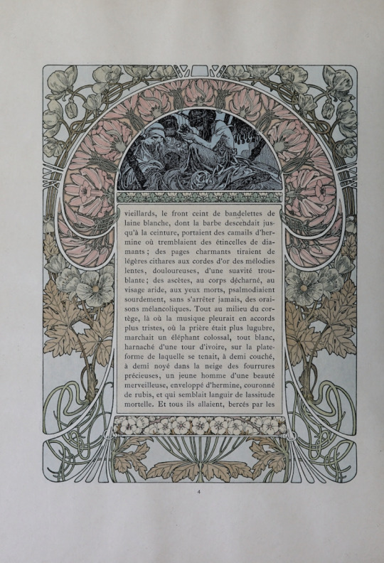
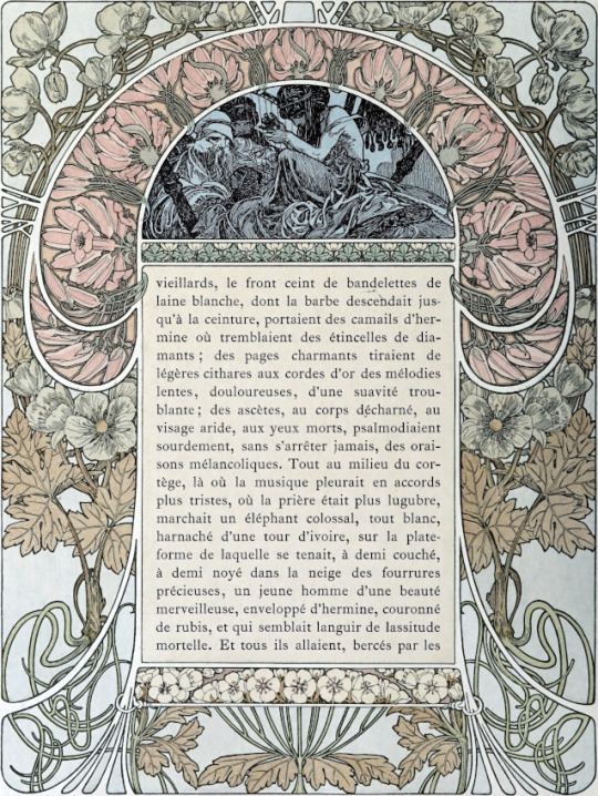
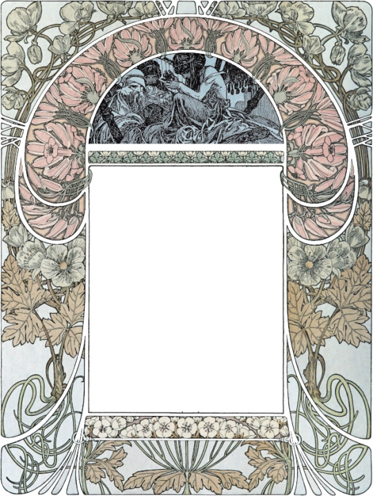
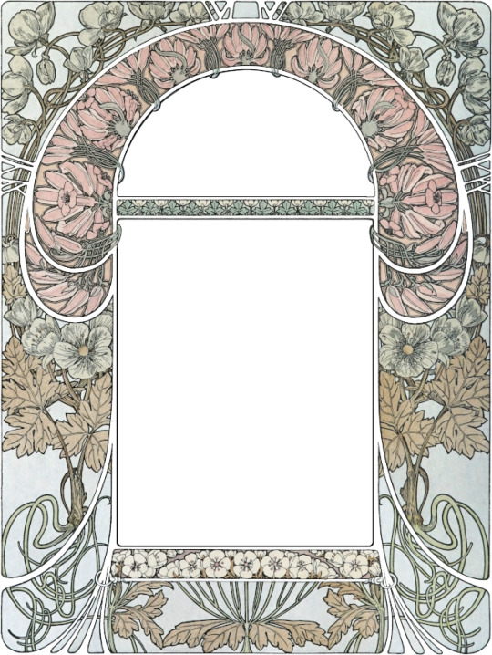
Around that same time I discovered Cloches de Noël et de Pâques, a french book from 1900 illustrated by Alphonse Mucha. There's a wonderful quality scan available online and each page has a gorgeous floral frame & I said to myself: well. I'm never going to find a fic that's a better fit for these illustrations than this series.
So, step one, I went through the book and picked up some of my favorite frames that has winter/autumnal vibes, since both fics take place from October-December. There are about 80 pages of frames, but less than 40 illustrations because they are repeated with varying color schemes. I needed 19 illustrations to have one per chapter. I recruited some friends in the Renegade Publishing server to vote on the order, though I ignored a lot of their sensible advice to put my favorites at the front and back of each volume.
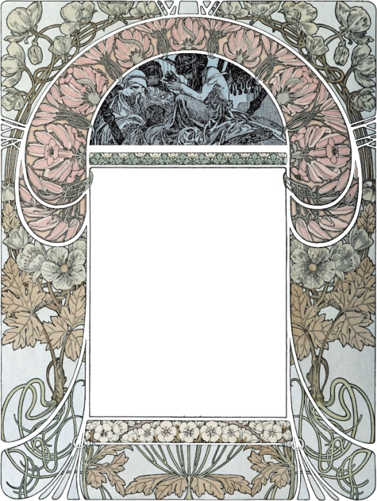
Then I had to do basic image editing to clean up the covers. The scans were good quality but were very grey. Each page had a dark and light side due to the curvature of the pages during scanning. So for each image I:
Cropped to size & auto-adjusted the white balance to brighten the background to white
Selected the transparent frame between sections and filled it with white
Used a layer mask on a duplicate of the image to lighten the dark side of the page, using an opacity gradient to make the transition seamless.
Covered the text frame and top illustration with smooth-sized white frames of matching sizes. I tried just filling these with white but at the reduced size I'll be printing the imperfections of the original linework were jagged and distracting.
16 notes
·
View notes
Text
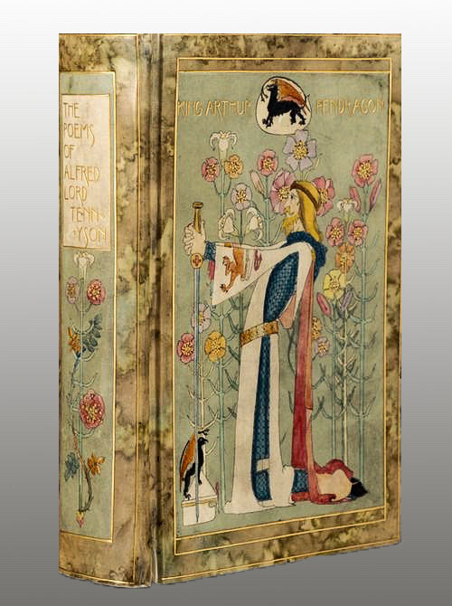
THE POEMS OF ALFRED LORD TENNYSON. (London: Macmillan, 1899). ‘Vellucent’ binding by Cedric Chivers, Hand-painted by Dorothy Carleton Smyth.
#beautiful books#book blog#books books books#book cover#books#vintage books#victorian era#alfred tennyson#poety#art binding#book binding#book design
75 notes
·
View notes
Text

MARIE ANTOINETTE by Pierre de Nolhac. (London: Humphreys, 1905). Cosway-style binding by Cedric Chivers.

#beautiful books#book blog#books books books#book cover#books#vintage books#edwardian books#marie antoinette#art bindings#miniature painting#book binding
6 notes
·
View notes
Photo

The Faerie Queene, vol. one and 2 only Edmund Spenser. Mixed edition, edited by Thomas J. Wise, illustrations and decorations by Walter Crane, crushed blue morocco gilt by Cedric Chivers of Bath, the first with inset "Vellucent" panel depicting St. George holding a lance and sword (of mother-of-pearl) on upper cover, the second with all-over design of English roses in red morocco onlays and gilt, both t.e.g., preserved in drop-back boxes.
33 notes
·
View notes
Photo

The Complete Works of Alfred Lord Tennyson Macmillan, 1926. Red levant morocco gilt by Cedric Chivers of Bath, with gilt-blocked "Art Nouveau" decoration on upper cover and spine, the upper cover with inset "Vellucent" panel with watercolour design of Sir Galahad on horseback holding a jousting lance, g.e., 8vo, ; together with another edition of Tennyson (1898) in a "Vellucent" binding by Chivers, with decorations in gilt and watercolour (2)
20 notes
·
View notes