#Carl Purington Rollins
Explore tagged Tumblr posts
Photo




it’s Fine Press Friday!
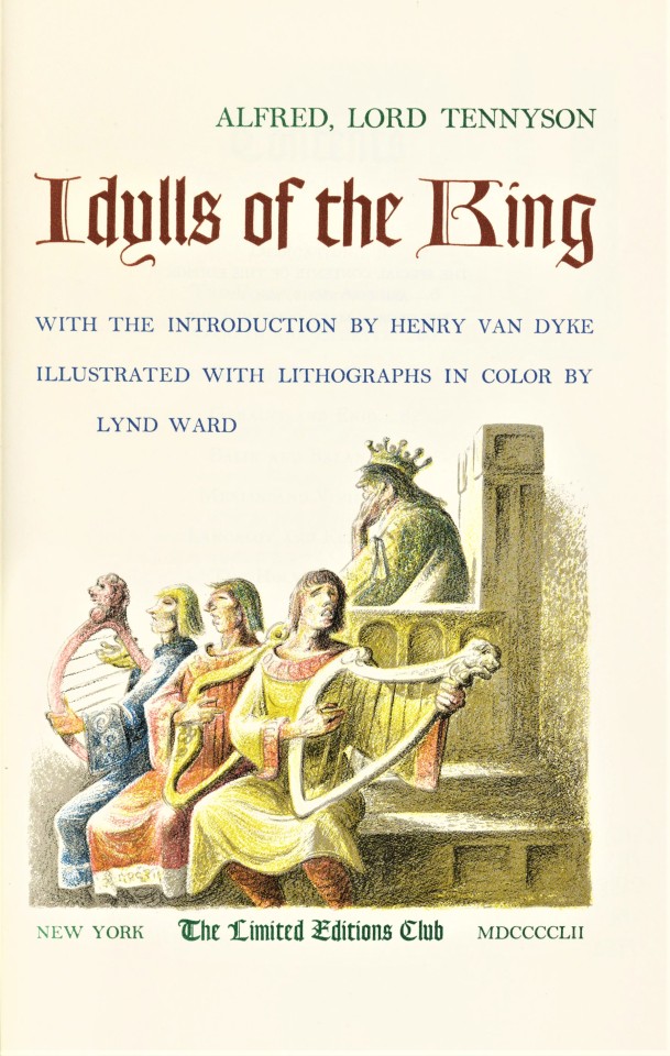
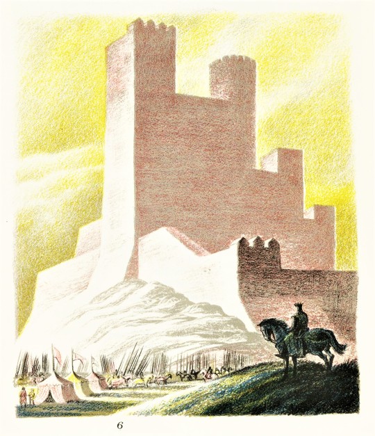
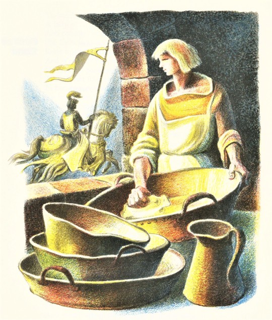
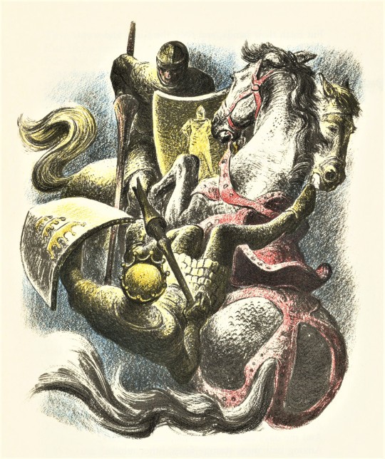
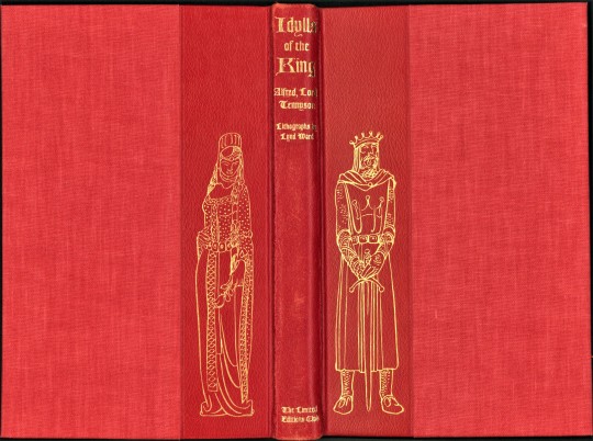
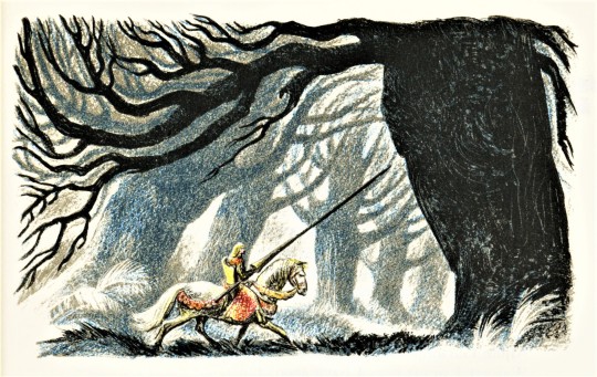
This week we present another title illustrated by American artist and illustrator, Lynd Ward (1905-1985): Idylls of the King, by English poet Alfred Lord Tennyson (1809-1892), with introduction by Henry Van Dyke, and published in 1952 by the Limited Editions Club, in an edition of 1500 copies signed by the artist. Idylls of the King was first published as a cycle of twelve narrative poems, between 1859 and 1885.
Lynd Ward made over forty individual lithograph illustrations for this fine press edition. The illustrations have at least three colors each, Ward drew directly on the printing matrix, an incredible amount of work. This direct process is sometimes called autolithography. The term, autolithography aims to differentiate the direct process of an artist drawing on the printing matrix, a stone or plate, from lithographs that are made by transferring an image to the stone by other means. The lithographic plates were printed at the Duenewald Printing Corporation. The typographic layout was designed by Carl Purington Rollins in Bakersville types. Goudy Text was used for headers and the title. The type was printed at the Printing-Office of the Yale University Press in New Haven, where Rollins had been master printer from 1920 to 1948. It is quarter-bound in vermilion sheepskin and English buckram cloth. The cover is stamped in gold with a design by Lynd Ward. This book is a gift of Loryn Romadka, from the collection of Austin Fredric Lutter.

View other posts with work by Lynd Ward.
View more Limited Edition Club posts.
View more Fine Press Friday posts.
– Teddy, Special Collections Graduate Intern
#Fine Press Friday#Lynd Ward#Limited Editions Club#color lithographs#Lithography#Autolithography#Idylls of the king#Alfred lord tennyson#Carl Purington Rollins#Yale University Press#Duenewald Printing Corporation#Printmaking#Fine press books#book illustration#LEC#Bakersville#Goudy Text#Fine Press Fridays#Austin Fredric Lutter#teddy
71 notes
·
View notes
Photo

handsome title page from an essay by carl purington rollins, Some Trifles which make for Perfection [george mckibbin & son, brooklyn, 1949]. rollins gives interesting & useful typographical advice for setting technical apparatuses: «volumes containing such paraphernalia as extracts, footnotes, appendixes, tables, and indexes» [ibid., n.p. but 2nd text page]; his ideas evolved, apparently, through many years’ contemplation of complex projects. rollins in early adult life pursued arts&crafts ideals in bohemian contexts. he joined the yale university press in 1918, succeeding in 1920 to university printer: «In the course of four decades, he designed more than two thousand books for Yale University Press as well as most of the University’s ephemeral materials.» [yale archives].
1 note
·
View note
Photo


Typography Tuesday
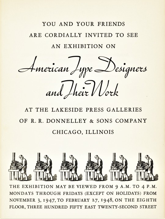
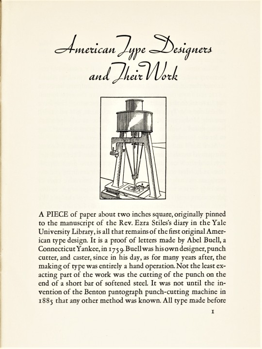
A new addition to our collection is American Type Designers and Their Work, a brief catalog for an exhibition held at the Lakeside Press Galleries of the R. R. Donnelley & Sons Company in Chicago, Illinois, 1947-1948.There are no type samples presented in the catalog, but it lists 48 American type designers who today are luminaries in the American type design constellation.
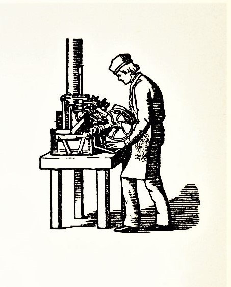
The catalog was designed by Carl Purington Rollins, the master printer to Yale University from 1920 to 1948. The text is set in Monotype Garamont, designed by Frederic Goudy in 1923, with Trafton Script, designed by Howard Trafton for Bauer Type Foundry in 1933. The illustration of the 19th-century type caster was redrawn form a wood engraving in J. Luther Ringwalt’s American Encyclopedia of Printing, Philadelphia, 1871. The simplified illustration of a matrix-cutting pantograph routing machine was supplied by Limited Editions Club and Heritage Press founder George Macy.
Rollins acknowledges the influence of the English Arts & Crafts movement on early 20th-century American type designers and notes that “With the invention of the pantograph punch cutter [invented by Linn Boyd Benton, the father of Milwaukee-born Morris Fuller Benton, the most prolific type designer of the 20th century] type design became an ‘art’ rather than a craft, and as might be expected the personality of the designer became for various reasons more important.” He continues,
Good types have character and power that we neglect at our peril.. . . A faulty choice can pull against the message and the purpose, even as the veriest jackass. A sound and happy choice can lend wings to words. . . .
Rollins follows this with an admonition from the great American type historian, printer, and founder of the Merrymount Press Daniel B. Updike:
If we do not judge types rightly, they will judge us -- the penalty of foolish choice being the penalty we pay for choosing foolishly in life. We are punished by getting what we want!
View more Typography Tuesday posts.
#Typography Tuesday#typetuesday#Typography Tuesday#Carl Purington Rollins#American Type Designers and Their Work#Monotype Garamont#Frederic Goudy#Trafton Script#Howard Trafton#Lakeside Press#R. R. Donnelley#exhibitions#type design#type designers#type exhibitions#Daniel B. Updike#type casters#pantograph#pantograph router#Linn Boyd Benton#Morris Fuller Benton
20 notes
·
View notes
Photo


Typography Tuesday
Today we present a designer’s Exquisite Corpse, Peter Piper’s Practical Principles of Plain & Perfect Pronunciation, published in Brooklyn by the Mergenthaler Linotype Company in 1936. Mergenthaler’s director of typography Paul A. Bennett assigned a letter of the alphabet to 41 noted, American artists and designers to design a separate page for their letter based on the 1836 edition of Peter Piper’s Practical Principles of Plain & Perfect Pronunciation. As Bennett notes:
Each was free to do the page without restriction in style or technique, and . . . There was no limitation to the selection of Linotype face to set the text. . . . none of them, obviously, had any idea of what his adjacent neighbors were planning.
The resulting abecedarium is a delightful Peter Piper pastiche. Click on the image for greater detail on the design of each page.
View some of our other Typography Tuesday posts.
#Typography Tuesday#typetuesday#Mergenthaler Linotype Company#Paul A. Bennett#bruce rogers#Peter Piper#Exquisite Corpse#abecedarium#20th century
34 notes
·
View notes