#Bungo stray dogs same reason as rwby
Explore tagged Tumblr posts
Text
Oh there’s a lot
rb and put in the tags what got you into your current fandom/fandoms
#for yttd a let’s play#haikyuu I needed to rewatch it so I can talk about it with my friend who love haikyuu#danganronpa and mha they were really popular and wanted to see them#assassination classroom even though I don���t post about it a lot it made me cry my eyes out#I also like nanbaka I need a third season for that#jjba my friend decided to watch it and I also wanted to watch it and now I’m on part 7 and still on part 3#I’m not covering all of them#RWBY I was curious about it#BEASTARS also for the same reason as RWBY#sdra2 I also for the same reason as RWBY#persona 5 I also watched a let’s play#Bungo stray dogs same reason as rwby
2K notes
·
View notes
Text
RWBY & Cinematography, Part 1 - Establishing Techniques

Animation has for a long time now struggled to crawl out of the stigma of appealing only to a younger audience. Combine that with internet animation in particular being very young compared to other film-making mediums, and you have projects within the platform that need to go through much trouble to make a name for themselves. RWBY is no exception to this, as from the beginning it has faced a lot of harsh ridicule by critics who are fans of anime, the very medium the web-series takes direct inspiration from. And despite having a growing fanbase and the production having come a long way in just five years, there are some aspects of the show that even much of its fans have neglected to refer to. If there’s one growing part of RWBY’s presentation that especially deserves mention. it would be the cinematography.
As stated previously, RWBY has always been inspired by and even aimed to emulate anime. As a cultural medium of entertainment, anime has been the pigeon-holed for its various tropes. The tsundere archetype, beach and hot spring scenes, shonen training arcs, transfer student character introductions, etc. And while the dismissal of seeing some the same tropes in many titles every season, every year is understandable, anime as a visual-storytelling medium has been cultivating itself for the past 60 years. With that much time, many names who have taken the positions of directors and storyboard artists in their careers alone have developed recognizable cinematic techniques. One example is Osamu Dezaki. Most may not have even heard of him due to his passing in 2011 or his works due to how old they are. But one may faintly recognize his techniques he pioneered that are casually sprinkled in many anime. Take the “postcard memories” technique for instance, a way of freeze-framing a shot into a hyper-detailed, sketchy still. It’s something meant to make the subject of such shots feel especially tense, mesmerizing or impactful and it can be seen in various works that some fans today have been exposed to like Sailor Moon, Kill la Kill, & One Piece.

And Dezaki is just one name that uses certain techniques to create a vision in anime titles. There are many others who have gone to either provide storyboards for or direct some shows and films well-known within anime fandom to this day. With Takuya Igarashi, the director of Ouran High School Host Club, Soul Eater, Star Driver, Captain Earth and Bungo Stray Dogs, his works commonly have vivid colors and lighting through windows and characters on symmetrically-opposed sides to convey the contextual mood. Then there’s Shigeru Yamauchi, the director of Casshern Sins, Dream Eater Merry, A Town Where You Live, the 8th, 10th, & 12th Dragon Ball Z films, Digimon: The Golden Digimentals, and a storyboard artist of episodes of many, many anime. Yamauchi is especially known for having whole scenes depict close-up shots of a character’s face or showing half of their bodies and having settings be done in a specific, sometimes monochromatic color schemes that feels like something out of a painting. There’s also Naoko Yamada, a name from studio Kyoto Animation who has developed a resume of directing shows and films like K-ON, Tamako Market & A Silent Voice that, despite them mostly having a moe vibe through the character designs, are deceptively-enriched in scenes shifting from bright, pastel colors to more dull colors to provide atmospheric moods and having characters express themselves not through their faces but other ways such as their legs.
There are far too many names to point to, but even ones who have yet to direct a whole anime, manage to apply their cinematic ideas into episodes of anime. Even something like Dragon Ball Super, a recent installment of a popular shonen franchise that’s often dismissed for having characters mindlessly flying and throwing beam blasts and fists, can be known for having episodes with competent stage direction depending on who is working on it.
With all of that said, it’s worth bearing in mind that RWBY, like the many anime it takes inspiration from, could also be credible for having and applying cinematic techniques. But this wasn’t always the case. Back in volumes 1 & 2, the process for storyboards would be led by Patrick Rodriguez, who is known for designing various characters in the show like Ironwood, Amber, & Tyrian, with the rest of the team consisting on Miles Luna & Kerry Shawcross, the writer and director of the show respectively and the animators. The problem however was that even with the storyboard team set up this way, scheduling was very tight, to the point where there was either little time or no time to make the boards for the show. Although the first two volumes were not entirely void of enticing shots, this led to needing to resort to basic camera shots and on few occasions, incomprehensible ones. By volume 3 however, this process changed. Among the many changes in the production pipeline, one of them was the overhaul of the storyboard team to be led by Joe MacDonald, an animator during volume 2 who had nearly 30 years of experience in the creative entertainment industry, with a newly established team consisting specifically of storyboard artist. The second was introducing a complimentary camera & layout team, also led by Joe MacDonald with some of the storyboard artists overlapping. Finally, the third was creating a camera bible. To quote from one of the storyboard and layout artist, Rachel Doda, in the volume 3 audio commentary:
“It was mentioned earlier too in some other commentary, but we originally created like a camera bible or at least tried to create like, stage direction in terms of just… hey! Ya know, If it’s a shot of Ozpin, it has to be kind of stagnant because he’s the most level-headed. And if it’s a shot of Ironwood, usually, they just, ya know, it has to be like he’s in power. So the camera has to be low to the ground. Then, ya know, just like all the characters themselves. Qrow has a little hitch to stuff.”
Since volume 3, the camera served as was a big way to help express the position or mindset of various characters. Take the character, James Ironwood as referred to earlier. Compare most of his shots in volume 2 to his shots in volume 3 & 4, and the differences in his scenes will feel more apparent. Camera manages to communicate when he feels it’s important to be authoritative and when to be more reasonably submissive. And that’s the key word: “communicate.” If Rachel Doda’s words as quoted are of any indication, then multiple elements in cinematography such as lighting, color, transitions, framing, staging, & character posture could be at play to sell and help deeply interpret meaning behind character’s thoughts and intentions.
In the case of volume 3 where this major shift in the show’s direction began, there are several scenes that became very striking to this day. One of the biggest examples is this shot of Pyrrha witnessing the Fall Maiden, Amber in a comatose state in chapter 6. When watching it the first time, one may think that match-cutting from Pyrrha turning away to showing Cinder at the stadium is simply meant to indicate that Cinder is Amber’s assailant. But there’s also a matter of Pyrrha feeling bound to take a risk of having her destiny be Amber’s and not hers compared to Cinder who wants nothing more than to become the very thing the former hesitates to be. Pyrrha feels she can’t avoid any of this and is thus overwhelmed as shown in chapter 8 when she can no longer even attain peace of mind from a simple leaf falling towards her in a burning sunset, all of which from that point on referred to the Fall Maiden in her mind.
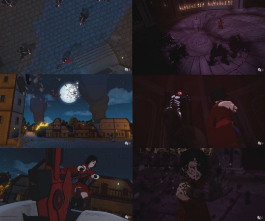
Though as much as volume 3 had its strong sense of visual direction, RWBY’s fourth volume arguably pushed the direction further through a variety of ways. While it has been criticized for spreading its story too thin by jumping between multiple plot points, some scenes in plot points tied to certain characters can contain some strong cinematography. Take for instance Cinder’s training scene in chapter 11, which by itself doesn’t seem to say much. But think about the Grimm she fought. They were a bunch of Beowulves and a Beringel, which are the same creatures of Grimm that Ruby Rose fought in the character short. Although Ruby takes longer to defeat her foes than Cinder, the former is shot to end her fight triumphantly while the latter is shown exhausted and has to catch her breath after her bout. All of this can be interpreted as an inadvertent way of presenting how even more salt is poured to Cinder’s wounds.

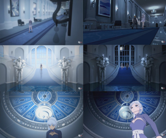
Another example in volume 4 are scenes of Weiss in the Schnee mansion in chapters 2 & 11. When comparing side-by-side, the shots themselves are practically the same but with three key differences. The first is the lighting, the second is Weiss’s facial expressions and body language, and the third is the fact Klein is accompanying her in the same shots in chapter 11. These shots show very effectively-opposite meanings with Weiss’s character who is first seen feeling lonely and submissive despite being in a fancy, spacious, brightly-lit home only to be feeling more defiant and at-ease when she has Klein to help her escape the home we learn she hates.

It’s this use to linking shots in different episodes that also sheds light to the context of the song “Mirror, Mirror”, which frankly never made much contextual sense up until this point. How can someone who carries pride in her family name be the loneliest of them all as the lyrics go? Well, this visual direction sums up why. Her father and his business-oriented ambitions created a growing rift in her family and she needs someone she can trust to be empathetic towards what she’s feeling. This is also why she felt hurt when she found out Whitley never really intended to look out for her. Combine these moments with shots of her witnessing the Atlas ships passing by her window in chapters 1 & 7, only to finally manage to leave in one by chapter 12, and you have a phase of Weiss’s character story packed with meaning.
There’s also quite a few cinematic techniques regarding Qrow in volume 4. One of the biggest cases is the use of a low light by his side with whoever he talks to about Salem. In times where connection to other Kingdoms in the World of Remnant are cut-off, Qrow welcomes or advises cooperation with other characters out of necessity. Warm lights such as lamps and campfires help illustrate this. With Qrow and Raven in chapter 4, the lamp on the table is closer to the former than the latter who only wants specific information and will otherwise walk away (or make a portal in her case) towards the darker side of the Tavern. And then there’s chapter 8, where Qrow informs team RNJR with as much information about everything to do with Salem and the fall of Beacon as possible, leading to well-presented shots of Jaune stepping briefly outside of the campfire due to his anger and wavering trust. Even this shot where he bluntly referred to Qrow’s motives as using his teammates as bait is framed to show his stance on who he was looking out for and who he wasn’t. Most interestingly though, is this shot here of Qrow framed to be surrounded by the campfire as he describes his semblance. While the cinematic techniques in some scenes can be admittedly up for debate, this shot was actually confirmed by Kerry Shawcross in the volume 4 director’s audio commentary to have been drawn by Rachel Doda and was highly approved after going through every department in the production.
“We uh, the shot inside the fire, was definitely one of the shots that we had uh, Rachel had the idea to do while we were boarding, Rachel Doda. And uh, I told her, “absolutely draw that! I make no promises that’s going to make it all the way through. But every next department after that I explained the shot and it was like, “no, we should do that!” Um, so yeah, it was one of those things where it was like, it was just such a beautiful shot that everyone wanted to make it happen and everyone went out of their way to make it happen.”
One of strongest cases of visual techniques applied though was in the forest scene in chapter 2. Here, we see Jaune, an often talkative character in previous volumes, be unusually silent and uttering only shouts and out-of-breath exhales as he trains through Pyrrha’s recording. He is mostly alone in the dark forest with shades of dark blue and green and bright, blueish lights illuminating his armor. Most fans who see this scene are struck by the music and Pyrrha’s words and Jaune’s determined, yet saddened facial expressions. Alone, those aspects are effective at the scene being a tearjerker. But there’s one other element, a visual one that can add a whole level of meaning: the fireflies.

In Japan, fireflies are theoretically that of Hitodama or “human souls” drifting in the night when away from their bodies. If we were to apply this motion to the forest scene in chapter 2, then the fireflies could be visually representative of the lives lost in Shion village. Thus what Jaune could’ve felt was not sadness for not being able to stop Pyrrha, but for being unable to do anything about tragedy of the villagers. Now to some, such an interpretation may be considered reading a little too much. While that response is fair, bear in mind that the villages seen in volume 4, Shion, Higanbana, Oniyuri and Kuroyuri are all named after flowers with specific meanings in Japanese, the matter of fireflies being that of human souls may not be that unlikely.
“I’m just tired of losing everything.” - Jaune Arc
If there’s any set of scenes that are arguably as striking in visual direction as in chapter 2, if not more-so, it would be in scenes of Ren and Nora in chapters 10 & 12. There’s the matter of how the reveal of Ren’s semblance after cutting from the shot of the lotus flower is representative of how a real lotus flower can bloom after being submerged in mud. There’s also the shots of Nora desperately holding on to Ren’s hand, one of which is out of fear of being left alone when they were kids while the other is to prevent Ren from risking being killed due to anger and reckless abandon. But probably the most powerful moment of stage direction is of this moment here.
youtube
That there concisely explains what Nora means to Ren. Bear in mind, Ren is a very quiet, calm & collected character. He’s the opposite of Nora in that regard, who wears her enthusiasm on her sleeve and openly express how much she enjoys Ren’s company. But up until this point, we hardly seen Ren’s perspective about Nora other than the occasional subtle smile at her antics. It’s not until the scene underneath the house in chapter 12 that we see what Ren sees when Nora is deeply saddened to the point of being in tears, something viewers have never seen her current express before. In his mind, Ren briefly sees the same frightened girl who he first met and swore that they would keep each other safe. He is all Nora has and if he realizes that if he gets himself recklessly killed, then she’ll be alone all over again. And that’s the last thing Ren wants to happen.
Even after all of this is said and done, there’s still more examples of scenes with visual direction to be unpacked and interpreted in volume 4 alone. But those can be talked more depth another time as they help compliment scenes in the focus of the next subject to be talked about in part 2.
#rwby#rwby6#rwby analysis#crwby#rwby5#cinematography#storyboards#rachel doda#rachel#doda#kerry shawcross#kerry#shawcross#joe macdonald#joe#macdonald
25 notes
·
View notes