#Ashedwings design
Explore tagged Tumblr posts
Text
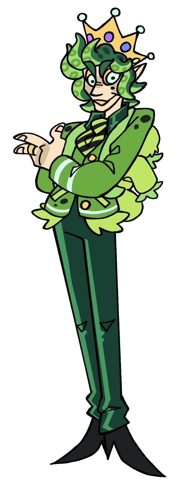
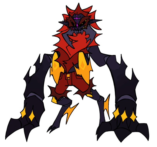
Leshy design maybe ig idk stuff might change
Flowers on his face are sorta meant to be false eyes
Also hc that his crown is the most emotive because he is always seeing through it
#ashedwings post#ashedwings art#ashedwings design#cotl#cult of the lamb#cotl leshy#cult of the lamb leshy#cotl fanart#cult of the lamb fanart
73 notes
·
View notes
Text
funny little Abeezle design based off @asherashedwings 's designs of Lucifer and Alastor!!!
no im not coloring it you cant make me/j
also go check out ashedwings art its really neat
29 notes
·
View notes
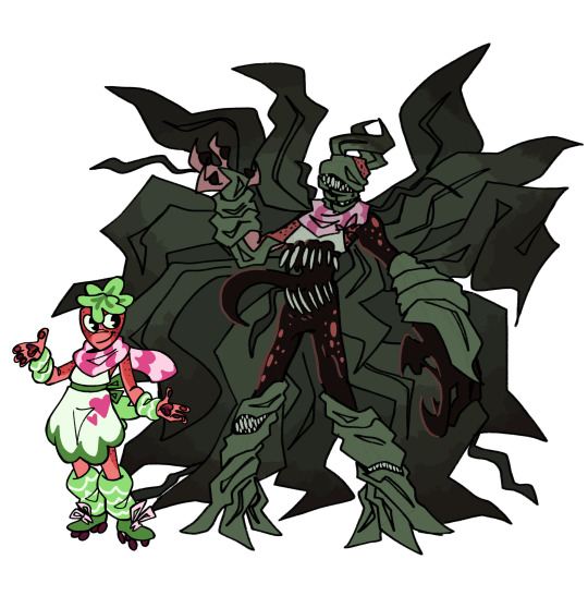
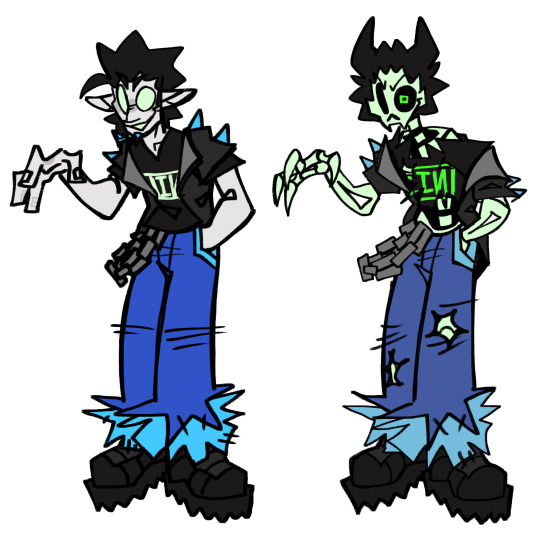
Text
Huh, something seems different..
MAIN UPDATE! Added Sprout finally and made a few changes to Astro and Vee
And I also drew their twisteds!
That is all, buh byeee
#ashedwings post#ashedwings art#dandy’s world#dandys world#dandy’s world roblox#dandys world au#dandys world dandy#dandy’s world dandy#dandy’s world pebble#dandys world pebble#dandy’s world astro#dandys world astro#dandy’s world shelly#dandys world shelly#dandy’s world vee#dandys world vee#dandy’s world sprout#dandys world sprout#tw body horror#ashedwings design
2K notes
·
View notes
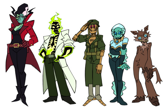
Text
COVER OUR SOULS IN ROBES OF BLACK, THE LORDS IN BLACK WE ARE 💥💥🔥🔥‼️‼️
Individuals under the cut
#ashedwings post#ashedwings art#ashedwings design#nerdy prudes must die#npmd#starkid npmd#npmd fanart#hatchetfield#hatchetverse#pokey starkid#pokotho#pokey hatchetfield#bliklotep#blinky#blinky hatchetfield#blinky starkid#tnoy karaxis#t’noy karaxis#tinky starkid#tinky hatchetfield#nibblenephim#nibbly#nibbly starkid#nibbly hatchetfield#wiggog y'wrath#wiggly#wiggly starkid#the lords in black
679 notes
·
View notes
Text
Nerdy prudes must die or something
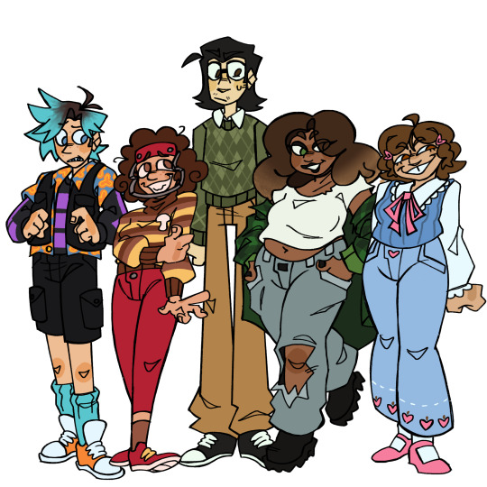
Individuals under the cut
Edit: Added Max
#I’m gonna be drawing Max next#and then maybe also the Lords in Black’s human forms#cuz silly#ashedwings post#ashedwings art#ashedwings design#forgot that was a tag of mine for a second 💀#nerdy prudes must die#starkid npmd#npmd#npmd fanart#peter spankoffski#pete spankoffski#stephanie lauter#steph lauter#richie lipschitz#richard lipschitz#ruth fleming#grace chasity
982 notes
·
View notes
Text
GOOB DESIGNS
Made him more dog-like, cuz I think it’d be silly if him and Scraps were cat and dog siblings.
Also, autism adhd siblings. I think it’s a fun subversion to make the dog autism and cat adhd, since it’s usually the other way around lol.
I also made Twisted Goob a lil more sketchy, line art wise, as well as including a sketch overlay that resembles the super bare bones figures animators often draw first when blocking out movements. I thought it’d be neat if the twisteds almost looked like unfinished animations or rough drafts sorta. Imma prolly do this with the other twisteds too.
Also lil hc I mentioned when talking to someone earlier
AND lil walk cycle I made for funsies
K that’s all now
#ashedwings post#ashedwings art#dandy’s world#dandys world#dandys world goob#dandy’s world goob#dandys world fanart#ashedwings design
935 notes
·
View notes
Text
MORE HELLAVERSE REDESIGNS
Saying hellaverse this time cuz I also did some sin redesigns cuz sillies.
Gonna add some bits of info for like, three characters cuz I either changed their animal theming (Zestial and Mammon) or made them an animal (Mimzy).
First of all, I changed Zestial and Mammon's animals cuz -- and this is coming from a spider enthusiast -- there's too many spiders. I feel like Angel's family is enough major spider characters. So I made Zestial a centipede and Mammon a tick.
And then I made Mimzy a canary because I realized she literally has like, no animal or object theming. And I thought a canary would be fitting because 1) Songbird, and 2) A reference to her and Husk's beef, with the whole "the cat that caught the canary" saying.
Anyways, that is all
#ashedwings post#ashedwings art#hazbin hotel#helluva boss#hellaverse#hazbin zestial#hazbin carmilla#hazbin clara#hazbin odette#hazbin mimzy#hazbin zeezi#helluva asmodeus#helluva mammon#helluva beelzebub#hazbin redesign#helluva redesign#ashedwings design#Wingz!HH Rewrite
408 notes
·
View notes
Text
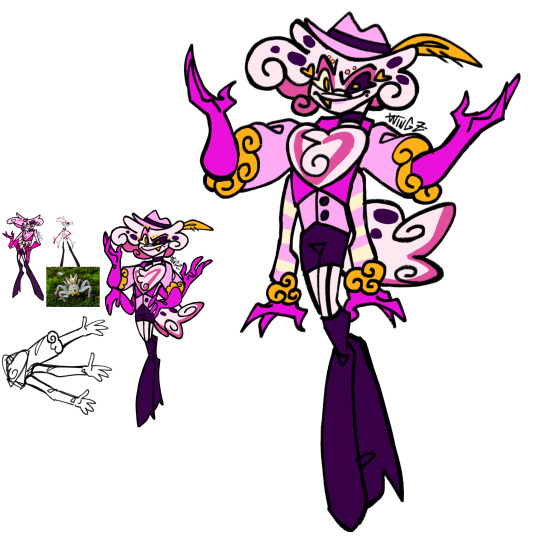
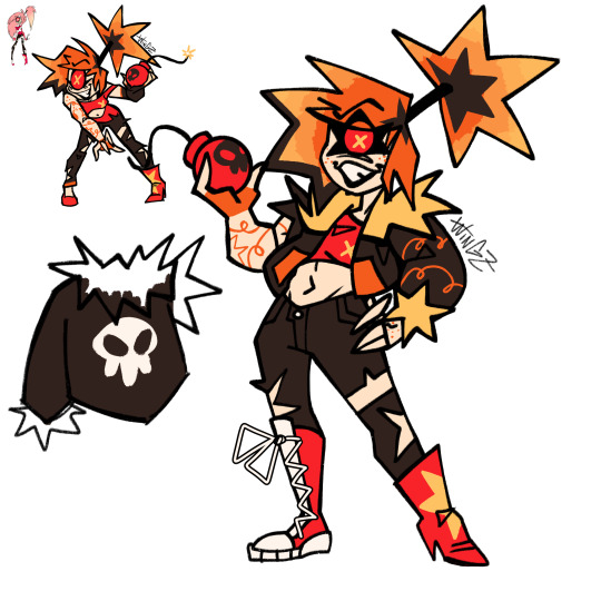
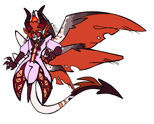
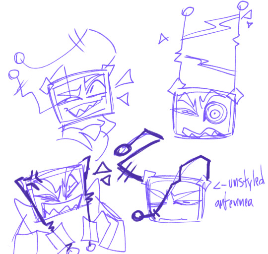
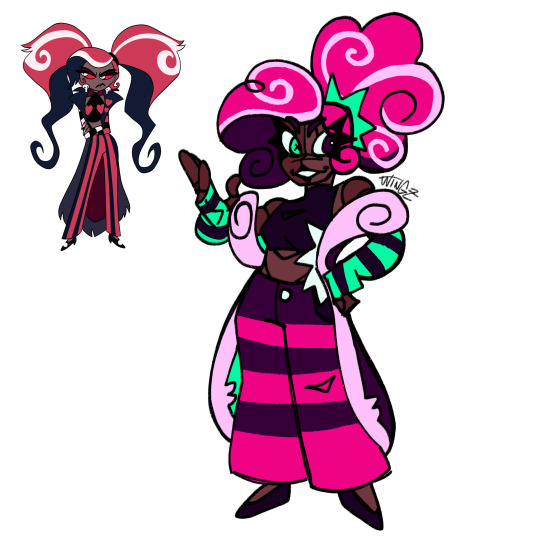
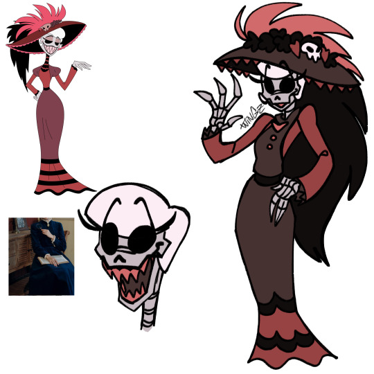
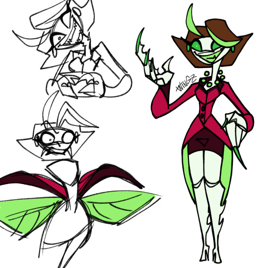
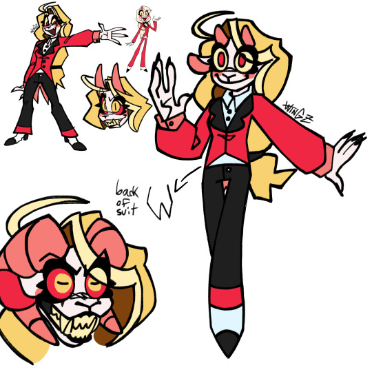
HAZBIN REDESIGNS.
Mainly for fun cuz I really like making character designs, so what better way than making self-indulgent tweaks of the designs from one of my favorite show.
There's some glimpses of my older redesigns on here, cuz I got back into Hazbin in like, November but just never posted anything out of fear of.. adult accounts. But now I'm saying fuck it we ball and posting anyways cuz bro I do NOT wanna go radio silent again, PLEASE-
Anyways, enjoy these silly designs. I'm gonna be doing more characters in the future, this is just all I got so far
#hazbin hotel#hazbin alastor#hazbin charlie#hazbin vaggie#hazbin angel dust#hazbin cherri bomb#hazbin sir pentious#hazbin husk#hazbin niffty#hazbin vox#hazbin lucifer#hazbin valentino#hazbin velvette#hazbin vees#hazbin redesign#hazbin rosie#hazbin katie killjoy#hazbin tom trench#hazbin art#hazbin hotel fanart#really hoping I'm tagging this good#ashedwings post#ashedwings art#ashedwings design#Wingz!HH Rewrite
413 notes
·
View notes
Text
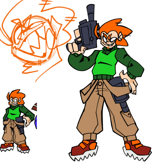
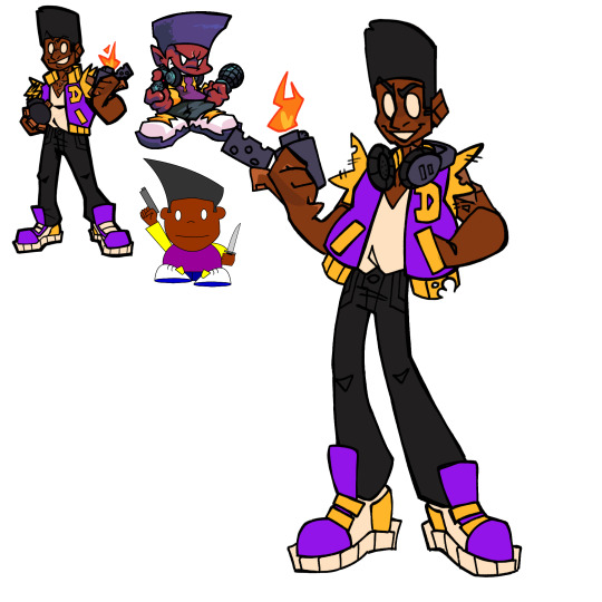
PICOS SCHOOL DESIGN DUMP
Pico
So, I decided that my previous designs for a lot of these characters are going to be more-so their designs during the events of the Pico’s School games. So when they were kids. Like, some will be a bit different, but for the most part, that’s how it is. So then these new designs are them as adults.
When trying to figure out Pico’s design, I didn’t know how I wanted his outfit in this new design to differ from his previous. Cuz like, that’s already the perfect Pico fit. But then I realized “omg, it’d be so much funnier if I DIDN’T change it.” Cuz he is definitely the type of mf to be wearing the same clothes he’s had since middle school.
Like, Cass or Nin come back for a rematch, and they both look super different, and then they look at Pico and he looks NO DIFFERENT than last time they saw him.
Darnell
I immediately broke my rule with the previous designs with Darnell, cuz I just really liked the previous design’s outfit and was like “eh, imma use that for his adult design, and just change the kid design.”
I imagine he got that varsity jacket like, custom made, and it was like super fuckin expensive. But like, when he got it, he decided “wait, I don’t want the sleeves” and just ripped them off 💀
Can’t have long sleeves when you’re always working with fire ig.
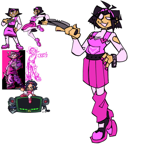
Nene
I think Nene is the one I’ve drawn in alt. outfits the most. What can I say, I just really like drawing her and messing around with her clothes. So I had a lot of previous pieces of mine I could look back on for reference.
The main change that isn’t outfit related is her hair. I just decided to dick around and see what looked good, and landed on that. I think it looks pretty good, idk.
Also, gave her a WWJD bracelet cuz sometimes I forget she’s Christian and I thought it was funny.
Reminded me of this one stupid idea I had, featuring my very headcanoned version of the G-Squad:
Like, the G-Squad are doing their whole cult thing, worshipping the Peniliens, when the Pico trio burst in, and Nene says something like “THERE IS ONLY ONE LORD AND SAVIOR, AND HIS NAME IS JESUS CHRIST.”
And then they kick their asses, idk.
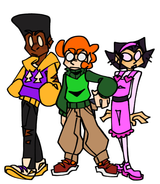
Also, here, them as kids. Pico just got spikier as he got older
Okay, time for some antags 💥💥💥
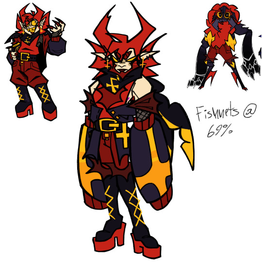
Cassandra
She was actually the first redesign I made in this batch.
Main change: Beard. I just sorta wanted to make the Penilien duo more androgynous. I imagine that they don’t really care about transitioning that much, since they don’t have the same gender roles and stereotypes as humans. Just “I’m [insert gender here], that’s it.” Also, I just think Cass slayed with a beard.
I also wanted to incorporate shapes from their alien forms more into their human disguises. So I gave Cass these big sleeve things to sorta emulate the big bulky arms she has in her true form.
One of her pincers is also chipped. This comes from the fact that in Pico’s School, one of her horn-hair things is shorter than the other, and I wanted to find a way to incorporate that.
Damien
I don’t think there’s much to say here that I have already said while talking about Cassandra.
I imagine Damien does less to hide his alien features, since he has a huge superiority complex and thinks Peniliens are superior anyways, so like, why hide his true colors? Why hide what makes him greater than everyone around him?
So yeah, that’s why he keeps his tail out.
Nin
YIPPEE, HEAVYILY HEADCANONED CHARACTER TIME‼️‼️
So Nin differs with the whole “previous design is them as a kid” thing, cuz he doesn’t really age past his age in Pico’s School. Cuz bro dies.
(Also, quick HC timeline: Pico 1 and “Pico 2” (the conflict with the robo-kids) both take place in middle school, while what I call “Pico 3” (the conflict with the G-Squad) happens in high school. So that’s why Nin appears less child-like; he’s a high schooler)
So like, I hc that when Pico killed Nin, Nin pulled some necromancy bullshit and revived HIMSELF. Cuz idk, that feels like some bullshit Pico’s School would pull.
So now he’s undead. His hair also sorta resembles horns cuz it’s sorta to symbolize his devotion to the Peniliens. If y’all are interested in hearing all the HCs I have for the G-Squad (or just PS in general), I might share more at a later date.
That’s all for now tho.
Bonus:
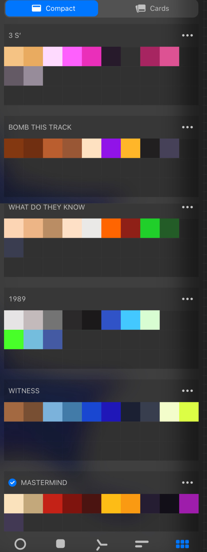
My color palettes for these fuckers. They’re all named after the MSI songs I associate with each of them. I do not support MSI, I just really like the music and it reminds me of Pico’s School for some reason, so I always listen to a lot of it whenever I get sucked back into this fandom
#ashedwings post#ashedwings art#ashedwings ramble#picos school nene#picos school cassandra#pico’s school#picos school#pico's school#picos school darnell#picos school pico#pico’s cousin 2 damien#pico’s cousin 2#pico’s school g squad#darnell pico’s school#nene pico's school#pico pico's school#cassandra pico's school#Wingz!NG AU#ashedwings design
215 notes
·
View notes
Text
UPDATED HAZBIN DESIGNS/REFS (Main Hotel Cast)
Just updated the refs for my designs for the main hotel cast. And a lot of them got design changes.
Mainly just wanted to update my refs to include the design changes I’ve made to a lot of them, but also so my refs were more comprehensible to other people, since those first refs were really only made for me
#ashedwings post#ashedwings art#hazbin hotel#hazbin hotel redesign#hellaverse#hazbin charlie#hazbin vaggie#hazbin angel dust#hazbin cherri bomb#hazbin pentious#hazbin sir pentious#hazbin niffty#hazbin husk#hazbin alastor#hazbin lucifer#Wingz!HH Rewrite#ashedwings design
256 notes
·
View notes
Text
EVEN MORE HAZBIN REDESIGNS
These are prolly gonna be the last of my Hazbin redesigns for now, since I’m waiting for other characters like Baxter, Crymini, Arackniss, etc to ACTUALLY show up in the show before I try and redesigns them, so I have more to go off of.
#ashedwings post#ashedwings art#hazbin hotel#hazbin hotel redesign#hazbin keekee#hazbin razzle and dazzle#hazbin fat nuggets#hazbin molly#hazbin egg bois#hazbin adam#Hazbin lute#hazbin saint peter#Wingz!HH Rewrite#Ashedwings design
341 notes
·
View notes
Text
HAZBIN REDESIGNS (new designs and updates to a few old ones)
First, let’s get the new ones out of the way
Then we also have Adam, but I’m less confident with this one and I’ll prolly change him up when I have better ideas.
Also, this redesign has a lot to do with my rewrite’s version of him. Basically, Adam is supposed to be in Hell, but was let into Heaven by some higher being. So he is actually a demon. The exorcists wear helmets with horns to create a crowd that he can blend in with, so he doesn’t stand out as much.
But yeah, I’ll prolly update him once I can come up with something better. So yall get to have this concept.
Now on to the updated designs !
First is Charlie. I just wanted to update her to look more like her parents’ designs.
I’m not fully set on the colors, so I may update her again at some point.
Then there’s Vaggie:
Not many changes, mainly just included the new detail of the eye pattern on her hair.
Lastly, Alastor.
I really only changed small details about him. Just wanted to make him look a lil more unhinged and like he could’ve been a serial killer.
Here’s a version with color and a version with notes cuz I didn’t feel like adding the notes to the colored version
#ashedwings post#ashedwings art#hazbin hotel#hazbin hotel redesign#hazbin lilith#hazbin sera#hazbin emily#hazbin charlie#hazbin vaggie#hazbin adam#hazbin alastor#hellaverse#ashedwings ramble#ashedwings design#Wingz!HH Rewrite
223 notes
·
View notes
Text
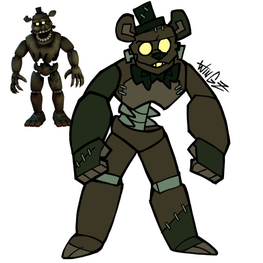
Got a lil silly and made designs for the Halloween bots. I love these critters.
#fnaf#fnaf dreadbear#fnaf Jack o Bonnie#fnaf Jack o Chica#fnaf Grimm Goxy#grimm foxy#dreadbear#jack o bonnie#jack o chica#ashedwings post#ashedwings art#ashedwings design
306 notes
·
View notes
Text
FNF CONNECTED UNIVERSE LINE UP Part 2: The Girlfriends
Yippee, new line up. Didn't have as much trouble on this one either.
Idk how much yapping I'll be doing, since I don't really know how much I have to talk about.
But still
Close ups and yapping under the cut
Alternate Universe Girlfriends
So just like with the Boyfriends, all these Girlfriends are technically all the same person, just from different universes. So I tried some elements of their designs consistent between them all, which stem from my base game Girlfriend design.
Unlike BF, there's a good bit more to talk about with GF since I draw her pretty different compared to her in-game design. The main thing is her more apparent demonic traits, like her horns, tail, and purple splotches. The explanation for this, in universe, is that she doesn't have the full power to cloak herself yet. See, her and her family are "music demons", which gain their power by leeching from music, usually a particular genre. GF hasn't really decided what genre to leech from yet, so she isn't as powerful as she could be. She also has a coat cuz uhhh. Silly. Things like her demonic traits and her coat (Or something of similar shape like a feather boa) would be the things to connect all the AU GFs.
Moving on, we have Herself, who I was looking forward to drawing the moment I started this line up cuz I had just. Such a clear vision of her in my head. Although it was a struggle to put that vision on paper.
It's hard to put the exact vision into words, but it's like having her form become less defined as it goes downwards, until it's just the wispy silhouette of her hair. There's a certain balance you have to strike with the wispy nature of her form and the trademark Girlfriend hair shapes, and that's what ended up being the biggest struggle. Once I figured that out though, it was pretty simple. Shapes were the most important thing since her coloring is pretty monochromatic. Not counting the black, this design only utilizes two different colors, both being shades of red. Her design includes a feather boa instead of a jacket, mainly cuz I completely forgot about that rule when I got to her and the boa was a lot easier to add than a jacket. It also makes an interesting shape I think.
Next is Funkadelix, and she really wasn't too hard. The main thing was giving her traits from my main GF design, which wasn't hard at all. For her horns I referenced her Halloween attire. Her tail too, sorta, but I mainly just referenced the thinness of it.
There isn't all too much to say about MDM. There wasn't a lot to change or add. Main addition was the boa, which was admittedly kinda fun to draw in my style for that AU.
Now onto Mix. If you saw my post yesterday about the doodle/sketch pile for this line up, you might've seen a design concept I did for Mommy Mearest, and that was literally just for Mix's design. Except it was virtually pointless cuz I didn't really include any aspects of my MMM into my Mix design. It's fine though, I think she turned out fine. Might take another pass at her in the future when I ACTUALLY have my MMM design figured out.
Lastly for this section, HD. I actually had quite a bit of fun drawing her. Don't really got much to say about her though. I'm pretty sure she was the first AU GF I gave a boa, so she's the one that started that. It was originally going to be all white, but my good good friend @minxtheeenby suggested it fading into black, and I really like how it turned out.
"Side" GFs
So first is Belladonn (B-Side). I know I wanted her to appear more sophisticated. That's just always how I imagined her, even back well the mod was still a simple recolor remix mod. There's also something so fun about classy characters that are also dangerous. We need more regal women that carry around bats full of nails. I had a lot of trouble nailing (pun not intended) her hair. The main thing that sets it apart from the traditional GF cut is her side bang (idk hair terms, I think that's what it is), but besides that, not much else. So I had to mess with it a bunch to get something I liked.
Amelia's (D-Side) design was pretty straight forward. The main thing was just adding a few more details to spice it up a bit. Which just happened to be buttons on her jacket and lil heart patterns on her knees. I also wanted her to be short. Cuz idk, she gives short vibes. A lil idea for her that isn't showcased here is that I imagine her pigtail buns actually turn into her horns when she is in her demon form. (Bad doodle, but just to show the concept:)
Lizzy (G-Side) was kinda fun to come up with ideas for. Most of her design is taken from the fake teasers for the mod, cuz silly. But because her mom is some sort of light spirit.. thing, I wanted to mix that in somehow too. So that's where the white highlights on her horns, hair, and tail come from, but that's not all it added.
She also has pretty funky eyes, that are somewhat inspired by Shara Ishvalda's eyes
Also, in that doodle, I imagine all of her hair is floating, I just. Didn't feel like drawing her pigtails cuz I mainly wanted to highlight the eye thing.
The New Yorkers
With Shaya, I mainly added a bit of stuff to her outfit, since the original is too simple with my design style. I basically just added a bat wing shape motif to her design. Cuz. Cuz vampire. This is also present in her ear shape cuz I didn't want them to JUST be pointed, cuz I wanted her to stand out a bit more from the demon girls. So different ear shape.
I don't really know how much Azalea (Neo) changed. I know I changed her hair a bit (to further differentiate her from GF) and I altered her top a bit but I THINK that's it. I did change her and her family's lore a bit though. Cuz I made them robots. THATS RIGHT, THIS IS WHO I WAS TALKING ABOUT WHEN I WAS TALKING ABOUT MAKING ONE OF THE GIRLFRIENDS A ROBOT. Azalea's pretty android-esc, but I imagine her parents are just full on robots. I can't wait to design them. But yeah, I imagine Azalea is much more human looking because she just wants to be part of human society and her parents love her so they got her the more human looking body so she could live out her dream. We love supportive parents *explosion emoji* *explosion emoji* *explosion emoji*
Not much to say about Grace. I just gave her a bit of melanin cuz apparently she's mixed. That's all I really changed tho.
I don't think I changed Judith MUCH. Her face is a bit more. Wolf-like? Idk. I also TOTALLY didn't reference Clawdeen Wolf's hair when designing her. Totally not.
Vikki (Minus) is grouped with the New Yorkers cuz. There's only one of her. Unlike the Minus BFs. I just made her a lil more goth, since people literally call her "Goth GF". Also made her hair a bit more blocky. cuz. cuz the minus symbol. Shape *sparkle emoji*
Who the Fuck Knows (Miscellaneous)
So starting with Cherry (Swappin'), in this AU she's actually GF's younger sister. She also already has a music genre to leech from (rap), so she's better at concealing herself. Not much else to say, I did not change her design much.
Nothing much to say about Barbara either, I barely changed her.
Now Astra (Starcatcher) was fun. While I was initially sketching her, I realized that both her alien species and the Alien Hominids have the same style of classic antennae. So I decided "Huh, what if their species are related." So I did that. Not much else to touch on besides that.
Tootsie belongs to @minxtheeenby and is part of their Sunday Night Snackin' AU. I drew her with her wings and tail out, which aren't usually out, but uh. Silly.
Belletrix didn't really change as much as I was expecting her too. The main thing was just. Making her an imp that could exist in the Hellaverse. Which was pretty easy. And then I just made shit up when it came to her outfit cuz it was kinda hard what was going on with that in the first place.
Next is Gabriella, YIPPEE. So she's the GF from Plants vs. Rappers. Vastly different appearance wise though, cuz, yknow. Can't have her look too similar to GF. And just like I did with Dennis, I decided to base her on another zombie from Neon Mixtape Tour: The Glitter Zombie
Idk, I thought it'd be cutie patootie. And it was. I really like how she turned out. I got lazy when it came to her flag, I did not feel like drawing that shit.
Last but not least is Ashley, the GF from my own AU. Which does not have a name. Idk, it's mainly just an excuse for me to draw anthro Monster Hunter monsters. But yeah, she's an intersex Leostra (Gender neutral term for the Teostra/Lunastra species that @sleepymushrxxm came up with) and I love her.
That's all I got. Gonna hopefully start working on the Pico's here soon.
#ashedwings post#ashedwings art#fnf#friday night funkin#friday night funkin’#wingz!ng au#fnf mod#ashedwings design#fnf mods#gf fnf#fnf gf#girlfriend friday night funkin#fnf girlfriend#fnf au#long post#ashedwings ramble
95 notes
·
View notes
Text
FNF CONNECTED UNIVERSE LINE UP Part 1: The Boyfriends
Chat. I spent 34 hours in this canvas. I am so tired.
Anyways, when I began working on Connected Universe AU, I already knew I'd be making line ups. Cuz I love making line ups and I also love suffering.
Close-ups and lots of yapping under the cut
THIS IS ABOUT TO BE A LOT OF READING IM SO SORRY-
Alternate Universe Boyfriends
So all these guys, unlike the other BFs present on this line up, are actually BF but from different universes. They're the same dude.
I thought it'd be neat to display the fact that they're from different universes by drawing them all in different art styles. It was also a fun exercise to test my art style range.
So starting from the left, we got Base Game BF. The main universe one. He's drawn in my usual art style. Not much special about him. Boyfriend.XML my beloved. I will note here though that I did take some of the elements form my own BF design and threw them onto the AU BFs. So that's why they all have some sort of jacket/hoodie etc.
Then we got Yourself. I reverted to old tactics and used my sketch for his line art, which results in him having thicker line art in general. I also further distinguished him by giving him harsh black shading. He always has that. He already had it on his face, so I just gave it to the rest of his body too. Cuz silly. You. You could even say. Silly Billy- 💥💥💥
Then we have Funkadelix. Him and a few other BFs make use of the Blackburn brush for their line art, cuz idk I like that brush. I referenced the Mutant Mayhem style when making him, since in the Connected Universe, he's in the same universe as those turtles. His colors are mostly yoinked from the actual Funkadelix sprite. I think. I may have tweaked them a bit/eyeballed them idk. I prolly eyeballed them.
Then we got Monday Dusk Monolith (MDM). I really went with the mentality of "NO ROUND SHAPES" with this fucker. Just wanted him to look super sharp and scratchy, since that AU is literally dealing with an apocalypse. So sharp shapes just made sense in my brain.
I had a lot of issues settling on a style for Mix, so I just chose to take inspiration from the FNF loading screens, cuz it just fit in my brain, idk. His design also features present in my Pico design, like the stupid cleat shoes and stray hair lines. Yknow, since he's literally a mix of BF and Pico. He also uses Blackburn
Finally, HD. I decided to try and go for a semi realistic style for him, proportion wise at least. Cuz. Yknow. HD. He also uses the blackburn brush, but I also pulled an old tactic for him and made his sketch visible over his coloring. Cuz idk, I think it lends towards the vibe.
"Side" BFs
Okay, now we're REALLY getting into AU territory.
So from here on out, all the BFs are separate people from THE BF, and have their own names and shit.
So staring off, we got Blake. I was reading through his wiki trivia and saw them say his style was more "radical and funky" than base BF's. I saw the word funky and ran with it dawg. So that explains this clothes. I also tried my darndest to get rid of a lot of the BFs caps, cuz dude, I can't have that many fuckers having cubic backwards caps. So I gave Blake a pair of star shaped sunglasses cuz funky, chat, FUNKY. We decided that his stage name is Love Bird, and he chose that cuz that's a pet name his GF has for him, and if he had a band it'd be called The Birds of Paradise.
Then we got .XML. I immediately knew I wanted to give him a mullet. Look at this man and tell me he wouldn't have a mullet. Besides that, not much changed. Since he kept the name of .XML, I imagine he is actually related to BF in some way, and he just goes by his last name. They might be cousins or brothers or something idk. There's also more dumbass info on him here:
Then there's River, or G-Sides BF. I took a lot of inspiration from his teaser designs, cuz they were silly. Literally named his river after the dumbass river design on his sweater. I don't got much info on him besides that. I can't talk about River without including this image so here:
The New Yorkers
This group is literally named after the fact that they all live in NY in my AU. Technically, the Minus BFs should also be here, but they're their own group.
Starting with Bartholomew, or B3, I just took the shape of his glasses and ran with it. Chat I needed to get that shape language from somewhere. I actually drew him twice, since the first time around I really was not digging how I drew him. He's fine now tho. His ass only got brim, cuz he had to be different somehow. Other than that. not much changed for him.
Now Evan.. Evan gave me so many issues. Like, dawg I drew him three times. I kept on trying to make the orange in his upcoming design WORK but I just COULDNT chat i COULDNT
So, per @braveboiart 's request, I ended up getting rid of it entirely and replacing it with his blues and grays. They also gave me the advice of brightening the colors a bit, which was very easy for me to do, I love bright ass colors. I also touched up his design shape wise, since that was also lacking the first time around. So boom, zippers on the pants and baggy ass sleeves. I'm content with how he came out. Chat I did all his design touch ups while I was exhausted out of my mind. Sometimes you gotta be delirious with sleep deprivation in order to cook, kids, trust me (please do not be like me-)
Benjamin was pretty simple. Kept him soft, kept him round, kept him pastel. Got rid of the caution sign on his hoodie since .XML already had that, and just replaced it with paint splatters. Not much more to say.
With X's design, I got a lot of help from my good good friend @minxtheeenby , mainly when figuring out his hair style. Those braids are not actually his hair, and are fuckass cords that connect to his headphones and can move independently. Don't ask about the logic, I will not be thinking about it. He was born in Philly cuz of his fuckass white eyes. White eyes means Philly, I don't make the rules here.
Minus BFs
The colorful critters, these guys are.
So. Beta. I had actually drawn him before this point, and he didn't change much from then
He has arrow shaped top surgery scars cuz I love giving constantly shirtless characters top scars and I just. HAD TO once I had the idea to make them arrow shaped. Main things to change since that drawing are some details on his pants and some of his colors; notedly the fact that his hat is a darker color compared to his skin to further distinguish it. Also Brave kept trying to get me to make parts of his design the same color as his nipples. So that happened /lh
Chat. I let my furry show with Blue. BUT CHAT HEAR ME OUT. On the wiki it's stated that he's a "Dog??". You think I could look at that and not go all the way? So yeah. Dog. He's silly and he got his weird ear ring things from his sister (Minus Miku).
Not much to say on Mean, he barely changed. I just drew him in my style and added a few details. He might also be an alien, idk.
Now, I posted about Golden a bit, but for those who didn't see that insanity: I made him an Alien Hominid. Cuz small yellow alien=Alien Hominid in my brain. Flawless logic. (Don't worry chat, I sat down and extensively researched the AH series to the best of my ability to check if it made sense. And I didn't see anything that would make it not make sense?) But yeah, silly. Him and Otis might be buddies, cuz goofy.
Who Fuckin Knows
These guys are just all the guys I had nowhere else to put. Miscellaneous group.
So first we have Bonnie, or Saturday Night Swappin' BF. He's another one that I had to go back and touch up. I actually touched him up the same night/morning as Evan. He ended up turning purple. The name we assigned him was an omen /j Chat I swear he was originally blue, I don't know what happened
HC that he just got really into FNaF when he was younger and has just been cosplaying a humanized Bonnie the Bunny ever since /hj
BIDU GAVE ME SO MANY ISSUES AND IDK WHY. It's prolly cuz by the time I got to him I was getting SUPER burnt. But I prospered and was able to finish him. And I don't hate how he came out, so bonus points there. Main change was replacing the prohibition sign on his shirt with a lightning bolt, cuz no one but BF is allowed to have that symbol, and Bidu already had lightning bolt imagery, so eh why not. His eyebrows being green, at least in my style, implies his hair is naturally green, and he just added the blue and pink, and I find that slightly humorous, idk.
Keith (StarCatcher) was another one I had to go back and touch up, but that's due to the fact that I was informed that him and his GF got a redesign before the creator deleted their FNF stuff. So I had to go back and fix my design according to that. I also leaned into the scape suit direction cuz SHAPE.
Now, you might be wondering, why is Flippin BF here and not with the other alternates? He was grouped with him in a previous post? Well, that's because after more assessment, I decided that Friday Night Flippin' is in fact, in the same universe as Base FNF and not an alternate universe like I had previously decided. So I changed his design a bit (mainly just getting rid of his hat and changing the color of his shoes) and boom. Different guy. He is staying pixel art tho. I do still need to come up with a different name for him tho.
Now this next one, Heath, is not from a currently existing mod, but from an FNF AU my friend Minx is making.
I decided to include him cuz he's silly and I love him. Their AU is canon to the Connected Universe.
Okay, so Cam (Hellbeats BF) changed A LOT. I let my furry slip out again. BUT I HAVE ANOTHER REASON FOR IT. See, in this connected universe, it's not just Newgrounds stuff that is canon. I also made other fandoms I'm in canon. So that means the Hellaverse is canon (specifically my rewritten version of it), and Hellbeats has to fit in with that. So I had to assign the characters species from that universe as well. So I made Cam a cherub, cuz I wanted him to stay short as fuck. He's also a raccoon cuz he's a lil shit and I thought it'd fit If ur curious, this is what everyone else is:
Okay I'm done yapping now. Gonna be doing the GFs next.
#CHAT IM SO SORRY THIS POST IS SO LONG#My insanity strikes again#ashedwings post#ashedwings art#fnf#friday night funkin#friday night funkin’#fnf boyfriend#fnf bf#bf fnf#boyfriend friday night funkin#fnf au#fnf mod#fnf mods#fnf headcanons#Ashedwings ramble#long post#ashedwings design
68 notes
·
View notes
Text
Boom, lambsona be upon ye
Two versions cuz I wear these two fleeces a lot and I figured there could be some neat designs changes depending on the fleece they were wearing
#ashedwings post#ashedwings art#cult of the lamb lamb#cotl lamb#cotl lambsona#lambsona#ashedwings design
34 notes
·
View notes