#Art criticism
Explore tagged Tumblr posts
Text
Unless I am seriously misunderstanding this article, this is not entirely true.
...a Smithsonian spokesperson said that Darnaude’s op-ed “only acknowledges one of two wall labels on view that address the work...the [Smithsonian's] statement read...“In the gallery in which ‘Untitled’ (Portrait of Ross in L.A.) is installed, there is a wall label that includes: ‘Gonzalez-Torres cared for his partner Ross Laycock, named in the candy work’s title, who died from HIV/AIDS in 1991.’”
Still not sure why they laid the candy out in a straight line though. That's odd.
the david zwirner gallery and the felix gonzalez torres foundation in the smithsonian removed the descriptive plaque for portrait of ross in la by felix gonzalez-torres. the old plaque explained portrait for ross' origins as the artist's partner's aids related death, and replaced it with a plaque with absolutely no information about the piece itself, who ross was, or who gonzalez-torres was either. portrait of ross was also reeranged to lay on the floor long ways instead of in a pile as it typically is situated, and the plaque outside the exhibition FOR GONZALEZ-TORRES omits his sexuality, as well as his aids related death. i'm in utter disbelief


52K notes
·
View notes
Text
some of y'all need to remember that ianthe explicitly doesn't look like coronabeth 2 complete with luscious golden locks and gorgeous eyes and conventional attractiveness but instead looks like if coronabeth was made of wheat bread and got left out in the rain overnight and everyone who sees her kind of wants to die for a second
1K notes
·
View notes
Text


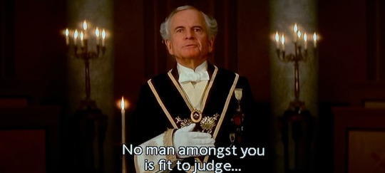
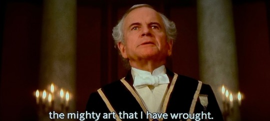
From Hell (2001, The Hughes Brothers)
796 notes
·
View notes
Text
youtube
Beauty in Splash Art 3
League of Legends splash art is, on the face of it, perhaps an odd place to go looking for beauty. These are JPGs whose first and primary function is to hawk video game cosmetics for a free-to-play game, it's not exactly the sort of thing you expect artists to particularly flex their creativity for.
And true enough, a lot of splash art is fairly rote. Here's a character, wow look at their cool pose, don't you want to spend dollars to own this, and so on.
But sometimes, one of the artists working at Riot, or at their outsourcing studios, seems to get a bee in their bonnet, or maybe they just get excited about an opportunity to practise craft, and you get splash art that tries to do something more than simply sell the product, or artwork which displays a real flex of technical skill, often in ways which are functionally invisible at any of the common resolutions that the art will ever be displayed at.
There is genuine reward to be found in those pieces, in zooming in close and marveling at the level of effort spent. So let's spend about an hour doing that!
Splash arts covered:
Odyssey Sona - by Kelly Aleshire
Victorious Sejuani - by Francis Tneh
Aurora - by Jennifer Wuestling
Redeemed Star Guardian Xayah and Rakan - by Ina Wong
Empyrean Vex - by Horace "Hozure" Hsu
Winterblessed Diana - by Bo "chenbowow" Chen
Porcelain Irelia - by Alsie Lau
Toy Terror Cho'gath - by Fortune "Fortuneee" K
#tb posting#tbskyen#tb skyen#tb videos#league of legends#riot games#splash art#game art#sejuani lol#sona lol#aurora lol#xayah lol#rakan lol#star guardian#vex lol#diana lol#irelia lol#cho'gath#art criticism#Youtube
281 notes
·
View notes
Text

guys how could i make ts more interesting?
i never seem to be able to pull off good and interesting artwork (ive been at this shit for 20 years)
#art help#artists on tumblr#art critique#art criticism#naruto art#obito fanart#obito uchiha#naruto#obito my beloved#obito the goat#team minato#PLEASE HELP
60 notes
·
View notes
Text
How compliments feel sometimes.

#artists on tumblr#art critique#art criticism#fnaf sun and moon#sundrop#daycare attendant sun#fnaf sb sun#dca sun#fnaf sundrop#fnaf sun#fnaf sunny#dca fandom#dca
308 notes
·
View notes
Text
Response to Recent Neil Gaiman Coverage.
"You could do this with any fantasy book" is a valid retort to criticisms of Neil Gaiman's work. Not every writer will share Neil Gaiman's specific habits. However, you can analyze any writer and say, for example: "Almost every male Garth Ennis protagonist is a laconic, ex-military widower, while every female Garth Ennis protagonist is essentially Ellen Ripley with a name-change, paired with her beta male, Porky Pig-like sidekick. His stories often involve taking real-world military history and turning it into a comic strip or adapting that history into another genre, whether superheroes, sci-fi, or crime. He also relies heavily on gross-out humor, mocking superheroes while continuing to write them for money, shock value, and gore."
And I say this as someone who is a fan of Garth Ennis. The conversation here should focus on criticizing Neil Gaiman's actions, regardless of his merits or lack thereof as a writer. Roasting his writing abilities makes this seem more like a ritual humiliation, targeting someone who's now out of the "Mean Girls" clique, by people who wouldn't care if he weren't famous.
#neil gaiman#fuck neil gaiman#neil gaimen allegations#comics#controvery#art criticism#opinion#bad writing#commentary
48 notes
·
View notes
Text

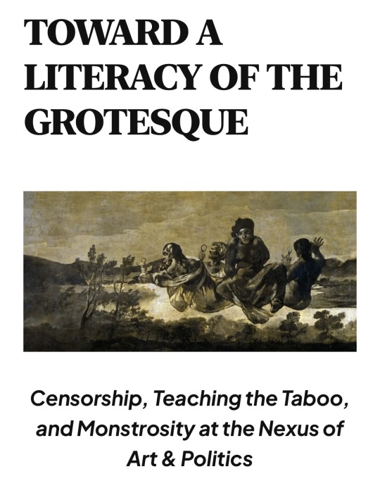
Howdy y’all, my essay on the abject is finally out! It discusses a number of issues, including purity legislation, self-advocacy in media consumption, and how we interface with dark/ugly topics in art and literature. It also delves into the issues surrounding HB900, Greg Abbott’s (failed) censorship law. It’s free to peruse, no paywall, so consider giving it a read if interested.
READ HERE
RT HERE (really helps!)
#media literacy#purity culture#education#censorship#media commentary#media consumption#media comprehension#media studies#art criticism#literary analysis#literary criticism#greg abbott#texas news#HB900#my writing#grotesque
64 notes
·
View notes
Text
how to critique and not to critique an artist: a guide to online etiquette for non-artists


what non-artists really misunderstand about artists is that we are showing you our old vs new art, usually with a redraw, we aren't asking for a comparison or for you to give unwarranted criticism. we are simply showing you our progress and how much we have improved over a given amount of time. for context, this is what my 2024 vs 2020 redraw looks like:


i genuinely don't mind other people not liking my art. art is a subjective matter and i understand that people have art styles they prefer. HOWEVER, to outright tell an artist you much preferred their old art is rude, especially when they are not asking for your opinion or criticism. we aren't asking for your "honest opinion" unless we directly asked for it -- if you have something to say about someone's art, better ask the artist first if they are fine with receiving comments, and even then, give the artist constructive criticism in terms of anatomy, colors, values, cohesiveness, contrast, etc. instead of just telling them your preferences.

this is the only time i asked for an opinion, and even then, i was only asking this specific person. however, saying stuff like "the colors in the new one is uncanny" is NEITHER helpful nor constructive

i want to focus on this comment for a bit. there's nothing wrong in not liking someone else's art, but saying that "he looks like he is wearing blush and the lips are so red he looks like he's wearing heavy makeup" is not constructive criticism, and it sounds like you're just stating your preference on what styles you like instead of actually giving advice on how to improve their work.
also, what's wrong with men wearing makeup? what's wrong with blush and lipstick? if the problem is "the colors are too bright", just say that, instead of saying "he looks like he's wearing makeup", because obviously, the colors are a stylistic choice
"you have very dark shadows" ok, then what do you suggest i do to improve it? elaborate on your comment instead of just stating your preferences.
"the expression looks way too exaggerated" and "the simplicity of the older one; looks cleaner, has a less cartoonish expression" is outright just telling your preferences and not constructive at all. do you dislike the way the artist rendered the work? do you dislike the linework and the detailing? be specific instead of just leaving it at "the old one looks cleaner" or "the eyelashes are too thick, looks uncanny"
and the expression is exaggerated because... i have a cartoonish art style. this is on purpose. there is nothing wrong with cartoonish expressions... on a cartoonish art style...

again i didn't ask for criticism on this work, but this time it's constructive and actually gives me advice on the anatomy, colors, etc. so i don't mind. if you are wondering how to critique an artist, this is the better way to do it.


this is how to PROPERLY critique an artist: tell them what they did wrong, and how to improve. don't just tell them your preferences, because again, that's not constructive. instead of just telling them "your shadows are too dark" or "the expression is too cartoonish", actually give them pointers on how to improve their anatomy, colors, shading, values, rendering, etc. etc. (although the comment saying that my line work was way too thick and how the femininity "should" be conveyed through experience and not features sounds more like personal preference)


^ these are more examples on how properly to give critique:
the shading: is it flat or overdone? does the shading convey the contours of the subject well? what can the artist do to improve on their rendering, values, and colors?
lighting: is it fine or is it way too sharp and bright? does the lighting convey the shape of the subject properly? does it suit the subject well? what can the artist do to improve it?
colors: are the colors way too flat and desaturated? or too bright and saturated? does the work have enough contrast or not? how can the artist improve their coloring?
anatomy: are the limbs too long? are the proportions off? is anything way oversized or way too small? did the artist convey the personality and character design well, or not? how can it be improved?
these are all i can think of for now, but hopefully you get the point!
conclusion: when commenting, provide constructive criticism instead of just telling your preferences. tell the artist how they can improve their work and style. and even then, make sure that the artist actually asked for criticism -- if not, ask politely if they accept criticism or if they don't mind receiving it, then actually provide constructive feedback. if you don't have anything constructive to say, then it's better to not say anything at all.
but once again, please be polite. everyone you encounter on the internet is another human being (unless proven to be a bot or an actual troll or something). treat them how you would treat people in real life. be considerate and respectful. it is easy to forget that random strangers are still human because of internet anonymity, but please, remember the human.
44 notes
·
View notes
Text


These are originally from this post (X) but I want to make it its own post bc it’s something I was kinda worried about people misinterpreting.
I actually agree with this person, anytime someone redesigns or redraws something and calls it “fixing” I always cringe a little. Art is subjective, no matter how you, I, or anyone else feels about it. To say that you’re “fixing” someone’s art is to imply that the original is “broken” or inherently wrong in some way, which it’s not. That is disrespectful — which is why I very purposefully don’t use that language.
As for small artists, I don’t think I phrased it properly above. Poor-quality media is rarely a result of a lack of skill on the part of the artists drawing the storyboards and final animation. Along with being overworked and underpaid, they are also given model sheets which they must strictly follow. If something looks wonky in a fully-produced show — in this case, a character’s head not being drawn to suit the angle it’s tilted at — it’s the fault of the designers and showrunners, not the artists actually drawing the frames. They’re the ones who decided how the characters should be drawn, and they’re the ones who approve the final product.
(And yes, I’m censoring this person’s username even though it’s easy to find on the original post. I’m not intending to incite rude comments toward this person, but if you’re the kind of person who would go out of your way to view the original post & find them, my words probably wouldn’t dissuade you anyway.)
53 notes
·
View notes
Text

??? Will but this time i try to be as realistic as possible
pls give me pointers if you have any 😭
(base by Dinosaor on youtube)

#oc#artists on tumblr#artwork#art#oc art#bat cats#fnaf#furry#five nights at freddy's#five nights at freddys#fnaf au#fnaf oc#furry artist#furry oc#sfw furry#furry art#furry character#furry community#furry fandom#furry ocs#furry sfw#anthro#anthro art#art criticism#art critique#art help
25 notes
·
View notes
Text


Baby update on artstyle. NOTHING HAS CHANGED 🥲
(Not done, complaining, and im gonna add more angles/lines/etc. also will be posting individually once all done🤪🤪)
PLEASE ADVICE, CRITICISM, ETC
#art#artwork#sketch#digital art#illustration#rendered sketch#rendering#sketching#artist advice#art criticism#artists on tumblr#digital artist#dmc#devil may cry#dmc nico#cyberpunk 2077#cyberpunk panam#panam palmer#smt#smt nocturne#demifiend#dungeon meshi#delicious in dungeon#falin dungeon meshi#delicious in dungeon falin#smt pixie#madoka magica#madoka kaname#kyoko sakura
68 notes
·
View notes
Text

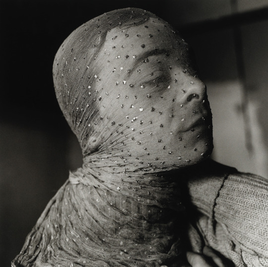
Now that 2024 is circling the drain, I’ll start regaling you with my “Favourites of the Year!” Most noteworthy passing: American author, playwright, actor, essayist, art critic and all-round bête noire Gary Indiana (né Gary Hoisington, 16 July 1950 – 23 October 2024) died of lung cancer aged 74. (As Indiana told an interviewer in 2014 “I’ve been smoking since I was practically two years old.” His brand of choice was Camel Filters. It’s amazing the dissolute Indiana lasted this long, considering his peers were people like David Wojnarowicz and Cookie Mueller). Anyway, words like “lacerating” and “scathing” barely suffice when discussing Indiana’s oeuvre. When I was in my twenties, buying each new work by Indiana and Dennis Cooper was de rigueur. (I probably purchased them at the long-defunct radical Compendium bookstore in Camden Town). I moved around a lot and wound up re-selling them to used bookstores for a pittance. Then Indiana’s books mostly lapsed out of print! (In more recent years, they’re gradually being reissued by Semiotext(e)). It didn’t help that Indiana gleefully burnt bridges throughout his life. As one of his associates noted almost admiringly, “He went through agents the way I go through t-shirts.” Some of his most noteworthy books were speculative fiction inspired by true crime figures like the Menendez brothers (Resentment: A Comedy (1997) and Andrew Cunanan (Three Month Fever (1999). (The viewers who clutched their pearls over Ryan Murphy’s recent Menendez miniseries would REALLY lose their shit over Indiana’s book. Indiana would have swooned over Luigi Mangione). For anyone interested in investigating Indiana, his memoirs I Can Give You Anything But Love is available in paperback. And his interview with Butt in July 2024 is essential. As its intro summarizes: “Gary earned his notorious reputation over the course of his unflinching, decades-long career. He writes about addiction, alienation, corruption, exploitation, obsession, perversion, power and sexuality with unfiltered candour, leaving no room for politeness … His tendency toward destructive obsession was kept in check by his brilliance, cutting humor and heart.” Pic: “Gary Indiana Veiled” by Peter Hujar, 1981.
#gary indiana#peter hujar#lgbtqia#bete noire#bad boy#lobotomy room#queer#i can give you anything but love#three month fever#resentment a comedy#the menendez brothers#andrew cunanan#the village voice#horse crazy#rent boy#avant garde#art critic#lacerating#art criticism#filth elder#role model
23 notes
·
View notes
Text
finished Jackie!!

Please critique me! I gotta work on my shading :p
So excited to get to know more about Jackie! They seem so playful, like Funtime Freddy
#art#artists on tumblr#digital art#fnaf#fnaf security breach#fnaf art#fnaf sb#queer artist#fnaf fanart#digital drawing#digital fanart#digital aritst#digital sketch#digital illustration#five nights at freddy's security breach#five nights at freddys#fnaf fighters fury#five nights at freddy's#fnaf dlc#fnaf ruin dlc#fnaf ruin#five nights at Freddy’s help wanted#fnaf help wanted 2#fnaf help wanted#fnaf circus baby#jackie fnaf#fnaf jackie#sketches#sketch#art criticism
20 notes
·
View notes
Text
[A critic is] someone who […] loves experience. I think it’s a disposition that comes even before attention to art. It is someone that looks at any phenomena and wants to extend their life by paying attention—by analysis—[by wanting] to juice this aspect of experience for all that it’s worth. Someone who is, in one way, battling death by saying I can extend this moment, and this one, and this one by way of attention. And so the best way to practice that disposition happens to be on art and therefore, [the critic] uses their taste, uses their standards, uses their whole apparatus of judgement, really, to express a kind of joy of being alive at the same time as the thing.
— Vinson Cunningham's response to the question, "What is the work of a critic today?" on The New Yorker's Critics at Large podcast
#Vinson Cunningham#art criticism#The New Yorker#Critics at Large#I've been thinking about this description all day
74 notes
·
View notes