#Art Deco Luxury Department Store
Explore tagged Tumblr posts
Text

THE CLASSIC ART DECO FURNISHINGS, STYLINGS, & MAJESTIES OF HISTORIC LOS ANGELES.
PIC INFO: Spotlight on classic Art Deco architecture, the Bullocks Wilshire building, located at 3050 Wilshire Boulevard in Los Angeles, California, designed by John and Donald Parkinson.
EXTRA INFO: 1929 Bullocks Wilshire, located at 3050 Wilshire Boulevard in L.A., is a 230,000-square-foot Art Deco building. The building opened in September 1929 as a luxury department store for owner John G. Bullock. 📸: Jeroen Tacx.
Source: www.picuki.com/media/3420540844022910781.
#Bullocks Wilshire#Bullocks Wilshire Building#Art Deco Luxury Department Store#Art Deco#Art Deco Building#Modernist#Art Deco L.A.#Wilshire Boulevard#American Architecture#Art Deco Buildings#L.A. Architecture#Wilshire#Wilshire Blvd.#John and Donald Parkinson#Art Deco Style#L.A.#Vintage Architecture#American Style#Modernist Architecture#L.A. history#United States#Modern Design#Modernism#Department Store#Los Angeles#Art Deco Architecture#Art Deco Los Angeles#Luxury Department Store#Architecture#Modern Art
12 notes
·
View notes
Text
HSR THEORIES - PENACONY ANALYSIS
I guess I'm late to the game, but I'm normally a lore gremlin for Xianzhou lore, not Penacony lore. Anyways, don't expect something very elaborate, but you'll be able to find :
Reflection on the period based on history (Penal Colony)
Reflection on the period based on fashion (NPC in trailers)
Reflection on the period based on architecture (Art Deco)
Reflection on the period based on cultural shift (Railway Mania, Department Stores)
Reflection on lore based on Literature (Jules Vernes, Herman Melville)
Reflection on lore based on Philosophy (Idealism, Utilitarianism, Transcendental Idealism)
Everything under the cut as always since I tend to babble.
The name "Penacony" possibly comes from the phrase "penal colony".
I'm certainly not the first to make the connection, but "Penal Colony" inevitably brings to mind Australia. This idea of "Space Australia" is also reinforced by the names for the characters we know at the moment, with a very clear English etymology : Sunday, Robin, Gallagher, Firefly.
The use of Australia as a "penal colony" by England took place after the American War of Independence, so we start with a period around 1780 to ~1870.
youtube
We didn't get to see a lot of NPC outfits in this very short clip, but what little there is could actually correspond to a period like this. However, we had a little more hints in Honkai Star Rail - Penacony Trailer | Game Awards 2023, where we see Acheron at the reception of the Reverie hotel :

This NPC in particular is interesting, because of her gloves. It's called "evening gloves" or "opera gloves". They were popular during the Napoleonic period (1800-1825) but were also very fashionable in the last two decades of the 19th century, i.e. 1880-1900 and before WWI, i.e up to 1910.
In terms of temporality, it is also important to note what concerns the architecture of Penacony.
It was noted on Reddit that the style of architecture could be reminiscent of the French Art Deco style, an architectural movement predominant in the 1910s to 1920s. Art Deco is said to have represented "luxury, glamour, exuberance, and faith in social and technological progress", so quite fitting for Penacony. Key features were : geometric/sleek designs, bold colors, luxurious materials, things that we find in the previews.
We'll have to wait to see more from Penacony, but it might be interesting to see if there is also any inspiration from the previous movement, Art Nouveau 🤔
Another architectural thing :
Look up and see the metal tracks crisscrossing the skyscrapers and the Spheroids rapidly rolling along them. They are the most visible means of transportation in this dreamscape metropolis and guide guests to each and every place around the city. [x]
This part about the Spheroids is interesting, because during this period (starting from 1825, with a peak in the 1840s), there was in France and England what we called the Railway Mania.
This is a point of interest because the Railway Mania saw the the arrival of the railroads in Paris. When it happened, this caused another major cultural shift : the rise of Department Stores. There is even a well-known french novel on the subject, called Au Bonheur des Dames (The Ladies' Delight) by Emile Zola.
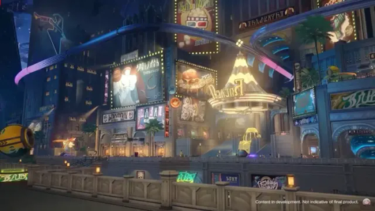
The end of the 19th century is also the period of birth of modern advertising and given the number of things that we see plastered all over Penacony, I think I can say that we are on the right track/period.
So, in terms of rough "era", we can go from 1780 to ~1920, so mostly the 19th century (1800-1900).
Speaking of period culture and Penacony in general, we currently have a Relic Set which I will use for the rest of the post: Penacony's Dream-Seeking Tracks
Opening a window no longer show a view of the stars in the deep sky, but of the city's shifting streams of light and shadows, holding up the constant echoes of giant clocks and theaters.
Okay, let's start with some details that I only noticed because I come from a literary studies background. I'm not going to lie to you, it's far-fetched, but stay with me, I promise it's interesting.
Giant clocks and theaters made me think "steampunk" works, whose setting are often set in an alternative history of the Victorian era (~1837 to 1900, so right in our period). One of the pioneering writers of the genre, “proto-steampunk” so to speak, is Jules Vernes, considered one of the "father of science fiction".
Remember Spheroids ? : "Spheroids are regarded as both vehicles and as toys in the land of dreams. However, few remember that the Spheroids are actually imprisonment cages — the vehicle towards dreams are tools originally used for locking up prisoners."
One of Jules Vernes' best-known novels is Twenty Thousand Leagues Under the Seas, a science-fiction aventure novel the majority of which takes place aboard the Nautilus, a submarine belonging to Captain Nemo. And interesting thing, "he also tells his new passengers that his secret existence means he cannot let them leave — they must remain on board permanently" ; They are prisoners in the Nautilus.
On another point, Jules Vernes is also considered as having had a strong influence on the surrealist movement "in which artists depicted unnerving, illogical scenes and developed techniques to allow the unconscious mind to express itself. Its aim was, according to leader André Breton, to "resolve the previously contradictory conditions of dream and reality into an absolute reality, a super-reality", or surreality"." Quite fitting for our dream planet.
For the next one... Well. I have no excuse for this one, it's even more far-fetched. But so, we remain in the literary universe.
The water from the spring turn into a giant whale and swim through the halls.
Giant whale made me think of one thing almost immediately : Moby Dick, by Herman Mellville, published in 1851 (once again in our era of interest). Moby Dick is a "sea novel" centered around the figure of the hunt of a whale. It's main themes are the limits of knowledge, fate and free will, nature and man, race, fellowship, and enslavement, madness and religion [x].
I wont copy and paste the whole shtick but I send you check again The Family description from the Data Bank.
With that, we're done with literature... so it's time to move on to something else wonderful and terrible, the greatest enemy of my high school years (when you have to do it for 8 hours a week, it quickly becomes tiring), I named: PHILOSOPHY.
For a transcendent experience, for an inspirational excitement, for the soothing of worries and wounds — guests of the highest caliber come to surrender their pain in exchange for peace and tranquility
I'm not going to dwell on that for too long, quite honestly. I'll just... put that here for you to do whatever the fuck you want with it.
Idealism : "Idealism in philosophy, also known as philosophical idealism or metaphysical idealism, is the set of metaphysical perspectives asserting that, most fundamentally, reality is equivalent to mind, spirit, or consciousness; that reality is entirely a mental construct; or that ideas are the highest form of reality or have the greatest claim to being considered "real"
At some unknown point in time, the small cells cut off access to reality, but people's consciousnesses became linked in dreams. In the midnight bell, that shared dream seemed so real, reflecting the sheer hypocrisy of reality.
Utilitarianism : "a family of normative ethical theories that prescribe actions that maximize happiness and well-being for the affected individuals. In other words, utilitarian ideas encourage actions that ensure the greatest good for the greatest number."
Those who follow the "Harmony" Path admire understanding, support, and cooperative behavior.
In addition to all previously "said", one of the greatest thinkers of the time, who is also the one at the origin of the definition of transcendent, is Immanuel Kant. His best known work is Critique of Pure Reason (1781), with which "he aims to reach a decision about "the possibility or impossibility of metaphysics".
Metaphysics "is the branch of philosophy that studies the fundamental nature of reality. This includes the first principles of: being or existence, identity, change, space and time, cause and effect, necessity, actuality, and possibility."
This work was the founding work of a philosophical doctrine known under the name of Transcendental Idealism. I'll spare you the convoluted explanations but look at that :
The scenery gradually becomes more and more incredulous, and the senses feel as if one has been lifted by silk. [...] The guests finally realize that they were never awake, but are instead witnessing Penacony's true nature in a dream — a place where time stops in a neverending dreamscape.
"Kant means that his philosophical approach to knowledge transcends mere consideration of sensory evidence and requires an understanding of the mind's innate modes of processing that sensory evidence".
"Kant outlines how space and time are pure forms of human intuition contributed by our own faculty of sensibility. Space and time do not have an existence "outside" of us, but are the "subjective" forms of our sensibility".
77 notes
·
View notes
Text
We took our Carol trip!

December 10, 2023, my good friend Sarah and I piled in my small Kia and made the 1 hr 40 min trip from Indianapolis, IN to see Cincinnati and Chevoit, Ohio shooting locations from 2015's "Carol." It's the only winter movie that matters to me. Here are some of the key locations we visited.
Tagging: @belivet, @pacinos, @lesbin
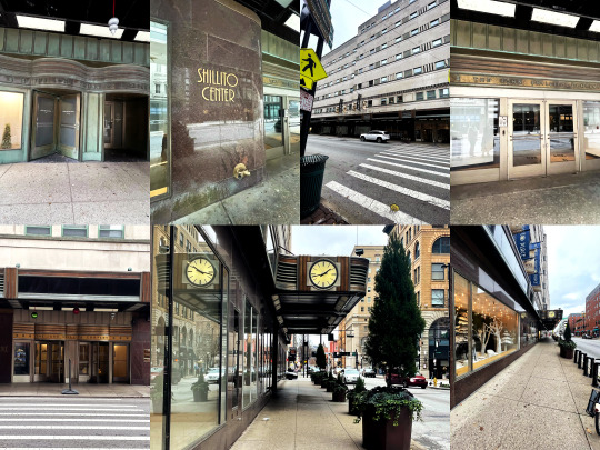

Shillito Center and art deco exteriors in Cincinnati.
Shillito Center was a department store with art deco features including the beautiful clock pictured above. This was the exterior of Frankenberg's in the film. The Shillito's department store has closed but the beautiful building has been turned into luxury loft apartments!
The other buildings of note were the Bell Telephone Company's "Cincinnati Bell" building--my friend noticed that the decorative border on the building is comprised of a stone pattern of old rotary telephones! The exterior of the now-Hilton Cincinnati is another Carol shooting site, which doubled as New York City's Drake hotel.
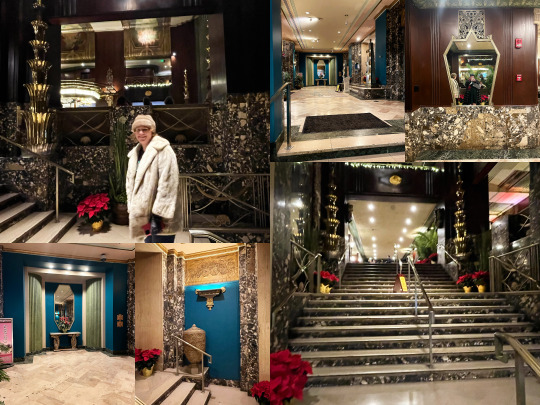

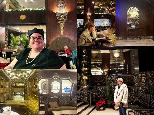
This is the exquisite Hilton Cincinnati at Netherland Plaza. As you can see, the art deco influence is strong and the rooms are gorgeous and grand. We were hungry and wanted to have lunch but the only available menu was the Dickens breakfast buffet, priced at a formidable $89! So we enjoyed a drink and a bowl of peanuts at the bar. A quartet of professional singers in Victorian costumes sang Christmas Carols beautifully in the background. The bartender was dressed like they used to dress, in a beautiful tailored slacks, shirt, and vest uniform. He did not work at the Hilton in 2014-2015 but was delighted by our quest. The entryway to the hotel is known as the "Hall of Mirrors," inspired by Versailles.

This is the stone bathroom structure at Eden Park, which was the setting for the Christmas tree farm impromptu photography session. My friend watched Carol to prepare (she called it "fun homework") and I prepared by finding a tam o shanter hat at a thrift store. My parents had the scarf, blonde fur coat, faux fur hat, as part of their repository of items from doing over 25 years of community theater together. The rest of my clothing items are a regular part of my wardrobe. I vacillate between eras but I love 40s, 50s, and 60s best of all. I also think it's likely they filmed the scene of Therese and Richard on bicycle going through a park at Eden Park as well, but can't be totally sure.
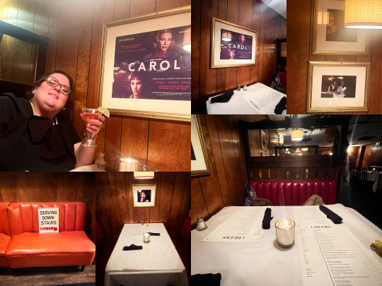
Finally, Maury's Tiny Cove Restaurant in Chevoit, Cincinnati is the setting of the first lunch between Carol and Therese. The booth they used for shooting has been preserved and I reserved it ahead of time, although surrounding booths also have pictures from filming hanging over them. It's been long enough that the server didn't know much about the film but told us that a group of excited college students ate there once and requested the same meal Carol and Therese ordered in the movie. I had lasagna as we had not eaten much all day, and a Santa Cosmopolitan from their holiday menu. The food was wonderful and it was obvious a lot of people are regulars. We noted that there are glass windows over the booths now, unlike in the movie, probably added during the height of Covid.
Bonus, but a disappointment:
Carol & Rindy's beautiful house at Grandin Rd has been completely re-done and now looks nothing like in the movie:

And, "that's that"! A truly special and memorable experience.
Here is a link to a Google Drive with all of the unedited photos and videos we took if you want to see anything in original quality/detail. We shot video of the photography scene but it was mostly goofy and unusable haha.
We talked about the movie some and Sarah asked me which character was the best fit for my personality. Hands down, Abby. I was wide-eyed Therese once, never glam enough for Carol, but Abby will tell you the truth and not blush from it. My hero!
29 notes
·
View notes
Text
Walking Tours in San Jose, CA: What You Can't Miss
Walking excursions in San Jose, CA present a completely unique and immersive manner to discover this bright the city. With its rich old previous, various subculture, and cute format, San Jose is a treasure trove of hidden gemstones all set to be came upon. Whether you are a local looking to uncover the city's absolute optimal-stored secrets and options or a visitor eager to soak contained in the points of hobby and sounds, these taking walks tours will take you on a journey using the core of San Jose. From historic landmarks to bustling neighborhoods, the ensuing's what you can't miss in your on foot expedition journey.
The Historic Downtown Tour Explore the Roots of San Jose
The Historic Downtown Tour is the very most sensible starting point for any taking walks journey fanatic. This commute takes you by means of the middle of San Jose, in which you're going to explore the metropolis's rich background and architectural wonders. Begin your journey at the long-lasting San Jose City Hall, a towering symbol of modernity amidst ancient scenery. Marvel at the extraordinary Art Deco layout as you delve deeper into downtown.
Discover Local Gems
As you continue your stroll, you maybe can stumble upon hidden gem stones that exhibit San Jose's eclectic tradition. Stop using the bustling San Pedro Square Market, where neighborhood artisans and delicacies businesses come together to create a sparkly ecosystem. Indulge in scrumptious culinary treats when soaking inside the lively surroundings.
Immerse Yourself in Art and Culture
No taking walks holiday is complete with out immersing yourself in artwork and tradition. The Historic Downtown Tour can deliver just that with a visit to the well-liked Tech Museum of Innovation. Explore interactive shows that demonstrate trendy technological expertise and surprise at the wonders of technology.
youtube
The Santana Row Stroll Shop 'til You Drop
For those in the hunt for a larger today's capabilities, the Santana Row Stroll is an absolute wants to-do. This upscale deciding to buy district boasts an array of clothier boutiques, immoderate-give up eating places, and in fashion cafes. Wander via employing the picturesque streets San Jose SEO Agency as you window-retailer or splurge on a great number of luxurious fashions.
Savor Culinary Delights
Indulge your style buds at one of the most such a lot many international-class restaurants that dot Santana San Jose online marketing agency Row. From gourmand burgers to delectable fusion food, there may be whatever to meet each and every palate. Treat yourself to a culinary experience and find out why San Jose is a foodie paradise.
Enjoy Live Entertainment
As the solar models, Santana Row comes alive with are living tune and enjoyment. Catch a efficiency on the outdoors degree or in standard phrases sit down down returned and soak in the brilliant setting. The Santana Row Stroll offers a desirable aggregate of looking out, consuming, and enjoyment when you wish to depart you short of greater.
The Japantown Experience Step into History
Japantown is a cultural gem nestled in the center of San Jose. Steeped in heritage, this zone offers a glimpse into the colorful Japanese-American area that thrived here for generations. Take a leisurely stroll by through Japantown's mesmerizing streets and discover its many stores, ingesting areas, and cultural landmarks.
Explore Traditional Architec
0 notes
Text
(ARTS347) Project #1 Presentation & Figma Module 3: What is Prototyping?
Week Four
Project #1: Airline Mobile UI & Wrap Presentation


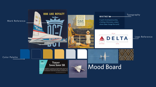
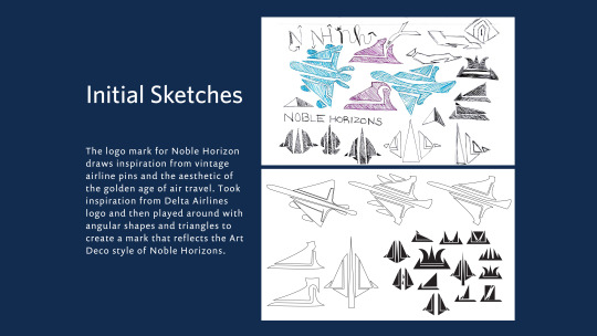


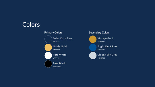




This week marked the official conclusion of project #1, in which students were assigned to create a luxury airline sub-brand for Delta Airlines. The goal was to develop an airline that reflected Delta's design principles. The deliverables included Figma files for the mobile and widget screens, a brief branding guide, process materials, and a plane wrap that served as a physical extension of the brand.
The project was inspired by Delta airline's current branding, particularly its mobile app and ticketing system. The goal was to create a luxurious experience for passengers. Inspiration was drawn from Delta's current and past branding, vintage illustrations, and imagery from the 1920s to achieve a sophisticated and glamorous look and feel. In summary, Noble Horizons is Delta’s new line of luxury airliners, catering to passengers seeking a comfortable and regal air travel experience. It introduces award-winning services and top-tier amenities, aiming to provide a seamless travel journey. Noble Horizons sets a new standard for luxury air travel by combining timeless sophistication with contemporary innovation. Every aspect, from spacious seating to elegant exteriors and gourmet dining, is designed to enhance the journey. Whether crossing continents or soaring through the skies, Noble Horizons guarantees an extraordinary experience, as exceptional as the destinations passengers seek to explore.
Starting with the mood board, I found images from Delta's current and older branding, particularly the crown and iconic triangle logo marks. I also looked for typography from their current branding, as well as other images that capture the look and mood of 1920s glamour and sophistication without being too specific to the Art Deco style. Moving on to the initial sketches, the logo mark for Noble Horizon was inspired by vintage airline pins and the aesthetics of the golden age of air travel. I took inspiration from Delta Airlines' logo and played around with angular shapes and triangles to create a mark that reflects the Art Deco style of Noble Horizons. The word mark is a customized Whitney Medium typeface that is slightly thinner than Delta's current word mark, paying homage to Delta as the parent company without looking too similar to Delta's current branding. The thinner typeface also presents a sort of luxury and royalty aspect. The logo mark pays homage to Delta's current logo mark but is more elevated to look sophisticated, reminiscent of the angles often seen in 1920s art deco, and is also in the shape of an airplane and a runway. The colors of the logo mark are light and dark gold to show depth and similarity to the current Delta Airlines logo mark (light and dark red).
The mobile screens display the UI design of the airline app and its widgets. The app itself has a clean look, with a subtly faded continuous background that features a more geometric style of Delta's current logo. Delta blue is integrated consistently throughout the app to maintain a unified branding identity across all screens. While these screens are not exact prototypes, viewing my designs on an iPhone 13/14 screen was helpful for assessing the text sizing and legibility. The mobile screens include medium, small, and large widgets, as well as welcome and booking screens, trip summary, departing, and ticket screens. All these screens maintain a continuous, clean, and easily navigable look and feel. The airplane wrap itself is a continuation of the branding identity. Overall, this project provided me with valuable experience in using Figma. Am I prepared to work on prototypes for the next project? To be honest, I'm not entirely sure, but I'm definitely up for the challenge and excited to see what project #2 has in store.
Figma Module 3: What is Prototyping?

The required reading for this week discusses the use of prototyping in Figma, how to prototype, and why it is still essential to learn. In reviewing my personal experience with prototyping from Assignment #3 and playing around with the prototype features for Project #1, this action is a very helpful feature in allowing designers to see how their designs look on various devices, whether that is an iPhone, iPad, Macbook, etc. While this is a helpful feature, learning to prototype seems daunting and at times impossible to do. However, I must learn how to prototype if I am going to complete and succeed at accomplishing the goals and requirements of Project #2, and this module couldn't have come at a better time.
To summarize, prototyping involves creating a digital model of a product for designers to test and receive feedback before final production. It's a way to transform sketches and wireframes into interactive simulations, often without coding, in order to evaluate user interaction.
Prototyping helps save time, money, and energy in the long run by enabling developers and designers to gather user feedback, obtain early validation, and refine features and improve communication skills. Prototypes help ensure that a design works well for users by allowing for early feedback, making it easier and cheaper to fix issues before investing in full development. Prototyping also validates early concepts, aligns stakeholders, and provides a realistic view of the product before it's built.
While reading this article, I'm beginning to understand the difference between low-fidelity and high-fidelity prototyping better. For instance, a low-fidelity prototype is used early in the design phase to validate concepts with minimal time investment. Essentially, this prototype serves as proof of concept to test ideas and functionality.
In contrast, high-fidelity prototyping is closer to the finished product, with more detailed design, interactions, and functionality. This prototype is typically used in later design stages to test specific features or flows.
Initially, a designer begins creating prototypes using paper to create quick, rough sketches of architecture, functionality, and flow. These sketches are easy to change but lack interactivity. Next, the designer moves on to developing a low-fidelity prototype, providing a working model of basic UX/UI elements without coding.
Lastly, the designer creates a high-fidelity version of the prototype, which includes realistic design details, polish, and complex interactions. This prototype is used to test the product in a near-final form, including hardware functionality if needed.
Overall, low-fidelity and high-fidelity prototypes have their place in the design process, and the choice depends on the specific challenge. After reading this article, I find this information incredibly helpful, and it's making me understand prototyping a little easier. Am I an expert? No, not by a long shot. However, prototyping doesn't seem as scary or intimidating, which I consider an absolute win.
0 notes
Text
Blood and Blue Diamonds: Chapter 24 Notes
Just a couple notes, since we're near the end. Bluewind’s (mentioned earlier for its tea room) is modeled on Bullocks Wilshire, a luxury department store built in 1929 that’s well worth checking out for its great art deco design.
I mentioned before that I structured Blood and Blue Diamonds to leave room for Jinx & Silco and Caitlyn/Vi to have their own story arcs. I’ve deliberately avoided coming up with any specific ideas for what that would look like (the Vilco flashback smut that lives rent-free in my head doesn’t count), because doing so would require its own bout of historical research for things I have zero plans to write. But the Lincoln Heights jail that opened in 1931 is where I imagine Caitlyn either getting tipped off to Vi’s existence or meeting her.
12 notes
·
View notes
Text
Ideas for Lots to Fill a Hood
I made a list like this before, and there’s already tons of other ones around the internet just like it. Buuut I can’t stop myself from making useless lists :P
I’m probably just bad at remembering this simple rule, but a hood can become much more realistic if you split up businesses/industry across multiple singularly dedicated lots rather than a single tiny one-stop place (which is how I usually do it).
So I wanted to make a list to remind myself that not only can there be a lot just for clothes, but there can be multiple clothing shops themed in more than one way, like costumes versus lingerie.
Then there’s buildings I listed just for the possible realism they add, like industrial buildings. Some of those may only be possible through hood deco instead of visitable lots, which personally I might overlook without having a list to remind me of the concept. Sooo maybe you’ll find it similarly useful idk
Food
Diner
Fast Food Burgers
Hot Dog Stand
Fast Food Chicken
Donuts/Coffee
Italian Restaurant
Delicatessen
Pizzaria
Bar & Grill
Bistro
Tacos
Noodle Restaurant
Cafe
Internet Cafe
Coffeehouse
Bar
Beer Garden
Cocktail Bar
Juice / Smoothie Bar
Tavern
Pub
Pool Hall
Clubs
Gun Club
Lounge
Boxing Club
Comedy Club
Country Club
Gentlemen's Club
Nightclub
Theatre
Cinema
Drive-In
Drama Society
Film Production
Venues / Entertainment
Art Gallery
Arcade
Science Museum
Recreation Center
Stadium / Arena
Bowling Alley
Casino
Beach
Lodging
Hotel & Spa
Campground
Lodge
Resort
Shopping Center
Mall
Plaza
Supermarket
Deli
Butcher
Groceries
Cornerstore
Farmer's Market
Bakery
Produce
Snack Shop
Stores
Discount Store
General Store
Mini-Mart
Liquor Store
Pawn Shop
Antiques
Boutique
Thrifted Clothing
Hippie Shop
Designer Clothing
Lingerie Shop
Costume Shop
Alternative Clothing (Goth/Emo)
Tattoo & Piercing Parlor
Plastic Surgery
Beauty Supply
Jewelry
Wedding
Pets / Pet Grooming
Sports
Books
Toys
Record Store
Video Store
Comic Store
Florist
Electronics
Arts & Crafts
Beach Gift Shop
Tourist Trap Gift Shop
Furniture Store
Paint Shop
Hardware Store
Appliance Store
Carpet Store
Garden Center
Barber / Salon
Salon Supplies
Nails
Car Dealers
Luxury
Budget / Discount
Showroom
RVs
Motorcycles
Banks
National Bank
Savings Bank
Headquarters
Recording Studio
Radio Station
TV Studio
News
Office Building
Services
Hospital
Travel Agency
Pharmacy
Gas Station
Car Wash
Mechanic
Package / Mail Delivery
Self Storage
Transportation
Parking Garage
Taxi Firm
Tour Guide
Bus & Coach Line
Goods Suppliers / Teamsters
Railroad
Car Rentals
Airport
Maintenance
Electrician
Sanitation Department
Department of Nuclear Power
Water Power Department
Wind Power Department
Factories / Industry
Fish Processing (Docks)
Shipyard
Lighthouse
Sawmill
Meat Factory
Chemical Factory
Industrial Manufacturing
Textile Factory
Storage Warehouse
Mines / Caves
Construction
Development
Demolition
Scrapyard
Auto Parts
Machine Supplies
Salvage & Scrap
Junkyard
244 notes
·
View notes
Photo

Arnold Constable (1928). Jean Dupas (French, 1882-1964). Poster. Lithograph in colours. Printed by Tolmer, Paris.
Dupas was trained as an academic painter and became a successful graphic designer and interior decorator. His style is the essence of refined and luxurious French Art Deco, with a sophisticated, if somewhat stiff, elegance. This poster, commissioned by the Arnold Constable department store, is designed in the sophisticated Art Deco style of allegorical fantasies which was a hallmark of Dupas' work. Here, he depicts three women dressed in the fashions of the past, present and future, amid lush, slightly surrealistic scenery.
41 notes
·
View notes
Text
Chicago Architecture Center: CAC
Chicago Architecture Center Building, CAC Illinois, Drake Family Skyscraper Gallery, USA Architectural News
Chicago Architecture Center
May 25, 2021
Chicago Architecture Center Building
Location: Chicago, Illinois, USA
Chicago Architecture Center Opens with New Exhibits and Tours in Time for Memorial Day Weekend Summer Kick-off
New tours downtown, in neighborhoods and more departures on the Chicago River;
New exhibits spotlight changing Chicago neighborhoods and cutting-edge home designs that are affordable, accessible, and flexible for every stage of our lives
CHICAGO – With the Memorial Day Weekend summer kick-off just days away, the Chicago Architecture Center (CAC) has re-opened with all-new and updated exhibits in its 10,000 square feet of galleries full of scale models of new building designs from Chicago and around the world. The Chicago Gallery, home to the Chicago City Model Experience, is completely overhauled and all-new exhibits on Current Chicago Projects, Chicago Chicago’s neighborhoods and the new home design exhibit, Housing for a Changing Nation.
The “Building Tall” exhibition in the Chicago Architecture Center’s Drake Family Skyscraper Gallery features scale models of high-rise towers around the world—as well as picture-perfect views of Chicago’s own iconic skyline: photo : James Steinkamp
These new exhibits cap CAC’s spring 2021 reopening that began with the April launch of new CAC Walking Tours and the Chicago Architecture Foundation Center (CAFC) River Cruise aboard Chicago’s First Lady. Both walking tours and the cruise have been popular options for Chicagoans and visitors eager to rediscover the beauty and inspiration of Chicago architecture.
“All CAC exhibits have been updated with new scale models of exciting architectural designs and we’ve created an all-new exhibit on cutting-edge, affordable, flexible home designs,” said Lynn Osmond, President and CEO of the CAC. “The new exhibit in the Chicago Gallery, Housing for a Changing Nation, highlights innovative architects who are creating homes for a diverse range of needs from live/work spaces to multigenerational families to cohousing.”
CAC EXHIBIT GALLERIES open May 22; Hours: 10m to 5pm, Thursday through Monday
The “Building Tall” exhibition in the Chicago Architecture Center’s Drake Family Skyscraper Gallery features scale models of high-rise towers around the world—as well as picture-perfect views of Chicago’s own iconic skyline: photo : James Steinkamp
THE CHICAGO GALLERY returns with new exhibits throughout.
• BRAND NEW FOR MAY 2021: Housing for a Changing Nation Exhibit is an entirely new installation, sponsored by AARP Illinois and the AARP Foundation, that explores how architects are replacing outdated 19th and 20th century housing with homes designed for fast-changing, diverse, multigenerational communities that need flexible, accessible and affordable housing:
o 100 YEAR LOT – a multi-generational home in Mexican and European influenced Pilsen by Canopy neighborhood splicing together a Chicago two-flat with a new two-story structure;
o MAKERS SPACE – a five-lot, live/work, micro-housing complex with shared community kitchen by Landon Bone Baker and retail marketplace and cottage-industry scaled workspace for South Chicago’s “maker” community;
o FLIP THE STRIP – strip malls and vacant storefronts transformed into flexible live/workspaces by UrbanLab—a contemporary update on the old concept of “living above the store”—for a new generation of small business entrepreneurs
o A NEW COURTYARD – a compact, pedestrian-orientated, affordable apartment building in Los Angeles that updates a familiar, sprawl-fighting California style by Brooks + Scarpa— a design that shares elements familiar to Chicagoans whose Chicago courtyard apartment buildings provided affordable housing to residents in the early 20th century.
• BRAND NEW FOR MAY 2021: The City in Change: Chicago Neighborhoods Exhibit introduces visitors to Chicagoans from some of the city’s 77 diverse, architecturally distinct and constantly changing communities.
• Chicago City Model Experience, featuring more than 4,250 buildings, returns with thirty new models of buildings under construction in 2020 and 2021—including St. Regis (Vista) Tower and Bank of America Building (110 North Wacker). Features a newly updated seven-minute video summarizing the city’s dynamic history, fascinating present and promising future.
• Current Chicago Projects Exhibit opens with new, cutting-edge Chicago projects and all new scale models.
The Chicago Architecture Center’s Drake Family Skyscraper Gallery features a line of scale models along the windows, each of which was at one time the world’s tallest building: photo : James Steinkamp
Projects include:
o 75th Street Boardwalk, The Nest, PopCourts! by ARC Community Design Initiative; o Cabrini-Green Redevelopment by Gensler, JGMA and Studio Dwell; o Steppenwolf Theatre Expansion by Adrian Smith + Gordon Gill Architecture; o Auburn Gresham Healthy Lifestyle Hub by MKB Architects; o The Obama Presidential Center by Tod Williams Billie Tsien Architects Partners, Michael Van Valkenburgh Associates, Interactive Design Architects; o Chicago Park District Headquarters and Park 596 by John Ronan Architects and site design group; o Fulton East by Lamar Johnson Collaborative and Clayco; o Tribune Tower Residences by Solomon Cordwell Buenz (renovation architect) and John Mead Howells and Raymond Hood (original architects); o SURGE Esports Stadium & VR Arenas by KOO; o KLEO Art Residences by JGMA; o 800 Fulton by Skidmore, Owings & Merrill (SOM).
THE DRAKE FAMILY SKYSCRAPER GALLERY featuring “Building Tall” reopens with seven new scale models of towers from Bangkok, Chicago, New York, Taipei and Tianjin and other skyscrapers from around the world and “Race to the Top” featuring oversized scale models of skyscrapers that were each tallest in the world when built.
New scale models in the Skyscraper Gallery include:
o 1000M, Chicago, JAHN, est. 2022 o CTF Finance Centre, Tianjin, SOM, 2019 o King Power MahaNakhon, Bangkok, Büro Ole Scheeren, 2016 o NEMA Chicago, Rafael Viñoly Architects, 2019 o Sendero Verde, New York, Handel Architects, est. 2022 o Solstice on the Park, Chicago, Studio Gang, 2019 o Taipei 101, C.Y. Lee & Partners Architects / Planners, 2004
In April, the CAC rolled out its downtown and neighborhood CAC Walking Tours for Chicagoans eager to rediscover their city’s classic architecture and diverse neighborhoods. The popular, always changing walking tours and CAFC River Cruise are led by a corps of 400 expert CAC docents, who in June 2021 celebrate the 50th anniversary of the 1971 first CAC docent class.
CAFC RIVER CRUISES departures Thursday through Monday starting May 22
On April 17, the #1 boat tour in Chicago based on TripAdvisor user reviews and the only Chicago finalist for Best Boat Tour for USA Today’s 10Best Readers’ Choice Award, Chicago Architecture Foundation Center (CAFC) River Cruise aboard Chicago’s First Lady (CFL) launched its 2021 cruise season along Chicago River’s canyon of architecture. Led by CAC docents, guests will hear stories of the visionaries who have designed more than 50 architecturally significant buildings along the Chicago River as well as the Chicago Riverwalk and the 13 bascule bridges on the cruise route.
The 90-minute CAFC River Cruise is the most in-depth, authentic architecture river cruise available and is lauded as a “must-do” activity when visiting Chicago. Exciting new buildings with cutting edge design elements continue to rise along the river including the recently completed St. Regis (Vista) Tower, the city’s third tallest structure, and the refurbished riverfront Old Post Office. Tour guests will leave the cruise inspired by the city’s wide variety of architectural styles—– which glide by as you travel up and down all three branches of the Chicago River—including art deco, neoclassicism, mid-century modernism, and postmodernism.
Chicago’s First Lady’s luxury fleet is the finest on the Chicago River and now includes the new, brass and mahogany trimmed Chicago’s Emerald Lady. Full-service bars on board each vessel. Cruises will initially limit capacities following the guidelines from federal public health officials. As passenger vessels under federal jurisdiction, cruises follow the current federal face covering mandate. Reservations are recommended and tickets are available at cruisechicago.com.
CAC WALKING TOURS departing from the CAC, Thursday through Monday starting May 22
Favorite Downtown CAC Walking Tours returned April 17 include:
– Art Deco Skyscrapers: The Loop Art Deco masterpieces built in Chicago’s financial district during the Roaring ’20s – Chicago Architecture: A Walk Through Time Chicago’s early skyscrapers to supertall high rises – Must See Chicago Chicago’s most famous buildings and more: Wrigley Building, Tribune Tower, Art Institute, Willis Tower – Historic Treasures of Chicago’s Golden Age architectural landmarks of Michigan Avenue and State Street 1890 to 1930 – Chicago Icons: Connecting Past and Present see how architectural styes from the 1890s connect to today’s skyline – Mid-Century Modern Skyscrapers Chicago’s modernist masters, Mies, Goldberg and Graham, set the stage for the modern city center – Lights, Camera, Architecture! see architecture that starred in Ferris Bueller, Batman, the Blues Brothers and other films
Neighborhood CAC Walking Tours returned April 17 include:
– Fulton-Randolph Market 150-year evolution from food wholesaling and meatpacking to gourmet restaurants, technology hubs and boutique hotels – Northwestern University Campus a stunning, wooded campus on Lake Michigan with 19th Century Collegiate Gothic to cutting-edge designs – Kenwood the stately neighborhood, home to early industrialists, modern-day innovators and President Barack Obama – Hyde Park home to the 1893 World’s Fair, the University of Chicago and Frank Lloyd Wright’s masterpiece, Robie House, pre-Chicago Fire houses and the famous Midway. – Evanston Along the Lake one of Chicago’s most desirable suburbs, with many homes and churches with notable designs, where Daniel Burnham established his “country retreat”
Drake Family Skyscraper Gallery, Chicago Architecture Center, Illinois – Building Information
Drake Family Skyscraper Gallery images:
The Chicago Architecture Center’s spacious Drake Family Skyscraper Gallery reopens with seven new models on display, on loan from acclaimed design firms worldwide including
Chicago’s forthcoming 1000M by JAHN: rendering courtesy of JAHN
King Power MahaNakhon in Bangkok, Thailand by Büro Ole Scheeren: photo by Wison Tungthunya
NEMA Chicago by Rafael Viñoly Architects: photo courtesy of Rafael Viñoly Architects
Taipei 101 by C.Y. Lee & Partners Architects / Planners: photo courtesy of the Taipei Economic and Cultural Office in Chicago
Sendero Verde in East Harlem, New York City: rendering by Volley, courtesy of Handel Architects
Chicago Architecture Center (CAC) images / information received 250521
Location: Chicago, IL, United States
Chicago Architecture
Contemporary Illinois Architecture – architectural selection below:
Chicago Architecture Designs – chronological list
Chicago Architectural Walking Tours by e-architect
Chicago Architecture News
150 North Riverside Office Building, West Loop Design: Goettsch Partners (GP) photograph © Nick Ulivieri 150 North Riverside Office Development
Wintrust Arena, 200 E Cermak Road Design: Pelli Clarke Pelli Architects photographer : Jeff Goldberg/ESTO Wintrust Arena Chicago Building
747 North Clark Design: Ranquist Development Group photograph : Marty Peters 747 North Clark
Zurich North America Headquarters in Schaumburg photo © Steinkamp Photography Zurich North America Headquarters Building by Goettsch Partners
Willis Tower Renovations 233 S. Wacker Drive – Willis Tower Building
Obama Presidential Center Building Obama Presidential Center Building
Chicago Architecture
Major Chicago Buildings
Aqua Tower Chicago
Lake Shore Drive Towers
Sears Tower Building
Website: Chicago
Comments / photos for the Chicago Architecture Center: CAC page welcome
The post Chicago Architecture Center: CAC appeared first on e-architect.
2 notes
·
View notes
Photo

Bullocks Wilshire, Los Angeles, California Photo by contributor Alison Carter
This elevator!
A bit about the building from Southwestern School of Law, the building’s current owner:
Designed by renowned Los Angeles architects John and Donald Parkinson and conceived by business partners John G. Bullock and P.G. Winnett, the Bullocks Wilshire Building operated as a luxury department store for more than 60 years. In 1994, Southwestern purchased the Art Deco landmark and set out to convert it into a dynamic academic venue, while retaining its historic character. Through its adaptive reuse, the law school now utilizes the building for cutting-edge scholastic, professional and social resources that represent the heart of the Southwestern community.
(Read more...)
#art deco#art deco architecture#1930s architecture#bullocks wilshire#elevator#elevators#los angeles#1930s style#art deco style
105 notes
·
View notes
Photo

New Money
Manhattan, New York
The proverbial Cinderella Story is the very definition of the Roaring Twenties, as young Cindy Tremaine is about to find out.
By the late 1910s, poor Cindy is struggling to maintain the hope that she promised her parents she'd never give up, as she is worked to exhaustion by her abusive stepfamily. With the limitations placed on both the poor and women, she knows that her only realistic way out of this hellhole is through marriage. With her natural beauty and charm, she’s confident she could score a wealthy man, if she just had some way of worming herself into one of those upper-class social gatherings...and into something nice to wear. It seems impossible... But then Cindy starts to notice some surprising upgrades in her stepfamily's lives. She's carrying and cleaning luxury items that would be pricey even for her filthy-rich relatives. Without revealing how much she's learning, Cindy gradually worms information from her stepmother and stepsisters about how they're affording all these things, and becomes familiar with the growing system of Credit—"Buy now, pay later." Credit Unions have been opened since the early 1900s, and as of 1914, Western Union and some department stores have begun issuing the first ever credit cards. The doorway Cindy needs to set her plan in motion has just opened before her, like magic.
While out running errands, Cindy looks around and realizes that social mobility is exploding all around her. Immigrants are fleeing persecution and starting new lives here in America. The African American community is undergoing a cultural revolution of art and music. The number of high school students in the country has doubled, and more and more of them are going on to college. To top it all off, women are finally about to win the right to vote.
Relying heavily on the advice of magazine columnist “the Fairy Godmother,” Cindy learns that the most important thing in winning over others is “it,” and all “it” is, is confidence. Clara Bow demonstrates on the silent screen, and Cindy practices dancing to the radio whenever her step-family isn’t looking (much to the chagrin of her rodent friends, who scramble to get out of her way). “It” finally all pays off when the most eligible bachelor in Manhattan throws a Gatsby-worthy New Year's ball at his mansion, on the eve of Prohibition. This December 31 of 1919, Charles "Charming" Prince's courtyard is lined with pumpkins full of alcohol that will only be legal for a few more hours. The party is a wild display of extravagance and decadence that Jay Gatsby would envy. But the most enthusiastic dancer is a girl who no one knows. She must come from an incredibly wealthy background, with all her extravagant jewels and sequins. She belts it out on top of the pumpkin kegs to the roaring cheers of guests and servants alike, kicking her heels in a pair of art-deco glass shoes. The smitten heir jumps up onto the pumpkins to dance with her, and suddenly Cindy forgets all about money.
In the crowd below, Cindy’s stepmother narrows her eyes suspiciously, while her two daughters burry their heads in some pumpkin kegs.
Before Charming can get the girl’s name, the clock strikes midnight…and an ambush of FBI agents burst from their hiding places around the mansion’s grounds, hollering, “This is a raid!” Prohibition is now officially in effect. Feathers and sequins fly through the air as guests tear across the courtyard. Coppers are hacking the pumpkin kegs to pieces with axes, spilling their contents onto the brick paths below. Cindy’s stepmother tries to bribe the police lieutenant, while the stepsisters catch booze from the wrecked pumpkins in their bucket hats. Charming searches frantically for his dance partner, but Cindy has already taken off in her rented limo.
The next morning, no one from the party seems to know the mysterious woman. Did 200 drunken dancers all hallucinate the same girl?
Then, finally, among the overturned furniture and smashed pumpkins, Charming’s butler finds an art-deco glass slipper—the largest purchase on Cindy’s new credit card.
A/N: Like most of these will be, this one is just a touch-up of an older version of the picture, with a new background. While one might think Snow White should be the first in a Disney princess series, I chose Cindy, thinking of the New Year's Eve scene in the first episode of "Boardwalk Empire." Her AU story is based on the silent movie "It" (1927) staring Clara Bow. Cindy’s headdress was inspired both by Daisy’s from “The Great Gatsby” (2013) and a Disney figurine of an Art Deco Cinderella. www.yourwdwstore.net/Disney-Sh…
UPDATE: I've changed her glass slippers to have an art-deco style. I have no idea why I didn't do that in the first place.
#disney flappers#cinderella#1920s#prohibition princesses#lizzy chrome#digital art#flapper#art#fan art#mice#glass slipper#roaring twenties#roaring twenties au#social mobility#new money#social class#fairy tale#disney#disney princesses#pumpkin#gatsby#new years eve
14 notes
·
View notes
Text
Adaptive Reuse Ordinance: 20 Years of Preservation in Downtown Los Angeles

Thanks in large part to the Adaptive Reuse Ordinance, downtown Los Angeles is once again a thriving neighborhood. Photo by Adrian Scott Fine/L.A. Conservancy.
The City of Los Angeles passed the Adaptive Reuse Ordinance (ARO) in 1999, making it easier to convert downtown’s vacant and underutilized buildings for new uses such as housing and hotels.
That same year, the Conservancy launched our Broadway Initiative to work with property owners, developers, and architects to maximize the opportunity of the ordinance.
Twenty years later, the ordinance—which the Central City Association spearheaded—remains a strong preservation tool that has expanded throughout the city. Adaptive reuse projects revitalize neighborhoods and meet the current needs of communities, all while preserving our architectural heritage.
Kick-Starting Downtown’s Renaissance
In 1999, before the ordinance went into effect, there were about 18,000 residents and 11,626 residential units in downtown, according to the Downtown Center Business Improvement District (BID).
Shortly after the ordinance passed, Killefer Flammang Architects and Degenkolb Engineers conducted a pro bono survey for the Conservancy identifying fifty historic buildings in the Historic Core suitable for conversion into housing. Based on the survey, the Conservancy created a database to track the design characteristics, economic factors, and other elements of these housing conversion projects, releasing a comprehensive report in 2003.
In addition to the report, the Conservancy—in partnership with the Fashion District, Historic Core, and Downtown Center BIDs, and with support from the Getty Grant Program’s “Preserve LA” initiative—produced design guidelines. The user-friendly, illustrated document spells out historically sensitive design for new and existing structures in the area, including storefronts and signage. Thanks in part to the ARO, today, the Downtown Center BID reports that there are over 46,000 residential units (many of which are historic), with another 5,000 currently under construction, and an estimated 79,525 people living in downtown.
Case Study Examples

Old Bank District
Located in the Historic Core, the district comprises three historic office buildings (the 1903 Hellman, the 1904 Continental, and the 1907 San Fernando). Following WWII, banks and businesses moved away from the area, leaving many turn-of-the-century buildings underused. In 2000, Gilmore Associates reimagined the three buildings and coined them the Old Bank District, becoming the city’s first project completed under the ARO and adding 230 residential units to downtown L.A. The project earned a Conservancy Preservation Award.

Orpheum Lofts
The magnificent 1926 theatre and its twelve-story office tower were built as the fourth and final home of the famed Orpheum vaudeville circuit in L.A. In 2001, the Beaux-Arts building became the first theatre restored under the ARO. In 2001, developer Steve Needleman brought the theatre back to life and converted its upper floors into the Orpheum Lofts (37 live/work units). Its remarkable renovation earned a Conservancy Preservation Award.

The Standard, DTLA
The former Superior Oil Building is one of the finest examples of the Corporate Moderne style in L.A. and one of the strongest designs of architect Claud Beelman’s later career. In 2002, developers 550 Hotel Partners LLC rehabilitated and reinvented the 1955 marbled-clad twelve-story landmark as The Standard hotel. With 207 rooms, the trendy hotel helped blaze the trail for adaptive reuse in downtown. The project earned a Conservancy Preservation Award.

Pegasus Apartments
The 1949 Mobil Oil/General Petroleum Building was the first office building constructed in downtown following WWII. Spanning a full block of Flower Street, it represents a significant stage in the evolution of high-rise office buildings in the city. In 2003, the Kor Group converted the building into 322 residential units. Renamed Pegasus Apartments after the Mobil Oil symbol, the transformation earned a Conservancy Preservation Award.
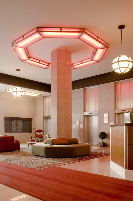
Pacific Electric Lofts
The 1904 Huntington Building once housed Pacific Electric Railway’s headquarters. Named after the company’s founder Henry Huntington, the Beaux-Arts landmark was the largest office building in the city upon its completion. After decades of incompatible alterations, Killefer Flammang Architects stepped in in 2005 and converted the building into 314 residential units. The project earned a Conservancy Preservation Award.

Eastern Columbia Lofts
Built in just nine months, the 1930 Art Deco icon once housed a popular department store. In the 1950s, upper floors were converted into office space and housed many nonprofits, including the Conservancy at one point. The building languished for decades until 2006, when the Kor Group beautifully converted it into 140 luxury condos. The project earned a Conservancy Preservation Award.

National City Tower Lofts
The 1924 Beaux-Arts tower originally housed National City Bank of Los Angeles. The bank anchored the southern end of the Spring Street Financial District, also known as the “Wall Street of the West.” In 2008, developers Shariar and Shahram Afshani converted the Walker & Eisen-designed building to 93 residential units and named it National City Tower.

Spring Arcade Building
The 1924 Spring Arcade Building is actually two twelve-story towers connected by a skylight designed to imitate the Burlington Arcade in London. Topped by a KRKD radio tower, the building spans from Spring Street to Broadway. In 2010, Downtown Management restored the shopping arcade and transformed the towers into 143 residential units.

Ace Hotel, DTLA
The 1927 United Artists Theatre and adjoining tower were built as the flagship for the production company formed by D.W. Griffith, Mary Pickford, Douglas Fairbanks, and Charlie Chaplin. The thirteen-story Spanish Gothic building once housed Texaco and became known as the Petroleum Building. In 2012, the building was converted into a boutique hotel with 166 rooms and 16 suites, and the theatre restored as an event and performance space. This spectacular project earned a Conservancy Preservation Award.

NoMad Los Angeles
The 1923 Neoclassical building once housed the Bank of Italy’s L.A. headquarters. Its lavish exterior includes whimsical images of American coins sculpted in the terra cotta framing the elaborate bronze front doors. The building fell into decline, succumbing to age and blight, as businesses moved. In 2018, developer Sydell Group revived this cultural landmark as the NoMad Hotel with 241 rooms.
Learn more about these sites on one of our walking tours. Visit laconservancy.org/tours for more information and to register.
6 notes
·
View notes
Photo
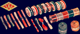
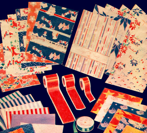
“Gift Dressing” — Early 20th Century Gift Wrapping
Because today is my birthday, I thought I would do something vaguely birthday themed for today’s post. And seeings as I’ve already covered cards for Valentines Day, I thoughts a look at how gift wrapping looked in our time period would be interesting.
History
Victorian Beginnings While gift wrapping in one form or another has long existed throughout the world, in the west, the practice as we would recognise it got its start during the Victorian era. Initially, in the UK specifically, it was employed by the upper-class as a show of status and wealth, and the wrap was made from wallpaper material — dense and difficult to work with. The act of wrapping was an extravagant affair with elaborately decorate papers, ribbon, and lace.
Wrapping at the Turn of the Century — 1900-1920 Over time both the material used and the intention behind the practice shifted. By the beginning of the 20th century, the paper used was light with bright colours — tissue paper was common for the first decade or so. More cost-effective manilla papers were also used at this time by stores to wrap purchases, and by the middle-class as a less ostentatious material with better coverage for gifts. This time also saw a shift in the British motivations behind wrapping — rather than showing wealth, wrapping was used to conceal the value of the gift from anyone but the recipient.
Advent of Modern Printed Gift Wrap — 1917 In America, the first company to supply gift wrap was Hy-Sill Manufacturing Inc, however, a change in materials happened in 1917 with the accidental discovery by the men who would become the Hall Brothers, and later the behemoth Hallmark. During Christmas that year, the brothers’ stationary store sold out of the then staple wrapping material of mono-colour tissue paper — gasp! Looking for a substitute to meet demands, they found in their inventory a stack of decorative “fancy French paper”. This paper was generally used to line envelopes for decoration, not for wrapping, but at 10c a sheet it was a hit with their customers and returned the following year to the same success. In 1919 the success of this new approach to wrapping paper saw the brothers producing and selling their own prints and the rest is history.
World War II Wrapping paper was one of the few exceptions to paper rationing towards the wareffort. It was decided that not rationing the material would contribute to keeping up morale. During this period, sales of wrapping paper incready by some 20% as a result.
Materials and Techniques
The materials used have expanded and come in and out of favour over the decades. Some of the materials that were available (if not necessarily popular) during the interwar period included:
Tissue paper: Most common material for the first two decades of the 20th century. It would come in single colour options, typically festive colours like white, green, and red.
Printed paper: By the beginning of the 1920s, the Hall Brothers were producing their printed paper to customers and it proved a popular option. In 1919 they sold it for 25c for three sheets. The designs on printed paper changed in the 1930s and 1940s with the growth in Art Deco style — out were the florals and cherubs, and in were the repetitive and geometric patterns.
Manilla paper: A cheaper option, this plain brown paper was a favourite of stores to wrap purchases, and a viable option if the more fancy papers were out of your budget.
Newsprint: Admittedly, I didn’t see this mentioned in many of my research sources, but I feel it would be remiss not to mention it. As people still resort of newspaper as a wrapping material today in a pinch, I highly doubt that it wasn't utilised in the early 20th century.
Fabric: A wrapping style long used in Japan, this was another cost-effective way of wrapping a gift. I, again found little mention of its use, but in a pinch, it does need like an obvious solution to wrapping a gift. Where our boys ever employed it, I’ll leave to your best judgement.
Cellophane: Introduced in 1912, cellophane was used for wrapping candy, and grew substantially in popularity from 1928-1930 after it was made moisture-proof. It was used both alone and together with other wrapping materials.
Gift bags and boxes: An alternative to paper wrapping, and also reusable.
Beyond the types of material used for the wrapping, also worth noting are the products used to secure any wrapping — because scotch tape did not make an appearance on the scene until 1930!
Ribbon: An obvious staple of wrapping, even today, but prior to adhesive options, ribbon was more than just decoration. Ribbon was used to secure the paper and ensure that the gift remained securely covered. There is a particular skill to this.
Twine and rope: A less fancy alternative to ribbon, these served the same function.
Adhesive Seals: These were small, gummed seals that could be applied to wrapping paper. They worked in the same way as stamps, requiring the user to lick the back-side before applying it to the paper. From this description, they were tedious to use and had a limited life-time.
Wax: The same as one would use a wax seal to seal a document, they could also be used to secure gift wrapping, this it is a very fancy option. So fancy.
Hall Sheen Ribbon: A product produced by Hall Brothers in the 1930s to accompany their printed paper, this was a ribbon that stuck to itself and gift wrap when moistened.
Adhesive tape: Scotch Cellulose Tape was invented in 1930 by Scotch brand, which was a game changer when it came to gift wrapping. Prior to this, Scotch as introduced their adhesive masking tape for painters, but the 1930 product was the first waterproof, clear adhesive tape. It would be worth mentioning that the skills and knowledge needed to wrap without tape would have still been around long after tape became available, and would likely have been seen as a luxury, especially to anyone on a budget.
All the other embellishments: The fancier you wanted to go, there were also other adornments one could add to gifts, including bows, tassels, decorative seals and stamps, etc.
So how much would these items cost? While it wouldn’t reflect lower-cost retailers, both Loesers and A&S printed prices in Brooklyn Daily Eagle papers, which gives an idea of how much higher-end products would have put you out of pocket.
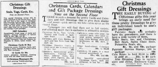
And then, there was always the ever-present option of getting a department store to wrap for you!
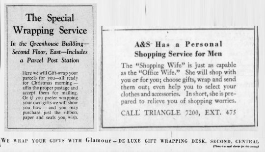
Brooklyn’s Abraham & Straus department store (and likely Loesers as well) offered gift wrapping services — at ‘a small charge’. Obviously, this was intended for customers, but tell me you don’t believe Bucky could charm himself some free wrapping.
Image Sources
Woolworths ribbon, 1930s | Source Woolworths ribbon and wrap, 1930s | Source A&S and Loesers Price ad complilation | [1] [2] [3] A&S Wrapping Service ad compilation | [1] [2] [3]

This post has been sponsored by Patreon supporter Joanna Daniels —longtime, and beloved follower. She and I would like to dedicate the post to the loving memory of her mother Joan Daniels, who sadly passed away this past year and who is sorely missed. Spring has hit us and the days are getting sunnier, don’t forget to get out and enjoy it!

#steve rogers#gift wrapping#gift dressing#gifts#1920s#1930s#1940s#vintage wrapping#vintage#bucky#brooklyn bridge#bucky barnes#james bucky barnes#captain america#captain america: the first avenger#captain america tfa#historically accurate#early 20th century#turn of the century#fanfiction#fanfic references#fanfic research#fanfic writing#captain america reference#writing resources#writing reference
39 notes
·
View notes
Text
The Lamp Factory London
youtube
Bespoke Chandeliers
Have you ever puzzled what it would be prefer to not have desk lamps? We take so many things for granted and https://thelampfactorylondon.co.uk/ if we did not have issues like lamps we'd be questioning what to do and learn how to add extra gentle.
The earliest historical past of desk lamps dates back to about 70,000 BC. The person who was in need of a lamp for extra lighting would take a hole shell or rock and fill it with moss or different supplies that have been soaked in the fat of animals. Once the rock or shell was filled with the moss it could be lit or ignited.
It was long after using rocks and shells that people started to make issues to hold the materials to make mild. Artifical pottery, bones from animals and alabaster were used. Wicks were then added at a later time so that there was more management over the burning rate.
Proper around the seventh Century BC, the Greeks had been making terra cotta lights and lamps. The word lamp is actually derived from the Greek language. Lamp as is what the Greeks name the light which suggests torch.
During the 18th century the central burner was invented. At present we name the central burner the oil lamp. The source of gas was encased in steel and there was a steel tube to manage the amount of fuel and how vivid the light was.

The primary electric lamp was invented by Sir Humphrey Davy in 1801. The carbon arc lamp was run by hooking up two carbon rods to an electrical supply. By having the rods at a sure distance the electrical energy would arc and cause mild.
Sir Joseph Swann and Thomas Edison each invented the first true electric table lamps. It was the lamp invented by Thomas Edison that became the world's first commercially offered lamp in the 12 months 1879. Table lamps have come a good distance since then.
Table lamps will be found everywhere in the world. These lamps are available an unlimited array of colours and sizes. There are handmade lamps and designer visit their blog lamps that can range in the hundreds of dollars to own. Table lamps of as we speak are in a position to run on every kind of various lightbulbs.
Table lamps will be purchased wherever that lighting and fixtures are offered. If you do not want to be spending rather a lot just for a desk lamp then it is best to go to the department stores or a house improvement store.
For individuals who are severe about the kind of desk lamps they will be displaying ought to make a visit to a lighting retailer. The those that work and specialize in just lighting are the consultants to ask your questions to. When TheLampFactoryLondon making an attempt to resolve which lighting would be the greatest for the look and feel you are trying to make it's best to visit a showroom and communicate with someone who is aware of all about lighting and the fixtures.
Additionally obtainable in the marketplace are the newest LED and job lamps. Although these are still thought-about desk lamps they had been developed for a sure activity. You will notice many The Lamp Factory London of these lamps on desktops. The only lamp that will not fall underneath the heading of table lamp is the ground lamp. A ground lamp is the place the base of the lamp really sits on the floor.
Flooring lamps are an incredible alternative to the table lamp where area becomes an issue. Both types of lighting will add fashion bespoke lamps and décor to your room. There are so many variations of lamps accessible that there's a perfect lamp for each taste.
A lamp globe, or even a lamp shade in a more widespread time period, is a fixture that covers the bulb on a lamp to diffuse the lighting that it gives off or to block it in certain instructions so it doesn't trigger glare by shining straight in one's eyes.

It was developed in the very first a long time of the 19th century so that you can disguise the intense electrical mild. And if you're looking for the most effective lampshade that will add glamour and full decorations within your own home, that is the location that is meant to reply your inquiries and considerations.
Conical, cylindrical and different forms on ground-, desk-, or table high-mounted along with suspended lamp designs tend to be the most typical lamp globes and due to this fact are made in a wide array of supplies. There are numerous different types of lampshades that you will see instances that you'll feel really overwhelmed with the prospect of actually selecting a desk lampshade, a flooring, or a ceiling one. You may even generate lamp shades out of any useful materials, like nut shells, paper that you may manually make, stained glass, or metal ribbon and form it right into a extraordinarily sensible lamp shade with shapes like a bell, curl, or perhaps a drum. However, if you don't have the luxurious of the time, attempt contemplating the following data and select wisely on your personal.
Now, many people are accustomed to the fundamental type of lamp shade that stretches its material between the highest and bottom cable circles of different diameters. This explicit form may be often known as a drum, coolie, or empire, depending on the sizing ratio and the scale Social Profile Here of each ingredient. Hardback shades have an exterior layer of material that's folded however nonetheless with an inside of plastic that can allow the sunshine to filter by means of. Nevertheless a more expensive one which is totally made of material is mostly a silk lamp.
If you will separate them when it comes to their design might be easy simply by taking a look at them. However lamp shades may additionally be differentiated depending on how they mild a specific room. As an example, task lighting may be made by a clear glass globe which is able to let virtually the entire light pass through. On the other finish, ambient lighting will prove to add extra mood moderately than brightness. Accordion lanterns made of colourful mulberry paper that usually forged a pinkish glow, on the other hand, will create peaceful surroundings.
Nonetheless once you use uncommon supplies you will also create differing kinds, typically unusual also, of lamp shades, that is notably true in the event you choose to own distinctive lamps. For example, wall-mounted sconces could be shaded with a punched tin rectangle that will create dazzling designs of light on the reverse wall. Library desk lamps, on the other hand, might actually use classical inexperienced lamp shades, whilst delicate, handmade lamp shades may cowl small, steel lumps.
The 1800s and early 1900s are a time period regarded again on with awe and admiration. Life was classy, refined, and exquisite. Every aspect of the era was spectacular. We often discover ourselves drawn to this time, and attempt to recreate the texture of the period in our personal properties. If this is the duty you've gotten undertaken it would be best to pay attention to among the vintage lamp shades you will have to choose from.

Not all antiques are from the same period. Now we have Victorian, Edwardian, art Nouveau, and art Deco. You will want to be certain the artist you are trying to find or recreate is within the appropriate time interval. Lampsplus.com carries all kinds of Tiffany type lamps. Tiffany was well-known and has been replicated closely over the years. You may be trying to adorn within the Victorian type. Lampshadesbybecky.com gives handmade lamp coverings that can grace any decor. Antiqueslighting.com is a quick supply to search out the precise lamps from varied time intervals. These won't be replicated or copied pieces, but might be lamps that were used in some one's dwelling, a few years ago.
It is exciting to think that your private home decor was as soon as a part of historical past as well. However whether or not going for vintage or reproduced, you might be sure to have a house with allure and character, by following this time period. In case you are using vintage lamp shades so as to add those special touches to your property, remember the fact that you do not have to decorate your entire residence, or even the whole room within the old fashion. Many various and modern decors will benefit from the look of an older lamp. By utilizing an older lamp type with your contemporary design, you'll create a singular, yet elegant look that others will admire.
If you are trying to go together with real or replicated, search for names like: Dithridge, Handel, Lightolier, and Crucet. These are a number of of the popular names of the time long past. They have been specialists in lighting, and had some of the most lovely material lamp shades, in addition to glass, and paper shades. With some research, and time spent, you will be able to create the fashionable and complicated room you were aiming for.
1 note
·
View note
Text
X and o necklace

X AND O NECKLACE FREE
In his workshop, Schlumberger used a rainbow of gemstones, gold and diamonds to create some of the company’s most beguiling designs.įrom striking earrings shaped like soaring wings to diamond birds perched on glittering gemstones, each of Schlumberger’s Tiffany designs dazzled. After joining the American luxury jewelry house in 1956, he soon had his own studio on the mezzanine of Tiffany’s Fifth Avenue store that he accessed by a private elevator. There, his vibrant work caught the eye of Tiffany & Co.
X AND O NECKLACE FREE
An extravagant confection of diamonds, amethyst, rubies and gold, the brooch featured gemstones adorning an intricate intersection of tiny spears and a breastplate over a glittering shield.Īfter serving in the French army and the Free French forces during World War II - and surviving the Battle of Dunkirk - Schlumberger left war-torn Europe for New York and in 1946 established a jewelry salon with Nicolas Bongard. The designer’s imaginative jewelry was in contrast to popular geometric lines of Art Deco, an independent vision he affirmed in the extravagant 1941 Trophée de Vaillance brooch created for fashion editor Diana Vreeland. One of Schlumberger’s early pieces - a cigarette lighter in the form of a fish whose head opened to reveal the flame - demonstrated his skill for capturing the vivacity of nature in precious metal. Uninspired, he departed for Paris and began creating buttons for Italian fashion designer Elsa Schiaparelli, who also commissioned him for costume jewelry. Born to a leading textile manufacturing family in Alsace, France, Schlumberger took to drawing as a child and showed promise as an artist, but his parents instead sent him to study banking in Berlin in the 1930s. Jewelry designer Jean Schlumberger once said that he strived to “make everything look as if it were growing, uneven, at random, organic, in motion.” His jewels interpreted the vitality of the natural world with lively designs that included a moonstone-topped jellyfish brooch with sapphire tentacles exuding a watery shimmer and a ring encrusted with a burst of diamonds that “bloomed” like a flower bud.Ī self-taught jeweler, Schlumberger’s mastery of color as well as his expertise as a draftsman brought his fantastic ideas to life.

0 notes
Text
Best Places to Visit in India
1. Varanasi

A blessed individual on the Ganges River in Varanasi.
Quite possibly of the most established consistently possessed city on the planet, Varanasi is apparently the holiest spot in India. The profound exercises occur along the holy Ganges River, where pioneers wash and grievers incinerate as of late departed family members on display of bystanders.
Vacationers, then again, find their own kind of mysticism taking dawn boat rides, delivering botanical gifts that float on the waterway, and watching the fire-filled Hindu reciting services from the precarious Ghats.
Away from the water, the roads of the old town diversion like an interminable labyrinth. Rumors from far and wide suggest that there's still no precise guide of Varanasi, and when you experience the complex city for yourself, you'll be leaned to trust it.
Visits in Varanasi
2. Agra

Assuming there was only one image to address India, it would be all the Taj Mahal. The landmark moves a huge number of vacationers to make the excursion to Agra consistently, awakening before first light to see sublime design transmit at the crack of dawn. In any case, Agra beat the rundown of the most ideal getaway spots in India because of reasons that go past India's most popular fascination.
The city in Uttar Pradesh is crammed with radiant Mughal landmarks, as Itimad-ud-Daulah's Tomb and Akbar's Mausoleum, decked out in mesmerizing trimmed marble plans through and through. Furthermore, travelers can likewise see another UNESCO World Heritage Site: the Agra Fort. With such countless miracles in only one spot, Agra is a must-visit city for travelers in India.
Visits in Agar
3. New Delhi

In spite of its groups and bedlam, New Delhi offers sightseers a ton to cherish. The beautiful capital of India is the ideal marriage of legacy and advancement. Old Delhi contains a portion of the nation's most cherished attractions, including the Jama Masjid, Red Fort, and Chandni Chowk shopping lane. Yet, all through the rambling city, vacationers can investigate incalculable different destinations of otherworldly and social significance.
Top vacation spots in New Delhi incorporate the Lotus Temple; India Gate; Humayun's Tomb; and India's tallest minaret, Qutub Minar. Fill your days investigating these hypnotizing locales, and refueling at road side chai slows down and top of the line eateries.
Visits in New Delhi
4. Mumbai

Need to see a more cosmopolitan side of India? Make a beeline for the lively, seaside city of Mumbai-home to super well off business people and the most sizzling Bollywood entertainers. Travelers are never distant from five-star lodgings or connoisseur cafés in this luxury city. Furthermore, regardless of whether those exercises are out of spending plan, a journey down the cherished Marine Drive will cause you to feel like eminence as you get a brief look at the beautiful coast and exciting Art Deco structures.
You can likewise see a more bona fide, nearby side of Mumbai in the clamoring "Cheats Market" or at the Churchgate rail route station, where countless hand crafted snacks are gotten together for conveyance to the city's office laborers consistently.
Ensure you commit a day to looking at Sanjay Gandhi National Park and investigating the 2,000-year-old Kanheri Cave carvings.
Visits in Mumbai
5. Rajasthan

Meant "Place that is known for Kings," Rajasthan overflows with remainders of the rulers and sovereigns of past hundreds of years. Between its sparkling royal residences, masterful fortresses, and enthusiastic celebrations, this western state merits a featuring job in your excursion to India.
Jaipur, part of the Golden Triangle Tourist Circuit, which likewise incorporates Agra and New Delhi, is one of the top spots to visit in Rajasthan. Named "The Paris of India," it's known for its trademark pink structures, rich City Palace, and adornments stores aplenty.
The "Blue City," Jodhpur, offers travelers a similarly remarkable involvement with its ridge Mehrangarh Fort.
Udaipur overflows sentiment with its rose lined roads and phenomenal City Palace Complex, where the imperial family actually resides today.
What's more, Jaisalmer seems to be an Arabian Nights fantasy rejuvenated, with its yellow sandstone structures and notable havelis (manors). Regardless of where you end up in this desert state, you'll be spellbound by the wizardry of Rajasthan.
Visits in Rajasthan
6. Rishikesh

Rishikesh has been on the radar for profoundly disapproved of explorers since the last part of the 1960s, when the Beatles invested energy in Maharishi Mahesh Yogi's ashram-now a neglected site that has turned into an off in an unexpected direction vacation destination for fans.
The town is settled in the lower regions of the Himalayas on the banks of the heavenly Ganges River, and fills in as a middle for yoga and journeys. Make a section in the move, or simply partake in the hints of the sanctuary ringers and touring from Rishikesh's two engineered overpasses, frequently monitored by emphatic groups of monkeys. Stay away.
Visits in Rishikesh
1 note
·
View note