#Aero Airlines
Explore tagged Tumblr posts
Text
Having a hard time not “gushing” about the new identity system developed for Aero and using way too much flourishing language about it. Just love it. Also, Brand New’s Under Consideration blog is a treasure trove of this kind of genius.


0 notes
Text
John Barnett, the Boeing whistleblower who raised safety concerns, “found dead” of “self-inflicted” gunshot wound, police say.
Riiiight

#boeing#alaska airlines#john barnett#whistleblowers#epstiened#boeing 747#boeing 737#spirit aero systems
103 notes
·
View notes
Text
🌐🌱🟦fizzy the MD83🟦🌱🌐

#my art#art#artists on tumblr#oc#original character#anthro#furry#aeromorph#plane#airliner#aviation#avgeek#mcdonnell douglas#MD 80#MD 83#mad dog#y2k#y2k art#frutiger aero#jubo jan
41 notes
·
View notes
Text
Aero Contractors Won't Refund Passenger After Receiving N81,760 Twice for One Flight Ticket
Aero Contractors Won't Refund Passenger After Receiving N81,760 Twice for One Flight Ticket
A Lagos State resident Chukwuneku Opiti, has recounted how Aero Contractors withheld her N81,760 after she was forced to book a Sokoto-Lagos flight twice due to a payment platform glitch. This online news outlet understand that Opiti told FIJ that the incident happened on April 8, 2023. “While trying to make payment for a Sokoto-Lagos flight on April 8, 2023, the transaction failed on the…

View On WordPress
0 notes
Text
No. 55 - Finnair [+ Centenary Livery]
So I know I'm in the process of writing a bunch of longer posts and thus haven't posted in absolutely forever, but I had to let something cut the line very quickly because in this case it was somewhat time-sensitive. I've missed the actual date by two months, but if I get in a post while it's still 2023 (...in my timezone, at least, so sorry to actual Finns busy enjoying 2024) I think that counts, and this entire blog is about what I think, so that means it counts.
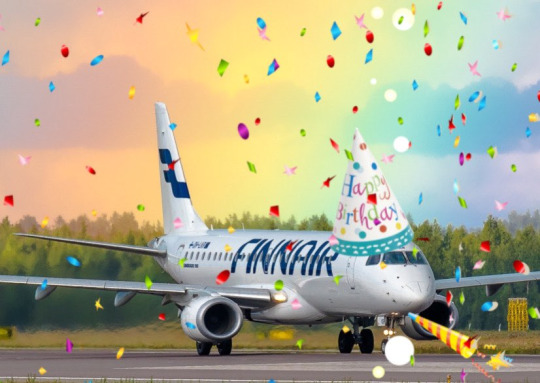
On 1 November 2023 Finnair became the sixth airline to turn 100 years old, consistent with its status as the sixth oldest airline in continuous operation. I wish I'd started this blog earlier in the year, or prioritized differently, because Aeroflot and Czech Airlines also turned 100 in 2023, but...well, I didn't. You'll probably see them both in 2024 instead. Finnair, however, was requested by @kuivamustekala - particularly their centenary liveries. Requested a long time ago, even. So I'm going to hope that late is better than never and throw Finnair one last birthday party to wrap up 2023 by looking at where they started, where they are now, and what they've been doing to celebrate.
1923: PROTO-FINNAIR
Finnair, obviously the flag carrier of Finland, was founded in 1923, but its first service was in early 2024, using a Junkers J.13 (fitted with obligatory floats, as there were no suitable airstrips in Finland at the time).
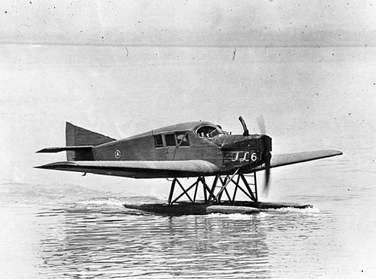
image: Joseph Eaton via US Navy National Museum of Naval Aviation This is actually the US license-built version, the Junkers-Larsen JL-6, but I couldn't find any pictures of actual J.13s on floats.
Unfortunately, Finnair was founded under the name 'Aero', which is probably the actual single worst name for an airline I have ever heard. We can jest and joke about things like Jet2 and Fly Air, but I sincerely do not think I have ever seen anything with worse SEO than an airline named 'Aero'. Even for 1923 this was fairly dire - back then, as for much of history, airlines were generally named for the area they served. Aero may have been a private company, rather than state-owned, but that didn't mean they couldn't name themselves for the area they served - private airlines have always done this and still do. Incredibly enough, there was a second 'Aero' founded in Poland in 1925, but that was quickly merged into what would become LOT Polish Airlines, shedding the name like a chrysalis.
Bafflingly, even when the Finnish government bought the airline in 1946 (they still own a majority share of it today) they didn't bother to change the name. They did begin writing 'Finnish Airlines[1]' on the fuselages, but as far as I can tell this appears to have been more of a stylistic flourish of sorts than an actual rebrand, or maybe even a clarifying subtitle on the very nonspecific name. In 1953 they began marketing under the much catchier 'Finnair', but the company remained legally named 'Aero' until literally 1968 and the fuselages still read 'Finnish Airlines'.
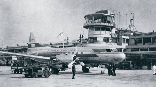
image: Finnair An Aero/Finnish Airlines Convair 340, photographed in 1953 in a livery which included both the large 'Finnish Airlines' wordmark and 'Aero' on the tail.
Early Finnair, like most early airlines, didn't have a particularly standardized livery for its fleet, and even where it did it's not very well documented. Finnair unfortunately has some of the poorest documentation for livery evolution of any large airline I've discussed so far, which really surprised me. That said, it's when the name became Finnair that things begin to be easier to find, and so that's where I'll begin.
1968: CLASSIC FINNAIR

This original logo[2], introduced in 1968, was designed by Kyösti Varis - at least, that's what every logo database I looked in said. I actually couldn't find either Finnair or Varis confirming this[3], but I still think it's probably true. Unlike designers like Vic Warren and Lindon Leader, who wrote and gave interviews about their designs for major airlines, Varis appears to have other preoccupations. He is enormously successful and prolific, to the point where his website doesn't even mention Finnair. According to the timeline he provides he would have either been creating this logo freelance or in his very last days at Advertising Agency SEK (probably the latter, since they did the two subsequent iterations), and based on his history as a typographer I think it's safe to say the letterforms are his creation as well. Also according to his timeline, he is younger than Finnair! And we almost have the same birthday.
I like the original Finnair branding. It's not ostentatious, but it's nice and sleek, with that forward slant I love in airline branding and a long unbroken line (both in the 'F' logo and in the even heights of the letters in the wordmark). It looks aerodynamic and the rounded, blocky letters have a hint of that 60s futurism while not being gimmicky. It's kind of incredible looking at it next to the '91-'94 FedEx wordmark, which occupies the opposite end of the sliding quality scale of TRON-looking text. The design as a whole is simple enough to easily reproduce but distinct enough to easily recognize. The shade of blue chosen is a fair bit lighter than the blue of the Finnish flag, but visually pleasing enough. They basically keep iterating on this general concept for the rest of their history, which I think is fantastic - no need to get rid of something that's working for you. It's nice to see an airline not feel pressured to reinvent its logo and livery every 20 years. That's about it for the logo[4] - what about the livery?
As mentioned prior, Finnair's liveries, before quite recently, were very poorly documented. Variants definitely existed between different types and different periods in the company's history, but the broad strokes of the branding seem to have remained almost startlingly intact for around thirty years.
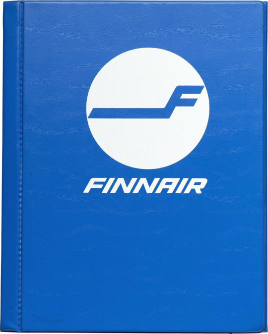
image: Letterform Archive The cover of a style guide from 1985. If it's changed from the 1968 original, I can't tell how.
But I'm really here to talk about one thing: the liveries.
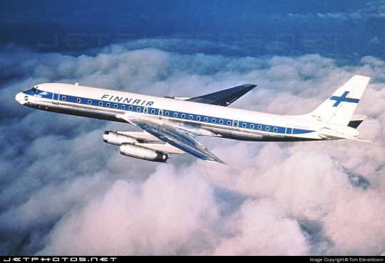
The above image was from Finnair's own archive and was taken in 1968[5], making it contemporary with the introduction of the Kyösti Varis branding, as well as lining it up with the 1969 addition of DC-8s, like the pictured airframe.
For the majority of Finnair's history, their livery is always going to look something a little bit like this. Primarily white, with a thick blue cheatline (in what I call the domino-mask style, where it's vertically centered around the cockpit windows) that lightly flips up at the very end and a blue cross on the tail to represent the Finnish flag.
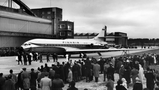
Finnair says this image is from 1960. If so, the livery was already well on its way to existing prior to 1968, with my guess being that it was introduced in 1960, along with the first jets in Finnair's fleet - the pictured Sud Aviation Caravelle, which pioneered the swept-wing, aft-engine format later seen on immensely popular jets like the DC-9 and Tu-134 - the latter of which was commissioned specifically because Nikita Khrushchev was so impressed with the Caravelle's aft engines and the quiet cabin experience they provided. It's a plane with a lot of unique visual features, featuring a nose that looks almost slanted downwards (a copy of the de Havilland Comet nose), a cruciform tail (instead of the more efficient T-tail used for future rear-engined designs), and triangular passenger windows. Most crucially, though, it was more or less the first short-range jet on the market. This made it perfect for an airline like Finnair, which at this point didn't really go that far from actual Finland.
This 1960 photograph provides a very strong blueprint for what was to come. It's the first iteration of the livery to say 'Finnair' instead of 'Finnish Airlines', and it's introduced a modern-for-1960 single-rule cheatline, although this early version was flipped horizontally, curling up at the front to frame the cockpit windows instead. (I think the white paint also cuts off behind it, leaving the space in-between the cheatline and painted nose blank metal, but in black-and-white it's somewhat hard to tell.) I do think I prefer the modern version. The use of the white downward curve with no blue hemming it in creates a really nice effect where it blends with the unpainted metal underside, due to the metal being right where you would expect to see a shadow anyway. (This effect is why I'm not quite sure where the paint ends on the Caravelle, and am just guessing based on which parts are noticeably reflective.) I definitely prefer the change made to the tail, where the single line of trim at the end of the rudder was replaced with a white canvas for the Finnish flag.

While I do tend to have a slightly pessimistic outlook on primarily-white liveries, I will say that if you're going to have a primarily white plane, and you are the flag carrier of Finland, this is a fairly understated and stylish way of incorporating it. While I probably would have done it on the main body, over where the first set of doors is, instead of on the tail, I think this is far from the end of the world. What they have is a nice, elegant taper where the tip seems to point directly at the tailplane, and it looks neat and intentional. A lot of airlines tend to just awkwardly slap a logo on their tail, which often looks really sloppy due to poor alignment or even just out-of-place entirely, and Finnair avoids that while keeping the tail from being completely blank. Having an element on the tail that's more horizontal than vertical, like the old 'AERO' rectangle or the tail rectangle on the one decent livery Lufthansa ever had.
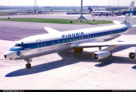
If you look in the background, you can see that wow has the Olympic Air livery looked like that for a long time! But that's a story for soon.
Additionally, some details were added on the nose. You can see on this DC-8, photographed in 1969, that the nose features an e-girl cheek stamp of the Kyösti Varis logo. Next to it is the name of the aircraft - in this case, Jean Sibelius - in really difficult-to-read thin text. (Finnair unfortunately appears to have stopped naming their planes by the late 1970s, but at one point they would frequently be named for Finnish people and places.) The 'domino mask' goes quite a bit beyond the cockpit windows to create a wider line from the side. I wish that the logo could have been integrated some other way, because the extra little blue thing just looks cluttered, but I can't imagine how they would do it without just replacing the cheatline. I mean, that would have been an option - indeed, it's what I would have done[6] - but assuming that they keep this general look I think the logo just can't fit in on the livery. The engine nacelles, maybe? Though that would still present issues on the Caravelle, where the engines are directly over the cheatlines. I also wish they would have made it a bit easier read the name, because I like to know what the plane's name is - thankfully, some later paint jobs actually do this before, tragically, Finnair stops writing names on their planes at all.
I believe this to be the strongest iteration of the classic Finnair livery, and it was pretty obviously optimized for the DC-8. Modern airlines tend to not bother adjusting their liveries between types, creating some absolute travesties of proportion, but Finnair boldly went in the opposite direction by modifying it for each airframe and yet still having it look worse.
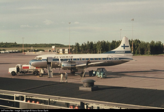
The sharpest deviation arises in the CV-440 version of the livery. This image is from 1971, just two years after the DC-8 liveries would have carried their first passengers, and it's wildly different. The cheatline is lowered sharply, sitting below the cockpit windows and wrapping around to contour the body of the airplane. There's a certain je ne sais quois to the domino mask that I find myself missing here. This design also has an unnecessary second 'Finnair' added to the tail, which kind of looks awkward stacked on top of the existing cheatline besides being redundant, and the Finnish flag on the tail is somewhat awkwardly made free-floating. It feels a lot less sleek and a lot more arbitrary.
On the other side of the plane the cheatline goes down quite a bit farther than on the jet models, probably because they thought it would be a better way of negotiating the Convair's rather bulbous nose, and I actually think I prefer the wide, upturned variant. This version, if anything, is too close for my taste to the livery VARIG operated in a similar timeframe. There are a lot of differences, yes, but in the 70s having one big solid cheatline on a white body and metal underbelly was the equivalent of the Lufthansa Line, so if you toed said line, be it cheat or Lufthansa, you risked becoming easily mistakeable for any airline with too similar of a color scheme. And blue-on-white was maybe the most common color-scheme at the time.
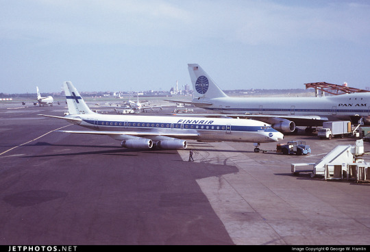
I doubt Finnair shared many tarmacs with VARIG, but here they are with Pan Am, and they could also expect to run into airlines like Sabena, Icelandair, and probably a half-dozen I've never heard of, all competing to be the one the others get mistaken for. It's a tricky position to be in.
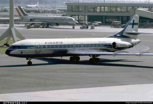
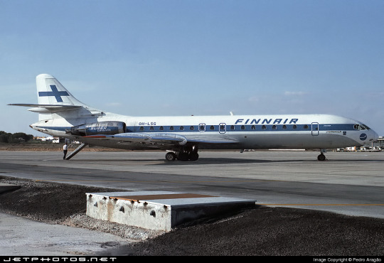
I do quite like the livery on the left, maybe even more than the DC-8 one, but I can't seem to find any other airframes painted like this. I'm not sure why this one is.
These images are from 1971 and 1969. They are both the same model of airplane - the Super Caravelle or Caravelle 10B. Their liveries are completely different. And that's just how it was back then - not even standard within the same airline, somehow still trying to stay distinct from dozens of other non-standardized blue-on-white cheatlines.
When evaluating classic Finnair, I have to keep myself tempered in both directions. When I think it's clean and well-proportioned I have to remind myself that it's just a complete nothingburger. When I think it's a lazy and cowardly non-design I have to remind myself that, no, at its best classic Finnair does look like it was designed with some thought, and it does have some traits that feel at the very least interesting enough to merit not being totally dismissed.
But...look, I have to give classic Finnair a D+. Because they tried, and they did something, sure, but it's ultimately not something especially memorable and the implementation is just spotty.
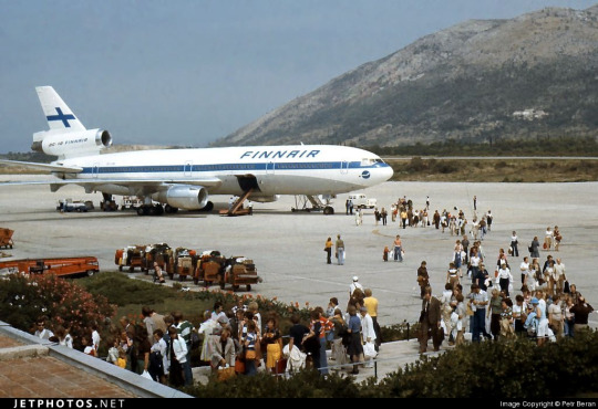
Even given a canvas like the DC-10, they fumbled. The DC-10, in my opinion, was a big test for them. And I do mean big. In the DC-10 is a plane with all the space in the world to add visual elements, and a space where just a couple lines can go from a detail to a fin that towers over anything that isn't a 747, showing off the Finnish flag as if someone had flown it from a building mast. The third engine, which I feel like a lot of airlines really struggle with on the DC-10, gets a nice horizontal line of writing that's not intrusive but helps prevent it from feeling like a giant gap. The wordmark gets larger, is moved forward, gets to really own the space it takes up instead of being squeezed in. And...they made the cheatline just....a really thin flat line that looks bad and stiff and boring. There's nothing setting them apart from Icelandair, and Icelandair's livery from this point in time was so boring that my only comment on it was that it looked like they forgot to paint the rest of the plane. You can do white planes well, but Finnair just really doesn't get there.
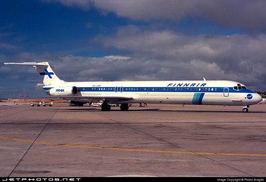
...hey, Finnair? You can't just decide to do belly stripes but worse, Finnair, you're literally next door to like two thirds of SAS and that livery was designed from the ground up. They have a couple of near-misses with SAS's toes but this is the one that makes me actually go 'is this allowed?'. It seems to have been exclusive to their late-80s MD-80 fleet, but it's just incredible to me that it ever happened. (That said, those three shades of blue are so nice together and I wish they had ever brought them back. I understand the appeal of sticking to the stark contrasted blue-on-white of the flag, but there's so much potential out there!)
1997: NEW TYPE, NEW LIVERY
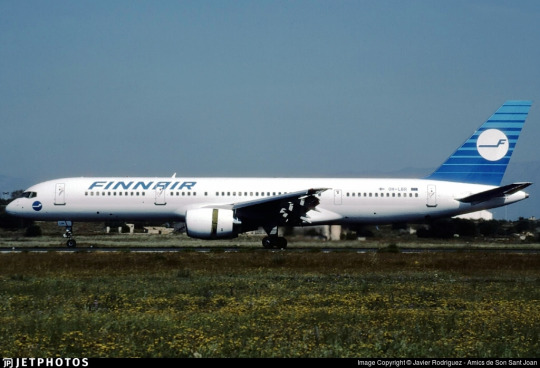
I really like the 757. It deserves a better livery than this.
Removing the cheatlines was a very trendy choice to make. This is the sad beast I call the Deltalite - a Deltalike but without the painted nacelles and belly that are usually slight redeeming factors. There's such a beautiful design on the tail that could have been put on the whole fuselage, honestly, and that's sad, but even on the most granular of levels...why keep the little cheek stamp if you have the logo visible on the tail now? Weird choice. Being so desperate to do the Deltalite thing everyone else is doing that you get rid of your country's flag on the tail is just a bad choice of priority, I think. There's not much to say about this. Honestly, I'd drop it to a D-. There's enough happening that it would lose something by being painted into Star Alliance colors, but it wouldn't lose terribly much.
2000: NEW FINNAIR

Oh, Finnair. Why? Did no airline resist the siren song of getting way too into airbrushing in the early 2000s?
Maybe I just have whatever the opposite of nostalgia is for the early 2000s, but this just makes me sad. They've made the wordmark look worse, overcomplicated the simplicity of the logo, and gone ham with the gaussian blur.
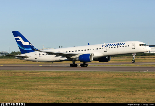
Look, it's not all that bad. The shades used on the actual plane are noticeably darker, and the colors at least don't look half bad now. And they've even bothered to paint the engines this time around! But...come on. You've changed 30 years of something that was working just fine for...this? Something which maybe climbs up to a flat D?
The 2000 brand overhaul, including the logo, was done by Finnish agency SEK & Grey. They're nearly as old as Finnair and have worked for brands as prominent as Coca-Cola and Kellogg's, but their about page puts Finnair front and center. They have an entire page describing their Finnair work.
Despite claiming to have included humanity and warmth and movement, I see none of this. I'll admit upfront I generally dislike what's dubbed 'Nordic' design. It's not the minimalism which I dislike but the banality.

What does any of this have to do with Finnair? What here represents the history of one of the world's oldest airlines? What here really speaks to the Finnish people? Why is just designing something generic and making sure it's all crisp (when you're photographing it fresh out of the plastic, before it's been tripped over and stepped on and yanked down staircases and accidentally sat on and stained with tea) considered a substitute for designing something that people will see years down the line and get nostalgic for? I'm nostalgic as hell for Alitalia, an airline that doesn't exist anymore. I still use the bag from an amenity kit I got on Alitalia nearly ten years ago to store small essential things like toothbrushes and medication while traveling, but I wouldn't know it was Alitalia by looking at it, because it's lovely and convenient and ergonomic but it's literally just grey. It evokes nothing, and it doesn't even say 'Alitalia' on it anywhere. Nothing here could ever be considered ephemera or memorabilia. I could steal Finnair's look at the Gap.
2010: SORRY, HERE'S NEW FINNAIR FOR REAL THIS TIME

SEK & Grey gave it another shot. This one's a lot better.
I like the change in the logo, first off. And this, the word 'Finnair', is the logo, but I'm comparing it to the earlier wordmark. 2000's attempt felt like it was taking the original and just trying to sand off the corners to make it more modern, but the 2010 take on it actually shapes each glyph into a neat little space-age thing that creates this curved shape by way of a lot of straight lines, in a way that feels visually pleasing and interesting. I enjoy the square holes in the A and R, the return of the crossbar on the N, and the extreme range of widths which gives the letters a real weight to them. This isn't a typeface - these glyphs exist in the context of the word FINNAIR in this exact configuration and one of four colorways. Finnair does have a proprietary typeface, Finnair Sans, and it looks nothing like this because this is not a font, it's a logo.
I think it is a shame that this is the logo now. I really liked the F. And they haven't gotten rid of it, but it's now been relegated to an official subordinate position, according to their branding guide:
The official Finnair logo is the text version of the logo, and it is primarily used. The F emblem is used as an additional symbol.
Look, I'll always think it's a shame when your main logo is just the name of your company. Some airlines do it, and it feels like an empty space to me. It can be satisfactory but not outstanding. When you start out with a nice little symbol and then take it away, though, I do feel somewhat robbed.

It stings extra because I really like the way the new F looks. It has that long brushstrokey look and it almost makes me think of Hebrew characters. The way it tapers now really adds to the feeling of movement I get from it, and it's a great base for a livery. Now that it's darker, even though this does bring Finnair into competition with airlines like SAS, LOT, TAROM, Lufthansa, and even Ryanair when it comes to dark-blue-on-white, it also contrasts better with the main body, and it's still light enough that you can recognize it as blue. Anyway, it doesn't take a genius to know how to integrate this into a livery. Long line for the fuselage, go up to match the tail...
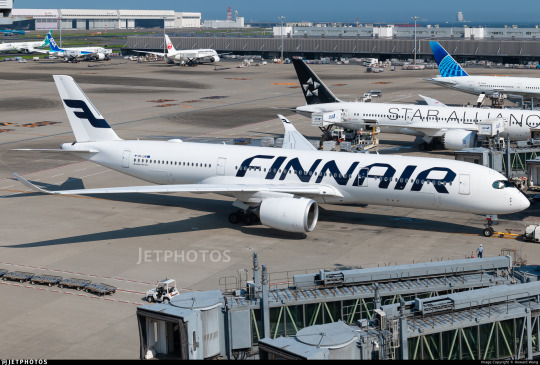
Finnair. Are you serious, Finnair?
Look! I get it! Billboards are in now, it's fine, I get it. it's probably the nicest billboard I've seen in a while, font-wise. It feels comfortable on the fuselage and it feels like it earns the space it occupies. The F is nicely centered on the tail, cuts off at a pleasant point. But...why?
I really can't be too mean about this. I want to be meaner than I actually can justify, because I think if any other airline made their plane this featureless I would hate it but Finnair's billboard livery is actually nice enough and everything is placed well enough that it's not at all unpleasant to look at. It's an acceptable livery. If maybe 25% less planes were basically all white it would shoot up in my esteem. I don't really like the fact that they put the little Fs on the inside of the wingtips of their A350s, but that's really my only nitpick. It's just sort of...bringing a really fantastic loaf of bread to a potluck when you were asked to bring baked desserts. You've done a very good job, but you didn't quite get the assignment.
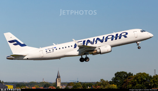
It's a bit hard to critique the modern Finnair livery in detail because I think it's executed fine. There's nothing really wrong with it except that it has a logo that could lend itself to all sorts of interesting shapes, it has 30 years of variants of a very specific design to draw on, and it's chosen to go tabula rasa just to be all clean and minimal instead of doing any of the interesting things it could have with this new start.
I want to dislike this take on the Finnair livery, but at the end of the day I just don't. I think it's completely satisfactory. A lot of airlines try to get this look and somehow end up seeming cluttered for it. Finnair is one of the only instances I can think of where a white fuselage with just a wordmark has looked okay. It isn't ugly. It hasn't failed at the thing it's trying to do, but I think that it should have tried to do something else.
At the same time, though, this is the most Finnair that Finnair has ever been. The blue cheatline and the Deltalites were stumbling over well-trod ground. The modern livery, at least, isn't sloppily tail-heavy and seemingly thoughtless.
I give modern Finnair a C. This took an excessive amount of deliberation, but it really is...good enough. It's satisfactory. It's fine! I would have taken a completely different direction, but they have done a good job with their sort of lackluster idea. It's alright. We'll check on them again in another hundred years and see where they're at.
2023: CENTENAIRY
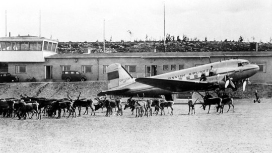
A century is a very long time. Finnair is older than my oldest grandparent. Finnair is older than over a dozen sovereign countries. Finnair is older than aerodromes in Finland. It's older than every currently operating airline except KLM, Avianca, Qantas, Aeroflot, and Czech Airlines. As of the first of November, Finnair is in triple digits.
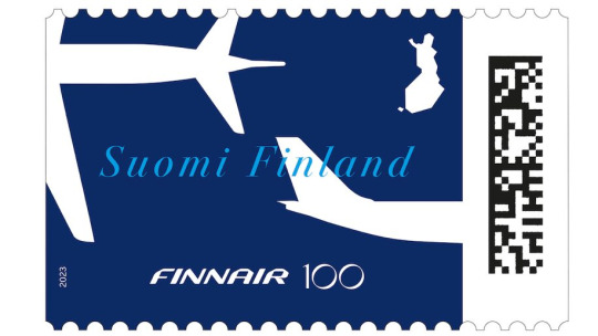
I adore this centenary stamp Finnair has put out, celebrating the long relationship between aviation and the mail. It's not complex, but it's not barren, either. It combines the dark blue of the modern livery with the light blue of the classic one, all with the white silhouettes of airplanes elegantly soaring over an outline of Finland. The outstretched white wings on the deep blue have the grace of a giant fish swimming beneath a glass-bottomed boat.
But of course it isn't just stamps. Finnair is an airline. Airlines do special liveries. Qantas and KLM both slapped a big 100 sticker on an airplane for their big anniversaries. Finnair has of course done something similar.
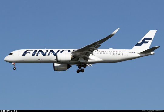
Three airframes - the pictured A350-900, OH-LWR, and two A320s - OH-LXK and OH-LXM - have had a 'bringing us together since 1923' sticker applied. Matching the rest of Finnair's branding, it's certainly quite minimal, but it's a nice gesture. It's not what people have been talking about. That's OH-LWO and OH-LWP, both A350-900s, who have been given something more substantial to wear.
youtube
I'm going to assume that after its renaissance on tumblr a few years back most people reading this are familiar with the Moomin franchise. I definitely am, because when I was in my larval stage my mother first taught me to read Russian using an omnibus book of Moomin stories. Creator Tove Jansson apparently designed both the shape of the eponymous white critters and the sound of the name Mumintrollen itself are designed to evoke a feeling of softness, and it's clear why these characters are so beloved.
It isn't the first time Finnair, which frequently collaborates with Finnish brands and highlights its Finnish roots, has featured Moomins.
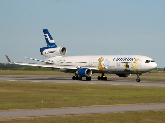
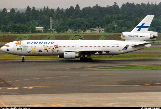
image on left: Antti Havukainen
In the 1990s, the airline first flew a Moomin jet. They had another in the 2000s. Both were withdrawn from service before 2010. It's been a while now since Finnair flew their last MD-11, but when celebrating their 100th birthday, a milestone that the vast majority of airlines will never see, they chose to do it by way of a soft Moomin embrace.
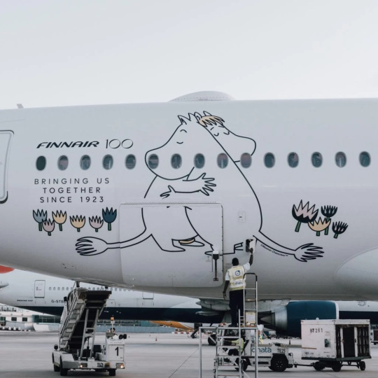
image: Changi Airport
And, I'll be honest, I think it's very sweet. It got an actual, sincere little smile out of me.
100 years is a really long time. In 1923 aviation was unrecognizable. What we would now consider an airliner didn't really exist yet - space for ten passengers, closed cockpits, and metal fuselages were the exceptions rather than the rule, and the Ford Trimotor was two years from its first flight. Cabin crew were barely even a concept. Airplanes, for all intents and purposes, were considered a type of boat. A nonstop flight across the Atlantic was a ridiculous concept. In a report published by the US National Bureau of Standards, it was said: 'there does not appear to be, at present, any prospect whatever that jet propulsion of the sort here considered will ever be of practical value, even for military purposes'. There were no aerodromes in Finland, so a small company called Aero attached floats to a plane just large enough for four passengers and took them from Helsinki to Tallinn.
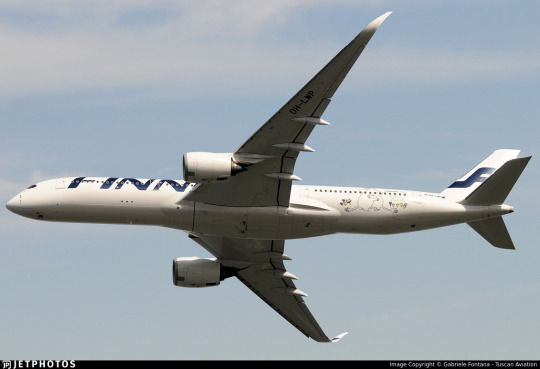
Look how far we've come.
Footnotes:
[1]: The Finnair website's history page, which I used as a source for much of the background and several images in this post, renders it as 'Finnish Air Lines', but on the airplanes themselves it clearly has no space, so I've corrected that seeming error for them. I don't know why this discrepancy exists, because as far as I know during this period they were marketing themselves as Aero so this text would only have existed on the livery itself. [2]: Actually, I very occasionally see this version where the F logo isn't fully surrounded by the circle and the F in the wordmark doesn't have the rounded top, and I don't know which came first or if the less round version is just somehow...not real? I did try to figure this out, I swear, but at some point I realized I am literally not a professional logo historian, and nobody is going to be let down if I don't brute-force an answer despite not even speaking Finnish, and I should finish writing the post before it's 2024. [3] The closest thing to an official source I can find is the descriptions of two listings for the centenary stamp including a quote from designer Ilkka Kärkkäinen attributing it to him. I don't at all doubt that he did design it, but I always like to find concrete attribution for things if I can and would hate to spread misinformation and the sparseness of confirmation here is something I find very strange. My best guess is that there's plenty of good sources on it in Finnish but nobody has bothered to make it as clear in English. [4] Admittedly this is a stretch, and I certainly don't think it was intentional, but it does remind me of the longship prow used in early SAS liveries. This motif was introduced in 1946 and continued to see use after the Finnair logo was introduced. The overlap is fairly limited in that SAS never used the longship in their logo (...I kind of want to talk about their logos one of these days) and the Finnair livery you'll see shortly doesn't look like SAS's at all, plus SAS has the extra pink on their liveries, but I couldn't get it out of my head that they do look sort of alike. [5] The absolute hero who uploaded it to jetphotos mentioned that Finnair had given him the photograph while planning to dispose of it, and this makes me wonder if the lack of documentation is just because Finnair doesn't hold onto their old materials, which makes me very sad. A lot of companies, more broadly, didn't bother to keep records until somewhat recently, but in Finnair's case it seems to be particularly egregious. As someone literally studying to be an archivist it makes me exceptionally sad to see history lost just because nobody cared enough to preserve it. [6] Maybe they didn't want to look like backwards SAS. Who can say?
#tarmac fashion week#finnair#grade: c#grade: d+#region: finland#grade: d#grade: d-#region: northern europe#era: 1960s#era: 1970s#era: 1980s#era: 1990s#era: 2000s#era: 2010s#era: 2020s#special liveries#commemorative liveries#requests
50 notes
·
View notes
Text

airsLLide No. 10397: N64150, De Havilland Canada DHC-6-200, Perris Valley Skydiving, Perris, CA, March 27, 1994
Golden West Airlines was a Southwest Californian feeder airline created through the 1969 merger of Aero Commuter, Cable Commuter, Catalina Airlines, and Skymark Airlines. Since they all were fleet operators of the DHC-6 Twin Otter, the new airline became a power user of the type, with 30 units flying for Golden West, including N64150 here.
In 1983, Golden West Airlines had to file for bankruptcy and was liquidated. N64150 was acquired by the local skydiving school at Perris Valley Airfield and converted with a portside sliding door to allow for smooth jumps. The colorscheme however was not changed, and so the Twin Otter still flies in full marks and colors of long-since defunct Golden West Airlines more than ten years after its demise. The only change is the elegant adaption of the former titles to the written claim «Skydive the Golden West».
2 notes
·
View notes
Text

Bombardier CRJ200 UVT Aero
Registration: RA-67155 Type: 200ER (CL-600-2B19) Engines: 2 × GE CF34-3B1 Serial Number: 7707 First flight: Nov 2002
UVT Aero is a regional airline from Tatarstan, Russia, with its main hubs at Kazan, Bugulma, and Begishevo (Naberezhnye Chelny/Nizhnekamsk) airports. The airline’s headquarters are in Bugulma. It offers scheduled domestic passenger flights. Established on April 9, 2015, following the closure of Ak Bars Aero, UVT Aero inherited its predecessor’s fleet. The airline’s inaugural flight from Bugulma to Moscow took place on July 17, and by mid-November, it was serving seven destinations across Russian cities. The name “UVT Aero” stands for “South-East of Tatarstan,” reflecting the location of Bugulma. The airline operates a fleet of CRJ200 jet aircraft.
Poster for Aviators aviaposter.com
4 notes
·
View notes
Text
Aviation's huge carbon footprint could shrink significantly with electrification. To date, however, only small all-electric planes have gotten off the ground. Their electric motors generate hundreds of kilowatts of power. To electrify larger, heavier jets, such as commercial airliners, megawatt-scale motors are required. These would be propelled by hybrid or turbo-electric propulsion systems where an electrical machine is coupled with a gas turbine aero-engine. To meet this need, a team of MIT engineers is now creating a 1-megawatt motor that could be a key stepping stone toward electrifying larger aircraft. The team has designed and tested the major components of the motor, and shown through detailed computations that the coupled components can work as a whole to generate one megawatt of power, at a weight and size competitive with current small aero-engines. For all-electric applications, the team envisions the motor could be paired with a source of electricity such as a battery or a fuel cell. The motor could then turn the electrical energy into mechanical work to power a plane's propellers. The electrical machine could also be paired with a traditional turbofan jet engine to run as a hybrid propulsion system, providing electric propulsion during certain phases of a flight.
Read more.
14 notes
·
View notes
Note
For the anon asking where GR and the gf went, based on what she posted (which she took down a few hours later), they flew Aero, which is one of those “private airlines” you can book by the seat. They only fly from LA to Cabo, Aspen or Sun Valley…so they went to one of those locations. My bet would be on Cabo because they have been there before but who knows?
.
2 notes
·
View notes
Note
Which Sonic The Hedgehog character do you believe could dismantle and repair a IAE V2500, a two-shaft high-bypass turbofan engine built by International Aero Engines which powers the Airbus A320 series of narrow-body airliners, and why is it Infinite the Jackal ?/ ! ! ^_^^
Why can't I ever get normal asks
The answer is obviously Rouge
2 notes
·
View notes
Text
Events 7.15 (after 1900)
1910 – In his book Clinical Psychiatry, Emil Kraepelin gives a name to Alzheimer's disease, naming it after his colleague Alois Alzheimer. 1916 – In Seattle, Washington, William Boeing and George Conrad Westervelt incorporate Pacific Aero Products (later renamed Boeing). 1918 – World War I: The Second Battle of the Marne begins near the River Marne with a German attack. 1920 – Aftermath of World War I: The Parliament of Poland establishes Silesian Voivodeship before the Polish-German plebiscite. 1922 – The Japanese Communist Party is established in Japan. 1927 – Massacre of July 15, 1927: Eighty-nine protesters are killed by Austrian police in Vienna. 1941 – The Holocaust: Nazi Germany begins the deportation of 100,000 Jews from the occupied Netherlands to extermination camps. 1946 – The State of North Borneo, now Sabah, Malaysia, is annexed by the United Kingdom. 1954 – The Boeing 367-80, the prototype for both the Boeing 707 and C-135 series, takes its first flight. 1955 – Eighteen Nobel laureates sign the Mainau Declaration against nuclear weapons, later co-signed by thirty-four others. 1966 – Vietnam War: The United States and South Vietnam begin Operation Hastings to push the North Vietnamese out of the Vietnamese Demilitarized Zone. 1971 – The United Red Army is founded in Japan. 1974 – In Nicosia, Cyprus, Greek junta-sponsored nationalists launch a coup d'état, deposing President Makarios and installing Nikos Sampson as Cypriot president. 1975 – Space Race: Apollo–Soyuz Test Project features the dual launch of an Apollo spacecraft and a Soyuz spacecraft on the first Soviet-United States human-crewed flight. It was the last launch of both an Apollo spacecraft, and the Saturn family of rockets. 1979 – U.S. President Jimmy Carter gives his "malaise speech". 1983 – An attack at Orly Airport in Paris is launched by Armenian militant organisation ASALA, leaving eight people dead and 55 injured. 1983 – Nintendo released the Famicom in Japan. 1996 – A Belgian Air Force C-130 Hercules carrying the Royal Netherlands Army marching band crashes on landing at Eindhoven Airport. 1998 – Sri Lankan Civil War: Sri Lankan Tamil MP S. Shanmuganathan is killed by a claymore mine. 2002 – "American Taliban" John Walker Lindh pleads guilty to supplying aid to the enemy and possession of explosives during the commission of a felony. 2002 – The Anti-Terrorism Court of Pakistan sentences British born Ahmed Omar Saeed Sheikh to death, and three others suspected of murdering The Wall Street Journal reporter Daniel Pearl to life. 2003 – AOL Time Warner disbands Netscape. The Mozilla Foundation is established on the same day. 2006 – Twitter, later one of the largest social media platforms in the world, is launched. 2009 – Caspian Airlines Flight 7908 crashes near Jannatabad, Qazvin, Iran, killing 168. 2009 – Space Shuttle program: Endeavour is launched on STS-127 to complete assembly of the International Space Station's Kibō module. 2012 – South Korean rapper Psy releases his hit single Gangnam Style. 2014 – A train derails on the Moscow Metro, killing at least 24 and injuring more than 160 others. 2016 – Factions of the Turkish Armed Forces attempt a coup. 2018 – France win their second World Cup title, defeating Croatia 4–2.
1 note
·
View note
Text

Eurofighter will guarantee 26,000 jobs in Spain by 2060
The program should contribute about €1.7 billion to Spanish GDP and create almost 700 jobs in Spain per year.
Fernando Valduga By Fernando Valduga 29/03/2023 - 16:00 in Military
The Eurofighter program will cumulatively guarantee 26,000 jobs in Spain by 2060, according to a recent study by the consultancy PricewaterhouseCoopers (PWC) on the economic impact of the 'Halcon' and 'Quadriga' contracts for the country.
The study, funded by Airbus, with the technical support of ITP Aero, and carried out independently by PWC over a period of six months until March 2023, estimates that, during its life cycle, the manufacturing phase (2020-2030) and maintenance phase (2023-2060) of the Halcon and Quadriga programs will create an average of 657 jobs - direct, indirect and induced - This is equivalent to a total annual impact on employment of 2.7% direct jobs in the Spanish aerospace sector.
Both Eurofighter Tranche 4 contracts are expected to contribute almost €1.7 billion to Spanish GDP, with the manufacture and maintenance of Halcon generating approximately €1.5 billion and Quadriga production composing the remaining €200 million.
Employment and economic contribution during both phases will generate a total tax collection of €430 million, of which €151 million will be a direct contribution. In addition, for every euro collected directly, 2.8 euros of total tax revenues will be generated in the Spanish economy.

Signed in June 2022, Halcon's contract consists of the acquisition of 20 state-of-the-art Eurofighter jets to replace the aging F-18 fleet operated by the Spanish Air Force in the Canary Islands.
The Halcon program followed Quadriga's contract, signed in 2020, to deliver 38 new Eurofighter aircraft to the German Air Force (Luftwaffe), making Germany the country with the highest number of orders for the largest defense program in Europe.
The Halcon program will see the Spanish Eurofighter fleet grow to 90 aircraft, with the first delivery scheduled for 2026, ensuring industrial production activity by 2030. Quadriga guarantees the production of the new Tranche 4 Eurofighter - currently the most modern combat aircraft built in Europe - by 2030, with a useful life well beyond 2060. Both programs are decisive in ensuring national and European strategic autonomy in defense, when it matters most.
In total, the Eurofighter program guarantees more than 100,000 jobs in Europe, which will be driven by state-of-the-art aircraft, such as Tranche 4, as well as, in the future, through technological advances in the development of Eurofighter.
To download the complete PWC study and additional material to complement this notice access the link here.
Tags: airbusMilitary AviationEurofighter
Fernando Valduga
Fernando Valduga
Aviation photographer and pilot since 1992, he has participated in several events and air operations, such as Cruzex, AirVenture, Dayton Airshow and FIDAE. He has works published in specialized aviation magazines in Brazil and abroad. Uses Canon equipment during his photographic work throughout the world of aviation.
Related news
COMMERCIAL
A321XLR program concludes second test campaign in cold weather
29/03/2023 - 10:30
HELICOPTERS
South Korea approves CH-47F Chinook helicopter purchase plan
29/03/2023 - 09:59
MILITARY
U.S. Navy and Boeing discuss unapproved purchase of 20 Super Hornets
29/03/2023 - 08:44
MILITARY
VIDEO: Airbus A310 guides and takes control in flight of a drone
28/03/2023 - 19:00
COMMERCIAL
China Southern Airlines plans to increase orders for Boeing and Airbus
28/03/2023 - 17:00
MILITARY
VIDEO: Prototypes of the South Korean KF-21 fighter fire weapons for the first time
28/03/2023 - 14:25
10 notes
·
View notes
Text
CalmWriMo Day 15
[11/15/2023]
Update!
So didn't really get around to working on the prologue today... (-.-) So kinda kicking myself for that. But I did make the writing goal time on other stuff so there is that. On that topic tho! I've been a little bit busier with work than I was honestly anticipating when I made the goal. (o.o) So I'm considering halfling it if things persist like this much longer. Cause the most important part of goals [and for me mental stability (0~o)b] is that they are obtainable! Still just considering it for now, but if it randomly changes next week that'll be why. ('^.^)
Progress:
2 Hour Writing Goal: ✅
Blurb: [see below]
Self Care:
Food: ✅
Hydration: ✅
Sleep: ✅
Reading: ✅
Blurb: NEX Conglomerate
(NEX = Neocago Enterprise Annexes... unless I figure a better acronym that fits lol)
The NEX Conglomerate, or simply NEX, was originally formed behind closed doors by a coalition of corporations who wanted to seize power over the city from Plax Technologies (Neocago's founding corporation). In a rapid hostile take over using both buy outs, refusals to honor security contracts, and a raid on Plax's headquarters the coup of the city ended almost as soon as it started. Now with NEX as the unshakable top dog in the city a new chapter opened in the city's history... and it would be one of cold corporate dominance. NEX is made up of seven corporations alongside their numerous subsidiaries.
List of NEX members:
Ferncorp: At NEX's head is Ferncorp, who controls most of the agriscrapers around the city and with them most of the city's food supply. A fact that they have used to leverage their power to maintain their position. Their subsidiaries are some of the more essential for the city's more financial functions, official media, as well as the remains of Plax itself.
Apex Water: This corporation was originally contracted to provide clean water and plumbing services for the city by Plax. Following the takeover they have effectively gained a monopoly on water in the city. They have begun producing several flavored soft drinks.
Biotechna: Is a corporation that before the Great Collapse was funded by the US government to gather and preserve the genetic material of as many species of plants and animals as possible. Following the collapse they found new contracts with Ferncorp to work on bioengineering projects to design superior crops among other things...
Holder&Holder Security Firm: A security firm with a small military at it's disposal. They primarily only provide protection for NEX assets, properties, and personnel.
Ares Armaments: A corporation that once was contacted to develop and produce weapons for the US. They moved on to working with Plax, and just as quickly jumped to NEX. While significantly quieter than other NEX member corporations they have the widest global reach and sell weapons across the world.
Street Flex: This corporation owns most of the road and rail infrastructure in Neocago after winning a major contract with NEX following the takeover. They keep the city's "veins" maintained and operational in return for a sizable stipend.
Ace Aero: Originally simply an airline company Ace Aero has developed into massive aerospace industry. They own and operated numerous space stations, satellites, and moon bases. They are only headquarter in Neocago as most of their launchpads and vehicle assembly buildings are further south nearer to the Gulf of Mexico. They also own the primary airport in the city.
[Bit of a random lore dump... Not short on ideas, but also not sure what to focus the blurbs on. ('^.^) So if anyone is curious any bits about this world feel free to ask! (^.^)b Anyways and always, I hope you had a lovely day, peace (^v^)v]
5 notes
·
View notes
Text
Part #2: About Boeing
Boeing was founded in 1916 as Aero Products Company in Seattle, Washington. In 1917 it was renamed Boeing Airplane Company. Boeing built a reputation over the years for being a leader in safety and building quality aircraft. As their reputation grew, so did their market share. Boeing’s planes became a favorite of pilots to fly — they handled well, and they were designed in a way that they were easy to fly. Boeing’s mission statement as I could discern is “Lead on safety, quality, integrity and sustainability” and their vision is “Start with engineering excellence”.
Boeing had a proud culture of being engineer-driven. The engineers who were designing and building the planes had a lot of sway in the company. The direction the company took, the types of aircraft developed, everything was focused around engineers and engineering. They created commercial jets, military jets, military helicopters, and spacecraft. Boeing was the driving force behind the United States becoming a leader in the sky and in space.
Boeing is contracted to design and build seaplanes for the US Navy for WWI, the Model C. They order 50 of them for the war effort. Boeing is also contracted to build the MB-1 bomber. Over the next few years, Boeing receives contracts to build various military planes, while continuing to build their civilian seaplanes. Boeing’s planes are either drafted for military use during WWII from their commercial uses, or they are contracted to build military-specific planes — like the B-29 Superfortress bomber. This is the model that dropped the atomic bomb on Hiroshima. The B-29 Bockscar dropped the bomb on Nagasaki.
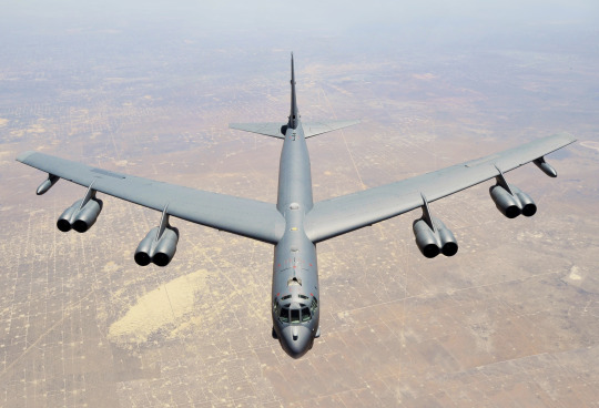
In June of 1946, Boeing begins designing the B-52, one of the most notable bombers in their history. Having flown in multiple wars, as well as being one of the primary planes designed to carry nuclear weapons in the event of a global thermonuclear war with the Soviet Union. It is first completed in November of 1951.
Boeing started making commercial passenger jets in 1955 with the release of the 707 twin-jet, first delivered to Pan Am in 1958. The 707 was the first plane that was ordered by the Air Force specifically for use for the President and other high-ranking officials. The 707 was the first jet to be called “Air Force One”.

The Saturn V rocket is the only launch vehicle ever to have brought humans beyond low-earth orbit. This is the rocket that brought Neil Armstrong and all the other Apollo missions to the Moon. The Saturn V holds the record for the heaviest payload launched into space. The Saturn V was designed by Boeing. Even the Lunar Rover was designed by Boeing.

In 1967, the 737 was released. Nearly all airlines in the US were flying Boeing aircraft. Southwest is notable for exclusively flying the 737 — their entire fleet is solely Boeing 737 aircraft. From their inception in 1967, they have (with two exceptions) only ever flown the 737 family of jets. The exception was briefly flying 727 jets for short periods. In 2021, Southwest had a total order of 234 737 Max jets which was the largest single purchaser of the 737 Max.
“The Queen of the Skies” — The Boeing 747. This plane made it possible for normal people to travel by plane, and brought about the “Jet Age”. The 747 was the first jumbo-jet, it had 4 engines, it could make it across the ocean with ease, and it could hold an immense amount of passengers. The 747 was the first twin-aisle aircraft, making ingress and egress much easier than a single-aisle aircraft. The 747 is one of the safest airplanes when adjusted for seat count. A modified version of the 747 serves as Air Force 1 — the president’s plane. The 747 is also notable for carrying the Space Shuttle as the Space Shuttle Carrier Aircraft.

Boeing’s culture underwent a major shift in 1996. It merged with McDonnell Douglas — who was at the time another major manufacturer of aircraft. The more business-first-focused McDonnell Douglas President and CEO became the President and CEO of the newly merged company. One change that was brought about was moving the headquarters from Seattle (which was near the engineers) to Chicago. The goal of this was to create physical distance from those who may object to changes made by the executives. The new mandate was to design and build the planes more cheaply, get higher profit margins, and increase the share price. Everything else came second.
This was around the time that Airbus was gaining market share, and in some cases, selling better than Boeing. In 1990, Boeing had 80% of the passenger commercial jet market, and Airbus had less than 20%. 5 years later, Boeing had 50%, with Airbus taking 30%, and by 2003, Airbus had 52% of the commercial jet market. The loss of the market leadership drove even higher a push to reduce costs, and increase the speed at which planes are developed and built. This loss spurred the development of the 737 Max, and with the newly required speed and focus on profits, the problems that ensued.
“Airbus beats Boeing in jet deliveries.” NBC News, 15, Jan. 2004, https://www.nbcnews.com/id/wbna3967553
Boeing. "Boeing: The Boeing Company." Boeing, www.boeing.com/company/.
Boeing. "Overview." General Information, Boeing, www.boeing.com/company/general-info/index.page#/overview.
Boeing. "Our Values." Boeing, www.boeing.com/principles/values.page.
Boeing. "Boeing: Our History." Boeing, www.boeing.com/history/.
"Boeing 707." Wikipedia, Wikimedia Foundation, 6 Apr. 2023, en.wikipedia.org/wiki/Boeing_707.
"Boeing B-52 Stratofortress." Wikipedia, Wikimedia Foundation, 5 Apr. 2023, en.wikipedia.org/wiki/Boeing_B-52_Stratofortress.
"Boeing to deliver last 747, saying goodbye to the 'Queen of the Skies'." Reuters, 31 Jan. 2023, www.reuters.com/business/aerospace-defense/boeing-deliver-last-747-saying-goodbye-queen-skies-2023-01-31/.
"British Airways retires its entire fleet of Boeing 747 jets." NBC News, 8 Jul. 2020, www.nbcnews.com/business/business-news/british-airways-retires-its-entire-fleet-boeing-747-jets-n1234149.
Bailey, Mark, and Keven McAlester. Downfall: The Case Against Boeing, Netflix, 2022, https%3A%2F%2Fwww.netflix.com%2Ftitle%2F81272421&usg=AOvVaw3CSSsbMZpxvie5HD6N85Nq.
NASA Armstrong Flight Research Center. “Factsheet: Landing Gear Development Flight Tests.” NASA, 4 Oct. 2018, https://www.nasa.gov/centers/armstrong/news/FactSheets/FS-013-DFRC.html.
"Saturn V." Wikipedia, Wikimedia Foundation, 6 Apr. 2023, en.wikipedia.org/wiki/Saturn_V.
"Southwest Airlines’ Love Affair With The Boeing 727." Simple Flying, 4 Feb. 2022, simpleflying.com/southwest-airlines-boeing-727/.
"International Business; Airbus Has Its Eye on Half of the Global Market." The New York Times, 13 Apr. 1995, www.nytimes.com/1995/04/13/business/international-business-airbus-has-its-eye-on-half-of-the-global-market.html.
2 notes
·
View notes
Text
Miss Conenginality, No. 1 - Boeing 377 Stratocruiser
Very recently I was asked what my favorite planes visually are, and I said that I would do a series of posts on the matter for each like the original post received. A lot of people close to me probably had an idea in mind as to what my first post would be, and I'm going to intentionally not give them what they expect.
Today's featured model is a blast from the past, the Boeing 377 Stratocruiser!
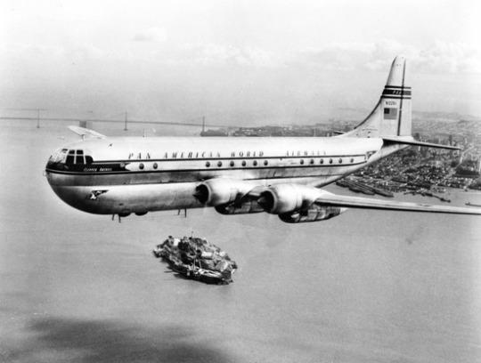
Image: San Diego Air & Space Museum Archives
Serving for just over a decade (1949-1963), the Stratocruiser was a member of that weird generation between the flying boat era and the introduction of turboprops and early jets, contemporary to the early Constellation models and the DC-6. For the day it was a pretty advanced design - it had to be, to compete with the two aforementioned giants. It had a pressurized cabin and impressive range but most notably it was a literal giant with its two passenger decks and triple-digit passenger of capacity, and was Pan Am's choice to replace the luxury overseas transport offered by their old Boeing 314 flying boats - they placed the most expensive order in history at the time, for 20 planes. In a very early example of the US government deciding Boeing was their favorite, mail routes flown by Stratocruisers were heavily subsidized for Pan Am and Northwest.
Sounds great! Only problem is that nobody can afford to operate it and the propellers fall off and overspeed whenever they feel like it. Nearly a quarter of the 56 examples built were destroyed in accidents and Boeing lost seven million dollars (in 1950s money).
But this blog isn't about those sorts of things. We Eat Babies Airlines can get a good rating if it has a good livery and the Christmas Bullet could get a feature if I liked how it looked. And can we talk about how the Stratocruiser looks like a plane dressed up as a blimp?
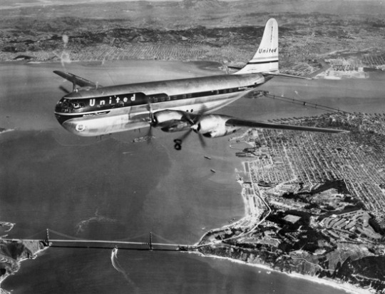
Those wings look way too skinny to lift her! Physics is truly incredible. Look how big those nacelles are compared to the wings! What is this thing! Image: San Diego Air & Space Museum Archives
How did we get here? Why did they design it to look like this? Well, it's actually a bit of a story. We did not start out here. We started out with the B-29 Superfortress, a decidedly normal-looking WWII-era bomber probably best known for the whole...nuclear bombs thing. We then added a second lobe (and some other modifications) for the C-97 Stratofreighter. And then the war ended and, as was not especially uncommon back then, the decision was made to develop an airliner variant of what had been a military cargo plane, and the Stratocruiser was born.

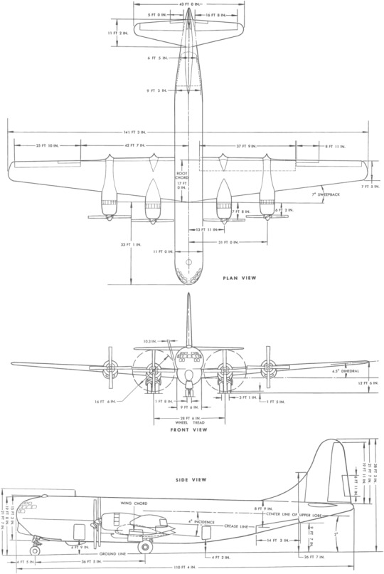
You can really see the transformation into an aerostat taking place.
I do think it really shows that this was a development of a more normal airframe, but I think that almost makes it even more charming. The Stratocruiser is a strange plane, a very large bumblebee made of metal and held together with dollar bills and chewing gum.
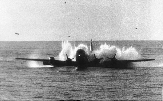
Image: William Simpson/US Coast Guard
Here's one being successfully ditched (as Pan Am flight 6), because why not!
And, thankfully, the world of aviation wasn't content to stop there. As aircraft grew in size and the space race began in earnest there arose a need for excessively large freighters. Today you may be familiar with the Airbus Beluga and Boeing Dreamlifter, but you may be a little less familiar with NASA's outsize cargo aircraft, used to carry full rocket stages. The only Stratocruiser-derived aircraft still in service: NASA's Aero Spacelines Super Guppy.
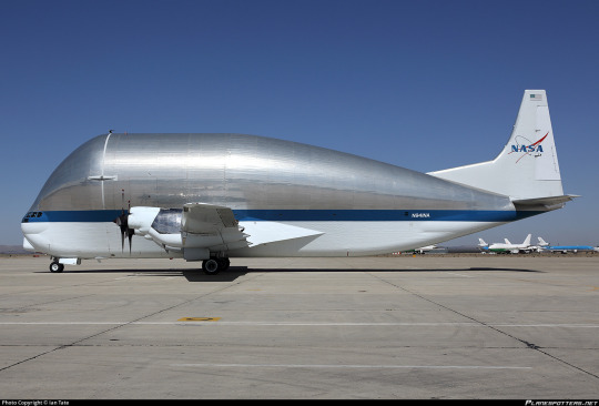
Yes, this feels like the end stage of the Stratocruiser's evolutionary line. This is correct. I love her, and I hope you all do too.
The Stratocruiser is a strange curiosity for sure, an odd-looking relic of a long-bygone era...and so irresistibly silly that I can't help but love it.
youtube
81 notes
·
View notes