#AIThatHelpsArtists
Explore tagged Tumblr posts
Visit Tumblr Blog
Explore Tumblr blogs with no restrictions, modern design and the best experience.
Last Seen Tumblr Blogs


Fun Fact
Tumblr Inc. is using 66 technologies for its website.
Text
These Few Weeks In "Time & Again" #31: There Are Reasons Why It's Taking So Long 😅 (Aside From Me Writing These HUGE Posts)
Phew. I'll get straight to the point right away, and it's a bit sad: the development of the chapter has slowed down a little bit immensely came virtually to a grinding halt within the last two weeks or so, due to some life matters (and lack of necessary focus). I'm still at the supermarket scene, and it's still not done. That makes me quite unhappy. Dammit, I hate when that happens!.. (and no, in the context of this post, that was NOT said about the abandoned shopping carts that are blocking the way from the parking lot) 🤣😅 As I said before, life takes away so much time from art!.. But I'm already picking up the pace and trying to refresh the vision after being near zero productive directly on the chapter. For example, I've made a promo art - one of a few I was thinking about for a nice representation of the essence of the latest chapters, with a cryptic and surreal twist. And boy it looks goooooood 😁 In my head though, I'm still constantly working on "Time & Again" and related stuff. But I need a spark (just like Lothar?.. ... ...?). It feels too grey to me right now (and that is BEFORE I applied the desaturation filter! Unholy snapmap!). It has always been a struggle to me - to spring back to the fired up state of readiness for whatever creative matters I attend to. Never ever in my artistic life have I answered the question of how to regain my creative spark that's been somewhat lost along the way, to lift my work to a higher level of productivity and awesomeness - even up to this day. I think listening to very good (read: hearty, conceptual, wholesome, wicked crazy, etc.) music albums used to help back in the day, but I'm not certain if that helps anymore. Or maybe I have become extra picky in my selection of inspirational art, because consuming and dissolving a lot of wonderful art into oneself is quite possibly bound to make oneself more demanding in regard of quality over time. I blame Lothar's thought pattern for my misfortune. That guy is no fun at all. Get your Sch***e together, Lothar, and be happy already so that I could be happy together with you.
To complicate the matters even further, while working on another piece the other day I happened to lose my progress due to Krita crash during an autosave, which broke my file to the point of complete rubbishness. I'm sure you're all familiar with that; I always hated losing any amount of my work, and I hate throwing away hours of effort like that just because of some random crap happening, especially since spare time is often a luxury to me. I ended up cursing a lot that day - most likely as much as Lothar does on the regular basis for no reason - or even more profusely. That was sure Sch***e, no exaggeration. ... Well, good thing I back up my files regularly 😁👍 But the sad thing is still sad: I resumed work on that piece later on, as if I haven't touched it after sketching at all. And saving incremental versions is now a must, although I never used to do that before. In the moments like that, I always think AI would've been so much help, because, well, why should I redo everything again if I already spent that much time but it all went down the drain for a reason that has nothing to do with me?.. Some people don't have nearly as much time to input into their art as I do. So help from aside to compensate would've been marvellous, for pesky little situations like that that make you want to play the new Doom and cherish moments of glory kills more (... says the person who hates glory kill mechanic as a whole). AI is nowhere near as terrible as the folks who have read too many horror sci-fi stories enjoy demonizing it; people just refuse to think how it might be helpful in resolving certain issues and boosting their own creativity, or using their limited time more efficiently. (I already wrote not just once about certain AI features I would like to utilize to boost my creativity).
... But the good thing is that my automation-fixated self found an easy way to speed up my work a little! I have installed Windows PowerToys - solely to be able to have the thumbnails and previews of the SVG files in file explorer! And I am furiously happy!!! 🥳 Such a simple thing makes my work so much easier and more enjoyable. Ich bin so erfreut 🤗 Now I don't need to start Inkscape every single time I need to quickly look up the speech bubbles placement. Neat-o! Art aside, PowerToys has so many little neat features that might come in handy for the nerds such as myself. Another one favourite of mine is Quick Accent - something I 've been dreaming about for, like, almost 15 years. I like typing (especially my large texts) on computer - I am not a cellphone person (says I, after copy-pasting the draft for this blog post from my Keep notes😅); so adding extra German and Spanish characters to the texts has been a bit of a nuisance - until now. The only downside to Quick Accent is that it sometimes starts off when the games are running (regardless of Game Mode being on), so instead of adding every single one of my 500 Steam games (and beyond) to the blacklist, I simply turn Quick Accent on only when typing in a mixture of languages. That's a small inconvenience, but I can certainly live with that 😁 On a side note, to share and confirm the already long existing joy: I love shell integration, context menus, and explorer previews that Krita provides! I can just look into my folder, enable preview pane in file explorer - and I can easily preview all my SVG and KRA work-in-progress files, if need be! Just like that:
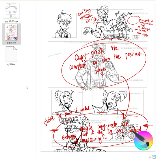
(as depicted on the screenshot above: the SVG file has a thumbnail now, too, thanks to PowerToys; Krita thumbnails and explorer previews come with the installer, and that's super useful. Also, this is a perfect example of the notes I leave on a separate layer RIGHT in my Krita files, to remember what else I need to do or how certain something must be done. Yup, it's always a mess. And it's a fun mess. Almost surprising how the final editions of my art always turn out so clean, eh?!..)
Working on a comic is a complex task after all, and it requires tying the storyboard, the written voice lines, and the intended way of representation of the visuals all together. Every single element in a work like that must have the reason to exist in a specific place, in a specific way, for a specific reason. Because I says so 🧐. (objections are not accepted. Shoo, shoo, heretics!)
Speaking of Krita... There's also one more thing I thankfully resolved the other day, so I'm sharing it here, in case somebody has the same issues and hasn't yet found a solution. I have noticed a weird stutter/lag with my pen a few days ago inside and outside Krita. And yes, you're right: it was doubly weird, because it was happening outside Krita as well, just on the desktop or when I used file explorer with my graphic monitor on. Since Krita obviously was not the culprit, I thought it might've been a problem with my Huion app. But it was up-to-date, and that never happened before until recently. So I did a quick search, and - just as quick, which was pleasantly unexpected and lovely - came across this post that described the exact same issue I had. So I followed the post's instructions. Logitech LampArray Service - disabled. Now drawing is a pleasure yet again 😁 I'm always very happy when the solutions to my techy problems are resolved so quickly and easily 🥳 (now, onto the more hardcore troubleshooting: trying to make the original 2 CDs retail version of American McGee's Alice run on Win11... Unholy snapmapadoodlemap, that's gonna be an adventure, and I am NOT looking forward to it 😵💫😩)
But back to "Time & Again"! Now, on to why you gotta be really patient with me right now; there's a reason. And the reasons is of a truly grand scale. Perhaps I've never mentioned that - or maybe I have only briefly - but I think that Chapter 6 is going to be the most complex chapter of all. Even more complex than the last one, Chapter 8. While Chapter 8 is primarily going to be an emotional explosion (surprise surprise *slow clapping*), Chapter 6 requires a lot of peculiar research done by me in order to represent certain things right, for the proper feel. And it's all gonna be about urban scenery. I must admit, I kinda hate drawing urban scenery: too geometric, too little nature. Everything should be perfectly straight or diagonal, depending on the view angle. That's just boring. And yet, it has to be done for my story, since it's basically a sci-fi story (the setting is definitely sci-fi). That's a personal preference, of course... But I'd always prefer to draw lush trees instead of tall concrete buildings. I bet ya that's because I am a bird nerd, and the trees often have birds on them, and the buildings often don't... Unless the birds are rock pigeons. Rock pigeons have conquered the world long ago. I bet they're planning on something mischievous right now as we speak. But I digress. However, when I appreciate other people's art, I absolutely don't mind urban landscapes and sci-fi settings; on the contrary, I actually really like them. One instance stands out especially in my memory and is still fresh even though a few years had passed since I played it: that's the supermassive office building in Infested that was incredibly difficult to navigate due to - well, as the name suggests - demon infestations. In fact, that place was the main inspiration for the layout of the mysterious abandoned building in Chapter 4 of "Time & Again". In Chapter 4, when Lothar and Jeanny travel around to see what the peck is going on, they come across something that resembles a giant greenhouse. Planning and drawing those 2 pages was so much fun for me! And although they featured geometric shapes as well, those 2 extremely green pages were a delight for me to draw through and through! I never get that feeling from drawing urban scenery. But again, a̴r̸t̵ ̷r̴e̵q̴u̴i̴r̵e̴s̶ s̴̖͚̈́a̴̹̋̈́̊̐͒c̵̱̭̋̓͂̕r̴͕̙̰̖͊̎̈̈̆i̷̘̜̼̲̎̈́͗̃̓̈́͜f̶͔̼̗͔̯̬̈́̋i̷͍̦̭̦̰̊͗̈̚͘͜͝c̶̡̝̩͔̄̆̾ͅe̴̮̖̜͚̦̓̅̏̃̀s̸̱̅̈́͜.
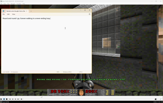
And, since I already mentioned Doom mods above, and how much they contribute to my artistic life, I gotta note something else. Within the last couple of days, I had a few random visions that I thought might improve the feel of Chapter 6. Quite rarely, I reconsider the parts of the storyboard and panel placements, so they ever so slightly differ from the initial sketched variation. So one of these snow-white and deer-filled winter mornings, armed with a red pen to apply corrections, I took off to look at the ending of Chapter 6, neatly and consistently outlined in my sketchbook. In my to-do list, for a long time I had a note saying, "Look at that Doom mod again for the extra inspiration for Lothar's thoughts". So the last summer, I got to play RAMP 2023, and there was that incredibly peculiar, very narrative little level called "Mirror Mirror". I played it at least twice to uncover the promised different endings, and I recorded one of the playthroughs for a future reference. And just a couple days ago, I rewatched my recording. I was stunned. I know that I might be biased. I know that I, in fact, might be VERY biased, knowing how often "Time & Again" is on my mind. But holy smokies! - the main character's thoughts in that mod bear some unbelievable resemblance to Lothar's train of thought in Chapter 6! Also has to do with depression (I think). Also has to do with mirrors and reflections. Also has to do with giving a damn or not. This fits perfectly. So I took notes as I watched the video and I'm thinking about refreshing some of Lothar's voice lines with creatively reworked lines from that level - or maybe I'll flat out keep them unchanged, for a better, incredibly subtle reference that nobody will ever get 😅. Because they are just fantastic.
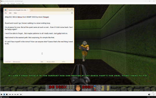
I really recommend y'all to play that short level. I don't think I have ever played anything like that before. The part with the mirror puzzles was quite entertaining, too.
I think it's time to wrap it up. I usually type on computer right away, but since I don't have enough time lately, I started to type my notes for the future posts in Keep (one might say I'm finally evolving, lol). And, knowing how much I can babble sometimes - just like Edgar - my Keep note hit its symbol limit, so I had to start a new one (that didn't take me long, yup). So I have A LOT of stuff left unspoken. I believe, some of my longreads might be very cucumbersome🥒 for some people to read. But it's not that you didn't know what you were getting yourself into when you visited my blog for the first time, right? 😉 Bis dann, until next time!
P.S. I know, I know: the "peck" joke is getting really old, but I really can't get over it. A Hat In Time was a real blast to play in co-op, and it left a few really nice sweet scars on my memory that will never dissipate. I really like writing "peck", even though I know that I pecking shouldn't curse in public.🐦⬛ (I also love northern flickers; can't wait to go see them by the lake this summer again... but I pecking-peckity-peck-peck digress🤪)
P.P.S. In the light of the aforementioned Doominess, I also started to wonder if I could replay Unloved as well. There were references to Unloved in Chapter 3, too, after all. And I never beat it without iddqd, maybe I could try harder this time? 😅
#TimeAndAgainbyDWF#TroubleshootingAndWorkarounds#Krita#PowerToys#videogames#Doom#AIThatHelpsArtists#ThisWeekInTimeAndAgain
1 note
·
View note
Text
This Week In "Time & Again" #27: About Why Inkscape Is My Best Friend (Aside From Krita) [VERY Techy] 🎨
Before I begin today's tale about how Lothar The Nefarious is doing, I must make a small note: I, indeed, did some work on "Time & Again", but within the last week, I was mostly busy doing a TTRPG character sheet commission for a very good friend of mine. Truth be told, I pretty much never do commissions. I don't think I can ever live off art commissions. I don't like them, usually. Most of the time I pretty much hate them. This is why I have a day job: so that I don't have to worry about commissions and deadlines, and so that I could actually enjoy doing whatever I want with my art. But there might be exceptions sometimes. That was one of them. And it actually allowed me to learn more interesting and useful tricks in Inkscape to further improve my happiness with my favourite vectorscape software 🤗. But that's beside the point right now; we'll get to that shortly.
So far, the road to completion of Chapter 6 of "Time & Again" looks this way:
The writing and the script - ✔done (long ago)!
The storyboard (drawn with a pencil on paper) - ✔done!
The Vector Stage (panels arrangement for every page according to the storyboard in Inkscape) - ✔done!
The Lineart Stage (drawing everything in black and white as it will appear in the final release) - gonna be working on it right now!
The Colouring Stage (colouring the lineart for the final release)
The Post-Production Stage (cleaning up everything, perfecting the speech bubbles, SFXs, and polishing everything squeaky clean for the actual release)
And as promised in the previous post, I'll tell you more about how the work on The Vector Stage is going for me as I work on my visual stories. With Chapter 6 of "Time & Again" now, it was pretty typical and without hiccups.
But first - an important intermission. I wanted to be extra prepared for the future and decided to add bleed directly to my Inkscape documents. I remember trying to do the same earlier sometime, but it didn't get anywhere for some reason - must be, because I ran out of my steam of persistency. Why? - I don't know. Because it actually proved to be SUPER easy.
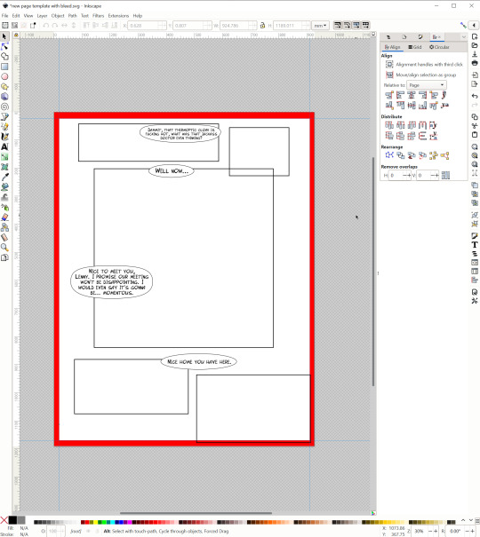
I opened one of the older pages from Chapter 5 and expanded it manually, placing a placeholder (what else do you think placeholders are for?! for placing, of course!!!) of the bleed area underneath the layers (needless to say, I made that placeholder in Krita). But instead of having a placeholder on every page, I wanted to have a thin outline of the bleed area, if possible. And it was, indeed, possible.
Page Tool allows you to set margins and/or bleed in a matter of a few clicks:
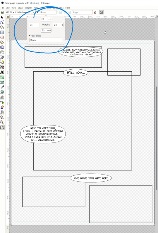
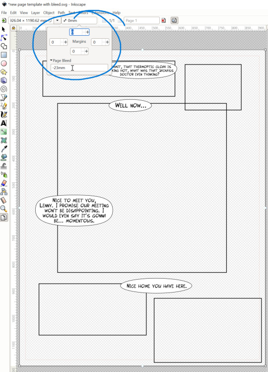
I think those screenshots are self-explanatory. As soon as you input your desired numbers (was defaulted to millimetres for me), very thin outlines appear right on the canvas to guide you: margins are outlines in blue, and bleed in red. Interestingly, if you're a fan of pixel math - just as I am - you can easily input your numbers in pixels, just remember to exchange mm with px as you type, for example: 100px instead of 100mm. And it will work. It will convert your pixel value into mm:

It might be a small thing, but I sure am fairly impressed!!! 😍 And I love it how simple and useful it is.
I believe, I never showed how I normally work in Inkscape. So here's the introduction. I make a document for each page and save it as a separate SVG. Just a few days ago I finally got to try out the multipage SVG feature as I worked on the character sheet - but in case with "Time & Again" and its severly overgrown Chapter 6 that will have 56 pages in total, I don't think that would've been useful to me. Useful to overwhelm me - yes, but not actually useful for work. As the work on each page starts, create 3 layers: one for the panel outlines, one for the speech bubbles, and one for the text. I look at my hand drawn layout of the page and try to reproduce it in Inkscape as close to my sketch/storyboard as possible. I open Inkscape on the right hand side of the screen, while my document with all the finalized voice lines of the characters goes to the left side. It might look confusing and messy (especially if the script is written in a weird way and with a lot of visual descriptors - such is the case with Chapter 6), but to me it's actually a wonderful, very ergonomic workspace organization.
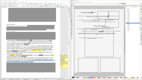
(of course, I have edited out all the stuff you don't need to see yet - and Lothar's swearing. He's always swearing. You can easily identify which voice lines belong to Lothar simply judging by the amount of cuss in them 🤣)
I manually copy-paste every single line of text into my vector document, and then I rearrange them, change the font size, text alignment within the text box (which is, in 99% of the cases, center-aligned), etc. Then, depending on the circumstances and what I'm planning on doing, I might create speech bubbles on a separate layer as well - but for Chapter 6 so far I haven't done that.
"Halt!" exclaim you. "Why do you input text lines right away? Doesn't it make more sense to put them in after all the art is done?" Well apparently not for me. Contrary to what seems to be logical, I put all the text lines on my vector page layouts right away, during The Vector Stage, very early on. Before working on lineart. Because I need points of references for my art arrangements. Later on, the text boxes might be rearranged, scrambled, and shuffled yet again, and quite possibly not once. But I need to see the full picture with the text right away to see what I must tweak or, in worst case scenario, scrap completely. The latter doesn't happen VERY often though. That said, this regular way of work organization might be a moot point for Chapter 6. Chapter 6 is going to be soooo incredibly convoluted and unique (comparing to the previous chapters) in the way what it does with words and sentences that I might need to copy-paste all the text all over again later on. But again, let's hope it's not gonna happen 😁.
... And that's is all! Once all the vector work is done, I simply export all the 3 elements into the subfolder with the page number (I'll remind you once again: Inkscape now supports batch export of layers natively, because back then I actually had to do it all manually, turning the layers off and on repeatedly... I don't miss those days one bit 😱). I just gotta make sure I export everything with the right DPI.
Previously, when all the vector work was done, I used to export all the layers in PNG format to use in Krita later. This time though I tried to experiment with the vector workspace in Krita directly. It's important to mention that Krita is a software that's designed to work with raster images, not the vector objects - although it supports vectors, too. But of course that goes without a doubt that Inkscape IS the software to go when it comes down to an extensive vector work. Krita has only limited functionality and compatibility with vector thingamajigs... I must admit, Krita dev team did a simply AMAZING job throughout the years improving the functionality of the native vector tools. However, with my requirements, it's still not enough. Normally, I have to switch from Inkscape to Krita and back numerous times as I work on my pages of the graphic narrative. The true solution is the following: I need a unified Krita + Inkscape workspace!!! 😍 Especially when it comes down to text, for I like certain features that are available in one but not in another. Generally speaking, I always go Inkscape for everything vector including text, because it's just so simple and FAST to use. But Krita has a very valuable feature to make any font/text italic, which must be based off some global offset. Any font that does not have italic style can be italicized in Krita, but not in Inkscape. Back when I didn't have an italic version of my own comic font - Frosty's Comic Font - trying to italicize separate chunks of the text where needed was A NIGHTMARE. I am so happy got to finally complete my work on Frosty' Comic Font Italic. Now I don't have to rewrite certain parts of text in Krita just because Krita can italicize anything 🤣 Phew! (more in-depth about how I make my fonts you can read in one of my previous posts here)
But alas, nothing of this kind exists in the world, just as AI-powered smart tools to automatically recognize and flood fill the characters with proper colours... yet. But I'm happy, and I'll take what I could get now - all to move forward in the development of the grandest project of my artistic life. And nevertheless, even with that in mind, I wanted to try to see how I could create "an illusion" of a Krita + Inkscape Fusion workspace through, perhaps, trying to import SVG objects right onto my Krita canvases. To see what happens. And so far my experience has been... interesting and enriching 🙃
So, as for intercompatibility between Krita and Inkscape goes, let me illustrate something.

In Krita, you can import an SVG file into your KRA file, and the vector objects are actually gonna be interactable. As you can see on the screenshot above, the panel outlines - which are simple rectangles with a stroke of a specific thickness and colour - work fine and look as intended. However, the text boxes are cut off. I have read about the possible incompatibility between Krita and Inkscape text objects. People wrote about some weird behaviours on Krita forum. Supposedly there's a plugin for Inkscape called InkSync (link from Krita forum here) that is designed to help improve text compatibility between the two programs - but alas, after playing with it so far, I, unfortunately, was not able to produce any useful result. Inkscape allows for an automatic text wrapping inside the text box (which I use all the time) - a feature that Krita does not support. I assume that might be a reason as of why the parts of text are being cut off, because if the text only occupies a single line, then it seems to be totally fine with Krita. I was able to prove that as I worked on the character sheet. And because I really need these very nice and advanced text editing tools from Inkscape for my project, then Inkscape is going to be my software of choice for now. I'll keep importing my text in PNG format to Krita for now - when it's complex.

Aside from that, Krita vector tools are very useful and quite identical to those in Inkscape. I was able to neatly group and spread the numbers on my character sheet totally hassle-free. Which I am very happy about. That was a total success. Because the numbers and writings were short 😁
Another one nifty feature in Inkscape that I found thanks to a random post on the forum is how to split an object into a few equal parts... Using interpolation. "Wait," sayeth thou, "but that kind of functionality is, like, the basic stuff!" And right you are. Surely, it's easy to split an object in two only using Align & Distribute and Division functionality, because THAT is the basics... But when you need more than 2 with extreme precision... then you're in a pickle. The solution I provided a link to above that uses the interpolation tactic is super simple, fool-proof and incredibly useful. The screenshots below illustrate that.


Within the last few days I also added proper bleed areas to the page templates that were higher quality, namely the title page and bonus materials backgrounds, and the intro/flavour text page. Surprisingly, it took me significantly less time than anticipated. I've also completed 3 out of 4 inner cover designs. The most succulent - and disturbing - one is kept for later, just as a dessert. Yeeeegh... I can feel shivers running down my spine just thinking about that artwork (at times, I wonder what happens if I get to work on a horror videogame that I would not be able to handle mentally by myself... For some reason, all of my videogame ideas have at least a few horror elements in them. And I wonder sometimes if I'd have to hire somebody else to do the scariest art for my own game, LOL). The main cover arts are pretty much ready to go, too; I only wanted to add some wee tiny detail for some extra chic 🐤, although it's not really needed.
Everything looks quite good so far :). Moving on! And see you next time! 👋
P.S. Even though it's that time of the year again, and you would think I should be playing something like that now (which I have downloaded already), or something like that (which I still have yet to buy), or perhaps simply replaying the absolutely explosively gorgeous DBK Holiday Special that I beat last year and had a blast like never before🧨 - I don't exactly feel like it just yet. Instead, Unhinged 2 extended demo is on the top of my list of Christmas inspirations. I was a bit late to the Halloween release, so I'm trying to ketchup catch up now. Well right on, then. I'm super eager to relive it all over again. I hope I finally get to water that dying hand tree. I̸͚t͌͒̈́͢ f͙ȩ̺͛͟͞e̫̫̲͆͢l̨͖̭̙̓̽ͧs̩̈́ l̺͔̎̾̂i̶̖̠̪̳͆̈́k̡͎͙̄͗e͐ͨ̏̈ͫ̕ h̭̣o̴̷͉̎͝ṃ̾̉ͭ̊ě͉͓̟̎͠.̠̀̓ͭ Oh ya! And I'm seriously planning on trying to play The Sky May Be. Like, for real. "Why?!" you ask. Because I'm curious and very open to ridiculousness. I hope I figure out how to get it running on my PC 😁
[UPD 11/14/2024]: Sssssooooo I played The Sky May Be... I was not able to beat it legitimately, but the Blessed Engine was sure amusing 😁 It was definitely remarkable for its time.
0 notes
Text
These Three Weeks in "Time & Again" #25: More Cover Arts, More Thoughts, More Everything - But NO MORE Legacy Editions! ☝
It's been a while since I posted the last update on how things were going with "Time & Again". A lot has happened. First and foremost, prep for GPop Culture Fair. Damn, I'm looking good I'm excited. Truly. I've never done anything like that before, and I'm beyond happy to be presented a wonderful opportunity to let everyone know about my crazy kiddos 😱. I want to make them famous!!! Because prep to GPop has been one of the biggest chunks of my artistic activities lately, there's not much to report on the matter, because, well, it's self-explanatory. The booth setup, decorations, designs, etc. I might post some photos later on if possible.
Now, friendly folks, here's the biggest news for today:
The Clean Cut Editions of "Time & Again" are finally available on GlobalComix and Itch.io to read and buy! 🥳🥳🥳🥂🍻🦆
(why is there a cute duck? I dunno. Because Frosty is a bird nerd, that's why 🙃 I have 4 birding apps on my phone; how many do you have? 😁)
Just a quick reminder: Clean Cut Editions of "Time & Again" are updated, slightly expanded editions of the graphic narrative that has been proofread anew, as well. Each chapter now comes with a special section of commentary, which is optional to read, for those of you who want to go down the "completionist" route and 100% all of these tiny little easter eggs and mysterious interconnections within the chapters 😁. It also contains some insight on the chapters' development. Here's the old announcement post for the Clean Cut Edition, if anyone's interested to refresh the memory.
Also as a quick reminder: legacy editions are no longer accessible. They're gone. Forever. And that makes me incredibly happy 😁 Because the Clean Cut Editions are definitely superior.
Might be necessary only to the most dedicated fans, but to clarify what kind of metamorphoses the chapters have undergone for the Clean Cut release, here's a little improvised list:
As already mentioned above, "Notes, Commentary & Hints" for every chapter as a part of bonus materials;
Chapter 4 has been expanded and now includes 2 extra pages of purest shapeshifting idiocy craziness (more about how I worked on that addition is in this post);
Chapter 4 now has a completely different epigraph that better matches the idea of the chapter and sets the tone for the story that awaits ahead (yup, I most certainly do not miss the old ridiculous one);
Some bonus materials have been rearranged or partially swapped to ensure the reader's enjoyment (especially in Chapter 4);
Extra SFXs have been added for the better impression and consistency;
The placement (and sometimes design) of certain speech bubbles across all first 4 chapters has been corrected to improve the looks; the text arrangement within the speech bubbles has been corrected accordingly, as well;
All the dialogues have been proofread, and the shameful typos are now removed (hopefully all of them);
Minor tweaks to art (unfilled pixels filled, missing detail added/modified, artist's epic fails corrected 🤦♀️, etc.);
... And some other, super minor stuff that was important to me to correct even though the readers might not even notice.
As you might've guessed, YES: that was a lot of work for me this year. And it was 100% worth it. I am happy.
The next important announcement for today is that I have completed the cover art for Chapter 6.2.
I cannot show it just yet, because it contains major spoilers to the story - so you'll have to wait a bit 😁
Now, onto a somewhat sad part. With all my life endeavours, and the fair preps, not to mention THAT TIME OF THE YEAR approaching (you know, the time that most retail workers as well as the buyers themselves seriously dread, lol!), it is becoming quite clear to me that it's very unlikely I will be able to finish my work on Chapter 6 this year. I probably will be lucky to finish up the lineart alone by the end of December... But as I said before, I don't exactly have them deadlines. And timed levels are my worst nightmares. Screw timed levels. So I'll simply do whatever I can 😁
My next objective in "Time & Again" Chapter 6 development is to draw all the panels and to arrange all the text boxes and speech bubbles properly on every page.
So, basically, the main body of work on the chapter starts from now on. And that is going to be... an adventure. Yup. Because Chapter 6 will be different. Oh so different. I truly hope it's gonna be the most creative chapter of all in the series.
And before I wrap it up for today, I want to expand on some techy stuff that I touched in the previous post. I mentioned that creating a timelapse video through Krita Recorder produces an odd flicker in random moments which makes the video highly unenjoyable. When I checked out the folder containing the snapshots, I've noticed that there are some files that are solid white with no art on them. Just empty white spaces. Manually deleting the weird white snapshots forces Krita to fail the conversion of the video; it doesn't automatically skip missing frames, it simply gives an error and, well, gives up on life. While I found no clue on the genesis of the empty white frames - seems that it's just a glitch in Krita for now - I have indeed found a resolution! 🥳 Unfortunately, it's not super straightforward and, to make it even worse, it requires some extra work on the artist's part (and the artist is already busy enough, but whatever will you do?.. everybody knows that the artist's life is very hard, lol). But it works!!! And let me tell you how! I came across this post on the forum that described the exact same issue I had. The comments below have a link to a GitHub repository that contains a handy tool called Rebecca's Krita Tools. What one must do is to simply follow the instructions to install the plugin (BTW, I've never installed plugins directly from GitHub before! That's super handy!). After that, you head directly to the location of your recording snapshots, and you have to manually go through all the snapshots to remove the white empty files. After that is done, run the script called Reorder Image Sequence in Krita, select the folder that contains the snapshots - and MAGIC HAPPENS! The frames are all renamed, and you can create a timelapse now! Without flicker and epilepsy warnings!
... So I manually went through all the 11300 frames of the recording I made when working on Chapter 6.1. cover, and then I did the same for the next one.
My workspace for the manual clean up looked approximately this way:

Cool, eh?! EH???!!! I will repeat again: there were 11300 frames that I had to manually look through, with my very own set of eyes. I will brainstorm a way to automate this process somehow in the future. That's why, I think, we need help of AI - for the situations like that that require little to no real creative involvement, for techy stuff that might be difficult to do programmatically and/or manually. To help the artists deal with annoyances faster, so that they could create more art in the meantime!!!
And I was finally able to create a good video. And I will be able to optimize it to be posted on YouTube in the future. Sweet!
I should write a feature/ bug fix request on Krita forum concerning the issue. I hope that Recorder glitch gets a fix in one of the new versions of Krita. But for now, we have a perfect - although a bit time consuming - solution 😁 But that will do for now.
Time to wave good bye. See you next time! 👋 And that will be after GPop 🎨🤪🤩
P.S. Before THAT TIME OF THE YEAR, Halloween is approaching fast. We're already prepared. Das ist gut. Alas, this time I will not produce light not produce a new Halloween artwork. I've noticed I already have plenty. I have ideas swirling in my head, but I don't think I have enough time to fiddle with that on top of everything that's been happening lately.
But I've been playing some little horror games to stay in the mood - and to discover my new sparks (well, in some cases to improve my Spanish, too, because ¿¡por qué no?!). Amongst all, Harvest Festival 64 and Feet In The Snow especially stand out. Those were very different from one another, very captivating short adventures, very well worth experiencing. I highly recommend.
P.P.S. Oddly for me... not many references to music and video games in this post. Hmm. Something is surely off... I blame Lothar. It's always Lothar's fault after all. [that urgently requires a comedy one shot]
P.P.P.S. Added a couple more references to enforce the stylish continuity of my blog posts. Yaaaay! 🥳
1 note
·
View note
Text
These Two Weeks In "Time & Again" #18: Everything Is 99% Ready For Printing! (Through Blood And Tears... Almost 🤣)
Hallöchen!.. All of a sudden, two weeks have passed. And I didn't even notice. To be completely frank, I haven't been feeling very comfortable over the course of those 2 weeks. Difficult life endeavours are sure not helping the situation, and I keep feeling antisocial - even more so than before (meaning: a bit less social than my normal introverted self). Intermitting work, home stuff, pushing it with "Time & Again" (still the top priority in my life), and simply being a human being has been a tad tense and somewhat distressing for me... So the emotional background is not exactly a candy right now. That said though, it doesn't mean that I'm not trying to persevere. Because oh booooiiiii, I sure doooooo!!! 😎 (keeping it up as the cracks are growing is something that Lothar is struggling with in his day-by-day life, that handsome bastard. His situation is a little different though)
Although it might seem that the amount of work on "Time & Again" that had been done was nowhere near tremendous, some things were subjected to substantial and quite important transformations. Plus, as per usual, considering writing short posts is most certainly NOT my forte, this post is most likely gonna be very wordy - but it will also contain a bunch of WIP screenshots. So brace yourselves - and more screenshots pop up as you go further ahead into the post. (Also, brace yourselves for a little bit of beeped soft cuss, because it had to happen)
... But before I begin today's oversized tale, I have to ask a curious question (because changing the topic randomly is what I excel at 😎):
How do y'all feel about cover artworks that have little, to nothing, to do with the story itself?
That's quite a daring question, isn't it? And I know that some might be frustrated with such a choice, shall the artist resort to such a rebellious decision. But lately, I've discovered that, to me this is not an issue. It's a difficult question, really, and it's a matter of a personal preference, for sure. I like puzzles and mind-bending stories. I like questions, and I like hints - and yet, I do not necessarily ask for any answers at all. As I read stories, I love co-creating/co-writing them in my imagination rather than reading about unnecessary [in my humble opinion] and meticulously explained points of the story that would've been better off kept in the dark, for the sake of the reader's joy. I also like stories that start somewhere from the middle and provide no introduction/exposition whatsoever. I'll figure it all out as I go ahead, all by myself. I don't see a problem at all. Perhaps, you can already see a certain correlation with "Time & Again" and the way it's written. But back to our question! I don't mind it when the cover art is a bit... off. I think it really depends on the story, on the author/artist, and the idea it is trying to convey. I don't take things like that as something offensive or disrespectful; I treasure creativity, and I deeply rejoice at the signs of mystery, and I love the excitement that a cover art like that could reward me with. But I would like to know your humble opinion on the matter, as well.
They reason I asked is because the cover art for Chapter 6 is still the only one that does not have a clear design in my pile of sketches. I think I will come up with the idea for it on the go, during the development, but currently 've got absolutely nada de nada (except for a meme sketch. Frosty loves old-skool dank memes. The meme sketch is not exactly suitable for the cover art tho, so I'll stash all my precious thoughts of longcat deep in the corner of my heart so that it doesn't accidentally pop up on the cover design).
But back to the topic now!!! Finally!
In the previous post I promised to head further and farther into the mysterious forest of the techy depths of 2D art creation.
So, I've been working on the "Clean Cut Edition". One of the most important objectives in this respect for me was the conversion of Chapter 1 into a Letter page format. The original release had a different width/height ratio - it was based off the European/Worldwide page standard that is A4 that is narrower from the sides (more in-depth info about the differences between Letter and A4 page sizes is here). I know, I know, Imma dummy: I should've done it right from the start. But I didn't, because back then in 2020 I couldn't even imagine that I might want to print my story someday. But wait, there's more! 🖐 My second objective after changing the page format/ratio was to add full bleed to all the pages for the proper printing - plus add a little more cushion to the speech bubbles to make sure nothing gets cut off when printed. I know, I know, Imma dummy: I should've done it right from the start (deja vu feeling here, anyone?).
So this is exactly what I've been doing during those 2 weeks of online absence 😁. AND I DON'T EVER WANNA DO THAT EVER AGAIN, NEVER EVER IN MY LIFE. Full bleed areas forever now, for all my projects, regardless if they go to the printers later on OR NOT. That's all. 🙅♀️
As you might've already guessed, I did not feel particularly happy about having to redo everything manually. That would've been a nightmare!.. 😱💀 And a supermassive amount of work...
However, I knew that I needed to fix some stuff manually anyway. Moreover, not everything was actually as hopeless as it seemed to begin with: on some files, the backgrounds already extended enough beyond the canvas boundaries, so I only needed quick fixes to make them look good. So I started off with the simple stuff first, such as the cover arts (oh boi, talking about cover arts a lot today!).

☝ Here you can see how much the full bleed area extends, thanks to the areas that are not filled with white colour. Cover art for Chapter 2 was super easy to add full bleed to. Actually, none of the cover arts needed any desperate measures. Somebody was half-smart a few years ago 😁😅
And yet again, I'm eager to dream about the [sadly] non-existent AI algorithms that could've been INCREDIBLY helpful in my situation! From the older post you already know that I'm not opposed to AI when it comes down to help with already existing stuff and with the prospects of automation, which in the end results in saving precious time. And to me time is of the essence right now, because I would rather invest my time and effort into the new chapter of the story rather than trying to recreate neater full bleed areas on already existing pages to make everything, well, printable. More content, new content, please!!! So my obvious thought was to utilize the help of the modern technologies and to use AI generators to automatically expand my pages to create bleed areas! Nice, fast, and simple, innit?!
So after a short search, Brian stumbled across a plugin for Krita called Krita AI Diffusion. And it sounded awesome!!! The manual said it can outpaint - meaning, it can extend the artwork beyond the canvas boundaries. And that was EXACTLY what I needed for my work! For that, I even updated Krita to version 5.2.2, for earlier I've been always using 5.0 😅 After setting everything up, installing the server and the packages as the manual suggests, after learning about it and playing with the settings for a while, I came to conclusion that...
The Sc***ße doesn't effing work for my bloody task 🤣
The plugin seems to work very well for what it is, but sadly, not for extending the canvas to create full bleed areas suitable for printing - which was THE task I specifically installed it for. It fills up the empty areas just fine, but... it doesn't really guess what I want or doesn't guess the pre-existing patterns.
For a test, I took the title page of Chapter 1 and requested to extend the canvas based on the artwork. I wanted the AI to simply extend the hexagonal cells pattern 40 pixels in each direction. After 5 minutes of thinking, it got me... a wooden pattern (as represented on the close-up screenshot to the right). That was a good guess, no doubt... But alas, far from what I needed ideally.


But I had a hack: since the high-res version of this background has been already created earlier as I'd been working on Chapter 5, I decided to swap the backgrounds and just scale the new one to the size suitable for printing. Didn't have to generate the pattern all over from scratch. Yay!
But the real test was to make the AI extend the actual comic page with a complex artwork on it. I took one of the first pages of Chapter 2 and tried the Extend function on it. Again, after, like, 5 to 7 minutes of it thinking, it gave me... some intricately designed fairytale-stylized forest pattern - with a heart on top nonetheless. Mind you, it also smudged Jeanny's pretty face to make her look as if she's a horror vision of sorts. (another kind of Abomination, maybe?..)


Yikes forever! 😬🤢 After that I pretty much understood that AI will have no use for me right now.
I will write a more in-depth review of Krita AI Diffusion plugin for the sake of contribution to its development, and to provide precious user feedback in one of my future posts.
In cases like that, one always wonders to themselves: what will be more time efficient right now?.. Trying to fight with the new unknown tech, learn it and make it work to automate the future work? Or is it more time efficient to simply do everything manually instead of potentially spending hours and hours on something that might not even work out in the end?.. I took a less risky path this time, obviously.
Well, since the help of the modern tech was out of question... I buckled my pants, mentally embraced the amount of work ahead of me and... pressed on. Because what else a starving artist will do in this case?..
To my surprise, it actually didn't take too much time. Some pages did tho. I DON'T EVEN WANNA TALK ABOUT SOME PAGES. Goodness gracious, I'm so happy the work is done now!!! Below there are some examples of what my pages look like now after adding full bleed to them ("safe zones" are included on the templates, too. I made my templates all by myself, based on the professional printers' templates I already had downloaded):


Surprisingly or not, extending Chapter 3 was as easy-peasy task - perhaps, because the chapter features relatively simplistic artworks, at least of the foreground.
And finally, "Clean Cut Edition" includes some little visual and textual improvements, not because that would've been better for printing, but because I said so. For example, as shown below, I rewrote the scary background font on the angry Jeanny panels to make it more readable, and I almost completely rearranged and redrew the speech bubbles on the bottom of the second page of Chapter 2. Now they look much more lively and playful, and fun. And no random tree patterns and hearts, for crying out loud. *cough cough*


I s'ppose, that is quite enough of reading for today. You guys must be very tired of my giant tale that stretched out across time and space.
So I bid farewell for now. The next step will be quite exciting 😁
0 notes
Text
This Week In "Time & Again" #11: Still Colouring, And Some Distractions
So... I have a few internet-posting goals for the close future. I know that I keep saying that all the time, but - since I'm an interwebs hermit, and I've been this way for, like, at least 10 years of my life now (and I have zero regrets 😁) - going online to post something takes an enormous mental effort from me. This is probably what happens when ageing, too. Every time I think about that, I just feel like those dogs from the funny videos who are being scolded for doing something their two-legged companions do not appreciate. So, basically and in a nutshell, this is my face when I think about going online to post stuff:

(source: https://makeagif.com/i/UyVZCW) And after all... why would I distract myself from work anyway? 😁 However, I really want more people to get acquainted with Lothar and Jeanny, and Edgar, and Winston, and Beatnik (oops, giant spoilers), and Daniel (oops, even more spoilers), and all of those other weirdos that our violent lovers meet on their strange path towards happiness (hopefully, because, truly, sometimes it's very difficult to say). So this is something that must be done eventually, so I will persevere😁💪 Rolling up my sleeves already!
Anyways, we know that Valentine's Day is coming! And I already have an artwork prepared to be uploaded very soon. Since in December last year I skipped a Christmas and New Years artwork, breaking my own good tradition and ever so slightly ruining a nice progression in the completion of my "2023 Pre-Christmas To-Do List", I figured I really should not delay with this one. And after all, everybody likes a little bit of spicy to set the mood for the upcoming Valentine's Day 😉 (and most of my Valentine's Day artworks are usually nothing short of "spicy" 😁 well, because they have to be that way).
I also made a totally random artwork, because I wanted to practice drawing certain something, a design element I would love to incorporate into my art style - so I came up with an idea to draw a parody of sorts. And it makes me really happy. It felt... rather refreshing. It gave me extra energy and happiness that I could use to continue working on the colouring for the actual chapter. Working so hard on the chapters of "Time & Again", I almost forgot how it feels to draw something random. Or something out of canon. Something simply for the fun of it. Many years ago most of my artworks used to be random and they were dedicated to random, various things and sometimes people. It was good. Now, since "Time & Again" to me is no less that a self-invented job (yeah, pretty much, for better or worse), I almost never do random funny and cute arts anymore, nevermind my greeting cards store had no updates from last year whatsoever... "Time & Again" might sound like a sort of obsession - but that is merely because I really, really, REALLY want to finish it up as soon as I can, because everyone should know what happened to Lothar and Jeanny and how they manage. Even if the confusion about the timelines still persists - but it's twice as fun this way! 😁
A fun observation: there's something in Lothar that I absolutely hate colouring! And the thing is absolutely essential to that particular dirtymouth individual! And the thing is... His glasses. Don't get me wrong! I love his glasses, the way they match his appearance, and that tiny bit of extra sexiness he magically acquires when wearing them. But dear goodness gracious, boy do I ever hate colouring them! 😤 It usually takes me at least 3 layers (lineart inclusive) to colour them, and then I have to arrange all the layers in the proper order. If the rest of the colours - including the skin and the clothing, but excluding special shiny/textured surfaces, if present - take me only one - ONE! - puny layer to make everything as it should be, then the glasses alone - that effing pathetic piece of... accessory! - take at least 2 layers of colouring. 3 with extra shine. Duuuuh. And they appear on every each panel with Lothar, because he wears them all the time. Geez, man! I hope sometime in the future that hot yet disgusting guy gets himself a pair of smart contacts with the built-in voice activated UI overlays. I'm sure he's rich enough to afford such a gimmicky thing. That will free me from a lot of extra work!.. (imagining things? entertaining my designer's hunger? foreshadowing? who knows?!?!;)))
... Which lead me to another one thought about the simplification of the colouring process. You see, with the colouring the way I do it, there's a lot of "automatic" work that is not really creative, one might say. I just need to fill the certain areas of the lineart with a certain colour and remove all the unfilled pixels afterwards... which is just a process of clicking, selecting areas and colours, and filling those areas with the right colours. And it's... kinda tedious. And monotonous. To be 100% fair, it's getting old fairly quickly. Now, shading and adding lighting effects is totally different. But filling the areas with the plain, flat colour prior to applying the shading... is incredibly "mechanical" to me. And my idea was... an AI program to do that. YES, YES, I KNOOOOW YOU'RE EITHER TURNING YOUR BACK ON ME NOW OR DOING THE ROBERT DOWNEY JR. MEME FACE after hearing (reading?) what I just said. I know the whole world just split into 2 groups of people who say either "AI yay!" or "AI nay!". Because, well, you see, human beings really enjoy disagreeing with each other, so there always has to be a reason (says I, cynically). My experience with AI is fairly limited as of now, but as a computer nerd - and a wife of yet another one computer nerd, for the full picture - the new technology mesmerizes me. I was shocked when ChatGPT named me the game I had trouble remembering the title of simply by my extremely vague (and partially wrong!) description - and it did it right off the bat, from the first try. I was utterly mind-blown. We've already heard a lot about AIs ruining the artists' works and yada yada, and we're not gonna touch this topic right now. But since AIs are capable of manipulation with the visual material, then why not teach it to automate the rather tedious processes in creating art while still keeping the essential "human" involvement intact? I would definitely use some nice program to automate the "select and fill, rinse and repeat" part of my work on Chapter 5 and potentially all the future chapters. An algorithm that would recognize the characters by their facial/bodily features and automatically colour them according to the colour scheme I created earlier (so, no random green hair if the character is blond, and no brown eyes if the eye colour must be blue, for example). Or something along the lines of that. Dammit, that would really make the work of the human artists so much faster whenever needed! I vote for this! I will hope from now on that somebody makes me a Krita extension with such a functionality now 😁
Deary me! I can't believe this actually happened! Sorta!.. I think this might be potentially the shortest blog post that I've written IN YEARS!.. Wowza! Apparently I can do that when I'm not trying, haha (but isn't it always this way?..😑 come to think of it, shopping works this way, too: when you're looking for something specific, you can never find it anywhere around!)
Sorry, no gifs today (aside from the funny dog one above). Moreover, when I looked into my screenshots folder, I have discovered that I did not take any this time while I've been working on the colouring like mad. This is sad, perhaps... So let me fix this! Here's a random screenshot that is very difficult to unsee, and it makes me super, super happy - especially considering what's actually happening in the story while Lothar is so... high? (would that be the right word in this situation? 🤔 man, sharing screenshots of random panels from the comic out of context is fairly odd)

... And now, I disappear into my little and comfy tree hollow, ruffling my feathers, so that I could work more on Chapter 5. Gotta make it stellar, after all! So I need more time in my tree hollow! Silky smooth! (ok, I start to get carried away associatively, so I better stop. Bye! See you soon in the next update!.. ah daaaaw, the next blog post! 👋)
0 notes