#AGP500
Text
Think Global, Act Local 2: Visual Research
I started my visual research for Think Global Act Local by going to the St Peters House Library, and looking at the magazines they had there.
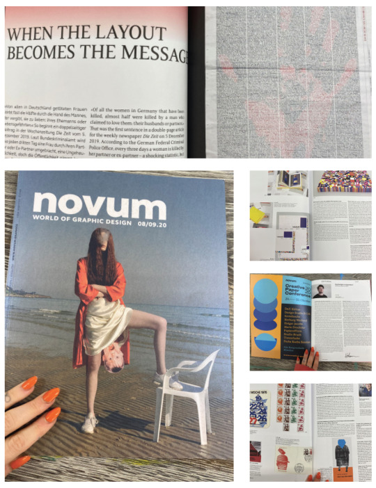
Novum
Novum is a 95 year old graphic design magazine. It read to me more like a conventional newspaper or magazine than some of these other visual communication publications, and in that respect, it followed more layout rules and had more to say, both visually and linguistically, about pragmatic page layout and magazine design.

Aperture
I loved this copy of Aperture Magazine entitled “Ballads of Sexual Dependancy”. The heavy emphasis on serif type and old-fashioned minimalistic black and white layout night only worked to highlight the photography and bring it to life, but also made the text very easy to digest, and the narrative very easy to follow. Mixing typefaces very subtly with a Comic-sans style sans-serif font made subheadings stand out, and very easy to digest.
The margins in this issue of Aperture are wide and lots of empty space is left surrounding the photography. It may have been a nudge to a wide-border photography framing style, or at least that’s how it can feel when you read this issue. Some pages utilise a black background, and these moments are chosen wisely, the photography on said pages curated for maximum visual impact, the vibe becoming even more shockingly lustful and sultry.
This magazine was very tastefully designed indeed, and has given me a lot of inspiration for the Think Global Act Local project.

Varoom
Varoom is an illustration magazine. This issue has got to be one of the most visually intriguing and satisfying magazines I have ever picked up. This issue gave illustrators a chance to show some of their practice with no pressure to show a definite narrative or story tell; simply to illustrate for the sake of it.

Foam
Foam is an internationally published photography magazine - three times a year, a specific theme is chosen, and photography showcased from creatives of all different origins and walks of life. I found this issue’s page layout to be really captivating - it is immersive. It lets you get lost in the worlds of the photos, designing the backgrounds of pages in distinct ways so as to pull you in. I thought the page layout was innovative and quirky. It caught my eye.
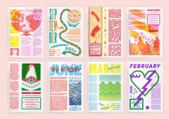
After I’d flicked through some publications, Luna’s idea to have our magazine in duochrome came up. If we used two colours to tie all our different pages together, we could create something very stylistically cohesive, and something the reader could really get lost in - that was a perfect style to print with a risograph printer. I looked at some riso printed publications for inspiration.
These publication pages are all by InkyGoodness.
By Ryan Putnam

By Kate Prior

By Cinema of the Sick

By Mary Universe

Here is an interesting series of book covers I found by Draw Down Books.


The above pages are by Pivot Print.

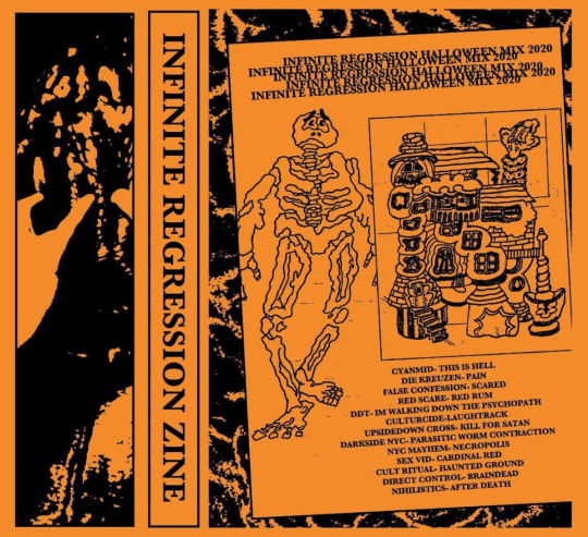
This is a zine called Infinite Regression.
N - M Zine by Waste Studio

Space Invasion by Gemma Davis.


It’s Freezing in LA! a magazine about climate change.


Paradiso magazine by Muse Muse

By Andrej and Andrej

By 6′56

By Travis Kane


Tractor Zine by Tractor Beam (Amazing work! This is my favourite thing I’ve found.)
8 notes
·
View notes
Photo
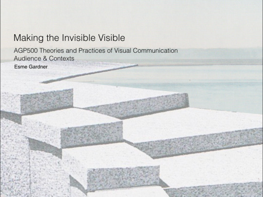
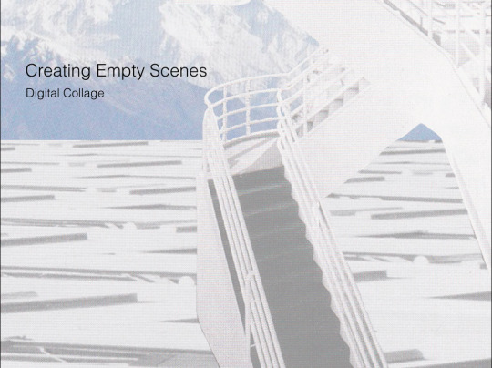
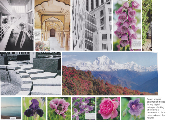


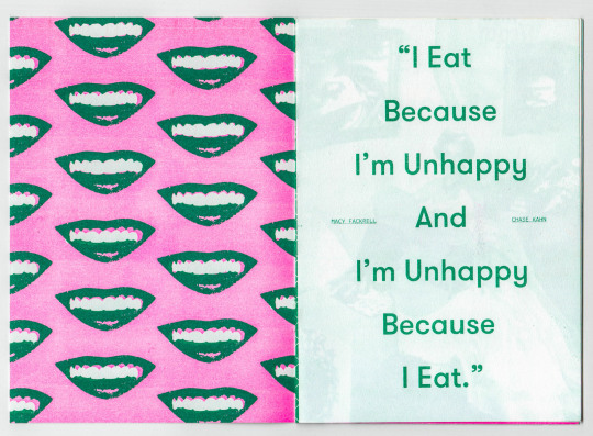
Part 1 of Making the Invisible Visible ideas, development, process, and final outcomes PDF
#making the invisible visible#project 2#semester 1#AGP500#part 1#brightonillustration#digital collage
1 note
·
View note
Photo


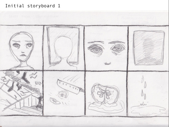
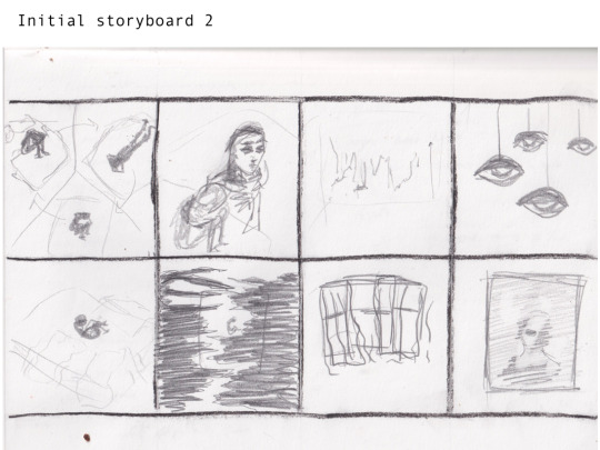
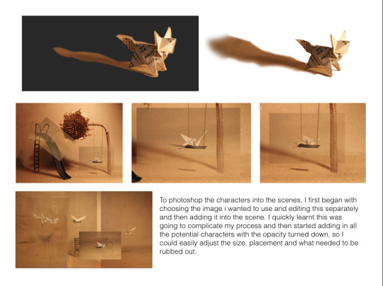
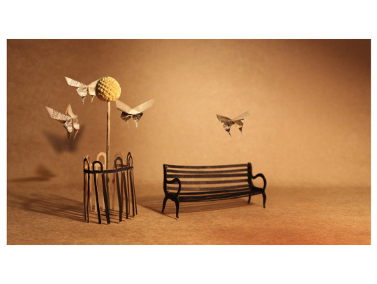
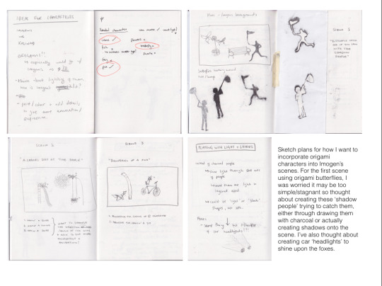
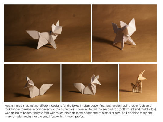
AGP500: Project 3 - Narratives in Motion
STORYBOARD
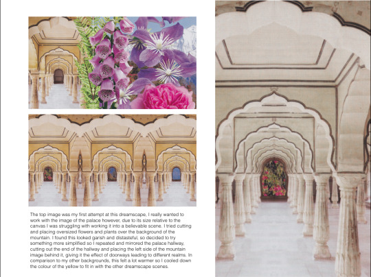
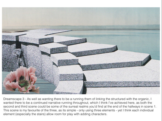
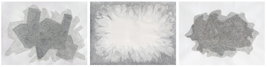
I have drawn out a storyboard that captures the keyframes that are essential to the narrative. This sequence of images that portrays each stage of the animation and how it will flow has provided me great visual reference to go back to and stick with when producing the characters and background. These quick sketches are a foundation for me to build on and develop my ideas and designs as they act as an anchor in the animation.
I used pencil and pen and decided not to include colour as it is just a storyboard since it’s purpose is to lay out the narrative and doesn’t focus on the quality of the drawings. These quick line drawings has provided me an insight on the composition of each section of the animation and the size of the characters and how they fit into the landscape.
1 note
·
View note
Text
Type and Language 2 - Visual research
Because the quote I have chosen is about science, wonder, and the beauty of scientific knowledge and the pursuit of it - I am going to collate some visual research of scientific diagrams, texts, posters etc. I want to use the design elements present in the science world in order inspire me to be able to express the importance and severity of the sentiment I am designing around.

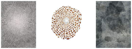
I began by looking at vintage scientific illustrations. There is a very specific and peculiar, gothic aesthetic to them. Due to their need for function over form, they are often meticulously crafted with rulers and compass to keep shapes just correct and symmetrical. The lines used are thin, utilitarian, and distinct, so as to inform the viewer and not confuse them. They are often kept bare and without much flair and experimentation, so that they serve their purpose well and do not distract the viewer. Modern science textbooks are borne with these same principles in mind, yet, as design conventions change, you are more likely to see even barer, stripped back illustrations, and even more likely to see photographs. Serif fonts are more popular in these old textbooks as well, as Sans Serif was yet to come into the world of academia. (More on modern textbooks later!)
A couple of months ago as I was starting to study my artistic anatomy module, I was gifted a set of two medical anatomy textbooks from 1937 and 1939 respectively. They are from the university of Edinburgh, and have some student’s scribbles and notes in them - I’m not sure who.

Doing this visual research has brought me to realise that graphic design is a massively important part of scientific inquiry and explanation.
NASA have some rather beautiful diagrams of their specialist equipment online. Below are a few of them - they feature extreme levels of technical detail, and accurate representations of scale. The extremely fine lines really show their purpose in these diagrams - if you need to display a lot of detail, then you need to draw in such a way that you can show that detail. I love when graphic subcultures are borne of necessity and resource, and diagrams like these are an example of how art styles have developed not through aesthetic means but through way of necessity.


Some designs created for the purpose of scientific exploration have become iconography in and of themselves: chemistry structures are explained by these hexagonal patterns, for example. This symbolism has entered popular culture in realms beyond scientific study. Another example of this taking place is solar system diagrams.


The following images are from a book I’ve had for a decade now. It is called See Inside The Human Body and it’s a science book aimed at teenagers. It has wonderful, detailed, informative illustrations and computer generated images of anatomical structures. It is a great example of how scientific illustrations have progressed from the likes of my 1930s books, to present day. The images are much more vibrant and dynamic, with even greater detail, bright and beautiful images and a really keen eye for texture. There are some pages printed on acetate which overlay others, to show the body’s muscular-skeletal, vascular, and nervous systems in 3 dimensional detail. It is a really wonderfully thought out book.

The graphic designer featured below is named Estefania Loret de Mola. I recently came across her work and I find it very apparent that she has been inspired by scientific diagrams and aesthetics. I have been really inspired by her use of diagrams to express human emotions and I think her work fits perfectly into the theme of my Type and Language project.

Katie Scott, who’s work is below, draws scientific style illustrations of biological beings. I absolutely love this illustration style and the layout of her drawings.

With this visual research taken into account, I think I have a great direction to go towards for artistic style now. Although typography is not a massive part of these visual languages, I want to take the lessons learnt from the design styles of scientific diagrams, illustrations, posters, etc, using their colours shapes and textures, to build up a typographic language and create type work that stylistically exists within the same world as this imagery.

Another designer I have found who uses a pseudo scientific art style is Beaming Design. I really love this art style and I wish to somewhat emulate it.
6 notes
·
View notes
Text
Type and Language 4: Typographic Visual Research

By Dean Montecillo

By Ryan McDonagh

By Milan Doctor

By Solitype

By We’re Not Really Strangers (Love this - type incorporated into the environment. It reminds of me Truisms.)

By Qashka Rulino

By Jerry Lee Bosmans

By Anna Sing

By Alex Valentina

By Jessica Barros

By Scarfolk

WW2 public information campaign

D Day currency change posters


By Paula Scher

1900s American army recruitment poster
4 notes
·
View notes
Text
Documenting 2: Visual Research
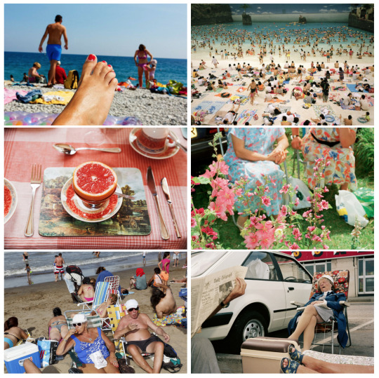
Martin Parr
Martin Parr is an English documentary photographer who is best known for his photography of the tradition of the Great British Holiday. He is probably my favourite photographer in the world, as I love how honestly and candidly he captures life. He has had around 40 solo photobooks published, and has featured in around 80 exhibitions worldwide. When asked about the art of documenting people through photography, and the ethics involved, he said the following:
“I think that all photography involving people has an element of exploitation, and therefore I am no exception. However it would be a very sad world if photographers were not allowed to photograph in public places. I often think of what I photograph as a soap opera where I am waiting for the right cast to fall into place. In more recent years I have photographed much closer where bits of people and food become part of the big picture, and one advantage of this is that it means people are less recognisable.”
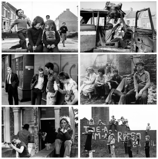
Tish Murtha
Tish Murtha was a Northern English documentary photographer who took black and white photos to create a record of youth unemployment, juvenile jazz bands, kids in Elswick in South Shields, and a series of photos of London by night. Her work is very striking and raw, the black and white photography really adds a sort of grit and solemness to her photographs.
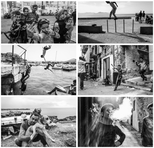
Francesco Faraci
Faraci is a Sicillian street photographer. I think his work is really beautiful and raw, and much like a contemporary version of Tish Murtha’s work.
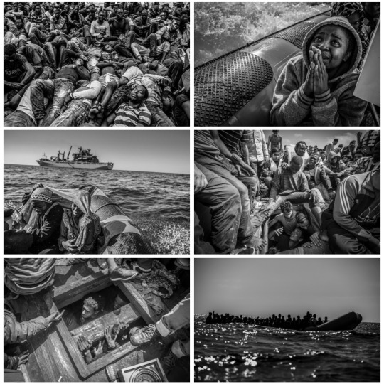
Jason Florio
Jason Florio is an English documentary photographer. This photoseries is called Destination Europe, and it shows the journey of refugees from Libya to Europe. He has done several documentation projects all around the world, and Destination Europe was one that won him a Magnum Photography Award in 2017. These photos are seriously effecting - they are beautiful and devastating, and tell a story brilliantly. This is documentary photography with a real purpose and meaning. These photos are heartbreaking.
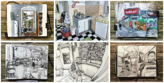
Keir Edmonds
“Berlin-based English urban sketching artist Keir Edmonds keeps a visual diary that illustrates his life as an expat in Germany’s capital. Believing that “you have to put in 10,000 hours to get really good at something,” the self-confessed “Englishman lost in Berlin” carries a sketchbook and pen everywhere he goes. From local architecture to summertime canals and graffiti-covered streets, his growing portfolio captures the undeniable charm of the city.
Edmonds started keeping sketchbook journals in 2015 with the goal to improve his skills in observational drawing.”
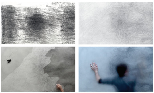
Sam Winston
Sam Winston is an artist based in London, who says his “practice is concerned with language not only as a carrier of messages but also as a visual form in and of itself”. He is known for his typography and his abstract illustration, having worked with some of the biggest art galleries in the world.
These images are from a project he undertook called 7 days - “a long durational studio work where the artist lived without sight for seven days and nights. Repeatedly transcribing five sentences the image created is without any visual reference.”
Sam says, “The idea of going ‘under’ or without images fascinated me. I had read of yogis spending years in complete darkness and psychologists running light deprivation studies but for me the question was - what landscapes are available to the artist when they are only given an internal view for seven days?
Biologically speaking the absence of daylight triggers large hormone imbalances in the pineal glad located in the centre of the brain. This gland normally releases melatonin which is the hormone that regulates sleep - and with this out of balance - you will quickly find yourself operating outside of conventional time.”
This method of abstract documentation is something I find very intriguing. As a designer, you have information input into you and it is your job to translate this meaningfully into the world. If we restrict our outputs and inputs, and put ourselves under strictor creative parameters, then as creatives we we surely find a way to make great work through the power of thinking ourelves out of those restrictions.
1. ‘A durational work where a pencil line records the length of every exhalation. The length of each line marks the length of time it takes to exhale. These marks were recorded over a 15 hour day without break. “The premise is deceptively simple - marking either an exhalation or inhalation with a pencil line - the length of the duration of a breath. Yet the cumulative effect of this action is a map that reveals a unique bridge between our unconscious and conscious functioning. It is also a refocusing of attention to our dependent relationship within the aerobic world.”
2. ‘An on going series of collages looking a various components of drawing. Each image contains one complete pencil.“This is the beginnings of a process looking at the materiality of the objects that inform artistic practice. By literally exploding, dissolving and collaging broken down artists tools we reveal their history and legacy. Whether the pencil graphite is from mines in China or the New Mexican cotton farms that make rag made paper - each artwork is a testimony to a globalized economy and the unseen geography of the tools by which we make art. “‘
3. ‘Birth day is an project that charts the 183,600 lives that come into being on the planet over a period of 12 hours. The participants draw circles to remember loved ones and also register their names in writing. In this way the public are asked to connect their own personal narrative to the much broader theme of population growth and decline.“By the time you’ve read this sentence three people have been born into the world.From observing this process I have noticed that the moment a person draws a circle (and it has a name) the artwork stops being about statistics and becomes a wall of brothers, sisters, mothers etc - in this particular case representing 260,000 lives that are born and die in 12 hours.”’
The text of Shakespeare’s Romeo & Juliet was read and categorised into three emotional states – passion, rage & solace. Once theses these three categories of text were typeset & printed they became the material for three the hand cut collages. The final work is the combined print of the typeset category and the hand cut collage.
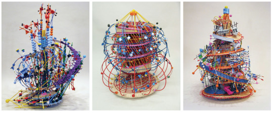
Nathalie Miebach
Boston-based conceptual artist Nathalie Miebach weaves colorful, complex sculptures using rope, wood, paper, fibers, and data from weather events. Two of the artist’s recent series explore the impact of storm waters on our lives and on marine ecosystems, with variables like wind and temperature (and the harmony of the composition) often informing the rainbow of colors used to translate the data into a three-dimensional structure.
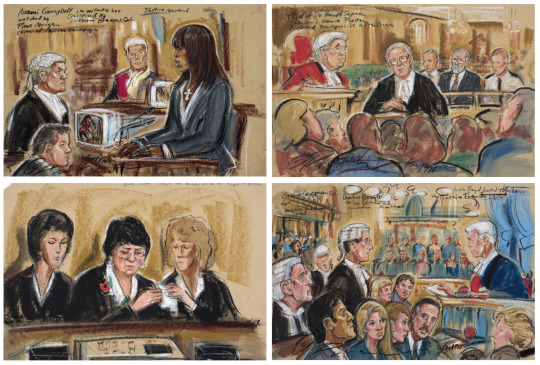
Priscilla Coleman
Priscilla Coleman is a courtroom illustrator. This is a dying art and in the UK there are only four official courtroom illustrators left. “It’s as if you’re memorising for a test,” she tells It’s Nice That. “You forget the details so you have to write something that will trigger your memory. Once I had to draw a line of airline hijackers, and they all had black hair but different hairstyles. One had long sideburns so I wrote Elvis, one was skinny so I wrote ‘skeleton man’, for others I wrote ‘potato nose’ or ‘fried hair’ or for another, I wrote the name of an ex-boyfriend he reminded me of! People’s faces are fascinating.”
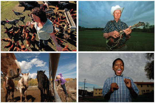
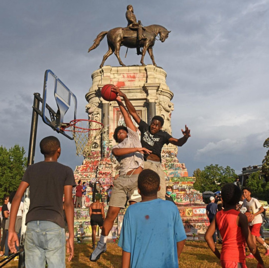
Scott Elmquist
This man is a very inspiring documentary photographer. The last image above is an extremely powerful photograph to me. It shows black youth playing basketball under the defaced statue of a coloniser. Amazing. Above that is part of his Americana documentary photography series, capturing rural midwestern America and it’s communities.
3 notes
·
View notes
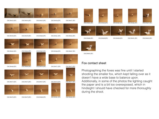
Photo


Part 2 of WORK PLAY WORK development, process, and final outcome PDF
1 note
·
View note
Text
Workshop: Font Design
We had a workshop directed by Jon where we were encouraged to think of strange rules of line behaviour in order to create a font. I found this workshop challenging and intriguing and it has encouraged me to think hard about creating my own dedicated fonts for briefs in the future.


I wanted to make some strange things, so the first font I came up with could only have lines of one shape - a bent sort of crescent moon style.


I then drew this font comprised of mostly bulbous and soft rounded squares with little thin ovals cut out or added. I want to develop this further with an even more limited visual style, but I really like this font, and I want to use it for a project in the future.

Next I made this comprised of lines with a diagonal angle, and little circles to accent it. Every single character had to have that same slash in it. It’s close to unreadable but it feels like some sort of space age hidden language and so I think for visual furniture it could work very well.

I digitised the fonts I had made, and I want to try and use them in context at some point in the near future.


This workshop informed my process during the Type and Language project, as after being inspired by this workshop, I went onto make my own fonts to express myself in that brief.


I learnt a lot in this workshop. I really enjoyed being able to dedicate a whole day to learning a skill that’s somewhat new to me. This day made me realise that in the future I definitely want to pursue font design in my practice, either as a focus or supplement to my other work.
1 note
·
View note
Text
Documenting 7: Rituals
After doing a huge wealth of photography, and finding myself uninspired by much of it, I thought that I would take after Hannah Mullins from my course and give myself a word to use to theme my photodocumentation around: ritual. I also decided to create a more tactile, candid and personal feel to my work by using a polaroid/instax camera to take the photographs.

The word “ritual” has vast meaning and very individualised meaning to different people. It can mean a personal day to day behaviour, or it can mean something as big and bright as religious celebrations. It was interesting to talk to people about the word and figure out their take on it.
In my day to day life I have many rituals. My morning walks; zoning out by cooking dinner; my daily skincare; having baths to calm down. I photographed some friends and their rituals, including my housemates smoking cigarettes, my friend Saphra doing their makeup. I planned to photograph my friend Maya, who celebrates paganism, practicing their religious rites, however, lockdowns prevented me from doing this and also prevented me from planning and executing other shoots.
Instax photography feels very vulnerable and raw, it tends to have a washed out and sensitive quality to it, and it has limitations that make it candid by nature and therefore for a documentary project it felt like a very appropriate method of visual communication. I came out with around 100 images by the end of this project.


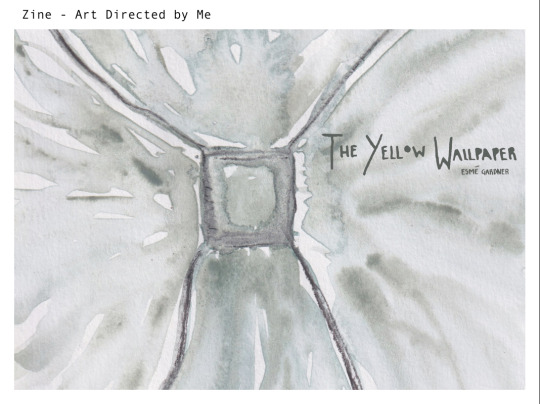
I began designing my zine.
I chose to make an A5 zine because it is around the size of a standard diary or journal, so feels more personal and delicate than A4 for example. I chose the front Metallophile Sp8, mostly in italic, because it felt very delicate. I wanted something that felt personal, understated, delicate and informal, not too serious, but not overtly playful. I chose an accent colour of lilac / light purple to match the bathwater featured in a couple of the included photos. I used black over white to design the magazine, using my accent colour sparingly, and then in order to perpetuate the air of mystery and softness I wanted in the publication, I put over a paper texture which made the colours more washed out and faded the black to grey.
I used procreate to create scribbled designs to give it a hand-made feel to go well with the instax photography. I worked hard to make every page feel different and intriguing within the rules of the publication. The text on the publication includes sections of dictionary definitions of the word ritual, and words taken from friends and acquaintances from mine who told me what the word “ritual” means to them, and if they have any rituals. I found a big variety of responses to the word, some even talking to me about their OCD rituals and how those uproot the lives of OCD sufferers.
As an exercise in image placement on pages, I found the making of this zine very valuable, and I hope that the ebb and flow that I wanted to be read from it is there for the viewer. I think it has good pacing when read as a booklet. I am looking into making a run of prints of it.


The front cover was difficult to come up with as I am always turned off of including too much information in a front cover. I kept it very simple and sleek and elegant. I think that ultimately I have made a very stylish and attractive, meaningful and communicative publication that I like very much. After seeking feedback from my peers I was met with mostly very warm praise for it. I am proud of the final product of this project.
1 note
·
View note
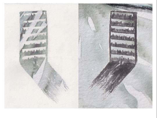
Text
Type and Language 1 - Choosing a quote, planning my project, brainstorming.
Selecting a quote for this briefing was something I tried to get done very quickly so that I could begin making work fast. At first I thought of doing the following quote by Bill Hicks:
“The world is like a ride in an amusement park, and when you choose to go on it you think it's real because that's how powerful our minds are. The ride goes up and down, around and around, it has thrills and chills, and it's very brightly colored, and it's very loud, and it's fun for a while. Many people have been on the ride a long time, and they begin to wonder, "Hey, is this real, or is this just a ride?" And other people have remembered, and they come back to us and say, "Hey, don't worry; don't be afraid, ever, because this is just a ride." And we … kill those people. "Shut him up! I've got a lot invested in this ride, shut him up! Look at my furrows of worry, look at my big bank account, and my family. This has to be real." It's just a ride. But we always kill the good guys who try and tell us that, you ever notice that? And let the demons run amok … But it doesn't matter, because it's just a ride. And we can change it any time we want. It's only a choice. No effort, no work, no job, no savings of money. Just a simple choice, right now, between fear and love. The eyes of fear want you to put bigger locks on your doors, buy guns, close yourself off. The eyes of love instead see all of us as one. Here's what we can do to change the world, right now, to a better ride. Take all that money we spend on weapons and defenses each year and instead spend it feeding and clothing and educating the poor of the world, which it would pay for many times over, not one human being excluded, and we could explore space, together, both inner and outer, forever, in peace.”
It’s very long, but I think it’s a very beautiful and well meaning piece of spoken word. Bill Hicks was a comedian-philosopher, and he was a very influential person in the formative years of my life from about 10 years old onwards. Definitely too young to be listening to Bill Hicks, but hey - his words really stuck with me and I think this quote is a very important one in my life.
I thought I could do something funny like this quote from Come Dine With Me:
Dear Lord, what a sad little life, Jane. You ruined my night, completely, so you could have the money, but I hope now you spend it on getting some lessons in grace and decorum because you have all the grace of a reversing dump truck without any tyres on.
But ultimately, I didn’t have faith that I would really be able to get excited about it!
I finally settled for this quote by Robert Sapolsky, a human behavioural biologist:
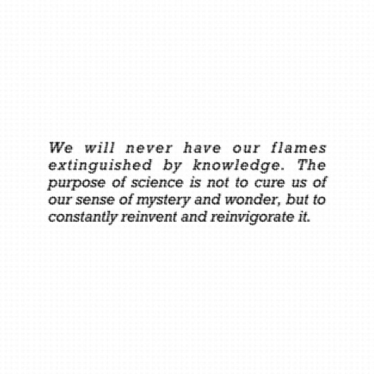
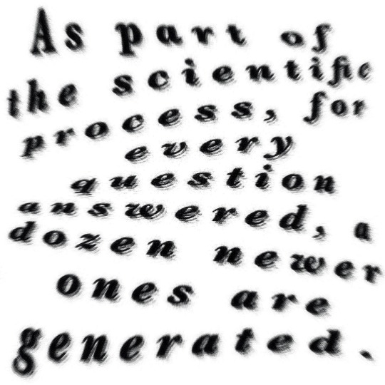
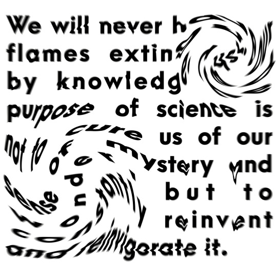
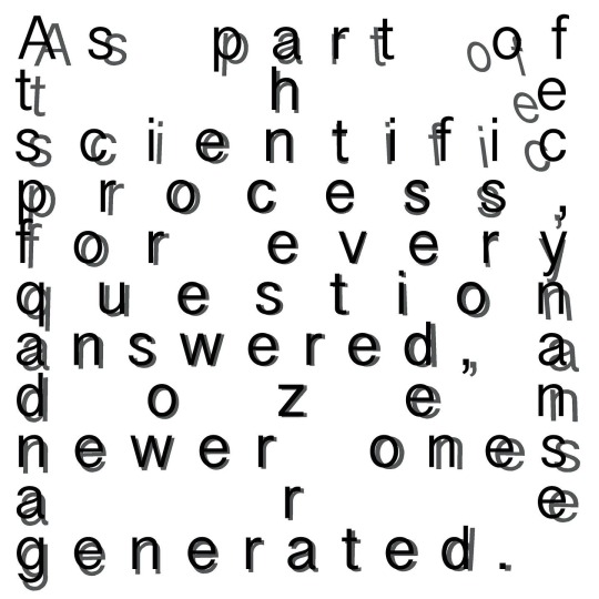
I am not worried if scientists go and explain everything. This is for a very simple reason: an impala sprinting across the Savannah can be reduced to biomechanics, and Bach can be reduced to counterpoint, yet that does not decrease one iota our ability to shiver as we experience impalas leaping or Bach thundering. We can only gain and grow with each discovery that there is structure underlying the most accessible levels of things that fill us with awe. But there is an even stronger reason why I am not afraid that scientists will inadvertently go and explain everything--it will never happen. While in certain realms, it may prove to be the case that science can explain anything, it will never explain everything. As should be obvious after all these pages, as part of the scientific process, for every question answered, a dozen newer ones are generated. And they are usually far more puzzling, more challenging than than the prior problems. This was stated wonderfully in a quote by a geneticist named Haldane earlier in the century: "Life is not only stranger than we imagine, it is stranger than we can imagine." We will never have our flames extinguished by knowledge. The purpose of science is not to cure us of our sense of mystery and wonder, but to constantly reinvent and reinvigorate it.
It’s very long, so I chose from it the most effecting and important sentences, and I was left with the following.
I am not worried if scientists go and explain everything. It will never happen. It will never explain everything. As part of the scientific process, for every question answered, a dozen newer ones are generated. And they are usually far more puzzling, more challenging than than the prior problems. Life is not only stranger than we imagine, it is stranger than we can imagine. We will never have our flames extinguished by knowledge. The purpose of science is not to cure us of our sense of mystery and wonder, but to constantly reinvent and reinvigorate it.
Robert Sapolsky lectures on human behaviour, taking information from many different scientific avenues, including biology, endocrinology, sociology, criminology, neuroscience, etc, to build a massive and complex picture of why it is humans behave the way we do, looking at our behaviour through multiple lenses and disciplines, and combining them in order to answer some of the biggest philosophical questions, including questions about free will, about love, about hatred and forgiveness and family.
He is one of the biggest influences on my outlook towards life and my trauma and mental health recovery, because not only are his teachings grounded in extremely interesting research and knowledge, but they are able to explain and open up discussions some of the most confusing and difficult parts of the human experience. Sex, love, violence, free will, tribalism, trauma, fear - Sapolsky tackles all of these terrifying and wonderful parts of our lives with such grace and poise and intelligence - his lectures have coloured my world with a newfound respect for myself and those around me.
He delivers this quote or similar at the end of one of his books and in his lecture series, to help clear up some of the biggest fears that people have of scientific knowledge, and it is a sentiment that I hold very dear to my heart. We should not fear advancement and knowledge. It can only enrich our lives, and a better understanding of myself as not just another person in society, but my very own series of complex and intricate biological mechanisms, has completely enriched my life.
I began by experimenting with very basic black and white type designs on Procreate on my iPad. I tend to jump straight into making before I do research, or much thinking at all, because it is often the case that I can come up with some very raw, messy, and interesting visual ideas. The first few attempts I have at a task like this can really inform where my project will go, what I would like to work on over the duration of the project, and what techniques will or won’t help me.
I often start projects in black and white because it is a very basic and simple building block foundation for the shapes in the work, and makes it so that more complex parts of a visual identity can be added later, giving me more time to think about colours and textures before going ahead with them.


I had fun warping text like this - it makes the writing mysterious and mostly illegible. It did not yet communicate effectively, however, and I had a talk with Sarah to better discuss where to go with this project.
Sarah told me to really think about WHO said the text, and WHY. To ask questions about WHAT I am trying to convey. How will I bring the message of the words to life? How can I use type to emphasise and better explain the language being spoken? How can I use typography as not just a fun image, but a visual tool to really hammer home the intent behind the words being spoken?
Sarah advised me to sketch out “how to quote acts”, how it moves and it feels. Also to question, how do I want people to react to this type?
With this higher level of specificity, I was able to think much more clearly about the task at hand. My plan now was to take certain important words from my quote, and do visual research surrounding them. To really give this project a microscopic view to begin with, I am going to focus on smaller fractions of the text, to begin to build up a catalogue of how those words really feel, act, and speak to a reader. I need to bring into question, how can I communicate better using type? How can I make somebody listen with my typography? How can I use my skillset as a designer to translate information into something visually consumable and interesting to look at?
Once I’ve done visual research and sketches focusing on the very zoomed in parts of this quote, I am going to try to visualise those in context of Sapolsky’s life and teachings. He started off his practice as a field scientist, living amongst primates, and studying their movements. He went on to combine this knowledge with laboratory work, studying hormones and neurodevelopment in rats and analysing other studies. He now, on top of all of this, lectures at Stanford, and has written multiple books on the subject of human and animal behaviour, for the casual reader and scientist alike.
How can I represent Sapolsky’s life with design? Can I start off the quote as rough and messy and dusty and animalistic, representing the time he spent amongst apes in the jungle - then developing it into something very neat, tidy and clinical like his lab studies are? Can I make 2 different designs to represent these, then overlay them? Use colours to represent the two different stages of his practice? Can I make this into a screenprint? A series of 2 or 3 posters?
Or could I make a typographic mural to go on the wall at Stanford or another institute of science? A series of posters? A small book or leaflet? An animation? Who am I aiming it at? Over the next few days I am going to collate visual research and express it as a series of typographic works.
1 note
·
View note
Photo
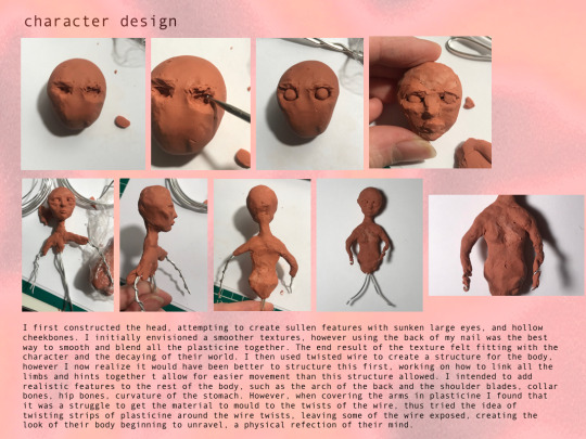
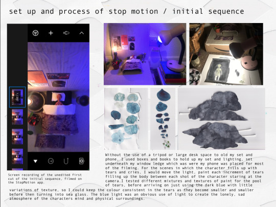
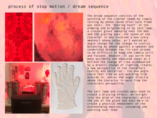
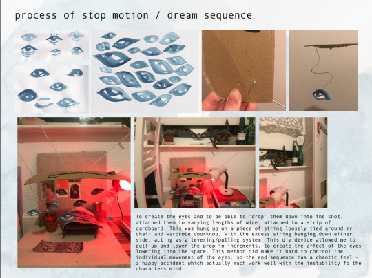

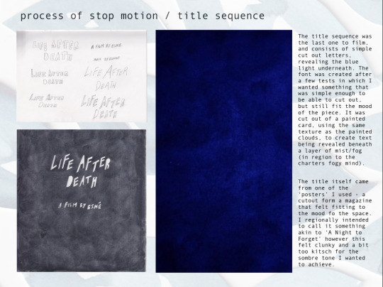

Part 2 of Narrative in Motion ideas, development, process and final outcomes PDF
0 notes
Photo
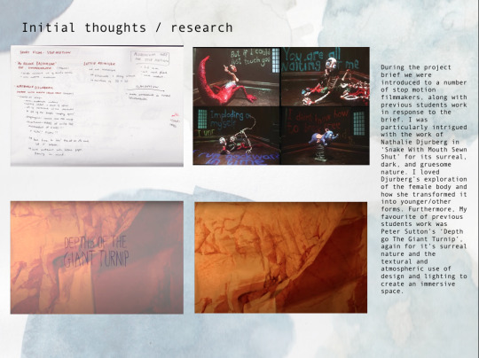
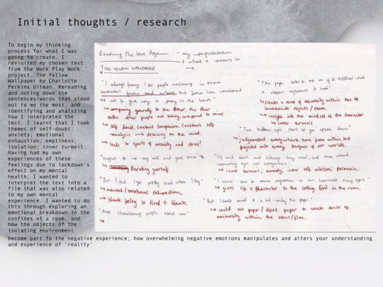


Part 1 of Narratives in Motion ideas, development, process, and final outcome PDF
0 notes
Photo


Part 3 of Making the Invisible Visible ideas, development, process, and final outcomes PDF
0 notes
Photo


Part 2 of Making the Invisible Visible ideas, development, process, and final outcomes PDF
0 notes
Photo

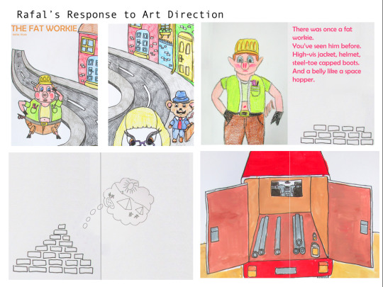


Part 3 of WORK PLAY WORK development, process, and final outcome PDF
0 notes
Photo
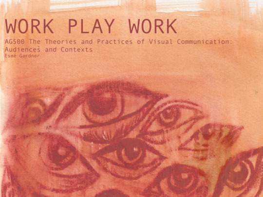


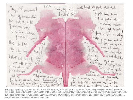


Part 1 of WORK PLAY WORK development, process, and final outcome PDF
0 notes
Last Seen Blogs

captainspirits
Rock Facts
sporadichearttcollector
do what makes you happy
captainspirits
Rock Facts
sporadichearttcollector
do what makes you happy

captainraisinghopestoreblog-blog
RaisingHope_Store