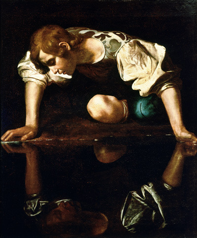
#7: narcissus by caravaggio
Explore tagged Tumblr posts
Note
for the artist ask: 4, 5, 7 and 19 <3
4. Favourite things to draw?
glasses have always been fun for me to draw, they're the one thing I can manage pretty easily on my own. and you didn't ask for a least favorite, but I'm gonna say it anyway, and it's noses. fuck noses. they're the one thing keeping me from trying to draw like actual art. just. I hate noses.
5. Anything you haven’t drawn yet but want to?
I would really like to try more realistic pieces, but I honestly could never do that. I don't have the talent or patience for it, so I dunno if that would ever happen 🤷🏻♀️
7. Favourite works of all time excluding your own?
if we're talking like. historically? rembrandt is my favorite painter, anything by him is gold. I also enjoy caravaggio's narcissus, I'm just a baroque fan in general.
if this is about other fan stuff, I'm obviously a huge fan of your stuff, moon! I adore your style and the way you capture emotion so well, and even just your little doodles are always a pleasure to look at. and not just your fan stuff, I really love everything you draw, and it's very cool that you share it with us, so I thank you for that 🫂
19. Favourite character(s) to draw?
this feels like such a hard question to answer since my depictions of characters never actually look like the people they're supposed to look like, but of the things I have drawn, I think kendall is the one I have the most fun with. stewy is hard for me since I struggle with facial hair.
art is never something I've really been good at, really, and I'm fine admitting it since it is so obvious, but it's something I do and I occasionally have fun with it. I am hoping that I can eventually get better at it, but I don't know lol
#to get an ask from THE moon... pinch me i must be dreaming#thank you so much this was fun to think about#asks#moon tag
6 notes
·
View notes
Text

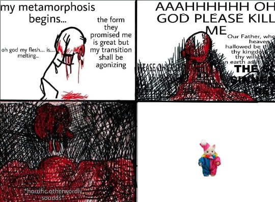
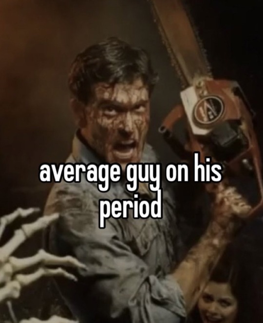
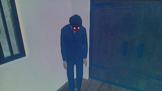
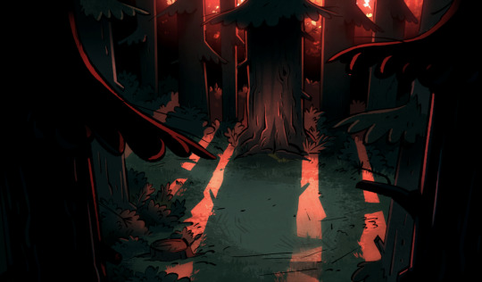



gender
#gender#transgender#transmasc#pic 1: disco elysium quote from measurehead#2: a meme i made#3: a meme about babygirl ash williams from evil dead#4: screenshot from the game The Fridge is Red#5: background from Gravity Falls episode dipper and mabel vs the future#6: another disco elysium quote#7: narcissus by caravaggio#8: deer shedding the velvet of its antlers i had saved on my phone#9: yet another disco elysium quote#10: sam raimi talking about his rules of horror#transmascs i invite you to add ur own. lets gender together#evil dead#ash williams#og
121 notes
·
View notes
Text
March Prompts
1. sailboat 2. younger brother 3. falconry 4. attacker 5. squad 6. recklessness 7. tiramisu 8. ruined birthday 9. worm moon 10. naiad 11. cost of this love 12. hobby 13. fancy dinner 14. bloated 15. caravaggio 16. neck bite 17. glitter 18. blinding 19. tiers 20. first day of spring 21. nail polish 22. narcissus 23. getting away 24. unreadable 25. repulsive 26. class clown 27. embarrassment 28. surgery 29. monitor 30. Jason 31. voyage home
236 notes
·
View notes
Text



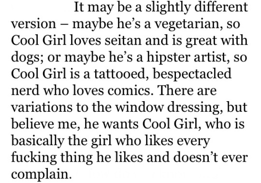
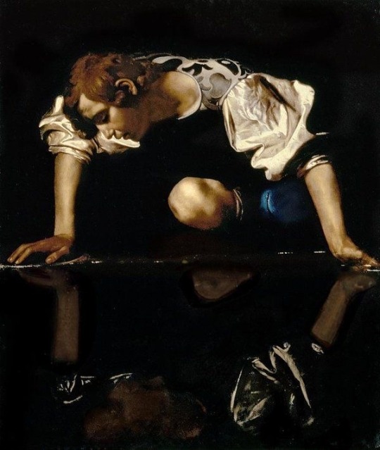

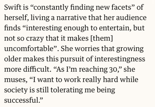


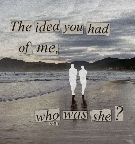
1. mirrorball, taylor swift // 3, 7. ‘taylor swift's documentary shows why we should stop trying to be ‘interesting,’’ andré spicer // 4. gone girl, gillian flynn // 5. narcissus (1597-99), caravaggio // 6. all too well (10 minute version), taylor swift // 8. mariners apartment complex, lana del rey // 9. ‘lana del rey hottest record, radio 1’s future sounds with annie mac’ (sept. 12, 2018), bbc radio 1 // 10. ig @almart_8
~ “i can change everything about me to fit in”
#web weaving#parallels#connections#lyrics#quotes#art#books#words#visual diary#visual art#mirrorball#taylor swift#folklore#swifties#swiftblr#cool girl#gone girl#gillian flynn#all too well#all too well 10 min version#taylor’s version#mariners apartment complex#lana del rey#feminist thought#radical feminism#radblr#feminist theory#feminism#collage#collage art
303 notes
·
View notes
Text
Harvard Reference & Bibliography
References
- Week 5
Michael Powell. (1947). Black Narcissus. Available: https://www.theyoungfolks.com/review/36083/the-film-canon-black-narcissus-1947/. Last accessed 15/12/2019.
Michael Powell. (1946). A Matter of Life and Death/Stairway to Heaven. Available: https://stairwells.org/stairs-in-film-a-matter-of-life-and-deathstairway-to-heaven/. Last accessed 15/12/2019.
Johannes Vermeer. (1657-1659). https://en.wikipedia.org/wiki/Girl_Reading_a_Letter_at_an_Open_Window. Available: https://en.wikipedia.org/wiki/Girl_Reading_a_Letter_at_an_Open_Window. Last accessed 15/12/2019.
Tom Hunter. (1998). Woman Reading Possession Order. Available: https://www.saatchigallery.com/artists/tom_hunter.htm. Last accessed 15/12/2019.
-------------------------------------------------------------------------------------------
Bibliography
- Videos
- Week 5
https://www.bbc.co.uk/programmes/p00hqprn
https://www.youtube.com/watch?v=WZ7UwnfQ2nA
- Week 4
https://www.youtube.com/watch?v=Z6Dx-o3vfJY
https://www.youtube.com/watch?v=qfZm_lwJaD8
- Week 3
https://www.youtube.com/watch?v=7qFF2v8VsaA
- Week 2
https://www.youtube.com/watch?v=j_Sov3xmgwg
https://www.youtube.com/watch?v=fas0b3YRqDY
- Week 1
The Revenant (2015)
https://www.youtube.com/watch?v=LoebZZ8K5N0
Gravity (2013)
https://www.youtube.com/watch?v=_KJHRF6RlTQ
Birdman (2014)
https://www.youtube.com/watch?v=uJfLoE6hanc
Halloween (19978)
https://www.youtube.com/watch?v=xHuOtLTQ_1I
Harry Potter and the Deathly Hallows Part 2 (2011)
https://www.youtube.com/watch?v=ITqYqMNF4R8
Avengers (2012)
https://www.youtube.com/watch?v=XlxILSc5XhM
Inception (2010)
https://www.youtube.com/watch?v=8PhiSSnaUKk
- Websites
https://www.premiumbeat.com/blog/7-basic-after-effects-skills/
https://www.adobe.com/uk/products/premiere.html?gclid=CjwKCAiAsIDxBRAsEiwAV76N89eiqPaPPQY3Z-QwjjqV5Mx7uWS2QTW8zCgkZ2QW7-dht5I_hmMp4RoCT5EQAvD_BwE&sdid=88X75SKR&mv=search&ef_id=CjwKCAiAsIDxBRAsEiwAV76N89eiqPaPPQY3Z-QwjjqV5Mx7uWS2QTW8zCgkZ2QW7-dht5I_hmMp4RoCT5EQAvD_BwE:G:s&s_kwcid=AL!3085!3!385303419011!b!!g!!%2Badobe%20%2Bpremiere
https://filmglossary.ccnmtl.columbia.edu/term/deep-focus/
https://www.studiobinder.com/blog/shallow-focus/
https://digital-photography-school.com/shutter-speed/
https://digital-photography-school.com/aperture/
https://www.premiumbeat.com/blog/how-low-key-lighting-can-instantly-make-your-film-dramatic/
https://www.premiumbeat.com/blog/how-low-key-lighting-can-instantly-make-your-film-dramatic/
https://digital-photography-school.com/introduction-to-white-balance/
https://en.wikipedia.org/wiki/Syndics_of_the_Drapers%27_Guild
https://en.wikipedia.org/wiki/Martha_and_Mary_Magdalene_(Caravaggio)
- Books
Adobe After Effects 2019 Beginner Tutorial - Getting to know your workspace
Adobe Premiere Pro 2019 Beginner Tutorial - Your Workspace
Adobe Photoshop 2019 Beginner Tutorial - Masking
Canon EOS Rebel T5i/700D For Dummies
Color Correction Handbook: Professional Techniques for Video and Cinema (Digital Video & Audio Editing Courses)
Cinematography: Theory and Practice: Image Making for Cinematographers and Directors
Lighting for Cinematography: A Practical Guide to the Art and Craft of Lighting for the Moving Image
1 note
·
View note
Text

JUPITER’S CURSE
An original short story about a girl named Jupiter, the demigod Narcissus, and a little bit of ghost-like possession.
Genre: fantasy, sci-fi, comedy
Tags: greek gods, possession, alcohol, supernatural, enemies to friends (ish)
Rating: T for language
///
Jupiter stared into her glass. The bright lights in the club danced over her skin, turning it all sorts of colors. She felt wobbly. How much had she had to drink?
She stumbled when Maggie crashed into her, laughing.
“I’m twenty three!” She half yelled, half sang into her friends ear, “Nobody likes me! I’m having such a great time, Jupe! Dance with me!”
“Do you know how many drinks I’ve had?” She yelled back. She tried to keep her balance, but Maggie was dragging her towards the dance floor too fast. She spilled her drink. Her hand jerked wildly, clear liquid spilling onto the floor.
“Huh? I dunno, why?”
“I feel drunk,” she said, holding onto Maggie for support, “I have to go.”
“Woah, woah, woah, what, do you feel bad? Do you think somebody did something to your drink?”
“No, it’s not that. I can’t have more than a drink or two. I only had two, why do I feel so drunk?”
Maggie took the glass from her hand, sniffed it, took a sip. She made a face and coughed. “Ugh! Can’t you taste how strong this is? Did you drink the whole thing?”
Her heart dropped. “Is it really strong?”
“My throats still on fire.”
Shit. The bastard messed with her taste buds. Since when could he do that?
I’ve been hiding that trick for a while, said a smooth voice in her head, let me out!
Resisting the urge to clutch her head, she ran to the bathroom.
“I have to pee!” she yelled, hoping her friend wouldn’t follow her. Mercy of mercies, there wasn’t a line. She ducked in, latched the door, and clutched the bathroom sink, staring at her reflection.
Son of a bitch.
“You asshole,” she told her reflection, “You asshole!”
You know, botox doesn’t cost much. I’m not saying you need it but if it’s not broke, fix it before it is, right?
“God I hate you. I hate whatever it is I did that cursed me with you.”
She looked at the corners of her eyes in the mirror. She didn’t even have wrinkles.
Not yet, said the voice.
“I’m puking. Bye.”
The voice laughed. Too late for that! It’s already in your system, sweetheart. Don’t worry, i’m not gonna get a haircut like last time. I’m just gonna party and show Maggie what a good friend you are.
She couldn’t believe this. The sink jerked in her hands, and she gripped it tightly to avoid falling. She never should have ordered a drink. She should have—
“Oh calm down,” he said with her mouth. With her hand, he began to fix her lipstick. “You’ve been standing in the corner like a wallflower the whole time. Why do you think she dragged you out onto the dance floor? You were being a huge bore.”
Great. Now she was stuck inside her own mind, a prisoner for at least eight hours until either the alcohol wore off or Narcissus got bored.
“Listen, it’s not exactly my idea of a fantastic time either. You think I want to be stuck inside the body of a twenty year old girl? I used to be gorgeous. And, to top it off, I can only come out when you’re drunk.”
Don’t even think of getting botox, or lip injections, or whatever! My face is fine, I like myself just the way I am.
“That’s a great outlook! And you should. I was only kidding about the botox anyway.”
Stop fixing my lipstick, it’s fine. You’re putting too much, my lips aren’t that big.
“It’s called over lining,” Narcissus said, finally capping the lipstick and slipping it inside her purse, “it’s supposed to make your lips more plump. You look great. I look great. Let’s party. Ooh, wait what’s this?”
Taking her hand out of the bag, Narcissus held her cellphone.
He looked in the mirror, met eyes of their reflection.
“Selfies!”
They spent a ridiculous amount of time taking selfies. Jupiter hated to admit it, but her lips really did look great. And for being a thousand year old demigod, Narcissus took amazing selfies.
At least she got a great profile pic out of tonight.
“See? I’m not that bad once you get to know me.” He said, opening the door. A girl rushed past them, and if Jupiter could, she would have blushed with embarrasment.
Jupiter scoffed. I don’t mind knowing you. I mind that I can’t control my body right now. Can’t you possess someone else?
Narcissus got another drink at the bar and paid for it. “If I could, believe me, I would. It’s only been a few weeks, give it some time. Dionysus’ curses usually last about three months anyway. I’ll be gone before you know it.”
Dionysus? You got cursed by Dionysus?
“Yeah,” he said, twirling a lock of hair around their finger, “Why else do you think this only happens when you’re drunk? He probably picked you because you never drink. If it weren't for your friend Maggie, I’d still be stuck in your head. I should thank her.”
Three months? They were stuck together for three whole months?
If Jupiter had control of her mouth, she would have cursed herself.
“Hey Jupe! Are you feeling better?” Maggie said, surprising them. Her birthday crown was askew, and they fixed it for her.
“I am! Now that i’m here. I mean, now that you’re here, birthday girl. Do you wanna dance?”
Maggie squealed, definitely tipsy, and led them to the dance floor.
Jupiter hated to admit it, but even stuck in her own mind, she had a good time. She could still see, hear, and feel everything that they did. And seeing her friend happy on her birthday made her happy.
See? Narcissus thought, I told you we’d show her a good time.
Yeah, Yeah, now hush. This is our favorite song.
Unfortunately for her, Narcissus kept drinking throughout the night. She wasn’t sure if it was because they were there, and he thought they might as well drink, or if he was trying to appease Dionysus somehow by consuming alcohol. Now that she knew he wasn’t thrilled by their predicament either, maybe he was doing all he could to undo it?
In the morning she woke up on Maggie’s bed, still in her party dress. She rose to get up and stopped, instantly regretting it when her head throbbed monstrously.
Sorry, that one’s my fault. They were good drinks.
“Ugh. They were.” she groaned.
She tried again, tasting her own breath and wishing Narcissus had the foresight to brush their teeth before they passed out. She found her spare in the bathroom, and tried to be quiet while Maggie was still asleep.
“Look,” she said, toothpaste dripping from her mouth and falling in a foamy mess on the sink, “If we’re gonna be like this for another two months, we need some ground rules.”
Ugh, Narcissus said in her mind, rules are boring.
“Yeah, well, I don’t like that you’re scheming every night to get me drunk. So what about this,” she paused to rinse her mouth with water, and spat.
“Every Saturday, we can get drunk. You can come out, you can do what you want. But only one drink for you. I can’t keep waking up with headaches, I just can’t.”
Only every Saturday? That’s a whole week i’m stuck in here!
“Well I don’t like the idea of getting drunk every day! I’m the one that wakes up hungover, not you!”
Narcissus grumbled in her head. Okay, fine. But a week? That’s literally torture.
Jupiter crossed her arms, looking down at her reflection. “Take it or leave it. It’s either that, or you’re stuck in there for two months.”
Fine, it’s a deal. Every Saturday. But we’re getting drunk in the morning. That way, I get the whole day.
Jupiter didn’t like the idea of giving up her body for an entire 24 hours, but she supposed it was only fair. Narcissus would be stuck in her a whole week.
It was fair.
From the other side of the door, Jupiter could hear Maggie moving around.
“Jupe? Who are you talking to?”
“I’m calling the bank!” she lied quickly, “They have a phone tree.”
“Ugh, I hate those! Hey, let’s go get some breakfast. And some breakfast drinks.”
Hey, Jupe, Narcissus said, a smile in his voice. You have to. Because guess what day it is?
Jupiter groaned. She walked right into that one.
Today was Saturday.
------------------------------
Thanks for reading! If you liked the story, consider donating to my Patreon here, or checking out my blog for more short stories and poetry! You can also find me on Instagram here.
Photo Credits:
1. Amazon
2. Narcissus (Caravaggio)
3. neonteenscult on tumblr
4. Imgur
5. Maybelline, Via google
6. Tumlblr, via google
7. Made by me in Gimp
8. Bacchus (Caravaggio)
9. Via google
#short story#fic#alt lit#spilled ink#fantasy#supernatural#greek god#narcissus#greek myths#myths#new adult fiction#new adult#ya fic#ya lit#jonnyblackwrites#heenawrites
8 notes
·
View notes
Text
Bibliography
Week 1
ADAM CHITWOOD . (2016). ‘The Revenant’: Watch a 44-Minute Documentary on the Making of the Oscar Contender. Available: https://collider.com/the-revenant-behind-the-scenes-documentary-leonardo-dicaprio/. Last accessed 3/1/20.
https://www.pinterest.com.au/pin/48273027234672994/
Jonathon Romney. (2015). Birdman review – Michael Keaton goes a long way to restoring his reputation. Available: https://www.theguardian.com/film/2015/jan/04/birdman-alejandro-gonzalez-inarritu-review-michael-keaton. Last accessed 3/1/20
https://youtu.be/JLFn_wD2B8I
STEFAN KYRIAZIS. (2016). 'Mike Myers is a rude, nightmare diva who made our lives miserable' says co-star. Available: https://www.express.co.uk/entertainment/films/725400/Mike-Myers-diva-cat-in-the-hat-amy-hill-great-indoors-stephen-fry. Last accessed 3/1/20
Freddie Carus. (2014). Group 7 - Foundation Production. Available: http://twgsbmedia15asgroup8.blogspot.com/2014/12/fc-opening-sequence-analysis-halloween.html. Last accessed 3/1/20
JOHNATHAN PAUL. (2016). Frame a High-Angle Shot Like a Master Cinematographer. Available: https://www.premiumbeat.com/blog/frame-high-angle-shot-professionally/. Last accessed 3/1/20
TANNER SHINNICK. (2019). Cinematography Tips: Four Ways to Use a Low-Angle Shot. Available: https://www.premiumbeat.com/blog/4-ways-improve-low-angle-shots/. Last accessed 3/1/20
Week 2
https://youtu.be/IDncPo0MER4
Week 3
https://youtu.be/2_LzS3_vjeA
https://youtu.be/dxdAMjLEbXk
https://nrc.instructure.com/courses/244/pages/week-3-cinematography-tasks-in-the-powerpoint?module_item_id=15685
BILLY FONG. (2019). Masterpiece Disrupted — With Women Artists Snubbed for Too Long, Institutions Look to Right Sins of the Past. Available: https://www.papercitymag.com/arts/masterpiece-disrupted-women-not-recognized-art-greats-da-caravaggio/. Last accessed 5/1/20
Marissa Fessenden. (2019). Dutch Museum Shows Every Single Last Rembrandt in Its Collection. Available: smithsonianmag.com/smart-news/dutch-museum-shows-every-single-rembrandt-its-collection-180971513/. Last accessed 5/1/20
Nathaniel Hood. (2014). The Film Canon: Black Narcissus (1947). Available: https://www.theyoungfolks.com/review/36083/the-film-canon-black-narcissus-1947/. Last accessed 10/1/20
n/a. (2012). Stairs in film: A Matter of Life and Death/Stairway to Heaven. Available: https://stairwells.org/stairs-in-film-a-matter-of-life-and-deathstairway-to-heaven/. Last accessed 10/1/20
https://en.wikipedia.org/wiki/Girl_Reading_a_Letter_at_an_Open_Window Last accessed 10/1/20
n/a. (). Tom Hunter. Available: https://www.saatchigallery.com/artists/tom_hunter.htm. Last accessed 10/1/20.
Week 4
https://youtu.be/yVb0mfmMV9w
Week 5
https://www.bensound.com/
Week 6
https://youtu.be/SYoJPto-YZQ
Week 7
https://youtu.be/lJ6RzitZ9FU
https://youtu.be/3hyIi3HawkQ
https://youtu.be/2eX4HNXXUeA
Week 14
https://youtu.be/KJ3GZimKMqw
0 notes
Text
Week 3- Lighting and Cinematography

(Image 1)
Cinematography, is the the art of photographing a moving film, in other words its a way of describing a way of making films that shows off whats in each scene by capturing the film image that the script as required, with help by the director, and as such most of the work for capturing the film is left up to the cinematographer, with this in mind, the cinematographer has a lot of creative freedom when it comes to how the film looks and feels, and the director has a lot of work when it comes to hiring a cinematographer
When setting a scene, weather it be for film making or photography, lighting is one of, if not, the most important aspect of how one sets a scene up, the lighting can determine how the viewer interpenetrates the image, weather it be positive or negatively, but it can also be used effectively without meaning to fully and effectively light a subject within the frame and create something that looks realistic, or something that looks unnatural and other-worldly. Lighting can be used in a viratity of different ways and with the several key lights that allow for customisation and experimenting, with the lights available. Much of the modern interpretations of lighting in cinema and photography come from how the classic painters used their lighting and why they thought it was important to frame the right subjects in the correct lighting to create mood and atmosphere in an image.
TASK 1:
http://www.bbc.co.uk/programmes/p00hqprn
In this interview with Martin Scorsese, he talks about the painter Caravaggio and how influential he is to his own movie works, talking about how powerful the images presented on screen are, and how his use in colours or lack there of, and the effective use in composition allows for a shift in subjects, as an example, when Scorsese talks about the “Conversion of Saint Paul” he mentions the use in composition, having the horse “become the image” effectively making the horse the main subject of the painting, rather than having the main subject be Saint Paul, this use in composition to have the audience focus on various different subjects has made its way into many of Scorsese's works
(Image 2)

(Image 3)
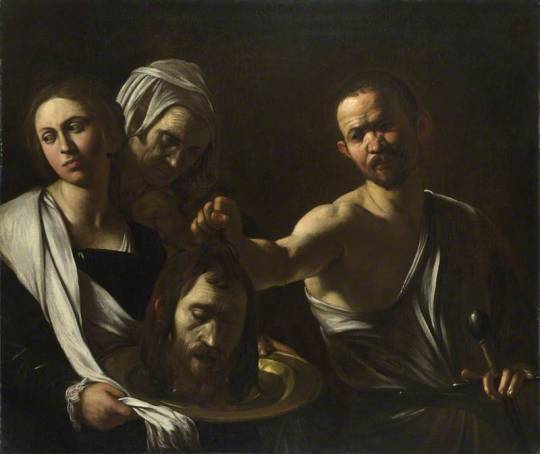
In these two examples, (Image 2 being Scorsese’s film “Silence” 2016) You can see how the use of warm colours and dark harsh shadows have been influenced by the works of Caravagggio- Salome Receives the Head of Saint John the Baptist. The main subjects faces are mostly shrouded in shadow, with only one of the females in Caravaggios works being shown in mostly light, this give the females an almost innocent look to them, whilst the male subjects are shrouded in harsh shadows, giving them a darker, more sinister look to them, which is fitting for the painting, meanwhile in Silence, the main subject is shrouded half and half, fitting the tone of the film, as he’s a priest but also has dark thoughts throughout the film, leading to the climax where he betrays his faith, fitting the image well.
TASK 2:
when discussing painters, two of the most influential were Rembrant and the aforementioned Caravaggio, and as seen with Scorsese, they can influence people not only in paintings, but also in film and other visual mediums. Taking two different images, one from each of the painters, i’ll analyse them.
(Image 4)

This image known as the “Wardens of Amsterdam” by Rembrant depicts 6 different subjects, with a mid shot of all the subjects looking into the “camera” at eye level. All the subjects appear to be shown in natural light coming from the left of the “frame” allowing for effective use in shadows in spots, which allows each subject to be differentiated from the background, instead of blending into the background.
The use in framing allows for the painter to get all of the subjects in, as for why the subjects are in this position, it give the audience the impression they’re on trail of sorts, with all the wardens looking directly at you (the viewer) with the lighting giving the scene a more realistic look to it,making the wardens look real and thus the image more chilling.
In a group, we were tasked with retracting an image from both Rembrant and Caravaggio, this is the image we produced

I feel as though we managed to capture the feeling of the image with all the subjects looking directly into the camera, whilst still giving the image that modern look.
The second image is by Caravaggio and the image we chose was: Martha and Mary Magdalene

In this image, two subjects are sat next to each other, and the image is taken at a mid shot at eye level, with natural lighting filling the frame, this neatly lights both of the subjects and the background allowing all the intricate details of their dresses to come through, whilst also casting Caravaggio's iconic shadows in the background of the painting and even on the faces of the subjects, this is however an exception to Caravaggio's shadows as it doesn't dominate most of the paining and also includes colder colours which is contradictory to how Caravaggio used bleaker and warmer colours in the last few paintings, with this style of lighting the comes a change in the gender of the subjects which in many ways justifies the change in lighting, as it shows off more of the womens beauty whilst in the other paintings, it was more about the detail and the horror of some of the subjects, with “Salome Receives the Head of Saint John the Baptist” being a painting filled with darker shadows and being a darker image in terms of content, they’re both different in that regard, whilst “Salome” was about a gory be-heading, this image is about two women looking into a mirror, which would initiate somewhat of a level of shock, not in a bad way, more of a surprising way as people would then realise that Caravaggio is an artist who can paint beauty as much as he can depict depression and gore
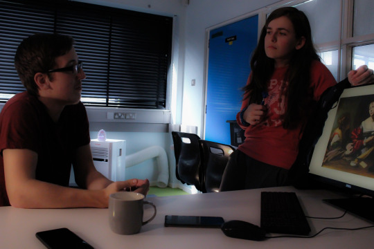
as for a recreation of the image, we decided to change the mirror into a computer, with the original painting in the screen, as if the two characters are looking into the painting, and therefore into the past. After taking the image, i then edited it to have a soft focus look to it, to enhance the feeling of beauty in the image, staying true to the source material, changing Martha from a female to a male was simply the result of limited resources, as there was no other female subjects, however with this, we were able to bring back Caravaggios use in deep dark shadows, as in this image we were able to allow more shadow in on the male subject.
TASK 3. Jack Cardiff was a British cinematographer who worked on many different films and took inspiration from the works of Rembrandt in how he framed and lit his scenes, in this task, i’ll take some screen shots and comment on how they compare to the paintings that inspired him. There are two main films that I’m going to be looking at, are:
A Matter of Life & Death
Black Narcissus
Starting with A Matter of Life & Death: https://www.youtube.com/watch?v=xj5nopMMSV0

( Image 5)
This shot from the film shows perfectly the cinematographers influence from Rembrandt and Carravagio, with its heavy use in shadows to keep the mysterious figure hidden in the shadows of the bush, with its use in angles to show the dominate figure in the scene, the angle of the camera making him look bigger than he is, not only to the audience, but also to the main character.

(Image 6)
Who in this scene is looking up at the figure, and as stated in the last image, the angle effects our perception of the character and the scene as the character now is framed at a high angle making him look smaller than he is. The use in shadows helps the scene out as well, wit it mostly lighting the characters face showing the audience that the rest of the set doesn’t matter and to just focus on the main character.
Black Narcissus uses its influences in two different ways.
:https://www.youtube.com/watch?v=CZRzcLK1Ar0

(Image 7)
In this frame, the use in shadows and lighting, bathes the main character in a shadow of the cross, with how the shadow is angled onto the main character, its obvious that the cross is higher up than the main character and again, with the use in angles we can see that the character is beneath the cross, whilst her own lighting shines through the shadows and allows her to fill the frame, the unique use in shadows almost as a reverse from how painters like Rembrandt and Caravaggio painted with the use in shadows not being the main focus of lighting, showing the audience he innocence.

(Image 8)
In this frame, the character is lit from behind almost creating a glow around her head, this would signify that shes somewhat good natured, however the use in angles and heavy use in shadows tell a different story, with she again being angled from bellow creating a feeling of superiority, whilst the rest of the frame being bathed in deep shadows gives the audience the feeling that she’s sinister motives behind her.
TASK 4. Vermeer and Tom Hunter
Vermeer was a Dutch period painter who mostly focused on portrates and is most famous for the image, Girl with the peal ear ring
Tom Hunter on the other hand is a Photographer who recreates the images of Vermeer with modern twists, and also manages to change the meaning of these images
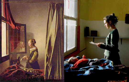
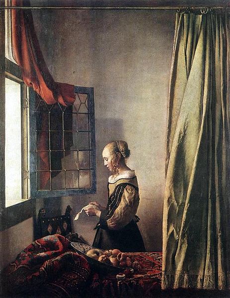
In this side by side ( Left: Vermeer's: A Girl Reading At An Open Window. Right: Tom Hunters: Woman Reading a Possession Order ) as stated before, Hunters work is a recreation of Vermeer's painting with a modern twist, this being that instead of a Victorian period house its a somewhat modern looking apartment with vastly different paint, the Victorian room looks regal and somewhat expensive, whilst the apartment looks cheaper and more run down, this adds to the title, of hunters work which changes the simplistic, reading of a letter in Vermeer's work, to a young woman receiving a possession/eviction letter, which adds to the sadness of the photo, along with the fact that the woman has a child which she needs to take care of, more than herself.
1 note
·
View note
Text
Introduction to Depth of Field
Introduction to Depth of Field
To be put simply, depth of field is the distance between the closest and farthest objects in a photo that appears acceptably sharp. Depth of field allows you to guide your audience's eye to different positions of the screen that you want them to pay attention to. Different depths of fields can evoke different types of emotions.
Aperture
“Aperture is the opening in your lens that lets light pass through to the sensor. Think of it as a pupil for your lens. It dilates to let more light in, and contracts to restrict light when it is bright. Aperture is probably the first thing most photographers think of when they want to adjust the depth of field.”
Fig 4.
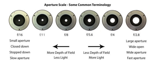
Large apertures produce images with a very shallow depth of field and is achieved through small f-stop numbers. Small apertures produce images with a large depth of field is achieved through large f-stop numbers.
Deep Focus
To achieve a deep focus, a small aperture opening will be used to allow light to hit the cameras sensors which gains a clear & focused image. A large depth of field image tends to use a wider lens, which allows for the full environment to be in full focus.
Shallow Focus
To achieve a shallow focus, a larger aperture opening will be used to limit the amount of light hitting the cameras senor, which means the depth of field will be noticeably shorter. This type of focus is used to make a subject in focus, while the background will be out of focus.
Aperture Test
After gaining some understanding of the aperture principles, Lewis, Alex and I made a short video to compare a deep focus to a shallow focus.
youtube
In this aperture principle test video the group set the camera’s aperture to f10 for one test and 1.8 for the other. The large depth of field(f10) was used to ensure that the actor was always in focus walking down the hallway set. The small depth of field(f1.8) was used to make the background of the actor out of focus, but as he got closer to the camera, it focuses more on the actor, while the background remains out of focus.
Introduction to Shutter Speed
Motion in a video is controlled by the use of shutter speed. A higher shutter speed will expose more often per second on a video. A benefit of using shutter speed is to make movement appear more realistic in video, the shutter speed can be manipulated to add or remove motion blur. A common use for using a higher shutter speed is for obtaining a clearer view of an object in fast motion, especially if the footage is planned to be slowed down.
After gaining some understanding of the shutter speed principles, Lewis, Alex and I made a short video to compare different shutter speeds.
youtube
In this shutter speed principle test video the group set the camera’s shutter speed to 1/50 for one test and 1/1000 for the other. As the higher shutter speed setting causes the video to become over exposed, we adjusted the ISO of the camera to 500 for the 1/50 test, and 6000 for the second test.
Introduction to White Balance
White balance is used to manipulate an image or videos temperature. When the camera work is being completed outside, and the sun is out images or videos will appear with a warmer colour capturing more yellow & oranges. Were as if it was a dull cloudy day outside, the images or videos will appear with a cooler colour capturing more blue colours.
Three Point Lighting
Three point lighting is a technique used to help capture a particular subject in photography & videos. The tree points include key light, fill light & back light.
Key Light
Being the main light out of the three, typically it is the strongest light & will be placed on the subjects right or left. This is to add strong lighten to one side of the subject while casting a shadow on the other half which adds more contrast and depth.
Fill Light
The fill light is placed on the opposite side to the key light. The purpose of this light is to fill the shadows created by the key light, to achieve a duller light on the shadows, the fill light is placed further away from the camera.
Back Light
The goal of this light is to create a separation between the subject & the background to help define the subject. This lighten is placed behind the subject.
Scorsese & Caravaggio
This video gives a detailed description outlining how Scorese’s cinematography was inspired by Carvaggio’s classic paintings.
https://www.bbc.co.uk/programmes/p00hqprn
Scorsese explains the ways in which he likes Caravaggio’s paintings, one being the use of light, describing it as “As colourful as black & white”. Scorsese also talks about how the use of just one point of light can add a range of shades, commenting on the use of extreme differences between the light on the subject & the dark backgrounds, with the contrast effect being exaggerated even more when there is only one light source being used.
Scorsese used minimal lighting which helps add shadow to both the scene & the actors, and is achieved through the use of a single focal point of lighting in a lot of his scenes. This was not just for effect, the use of lighting helps show the characters in their true light. The unique style used by Scorsese is created through the use of heavy shadows & limited light sources which helps project a dynamic look to his movies.
Rembrandt & Caravaggio
As a group task we attempted to recreate the famous painting Syndics of the Drapers Guild by experimenting with the lighting. The group took the angle into consideration when recreating this image & the intensities of the lighting.
Fig 5.

Fig 6.
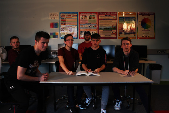
In the painting of Syndics of the Drapers Guild, there are 6 men sitting around a table. The class recreated the frame by positioning the 6 acting characters around the main focal point of the image being the table with the same stances seen from the paintings subjects. The lighting on the subjects faces & the dark shadowy background were the main aspects that the class wanted to reproduce. We achieved this by blocking out the natural light from the windows with curtains and used two LED light boxes to help illuminate the subjects faces. The main difference between the class recreation & the original is the lighting. The original uses fairly dull colours while the class recreation looks more vibrant.
Black Narcissus & A Matter of Light & Death
This image is a still shot which can be seen in the movie “Black Narcissus”. The image is a long shot and is filmed using a high angle. The purpose of this shot is to show the mass scale of the scenery, in compared to the subject ringing the bell, adds the sense the sound will be heard throughout the whole landscape. The valley which can be seen in the background not only adds to the sense of scale, but also adds a sense of mystery & adventure. The sense of scale in this shot is also further developed through the use of high angle shots.
Fig 7.

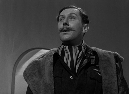
This image is a still shot which can be seen in the movie “A Matter of Life & Death”. The image is a medium shot and is filmed using a low angle. The purpose of this shot is to show enough of the body to be shown, which allows the viewer to read the subjects body language, and the use of the low angle projects the subject as being more interesting or powerful.The background in the scene has no other details, so this shot type compared to long shot suits better,
Fig 8.
Vermeer & Tom Hunter
Vermeer is a well known portrait painter, best known for his middle class lift paintings. Photographer Tom Hunter was influenced by Vermeer & went on to recreate some of his work, but with adding his own vision.
Both pictures have identical compositions, except Tom Hunter created a more modern setting of a luxurious room compared to Vermeer's painting. The message is conveyed different from both images, and can be seen in the facial expressions of each subject. Vermeer's painting on the right, the woman’s face shows concern, as to Tom Hunters image on the left, the woman’s face expresses interest and joy from reading the letter. Tom Hunter recreated the colours which Vermeer used in his painting through the use of colour balancing the image to be more warm with yellow/orange colours.
Fig 9,
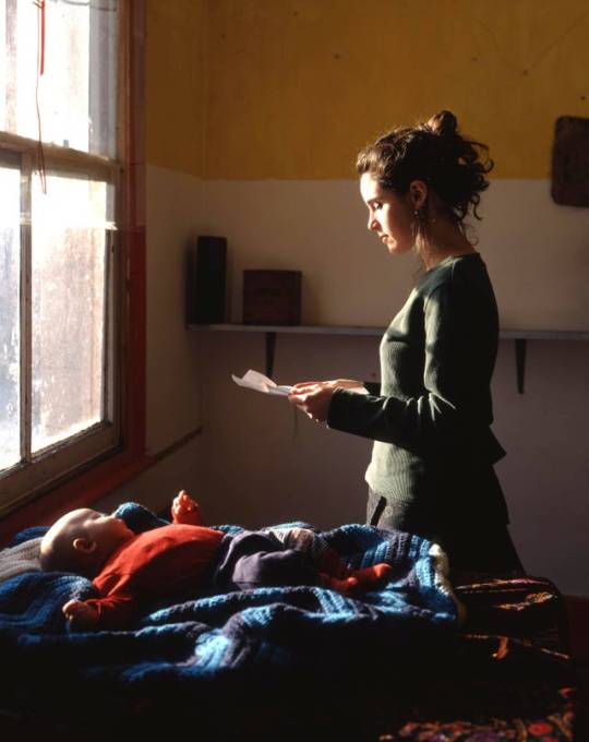
Fig 10.
0 notes
Text
What is cinematography
Cinematography is an essential to good visual storytelling in film and is sometimes overlooked in film. The idea of cinematography is using creative visuals that refinance a films narrative and allow the audience to experience some emotion from the experience of watching. A cinematographer is like a second director essentially as they make decisions for the director for the actual film for example how its shot or how the colors are used and the lighting as these all combine into a good piece of film. The DP (Director of Photography) will read the script and move the lighting, actors, cameras etc to convey various emotions and feelings through the shots he/she takes for the film as this part of film making is just as important as getting the right emotions for actors faces and the tone of a scene can allow the audience to understand the emotion of the scene for example.
Lighting
Lighting is one of the most important parts of cinematography but is sometimes overlooked by rookies. The lasting impact that lighting can have is immense when done correctly with the appropriate planning, time and consideration. It allows the finished shot or product to have an effective impact on the audience while looking high quality.
Lighting is important in film and video because the human eye sees light differently to the camera lens as the human eye can pick up the fine detail and lighting contrast far better than any camera lens can. The lighting can determine the mood of a scene and amplify the mood of characters for example a funerals lighting is usually very low and dull to reflect the sad emotion.
One of the main lighting techniques that will be discussed is the standard 3 point lighting technique, there are three types of lighting in this technique which one might have already guessed. The types of lighting are Key lighting, Fill Lighting and Back Light.
Key Light
This light is the main light of the scene or photograph and this is the light that will have the most impact on the feeling or emotion of the scene in terms of the lighting. The light itself is usually placed of to the side of the camera/subject which will created a light and shadow side to the subject adding depth and creating emotion in the shot.

Fill Light
This is the light that is used as a secondary light and is usually placed on the opposite side of the Key Light. The fill light does what's its name suggests, it fills the dark shadows that the key light would have been creating on its own. This light is usually a dimmer light to complement the the light but not over bombarding the subject with white light.

Back Light
The back light is is again similar to its name. It's a light that is placed in the back. The light it provides is not direct light such as the key and fill light but its purpose is to light the back of the subject from the rear of the scene or shot and is used for subtle highlights around the subjects outline, this use of light helps distinguish the subject from the background.

https://www.mediacollege.com/lighting/three-point/
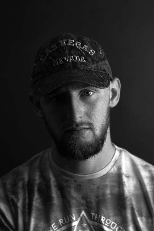
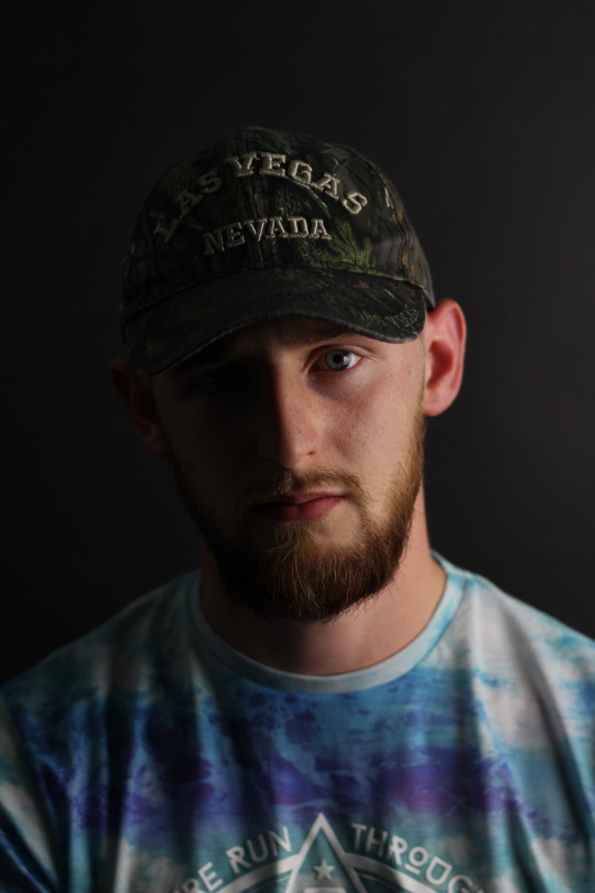
Below one will see a picture of the uses of the lighting. The lighting was used to create a head shot of the person, notice that the Key light was used and the absence of the fill light has left half of the subject shadowed as well as the background. The black and white photo shows a better demonstration of the lights effects as the white is very easily seen hitting certain parts of the face.
Scorsese Short review
Scorsese was interviewed by the bbc on the painter Caravaggio and how he affect his film in terms of light. The first point he makes is that the light in the paintings always comes form one light source and he also states that color in films is nice but black and white is also color. This is hinting at light and shadow being used. He also comments on how the actors were imprimatur as they were ordinary people living life and that was direct and impact. The paintings push boundaries as they would often times showcase the saints as ordinary people as Scorsese points out that in the painting the conversion of Paul, the horse is the image as he lays under the horse and it almost seems undignified and the fact that a prostitute was use for the holy Mary shows courage but also lack of judgement as you don’t judge the girl for being a prostitute in the painting but they also show physicality like in the painting of the crucifixion of peter.

This is a scene from a matter of life and death. This scene is filmed from a low key angle and is rather interesting in terms of light as the holes in the ground all show light. But the first gap in between the first two rays of light has one of the darkest spots in the scene and since the rest of the scene is faded grey due to the light the eye goes directly to this, this dark area is beside the main actors so as soon as ones eye goes to the dark it will direct to the actors. There are several actors in some holes and there is a voice over but using this dark space is a good way of indicating which actors are the main ones.

The other clip is from the movie the Black Narcissus which is a movie that is about a group of nuns in India and one of them succumbs to madness. The movie is in color but the overall color variety is low due to white nun clothes, pale skin and very dull colored interiors. The movie itself is all filmed in one location to be consistent and the backdrops are all painted and is one of the few times there is color. When color is in the shot is effective for example the scene with the red dress and lip stick shows the tension and shows this woman decent into madness by setting her apart in a large way as the red contrasts of the whites very well but also sets here apart from the other nuns and while one thinks of the white being associated with faith this red is more linked to evil, hell and blood showing this nuns continued decent away from being a fellow nun.
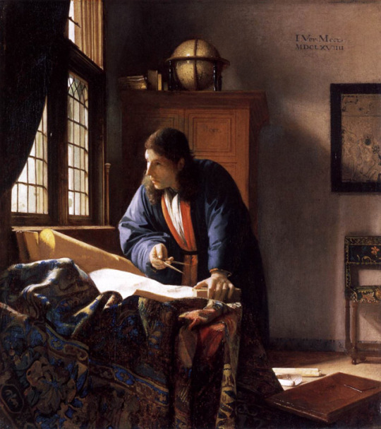
This is a painting by Vermeer, who was a famous dutch painter who painted a large majority of domestic scenes and simple folk doing every day life tasks. His know for his use of light in his paintings. This painting uses the lighting very well as not only has the face been given the shadowing but also the background as it reflects of the globe and the pages of the book. He is one of the dutch masters and another similar to him is Caravaggio who was a large influence on Martin Scorsese.

The above images are of a Caravaggio painting called The Calling of St Matthew for the bar and a scene from Mean Streets from 1973. Here its obvious that the light source is coming from the same direction and the thing about Caravaggio is that he only used one light source which is what has been influenced here as it gets darker towards the ends of the screen. The shadows between the characters is also similar and the use of light to get the depth in the backgrounds along with the simple actions that the actors are doing.
Tom Hunter

Above is a Vermeer paint beside a tom hunter photograph and it’s easy to see the influence on the scene. The whole set up of the scene is a basic modern version of the simple life of a woman back in his time period. The light source comes from the large window and fills the charterers face leaving the back of the head slightly darkened. The whole back of the character is darkened as the full light hits the front. The wall lighting is also faded towards the edges similar to the painting again.
Referencing
www.mediacollege.com. (2018). The Standard 3-Point Lighting Technique. Available: https://www.mediacollege.com/lighting/three-point/. Last accessed 7/11/18.
0 notes
Text
EOMA68 Computing Devices
New Post has been published on https://www.aneddoticamagazine.com/eoma68-computing-devices/
EOMA68 Computing Devices

EOMA68 standard, a freely-accessible royalty-free, unencumbered hardware standard formulated and tested over the last five years around the ultra-simple philosophy of “just plug it in: it will work.”
Truly Free: Everything is freely licensed
Modular: Use the same Computer Card across many devices
Money-saving: Upgrade by replacing Computer Cards, not the whole device
Long-lived: Designed to be relevant and useful for at least a decade, if not longer
Ecologically Responsible: Keeps parts out of landfill by repurposing them
Some of you might recognise the form-factor of EOMA68 Computer Cards: it’s the legacy PCMCIA from the 1990s. The EOMA68 standard therefore re-uses legacy PCMCIA cases and housings, because that’s an environmentally responsible thing to do (and saves hugely on development costs).
Read more on the ecological implications of electronics waste in the white paper.
vimeo
Compliant with the EOMA68 Specification
A20 Dual-Core ARM Cortex A7, 1.2 GHz
2 GB RAM
8 GB NAND
Micro-HDMI Interface (for 2nd monitor)
Micro-USB-OTG (bi-directional power)
Micro-SD Card Slot
Pre-installed with Parabola GNU/Linux-libre Operating System
Respects Your Freedom (RYF) Certification from the Free Software Foundation (currently in progress with no known blockers – a full refund will be available if certification is for some reason not granted)
Micro Desktop Housing
Tiny size: 4.5” x 4.5” x 0.5”
EOMA68 Computer Card slot (user-upgradeable)
2x USB2 ports plus one USB-OTG on Computer Card
VGA port
Micro-SD Card slot
Standard 5.5 mm DC Jack, powered by anything from 7 V up to 21 V
Beautiful laser-cut wooden case
20-pin internal GPIO Expansion header documented here
15.6” Laptop Housing
15.6” 1366 x 768 LCD
10 Ah battery (approximately 6-8 hours running time)
Only 1.1 kg weight
EOMA68 Computer Card slot (user-upgradeable)
Full-sized QWERTY Keyboard including numberpad
3 USB2 ports (2 internal, 1 external) plus one USB-OTG on Computer Card
Special internal compartment (easily accessible, 8 mm x 90 mm x 60 mm)
Micro-SD Card slot (takes 256 GB MicroSD cards)
1W Stereo speakers, built-in Mic
CM108AH USB Audio with stereo headphone socket
4.3” Capacitive touch panel and backlit LCD (instead of mouse trackpad)
STM32F072 Embedded Controller with firmware under GPLv3 license
Full schematics available.
3D-printed casework design files available under GPLv3 license
Eco-friendly plywood panels
http://rhombus-tech.net/
Related Post
Pawel Kuczynski: Narcissus ( Caravaggio travesty )
Atiq Shahid :”Barcellona: Attentato terroris...
Alexandria and the Open Index Protocol
RootIO Radio stations
I ghost fliers
Pete Kreiner “Flame Eternal”
The European Robotics Week (ERW)
Transfert price: intervista ad Enrico Furia
ORIGINE DELLA PAROLA “OK”
Dalle forze speciali agli eserciti privati
Robert A. Heinlein: La Storia Futura inizia oggi
Super Blue Blood Moon and Lunar Eclipse
.yuzo_related_post imgwidth:155px !important; height:145px !important; .yuzo_related_post .relatedthumbline-height:15px;background: !important;color:!important; .yuzo_related_post .relatedthumb:hoverbackground:#fcfcf4 !important; -webkit-transition: background 0.2s linear; -moz-transition: background 0.2s linear; -o-transition: background 0.2s linear; transition: background 0.2s linear;;color:!important; .yuzo_related_post .relatedthumb acolor:!important; .yuzo_related_post .relatedthumb a:hover color:!important;} .yuzo_related_post .relatedthumb:hover a color:!important; .yuzo_related_post .yuzo_text color:!important; .yuzo_related_post .relatedthumb:hover .yuzo_text color:!important; .yuzo_related_post .relatedthumb margin: 0px 0px 0px 0px; padding: 5px 5px 5px 5px; jQuery(document).ready(function( $ ) //jQuery('.yuzo_related_post').equalizer( overflow : 'relatedthumb' ); jQuery('.yuzo_related_post .yuzo_wraps').equalizer( columns : '> div' ); )
0 notes
Link
Italy has an astonishingly rich history of art and culture stretching back thousands of years. Fortunately, many of these breathtaking artworks are still around for us to enjoy.
Of these scores of famous painters, Caravaggio stands out as one of the most revolutionary. He’s famous for his realistic portrayals of the human form using light and shadow to bring his works to life.
If you’d love to see some of these masterpieces in person, Rome is the place to go. Here’s where to see the best Caravaggio paintings during your trip to the Eternal City.
1. Caravaggio Paintings at the Vatican
The Vatican Museums contain some of Italy’s most treasured historical artifacts including art and sculpture.
You’ll find Caravaggio’s ‘The Entombment of Christ’ on display in the Pinacoteca along with some paintings by Raphael, Perugino, Giotto, and da Vinci.
Apart from these brilliant works, the Vatican is also home to the Sistine Chapel, the Borgio apartment and the Spiral Staircase. Now, those are things you can plan a vacation around.
2. The Borghese Gallery
One of Rome’s top art museums, The Borghese Gallery, has almost a dozen Caravaggio artworks on display. These include:
Boy with a Basket of Fruit
David with the Head of Goliath
The Caravaggio self-portrait as Bacchus
A portrait of Pope Paul V
St Jerome Writing
Madonna and Child with St Anne
St John the Baptist
You’ll need to make reservations to visit this elite gallery and your ticket gives you access for two hours only.
If you want to visit this gallery, it makes sense to buy your tickets online in advance. They’re in high demand.
3. Church of San Luigi Dei Francesi
This small church near piazza Navona has a few Caravaggio works on display in the Contarelli Chapel. These represent the artist’s “Saint Matthew” cycle and include:
The Calling of Saint Matthew
The Inspiration of Saint Matthew
The Martyrdom of Saint Matthew
This series is famous for the way in which Caravaggio used the existing lighting of the church to bring his paintings to life.
Instead of competing with the interior gloom, Caravaggio used it to bring suspense and drama to his work, using the only two rays of light in the room to highlight key areas of the paintings.
Entry to the church is free, but you’ll need to pay a small fee to activate the lights so you can see the paintings in all their glory.
4. Church of Santa Maria del Popolo
This unassuming Cerasi Chapel is home to one of Caravaggio’s most famous works–The Crucifixion of Saint Peter.
You’ll also find the “Conversion of Saint Paul on the Road to Damascus” in this small chapel on the north side of Piazza del Popolo.
Admission to the chapel is free.
5. The Capitoline Museums
The Capitoline Museums also house two Caravaggio works. One of these, “The Fortune Teller” is the first version of a painting that the artist created twice.
The recreation is in the Louvre in Paris.
The second Caravaggio painting located at the Capitoline is, “John the Baptist (With a Ram).”
You’ll find the Capitoline Museums at Piazza del Campidoglio.
6. Palazzo Barberini
The Barberini Galleri has famous masterpieces by most Italian artists within its walls. Caravaggio’s work includes the following four pieces:
Narcissus
Judith Beheading Holofernes
Saint Francis in Meditation
Saint John the Baptist
While you’re there, you can also see paintings by more than 40 other acclaimed artists.
7. Palazzo Doria Pamphilj
You’ll find this large gallery in a private palace between the Via del Corso and Via Della Gatta. It’s the largest privately owned palazzo in all of Rome.
Here, you’ll get to see the following Caravaggio artwork:
John the Baptist
Rest on the Flight into Egypt
Penitent Magdalene
The paintings are on display in staterooms and in galleries surrounding a courtyard. The Palazzo Doria Pamphilj also contains an interesting collection of Byzantine and Medieval art.
8. Galleria Corsini
This small art gallery has only one Caravaggio work, namely a representation of “John the Baptist” from 1604.
Galleria Corsini is along Via Della Lungara in an out-of-the-way location that doesn’t attract a lot of visitors. The entry fee is just 5 euros.
It’s a beautiful place and together with the Palazzo Barberini and Galleria Borghese forms part of Italy’s Arte Antica collection.
Along with the 16th and 17th-century artworks, Galleria Corsini has a large library of beautifully bound books to admire.
9. Church of S. Maria Immacolata
A single Caravaggio painting was recently authenticated at this small church on Esqilino Hill, close to Piazza Vittorio Emanuel.
The piece, entitled ‘The Meditation of St Francis’, dates back to 1605 and is a good example of Caravaggio’s use of chiaroscuro to convey emotion.
An almost identical version of this painting is on display at the Museo Civico in Cremona. At first, experts questioned the authenticity of both these paintings.
However, both are now accepted as legitimate Caravaggio paintings, although there’s still some dispute over which one came first.
10. Casino Boncompagni Ludovisi
This privately-owned villa contains ”Jupiter, Neptune and Pluto”, one of Caravaggio’s earliest works. It’s also the only oil wall painting he ever did.
The painting adorns the roof of what was once cardinal del Monte’s private study. It’s believed that del Monte allowed his protege to complete his first attempt at a wall painting in this enclave far from prying eyes.
Either way, it’s interesting to stand at the very site where this acclaimed artist once toiled away, brush in hand.
As the villa changed hands over the years, this painting was largely ignored until an Italian scholar brought it to public attention in 1969.
Find the World’s Best Treasures
If you enjoyed this article about Caravaggio paintings, you’ll also enjoy the rest of our travel section.
Keep reading for more useful information about how to make the most of your wanderlust, locally and around the world.
The post 10 Best Places to See Caravaggio Paintings in Rome appeared first on Florida Independent.
0 notes
Text
Hyperallergic: Caravaggio’s Fascination with Death
Caravaggio, “The Denial of Saint Peter” (1610), oil on canvas, 37″ x 49 3/8″, collection of the Metropolitan Museum of Art.
Caravaggio is a disturbing, unsavory, alluring, provocative, and for some, polarizing figure. No one would accuse him of being tender or a humanist. Some might say that he lacked empathy, but that could also be said of Andy Warhol or Roy Lichtenstein. His favorite subjects were murder, martyrdom, lying, and cheating. A man who loved to swagger through the streets armed with a sword and dagger, he was a loner blessed with faithful friends, such as the painter Mario Minnitti, his one-time model and, later, briefly his protector. This and other paradoxes make it hard for us to feel at ease with his work.
Pride and violence, set off by a short fuse and racked by guilt, infused a sense of fated destiny that was central to Caravaggio’s character. He was also a show-off. In contrast to his contemporaries, who used drawing as an intermediate step to resolve the transition from model to painting, he preferred to work it all out on the canvas.
For this and other reasons, a number of respected authorities have declared that Caravaggio is the beginning of modern painting. I don’t know if any of this matters much to me because I am not sure what it means to be a fan of Caravaggio’s paintings. However, while in Rome some years ago, my wife and I devoted one day to looking only at work by Caravaggio, including “Narcissus” (1597-99), which is in the National Gallery of Ancient Art.
I thought about “Narcissus” when I went to see Caravaggio’s Last Two Paintings at the Metropolitan Museum of Art (April 11 – July 9, 2017). The paintings are “The Martyrdom of Saint Ursula” and “The Denial of Saint Peter” (both 1610), done in the months before he died, on his way to Rome in hopes of receiving a Papal pardon for murder. (Had there been a movie of Caravaggio’s last days, I think Alain Delon would have been perfect for the part).
This is what the museum’s press release has to say about these paintings, which are displayed on adjacent walls:
Commissioned by the Genoese patrician Marcantonio Doria two months before the artist’s death in July 1610, Caravaggio painted The Martyrdom of Saint Ursula in an unprecedented minimalist style; its interpretation of the tragic event that is its subject, combined with the abbreviated manner of painting, has only one parallel: The Denial of Saint Peter.
Although the paintings were together in a corner of the gallery, I spent almost the entire time looking at “The Martyrdom of Saint Ursula,” perhaps because I did not know the details of this lurid story, which is said to have happened in the late fourth century. By the time Caravaggio took it up as subject, more than a thousand years later, the legend had gained many additions and variations.
This is the story in a nutshell. After a number of adventures and miracles, Ursula and eleven thousand virgin handmaidens set sail from Britain and arrived in Cologne, ostensibly to try and persuade the Huns to stop their march toward Rome. When Ursula refused to marry the general, which is what she had to do to change his mind, he shot her with a bow and arrow and the eleven thousand handmaidens were beheaded.
This is what Keith Christiansen, head of European Painting at the Met, told artnet news:
Having escaped imprisonment in Malta and worked in Sicily, he arrived in Naples hoping to gain a pardon for the killing he committed in Rome in 1606. He was then attacked and his face slashed, and in Rome rumors spread that he had been killed. It’s at this point he painted the two pictures on view.
Both are paintings of contrasts, starting with darkness and light, albeit one that is gloomy and hushed. There is no sunlight. The darkness hints at an incomprehensible vastness, which threatens to envelop the figures. There are five figures in “The Martyrdom of Saint Ursula.” Caravaggio focuses on the moment the arrow has pierced Saint Ursula, the moment she realizes that she is mortally wounded. The general holds the bow, its string still vibrating. His face is grizzled, lined, leathery, scrunched up, and old, while hers is smooth and ashen. An embittered old man has destroyed an innocent young woman; age has had its revenge on youth.
Caravaggio, “The Martyrdom of St Ursula” (1610), oil on canvas, 56 1/4″ x 70 7/8″, Intesa Sanpaolo Collection, Naples.
Both the general and Saint Ursula are wearing red, which binds them together, as well as separates them. The sleeves of his uniform are darker than the voluminous folds of her shawl that drape her body below the arrow. He is wearing a breastplate with an embossed lion’s head, a sign of his animal ferocity, strength, and leadership. Ursula’s muslin undergarment is dirty next to her flawless skin, and does nothing to protect her. The arrow has pierced it.
Her hands are gently pressing the wound. The thumbs point upward, as if to form a niche for the arrow, while she stares down at, impassive. There is no sign of suffering and she is not looking to the heavens for salvation. All her attention is on the arrow and the knowledge of her impending death. She is on the right side of the painting, hemmed in by three figures. The general occupies the left side, taking up a wider expanse. His arm holding the bow is thrust forward at a diagonal. While this connects him to Saint Ursula, the position betrays the flight of the arrow: he could not have shot it into her from that position, but it does not matter. Meanwhile, a hand reaches out from the darkness and floats between them, fingers outspread, as if measuring the distance between bow and wound.
The hand presumably belongs to the figure in the shadows, standing between the general and Ursula. I find it disconcerting that while his hand is floating between the general and the saint, his gaze is focused behind the general, suggesting that the reactions of his head and hand are occurring in separate dominions. This disconnectedness runs throughout the painting. Nobody is making eye contact. Everyone is looking in a different direction. The armored soldier angled in on the far right and the general on the left are the only ones looking at the wounded woman. The sectioned armor covering the soldier’s arm on the far right is insect-like, yet the crook of the elbow makes it appear as if he is about to embrace her.
Caravaggio, “David with the Head of Goliath” (1610), oil on canvas, 49″ x 40″, Galleria Borghese.
A head is visible between the soldier on the right and Ursula’s pinned-back hair. It is thought to be a self-portrait of Caravaggio. It harkens back to another painting Caravaggio did earlier that year, “David and Goliath” (1610), in which the severed head is supposed to be that of the artist.
Caravaggio’s head, which seems to be resting on the nape of Ursula’s neck, is squeezed in by a hand holding a lance at a slight diagonal (it belongs to the soldier between the general and the Saint) and the helmeted head of the soldier on the far right. The artist is portraying himself as a rubbernecker craning to see what is going on. Long before Ludwig Wittgenstein wrote about the mind-body problem, Caravaggio recognized that they were separate. That bodiless head adds a distressing note to the painting. What is that fascinates him? What is he desperate to see?
I don’t think Caravaggio’s Narcissus was looking at his reflection. In that flattened, impossible space, he saw something else in his mind’s eye. Robert Creeley’s line, “the darkness surrounds us, what can we do against it,” comes to mind.
The post Caravaggio’s Fascination with Death appeared first on Hyperallergic.
from Hyperallergic http://ift.tt/2tBuHyW via IFTTT
0 notes