#3d max tutorials
Explore tagged Tumblr posts
Text
I made a tutorial for 3D Studio max users for blender
youtube
15 notes
·
View notes
Text
saw one (1) post about star wars series' art styles n how the clone wars style has been used a lot lately n veriety n stuff and suddenly im filled with the urge to pull out, dust off, and get going on my old 3d modeling skills to see if i could make something with a fun style to it (i promise nothing)
#wonder if i could do clone armour in an vaguely-arcane-inspired painterly texture yknow?#but all my 3d modelink knowledge is based in 3d max cause thats what we learned in college* but that costs money and im yet to find a good#written down tutorial for blender which is on my external harddrive which my laptop is struggling to register so uh. i can try when i'm don#with the current project and other pressing stuff but i predict many issues to come and thus i promise NOTHING#but it would still be fun to make one of those series poster things with the 792nd and 793rd#and it would give me something to do when i wanna keep making things but my wrist needs a break considering my drawing hand is left n my mo#se hand is right#[*college in the uk is ages 16-18. please stop thinking college means usa college for the love of fuck]#telly static
17 notes
·
View notes
Text
youtube
In this tutorial, we will create a parametric infinite cube table and we will see how to keep some of its parameters parametric, meaning that, after making the main geometry, we can go back and change things in it. After extracting the necessary segments from a base chamfered box(used as a path), we will use Loft to make the main shape using a custom rectangle as a profile.
#3dsmax#3ds max tutorials#autodesk#autodesk 3dsmax#learn 3dsmax#3dsmax modeling#3dsmax furniture modeling#3dsmax parametric#parametric in 3dsmax#3dsmax online course#3dsmax online training#3dsmax how to#3dsmax loft#Youtube
3 notes
·
View notes
Text
Albatros D II - Modelado - 39 Cabina (Parte 3)
Confecciono el medidor central sobre los mandos de pilotaje del Albatros DII así como las piezas implicadas con él.
youtube
#albatros#WW1#hardsurfacemodeling#mazhuka#israelcantillo#3dsmax#3dsmaxtutorial#modelado3d#youtube#fyp#3dmodeling#tutorial3d#3ds max#tutorial 3ds max#3ds max español#3dsmaxespañol#Youtube
1 note
·
View note
Text
Dive into the Corona Tile Map for 3ds Max
Get familiar with the surprising flexibility of the new Corona Tile Map, introduced in Chaos Corona 11.
youtube
0 notes
Text
Eiffel 65 - Blue (Da Ba Dee) 1998
"Blue (Da Ba Dee)" is a song by Italian music group Eiffel 65. It was first released in October 1998 in Italy and became internationally successful the following year. It is the lead single of the group's 1999 debut album, Europop.
The song initially found success in France, where it debuted in August 1999 and reached number one for three weeks. It then found success in other European countries, reaching the top spot on many charts in September the same year. It became one of the biggest-selling songs of 1999, reaching number one in at least 18 countries, charting at number three in Italy, and peaking at number six on the US Billboard Hot 100 in January 2000. It reached number one in Australia, New Zealand and Canada. In the UK, the song initially entered the top 40 purely on import sales; it was only the third single to do this. The song re-charted on 6 May 2013 at number 40 in the UK, following its inclusion in Iron Man 3.
The song received a Grammy Award nomination for Best Dance Recording at the 2001 Grammy Awards. "Blue (Da Ba Dee)" has also been heavily sampled and remixed in later years.
The accompanying music video for the song was released in 1999 by BlissCoMedia, a computer graphics division of Bliss Corporation, and featured computer-generated graphics that were done in 3ds Max. With very few resources, tutorials and books, and only one editing machine, the video was made between 1998 and 1999 in a garage in about two to three months.
"Blue (Da Ba Dee)" received a total of 75,2% yes votes!
youtube
3K notes
·
View notes
Text
“ LOOKS-MAXXING ” pick-a-card reading.💝
Your next glow up.
What can you do in order to have a big glow up?
Pick a pink 90s magazine cover:
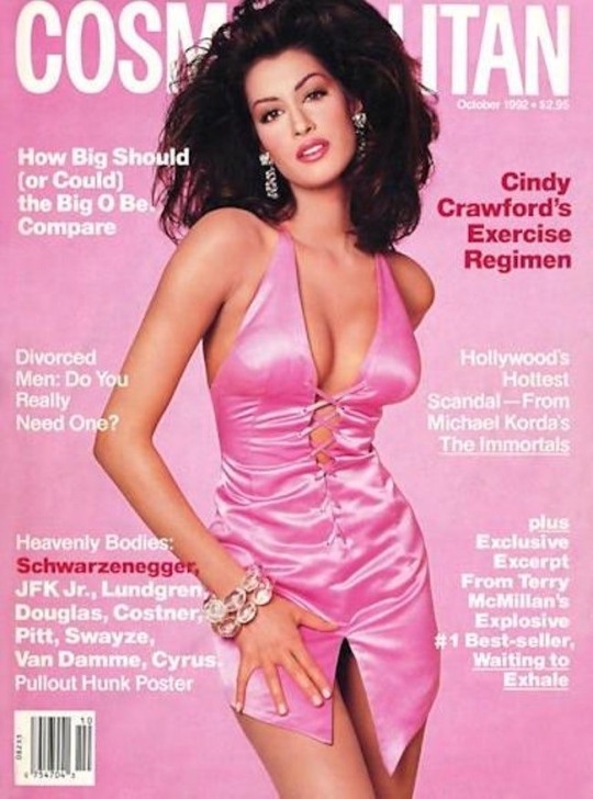
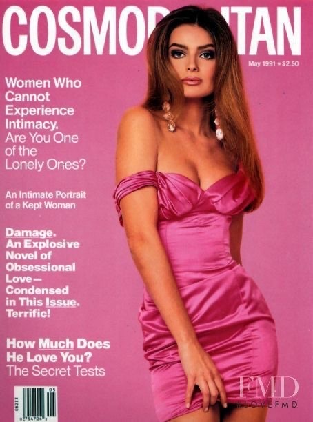
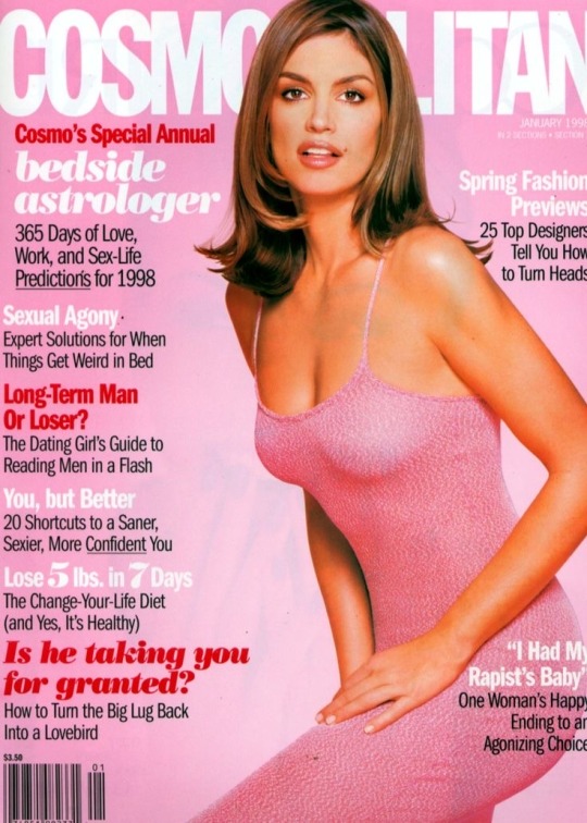
—>Pile 1
Your next glow up will most likely be related to getting « in peace » with your s€xuality prior to glowing up both physically and mentally. What I mean by this is you will probably need to get rid of any self doubts about your looks, any shame around your $£xual side due to past traumas or for some the way you were raised, some may have been raised in a controlling or conservative family.
One of the ways you can make this glow up happen is if you really enjoy your life and what you do. Try to practice your hobbies more and work on bettering your natural talents, by doing that you may find your purpose in this world and this will lead to the biggest glow up ever.. for some it may lead them to their dream career.
Something which appears in the cards is that you may need to forgive your parents or parental figures for the way they treated you in order to reach peace within yourself and your physical body. Forgive yourself as well for not acting in the « right way » or not looking a certain way, this is the best you could do at that point of your life . It is all in the past.
As for a physical glow up: judging by the pictures shown on the cards that fell, maybe start focusing on a regular work out routine, focusing on legs, butt or whatever you feel like you need to improve. Updating your clothing style may benefit you a lot. Stop caring about what others would say and pick clothes which give you freedom of expression, be yourself shamelessly. Some of you who chose this pile may have some creative vision which they may have been scared to express - do it. Meditation may help with your « glow up » in some form as well. Try bolder makeup looks and outfit choices.
Moodboard/Vibes for pile 1:
The vibes I get from this pile is totally Julia Fox as a persona,not only style wise. She’s unapologetically herself, maybe for some she’s a bit weird. But the main point is, despite people’s opinions and perceptions of her, she has always followed her own rules and expressed herself. Before she got famous she was a dominatrix, did a photobook, an art exhibition aand starred in a famous movie in which her character was inspired by her real life . All this happened because she was authentic,lived her life the way she wanted and followed her heart, exactly what u should do as well,pile 1.
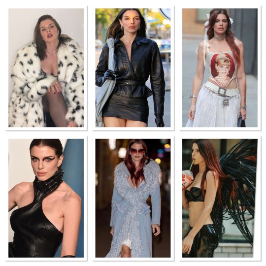
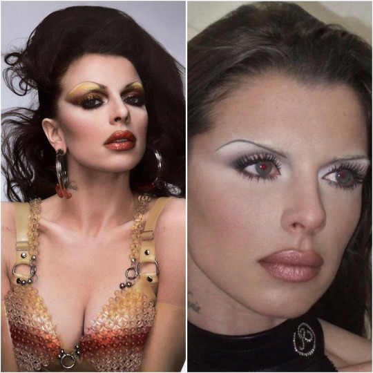
Songs which remind me of this pile’s vibe:
—>Pile 2
Pile 2, you’re going through or will go through a huge transformation.. luck will definitely be on your side and you may find out answers for things which you’ve always wanted to know about. ( it can be pretty much about anything. If we are talkibg about a physical glow up exclusively, you may learn some very good beauty hacks soon. It can be about makeup, diet, exercise, skin care, personal development etc.. this is a general reading so I cannot be exact but whatever your case is it will lead to a HUGE glow up. Two of the cards are talking about some « secret knowledge » so whatever it is it will be significant for you.
This pile is very different from the first one as the glow up that appears here is not just about one or two things in your life or looks, it’s about everything. The things you can do in order to glow up faster, pile2, is maybe start watching makeup tutorials and pay attention to new techniques or products you haven’t heared before, ask people for where they shop they may tell you some secret thrift store with really cool clothes which can uplift your style.. anything which can help you get this « secret knowledge » which appeared in the cards. Another thing I can say for this pile is: focus on manifestation, envision the changes in your looks or life as a whole you would like to have and act accordingly in your 3D universe in order to get to where you want to be. Positive affirmations and subliminals (as in subliminals I mean not the crazy unrealistic ones, but those about self concept, confidence and beauty in general) may also be helpful in your case.
Moodboard/Vibes for pile 2:
The vibes I get here are Fran from “The Nanny” and Maddy from “Euphoria”. Fashionable, bold, colourful. Radiating confidence. Crystals, glitter, sparkle, feathers, bold and colourful makeup, everything of that sort. Do not dim your own light to make someone else feel better about themselves if they are insecure.
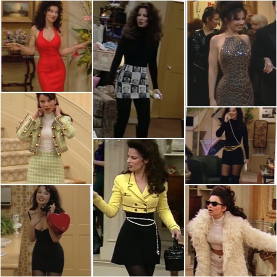
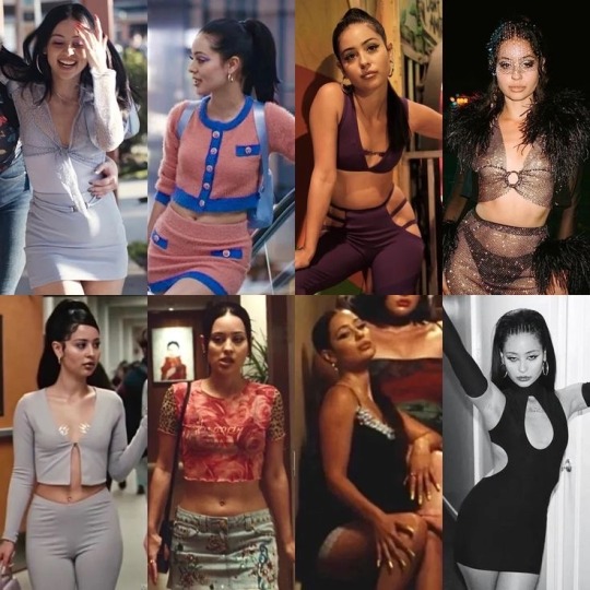
Songs which remind me of this pile’s vibe:
—>Pile 3
Pile 3: I think you would definitely be bettering your financial situation sooner than you may have even expected, this may help you get a glow up. You would be able to afford nicer things, skincare, clothes, procedures etc.. If you’re not already on a path to improve your finances, then you would definitely be motivated to start working on this problem soon and be very committed on your mission of « glowing up » in every way possible. Physically, mentally, spiritually even. You will be finding yourself after a long period of feeling lost and unlike your true self.
You would become much more intuitive, confident and cut throat even, you won’t let energy vampires use you as they may have done in the past and this would lead to a more beautiful and healthy version of you, because you would not have to deal with others’ negativity anymore. When it comes to relationships you would not be satisfied with with mediocrity, you will be finally standing your ground and being true to your standards and what you deserve. You will be getting your justice if you’ve been mistreated in the past.
This pile has huuuge « femme fatale » « dark feminine » vibe. This may be the energy you will be channeling after you have your glow up. Doing classic makeup like red lipstick+ black eyeliner, black smokey eyes and nude lips combo might help you channel this energy that i am seeing here better. Wearing colours like: red, black, gold and nude might help you elevate your look. Also wearing jewelry, lace and high heels. Don’t be scared to embrace your « dark side » which you may have ignored in the past in order to fit in with the crowd.
May sound trivial, but follow your intuition and do what makes you happy, it will make you glow in ways which you have not expected..
Moodboard/Vibes for pile 3:
The vibes I’m getting here are as I said in previous paragraphes: femme fatale, dark feminine energy,monica bellucci core type of look/aesthetics..
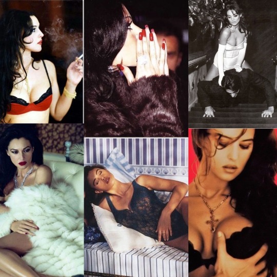
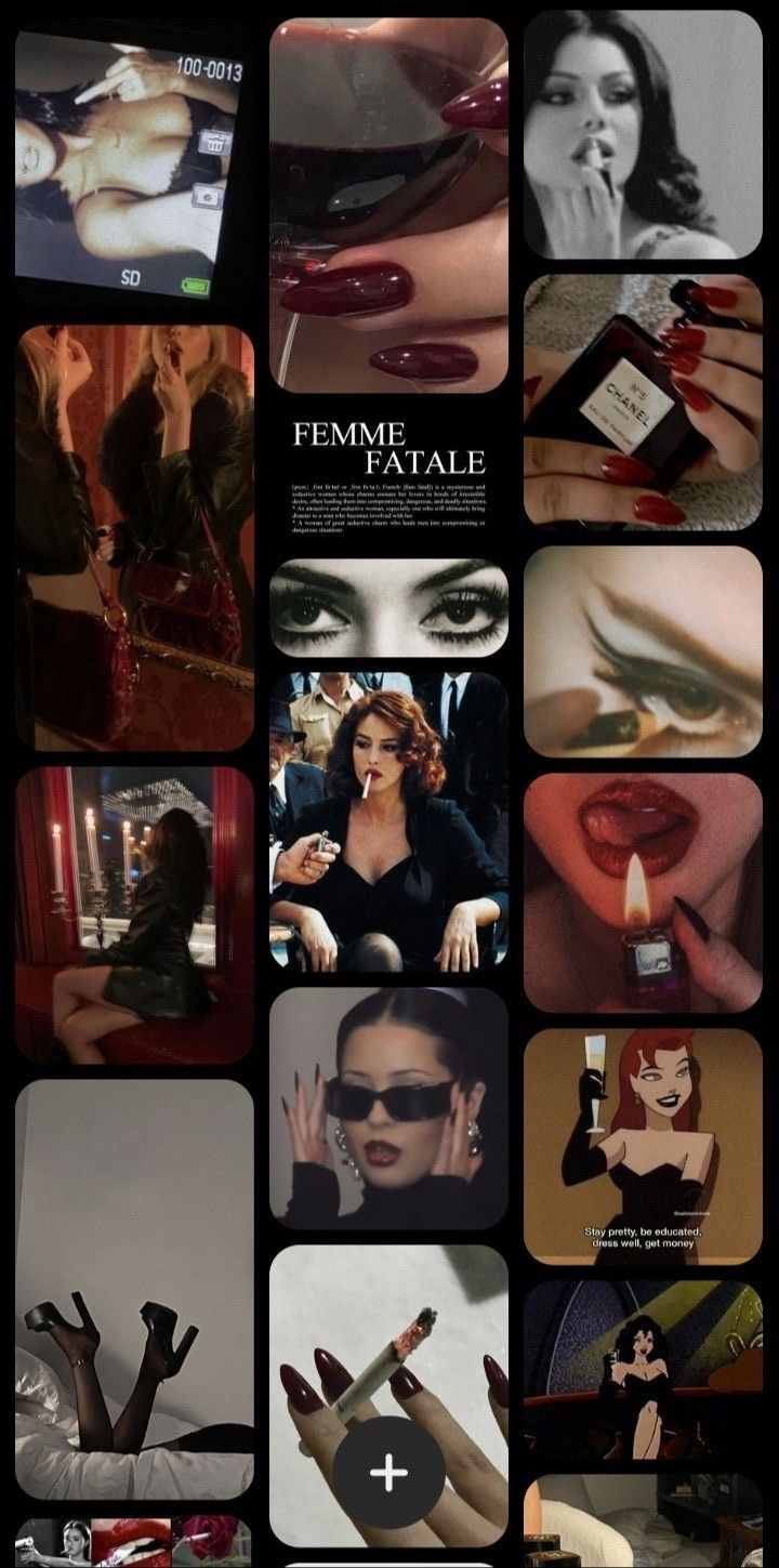
Songs which remind me of this pile’s vibe:
That was all from today’s PAC. It was a bit different from previous ones and I myself did not expect it to turn out the way it did, but sometimes completely different information pops up in readings because someone needs to hear a certain thing.. Hope you enjoyed it!!
Leave a comment/feedback if it resonated, share and follow for more.
Thank you for reading!
- La Sirena💋
Decks used: ‘$£xual magic’ oracle deck by Lo Scarabeo; ‘Manara’ €rotic tarot deck by Milo Manara/ Lo Scarabeo;
Photos are from pinterest; all credits to their respective owners.
#SoundCloud#tarot#tarot blog#tarot reading#lasirenatarot#pac#free tarot readings#tarotblr#pick a card#free tarot#tarot pac#monica bellucci#dark femininity#femme fatale#tarot spread#tarot readings#maddy perez#julia fox#glow up#looksmaxxing#looksmaxx#self growth#self improvement#pick a card reading#pick a picture#pick a pile
1K notes
·
View notes
Note
Hii 🥰 I love your art so so very much and it's inspired me to start drawing again after about a year and a half of nothing. I was wondering if you could do a quick explanation of how you draw creature heads? Even with skull references and stuff I'm having troubles particularly with the eyes / eye placement and cheek areas
hi thank you, i'm happy you've gotten drawing again. i try not to make fully drawn 'here's how i do x' tutorials anymore since realising that i would just be training people to replicate my mistakes and photos really are the best reference
however not many people know HOW to use photorefs so i will show you this thing i made for someone else who asked a similar question in my dms once. step 1 is to discard any hangups you might have about tracing. professionals trace. it's fine.
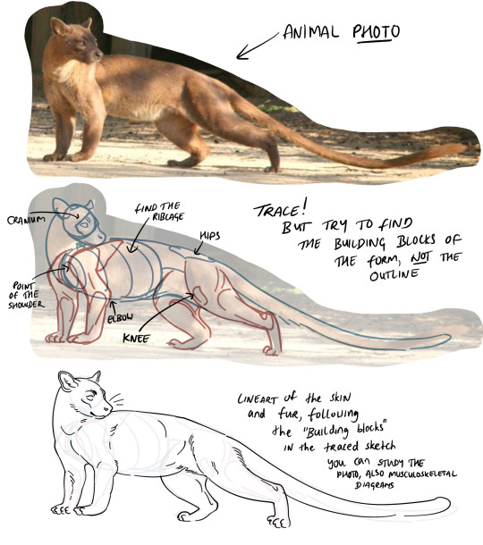
for an example of what i mean when i say drawn tutorials just teach you how to replicate mistakes: i got the knee visibly wrong in my drawing here lol. but for a guide you get the idea. you basically want to put on x-ray goggles when you're looking at photos. you want to be able to see through the animal and understand 1. the axial skeleton [skull, ribs, spine] first and 2. the appendicular skeleton [pelvis, limbs] secondarily. you want to understand it in a 3D space - see how in my traced sketch, I have blocked out the ribcage as a solid form using contour lines which describe a curve. i didn't draw every individual rib, there's no need. don't get bogged down in the weeds, this drawing should take like 5 minutes max
the reason we are tracing and not just closely referencing is because this saves us from also having to worry about getting angles & proportions right. we will worry about those later. for now we are gaining understanding of how a body is formed without the pressure of having to get it 'right'.
okay so you asked about heads in particular so we'll look at heads. in the thingy above you can see that i traced a kite shape onto the front of the cranium before filling in the snout.
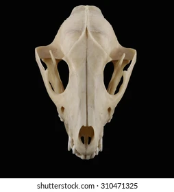
it's a canine and not super interesting but i think they show really well what goes on with the frontal bones. the cheek bones form the two lateral points of a kite shape.
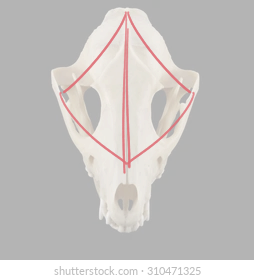
if you start your sketch at the kite shape you can turn it in space
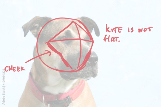
what you are looking for is the kite. the kite is not flat. the kite is the front of the cranium minus the nose/snout etc, it is laid out over a curved surface. you will find the eyes along the horizontal line and the cheekbones tucked under the bottom faces of the kite. the snout/nose/etc emerges from the crosshairs in the middle and the cheekbones follow the outer edge of the kite, but not the jaw. this is how i construct all my faces, human or animal doesn't matter it's all this underneath. using it i can visualise the hidden parts of the face such as the obscured cheekbone
try to find as many different types of animal or human heads as possible and trace the kite onto them. then you will see
111 notes
·
View notes
Text
Quick Mata Nui Height Map Tutorial
I've had some requests I explain how I made the Mata Nui model from this video, and that I 3d printed here, so here it is.
So step one, you need a height map and a coloured version of the Mata Nui image, like so:


Import them both in to blender as planes.

I'm using 2.79, deal with it.
On the coloured one use a subdivision modifier. These can be quite dangerous, its very easy to overload your computer. A good rule of thumb is find the closest power of two to the resolution of the image and go with that, the resolution of this image is 4249, so the closest power of two is 4096, which is 2^12. Again, for safety's sake, I'd lower that down a bit for the view port render, unless you're sure your computer can handle it.

Seems the max is 11 anyway. You can stack modifiers though, but again: its very dangerous.

Now add a displacement modifier, add a new texture, and set coordinates to UV.

Open up the texture tab and select the displacement modifier, and set the image to the bump map you loaded in earlier.

Now you should get something that looks like this.


Strength of .1 is a lot more reasonable.
And there you have it, a nice little model of Mata Nui.

69 notes
·
View notes
Note
For your 3D art:
What are your influences?
What is your process for creating and texturing the models?
What software do you use?
Other than that, I will be keeping an eye out for more of your models as you are what I aspire to be as a hobbyist 3D artist.
Thanks for asking! I'll apologize ahead of time I'm not the best a writing but I hope my answers will be helpful and fun to read
1: I'm really inspired by arcane and into the spider verse! I love the way they can make 3d look like paintings or comic books I love to stylize 3d and I hope with more practice I can make my 3d art come off as different 2d styles. I'm also a big fan of the old low poly games look with the silly pixel texture it's kinda a funny balance between wanting my art to look nothing like 3d and wanting it embrace the sillies of the art form.
2a modeling: I start with cubes for almost everything I make. I started my 3d art journey with texturing Minecraft skins so I kinda like cubes, it also makes unwrapping it onto a flat plane for texturing just a bit easier for me. Here's an image with the geometry of my silly mailbox model highlighted.

3: I use Blender to make all my models although I just learned a little bit of 3ds Max in my first 3d animation class, I'm mostly self taught though that being the one semester of a 3d animation class under my belt but youtube has been a gold mine for every question I have about 3d and I've practically learned everything I know about using Blender of youtube tutorials.
2b texturing: I use an add-on called uv pack master in blender to speed up my uv unwrapping process so I can make my texture look nicer faster. As for painting I use the tools in blender to texture my models with a couple extra brushes from another add-on it's outdated though and I should probably find some new brushes lol. This is what my texture looks like btw! It's a little messy but I hope you can find it helpful!

I'm really passionate about 3d animation and almost everything involving it I love talking about it thank you for asking!
101 notes
·
View notes
Note
Hey fren, is there a possibility you could show us how you draw Fort Max’s big ass head? I struggle with the little overhang in the front - loveofbots
Waaa! Hello there! Im glad you asked and Im willingly here to help you with that!
Although,Im not a really an expert for tutorials. So please bear with me with some grammatical errors qwq
long post ahead!
Okay,so here it is: I. Angles and shapes
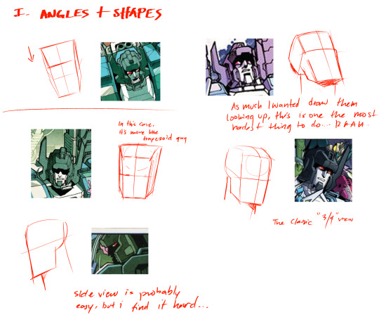
First off,you need to determine his head angle. I used some angles from the existing pics of Fort Max from MTMTE for this owo When you do,try to make a basic shape. In other words,draw a box. So when you draw a box,it should be look like 3D-ish like my illustration above. Fortress Maximus has a very Square-shaped individual and his head shape could vary in some angles and may inconsistent. (my brain is not brainging atm)
II. Drawing For drawing,now I picked the 3/4 angle because it's easy,lol.


I started sketching his head with a circle first and then proceed to add the box shape. The top of his head is not completely flat,but more like curved. But it won't be neccessary later on,I think? (It's just my liking when sketching tho qwq). Then you see a shaded part so it looks like 3D-ish,and I added a jawline and neck.
Next,drawing his face and neck. It didn't go the way the base looks like,but you could overlap on some areas if you needed to (such as chin,jawline,forehead,etc..). Btw,you can use the lasso tool and transform tool to adjust the angle for you liking.


Then,you draw a slightly elevated angular square for his brim.(similar to this lego piece,lmao). Also,you can add his side thingy-stuff (ii have no idea what are those called). I preferrably draw those things angular,but you can draw it straight up a rectangle and more easier.

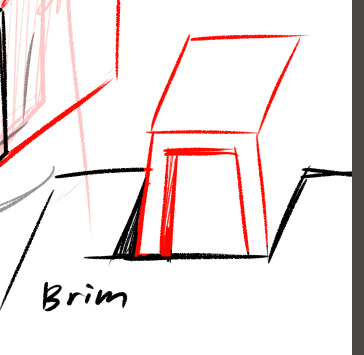
Then add that little thing in the middle like most every cybertronian have. Again,repeat the same "Slightly elevated angular square" but its now a triangle-rectangle hybrid.
Also,try to make it look like buried within the brim. (It still depends on you if you want it on top or look pushed down)
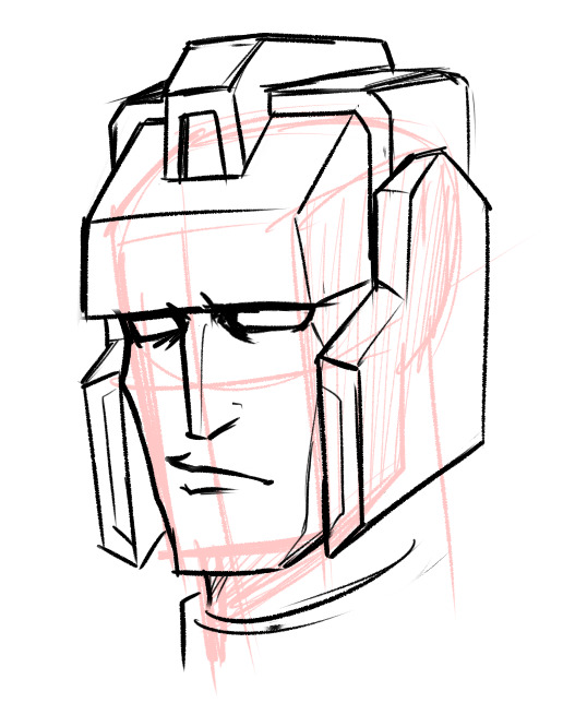
I erased some of his forehead and jawline. And Ta-Da! This looks cursed af,but we're getting there! Final step is to add his antlers or horns.
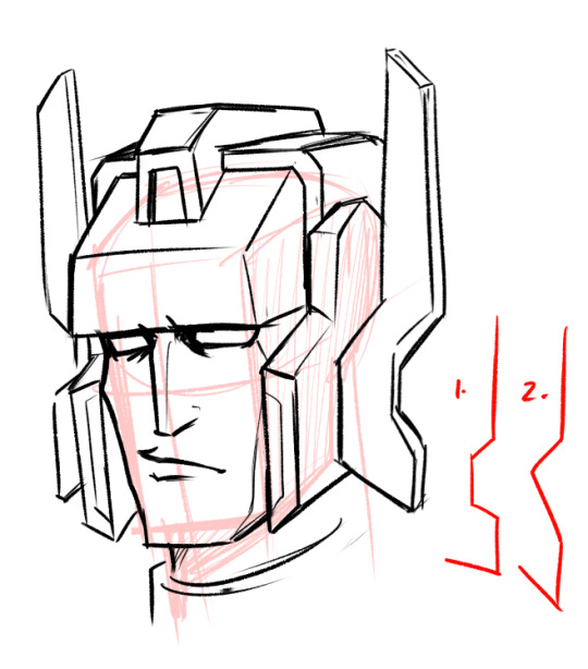
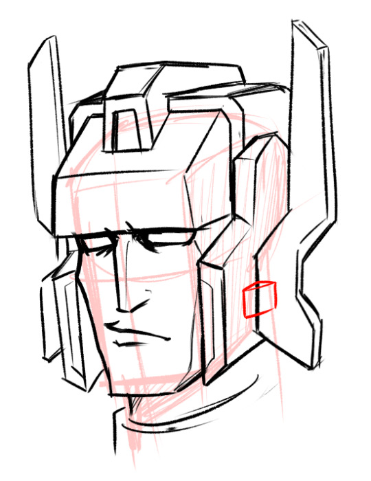
I finally added his horns/antlers! his horns/antlers could vary in shapes too! some examples seen on the lower right,but ive seen more than that!
keep in mind that to flip/mirror the canvas if you drawing those so you can be aware if it looks weird
Add that smol half square between his helm and antlers


and we're almost done! added some details too You can also add those "shadows" on his eyes,like in the idw comics. Max eyes looks a bit small and weird,but it can be fix by erasing some parts to make his eyes looks better.

Finallly...Done!
I made some few minor adjustments for my liking.
I hope you find this tutorial helpful,this is my first ever tutorial i made. It may not be 100% percent accurate,but you get some ideas. Also,I really appreaciate that you asked me for this and it makes me very happy!
Also some bonus side profiles sketch i made last week or so:

Fort max,Inferno and Red alert
my brain is not entirely functioning since i woke up middle of the night and,decided to make a tutorial instead of staring in the darkness qwq
217 notes
·
View notes
Text
Here's my review on Metaphor: Refantazio after being 5h in and not quite done with the demo:
First let me say if you're on the fence about getting this game or not, try the demo. It's available on Steam, PS, and Xbox. It's free. It's ~5h, more or less depending on how much you want to play around with it. The save data can carry over if you decide to buy the game. See if it's fun for you. I talk about performance and graphics on my PC, but see how it works on your system too.
And with that, on to my review.
Graphics & Performance:
I saw a lot of Steam reviews saying they were having a lot of performance issues with the game, even on high-end computers. I didn't really experience anything like that. There was one scene really early in the demo, like an intro narrator bit where it was panning over a map and for some reason that did have some dropped frames and stuttering, but it was only for those 5 seconds and I haven't had a repeat since. I did max the graphics settings and uncap the frames and still had no issues.
I should also say, I don't have a super high-end computer. However, my computer is still pretty nice so maybe on much lower end PCs there would be some issues. I tried min settings as well and honestly didn't see too much of a difference in quality. If you did need to run it in lower graphics, it would still look fantastic.
And it DOES look fantastic. I've noticed there is a lot of different art styles going on. There are animated cutscenes just like in persona where you kind of just watch an anime. There are gameplay cutscenes, where you are watching the 3D characters models in their scene. I noticed the surroundings take on the same level and detail as the characters in these scenes. Then you have the gameplay graphics, which have an almost stylized sort of living painting feel to them.
You'd think having that many styles going on would be chaotic and immersion ruining but honestly it's kind of seamless.
Gameplay:
As is typical of an Atlus game, I'm only just barely getting out of the tutorial, even being 5 hours in. Now that I'm kind of getting into the flow of combat, I genuinely really like it. I wasn't sure how I was going to like a combat system so different from their current IPs (what do you mean there is no demons??) But overall I think they've managed to keep the spirit of their games alive and well while still trying something new for them. I also love that they stuck with the P5R system of being able to kill enemies lower than you without having to go through the whole turn based process, but also made it slightly more involved. They're really leaned into the hybrid action/turn-based gameplay and it's very satisfying.
Archetypes hold the spirit of personas or demons in that you can level them up and build them to suit your characters, but they come with the advantage of your entire party getting to mix and match. Also like personas, you strengthen and enhance them more through social bonds. Thus far in the demo I've gotten as far as unlocking them so I'm not really sure how ranking them plays out quite yet.
By far my favorite part of the game play right now is that if your protagonist dies, it's NOT game over. In fact as long as you have 1 party member standing, the show will go on. Also at the end of the fight your dead characters will revive (with 1hp) and still gain all the xp from the fight.
Some really cool bits that I personally think make the game more fun and challenging: there are many different status effects, but they are divided into 2 categories, physical and mental. Mental status effects expire after the battle, but physical status effects persist. It's a cool little blend of old JRPG punishment with new age JRPG simplicity. (Ask me how I feel about it later when I'm suffering.) Also turn icons, like in SMT, are back. They work relatively the same, which I've always found to be fun, but does make the game a little more challenging. And finally, there is auto-battling if you want to engage it. It will repeat the actions you used prior to engaging it, so if you have a flow going, it does make that kind if easier.
My complaints so far are: for the first few battle areas, your party members are on auto. It's not really fun, and frankly their AI is bad. It's not a long time, but it's more than I liked to see. Also enemies can spawn in right in front of, next to, or behind you where they were not before. This makes it harder (impossible if youre me) to avoid getting ambushed, and honestly feels counterintuitive for a game that's primary gameplay design is strategicly deciding when to attack and when to engage in turn-based combat.
Story:
I am 5 hours in, which in the terms of Atlus games is like, .5%. So I can't really tell you a ton about the story yet. I can say it's interesting. The whole concept is something so fresh for Atlus, and I am eager to know more about the story, the world, the different races, the humans, everything. They have built a solid foundation I absolutely want to see the completion of.
And the characters? I would die for them. Atlus has proven they can write characters with strong bonds and beautiful friendships that will make me go absolutely feral and I can already tell this is where these characters are going as well. I cannot wait. Plus the character designing in this game is above and beyond.
In conclusion, this game has so much potential and promise. I can already tell it's going to be an experience to play though (in a positive way). It's doing a lot that feels very new for Atlus, while remaining true to their current franchises and what makes them so good. I had my doubts about their releasing a brand new IP for their 35th anniversary, but honestly this is perfect. This game pays homage to what already makes their games so good while also showcasing a broad future.
Oh and the soundtrack is absolutely insane. It's Shoji Meguro so of course it's great but I'd be remiss not to mention it anyway.
#metaphor refantazio#game review#long post#if you see typos#sorry my eyes hurt#if you have any questions or wanna just talk about it hit me up
12 notes
·
View notes
Text
youtube
This tutorial will give you a basic understanding of the under-the-hood relation between the modifier stack and the transform engine inside 3DS Max. This will help you understand some of the issues that may occur, that look weird. One of the issues that many of the users bumped into, is when scaling a shape, then applying an extrude modifier, to find out that the extrusion height doesn't match the extrusion value in the stack.
#3dsmax#3ds max tutorials#autodesk#learn 3ds max#3ds max expert#autodesk 3ds max#3d#3dsmax tutorials#3ds max modifier stack#3ds max transforms#Youtube
3 notes
·
View notes
Note
Shaders!
How did you get into making shaders? I've done a lot of modeling and texturing, and while I've hacked together code for other things, I've never tried making shaders and it seems like something that would be really fun. I'd love to know how to get started making things like your raymarching shader. Do you do it within your modeling program or in an engine like unity/unreal? My modeling program of choice is 3ds max and I am not exactly sure if it supports making custom shaders
i think at some point i was just like, i wanna make cool sparkly rocks!!! so i slowly taught myself to make shaders in unity (since i was already learning unity for school). nowadays unity and most other programs have node-based shaders, which work just as well, but i find myself being a lot faster and more organized with just writing them in hlsl (the shader language unity uses)!!
a lot of the things i learn just end up as a result of little journeys - raymarching is a great example, i learned about it by watching a bunch of graphics gdc talks, and stumbled on it in a talk on how they rendered clouds in horizon zero dawn. i cant seem to find the talk it might be vaulted but this paper goes over basically everything from the talk. so i just started implementing the things from the talk!! or at least thats what i wanted to do. i got very stuck very fast and although i looked up a bunch of different tutorials on raymarching, i couldnt crack through it
so i took a break!! until a year later when i knew more and was like, i wanna try again! so i did and that time i got it working. this was my first little raymarching shader :)
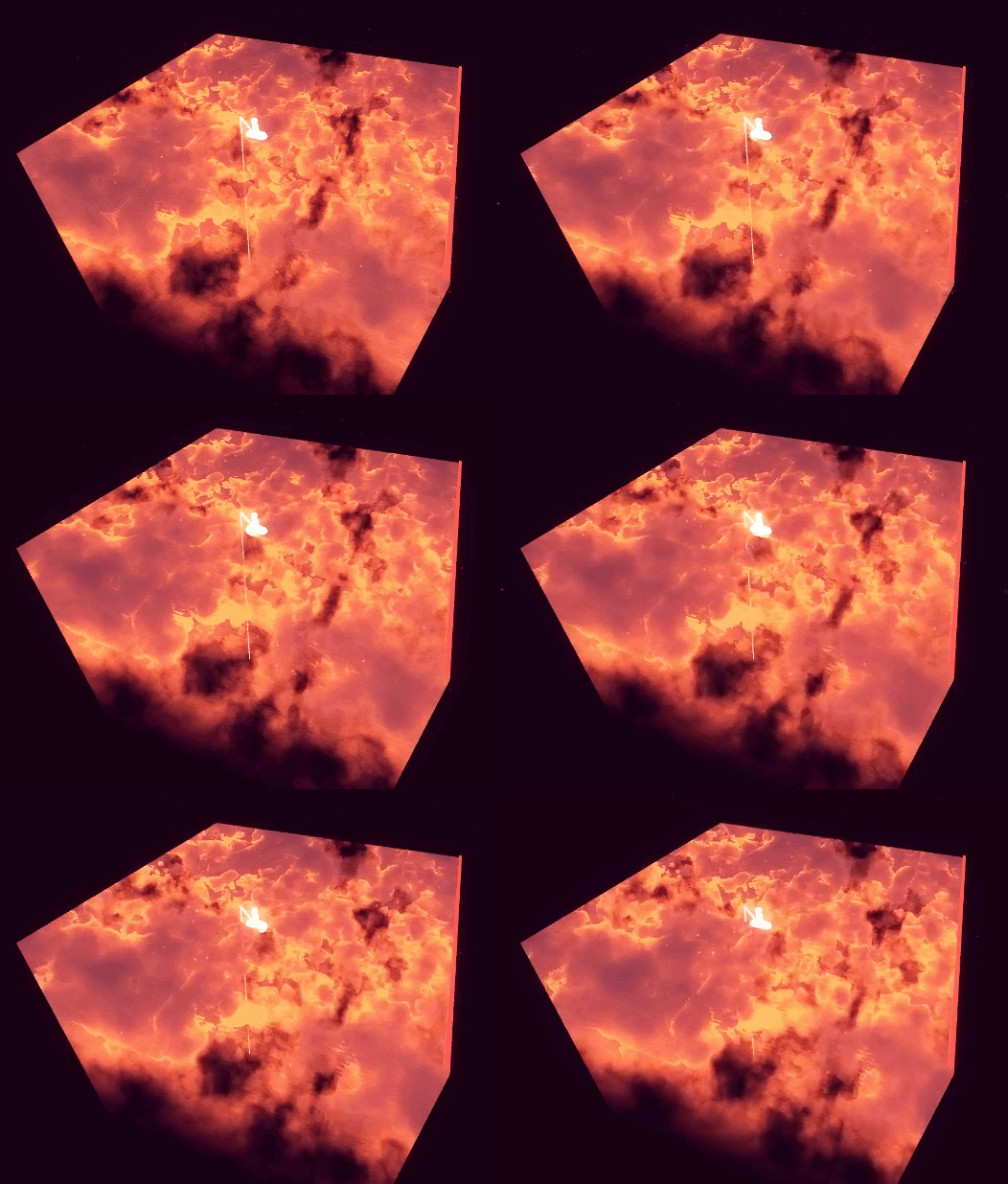
anyways hope this helps a bit.. hard to put into words Exactly how i learned but it was mostly just, looking up resources online of cool things i wanted to do, googling whenever i got stuck, putting it down when i hit walls and tried again later, etc... lots of experimenting and failing and trying again !!!!
bit of an old post but here's one specifically for unity shader resources, but most of the fundamentals between programs are the same
90 notes
·
View notes
Note
How did you make the custom Apollo animations?
- one very tired fool who thought it would be fun to attempt similar model shenanigans with Athena
Keep in mind three things,
one- I have never touched 3d animation before and this has just been me beating the shit out of this program until it does what I want, so this might not be the "right" or easiest way to do anything
two- I am using 3DS max for this so this might not apply to blender or any other program.
three- I'm going to assume you know how to load models and animations, at least directly from the game files
Also this is a very slapdash tutorial so you can send any other questions in, knowing I won't hit everything at all.
The easiest thing for you to do, amateur to amateur, is pick an animation that makes a good base. This can just be the neutral pose, a talking pose, whatever. I don't like dealing with talking and blinking so I usually make sure I have those loaded beforehand.
Before you worry about animation, spend time posing and adjusting things that aren't going to be moving, and just generally solidifying the pose. It's much more annoying to do this after you start animating. In my... very non-professional opinion.
Once you have that down, look at the bottom of the screen.

It's a lot, but you're going to be staring at it if you want to animate. What I do immediately is click on that little icon directly below the frame slider, at the very left edge. After that, click "Editor" and then "Curve editor". Then just enlarge it a bit, and...

boom, animation curve timeline. Let's get an actual animation to show what this actually represents...

I'm selecting bone15 here, which corresponds to his left upper eyelid. The red peaks in the curve timeline represent him blinking. So basically, this is a linear representation of all of the moving parts in the animation over time... very fun.
If you grab onto a node and move it around, you can see the effect it has, so this is one method of adding animation points. Another method is to move to the frame you want, and, after turning on "auto key" move the model to the pose you want.

this automatically adds animation keys when you move things around, which is better than physically editing the timeline sometimes. I do both depending on things.
I'd honestly just suggest screwing around in here with no goal first, as that's how I started. But, as for actual things...
Don't move the parts themselves, move the bones. If you must, messing with the mesh is possible (I had to do it for his jacket in the bashful emote) but it is very very janky. Try to stick to rotating things instead of moving them when messing with joints. "," and "." advance 1 frame back and 1 frame forwards respectively.
As for how I edit them out, you probably see my great green screen up there. It's just a flat plane turned green. I just screen record the animation and use websites online to crop out the green, turn the video into a gif, and resize it to my liking. I... should probably figure out how to directly get a transparent video or gif out of the program, but oh well, this works.
12 notes
·
View notes
Note
Hello friend! I just wanted to start by saying I absolutely adore your CC - you have nailed the maxis style perfectly! Do you mind sharing how you learnt to make CC? If you have any good tutorials, perhaps you could link them? Tysm! <3
Hi! Thank you so much! For creating cc you have to be familiar with a 3D sofware such as Blender, Maya, 3D Studio Max. For making the objects you can find tutorials for these softwares on Youtube. I personally use Blender because it's free but has a lot of features. For putting it together and to be able to put your 3D meshes into the game you'll need Sims 4 Studio. You can download it from their forum and everything I know (which isn't a whole lot but I'm still learning) about Sims 4 Studio is from their forum. Honestly if you have a problem you face you search for it there and someone probably have already answered it. So all in all, if you have experience in 3D modeling you can start with these tutorials here: https://sims4studio.com/thread/662/index-studio-tutorials-online-manual Hope you start it! Let me know how it goes or if you need any help!
7 notes
·
View notes