#210gsm
Text
𝐁𝐄𝐒𝐓 𝐏𝐒, 𝟐𝟏𝟎𝐠𝐬𝐦 𝟏𝟎𝟎% 𝐏𝐑𝐄𝐌𝐈𝐔𝐌 𝐂𝐎𝐓𝐓𝐎𝐍 𝐏𝐀𝐍𝐓/𝐒𝐇𝐈𝐑𝐓
𝐅𝐄𝐀𝐓𝐔𝐑𝐄𝐒:
100% Premium Cotton, Mercerized/Sanforized, Elasticated waistband for fit, Two Chest Pockets, One Back Pocket, Two Swing Pocket, One Tool Pocket
𝐅𝐀𝐁𝐑𝐈𝐂 𝐖𝐄𝐈𝐆𝐇𝐓: 210 GSM
𝐂𝐎𝐋𝐎𝐑: Petrol Blue / Navy Blue / Khaki / Orange / Red / Grey /
𝐒𝐈𝐙𝐄𝐒: Small to 4XL
Visit : https://sams-solutions.com/.../ameriza-best-ps-210gsm-100...
To place your order online : https://www.ppe-online.com/.../ameriza-best-ps-210gsm-100...

#ameriza#best#quality#pantshirt#210gsm#mercerized#certified#bodyprotection#safety#100percentcotton#highquality#bestseller
0 notes
Text
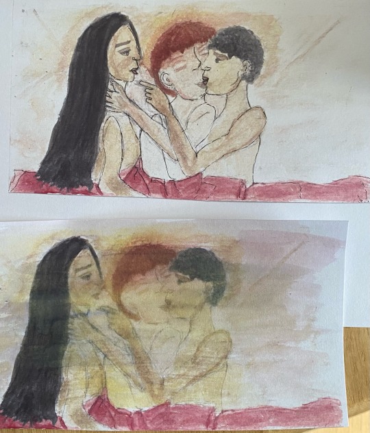
I printed copies with my art classes printer and I’m trying to decide which one I like best (also I want some colour fine liners a lot) + best captures the vibes of the scene I have in my head.
(A pivotal scene from my Tudors OT3 verse - water colour printed)
#also unfortunately 210gsm water colour paper is SO AMAZING TO WORK WITH#like yes now I cannot get away from the expensive paper this is exactly me with yarn#pending graphic tag#ot3: political power trio
10 notes
·
View notes
Text
Hotel Vast Horizon by @rocket-eighty-eight
Heat (1995) | Vincent Hanna/Neil McCauley | 16,202 words | 100 pages
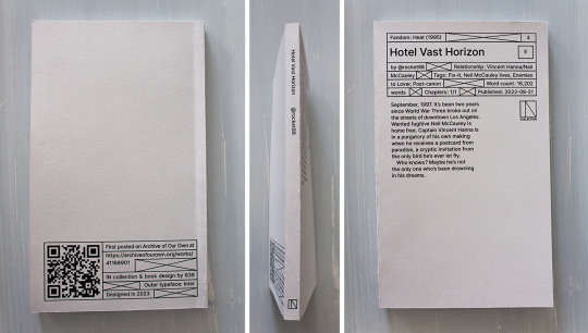
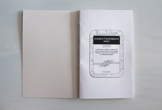
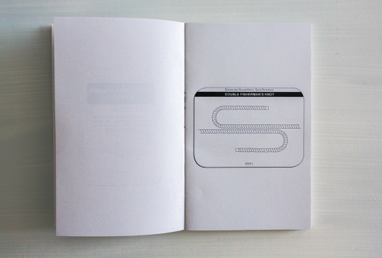
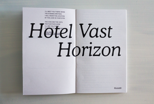

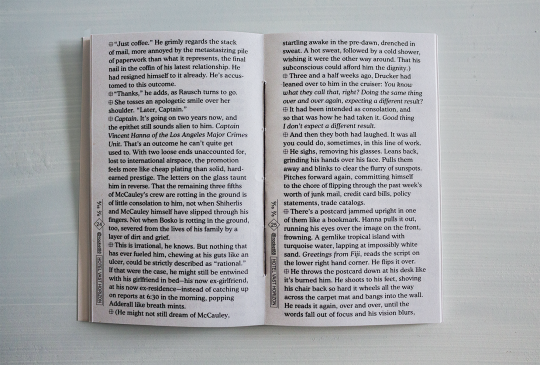
You can see and download the whole typeset HERE.
You can also print it if you want a copy for yourself! I provide printable files below. Check out the guide first ↓ The book is 11x18cm AKA 4,3x7,1" & can be printed with a coptic stitch or staples. Mine's printed on 80gsm grey recycled paper & 210gsm grey paper for the cover.
DOWNLOAD THE FILES / PRINTING & BINDING GUIDE
PRINTING NOTES: This typeset goes pretty close to the edges of the pages, so be careful when cutting it, and the first signature or so has double-spread images, so I'd really recommend making sure your double-sided printing is calibrated for this one (whether you're doing it at home or at a printing shop).
HEY!!!! HI! finally. If you've checked the Heat (1995) (Al Pacino and Robert De Niro Go on a Date: The Movie) tag on AO3 in the past year you've probably checked out Hotel Vast Horizon (Michael Mann Could Never: The Fic). Welp here it is on paper.
The common thread in the typeset was always the ocean (and shit, I said the o-word. did you know there are like 20 references to water, seas and storms in HVH, and yet never once "ocean" is said?). The other thread was the Bitstream Cooper typeface, which is round and curvy and so pleasing on the eye. Isn't it? Also Arial (underrated), because I needed it for the sequencing to show that Michael Mann is a loser. I'm kidding. Or am I? But this brings me to another major thing: the sequencing. (The common denominator between movies and books: the sequence.) That can only be apprehended on the full PDF/book, and it's really something that did not really exist (in so much depths) in the previous typesets.
As to what the sequencing is saying, or what the hell this intro is about (no I did not have a stroke when I did it), I will not say much if only that it is about the vocabulary, the image, the movie, the things that go beyond fate, a little bit Neil vs Vincent and a lot the reason vs the heart. More things shall remain unexplained because I feel they would be better experienced than laid out here.
If you'd still like to know what's actually going on in this thing don't hesitate to send in an ask lol.
More details on the technical matters + a visualization at the bottom, because there is work involved and my micro typography is so clean it could give Neil McCauley a boner.
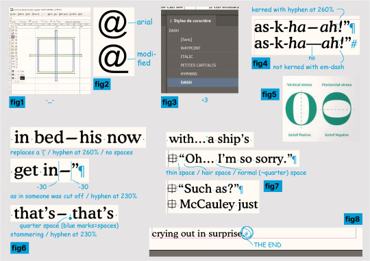
help where do i even begin? I learnt how to use FontForge to create a new typeface specifically for that symbol at the beginning of the paragraphs in order to implement it in InDesign (see fig.1 below), I changed the Arial's @ in FontForge too (fig.2) to have it fit with the underline in @ rocket88, what the hell.
2. I also drew 11 (I think) illustrations for the intro (yes, those knots......), but that wasn't as complicated as I thought it would be. I do deeply curse InDesign's "Print Booklet" function for how much it hates images though.
3. I would like you to meet my InDesign characters styles (fig.3) as they simply are impeccable and the best you will ever see, I could not have been more professional if you had paid me 5 grand for this. The hyphens! The dashes! The custom small caps!
4. To get even further in the micro typography. It is, in most, most cases, much too time-consuming to properly kern (=modulate the space between your characters and/or words) your text for how little the average eye will get out of it, and/or your average graphic designer is certainly not getting paid enough to actually do it properly. I, on the other hand, am insane and unemployed, therefore yes, I kerned this shit. Micro typo is actually the sculpture of the white spaces of your page. When done thoroughly it does mean checking every characters with your own eyeballs.
So in english, since this typeset is in english, the rules are no spaces for punctuation. Right? and not right ? It makes for a pretty tight block. I do argue too tight - although of course you'll also have times where you want tight. (And this is all within the 5% of the time where kerning matters.) That might not sound too bad until you get to em-dashes, this '—' thing. Which is a literally useless punctuation mark that is so hysterically long it'll leave an unnatural horizontal void in your text and draw all attention to it—you know, instead of the text itself. Useless, because it can always be replaced by commas, colon, semicolon, or parentheses. Unnatural, because em/en-dashes do not follow a typeface's characteristics (when hyphens do! fig4), so they hardly fit with serifs, AND characters are generally vertically stressed in latin (fig5: which one looks normal?) except... well. So you'll have the tightest group of punctuation marks humping each other?!"— then a dash literally the size of a whole ass m that looks nothing like the rest. ridiculous. absurd.
Anyway the point is I said bye-bye to this aberration and used hyphens stretched at 260% (lmao. it works so well?). And sometimes 230%. Sometimes with a space after, sometimes not - if not the same meaning then why the same treatment (fig6)? I wondered at this point if I wasn't going too far (lol) but this is the point of micro typo, so, whatever. See fig7 for more kerning stuff.
5. I have far less things to say about this part than the last even though I must have spent twice as much time on it, but I just wanted to say that I manually set the text rag on all 69 pages, it looks nice, I love tetris, AND!!!! the greatest thing about the whole fucking book (fig8): the text starts on the top line of the first column, and ends, on p.91, on the LAST line of the column, at the very bottom of the page, and IT IS NOT. BY. CHANCE!!!!!! HAHAHAHAHA!!!!!!
thanks for reading. perfection has not been achieved and there might still be typos. see you later.
74 notes
·
View notes
Text

#love#instagood#fashion#art#photooftheday#photography#beautiful#nature#instagram#cute#picoftheday#travel#happy#follow#style#tbt#instadaily#like4like#repost#summer#food#beauty#selfie#me#instalike#girl#friends#smile#photo#family
2 notes
·
View notes
Text
"The Abbey has a long history, not all good."
Charcoal x Graphite in vellum paper 210gsm A4 size.

22 notes
·
View notes
Note
what materials do you use for your traditional work? i.e. your paper and inks
210gsm A5 paper, 2b pencil, Mitsubishi uniball for lines, tombow brush pen for inks and random copics I bought cheap off a friend in a garbage bag he had.
5 notes
·
View notes
Note
do you print all your artworks? what do you use to do them?
Hii!
Yes, I do print them!
I print them on art papers (210gsm for posters or 150gsm for art books). They need pigment ink so the colours are exactly like the one on my screen. Epson generally support pigment ink that’s why I use them (I use the L1800 model that supports A3 printing, cost around 1,300AUD here).
Hope that helps and thank you for asking 💓
1 note
·
View note
Text
Satin and Archival


Bring your artwork to life in high-end detail and treat your customers to quality poster prints they'll love. Available in 210gsm paper (satin) and 230gsm (archival matte), these prints will look stunning up close for a long time. To help you find the perfect fit for your art, these posters come in 18 sizes, as well as with horizontal, vertical, and square framing options..: Materials: 210 gsm paper (satin), 230 gsm paper (archival matte).: Two paper options - satin or archival matte.: Available in 18 sizes.: Horizontal, vertical and square options available.: Assembled in the USA from globally sourced parts
Click here to view the product
0 notes
Text
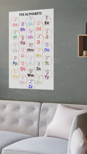
THE ALPHABET POSTER - Satin Posters (210gsm)
Elevate Learning with THE ALPHABET POSTER - Satin Posters (210gsm)
Introduce a touch of elegance and education into any space with "THE ALPHABET POSTER" from TrendCreative. Perfect for nurseries, classrooms, or playrooms, this poster is more than just a decorative piece—it's a functional educational tool designed to inspire young minds. Printed on premium 210gsm satin paper, it boasts a luxurious low-glare finish that enhances the clarity and vibrancy of each letter, ensuring it stands out in any indoor environment.
Available in multiple sizes, "THE ALPHABET POSTER" can be customized to fit perfectly into any space, whether you’re working with a cozy nook or a large classroom wall. Its durable construction and high-quality materials, assembled in the USA from globally sourced parts, ensure that it not only looks great but also lasts.
What Our Customers Are Saying:
"Absolutely love this poster! It’s the perfect addition to my son’s room. The colors are vibrant, and the quality is top-notch." – Sarah T.
"As a teacher, I'm always looking for resources that are both educational and visually appealing. This poster checks all the boxes!" – Emma W.
"The satin finish is beautiful and really makes the letters pop. I couldn’t be happier with my purchase." – James R.
Conclusion
Make learning fun and stylish with "THE ALPHABET POSTER" from TrendCreative. Whether you’re decorating a child’s bedroom or enhancing a classroom, this poster offers the perfect blend of functionality and aesthetic appeal. Don’t miss out on this must-have educational tool—order yours today and inspire the next generation of learners with TrendCreative!
#AlphabetPoster#EducationalDecor#KidsRoomArt#ClassroomDecoration#NurseryWallArt#LearningTool#ABCLearning#SatinPoster#KidsEducation#TrendCreative
0 notes
Text
Paper Cup Sheet 3inch 210gsm PE Coated High Bulk
Product Name: PE coated paper sheet for paper cups
Industrial Use: Beverage
Use: To make paper cup, paper bowl, paper cup fan
Payment Terms: By T/T
Lead Time: 25-30 days
FOB port: Shanghai, China
Transport: By sea, land
Zhejiang Mingfei New Materials Co., Ltd. is China Paper Cup Sheet 3inch 210gsm PE Coated High Bulk Suppliers and Paper Cup Sheet 3inch 210gsm PE Coated High Bulk Company, It is a comprehensive company engaged in the production and sales of long-distance transmission heat network projects, reflective layer products used in the construction industry and food packaging paper, mainly engaged in the research and development of nano-materials, nano-airbag reflective layer, glass fiber composite insulation materials, aluminum silicate needle punch blanket, refractory materials, thermal insulation materials, laminated paper, etc.
CONTACT US
+8615968871306
[email protected]
#30, Zhenxing South Rd, Deqing, Huzhou City, China 313223

0 notes
Text
𝐁𝐄𝐒𝐓 𝐂𝐕, 𝟐𝟏𝟎𝐠𝐬𝐦 𝟏𝟎𝟎% 𝐏𝐑𝐄𝐌𝐈𝐔𝐌 𝐂𝐎𝐓𝐓𝐎𝐍 𝐂𝐎𝐕𝐄𝐑𝐀𝐋𝐋

𝐅𝐄𝐀𝐓𝐔𝐑𝐄𝐒:
100% Premium Cotton, Mercerized/Sanforized, Elasticated waistband for fit, Two Chest Pockets, One Back Pocket, Two Swing Pocket, One Tool Pocket.
𝐅𝐀𝐁𝐑𝐈𝐂 𝐖𝐄𝐈𝐆𝐇𝐓: 210 GSM
𝐂𝐎𝐋𝐎𝐑: Petrol Blue / Navy Blue / Khaki / Orange / Red / Grey /Yellow
𝐒𝐈𝐙𝐄𝐒: Small to 4XL
#ameriza#best#quality#coverall#210gsm#mercerized#certified#bodyprotection#safety#100percentcotton#highquality#bestseller
0 notes
Text
Accidents of Happenstance & Other Poems by orangery
Heat (1995-2022) | Vincent Hanna/Neil McCauley | 8,286 words | 112 pages
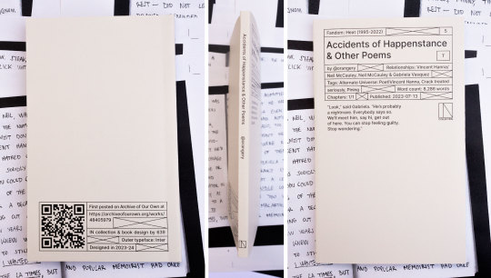

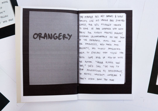
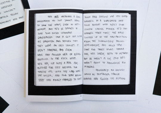
You can see the full typeset HERE.
You can also print it if you want a copy for yourself, I provide printable files below. The book is 11x18cm AKA 4,3x7,1" & can be printed with a coptic stitch or staples or saddle stitch. Mine's printed on 80gsm grey recycled paper & 210gsm grey paper for the cover.
DOWNLOAD THE FILES / PRINTING & BINDING GUIDE
PRINTING NOTES: this file is sadly a bitch to print due to the overabundance of double-spread images, which means you need pretty good double sided calibration to have the black background be aligned... or just accept the offset... good luck it took me 4 tries lol.
Second and last typeset for a Heat fic, this one is severely underrated (go read it). Well, I get that poet!Vincent Hanna would confuse most people, but the fic remains amazing. Crack treated seriously is the best... Vincent could be a poet... as a treat...
As for the typeset, I think this time, less will be more. I'll gladly answer an ask if you want to know more but until then... I'll leave it at that.
#fanbinding#book design#bookbinding#graphic design#heat 1995#vincent hanna#neil mccauley#ficbinding#al pacino#robert de niro#mchanna#heat 2#editorial design#typeset#typesetting#blog
35 notes
·
View notes
Text

Calle del Cristo Poster, San Juan, Puerto Rico Wall Art Print (210gsm)
Artist: Nicole Noemí
Shop your print on Etsy or here
Gracias por apoyar mi arte <3
#art#artist#illustration#mine#artists on tumblr#puerto rico#sketch#nicole noemi#illustrators on tumblr#traditional art#watercolor#acuarela#puerto rican art#arte puertorriqueño#boricua#queer artist#lgbtq#street art#wall decor#art prints#watercolor posters#watercolor illustration#urban sketchers#uskpr#etsy seller#artsy gifts
0 notes
Text

#love#instagood#fashion#art#photooftheday#photography#beautiful#nature#instagram#cute#picoftheday#travel#happy#follow#style#tbt#instadaily#like4like#repost#summer#food#beauty#selfie#me#instalike#girl#friends#smile#photo#family
0 notes
Video
youtube
#printondemand #posters #SatinPosters#Shorts
https://www.etsy.com/listing/1694526588/satin-posters-210gsm?ref=listings_manager_grid
0 notes