#2 colors only also: prussian blue and titanium white
Explore tagged Tumblr posts
Visit Tumblr Blog
Explore Tumblr blogs with no restrictions, modern design and the best experience.
Last Seen Tumblr Blogs


Fun Fact
Tumblr has been banned in Indonesia for providing people with access to pornographic content.
Text
ATTENTION ARTISTS!!
I have been going down an art history hyperfixiation at the moment, so I’m going to make it all of you lovely people’s problem.
I have an art challenge for you! Throughout history, there have been multiple famous painters that use ‘limited palettes’, which are palettes that only have a few specific colors and nothing else. This would add a level of challenge while also making their art distinct.
In this event, you must use a different color palette used by famous painters for 7 days.
RULES
You can do this digitally or traditionally
ONLY THE PALETTE OF THE DAY, NO OTHER COLORS.
You dont have to use every color listed in the designated palette, because some of them are VERY long.
Some of the colors (i.e: vermillion, cadmium, lead) are actually TOXIC paints. DO NOT USE THE ACTUAL TOXIC PAINT. This is for your safety; please use the shades similar to it.
Make sure to use the tag #limitedpaletteweek so I can see :D
Have fun!
Day 1: Anders Zorn
Ochor Yellow, Ivory Black, Titanium White and Vermillion
Day 2: Paul Gaugin
Prussian blue, Cobalt blue, Emerald green, Viridian, Cadmium yellow, Chrome yellow, Red ochre, Cobalt violet, Lead white, Zinc white
Day 3: Rembrant
Lead white, Bone black, Ochre, Sienna, Umber.
Day 4: Fredric Remington
Prussian Blue, Bone Black, Flake White, Vermillion, Cad Red, Cad Yellow, Chromium Yellow, Chromium Orange, Emerald Green, Chromium Oxide Green, Hooker’s Green
Day 5: Emile Grupe
Ultramarine Blue, Rose Madder Deep, Cadmium Red Deep, Cadmium Orange, Cadmium Yellow Deep, Cadmium Lemon, Phthalo Blue, Zinc White, Raw Umber
Day 6: Richard Schmid
Cadmium Lemon, Cadmium Yellow Pale, Cadmium Yellow Deep, Yellow Ochre Light, Cadmium Red, Terra Rosa, Alizarin Crimson, Transparent Oxide Red, Viridian, Cobalt Blue Light, Ultramarine Blue Deep, Titanium White
Day 7: William Bouguereau
Naples Yellow, Yellow-Ochre, Chrome Yellow, Viridian, Cobalt Blue White Lead, Light Vermilion, Chinese Vermilion, Mars Brown, Van Dyck Brown, Burnt Sienna, Ivory Black, Bitumen, Genuine Rose Madder
#art history#art challenge#color palette#artists on tumblr#art#limited palette#limitedpaletteweek#coloring#colors
29 notes
·
View notes
Text
Painting Tutorial
Disclaimers !!! (important)
I’m not an expert or teacher.
There is an infinite number of ways you can paint. THERE IS NO WRONG WAY TO PAINT! This is how I do it / how I was taught to do it.
I’m doing this (during mars 2020) because I’m getting restless during the global quarantine. If you want to paint but you don’t have the supplies: PLEASE don’t go out to buy supplies. This is not a necessity so please stay safe. Also, if you’re considering buying art supplies on the internet ask yourself if it is necessary (like if you have an assignment/it’s part of your job/...) and try to minimize the strain on delivery services for non-essential supplies.
This post will still exist in a few months. I’ll even self-reblog it at the end of the lockdown so that, if you’re still interested, it’ll be here.
I’m going to make fan art for @letmetellyouaboutmyfeels (madsthenerdygirl on AO3) and her witcher fic “Even Steel Blades Need Fire” that you can find here.
I’m trying to make a non-spoiler piece, but I’ll talk about the fic (so spoilers!) during the process. If you have not read her fic and you don’t want to get spoiled, go read it before you continue.
I started painting two years ago, and I remember vividly my struggles in the beginning. Painting can be confusing, and I am going to assume that people with no experience are going to read this.
I’ll be explaining the painting process in-depth so LONG POST (I guess) and stay tuned for updates !!! (yay)
I think that’s all.
Let’s start !!!
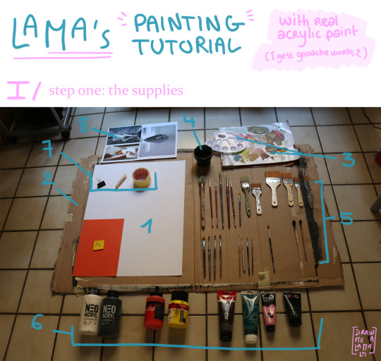
Here we have it all! All the supplies (and some) I use when painting with acrylic paint.
First, note that you don’t need all these supplies to paint. Most of the time I do it with less, but this is a tutorial so...
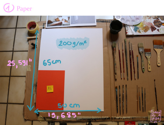
1. Paper
Good news, you don't need to have a canvas to paint !!! You can just use paper (cool right?!).
Any size is ok, but I prefer to paint big (this paper here is on the smaller side. I usually paint on “grand aigle” paper or “double grand aigle”. Which translates to “great (?) eagle”. Look it up!).
Here I’ll be using a 65x50 cm piece (called “format raisin”/ “grapes format”...)
I advise to use 200gms (or 200g/m2) or more but 180g can work too.
225gms and 250gms are my personal favourites.
2. Something to protect the surface you are painting on.
when I started painting I was super messy. I had no control over the paintbrush/the paint/etc..
I recommend using something (cardboard, plastic bag (not the best...), or newspaper) to cover up where you're going to paint.
The smaller your paper, the more likely you are to spill paint next to it.
On that note, when I started painting I used to wear a chemistry lab coat to protect my clothes.
It can save you when you least expect it (read: the whole bottle of paint falls and explodes everywhere). Now I stopped doing that (bad) but I don't really care about my clothes and also painting in your underwear when you're alone is fun.
remember to remove any jewellery (RINGS!!!) (you don't want to scrape off dried paint of off jewellery).
Don't wear gloves. (acrylic paint washes of with soap and hot water). Plus gloves are going to make your hands sweat and I don't recommend wearing them for long periods.
have a towel nearby or something at your disposal (but only use old stuff. you will probably never get all the paint stains off. I use my old lab coat.)
where you are painting is important too. When I started painting I liked using an easel. If you don't have an easel, that's ok. I don't have access to one during this quarantine business, so I'm doing sans-easel.
Also, I prefer to paint on the ground or on a table (depending on the cleanness of the ground and the paper size. if it's too big for one table, I sometimes use two side by side but it's not really practical).
Also with bigger papers, an easel can be impractical = you can't reach the top/bottom easily and you tire very easily.
Here is something my teacher used to tell us:
“Don't sit on a chair.”
Explanation: when using a chair your paintings tend to look "tired" or "sloppy" (Idk how to describe it, but for better results try to stand up)
however if you are doing:
a big piece
painting for a long time
or you have medical issues that make standing up for a long time painful
then I recommend either having a chair nearby to take "sitting" breaks or painting on the ground.
In all cases take breaks!
Second advice from my teacher:
“Don't listen to music while you paint.”
Explanation: when painting you want to avoid "coloring" with brushstrokes that go left-right and up-down all the time. when listening to your music you will unintentionally start following the rhythm of the music with your strokes and making them repetitive. Similarly, I noted that I'm slower when listening to music because I tend to focus more on the music than on what I am painting.
BUT, I know someone who makes these beautiful, giant paintings on bedsheets, which take like weeks to complete and with lots of details. And guess what? Not only does she sit down but she also listens to music while doing so.
In conclusion, it's up to you. but if you struggle painting: try sitting down/standing up/ taking more breaks/ turn on/off your music...
3. Paint pallets
Ok, so here again it's up to personal preferences.
you can use a
plastic/wood/glass pallet (that you re-use every time)
or you can use
disposable paint pallets/a piece of cardboard/paper plates (that you reuse a couple of times before throwing away).
At first, I started to use plastic pallets but I kept trying to clean them at the end of each lesson and I was losing so much time... (note: I found that bigger pallets with no little "holes" work the best).
Problems:
If the paint is dry it’s super difficult to get it off without soap or other types of cleaning products.
You use a lot of water to clean it and paint gets in the sewers.
An alternative is disposable pallets like on the picture (or cardboard/paper plates). you don't have to clean them, it's super cheap/free and a lot lighter.
Problems:
you can't use them forever and will need to throw it away (or recycle them into weird paintings).
If you use straight-up cardboard and try to mix a lot of water in your paint it will make a mess and destroy your pallet.
4. Water dish
Anything that holds water and that you don't use to drink is ok. Remember you will probably never get all the paint off.
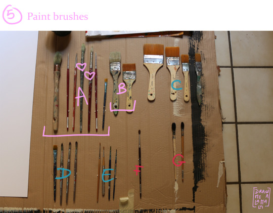
5. Paintbrushes
Okay, this is the weird part where I tell you that "paintbrush" is "pinceau" in french and that the word comes from the Latin "penicillum" which means "small tail" or "penis". Also, there's this text (of which I don't remember de name or the author) but it discusses the implication of artist's preferences for certain types of paintbrushes when you compare them to penises and it's silly and fun but now I need to talk about the paintbrushes I use and I don't want to make this awkward, so just forget what I just wrote there.
Let's see. I grouped and ranked each brush from A to G depending on how much I use them.
A) My personal favourites, that I use all the time: they are mostly round brushes.
There's a big one that's actually to paint walls but works well when I need to cover big surfaces
then a few tiny/flats with rounded tips for detail (called ”Filbert”)
a couple of medium/rounds
and this flat squared tipped (called “Flat” or “Bright”) for when I need to get clean edges.
B) Medium/flat and square tipped brushes I use the same way as the big round.
C) These ones I use when the others are already in use and I need a clean brush. the problem is that some of them have these synthetic bristles that are super bendy and I don't like it.
D) Some more small brushes for detail. I sometimes use them for watercolour because they can hold a lot of water. See how they have a shorter handle? Long handle = for easel painting (because then you can get further away). The small handle = not for easel painting.
To be honest I don't really care. it's not super important (but I prefer the long handle ones).
E) These are really tiny small round brushes that can be used for even smaller detail (but I don't use them a lot).
F) I never use this paintbrush. the bristles are super soft and fur-like and see how they're pointing outward instead of inwards, and don’t make a point? yeah, I can't do anything with that.
G) Please, PLEASE, for the love of god do not use these types of brushes with acrylic paint. they're for ink painting and calligraphy and other stuff. They're super expensive and a pain to wash. I've seen people use them with paint and I don't judge but personally, it just feels wrong to use them with paint.
General tips to keep in mind when buying brushes:
Size matters.
The bigger the better.
Hog bristles = texture + (in general) better quality + stiffer
Synthetic or nylon bristles = cheaper + bendier + smoother finish.
If you are getting a pack of brushes try to look for one with more of the bigger brushes than smaller ones.
You don't need every size but you need a couple under 10, one or two around 20 and one 30 or 40.
Brushes are expensive. Like, think book price range (where I buy them they are around 15 euro or around 20 euro).
Any free brush is a good brush.
Handles don't matter.
General tips to care for brushes:
Wash your brushes.
Use soap (dish soap is fine). I've seen people use shampoo and I'm sure it works but for acrylic paint (= water-based paint), it's a bit overkill.
Let them dry laying flat.
Don't let them sit too long in the water. you don't want to weaken the wood or glue or metal that is holding everything together.
Handles don't matter (just keep a picture or a reference of your brush before it gets covered in paint and you can't tell what size/brand it is anymore).
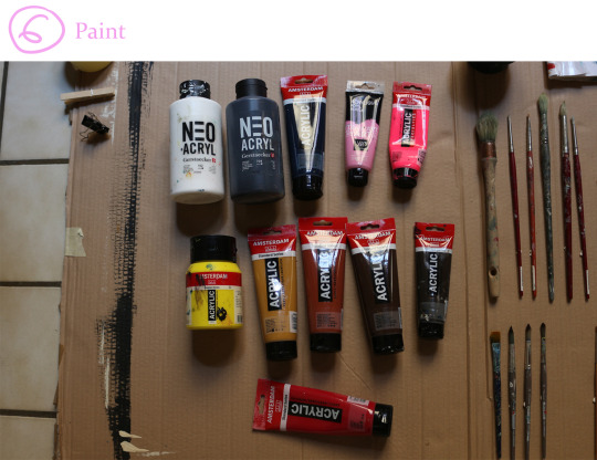
6. Paint
The fun part!
Here are the colours I am going to use (I'm not using all the colours i have and I tried to make a varied but coherent pallet).
(from top to bottom, left to right.)
Titanium White (neo acryl, Gerstaecker, 102)
Black (neo acryl, Gerstaecker,704)
Prussian blue phthalo (acrylic standard series, Amsterdam all acrylics, 566)
Quinacridone pink (I love art, Gerstaecker, 350)
Reflex rose (I love art acrylic, Gerstaecker, 384)
Primary yellow (acrylic standard series, Amsterdam all acrylics, 275)
Raw sienna (acrylic standard series, Amsterdam all acrylics, 234)
Burnt sienna (acrylic standard series, Amsterdam all acrylics, 411)
Burnt umber (acrylic standard series, Amsterdam all acrylics, 409)
Vandyke brown (acrylic standard series, Amsterdam all acrylics, 403)
Carmine (acrylic standard series, Amsterdam all acrylics, 318)
General tips to keep in mind when buying paint, or how to choose colours when you don't want to spend too much on paint:
You CAN NOT paint with only primary colours !!!
NO magenta (it's like using 100% red. Also paint is pigment not light so magenta does not equal red)
Get more white and black paint (you can start with small quantities but these two getts used the most. I've also seen people buy "handyman paint" in white to get large quantities for cheaper but I never tried before.)
Pick darker colours over lighter ones
and pick lighter colours over mid-tones (I will go over this later when I start painting)
If you're like me and don't have tons of money to spend on paint, avoid paints with double colour names like "greenish-yellow", get yellow and get green and get white and then mix! (so you have green, yellow and everything in-between...)
When in doubt pick colours with:
fancy names (royal blue, ultramarine blue,...)
natural pigments names (cobalt, carmine, sienna,..)
well known names (TITANIUM white !!!)
artist’s names (Vandyke brown, Klein blue, ...)
Exciting and unusual names (what intrigues you? If you go: wtf is "Quinacridone pink?", "Phthalocyanine emerald" "Vermillon?", then pick that.)
I know I said don't use primary colours but you NEED to mix colours. Go crazy! (note: straight from the tube colour can be used but in moderation or with good reasons..)
BUT You NEED brown, don't try to make it yourself
you DON'T need purple (I'll explain later)
(fluorescent colours can give you unexpected results when mixing. (I bought the fluorescent pink thinking I'd only use a small amount but now I'm kinda running out. And I don't even like pink that much...))
7. Something to pin down your paper
You only need this if you are going to work on something not horizontal.
Any type of pins (that can support the weight of the paper)
repositionable tape
or any kind of masking tape (that does not ruin paper when removed)
8. references
(The references on the picture are from another project.)
If you're not painting from life I recommend printing out your references over just having it on your phone or laptop or any screen, because
when you print them you are using pigment
and then when you are painting you're looking at pigment and not pixels/light.
So it's actually easier to SEE the colors you have to use (and it can improve your results when painting with PIGMENT).
Also, try to print them as big as you can.
Right now I don't have a printer with me and I can't, like, get it printed or anything (not only because of the lockdown but because this is witcher stuff I'm going to make so I'm going to need reference photos of the actors and everything... yeah, no).
I'm just going to have my refs on a screen...
Hope some of you made it this far. If so, congratulation!
(I tried to make this as clear as possible (English is not my first language and I struggle with writing)).
#painting tutorial#art tutorial#the witcher#witcher fanart#long post#long post cw#tldr: look at the pictures. That is what i'm going to use to make witcher art in this tutorial#lama draws
47 notes
·
View notes
Text
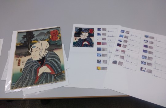
-Report on the results of paint analysis pt2-
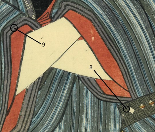
8-[prussian blue + orpiment + rice flour]
The same paint combination as 4, but this one has a yellowish and brownish tint.Regarding the yellowness, it is a matter of the amount of orpiment, but for the brownish one, it was expected that ink and red iron oxide would be mixed in by the first judgment only by the naked eye.But it is not actually detected and the cause is unknown.
In the early Edo period, most orpiments relied mainly on imports from China and Southeast Asian countries, but in the first half of the 18th century, artificial orpiment production was developed in Aizu.It is said that the frequency of use of ukiyo-e will increase after around 1830, so it seems that the market system for supplying cheaply to some extent was established around this time.宇田川溶庵・訳「舎密開宗 巻十四 第二百四十ニ章」1837 describes the Western-style orpiment manufacturing method.And it is written that the color tone of red to yellow can be produced depending on the amount of sulfur and arsenic used as raw materials.Therefore, the origin of the brown color in 7 this time is that there was a red orpiment as a type of orpiment that was on the market at that time. And the first speculation is that it was used. In addition, I do not yet know anything definitive about the aging of orpiment,but, from the comparison with 4, I think it is unlikely that this brown color is due to aging.In old literatures, there are descriptions such as "poor durability and gradually fading" and "it is not affected by air and humidity, but it has the property of fading when exposed to sunlight."The second speculation is the possibility of safflower red contamination for the following reasons.
9-[safflower red or rice flour]
On the Horiba side who requested the analysis this time, Ukiyo-e was the first subject of the survey, and there is a part that could not be determined in this survey.It is the distinction between safflower red, turmeric, blue and aobana paper, and rice flour.(In this regard, even if the original image uses other dyes such as yellowfin and malus sieboldii, it may have been difficult to distinguish between them.)That is why the analysis results of these 9 are safflower or rice flour, and the use of aobana paper can be clearly confirmed with the naked eye.That is why there is a phrase "or" in the results of 13 and 14 below.
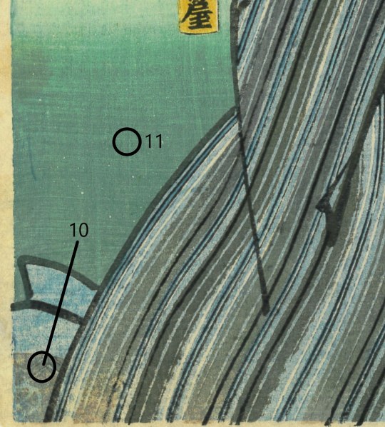
10-[prussian blue + orpiment + rice flour + glue]
This part is printed on the blue (Prussian blue + rice flour) rubbed in the same version as 17.Therefore, it is necessary to keep in mind the possibility that the paint used for the woodblock on which this part is printed is mainly orpiment and glue when making the actual color.Adding glue to orpiment is effective given that orpiment is a relatively coarse-grained powder pigment.However, glue was not detected in places such as 4, 7, 8 and 11 even though one of the orpiments was used.The use of glue is commonplace, as synthetic pigments are common among modern traditional printer.
But as far as I read the literatures written about old ukiyo-e techniques such as 高鋭一「日本製品図説」1877, or 石井研堂「錦絵の彫と摺」1929, the description about the use of glue is very limited.So there is a kind of question about how much it was used in the past, its range and frequency of use.
When I actually analyzed the original paint this time, the suspicion deepened further.
In the future, I would like to proceed with research to clarify the regularity and factors of the use of glue in the original ukiyo-e.
11-[prussian blue + orpiment + turmeric or rice flour]
It seems that the green around this age is generally a combination of Prussian blue + orpiment and also, in terms of necessity, it is unlikely that turmeric was intentionally mixed in to produce color, but , as the number of analysis points of the original picture is increased in the future, it may be possible that the mixture of "turmeric" will become new knowledge about how to make green at this time.
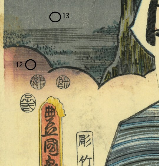
12-[safflower or rice flour]
As with 9, we could not identify it by this analysis, but it seems that the use of aobana paper is correct.
13-[lead white + ink + indigo]
Since Prussian blue was first used in Edo ukiyo-e in 1829, the use of indigo has been very limited.Also, since the bluish tint could not be confirmed with the naked eye from this point, the detection result of the indigo after the analysis was unexpected.
This was not because the printer at that time intentionally used the indigo , but rather because of the problem of cleaning the brushes and paint bowls, which were the tools of the printer at that time.
It may be more correct to think that the paint from the previous work remained in such things.Also, as mentioned above, there is a possibility of problems in analysis judgment.
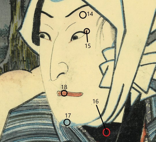
14-[safflower or rice flour]
Reds such as 2 and 18 contain red iron oxide, but 14 does not.
It can be confirmed in the literature that Bengala, mercury vermilion, and lead are mixed in the red when it is made for printing.And also, I was able to actually confirm it in this survey, but in 14, it is only safflower.This is because safflower red was an expensive paint at that time, and in order to reduce its use, Bengala and vermilion were mixed when using it, but it is thought that there was no need for it in light colors such as 14 and It is also possible that there was an idea that only safflower red was used to the eyes gradation as a way of using colors and aesthetics at that time.
15-[bengala + Prussian blue + ink + stone yellow]
Initially, it was speculated that the brownish color of this area might be due to the aging of safflower red but ,in fact, no safflower was detected, and it turned out that it was brown from the beginning when it was printed.If it weren't for this analysis, I would have thought that I would have mixed red flowers and safflower to create a color and aimed for the color before fading, and finished it with a color that was more reddish than the original.Also, the use of prussian blue, sumi, and orpiment was almost impossible to distinguish with the naked eye.
These have a minor effect on the color, and I think that the color was judged to be due to aging.
It seems that the color of the eyes has a large effect on the impression of the picture due to the difference in color, so I could not help but realize the usefulness of scientific analysis of paints.
16-[sumi + rice flour + glue]
In the use of ukiyo-e paints, there are two types of sumi, "pickled sumi" and "glossy sumi".
The former is made by soaking the sumi stick in water and mashing it when the glue that hardens the sumi is soaked, and the latter is made by mashing the melted pieces of sumi stick.In addition, it seems that there was also a case of "especially when printing fine luxury items, use the fine sumi stick with an inkstone" (石井研堂「錦絵の彫と摺」1929) , I don't think all of the printers today do this, but I've heard that Inuki Tachihara was doing it.
The period for soaking the pickled sumi in water is "3 to 4 days and nights" in the above-mentioned "錦絵の彫と摺", but it is "5 to 6 months" in "榊���芳野 編「文芸類纂 巻八」1878".
Regardless of the period of soaking, it seems that glue will remain more or less in both pickled and glossy ink, so the results of this analysis were within expectations.
Also, although it is not seen in the literature, it seems that it has been common sense for a long time to mix glue when using sumi including india ink or non-genuine sumi in modern traditional printers.
However, T. TOKUNO "JAPANESE WOOD-CUTTING"
AND WOOD-CUT PRINTING "1894 says," when using pickled sumi, add glue or rice flour paste, and it is up to the printer to decide which to add. " In addition to this, I have not yet seen the description "adding glue to sumi as printing" in old literature.
Some doubts remain about the actual state of glue addition (the actual state of use of glue) in sumi in ukiyoe in the edo period .
17-[prussian blue + rice flour]
It seems that the color of Prussian blue currently on sale has been improved more beautifully than before (in addition, there are differences in the type itself).
Therefore, I'm a little worried from now on whether the finish will be too bright and clear when I print the color, even considering that it is made after removing aging deterioration.
If I do it in the way of a traditional printer, I can mix other paints appropriately and bring it closer to the desired color, but I do not want to do it as much as possible.
18-[bengala + titanium + safflower or rice flour]
Titanium detection was totally unexpected.Titanium White as a paint containing titanium, but it was developed in the 20th century.What was detected this time is thought to have adhered in some way later, but the actual situation is unknown.
・After the analysis
There are many parts where the actual conditions and properties of the use of ukiyo-e paints in the past have not yet been clarified, in addition, the colors of ukiyo-e are easily affected by aging, and there are also parts where the colors are personally and voluntarily created by the printers of the time.
So, it is often impossible to distinguish the paint used in the current original based only on knowledge, experience, and sense.
Especially this time, I felt the usefulness of scientific analysis, such as "discrimination of the use of lead white" or "discrimination of the color mixture of safflower red and red iron oxide", which are the parts that greatly affects the color of the finished work during restoration.
In addition, "actual conditions of use of glue and rice flour paste", "types of orpiment paints and aging properties", "aged properties of white lead" or "presence of lead sulfate", these things have become even more conscious as my future research theme.
Scientific analysis of original paints is a very effective and meaningful method for restoration and research on ukiyo-e manufacturing methods and paints in the Edo period .I would like to continuously adopt this method, utilize it in the production of works, and proceed with research and elucidation.
(As an aside, there are people who confuse the "reprinted ukiyo-e" made by traditional woodblock printmakers with the "restoration of ukiyo-e".It makes me feel dark when I think that I'm seemed from the world that I'm trying to make the same thing as the traditional reprinted ukiyo-e by the current craftsmen of traditional woodblockprinting, or reprints of used items that are cheaply available at online auctions and second-hand bookstores.
I hope that those who have read this far will understand that "reproduction" made in the traditional woodblockprint industry is different from "restoration".)
Thank you for reading.
Yuuya Shimoi
1 note
·
View note
Text
Christ and His Creatures (Mural)
To see final artwork please scroll to the photosets at the end of this post. If reading this from Twitter, please visit laurelnoellewilliamsart.tumblr.com for the full post with concept art, process photos, etc., if you are interested. Please also note that this post is from fall of 2018 and is being re-posted after the closure of another website.
Hello, All!
It’s been quite a while since my last post but I’m finally back. For the past six weeks I’ve been working on a mural for the Corona Seventh-Day Adventist Church and I can now share it with you.
The mural was commissioned for a Sabbath (church) school room for toddlers. I was asked to cover four approximately 30’ x 10’ walls and the theme was Noah’s Ark. I was also asked to include Jesus in the painting and to go heavy on the plant life so that there would be a lot of green and blue present. Within these parameters, I decided to go for a storybook kind of realism; almost realistic but with an extra dose of vivid color and childlike fantasy. I also wanted to include a lot of specific and rare species of animals so that it would be educational as well. You will find a few of the typical lions and tigers and bears (oh my!) but mixed in with a lynx, lemur, llamas, etc. Wow, those all start with “L”…and I thought I was mixing it up! Oh well, anyway….
As the walls were already covered with another mural it took some time to get them repainted white. Another painting company did this part for me so in the meantime I worked out some concept sketches for approval. I did these sketches in ProCreate on my iPad Pro and they ended up being pretty close to the final work. To do them, I took pictures of the actual walls that I’d be covering, “whited out” the current painting on the walls, did line “ink” drawings of what I’d be painting and then filled it in with some color just to get an idea of what it would look like. In the images you can see the actual doors, windows and cabinets, so don’t be alarmed if something looks off.
After getting the concept approved, I moved on to collecting the materials I’d need for painting. There were many things involved but obviously the main ones were paint and brushes. For paint I went with Behr Ultra interior paint in the eggshell finish so that the end result would be close to matte but just shiny enough to be cleaned and wiped off if necessary. I’m told it’s also good for painting over or adding to later. I chose gallon-size amounts in colors close to what I would use for a normal canvas painting: titanium white, mars black, cadmium light yellow hue, permanent rose, ultramarine blue, Prussian blue, burnt siena, yellow ochre and alizarin red. I also picked some sky blue and grass green since it would be used so often. Behr had different names for the paints but when comparing the colors to my tubes, they were pretty close. For some of the tight details I did actually use my regular tubes of Liquitex heavy and/or soft body paint as well.
As for brushes, I used a hand roller for some of the wide open areas but I also used regular house painting brushes and “smaller” acrylic painting brushes. These brushes were to add details and texture but were large for a canvas painting, so nearly the size of a 1” or 2” house-brush. I also used a sponge for the clouds and bushes. (The plastic tubs in the photoset were for mixing large amounts of the same colors for the clouds, etc. On the color sample cards, I went with the deepest shade of each card.)
After getting the materials together, I set to work tracing my original concept drawings to the walls by using a portable Epson projector. I removed the colored layer from the drawings as well so that I could see the lines more clearly. I traced in colored pencil, using brown, grey, magenta, blue and a dark yellow to help me mark out what colors I’d be using where and also to help the lines disappear easier with paint over the top (I thought Sharpie would be too dark and show through the paint).
Then I went ahead and taped off the ceiling, carpet, doors, windows and anything else on the walls and got right into painting. As you’ll see in the photoset, my process is to work around the entire room at once, from the things furthest in the background to the things closest in the foreground, aside from the animals which I saved for last. I mixed colors and added texture as I went as well. The nice thing about the walls being painted a bright white underneath is that it helped to keep everything brighter so that I didn’t have to work as hard to soften colors. Normally I wouldn’t use straight mars black either but I quickly realized it was a good thing I’d gotten some because it really helped to speed up the process.
As you look at the photoset, you will notice that some of the images look a bit darker or lighter at the top. If they are darker it’s because I painted the sky in a gradient. If they are lighter, it may just be the overhead lights causing a glare. My apologies for that. I was unable to get studio lights into the room and I had to keep the window shades down because they only cast more odd slanted shadows on the mural. You might also catch some glimpses of the furniture in the room which was stacked in the center, so once again, my apologies if it’s blocking the view.
So without further ado, here is the final mural photographed in four segments and with several close-up shots of some of my favorite animals and details. Also, a big thank you to the Corona SDA Church for sending this project my way and to you All for taking the time to check out my work!
4 notes
·
View notes
Photo
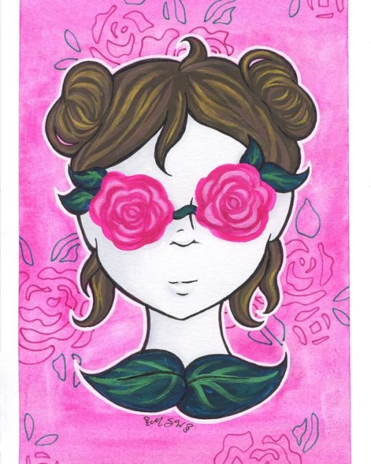
Roses in Your Eyes
Oh look, a not-Inktober thing! So after my first dive into The Realm of Gouache, I really wanted to play with the medium a little more and try doing some different things with it. More accurately, I wanted to try using the gouache more opaquely, since last time I took a more transparent/watercolor approach. Full disclosure, I actually had the sketch for this done before the gouache set even arrived to me. My original plan was to do the rose part of the "glasses" in the watercolor style from my In Bloom Le Plumes piece, maybe the leaves too, and then do the hair and possibly the skin in the more opaque gouache style. That was the plan so that I could try to get the most out of both sides to what gouache can do. But after I got the gouache and swatched it out, I wanted to try something a little more experimental before I jumped into this drawing so that I'd have a better handle on what I was actually working with. So that's where the first gouache painting came in. So it was after that when I made the decision to commit a little more closely to using gouache in it's more opaque form. The concept for the drawing is something of a play on the phrase "looking through rose-colored glasses," (or whatever the full version of that phrase is, you know what I mean). The original expression, as I'm sure we all know, means seeing something as being better than it actually is, usually because of personal bias. This idea takes it to a bit of an extreme; the glasses aren't just tinted in a rose color, they're straight-up roses. Instead of just viewing something as better than it actually is, the person is willfully ignoring or otherwise blinded to seeing things as they really are entirely. And possibly hurting themselves in the process, if the roses have thorns. (I didn't draw any but they could be there, unseen.) A couple of other notes on the drawing design before I move on: I went with buns in the hair since I usually draw loose/down hair and wanted to mix it up a bit, and to "close off" the drawing I added the leaves at the base of her neck, which also kind of double as a shirt-collar in terms of appearance, which I thought was neat. The leaves and the bit of vine across the nose, as may be obvious, are supposed to represent the frame and bridge of glasses. I transferred the lines from the sketch to piece of Strathmore mixed media paper since I didn't think I'd be using enough water or watercolor techniques to warrant breaking out some 100% cotton paper, but I wanted something thick enough to handle paint, and I thought the smooth-ish texture would suit the gouache based on what experimenting I'd already done. The roses for the eyes had no lines, and admittedly I probably could've gotten away with even fewer lines than the ones I did transfer since the gouache is opaque. I actually had a fair number of hairlines drawn in that got totally covered up since that was way easier than trying to carefully work around them. Anyway. For all the gouache parts, I started with a darker base color, since it's usually recommended that you work from dark to light in gouache, and then I'd go back in with 2-3 lighter colors on top to add shading/depth. The main issues I ran into were when the gouache color wasn't totally opaque, such as the rose base color (which is actually called "Rose," believe it or not) which gives me mixed feelings because on the one hand, it can look kind of interesting in giving you less structured, more unpredictable shading based on how you layer it, but also...well, it's not as opaque, so you have work with it slightly differently compared to the more opaque colors. The other issue was that I really struggled to have enough paint on my brush, particularly when doing tiny details, to get the full opacity and smooth color that I wanted, without leaving a glop of paint where it didn't need to be. Especially in areas like the hair that had a lot of fine tapering lines. I'm not sure how much of the problem is me and how my is or isn't my brushes or what, but this is something I occasionally have issues within acrylic painting too, but it felt way more prevalent here. I did manage to fix some areas that got away from me by layering darker colors back on top of the lighter ones, but then you also have areas like one of the loose hair strands around her chin that got away from me and I had to make noticeably longer than it originally was in order to fix it. (You can probably guess which one it was without me having to point it out for you.) I also had an "issue" in that it was seemingly very easy to mix up way too much of custom color, but that's more of a me problem than a problem with the paint. (And admittedly the above aren't necessarily paint-specific problems either.) Speaking of which, I'm still not sure if my "Titanium White" and "White" got mixed up or not, but since I suspect they did, I used the one I felt like looks more like the mixing white to do so. (Although admittedly I probably could've tried some mixing tests with both to see if I noticed a difference there whatever, perhaps some other time.) And I specifically avoided using black, since I thought it would be too harsh in mixes. For the hair, I just used one of the pre-mixed browns for my darkest and then used lighter colors and made my own lighter mixes to go over it. For the leaves, I actually mixed some of the Prussian Blue into one of the greens to make it darker. I think I may have benefitted from going a little lighter on how much of the blue went in, though. The roses were actually one of the more fun parts since they didn't have to be so precise or specific to make the look work. I started with a base of the Rose/hot pink color, mixed a lighter pink to make sections that probably should've been a little less light in color and slightly larger in shape, and then a slightly lighter pink than should have been lighter to layer on top of the already lighter pink parts. Partly because of some the issues I mentioned earlier and partly because I was just kinda going for whatever with only a minimal plan, I did have to go back and forth with the lights and darks in some areas on these, and I still don't think they look quite alike enough, even though I never intended to make them perfectly symmetrical. I also decided to not totally abandon gouache's watercolor properties with the background, since at this point I was thinking I didn't want to leave it plain white, but I also didn't want to do anything too complicated or intense that might take away from the rest of the art and the concept behind it. So I watered down some of the pink I used for the roses' base color and just kinda went over the background to my heart's content until I was happy with what the textures were doing since I knew it was unrealistic to expect to be able to get the background totally smooth trying to work around the rest of the drawing. Now, originally I was planning on painting in the skin with the gouache, however, I made the grave mistake of not thinking about it until after I'd pretty much finished with all the other painted parts, and I really did not feel like trying to paint around everything. And, honestly, I really did like the contrast of the white skin against the other colors. I did acknowledge that I could have mixed a gray from the gouache and shaded the white skin with that, but it felt like too much of a risk and still like too much of a hassle, so I conceited that I could bring other mediums into this since I'd already done my gouache-exclusive test piece. I grabbed a couple of very, very light gray Copic markers and added some very careful, very subtle shading to the skin. And you guys haven't seen the first time I used this mixed-media paper just yet (it's coming down the pipeline, I promise!), but for the second time I'm kind of in love with how it handles alcohol markers and I really need to try a more marker-heavy illustration on it sometime. After all that though, it was still missing a couple of things. I ended up breaking out my white uni-ball Signo gel pen to line around the girl just so she really would pop off the background, opting for it instead of the white gouache because, again, that seemed like too much of a chore to try and do. And my white Sakura gelly roll tends to be a little more transparent compared to the Signo, and I really wanted the stronger, stark white look. Then after some thinking, I added the rose lines in the background using a pink and a green Sakura gelly rolls and the stencil I've toyed with using on other projects before. And overall it, it has its faults (especially if you look at it too closely), but I really like how the whole thing turned out. It has almost a surreal vibe to it that I think drives home the initial concept really nicely, and just, in general, it's very sweet colors but has a more eerie feel to it. (At least when I look at it, anyway.) It also very vaguely gives me Luna-Lovegood vibes, so of course, I like it for that alone. I'm not sure what I'm going to make with the gouache next, as so far it seems its planning requires a slightly different thought process than I'm used to, but I have some ideas and all this has succeeded in doing is making me want to use the gouache more. This definitely isn't the last we'll be seeing of it, that's for sure! ____ Artwork © me, MysticSparkleWings ____ Where to find me & my artwork: My Website | Commission Info + Prices | Ko-Fi | dA Print Shop | RedBubble | Twitter | Tumblr | Instagram
1 note
·
View note
Text
Bob Ross Oil Painting Technique – Frequently Asked Questions
The following is a list of frequently asked questions about the BOB ROSS Oil Painting Technique and some instruction about the use and care of the materials.
BLENDING:
This technique refers to the softening of hard edges and most visible brush strokes by blending the wet oil paint on the canvas with a clean, dry brush. In blending, an already painted area is brushed very lightly with criss-cross strokes or by gently tapping with the corner of the brush. This gives colors a soft and natural appearance. Not all oil paints are suitable for this technique – most are too soft and tend to smear. Only a thick, firm paint is suitable for this technique.
MARBLING:
To mix paints to a marbled effect, place the different colored paints on the mixing area of your palette and use your palette knife to pick up and fold the paints together, then pull flat. Streaks of each color should be visible in the mixture. Do not over mix.
THINNING PAINTS FOR ADDING HIGHLIGHTS:
When mixing paints for application over thicker paints already on the canvas, especially when adding highlight colors, thin the paint with LIQUID WHITE, LIQUID CLEAR or ODORLESS THINNER. The rule to remember here is that a thin paint will stick to a thicker paint.
CLEANING AND DRYING THE BRUSHES:
Painting with the wet on wet technique requires frequent and thorough cleaning of your brushes with paint thinner. An empty one pound coffee can is ideal to hold the thinner, or use any container approximately 5″ in diameter and at-least 6″ deep. Place a Bob Ross Screen in the bottom of the can and fill with odorless thinner approximately 1″ above the screen. Scrub the brushes bristles against the screen to remove paint sediments which will settle on the bottom of the can.
Dry your larger brushes by carefully squeezing them against the inside of the coffee can, then slapping the bristles against a brush beater rack mounted inside of a tall kitchen trash basket to remove the remainder of the thinner. Smaller brushes can be cleaned by wiping them with paper towel or a rag (I highly recommend using Viva paper towels because they are very absorbent). Do not return the brushes to their plastic bags after use, this will cause the bristles to become limp. Never clean your Bob Ross brushes with soap and water or detergent as this will destroy the natural strength of the bristles. Store your brushes with bristles up or lying flat.
APPLYING LIQUID WHITE:
Use the 2″ brush with long, firm vertical and horizontal strokes across the canvas. The coat of Liquid WHITE should be very, very thin and even. Apply just before you begin to paint. Do not allow the paint to dry before you begin.
PLACEMENT OF OIL COLORS ON THE PALETTE:
I suggest using a palette at least 16″x20″ in size. Try arranging the colors around the outer edge of your palette from light to dark. Leave the center of the palette for mixing your paints.
LOADING YOUR BRUSH:
To fully load the inside bristles of your brush first hold it perpendicular to the palette and work the bristles into the pile of paint. Then holding the brush at a 45 degree angle, drag the brush across your palette and away from the pile of paint. Flipping your brush from side to side will insure both sides will be loaded evenly.
(NOTE: When the bristles come to a chiseled or sharp flat edge, the brush is loaded correctly.)
For some strokes you may want the end of your brush to be rounded. To do this, stand the brush vertically on the palette. Firmly pull toward you working the brush in one direction. Lift off the palette with each stroke. This will tend to round off the end of the brush, paint with the rounded end up.
MIXING FOR HIGHLIGHTS:
Place the tip of your brush into the can of LIQUID WHITE, LIQUID CLEAR or ODORLESS THINNER allow only a small amount of medium to remain on the bristles. Load your brush by gently dragging it through the highlight colors, repeat as needed. Gently tap the bristles against the palette just enough to open up the bristles and loosen the paint.
LOADING THE PALETTE KNIFE:
With your palette knife, pull the mixture of paint in a thin layer down across the palette. Holding your knife in a straight upward position, pull the long working edge of your knife diagonally across the paint. This will create a roll of paint on your knife.
WHAT IF I HAVE NEVER PAINTED BEFORE?
There are no great mysteries to painting. You need only the desire, a few basic techniques and a little practice. lf you are new to this technique, I strongly suggest that you read the entire section on “TIPS AND TECHNIQUES” prior to starting your first painting. Consider each painting you create as a learning experience. Add your own special touch and ideas to each painting you do and your confidence as well as your ability will increase at an unbelievable rate.
WHAT PAINT SHOULD I USE?
The BOB ROSS technique of painting is dependent upon a special firm oil paint for the base colors. Colors that are used primarily for highlights (Yellows) are manufactured to a thinner consistency for easier mixing and application. The use of proper equipment helps assure the best possible results.
Liquid Clear is a particularly exciting ingredient for wet-on-wet painting. Like Liquid White/Black, it creates the necessary smooth and slippery surface. Additionally, Liquid Clear has the advantage of not diluting the intensity of other colors especially the darks which are so important in painting seascapes. Remember to apply Liquid Clear very sparingly! The tendency is to apply larger amounts than necessary because it is so difficult to see.
13 colors we use are listed below:
*Alizarin Crimson *Sap Green, Bright Red *Dark Sienna *Pthalo Green Cadmium Yellow Titanium White, *Pthalo Blue, *Indian Yellow *Van Dyke Brown *Midnight Black Yellow Ochre *Prussian Blue (*indicates colors that are transparent or semi-transparent and which may be used as under paints where transparency is required.)
HOW DO I MIX COLORS?
The mixing of colors can be one of the most rewarding and fun parts of painting, but may also be one of the most feared procedures. Devote some time to mixing various color combinations and become familiar with the basic color mixtures. Study the colors in nature and practice duplicating the colors you see around you each day. Within a very short time you will be so comfortable mixing colors that you will look forward to each painting as a new challenge.
SHOULD YOU USE JUST ANY ART PRODUCT FOR THIS METHOD OF PAINTING?
Possibly the #1 problem experienced by individuals when first attempting this technique and the major cause for disappointment revolves around the use of products designed for other styles of painting or materials not designed for artwork at all (i.e. house painting brushes, thin soupy paints, etc.).
All of the paintings for this technique were created using Bob Ross paints, brushes and palette knives. To achieve the best results from your efforts, I strongly recommend that you use only products designed specifically for use with the Bob Ross wet-on-wet technique.
HOW LONG WILL IT TAKE MY PAINTING TO DRY?
Drying time will vary depending on numerous factors such as heat, humidity, thickness of paint, painting surface, brand of paint used, mediums used with the paint, etc. Another factor is the individual colors used. Different colors have different drying times (i.e., normally Blue will dry very fast while colors like Red, White and Yellow are very slow drying). A good average time for an oil painting to dry, when painted in this technique, is approximately one week.
SHOULD I VARNISH MY PAINTINGS?
Varnishing a painting will protect it from the elements. It will also help to keep the colors more vibrant. lf you decide to varnish your painting, I suggested that you wait at least six months. It takes this long for an oil painting to be completely cured. Use a good quality, non-yellowing picture varnish spray. I personally spray my paintings after about 4 weeks and have not had any problems.
Introduction of our website: Filtration Products web site gathers the most current knowledge, R&D and filtration parts fresh from the filter field. Filtration-Products.com keeps you familiar on separation and all the main market techniques including wound filter cartridges, pleated elements, meltblown depth filters, sock filters, reverse osmosis filters, from brands such as 3M recommended for water filtration, and anything else the filtration business has to inform.
from Filtration Products https://ift.tt/2tZbGIA
0 notes