#09Scene
Explore tagged Tumblr posts
Text

Itch link: https://lily-yu.itch.io/2d-art-finallll
This is my Final Project for 2D Art In Games, ALSO MY LAST FINAL IN NYU!!!
Winnie I love you so much you are my favorite professor also the best professor in NYU, so honored to be your student and I will work extremely hard to make you proud one day!!!
8 notes
·
View notes
Text

My final for 2D art in games. An in game expansion of the characters and themes explored over our worldbuilding unit. I'm used to building in game scenes, but primarily make pixel art assets, so I'm used to working in much smaller resolutions. Going back to hand drawn assets after so long was a bit of a learning curve, but still fun!
I'm glad I had the opportunity to take this class in my final semester! Thanks to Winnie for teaching me so much, me and the other seniors are gonna miss you! 💗
Play the scene here: https://venusgames.itch.io/2d-art-final
2 notes
·
View notes
Text

project link: https://kimyalastname.itch.io/2d-art-for-games-final password: lol
assignment 13: in-game perspective (final assignment)
tools: ipad, procreate
description:
heavily inspired by games like divisible, i decided to recreate a scene in which the action is paused and two characters are conversing with each other
"animation" is overly simplistic
feedback:
i forgot how to fist fight unity
really enjoy how this came out! totally different vibe than i expected but i just rolled with it! i simplified the designs slightly for the sake of this project but i think it's still effective, and i'm really proud of the background!
for improvements, i think i want to modify snideon's face more and make the background more dynamic - it's a bit too much green so everything looks washed out.
#09scene#artforclass#snideon#concept art#character design#mauxe#game scene#itch.io how tf do u work wtf
2 notes
·
View notes
Text

itch link
password: 2Dart
Assignment 9: in-game perspective
Tool(s): Procreate, Unity
Description: A mock-up for in game - kind of like a visual novel, point-and-click adventure with horror game elements (lol)
Feedback: Colors are still throwing me off - simplification of things to make cohesiveness would help - layout feels more akin to mobile because text is big and icons are big
if i had time, i would animate the active icon (eye) and the heartbeat monitor lol,,
4 notes
·
View notes
Text
BUILD:
Assignment name: In-Game Scene
Tools: Procreate
Description: An in-game scene for Death Oracle
Self-valuation: It took me some time to figure out the art direction, but eventually it was working.
Link to reference board: https://www.pinterest.com/danfengyang/week13-in-game-scene/
6 notes
·
View notes
Text
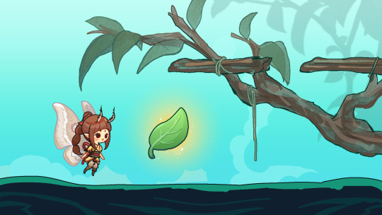
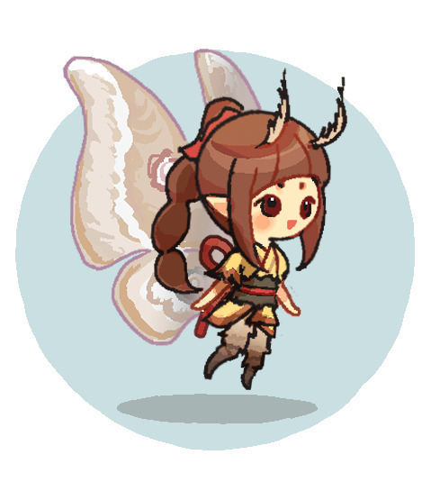

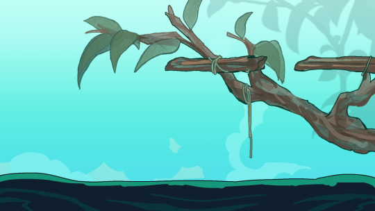
Assignment name: 09 Scene
Tools: Clip Studio Paint, Wacom Intuos Pro; Unity
Description:
I create 3 sprites — one background asset, one character asset, and one foreground asset — and place them in appropriate scale, perspective, and resolution for a 2d horizontal side-scrolling RPG.
Itch Link:
6 notes
·
View notes
Text

Game scene practice, featuring my void critter lirim. Visual novel style, decided to go with pixel art because I love pixel art, though admittedly halfway through it became a little bit of a slog to get through. In the end I’m proud of how it came out, however! Pixel art just has that crunch to it that I love for games, versus something more rendered. The point of this scene was that you are in the void, faced with this creature of the void, so a lot of the elements were meant to really blend into each other, with the outline being the only thing that brings lirim out from the background.
itch: https://adomaniia.itch.io/lapelle-du-vide
2 notes
·
View notes
Text


Tools: Unity, Autodesk Sketchbook
itch link
Game style is a side-scrolling beat 'em up. I imagine the main character is able to pick up and use weapons dropped by enemies. I did minimal shading on the character and prop because I imagine that a lot of the lighting would be handled by in-game graphics.
0 notes
Text

itch link
password: ALLEY2DART
Assignment 9: in-game perspective
Tool(s): Procreate, Unity
Description: A mock-up screenshot of the game with my character Sage. This game would be mostly an side scroller adventure with hover board sections.
Feedback: The lineart on the main character needs to be a little more thick. There needs to be better contrast between the characters and the background, they start to blend together. I was sort of stuck on the UI. I like the idea of using facial expressions to express the level of health but I am unsure if it comes across that way in the screenshot.
0 notes
Text

itch Page: https://craneonz.itch.io/09scene
Password: 09Scene
0 notes
Photo
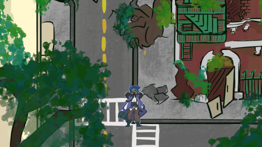
Link to Itch Page: https://honeydroops.itch.io/in-game-scene-assets-2d-art
Assignment Name: In-Game Scene
Tools: Procreate, iPad
Desc: 3 game assets (character, background, and foreground element) put into a Unity project at 1920 x 1080 resolution for a top down illustrative RPG game.
Feedback: I really liked that I went with the top down RPG format for this game, even if I didn’t go with the traditional pixel art style for it and went for a more illustration heavy style. I felt that I might not be able to translate my game well if I tried to put it into pixel, but I think going in that direction would have given the game a different vibe but still look nice in a different way. My main issue with my project was the difference in my line art weights between the player character and the background, as I had realized too late that the widths did not match up at all. I also made another mistake of drawing my background on a square canvas instead of remembering to resize it to the size of how I wanted my game resolution to be. But it didn’t turn out to be too much of an issue, as I made it so you can briefly walk the character up and down to see the rest of the environment.
Link to Ref: https://www.pinterest.com/honeydroops/key-art/ https://www.pinterest.com/honeydroops/in-game-scene/
1 note
·
View note
Text

Assignment Name: In-Game Scene
Tools: Sketchbook
Description: Here is a sidescroller example of what my game may look like. This composition shows a candle mage fighting Mammon, with Mammon's castle in the background and some Lightsoul arms in the foreground. The player plays as the candle mage, who in this scene fights Mammon on a bridge in Hell. For the art style, I decided to pivot slightly and go more comical/playful, using the techniques I learnt when sketching my cuphead clock and applying them here. Overall, the piece is interesting but does have a dissociation in art style between the candle mage and Mammon, the latter drawn realistic with shading and the former more comical and flat. Discounting this difference in style, I do like the setting/composition of the piece. I feel like the different parts of the game are very distinct -- the castle is clearly in the background, and the player, bridge, and platforms clearly denote the plane upon which the player stands.
Self Reflection: Happy days! The last assignment is over. Although I am admittedly burnt out from drawing, my whole experience in this class has aptly trained me for drawing in the digital space and I am super grateful. Regarding this piece, the only thing I would probably change is the positions of Mammon and the candle mage to show a greater variety of movements. Otherwise, totally satisfied with the result, especially since I got it in on time. Thanks for everything! Hopefully new posts will continue to come through... :)
Itch.io build link:
0 notes
Text

Assignment Name: 09 In-Game Scene
Tools: Photoshop, Unity
Description: An in-game scene with own sprites.
I plan to create an adventure game in the desert and wilderness based on the concept of my environmental design.
Itch Link: https://siaysiya.itch.io/2d-arts
0 notes
Photo

Assignment: 09Scene
Tools: Procreate, iPad, Unity
Description: Frost Tower 2D in unity. Enter a world of frozen terror and dystopian struggle in a world ravaged by a sudden drop in temperature and the emergence of terrifying frost beasts. Humans have banded together in clusters of giant steam towers, connected only by train, as they fight to survive against the relentless attacks of the beasts. As a young girl named Xinxin, you will embark on a heart-pumping journey through this dangerous and unforgiving world, as you brave the cold, face off against the beasts, and seek to unravel the mysteries of the tower and the train.
Link to itch: https://asukanami.itch.io/frosttower2d
0 notes
Text

Assignment Name: A9 In Game Scene
Tools: Clip Studio Paint, Unity, Huion Kamvas
Description: In game scene of my character from A8 and my environment from A7. I went with a point and click adventure style for my game. The idea being that you can click on the character to talk to them and the foreground element to interact with it.
Self-Feedback: I think that a challenge for me while drawing this was that I wasn't fully sure what elements I wanted to emphasize or how I wanted the background and foreground to relate to each other. I tried increasing the line width for the character and foreground element to emphasize their importance, I also used a very saturated blue on my character in order to make them pop out more. I think that posing was something I considered a lot when making this screen, since I wanted the character to be one you can click to talk to, I posed the character in a way that deemphasized its potential to move and could seem more like a still image.
Reference: https://www.pinterest.com/LokkeiCold/09scene/
0 notes