#(this is an alt poster for movie 6 for context)
Explore tagged Tumblr posts
Text


#usopp#he's the only bitch not excited to be on that island here#and you know what??? he was fucking right!#(this is an alt poster for movie 6 for context)
7 notes
·
View notes
Photo
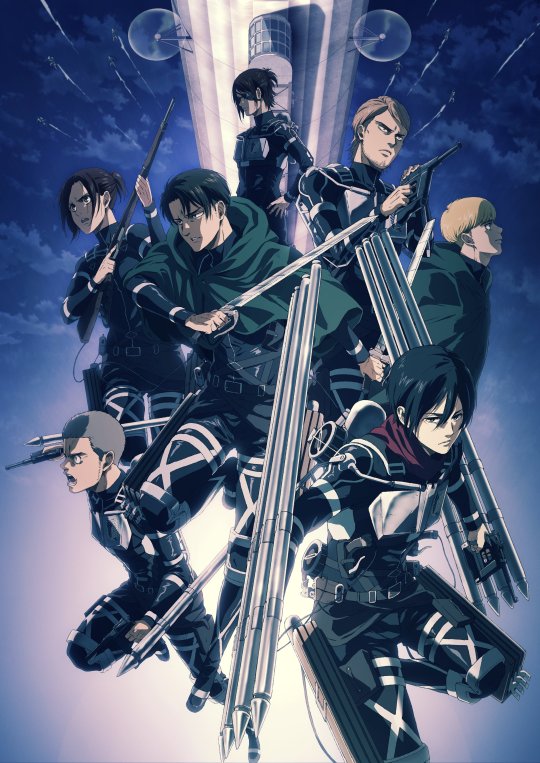
The new key visual looks awesome!! Finally getting more Final Season artwork is so satisfying and this is pretty great! The marley arc is probably my favorite in the manga and getting even more promotional art for it is really cool : D Since we’re still 3 months from the airdate I hope we’ll get another Warrior-centric one, with the new and old crew, but rn, especially with manga context, I love this, and I need to ramble about it.
First of all, Mikasa!!! Mikasa front and center!!! lets gooooo ahh I’m so happy about this! I don’t think she’s ever been this focused on in any of the promotional key visuals and it’s been about time! She looks gorgeous and absolutely ruthless, I’m here for it. It’s also relieving to see that the scarf did in fact stay red which wasn’t totally certain in the pv. I also think it’s interesting that both that shot of her in the pv, as well as her in this visual both kind of highlight her more badass/ruthless side--I’m all here for it cause like, look at her!!! But she also spends a good amount of time in marley being sad and distressed which I hope they’ll do justice to. Either way, she looks amazing and I can’t wait to see her finally in motion.
Levi I’m a little less sure on--his face looks a little odd? Maybe it’s the nose? I’m not really sure. To be fair, his design has probably been the least consistent across the whole anime, and he’s certainly looked worse! But yeah, I’m not 100% sold on his look yet. Also just as it was in the first key visual, his cape is green? Even tho its specifically dyed black in the manga? I’m sure why and I’m kinda sad about that cause I would’ve loved to see that all black look on him, it’s an odd change.
Connie, Jean and Sasha all look good to me (I’m glad we’re getting Sasha artwork before, you know), but Armin gets pushed to the side pretty hard kind of? Given his rather small role this arc, I think it makes sense, tho hopefully key visuals for the later arcs will improve on that. Also sidenote, his pose reminded me a lot of Jean in the S2 Group visual lol

Hange being a bit smaller, but also being centered and depicted as the leader fits well here, especially with her being closest to the airship since she never leaves it. It reminds me of Erwin in a few other posters, kind of continuing the commander position, in a way
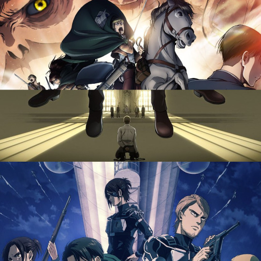
That’s some solid continuity!!! (also, Hange :/)
One thing I also dig about this visual is the look of certain textures, specifically metallic objects, like the blades, thunderspears, even the airship.
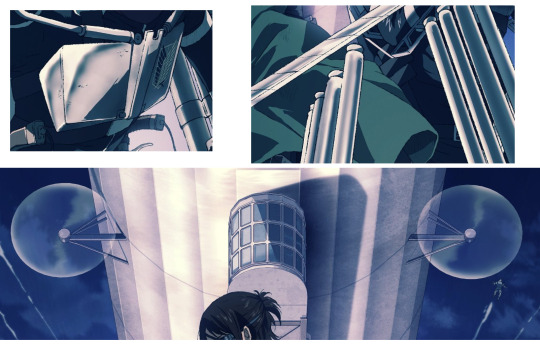
It has this like..shiny glow? I can’t really express what I mean with it, but all these objects feel very tangible, very three dimensional, which is cool!
Unfortunately I don’t really feel the same way about all the textures present in this visual. See, non metallic textures, like clothing, skin, and the characters outlines in general have this kind of rough, or gritty look to them. The lines are clear and straight like they used to be, but it’s a little messier? The first key visual did the same thing, let me show you.
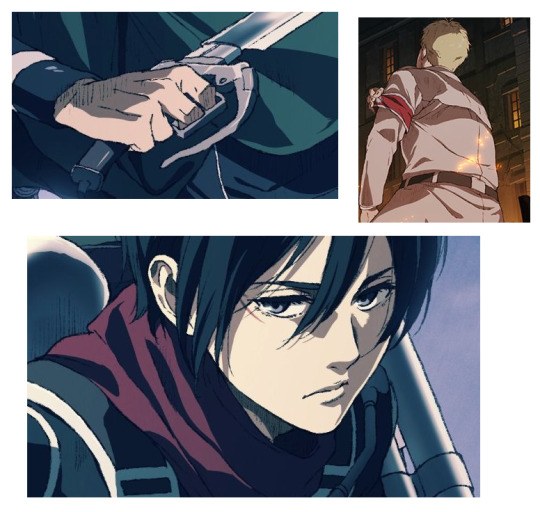
Compare it to something like this, where (even tho the resolution is a bit botched on tumblr) everything looks much smoother, cleaner, softer. Maybe it’s because I’m so used to Kyoji Asano’s style of drawing these key visuals for 6 years, but I think I prefer it over the approach of Tomohiro Kishi’s style. But this only is the start of seeing new artwork, maybe I’ll get used to it. It’s a bit odd as Wit’s animation style in the show was known for generally having thicker lines, and even tho they cut back on that in later seasons, it’s still not as thin as in the final season pv, yet its artwork has lines that feel thicker. It’s an odd back and forth.
My honestly biggest gripe with this key visual is it’s actual get up--having characters kind of float around in nothingness isn’t something I really love. I much prefer most of the older group visuals (like the recap movies or the S2 one) where characters at least seemed to stand on surfaces and physical space, and those who weren’t were either shown to be mid air, or obscured enough so you couldn’t see them stand in nothing. As a result, this reminds me a lot of the 3rd S3 visual
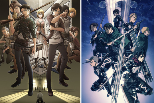
I wasn’t a huge fan of that one as it just reused and rearranged the Vol13 poses without really any effort. Like it just plants everyone there and I don’t think the result is really all that impressive. This one does this a lot better, as it has a bit more synergy going for it, there’s a bit of motion (the soldiers flying next to the ship looking like speedlines is a cool touch), and it just looks more interesting in my opinion. I also think it does the manga-ripoff better, as it clearly is meant to resemble vol 26 with the airship and the squad, but it doesnt just reuse the poses--they’re new here, and the overall positioning of everyone reminds me more of the Vol 25 alt cover, or the new 32 one. It feels true to the spirit of the manga without outright copying! I still don’t like the mid air floating, but other than that it’s a solid grouping!
One additional neat thing is that the new gear is drawn with so much detail! Just as in the PV. Which is awesome! Sometimes its a bit though to get a good look at all the specifics in the manga, but here it’s just---exciting. I never even realized that Mikasa has to swap to an entirely different set of 3DMG handle/trigger/grapple that’s attached to her gear as well--everyone else has only one set for either the gun+thunderspear combo or the swords, but Mikasa has both sets on her since she does switch to swords on 103. And its just fucking crazy just how much gear this girl has on her lmao (did you know a single thunder spear weighs 5kg? thats 20 on each hand! plus all the heavy gear that comes with it! she is too strong lmao)
Ultimately, I like this visual a lot. It’s not perfect and some things are gonna take a while to get used to, but overall, I’m so excited to see everyone’s different looks highlighted as the season goes on. And getting so much Marley arc promo atm is very much appreciated! Hopefully we get another one focused on the warriors soon, and, man, even tho it’s a spoiler, I would kill for one visual dedicated to Marley Eren specifically...like...please.
Bring on the Final Season!!
#I was not expecting to ramble this much about this visual but here we are#Im really excited man#attack on titan#snk#the final season#mikasa ackerman#levi ackerman#hange zoe
83 notes
·
View notes
Text
Into the Unknown: Making Frozen 2 - Review
Finally finished watching all 6 episodes of the Frozen 2 Documentary! My consensus is drum roll please... it was not very good.
Things I liked first: I loved watching the team get emotional when they saw their projects coming together (finishing Into The Unknown, etc).
Watching random guys rub rocks together for sound design was funny.
I loved looking at the Disney offices and all the merch, posters, art, etc.
The actors/workers were very charismatic and believable. They seemed to legit enjoy their work and were happy to help.
- -
Criticism:
The documentary promised to be a look into all the hard work, collaboration, blood, sweat and tears, it took to make Frozen 2, but it came off more as a look into the very final stages of Show Yourself and a few unfinished animation clips. So little of the actual movie making process was shown and it was extremely misleading and frustrating.
-
Songs:
Songs and the songwriting process were definitely the aspect of F2 Disney was most comfortable showing, but that’s saving very little because the attention per song was extremely restricted and lopsided. About 50% of the entire docu-series focuses on just Show Yourself while every other song gets about 20 to 1 minute(s) of screentime (in order from most to least discussion, it goes: Next Right Thing, Into The Unknown, Lost In The Woods, Some Things Never Change, When I’m Older, All Is Found, and Vuile isn’t even mentioned by name). And even when they did discuss these songs, they only showed the lyrics that got into the movie, no cut lyrics or alternatives were shown at all. So it was just long extended scenes of Jenn and the Lopez’ trying to decide whether they should or should not add parts to the song which we, as the viewer, already know were added. And again, they showed no alternatives, so it wasn’t a choice of A or B, it was A or maybe rewrite the middle-ish but no specifics.
They didn't even discuss the public outtakes / deleted scenes they've already released / planned to release like "Get This Right", "Seek The Truth", "Unmeltable Me", etc (they did mention “See They Sky” but nothing else).
The last thing I’d like to mention for this category is that they did discuss the intended emotions / themes of the songs they kept in. They talk about how Show Yourself was supposed to make you feel empowered and satisfyingly wrap up the story, how Next Right Thing was supposed to make you feel just as emotionally raw as Anna, etc. So I can give them credit for that. But again, these explanations became few and far between once they got into the “lesser” songs. Nor do they explain why certain songs were added to the story; for example When I’m Older’s entire existence was justified with “kids really liked it”. “Lost In The Woods” was an 80’s rock ballad because they kinda just wanted to make a 80’s song, etc.
-
Animation:
Again, just like the songs, Disney was very comfortable showing off the animation process, but only unfinished clips, models, skeletons, etc of shots that were actually used in the film and nothing else. But, I did have fun watching animators physically act out character movements, record them, and then animate them (ex: that poor girl who recorded like 5 shots of her own face singing, all super imposed on bobbing reindeer shaped bubbles for the Lost In The Woods scene lol).
The most new/deleted content they showed were storyboards and sketches of Show Yourself where we got to see alt. backgrounds of Ahtohallan and young Iduna and and See the Sky which was a dance-off type thing between the Northuldra / Arendelle soldiers.
-
Story:
This, and every consecutive category, is where this documentary was severely lacking. They showed no alternative scenes or storylines like “Hard Nokks” or the secret library. Nor did they go into the intended messages/significance of the story elements they did use, like why they chose to trap the Enchanted Forest in mist, why they spared Arendelle, why Elsa left Arendelle, why they chose a dam for the physical boundary they needed to destroy (even though apparently it was loosely based on an IRL dam that hurt the IRL Sami people; I got this from outside resources), etc.
They also don’t dive into any character motivations (outside of the context of Elsa in Show Yourself/Into The Unknown, Anna in Next Right Thing, and Kristoff in Lost In The Woods).
They very explicitly refused to discuss any changes they made to the script. In episode 5 they spend a lot of time emphasizing the importance of audience feedback but refuse to show any actual feedback (they even talk about how they gave out questionnaires but don’t even show us a blank one). This was very blatant and annoying because they spent a lot of time looking DIRECTLY at the camera going on about how important feedback was, how being willing to change was important, how they DID change things, and how change impacted a lot of the movie (ex: cutting songs and simplifying things for children), but refused to show anything. The one (1) change they did show was the prologue, so we see young Anna and Elsa playing before we see Agnarr's flashback, but that was pretty much it.
-
Design / Environments:
Character design and dress design was not discussed at all. They do show us a few seconds of fabric physics for Elsa’s spirit dress and show us how they designed Olaf when he was pretending to be Grand Pabbie (using his snowball feet as ears and ferns as a cape), but nothing else. You’d think that since Elsa and Anna both had like 5 costume changes each, they’d want to discuss that, but no. Nor do they even mention Iduna’s shawl / the unity snowflake which had a ton of significance in the movie. They also don’t discuss the designs of the spirits or their symbols (or even water animation for the Nokk’s body which would’ve been perfect in the animation portions).
-
Research:
The only research we see them doing is visiting IRL glaciers for Ahtohallan in episode 3. This was neat and all, but also very bittersweet because they really emphasized how spectacular and breathtaking Ahtohallan was going to be, but it was literally just an empty cave made of ice; and not even shiny ice (like Elsa’s castle) just dark, flat, and blue. Like I know creating environments is hard but Ahtohallan is very literally empty besides a few extremely narrow hallways and dark colorless abysses. Like it may have been hard to build in a computer but it was NOT creative nor something to boast about (especially compared to the concept art they showed). But this is all my opinion...
They do show a black sand beach which greatly inspired the black sea, but otherwise they don’t show the research it took to properly replicate the Enchanted Forest (like plant life and ecology) nor any of the locations Elsa and the gang briefly passed through on the way to the forest.
Most egregiously of all they completely omit the Sami community and their contributions to the film. They don’t address them by name or even acknowledge the Northuldra are based on them. Nor do they mention the apparent collaboration they did with the Sami community to accurately replicate their culture. The closest they get to acknowledging them or their hand in the creation of F2 was that the subtitles described Vuilie was a "yoik". Which does not count, since no one even says it out loud. You could dismiss all my other complaints about the lack of content and deleted scenes, but this is just flat out disrespectful.
-
Ending Note:
To me, I just don't see the point of this. If this entire documentary was condensed into an hour long YouTube video and explicitly only about the songs/animation I would've been perfectly happy and would've given this an A! Maybe even more because the little parts about the sound design and interviews with the cast would've been little bonuses. But I can't because this is a 6 episode Disney+ only "documentary" on all of F2.
Tl;Dr - I expected a lot more, but was severely disappointed. I wanted an inside sneak peak on the making of one of Disney’s most iconic and my personal favorite IP, but instead I got 240 minutes of Jennifer Lee and the Lopez’ trying to feel the vibe of Show Yourself and crying. Surely they could’ve cut some of that out to talk about literally anything else. Watching this just felt pointless and I was never engaged nor were my curiosities satisfied.
-
Extra Note:
For about 10 minutes at the end of one episode (which may seem short but that’s like ¼ of an episode), the documentary takes a detour to talk about Ryder Buck. Ryder Buck was Chris Buck’s (one of the director) son who died shortly after F1 was released, and I mean no disrespect but the sequence dedicated to him had nothing to do with the film or documentary. One of the F2 character’s was named after Ryder, but that was the only connection (they don’t even mention if Ryder in Frozen was based personality-wise on IRL Ryder, just that they shared a name). The whole 10 minute sequence was literally just a charity event in Ryder’s name and Chris and his wife sitting on a mountain talking about how they miss him. Again, no disrespect and I’m sorry Ryder Buck died so young, but a documentary on Frozen 2 wasn’t an appropriate place or time to talk about him.
Crossing out this section because some people took this as an opportunity to attack Chris Buck and his son, which is completely unacceptable and disgusting.
#frozen#frozen2#disneyfrozen#frozen analysis#frozen 2#frozen 2 analysis#intotheunknown#frozen2documentary#Into the Unknown: Making Frozen 2
40 notes
·
View notes