#(hi op please edit the description into the post for accessibility!)
Explore tagged Tumblr posts
Visit Tumblr Blog
Explore Tumblr blogs with no restrictions, modern design and the best experience.
Last Seen Tumblr Blogs


Fun Fact
Average visit duration of Tumblr.com is 10 mins and 25 secs.
Text
[ID: a detailed, realistic painting of the hathor columns at the dendera temple complex in dendera, egypt. /end ID]
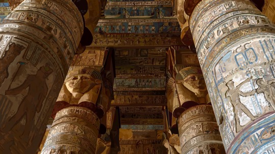
I know this isn't ninjago guys but I finished this 17 hour painting for my art class and I was proud of it so...enjoy.
I love Egypt fun fact about me. :)
#art#ID#accessible art#ty to someone in the notes for identifying the place :)#(hi op please edit the description into the original post for accessibility! no credit needed)
150K notes
·
View notes
Text
Hijab-Described Pinned Post
Hi everyone! This blog is dedicated to making hijabi content accessible to blind and visually impaired users by adding image descriptions. Special software called "screen readers" reads the description aloud, meaning that blind and VI people aren't left out when they can't see an image.
You can copy and edit any of my descriptions. Feel free to paste them directly into the original post if you're OP, or add them onto a different reblog in the chain. Credit appreciated but not required.
If you are a hijab fetish blog: Please do not reblog, like, follow, or interact in any way. The people on this blog aren't here for your gratification and they didn't consent to being sexualized. It is extremely disrespectful and I consider it harassment. I will block you.
I always try my best with descriptions, but if I make a mistake, please tell me! Just shoot me a message and I will edit the IDs! I frequently use they/them pronouns. If you prefer she/her or any other, you can tell me.
Also, if you are in one of my posts and you would like it taken down please contact me. I will take it down asap!
Links:
More description blogs.
My original posts are tagged #mine
My Ko-fi: ko-fi.com/ameera_ameera
My Meiker: Games by Ameera (not screen reader accessible)
My itch.io: ameera-ameera.itch.io (screen reader accessible)
My side blogs: @ameera-ameera (personal blog, fully described) and @ameera-art
Fetish Blogs DNI. You will be blocked. Do not interact.
58 notes
·
View notes
Text
All About RP Icons For Beginners by Birdy
Hi OP, I’m not sure how experienced you are with all the nonsense surrounding the making and using of RP icons, so I’m gonna come at it as though you don’t have any experience with it at all and I’m sorry if that’s too simplified for you, but also if I’m gonna write many paragraphs about one topic I may as well make it accessible for as many people as possible ¯\_(ツ)_/¯
This post goes into what tools are out there for the popular methods of finding/making RP icons in the first half and my personal methodology for choosing and using them in my RP for the second half. This is a very surface level answer to the question and is not meant to be an in depth tutorial for the more labor intensive aspects of the process, but if you guys want more information and can’t find it elsewhere, please ask and I'll know what I should be talking about next.
Also I’m also contractually obligated to mention to the masses that I do take commissions both for the drawing of RP icons and the service of capping, cutting, recoloring, and framing canon icons. Sometimes I even post batches of canon character icons for free on this blog so like,,,,, hit me up if you want. But!! You don’t need me, you can absolutely do all of it yourself!! I go into the broad strokes below.
Question 1: “How do you get icons?”
This is kind of a broad question and the answer depends on what your needs are. The right answer for you is gonna live in one of two camps
Find some that already exist that are free to use
Make them yourself / commission somebody else to make them for you.
What you'll choose is gonna depend a lot on your character first and foremost. The big determining factor in most cases is whether or not the face you want has been in anything you can take pictures of.
If you have a canon character who exists in visible media--
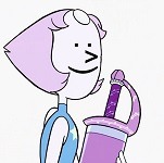
--you're in luck! The chances of you finding some resources that exist already is higher when you have a canon character who is in at least a few pieces of media. OP asked about Pearl from Steven Universe, and she's a great example of a character with a lot of resources. Searching for rp icons of a popular character will often yield packs of icons on Tumblr, Dreamwidth, Livejournal, etc. Most of these will be completely free to use or have very reasonable conditions for use (like credit the person who made them for example.) It's often a good first step to see what preexisting resources are available to you even if you still plan on making your own icons.
If you have an OC or a character that's not all that popular--
--you're gonna fall into the second camp. If you want icons, you have to have them made. So what are your options?
Help! My character appears in no media! What are my options?
If your character appears in no media you're in a tough spot. Different people approach this problem in different ways.
Face Claims
One option you have is to choose a face claim to represent your character. In roleplay a face claim or ‘FC’ is a person or character whose appearance you use for the physical description of your character. I personally am not big on doing this, I prefer drawn icons and I tend to RP as animated characters, but some people really like using celebrities and stuff to represent their characters. When I was playing Angus McDonald he hadn't appeared in any visual media yet, so I sometimes used Bryce Clyde Jenkins as the face claim for certain types of threads.
If you're somebody who likes to use face claims there are loads of resources out there for finding the perfect one, including here on tumblr. Try searching up RP Faceclaim Directory and playing around with some of the ones that pop up.
DIY RP Icons
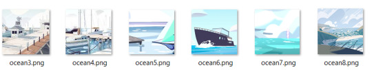
The other option you have is to create those icons from scratch. Draw them yourself based on icons you like or commission an artist to draw some for you. If you can't draw yourself, I've seen some people get really creative with this. Some people create their character in the sims, dollmakers, or their favorite RPG and then take screenshots of that to use for icons. There's also no law that says every icon you use has to be your character's face. When I was writing a trashy mermaid AU I got a lot of mileage out of icons that depicted harbor and oceanic scenes with no actual faces. Get creative, go nuts, have fun.
Icons Aren’t That Important
The other thing to remember that icons are not a must in many RP circles. It's perfectly possible to have a great time and write cool stuff without any pictures at all. Depending on your platform of choice there are probably also other interesting ways you can make your posts unique to you by formatting the text or using symbols or emojis or otherwise denoting your personal style in text.
Help! My character appears in lots of media! How do I make icons?
Again, there are a million and one answers to this question and it really depends on what tools are available to you and what your preferences are. This section is not a tutorial but it will outline some of the options you can look into.
The icon making process is typically in 2 stages-- stage 1: get all your images of your character, and stage 2: edit all of those images into icons.
If you have access to the source material, any version of Photoshop, and software that automates the collection screencaps from video (KM Player, VLC, etc) you're pretty much gucci. You're gonna have no problem getting loads of nice icons in a reasonably short amount of time and there are a million different tutorials on how to use those things whichever way you prefer.
If you don't have access to those things you still have options.
You can still screencap things manually, and you can screencap in batches by holding down the windows key and pressing PrtSc any time you want to save an image. They should be saving to >pictures>screenshots unless you’ve set things up differently. It’s a good way to take a lot of screenshots without stopping in between.
( EDIT / UPDATE: to say that if you use automation for taking screencaps remember to turn that shit off when you’re not using because it oh mylanta it WILL continue to take images without you realizing. Figured out where all my disk space has been going with this rookie mistake, thanks OP)

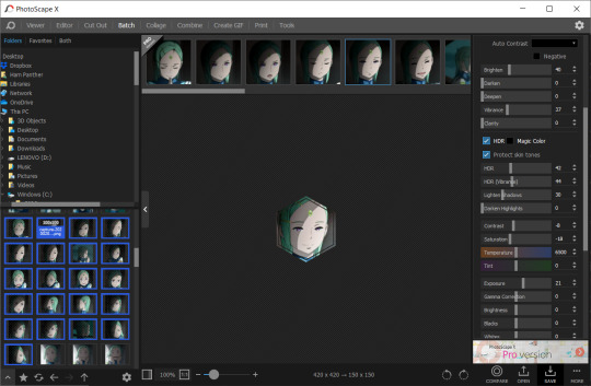
Additionally, PhotoScape X is a really great little tool for windows and mac that I've never seen anybody talk about, but I use it sometimes and it's totally free with the exception of a few paid features I’ve never once needed or wanted. This program is not as efficient as using Photoshop but it has presets for cropping images easily as well as batch editing options for some basic borders and color retouching. While it’s not as powerful as Photoshop, you can get a lot done with it reasonably quickly compared to other choices. You can also take and edit snips of anything on your screen with it, which is really really useful if you don’t have access to the video or image files you would need on your hard drive for other version of this process. The program looks like this:
Also, not to be like a minimalist about it, but you can also just fucken use Microsoft Paint or whatever you have. Like, whatever, there’s no law. You graphics dont have to be comlpex or deep fried. Half of my icons have been made or edited in paint at some point. It wont be as fast as some of these other methods but a lot of us aren't out here making icons in batches of 100 at a time.
Anything that you can use to make smallish images of your characters face will work to make icons.
If you want more information about any of these methods of icon creation let me know and I’ll talk about them.
Question 2: “How do you make your icons ‘work’ in posts?”
I'm a little confused on what you mean by "make them work" so I'm gonna cover my bases here. I'm assuming what you're getting at is a sort of sense of cohesion in the icons I use, or having the "right" expression for the scene I'm writing. Either that or them not stretching and looking weird thanks to tumblr. I’ll get to both of those.
And before I go into my own rationale for icon choices I feel I should point out that a lot of people who aren't me do successfully manufacture cohesion out of their images by doing fun stylistic things like recoloring their images all the same way or putting cute borders and stuff around them or making them fun shapes, and that's totally something you can learn how to do if it interests you. I do this for icons commissioned by other people and I’m not against talking about how to do those things, but I don’t really bother with them for my own icons all that much. That stuff is all fun and it’s a neat thing you could get into that can make your icons all look really nice together.
BUT ANYWAY --
Since the character you asked about is Pearl, I’m going to focus on her. Nearly all of my Pearl icons are completely unedited and a lot of the credit I would have to give regarding icon quality goes to Pearl herself and the consistently good lighting that the show uses. I don’t have a huge need for editing or color retouching beyond making memes or whatever other goofy things I might be getting up to. Pearl is extremely expressive compared to other characters I have written and since she's in nearly every episode, I've managed to collect…
...oh god, that’s too many icons.
Pearl is a main character and I've been RPing as her for over 6 years now so I have a fuckload of images to choose from and I'm not gonna pretend that doesn't help when I wanna “make things work”. She gives me a lot of options.
That said, you absolutely don't need 3000 images to make a good post. The way I've collected and organized these images may be of use to you even if you dont have as many icons. I've done a lot with my setup to make finding the right icon very easy.
For starters, a minor subset of my Pearl icons are grouped by a particular defining feature. I have one large Pearly folder full of icons and then a few smaller folders inside for icons I thought worth grouping separately. For example, all icons of SUF Pearl in her new jacket are in the same folder. All icons of Pearl in short term alternate outfits are in the same folder. Anything I sourced from Attack the Light is in its own folder. I do this with anything that has a very specific use, such as writing AU content or flashbacks to specific time periods. If I can picture an icon in my head, I usually know where in my ridiculous hell collection to go to find it.
This folder was originally just for her pre-canon outfit but now all of her outfits that only appeared temporarily are in there.
Perhaps more important for the sake of cohesion is that nearly all of my icons that aren’t squirreled away in some smaller folder are loosely arranged by episode. What that means is that most of the time I have icons from the same scene right next to one another. It makes it incredibly easy to make my RP replies appear as though it's all one cohesive scene even if I use more than one icon. When you do it this way it becomes very easy to choose icons that have the same lighting or that appear to lead from one expression seamlessly into another. Exhibit A:
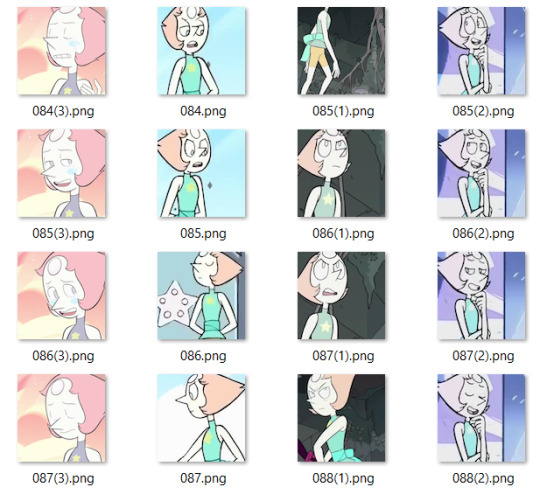
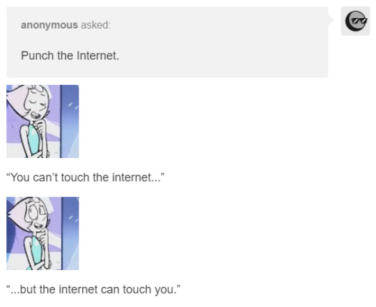
While the vast majority of my icons are numbered, I do take the time to name ones I find myself using a lot or that have particularly unique expressions. Usually I'll choose names that I'll find descriptive or easy to remember based on the context of the icon. You can have a lot of fun with that and never lose your favorites.
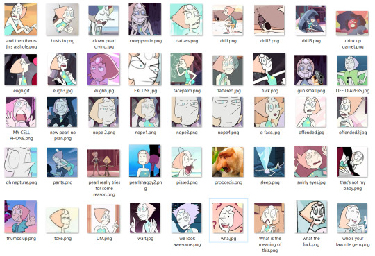
Also don't be afraid to lean on icons you got from weird places if you like them. The icons of Pearl from the official comics run don’t look like most of what I have. I think them being different would turn a lot of RPers off, but I use them a lot because I like the style and I almost never see other Pearl RPers using them. It either makes me stand out or it makes me tacky, one of the two, haven’t figured out which, but also I’m not stopping.

And just to reiterate, you can use icons that aren’t your character if they’re thematically relevant or vague enough to look like them. When I’m capping I’ve started saving a folder of miscellaneous environments of interests, hands, and other everyday types of scenery that appear in the thing I’m taking screencaps of.
You can use any size you want for RP icons but the most common is 100x100 or 150x150 pixels. Any smaller than that and the image gets to be difficult to read and work with in my opinion. That doesn’t stop people, of course, but I’m elderly and need glasses now, so no tiny icons for me. On that note, I rarely see RP icons larger than 300x300. Any larger than that it tends to get bulky and be in the way of other people’s comfortable internet browsing experience, especially on mobile. Of course, these are just my suggestions. What you choose will ultimately be up to you, but somewhere in that 100 to 300 px range is pretty safe.
A very tumblr specific thing to know is that any image that is wider than 300 pixels will be stretched to hell, so you probably want to keep it smaller than that.
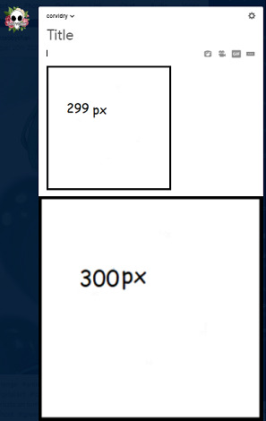
Thanks, Tumblr, I hate it!
Also, don’t be afraid to make trash images for fun if you’re so inclined. People love that, or at least I do. Not having the right icon can be fun and lead to a very silly solution. Lean into being a shitposter if that’s what you’re called to do.


So yeah, that’s basically what my suggestions are. Collect your images in a way that helps cohesion and ease of use. Keep them a good size. Don’t be afraid to get unconventional with your choices or make memes or whatever. It’s all for a fun time.
Anyway, that’s all I can think of right now, but more info on any of this can be obtained at the price of one ask, I know it was a lot of different moving parts.
17 notes
·
View notes
Text
Image Descriptions
I’ve got two asks by anons on the same theme, so I’ll combine them into one post to save a few spoons:
Hi! I was wondering if you had a guide for writing image descriptions? Something outlining how much detailed is needed and what should and should no be included, any tips really. Thanks!
hi! i had a couple of questions about image descriptions; do you have/have a link to a guide on how to write them properly (eg. amount of detail, how to write multiple image descriptions on one post and still be clear etc)? and if we dont have the spoons for a full description, would a simple/basic desc (eg: "a jar of blue orbeez on a wooden desk" w/ no more detail) help by giving the mods a starting point to edit from rather than writing from scratch or would it be a hindrance?
This is actually a hard question for me to answer, because it asks me to do something I do without thinking - convert non-word information into words. In all honesty, my first response was well, just describe it which is so not helpful to anyone. For me, this is like asking someone to explain how they fall asleep - it’s an automatic process that doesn’t involve a lot of conscious decision-making.
So I let both asks lie fallow for a few days until I got past the not helpful first response and figured out what it is I actually do when I describe.
I’ll also observe that while I do need image descriptions myself (for GIFs and videos) I am not the primary target for them, so there might be needs I have forgotten or overlooked. I’m in the position of needing descriptions but still having full access to reading the text, so there’s probably a lot of issues folks who use screen readers face that I haven’t included. Please correct me if so.
First: any description is better than no description.
If you only have spoons for one line, do it and call it done, seriously. Yes, a more detailed description is preferable, but when you look at the vast amount of undescribed posts on Tumblr alone, if even a brief descriptive line makes those posts more accessible, we’re better off. We need to make Tumblr a more accessible place for everyone, so every little bit makes a difference.
(Speaking for my needs here at @stimtoybox, I can always add a description line if there’s something I think needed that the OP has left out, and I have done this in the past. That’s still less work than my having to do it myself, and I’m pretty sure the other mods will agree. Anything that means less work for us means more posts for everyone else. Right now, I have the posts to go up to posting five or six times a day easily, but we can’t format them fast enough to do so.)
I’ve tucked everything else behind a read-more cut. This is a long post and is probably best read when one has time and spoons on hand:
Second: you do not and should not describe every tiny detail in an image.
Look at an image long enough and you’ll see a chapter’s worth of detail you can describe, but nobody wants to read through or listen to a whole chapter just to know what’s in the image. To be blunt, nobody cares about the fine grain detail of the table on which your stress ball is sitting. They’re more interested in the pattern on the stress ball.
We need to describe in more detail the relevant information and in less detail the incidental information. This is all the more important for describers with limited spoons, like most of us, but it’s also important for folks who need the descriptions but don’t have the spoons to read a paragraph for one relevant sentence.
To figure out what’s description-worthy, as in what the majority of your description should focus on, you might want to ask yourself these questions:
- Who is the image for?
- What is the image about?
Take any photo on this blog as an example: this photo is for stimmers, about a given stim toy, and its purpose is to show people what this toy looks like and, often, how it might be used. That tells you immediately what your focus is. Often, it’s the central object in the image, as we have a long history of indicating importance by putting something in the centre of a composition. However, it could also be several stim toys or people; chances are high that any single image is actually about a few different things at once.
Next, we move on to details we think people are going to want to know:
- What do the subjects of the image look like?
This can be broken down into a few different categories:
- Colour: what colour or colours is the subject?
- Shape: is it rounded? Angular? Cube, rectangular, circular? How many different shapes comprise it?
- Texture: is it soft? Hard? Fuzzy? Prickling? Protruding?
- Size: how much bigger, longer or wider is the subject compared to any other items in the photograph?
(Stim toy review shots often have the toy beside a coin or credit-card-sized card for scale, so describe the difference between that item and the toy.)
- Text: is there any text in the image, particularly on labels, signs or packaging? Include this, especially if it conveys meaningful information!
- Material: plastic? Wool? Wood? Metal? How many different materials comprise it? How is it put together?
- Expression: does it look happy? Sad? Indifferent?
Less relevant for stim toys, more relevant for animals/people. I don’t just mean facial expression here, but body language as well. The difference between a dog growling and a dog lying on its side sunbaking is something people will want to know.
Next,
- Is there anything in the background that impacts the subject?
For stim toys, this often isn’t the case. You can write a short line referencing the background or, if you need to save spoons, exclude it. This is where you don’t need to go full-on detail, because it isn’t necessary to the information the image is trying to impart. A reference is good, as it goes some way to giving the reader the whole visual experience, but this shouldn’t be the focus of your description if it has nothing or little to do with the subject. Contrarily, for a landscape shot of mountains, the background is as much the subject if not the subject, so it should be described with more detail.
- Is there anything in your description irrelevant to the subject?
For example, glare, flash, an out-of-focus shot, two sentences describing the wood grain of the table on which the Tangle is sitting. If your description is already tending to the long (more than a paragraph), these are the sorts of things that are first to be cut because they don’t aid in conveying meaning. If you do include these things in your description, keep them to brief mentions: they should not be the focus.
- Is my description too long to be readable?
The general rule is this: the longer the description, the more incidental/extraneous detail you need to cut (and the more formatting it will need, see below). The more photos in one post, like a long photoset, the more you need to cut detail that isn’t absolutely relevant, since nobody is going to read or listen to ten paragraphs of description about said photoset.
This is why I dislike information posts here on Tumblr that contain upwards of say ten images: they’re difficult to describe properly without creating an essay-length description that even folks who need that description won’t bother accessing. Conversely, the amount of information needed to be cut to make the description readable means the folks who need those descriptions just aren’t getting enough information. The very format of these posts makes them impossible to make fully accessible.
(It’s different on other websites, especially for things like tutorials and essays, where you can put the description as alt text and it’s broken up by the body text itself. When you’re forced to put image descriptions as one separate section of text, as here on Tumblr, it is a problem.)
If you want your post to convey information and be accessible to the majority of people, consider the amount of images in your post. This post is an example of why a large amount of images render the post, when described, absolutely inaccessible. You’re better off to make a few smaller posts, that can be described with readable/listenable descriptions, than one massive post, even if you tuck the descriptions under a read more.
Lastly,
- What is the image trying to convey to its audience?
This is less relevant for stim toys, more relevant for photos of animals/people, comics, anything where the image is doing more than conveying factual information. When an image is telling a story, check if the factual descriptions do communicate that story. Your description should be doing, as much as possible, the job of the image, which means conveying information or telling a story.
When describing, keep asking yourself: if I couldn’t see this image, what would I want to know? A description that answers that question without becoming an essay is a good description.
Third: formatting is important.
Paragraphing: in most cases, anything more than ten lines a paragraph will result in nobody reading it. Humans have short attention spans, even more so for non-fiction/non-creative/informative writing, like web writing. Not to mention that many disabilities make processing slabs of text difficult if not impossible. If your description runs longer than ten lines, break it up somewhere. Also, if you need to break up your paragraph, that’s a good sign that your description might be long enough to go under a read more cut.
Make sure you’ve got a line space between each paragraph. Anyone who reads your description (me, for example, if you’ve described a GIF) is used to the standard online formatting of a line space between paragraphs, and just starting a new line throws off the brain’s ability to realise you’ve paragraphed. It will still look like an unreadable block of text, and I can promise you that I won’t read it (can’t read it, in fact). Which is a waste of your time, sadly, since you mean the best, but that’s how much formatting does matter.
(Tumblr mostly adds line spaces between paragraphs automatically for you if you’re typing in rich text mode; you’ll need to add the HTML for paragraphs if you’re in HTML mode. Just add <p> to the start and </p> to the end of each paragraph.)
Indicating: use some indication (usually the words “image description” and brackets) that the description is not the body text, as that signals to sighted readers that they can skip past it. I use squared brackets [] because they’re not in common use in prose/non-mathematical text. I dislike the use of rounded brackets () because they’re in common use, so my brain thinks the description is body text. I realise it a few seconds later, but if we can tell the brain immediately that the text is optional, it’s easier on the reader, especially if they have limited spoons for text processing.
This one is subtle editing; I know most people don’t think about how much text formatting guides and alerts the reader, but there’s a reason we stick to some norms in English. The brain gets very used to certain styles and punctuation conveying meaning, and folks with developmental disorders in particular might find it hard to understand meaning without these cues or have to work harder to get that meaning. Speaking from personal experience!
Numbering: in most cases for multi-image posts, you’ll need to mentally assign a number to the post (left to right, top to bottom) and describe those pictures in order. This is for folks who can see images but need the text to help with processing; if they’re not in order, it’s ridiculously confusing. Start each description with the number of that photo and break each description up into a new paragraph. Here’s an example on my sensory room post.
The exception for this is when there’s only a few images or those images aren’t very different from each other. Then, to save spoons (as I have few myself) I’ll describe the subject of the image and then how it differs in each photo, often in a single paragraph. Here’s an example on a slime post. I admit that this is a less-clear way of describing, but it saves a few spoons!
I’m sure there’s something I’ve forgotten, anons, but this has taken me quite a few spoons. If there’s something confusing or there’s a question I haven’t properly answered, ask and I’ll do my best to answer/answer properly.
Likewise, if folks who use screen readers want to add corrections or changes, please do so!
- Mod K.A.
#ask#text#not a toy#off topic#discussion post#accessibility discussion#long post#very long post#mod K.A.
14 notes
·
View notes
Text
[ID: a digital drawing of a grey mouse holding up a bouquet of yellow flowers. /end ID]

Drew a tiny mouse today 🌿
#art#ID#accessible art#(hi op please edit the description into the original post for accessibility! no credit needed)
16K notes
·
View notes
Text
[ID: an illustration of treebeard carrying merry and pippin on his shoulders as he walks. /end ID]
[small text: you can get a print here]


treebeard and the hobbits
you can get a print here
#art#ID#tolkien#this is so lovely!#(hi op please edit the description into the original post for accessibility! no credit needed)
19K notes
·
View notes
Text
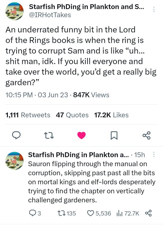
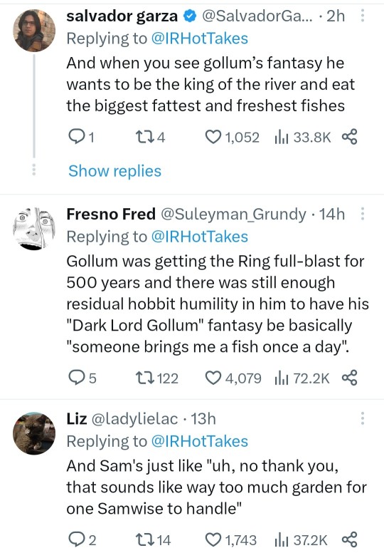
[ID: tweets.
@IRHotTakes:
An underrated funny bit in the Lord of the Rings books is when the ring is trying to corrupt Sam and is like "Uh... shit man, idk. If you kill everyone and take over the world, you'd get a really big garden?"
Sauron flipping through the manual on corruption, skipping past past all the bits on mortal kings and elf-lords desperately trying to find the chapter on vertically challenged gardeners.
@SalvadorGa…:
And when you see gollum's fantasy he wants to be the king of the river and eat the biggest fattest and freshest fishes
@Suleyman_Grundy:
Gollum was getting the Ring full-blast for 500 years and there was still enough residual hobbit humility in him to have his "Dark Lord Gollum" fantasy be basically "someone brings me a fish once a day".
@ladylielac:
And Sam's just like "uh, no thank you, that sounds like way too much garden for one Samwise to handle"
/end ID]
77K notes
·
View notes
Text
[ID: two photos of a stone/small boulder with two adjustable leather straps, resembling a backpack. /end ID]


Jana Sterbak, Sisyphus Sport
#art#ID#accessible art#(hi op please edit the description into the original post for accessibility! no credit needed)
18K notes
·
View notes
Text
[ID: several photographs of the moon in various phases. some are more close-ups, some are from a larger distance. /end ID]
the moon is cool i think. big fan of the big rock.
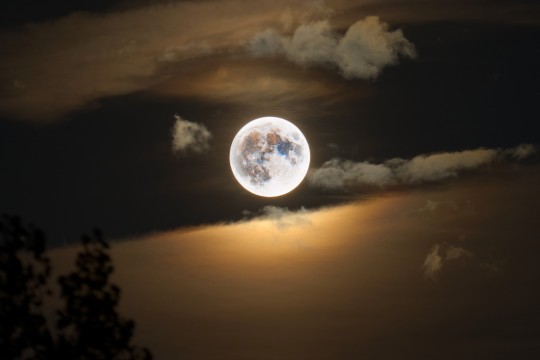

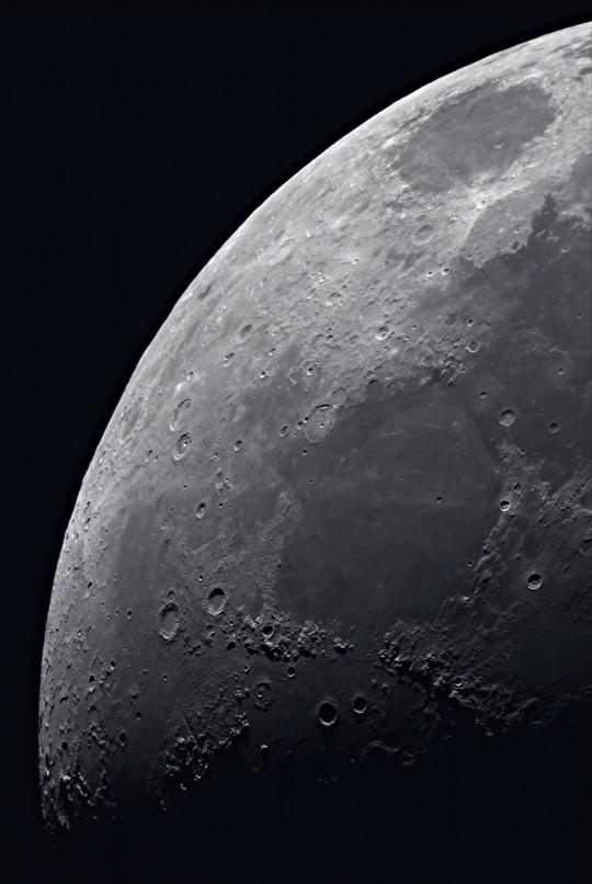
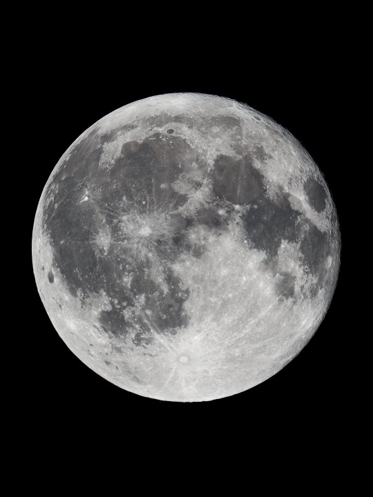
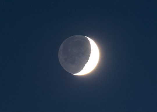
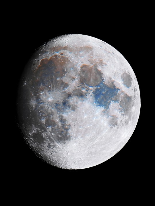

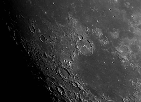
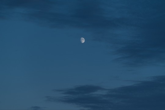

photos all by me
#ph#sent to me#ID#THE MOON MY BELOVED#can we talk about the moon tonight? (low & full in the baby blue sky)#<- been way too long since I used that tag#(hi op please edit the description into the original post for accessibility! no credit needed)
14K notes
·
View notes
Text
[ID: digital coloured drawings/redesigns of the winx club girls, in human and fairy forms. /end ID]
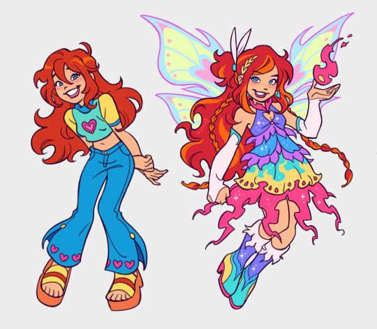
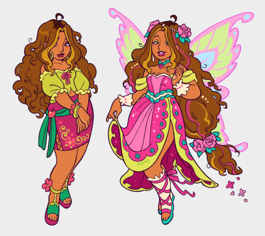
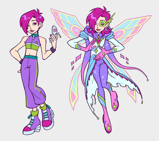
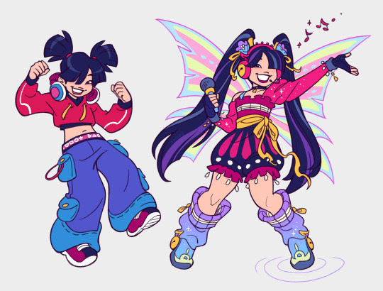
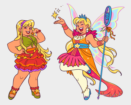
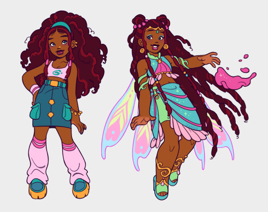
[Winx] come get your glitter girlies ✨
#art#ID#SO CUTE OMG#(hi op please edit the description into the original post for accessibility! no credit needed)
49K notes
·
View notes
Text
[ID: a tweet reading, “Do you ever just have this deep seated desire to bother people. I have clown blood”. /end ID]
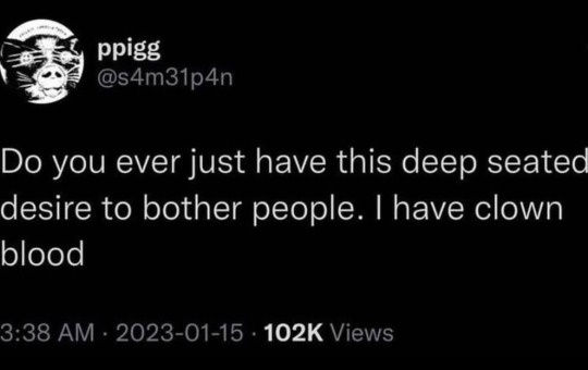
#ID#brother tag#<- us w each other#(hi op please edit the description into the original post for accessibility! no credit needed)
40K notes
·
View notes
Text
[ID: a text conversation with “Lynden”
sent: Please tell me that post was a joke and you are not naming your daughter Tragedeigh
received: Oh, i am. See the word, “Tragedeigh” has been used as a demeaning and offensive insult towards creative mothers and i am sick of people on facebook calling me that slur. So my baby girl is reclaiming it and Tragedeigh Anne is her real name. I don't want to hear about it from someone like you
“tragedeigh” is the word “tragedy” spelt with e.i.g.h. instead of a y. /end ID]

#ID#sent to me#HELP#url change to ‘tragedykereigh’ when#(hi op please edit the description into the original post for accessibility! no credit needed)
30K notes
·
View notes
Text
[ID: a digital sketch of gandalf and pippin sitting in a ford fiesta. gandalf is driving, looking relaxed and wearing sunglasses. pippin looks out of the window with comically wide eyes and small pupils, giving him a shocked or haunted look. text reads, “we’re passing into gondor, pippin.” /end ID]

This is unrelated to anything but watching Lord of the Rings with friends while I work when one friend mentioned it would be a lot cooler if Gandalf had a Ford Fiesta
#ID#PLS#(hi op please edit the description into the original post for accessibility! no credit needed)
7K notes
·
View notes
Text
[ID: a gouache painting of peaches lying on a light blue plate. there is about a peach and a half in total: one whole one, and a couple of pieces lying next to it. /end ID]

farmers' market peaches
#art#ID#accessible art#thesis#(hi op please edit the description into the original post for accessibility! no credit needed)
2K notes
·
View notes
Text
[ID: a coloured digital drawing of nona from the locked tomb series, floating in the ocean with her eyes closed. there are jellyfish around her. the water fades from pink to purple to blue to teal. /end ID]

#art#ID#LOVE!!!#(hi op please edit the description into the original post for accessibility! no credit needed)
227 notes
·
View notes
Text
[ID: a digital coloured portrait of éowyn from the lord of the rings, dressed extravagantly in a nordic style. /end ID]
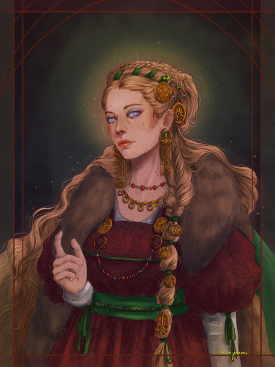
Eowyn - Silmarillion Extravaganza
Decided to lean into a more Nordic style, not historically accurate XD
#art#ID#sent to me#THIS IS GORGEOUS HOLY SHIT#tolkien#(hi op please edit the description into the original post for accessibility! no credit needed)
1K notes
·
View notes