#藍天海岸室內設計
Explore tagged Tumblr posts
Visit Tumblr Blog
Explore Tumblr blogs with no restrictions, modern design and the best experience.
Last Seen Tumblr Blogs


Fun Fact
BuzzFeed published a report claiming that Tumblr was utilized as a distribution channel for Russian agents to influence American voting habits during the 2016 presidential election in Feb 2018.
Text
instagram
youtube
主視覺設計:克里斯(Christopher Boyd)


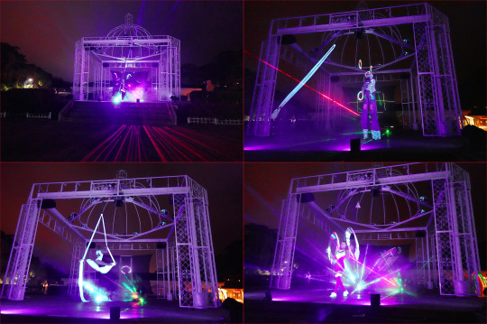
駁二藝術特區C9-11倉庫 (駁二大意站)2pm-7pm 5/23-5/25
法國生活節 2025 KAOHSIUNG FRENCH FESTIVAL - French Riviera 「蔚藍海岸」
呼應2025年法國尼斯將舉辦第三屆聯合國海洋會議(UNOC),今年法國生活節以「法國蔚藍海岸」為主軸,融合高雄港灣城市特色與海洋文化,讓民眾享受法式風情,也能認識海洋文化及環境永續重要性。
延續去年熱潮,內容涵蓋藝術、滾球及法式音樂,今年更加入VR科技元素、戶外講座及海洋文化體驗,也將再度集結在地特色品牌、法式餐廳及知名烘焙品牌。
主視覺特別邀請2025福爾摩沙藝術駐村計畫藝術家—法國插畫家克里斯(Christopher Boyd)擔綱設計,透過生動筆���,勾勒高雄與南法蔚藍海岸城市共有的海洋風情、傳遞永續海洋理念。
【Part 1】
陽光普照,天氣熾熱,人潮擁擠,推展販售各式各樣的法式美食和白酒、紅酒,其實我就是為了出門曬太陽的,吸取適度的維他命D。哈哈! 那裡幾乎每一家咖啡店都座無虛席,熱鬧擁擠的地方總是讓我頭疼,腦海裡無法播放著輕快迷人的法國香頌,只有不間斷地蜜蜂嗡嗡作響的吵雜聲,所以我快速地瀏覽許多年輕一代的藝術家們的創意和新奇點子之後就返回工作室了;最令我驚訝的是居住在台灣高雄的法國人如此之多,並且中文都能說的很流利,當然其中不乏來自其他城市的法國貿易商。不管怎樣,現在沒有戰爭,人民,國家,我們都十分幸福。📿 🪷 🙏 Lan~*
(The sun was shining, the weather was hot, the crowds were crowded, and a variety of French delicacies and white and red wines were on sale. In fact, I just wanted to go out to bask in the sun and absorb the right amount of vitamin D. Haha! Almost there was packed at each coffee shops. and always give me a headache in crowded places, I couldn't play the brisk and charming French chanson in my mind. There was only the incessant buzzing noise of bees, so I quickly browsed through the creativity and novel ideas of many young artists and returned to the studio; what surprised me most was that there are so many French people living in Kaohsiung, Taiwan, and they can speak fluent Chinese. Of course, there are many French traders from other cities among them. anyway Now no war the people the country we're such happiness.) 📿 🪷 🙏 Lan~*


#法國生活節 2025#2025 kaohsiung french festival - french riviera#高雄/ 駁二C9-11#taiwan 台灣#christopher boyd 克里斯#Instagram#Youtube#chu lan#朱蘭皮藝#fine craft artist#leather art artist#beautiful life#daily life
10 notes
·
View notes
Text
西武現實主義(Seiburealism)
/ Victor Burgin, 1989
四月的東京。在上野公園,櫻花低垂如雲,野餐席遍布其下。啤酒潑灑成水漥,載著狂歡人群的塑膠布筏子順著櫻花樹大道漂流(每艘筏邊整齊地擺放著一圈鞋子)。這些瀝青河流的兩岸擠滿觀光客,他們既為櫻花短暫盛放的美感所吸引,也沉醉於花見野餐所展現的景象——櫻花短命的綻放成了這場狂歡的道德藉口、一種死的提醒(momento mori)。櫻花影像被傳輸到西武百貨澀谷店,以環境影像的形式出現在店內各處。透過十二層樓的螢幕、交錯的手扶梯與電梯中,櫻花在商場每個角落綻放;如同富士山的影像(櫻花融化為山景,伴隨著約翰·藍儂《Imagine》的旋律);又或是街上的路人影像,被隨機捕捉,短暫地使螢幕成為千扇窗戶,讓人望向外部世界。(從外頭望上,百貨外牆橫跨數層樓的數位螢幕上,行人可能只看見巨大的魟魚,在海底悠然擺動,然後畫面轉化為像素化的動畫新聞,播報最新的人質危機。)
班雅明(Benjamin)曾視十九世紀的購物商廊為從街道過渡到百貨公司之間的中介階段。商廊——一條室內街道——白天靠天窗照明,這種大片透明玻璃得以實現,乃因為鐵架的支撐使其成為可能。抬頭望去,人們可見白日的雲朵,或夜晚的星空。在西武百貨中,這些鐵框玻璃矩形彷彿已從格子中爆裂而出;我想像它們在電腦動畫中慵懶地翻滾,變形為無所不在的視訊螢幕。在一種與時間無關的均勻冷光照射下,這些螢幕可以顯示雲朵、火星地貌,或任何可用二進位編碼定義的影像。東京位於富士山以東約百公里之處。從江戶時代(1600年)起至明治末年(1912年),富士山仍可間歇而清晰地從市內望見——成為一種固定的時空精神指標(在東京,能望見富士山之地即為「名所」)。如今,建築與空氣污染抹去了富士山的輪廓,至少在肉眼中是如此。新的參照點、新的「山」,在城市中自身誕生,成為僅能從百貨公司中看到富士山的景觀。儘管如此,觀看富士山的現象學經驗仍保留於百貨空間中——人們在穿越商場、從一處螢幕移動到另一處時,如同昔日穿越建築縫隙偶爾瞥見山景一般。
日本人稱為「立讀(tachiyomi)」的行為,是一種移動中、隨機式、斷續式的閱讀方式:翻閱漫畫與雜誌,只是路過隨手翻看,並無購買意圖;或在地鐵上從鄰座撿起報紙隨意瀏覽。安德烈・布勒東(André Breton)曾回憶戰時與賈克・瓦謝(Jacques Vaché)在南特的日子,他們的習慣是「無論正在播放什麼,都隨意走進電影院,看到哪裡算哪裡,一旦感到無聊便馬上離席,前往下一家影院,如此不斷輪替」。如今我們不斷切換電視頻道。(有段時間,在紐約某些餐廳流行「瀏覽式點餐」——這嚐一點、那吃一口。)觀光客也像這樣「套餐式」地體驗文化:在這座城市待兩天,再去另一座城市幾日(就像我如今在這區閒晃,在那區遊蕩)。而日本人不也常被說是「瀏覽」西方文化、取其所需再「本土化」的代表嗎?如果文化本身是複雜的文本,那麼它們如今已成為富裕與閒適者邊走邊翻的文本——無須承諾,只是移動中的一瞥。
在這間西武百貨的書籍部(藏書四十萬冊,我甚至找到兩本由密西根安娜堡的UMI學術出版社出版的超現實主義論文),一整面牆成為了放映螢幕,播放經典好萊塢電影的片段——以主題分類,其中之一是「戰爭」。畫面上,美國轟炸機正準備夜襲(東京曾在戰爭中遭遇毀滅性燃燒轟炸),畫外音��定表示:「無論敵人藏在哪裡,我們都會追擊。」螢幕右側,在轟炸機飛出畫面之處,擺放著一座展示模型——燒焦的塔樓,其頂部爆炸場景正是電影《魔鬼剋星》(Ghostbusters)結尾的鏡頭之一。
(布勒東初識瓦謝是在1916年的軍方精神病院,當時布勒東是實習醫生,瓦謝是病人。其他病人中,有一人堅信所謂的「戰爭」不過是模擬場景;砲彈是道具,傷口是化妝;死者是從醫學院解剖台上帶來的屍體,趁夜散佈在假的「戰場」上。)美軍轟炸機由畫面左側飛向右側,如同西方的閱讀方向。而在書區翻閱時,我又看到一部漫畫,開頭描繪的是日本轟炸機自右向左起飛。它們先摧毀珍珠港,然後轟炸美國本土。接著,日本士兵踢破美國住家的大門。一戶家庭——男子、女子與一名幼童——蜷縮在客廳中,被士兵襲擊。男子遭殺害。士兵開始撕扯女人衣服,孩子哭喊。一名日本軍官抓起孩子的腳踝,以一個橫跨雙頁的弧線將他甩向牆壁。孩子的臉部從頭顱撕裂開來,飛越畫面,拖出一道墨筆揮灑般的筆觸,讓人聯想到禪宗書法。接下來半頁畫面中,女人遭輪暴(其哀號以英文呈現),最後士兵們聚集起來,坐在倒塌自由女神像的伸展手臂上合照。下一頁,也是最終頁,我們看到裕仁天皇騎馬現身。有人說,東京之所以安全,是因為所有暴力都被收納於這些漫畫中。
布勒東在《超現實主義第二宣言》中曾寫道:「最單純的超現實主義行動,就是手持左輪手槍,走到街頭,盡你所能隨機射擊群眾。」如今,這樣的行為雖然不常見,卻也成為日常生活中的一種現象。有評論指出,第二次世界大戰的爆發令超現實主義失效,因為現實世界的暴力早已超越藝術所能預見。(盟軍登陸時,超現實主義攝影師李・米勒(Lee Miller)遊走於滿目瘡痍的街道,每扇門像是通往駭人而奇幻的風景。有次她不慎踩到一隻人手,撿起後憤怒地將其拋向街道。)但人們往往忘了,超現實主義始於第一次世界大戰,其戰間��的重要使命之一,正是將日常生活中的恐懼與失落加以昇華——轉化為幻想,特別是在性愛的範疇中。
在街頭,人群偶爾會突然分開,使人瞥見某個身影、某張臉,但那一瞬即逝,卻觸動了情慾神經。班雅明稱之為「最後一瞥的愛情(Love at last sight)」。百貨公司則提供這一現象的變體:透過那些輕薄帷幕圍成的小空間,女性離開觀眾群,成為被觀看的對象——不僅為了自己與其他女性目光的觀賞,也為那因帷幕掀開而勾引來的非法凝視所設(羅蘭・巴特曾問:「身體上最具情慾性的部分,不正是衣物掀開之處嗎?」)。我匆匆轉移視線;某些光線在鏡面空間內反射、延遲,在我視網膜上形成混亂(與其說是超現實,不如說更像立體主義),只能依靠記憶,在其中提取出一段熟悉的、被愛的身體片段。班雅明在論述超現實主義的文章中寫道:「在秘儀式的愛情中,女人本身並不重要。布勒東亦如此。他與娜佳(Nadja)親近的,不是娜佳本人,而是娜佳身邊的事物。」我們可以將這種「秘儀愛」以臨床術語命名——「戀物癖(fetishism)」。百貨公司,作為商品戀物的神殿,也召喚著佛洛伊德所言的戀物心理。男性漫遊者(flâneur)若欲前往正當之地,勢必得穿越洋裝海洋與香水濃霧的沙漠。他別無選擇,只能進入這些禁忌之地。他的藉口天衣無縫,而內心的罪惡快感則無可迴避。當他在衣架間無意識地翻看服飾時,或許以為自己在為情人挑選禮物,但同時他也正盲目地觸摸著母親的身體。某刻我在西武感到口渴,找到了飲水機,其透明上層水流覆蓋著石礫——彷彿是一段溪流被切割下來,擺放於展示台上的自然部件。
在街道層,有一家以廢墟為造型的酒吧(採用「後末日建築」風格),其立面突出一段飛機機翼,下懸的引擎艙象徵性地讓人聯想到曾夷平越南的 B-52 轟炸機。在奈傑爾・柯茲(Nigel Coates)設計的 Café Bongo 中,「內部空間」衝破與「外部空間」之間的脆弱邊界。���同一個六本木(Roppongi)地區,為時裝設計師安傑洛・塔拉齊(Angelo Tarlazzi)設計店鋪的建築師八束一(Hajime Yatsuka)曾說,他將整棟建築構思為城市的「內部」。班雅明曾評論:「對於漫遊者(flâneur)而言,街道就是他的住所;他在房屋立面間的感受,猶如市民置身於四面牆內一樣自在。」百貨公司已成為那些從榻榻米小房間逃出的富裕難民的共同居所,他們在地鐵裡入睡。在城市各處,人們沉睡的景象隨處可見。男性躺在西武百貨各樓層扶梯轉折處旁的寬大沙發上,看似專為此而設(否則用途為何?),進入沉睡。
在這家百貨公司底下的有樂町地鐵站內,年輕的女性上班族也入睡著。她們從城市邊緣通勤,來回奔波於狹窄的住處與辦公地點,週末則重返澀谷、銀座、池袋,或其他西武分店。她們購買的是三宅一生(Issey Miyake)、Comme des Garçons 等品牌的服飾,而這些品牌對歐美的同齡女性來說幾乎遙不可及。從她們狹小房間出發,搭乘約一個半小時的列車,度過一天如遊蕩者般的生活,徘徊於西武那奢華至極的空間——這些空間透過無所不在的環境影像,開啟通往無限空間的通道。作為來自英國北部工人階級家庭的流離者,我想起了那位較富裕的姑媽家中的「前廳」(frontroom)。那是一間擦得發亮、充滿蠟香的房間,平時封閉,只在打掃或有訪客來時才會開啟。來客可以看,但不能碰,只能站在敞開的門前觀看,而不能踏入其中(這間「起居室」沒人坐,這間「客廳」裡也無人交談)。這房間彷彿是一個全息投影的模擬空間,只為提供心理上的額外生活空間,如同西武百貨所帶來的慰藉一般。在西武百貨,正如其西方對應對象(至少在這方面),家具部就如同無數富人家庭的前廳;彷彿從其原始情境中抽離,再「傳送」到這座城市的樓層中——這座由無數「前廳」構成的城市,雖然沒有牆壁,卻以內部街道相互隔開,主要用途就是用來閒逛(flânerie)。
尚–盧・高達(Jean-Luc Godard)曾表示過這樣的想法:既然任何東西都可以被拍進電影,那就所有東西都應該被拍進電影。比起電影,西武百貨更是一場由異質集體所創作的組合展——包括買手、租戶精品店業者、駐場視覺藝術家、圖書管理員、旅行社人員等。這裡沒有「作者控制」或「敘事封閉」的概念(因此也不需要布勒東與瓦謝式的逃避);其組織原則早已是非整體的、務實的、機會導向的。在某種程度上,這場組合也可視為一種整體,由此構成的過程類似於超現實主義者的集體書寫實踐。
西武百貨是超現實主義於後現代階段的作品,一件無盡變奏的作品,由遊蕩者(flâneur)「自動書寫」而成,其對於商品的興趣與對所處空間的興趣無高下之分。(班雅明有句格言:「建築是在分心狀態中被欣賞的。」)
在日本,想看一場重要的藝術展覽,你有很大機率會在百貨公司,而不是美術館看到它。當西武百貨展出尚・杜布菲(Jean Dubuffet)的作品時,東京上野公園內的東京都美術館也於1988年4月開展名為《1920年代的日本》的展覽。我在那裡得知,1923年摧毀東京的關東大地震,被視為日本「機械時代」藝術的開端。布勒東的《超現實主義宣言》與《超現實主義革命》首期,也是在1924年的巴黎發表。在東京都美術館,我發現大量機械美學影響的證據,特別是包浩斯(Bauhaus)對視覺藝術——攝影、繪畫、建築、工業設計、電影、劇場設計、時尚等的深遠影響。同時也能看出德國表現主義的廣泛影響,尤其在劇場與電影領域;而隨著1920年代結束,愈來愈多政治啟發下的「寫實主義」創作開始盛行。然而我幾乎找不到任何關於超現實主義的明確跡象。並沒有理由認為當時的日本在1920年代對於超現實主義的了解會比其他歐洲美學運動來得少。1970年,瀧口修造(Shūzō Takiguchi)——在布勒東與艾呂雅所編的《簡明超現實主義辭典》中被列為「超現實主義作家」——曾寫道:「在日本,從未出現過像法國那樣的超現實主義團體。」我無法判斷超現實主義在戰間期或今日的日本意味著什麼,也無從推測它未能代表什麼;我確定的是,它的意義絕對與我自己的理解不同。許多超現實主義研究者認為,這場運動的編年史應該終結於1968年五月事件。而就在同一年,一個法國電視台團隊前往東京郊區採訪三島由紀夫。他是傳統價值的擁護者(兩年後,他將以近乎完美的切腹行動實踐他的理念),當時他住在一間宛如法國蔚藍海岸別墅的宅邸中。一樓以十八世紀法國風格裝潢,而樓上則採用現代國際風格設計。三島說道:「在這裡,只有看不見的部分才是日本的。」
9 notes
·
View notes
Text
秀才人情
H:秀才人情,重點是感恩,依自己能力道謝,是自古的美德,也感曾經幫助我的人,謝謝!20250303W1
網路字典
秀才人情
秀才多以詩文書畫為餽贈之物,所費無非紙筆而已。比喻菲薄的贈品。元.王實甫《西廂記.第一本.第二折》:「量著窮秀才人情只是紙半張。」《鏡花緣》第三一回:「些須微物,不過略助雅興,敝處歷來猜謎都是如此。秀才人情,休要見笑。」
秀才人情 成語解釋
秀才人情
【解釋】秀才多數貧窮,遇有人情往來,無力購買禮物,只得裁紙寫詩文。俗話說:秀才人情紙半張。表示饋贈的禮物過於微薄。
【出處】清·朱之瑜《答奧村庸禮書》:“外具湖筆、斗方貳種,真乃秀才人情而已。”
【語法】偏正式;作賓語、定語;含貶義
儒林外史/第14回
儒林外史
目錄儒林外史◀上一回第十四回 蘧公孫書坊送良友 馬秀才山洞遇神仙下一回▶
話說馬二先生在酒店裏同差人商議要替蘧公孫贖枕箱。差人道:「這奴才手裏拿著一張首呈,就像拾到了有利的票子。銀子少了,他怎肯就把這欽贓放出來?極少也要三二百銀子。還要我去拿話嚇他:『這事弄破了,一來,與你無益﹔二來欽案官司,過司由院,一路衙門,你都要跟著走。你自己算計,可有這些閒錢陪著打這樣的惡官司?』是這樣嚇他。他又見了幾個衝心的錢,這事纔得了。我是一片本心,特地來報信。我也只願得無事,落得『河水不洗船』﹔但做事也要『打蛇打七寸』纔妙。你先生請上裁。」馬二先生搖頭道:」二三百兩是不能。不要說他現今不在家,是我替他設法,就是他在家裏,雖然他家太爺做了幾任官,而今也家道中落,那裏一時拿的許多銀子出來?」差人道:「既然沒有銀子,他本人又不見面,我們不要耽誤他的事,把呈子丟還他,隨他去鬧罷了。馬二先生道:「不是這樣說。你同他是個淡交,我同他是深交,眼睜睜看他有事,不能替他掩下來,這就不成個朋友了。但是要做的來。」差人道:「可又來!你要做的來,我也要做的來!」馬二先生道:「頭翁,我和你從長商議,實不相瞞,在此選書,東家包我幾個月,有幾兩銀子束脩,我還要留著些用。他這一件事,勞你去和宦成說,我這裏將就墊二三十兩銀子把與他,他也只當是拾到的,解了這個冤家罷。」差人惱了道:「這個正合著古語,『瞞天討價,就地還錢!』我說二三百銀子,你就說二三十兩!『戴著斗笠親嘴,差著一帽子』!怪不得人說你們『詩云子曰』的人難講話!這樣看來,你好像『老鼠尾巴上害癤子,出膿也不多』!倒是我多事,不該來惹這婆子口舌!」說罷,站起身來謝了擾,辭別就往外走。馬二先生拉住道:「請坐再說,急怎的?我方纔這些話,你道我不出本心麼?他其實不在家,我又不是先知了風聲,把他藏起,和你講價錢。況且你們一塊土的人,彼此是知道的。蘧公孫是甚麼慷慨腳色,這宗銀子知道他認不認,幾時還我。只是由著他弄出事來,後日懊悔遲了。總之,這件事,我也是個傍人。你也是個傍人,我如今認些晦氣,你也要極力幫些,一個出力,一個出錢,也算積下一個莫大的陰功。若是我兩人先參差著,就不是共事的道理了。」差人道:「馬老先生,而今這銀子我也不問是你出,是他出,你們原是『氈襪裹腳靴』。但須要我效勞的來。老實一句,『打開板壁講亮話』,這事一些半些,幾十兩銀子的話,橫豎做不來,沒有三百,也要二百兩銀子,纔有商議。我又不要你十兩五兩,沒來由把難��目把你做怎的?」馬二先生見他這話說頂了真,心裏著急道:「頭翁,我的束脩其實只得一百兩銀子,這些時用掉了幾兩,還要留兩把作盤費到杭州去。擠的乾乾淨淨,抖了包,只擠的出九十二兩銀子來,一釐也不得多。你若不信,我同你到下處去拿與你看。此外行李箱子內,聽憑你搜。若搜出一錢銀子來,你把我不當人。就是這個意思,你替我維持去。如斷然不能,我也就沒法了,他也只好怨他的命。」差人道:「先生,像你這樣血心為朋友,難道我們當差的心不是肉做的?自古山水尚有相逢之日,豈可人不留個相與?只是這行瘟的奴才頭高,不知可說的下去?」又想一想道:「我還有個主意,又合著古語說『秀才人情紙半張。』現今丫頭已是他拐到手了,又有這些事,料想要不回來,不如趁此就寫一張婚書,上寫收了他身價銀一百兩。合著你這九十多,不將有二百之數?這分明是有名無實的,卻塞得住這小廝的嘴。這個計較何如?」馬二先生道:「這也罷了,只要你做的來。這一張紙何難?我就可以做主。」
當下說定了,店裏會了賬,馬二先生回到下處候著。差人假作去會宦成,去了半日,回到文海樓。馬二先生接到樓上。差人道:「為這件事,不知費了多少唇舌!那小奴才就像我求他的,定要一千八百的亂說,說他家值多少就該給他多少。落後我急了,要帶他回官,說:『先問了你這奸拐的罪,回過老爺,把你納在監裏,看你到那裏去出首!』他纔慌了,依著我說。我把他枕箱先賺了來,現放在樓下店裏。先生快寫起婚書來,把銀子兌清,我再打一個稟帖,銷了案,打發這奴才走清秋大路,免得又生出枝葉來。」馬二先生道:「你這賺法甚好。婚書已經寫下了。」隨即同銀子交與差人。差人打開看,足足九十二兩,把箱子拿上樓來交與馬二先生,拿著婚書、銀子,去了。回到家中,把婚書藏起,另外開了一篇細賬,借貸喫用,衙門使費,共開出七十多兩,只剩了十幾兩銀子遞與宦成。宦成嫌少,被他一頓罵道:「你奸拐了人家使女,犯著官法,若不是我替你遮蓋,怕老爺不會打折你的狗腿!我倒替你白白的騙一個老婆,又騙了許多銀子,不討你一聲知感,反問我找銀子!──來!我如今帶你去回老爺,先把你這姦情事打幾十板子,丫頭便傳蘧家領去,叫你喫不了的苦,兜著走!」宦成被他罵得閉口無言,忙收了銀子,千恩萬謝,領著雙紅,往他州外府尋生意去了。
蘧公孫從墳上回來,正要去問差人,催著回官﹔只見馬二先生來候,請在書房坐下,問了些墳上的事務,慢慢說到這件事上來。蘧公孫初時還含糊。馬二先生道:「長兄,你這事還要瞞我麼?你的枕箱現在我下處樓上。」公孫聽見枕箱,臉便飛紅了。馬二先生遂把差人怎樣來說,我怎樣商議,後來怎樣怎樣:「我把選書的九十幾兩銀子給了他,纔買回這個東西來,而今幸得平安無事。就是我這一項銀子,也是為朋友上一時激於意氣,難道就要你還?但不得不告訴你一遍。明日叫人到我那裏把箱子拿來,或是劈開了,或是竟燒化了,不可再留著惹事。」公孫聽罷,大驚,忙取一把椅子放在中間,把馬二先生捺了坐下,倒身拜了四拜。請他坐在書房裏,自走進去,如此這般,把方纔這些話說與乃眷魯小姐,又道:「像這樣的纔是斯文骨肉朋友,有意氣!有肝膽!相與了這樣正人君子,也不枉了!像我婁家表叔結交了多少人,一個個出乖露醜,若聽見這樣話,豈不羞死!」魯小姐也著實感激,備飯留馬二先生喫過,叫人跟去將箱子取來毀了。次日,馬二先生來辭別,要往杭州。公孫道:「長兄先生,才得相聚,為甚麼便要去?」馬二先生道:「我原在杭州選書。因這文海樓請我來選這一部書,今已選完,在此就沒事了。」公孫道:「選書已完,何不搬來我小齋住著,早晚請教?」馬二先生道:「你此時還不是養客的時候。況且杭州各書店裏等著我選考卷,還有些未了的事,沒奈何,只得要去。倒是先生得閒來西湖上走走。那西湖山光水色,頗可以添文思。」公孫不能相強,要留他辦酒席餞行。馬二先生道:「還要到別的朋友家告別。」說罷,去了。公孫送了出來。到次日,公孫封了二兩銀子,備了些薰肉小菜,親自到文海樓來送行,要了兩部新選的墨卷回去。
馬二先生上船,一直來到斷河頭,問文瀚樓的書坊,──乃是文海樓一家──到那裏去住。住了幾日,沒有甚麼文章選,腰裏帶了幾個錢,要到西湖上走走。
這西湖乃是天下第一個真山真水的景致!且不說那靈隱的幽深,天竺的清雅﹔只這出了錢塘門,過聖因寺,上了蘇堤,中間是金沙港,轉過去就望見雷峰塔,到了淨慈寺,有十多里路,真乃五步一樓,十步一閣。一處是金粉樓臺,一處是竹籬茅舍﹔一處是桃柳爭妍,一處是���麻遍野。那些賣酒的青簾高颺,賣茶的紅炭滿爐,士女遊人,絡繹不絕,真不數「三十六家花酒店,七十二座營絃樓」。
馬二先生獨自一個,帶了幾個錢,步出錢塘門,在茶亭裏喫了幾碗茶,到西湖沿上牌樓跟前坐下。見那一船一船鄉下婦女來燒香的,都梳著挑鬢頭,也有穿藍的,也有穿青綠衣裳的,年紀小的都穿些紅紬單裙子﹔也有模樣生的好些的,都是一個大團白臉,兩個大高顴骨﹔也有許多疤、麻、疥、癩的。一頓飯時,就來了有五六船。那些女人後面都跟著自己的漢子,掮著一把傘,手裏拿著一個衣包,上了岸,散往各廟裏去了。馬二先生看了一遍,不在意裏,起來又走了里把多路。望著湖沿上接連著幾個酒店,掛著透肥的羊肉,櫃檯上盤子裏盛著滾熱的蹄子、海參、糟鴨、鮮魚,鍋裏煮著餛飩,蒸籠上蒸著極大的饅頭。馬二先生沒有錢買了喫,喉嚨裏嚥唾沫,只得走進一個麵店,十六個錢喫了一碗麵。肚裏不飽,又走到間壁一個茶室喫了一碗茶,買了兩個錢處片嚼嚼,到覺得有些滋味。喫完了出來,看見西湖沿上柳陰下繫著兩隻船。那船上女客在那裏換衣裳:一個脫去元色外套,換了一件水田披風﹔一個脫去天青外套,換了一件玉色繡的八團衣服﹔一個中年的脫去寶藍緞衫,換了一件天青緞二色金的繡衫。那些跟從的女客,十幾個人,也都換了衣裳。這三位女客,一位跟前一個丫鬟,手持黑紗團香扇替他遮著日頭,緩步上岸。那頭上珍珠的白光,直射多遠,裙上環珮,叮叮噹噹的嚮。馬二先生低著頭走了過去,不曾仰視。往前走過了六橋,轉個灣,便像些村鄉地方,又有人家的棺材厝基,中間走了一二里多路,走也走不清,甚是可厭。馬二先生欲待回家,遇著一走路的,問道:「前面可還有好頑的所在?」那人道:「轉過去便是淨慈、雷峰,怎麼不好頑?」馬二先生又往前走。走到半里路,見一座樓臺蓋在水中間,隔著一道板橋。馬二先生從橋上走過去,門口也是個茶室,喫了一碗茶。裏面的門鎖著。馬二先生要進去看,管門的問他要了一個錢,開了門,放進去。裏面是三間大樓。樓上供的是仁宗皇帝的御書。馬二先生嚇了一跳,慌忙整一整頭巾,理一理寶藍直裰,在靴桶內拿出一把扇子來當了笏板,恭恭敬敬,朝著樓上揚塵舞蹈,拜了五拜。拜畢起來,定一定神,照舊在茶桌子上坐下。傍邊有個花園,賣茶的人說是布政司房裏的人在此請客,不好進去。那廚房卻在外面。那熱湯湯的燕窩、海參,一碗碗在跟前捧過去。馬二先生又羨慕了一番。出來過了雷峰,遠遠望見高高下下,許多房子,蓋著琉璃瓦,曲曲折折,無數的朱紅欄杆。馬二先生走到跟前,看見一個極高的山門,一個直匾,金字,上寫著:「敕賜淨慈禪寺」。山門傍邊一個小門。馬二先生走了進去,一個大寬展的院落,地下都是水磨的磚。纔進二道山門,兩邊廊上都是幾十層極高的階級。那些富貴人家的女客,成群逐隊,裏裏外外,來往不絕,都穿的是錦繡衣服。風吹起來,身上的香一陣陣的撲人鼻子。馬二先生身子又長,戴一頂高方巾,一幅烏黑的臉,捵著個肚子,穿著一雙厚底破靴,橫著身子亂跑,只管在人窩子裏撞。女人也不看他,他也不看女人。前前後後跑了一交,又出來坐在那茶亭內──上面一個橫匾,金書「南屏」兩字,──喫了一碗茶。櫃上擺著許多碟子:橘餅、芝麻糖、粽子、燒餅、處片、黑棗、煮栗子。馬二先生每樣買了幾個錢的,不論好歹,喫了一飽。馬二先生也倦了,直著腳,跑進清波門。到了下處,關門睡了。因為走多了路,在下處睡了一天。
第三日起來,要到城隍山走走。城隍山就是吳山,就在城中。馬二先生走不多遠,已到了山腳下。望著幾十層階級,走了上去,橫過來又是幾十層階級,馬二先生一氣走上,不覺氣喘。看見一個大廟門前賣茶,喫了一碗。進去見是吳相國伍公之廟。馬二先生作了個揖,逐細的把匾聯看了一遍。又走上去,就像沒有路的一般。左邊一個門,門上釘著一個匾,匾上「片石居」三個字,裏面也想是個花園,有些樓閣。馬二先生步了進去,看見窗櫺關著。馬二先生在門外望裏張了一張,見幾個人圍著一張桌子,擺著一座香爐,眾人圍著,像是請仙的意思。馬二先生想道:「這是他們請仙判斷功名大事,我也進去問一問。」站了一會,望見那人磕頭起來。傍邊人道:「請了一個才女來了。」馬二先生聽了暗笑。又一會,一個問道:「可是李清照?」又一個問道:「可是蘇若蘭?」又一個拍手道:「原來是朱淑貞!」馬二先生道:「這些甚麼人?料想不是管功名的了,我不如去罷。」又轉過兩個灣,上了幾層階級,只見平坦的一條大街。左邊靠著山,一路有幾個廟宇。右邊一路,一間一間的房子,都有兩進。屋後一進,窗子大開著,空空闊闊,一眼隱隱望得見錢塘江。��房子:也有賣酒的,也有賣耍貨的,也有賣餃兒的,也有賣麵的,也有賣茶的,也有測字算命的。廟門口都擺的是茶桌子,這一條街,單是賣茶就有三十多處,十分熱鬧。
馬二先生正走著,見茶舖子裏一個油頭粉面的女人招呼他喫茶。馬二先生別轉頭來就走,到間壁一個茶室泡了一碗茶。看見有賣的蓑衣餅,叫打了十二個錢的餅喫了,略覺有些意思。走上去,一個大廟,甚是巍峨,便是城隍廟。他便一直走進去,瞻仰了一番。過了城隍廟,又是一個灣,又是一條小街。街上酒樓、麵店都有,還有幾個簇新的書店。店裏帖著報單,上寫:「處州馬純上先生精選《三科程墨持運》於此發賣。」馬二先生見了歡喜,走進書店坐坐,取過一本來看,問個價錢,又問:「這書可還行?」書店人道:「墨卷只行得一時,那裏比得古書。」馬二先生起身出來,因略歇了一歇腳,就又往上走。過這一條街,上面無房子了,是極高的個山岡。一步步去走到山岡上,左邊望著錢塘江,明明白白。那日江上無風,水平如鏡。過江的船,船上有轎子,都看得明白。再走上些,右邊又看得見西湖。雷峰一帶、湖心亭都望見。那西湖裏打魚船,一個一個,如小鴨子浮在水面。馬二先生心曠神怡,只管走了上去,又看見一個大廟門前擺著茶桌子賣茶。馬二先生兩腳酸了,且坐喫茶。喫著,兩邊一望,一邊是江,一邊是湖,又有那山色一轉圍著,又遙見隔江的山,高高低低,忽隱忽現。馬二先生歎道:「真乃載華嶽而不重,振河海而不洩,萬物載焉!」喫了兩碗茶,肚裏正餓,思量要回去路上喫飯。恰好一個鄉里人捧著許多盪麵薄餅來賣,又有一籃子煮熟的牛肉。馬二先生大喜,買了幾十文餅和牛肉,就在茶桌子上儘興一喫。喫得飽了,自思趁著飽再上去。
走上一箭多路,只見左邊一條小徑,莽榛蔓草,兩邊擁塞。馬二先生照著這條路走去,見那玲瓏怪石,千奇萬狀。鑽進一個石罅,見石壁上多少名人題詠,馬二先生也不看他。過了一個小石橋,照著那極窄的石磴走上去,又是一座大廟。又有一座石橋,甚不好走。馬二先生攀藤附葛,走過橋去,見是個小小的祠宇,上有匾額,寫著:「丁仙之祠」。馬二先生走進去,見中間塑一個仙人,左邊一個仙鶴,右邊豎著一座二十個字的��。馬二先生見有籤筒,思量:「我困在此處,何不求個籤問問吉凶?」正要上前展拜,只聽得背後一人道:」若要發財,何不問我?」馬二先生回頭一看,見祠門口立著一個人,身長八尺,頭戴方巾,身穿繭紬直裰,左手自理著腰裏絲絛,右手拄著龍頭拐杖,一部大白鬚,直垂過臍,飄飄有神仙之表。只因遇著這個人,有分教:慷慨仗義,銀錢去而復來﹔廣結交遊,人物久而愈盛。畢竟此人是誰,且聽下回分解。
返回頁首
上一回下一回儒林外史
1 note
·
View note
Text
開心玩整天的國旅推薦-西湖渡假村一泊三食超值攻略,一次搞定住宿與玩樂的北部渡假村,北部可以玩整天的親子飯店

最近開始在Ptt、Dcard及各大論壇爬文研究國旅推薦,想找國旅哪個地方最好玩,有沒有高CP值北部渡假飯店?雖然出國旅遊很不錯,但光準備護照、查核行程、排隊過海關就讓人頭痛了,更別說還得擔心航班延誤、匯率變動這些麻煩事,沒想到就被苗栗西湖渡假村一泊三食優惠方案圈粉了!
西湖渡假村交通超方便,開車下三義交流道只要轉個彎就到了,搭火車還有免費接駁,完全不用多操心。園區內有動態恐龍展、凡爾賽花園、SPA美人湯,還有各種適合拍美照的景點,全家人都能一站搞定吃喝玩樂。而且現階段推出的西湖渡假村年終特惠住宿專案,雙人一泊三食只要3,600 元,還送4,000元住宿抵用券(4,000元住宿抵用券可當日開第二房使用或下次住宿折抵使用)兩天一夜的吃喝玩樂通通包辦,只要入住園區就可免費暢遊所有設施,還能吃好、住好,這麼划算的機會怎麼能錯過!

西湖渡假村交通資訊及地理位置
西湖渡假村一泊三食年終特惠住宿專案
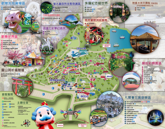
西湖渡假村圈導覽圖
松園附近景觀介紹
松園會館
check in 流程
西湖渡假大飯店
美人湯SPA
森林小木屋
動態實境恐龍特展
西湖渡假村生態
歡樂世界好拍好玩
天鵝船遊湖
映象水岸下午茶
松園會館開箱
西湖渡假村晚餐
西湖渡假村光雕秀
花園露天酒吧
西湖渡假村早餐
玩樂住宿整體心得
年終特惠住宿專案購買資訊
西湖渡假村交通資訊及地理位置
苗栗縣三義鄉西湖村西湖11號的西湖渡假村交通超方便,它就位在苗栗三義交流道附近,也可從高鐵或臺鐵台北站搭豐原客運6606(往豐原)、從台鐵豐原站搭豐原客運6606(往臺北)至西湖渡假村站下;除了有國道客運,三義火車站還有免費接駁服務,坐車一下子就到,真的超級方便。不怕在假期因迷路而花時間、開車也不用擔心停車問題,光是這點就省下不少麻煩啦!
更棒的是,渡假村附近還有一堆超有趣的景點!像是有很多手作的三義木雕街,散步逛逛都很放鬆;還有文青們最愛的舊山線鐵道自行車,拍照打卡超美的!如果帶小朋友來,還可以去勝興車站看火車、卓也小屋感受田園風光。就算只住個一兩天,也能把周邊玩得超豐富,真的很值回票價!
西湖渡假村一泊三食年終特惠住宿專案
住宿
標準雙人房住宿1晚,可選擇:渡假飯店、松園會館、森林小木屋(雙人房加床需額外收費)
門票
入住期間無限次免費入園
餐點
映象水岸下午茶雙人套餐 1 份、主廚料理晚餐 2 客、自助式早餐 2 人
體驗
Spa美人湯泡湯券2張
加贈
1.加贈4,000元住宿抵用券一張(含早餐、下午茶、主廚料理晚餐)
2.花園露天酒吧100元宵夜抵用券2張
這次活動雙人一泊三食只要3600,住小木屋、松園會館或渡假飯店的雙人房都可以,還送你4000住宿抵用券,如果有多人同行可當場用,也能等下次再來玩使用,超方便!
記得喔,買住宿券的時候只要選個大概的入住日期就好,但真的要入住之前,還是得上西湖渡假村的官網或打電話 (037) 876-699 來確定訂房資訊唷!
西湖渡假村園區導覽圖
60公頃的西湖渡假村山林綠意盎然、花草扶疏,空氣清新到讓人深吸一口都覺得心情瞬間被洗滌了,這裡根本就是樂活紓壓的聖地!園區內設施更是多元除了餐廳及住宿之外,像會議廳、遊樂區、生態園區和主題景觀區也應有盡有,每個區域都有步道相連,逛起來既方便又舒適,難怪常常有公司團體或學校組團來這裡開會研習。

松園附近景觀介紹
入口旁有個超吸睛的維多利亞館,不僅有地方特色伴手禮的展示空間,還悄悄藏著一片恐龍迷的小樂園!館內有各種恐龍主題的佈置,還有會動、會嘶吼的動態恐龍,超逼真,小朋友光看到就會尖叫著衝上去。
除此之外,還有超可愛的恐龍搖搖車讓孩子玩到笑聲不斷;還有恐龍拍貼機,��幾張搞怪照片,直接成為回憶殺!這些主題設施安排真的超貼心,就算遇到天氣不好,小朋友也能玩得不亦樂乎,甚至會賴著不肯走!
愛拍照的朋友來這裡很容易瘋掉!西湖渡假村的每個角落都充滿巧思,無論是精心設計的景觀還是各種讓人眼睛一亮的造景,隨便一拍就是美照!因為恐龍動態展超受歡迎不光是展示,西湖渡假村的地標附近還有一隻會動的超巨大恐龍喔!

凡爾賽花園種植了各式各樣美麗的花卉,是個讓人放鬆心情的好地方。花園裡還有一座雕塑噴水池,增添了不少藝術氣息,讓人彷彿置身於歐洲宮殿的庭園裡。這裡非常適合拍照、散步,靜靜坐著也能享受悠閒的時光。
在花園附近的情人坡有一座超浪漫的白底藍色的花園教堂,營造出濃濃的地中海風情,感覺很浪漫。無論是情侶約會、婚紗拍攝,還是單純想放鬆心情,都是能讓人感受到愛與美的夢幻場所。
園區裡還有一座優雅的的白底金邊旋轉木馬,散發出貴族般的高貴氣息,真的是像進入了皇室的夢幻世界!無論是大人還是小孩都可以在這座華麗的旋轉木馬找到童趣,在音樂中享受旋轉時的愉快與輕盈。

園區裡還有一列超顯眼的紅色遊園小火車,超可愛的設計讓它成為焦點!
大家都可免費搭乘這小火車繞著凡爾賽花園廣場一圈,一邊輕鬆玩樂一邊享受風景,特別適合親子一起感受這段小旅行帶來的歡樂和放鬆。
園區裡隨處都藏著驚喜,巨蛋會議廳前有一排威武的皇家衛兵站得筆直來迎賓,讓人不禁停下腳步拍個照。米蘭會議廳前的電話亭、恐龍蛋造景更是別具一格,附近還有之前台北燈會的主燈-鴻福齊天,隨手一拍都很有話題。
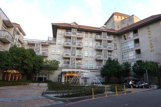
松園會館
考量到夜間表演跟酒吧比較近的緣故,所以我們選擇入住較靠園區入口的松園會館。
松園會館有6層樓,6樓是養生村住戶居住,1~5樓開放給遊客住宿。松園會館的門口有迎賓車道及噴水池設計,還蠻有尊榮感的,園型噴水池夜晚還會打上不停變換顏色的絢麗燈光,讓整個氛圍更加迷人浪漫。

check in 流程
松園會館裡面的裝潢雖然不算新穎時尚,但大廳還蠻氣派的,很符合印象中傳統飯店的模樣。
雖然房間要到下午3點才能入住,但從早上9點開園後就能到櫃台先辦理手續並寄放行李,之後就能直接進園遊玩,這樣的安排超級方便,記得要先預約晚餐、選擇主餐喔!
辦理入住時,櫃台人員問完姓名後就遞上信封,上面已經印好房號、進退房時間等資訊,整個流程超快速!信封裡有兩張房卡,還有專案裡的所有票券。
櫃台人員還很貼心地詳細解釋了票券的使用方式,並給了我們一張園區地圖,上面還標註了遊玩順序和娛樂表演的時間,這樣就不會錯過想看的精彩活動,超專業的!

因為園區真的超大,像映象水岸、天鵝船、美人湯SPA跟恐龍展這幾個點其實都靠近西湖渡假大飯店。如果要到那邊,只要跟櫃台說一聲他們就會派園區專車來接送,超貼心!
等玩完要回松園的時候,也不用擔心路遠或迷路,一樣只要跟飯店櫃台講,他們還是會派專車接送,完全不用走到腿軟,超方便的服務!

西湖渡假大飯店
西湖渡假大飯店在園區比較裡面的那區,有81間客房。飯店內還有餐廳、美人湯SPA,接待櫃檯旁還有可以歡唱的KTV交誼廳、及讓大人小孩都放鬆的電子育樂遊戲室,公共設施機能很豐富。
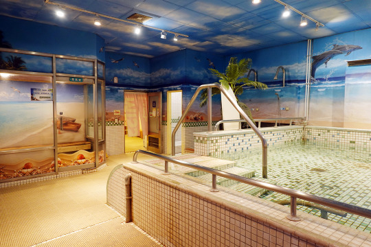
美人湯SPA
B1的美人湯溫泉可是從地心深處2000公尺抽上來的碳酸氫鈉泉,浸泡後肌膚會變得光滑水嫩,泉水溫暖又帶點微微的滑感,特別適合忙碌的上班族來消除疲勞,對於住客來說,晚上泡一泡,睡得超級好。
小提醒:記得要穿泳衣喔!裡面有男女更衣室設施齊全,��方便換衣服。
對於帶小朋友來的家庭,裡面也有設計得很貼心的親子池,特別適合12歲以下的小朋友。水溫剛剛好、深度也安全,大人可以坐著跟小朋友一起玩水,一家人共享美好時光。
美人湯裡還設有蒸氣室,進去後能讓全身都感受到被溫暖包覆,蒸完出來整個人像被重啟了一樣,身心都超放鬆。

森林小木屋
荷蘭式森林小木屋據說是園區最早落成的住宿區,外觀是採荷蘭穀倉風設計,外型就像童話故事裡走出來的一樣,尖尖的屋頂、溫暖的木質設計,配上周圍的綠意盎然,彷彿置身歐洲鄉村,整棟的小木屋位於森林區,晚上可以聽到星空下的蛙鳴聲。很適合喜歡大自然的朋友。
動態實境恐龍特展
全台最大恐龍實境場景真的讓人目瞪口呆!除了廣場那隻霸氣的巨龍之外,沿著恐龍世界步道走,還能發現恐龍蛋和各式各樣的超擬真恐龍,每隻都有牌子詳細介紹牠們的名字和相關背景。
最酷的是,整個場景超逼真、到處都是超擬真的恐龍,有些還會動、會叫,搭配旁邊的煙霧效果,彷彿真的回到侏羅紀,恐龍迷看到這裡絕對會瘋掉!
白天在旁邊的名人廣場上有歐洲綜藝秀表演,除了星期三公休之外,每天安排三個時段、每場約30分鐘。如果喜歡烏克蘭舞者們充滿異國風情的表演,可以留意一下演出時段,相信會有滿滿的驚喜和歡笑。
西湖渡假村生態
彩蝶園是戶外教學的超棒場地,種植了各種蝴蝶愛的蜜源植物,還種植有「蝴蝶威而鋼」之稱的高仕弗澤蘭,吸引超多蝴蝶來駐足。不管是小朋友還是大人,都能近距離觀察,感受自然的奇妙生命力。
走在西湖渡假村的步道上,真的會有種邊走邊探索的感覺!每隔幾步路就能看到植物的解說牌,上面不僅有名稱和基本介紹還貼心地附上 QR Code,只要掃一下,就能跳出更詳細的植物資訊。像是它們的原生地、生長習性,就算不懂植物的,也能瞬間化身植物小專家,超有趣又增長知識。
西湖渡假村自從轉型成為生態休閒渡假園區後,真的超有誠意地以環保為核心價值,不但四季都能賞花,還能親近自然,享受豐富的生態體驗!
每個季節都有不同的驚喜:春天賞櫻、夏天賞桐,還能賞鳥、看螢火蟲!冬季也有浪漫的落羽松,每一個季節都像是一幅自然畫卷,美得令人屏息。
森林平台上一整片原始綠意讓人完全放鬆。沿著環湖步道走就能欣賞湖光山色,還能看到三義地區的最高峰-關刀山,夜晚還可以仰望星空,享受最純粹的自然饗宴。
歡樂世界好拍好玩
漫步樂活森林中可以看到安徒生童話花園、造型可愛的夢幻糖果屋,及宛如神話中從天而降的純白夢幻飛馬雕像,這些都能滿足小時候的幻想,真的超級適合拍照留念!
園區裡還有珍貴的木化石展覽!經過幾百萬年的時間形成的木化石,堪稱大自然的奇蹟。有些人還說坐在木化石前靜心冥想,可以感受到它的正向能量,全身放鬆舒暢!不過到底效果如何,當然只能親自體驗看看囉!
糖果屋旁有粉色的旋轉櫻花鞦韆真的超浪漫!上面佈滿了櫻花裝飾,坐在鞦韆上輕輕搖晃時整個人都快飄起來,愉快得像小時候一樣無憂無慮,真的很適合情侶放閃及親子互動。

靈山洞的入口有一座日式鳥居門面,給人一種靜謐莊嚴的感覺。走進步道周圍環境幽靜,伴隨著鳥鳴蟲聲讓人置身大自然的懷抱。洞內特別設有蝙蝠保護生態區,為了保護這些小生物,洞口還設有柵欄,不能進入探險,但可以透過園區的監控畫面觀察蝙蝠的日常活動。
無論是出於宗教信仰還是純粹欣賞大自然,都能讓人感受到平靜和神秘,特別是隧道內那六尊青斗石觀世音法相,每一尊都象徵不同的祝福。走到洞口還有滴水觀音和許願池,讓人停下腳步許下心中的願望。真的是一個身心靈都能放鬆的地方!
西湖渡假村的泡泡樂園根本就是孩子們的天堂,連大人都會瞬間找回童心!
樂園裡有一區可以讓人可以自己用工具製造泡泡,拉長的泡泡在陽光下閃耀七彩光芒,特別療癒!除了手動之外,樂園裡還有自動泡泡機,特定時間超多泡泡像雨一樣灑下來、滿天飛舞,彷彿進入了一個泡泡星球。
泡泡樂園裡有超可愛的旋轉小恐龍,讓孩子們騎在恐龍背上,像小小探險家一樣旋轉飛舞;還有趣味滿滿的小火車,可以在泡泡的世界裡穿梭。
這些設施雖然簡單,但搭配���泡的場景讓樂趣更加倍,整個畫面就像童話故事一樣夢幻,飛舞的泡泡伸手就能碰到,這感覺真的很魔幻!

氣墊遊戲區是特別為3歲以上到12歲以下、體重不超過40公斤的小朋友設計,像一個充滿歡笑的小樂園,安全有保障,但還是需要家長陪同,這樣更能增進親子互動。
每個小朋友玩完後都是滿頭大汗但卻笑容滿滿。
氣墊溜滑梯的高度對小朋友來說剛剛好,滑下去的瞬間,彈力讓孩子覺得既刺激又好玩,摔倒也不用擔心受傷,因為氣墊的設計很柔軟。
氣墊城堡裡有迷宮和跳跳區,小朋友可以盡情地奔跑、跳躍,感覺像是在一座神奇的童話城堡裡探險。

天鵝船遊湖
映象水岸湖水清澈周圍還有綠樹和花草環繞,整體環境非常漂亮。除了能賞湖還可搭天鵝船遊湖,每艘船都配有救生衣,只需用腳輕踩踏板就可輕鬆��進或轉向,沿途還可以近距離欣賞湖邊的花卉,還能看見悠游的鴨子與魚群。
搭天鵝船是自費行程,坐每個人150、可以坐半個小時,很適合朋友、家人或情侶一起搭乘。

映象水岸下午茶
映象水岸有一排充滿異國風情的峇里島茅草屋造型包廂,讓人覺得彷彿來到了南洋渡假天堂,餐廳提供特色主餐、鬆餅、炸物、飲品、咖啡、調酒,也提供蛋奶素餐點。湖畔餐廳的氣氛非常浪漫,無論是餐點擺盤還是天鵝船的造型與湖景,在這裡隨手一拍都是美照,如果要坐景觀包廂區需低消1,500。
映象水岸用下午茶兌換券真的超方便!直接到點餐檯說要用兌換券就行,完全不用麻煩地畫單點餐。用下午茶兌換券換的雙人套餐內容很簡單,就是「原味鬆餅 + 綜合水果茶」,但重點是它質感不錯!水果茶可以選冰的或熱的,而且都是一整壺,份量超足夠。
原味鬆餅外酥內軟,還放了鮮奶油和櫻桃點綴,旁邊再搭配巧克力燕麥穀片,每一口都有不同層次的口感。綜合水果茶裡面有新鮮的蘋果、柳橙、金桔、百香果,能喝得到豐富的果香,味道甜度適中,茶香和水果的自然酸甜交織得很和諧。
以免費兌換來說,這組下午茶真的很有誠意,讓人覺得既划算又滿足!
映象水岸下午茶既能品味甜美點心,又能感受湖畔風光,整個下午都很愜意,真的很適合閒聊、發呆或放鬆心情。

松園會館開箱
吃完下午茶也玩了一些相關的設施,我們又搭專車回松園會館。
松園會館在面向凡爾賽花園的那一側還藏有一個特別的捷徑。從後面的小門走出去,再順著樓梯慢慢往下,就可以直接散步到花園及旁邊的花園露天酒吧。
松園會館房間
雙人房房型可以選擇一張大床或兩張單人床,來滿足不同需求。大床就是一般標準雙人床大小,枕頭及床墊的軟硬適中,睡起來還蠻舒服的。
床頭有檯燈、光線很足夠,每個房間都有自己的獨立空調,不會因中央空調的統一設定而感到太冷或太熱,除了使用更衛生也更安靜,又不用擔心中央空調運作時的管道噪音去影響到睡眠品質。

有些舊飯店會有股黴味,或者床單被套的消毒藥水味超重,住起來特別不舒服,但這裡完全沒有這些問題!
松園雙人房的空間真的很大,裝潢雖然不是��新穎但整潔度維持得不錯,住起來很舒適!
房間裡還有雙人小沙發和茶几,很適合放鬆休息,辦公桌椅的設置也很貼心,讓人可以兼顧工作。
玄關區旁邊有衣物櫃和茶水櫃,衣物櫃裡能掛長短衣物,還設有可保管東西的保險箱及紙拖鞋。茶水櫃裡則有冷水壺、瓶裝水、快煮壺,甚至貼心準備了無茶咖啡因的茶包、杯子和一個小冰箱,雖然沒有現代飯店常見的USB插孔和萬國插座,只能用檯燈旁的插座充電,但基本需求都能滿足。

因為政府規定的關係,房間內沒有提供一次性的備品,像牙膏、牙刷、浴帽、刮鬍刀和梳子都需要自備。但洗髮乳、沐浴乳、毛巾、浴巾和紙拖鞋都有提供,整體來說,實用性和舒適度都不錯!
而且這裡的浴室超貼心!它採乾濕分離設計,完全不會像一般浴室那樣濕答答的,乾淨又安全。
浴室門旁的牆邊還有一面大鏡子,可以當穿搭鏡用。每次洗完澡走出來或要出門時,就能馬上檢視自己的造型,超方便的,根本是梳妝打扮的最佳夥伴!

松園會館每間房都有自己的陽台,我們住的房間是面對園區景觀,早上起床可以看到山林綠意和園內的造景,晚上還能欣賞星空及園區漂亮的燈火夜景。
松園會館既有濃厚的自然氛圍,也有現代的便利設施,以簡約舒適為主的房間設計安靜且乾淨、好住又好睡,神經很細的我是很會認床的人,那天居然睡得超好!

偷偷講一下:松園會館真的很貼心!除了一樓大廳之外,每層樓還都有交誼廳可以隨時放鬆聊天。B1還有麻將間、投幣式自助KTV,開心的時候就去玩樂唱歌放鬆一下,還有自助洗衣烘衣設施,簡直讓人省心。二樓的健身房也超方便,不用出門也能運動保持健康。
這裡真的讓我越住越喜歡,甚至還有想說老了後也能來這裡住養生村的念頭,應該也很理想!

西湖渡假村的晚餐
辦理入住時服務人員有特別提醒晚餐是到松園會館內附設的御花苑餐廳用餐,晚餐用餐時間是晚上5:30跟6:30各一場,需事先預約。
到餐廳用餐時還可以提前預約隔天的早餐,早餐有7點跟8點兩個時段,可以挑自己喜歡的時間,隔天就能輕鬆享受一個美好的早晨。
西湖渡假村的主廚料理套餐,真的讓人對健康飲食有全新的感受!他們特別強調安心食材、在地食材、低碳飲食,少負擔又能吃到食物的純粹美味,還能支持當地農業、做到永續發展,符合追求健康與環保的現代人。
只要打卡評論就送小魚乾,小魚乾比我想像中大隻很多而且完全不腥,香酥又帶點自然的甜味,吃起來超涮嘴。
晚餐時間走進餐廳後只要報上房號,就有服務人員幫忙帶入座。餐點有六種主餐可以挑一個,保證能滿足味蕾。重點是白飯可以續!對於飯量大的朋友來說,真的太貼心了。
一坐下來服務人員就馬上倒上他們的國寶茶,清香四溢、喝起來回甘又舒心,而且喝不夠還可以續杯,完全不怕渴到。

御花苑的晚餐不是那種大魚大肉的buffet,而是精心設計的個人套餐,但每一道都很有誠意!主菜不僅選材講究,擺盤還特別精緻,看起來就讓人食慾大開。配菜也很豐富,有各種小菜搭配,吃起來不會膩,而且很營養均衡,還有附上當季水果,甜甜的果香讓整餐的結尾更完美!
我的主餐是紅酒燉牛腩,牛腩煮得非常軟嫩,一咬下去就能感受到那層層的膠質感,口感不油膩且超滑順。紅酒的香氣完全滲透進肉裡,濃郁但不搶味,每一口都能嚐到慢火燉煮的美味。
同行友人選擇乾煎鮭魚排鮭魚排煎得外皮酥脆,內層還保有鮭魚的鮮嫩汁水,火候控制得不錯。
另一位友人選擇冬令限定一品麻油雞,用砂鍋裝的湯頭散發出濃濃的麻油香、特別暖胃,但厲害的是湯底沒有酒味、不用怕喝醉,雞肉也煮得剛剛好,嫩得入口即化卻又保有彈性,配上一口熱湯整個人都暖起來了!
御花苑套餐的配菜真的一點都不隨便,甚至還有鳳梨蝦球!蝦球炸得金黃酥脆搭配酸甜的鳳梨,讓人吃了胃口大開。
更貼心的是,除了麻油雞這種本身就是湯品的主餐之外,其他套餐都有附了一碗紅棗膳雞湯。湯頭溫潤香甜,紅棗的自然甜味讓湯更具層次感,喝一口就覺得身體被暖流包圍,實在太幸福了!
晚上園區會打上五光十色的燈光,恐龍、樹林、花園都被照得超繽紛,除了帶孩子來的家庭能盡興拍美照,對情侶來說,這浪漫的氛圍也能讓約會加分不少,氣氛超級棒!

西湖渡假村光雕秀
每天上7:30有夢幻光雕秀,利用雷射燈光打造出變幻莫測的畫面,每一幕都像在欣賞藝術作品。光雕秀是故事性表演,搭配光影講述四季變遷與大自然的奧妙,燈光會隨著音樂的節奏變換顏色和形狀,超級療癒。
甚至還突破季節限制、讓人欣賞螢火蟲在夜晚點亮的奇蹟、既能感受到科技的炫麗,也能體會自然的靜謐!
緊接著是幸福廣場的炫光特技秀,表演者身穿螢光服裝,在黑暗中隨著動感音樂進行高難度特技表演。當他們在空中翻轉、舞蹈時,螢光燈像流星劃過夜空,整個畫面超級炫酷!夜晚的空中舞綢與吊環融入炫光效果,表演者在空中舞動螢光絲帶,宛如點亮夜空的精靈。精準到位的動作配上動感音樂,真的讓人忍不住驚呼。
踩高蹺的特技者搭配燈光,仿佛巨人行走於夜晚,整場表演熱鬧又震撼,讓人彷彿置身國際嘉年華的狂歡現場。
花園露天酒吧
花園露天酒吧是晚上8點才開始營業、營業到晚上10:30,看完燈光秀後剛好可以來喝點小酒、吃個霄夜。
花園酒吧的飲品很多,咖啡、茶飲、調酒、生啤酒都有,除了有單點的小點心還有蔬菜、滷味、炸物三種拼盤,每道大概2百多元,價格比起城市裡的酒吧餐廳要親民多了,真的是很超值!
因為有抵用券,只要貼一點錢就可以在花園露天酒吧輕鬆喝酒、吃點心,微醺的感覺超棒!
而且到花園露天酒吧只要有消費,就可以免費歡唱K歌,邊喝酒還能邊唱歌,氣氛又好,這樣的娛樂享受真的很划算!

西湖渡假村早餐
松園早餐也是在御花苑用餐,因為前一天已預約,報上房號後服務人員會幫忙帶入座,然後就可以自行享用自助式餐點。
中式早餐部分有很多熟食和醬菜、花生、豆腐乳、肉鬆這些經典配料可以搭配白粥,且有滷肉可以加白飯或白粥;還有像是水煮蛋、炒麵、青菜、蒸南瓜、之類的熟食,芋頭香菇粥、味噌湯也很暖心,角落蒸籠裡甚至還有饅頭、芋頭包喔!
喜歡吃西式早餐的話也能選生菜沙拉、穀片,或是西式小蛋糕、烤麵包、餐包和吐司,我個人特別喜歡能感受濃郁蒜香的鹹香香蒜麵包。
無論中式還是西式早餐都簡單卻不失美味。除了可以無限享用自助吧,在寬敞的空間享用美食還能看著窗外美麗的景色,吃起來也超愜意!
玩樂住宿整體心得
說真的,玩了一圈回來,發現西湖渡假村真的是比很多樂園或其他渡假村更超值!交通方便不說,又有彷彿異國的自然景觀和造景設計、來西湖渡假村玩就很有偽出國的FU!白天熱鬧、夜晚夢幻,園區內該有的設施全都有,小孩可以跑跑跳跳、玩樂、看恐龍展放電,大人也可以泡湯、散步、喝下午茶,好好享受難得的放鬆時光。玩得開心、住得舒適吃得又好,從頭到尾都不需要操心,這波活動價格佛心又超划算!雙人一泊三食還多送4000元住宿抵用券,等於多一份雙人住宿再加下午茶、晚餐、早餐!人多直接多開一間房,雙人行還能下次繼續爽住,根本賺翻!別處哪裡找那麼讚的優惠方案啊!
如果你也在找適合全家出遊又不想太累的地方,強烈推薦趁著這波優惠到西湖玩一趟,保證回來會跟我一樣有種賺到了的感覺喔!
年終特惠住宿專案購買資訊
:https://www.facebook.com/westlake.com.tw/posts/pfbid02gWhxxLENQrnE8cWD5t2vbNPcd9xbmAikupVVKt3AsqfchR16hBuoexfpanUTGrKgl?locale=zh_TW
住宿詳情請看👉 https://reurl.cc/O5Xn5X
🌸專案內容
1. 標準房雙人房1晚
2. 住宿期間免費入園
3. 中式/西式自助早餐2客
4. 主廚料理晚餐2客
5. 映象水岸下午茶雙人套餐一份
6. Spa美人湯泡湯券2張
💖加贈
1.加贈4,000元住宿抵用券一張(含早餐、下午茶、主廚料理晚餐)
2.花園露天酒吧100元宵夜抵用券2張
本住宿優惠專案,同時開放西湖渡假村受理預約訂房
空房查詢/訂房網址 :https://reurl.cc/O4rMnv
📞預約訂房專線 037-876-699#1
西湖渡假村
地址:苗栗縣三義鄉西湖村西湖11號
訂房專線:037-876699 轉1
官網:http://www.westlake.com.tw
粉絲專頁:https://www.facebook.com/westlake.com.tw
文章轉自 開心玩整天的國旅推薦-西湖渡假村一泊三食超值攻略,一次搞定住宿與玩樂的北部渡假村,北部可以玩整天的親子飯店 - emily愛玩美部落格 - FashionGuide 華人時尚專業評鑑
0 notes
Text
Tamer-Beyond the Burning Desert.

youtube
❖ 此篇小說主要是接在官方的馴獸師故事之後,直到遇上黑精靈前,與亦雷茲拉結識並一同旅行的空白歷史的補充。
Episode 1.
蜃景。
綿延無際的黃沙層層積累,堆疊出難以計數的沙丘。
高溫凝聚形成的熱氣蒸騰,遙望起眼前起伏的稜線,視野可及的地平那端,彷彿有著水窪令光線折射而促成的虛像,既是錯覺,更是羅網。
我一直在奔跑,跟前與腦後的向陽島幻影依舊是一片無窮盡的峻嶺。「揮使」的祠堂,殘瓦與斷壁,沒有哪處不是一片乾凅泛黑的血液濺射。懸垂殘缺的門額、藍縷淒清的枯骨,在我的心裡,佈滿了隨處可見的傷痕。曾為母國的雲之國,早已在那場屠戮王室的大規模叛亂中被消滅了,無力改變這一切的雲之國遺民們變得困頓交加,少部分人遷移到向陽島試著另闢天地,而更多的人則連遠離迫近的衰亡都做不到。
不過,只要朝向南方取道佑路海域,穿越瑪戈利雅大洋,便有機會抵達相對繁榮的巴嵐洛蘇。然而,憶及「揮使」曾言及巴嵐洛蘇自身也深陷戰事囹圄,恐怕亦無力收容過多的外來難民。但,若雲之國不曾發生那慘劇,常人又有誰會眼睜睜地令出生地荒蕪傾頹呢?
我記得……
「黑狼」,在我的歲數成長到能明白這個詞彙之前,我便已經懂得開口出聲呼喚,就像是某種深植在血脈裡的記憶傳承那般,我知道牠,牠認識我。
前往南浦搭上與巴嵐洛蘇交流的定期貿易航班,由於黑狼畏水,我在橫渡瑪戈利雅大洋的四十五日單趟航程裡,只能趁著入夜後甲板人少時才得以喚出黑狼,讓牠在夜間出來透氣,委屈牠悶著說實話還真過意不去。倒是隨船的水手與行商浮浪等,一點也不訝異黑狼的出現,反而開始閒談起在巴嵐洛蘇之外,像是卡爾帕恩、咖瑪希這些我心底結論起來,應該是地名或國名的其它土地上,所遇到的珍奇異獸之事。也幸虧有這些人的見聞軼事,才令整趟除了觀海外便幾乎沒有消遣的旅程不至於顯得枯燥。
歷經向陽島人禍的我,在橫渡瑪戈利雅後雖然時間不長,僥倖地在貝爾利亞村莊體驗到鮮有的平穩生活。就是在這段期間,對這片新土地的認知如同白紙的我,借宿在巴特利農場與艾恩瑪等人一起生活,並得以在村內的煉金賢者,艾羅斯汀的講習會中被授予所需的知識。曾幾何時,我已經不再將巴雷諾斯的發音拼成「巴嵐洛蘇」了呢?「卡爾帕恩」也逐漸調整為卡爾佩恩。而發音成「咖瑪希」這件事,則讓我暗自決定,將來要是需要再度前往晨曦之國,優先事項之一就是去青山書院提出修正歷史文獻的申請——才不是什麼五十年前登載的「咖瑪希」,是「卡瑪希爾比亞」。畢竟我因為這個「咖瑪希」的發音,被艾爾琳戲弄了好一段時間。
十六歲時,經由賽林迪亞東部邊境關口外的卡瑪希伯寺廟廟長,那是我生來首次見到加奈��,以及獲悉東邊的沙之國。其後,為了更加靈活地探索沙之國——瓦倫西亞,經過一番權衡,我驅策黑狼來到巴魯漢關口,加入並成為卡丹的僱傭兵。十七歲,已離開貝爾利亞兩年有,也是在僱傭兵生涯開始後,某次護航夏卡魯旗下商團橫越大沙漠期間,在伊培拉綠洲與那名灰袍魔女結識。
『(前略)……前輩大師們從未忘懷,最悲慘的殉難自有它成全之道……(後略)』
夜間,商團在綠洲水草邊上點起驅寒篝火。那位全身上下幾乎都被灰袍包覆的女子,正與沙漠巡禮的朝聖者、阿爾教派信眾的阿爾藍們討論起阿爾的教誨、吟誦起詩詞禱文。
『後知後覺使我羞愧難言。只為了悔改我的錯誤,瘋狂地向權能挑戰。』
「卡普拉斯的……《榮耀》?」
在外圍聽著他們交流言談的我脫口而出,依稀想起以前巡遊卡爾佩恩時,大圖書館的書架上,安放登載這句話的古書謄本。那灰袍女子乍聽卡普拉斯一詞,轉過頭向著我招手邀我加入篝火邊。
「我是瑪戈利雅彼岸,向陽島的芭里。你是——?」【註1】
「……亦雷茲拉,爾提諾巴與塔利波的亦雷茲拉。」
Episode 2.
夏卡魯,在這場歷久的戰事中,他很早就以行動證明自己並不是採取中立這種模稜兩可的壁上觀姿態。憑藉巨賈之力將聯軍與瓦倫西亞兩方的後勤補給都牢牢掐緊,僅僅一人之力就封鎖了阿爾哈嵐海域的航運,以及作為瓦倫西亞入口的都市「倫」。使得聯軍只能放棄北上,轉而不斷地向著塔普塔魯平原的巴魯漢關口發起侵略。另一方面,瓦倫西亞也無法因此得利,夏卡魯驅逐時任瓦倫西亞第十五世國王的伊穆爾‧奈希勒的特使,拒絕讓瓦倫西亞的軍隊通過艾伊利斯峽谷南下,同時更加強依培拉綠洲北面出入口的管制及監視,令瓦倫西亞軍只能艱苦地橫越大沙漠後,還得分開駐紮輪調於殉教者的安息處與瓦倫西亞西部高原的巴札勒耕地。

艾爾利恩曆259年,秋季。東征的聯軍發起對巴魯漢關口第七次的大規模侵略。
由靠近沙粒巴札勒方面的卡普提亞甬道朝著關口方向看去,便可見聯軍主力以塔普塔魯平原的制高點為中心,向下向前排開層層陣列。攀上巴札勒耕地以望遠鏡對準平原北面觀察,更能捕捉到聯軍藏匿在平原北面出入口,畢拉費惡地的預備隊蹤影。與其他在對壘開始時就奉命站上最前列的僱傭兵們不同,憑藉使喚騎乘黑狼的優勢,我在巴魯漢關口的指揮官——佳尼恩阿斯的要求下被編入卡丹的戰鬥駱駝騎兵團,駐守於她佈下的瓦倫西亞箕形陣左翼,而亦雷茲拉則與佳尼恩阿斯隨行,她是她的親衛隊裡唯一的僱傭兵。
秋末入冬前一週,安息日後的第四天,聯軍趁著巴魯漢關口部分戰象後撤至殉教者的安息處,與該據點的戰象換防交接空擋,在陽光從西邊升起的破曉時分,憑藉著關口往塔普塔魯平原受制於逆光的優勢發起攻勢,那從制高點吹出的宏亮號角聲,連高原上的巴札勒耕地都能聽得一清二楚。前日去畢拉費惡地的斥候沒回來,而在高原的偵查隊伍透過望遠鏡窺察卻絲毫找不著一絲預備隊的蹤影。嘉恩尼阿斯彙整情勢時,便大膽地假設預備隊已併回聯軍,指出右翼往平原北上的西北上坡會是聯軍鐵蹄發起突襲的位置,當即將左翼的部分騎兵抽調至右翼的騎兵隊強化守備。
嘉恩尼阿斯的防守原則是將戰場拘束在關口前這片風積扇狀地形,憑藉經年由卡普提亞甬道裡,來自大沙漠的橫向風力作用形成的沙丘來限制西側諸國的馬匹機動性。於是這破曉衝鋒開場,至少有七或八成與嘉恩尼阿斯的預測吻合。預備隊——孤煙的傭兵團,確實是併回聯軍裡。且作為高級的險棋,以孤煙及其團員為首的鐵騎楔形陣為了維持馬匹在沙丘的衝撞力度,別無選擇只能由那個上坡發起進攻。雖說別無選擇,但防守方也少了戰象而無法有效抑止衝來的鐵蹄。不過,鐵騎是聯軍暫時借出給孤煙的,他們結束第一波衝鋒,藉衝擊打散右翼的騎兵隊後,在亂軍中跳下馬,讓那些馬自主地反向朝戰場邊緣脫離。
右翼的副官倒沒有因此自亂陣腳,而是穩住座下駱駝並讓身側旗手揮起進攻的紅旗。隨後駕著駱駝來到左翼抽調過來的備援騎兵列隊前,領著我等向已陷入短兵鏖戰的前排回防。黑狼旁的武裝駱駝們繫在戰甲與關節的鈴鐺,群體奔馳起來時噹啷作響的金鳴,在交雜的吼喊嗚咽裡格外突出。副官一眼便定位出孤煙的位置,率先抽刀奔上,欲以騎兵優勢直接斬下——然而,單手揮動的下劈卻被孤煙以側身輕易地閃過……下個霎那,隨即被孤煙那柄巨劍連人帶駱駝一併斬成兩半,爆出的鮮血與保存在駝峰裡的脂肪、以及胃壁肉袋裡的儲水,在啜飲衁污的黃沙上再增添一片泥濘。孤煙在斬殺隊伍的中樞後,趁著指揮陷入混亂的幾秒裡,奔馳至另位慢了一拍才驅策座下駱駝展開包圍戰術的騎兵,舉起巨劍又即將再度斬下,我見狀不妙,駕著黑狼由包圍網中衝上前撞開那位騎兵與駱駝,對著那下劈的巨劍掄動藍天棒——
雙腿本能地緊緊夾住座下黑狼,與腰椎及肩胛肌肉一併出力穩住全身重心,同時雙手的虎口在意識到得做出反應前,早已分別緊握打橫的藍天棒竿身兩端個別的施力點,以藍天棒橫架在自己面前硬生生地接住並格擋那柄向下劈斬的巨劍……慶幸擋是擋下了,但那柄巨劍強劍身的鋒刃卻還是憑著力道與重量砸上我的頭蓋骨,在那裡輕易地將額緣中央的皮膚壓碾擠裂出一道不淺的傷口,赭色血液噴濺在那巨劍劍身上,而我的鼻樑鼻翼則感到淌下的濕熱汩流。
「黑狼!!!」
我咬牙按捺住重物砸傷���頭的苦楚,鮮血滴淌濡濕上唇時我動起左腳腳跟,將腳跟後方的馬刺向內、黑狼左側的腰際施加壓力,高聲示意黑狼向右方騰蹬以化解這個格擋態勢。注意到我的指示,黑狼對眼前的孤煙發出警示的哮吼,旋即以後肢雙足的膝關節出力,猛地向右方騰挪且冷不防地在抽身蹦躍的同時,提起前肢左腳掌一掌襲向孤煙的巨劍試圖將其從孤煙腕上拍落;而我,在黑狼向右跳脫令格擋消解後,迅即地調動藍天棒,將藍天棒尾端歸納、收夾在右側腰間,左手緊貼腹前握穩竿身的重心,右臂隨著腰椎帶動的轉向,「喝!」地一聲,與黑狼連袂大力地吼出揮出,朝著當前身位幾乎與平行無異的孤煙的護腰與側腹軟甲銜接的間隙一棒橫掃過去——!!!
孤煙那柄巨劍隨著我與黑狼向右騰移同時發動的反擊,本該順勢循著自身重量或受外部衝擊而劈落或離手,不過孤煙卻僅費一雙手腕的出力便將劈下的劍身懸停,並且硬是接下我對他側腹接近腰後尾椎的棍擊,他的身子在棍擊下一陣緊繃抖動,左腳膝關節為了穩住外來的衝擊而向下彎縮吸收餘波,接著才得以拉挺脊柱將身體中線重新復位。隨即,他選擇將巨劍倒持,令劍尖朝向地面,以厚實的劍脊罩住自己身前採取防禦姿態,與乘著黑狼的我開始小步小步地踏出步伐繞起圓圈稍微將距離拉開。在繞起圈來對視打量彼我時,我可是聽見孤煙那甲冑的全罩式覆面頭盔裡,傳來幾聲「哼……」地咧咧低吟。
周圍的卡丹兵、瓦倫西亞一般兵,還有卡爾佩恩軍及其他傭兵,在注意到孤煙的動向後,逐漸地在我與黑狼,還有孤煙身後形成一層層的環形人牆將我們包圍起來。
「等下貫穿他,黑狼,之後就伺機而動喔。」
黑狼與我又一次的與孤煙平行交錯,只是這次隨著衝向人牆盡頭黑狼急煞的同個剎那,我已將藍天棒一端向下直插入黃沙,趁著黑狼還在打橫穩住身子,我早從其背翻騰躍起,���手握穩藍天棒高處,腳踩挺直於地面中的藍天棒竿身,在黑狼衝勁的作用力尚未消卻前,藉著反作用力鬆手——從藍天棒一蹬,黑狼揚起的塵土甚至還未落地,我便已飛身彈出——向著一、二秒前,曾欲以巨劍上挑擊落黑狼與我的孤煙,那尚且迴轉至一半的背後。
彈離藍天棒的一剎,背上揹負的短劍橫空出鞘——並讓劍身隨著取劍復歸向前的右臂在空氣中劃開一道弧型,左掌則抵在劍柄尾端令劍尖直指孤煙人頭,向覆面頭盔留做視野的豎狀洞口直襲。孤煙偏過頭嘗試躲避直取他頭盔留給視野空間縫隙的強攻,但卻晚了一步……他的人頭確實是閃開我的飛身突刺,可是劍鋒已劃開他頸側的鎖鏈甲——熹微的晨光映出鋒刃邊上赤血。
然而,我後頸的汗毛在落地不過微秒已然豎起,頸子沒轉分毫便直覺地原地向身後翻蹬,視野在半空中克難校準,餘光往揚起的煙塵收攏投望。頃刻,那柄兇器已橫斬向我原先的落點。幸好,我在半空滾圈後落下踩在巨劍劍脊上,結實的劍身恰巧成為良好的施力點,讓人得以連續踩著巨劍跳躍。我倒翻過孤煙頂上,並從顛倒的半空中對著孤煙的頭盔揮出帶著黑色能量,黑狼影身俱現的向下爪擊。
「咬掉它,黑狼!!!」
再次落地前我對本欲歸還至身側的黑狼喊出命令,劍指孤煙持劍的手腕。
黑狼猛地撲向孤煙,張口便直接咬住他把持巨劍的雙手手腕,接著孤煙無論用膝蓋頂撞黑狼的下巴或是以頭盔的頭錘砸向黑狼顏面,黑狼依舊狠狠地咬緊該處,迫使他不得不鬆手才得以掙脫。待巨劍落地後,黑狼對著圍觀的人牆與孤煙發出咆哮,盤踞並壓制起巨劍的劍柄。而我在降落後趁著黑狼牽制孤煙的難得喘息裡,轉正身子並將短劍納回背上的劍鞘。並舉手接住黑狼用尾巴捲起並擲回的藍天棒。
被迫捨棄巨劍的孤煙雖然狼狽,可是他馬上轉向我,並由背後取回盾牌並將一併在背後的長劍轉移,納至左側腰間。他沒有馬上拔劍,反倒是架起盾牌,小碎步地左右橫移意圖擾亂我的判斷。見狀,我左右手一後一前的將藍天棒收回右側腰間,跨開腳步穩定下盤後令藍天棒前端對準孤煙,騰出長竿試探,驟雨般的刺擊與旁敲,孤煙被動地不斷以盾面及盾緣阻擋、彈開……接著,他讀出我的攻擊規律,瞬間以盾牌下緣轉起攻勢。
藍天棒被孤煙用盾牌的下緣向下壓制,並使攻擊端著地。且在著地的那刻,他幅度細微的挪動左前右後步伐,採取小墊步閃身,以右腳踢向藍天棒下墜端的重心,令其從我手中掙脫。並趁著踢開藍天棒,牽引我上半身朝向他正面前傾失衡的毫秒瞬息,他一個輕細,幾乎不帶前置動作的伏身收腰,接著便是那間不容髮閃光般的拔劍——!待我耳蝸傳入劍身「唰——!」地出鞘聲時,孤煙那單手長劍的劍鋒已經掃過並劃破我在下意識裡,丟失藍天棒後本能地向後仰並用左手經由腰後從背上取回,自主護在喉前的劍鞘——
圍觀的士兵們目睹孤煙的殺招與我死裡逃生的瞬間,紛紛爆出吵雜的喧嚷鼓噪,並倒抽幾口氣後回歸屏息。
然而,雙方亦無時間驚嘆或訝異。孤煙在出招失手後,旋即又持劍繼續朝我砍來,我則是再藉著調整筒狀劍鞘的傾斜弧面,一邊格擋孤煙的攻勢一邊使其劍身的弱劍身鋒刃偏移,爭取幾秒尋求穩固腳步與拔劍的時間。——終於,以劍鞘彈開孤煙另一次橫劈後,迅速地迴轉身體擺正的瞬時,拔出短劍令劍尖朝地,借助迴轉力道準備向著孤煙的大腿砍去,或向上半身挑擊時,已發覺我意圖的孤煙亦令其鋒刃重新咬上並防守起我的劍刃。
僵持還未足一秒,在我嘗試滑動劍刃硬刺向孤煙的大腿甲冑間隙的同時,他果斷地出力以長劍帶動我的短劍,又再次牽引起我的身形,令我持劍的右手與劍身隨著他伸展的右手向著斜上前方的空氣挪去,並藉著長劍本身的重量壓制我的手臂,試圖迫使我曲折手臂棄劍。我本以為那是他的打算,他似乎也覺得我會如此被他牽制。可是他那持劍早一步向後向上騰挪的右手前臂與手肘卻讓我察覺到異樣,他施力震開我的劍身後,拉直不過毫秒的右手劍刃又迅即彎折並向我的脖頸橫砍而來——我只得在下個眨眼動作閉合前趕忙地蹲縮腰腹,閃過從頭頂掃過的來回兩次劈擊。
我沒放過孤煙這兩次橫劈露出的空擋,在他因劈砍未成而再度試圖墊步調整走位時,我出手斬向一時暴露的腳脛與大腿在膝蓋間的甲冑間隙,將那處的鎖鏈軟甲劃開一道裂口。我是怕死,可是不代表我對積極進攻有所畏懼,更多的是因為我對戰鬥的貪婪,才使得我必須使出這劍。我知道,這劍並沒有造成有效傷害,更像是透過這看起來顯得貿然、不選擇繼續迴避的出手,透過劍刃交流傳遞一個我知道你罩門在哪的訊息給孤煙。
然而我的想法馬上被識破,他即刻拉正軀幹完成轉向,並在途中迅疾且猛力地對我的顴骨使出一個迴轉肘擊!當下我只感到一邊側臉好像向內凹陷,痛楚則隨即湧現。孤煙這次沒有停下,而是直接橫架長劍發起突刺,那纏繞在劍身,以及凝聚在劍尖的猩紅劍氣,發狠地直接貫穿我遑急之中抬手斜撇在前的劍鞘並擊碎閃避不及的左肩……莫大的衝擊令我踉蹌地後倒,黑狼見狀不妙,當斷則斷地棄那落地巨劍不顧,撞開孤煙並試圖阻擋在我跟孤煙中間。
孤煙先是小後退幾步,然後馬上架起盾護著身朝黑狼奔撞,黑狼以為孤煙是針對牠發起進攻,直到左前肢抬起準備揮動時才意識到誤判了……孤煙無視黑狼的掌擊,逕自單腳踩跨黑狼背脊縱身一跳翻過牠,向牠身後才剛勉強撐起身子的我凌空下刺而來——
「成敗——!!!」
我聽見那頭盔裡難得的發出吼聲,以及周圍人牆新一輪的焦躁喧鬧……
我讓右手拇指與虎口夾著劍柄將短劍打橫,令其與打直的四指縱向呈現,小幅度地收縮手肘至腰間,對準向下刺來的劍尖開掌,在霎那間上推而出——崩擊——由掌中迸出的黑色能量灌入長劍的劍尖,直接將弱劍身的部分一次震碎,然而崩擊的反作用力倒是將我自己又埋進沙地深處些許。孤煙則在半空中向後仰倒,可就如預想的那樣,他在意識到受擊並明白會向後倒去的那時,便毅然地將斷劍向後拋,舉起手快捷地伸向腦後抱住後腦勺且盡力地捲縮腰部,令背部呈現弧形並在下秒就像滾輪似的翻轉安然落地。他確實也不簡單,目擊劍刃崩毀的頃刻隨即將持盾的手臂反縮,調動盾牌阻絕崩擊的餘波以保護正面軀幹,而崩擊的三重衝擊,除卻第一波與劍俱亡,餘下的雙重勁力撞上盾牌的金屬表面後,在盾面留下一個成人拳頭深的凹陷窟窿。
但是,我的藏招好像真正地將他惹惱……他起身後隨即丟棄盾牌並重拾那柄斷劍,倒持餘下的強劍身再度向我奔來,意圖要繞過黑狼然後用劍柄尾端的鈍物重心球,將正好要站起來、全身上下都是破綻的我毆打至死……不過,一柄以魔力構成的巨型鐮刀由層層環形人牆外頭,空襲砸在孤煙與我對峙的中間,從鐮鋒弧形如新月般內彎的半透明剃刀上,還溢散著可視化的黑色魔力。
卡丹兵與瓦倫西亞兵兩者人數較多的集團人牆逐漸自動分開一條通道,我起身後將腰椎拉直,右手拍掉護甲上的塵土,把掌中血污抹在破損的左肩甲側,沒有轉頭但開始繞起圈子迫使孤煙移動一同踱步,眼角餘光隨著繞圈便開始捕捉到那一身黑豹皮戎裝的關口指揮官——嘉恩尼阿斯,此時正騎著戰鬥裝束的駱駝,在親衛隊與亦雷茲拉的戒護中,逐步靠近這場遭到打斷的對決。
「今日陣歿的軍士也夠多了,況且——」
佳恩尼阿斯乘在全副武裝的駱駝鞍上,撥開沾染上血液凝成條狀的紊亂前髮,眼神先是向孤煙手持的斷劍示意後才轉向灰頭土臉的我頷首,接著一抬手便是將斬獲的聯軍多位副將頭顱串,扔擲至孤煙與我中間的污濁沙地上。
「我有同感。」
孤煙識相地簡短應答著佳恩尼阿斯不帶情緒起伏的威嚇,收納斷劍回腰,接著拾起落在地面的巨劍劍柄將劍身重新扛上肩,隨即掉頭走進聯軍兵卒裡,宏亮喊起撤回平原前進據點的催促軍令。我則是待兩方人馬明確地朝各自陣地後撤時,將他棄置在現場的那盾牌,以及幾塊可供拼湊的那柄長劍弱劍身碎片回收,作為戰利品擱置在黑狼背上帶回關口。

在這次雙方拉鋸各自撤回後,又間斷地發生十數場的侵擾與阻滯,可是孤煙傭兵團卻再也沒有出陣過。戰況依舊膠著,直到雅爾達之夜過後一週,聯軍終於鳴金收兵撤回岩石崗哨,第七次侵略在經過四個月多的固守後就這樣落下帷幕。也在戰事緩和的新年後幾天,才從佳恩尼阿斯口中得知孤煙的傭兵團在那次的僵持後,他便率團暫時脫離戰線了。
Episode 3.
「他是個聰明的死亡商人,不會為了背後的野心家丟掉腦袋的。」
亦雷茲拉在我們暫時卸下僱傭兵身份,伴隨商團橫越大沙漠回到瓦倫西亞城,並在旅館裡大口大杯吃喝數月未嚐的燉菜美饌,還有無花果派時,若有所思地咕噥著。
「商人沒有生意做可不成活,據報是丹提利恩王國的重金禮聘,請他率團去訓練自家軍隊了。說是為了做足攻打阿爾耶利之門後方拉克西王國的準備才撒錢的。他們還要重新補員跟訓練,磨合也費點時間,得低調個幾年只能接些小差事,我們要再遇上他們可能有些難度啦。」
我先是「蛤?」了一聲,對亦雷茲拉居然操心起孤煙的死活而發出假意的埋怨聲,才又接著講起從傭兵業界探聽到關於孤煙在那之後動向的情資。
「阿爾耶利?哼……這可有趣。這樣吧芭里,我們要不要去叩關阿爾耶利之門看看,你也知道我是如何深嗜古代人知識,或許拉克西王國就是那麼一個地方……」
「聽起來不錯,就當作是你那時把鐮刀丟進來救場的回禮。拉克西王國啊,記得瓦倫這邊的人都叫那塊地方惡魔領域,可是你還記得嗎,即使我們先前逛遍北疆,卻連一隻可以被稱得上是惡魔的生物都沒見過?啊……如果你要說嘎比納火山那邊的話,牽強點或許可以說是啦……」
「話說你跟孤煙對上那場,看到你把劍鞘弄壞時我還以爲你真的不要命了……」
亦雷茲拉聽著我的「蛤?」後,回賞了一個白眼給我接著將話題又硬轉回孤煙身上。
「對決時不能讓劍鞘掉在地上啊,那會招來厄運的。況且只是被劃破跟貫穿而已,又不是整筒截斷,修修補補後還是能繼續用的。」
「我沒去救你,你能活下來?」
「會死,乾杯。」
我舉起阿利赫恣村莊出品的椰子樹原木杯子,自顧自地欲將愛蘭一飲而盡前吐出兩字。

Episode 4.
「醒啦?紅色太陽消失的時間即將到來……現在該出發了,這是一個艱苦的旅程,你是第一個一起走到這裡的人。」
亦雷茲拉,我記得……
「與你一起的日子都很美好……但是,最終還是變成這樣。」
赫斯特里亞廢墟裡的背刺,我記得……
颳著沙塵暴的日子總是令人提不起勁,隨著那話音飄落,我的視野逐漸黯淡,卻忽然地想縱聲大笑,可惜我不能,我——
再次醒來時,看起來一身加奈爾旅行裝束的女性、旅行服的��類男性與矮人男性,在我意識尚且混濁的視野中,急切地在商討著什麼。
「我可是花了累積四百多年的能量,十年換一年,費了好大力氣用上四十六年點滴點滴地把你重構並轉移到這的,人體太神奇真是累死我啦!」
那飄進我眼前的黑色靈體好像稍微臌脹變化,哼哼哼地嘟囔起來。貝爾利亞村就跟我在聯軍與瓦倫西亞三十年戰爭落幕後回到村內的二十七歲那時一樣,無論是伊葛路巴特利村長、艾羅斯汀、艾爾琳或艾恩瑪等人,幾乎完全找不到歲月在他們身上留下的痕跡。整座村莊連人帶物彷彿是陷入一段除了我與黑精靈,或許還有亦雷茲拉,以外都沒有察覺到的「停滯」時光。我都在暗自猜想,是不是到我被尋獲且甦醒的前一刻,世界才又「延續」起來?
「現在是艾爾利恩曆318年喔,但他們都還以為是282年呢,嘻嘻……」
黑精靈看我不解地從洛嵐竹莫雷伊手上,接過據信是某個自稱認識我的貝迪爾,在我醒來不久前造訪村莊時送來的迪納與韁繩時,自顧自地在我耳邊「報時」起正確的年份。
「我說芭里,你那十年二十年在外面的世界究竟經歷了什麼呢?」
我報以莫雷伊一個本想再說些,卻旋即把話題轉開的恬淡笑容。
「迪納……你是哼哼馬的朋友嗎?」
不知怎麼,我意識裡早已知曉眼前的馬匹是來自卡瑪希爾比亞的神獸——迪納。在這神獸中,我依稀記得其實有匹迪納叫做哼哼馬,但卻無法憶起關於其主人的任何輪廓。
「以前,我在舊瓦倫西亞城的最高處留了點東西,說不上什麼貴重珍品,不過或許就是在等待像你這樣的冒險家前去探究呢……好了好了,再多說下去艾斯利恩又要調笑我的想當年啦……前往海地爾只是你的一小步,而巴雷諾斯的貝爾利亞永遠會在這。Salaam Alaikum.」
我欣然接下伊葛路巴特利在語末,以瓦倫西亞用語向我道別的祈福。
「下次再回到這邊休息,不知道是什麼時候了……往後若再訪瓦倫西亞城,我會請人帶那綠洲的土產,以及找到您在舊瓦倫城的遺產的信紙回來的。自由人再次向您致意,伊葛路巴特利村長。Wa Alaikum-Salaam.」
再度告別貝爾利亞,並在巴雷諾斯山頂溜溜黑狼後,踩進馬鐙翻上迪納準備掉頭下山往海地爾前進時,本應只能從薩扇營地或伊利亞島的烽火台,往阿爾哈嵐海域望去才有渺茫機會一睹,位於瓦倫西亞北部的阿爾耶利——巨人之牆的連峰邊角,居然藉著陽光與海面的偏轉而在薩扇群島近海投射出幻影。見此,我慶幸起至少今日是個好天氣,但在心裡明白那不過是偶然形成的虛像,接著回首喚回黑狼。
「啊,是啊,亦雷茲拉……『我很抱歉,結局是如此』。」
黑狼隱匿,我則喃喃地低語起灰袍魔女的名字與她曾吟誦給我聽的詩詞。黑精靈,窺視起我的內心,在察覺我的本意後顯現並飄進視野。黑色的靈體假若有表情,那麼此時便是形容祂一臉不懷好意的最佳時機,畢竟祂在那團黑霧裡,明顯地對我表現出向上勾起的赭紅眼眸與毫無遮掩意欲的賊意竊笑。我與祂的拌嘴吵鬧,隨著詩詞及迪納沿著獸徑謹慎踱步下山的喀噠喀噠馬蹄聲,在疊嶂嶙峋的崎嶇行進間垂垂散佚。
『關於苦難他們從未錯看,那些前輩大師多麼熟知人間疾苦……(中略)……前輩大師們從未忘懷,最悲慘的殉難自有它成全之道……(中略)……後知後覺使我羞愧難言。只為了悔改我的錯誤,瘋狂地向權能挑戰……(後略)』【註2】
迪納在接近山腳時開始奔跑,牠蹄下的林道受到神獸靈氣的祐助滋養,迅速地增生並隨著行進的步伐劃出一道如茵新綠的馳騁軌跡。我的跟前與腦後是逐漸鮮明起來的海地爾燈火,以及變得有些模糊的巴雷諾斯關口,迪納蹄下的主要幹道開始出現來自插著卡爾佩恩、德利堪、奧迪爾利塔,甚至是瓦倫西亞旗幟的趕集時錚錚聲響的貿易馬車,海地爾及巴雷諾斯往來的人流更是不見停歇。目光所及,連接賽林迪亞與卡爾佩恩的德米江與北部平原,還有隱蔽在層巒松林陰翳裡的賽林迪亞連峰只見山稜的遠景盡收眼底。
我依舊在奔跑,只是這次內心再也不是那片了無生機的荒漠。反倒像是發現綠洲或甘泉那般地雀躍,重新填滿了鮮明可見的不倦光輝。
我們還會再見面的,就在阿爾耶利,就在那熱沙的彼方——

【艾爾利恩曆,時代表】
(這項是參照黑色沙漠Wiki的時代表格加以製成)
234年,孟秋。
黑死病大規模肆虐卡爾佩恩、凱波嵐、海地爾及奧爾比亞。
234年,晚秋。
艾爾利恩教的祭司宣告,煽動黑死病起因於瓦倫西亞的異端行為,以及黑石的鍊金術。
235年,仲夏。
以卡爾佩恩為首的巴雷諾斯、賽林迪亞以及梅迪亞組成的聯盟發動與瓦倫西亞的戰爭。
240年,0歲。
在曾經的雲之國出生,未足滿月便被藏匿至向陽島。
250年,10歲。
初次抵達南浦,雲之國已經滅亡十載。
255年,15歲。
初次抵達巴雷諾斯的貝爾利亞村。
256年,16歲。
賽林迪亞、卡爾佩恩、德利勘三地巡遊。
257年,17歲。
卡丹僱傭兵生涯開始。
259年,春,19歲。
結識亦雷滋拉。
259年,秋,19歲。
塔普塔魯平原攻防與孤煙交手,未分勝負。
261年,21歲。
與亦雷茲拉共同叩關瓦倫西亞北部的阿爾耶利之門未果,被當時駐守的瓦倫西亞守門人擊敗並被捕下獄,以非法越境的罪名一起被關了一年。
263年,23歲。
阿爾耶利之門的越境審查因瓦倫西亞陷入長年戰事而有所鬆弛。出獄後幾經申請,終於得到好消息,與亦雷茲拉獲准進入阿爾耶利,並與該地的拉克西王國達成古代人情報共享的密約。
264年,24歲。
丹堤利恩王國趁亂脫離聯軍戰線,並侵入阿爾耶利對拉克西王國發動攻擊。在此與孤煙第二次交手,依舊未果。而孤煙在此役中孤身斷後後失蹤,孤煙傭兵團亦因此解散。
265年,25歲。
與亦雷茲拉共同參與拉克西王國對丹堤利恩王國的反擊行動。
266年,26歲。
丹堤利恩滅國戰爭,結果是丹堤利恩從地圖上被抹除。
267年,27歲。
四國聯盟與瓦倫西亞的三十年戰爭終結,其實是三十二年,最後的兩年都是在準備終戰的善後。
270年,春,30歲。
特爾梅‧奈希勒登基成為瓦倫西亞第十五世國王。在覲見國王後獲贈「耶尼切里(Janissary)」與「阿扎德甘(Azadegan)」雙頭銜及王室信物。 【註3】
270年,冬,30歲。
瓦倫西亞大沙漠西南部,紅色沙漠區域因來自德利堪的龍——羅裴勒肯特遷徙移居的緣故而產生異象,偶爾能降雪的冬季變得只剩沙塵暴漫天的惡劣天候。與對此感興趣的亦雷茲拉一起前往該地查探究竟,並在此行後續往東南部的大裂隙探險中找到赫斯特里亞廢墟的入口。
271年,春,31歲。
與亦雷茲拉在月牙山脈深處發現一具仍保有半���活動機能的古代亞特魯巨像後,一起被吸收進巨像動力源的古代碎片構成的球體心臟裡。
272年,春,32歲。
在古代亞特魯心臟的異空間裡與亦雷茲拉解除各種試煉後終於成功逃脫並回到瓦倫西亞,經過詢問才得知外面的世界已經過了一整年。亦雷茲拉在回到瓦倫西亞後,開始執著於在異空間裡得到關於「十萬軍團」的知識,並試圖以各種代價、手段來推動並實踐她的計畫。
272年,仲夏,32歲。
特爾梅‧奈希勒國王在亦雷茲拉進言後,發起由王室主導,並挹注資金的赫斯特里亞深度探勘。
然而在廢墟裡,遭到亦雷茲拉的背刺,亦雷茲拉留下簡短話語後隨即傳送離開。命絕即將闔眼前,與被亦雷茲拉解放的「黑精靈」立下契約,此後消息不明。
318年(282年),仲夏,??歲。
巴雷諾斯西部——古代人石室,在挖掘現場的深處被尋獲。經現場負責人艾丹確認過瓦倫西亞十五世國王的信物而辨明身份,是十年前(四十六年前)在赫斯特里亞廢墟失蹤的「阿扎德甘」。「世界不是邁向毀滅,只是曾被再度遺忘。」即將甦醒前,傳入耳蝸的是深淵諸神吞吐茫茫凡塵的集體意識後,匯流至錆錆群青海面的低語,「馬各努斯,深淵珍珠」。
【角色設定】 & 【註1】


外觀:身長 155 cm。
現職:「阿扎德甘(Azadegan)」,自由人。前任瓦倫國王賜下的「耶尼切里(Janissary)」頭銜職級的銀幣還是照領,但還沒回瓦倫所以完全不知道這件事。目前是海地爾豪商——拉拉的黑狼打工仔。
性格:後來跟蓮花聊得很投緣,可能是因為實際年齡與經歷相近的關係吧。簡單說,就是有共通的老人話題。十數年前原先那種貿然躁進的行事作風,經過赫斯特里亞廢墟裡的亦雷茲拉背刺,再度醒來後便內斂了些許,不過關於做事做人,依舊是全心全意地把事情往好的方向推動。至於,貪刀什麼的,逐漸沒有意欲了。可是該痛下殺手時,仍舊是向陽島人禍後的那模樣——既不憐憫也無視同情,亦無法被安撫,求敵若渴。可是除此之外,就只是個偏好當旁觀者的淡薄人,並非抑鬱只是不再喜歡刺激。會放著沒那麼優先的事情任其發展,然而絕對不是局外人,只是心裡很明白而已,無論事情結果怎麼發展,最後都還是得概括承受。
興趣:古墳探索,還有居住地室內裝潢。之後買了卡爾佩恩與奧迪爾利塔的大房子。
星座:鑰匙座。
【註2】
關於亦雷茲拉在此篇小說中,曾吟誦的這首詩,混合自 W.H.Auden 奧登,於1938年時發表的《美術館》一詩,以及黑沙 Codex 裡,「卡普拉斯 - 榮耀的古書」這件物品的說明文。以前官方宣傳預告裡,亦雷茲拉曾經表示她死過兩次,這次是她第三次的生命,想想她也是個為了探究知識而到處引發騷亂的可憐之人(?),那麼為了探究知識而殉難,則是她在成為灰袍魔女前最具人性的輝煌時刻。所以才在故事中引用這首詩,單純從字面意思上來補足亦雷茲拉的角色輪廓。
【註3】
「耶尼切里(Janissary)」,想必沒有把黑沙主線一路RRR過去的冒險家們,應該對這個名詞保有印象吧?沒錯,就是巴利斯三世贈予完成烏魯基塔主線的冒險家的稱號,也就是巴利斯三世的「新軍」、「禁衛」。而「阿扎德甘(Azadegan)」,則是意指「自由人」、「解放者」,用意是冒險家的旅行還是要繼續書寫的,怎麼可能就此停留在瓦倫西亞呢?所以才幫此篇小說中的馴獸師準備了這麼一個來自國王賜下的頭銜,以方便解套及自由地探索古代人遺跡為目的。
❖
釣魚掛馬,謝謝閱覽。
扶我起來,我還能農。
❖
0 notes
Text
May 2024 Vacation in Hokkaido- 2 of 7
II. 景點
札幌是北海道第一大城,但是想以後很可能會再來,加上那一天太冷,我們沒有去太多地方。上午隨意逛逛市區就急著去吃午飯了。四、五月份到日本一定是賞櫻。依據北海道官網的預測,我們去的那段時間正好是吉野櫻盛開。但是在札幌的圓山公園 Maruyama 和神宮只看到十幾棵櫻花,雖然粉的美麗但不是很驚艷,猜大概尖峰時段已經過了。
早上四點鐘天就亮,加上我們生理時差還沒調整過來,不到五點就起床了。吃完早餐搭火車到小樽也才八點多鐘,這個城還沒醒呢!小樽百年以前是個很繁華的商港,離碼頭不遠有一條運河供穀麥和貨物運輸。河岸仍然留著一排一排磚砌的儲貨倉庫,除了一些空在那裡,大多數已改裝為商店。一早街上已經有不少的遊客沿著運河照像、買紀念品。沿運河走到底有一幢三層樓歷史建築,樓下像普通的紀念品商店,但樓上像一個博物館,收藏了很多機械音樂盒和模型建築。
沿途開車時常常遠望到許多民宅前院種的芝櫻。芝櫻 (學名 phlox subulata) 是蔓延在地面的五瓣櫻花,各種鮮豔的顏色非常醒目。網走 Abashiri 南方的東藻琴芝櫻公園 Higashimokoto Shibazakura Park 滿山遍野的盛開, 像替大地上舖了一層地毯。老婆想買些種子帶回去送兒子,想波士頓地區氣候與北海道差不多,應該能種活。公園前有商店賣苗, 卻沒有人賣種子。我的評分:5。
層雲峽 Sounkyo 在北海道中部的大雪山北邊。看字面原以為是一個峽谷, Google Map 帶我們到半山腰就宣稱已到達目的地了。繼續盤旋開了十分鐘的單線山路,竟然沒有一個可下來看風景的停車點。好不容易看到一處巴士侯車站,儘管插著不准泊車的標誌,看四處無人就借它一用。小溪沿著公路流過,還有一座發電站,但是橋上卻設鐵閘門,鎖上不准進入。照了幾張相繼續驅車前往黑岳 Mt. Kurodate。有䌫車上山,遠眺大雪山脈群峯仍積雪綿綿。在山上小徑殘雪中走著走著,兩人都感覺這地方像以前在美國去過的一座山頭,卻想不起來是何年何處。
下山後彎回39號公路繼續往東就是另一景點- 層雲峽雙瀑。有稱銀河和流星的雌雄雙瀑,如白絲緞帶似的由百米落差流下。停車場後方是到雙瀑台的山徑入口,牌��上標示只有2公里,卻爬得腿軟。我們第二次坐下休息後起身準備往回頭走,一位正下山的日本母親竟然要求她兒子回身來告訴我們只剩下十米就到山頂,勸我們堅持爬上去。果然轉過小樹叢就到頂端觀景台,由這𥚃遠望銀河流星在不動石的兩邊飛舞,水聲瀧瀧,更是精緻。特別錄製兩分鐘影片留念。我的評分:4。
在這次旅行之前我還沒見過紅狐狸,但經過南部鄉下小路會見到像狗似的動物在路旁。在北見因為下雨得找一個室內的地方去,查到附近有個日本唯一的紅狐收容所,名字卻叫 Fox Farm,可能也是個培育中心吧?園內中間草地上放養了差不多三、四十隻狐狸,幾乎都有淡褐色的毛,中型犬般的大小。一些懶在草地上晒太陽,也有的躲在地上設置的樹洞𥚃。園區設計是讓狐狸養在野外自然生態裡面,但園內只有幾顆樹,草地也是秃秃的。前面籠子裡另外養了幾隻長得不一様的動物,短耳朶比狐狸可愛,標示說是日本浣熊狗 Japanese Raccoon Dog,卻一點也不像美國的浣熊。狐狸有它在日本神化中的地位,也是很可愛的動物,也但是園區設施卻陳舊不堪,急需整修翻新。 我的評分:2。
北海道山多,湖也多。我們此行一共去了大約九個湖。
洞爺湖在札幌西邊大約一百公里,但是坐火車得繞著海岸線走。我們大清早就離開札幌的旅館, 卻到快要中午才到達湖畔。洞爺因為2008年 G8 在這𥚃舉辦高峰會而出名。湖四周環境很商業化,也整理的很好。岸邊設有公園步道,擺了很多現代雕塑藝術品,有很多温泉旅館和幾家小餐廳。我們吃了中飯之後搭一條裝飾得像歐洲城堡的遊覧船到湖中心的大島。𡷊蠻大的,看標示圖可以環島走一圈7.6公里。島上還有博物館,要收費就不進去了。在𡷊上閒逛坐下吃了橘子,停留半小時後搭下一班船回湖岸。我的評分: 2.
著名的知床五湖 Shiretoko Goko Lakes 在國立公園𥚃。我們離開芝櫻公園後,由斜里 Shari 沿鄂霍次克海岸 Okhotsk Sea 到知床。天氣好,海面平靜無浪,搖下車窗讓陽光晒進來,風暖洋洋的,這一路開得舒服。吃完中飯後先到國立公園自然中心。很漂亮的建築,有很多展示介紹知床斜里的自然生態,後面有一段步道引到一個山泉流入海灣的瀑布 Furepe Fall。走五分鐘就看到一大群鹿,安靜的散佈在林間吃草。鹿早已經習慣人類的入侵,見到人來只看看你,低頭走開或跳過木欄離開步道。
服務處告訴我們五湖因為可能有棕熊出末,除了一小段之外必須參加有執照的導遊團體才能進去。導遊藍小姐在電訊內再三警告:3小時路程沒有上廁所的機會。第二天早餐不敢喝咖啡了。
知床這一帶從前是林場,愛奴族人在這裡砍樹蓋房子。成立國家公園之後區內除了小徑之外,儘量不外力干涉,保持為自然森林。我們十幾個遊客一邊走一邊拍手嚇熊。走到第一湖,小小的,心想這湖跟咱家佛州後院的蓄水塘也差不多。還好二湖、三湖漂亮多了!三湖最大,最美。我們到的時間正好陽光讓遠處雪山倒影映在湖水中。三湖到四湖的距離比較遠,得過一個山坡,遠遠的看見一隻狐狸懶在樹林草叢中晒太陽。四湖也不錯。五湖有幾個人用橡皮艇撈湖內生長過盛的浮萍。導遊也說不清為什麼這樣地方會產生生態不平衡。走了三個小時沒有遇到熊,回旅館的路上倒是看到一隻棕熊在車子前方不到三十公尺過馬路。動作很快,沒等我拿出手機照相就消失在路另一邊的林子裡了。我的評分:3+。
吃中飯時鄰桌是一家台灣來的遊客,我用南部台語結結巴巴的跟那位爸爸聊天。他們也是自駕,但是朝與我們相反的方向走。我提起明天的計劃是去阿寒湖,媽媽插嘴說值得彎到摩周湖去看看,但是最好能一早就到。
一早離開,設定摩周湖 Lake Mashu 為第一站。接近時眼角已經𣈴到邊上有湖水反光, Google Map 卻引導我一路上山。一直到達目的地的大停車場仍然看不見四周有湖的跡象。下車又遇到說中文的同胞,指點我往台階上去。半信半疑的爬上頂端才發現湖是在下面的群山之中。典型的火山湖,像奧瑞崗州的 Crater Lake。碧藍的湖水,半邊被稀疏的白雲掩蓋著。美則美矣,卻因尿急沒心情待久。我的評分:4, 但因無公共設施扣一點。
停了琉璜山 Mt. Io, 再往下開是屈斜路湖 Lake Kusshiro,網路上推薦的景點是所謂「砂湯」,形容在湖邊挖個坑就可以泡熱温泉。 真的有這種好地方?到達停車場竟然没有一個游客,湖邊只有一家小店,𥚃頭賣些木雕纪念品、冰琪琳。碼頭上散放了幾艘天鹅船,漆都斑斑駁駁的。我不死心,往上走到一個像露營區的地方,招牌寫著 Recamp, 我不懂這個字。亭子間𥦬戶都鎖上了,有一些劈好的木柴擺在地上賣,前頭擺了幾把大小鐵鏟出租。湖邊砂灘上的確有不少淺坑,但是沒水。這地方怎麼回事?離開臨上車前終於看到一輛遊覽車轉入停車場。我的評分:1。
阿寒湖是另一個火山湖,湖底生長綠球藻 Marino,被宣告為「國家特別自然紀念碑」。乘遊覧船可以到湖中小𡷊上的自然觀察展示中心看到球藻如何在湖底從漂流的絨毛藻,漸漸結合在一起為圓球狀,再經過幾十年長大像足球那麼大的綠色毛絨球。可惜中心只有繪圖解釋和在一個玻璃缸內裝幾個球藻供遊客觀賞。太可惜了,我倒認為這種特別的生態應該開發用玻璃底船或深入湖底隔著玻璃窗讓遊客近距離觀察。我的評分:4。
住在阿寒湖的隔天,原本計劃只過境釧路 Kushiro 吃過中飯就到帶廣 Obihiro 的。繞了許多鄉間小道,好不容易到了鶴居村卻沒有看到一隻丹頂鶴,只好繼續往下開,進入釧路濕原國家公園。
看到路邊有標示「溫根內訪客中心 Onnenai Visitor Center」,原來只想停下來休息一下再走,卻發現後方有整理的很漂亮的木步道,就留了下來。環繞沼澤區一圈需一個半小時,有非常開闊的原野,包括丹頂鶴在內的許多候鳥都會來這裡休憩過冬。
繼續南下幾公里順道探訪濕原展望台,在樓下吃了頓咖哩簡餐後再走小徑參觀北斗史跡展示館 Hokuto Historic Site Exhibition。北斗是繩紋時代 (BC 8000 - AD 800) 的遺跡,顯示此地在10000年前已經有人居住。但是現在展示區只有四、五幢籚草牆頂的仿造類帳蓬建築,𥚃面擺了些鑄鐵鍋示意而已。看板解釋北斗史跡發生在石器時代,百思不解。回家後看到資料提到日本的石器時代同時是中國的秦漢!我的評分:4。
因為在知床五湖沒能看到棕熊,我們到了十勝後又特地彎到北邊的棕熊保護區 Sahoro Resort Bear Mountain。經過多年的特區保護而北海道棕熊的數目卻愈來愈少,日本現在對熊的保護政策轉變到「共存」。2006年熊山成立為一個特定棕熊自然觀察園區。現在有1 1隻成年棕熊在15畝大的森林裡生活。我們先搭乘巴士,近距離觀看這500磅的龎然大獸。上車前還盤算著該坐那一邊才好看熊,但一看到有兩隻熊在水塘邊上,刷的一下,全車的小孩、大人通通都站起來湧到一邊的窗口了。三隻熊徜徉在樹林裡不慌不忙的邊嗅邊走,兩隻在水塘裡吃漂浮的果莓,蠻自在的。不像動物園關在鐵柵欄後的水泥房裡那般可憐。
車道之外有一段步道供遊客在5公尺高的圍籬後面看熊生活,進出都得經過兩道鋼欄柵門,這大概是最接近電影侏羅紀公園的地方了。我的評分:5。
1 note
·
View note
Text
12/23 柴寮偶記
中共長期化介選 美中上演代理人戰 台灣詭異現象 經濟選民消失?/台灣大選詭異現象 美中上演代理人戰?/經濟選民消失.中共介選長期化台灣能擺脫?|20231201| - YouTube 人家韓國、日本、菲律賓沒有必須在夾逢中生存的問題。
王建煊堅信中共和統.一國兩制 屢遭廖筱君舉證打臉 竟惱羞成怒罵XX /前監察院長王建煊85歲耳聰目明看世局/趙少康捲款退黨?王:不能說他有或沒有/新黨主張和統卅年不變 制衡中共武統|20231202| - YouTube • 擺脫中華民國的國旗、國號、國歌是早晚的事情;二戰之前台灣沒有這些東西。 • 一方往死裡說,一方拼命說理,說理的一方會落入困境;其實一開打,戰場只可能在中國。
林毅夫最新演講:如何認識中國的機遇與挑戰?【字幕版】 - 這顆蛋頭誤導中國漸漸走入困境。
日台交流広場(台湾と日本) | Facebook 來回走了六年;巷口賣花生、納豆,右側白色三層樓是功學社,和義美一樣應該都還沒開張。
Facebook
季辛吉不擇手段出賣台灣 宋國誠列舉八大罪狀:死有餘辜遺臭萬年/季辛吉百歲逝 縱橫美國外交毀譽參半/季辛吉促美中建交不犧牲台灣?宋國誠:相反/季辛吉縱橫外交 只看權利無視人權|20231205| - YouTube 一個人會失去動能除了年紀老大之外,還有一樣就是享譽超過天賦;季辛吉 就是一個很好的例子。在當時美國總統 尼克森 的特別提攜之下,季辛吉 一出現, 國際風雲戲劇性之轉折,到了尼克森訪中達到高峰。 吳庭琰、阮慶、阮文紹、阮高基,政權一再更迭(看我記得多熟);越戰給美國帶來的民窮財困,反戰示威 全國動盪,實在是別無他法。 在一個大變局的大環境,要從中找出線索解套,一般說來不會很困難;對抗 的反向思考是其一,比如求和撤退,要另開新局,就嘎嘎呼其難也。撤退,先要設定 知其不可為,或不值得的撤退點;當發覺一個女生顯現心猿意馬,複雜 = 性空,如同韓國文在寅,或阿富汗,應該找出比較好的時機與方法,有序移出砝碼,收手 走人,更不應該打一場不求勝利的戰爭。 就台灣來說,要去求和投靠,享盡風光之餘,還賺得砵滿盤滿,都很容易。要能整體上下一心,恢宏大氣,及於細微末節,其能耐就遠遠不是如同 季辛吉 一般者流 所能望其項背了。
北京大叔感受台北🇹🇼 北京与台北最大的相同与最大的不同(眼见为实;有一说一) - YouTube 風土不同,風情自然不同;要談相異處,不如多多享用各種多元內容,如同在世界或中國各地,或比如雪梨或墨爾本,這就會更加豐富生命,而不是形成一種無所助益的比較。• 黃珊珊》給你的一封信 | i-media 愛傳媒 應該是柯的副總統候選人才對。
移民加拿大最大胆金融小哥:今天我豁出去了,回国真能拘留我? - YouTube 人口經濟的紅利只可能一次,還有一點目前體制無能為力的就是平均分配。
〔全程字幕〕108課綱刪《廉恥》 北一女老師怒轟:無恥的課綱|三立新聞網 SETN.com - YouTube 腐儒也不再學珠算了。
《#侯友宜 #趙少康 搶攻年輕票!藍綠拚國會席次過半!》【年代向錢看】2023.12.08 @ChenTalkShow #柯文哲 #蕭美琴 #賴清德 - YouTube 40年前的東京上班族,住家都在搭電車一個多小時的地方;就算下了電車,還要走十多分鐘才能回到租來的住家。這種狀態很普遍。
专访黄亚生:中国为何一直逃不脱专制? - YouTube 蔣經國的改變主要是來自社會(黨外力量)的要求,與美國的壓力,因此他說:「環境在改變,時代在改變。」中國的改變,相信美國的力量相當重要。這樣說可能不太好,就是透過經濟的下行,讓中共的統治失去人心,失去合理性,也就是相當大部份的底層民眾會受苦,甚至顛沛流離,在這段期間應該要有承接的力量成形。之前有 新中國聯邦,可惜因為種種原因,已經成了過去式。
或許清末的同盟會可以參考。地下組織還是重要的。台灣的民主化,除了黨外運動之外,海外的勢力遊說美國,與回台參與,都是讓國民黨為開明勢力取得政權的力量。反抗勢力可以是零星而散漫的,就只待一聲巨響,全國四處開花,習獨夫連身邊的親信都整肅,可見現在時代已經不同。回頭看台灣的民主化,30年後的今天仍舊在搏鬥就可以瞭解,原本就是非常的不容易。 https://zh.wikipedia.org/zh-tw/%E9%BB%83%E8%8A%B1%E5%B4%97%E8%B5%B7%E7%BE%A9
学者说书 《万历十五年》 吴思 (youtube.com) 所舉古時 “數字管理” 並無法 “籠罩” 過去整個中國,而 黃仁宇 所說,則比較會是現代的科學管理,以 “數字管理” 表示,可能是當世尚無法以 “科學” 二字表述。
互控大巨蛋 藍白交鋒變藍白搓/中間選民流失 15%不表態/姚立明喊話盼陳建仁重視民怨/藍白北市執政20多年 姚立明:沒人敢說大巨蛋真相/標榜公開透明 柯文哲與趙藤雄密室喬大巨蛋|20231212| (youtube.com) 外型也不符原設計。
國防大學教授涉洩密 中校禁不住4.8億誘惑擬投共 邱國正震怒:叛國者應槍斃/叛國! 國防大學教授葛明德與中國技術合作10年/開價4.8億新台幣 檢調:中共曾策動我軍駕CH-47叛逃|20231212| (youtube.com) 應該在意識模糊的戰後嬰兒潮世代退休後,新世代會有大幅的改善。
Anna曝波蘭免費醫療藏陷阱!! 媽媽動手術要等七、八年?! 【WTO姐妹會】 - YouTube 加拿大健保包括:結石、心臟、攝護腺等的免費開刀。
《網友打臉侯康貸!侯外交翻車!國民黨知識藍選民流失?!侯貼葛來儀合照自抬身價!國民黨破口是趙少康!國台辦重點關切台選舉!夏立言又訪中!》【2023.12.16『年代向錢看』週末精選】 - YouTube 侯友宜是個土台客。
綠電、香港、萊豬都有問!戰貓能回應民進黨內政問題? ft.副總統候選人 蕭美琴 | 斐姨所思【阿姨想知道】 EP124 - YouTube 面對同樣尖銳的問題,柯文哲常常顯得逃避。 • 台灣民意,中國狀態,國際情勢,都是處於變動狀態;在前述變動狀態的情況下,一般要求談的媒體與部份民間必須說出:「在何種狀態下就是可以去 “談” 的時機。」記憶中,以前柯林頓也說過要談,不過:“不要談出結果”,這已經是二十多年前的事了。馬英九也曾經要簽服貿( “談” 的第一步),結果就發生了太陽花;這後面可是有藏鏡人、影武者的。我也覺得要談 - 放屁安狗心爾。
兩岸不會有戰爭,台灣必須有侵略性。與歐洲國家相比,台灣一點也不小;去看看北韓的金正日、以色列、芭樂斯毯,有台灣這麼漏始的嗎?國民黨又去談了,大概是談的如何幫國民黨勝選吧?中國一黨獨大,價值與體制,都與世界潮流背道而馳。台灣與日本做為區域強權,必須有的做為,就是成為亞洲的自由女神,解中國人民於倒懸。
中國在南海發飆,肇因於美國封鎖;既然中國擁有南海主權,封鎖船隻進出才是道理,也不敢在台海生事,只好找小國菲律賓出世水。
還有,心情必須放輕鬆,舉重若輕;談話有內容、夠深入,這些都很好,從容大氣的就屬老江湖的深宮怨婦 呂秀蓮。
【道歉聲明】蕭美琴專訪影片開頭內容澄清 - YouTube 都是一些柯粉,可以掠過不必在乎。
#凝觀說說看 2024#賴清德 對決#趙少康 !@ChenTalkShow #國民黨 #侯友宜 - YouTube 國民黨來台,除了眷村之外,主要就停留在雙北;接受日本教育的雙北本省族群,只有萬華與大稻埕。其它地方大多是農田,比如現在的大安區。
6、70年前的本省家庭,使用的語言大多台、日語交叉使用,而不是之後的國、台語,現在國語一體化已經相當明顯。桃竹苗屬於另一種族群景像。
因此說外省族群教育程度高,比較是在與生俱來的中國文史方面。而理工方面,可能就比較是在南部。
侯友宜是本省人,成了候選人原因,除了在新北治績第一之外,主要是因緣際會,之後才知道格局問題。而更重要的是 “本省人” 不是國民黨黨性;
主流非主流時期除外。
《#侯友宜 收政治獻金?!#柯文哲 農地變停車場!#賴清德 老家礦工悲劇!》【年代向錢看】2023.12.19@ChenTalkShow #蕭美琴 #趙少康 #曹興誠 - YouTube 仰德集團、姓許= 國賓飯店
親密戰友爆料 姚立明準備被抓/姚曾部署到北京天安門 拉起中華民國國旗/獨家! 韓國瑜.妙天 都找"他"輔選/姚立明:柯P本性愛說謊 看不起人/”我是一隻小小鳥“ 姚老師開唱|20231218| - YouTube 歷史平話,共三冊 作者:姚季農 總代理 台灣英文雜誌社 售 100000 郵局劃撥 1995號
美國聯準會急轉鴿 竟與中國經濟崩壞有關?美國現在對抗中共 一併算入香港澳門!全球一盤安全棋!2023印太最特殊 美日韓航空軍力大串接!|吳嘉隆|吳明杰|新聞大破解 【2023年12月20日】 - YouTube 大死一次 從頭來起
親密戰友爆料 姚立明準備被抓/姚曾部署到北京天安門 拉起中華民國國旗/獨家! 韓國瑜.妙天 都找"他"輔選/姚立明:柯P本性愛說謊 看不起人/”我是一隻小小鳥“ 姚老師開唱|20231218| - YouTube 諸葛亮為人特點 總使自己處在平凡的地位上 要從困難環境中求得新的生機除了忍耐力還要有創造力 - 姚季農
#凝觀說說看 #樂樂法利 :#柯文哲 給我的感覺就是大爺的氣質…@ChenTalkShow (youtube.com) 柯的基本人設有問題之外,盲點很多:• 普世價值之上有各自的 “文化”、• 鄧小平三上三下的大背景是,當權派的勢力,遠遠大於毛左、• 和中談判,因為價值背反,為世界一致唾棄,尤其中共可能下台、• 貪腐柯須自省、• 主權觀游移,不可放棄、• 多元文化之上有主流創造、• 傳統產業發達,肇因不受中國影響,etc。
【一刀未剪】應援之夜小英人氣爆棚!酸國民黨喊選綠中華民國會滅亡 蔡英文反擊:不但沒滅亡 每年國慶國旗愈來愈大!當場自曝退休計畫…│【焦點人物大現場】20231229│三立新聞台 - YouTube 發言內容精審,每句都是標語!
Facebook 應該要鼓動 文藝復興,去除民族主義。
服貿大將改口反服貿? 李淳為何強調自己「立場如一」?ft.外交部政務次長 李淳 | 斐姨所思【阿姨想知道】 EP81 (youtube.com) 對中台雙方,一直以來,政治就是主要考慮的關鍵,不過雙方立場相反;這樣的關係很難改變,即使中國民主化之後。
【一刀未剪】楊志良點燃女性怒火!吳思瑤要全天下所有楊志良們 管好自己的嘴 高喊"我的子宮輪不到你來管" 吳沛憶接力喊"我沒結婚生小孩 但是超級有用"│【焦點人物大現場】20231229│三立新聞台 - YouTube 老實說,台灣的女生比男生厲害。
0 notes
Text
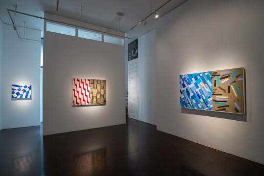
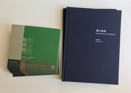
平行與斜率 – 耿晧剛的第三自然
第三自然 耿晧剛個展
The Third Nature / Daily Pattern Keng Hao Kang
9.9 – 10.8 2017
月臨畫廊 台中
Moon Gallery Taichung
在新世代的抽象畫家中,耿皓剛是表現頗為傑出的一位,生長在藝術世家,結合父親建築師的理性建構,和母親的水墨抒情,耿晧剛在留學義大利的1990年代末期,和新世紀初期,已逐漸顯露個人在藝術創作上的獨特面貌:一種對外在世界好奇、探索,不斷吸納、映現、拼貼,甚至帶著強烈的、屬於年輕世代的時尚色彩。
1969年出生的耿晧剛,已經是屬於玩著機器戰警、打著電動玩具長大的一代;在東海大學美術系畢業之後,便前往歐洲古老卻也時尚的城市米蘭,進入布雷拉藝術學院就讀,主修繪畫與裝置,指導教授Prof.Diego Esposito更是一位強調觀念與思考的前衛藝術家。這樣的背景,讓初至異國的這位東方少年,學會了用心眼去觀看、認識、掌握、紀錄那個既古老又時尚的歷史名城;那曾經是歐洲文藝復興的故鄉,也是達文西、米開朗基羅這些偉大的曠世奇才生活、創作的地方……。
然而相對於那些古老而久遠的歷史,眼前櫥窗的擺置、琳琅滿目的商品色彩,乃至古老牆面馬賽克的幾何紋飾和質感,以及街道石塊排列的規律,在在更吸引了這位年輕人的眼睛和心靈;而這些視覺的元素,也自然而然地融入他的創作之中,成為畫面的一部份。
在西方風景畫的傳統中,大自然地景的高低起伏、尺度變化,曾是尼德蘭地區這些所謂的「低地國家」畫家最早關心、記錄的對象,因���,風景畫被稱作「Landscape」。等到近代,尤其是印象派的興起,市民階級的抬頭,工業社會初期正在形成的都市景觀,成為藝術家關懷的新課題,於是相對於最初的大自然之被稱為「第一自然」,城市景觀則成「第二自然」。
到了工業文明的極度成熟,人工的製造物、商品、印刷品、電腦圖像……等,又取代了城市景觀的街道、建築,乃有了「第三自然」的成立。
對於像耿晧剛這些玩著機器戰警與電動玩具長大的新一世代而言,「第三自然」顯然是他們生活中更親切、熟悉,足以互動、合一的內涵與課題。
耿晧剛對這些「第三自然」視覺美感的吸收與運用,初期並不納入完全理性的掌握或歸納,也不抒發成一種全然感性的情緒或發洩;毋寧說,他更像是一個行吟的詩人,以開敞、流動、適意的心靈,讓這些色彩、形式,乃至衝突、拉拒的語彙,依他們自有的溫度、個性,同時呈現在畫面之中。耿晧剛初抵米蘭的1998至2000年間,��有一批以有色墨水形成的紙上作品,往往以極簡拙的幾筆,捕捉某些湧現的靈感或意象,有時是一些反覆的平行線,有時是一些重疊的符號、筆劃,有時則是人體的勾勒……。總之,這些早期的紙上手稿,作為日後創作的參考,卻也記錄了某些閃現的靈光,基本上,反而更透露了藝術家在創作前期的思維痕跡與焦點。
而在壓克力彩的作品中,我們也可以窺見耿晧剛在色彩重疊上所投注的用心,往往看似平面的色塊中,其中有一些壓印、重疊的肌理,在淡亮的色彩底層,其實掩埋著多重層疊的暗沈色彩;這種猶如複寫紙般的層疊效果,既增加了畫面的肌理質感,也呈顯了歷史記憶的層累與呼喚。
此外,色彩也擔負著溫度傳達的任務,像幾件標題為〈熱帶〉(2012),或〈24度〉的作品,都可以看見藝術家對環境的敏感與掌握。有時,你會窺見某個建築古老的馬賽克拼貼圖案;有時,你會發現猶如方格玻璃櫥窗後繽紛的色彩;甚至,有些時候,畫面中就直接出現米奇、米妮、海綿寶寶,和超人、蝙蝠俠等等的卡通圖案;在2013年的一批作品中,則在幾何的圖樣中,出現斑馬、豹等動物的皮毛,耿晧剛的作品,充分反映一個多所關懷、凡事入心、凡物入眼的熱情藝術家的生命本質。
耿晧剛創作取材的範圍,顯然極廣,有時來自城市的壁面、櫥窗、市招、路石……,有時來自居室空間的小物件,如:信封、摺紙……等。幾件取名〈喬依斯(Joyce)〉(2012-2015),或〈梯〉(2014)、〈迷彩〉(2014)的作品,也顯示藝術家生活的片斷與接觸或閱讀的內容。
作為一位成功的藝術家,關鍵還不在對外在世界的感悟與捕捉,而是在如何將這些事事物物,安置、集中在一個有限的畫面中,而顯現出一定的意義或美感。明顯地,耿晧剛的成功,正在將這些原本獨立、片斷的物象或語彙,從自身的語彙脈絡中抽離出來,又併置、拼貼到另一個脈絡或文本中,形成新的意義或語境,增加了觀眾觀看、理解的空間,甚至不同的詮釋或感動;這樣的手法,其實就和裝置藝術的構成,有著相當雷同、流通之處。
2015年的〈導航〉顯然是一個新的開端。這件畫在畫板上的作品,一反之前較具指事性或象徵性的半圖像構成,是採用完全平行與垂直的畫面構成;左半約近全幅三分之二寬幅的部份,色彩明度較低,從粉紅、灰黃、黑、藍、墨綠到紫藍,而右半約僅三分之一寬幅的部份,則作較小的平行分割,接近中間的幾個色塊,如純白、灰、橘紅等,明度較高(尤其由中間的一塊紫藍及左側的大塊黑色所襯托),成為全幅視覺的焦點,猶如具有〈導航〉的作用,一如在黑暗海面上,引領船隻航行的燈光。
從〈導航〉出發,2016年即有一批名為《前進》系列的作品,這批畫在畫布上的作品,尺幅略小於2015年的〈導航〉,但在平行與斜率的畫面分割中,較低沈的色塊,給人一種優雅、內斂的感受。
而就在這種平行與斜率的構成變化中,亦發展出2016年的另一批作品,即:〈抽象-1〉、〈抽象-2〉、〈動力學-1〉、〈動力學-2〉、〈動力學-3〉、〈動力學-4〉,及〈紛-1〉、〈紛-2〉,和〈停泊〉、〈工作天-1〉、〈工作天-2〉、〈階梯〉等。這些作品,在平行與斜率的交織中,因色面大小的變化、因色相搭配的不同,更因彩色與無彩色的巧妙對照,讓畫面產生各種不同的視覺感受與心境風景;其中,尤以《動力學》系列,明度強烈的對比,加上線狀與面狀的斜率變化所產生的空間感,讓人對那些粉紅的色線特色留下深刻印象。
在2016年的這批作品中,〈動力學-4〉及〈階梯〉所構成的曲面空間變化,顯然為2017年的發展,作出了預告,如:〈成長〉、〈眼中的世界-1〉、〈眼中的世界-2〉,及〈登頂〉等,這是藝術家現階段最新的面貌,也是從平面與斜率發展的幾何性構成,最為成熟的發展;當中可以看到一些色面與短色線較複雜的變化。
幾何抽象最大的挑戰,即在如何維持藝術創作的思維特性,不致落入純粹設計的陷阱。耿晧剛的這批新作,明顯地發揮了他擅長的色彩掌握與畫面空間的深度感。那些交錯的平行線與具斜率的規律變化,正是建築物在陽光投影下最鮮明的印象呈現,但藝術家的色彩賦予,更塑造了濃厚的音樂性與空間感。
在2015到2017年的新作中,也可以發現幾件刻意加入書寫線條的作品,如:2015年的〈桃花〉、〈檸檬樹〉、〈海岸線〉、〈日光浴〉,2016年的〈是雲-1〉、〈是雲-2〉,以及2017年的〈工作天-2〉等,顯然藝術家在這個講究平行與斜率的主軸下,另一可能的嘗試。
作為新生代的抽象畫家,耿晧剛以強勁的創造力、辛勤的耕耘,再度向藝壇證明他的存在與努力,值得肯定、也值得期待。
蕭瓊瑞 《國立成功大學歷史系所教授》 台灣美術史學者

Parallel and Slope – The New Works of the Third Nature by Keng Hao-Kang
Of the abstract painters in the new generation, Keng Hao-Kang, born in a family of artists, is one of the best who combines the rational constructivism of his father and the lyric style of his mother. When Keng studied abroad in Italy between the late 1990s and the early 2000s, he had gradually revealed his personal unique taste of art creation whose works show strong and young colors of the new generation to express the curiosity towards the world to explore, absorb, reflect, and collage.
Born in 1969, Keng grew up with robot police toys and video games. After he graduated from the department of fine arts in Tunghai University, he left for Milan, an ancient and fashionable city in Europe, and studied in the Art Academy of Brera with is major in painting and installation art. His thesis advisor, Prof. Diego Esposito, is an avant-garde artist, who taught him to observe, understand, explore and record the historical city through his mind because Milan used to be the origin place of the European Renaissance and also the place where Leonardo da Vinci and Michelangelo lived and created the master pieces.
However, compared to the ancient history of the city, the deployment of store windows, various colorful products, geometric patterns and textures of ancient mosaic walls, and the arrangement pattern of paving stones were more attractive to him. And these visual elements have naturally blended into his art pieces, forming a part of the paintings.
In traditional western landscape paintings, the rolling hills used to the theme for the painting artists in low-lying countries such as the Netherlands, and this is also the reason why the landscape paintings are named as “landscape.” Then, with the rise of impressionism and citizen class, the urban landscape forming in the beginning of the industrial society had become the new topic concerned by the artists. Therefore, the Mother Nature is called “the First Nature,” and the urban landscape is called “the Second Nature.”
When the industrial civilization became mature, the man-made objects, products, printings, digital images…etc. have replaced the streets and buildings of urban landscape, forming “the Third Nature.”
Furthermore, for the new generation like Keng who played robot police toys and video games in their childhood, “the Third Nature” is obviously a closed, familiar, interactive and integrated theme in their lives.
In the beginning, Keng neither fully grasped nor concluded the ways to absorb and use the visual aesthetics of the Third Nature, nor he expressed the entire emotions. It is rather to describe him as a troubadour who presented colors, formats and words with open, flowing and enjoyable minds of their own warmth and personality on the paintings. When he first arrived in Milan during 1998-2000, he made some colorful ink paintings that used simple strokes to capture the ideas or images emerged suddenly, or some repetitive parallel lines, overlapping symbols and strokes, and outlines of human figures… These early manuscripts were served as reference for his creation in a later date but also recorded his ideas; moreover, these also revealed his thinking trace and focus in his early creation stage.
We can see his efforts on his acrylic paintings, where he overlapped colors to create imprinted texture of color lumps. He also painted light bright color on the lower layer, where actually covered multiple layers of dark colors. This articulating-paper effect not only increases the texture of the paintings, but also presents the layers and echo of history and memories.
In addition, colors also bear the mission to express warmth. As in some of his art pieces, such as “Tropical” (2014) and “24 Degrees,” we can see his sensitivity and management on the environment. Of which, sometimes you see the ancient mosaic patters of buildings, colorful square glass windows, and even cartoon figures like Mickey Mouse and Minnie Mouse, Sponge Bob, Superman, and Bat Man, while there are animal furs like zebras and leopards appeared in the geometric patterns in his art pieces in 2013 to fully reflect the nature of an enthusiastic artist who cares a lot of everything.
Obviously, Keng is inspired by various topics from both cities such as walls, shop windows, sign-boards, and paving stones and living objects such as envelopes and papers. Some of the named pieces like “Joyce” (2012-2015), “Stairs” (2014), “Camouflage” (2014) also showed the fragment that the artist’s life.
To be a successful artist, the key is to arrange and deploy these things and objects in a limited frame to present certain meanings or aesthetics, instead of the sentiment and capture of the external world. It is very obvious that the success of Keng is that he detaches the independent fragments and terms from his language context and collages and combines with another context to form new meanings and contexts, creating a space for audience’s viewing and understanding and even different interpretation. This kind of method is very similar to the construction of installation art.
The art piece “Navigation” in 2015 is a new beginning which is very different from the self-explanatory or symbolic half-image construction. The painting is comprised of completely horizontal and vertical images with the two-thirds of the left half painting by lower brightness including pink, greyish yellow, black, blue, blackish green, and purplish blue and with one-third of the right half separating by smaller parallel cutting and some high brightness blocks near the middle including pure white, grey, and citrus red (especially setting by one purplish blue in the middle and a big black block on the left side), serving as the visual focus of the full frame painting. The “Navigation” effect is like a spot light that navigates boats on the black sea.
Since “Navigation,” he further created a series of art pieces named “Moving Forward” in 2016. Although the size of “Moving Forward” is comparatively small compared to “Navigation” (2015), the parallel and slop splits of dark color blocks bring people elegant and introverted feelings.
Through the changes in parallel and slope construction, he developed another series of “Abstract 1,” “Abstract 2,” “Dynamics 1,” “Dynamics 2,” “Dynamics 3,” “Dynamics 4,” “Tangled 1,” “Tangled 2,” “Anchoring,” “Working Day 1,” “Working Day 2,” and “Stairs.” By parallel and slope intertwining, the changes in color field size with different color hue, the genius comparison between colors and achromatic colors produce various visual and spiritual feelings. Of which, the series of “Dynamics” have a strong comparison in brightness with the space sense created by linear and plane slope changes, leaving strong impression for the viewers on the pink lines.
The curved spatial changes constructed in “Dynamics 4” and “Stairs” in 2016 are served as the trailer for the development in 2017, including “Growth,” “The World in the Eyes 1,” “The World in the Eyes 2” and “Reaching the Summit.” These art pieces show a new appearance of the artist and they are also the most mature development of the geometric construction of parallel and slope development as seen from the comparatively complicated changes in color fields and short color lines.
The most challenging geometric challenge is to maintain the thinking characteristics of art creation without trapping by pure designing. The new series by Keng have expressed his ability to manage colors and spatial depth perception. The crossing parallel lines and regular slope changes is the most expressive presentation of buildings under the sun shining; however, the color painted by the artist gave the art pieces more musical and spatial senses.
We can also observed the calligraphy lines that the artist intentionally added into the art pieces from 2015 to 2017, including “Peach Blossoms” (2015), “Lemon Tree” (2015), “Coastline” (2015), “Sunbathing” (2015), “It is Cloud 1” (2016), “It is Cloud 2” (2016), and “Working Day 2.” These art pieces are another possible trial for the artist under his chief focus on parallel and slope.
As the abstract artist of the new generation, Keng uses his strong creativity and diligence to prove his existence and efforts to the art field, which is worthy of recognition and expectation.
Hsiao Chong-Ray, Taiwanese art historical scholar
Professor of the Department of History, NCKU,


0 notes
Text

The formation of Living 建構。生活,我們以設計質量及工程管理為核心,我們擁有多年專業室內設計及工程經驗並在珠海設立了佔地四萬呎的廠房,項目包括住宅、辦公室、商舖,酒店及會所等等。
0 notes
Text

The formation of Living 建構。生活,我們以設計質量及工程管理為核心,我們擁有多年專業室內設計及工程經驗並在珠海設立了佔地四萬呎的廠房,項目包括住宅、辦公室、商舖,酒店及會所等等。
0 notes
Text
The formation of Living 建構。生活,我們以設計質量及工程管理為核心,我們擁有多年專業室內設計及工程經驗並在珠海設立了佔地四萬呎的廠房,項目包括住宅、辦公室、商舖,酒店及會所等等。

0 notes
Text
The formation of Living 建構。生活,我們以設計質量及工程管理為核心,我們擁有多年專業室內設計及工程經驗並在珠海設立了佔地四萬呎的廠房,項目包括住宅、辦公室、商舖,酒店及會所等等。
0 notes
Text
The formation of Living 建構。生活,我們以設計質量及工程管理為核心,我們擁有多年專業室內設計及工程經驗並在珠海設立了佔地四萬呎的廠房,項目包括住宅、辦公室、商舖,酒店及會所等等。

0 notes
Text
【Adler x Stitch】
⚠️ooc預警⚠️完全腦洞⚠️自我架空⚠️含大量私設
吃不到cp真是太痛苦了,我只能自產自銷
不知道這樣釣不釣得到同好(?
因為我真的覺得stitch很受,他就是個小可愛(?
由於內含大量私設,純腦洞,想寫他們如果結婚去蜜月會發生什麼事。
而且我沒寫完(欸
之後看有沒有空再說。
下收正文:
維霍爾.庫茲敏後來仔細思考,才發現自己都已經這樣的歲數了,竟然完全沒有到外頭旅行過。在維霍爾的印象中,就算是到其他國家,也全是為了工作或者研究,而且通常都是他獨自一人,沒有旅伴,當然也不可能有旅遊或是其他觀光行程。
所以,像這樣和另一個人出來旅行,對維霍爾來說,還真是頭一遭。
況且自己現在可不單純是出來旅遊而已。
「——在想什麼?」
站立在他身旁的羅素.阿德勒微笑著開口詢問,他注意到身邊的維霍爾貌似相當分神,便輕輕伸出手撫著他的臉頰。維霍爾瞬間回神,瞧見了身邊站著的阿德勒,看見他身上輕便休閒的衣著、然後又看到了對方身後美麗的河岸城市景色,這才突然間回過神,他和阿德勒現在身處在義大利的威尼斯,這次他們並不是為了工作或是任務前來,而是單純就是來旅行的。
或者該說,蜜月旅行。
事發在莫約一個多月前,事情的開端維霍爾記得不是很清楚,總之,基地裡不曉得是誰——十之八九是龍心或歐蕾西雅,發現除了維霍爾跟阿德勒之外,其他所有夫夫們都已經度過了蜜月。而維霍爾由於副指揮官的身份,已經很長一段時間沒有休假,又正逢阿德勒解決完一個長期任務,於是基地裡的所有人一致認為,他們應該去度個蜜月假期。
所以,最後在維霍爾抗議無效跟其他人的半強迫、還有阿德勒溫柔的邀請之下,他們便來到了義大利的威尼斯。此時的他們倚靠在一處小橋樑邊望著底下河道來往的貢多拉,這樣輕鬆悠閒的氣氛,讓維霍爾有些不適應。
「沒事。」維霍爾回答:「有點不習慣而已。」
阿德勒微笑著,冷不防的湊上前去吻了吻對方。而維霍爾立���因為他的行為而紅了臉頰,他下意識慌張的環視著周圍其他路人,不過其他人只是瞧了瞧他們的方向,然後便紛紛又轉開了視線。
「緊張什麼?這裡沒人在意的好嗎?」阿德勒笑著,伸手摟著維霍爾的腰,見到他有些慌亂外加許久不見的羞澀模樣,阿德勒忍不住又把他整個人摟進懷抱裡親吻。
「好了!別鬧!阿德勒!」維霍爾伸手推了推對方,羞紅著臉瞪著他,雖然說他也知道在義大利這種歐洲國家,像他們一樣的同性情侶,根本就見怪不怪,但維霍爾總還是感覺彆扭,或許也因為這是他第一次跟阿德勒一起出來旅遊,沒有任務纏身、沒有隨時都要留意周遭,這樣的輕鬆氛圍讓維霍爾感覺非常微妙。然後這時他總會無意間的瞥見自己右手無名指上的戒指,跟阿德勒左手無名指上戴著的同款婚戒,一起在義大利和煦的陽光下閃著光芒。
維霍爾會在這瞬間突然意識到——他們已經結婚了,而這樣的事實總會讓維霍爾感覺彆扭跟害臊。畢竟平時老是忙於工作,維霍爾總會忘記自己其實已經結婚這件事情。
不過,相對於有些工作狂的維霍爾,阿德勒倒是隨時隨地都會記得這件事。他老早就想跟維霍爾出來一趟旅行,但無奈於局勢,他們分別的時間總是大於相處,所以對於這次為期兩週的蜜月,阿德勒顯得非常滿意,這一次總算不會被任何人打擾,他們可以正大光明的牽著手,一起漫步在街道上。
望著不遠處正在買飲料的阿德勒,維霍爾還是感覺相當新奇,這好像是他第一次看見阿德勒穿得這麼休閒,但是即便是休閒的打扮,也無法掩蓋他的好身材,阿德勒的身形非常高挑,健壯的體魄在休閒襯衫跟長褲的勾勒下顯現出完美的肌肉線條,一頭金髮搭配著天藍色的深邃眼睛,帶著傷疤的臉龐反而替他多增添了一抹獨特的魅力,這讓阿德勒笑起來的時候更加迷人,不光是維霍爾,周遭有許多人都把目光落在了阿德勒的身上。
其中有兩名女性正在對著阿德勒議論紛紛,而她們站的位置離維霍爾相當近,他能清楚聽見她們的對話。由於站在橋邊也沒什麼事情可以做,維霍爾的注意力便很自然的集中到了女性��談話內容上。
「——像是外國人,美國?加拿大?」其中一名女性說著,目光直勾勾的盯著阿德勒:「老天,妳看他的身材,真是好的不像話!」
「可不是嘛,姐妹!」另一名女性吸著飲料回答,有些感嘆般的說著:「不知道他有沒有女朋友?天啊,要有多好的條件才配得上那種男人?」
是啊,要有多好的條件,才能夠配上他?維霍爾倚靠在橋邊,與兩名女性同樣望著不遠處的阿德勒,偶爾想起他們在一起的事實,維霍爾還是對於阿德勒最後選擇了自己這件事感到不可思議,他從來沒有什麼能給他的,但阿德勒還是選擇和維霍爾在一起、甚至走向了結婚這個選項,這是維霍爾壓根兒沒有預想過的結局,他到現在仍然想不透阿德勒選擇自己的原因在哪裡,光是外貌條件,維霍爾就知道自己已經輸了一大截,更別說個性還有其他部分,維霍爾就沒什麼能拿出來說的優點,就像那兩名女性說的——得有多好的條件才能跟那樣的男人在一起。
但是,維霍爾.庫茲敏不知道的是,阿德勒對他的一切早已完全著了魔。
此時的阿德勒在等候餐點的同時,把目光移回半趴在橋上的維霍爾身上。阿德勒注意到維霍爾的視線,便對他勾起一個淺笑,而維霍爾則是匆匆地把目光移動到橋下的小攤販上,害羞的反應惹的阿德勒輕笑出聲,就這樣盯著維霍爾的身影不放。
雖然維霍爾本人老覺得自己的相貌水平一般,但事實卻是有很多人都在盯著他瞧,維霍爾穿著的襯衫領口釦子並沒有全部扣上,加上他的姿勢半趴在橋樑扶手上,可以隱約看見胸口的肌肉線條,光是這樣就已經吸引了不少人的目光,更別說他今天穿的長褲還非常貼身,臀部的線條被勾勒的更加明顯,甚至可以說相當性感,惹得阿德勒不自覺的吞嚥了一口口水。
而理所當然的,被維霍爾吸引的人,可不光只有阿德勒一個。
「他媽的,你看橋上那個男的。」其中一名男子在經過阿德勒身邊時,這樣對著身邊的同伴訕笑著說道:「你看見了嗎?那個性感的傢伙?」
「看到了,我的老天。」他的同伴回答,目光不懷好意的盯著維霍爾的身影猛瞧:「老兄,我告訴你,我願意花五百歐元跟他上床幹一炮。」
另一名男人笑出聲音,悠哉的繼續說:「我也是,我可以再加碼一百歐元讓他幫我口交,靠,你想過去跟他搭話嗎?」
他們發出一連串笑聲,絲毫沒注意到後方的阿德勒表情非常陰沉,依舊對著維霍爾指指點點。而阿德勒在取走攤販的飲料後,經過兩人身邊時,趁著沒人注意的當下,悄無聲息地把一邊花店攤販的推車往他們的方向踢了一腳,那兒正巧是下坡,載滿花盆的推車就這樣不偏不倚撞上了兩人。
阿德勒回過頭,狠瞪了兩個一臉莫名其妙的男人,他們當然不曉得這是阿德勒做的,只是困惑又驚恐的摔倒在地上。阿德勒沒再搭理他們,逕自拿著飲料回到了維霍爾的身邊。
「那裡怎麼了?」看見方才的騷動,維霍爾露出些許困惑的神情望著阿德勒。但阿德勒只是微笑,把手中的飲料交給對方。
「不知道,不重要。」阿德勒輕鬆的回答,然後伸手接過維霍爾原本拿在手上的外套。「把外套穿上吧。」他説道,然後也不管對方答不答應,就直接把薄外套披在維霍爾的肩頭上。
「為什麼?」維霍爾困惑的發問。
「穿著就對。」阿德勒回答,外套的長度剛好可以遮到維霍爾的臀部。
而維霍爾雖然覺得莫名其妙,但也沒有抗拒的意思。他們繼續在威尼斯的街頭上漫步,這是維霍爾第一次到歐洲國家,路上的許多事物都讓他覺得新奇,這瞬間的他像個孩子,冰藍色的眼睛不自覺的一直到處張望。
看見這樣的維霍爾,阿德勒始終掛著寵溺的微笑,他牽緊維霍爾的手,帶著他走過巷弄街道。這不是阿德勒第一次來義大利、也不是他第一次和別人出來旅行,但過往的經驗裡,旅程中從來就沒有讓阿德勒值得留戀的事情,甚至是他和前妻的蜜月旅行,都在中途就被自己用工作為理由而中斷。
所以,像這樣享受旅程的一切,對阿德勒來說,也是第一次。
晚間他們回到了下榻的飯店,威尼斯在這種觀光產業上做的可謂相當淋漓盡致,他們入住的飯店不算最頂級,但整體的設計可謂相當別出心裁。頭一晚他們抵達時由於長途飛行的疲憊而沒有好好待在房裡欣賞,第二晚又因為附近的煙火表演,回到房間時已經是深夜,直到第三天晚上,阿德勒跟維霍爾兩個人才終於乖乖待在房裡沒亂跑。
房裡的設計帶點中世紀風味,柔軟的大床上掛著布幔以及薄紗。阿德勒在一邊整理行李時,轉頭瞧見了趴在床上休息的維霍爾,他的身影在薄紗後若隱若現,阿德勒看著維霍爾懶洋洋的在床上舒展著身軀,對上阿德勒的眼神後,側躺著露出一個淺淺的微笑。
於是阿德勒便很自然而然地爬上床去,伸出一隻手把維霍爾壓在身下,先是俯下身親吻著他,然後才露出一個壞笑。
「你故意的吧?」他笑著問,而維霍爾則是歪著頭回答:「故意什麼?」
阿德勒俯下身,把他壓在身下索吻,維霍爾並沒有拒絕的意思,伸出手摟著阿德勒的腰,而阿德勒也很自然而然的便把手伸進去維霍爾的衣服裡,指尖滑過他的腰線,向上撫摸到胸膛,揉捏著維霍爾的乳尖,他聽見身下人發出小小的呻吟,便露出滿意的微笑,目光炙熱的盯著維霍爾泛紅的臉龐。
「這兒有很多東西能讓我們慢慢玩。」阿德勒說:「房間服務很周到。」
維霍爾勾起一個淺笑,又一次歪著頭回答:「你有什麼能玩?」
阿德勒笑出聲,順手脫掉了自己的上衣。「多著呢,小貓咪。」他酥麻的呢喃低語,他們在擁吻中像瘋了一樣做愛,阿德勒掐著維霍爾的腰,一下讓他趴在床上、一下又讓他側躺著,撩起他的一隻腿幹、過了一會兒又覺得操得不夠深,便把維霍爾整個人壓在身下,但終歸沒停下的都是紮實的抽插。這張床夠大,方便他們不停變換姿勢,而阿德勒的性慾永遠強的驚人,維霍爾在幾次高潮之後就有些撐不住,於是阿德勒壓在他身上,吻遍他身上每寸肌膚,然後笑著取來早已放在床頭櫃裡的春藥,對著身下喘息不止的維霍爾呢喃。
「不行了嗎?」他喘著粗氣說道:「讓我幫你,小貓咪。」
說完後,阿德勒將一粒春藥塞進維霍爾的口中,貼著他的耳畔,用溫柔卻強欲的語氣下令:「吞下去,聽話。」
維霍爾有點神智不清,乖乖聽從阿德勒的指令把藥給吞下,然後阿德勒滿意的微笑,繼續吻著對方臉上的淚痕。藥效發揮的很快,幾分鐘後維霍爾原先已經半垂著的陰莖又一次硬挺起來,他的喘息帶著嬌軟又淫慾的喊叫,扭著腰迎合阿德勒的抽插,緊緊抱住了他的身軀,阿德勒都不需要做太多事情,維霍爾就會因為藥劑的關係顫抖著哭著高潮射精,但他仍然渴求著性愛、主動吻著阿德勒、在他耳邊低語著下流的情話。
「你喜歡我這樣操你,對嗎?」阿德勒笑著問,故意在這時停下了抽插的動作:「喜歡嗎?小貓咪?」
維霍爾因為得不到快感,便睜開欲求不滿的眼睛望著阿德勒,他發出了像是哭泣一樣的啜泣聲,用力的點點頭,挺著自己的腰讓阿德勒炙熱又巨大的陰莖完全頂進自己的深處。
「不要、不要這樣——」他接近崩潰的哀求:「羅素、操我——拜託、求你操我——」
阿德勒露出滿意的笑,又把維霍爾整個人壓回床上狠操,他們之間最後只剩下喘息、喊叫還有抽插時淫慾又下流的水聲,兩人的身軀幾乎完全緊密交纏貼合,春藥跟潤滑劑的空罐被他們扔在地上,這場性愛直到接近黎明時分才總算終結,無論是哪一方都已經精疲力竭,但他們望著對方的目光卻仍帶著炙熱的愛。
於是,這天他們沒有任何外出的行程。阿德勒睡到中午才醒來,而維霍爾完全沒有醒的意思,依舊躺在他懷中熟睡。
阿德勒輕手輕腳離開被窩,順帶吻了吻維霍爾的臉頰,然後才下床盥洗。由於他猜想維霍爾並不會那麼早醒過來,便相當悠閒的叫了客房服務,侍者把早點跟報紙送到他們房間。阿德勒倚靠在陽台的窗邊輕啜著咖啡,外頭的天氣依然非常舒適,阿德勒望著底下的河道街景發了好一會兒呆,然後才回到室內享用早午餐。維霍爾還在睡,而且睡得非常沉,由於阿德勒不在身邊,他順手抱著枕頭,整個人埋在棉被堆裡睡得香甜。
阿德勒咬著麵包,無法克制自己臉上一直露出相當寵溺的微笑,他望著維霍爾意外天真可愛的睡臉,���了個身從行李箱裡拿出相機,就這樣把維霍爾幾乎每個角度都拍了一張相片。
回去洗照片的時候這傢伙一定會生氣。阿德勒微笑著想。
維霍爾又過了一下子才醒來,他在床上翻了個身,感覺自己全身都酸疼的不像話,每次一跟阿德勒做愛就是會有這種下場,他邊想邊睜開了眼睛,而一邊的阿德勒注意到他醒來後便微笑著走到床沿邊坐下。
「早安,睡得好嗎?」阿德勒笑著詢問,不過維霍爾看上去還略顯疲態,有些懶洋洋地看著自己手中拿著的盒子。
「你在幹嘛?」維霍爾有些困惑的盯著那個紙盒:「那是什麼東西?」
阿德勒把目光落在盒子上。「這個?」他微笑著,把小盒子在手中揚了揚:「這麼快就忘了?虧你昨晚吃了一堆這東西呢。」
聽見阿德勒的話,維霍爾這才意識到他手上的小盒子就是昨晚他倆用來助興的春藥。看上去盒子已經空了,鬼知道這傢伙昨晚趁著自己意識不清到底餵自己吃了多少!難怪會全身酸痛成這樣!維霍爾瞪了阿德勒一眼,沒好氣的開口回答:「幹嘛?你還嫌不夠嗎?」
「我喜歡這東西。」阿德勒壞笑著,貼近維霍爾身邊說道:「這小東西讓你性感的像隻發情的貓一樣。」
聽見阿德勒的話,維霍爾有點害臊,畢竟昨晚自己的行為確實相當放蕩。於是他抓起一邊的枕頭狠狠就往阿德勒身上砸,對方大笑著閃開,趁機又把維霍爾壓在身下親吻著,維霍爾沒有抗拒,就這樣與阿德勒擁吻了一陣。
他們在午後的溫暖陽光下接吻,微風撫過身旁,時間在這一刻凝結,這瞬間他們是兩個相愛的普通人,彷彿一切痛苦都沒有經歷過、一切遺憾都未曾發生,他們的愛將會持續到永恆。
「——我愛你。」在放開對方之後,阿德勒輕輕對著維霍爾呢喃。而維霍爾回給他一個淺笑、以及相同的一句「我愛你」,他們相視而笑,阿德勒在他身邊坐下,讓維霍爾把頭枕在自己的大腿上休息。
這時的維霍爾安靜的躺在阿德勒的大腿上,對方正在看著早報,維霍爾則是在這時又瞥見了右手上的婚戒,他輕輕撫摸著那只銀色的戒指,過了一下之後換了個姿勢,仰躺在對方大腿上望著他專注的臉龐。
「怎麼了?」注意到維霍爾的目光,阿德勒笑著把視線移到他身上:「你想吃點東西嗎?」
維霍爾並沒有回答,只是對著他勾起嘴角。此時的維霍爾仍舊赤裸著身體,除了底褲外一絲不掛,柔軟的棉被蓋著下半身,他對著阿德勒笑了一下之後便將視線移���到手上的婚戒,修長的手指輕輕撫摸著戒指,雙腿在床上勾著交疊,隱約能看見大腿內側跟下腹的吻痕與咬痕——維霍爾大概不知道自己常常下意識做出相當性感的動作,這不曉得算不算天份,總之,阿德勒對於四下無人時他這樣的行為感到非常的滿意,於是他伸出手輕輕撫摸著維霍爾的腰,忍著跟他再來一發的衝動,把報紙放在一邊的小桌上。
「你該起床吃點東西了。」他呢喃著說:「都已經快下午三點了。」
維霍爾沒有拒絕阿德勒的提議,畢竟他真的有點餓。於是維霍爾伸了個懶腰從床上坐起身,有些懶洋洋的朝浴室走去。而這次在他換衣服時,阿德勒直接站在他身邊幫他挑選衣服。維霍爾露出不解的神情,很自然的歪了歪頭,他在困惑時總會有這樣的舉動,無論看幾次都讓阿德勒覺得可愛至極。
「為什麼是你幫我挑?」維霍爾挑著眉問道,但是卻乖乖接下阿德勒給的衣物,是一件素色的T恤外加一件襯衫外套,以及較為寬鬆的長褲。
「因為,」阿德勒笑著,湊上前吻了維霍爾:「我不喜歡路上一直有人盯著你瞧,這很合理吧?」
維霍爾愣了愣,有些懷疑的望著阿德勒。「要看什麼?有誰會看我?」他邊問邊把上衣穿上:「除了你以外?」
阿德勒露出一個壞笑,伸手猛然揉捏著維霍爾的臀部,貼近他的身子後呢喃著說道:「多著呢,看你有多性感、多可愛,還說著想跟你來一炮,你說我要怎麼不擔心?」
聽見阿德勒的話,再看見他有些嫉妒跟埋怨的眼神,維霍爾稍稍紅了臉頰,但依舊不怎麼相信對方的一番說詞。「聽錯了吧,怎麼可能是在說我。」他哼了哼聲,把襯衫套上,原先想這樣直接走出房間,卻被阿德勒給拉了回來。
「就是在說你。」阿德勒有些不滿的伸手把維霍爾襯衫的扣子給嚴實的扣上,因為他發現即便只是簡單的T恤,維霍爾的胸線依然在衣服下隱隱乍現,於是阿德勒直接把襯衫的扣子全扣上,然後挑著維霍爾的下顎,湊上前吻著他帶傷疤的左眼。
「這樣還差不多。」阿德勒露出滿意的笑,然後才牽起他的手往房間外走。維霍爾沒有拒絕他的行為,反正就算把他的手甩開,等會兒阿德勒還是會重新貼上來。他們就這樣在街道上漫步,今天沒有安排什麼特別的行程,所以他們的腳步悠閒中帶點懶散,另一方面當然也是因為阿德勒知道維霍爾應該不能走得太快——畢竟他們昨晚可是幹了整整一晚上。
而維霍爾低頭看著自己跟阿德勒十指緊扣的手,又往上移動到他的側臉,恍然間感覺好像在做夢,阿德勒注意到他的視線,便轉頭對著他一笑。
「怎麼了?」他輕聲詢問:「你覺得無聊了嗎?要去其他地方走走嗎?」
「不,不會。」維霍爾回答,稍稍用力握緊了阿德勒的手,對著他露出一個淺笑:「這樣很好。」
阿德勒同樣緊握住維霍爾的手,是啊,無論怎樣都好,只要知道現在前行的路上有彼此,那樣就夠好了。
他們在一處看得見海的小餐館裡歇息。維霍爾待在座位上咬著吸管喝著玻璃杯裡的水果氣泡飲,他們的座位在室外區,阿德勒拿著菜單去吧檯點餐,而維霍爾就獨自一人在座位上等他。維霍爾在座位上伸了個懶腰,舒展著身軀,然後把目光移向遠處蔚藍的大海,海面非常平靜,偶爾有幾隻海鳥從空中滑翔而過,平靜的景色讓維霍爾有點發愣,所以他並未注意到有個人影正在朝著自己的方向接近。
「Ciao(你好)。」
一個相當陌生的低沈男音在維霍爾身邊響起,他被嚇了一大跳,慌張轉過頭看向聲音來源,這才看見自己的身邊不曉得何時站立了一個黑髮的高挑男人,深邃的五官以及深色眼珠,是相當標準的義大利男性長相。此時男人正對著維霍爾露出一個燦爛的笑容。而維霍爾並不認得他,於是下意識的產生了戒心,畢竟曾經在戰場廝殺這麼多年,他對於陌生人的警覺還是相當重的。
「對不起,我是不是嚇到你了?」男人微笑著問。維霍爾用相當不信任的眼神打量著他,冷冷的說道:「我不認識你,你找錯人了。」
「那麼,我想我應該先自我介紹?」男人依然笑著,看不出有任何威脅性存在:「列托.雷斯特利。你呢?Bellezza(美人)?」
由於維霍爾聽不懂義大利文,於是他只得露出有點困惑的表情,輕輕的歪了歪頭:「什麼?」
對方被他的反應逗樂了,便相當自然的笑出聲。這反而讓維霍爾有點緊張,畢竟除了阿德勒之外,幾乎沒有人會像這樣在自己面前笑著,維霍爾確實對於自己的行為常常無意識的帶著可愛以及性感這點一無所知,所以他並不曉得眼前的義大利男性究竟為何會笑得如此開懷。
「你一個人?」列托微笑著,用手撐著桌面,相當自然的靠近了維霍爾幾寸:「來威尼斯旅行嗎?還是工作?」
維霍爾一時之間不曉得該不該回答,於是只能用懷疑的眼神瞪著他。
列托依然微笑,目光停在維霍爾那隻已經瞎了、並且帶著傷疤的左眼上。「你的眼睛怎麼了?」列托詢問,一瞬間露出了略帶疼惜的目光:「真是可惜你的眼睛,是那麼漂亮的藍色。是因為意外嗎?」
維霍爾沒有回答,事實上心底相當慌亂,除了阿德勒以外,他可從沒被別人用帶著疼愛的目光注視、也從來沒被別人稱讚過,更別說他倆才認識不到三分鐘。於是維霍爾下意識的想從座位上起身,但他很快注意到列托正巧擋著離開的路,只得僵硬著身體又坐回原位上。
列托又露出相當燦爛的笑:「怎麼了?你害羞嗎?Bellezza?」
「——這應該不是你要注意的事。」
阿德勒的聲音在他身後響起,列托跟維霍爾同時把注意力向後轉,看見一臉陰沈的阿德勒站在列托後面,他的眼神帶著殺意,像是現場就要直接把列托給宰了,他伸出手,相當不客氣的抓著維霍爾的手腕,讓他從位置上起身。
「阿德勒——」
「換個座位,這兒有隻煩人的蒼蠅在。」阿德勒輕聲對著維霍爾說,然後輕輕挽著他的手臂往另一側走過去。
但即便見到了阿德勒不悅的表情與他們之間親密的互動,列托依然沒有死心,他微笑著擋在了兩人面前,目光在阿德勒跟維霍爾之間來回逡巡。
「他是你朋友?」列托笑著詢問維霍爾。
而阿德勒完全沒有讓維霍爾回答的意思,他橫了個身,擋在列托跟維霍爾之間,抓著維霍爾的右手拉到對方面前,讓他清楚看見兩人無名指上的同款銀色戒指。「是丈夫。」阿德勒冷冷的說,然後拉著維霍爾頭也不回的轉身離開。
幸好列托並沒有跟上來,他們選了一處較為角落的位置坐下,維霍爾能明顯感受到對面的阿德勒情緒不佳,他皺著眉頭,目光落在他們走過來的方向,像是在擔心列托會跟上來一樣。
「⋯⋯你生氣了?」維霍爾有些歉疚的開口,而阿德勒在聽見他的話之後才把視線轉回他身上,見到維霍爾帶著愧疚的眼神,阿德勒搖搖頭,露出一個微笑,伸手越過桌面握住了維霍爾的手。
「好了,現在你知道你有多引人注意了,對嗎?」阿德勒輕鬆的回答,撫弄著維霍爾的手指。對方則是稍稍漲紅了臉頰,確實,維霍爾並沒有預想到自己竟然也會被別人搭訕,這還真是他人生中頭一次,更別提對方的相貌還不差,雖然維霍爾依然不明白當中的原因是什麼,但不管怎麼說,現在他不得不承認阿德勒說的的確是事實。
「我又沒回答他。」維霍爾哼了哼聲,但目光依然帶著些許自責。看見維霍爾的眼神之後,反而是阿德勒感覺有些愧疚,於是他牽起維霍爾的手,湊到唇邊輕吻著他的指尖。
「我沒有生你的氣。」阿德勒溫柔的說著:「不要那個表情,我們可是出來度蜜月的,我可不想為了那種傢伙壞了好心情。」
維霍爾又一次泛紅著臉頰,但他並不怎麼想承認,於是便故意哼了哼聲,斜睨了阿德勒一眼:「怎麼,你吃醋嗎?」
「沒錯,我當然要吃醋。」阿德勒相當大方的承認,緊緊握住了維霍爾的手,對著他溫柔微笑:「我好不容易才得到你,怎麼能這麼輕易就隨便被那種來路不明的人搭訕?」
「好了,哪有那麼誇張?」聽見阿德勒的話,維霍爾反而有點彆扭:「別講得好像我是什麼稀世珍寶一樣好嗎——」
「你是。」阿德勒吻著維霍爾的指尖,望著他的目光帶著強烈的愛戀、珍視、溫柔與疼愛。「在這個世界上,沒有比你更珍貴的人,維霍爾。」阿德勒輕聲的呢喃。他們之間經歷過太多痛苦,最後才終於能夠走到這一步,打從維霍爾決定接受阿德勒給的愛的那瞬間開始,阿德勒就已經發誓這輩子不會再讓他承受任何一點痛跟悲傷,維霍爾已經痛苦了太久、他被傷害太深太痛,而最讓阿德勒自責的,是造就這一切根源的人正是自己。
所以現在的維霍爾值得所有最好的一切,阿德勒給他的疼愛完全超出維霍爾的預期,甚至有的時候反而讓維霍爾感覺相當彆扭。畢竟,在這漫長的人生路上,他獨自跌跌撞撞,身上的傷多到後來已經不會疼,維霍爾曾經以為再也沒有任何事能讓他感受到痛,但最後最痛的反而是在阿德勒幫他療傷的那段時間、他重新拼湊起已經支離破碎的自己,一針一線一字一句把已經破碎的心重新縫合回去,傷口直到這一刻才開始滲血劇痛,阿德勒的溫柔讓維霍爾留戀、同時也讓他痛不欲生,維霍爾痛到感覺自己要死了、所以再一次瘋狂的嘗試逃離,但這一次阿德勒沒有再放開他、再也不放了。
然後阿德勒意識到——維霍爾根本不懂什麼是溫柔、什麼是被愛,而這全部起源於自己對他的背棄,但維霍爾卻仍無法恨他,最後只能讓自己滿身傷,好忘記曾經深深愛過他的那個自己。
於是,時間跳轉到現在,阿德勒面對著眼前略微無所適從的維霍爾,緊緊握住了他的手,吻著那個與自己同款的銀色婚戒,幸好他們終究走到了一個好的結局,現在的阿德勒除了維霍爾以外,完全不在意其他事,為了他,阿德勒甚至想著自己可以親手毀滅世界。
不過,現在那些也全部不是重點,現在的重點是——阿德勒確定了維霍爾走在路上確實是有可能會被搭訕的,雖然維霍爾一直認為自己相當平凡,但事實卻並非如此,他意外的相當有魅力,一些無意識下的行為舉止總會讓人忍不住想多看他幾眼,不過通常這種時候,那些偷瞄維霍爾的人都會接收到阿德勒充滿殺意的目光,隨後便會嚇得逃開原地。
於是,阿德勒冷冷瞪著一名年輕男人逃開的方向,那個不怕死的小伙子剛才用一種貪婪的眼神盯著維霍爾的臀部猛瞧,阿德勒必須很努力才能克制住衝出去揍他一拳的衝動。
「你又在幹嘛?」注意到阿德勒正眼神陰鬱的望著遠處,維霍爾抬起頭,對著他露出不解的神情:「你從剛才到現在到底在看什麼?」
「沒有,沒什麼。」阿德勒對著維霍爾露出微笑,而正想順著他剛才的方向看過去,就立刻被阿德勒托著臉頰轉回來。「就跟你說沒有東西了。」他勾起一個淺笑,看向對方有點不滿的目光:「別分心,你知道我不喜歡你看別人。」
「在分心的是你吧?」維霍爾忍不住抱怨,揮開了阿德勒的手,然後繼續往前走了幾步。這時維霍爾抬起頭,正好瞧見了有一名女性正盯著自己瞧,對方與維霍爾對上眼神之後,便向著他露出一個微笑。
---------------------------------------------------------
是的我斷在一個奇怪的地方了(欸
沒辦法就剛好只寫到這裡,有空再說(不負責任
20 notes
·
View notes
Text
[義仁] Reflets dans l'eau (Combeferre/Enjolras)
這裡是撤離老墳頭的抖森的學妹
搬篇短篇試試水
[義仁] Reflets dans l'eau
退役軍醫C/冬兵(???)E,應該算無差 戰損+哭唧唧的領袖好好搞
總之是個奇怪的盾冬(?味兒二戰AU,領袖真的很適合軍人設定,但是如果角色反轉了呢?
也繼續搞音樂家ABC
說是義仁其實也打了點ER雙C擦邊球,不適者請自行避雷
自殘畫面預警。本來是想要寫個BE的可是薏仁這麼冷就還是別了吧
照慣例可全文搭配拉威爾G大調鋼琴協奏曲第二樂章食用
也可以單獨收聽個別節點自帶的BGM
1.
Sergei Rachmaninov- Elegy in E-Flat Minor, Op. 3 No. 1
1946年5月8日。
醫學生聚集在教授休息室聆聽無線電收音機轉播的審判結果。他們最關注的名字有三人被判決死刑,最後一人終身監禁。
「整整一年過去,」若李說,「我還不能完全相信我們又在巴黎,試圖重新讀進中級解剖學課本。領袖這兩天怎麼樣?」
「也許他很快就要想起格朗泰爾了。」公白飛說。
回國後若李被困在綿延不斷的憂傷。它不叫人在自己的房間痛苦地嚎啕,���不入侵夢境,卻徘徊在空氣裡消散不去。這低落的情緒趕也趕不走,被它纏住的患者只能學習與其和平共處。
「我確信這也是一種戰後的心理疾病。」若李又說,「最好注意下領袖,公白飛,我擔心他在找回自己的途中也患上這個討厭的毛病。」
「回你住處去,若李,」公白飛則說,「回去試著多睡會,你蒼白的像患貧血。」
這是個依然有效的恐嚇,即便若李自己與公白飛同樣清楚他不過是花了過多時間在解剖室悶頭研究而缺乏適量的陽光照射。回巴黎後若李換了個新住處,他回去的路上總會經過拉雪茲神父公墓,他也總會付幾個硬幣給賣花女,把花束等量分配後擺在幾座尚且光亮的墓碑前。
公白飛找出他身上的幾個硬幣交給若李,「幫我給大伙兒問好。」
「也幫我給安灼拉問好。」若李說。
回巴黎後公白飛被招回醫學院給一年級新生講課,他想在醫院繼續實習的計畫暫時被擱置了。起先公白飛上課經常上的提心吊膽,但是安灼拉回到巴黎後的表現很平靜,除了那幾次他才進門便看見滿桌滿牆腥紅的污跡,而安灼拉拽著手腕,或肩膀,或小腿,刮鬍刀片或什麼尖利的物品掉在他手邊的血塘子。戰爭結束一年了,安灼拉還在戰場。公白飛感覺有股從戰俘營帶回來的陰霾正在與陰霾底下奮力掙扎的安灼拉相互消耗。他怨恨、疼痛、怒不可遏、孤獨,畏懼,甚至恐慌,這是戰爭對安灼拉做的,是戰爭對他們所有人做的。不論原因有多正當,不論發動戰爭有多必要,戰爭本身即是罪惡[1]。戰爭帶走鮮活燦爛的生命,留下來的即使活著也大多在苟且偷生裡學習憎恨。
公白飛在巴黎的住處幸運地被沒有被轟炸摧毀。巴黎在重建,她是座堅強的城市,她見證歷史、見證人類救贖自己,也見證奇蹟。巴黎是他們的家鄉。
安灼拉捧著相框仔細端詳相片裡的青年們。公白飛掛好外套,找了個地方放書,循著物品被移動的聲響來到書房,安灼拉就在這裡;看見公白飛讓他露出片刻的迷惘,接著很快認出他。這是個進展。公白飛也沒有時間學習憎恨,他有各種意義上都更重要的任務得完成。
他用手指尖輕敲相框,說,「這是你。這是我。這是格朗泰爾。」
安灼拉找到另一個他瞧得出是誰的面孔,相片裡青年都才剛領到新制服,在攝像機前勾肩搭背。他瞧著那張臉上明亮的大笑,遲疑著拼湊出那個名字。
「這是古費拉克?」他問。
公白飛忍受著又一次滾進他喉嚨的火球,說,「是的。這是古費拉克。」
下一秒安灼拉粗魯地把相框摜回書架,背過身走向窗戶。書桌上早就沒有任何物品,抽屜也都上了鎖,自從幾週前安灼拉又在抽屜裡尋到削筆刀,公白飛找來鎖匠,給他這間屋子所有的抽屜配上鎖匙。安灼拉稍微清醒後同意他的決定,所以昨天公白飛回家時看見的是安灼拉坐在浴室,臉上又給刮出新傷,血絲和著還沒有乾的淚痕,他的手指關節全是瘀青和血,玻璃鏡的渣子如雪片撒在磁磚地面。
書房的窗子是這間屋裡最大的,他們離開巴黎前也經常聚集在這裡談論整個世界。窗簾長期拉開,陽光經常把公白飛的木頭書桌曬的暖烘烘的,陽光也照在安灼拉有些蓬亂的頭髮,他沐浴在晚春潔淨的陽光,卻仍舊被困在黑暗。普通醫院會把這個狀態判定為極度不穩定,在公白飛看來已經是夠好的了。某個程度上安灼拉已經戰勝陰霾-他不讓那些被強加給他的怨恨傷害旁人,因此只能傷害自己。
「您這是在浪費時間,」他說。
「你。」公白飛說。
「我連我自己都認不出來。」安灼拉回頭來看公白飛,他的眼神熱烈的像火,曾經那把火是他們對未來的希望,是他們對祖國的熱忱。公白飛望著他,安灼拉眼睛裡的火焰被痛苦取代。他恨上了世界,也恨他自己。
「你認得古費拉克了。」公白飛說,「他會很高興的。」
安灼拉反唇相譏,怨恨且惡毒,「不,他死了。他什麼都感覺不到。」
「你卻還感覺的到,」公白飛說,「我也還感覺的到。你怎麼不來攻擊我呢?」
在特定情況,公白飛甚至會適度允許安灼拉拿他自己去撞什麼東西,但是今天不行。他逮住安灼拉的手腕,他最好的朋友沒有屈服,至少他放下拳頭。兩秒鐘前他又要拿他自己的手去打水泥牆。
「我不是你最好的朋友,」安灼拉說,「你認識的那個人也早就死了。你最好在我決定攻擊甚至打死你之前離開。」
公白飛冷靜地問,「為什麼不?」
沒有遲疑的安灼拉說,「因為你也是我的[2]-」
那個f音起始的字沒有被順利說出來。公白飛在安灼拉身上看見治療失憶症的問答法的可行性:安灼拉滯在當場,他劇烈地顫抖,像是他腦海裡的兩個聲音正在殊死決鬥。上前線前,他們穿著制服,在謬尚激動地談論這些問題。那是最後一次朋友們所有人都在謬尚。同胞就是他們的兄弟,部分罕見的友誼或許比兄弟的血緣更能信賴。當兄弟被迫站上與他們對立的另一條線,他們又應當採取什麼態度?
公白飛伸出手等著,安灼拉扶著灰色的牆猶豫半晌,最終露出做出重大決定的表情。他給出他的信任。
公白飛握住他的手。若李曾經因為這個舉動被誤傷,他沒有防備地去碰安灼拉,被他反手一搡掀翻,護士也被若李撞倒,她托盤上的藥瓶挨個跌碎。那時所有人都認為安灼拉不再有希望,公白飛沒死心。也是在那天,他想起那個其他軍醫沒有想到的詞,這個詞成了他們的安全關鍵字。它擁有某種有絕對的力量將安灼拉從混沌喚醒,那些極短暫的時間裡,他又是他本來的模樣。公白飛把這個發現告訴若李,他們證明了安灼拉不僅有希望,並且是充滿希望-他想要回家。
他們只需要時間。
公白飛握住安灼拉的手,他低著頭,抖得厲害。安灼拉身上佈滿已經很難褪除的痕跡,可今天清早公白飛分明聽見他溜出臥室摸進書房來彈鋼琴,單手單音彈出那支最早喚醒他的旋律。公白飛試著再往前一步,安灼拉還是沒有屈服。他被困在混亂的思緒裡掙扎不休,清洗不乾淨的記憶正在與那些使安灼拉仍舊是安灼拉的記憶相互抵制。與此同時,他接受了這個不成形的擁抱。他全身灼燙。
「公民,」公白飛用極輕也極堅定的聲音問他,「告訴我,你感覺到什麼?」
2.
Ludwig van Beethovan- Sonata for Violin and Piano No.5 in F major, op.24:2. Adagio Molto Espress
戰爭後的重建工作也揭發不少真相。自命是科學家的納粹軍官在紐倫堡審判上說明實情,人民也就原諒了安灼拉。至少大部分的人民都原諒他。盟軍將領收到數量驚人的信件,被他幫助過的士兵來信拼湊出更多事實卻也不無誇大的成份。取得寄件者同意的信函被公布在報上,若李拿那些報紙墊實驗室的桌腳。公白飛自己也有信要寫,他定期寫信給安灼拉居住在南方的父母報告他的情況;他們寄來幾張新的唱片,公白飛拿起其中一張放上唱機,安灼拉端著相框試圖認出相片裡頭有誰,唱機裡的小提琴就著鋼琴演奏流動如河水的行板,這段音樂使安灼拉從公白飛手上奪過唱片盒,期待著什麼似地盯住紙盒上印刷的德文標示。
「我在哪裡聽過這支曲子。」安灼拉說。
公白飛知道他就要再想起一件往事了。
「是的。」他微笑著回答。
“ABC的朋友們”曾經是同盟國軍隊裡名聲最響亮的工作分隊,十字軍行動(Operation Crusader)成功有他們的一份功勞。他們紀律嚴明,配合度好的異常,原因無他,他們原先就是朋友,隨著時間推進也逐漸成為真正的兄弟。從1942年下半葉開始,盟軍把ABC的朋友們定位為特殊部隊,專門執行奇襲、援救、破壞埋伏等工作,他們也執行過幾樁暗殺敵軍地區主將的任務。他們為盟軍執行過十八件敵營偵查,三十二件救援戰俘的行動。安灼拉是他們的隊長,這是種遵循慣例的模式,還在巴黎的時節,安灼拉就是領袖。公白飛以醫官的身分擔任副隊長,格訪泰爾負責駕駛汗馬車或坦克載他們衝進敵陣,古費拉克負責偵測爆裂物。其他人各有所長,例如巴阿雷很能近身格鬥、馬呂斯破譯部隊竊聽來的情報,弗以伊甚至能假扮成納粹兵潛入德軍竊取第一手消息。在某個ABC紮營於森林,依靠斜坡的陰影作掩護的黑夜,熱安在細心維持著小且不滅的柴火旁談論起近代歷史,話題很快地蔓延開,安灼拉不得不數次厲聲讓朋友們放低音量。格朗泰爾用火上烤熱的瑞士刀切開僅剩的黃油,讓每個人挖一塊去給他們的豆子罐頭添添味道。
熱安又說,「剛才,我有個瞬間的錯覺,我們這不是在同德國打仗,是在六月革命的街壘下等待天亮。」
「嚮導,」古費拉克說,「給我們說些有意思的故事吧。」
「小聲些。」安灼拉提醒他們,他的目光也充滿期待地定格在公白飛身上。那個深夜,他們熄滅柴火,頂著寒冷的夜露,在黑暗裡清楚看見彼此。公白飛給朋友們說起維吉爾、中世紀的宗教音樂、農事詩,詩歌的話題取代革命延續到下半夜,直到安灼拉不得不出聲提醒他們爭取時間休息。
「古費拉克,你跟我一起看哨。」他說。
古費拉克就著月光挪動他扔在地上當坐墊的外套,換了個視野更好的位置,面向森林。
「我知道現在提他會給你們斃了,不過-」格朗泰爾笑著說道,「如果你們現在都在腦子裡給自己奏安眠曲,我祝這些音符長翅膀,帶你們在夢裡飛過恆河邊上,去到世上最美的地方[3],對我來說,那裡必定有喝不完的白蘭地。」
「大R,海涅是猶太人。」熱安說。
格朗泰爾諷刺兮兮,「一個德國的猶太人。如果他現在給關押在集中營,恐怕我們倆得申請個特別任務去炸掉奧斯威辛。」
「住口,格朗泰爾,」安灼拉說,「睡覺。現在。」
古費拉克在竊笑。他就坐在公白飛左邊,公白飛也半坐著,警覺以及他正在盤算的細節讓他保持一定程度的清醒。那是場救援盟軍戰俘的行動,弗以伊偵查過後帶回來的地理信息比他們原有的更複雜,計畫全盤改變,他們幾個身上帶的地圖都已經給塗畫的看不出原型。
「至少想辦法睡著。」古費拉克湊在公白飛耳邊說。
「我在試呢。」公白飛回答。安灼拉在離他們不遠的草地,伸手將不怎麼安分的格朗泰爾打平在草地。
古費拉克在安灼拉轉過來低聲訓斥他的前一秒,飛快地吻在公白飛的鬢角。這是古費拉克表達他的感情的方式,整個ABC都給他吻過,安灼拉也沒有倖免。那時他們剛結束十字軍行動,從北非回到法國北部戰線。巴黎就在一趟火車之外的遠處,幾乎等於他們回家了。
不過他們沒有回巴黎,而是留在軍隊。ABC的名聲隨著十字軍行動的成功傳播,女酒保拿出她們收藏起來當救急藥品的伏特加。酒吧裡還有其他盟軍成員,目睹這樁事的人幾乎瘋狂,安灼拉揉揉他給古費拉克逮著啃的臉頰,躲到公白飛背後,對於他自己揚起的嘴角出賣他的事實並不理睬。格朗泰爾見狀抬腿去踹古費拉克,熱安當場做出頌詩紀錄這歷史性的瞬間。公白飛試著拉開還要去追安灼拉的古費拉克,他一回頭猝不及防也啃了把公白飛的顴骨。軍隊的酒吧有鋼琴,音色糟透了卻是當時他們能得到的最好的。古費拉克就像在謬尚那樣,喝上兩杯過過癮,然後把酒杯擱在鋼琴的角,坐下來開始彈奏德彪西。
格朗泰爾兩手各摟著若李和博須埃,安灼拉趁他沒注意偷走伏特加酒瓶塞回女酒保手裡。公白飛在隨身攜帶的地圖背面用鉛筆憑記憶畫蠶蛾,古費拉克彈琴時,巴黎就被他的音符潑灑在軍隊酒吧了,鬧哄哄的酒吧安靜下來聽那支《水中倒影》。塞納河面的巴黎鐵塔倒影是銅銀色,午後的公園經常有穿戴漂亮的少女陪伴她父親出門散步;馬呂斯在公園認識了他的珂賽特。大學課室敞開的木板門釘著考試公告,維吉尼花園開滿了睡蓮,圓形的葉片連同生著芽蟲的花緊貼水面,乍看也彷彿逆著方向生長到水下。謬尚咖啡館的玻璃窗總是被擦的發亮,光芒在咖啡杯或酒杯裡朝ABC的朋友們眨眼睛。星期天的下午三點整,巴黎聖母院的鐘聲經常打斷熱烈的爭辯。
戰爭時盟軍不成文禁止演奏或聆聽德語區作品。這項規則在ABC內部不適用,弗以伊率先提出音樂不應該被政治意識影響,格朗泰爾直接無視這陣風氣,針對海因里希‧海涅和菲力克斯‧門德爾松的民族認同問題發表大篇宣言,如果有人拿紙筆記錄下他講的話,恐怕可以寫成整三大頁。
「猶太人可說是地球上最了不起的民族,法蘭西人發明共和國,可猶太人發明了雅歌和上帝!」格朗泰爾在大庭廣眾下嚷嚷,「海涅!啊!海涅,他的妙筆能使莫斯科的凍土開出鮮花,啊,那是甜美的罌粟,朋友們,我們來品嘗愛情與寧靜,安灼拉,給我們一支曲子的時間做個神聖的好夢!」
「R,你太醉了。」巴阿雷說。
熱安狂熱樂迷似地給安灼拉鼓掌,馬呂斯很快加入催促安灼拉的行列。格朗泰爾醉的走不穩路,給他起了外號的軍隊的女酒保同樣為格朗泰爾保管他的小提琴,酒吧里的士兵意識到他們即將聽見的是什麼,跟著古費拉克製造出震耳欲聾的喝采。
「燴兔肉,別告訴我,您把我的寶貝拿去當柴燒啦。」格朗泰爾對女酒保喊道,他杯里的伏特加撒了自己整身。
「去啊。」公白飛對安灼拉說。
安灼拉輕蹙雙眉,「我們不大應該這麼做。」
「這只是音樂,」公白飛笑著說,「而且,至少別讓格朗泰爾失望。」
格朗泰爾端著酒杯去拿他的琴,玻璃杯因此被他放開,旁邊的美國人眼明手快救下杯子卻救不了裡頭的伏特加,整間酒吧全是笑聲。熱安巧妙地用法語為大伙兒全篇朗誦那篇浪漫詩,格朗泰爾湊過來,大半個人壓在安灼拉腦袋上醉醺醺地懇求或者逼迫他。博須埃笑到手指上夾著的香菸都掉了,把他的耐磨長褲燙出一個洞。
最後安灼拉撥開黏在他身上的格朗泰爾,宣布,「行吧。」
古費拉克拍拍桌子,酒吧裡的士兵用同一種語言的同一個詞歡呼,”Bravo!”
那場突發的小演奏會是整個戰爭裡色調最柔和的一筆,戰爭過後也在不經意間幫他們喚醒安灼拉。也許格朗泰爾在看不見的地方幫了忙。格朗泰爾醉的時候反而能鋸出他能給的最好的音色,安灼拉給他彈琴,被月光渲染的恆河就讓他們帶進軍隊酒吧了,紫羅蘭的耳語,玫瑰的傾訴,河水潺潺的流動打碎煙硝,把他們帶回夢境裡的故鄉。後來安灼拉主動又給酒吧裡的同袍演奏另一支曲子,公白飛與古費拉克並肩坐定,熱安率先唱起來,他們都記得那支曲子裡的祈禱詞。
公白飛不相信朗誦經文的形式能夠獲得甚麼禱告效果,他的幾次祈禱獻給他的朋友們,他越過聖經,直接呼請上帝為他的朋友敞開祂的花園,請求祂帶安灼拉回家。
安灼拉不穩定的情況持續到他們返回巴黎。他也有絕對清醒且試圖重新認識巴黎的時刻,納粹殘留在他腦海裡的聲響就像無線電收音機的雜音,當1942年以前的回憶逐漸占上風,這些雜音就對他發動偷襲。公白飛不記得他上回一睡到天明是什麼時候。安灼拉睡在他住處的客房,公白飛面對他自己的惡夢,更經常在夜裡拿鑰匙開客房的門,從捲成蛹的被單拯救出安灼拉。他的夢境也是無休止的鬥爭。公白飛在囈語裡聽見那些熟悉的名字,他們的朋友的名字;這是希望的象徵,公白飛讓他放棄接受國家計劃性的記憶治療,安灼拉只能靠他自己。夏天來了,氣溫突然增���的夜晚叫巴黎無所適從,公白飛也睡不著。他躺在床上數天花板的裂縫直到凌晨,最後決定起床找書看。離開巴黎前,ABC共同的話題停留在自由主義的新定義,公白飛向安灼拉借來讀的英語書籍還沒有還給他。
安灼拉在噩夢裡嘶聲力竭,公白飛抓起客房鑰匙過去開他的門,跪在地上與安灼拉著實搏鬥了好一陣子。安灼拉被訓練出睡前鎖門的習慣,即使他的敵人擁有無數不靠鑰匙開門的手段。他被夢魘糾纏卻從不對陰霾求饒,半夢半醒之間掙扎的力量大的幾乎迫使公白飛鬆開他。他在夢裡,也許又在對格朗泰爾大喊大叫,那是他們相處融洽之道,安灼拉希望格朗泰爾別信仰他。在夢裡,”自由”和”祖國”最常被高聲提起。公白飛按照標準醫療流程紀錄他聽見的夢囈,只同若李談論這些心理病況,前些天他們推測著或許真正的安灼拉就要回來了。
公白飛費了點勁頭把安灼拉搖醒,把他拖出遍布煙硝的混亂夢境,那場技術上完美成功的救援行動結束於德軍扛著火炮追出戰俘營,通電的柵門警鈴嗡嗡大做,ABC救出百十個盟軍戰俘,安灼拉挨了子彈,他沒法跑的快,留在鐵柵門後頭,把最後離開的同袍推出去,對他們下令,「快走!」
「醒醒。」公白飛說,「安灼拉,你得醒過來。」
他們像剛結束格鬥訓練般渾身是汗,公白飛搖醒他,安灼拉陡然睜眼,夢境裡來不及流的淚水被帶回清醒的世界,他揪著公白飛,雙膝跪地大口喘息,才結點薄痂的手指又給他磨破,衣服上的血痕斑斑點點。
「公白飛,」安灼拉說,「其他人在哪裡?」
那是他的聲音。安灼拉自己的聲音,他急切地詢問戰略問題,公白飛甚至還沒有聽明白他在問的是ABC執行的第一場還是最後一場救援行動。
「傷兵都送走沒有?」安灼拉問,「納粹發現我們了。飛兒,帶上若李快走,格朗泰爾在哪裡?」
「安琪。」公白飛說。
安灼拉的眼神又是他自己了。他的眼睛裡燃燒著熱忱,熾烈的像星火,清澈的像陽光晒化了的雪融入山泉。他不會仇恨,他只愛人民與自由,那就是他的信仰,如詩如歌,如溫柔的天鵝也如展翼的雄鷹,是恆河彼岸不凋的紫羅蘭也是塞納河畔灼灼盛放的玫瑰。
他回來了。
「安琪,」公白飛重複。安灼拉比前幾秒更加困惑,公白飛得向他解釋很多。他與他最好的朋友緊緊相擁,安灼拉不明所以,只管展臂也擁抱他。公白飛希望他們的朋友都看見了。他只給安灼拉說明最重要的一件事,
「戰爭結束了。」
3.
Franz Schubert- Der Lindenbaum arr. Piano and Cello
「我做了什麼?」安灼拉問。
「你什麼都沒有做。」公白飛說。
安灼拉放下塗鴉著人物肖像的地圖,無眠的夜晚過後他們迎來真正的朝陽,公飛下樓問公寓管理員要來兩杯剛燒好的咖啡。安灼拉回來了,他的戰爭正式結束,剩下要做的是審判與和解。公白飛上樓時聽見他的鋼琴被奏響,安灼拉展開格朗泰爾留給公白飛的地圖,擱在鋼琴譜架,圖紙背面給他畫著ABC的朋友們的半身肖像。
「我殺過多少我們自己的同胞?」他問道。
「那不是你,」公白飛溫和的強調,「當你被奪走你自己的心智而做出對不住人民的事,那樣事就不是你所為。那是納粹德國所做的,你也是受害的一方。[4]安琪,你不需要承擔這些。」
安灼拉沐浴在初夏早晨的陽光,金色的頭髮在陽光下接近白色,側影線條分明,公白飛把咖啡杯放在鋼琴上頂蓋,過去坐在安灼拉身邊。在那個彷彿上輩子的無憂無愁的大學生涯,他們在謬尚,也是緊挨狹窄的咖啡廳角落相偕而坐。安灼拉抬起頭時臉上是濕的,他在做他自己的法官,從德拉古法典尋找佐證的法律。
「你沒有做過任何危害法蘭西人民的事。」公白飛用雙手按在他的肩膀,又說,「沒有人會責怪你。為了我們的朋友,你也必須停止審判你自己。」
「但是我記得那些。」安灼拉說著,眼淚順著他雕像般的臉龐滑下來。
公白飛說,「你付出的夠多了。」
星期天的早晨有彌撒。聖母院的鐘聲喚醒整個巴黎。安灼拉聽見鐘聲,模樣顯得有些無助,公寓管理員在清掃樓梯,用跑調的歌聲哼唱那支原先只在法國境內流傳的祈禱歌。
「瞧,他不是帶你回家了嗎,」公白飛微笑起來,對安灼拉說,「就像她帶他回家一樣。」
公白飛信仰,但很少祈禱。他知道管理他們公寓樓的老太太會去聖母院給安灼拉點白蠟燭祈禱,她是最先對安灼拉敞開大門的人。
「如果您們想搬走,也請自便,上帝保佑您們,」她對威脅她的其他住戶說,「這個青年為盟軍奉獻的是比他的命還貴重的東西,萬福的瑪利亞,祝福他的靈魂。」
公白飛的決定讓軍方不免有推卸責任的嫌疑。德軍正式投降前的最後一波地毯式奇襲以敵方首領突然停止襲擊造成的失敗告終,跟在他們首領後頭發動攻擊的德軍還沒有反應過來,盟軍擊中並當場逮捕在槍林彈雨下突然停止前進的納粹特務,扒下面罩,看見一名眼神狂亂的俊美殺神。關於納粹在戰俘裡挑選菁英士兵,進行藥物控制後訓練成特種殺手的謠言被坐實。公白飛在軍隊醫院收到這個消息,他的懷疑也獲得印證。盟軍開始調查1943年後所有北方戰線指揮官離奇的刺殺案,重新檢視幾件德軍地毯式突襲的線索,罪證水落石出,可沒有人敢真的對安灼拉做什麼。被1942年末那場由ABC執行的救援行動救出戰俘營的士兵違反軍紀闖進將領會議室,以舉槍自殺的威脅成功阻止盟軍將領對安灼拉做出任何判決。
公白飛是那場意義重大的鬧劇發生的隔天才從馬呂斯那兒聽來這樁事。近百名操著不同語言的士兵在將領會議室外整齊劃一拿上膛的手槍抵在自己太陽穴威脅他們長官,馬呂斯被喊去維持秩序的同時,公白飛在軍隊醫療翼對付安灼拉。無線電收音機在角落發出不間斷的聲響。兩支鎮靜劑讓安灼拉徹底失去反抗的力氣,被擺佈著讓公白飛執行過整套檢查。他臉色慘白,藥劑的效用迫使他放慢了呼吸,眼神依舊熾烈的像隨時要爆發,那卻是他們不認識的眼神。安灼拉不會仇恨,公白飛確認過安灼拉依舊能聽懂法語,嘗試與他交談。若李結束諾曼底的工作,回到北方部隊擔任軍醫,在他們隔壁床照料突襲裡被炸掉右邊手腳的德國士兵。志願護士想給安灼拉的傷口做些包紮卻被他的模樣嚇退。
「安灼拉,你記得伽佛洛什?」公白飛問。
那時的安灼拉像具活屍。公白飛看著這副他再熟稔不過的面孔卻認不出他最好的朋友。安灼拉帶著詭異的冷靜詢問,「我該殺他嗎?」
「不,他是我們的弟弟,」公白飛說,「謬尚呢?記不記得謬尚?」
「離我遠點。」
「我們在謬尚曾經為了社會契約論的漏洞爭執整晚呢。」
「我根本不認識你。」
然後一個醫學意義上的聽覺記憶範例發生了。
安灼拉還被皮帶綑在病床,公白飛停止追問,讓護士準備他需要的物品,拉起安灼拉的手讓人用酒精擦掉乾血跡。公白飛掐著他,這是個有效的恫嚇,安灼拉理解到掐著他的這只手對人體的熟悉程度足夠公白飛隨時卸掉被他掐住的關節。護士用棉球清理傷處的膿瘡,無線電收音機的頻道播放起女高音演唱的門德爾松作品第三十四部第二號。
安灼拉還讓公白飛逮著手關節,那支曲子如同響雷般擊中他。他猛地回頭尋找那個聲音,收音機那兒沒有人,安灼拉往別處張望著找人卻沒有找到他要的,護士領班假裝忙著整理藥櫃,玻璃櫃門照出她拿手帕擦眼睛的模樣。若李正要給他負責照料的德國傷兵注射消炎劑,他也停下來,針筒隨之停在半空中。他也看著安灼拉擺脫護士,掙脫出來的手揪緊公白飛的白大褂。公白飛想告訴他答案,可他只是安靜地望進安灼拉的眼睛,一度被掩埋的記憶如同樹苗的芽鑽出堅硬的土壤。安灼拉困惑又徬徨,他抓住公白飛,那個瞬間公白飛決定不再讓任何自稱是醫學專家的人在往後的日子繼續折磨他最好的朋友。
音樂最終消失在無線收音機炒豆子似的雜音裡,經過角落的護士調整天線,試圖找出信好最好的角度。公白飛放開安灼拉的腕關節,握住他的手。若李聽聞安灼拉被送進盟軍醫療翼後興沖沖趕來瞧他,被安灼拉下意識掀倒,其他醫官登時拿起皮帶把他囚禁在病床。
「公民,他們對你做了什麼?」公白飛問。安灼拉用茫然的藍眼睛瞪他。
他們隔壁床的德國士兵成了整間醫療翼的箭靶,仇恨的目光匯集在他身上。志願護士放下托盤,藉口照顧其他盟軍士兵抽身離開,有人用不明顯的聲量說了幾句粗魯的德國罵人話,德國士兵垂著頭。那不真的是他個人的錯誤,他卻為他的國家在盟軍的醫療翼承擔錯誤的後果。若李放下消炎針,雙手舉在眼前,他等到它們停止顫抖才給他的病人完成注射。他們對面的美國士兵往空水杯啐了口痰。
德國士兵對治療他的醫療員說,「Danke (謝謝)。」
若李回答他時臉上沒有肉眼能見的波動,「Alle Menschen werden Brüder, Wo Seine sanfter Flügel weilt (在他光輝照耀下面,四海之內皆成兄弟。)[4]」
ABC裡德語最流利的是弗以伊,再來是馬呂斯,接下來是格朗泰爾,ABC們為了作戰工作也向他們學習這門言。當戰爭過去,語言成為新的軟武器,若李寫完紀錄,離開去檢查下一床英國傷兵。公白飛想起弗以伊在他們親手挖的壕溝裡,用席勒給大伙兒解釋語法問題,安灼拉在站哨,古費拉克划火柴點亮煤油燈,話題隨著詩的內容又扯回二十世紀後的新興獨立國家;他沒有忍住笑容,眼眶像是給火柴點著了。德國士兵在公白飛擺平安灼拉,讓護士繼續清潔膿瘡的當兒,用他僅剩的左手摀著臉龐。他為他的祖國承擔戰爭的後遺症,連流些眼淚也不被允許。
部隊對於公白飛讓他住在普通公寓的想法明確表示反對,公白飛也明確告訴法國政府他們不會再讓安灼拉受到沒有意義的虐待。啟程回國前若李拿到政府給安灼拉安排的治療說明書,裡頭列舉的療法相當於把德國人用在安灼拉身上的法子重新操作一輪。
「這太荒謬了,」若李說,「他值得更好的。」
他的確值得。上前線前公白飛在醫院剛做完一年實習,ABC們有好幾個甚至還沒有完成大學最後一學期。如今他們回到祖國,試著建立新的日常生活,安灼拉經歷了兩段人生,又靠著他自己驅散納粹強加給他的魘霾。他是如此堅韌。如今他回到家,記憶在復甦,他想念他的朋友,渴望看見他的師長家人,他想出門去散步,他還想喝點謬尚的咖啡。所以若李把咖啡連同做咖啡的女侍還有他的女朋友帶來了。愛潘妮穿著黑色的裙子,神態世故鋒利許多,公白飛見過米西什塔幾次,她是猶太人,當過一段時間的電報接線員,戰後她在醫學院附近的餐館值日班。
「領袖!」他撲上去掛在安灼拉的脖子,「我可太高興又看見你啦!歡迎回來!」
公白飛找出空瓶,米西什塔往瓶子插上她帶來的矢車菊,若李喋喋不休說著安灼拉錯過的精采故事,安灼拉看著那束花,在若李談及格朗泰爾把他的小提琴做了砸破納粹間諜腦袋的最佳貢獻時開口說話。
「我很想見一見他們。」
公白飛放下他擦拭乾淨的相框,若李安靜下來。安灼拉將插花的瓶子挪到日照更充足的地方,垂下眼瞼,光與影在他身上就像油畫,外頭的街道有棵擁有百年以上歷史的菩提樹,它與這個街區同樣好運地沒有受到轟炸摧毀,安灼拉倚著牆,午後往西邊傾斜的陽光拖長了菩提樹的影子照進客廳。ABC的朋友們在盟軍的酒吧無數次違反不成文的禁令,熱安對德奧作曲家的偏好有限,舒伯特則是古費拉克即興演奏的好夥伴。
公白飛安慰他,「我也很想念他們。」
「我們可以紀念他們。」愛潘妮提議。她說的是我們而不是你們。
「有一支曲子,」公白飛說,「你不在的時候,我們經常提到它。」
安灼拉用軍隊酒吧那架音色糟透了的鋼琴演奏這支祈禱歌的時候,屋子裡的法國青年跟上節拍大聲唱歌,他們都想家,也都在同袍身邊找到片刻歸屬。其他同盟國的士兵抄下禱文,弗以伊給他們用數字譜做註記,這支原先只在法國境內流傳的祈禱歌就這樣被傳到歐洲大陸甚至美洲。安灼拉在另一個難得的機會拗不過朋友們的要求,又給酒吧裡的聽眾演奏它。那時這支祈禱歌已被翻譯成不同的語言,公白飛的杯子還在嘴邊,他被格朗泰爾推出去,ABC起鬨要他去領唱法語歌詞,古費拉克嚷的最大聲,不僅帶頭起鬨還笑出眼淚。博須埃在吹口琴,熱安也不知道從哪兒搞到了柄長笛,單方面宣布這足夠他們組成完整的合唱團。
那時公白飛無奈地說,「我們這都在做什麼。」
安灼拉聳著肩膀,「就當成哄那幾個傢伙高興了。」
「這可不是我瞎吹,」格朗泰爾拎著小提琴過來站在鋼琴另一側,「盟軍裡有哪個國家的部隊有這樣完整的樂手配置?」
安灼拉發布過無數不允許反駁的命令,也總拗不過他的朋友群起懇求。他為他們演奏過很多次祈禱歌,在巴黎,在軍隊酒吧,在公白飛的書房。
主在上,聽我祈禱:
當我需要幫助,您總是在我身旁;
讓他歇息,上蒼庇佑,
賜他安寧,賜他歡愉,
帶他回家吧,
帶他回家。*
公白飛在客廳書房擺上他擁有的ABC們的相片,這樣他們也就見證安灼拉甩掉追逐他的陰影找回他自己。他回來了,卻還在漂泊。公白飛想幫助他最好的朋友得回他應有的寧靜。
4.
Felix Mendelssohn- Auf Flügeln des Gesanges arr. Violin and Orchestra
人民想念安灼拉。安灼拉想念他的朋友。最大的問題是安灼拉認定自己沒有臉面再見他的同胞。在ABC的朋友外首個見到安灼拉的自然是他的雙親。公白飛拍了封電報通知他們來瞧他。剛回巴黎時安灼拉的父母來見過他,就連他們都幾乎認不出安灼拉。那時他的眼神能夠把聖母院那口大鐘從它的鐘樓剜下來,公白飛甚至得提醒他朋友的父母別太靠近他。若李無法回答安灼拉父親提出的問題,他母親嘗試著說起幾件只屬於他們家庭最私人的往事,短暫的茫然後換來的是安灼拉的另一次爆發。
這回不一樣。安灼拉思念他的家人,公白飛上郵局發出電報,很快收到回覆,安灼拉又反覆向公白飛確認上回他們見面時他沒有做出傷害他父母的事。馬呂斯從火車站接到那對心情介於焦慮與亢奮之間的夫婦,敲開公白飛的公寓門。安灼拉從公白飛的背後怯生生探著頭看見他的父母,他的母親也從他父親背後怯生生踮起腳尖想多看見他。
公白飛輕輕推了安灼拉,他在發抖,公白飛想說點鼓勵他的話,他的母親也注意到了。她忘記所有的擔憂,越過她的丈夫,踮起腳一把摟住她的孩子。公白飛把朋友們帶進書房,讓安灼拉與他的家人用足夠的時間重新認識彼此。
若李拿起書架上的相框,珍惜的觀賞ABC的朋友們換上軍隊新制服的合照,說道,「我來的路上去了趟公墓給大伙兒報告新消息,他們會很高興的。」
「但是真的沒有必要再進行任何審判,我敢說盧森堡宮不會同意開這個庭。」馬呂斯說。
「他希望能這麼做。」公白飛說,「就當成換個方式的補償了。」
若李拿起稍小的單人相框,晃晃那裡頭在自己學院畢業典禮遲到的格朗泰爾,說,「如果R能一水壺敲醒他就好啦。」
十字軍行動是ABC作為完整受訓的陸軍隊伍正式參與的首件行動。他們被法軍元帥指派去支援英國軍隊,從德軍手上收回大片北非領地,那是場傷亡慘重的勝仗,慶功宴也是哀悼彌撒。事後他們返回歐陸戰線,從側門進入打烊的軍隊酒吧,平常安灼拉禁止隊伍在白天喝酒,那天他破了例,讓格朗泰爾從吧檯下搜出幾瓶全新的酒,弗以伊用威士忌杯壓住鈔票放在收銀櫃上。
「我想我們得舉杯,」他說,「從今天開始,我們都與過往的自己道別了。」
「敬我們的同胞,」熱安附和著,格朗泰爾倒的第一杯酒便給了他,「敬我們的同袍。」
「敬自由法國。」
「敬法蘭西共和國。」古費拉克說。他拿到酒,伸手來與公白飛碰杯。安灼拉接下酒杯的同時右手還在寫偵查計畫表,格朗泰爾揉他的腦袋,安灼拉寫到最後一筆的r字母線條在紙上飛成形狀奇特的波紋,公白飛說,「R,別欺負他。」
「嚮導,別欺負R。」古費拉克說。這下子連安灼拉都不能不笑了。
「這聽起來���別彆扭,」博須埃說,「但是,我挺希望時間能停在這裡。我們打了場勝仗,大伙兒都完好無缺的在這裡。」
巴阿雷掏出打火機點菸,嘟囔幾句同意的話,馬呂斯抓緊空檔寫他自己的信,珂賽特利用報社的工作經常給他們寄送免費刊物。離開巴黎後,熱安也負責代表他們全體與謬尚保持通信。格朗泰爾借巴阿雷的火點他自己喜歡的菸,古費拉克拒絕吸收他們吐出來的廢氣,跑去坐在鋼琴那兒,不一會兒便控制不住自己打開琴蓋彈起琴。
安灼拉說,「時間得往前移動,戰爭才有機會結束。」
「珍惜會當下吧,」公白對他說。安灼拉正在新的紙頁抄寫他被打斷的偵查計畫內容,他對公白飛露出笑容,寫完計畫第三項,收起鋼筆。公白飛擔任著某種補充或糾正安灼拉的角色,這是ABC對他們的形容,他們隔著桌面互相碰杯敬酒,手指節一擦而過,在公白飛的皮膚留下火燒般的記號,溫和的蔓延到他全身。安灼拉抿了口酒,直勾勾盯著貼滿軍樂隊畫報的牆。
若李說,「公白飛說的對,我說句掃興話,因為這很可能成真,戰場上什麼事都說不準,如果現在有個記者還是軍隊攝影師,我希望他來給我們拍張照片。」
「古費,給我們點即興曲,今天別理那苦大仇深的肖邦了。」格朗泰爾說,「是啊,戰爭,他們說在舊社會為國家陣亡是最甜蜜的死法,這個時代的戰爭只會讓人死的時候還摸不清自己到底幹嘛去送死[6]。根本沒有什麼榮譽的死亡,看看那些戰敗的國家,他們死了一整代青年人口卻什麼都沒換到。所謂的犧牲是虛假的謊言,我們現在在這裡,不過是從維琪(Régime de Vichy)巴黎逃到北省,根本摸不清未來長什麼模樣,說不定到最後我們統統被抓去給蓋世太保擦鞋哩。」
前頭安灼拉等待著墨水乾燥。他闔上記事本,端起酒杯卻不喝,問道,「你為什麼又來這裡?如果你不信仰這些,生死、榮譽、盟軍,我們的法蘭西,你為什麼還浪費你自己的時間來打這場看不清楚未來的仗?」
古費拉克把他自個兒埋在鋼琴鍵盤,他的即興曲是種張揚的宣言,色調繽紛濃烈,糟透了的音色也擋不住碰跳著的晶瑩的彩色的音符竄過酒吧。
「讓我引用我們都愛極了的猶太朋友,」格朗泰爾坐在桌面,拎著酒杯,豎起手指夾開他叼著的香菸,公白飛猜測到格朗泰爾即將要說的話,他沒有出言阻止。安灼拉明亮的藍眼睛也望著格朗泰爾,香菸菸蒂給他咬出齒痕,酒杯早已見底。格朗泰爾拿起瓶子倒滿整杯,吐了個煙圈,他總是笑的肆無忌憚,對安灼拉說,「我不相信上帝,他的甫祭全是侏儒。我只信你的心,除此之外,我別無信仰[7]。」
安灼拉嚴厲地打斷他,「少胡說。」
「實話就該說出來呢。」
「你喝醉了。」
「我看起來像醉?」
「如果你真的有信仰就不會把信仰掛在嘴邊。」
格朗泰爾擺出嚴肅的表情,「你可太小看我了。」
公白飛清清喉嚨。安灼拉不再同格朗泰爾爭辯。他站起來,氣勢相當懾人,格朗泰爾抬起眉毛,安灼拉什麼都沒有說,右手按著格朗泰爾的肩膀,格朗泰爾哈哈大笑,拍在安灼拉的手背。古費拉克彈琴到他滿意了,也停下來,他搖晃酒杯,攏攏散亂的鬈髮,說了句沒頭沒尾的話。
「這就是我中意舒伯特的原因,」他說,「肖邦啊,他拿樂譜塞進你的腦袋,對你說”自己體會”,你花了十年研究他也沒個定論。舒伯特不來這套,門德爾松同理,他們什麼都告訴你了。你一聽曲子就知道,他們把一切都告訴你了。」
安灼拉對格朗泰爾的記憶停止在他們從德軍戰俘營撤退的那幾分鐘。格朗泰爾掩護他救援的美國士兵,安灼拉掩護他們。他想知道行動的成果,公白飛告訴他了。他們在客廳促膝談話,安灼拉養成新的習慣,當屋子裡只剩他們兩個,安灼拉會倚在公白飛這兒,這是種依賴,公白飛則很高興得知安灼拉找回需要依賴的感覺。他把手臂環過安灼拉的後頸,繞過肩膀,停留在距離胸前幾吋的地界。唱片在循環播放,安灼拉知道了救援行動的最後一刻格朗泰爾是怎麼被他趕出戰線之外。他拿起唱片匣,結痂的手指拂過那行德語字樣。安灼拉在逐一找回屬於他的回憶,他的朋友未曾殉身於他手的事實也不足以安慰他。
「這是他最喜歡的曲子,是嗎?」安灼拉問。
「格朗泰爾愛它。」公白飛回答,他也愛這支曲子。格朗泰爾為了幾句詩歌愛著海涅,同樣是猶太人的門德爾頌為海涅做曲;它在戰爭剛結束的混亂裡成了他們朋友的替身,它也率先為ABC的朋友們將安灼拉從納粹遺留在他腦海的陰霾喚醒。
懷念佔據他,安灼拉還拿著唱片匣,客廳的矮桌也擺了些相片,安灼拉拿起其中一只相框,那張相片原本釘在ABC臨時宿舍的牆,取下來時被圖釘扯了個口子。相片裡的格朗泰爾與安灼拉穿著大學槌球隊的運動服,手拄球桿,在運動場的草地讓人拍下合影,安灼拉向來比誰都克制,就算開開心心的笑著也流露出嚴肅的神態,格朗泰爾朝鏡頭擠眼睛,笑的肆無忌憚。
「我們也都愛你。」公白飛說。
「我背叛了你們。」安灼拉說。
公白飛說,「你沒有。」
然後他吻他。他吻安灼拉的嘴唇,帶著所有朋友對他的愛,ABC早就不是朋友了,卻也不是兄弟-他們比手足更親。公白飛把ABC對他的愛留在安灼拉的嘴唇。它們鮮潤柔軟。安灼拉追上來吻他,公白飛也說不上是驚喜還是意料之內地愉快,這是個熱烈又沉重的,私人的吻,把所有過往和盤托出,或許他很久以前早就想這麼做只是不曾自覺,又如果這樣能讓他最好的朋友相信他們愛他也無不可。
「但是馬呂斯說的對,」公白飛說,「該過去的都過去了,沒有必要再進行任何審判。」
「該做的還是得做。」安灼拉答道。
他微笑起來,平靜的神態裡出現他特有的肅穆,追加道,「我準備好了。」
5.
Maurice Ravel- Sonatine, M. 40:No. 2 in D-Flat Major, Mouvement de menuet
貝當元帥(Henri Philippe Pétain)把他們的巴黎投降給納粹的決定是最令人無法接受的。納粹入侵巴黎後伽佛洛什不再上學,公白飛就在謬尚教他算術,安灼拉充當歷史課輔導,熱安教他文法。伽佛洛什做了報童,古費拉克用謬尚的破舊鋼琴
給他編出一支送報歌。伽佛洛什為自由法國送報紙,安灼拉則堅持拒絕使用那兩個分裂他們祖國的稱呼。他們在謬尚研究彼此收到的徵兵令上的報到日期,格朗泰爾走進來,已經換好嶄新的陸軍制服,衣衫上卻有血。他瞧了眼興高采烈的朋友們,發出沒有聲音的冷笑。愛潘妮在工作的空檔給她弟弟補衣服,格朗泰爾說,
「共和國萬歲,妳白效力了,愛潘妮,我們那湯姆‧索耶小兄弟為了嘲笑維琪法國派來的德意志鬼子給用刺刀戳死了。」
隔天安灼拉領著還沒有報到的幾人提早簽字入伍。愛潘妮有她自己的辦法:伽佛洛什葬在公墓,他的姊姊取回那套被刺刀打穿,血漬變成銹紅色的舊衣衫,掛在謬尚門口。戰爭期間的謬尚改成孤兒收容所,報社打字員成了志願教師,咖啡館女侍變成監護保姆,對巴黎女人還有她們的德國舞伴橫眉豎目。
「你們可想清楚了,」愛潘妮往他們的桌子放下托盤,說道,「珂賽特是負責登頭版的,消息一登報,你們就沒有機會反悔。」
「我準備好了。」安灼拉說,「我們準備好了。」
「公白飛,別告訴我你還真同意這個瘋子的想法。」
公白飛心安理得,「這不就是朋友會做的事嗎。」
安灼拉翻閱馬呂斯寫好的辯護文件,愛潘妮睥睨著這幾個她眼中的傻瓜,搖搖頭。
1942年末,公白飛被調職成為主任軍醫,他不能繼續與ABC的朋友們在最前線紀念安灼拉。古費拉克接下隊長工作,若李則接替公白飛的隊醫職位。那場救援行動讓ABC失去他們的領袖。盟軍搜索三十餘天,在安灼拉的檔案簿蓋上標示死亡的紅印章。公白飛拿著檔案簿拍開戴高樂將軍的門質問這個消極的決議,為此收到調職通知作為不服從調查結果的處分。
「戴高樂是個混蛋,」古費拉克對公白飛說,「而你是個善良的笨蛋。」
「是我的錯。」格朗泰爾說。
「別說這種話。」ABC們說。
ABC的朋友們從德軍陣營救回來的盟軍士兵組織起一場紀念會,軍隊酒吧掛上紅色旗幟。士兵們在酒吧裡談論他們對安灼拉的印象,細數救援行動堪稱精彩的過程。有個參戰前做過神學生的準牧師拿酒吧的鋼琴當教堂管風琴自彈自唱美國���方的聖歌。公白飛走進酒吧,越過人群看見巴阿雷鑽進儲藏室。他跟過去,看見他的朋友們齊聚在此,格朗泰爾分不清是哭得不像樣還是醉得不像樣,古費拉克摟著他。
博須埃說,「這不是你的錯。領袖見了你這副聳樣準會揍你。」
馬呂斯掰開格朗泰爾的手指,拿走那支酒瓶。格朗泰爾又說,「是他們先發現我的,全賴那個該死的-怎麼不是我的錯,你們都撒謊,安灼拉就是個王八羔子-你他媽是個瘋子,安灼拉,待在你的位置,別過來挨子彈!快跑!熱安,上帝把他的二品天使拋棄啦,納粹鬼子逮住他了,公白飛,你看見納粹鬼子逮住他了,我們拋下他自己跑回來了!混蛋、膽小鬼、我們全是群懦夫,我把安灼拉害死了。」
「我們是在執行隊長的指令,」古費拉克摟著他說道,「記得吧,R,安灼拉說”我來斷後,你們得把這裡所有的人帶回去。”」
「是啊,」格朗泰爾嗚咽,「斷後!多英勇!多高貴!納粹鬼子拿他們骯髒的槍桿子打中我們的領袖,瀆神!他們射殺了阿波羅!」
「你怎麼就信了戴高樂的謊話?」公白飛問道,「安灼拉不會死。他扛的過去。我們會打贏這場戰爭,叫納粹把安灼拉還給我們。」
「他可是塊強硬的雲石,米開朗基羅的鑿子也敲不動他。」古費拉克也說。
「讓大R哭一哭吧。」熱安對朋友們說,「我也相信領袖還活著,眼下我們就暫且別逼他了。」
古費拉克攬著格朗泰爾,讓馬呂斯把白蘭地酒瓶擺去他搆不到的地方。熱安拿出他隨身攜帶的本子,給朋友們讀他抄在裏頭的詩。格朗泰爾把自己埋在古費拉克懷裡,結結實實哭了整個晚上。
留在前線的朋友們出發去諾曼底前把他們重要的物品交給公白飛保管,這當中有巴阿雷觀賞鳥類的望遠鏡、格朗泰爾的琴弓、他用四年時間畫成的幾大冊畫集,以及弗以伊帶上前線的所有家當。盟軍解散後它們也回到巴黎,公白飛買了新櫃子單獨放這些物品,古費拉克的腕錶現在被他接收來戴著。熱安的本子附有棉線製成的標籤,公白飛小心地避免移動標籤,翻開本子,給安灼拉找到熱安給朋友們讀的詩。
安灼拉用指尖掃過光滑的紙面。熱安的字具有漂亮的弧度,像是協和廣場噴泉的水柱,他在本子裡抄下他最喜愛的作家的作品。安灼拉的眼睛看見那些字句,公白飛則回憶熱安讀它的模樣。
「光明的星星將烏雲化為一團絨絮,」熱安拿著本子,神情莊靜柔和,口吻彷彿佈道的主教;他眉目含笑,環視他身邊的朋友,
「這是有思想,有生命的光明,
它撫平了波濤澎湃的暗礁,
人們相信從珍珠鐘看到了一顆靈魂,
是夜裡,黑暗徒然籠罩,
天空神般的微笑亮了。[8]」
「他是對的。」公白飛微笑著對安灼拉說。
安灼拉的手指現在被若李強制纏滿塗飽藥水的創可貼。他的手腕和腿有數道泛白的長條疤痕,那是安灼拉還被困在黑夜裡時他同他腦海裡的納粹軍隊進行決鬥的遺跡。公白飛縫合過那些刀子割出來的傷,幾天後安灼拉割斷縫線,公白飛就再縫合新的傷口。他們反反覆覆又與看不見的敵人鬥爭到安灼拉如同樹芽鑽破加厚水泥牆長出頭般穿過重重陰影親手奪回他自己的心靈。
安灼拉的記憶有幾段完全的空白,也許永遠想不起來,這是公白飛唯一放棄不管的,他也勸服安灼拉放棄重建那些記憶。公白飛沒有問過任何他在納粹戰俘營的經歷,他希望安灼拉永遠徹底將其遺忘,他希望他過好當下的生活,因此也才能夠為他們的朋友迎接未來。
馬呂斯上樓的時後順便把公寓管理員用線捆起來的整疊信件交給他們。公白飛聯繫過他們在陸軍指揮部的舊長官,由馬呂斯與法院敲定日期,消息也登報發布出去,想念安灼拉的人民寄信到報社,報社就把這些信原封轉寄到公白飛的地址;來拜訪他們的指揮官一度懷疑這是場精心策畫的整蠱行動,安灼拉的說詞說服他,最後一場審判就這麼確定了。
「庭審的結果是可以預料的,」ABC的朋友們的指揮官說,「人民早就原諒你了,審判庭不會是他們期待看見你的地方。」
「他們不知道我做過什麼。」安灼拉說。
「不,他們知道。他們只會驚訝於你的選擇。」
「讓人民決定吧,」安灼拉說,「拉馬克將軍。」
拉馬克將軍說,「我向上帝發誓,你是我見過最頑固的-」
他沒有想出最合適的字眼。安灼拉是個頑強的戰士也可以是最固執的傻瓜。拉馬克將軍又對公白飛說,「你創造了奇蹟。」
「我沒有。」公白飛答道,「是我們的朋友們創造了奇蹟。」
「過來,孩子們。」拉馬克將軍招招手,他擁抱這幾個僅剩的ABC的朋友就像擁抱他不曾擁有的兒子;其他人在大大小小的相框裡無聲地歡笑。
6.
Claude Debussy- Images Book 1 no. 1. Reflets dans l'eau
公審的日子是1946年的6月5日,這是個好日期,天氣也很好。
拉馬克將軍在證人席,馬呂斯是安灼拉的辯護律師,戴高樂將軍擔任法官,這是場軍事庭審,無法進入審判廳的人民聚集在法院外高舉無罪標語,新聞記者拿鏡頭瞄準他們的目標。
安灼拉回來後,公白飛也找回以往在週末早晨彈琴的習慣。他有很長時間沒碰過鋼琴了。出門前,公白飛給安灼拉演奏德彪西的意象集,回憶也讓音符串成的線牽著在他們的話題裡連篇飛舞;那些回憶是柔和的油彩畫,沒有硫磺煙硝,歡聲笑語在已趨平靜的往事裡清晰可辨。
審判結果如同拉馬克將軍預言的在意料之內。法庭助手用幻燈片播放出軍隊檔案館的紀錄照片,安灼拉認下所有出自他手的案件,包含那樁他在神識不清的情況下中途停止前進的突襲;他沒有提出自辯,也沒有被判定任何刑責。聽眾席甚至陪審團在法官宣布判決結果的當下便已起身鼓掌,戴高樂將軍甚至沒有辦法宣讀完整份判決書。
公白飛與若李離開座位走下台階,馬呂斯過來的時後差點兒被他的律師袍絆倒,安灼拉還在他站著受審的地方。漫長的公審結束了,安灼拉聽見他背後聽眾席的掌聲,若李拉他離開受審人的站席,三個人把安灼拉夾在中間,過於使勁的擁抱險些讓他窒息過去。
「這是你應得的。」馬呂斯對他說。
若李喊道,「其他人都看見了,我敢說-不,我很確定!」
安灼拉也擁抱他的朋友們。他湊在公白飛耳朵旁說悄悄話,「我想見他們。」
戰爭的末期,公白飛留在醫院照料從前線回來的傷兵,他的朋友中僅有兩人見證諾曼底戰役獲得勝利。ABC的朋友們臨危接下接應奧哈瑪海灘(Omaha)美軍部隊登陸的任務,他們在1944年的6月5日離開北部,與空軍一道前往西戰線。德軍開始潰敗後盟軍又遭遇幾次地毯式突襲,好不容易守住的戰線險些又被攻破。公白飛檢查遭遇暗殺的前線指揮人員的遺體,判定作案手法與死因,那時公白飛已大約猜到最壞的結果-他太認識這些造成遇刺盟軍將領致命傷的手法了。古費拉克拿到盟軍擊退突襲敵軍的作戰報告仔細研讀,在藥品倉庫找到公白飛。古費拉克也在猜測最糟的情況,那些德軍突襲的模式都是ABC進行特殊任務時使用過的。納粹軍隊從盟軍戰俘挑選人力訓練成殺手的謠言從戰線移動到法國北部就蜚蜚地流傳不休,公白飛的發現幾乎證實古費拉克的推想。他在藥品倉庫來回兜圈子,作戰報告給他揉成皺巴巴的紙球,公白飛拉住他,古費拉克把他還得交還給檔案室的報告扔出去,紙團砸在牆上發出聲響,古費拉克抱著腦袋癱坐在地,紙團掉進碘酒籃子。
「操。」他說,「畜生。我沒有這麼期待過打仗。」
「冷靜點。」公白飛說,「安灼拉活著,這才是最要緊的。」
古費拉克哽咽著說,「他們把我們的安琪變成殺人的傀儡了。」
「他還活著。」公白飛強調,「你猜怎麼著,我們會勝利,我們會讓納粹把安灼拉還給我們,然後把他變回來。我們會帶他回家。」
半晌,古費拉克問,「你相信我們辦的到?」
「我不信兩年的藥物控制能勝過十年真正的友情。」公白飛陪他坐在倉庫冰涼的地板,回答。
古費拉克的眼睛紅紅的,他是個快活的小伙子,戰場上的生活往他們所有人的臉龐刻上改變他們鋒芒的痕跡,古費拉克笑起來,咧開的嘴角露出幾顆潔白的牙齒。「飛兒,你很愛他,不是嗎。」他說。
公白飛也笑著說,「你不愛我們最好的朋友?」
「我愛他。我們都愛安琪,」古費拉克說,「不過不像你這樣。說不定你是對的,安灼拉也愛你,他不可能忘記這個,等我們幹掉那些混蛋,你會把安灼拉變回來。」
公白飛得等回到巴黎才能理解古費拉克的話了。那個時後他說的是,「你胡說什麼呢。」
「你自己體會。」古費拉克說。
他們沒有把關於安灼拉的猜測告訴其他人。當時戰爭即將看見盡頭的盼頭在盟軍部隊點起雀躍的氣氛,ABC的朋友們收拾行囊準備前往諾曼底,臨時宿舍所有可以貼東西的地方貼滿戰略地圖,在地圖上邊又用圖釘釘住相片。馬呂斯漲紅了臉結結巴巴央求公白飛代替他暫時保管珂賽特的信件,解釋道,「我不想遺失它們。」
公白飛建議朋友們把重要的物品留在北部由他保管,熱安把長笛交給公白飛,打開背包拿出他抄詩的本子。幾個朋友的東西裝成一框,讓公白飛收在軍醫宿舍。拉馬克將軍來到臨時宿舍為ABC講述盟軍的登陸計畫,奧哈瑪海灘的指揮部門缺乏陸軍接號員,古費拉克提出自薦,格朗泰爾說,「法國萬歲,我也是一個。」
他爬上鐵床架,拔出牆裡的圖釘起取下那張合影,公白飛為了專注課業離開槌球校隊,隊長的位置空出來,安灼拉向球隊教練推舉格朗泰爾,那幾個球季他們的球隊沒有過敗績。
格朗泰爾把這張相片連同畫冊,還有背面被他畫滿肖像的地圖交給公白飛,又說,「我們要代表安灼拉去砍日耳曼韃子啦。」
「別難過,嚮導,你在這裡有個好處,」古費拉克解下他從南方的家鄉戴到巴黎又戴來戰場的腕錶,「要是誰在諾曼底受傷,你就是負責把我們的胳膊肘縫回來的那個人。」
ABC忘記他們的指揮官還沒有離開,被古費拉克惹得放聲大笑,若李連聲啐掉不吉利的扯淡話;公白飛聽明白古費拉克話外的意思,他將格朗泰爾交給他的相片夾進記事本,笑道,「別亂說。你們會好手好腿���整地回來。」
「這是當然的。」古費拉克輕鬆地回答。
但是他們沒有回來。
諾曼底登陸戰役始於1944年的6月6日,兩個半月後盟軍重新佔領巴黎,回到北部指揮區的只有馬呂斯和若李。德軍被驅離西海岸,天氣炎熱,陣亡的盟軍將士在西岸就地安葬。ABC的朋友們最開始有十人,到了1945年餘下三人,現在則重新是四人。ABC們的衣冠塚並列於拉雪茲神父公墓花草最盛的一隅,安灼拉錯過共和政府追思陣亡將士的公開典禮,現在他回來了,他挨個在鐫有格朗泰爾、古費拉克、熱安,巴阿雷,弗以伊還有博須埃名字的石碑前放下花束。公白飛陪他在安靜的公墓紀念這些朋友。
「謝謝你。」
公白飛說,「為什麼?」
「你沒有放棄我。」安灼拉說。
「不,安琪,是你沒有放棄,」公白飛說,「我拒絕部隊提供給你的療法,是你不放棄你自己。」
樹影在他們上頭搖曳,夏季的熱風吹進公墓,安灼拉握住公白飛的手,他指節的痂也掉的差不多,握起來有些粗糙,不過這些會好,他們只需要多點時間。
公白飛看了眼腕錶,提議去散步;安灼拉又用手掌心挨個拂過陽光下的墓碑,往後他也能經常來瞧這幾個朋友了。他們離開拉雪茲神父公墓,經過街道,沿著塞納河右邊河畔的磚頭路漫步,這時安灼拉提起他沒有說過的事,公白飛沒有想過問這些,不過既然安灼拉開口,他也就聆聽。
「這幾個傢伙不肯走,還有你們,我腦子裡的你們扛過納粹對我做的事,」安灼拉說,「我經常聽見你們的聲音,那些笑話,那些曲子,還有我們在謬尚說過的話。是你們帶我回來。」
「因為你值得。」公白飛說,「你屬於我們的祖國,屬於這裡。你屬於巴黎。」
「我屬於你們。」安灼拉回答。
他們來到樹蔭下,陽光穿過沙沙作響的樹葉照亮他們,公白飛乘著四下沒有別人,吻在安灼拉的嘴角。
「還有未來。」他笑著說,「我們得代表其他幾個過好接下來的生活。」
安灼拉也笑了,這笑容與他的雙眼同樣明亮。
「是的,」安灼拉同意道,「這是我們接下來的任務了。」
馬呂斯在事務所,若李在學校上課;公白飛與安灼拉走在河畔,他們談笑著,爭辯起沒有在謬尚獲得解決的題目,河水倒映天上的白雲也倒映岸上的人影,潔淨的陽光照亮流動的河水,兩個人影被打散,出現了堆疊的複像,如果仔細去數,水中的倒影約有十人。
注:
[1]海明威於1946年所言,“Never think that war, no matter how necessary, nor how justified, is not a crime.”
[2]借了點原著梗,原著E槍殺國民自衛軍前,嚮導說”他也是我的兄弟(frère)”
[3]改自海涅《乘著歌聲的翅膀》首節,” Auf Flügeln des Gesanges,/Herzliebchen, trag' ich dich fort,/Fort nach den Fluren des Ganges,/Dort weiß ich den schönsten Ort.”
[4]竄改《哈姆雷特》第五幕第二景,” If Hamlet from himself be ta'en away,
And when he’s not himself does wrong Laertes, Then Hamlet does it not……His madness. If’t be so, Hamlet is of the faction that is wronged.”(禁止莎腔莎調喂
[5]取自席勒《歡樂頌》,原文應為Wo dein sanfter Flügel weilt文中的”你”在全詩語境均指上帝。
[6]R式魔改海明威於1935年語,” They wrote in the old days that it is sweet and fitting to die for one's country. But in modern war, there is nothing sweet nor fitting in your dying. You will die like a dog for no good reason.”
[7]海涅《補充詩篇(Nachlese)》,原句”Ich glaub nicht an den Herrgott, Wovon das Pfäfflen spricht, Ich glaub nur an dein Herze;‘en andern Gott hb ich nicht.”
[8]雨果《懲罰集》裡的<星(Stella)>
*本來想用法版歌詞的但是法版沒有與bring him home意境相對的詞所以作罷(。
C’est Fini
3 notes
·
View notes
Text
Marine snow
以都心的標準來說,都營大江戶線就是相對地挖得很深很深。在淺寐的清明夢當中,我挨著西新宿站內ㄧ路直下的電扶梯扶手潛入地底,將那無論乘客有否都毫不間斷地乘坐叮囑聲置於身後,經過一個短暫的轉角,再次搭上繼續向底端月台延伸的電扶梯,強烈的站內循環冷氣像是激流那般,膨大且迅速地招呼過顯露於衣著與口罩外的肌膚,隱隱約約地讓毛細孔緊繃了起來。
蝶蝶--在電扶梯下方更接近月台的前幾��,我注意到她那一頭染成金色的中長捲背影。然而不曉得她有無察覺,出聲呼喚的想法隨即打消。正巧在不自覺地自然眨眼之間,她的身子以泡沫的形式分解後溜出我的眼簾,不過卻又早一步地在端末的月台那重新凝聚。此時,下個班次的電車即將進站的站內播音開始放送,顧不得多餘的思忖,提起雙腿倉惶地向著月台奔馳。我想要確認--那個重新聚合的蝶蝶,究竟是同一個人嗎,又或者到底只是有著同樣外殼的個體呢?
踏著混亂的步伐趕抵月台--啪唰地是車門開啟,啪唰地也是車門閉合。蝶蝶已乘上那班電車,發車移動的透明壓克力車窗,恰巧反射著站內的照明,儘管蝶蝶面向我,但卻讓人無法辨識她的臉孔。月台上僅我零落一人,目視該電車急遽地消隱在隧道彼端。莫名地,我隱約察覺下個班次的電車,是不會再有的了。
就在我回頭準備折返時,身後原先的電扶梯已不見蹤影,取代而之的是每階段都有著三個成人高度的藍色石階,向著原途徑堆疊竄升直至消失在視野的邊際。仰望,但只得一片漆黑的深邃空洞。既無法攀爬更無從離開,除了自己以外空無一人的地底月台,電子看板重複登載班次延遲的顯眼紅字,頂上行列有序的白色 LED 照明在此刻格外地予人壓迫。本應是低熱能的燈光在封閉的空間裡卻宛若鹵素燈泡不斷放出灼傷般的焦躁感--好比碰觸到火與電的瞬間抽手的反射動作,那淺層睡眠的夢境在我彈起驚坐時戛然而止。
握住置於床頭邊小几桌面的保溫瓶瓶身,將倒扣在上的水杯翻正,替自己斟了莫約五分滿的溫水慢慢喝完,試圖緩和情緒以及暖胃。接著挪動雙腳,前後踩進左右兩邊都有著貓耳裝飾的發熱鞋裡。準備盥洗前,先將全遮光窗簾撥開一道間隙,望向公寓窗外--
年末最後一個花金的晨光,熹微。
記憶追溯回十一月初,因公事漏接的那通電話轉成了語音留言:
「以前想去的那家旅館,請你也來吧。」
語音信箱的列表上,聯絡人抬頭的姓名,唯獨署名蝶蝶的訊息我不怎麼定期清除。也因那句邀約,回撥給蝶蝶向她確認日程後,在工作日將很久沒用過的有給休暇申請送出去。
於是,時間來到這早朝。梳理整裝完畢,確認家電的關閉與否,在玄關換上革靴,帶上門鎖後乘電梯向下。在這給休的年末最後工作日,慣例地到對角的 FamilyMart 買好能量飲料與早餐,之後原路折回公寓旁側的立體停車場取車。駛離位於小石川町的 Princess Isle 後樂園居所,十來分鐘後順著首都高速道路 5 號池袋線的號誌經竹橋 JCT 接入都心環狀線 C1,馳騁--即刻與東京拉開距離。
腦中偶爾會閃過、憶起蝶蝶行動力總在計畫前的直率,那種出人意表所帶來的憧憬,就像是連日陰雨後的突然放晴、上班日的早晨共睹體液暈染的被褥,我認為能這樣子灑脫的蝶蝶,早已不用外在的推力支持,而是憑藉自己的直觀,爽快地將能力所及的物事都承攬在肩上。或許更該說,是蝶蝶十足地暸解她與我之間的距離感,因此才得以那麼寬宥有餘。
而我需要為自己的性向對自己提出申辯嗎?就好比在《Merry Christmas, Mr. Lawrence》當中,大衛・鮑伊擁吻坂本龍一後,對坂本所飾演的世野一角與其他「當時的」日本人所爆發的人文衝擊那樣。蝶蝶是未婚妻,不過與我關係距離更貼近的是大江茜這名同性的摯友,蝶蝶與我互通有無,但我無法割離對茜的愛。像我這樣的人,在完全做好最後的決定前本來就不該妄圖任何的愛憎,交際更是難以維持在同溫層的保護傘下,一時半刻都無法說服自己了,怎麼還能強要蝶蝶又或是茜兩方圓融呢。我並不想撕裂任何一方,畢竟只要有一人崩解肯定是三方一同陷溺。雖說這樣有些情緒化,不過歡欣的過往還是佔據多數,但人性就是最大的感性公約數,那些短暫如一瞬流星的快樂能被無限上綱,對於藏匿在後的那些相對犧牲與齟齬往往渾然未知。在精心佈置的冬陽午後陽台小憩,茶几上放著剛煲好的紅茶,蝶蝶在旁邊的躺椅上哼著山下達郎的 Love Space;在清早的下灘無人車站,與茜並肩齊眺瀨戶內海,放著青春 18 的車票不管任憑久久一班的予讚線電車通過。到底是人都無法界定出歡愉的巴別塔能增設到多麼高聳,那是媲美天堂的偉業呢可不是嗎?
通過廣島東 IC 地點的出口後,順利地沿著府中往廣島車站方向的出口下了高速道路。把握九鐘頭半的方向盤後的午後四時,我抵達了廣島市內、蝶蝶預約好的旅館。
「午安妳好,我是有預約的北小路--」
向右側拉開旅館的門扉,我在玄關朝著出來招呼的女將簡單地告知身分。
「您的太太在松之間,這就讓我為您領路。」
其實還沒有去登記呢--我在心中對於蝶蝶這樣權宜的舉動輕做嘖舌。旅館的佔地並不算寬廣,進入玄關換上室內鞋踏足木造廊道後,馬上就能看見口字型的中庭水池以及天井,透過女將介紹得知那池養著十數隻錦鯉的水潭是女將父親過去的主意。午後傾斜的日照穿透天井的半透光隔板,灑落在粼粼池面。館內一樓的房間由於考量天花板上二樓的聲響因素後,原則已不做營業用途,隨著女將前往二樓的階梯時,扶手上的幾何結構也獨具巧思。來到松之間外門前方,待女將打開外門輕敲內門的幾秒內,我短暫詳視了外門門柵上的松葉型的簍空雕飾與客室入口地面上也堆砌成松葉樣子的浮雕,暗自感佩這樣子的堅持。隔著內門,裏頭的應門語調是我熟悉的方式,下一秒便聽見門錠打開的聲音--蝶蝶隨即在內門後方出現。
等我向女將道謝並目送其離開後蝶蝶便將我拉入房內,她早我兩天先行搭乘新幹線來到廣島。上次見面是在十一月中旬,間隔一個半月又九個多鐘頭後的她,舉手投足以及那挾雜在香水裡涼菸的淡薄尼古丁香,仍然都是我熟悉的那個模樣。向她詢問頭兩天的空檔裡,去做了什麼又或者去哪些地方踩踏,她在腦中整理後約略地托出:
「散步、爆睡、書寫、抽煙、『買花』,即使是我也有各種要煩惱的事嘛。」
「還是在抽 VIRGINIA S.DUO 嗎?」
館內禁菸,我想蝶蝶十有八九是趁著散步時去到街頭的公共吸菸區解癮了吧,注意到房內的桌几上不見菸盒擱置,閃掉『買花』的個人私德,便把話題轉移到她慣用的香菸上。
「沒帶到留在代代木那邊了,過來的路上就買同品牌的 Noire 撐著……」
圓窗旁蝶蝶上身趴伏,下巴倚在桌几上她自己帶來的肉骨抱枕,盯著手機的螢幕手指上下來回滑動,如有所失地發著哀怨聲。
「辛苦你了,那真是不得了呢。」
我發出「欸--」拉長音的語氣,從行李拿出個人衛浴的小包裝以及替換衣物時,視線卻被她那鴨子坐坐姿而朝向外側--從青靛袴裙末端顯露的,米白色薄光蕾絲花邊隱形襪包覆的足裏,以及在其布料內側正巧細微騷動起伏的腳趾形跡所吸引,然而長距離、高耗時的奔波後想先沖個澡讓筋骨舒緩的生理催促則令我只好進入浴室內。
旅館是在戰後五年,也就是昭和 25 年時落成的。在廣島被爆的損害下,市內的遊郭花街也在當時同成為歷史的灰燼,而當旅館則在五年後新築落成,至直 33 年政府完全落實、實施賣春防治法--令公娼制度廢止,迎來赤線時代的落幕為止,當旅館在這先前,仍是被列冊的多數男女幽會的「特殊飲食店」;到了 35 年時,旅館裡外雖保留遊郭外觀與格局,不過卻已改建轉型完成,只留下「遊郭」的外殼,徹底地成為一般的旅宿,就這經過了七十年的風雨。因此無論是我現在泡澡的石作浴池,又或是客室內的古典圓窗以及相關的擺設,幾乎都保持與六、七十年前如出一轍的模樣。
「喲--沖完澡後完全沒聲音,我還在想你是不是在浴室睡著了?」
浴室的拉門突然被拉開,盤好頭髮的蝶蝶纏著白色的大浴巾自顧自地踏入浴室,拉過浴椅扭開浴池旁獨立的出水口後坐下,順手地就拿著我的衛浴小包裝擠出沫浴乳,從雙腳開始搓揉泡沫。這樣子山賊般的行為,看在想要補眠的我眼裡,說起來有點--可愛?沖洗的淅瀝水聲消停,蝶蝶起身移動到浴池前作勢要爬進來,指了個方位要我讓開出空間的手勢。
「話說我還這裡面欸,你也進來泡的話就太擠了……」
「不讓我進來會著涼的是我欸,就不知道是誰啊--說想要跑遊郭跡巡禮的?」
忽視我抗議的蝶蝶,提起膝蓋、橫過大腿爬進浴池裡匍匐到另一個邊上,背對我出聲拆掉我話語中的台階。我繼續倚著浴池邊上平坦的置物空間,枕著手臂小寐,並沒有搭理她。
「補眠可以再等等吧?真的在浴室熱水裡睡著也太危險了。」
划動池水的翻騰捲滾聲響傳入耳蝸,抬起沉甸甸的眼皮,蝶蝶從池裡起身移動,雙手向後扶著池邊支撐上半身,底蘊含蓄的乳房、平坦腹部的腹白線,美裸地胴體就半坐在我正前方。水中,她擺盪右腿,以右腳的腳趾前端從我充血的陰囊下方將其托起,祟動的五趾隔著表層皺折來回逗弄裡頭兩側睪丸,有些搔癢不過卻帶來不少的快感;隨後蝶蝶改變了攻擊的位置,將腳掌貼上已經勃起的陰莖,開始輕微地施力搓踩--期間她索性地把左腿向旁張開,將雙腿間倒三角形地帶的外陰部揭顯在我眼前,也染成金色且修剪整齊的陰毛、微微律動張合的縫隙,都相當地奪人目光,連睡意都能徹底地驅逐。
蝶蝶起了玩興,將擱置在旁的浴巾朝我扔來遮斷我的視野,右腳則暫時從陰莖離開,以腳趾尖左右來回磨蹭、扒刮過我盤腿踞坐的大腿兩股內緣數次,惹得陰囊與根部開始抽蓄,旋即又貼回陰莖--將龜頭盡力地挾箝在拇趾與食趾的縫隙,用趾腹的柔軟肌膚反覆撥弄著冠狀溝下緣,有規律地妥善分配滑嫩足裏的力道,讓陰莖陷溺在射精衝動的莫比烏斯帶裡無法掙脫。
「看不到不是更刺激嗎?你自己動手吧我想看你自慰。」
突然,她先是停下腳部的動作,然後將右腳從陰莖抬伸到我胸前踩踏,使得我得向後仰躺--接著她向我下達自慰的命令。雖然中斷的錯愕帶來幾秒短暫的沉默,不過我還是伸手握住那依然挺立在水下的陰莖,遵從她的意志開始自慰;人聲的靜默持續,矇在浴巾裡再度闔上眼,聽覺的感官範圍在失去視覺能力後大幅地擴張,握住陰莖鬆緊有韻的手掌力道,與手指彎曲伸張相互協調,上下套動,又或以手掌像是握住排檔桿頂部那樣,包覆起龜頭前後左右地循環畫圓;輕淺地划水聲在腦海中放大如潮汐激流,忽明忽滅勾的勒出蝶蝶日常穿鞋,在鞋尖後方露出腳趾縫隙的尾端,以及脫下鞋子時,從後方窺視那踮起的腳跟與足裏的連線,肌肉群拉張收束成曲弓形的模樣--嗚呼,好似在她的身軀體膚上,看見西方中世時那些米色大理石凝膏塑像的再誕--體感我套弄陰莖抵達五分鐘時,嘴巴周圍的浴巾被蝶蝶用腳趾夾開--
「未帆,你舔啊!」
蝶蝶叫喚我的名字打破寧靜,把腳趾放在我的嘴唇邊游離試探;我張開嘴蝶蝶把腳趾塞進我的嘴中,小心翼翼地試著不讓牙齒嚙咬傷人,並用舌頭一道一道地清潔她的腳趾縫隙,自然分泌的鹼鹹與些許滲入皮下的沫浴乳合成果香,以及用磨砂膏養護好的木質調芬芳--在味蕾上奔竄流轉。或許是等不及看到--要求看我自慰、舔她腳趾與足裏的蝶蝶,現在是什麼表情,手掌握住陰莖上下套動的速度便比平常加速許多,想快點射精、想快點再看見她的臉--
「欸你不要在水裡自慰到射精喔!這池還要換我用呢。」
查覺到我意圖的蝶蝶,把左腳伸過來踩停我手部的上下往復,再度地將射精的節奏打亂,然後將右腳從我的嘴中退出,用同樣的方式將遮蓋我視線的浴巾卸除。
「不是因為我的裸體,而是用我的腳弄到完全勃起,你是變態嗎?」
面對蝶蝶的責備,我不作聲地從浴池中起身站立,讓她戲弄後充血紫腫的龜頭膨脹地幾乎比核桃還大上些許,周圍,甚至到陰莖根部,都有前列腺的分泌液塗抹後的輕微黏稠。發散著熱氣的尿道口更是滴落幾滴在蝶蝶交疊的腿上,在上閃著略帶混濁的水光。腦海被射精的念頭佔據大半的思考迴路,一時找不出可以辯駁的說詞,只好稱讚她起來--
「--你開發有方嘛……」
「看來只好取消去宮島看鎮火祭了呢--」
蝶蝶抬手將盤好的頭髮放開,聽似遺憾的但至多也只是嘴上的遺憾,我明白她的居心便讓她由背後推著從浴室離開……
是從什麼時候開始習慣於,在冬季時室內的性愛的呢?明明與窗外身著寒服冬衣行走、背膀像是貓咪捲曲起來那樣緊縮的行道人群僅有二樓一牆之隔,我們卻是以裸身的方式弄得汗潮淋漓,甚至連有著窗簾阻隔的玻璃窗內面,都因兩人體溫升高使得四疊半大小的室內更加暖活地驟起熱氣,而與外頭的冷空氣蒸凝出一層薄露。像這樣的情愫,我並不認為是什麼隱晦淫穢的事。
蝶蝶的腰窩凹陷內仍有局部殘存、沒有滾落到被褥上的,早前一刻的精液積聚流淌的痕跡,在天井燈光的下方顯得清晰可見,本想替她擦拭不過她卻先說出再做一回,順應她的意思在沒有變換體位的背後環抱姿勢下,挪動手掌經由她的鼠蹊,微速地先向著下腹--子宮的位置,伴隨著她悄聲地低鳴輕輕地按摩;這之後那因緊密接觸而持續發熱的掌心,朝著上半身撫過撩動,指甲早已修剪磨平的食指像是繞著漩渦般,從乳暈的環狀帶由外向內的不停迴旋--直到觸及勃起的乳頭時,手掌完全地張開並將部分的乳房緊握、捻揉;蝶蝶的嗚咽隨著動作的加強又開始高漲起來,為了避免呻吟的音量過分明顯,我將揉捏擠壓她胸部的手掌換了個位置,一轉受容強硬地要求她張開嘴巴,將方才服侍過她身軀的食指塞進她的嘴中--
「舔吧!」
我靠近她的耳際,在旁發下命令後,食指便感受到她以濕熱黏滑的唾液包覆著吸吮,舌頭也由最初自然抗拒的反射條件逐漸的轉化為非定速的不規律纏繞��陰莖在這段期間以半勃起的情況擱置輕貼在蝶蝶的外陰,龜頭碰到被單時連帶因她的雙腿根部的捕夾、咬肉,或許在此時賀爾蒙分泌就轉化成了清楚可聞的體香,又讓我浮現尋求在她身上那些性癖的部位射精的肉慾……在我要她停下嘴中的動作,好讓我稍微抽身去拿一旁桌几上的保險套時,「啵」地一聲,食指、髮絲以及唾液,混合著蝶蝶的喘息由她的口腔退出--
而蝶蝶也確實流露出急躁的樣態--那管不住的雙腿在我拿取保險套時,雖然上半身保持不動,卻伸腳過來以足裏及腳趾對陰囊向著陰莖撥撩催促幾番;隨即重新挺進蝶蝶的體內後,我箝制住、抓緊了蝶蝶的兩肩,令陰莖又得以更深入享受她濕潤陰道裡的擠壓,混合著她腰背上那些多少乾涸的精液染痕的視覺刺激,即使與陰道壁內的層層皺褶有一層阻隔,也讓勃起時連帶陰囊上升的受器體感更進一步的放大,帶來好像隨時都能將保險套撐破並在體內射精的快感--不過蝶蝶暫時還沒有打算讓我這麼做的計畫;經過十數分鐘那像是打樁模樣,有規律的在慢速高速間調節的上下動作,由自己腳部蔓延上至骶髓的輕微酥麻感,讓我繃緊大腿的肌肉在她的陰道裡使勁地頂上一下後,暫時將陰莖從陰道拔出--尚未射精,不帶儲精囊的保險套則令前列腺液與體液以及空氣混合成白沫的狀態,將保險套包覆的肉桿局部浸染白濁。
現在我又把手指塞進她的嘴中,用著十數秒攪和那些唾液弄得整個手掌滿黏潤,退出後她那在嘴角牽成絲狀的迷離側臉與向後垂視的眼珠十足地奢靡。在她恥邱覆蓋上那沾滿她體液的手掌,愛撫著充血勃起的陰蒂周圍之際,兩指併合後更是遞進她的陰道內來回出入刺激皺褶下的神經梢點,蝶蝶忍不住地令呻吟聲加大了些。
「這可是你的口水呢!用自產的方式讓人替你弄得更溼你不也挺痴狂的嗎?」
「像這樣恍神迷亂的表情,就算是在代代木那邊跟你做的時候也沒見過呢,你能用這種扭曲的臉孔出現在鄰居前或是職場裡嗎?還是說這是只有去『買花』時才特有的浪蕩啊--!」
移開手掌後,我俯身到她的耳邊發出斥責的穢語,陰莖尚未沾染白濁的中段至根部的青筋仍舊可見浮現,鼓譟著那亟欲射精的醜態,我伸手調整陰莖的位置,在蝶蝶的下陰處外部,以龜頭的冠狀溝摩擦幾番後,向上移到雙臀的間隙,貼緊那道溝渠,像是畫圓那樣來回擺動。在她迷茫浮沉的氣音途中,提起自己的腰身--然後毫無預警地再次插入--
蝶蝶像是觸電那樣哀叫了一聲,這次左右手掌交疊把握住她了兩掌,手指縫間密緻地合貼在一塊,共同將被單緊緊抓牢。從上俯視蝶蝶背部的曲線、鼻腔內浸潤混合雌雄體液的腥羶、交合時披散亂墜的金髮,還有她那弄溼枕頭的嘴邊垂涎--鬆開其中一側的壓制,將她的頭部按壓在床單上,讓她身子移動的方向配合著陰莖在她體內進出的前後往復,不給她有機會撐起上半身;之後我徹底無視蝶蝶嘴裡含糊不清的話語詞句,便又抓起她的雙臂,沒有停下陰莖在她體內的鑽突便直接將她往我的方向像是蝦子那樣仰翻,抽蓄收縮的陰道內,多層次的紋路與顆粒的蠕動就像是章魚吸盤糾纏緊繞上來絞榨,陰囊內想突破尿道括約肌壓力馬上在蝶蝶體內洩精的強烈性刺激,就好像深淵之底那種虛邪的呢喃在腦中催化誘使--
「我也不是完全要討你歡心才跟你做的--你有煩惱我也有想短暫擺脫一切束縛的時候啊搞清楚!順著你的意思想讓我怎麼做就怎麼做的戀人遊戲的戲言就全留在東京那啊東京!現在在這裡跟我媾和的你就只是我的--」
在半跪的後入姿即將衝抵那射精的紅線前幾秒,陰莖猛烈地從蝶蝶的陰部拔出,接著迅速地摘掉前端的保險套,要蝶蝶將雙足併攏朝上折起,接著抓住那合併成對的透紅腳底,用她的腳掌劇烈地套弄陰莖,而陰囊內那像是天地翻攪的滾動,令我的腳趾由捲曲至緊閉,在前列腺收縮將那酥麻的快感完全釋放,直接竄上腦門達到高潮時伴隨著低吼,精液像潮水暴漲後洩洪那樣--激烈地濺射向她的足裏--
“但即使兩人的私生活再怎麼官能耽溺,無論性別與性向,最後在射精時都會成為野獸。”
「那些話才是你真正的樣子嘛……」
「氣勢上來太衝動了,抱歉喔--」
順勢地讓脈動起伏的陰莖貼抵著蝶蝶的足裏射精後,以前茜在完事時講過的那段話將理智扯了回來;此時我的手指,在那沾上淌落精液的腳趾縫間游走勾纏,弄得蝶蝶發癢抽蓄,待稍微冷靜下來後,我回到她的身邊,以沒有沾上精液的另隻手抱住她的腰側,將半張臉埋入她的金色中短髮裡,畢竟完事前突然想到茜的事,對蝶蝶射精後便升起些許的自我嫌惡,可是蝶蝶那顯得潮紅並略為喘氣的側臉與髮香,又令陰莖開始躁動,讓我不得不調整過度密合的姿勢。蝶蝶見狀只是笑意摻雜的用問句的方式要我不要多事去打斷她的餘韻,至此我只得在心中幽幽地對自己下了審判:
「真是人渣--」
渾然不覺斜陽密匿,再醒來時街燈已著,胡亂地摸索擱置在桌几面上的手機,瞥過螢幕上的 19:37,大約補眠了一個半鐘頭,完事後也沒有關閉的白色基調燈光,有點弄痛剛張開的眼睛,雖然模模糊糊地尋不著蝶蝶的身影,不過浴室裡傳來的沖洗交織的水聲讓人安心下來。翻過身背對浴室方式,盯著螢幕左右滑動,確認輸入在行事曆裡的行程。
如果用海洋深度的色彩來做歸納,蝶蝶、茜,還有我,都在那藍色的光譜上。只是蝶蝶的色調與茜的色調或許是在光譜的兩個極端。紺青色的蝶蝶釋放著凌人地威勢,但卻無法隱藏住其中的落寞,而瓶覗色的茜則是透著清涼,寧靜之中蘊藏著相對掀起駭浪的力量。關於我--群青那般在 2°C 的斜溫層之底、深水層之頂的夾層邊際起伏不安,困惑自己是需要朝著海床飄零,還是順著湧升流再次朝向透光帶發進?摸索有關三人距離時,捲曲在白色照明下的我顯得薄弱,浴室的水聲逐漸趨小,記憶都被沖刷。
「起來啦!大晦日哪有人在睡覺的,晚點不是還要去搭渡輪去嚴島初詣嗎?」
走出浴室盥洗完畢的蝶蝶一腳踩在我的背後,開始提點更晚的行程。我坐起來,拿過早前本來是沖澡後要換上,但卻遇事延宕未使用的衣物,準備再次進入浴室,途中向她詢問她怎麼處理完事後腳部的汙濁。
「踮腳,然後踮腳,跳進浴室洗掉。」
「好險明天才有別組客人要來,女將講我們的關係太好了--」
帶上浴門時,她就像影劇中的反派讓計畫得逞那樣她賊賊地笑著。
由於事前已經知道旅館沒有供餐���服務,因此再盥洗後立刻打理一陣,偕著早已穿戴整齊的蝶蝶準備出發,晚餐或許是在藥研堀,也可能是抵達宮島才處理。將客室外門的掛鎖鎖上,下到一樓與女將再次打過照面,交代明日才會返回的事項後從玄關離開。
「那個緊急出口,以前唸做『裏樓梯』喔,給男女完事後遁走的呢--」
掩上正門出入口門扉,走離旅館有段距離後,蝶蝶講起二樓往逃生方向的階梯,伸手捏了我的臀部時裝得若無其事地樣子提起。
20:44,我們在八丁堀搭上往宮島口的廣島路面電車 2 號線。因為有一個鐘頭的車程,車內也無法連續交談,為了方便溝通我便拿出手機開始敲擊虛擬鍵盤,把今早出發前的夢境用文字的方式傳送給她。明明並肩鄰座,卻以這樣子的形式交流,不免顯得突兀。
『只有一個人的旅行難過嗎?』,讀完我描述的夢境細節,她丟訊息過來。
「--那倒未必喔。」,我將訊息回傳。
『跟我一起旅行,苦��嗎?』
「--不見得。」
『做愛時覺得寂寞嗎?』
「--嗯。」
「嗯」很明顯地令人受傷,蝶蝶把手機收起後交代了句抵達時要叫醒她,隨即閉眼休眠。我也無意打斷她的假寐;在那夢中,我僅僅目送他向那個不知曉的目的地出發,將對她的依賴減縮到幾乎不復記憶,因此才表示即使做愛也感到寂寞。但是到底,性愛一事長久看來僅佔據生活裡短暫的現在過去,與亂數的未來。即使加諸精神上的共享,肉體的關係仍是相對多數,只要情感還存於人世的一日,那麼任誰都得擁抱不安吧,這份不安當然可理解為精神上的潔癖,抑或未能克服的懦弱--各種說法。因此,在肉體媾和當中,我甚少找到自身企及的寧靜。但也因為這份不安,從旁看去,蝶蝶與我的連繫就像在獨木上做作用力形式的來回拉鋸,待到切斷這根獨木時,連繫終究傾頹,雙方永遠靜滯。所以,那道「嗯」的訊息,便是我的不安,以及我們關係在目前還得以存在的象徵。
抵達時我喚醒蝶蝶,跟她在街上找到公共的吸菸區時,她遞了隻菸過來。她知道除了公事外,我沒有碰菸的習慣,於是我解讀為這是那道「嗯」之後的報復。上午奔馳在高速道路時,思考著關於由藏匿起的犧牲與齟齬所建立的巴別塔,僅僅在幾個鐘頭後,便從模擬的想像中,承受著來自現實的侵蝕。燃燒後的薄荷醇化合物香氣,我用吸管喝水那樣的方式,吸了一整口填滿肺葉,隨後再緩緩地讓煙霧從嘴巴吐出--即使有過抽菸經驗,不過老實說一直沒有習慣Noire,或者其它菸品那種突然湧現的冷涼,弄得氣管隱約緊繃起來,抗拒似地在吐出煙霧的途中嗆咳不止。
「還剩四支我們就均分掉吧,抽完才去買渡輪船票喔。」
蝶蝶看了看菸盒,又用指節敲了敲反射吸煙區頂上淺蔥色螢光的手錶鏡面,滴答滴答--
我們總算搭上往嚴島渡航的渡輪時,已經是 22:40。上層甲板的船尾角落,她挽著我的手臂,在望著漆黑海面,對向的返回船程時,說了句「來接吻吧」,突然地便吻了上來,並將舌頭伸進我的口腔中,索求著什麼那樣。周圍一部分人群的注意力在我們的身上飄移,她發現卻也無意隱藏,直到滿足後她才收回舌頭的纏繞。鞭子與糖果、毒與蜜,她的眼裡共存著兩種情愫--審視與魅惑,我則像是在明知不可繼續前行的深淵邊際,讓她拉著手向著淵底齊墮。
與其說是蝶蝶還在生著悶氣,倒不如說是她在搶回主導權,積極而且愈發狠心。
下船後從港町出發的那小段路幾乎是摸黑前行,不見鹿群只有稀稀落落的隻影暗中向人群張望。然而有參訪人群的地方,屋臺自是少不了的,折過一轉角--接入此刻島上最是熙攘的參道商店街的堤防通路,也不知道蝶蝶的興致怎麼來的,早先在八丁堀時已用過晚餐,現在還特意地買好兩份廣島風的什錦燒後,拉著我坐到堤防邊上大快朵頤起來。海水正逢退潮,堤防上的探照燈餘光亮度勉強可以看見後退的海岸線,我一向吃得沒蝶蝶快,就在我瞭望著海岸線以及沉浸在海潮的迴響裡時,沒留意到背後一隻循香氣而來的落單成鹿,突然咬住服裝背後,讓我怪叫一聲,蝶蝶見狀噗哧地一聲別過頭去。
「我不是有意的,但有時你就該被這麼刺激一次--」
蝶蝶將嘴擦拭乾淨後,兩手手肘抵著左右膝上,雙掌捧著下巴轉過頭來向我說著。我本來想說些什麼的,但為了不重蹈覆轍那個「嗯」的失言,吞下最後一口什錦燒後覺得還是算了。處理掉完食器皿後,蝶蝶握住我加入朝著神社行進的行列--在中途推進到可以將大鳥居盡收眼底的彎道附近時,鯽魚般簇擁的人群實在是太擠了,按捺不住的蝶蝶又拉著我從隊伍裡掙脫,一時地欲往沙灘退避。
「成為大人後,無論男女,人總要有些雅俗、癖好才能繼續面對人生。或許,以後我會為新的生命改掉這些癖好,不過我希望還能在你的身上懷念曾經的自己,才好分清楚你我各自的司職。」
握住她小心地走下通向沙灘的階梯,讓她依然摟著我的腰,方便穩穩地走在泥濘的地面。與大鳥居取出一個適當的距離後,我請附近的遊客替我們拍了幾張與大鳥居的合照--畫面上的她,難得地收斂起平時的奔放,自然地露齒微笑著。滑動過照片幾回後,她伸手再次摟住我的腰際時,我不多作表示地接受她那像是替自己找個聊表歉意的說詞。
「意思是得有癖好才能活得像人呢--那為什麼在年末來到廣島呢?」
「在你夢裡,我不是前往一個未知的地方嗎?我覺得這點,你我姑且是相同的--都有著想逃離到另個遙遠地方的靈魂;北方太冷,南國更遠,所以才起意選了廣島。」
消退的潮水與我們佇足的沙灘有段距離,大鳥居甚至都露出滿潮時浸潤在海中的根部,從沙灘向岸上望去--雜沓、等待參道底端的入口開放,臨近年始的列隊人龍不見末尾。不超過 4°C 的冬季海風中,蝶蝶摟著我腰際的手,又摟得緊了些。
師走,年末嚴島 23:45。
「你能愛我嗎?」
「--」
發出聲音的嘴型,是她想聽的答案。
潮時去來,海淵沉潛,東雲茜時,泡沫心中。
3 notes
·
View notes