#<3 nature psds
Explore tagged Tumblr posts
Text

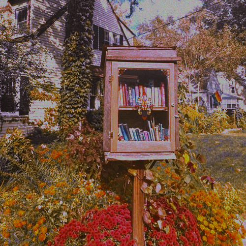
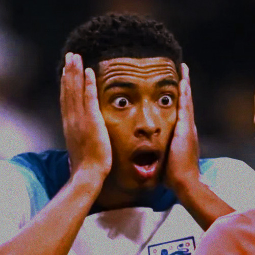
☆ ⠀__ ⠀ .ıllı ⠀ ⁺ ⠀ : ♡ 𓊈 𝒈𝒐𝒐𝒅𝒃𝒚𝒆 𝚋𝚛𝚘𝚠𝚗 𝚎𝚢𝚎𝚜 ִֶָ ☁︎·˚𓊉 ☆ ⠀ .ıllı ⠀ ⁺ ⠀ : ♡
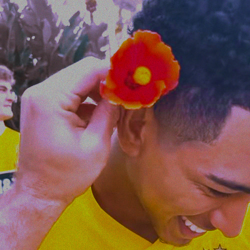
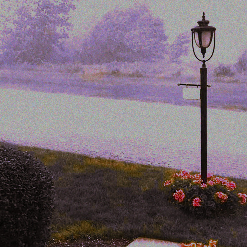
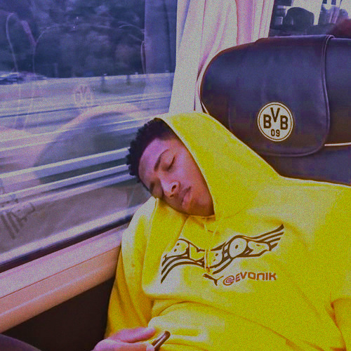
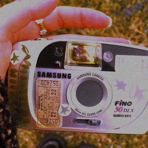
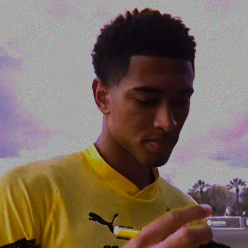
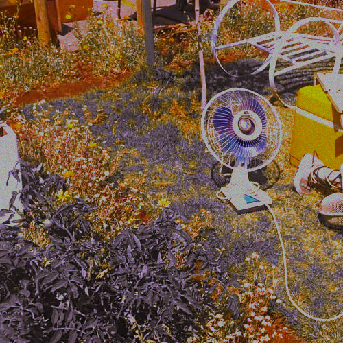

Summer Rain, PSD #024 by Mila
psd
#psd#coloring#psdcoloring#colouring#psd photoshop#icons with psd#photoshop#psd coloring#yellow psd#jude bellingham#yellow moodboard#rain moodboard#summer rain#nature moodboard#nostalgic moodboard#nature core#nature aesthetic#bf material#boyfriend material#<3 blue psd#<3 yellow psd
23 notes
·
View notes
Text
1690s mantua dress

we're back to the sims 4! it's a request-turned-collaboration, which I am pretty happy about, because it was fun.
I am the author of the mesh (9030 polys) and... only 3 swatches. sorry for breaking the immersion, but take a better look:

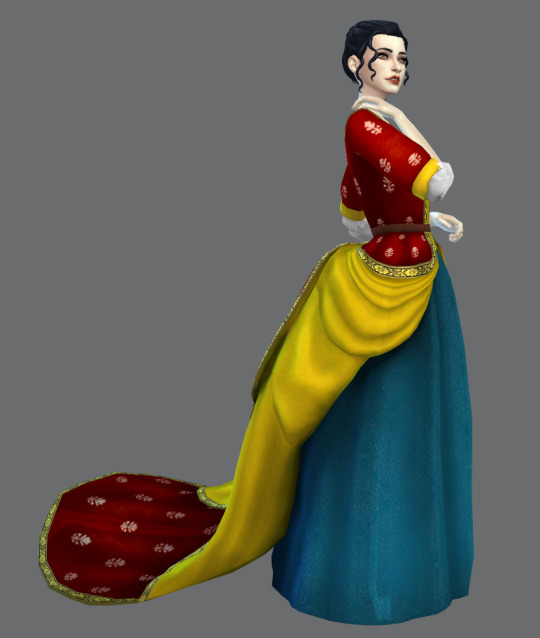
@denerdnr is the author of the idea, the beautiful screenshots and 14 sets of recolors, some of which are featured below (except the two on the last screenshot, these are mine).
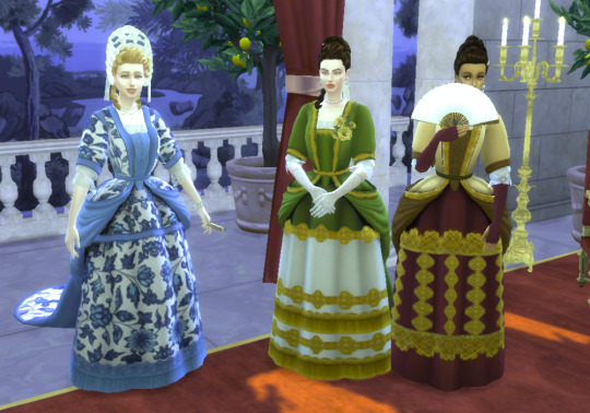
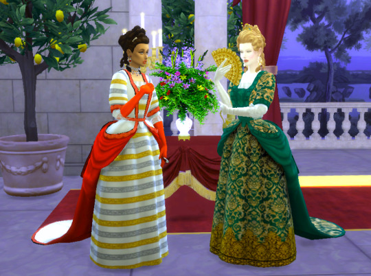


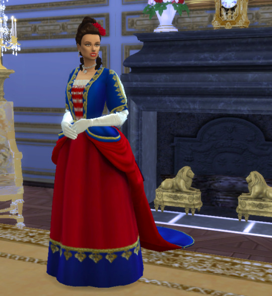
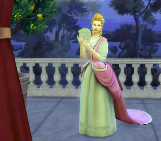
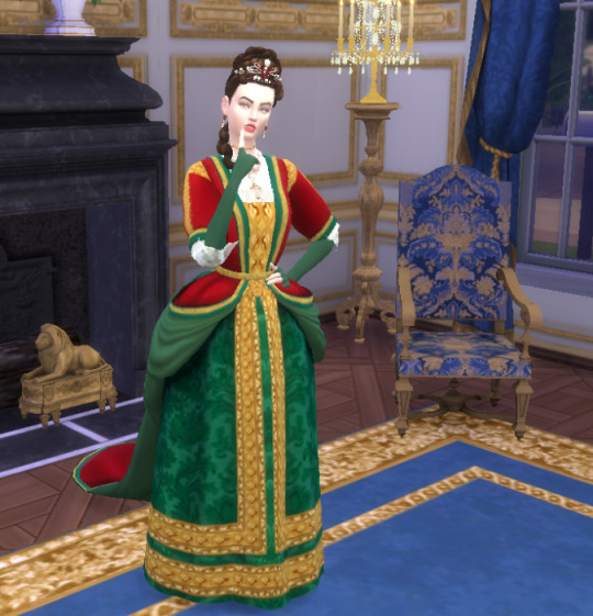

known issues (as always):
some distortion of the central part while moving (you can see that on the CAS screenshot) - can't seem to fix that
this stray polygon I can't get rid of >:( only really visible with the selection outline or if you look very closely on SOME movements, but argh

this mesh has transparent parts and naturally won't look that good if you have transparency turned off. the download links are below, enjoy! ❤️
DL MESH + 3 SWATCHES DL RECOLOR SETS DL PSD if you want to make your own recolors conveniently
CREDITS (again, courtesy of @denerdnr; I converted what I could into at's, the rest are plain text, sorry! some might not be featured in the screenshots I picked, but the exposure doesn't hurt):
hair: @inlovewithregencyera, @javitrulovesims, MM
headpieces: @inlovewithregencyera, @funkyllama, Alin22, @glitterberrysims, @guemarasims, @melonsloth, S-Club LL, @acanthus-sims
make up: @javitrulovesims
jewelry: @flowermilksims, NataliS, @acanthus-sims, @batsfromwesteros, @coloresurbanos, @royaltysimblr, @glitterberrysims, @melonsloth, @mssims, @normalsiim, @redheadsims-cc, S-Club LL
flower: @acanthus-sims
shoes: TheRegalSims
gloves: @helgatisha, Lilyan990, @acanthus-sims, Rosede_1023
hand fans: @kikiw-sims, @sims4-sin-a, Beep
scenarios: @denerdnr, @thegoldensanctuary, @felixandresims, @stereo-91, @thejim07
418 notes
·
View notes
Text

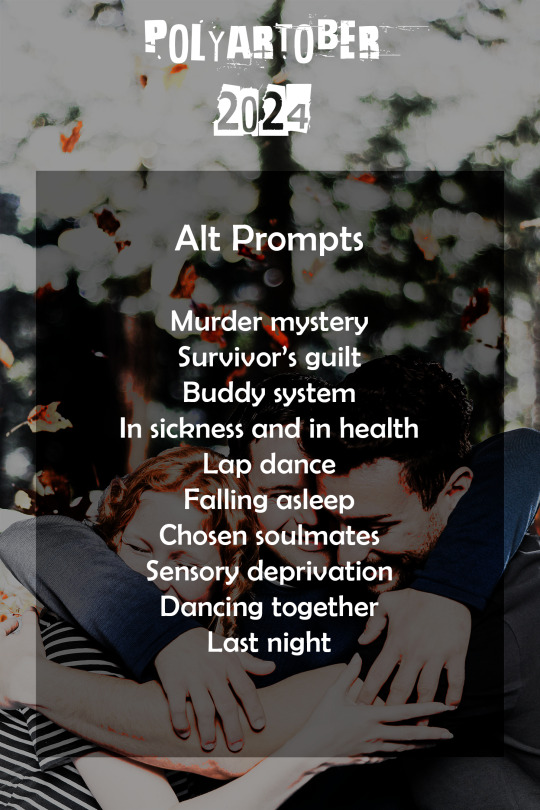
The Polyamships discord server (invite here) is happy to invite you to Polyartober. Inspired by Inktober, but for polyamory, Polyartober brings you 31 daily prompts (+ 10 alt prompts) for October to get you in the creative flow to make more art.
Polyartober rules
1) Make a drawing* of your polyam ship (it doesn’t have to be in ink. Stick figures welcome. Not all characters have to be in the drawing, but the subject of the drawing must be polyam in nature) 2) Post it** 3) Hashtag it with #polyartober and #polyartober24. You can also mention us @polyamships to make sure we see it. 4) Repeat
*So you want to write instead of draw? We created this event focused on artists, but if you feel inspired, please go ahead and create something else: writing, gifs, moodboards, meta, etc. The most important rule is to make it polyam and have fun!
**Please post your work mentioning the fandom and characters somewhere in the post so we can tag it appropriately. Use the character’s name as it appears in canon (this may mean Lastname Firstname for some fandoms) - if they only have a 1 word name please put the fandom in brackets after it e.g. Parker (Leverage).
Feel free to combine this event with any other events that allow it such as whumptober, lyrical titles bingo, ficathons, etc. for an extra challenge.
Please note that since we’ll be running this month-long event, there won’t be a PolyamShippingDay prompt on the 14th October. We’ll be back in November with our regular PSD posting :)
Now we're also on X/Twitter @ polyamships - our X/Twitter Polyartober2024 thread
AO3 COLLECTION (for both art and/or fics)
List of prompts in plain text under the cut.
Prompts
Lovers
Birthday
Dungeon
Bed
Date
Game
Wound
Morning
Comic
Kiss
Shadow
Breakfast
Portrait
Fire
Tentacles
Shower/bath
Shotgunning
Black and White
Extra
Flowers
Luck
Knife
Water
Rope
Autumn
Road trip
Golden
Drinks
Marks
Angst
Costumes
Alt prompts
You don’t like one of the prompts? Feel free to use one of our Multiamory March prompts which you can find here.
You’ve already done all the Multiamory March prompts? Wow, you’re amazing! Here you have 10 extra prompts to get you going:
Murder mystery
Survivor’s guilt
Buddy system
In sickness and in health
Lap dance
Falling asleep
Chosen soulmates
Sensory deprivation
Dancing together
Last night
#polyartober#polyartober24#polyamshipping#OT3#OT4#polyshipping#polyships#poly shipping#poly ships#polyamships#polyam ships#polyamorous shipping#polyamorous ships#polyamory#polyamships prompts#modposts#prompts#polyartober prompts#fandom events
246 notes
·
View notes
Text
ㅤㅤㅤ ㅤㅤ ㅤㅤ ㅤㅤ ㅤ ࣭ ࣪ ֢ 🌹₊ ࣪ ⊹


ㅤ ㅤㅤㅤⒾ ICONS CIEL & SEBASTIAN ☆ BLACK B. (120×120).


— presentinho de natal pra um amigo <3
curta ou reblogue se usar.
créditos não são necessários, porém apreciados ♡︎
psd used: tonespot by mahgi, supershy by colour-source & nature-flavor by oprum.
#ciel phantomhive#sebastian michaelis#black butler#kuroshitsuji#black butler icons#kuroshitsuji icons#spirit icons#social spirit#120x120#icons para spirit#psd icons#icons psd#psd
69 notes
·
View notes
Text
On Gifmaking:
So season 2's coming soon, and I wanna reflect on making gifs ever since I came back to Tumblr. I can't believe it's been 2 years of making gifs for this show!!!!! Look at how large my folder is lmao

And those are JUST gifs lol
Anyways, over time, my style has changed, especially how I color edit Arcane gifs. I kind of strayed away from a stylized filter color into just something that looks a lot more "natural" and works with the original scene.
Initially, I thought I'd save time, but I ended up not using my old arcane preset PSDs and resulted to coloring almost every scene manually. So in the end, it takes even longer to make them HAHAHA. It takes around an hour and a half for me to make a 10 gif set, basically. It also helps that I have a photography background, so coloring/editing is a lot simpler for me.
Here's a lil before and after of a dark scene (hiiiii viiiiiii <3)


Arcane is a REALLY dark show, but it goes for most of TV shows. Many of them are darker and harder to bring up the lights to make stuff look nice as gifs. Some people don't like to color their gifs, and that's okay. I personally just like color edited gifs more.
I've started learning how to upscale scenes myself, so that I have a better resolution and leeway to make things look "HD" more.
If you're wondering why my stuff look so "crisp", it's a combination of the scene's lighting, my sharpening settings on Photoshop and knowing how to upscale everything into 4k resolution. Of course, doing this needs an extremely beefy pc, which I am very lucky to own one.
Here's another before and after of a nicely lit scene. These are much, MUCH easier to do than all the darkly lit scenes because of shadows and lighting (caitlyn kiramman truly the rizzler <3)

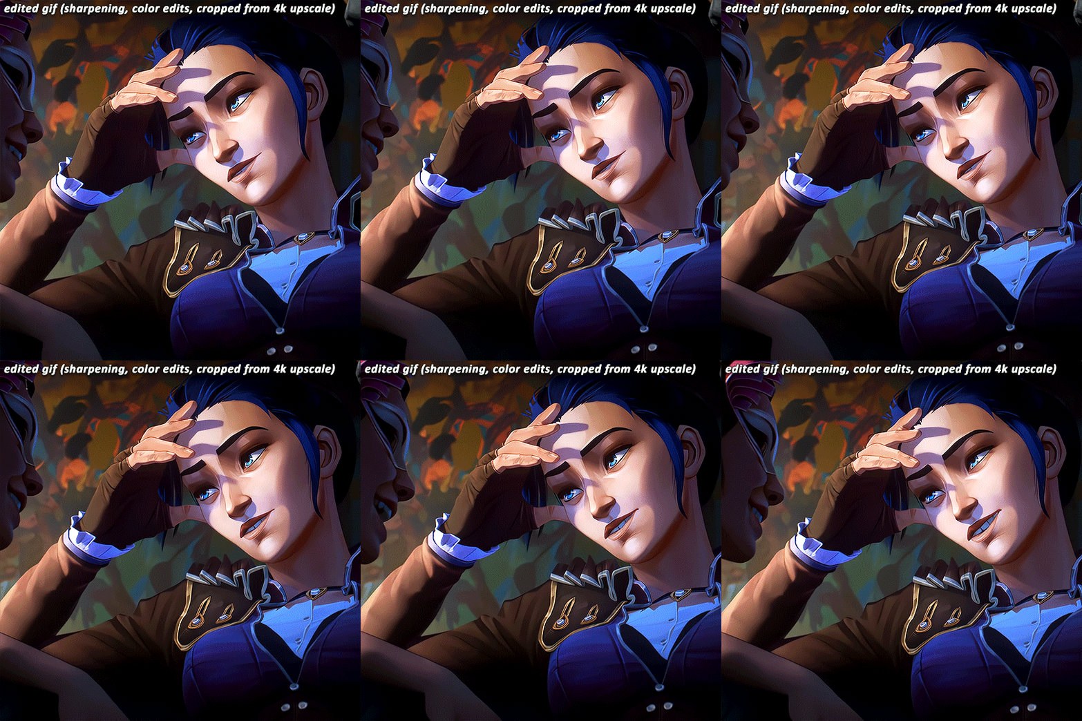
I've been very lucky to be able to essentially take a nice, long break for like a month doing nothing after being so damn busy for the last year and a half, so it's nice that I was able to make a ton of gifs and be chronically online for a short while LMAO.
It's been so fun! But it's time to go back to reality lmao. I closed reqs for a bit because I was just so swamped with them the last few days, and I wanted to gif scenes that I like this time. I've done like 2 weeks worth of gifs. And you will see Vi a lot bc she's on my mind a lot heehee 🥰what can I say, she's such a babe <3
Here's a lil sneak peek, just look at herrrrrrr 🥰🥰🥰 and yeah, 4k upscaled resolution really helps making these tight crops, it's why i never went back to 1080p lol. It's how I’m able to make zoomed in gifs look decent (like the kirammountains gifset lol)

Thank you so much for all the support, likes, reblogs, and the nice tags you guys give. Yes, I can see and read all of them (both the nice and nasty ones lmao). If you have nothing good to say about the characters or my editing style, or anything related to the edit, please I beg you, just write a separate text post about it <3 If you have nothing nice to say, don't say it in my edits.
Lastly, thank you to the people who share my stuff outside the site and credit the blog and link them back here. I see you and appreciate you <3 You guys don't know how much I appreciate shoutouts and link backs, because people stealing my gifs is something that I've dealt with after making them for like a decade.
Tumblr is sadly not what it used to be in the 2013-2015 era. There’s definitely less activity as time goes by, so I appreciate all the people who credit and link back to this sideblog. Unfortunately, there’s more people who just repost them and it gets wayyy much more traction in other soc med sites. Yeah, ofc I get a lil jealous, but eh what can you do 😞 can’t really stop em.
I also don’t like putting watermarks because it personally looks tacky to me, but I understand why other people do it.
Anyways, if you reached at the end of this lil rambling of mine, thank you! I sadly might be busy during November because that's usually busy season, but I'll try to make time for making gifs of Season 2! Thank you and enjoy your stay on this lil sideblog :)
#personal tag#arcane#long post#nothing i just have free time rn and i wanna spend time on it rambling and yes im tagging the public tag lol#goodbye leave hello real life again
113 notes
·
View notes
Text
CLİPART - DRAGON+ (3)

Clipart.tips offers a diverse range of clipart categories to cater to various design needs, including tools clipart. Whether you are working on a DIY project, creating digital content, or designing promotional materials, the tools clipart collection provides a wide array of graphics to enhance your visuals. With over 21 million free and royalty-free clipart images, vector illustrations, stock photos, and fonts available, you can find the perfect tool-themed graphics to elevate your projects.
For those in need of people clipart, Clipart.tips offers a vast selection of high-quality images and graphics. With over 100,000 vectors, stock photos, and PSD files available for free commercial use, the people clipart category provides a rich source of inspiration for various creative projects. From detailed illustrations to digital art and stock illustrations, the people clipart collection on Clipart.tips offers a diverse range of copyright-free options.
Nature clipart enthusiasts can explore a treasure trove of visuals on Clipart.tips, with a dedicated category for nature-themed graphics. Boasting an extensive collection of over 555,900 nature clipart stock illustrations and vector graphics that are royalty-free, this category allows users to discover captivating images of landscapes, flora, fauna, and more. Whether you are looking for scenic views, botanical elements, or wildlife illustrations, the nature clipart section on Clipart.tips offers a plethora of options for your creative projects.
147 notes
·
View notes
Text
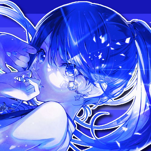
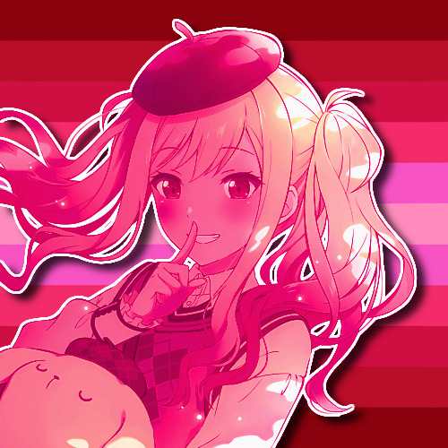
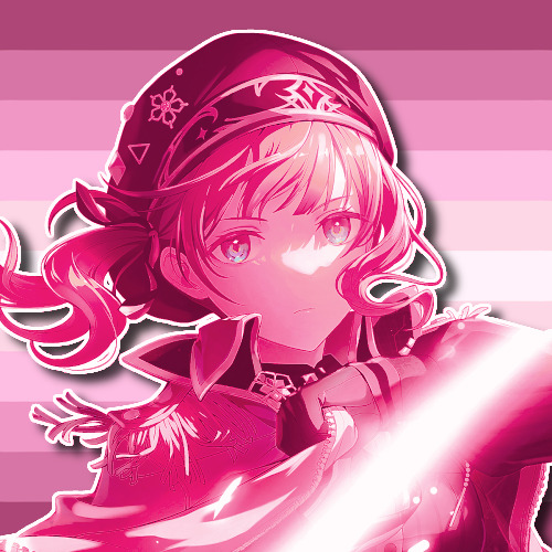

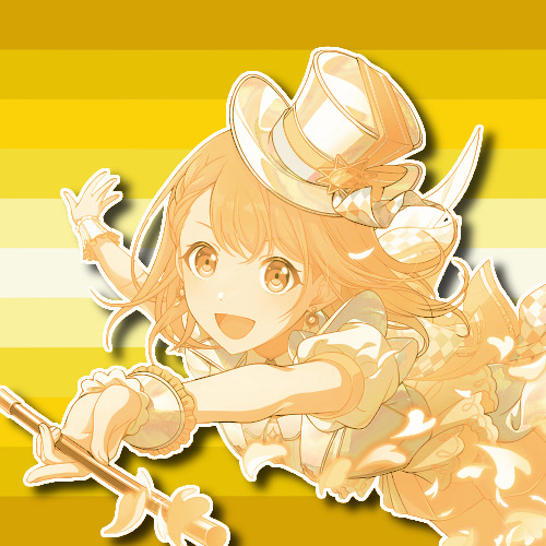

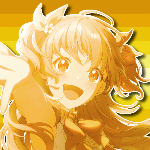
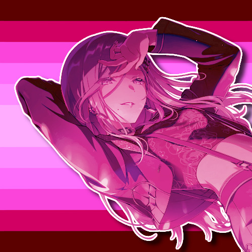

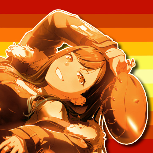

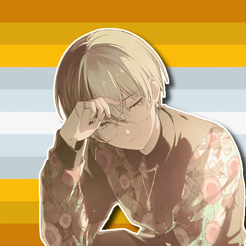


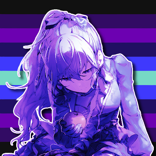

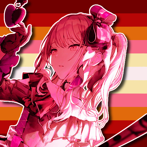
SEKAI Bingo 7 (@sekaitransparents' 1 Year Anniversary Event): silly/funny OR flower meanings.
Chose flower meanings. Reasons for each one under the cut. The PSDs were made to match the flag, which were made based on colors of the flowers (because the original flags repeated the same color palettes and just put the flower on top).
Flags: Bluebellian (Ichika), zinnian (Saki), cireraean (Honami), irisian (Shiho), dandelinian (Minori), dahliaic (Haruka), daffodilian (Airi), lotusean (Shizuku), magnolic (Kohane), chrysanthean (An), sunfleurian (Akito), daisyan (Toya), peonian (Tsukasa), poppyic (Emu), hibiscian (Nene), lavendrian (Rui), hyacinthian (Kanade), pansyean (Mafuyu), marigoldian (Ena), and roseian (Mizuki)
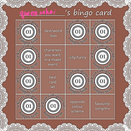
Flower choices (usually when I say "and more," it means there's a negative connotation or one that isn't applicable):
Ichika: Bluebell, meaning loyalty, constancy, humility, and gratitude. Seems self-explanatory.
Saki: Zinnia, meaning thinking of you, remembering absent friends, and sentimentality. Considering Saki's return is what brought Leo/need back together, I thought it fit.
Honami: Cherry blossom, meaning (in Japanese flower language) transience of life, gentleness, and kindness. Seems self-explanatory.
Shiho: Iris, meaning (in general) eloquence, good news, light, faith, valor, wisdom, friendship, and a message. Shiho has (as of 20 November 2024) had two focus events featuring faith in the title, and Leo/need in general is about friendship. Also, White Day knight Shiho card (the 3* from the first set) gives me the valor vibes.
Minori: Dandelion, meaning overcoming hardship, faithfulness, happiness, and more. Minori is basically the poster child for overcoming hardship, given her struggles to become an idol.
Haruka: Dahlia, meaning elegance and dignity, among other things. Seems self-explanatory.
Airi: Daffodil, meaning regard, respect, self-love, and more. A bit more of a stretch, but the respect stood out to me.
Shizuku: Lotus, meaning purity, chastity and elegance, and more. Seems self-explanatory.
Kohane: Magnolia, meaning perseverance, love of nature, and nobility. Following Light Up the Fire, it was a Kohane event that showed Vivid BAD SQUAD persevering in their goal to surpass RAD WEEKEND. And then it was a Kohane event where they did that.
An: Chrysanthemum, meaning (in general) fidelity, optimism, joy and long life, "you're a wonderful friend," rest, and cheerfulness. I saw this and immediately thought Anhane (platonic but could be romantic too). I know she has a sunflower association already, but I used that for...
Akito: Sunflower, meaning adoration, pride, and more. Immediate Akito vibes from this.
Toya: Daisy, meaning (in general) loyal love, gentleness, innocence, purity, fidelity, patient endurance, and more. Tell me this isn't Toya, especially towards VBS and the Tenmas.
Tsukasa: Peony, meaning (in Japanese flower language) masculinity and bravery. I think it fits the new card, okay?
Emu: Poppy, meaning sleep, imagination, fantastic extravagance, and more. Ignoring all the negative connotations that were there, I got wonderhoy vibes.
Nene: Hibiscus, meaning delicate beauty. Nene was hard to come up with one for, so I went with something a bit generic.
Rui: Lavender, meaning love, devotion, and loyalty, among others. Leo/need can't be the only one getting loyalty meanings, alright? He's loyal to WxS and is deeply devoted to them.
Kanade: Hyacinth, meaning (for blue and purple) constancy, grief and sorrow, and, "Please forgive me." Seems self-explanatory given her father.
Mafuyu: Pansy, meaning thoughtfulness, merriment, remembrance, you occupy my thoughts, and, "Think of me." Mafuyu was another difficult one to come up with for, but I do think Kanade (and the rest of Niigo) occupies Mafuyu's thoughts, and Mafuyu can be thoughtful.
Ena: Marigold, meaning pain and grief, jealousy, and more. I know Ena has an association with daffodils, but this screamed Ena between her issues with art, her jealousy towards Mafuyu, and more recently with Where Does the Path of Thorns Go?
Mizuki: Rose, meaning (in general) love, silence, privacy, and conversations held in confidence. I mean... Where Does the Path of Thorns Go? Enough said, I think.
26 notes
·
View notes
Text
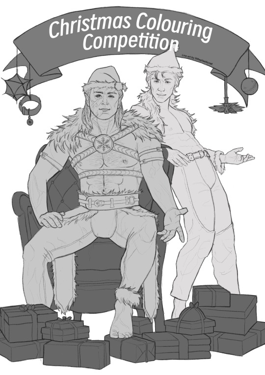
Christmas Colouring Competition
It's time for a Christmas Colouring Competition! Colour these lovely elves traditionally or physically, realistically or psychedelically. You can add your own design to the banner and the gift boxes too :)
The prize is a custom NSFW colouring page featuring your Baldur's Gate 3 blorbos. Please check the bottom of this description for FAQs. Due to the nature of the artwork, only 18+ year-old artists will be considered for the prize.
Here's how to enter:
1. Follow my Tumblr (@littleplasticrat).
2. Download the colouring page/.psd for $0 from my Patreon and just go wild with it.
3. Get your finished art under my eyeballs. Post it somewhere and tag me, DM it to me, print it out and slip it into my pocket while I'm Christmas shopping - it's up to you.
Winner(s) will be announced in early January. I'll also be releasing the NSFW version of this Christmas Elves picture on the Colouring Page Afficionado tier of my Patreon on Christmas Day :) :) :)
Feel free to send me messages about this, and please reblog it to spread the Christmas colouring love 💝
FAQs
What could I win?
The winner will get a custom NSFW drawing of some combination of up to 3 BG3 characters. I prefer Astarion, Halsin, Raphael, Haarlep or Gortash, but my ears are open to your suggestions. No beastiality or underage stuff, and I reserve the right to reject other ideas I just don't dig. We've both got to enjoy the product, no?
I'm an amateur artist and I think my colouring is bad. What do?
You know, what I'm looking for is a certain je ne sais quoi. This quality of intangible BG3 slut culture may be attained through masterful colouring, some extremely cute wrapping paper designs, or something else. Like I said, just go wild!
I love these Elves very much!!!!!
Yeah, me too. My gosh!
#bg3#astarion#halsin#halstarion#astarion x halsin#bg3 fanart#colouring#coloring#my art#christmas colouring competition
139 notes
·
View notes
Text


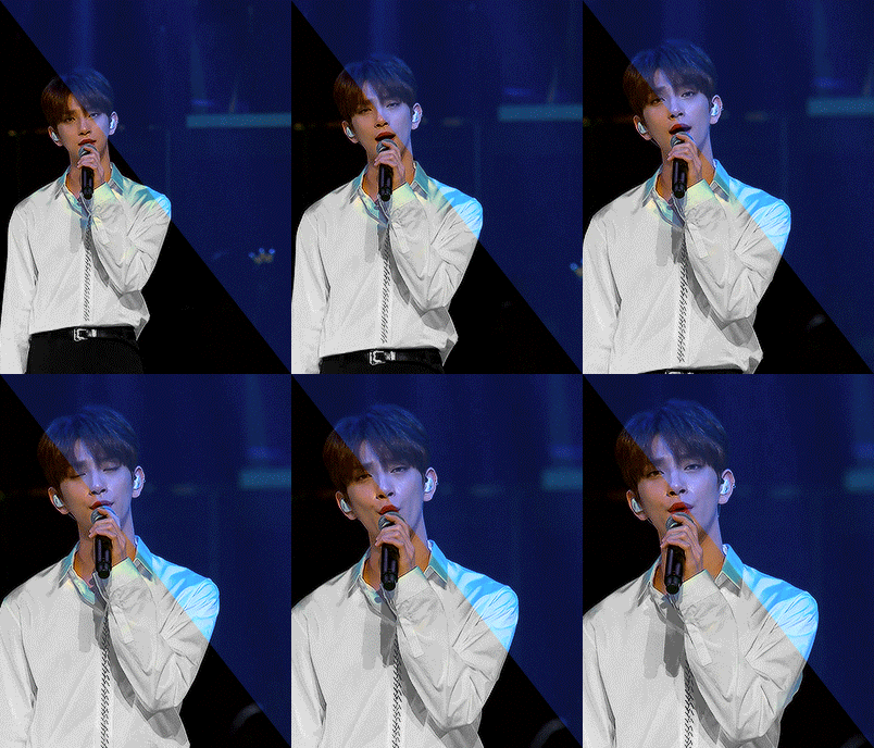
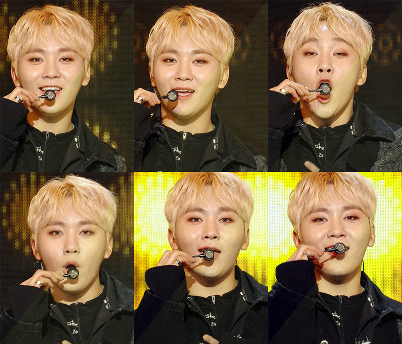
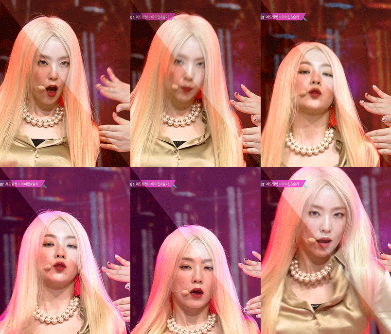
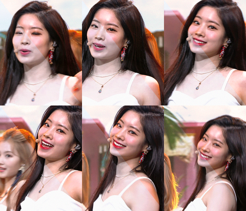


BEFORE & AFTER CHALLENGE 🩵 thanks for tagging me @withyouth <3 i had a lot of fun doing these and i was super interested in seeing how my own colouring process (and gif making process) had changed since the last year and a half, i used to have a really strong aqua/orange hued psd i'd slap on everything and then i was really into blues/reds but now i'm gearing towards more natural colouring and not too strong/contrasty (at least when it comes to kpop but sharpening also plays a role in that) i also really love peachy tones in gifs but i've yet to figure out the perfect way to do that <3
TAGGING 🩵 @reginageorg @muldery @guinevere-pendragons @emilybluntt @fawad-khan @ajusnice @irlvernon @mingyuskim @yeonjune @wenjunhui @lesseraive @sunghanbin @eeunwoo @minzbins @seoksgyu @jeniferhuh @farascha @eddiediaaz @antoniosvivaldi @heybaetae @yenvengerberg @crazy-form @simleez @ahiz @twiceland @facethesuns
#z.psd#2605#this was fun omg but now i have so many files to delete on my laptop <3#tagging so i dont flop ->#userace#heyteo#uservince#heymax#usershreyu#danablr#usermery#usersemily#userzil
71 notes
·
View notes
Note
Hi! Adding this onto a previous question from someone else. For your sims pics of the 4 grouped together, how did you do it? As in, how did you merge them all together so seamlessly? I hope this doesn't annoy you. I'm just hoping to learn from someone that's really good at this 💜
OH i annoyingly deleted the psd but illl do a quick rundown for u <3 and thank u sm <3
i use photoshop 2021!
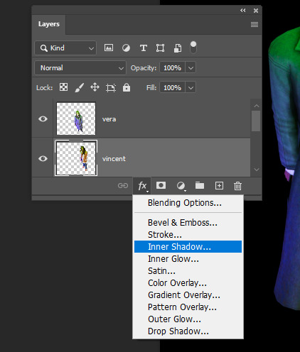
first of all this tool is ur friend (you find it by clicking holding on the magic wand/quick selection tool):

2. then simply draw a box over ur sim like so and it should auto select them:

3. do some manual tweaking withthe lasso/polygonal lasso tool to pick up any bits that were too close the the bg colour
4. then u copy paste them all to a sheet n mess abt with their positioning

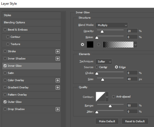
5. then, on each character, I add both an "outer glow" and "inner glow" layer style. (you can copy layer style and paste to the others to avoid having to do it for each sim).
heres my settings for outer glow:

heres my settings for inner glow:
this makes the sims look more natural standing next to eachother

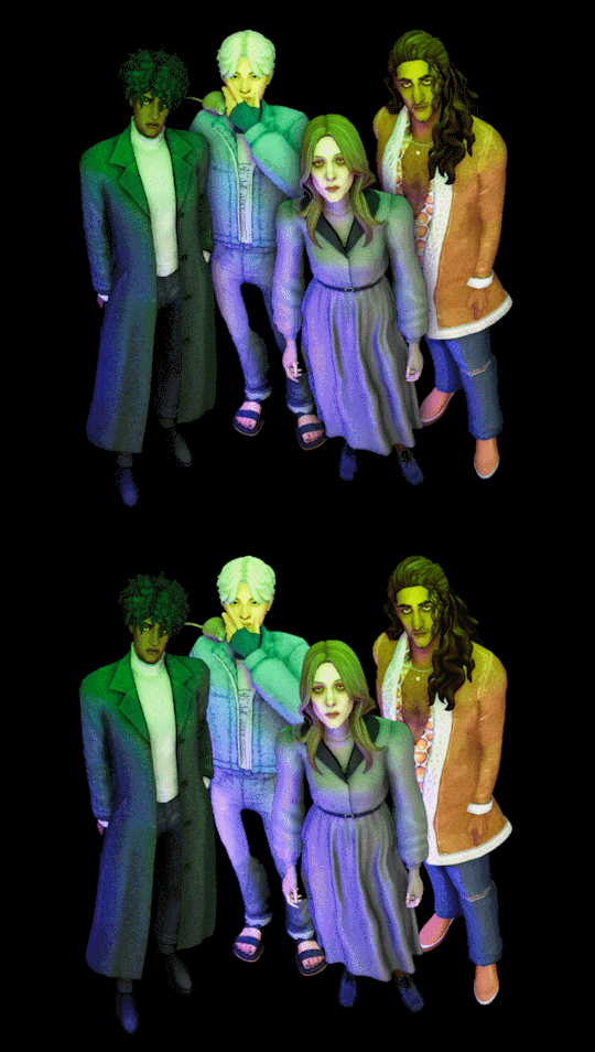
6. then just merge it all together and do any final touchups ie topaz clean or whatever u like to do :)
note: this works better with higher res screenshots so the object select tool has an easier job.
60 notes
·
View notes
Note
🌈⭐️💻🎀🥇🏆🎲
🐝 * ― 𝑺𝑯𝑶𝑼𝑻-𝑶𝑼𝑻𝑺 𝑶𝑭 𝑨𝑾𝑬𝑺𝑶𝑴𝑬𝑵𝑬𝑺𝑺 - Under a cut since there's a LOT <3
🌈 ― aesthetically pleasing blog - @burdenedbyeternity / @magnificoregno ! Sasha makes some of the most stellar graphics and psds ever tbh! I've always been a big fan of his work, and then also his writing is just insanely well done. This is also me lowkey schmoozing to get my commission going (I'm kidding you can take your time for forever <3)
⭐️ ― convincing portrayal of a canon character - can I say ALL of @loreforged's muses??? For real. The amount of fucking WORK Murph put into Aeron ALONE makes my brain go "Oh brrrrrrrrrrrrrrrrrrrrr" when trying to do replies for them. Every muse is so accurate to canon, while also being so uniquely Murph's that my mind is blown constantly.
💻 ― excellent writing - @lvscinvs / @arvkado / @cowboynanami ! When will Em return from war for real? Em's writing has always been super fucking intriguing for me to read, whether it's with me or not or it's muses I know or not. Just so fucking solid all of the time, flows so eloquently, stuns me constantly.
🎀 ― all-around kind person - @swornbones / @godlessrogue ! I've only known Aura for like 5 minutes but if anything happened to him, I'd kill all of you and then myself fr. Other than the emotional support during this trying time (Luka getting traded to the Lakers), the constant ribbing is so much fun and genuine in a way that makes me laugh constantly. I'm keeping my eye on you, kiddo (#affectionate).
🥇 ― well-developed oc - Oh no! More opportunities for me to gush about the love of my life, @ownsdeath ? A travesty for real. Asteria has always been, for YEARS NOW, one of my absolutely favorite OCs to ever see on Tumblr for real. Astra has crafted such beautiful muses in general over the years, including OCs, but Asteria has the most deepest and special place in my heart. If you weren't a Rangers fan, you'd be perfect (not kidding <3).
🏆 ― 10/10 blog, would recommend - @dcviline / @khalesci / all of Mari's blogs tbh. Mari has been a staple on my dash for so long, across my multis in the past to now. One of the first people to welcome me into the F&B/HOTD/ASOIAF RPC back on my multi. I absolutely adore Mari and always will.
🎲 ― random choice ( type @ and a letter and shout out whoever appears first ) - @realmscruelty I had to go with the second because I already shouted out Murph up there AND I have a screenshot so you don't think I cheated. Lexi, Lexi, Lexi, what else can I say about you that I haven't before? The detailed headcanons and thoughts you've put into Jon, Rhaenyra, and Daemon? Plus all the muses on your multi? The way your writing is gorgeous and delightful? The absolute kind nature you have as a person? How hilarious you are? Like if you weren't a Chiefs fan, you'd be perfect (I'm KIDDING I don't have a horse in the NFL yet). Everything you write comes to life in a way that is insane to see. Developing deeper connections with you, whether its with Jace and Daemon or Rhaenyra or Jon even. Or writing BatCat and Reylo??? I love it all so much. Screenshot below for PROOF <3

7 notes
·
View notes
Text
CREATOR GAME TAG - post some of your gifs before and after coloring! - i did all in one cause that is less encoding for me <3


I can't believe I finally got here - I was tagged by @btsjk-biased @rjshope @jkvjimin @cosmicdreamgrl - thank you!
I usually never do these tag games, I never did in the past either (I never save my gif psds and I just didn't want to recreate them because the coloring would change - its literally never the same) but I thought this one time I will give it a go and save some of my gifs and post them in one post. I did make one (just so it can be 6) that wasn’t in any of my recent sets but oh well!
I didn’t want to keep this in my drafts for longer it literally kills me when I have gifs in there!
My coloring is very basic - I do like to keep it or make it as natural as possible because that’s what makes me happy! I envy those who can play with the colours and make unique patterns but thats just not for me! I am happy I developed a kind of style over the years so yeah 💜
I use the same psd for everything (its the best for concert stuff) and I just play around with that so I never work from scratch!!
Thank you all for tagging me! I probably won’t do this kind of tag game ever again but this one time I thought I will do it💜 Not gonna tag anyone cause it’s been going around a while now and I am sure everyone got tagged but thank you for giving me an opportunity for this!!
Love u all💜
#tag game#réka talks#sorry for clogging the dash with this but I literally cant stand having gifs in my drafts
15 notes
·
View notes
Text
ㅤㅤㅤ ㅤㅤ ㅤㅤ ㅤㅤ ㅤ ࣭ ࣪ ֢ 🗣️₊ ࣪ ⊹


ㅤ ㅤㅤㅤ Ⓘ ICONS WALLACE WELLS ☆ SPTO (120×120).


— o escravo do molhinho. amo ele <3
curta ou reblogue se usar.
créditos não são necessários, porém apreciados ♡︎
psd used: tonespot by mahgi, supershy by colour-source & nature-flavor by oprum.
#wallace wells#scott pilgrim takes off#spto#scott pilgrim icons#wallace wells icons#spirit icons#social spirit#120x120#icons para spirit#psd icons#icons psd#psd
68 notes
·
View notes
Text

# 𝐏𝐎𝐒𝐓𝐌𝐎𝐑𝐓𝐈𝐄𝐌 , an independent , selective & crossover friendly RP blog for original companion 𝐊𝐈𝐊𝐈 — Specialization: Reaper, from Dragon Age [ TV ] , Mun & Muse +25 , taxidermied by Fungi [ she/her; they/them ] , heavy topics, gore, potential nsfw warning , personals DNI

𝐋𝐀𝗕 𝐑𝐀𝗕𝗕𝐈𝐓𝐒 : @spitecrow , @fadedmemoria

𝐈. 𝐆𝐔𝐈𝐃𝐄𝐋𝐈𝐍𝐄𝐒 + 𝐌𝐔𝐒𝐄 𝐈𝐍𝐅𝐎. 𝐈𝐈. 𝐑𝐏 𝐏𝐑𝐎𝐌𝐏𝐓𝐒. 𝐈𝐈𝐈. 𝐏𝐑𝐎𝐌𝐎 .

-> blog resources made by @ilithid-psds <-

𝐑𝐔𝐋𝐄𝐒 :
I. Mun ≠ Muse ; I think that much is clear. Any statements that come up ic are not specifically my own. II. No God modding ; Small liberties like change of scene and such are totally fine and do not have to be discussed. You can hurt her, shove her or whatever, just keep in mind that my muse will react accordingly. Do not assume reactions and write my muses actions. III. You can always message me for plotting or headcanons if we are mutuals. ; However, I prefer if things play out naturally. We do not necessarily have to plot out every thread till the end. I am more than happy writing and see how things develop. IV. You can always send a starter, no need to ask! ; Again, if we are mutuals. Same goes for sending me rp prompts to my inbox, memes, or whatnot. You are also free to tag me in dashgames! My prompts have no expiration date. Just make sure you link the post if it was a meme from a while ago (so I do not lose the last bit of sanity) V. OC friendly of course. Just be sure to have a little bit of information ready and visible on your blog, so I can look it up before we interact. We stan OCs in this household. VI. Post trimming. ; I use XKit Rewritten to trim my posts. It is not a MUST, but I would be thankful if you have a way to trim your posts. Just to keep it nice and clean on the dash. Other than that, I use the small text, cursive, bold text edits, colored text and double-spacing. Don't feel like you have to format in order to write with me. I just like having an aesthetic and enjoy going crazy in my posts :3 VII. I won’t write NSFW with minors. Mun or muse. Please make sure to have the age somewhere on your blog before interacting. If smut happens, it will be under 'keep reading'. VIII. Shipping: I am a huge sucker for ships. If said thing happens, keep in mind my muses are multiship, means that every ship takes place in its own universe. I do have to see chemistry between muses tho, let it be through rp or just nerding about them. I would like to have at least a thread or interaction beforehand ♥ IX. No racism, homophobia, transphobia and so on. Don’t be an ass. I can definitely tolerate ic biased opinions on that in threads, just don't bring it into the real world. X. Please refrain from reblogging art you are not involved in. I feel honored people enjoy my silly sketches, I truly do, just please let me remind you that this is still a roleplay blog and having a clustered box is sadly very stressful. If I want my stuff reblogged, you will most likely find it on my art blog @fvngus . You can always ask me beforehand, should you be unsure about reblogging my artwork ♥

5 notes
·
View notes
Text

# 𝐒𝐋𝐄𝐄𝐓𝐊𝐈𝐒𝐒𝐄𝐃 , an independent , selective & crossover friendly RP blog for Dark Urge 𝐄𝐒𝐓𝐄𝐑𝐈 — a frost sorceress & artist from Baldur's Gate 3 , Mun & Muse +21 , composed by Fungi [ she/her; they/them ] , heavy topics, gore, potential nsfw warning , personals DNI

𝗕𝐋𝐎𝐆𝐑𝐎𝐋𝐋: @bloodyarn , @yourfavoritetiefling , @swarmcall 𝐄𝐐𝐔𝐀𝐋𝐒: @zalimbane , @bloodtwin

𝐈. 𝐑𝐏 𝐏𝐑𝐎𝐌𝐏𝐓𝐒 𝐈𝐈. 𝐈𝐍𝐓𝐄𝐑𝐄𝐒𝐓 𝐓𝐑𝐀𝐂𝐊𝐄𝐑 𝐈𝐈𝐈. 𝐖𝐀𝐋𝐋 𝐈𝐕. 𝐋𝐄𝐀𝐆𝐔𝐄 𝐕𝐄𝐑𝐒𝐄

-> blog resources made by @ilithid-psds <-

𝐑𝐔𝐋𝐄𝐒 & 𝐀𝗕𝐎𝐔𝐓 :
[ Hey, I'm Fungi [she/her], 25 years old and living in Germany. [GMT+1] ]
❅ Mun ≠ Muse ; I think that much is clear. Any statements that come up ic are not specifically my own. ❅ No God modding ; Small liberties like change of scene and such are totally fine and do not have to be discussed. You can hurt her, shove her or whatever, just keep in mind that my muse will react accordingly. Do not assume reactions and write my muses actions. ❅ Feel free to continue asks! I will be the last one turning one down. ♥ ❅ You can always message me for plotting or headcanons if we are mutuals. ; However, I prefer if things play out naturally. We do not necesarrily have to plot out every thread till the end. I am more than happy writing and see how things develop. ❅ You can always send a starter, no need to ask! ; Again, if we are mutuals. Same goes for sending me rp prompts to my inbox, memes or whatnot. You are also free to tag me in dashgames! ❅ OC - and Tav friendly of course. Just be sure to have a little bit of information ready and visible on your blog so I can look it up before we interact. We stan OCs in this household. ❅ Post trimming. ; I use XKit Rewritten to trim my posts. It is not a MUST but I would be thankful if you have a way to trim your posts. Just to keep it nice and clean on the dash. Other than that, I use the usual small text, double space, cursive and bold text edits. You do not have to match my writing or editing style, as soon as everything is nicely readable. ❅ I won’t write NSFW with minors. Mun or muse. Please make sure to have the age somewhere on your blog before interacting. If smut happens, it will be tagged and under 'keep reading'. ❅ Shipping: I am a huge sucker for ships. If said thing happens, keep in mind Esteri is multiship, means that every ship takes place in its own universe. I do have to see chemistry between muses tho, let it be through rp or just nerding about them. ❅ No racism, homophobia, transphobia and so on. Don’t be an ass. I can definitely tolerate ic biased opinions on that in threads, just don't bring it into the real world.

ABOUT:
Basics:
Name: Esteri Venla Väisänen Nickname/Alias: Ester , The Dark Urge Age: 34 years Date of Birth: 5th december Gender & Pronouns: female, she/her Orientation: demiromantic, pansexual/romantic Race: human Nationality: baldurian Class: sorcerer [ dragonic bloodline - cold ]
Appearance:
Height: 180 cm / 5'11'' Hair: white Eyes: pale red Scars: none visible Other: several beauty marks all over her body, subtle freckles
Personal:
Positive Traits: • honest • creative • patient • mature
Negative Traits: • snobbish • indifferent • lack of empathy • slightly narcissistic

6 notes
·
View notes
Text
RECOMENDAÇÕES (e especificações)
🌙: AVISO DE POST LONGO! use translator, sorry :(
Olá! Finalmente trouxe um post com recomendações de psd! Esse post vai ter bastante texto, por questões de: eu sou fresco detalhista, esclareço mínimos detalhes que às vezes nem precisa. Todos os icons aqui são de minha autoria, e deixo dito desde já: não sei fazer psd! Eu só invento cor e taco.
Por começarmos, minhas edições tem dois psds como base em quase todos eles, que são bem conhecidos.
vibrum por oprum.
vibrant por neighbourhood-ps.
Esses dois eu uso junto! O vibrant (que tem no pack junto de outros que serão citado) por baixo com poucas opacidade e oprum do jeitinho dele, e às vezes, saturação e mudança de hue, como nos icons aqui embaixo:





Igual os icons de naruto e jibaku shonen! Ou os de kpop que são bem saturados. Quase sempre faço assim, com 3D ocasionalmente. Eles se dão bem praticamente tudo.
filtro 1 por mim.
Aqui já começam minhas loucuras. Eu faço muuuuito psd-não-psd, ou seja, aquela brincadeira com as ferramentas, fazendo minha mente achar bom, em um deles, esse aqui! Uso muitíssimo ele, inclusive usei recentemente. Ele é um blackout louco, fica tudo preto com branco mas ainda tem cor. Eu faço ele funcionar, diminuo a opacidade e por aí. Se dá bem com 3D vermelho-azul.
adendo, embora cabuloso que ele é, com os ajustes fica sussa na pele negra/morena, coloquei os ajustes no psd.


rosinha 1 por mim.
rosinha 2 por mim.
Esses aqui são outras loucuras, uso eles dependendo da foto, eles deixam um rosinha com branco e o outro é só um rosa. Linha de cima, rosinha básica, linha de baixo um rosa com brilho intenso, então fica branco. Eu usava bastante nos meus icons antigos. Obs.: fica bem com ícone da tomie, colorido ou não.



maçã caramelizada por mim.
Auto explicativo. Ou não. Ele deixa tudo chocolate, caramelo, tudo marrom se dá bem com iluminação boa da foto, mas com o ajuste de iluminação certo ele fica bem. 3D após mesclar ícone com as cores.


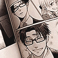
manga por mim.
Vai chegar mais de outros, prometo! Esse eu adoro, deixa meio rosado e é o básico do básico (dois ajustes só), eu amo usar com esse 3D aqui, recomendo. Ele também fica legal com outros estilos sem ser manga + neutro pra escurecer detalhes.
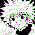
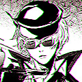

sft por neighbourhood-ps.
anemo por stardustinqs.
Os de jojo! E qualquer outro com essas cores vibrantes! Dá pra se notar, que ele é usado para "vibrar" tudo. Foi qual usei nas headers de jojo postadas aqui no perfil. A PROCURA DE CORES (presente no anemo) muda tudo! Às vezes fica belo e às vezes você diz não. Eu uso eles diminuindo a opacidade. Com 3D bem colocado, xablau.
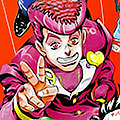

água de arroz por arson1st.
algodão doce por arson1st.
No link tem vários outros dessa pessoa maravilhosamente talentosa (que eu sou fã) mas esses dois são xodós, recomendo muito. No ícone da power coloquei mais saturação (fora do psd). Tão na pasta rosa, e preto e branco.
nature flavor por oprum.
nature por color-source.
cute por neighbourhood-ps.
Respectivamente cada um deles. Eu amo estes e uso bastante, sendo presentes demais nos meus icons antigos.



Eu sofro de dor nas costas intensa, por este motivo, daqui pra baixo são recomendações apenas no link.
blue madness por oprum.
reflections por melino.
icy por chacha (iapetite).
jennie red por dayaze.
peaches and cyan por neighbourhood-ps.
cottagecore by dayaze.
godsddudu por autuunm20.
103 por sttoneds.
É ISSO! *palmas* chegamos ao fim. Eu teria feito mais, porém sou velho acabado, sinônimo de dor nas costas.
Do resto das minhas edições é tudo coisas da minha mente, PORÉM a maioria tenho salvo, então se tiver algum específico (psd) que eu usei em certa imagem, fique livre pra perguntar <3
até~ (acho que ninguém vai notar mas prfvr não façam bully com meu eu bambino na conta do drive)
#helfan post#icons#psd#120x120#spirit icons#soft icons#coloring#messy icons#vampicons#recommendation#recomendações#Photoshop
77 notes
·
View notes