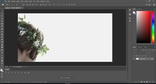
#<- please let me know if i can improve my alt text in any way (:
Explore tagged Tumblr posts
Visit Tumblr Blog
Explore Tumblr blogs with no restrictions, modern design and the best experience.
Last Seen Tumblr Blogs


Fun Fact
The “We are the 99%” Tumblr blog became the slogan for the Occupy Wall Street movement.
Text
Stream Schedule Week of 12/22/24

This week's stream schedule! I'm still raising money for Thankmas for the rest of the month!! You can learn more about Thankmas here, and you can donate to my campaign here. If you donate while I'm not live, please send me a DM to get a tarot reading as thanks. <3
Monday, 1:30 PM: A bit of post-solstice prosperity magic and more Starbound!
Wednesday: No stream, because it's Christmas!
Thursday, 10:00 AM: Adding a couple more cards to my custom oracle deck and free tarot readings to practice with my Normal Tarot decks!
Come check it out over on Twitch!
#aese speaks#twitch#small streamer#variety streamer#tarot stream#witchcraft#thankmas#thankmas2024#id in alt text#<- please let me know if i can improve my alt text in any way (:
9 notes
·
View notes
Text


What if the characters in Ace Attorney all texted each other. Because they're friends. <3
(My alt text descriptions were a little long so I've added the individual text exchanges below, btw if there's any way I can improve my alt text please let me know!)
[id: drawing one shows text history between Maya Fey and Phoenix Wright on Nick's phone, starting with older texts at the top
Maya: ramen? (Nick has given this a thumbs up)
now we see texts from today at 11:37
Maya: Burgers?
Nick: sorry, not today, big case :(
Maya: Aww Nick
Maya: I'll pick it up and bring it over!
Maya: ... can i use your credit card (she punctuates the sentence with a big smiling face emoji) /end id]
[id: drawing two shows text history between Phoenix Wright and Miles Edgeworth on Miles's phone, starting with older texts at the top
Edgeworth: This was a riveting article, I thought it might interest you.
now we see texts from today
Nick sends a screenshot of a twitter post that reads: Lawyers help people get through the worst day of their life. They're good at it because they have experience getting through their own worst day, which just so happens to be every waking day of their existence
Miles: Ha.
Nick: Just one "ha"?
Miles: Not your best work.
Nick sends a frowny face :( /end id]
[id: drawing three shows text history between Miles Edgeworth and Maya Fey on Maya's phone. The text bubbles from Maya here are green as a result of her, an iPhone user texting Miles, a google pixel user. Maya has also sprinkled several emojis into Miles's contact name, the libra scales, the angry face emoji, the shouting emoji, and the clashing swords emoji. They're mid conversation and Miles has sent a text bubble so big we can't read the whole thing.
Miles: -completely unnecessary. Doing a Steel Samurai reboot so soon after the series ended is a foolish decision, everyone will be directly comparing the two from the moment the first episode drops. I don't believe they even have a fresh direction for the show, the only difference will be the cgi. God forbid we rock the boat and follow a new character! It's abundantly clear to me that the studio executives are cowards.
Maya: Oh my gosh, and did you see the new outfits? Maya includes a sobbing emoji
Miles: Oh, don't get me started.
we see three dots at the bottom of the screen indicating that Miles is still typing. /end id]
#LET IT BE KNOWN i don't care about phone brands and the only reason i specified was because i wanted miles to be pretentious and different#i know they all have flip phones in the game but I imagine them existing in the modern day purely because i think maya would love tik tok#also sneaky easter egg... Sanrio charms on mayas phone and sanrio sticker on nick's phone.... she gave it to him#they all care for each other... maya gives nick trinkets and makes sure he eats... miles and maya share their interests together...#nick and miles send things that remind them of each other... love languages my beloved#i'm so glad it's just them that are friends and there isn't a 4th guy who hangs around and causes problems on purpose and rhymes with barry#ace attorney#ace attorney fanart#my art#gyakuten saiban#miles edgeworth#phoenix wright#maya fey#naruhodo ryuichi#mitsurugi reiji
3K notes
·
View notes
Text
this is. so fucking stupid
i put way too much effort into this
edit: picture formatting
transcription/image ID and more under the cut
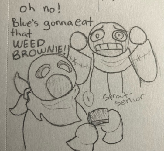
[panel one: Error is looking at blue, who is in the foreground about to eat a brownie with a very wide open mouth, with horror. his hands are on either side of his head.]
Error: oh no! Blue’s gonna eat that WEED BROWNIE!
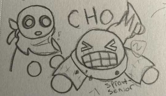
[panel two: Error eats the brownie, accompanied by the word CHOMP. Blue watches with surprise.]
[panel three: Blue is grinning, while Error looks very distressed, holding his hands in front of him.]
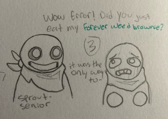
Blue: wow Error! did you just eat my forever weed brownie? [the words forever weed brownie are in green.]
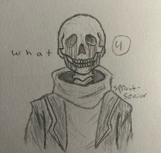
Error: it was the only way to-
[Error cuts himself off, and the next panel displays him looking like a photorealistic skeleton, a vast contrast from the extremely round and simplistic style of the previous panels.]
Error: w h a t [the word what, spaced out for dramatic effect]
[end comic transcription]
anyway yeah i’m getting back into traditional art at least for the time being since i can’t find my damn stylus. this is the first page in my new sketchbook
[image ID: a sketchbook page, featuring several doodles. in the top left, there is a cute bunny man holding up a peace sign, winking, and smiling with his mouth open. he is on a neon orange background, drawn with purple ballpoint pen, with the caption “WAOW!”. next to this, in the top right, is a simplistic drawing of a lavender bush, colored with bright purple and green markers. below the bunny man are three small doodles of various expressions. one looks concerned and a little disgusted, captioned “yeesh”. the second is a somewhat curious looking one with its eyes popping out of its head, captioned “idk”. the third and final expression is a top down view of a face with very large sparkling eyes, captioned “forced to eat cement at age six”. the bottom half of the page features the comic transcribed above, with numbers and arrows clarifying the order of events. end sketchbook page transcription]
one final block of text to round out the post: i’m doing image descriptions/transcriptions now! i gave up on alt text a while ago, because it was such a pain to format and difficult to work with for me, and i forgot that i have free will and can type that information in the actual post. please let me know how i did! accessibility is important to me, so if my descriptions are lacking in any way or could stand to be improved, i would so so appreciate it if you could tell me what to do to improve! thanks!
#utmv#undertale au#utmv art#error sans#swap sans#blueberry sans#error sans art#swap sans art#blueberry sans art#tagging blue as blueberry bc he kinda looks like him in this style#sprouts sketches
48 notes
·
View notes
Text
Harvesters Comic
Part 1 - Pgs. 14, 15, & 16

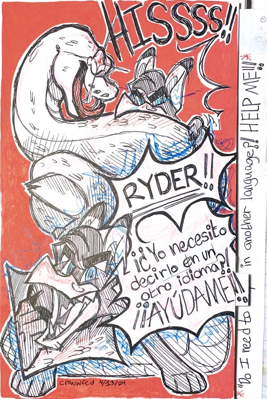
And finally we have the last member of our normal cast! For now, at least!
Edit: 4/16 Grammar correction for Spanish dialogue, uploaded pages again in higher quality
(Translation in Author's Note)
First here!
Previous here!
Next here!
ALT TEXT PROGRESS/DIALOGUE TRANSCRIPTION: WIP
You will find both of these underneath the "ALT TEXT" option on the image uploads above! :) OR a google doc available here!
If there's anything I can do to improve accessibility with my descriptions, please let me know!
Author’s note below…
Note about the Spanish: I'm learning Spanish in college, so this is an easy and fun way to practice! I am not perfect though, so if there are any grammar errors/mistakes, please let me know!
Translation: "Ryder! Do I need to say it in another language?! HELP ME!!"
hope you guys have a good week!
-Moe
#crowwfed#art#traditional art#fantasy#original character#harvesters#oc#mythical creatures#comic#series#oliver#oliver crowley
7 notes
·
View notes
Note
wait, how does one describe an image…
I'm really not the person to be asking this, as I don't require a screen reader. I believe I have a post explaining what little I know... I'm copy pasting the info here.
For good examples, please check out the blog @/accessible-art . They describe art as much as they can, and they would likely give better advice than I would.
If you still would like to hear what I know, here it is:
What I do is try to describe as much of what's in the image as possible without too many words and without adding any subjective opinions. Key details like colors, poses, shapes, styles, and expressions take priority when I describe my own art.
With a text screenshot, make sure to include the name of the person who said it if their name is in the shot, and the source if possible. Double check your transcription.
Also: treat words typed with numbers as letters as though they need an ID, or tag them undescribed. I have seen multiple screen reader users complain about Homestuck quirks.
And: Never fill the alt text with anything but an image description! I have seen so many people complain about that. A picture of a person holding a rock should be "person holding a rock" not "Image 1" or "teehehe let me tell you a pun here!" There's more than one way I've seen people add alt text.
MOST IMPORTANTLY, A DISCLAIMER: I am not someone who needs image descriptions. I am sighted, do not require a screen reader for Tumblr, and usually do not have trouble reading strange or edited fonts. I am not the target audience for an ID, so it would be better to research further if you want your IDs to be good.
I would also like people who are more qualified to correct any unintentional errors in this post. I am also looking to improve my IDs. I wish you the best of luck! Anyone who has better advice, please add on!
(do not use this post to talk about hating image descriptions.)
2 notes
·
View notes
Text
Hey folks, just a heads up -- I've decided to start adding image descriptions to all my screenshots, so people who use screen readers can enjoy this blog too!
I plan to start with my newer posts, and slowly work my way backwards. So it may take me a little bit to get to all of them, but please don't be afraid to let me know if I ever miss any alt text in my future posts!
I am always open to feedback on my alt text and suggestions for how I can improve.
2 notes
·
View notes
Text
Is it an old issue that screen readers etc. can't read the alt text on Tumblr, or is this an ongoing one?
I'm not familiar with screen readers, so I was unaware until I saw it mentioned today and I ask because I've generally switched to including text IDs in alt text on my original posts, but if that's not actually accessible then I'd of course want to switch back or use both.
That said, I'm also not familiar with best practices on writing descriptions, so if there's any other way I can improve what I'm doing, please let me know.
0 notes
Text
making the supernatural fandom more accessible
hey fellow spn fans!! what if we all teamed up to make the spn tumblr experience more accessible?
it sucks that some of the best posts this fandom churns out are completely unreadable to bloggers who use screen readers (or heck, even to people whose wifi sucks so that images never load).
take the amazing scripts that we’re currently so pumped about -- imagine you use a screen reader (if you don’t), and you hear fellow fans going completely feral over content you can’t access. you want to be in on the hype! but you have zero clue why everyone’s screaming about windmills or whatever, because the scripts getting shared are un-captioned screenshots.
...and then there are posts that are just. walls of text! which is really difficult for certain neurodivergent folks to read, such as those with adhd. being aware of that when making original posts (or comments) and adding more paragraph breaks -- and possibly even spicing up the text by bolding important parts, etc. -- is an easy fix for that!
so. here’s my proposal: each one of us commits to whatever level of effort is possible for us (given each person’s unique time, energy, abilities, etc.) in the joint effort to improve accessibility.
Level 1: the ID hunter.
when you go to reblog any spn post that includes images (whether that’s gifs, screenshots, fanart, etc.), check in the notes to see if someone else has added an image description already!
if they have, reblog from them so that the image description spreads further.
"BUT what if someone added the image description before certain commentary was added to the post, and i wanna reblog the post with those extra comments?”
Well, i can’t speak for everyone who creates image descriptions, but i for one don’t care if someone copies & pastes my ID so that they can add it to their own reblog. i don’t care that my blog’s no longer connected to the image description i wrote -- so long as the ID is spread, i’m happy!
Level 2: the copy-paste monster.
when you love another fan’s tags enough to add them to the post -- do so by copy & pasting them, not by screenshotting them!
for your own posts or comments: if you’re sharing, say, a quote from an article or a fanfic or a tweet, do so by copy & pasting the quote instead of taking a screenshot.
if someone else has already shared a screenshot from an article, fanfic, or tweet, and you have a link to the original, do the extra legwork to go to the source, copy and paste, and make an ID.
Level 3: the fandom angel.
If you have the ability, time, and energy to type out image descriptions for spn posts that don’t yet have one, please do it!
If even just a few of us commit to creating even just one ID per day each, that will add up!
And, of course, if you’re making your own post, give it an ID right there in the original posting, if you’re able! I understand that not everyone has the spoons (/time/energy/ability) to do this, and that’s okay. But those who can, please do!
Tumblr now allows you to put alt text on images, so you can do it that way or the old-fashioned way of just including your image description in the text of the post.
Not sure how to write an image description? This post offers some truly comprehensive advice on how to write IDs for various types of content, from photos to fanart to charts to screenshots of text.
By the way, I’ve seen folks ask that you don’t put the ID under a readmore. Keep it easy to access!
Nervous that you’re not gonna write an ID right? First off, practice makes perfect -- you’ll improve with time. I’m pretty sure that an imperfect or incomplete ID is better than no ID at all -- hopefully someone else will come along to reblog with any necessary corrections to whatever ID you write!
Level 4: the man of letters (gn).
You’re going above and beyond what this post advises -- you’re also out there coming up with and implementing other ways to improve accessibility!
Maybe you’re a blogger who uses a screen reader yourself, with more you want to add to this post from your own experience.
Maybe you’ll choose to seek out bloggers who use screen readers themselves -- or who have other accessibility needs -- so you can learn straight from them what their needs are.
Maybe it’s something else! I don’t know, but I do know this post is incomplete -- so please, share your ideas for other ways we can all work together to improve our fandom.
None of us has to do everything, but most of us can do something. If enough of us take even just small steps, we can create a more accessible fandom. Who’s with me?
If you’re in, please reblog this post so word can spread!
(I’m closing this by tagging some bloggers whom i’m hoping might be interested in helping me spread this around, because i am Not A Big Name in this fandom and can’t do it by myself! Let me know if you want me to un-tag you.)
@sunforgrace @castiellesbian @plantdadcas @jenderstudies @youchangedmedean @meadowdean @winchestersingerautorepair @phoebenatural @steveyockey @bedlund @seraphcastiel @marcusantonius @marynatural @redwing @t4tdeanwinchester @spn-brainrot @lobotomycas @samdyke @deanwinchesterforbatman2k21 @themanwhowouldbefruit @4x01 @thatisahotsoup
436 notes
·
View notes
Text
How to add GIF overlays to your edits (Photoshop)

this is a remake of the tutorial I posted around this time last year at an anon request. since then my editing skills have definitely improved so I hope you find this useful! this is a fairly beginner’s explanation of how to use Photoshop to put gif overlays on your edits.
** please remember that you don’t need to pay for a program like Photoshop to create edits and there are many alternatives! If you have any questions about this tutorial let me know, I will do my best to answer. I’m far from an experienced Photoshop user and there are plenty of ways to putting gif overlays on still images, this is just my personal method! When writing this tutorial, I mostly had the writeblr community in mind, but it should work for fan edits and so on.
tutorial below ↴
basic photoshop commands:
ctrl+c = copy
ctrl+v = paste
ctrl+z = undo
ctrl+alt+a = select all frames
1. find your image & gif overlay
This is the easiest step, so get excited! Finding an image should be simple enough and definitely depends on whatever you’re actually trying to make an edit for. Pinterest is the classic choice, but there are plenty of alternatives! As high quality as you can find is best. It doesn’t matter what size your image is or, if you have multiple images, if they’re different sizes - this will be fixed later.
In terms of gif overlays, you can find them through a simple google search, but I personally recommend two excellent gif overlay packs, found here and here. There are a number of different styles - snow, stars, sparkle, smoke, tv static, etc. that should suit your needs!
Bonus: particularly if you’re making a multi-image edit, you might want to use recolouring psds to create uniformity between them. I personally recommend castor over at @pilipalette for these (and for heaps of other incredible & simple psds you can use for edits if you’re a writeblr!).
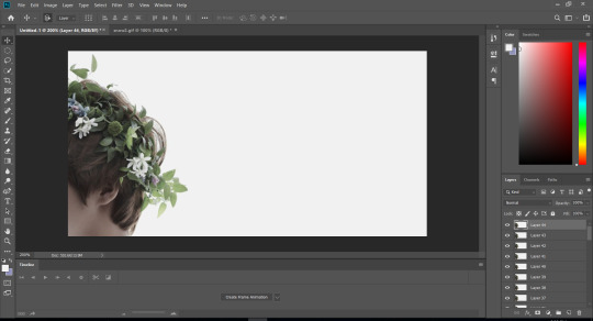
2. open a new canvas in photoshop
It’s up to use to choose the size and shape of your canvas, which will be the size of the finished edit at the end regardless of the size of your image or gif. Be aware of tumblr’s file size restrictions and what will look best on your dash. To prepare for making gifs, click Window > Timeline.
3. paste your image & open your gif
Copy and paste your image onto your blank canvas, resizing it through Edit > Free Transform to fit how you like. Then, in the sidebar when your layers are, left-click the top layer (your image) and choose Merge Down to combine the image layer with your base canvas. Note: if you would like to add text to your edit, now is the time! Merge text down by left-clicking the layer, choosing Convert to Smart Object and then Merge Down.
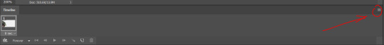
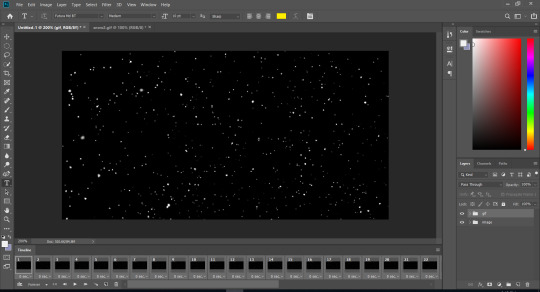
Ok, cool, we have our image almost ready. Now, open your gif in Photoshop. When it opens, you’ll see it separates into a certain number of layers and frames (which are in the timeline at the bottom). It’s important you pay attention to what this number is as it is the number of frames that’ll be in your final gif.
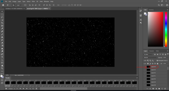
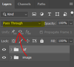
As you can see, my gif has 44 layers and frames. You’ll notice that overlay gifs generally have pure black or white backgrounds - this is intentional and we will remove it later! I’m now going to select the top layer in the sidebar, scroll to the bottom and then shift+click the bottom layer. This will select all of the layers. At the top of the window, choose Layer > Group Layers. This will put all the layers in a folder, which you can name “gif” or something like that.
4. let’s get the same number of image frames
Alright, let’s swap back to our image project! Here’s what’s going on:
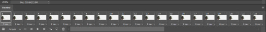
This is the key for the next step: we need to have the same number of frames of our image as our gif. Click on your layer over there in the layer sidebar, copy (ctrl+c) it and then paste it using ctrl+shift+v until you have that same number of layers as frames in your gif. For me, this is 44:
Now, down in our Timeline at the bottom of the window, there should be a little box with a drop-down menu. Select and click on Create Frame Animation. You’ll start off with only one frame. Click on the three little lines in the corner of the Timeline window (shown below) and choose Make Frames From Layers.
Ok, that looks better, doesn’t it? Check sure you have the same amount of frames here as you did in your gif (for me, 44).
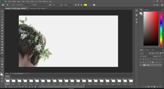
The final part of this step is grouping the layers, like we did with the gif. Select all the layers then go to Layer > Group Layers. Name it “image” or similar.
5. time to bring these bad boys together
This step is the most technical, so pay careful attention.
Go back to your gif, click the three little lines like we did before, but this time choose Select All Frames. Click again and choose Copy Frames.
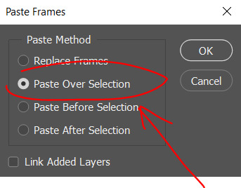
Swap over to your image, click the three little lines, choose Select All Frames. Click again and choose Paste Frames. This window will pop up, you will need to choose Paste Over Selection. If you’ve done this right, things will work out!
Here’s how we’re looking now, with our gif covering up our images. If your gif is the wrong size for your canvas, you can resize it through the Edit > Free Transform method we used earlier.
6. the almost final step
In the layer sidebar, see this little drop-down menu? Make sure you’ve selected your gif folder in the sidebar, click this little drop-down menu and choose an appropriate setting to remove the background of your gif. Lighten will work for black backgrounds, Darken for white backgrounds... but I’ll be using Screen. You can hover over all the options to see which one will work best for your gif.

Hey, look at that! The background’s disappeared, leaving us with the gif overlay on top of the image. You can press the play button in the Timeline window to watch your gif play and see if it’s alright. If you’d like to add a recolouring psd, now’s the time! If you don’t want to the psd to also affect the gif, move the psd folder below the gif, but still above the image!
7. export your gif
You can’t just Save As your gif as a gif for it to work, unfortunately. At the top of your window, click File > Export > Save for Web (Legacy). A new window will pop up.
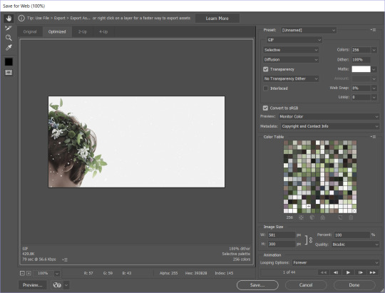
Review your gif and make sure it plays right. In the bottom right-hand corner, make sure Looping Options is set to Forever. Then, just choose Save... and save it wherever you’d like!

Hooray! There’s our edit! And a quick example of one that I’ve recoloured using a psd from the lovely @pilipalette that you can find here.
I hope this was helpful! Remember this is only the beginning, and it’s okay if things are messing up. Photoshop takes time to get used to. Always feel free to message me if you need help - I’m not an expert but I will always do my best to help. Particularly if there’s anything that needs clarification in this tutorial, don’t hesitate to contact me be ask or message.
#writeblr#photoshop#photoshop tutorial#writing community#editing#*mine#i did my best to make this as easy to follow as i could!!#pleasepleasplease let me know if you need help with anything in here#anything at all!!#also yeah the images are blurry but it's okay it won't affect anything#i wrote this entire thing in one night so i guarantee there are mistakes#but i did my best!!
494 notes
·
View notes
Text
Stream Schedule - Week of 12/15/24

I'm streaming all week to raise money for Thankmas over on Twitch! You can learn more about Thankmas here, and you can donate to my campaign here! If you donate while I'm not live, please send me a DM to get a free tarot reading as thanks. <3
Monday is more cookie decorating and a cozy video game -- chat's choice! Folks who donate to the Thankmas fundraiser get to pick a cookie and have it decorated exactly the way they want.
Wednesday is the Cozy Chaos Variety Wheel! What's going to happen? The Wheel decides!! From finding a random free game on Steam and playing it to one of several silly dating sims in my library to Foodguessr to free tarot to chat's choice... Donators get to add whatever they want to my stream screen. That's right: Anything. Cat cam, pictures, memes, gifs, anything.
And Thursday is tarot day! Free one-card pulls for everyone, three-card pulls for anyone who donates. Plus other tarot-related activities, like shitty MS Paint tarot design (donators get to request a card, real or fake, for me to badly draw) and pictionary (guess what I'm drawing badly) and maybe a review of the Normal Tarot if it arrives!
This should hopefully be my Official New Schedule (tm)!! I hope to see you there! (:
#aese speaks#twitch#small streamer#variety streamer#tarot stream#witchcraft#thankmas#thankmas2024#id in alt text#<- please let me know if i can improve my alt text in any way (:
8 notes
·
View notes
Text
Powerpuff Girls 2016 - The Top Title Cards
One of the artistic choices the show makes is its use of unique title cards. On one hand, the reboot's title cards lack the punch of the original's. The original had the Powerpuff Girls flying, making. In the reboot, it's lumpy text with some drawings surrounding it with some soft ambient techno over it. On the other hand, the reboot lacks the punch of the original, so they fit perfectly.
One improvement I can see with these title cards is the variety. The originals do not have pictures, it's just white text on black background. The reboot has these works of art for each episode. I don't hate the original's title cards, far from it, but I couldn't rank them. Just for fun, I’m going to rank my top favorite title cards of PPG 2016. These will be ranked based on if they fit their episode and whether or not they look great.
10. The Trouble With Bubbles
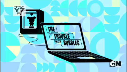
Out of all the Bubbles coding episodes, this is my favorite one. While the title is actually kind of generic, it does show that this is an episode where Bubbles codes a clone of herself and prints it with a 3D printer. The title is even laid out in a way similar to Scratch, a beginner's programming language that the Powerpuff Girls even had a tie-in with at one point. It's a little more literal than something abstract or symbolic, but it works.
9. The Secret Life of Blossom Powerpuff
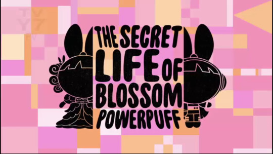
Yes, they actually believed that the Powerpuff Girls' last name should be Powerpuff in Season 1. Let's ignore that, as that's one of the few aspects they did change their mind on in Season 2. I like this effect of Blossom getting split into two different versions of herself, one in a Victorian dress, and the other as an astronaut. This does perfectly show what this episode is going to be about: Blossom imagining herself as different versions of herself much like Walter Mitty.
They had to leave out one Blossom for this title to look good. Honestly, I would have went with the breakdancer Blossom, as it would have been a contrast between the elegant Victorian Blossom. The astronaut Blossom still works as a "Past vs. Future" contrast, and the cynic in me also notes that they are also the low points of the episode.
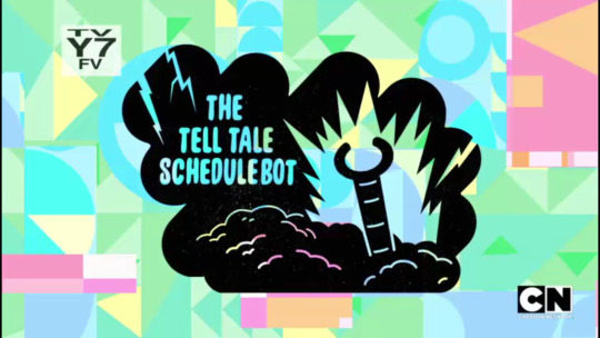
8. The Tell Tale Schedulebot
Maybe I'm going for more of how it looks rather than what it represents. The title references a horror story, and, while it's not exactly a reference to the original story, the title card represents a horror theme. Yes, Schedulebot seemingly rises from the dead in one of the very, very few times they referenced plots from previous episodes, and the title card shows it as this zombie rising from the dead. They put this title card in this artsy cloud-esque smudge, with lightning inside of it, which adds to the effect.
7. Once Upon A Townsville
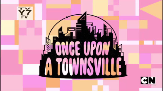
The episode's idea is that it's a Disney-esque princess in a modern day world. I did not get this at first, thinking this was just a generic city. I didn't even notice the little circle around it, which is supposed to represent that part of the logo where Tinkerbell flies around the Disney castle in an arc.
I think the less said about Once Upon A Townsville, the better, so let's move on.
6. Save The Date
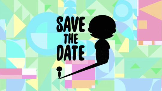
Not all of my favorite title cards are graphically complex, as this one is pretty simple: just Ms. Keane and a really, really big shadow. The obvious meaning comes from how Ms. Keane turns into a giant in this episode. I can't help but see another meaning in this, referring to the other plot of the episode that is intertwined with.
Ms. Keane is on her first date with some random dude, and she is not confident about it. She can't walk in high heels, she has a zit that we thankfully never get to see, and she's late! Maybe I'm looking too deep into this, but I'll still rank it this high.
5. Breaking Bliss
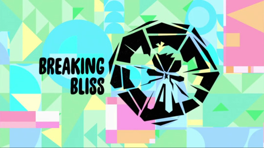
Also known as part four of the Power of Four, which is actually five parts long. Each part of the Power of Four has a standalone version, complete with its own unique title card. This is the only special to get this treatment; Small World just uses that magic hat for every episode. Outside of Find Your Bliss, which just has the title on 3D glasses, they're all pretty good. I even like Bliss Reminisce's title card, with. I decided to choose only one, and it was a tough pick between this one and Blisstersweet Symphony.
In the end, I went with this one, which is a good representation of the episode. Bliss is utterly broken inside in this episode, and the title card puts that in a symbolic way that looks aesthetically pleasing. The only real problem with this one is that the text seems to be put as an afterthought. Granted, this title card never aired on US TV; Power of Four only aired as a special, and that only came with a rather generic title card of four Powerpuff Girls flying.
4. Power Up Puff
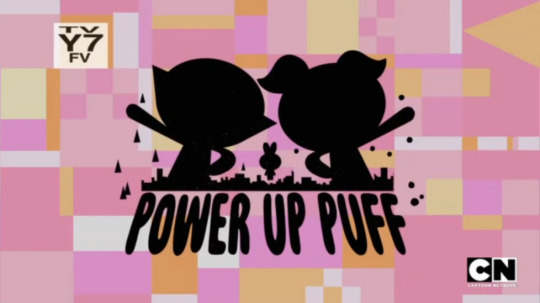
Rather than outright showing the aura powers that were the star attraction to this episode, this episode focuses more on how Blossom seems to be overshadowed by her sisters. I do like the idea behind this one; Blossom is just way in the background while her sisters do these poses.
I will say the drawing is a bit awkward here. They forgot Buttercup's all-important cowlick, which is shockingly common in title cards. so it's a little bit lower than another episode that has a similar idea.
3. Bubbles The Blue

Well, this episode seems to rank high in any PPG 2016 list I would make. Bubbles is sitting down, looking sad, while her sisters are very tiny. I would say it represents their understanding of the episode's situation, and not in a way that can be blamed on bad writing. This episode's title card is very similar to the last entry in this list. Honestly, I would have had this in a tie.
Also, they actually remembered Bubbles' pigtail bubbles. That doesn't look like Blossom or Buttercup, though. That looks like a wrapped peppermint and one of those Ring Pops. I can still see what they were doing there.
2. Can't Buy Love
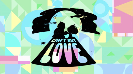
One of the more artsy title cards. They could have just had a cupcake, but instead, we get this romantic shot under the moonlight. One may have to ignore the participants here. If it is your thing, that's fine, but I don't think a lot of people would have wanted BarryBucks. The joke is that's the case even in-universe.
This episode is about Princess believing this fantasy this title card seems to portray. Everyone else around her isn't even aware of this, including the hunk-in-her-eyes-and-only-her-eyes Barry. Since this episode is from her perspective, the title card decides to use a shot from her perspective.
1. Salamander
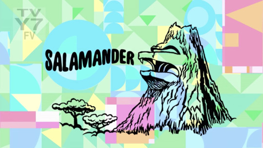
There's absolutely no way this title card wouldn't be #1. Just look at that volcano's majesty. The detailed lines, those two trees that give the title card more body, and that sculpt of the villain's face. This volcano lair looks like something straight out of those 80's cartoons with the over-the-top bad guys, which is exactly what they were going for with this episode's lead villain. This one is a work of art, plain and simple.
I'm not going to do a Bottom 10, because most of the bad title cards can be summed up as "yup, that's an X", with maybe some text put in as an afterthought. I will do a bottom 3, though.
3. Man Up 3: The Good, The Bad, and the Manly
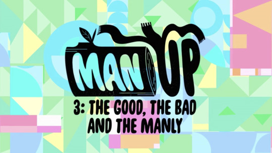
One thing I didn't really notice is that they did remove the wacky inflatable tube man from the second Man Up. They didn't do it for this one. Man Up 4 at least had a different title card. Sure, it's just a strawberry, a reference to a plot that rarely even appears in the episode, but it's better than reusing the same log and tube man again and again.
The biggest flaw with this one besides the reuse is a similar problem the second one had: this title card doesn't convey Man Up 3 to me. It's just Man Up, with some really tiny fine print that says it is the third one.
2. Odd Bubbles Out
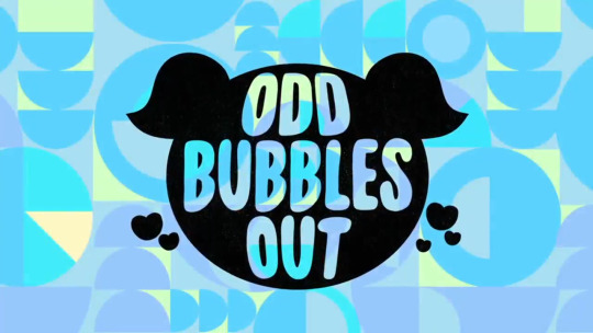
It's a Bubbles head surrounded by hearts, which has basically nothing to do with this episode, as Bubbles, surprisingly, never really got a love interest. Maybe it's supposed to represent the love of her friendship with Donny and only Donny that depends on his friendship with Bubbles and only Bubbles, but that's a stretch.
Also...Odd Bubbles Out? I know I'm judging these title cards based on their artwork rather than their titles, but that has to be addressed. It's a play on being the Odd One Out, which is certainly what's happening in this episode, but I can't even consider it a pun.
1. The Bubbles-Sitters Club
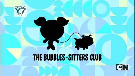
It just looks like a screenshot they put a sillohuette on. If they couldn't even bother to make the text not look like something they just slapped on at the last second, why should I put more effort in describing it?
Next week, I'm going to dedicate Saturdays to DuckTales 2017 reviews, since that show is returning. Just one per week; as much as I want to review them quickly, I'd rather not have another hiatus. I also need the time for college. See you soon!
2 notes
·
View notes
Text
004. Self Care: Mental Health v Emotional Health

Yes. There is a difference.
Mental health encompasses psychological, social, and emotional health - your thoughts, your actions. Symptoms of a mental health problem may include changes to your mood, sleeping patterns, appetite, and chemical dependencies - like alcohol or drugs. It can also be earmarked by a lack of energy.
Emotional health, while a part of mental health is an acknowledgement of your emotions, and how we manage and express those emotions in an appropriate manner. Symptoms of an emotional health problem may include outbursts, over- or under-reacting to various stimuli, and the inability to handle small tasks.
Mental health is where we process information.
Emotional health is how we express the emotions that arise in answer to that process.
The functioning of the brain versus the functioning of the emotions.
You CAN have a hard time with one and the other is fine. You can process information just fine and still have a poor emotional response. You can have the lack of energy that mental stress hands out, but still find the strength emotionally focus on all your tasks for the day. Feelings of sadness or anxiety can be perfectly healthy emotions that cause us to act & react, and protect us from being unprepared.
They are not inclusive. They are not exclusive. They work best together when they are in balance.
While there are medical treatments if one or both are out of balance, I won’t be discussing that here. However, I will say this: If you feel you do have a problem, do not be afraid or ashamed of going to your medical professional for help. Those feelings are likely being caused by those imbalances! You owe it to yourself, no one else, to be your best emotionally & mentally. Please get the help you need.
So, where’s the self-care? What’s this got to do with polyamory?
The Roles of Mental & Emotional Health in Polyamory
I’ll use myself as an example.
I am inherently a believer what is called emotional fidelity. (But you had a girlfriend! A triad! Yes, some shit sneaks up on you. I gladly made that work. I have the ability to maybe date/love again. I currently choose not to. Let’s move on.)
I am inherently emotionally monogamous. What this means is that I can agree with “love one person” and also have ethically non-monogamous sexual relationships with other partners. I also have zero problems with my husband doing the same. I do not feel that polyamory is wrong. I do not feel that emotional monogamy is the one correct way to love. It’s just my personal default setting. That isn’t what this post is about, but I hope it explains some of my emotional thought processes I’ll talk about. It also may help polyamorous partners of monogamous people (mono/poly relationships) understand that thought process a little.
The role of mental health in polyamory is about understanding the FACT of polyamory.
I understand polyamory. I used to say I could write a textbook, but now I’ll just say, I CAN WRITE A BLOG ABOUT IT! In those encompassing mental things mentioned above: I can psychologically understand polyamory. I can see the social aspects of polyamory and how it logistically works and, yes, even benefits society. The FACT is that my husband, partner of 18 years, is polyamorous.
The role of emotional health in polyamory is about PROCESSING all of those facts in an appropriate and healthy way.
It still hurts me a little when he feels deeply for someone else. It also feels amazing, and I love seeing his happiness. It still stings when I can’t depend on him being there every time I turn around. But it feels freeing when he’s not up my behind! LOL! It is still difficult for me to separate my emotions from “You’re my one” and “I’m his one of”.
Mentally, I get it. I am not less than one. They are not less than ones. We are all one of a whole.
Emotionally, there is a... ugh I don’t know. It’s a feeling that I can’t explain. You know that feeling when you’re watching the sad puppy commercial? It’s not your puppy. No one’s gonna take your puppy. But it makes you want to cry anyway? That’s what I feel when I HEAR new news about his polyamorous life. I usually have a startled reaction that shows in my body language that I just. can’t. prevent. Then he’ll hold me to remind me that it’s ok to feel my way, and it’s ok to feel his way. Then I start to relax.
Put me in a situation with them and I get to SEE his polyamorous life, and I feel that exact way for about 30-60 seconds. Sometimes he notices and pulls me in for a quick kiss or rubs my hand… just a reconnect. Then I carry on with whatever is going on. I might occasionally feel like a 5th wheel on a wagon for short bursts, but that usually happens when I have to interrupt their conversation for any reason or occasionally if they’re talking about something cool they did that I didn’t get to do…then I continue with whatever is going on and I’m fine.
I’ve unfortunately never had to face a first date. (Yeah, things have been different with us.) But, I have had to face giving him time to have a private conversation or alone time with a partner (phone, text, messenger, sex, etc). With each new partner, especially when it’s new and he’s having NRE, I have that puppy commercial feeling again. I may or may not cry. He’s having his conversation, and I don’t get to lean on him to make it easier. But I know he’ll be back. Sometimes I’m 100% before he gets back. Sometimes I’m only 50% or 90%. By the way, 90% is the worst. He’ll come back, see the puppy commercial on me, hug me, and bam... waterworks… jerk. Sometimes it sucks when they can read you like a book LOL!
I can only imagine I’ll feel the same way on a first date. The difference in a date is that I will not see or hear what is going on. I will not have that touch or reassurance during or immediately afterwards, and maybe not even that night or that day or that week. I will be responsible for that reassurance and caring for my own emotional responses.
That is self-care.
How to Self-Care & Why It Helps
Self-care is any activity that we deliberately do to care for our emotional, mental, and/or physical well-being. It is also something we frequently overlook. With good self-care, we can improve our mood, decrease anxiety, and feel better overall.
Here is a grossly exaggerated example:
Looking in the mirror, with a disgusted look on my face, I say to myself (and I knew it was me because I was wearing my underwear and… Nevermind. lol), “My hair is a mess. Ugh so greasy. I stink. WHAT is that on my shirt? No wonder they’re dating other people. Why would they want to be home with this?”
Here we see mental health problems: self-contempt, depression; emotional health problems: assumption that their partner doesn’t “want” them; and physical health problems: lack of general hygiene. We can maybe assume that they’re down in the dumps about their partner’s new polyamorous relationship. Maybe their other boyfriend just broke up with them, and their nesting partner had a busy date week planned. Maybe their partner hasn’t gone on a date in weeks, but they’re on a business trip and not home. Maybe they’ve got a newborn, that’s spit up on that shirt, and no one has slept more than 3 hours in the last 3 days. Who knows!?! So many things can cause this self-deprecation. And something that can make us feel better is self-care.
Let’s assume this is you or me. We had this realization while we brushed out teeth. Then we realized that it was time to do something about it. Here are TEN EASY BABY STEPS we can do TONIGHT:
Get a glass of wine or a bottle of beer. Maybe a rum & coke!
Head to the bathroom with your fluffy robe and favorite pjs in hand.
Put on your favorite music.
Brush your hair.
Start the shower and get in.
Scrub your body once and your hair twice. (Don’t even worry about shaving. There’s time later for that!)
Dry off vigorously with your favorite towel, then wrap it all puffy-like on your hair.
Jump in those pjs & put on your robe.
Head back to your bedroom or your favorite spot on the couch- BUT…
Stop in the kitchen to refill your drink and grab a snack first. Mmm snacks!
Now, sit down with your drink, your snack, and the remote and put on that show you’ve been meaning to catch up on for a while. Or stop by your room, grab the top book on your “to read” pile (don’t look, just grab it - this is about ZERO procrastination), put some music on before you sit down with your drink & snack, and just read.
Doesn’t that sound so easy? Isn’t this something we should/could be doing EVERY DAY? Yes, it is. But when we get into those “funks” it’s hard to give even these simple tasks a priority. Sometimes you have that conversation with yourself and instead of taking that shower and cleaning up you grab a spoon and a bucket of ice cream. And you know what? THAT is self-care too. Take one more day to wallow and snack then shower tomorrow. BUT TAKE THAT SHOWER!
Then tomorrow, after your partner has come home and has processed his night, tell them that you need to practice more self-care. TELL THEM. It holds you accountable to yourself. Ask them to take the kids to the park after dinner so you can take another shower alone. Shave your legs this time! It won’t seem like such a chore when you feel a little bit better about yourself. And if this strategy doesn’t work the first time, keep doing it. Keep making yourself get off your ass and take care of yourself. Set an alarm if you have to and take a 5 minute shower. Wash your face. Brush your hair. It will eventually be a part of something you like to do.
Up the ante and next time he’s at the park, go get your nails done. Get a pedicure. Buy a fancy brush, a fluffier or silkier robe, or go walk around the bookstore and get one more book to add to the “to read” pile. Take yourself out for a coffee. Get a subscription to Cosmo. Think about the little things you like that make you happy in small ways. Those small things add up to big self-care.
If you are not into mani/pedis, or it’s no shave November, go watch a movie with your hairy ass face or legs. Go to the coffee house with your book. GO TO THE PUB WITH YOUR BOOK! Eat a pound of fish & chips.
And their next date night: you might be pushing them out the door and locking it behind them so you can go take a bubble bath with Vanilla Ice blasting and a funky green face mask on. (PS. Yeah, dudes… We know you do it too.)
Yours,

Resources utilized in this post:
· https://jeanhailes.org.au/health-a-z/mental-emotional-health/
· https://www.pyramidhealthcarepa.com/pyramid-healthcare-assessment-center/pfbh-assessment-center-blog/what-is-the-difference-between-mental-health-emotional-health/
· https://www.hopetocope.com/blog/mental-health-vs-emotional-health-is-there-a-difference/
© Anne M. Freitas and “Let’s Talk Poly”, 2019. Unauthorized use and/or duplication of this material without express and written permission from this site’s author and/or owner is strictly prohibited. Excerpts and links may be used, provided that full and clear credit is given to Anne M. Freitas and “Let’s Talk Poly” with appropriate and specific direction to the original content.
#let's talk poly#polyamory#polyamourous#self care#polyamorous relationships#mono/poly#mental health#emotional health
1 note
·
View note
Note
Hey this is probably a dumb question, but how do you write an image ID?
I can tell you what little I know, but I am not an expert by any means, nor should I be considered an authority on the subject; I'm just trying to make my blog a little more accessible.
For good examples, please check out the blog @/accessible-art . They describe art as much as they can, and they would likely give better advice than I would.
If you still would like to hear what I know, here it is:
What I do is try to describe as much of what's in the image as possible without too many words and without adding any subjective opinions. Key details like colors, poses, shapes, styles, and expressions take priority when I describe my own art.
With a text screenshot, make sure to include the name of the person who said it if their name is in the shot, and the source if possible. Double check your transcription.
Also: treat words typed with numbers as letters as though they need an ID, or tag them undescribed. I have seen multiple screen reader users complain about Homestuck quirks.
And: Never fill the alt text with anything but an image description! I have seen so many people complain about that. A picture of a person holding a rock should be "person holding a rock" not "Image 1" or "teehehe let me tell you a pun here!"
There's more than one way I've seen people add alt text.
MOST IMPORTANTLY, A DISCLAIMER:
I am not someone who needs image descriptions. I am sighted, do not require a screen reader for Tumblr, and usually do not have trouble reading strange or edited fonts.
I am not the target audience for an ID, so it would be better to research further if you want your IDs to be good.
I would also like people who are more qualified to correct any unintentional errors in this post. I am also looking to improve my IDs.
I wish you the best of luck!
Anyone who has better advice, please add on!
(do not use this post to talk about hating image descriptions.)
#undescribed#opal says words#ask answered#accessibility#Please add on or correct me if you have better advice!#I am not an expert
0 notes
Text
things I would like @throne3d and @marrinikari to fix about tumblr, please:
give me a way to reblog-to-queue directly from dash, the same way you can reblog directly from dash with alt+reblog, so I don’t have to open up the reblog pop-up each time
an option on my queue page to enter a tag or set of tags and have all queued posts automatically tagged with those
right now if I accidentally add something to my queue and then realize I want to edit or delete it, I have to scroll through my entire queue to reach the post. instead, give me an option to view my queue in reverse chronological order.
just ... get rid of chat posts. no.
for some reason unless you’re specifically making an image post, you can only add images from your computer, not from the web? surely it can’t be too hard to fix this, given that we do have the functionality for image posts.
while we’re on the topic: give me the functionality from image posts where I can click and drag images to put them next to each other, but on all posts
when I try to upload a gif but it’s too big, actually give me an error message? indicating that? and telling me what the maximum size is? this will take you like FIVE MINUTES to implement okay? if you want to be really fancy you could offer to resize it automatically for me but I understand if that’s too hard
stop making ( c ) automatically convert to (c). if you won’t do that, at least have it do that in the rich text editor too, instead of doing so without warning when I actually make the post.
when posts get beyond a certain length, the little pop-up with options to add an image or horizontal line or read-more stops appearing on new lines. this is an annoying interface in the first place, can it just be always visible instead of appearing when I go to a new blank line? otherwise, can it at least do that reliably?
if I try to preview a post with a read-more, it shows me the stuff above that fine, but if I try to click on the read-more link, it tells me there’s no such post, so I can’t actually preview that part of it. please fix.
if I’m binge-reading someone’s infinite-scrolling blog and decide I want to reblog a post, clicking “reblog” will take me to my dashboard, pull up the reblog interface pop-up over that, and then when I’m finished reload the page I was originally on, of course losing my infinite-scrolling place in the process. can this please be fixed? can the reblog pop-up just come up over the page I’m already on?
for that matter, instead of having a reblog pop-up at all, could we have a “quick reblog” option or something that just opened up a text field within the page, let us enter commentary and/or tags, and then could be reblogged just like that? this would be a vast improvement on my experience
have some kind of “default page theme” with an option available to toggle any tumblr you’re reading into that theme, for when tumblrs have terrible themes. bonus points for letting us customize our default page theme. please make sure it has like, reblog, and comment buttons available for every post, a bizarre number of themes don’t have those.
let me view all posts with a certain tag including reblogs. I get that most of the time I don’t want to see a thousand copies of the same post tagged “pretty” or w/e but sometimes I really do want to see reblogs too. please.
a straightforward way to “orphan” a tumblr, like you can do with works on ao3, for when you don’t want to have it on your list anymore but also don’t want to delete it altogether. (this can be achieved OK via workarounds at the moment but it would be nice not to have to use them.)
an option to choose the preview image for link posts
maybe go through some tumblr extensions and think about adding some of their functionality? like. an option to only play gifs when you hover over them/click on them. a “block this post and all reblogs thereof from my dash” option. a “hide all posts with this tag from me” option. a way to reply to comments. you get the gist.
between submissions/comments/asks/messages the “talk to other people” system is a mess. this is a bad thing on a social platform. please consolidate
if I’m making a post and switch to another tab and then come back, my cursor always goes to the beginning of the post. why does it do this and can you make it stop please
the user settings are all over the place in different locations in a completely unintuitive matter. please consolidate
can we have some kind of master changelog?? please??
a way to view all posts on a tumblr in chronological order
is there a reason that in order to add tags when replying to an ask you have to save it as a draft first. could we just. not have that be how it works
a “jump to the oldest unread post on my dash, let me read forwards from there” option would be p cool if you could implement it
notes. just ... everything about the notes dropdown. can we rethink this please
when I’m on a post’s page and viewing notes, and I get to one where someone has reblogged it, there’s no way to just go to their reblog and see what they’ve said. the only option is to go to the main page of their tumblr and scroll down and hope it hasn’t been too long since they reblogged it. why.
when there’s a little pop-up on my dash to let me know someone reblogged my post, clicking on it takes me to ... my original post? not their reblog? why
the little social-map thing that shows you how reblogs have spread for a given post is cool! but one most often wants to see it for one’s own posts, and can only do that when they happen to show up on one’s dash. maybe make it possible to access directly from one’s blog?
honestly I just. can’t believe you guys on this overall. what went wrong? the constellation is so great, and then ... this? step it up please
17 notes
·
View notes
Text
What is SEO Optimization of a Website?
Both pay-per-click and SEO are targeted to get your website placed as near the top of search engine results. SEO and marketing are distinct, yet very similar. In boosting the traffic of someone's website SEO are considered. Great SEO's notions are a secret. The men and women who understands issues with SEO and construction will be developers, web developers the very men and women who make them, and software programmers.
Many long-time SEO's working with usability analysts and are taking a look at the big picture. Many SEO are scam artists. I believe it is interesting that all these novices are given the impression that there's to performing well in search engines, 1 response. SEO are raise your opportunity of putting well in searches and techniques utilized to optimize your internet site, to be engine. Since any leads you get from SEO are leads, However, SEO may be the techniques of prospects.

You will find a number of businesses which embrace a unethical and speedy strategy to SEO. They use. The results from SEO are attained. Black hat SEO will be so as to bring in more visitors to sites, the strategies used to deceive the search engines. Owners who use black hat methods of SEO are faced being prohibited and vulnerable to changes in search engine algorithms.
Hardcover books on the topic of SEO are seen as a vehicle to assist the newcomer understand the procedure for search engine optimisation. That is because the fundamentals behind SEO aren't straightforward. Webmasters participate in SEO and They're extremely enlightening and utilizing it. Black hat SEO and white hat are two views of the way to do search engine optimisation. SEO are approaches that aim to enhance a website's rank or position from the listings. SEO's advantages are infinite.
Look out for applications and SEO Tools that's useless and obsolete. Before you get any search engine optimization software since the search engine results are changing enhancing their search engine to offer the most relevant results to their customers research. Search Engine Optimization tools such as MSN, Google and Yahoo are numerous. PRWeb introduced Search engine optimization tools for media release optimization in June's end known as SEO Wizard. Search engine optimisation is hard, but your site advertising task just got a whole lot simpler. Websites are one of the very best SEO programs and a few like WordPress are liberated. Google Sitemaps' are by visiting my site, a search engine optimization tools that you are able to acquire free.

MSN has launched a suite of search engine optimization tools to go for their pay-per-click merchandise Adcenter. There are numerous search engine optimization tools available on the world wide web, many are better then others, and a few aren't. Alt image tag text, tags, Keyword density that is appropriate text formatting fonts, begin text key-phrase as phrases, hyperlinks pointing to every page and your website along with your domain name. Technical SEO tools will help improve your search engine rank especially and can allow you to decide the validity of your keywords that are potential as well as the popularity.
Composing content that is fresh plays a part in keeping traffic. Let us talk SEO content approach and web page articles. Locating a search engine optimization content writer is simpler than you think. Just run a Google search or checkout elance.com. What's SEO Content that is great? It's exceptional, quality information your customers can be useful to them and can use. RSS feeds are a valuable tool in the search engine optimization content toolbox. If you wind up scratching a few spam pages and scratch SEO articles, you might get noticed more because somebody is currently exploring the junk pages.
The main factor which will determine if your search engine optimization content will be"good enough" is your content given by rival sites. You require content to be able for it to pass content filters which nobody has. That is the reason it's very important to receive your content posts before you publish them indexed. I believe though the articles can be traced back by search engine calculations and see who printed it so at least be sure that you print it to your site or website prior to submitting it.
You require keyword search engine optimization content that is rich to strengthen the topic of your web site. SEO content writing hints content writer intent is to make a written piece that's easy original, informative and to the purpose. Compose specific SEO articles to your pages that are individual. Unique search engine optimization content remains king. Showing your traffic you can write content, your visitors will increase fast. It was content writing but today it's widely called SEO content writing. There are a few rules. Your search engine optimization content ought to be converting them When you've got visitors. Half your search engine ranking optimization work is finished.
Search engine optimisation is essential or you'll get banned. It is not if, it is when. Search engine optimization is intriguing to me and was. Search Engine Optimization is a part in a success. The aim of Search Engine Optimization (search engine optimization ) is to attain high all-natural search engine positioning for applicable key words or keyword phrases. Employing a search engine optimisation business to rank in the results is vital to long term success.

Your white hat SEO (search engine optimization ) campaign will supply you with a long-term growth in targeted traffic and qualified traffic to your Internet website. Stop by my website as I update you with the latest news and rumors everyday and add it. The impacts of search engine optimisation that is terrible are gloomy and catastrophic. Each site is unique in its own manner and therefore your (search engine optimization ) plans differ from site to website.
My website has some hints about the best way best to do search engine optimization (also know as SEO) in your own site. Should you send an email to me I've a comprehensive guide to the practice of search engine optimization for all those unfamiliar with the topic. There is a good deal of hype out there about search engine optimisation (search engine optimization ) services. Some are great and some are poor. As they've got some info on their website about it read Google's terms of support.
Frequently, SEO and visual layout are considered to be a sacrifice. Pay-per-click and SEO are targeted to get your website placed as near the top of search engine results. Pay-per-click cost money, however, the clicks out of SEO cost nothing. In boosting the traffic of someone's website SEO are considered. Both, SEO and PPC are significant. The reality isthe most rewarding part of SEO are the slowest to benefit. SEO and PR are based on value and editorial authenticity .
SEO are raise your opportunity of putting well in searches and techniques utilized to optimize your internet site, to be engine. You will find a number of businesses which embrace a unethical and speedy strategy to SEO. Search-engine SEO's elements are optimization of the Meta tags, the headline tag, the body text as well as the name label. Businesses are not with their site seems pleased. Developers with a comprehension of SEO are in high demand. As a matter of fact, websites with Search Engine Optimization are making jumps and receiving a increase in traffic that is with Google upgrade.
In case can not tell which you're worthy of the trust web usability and SEO are squandered. Are in the exceptional position of knowing the internet that no marketing and advertising agency can expect to. Black hat and white hat SEO are two views of the way to do search engine optimization in the event that you use a single, choose with care. The main aspect for SEO that is high is that the headers. Use H1, H2, H3, H4 headers.
The search engines ban A number. SEO's advantages are infinite. Bad methods of SEO are a rigorous'NO' . SEO's five forces are exceptional Content key terms Code, Links that are applicable and use of Technology. Designing for SEO and designing for users aren't mutually exclusive objectives. There'll be compromise. White hat SEO are strategies which follow the principles and guidelines stand a better prospect of getting higher and traffic positions.
Because of this it's crucial to attempt and remain updated so far as SEO that is fresh are worried. The components of SEO and site marketing are equally as significant. Nearly all problems with SEO takes some time and is quite basic. SEO and web design are different areas, but a certain level of cooperation is necessary. It's simple to see why SEO are actually much in demand. Black hat SEO is manipulate or techniques utilized to deceive search engines to get higher positions.
The results of your search engine optimization efforts are impressive if done correctly. People who practice what some refer to as"moral" and"right" SEO are known as White Hat SEO's. The very crucial for SEO would be to stick to the principles and you will not have a thing to be worried about.
0 notes
Text
Creating Online Environments That Work Well For Older Users
Creating Online Environments That Work Well For Older Users
Barry Rueger
2019-11-04T13:00:59+02:002019-11-04T12:22:17+00:00
With the single exception of my 94-year-old mother, I don’t know a single person over the age of 65 who doesn’t have a smartphone, computer, or tablet, and usually all three.
I’m well past sixty, and have worked my way through punch cards, a C-64, many versions of Windows, Apple and Linux. I know at least a few people over seventy who have a programming background or who have spent a lot of time doing graphic design and computer music composition on various machines.
That’s why I’m always amazed to read comments like these:
“Amazon Echo has been particularly popular with the older generations, as it allows them to interact with technology and the Internet in a natural, personal way, rather than via a computer.”
We are the generation that invented and grew up with personal computers. It’s absurd to suggest that we are less capable of using technology. In other words, you can’t complain about old people not understanding tech, and then also complain that they’ve taken over Facebook and Twitter.
Even though we’re as tech-savvy as anyone else, older users have some specific needs that web designers and programmers should consider. None of them are particularly difficult to accommodate, but they can be critical for our use and enjoyment of the Internet. As a bonus, you’ll be designing environments that will also work for you when you get older. “Older” meaning “past forty”.
Text Is Preferred, As Is Grammar And Spelling
I’ve been online since the 300 baud BBS days in the mid-80s, but like most people over fifty, I spent the first half of my life relying on books, newspapers, and magazines for almost all my information needs. I prefer text over video because I can absorb and retain information faster by reading than by watching YouTube. Unless it’s something hands-on like a car repair, I’ll ignore any search result that points to a video.
I routinely skip past pages that are mostly big pictures with short captions. If you’re showcasing professional photography or artwork that’s fine, but for most things, I’m looking for well-written copy with images to complement or expand on the text. A well-chosen image can certainly improve a web page, but it’s the written word that draws me in.
Because I grew up reading and writing text, I also care a lot about how well it’s written. Just because you’ve created thousands of tweets or forum posts does not mean that you’re a professional caliber writer. I’ve been writing for decades and know that I still have some skills that could be improved. If you don’t have writing chops you need to hire a real writer to create your copy, and hopefully a real editor to fix what the writer misses. If your page hasn’t been spellchecked and proofread, you’ll lose me pretty fast.

A typical older computer user (Source: Wikimedia Štěpán Pech) (Large preview)
Black And White Please
Any Internet user over the age of sixty will complain that many pages are impossible to read — as are food packages and the tiny printed ‘Quick Start Guides’ that have replaced user manuals.
It’s not because we don’t appreciate current design choices, or because we’re behind the technological curve. It’s because so many web designers have decided that pale gray type on an equally pale field is something that looks good. At age twenty, that may seem like a valid choice, but as the rest of us age, our eyesight changes for the worse. After age forty, eyesight deteriorates enough that we need black text on a white page.
The American Optometric Association describes this deterioration:
“Beginning in the early to mid-40s, many adults may start to have problems seeing clearly at close distances, especially when reading and working on the computer. This is among the most common problems adults develop between ages 41 to 60. This normal change in the eye’s focusing ability, called presbyopia, will continue to progress over time.”
As well as presbyopia, most people will eventually deal with one or more of cataracts, macular degeneration, a deterioration of color vision, or a loss of peripheral vision. On top of that, we’re dealing with the inevitable and unstoppable loss of synapses, with the nerve cells that carry information to the brain disappearing one by one.
None of this is in any way unusual — it’s just part of the aging process and sooner or later affects everyone. Although cataracts can be repaired with new lenses, and many of us have reading glasses, most of these conditions are irreversible.
Recommended reading: Using Low Vision As My Tool To Help Me Teach WordPress
Unfortunately, for those of us with declining eyesight, there are a lot of web designers that seem unaware of any of this. A quick Google search will turn up years of debate about black versus grey text, most of which boils down to young guys saying “I can read this pale text just fine,” and old-timers replying, “But I can’t!”
This is not about who’s right or wrong; it’s about creating web content that everyone can use. Just accept that if you want 50+ aged visitors, you need a contrast ratio of at least 4.5 to 1 between text and a text’s background. (This is defined in the Web Content Accessibility Guidelines 2.0 (WCAG).) A good guideline is that on a white background text should be #959595 or darker for larger typefaces, and #767676 for smaller print. If you really need to have a gray background, the text needs to be darker than this.

Black on white is still preferred. (Large preview)
As well as offering us high contrast black-and-white type, you need to think carefully about the size of the typefaces you use. Fine print may be acceptable on a car rental contract that no-one looks at, but it will send website visitors back to Google to find a source that they can actually read.
What size is good? A 2011 article at this very site by writer D. Bnonn Tennant suggests 16 pixels, and he explains in detail why this is the accepted minimum. In a nutshell: because that’s the size that web browsers are designed to display and it’s a size that most people can read easily on their device. Some designers suggest that you set your base font size to 100%, and let the browser present a font size that most users will be able to easily read on that device. On a desktop monitor, 100% defaults to — you guessed it — 16 pixels.
At this point, someone will usually say that users can just zoom. Tennant counters this easily:
The users who will most need to adjust their settings usually don’t know how. And the users who do... well, they’ll probably just take the easier path by hitting the “Back” button. ...Our personal tastes are not more important than best practices in usability.
Note: All of the above are general recommendations for text size. If you’re really serious about the science of vision and screens, you need to read Robert Mohns’ “What’s the best font size for the web? Well, it depends.”.)
Have Reasonable Tech Expectations
Before computers, I spent many weekends constantly upgrading and tweaking my 1969 Dodge Charger to get maximum performance, and when I started using and building PCs that DIY zeal carried over. Somewhere around the turn of the century, I stopped doing that. One reason was that it had become boring, but more importantly, it just wasn’t needed anymore. Unless your target audiences are gamers or niche groups like animators, it’s likely that computer upgrades happen every few years — not every few months.
I’m not alone in stretching the lifespan of my hardware, and older users are more likely to keep their computers until they are truly at the end of life. Although the common guideline is to replace computers every four years, according to Statista five to six years is the norm.
Depending on your target audience, you might also consider the number of people who hold on to systems much longer than that. I don’t need the biggest, fastest, and newest machine on the block, and my wife held on to her Windows XP machine until three years ago because “every time that you do an upgrade it breaks something.” When her motherboard gave up the ghost, she moved to an HP Envy Laptop that has mostly proved her right — it’s been one long battle with Windows 10.

Dell E6400. Still my daily driver. (Large preview)
I recently abandoned Gmail. For the last year or so, that single Chrome tab would invariably consume every scrap of my 4 gigs of RAM and grind my trusty Dell laptop to a halt. Changing Gmail for Thunderbird means that I don’t need to upgrade the memory (or anything else) and I’ll squeeze another couple of years out of this machine. For my uses (which are primarily web browsing and writing), I am perfectly productive using the applications that installed with Linux, and I honestly can’t see that changing. If your website demands too many resources I’ll go somewhere else, and this is true of a lot of older users that are happy with their existing, older tech.
My advice is to test on older, slower, less capable machines to see how your work looks and performs. If the site moves slower than molasses, you might look for ways to improve things.
Understand Our Expectations
Mine is the generation that invented personal computing and the Internet. Our experience has been that every year the Internet will get easier, more reliable, and more enjoyable. Sadly, that hasn’t been the case for a while now.
I can remember being one of the first people in my town with high-speed DSL Internet, and being amazed that web pages now appeared in a flash instead of taking seconds to load on a dial-up connection. My expectation is still that a website should load completely in a couple of seconds, but these days far too many sites take twenty, thirty, or sixty seconds to load all of the ads, pop-ups, clickbait, and gimmicks. That kind of lagging performance is enough to drive me away. I don’t think that I should have to wait for a website to load and if you can’t find a way around that, you’ve lost me.
With a cable connection that promises 150 megabytes per second download speeds, I feel that every webpage should load completely in a second or two. If some part of your page still hasn’t arrived after a few seconds, I’ll leave. When the text that I’m reading suddenly disappears two inches down the page to accommodate a slow-loading ad, my first instinct is to click the Back button and look elsewhere.
Older users understand that time is valuable. We’re conscious that we have only a finite number of years, days, and hours left, and not wasting our time shows that we’re respected. If your site takes forever to load or is “down for maintenance” more than once a year, or if it expects us to jump through multiple log-in hoops every time that we visit, we’ll go somewhere else that’s faster and easier.
If It Ain’t Broke, Don’t Fix It
Part of the reason why Amazon.com has taken over the retail world is because over the last decade the user experience has remained consistent and predictable. Despite adding Prime, and video streaming, and the whole AWS empire, the process of searching for a product, choosing it, and buying it really hasn’t changed. For many of us, that’s what keeps us coming back even if we might question some of Amazon’s corporate behavior. We know the site, and we know that we can do our shopping quickly and painlessly.
If your site works fine for us today, resist the urge to reinvent it. The first concern of every web designer should be how well a site functions, not whether it uses the newest and coolest technology. Before making changes, think long and hard about whether you’re breaking something that works just fine.
If you take the time to really consider these suggestions, you’ll likely realize that they don’t just benefit older people. Anything that makes your site easier to read, easier to use, and which gives visitors a consistent experience is a positive thing. Improvements to accommodate older, slower equipment will also make your site faster for people using bleeding-edge tech. And as a bonus, a lot of these ideas also help you to build a site that works well for people with legally defined disabilities. Design that acknowledges accessibility makes a website that works better for everyone.
Extra Resources
For really useful guidance in this area, I’ll suggest that you stay away from forums and discussion boards. Instead, check out some of the longer, and more evidence-based articles that look at these questions in more detail.
“How the Web Became Unreadable,” Kevin Marks, WIRED
“Seven Things Every Designer Needs To Know About Accessibility ,” Jesse Hausler, Salesforce UX
“The 100% Easy-2-Read Standard,” Oliver Reichenstein, IA Writer

(dm, yk, il)
0 notes