#// this would also line up with the start of tk5 of jin saying he had NIGHTMARES TRIGGERING the DEVIL GENE -
Explore tagged Tumblr posts
Text

never NOT obsessed with the theoretic idea that devil within is canon but also never actually happened because it was all in jin's head. like playing a game but it turns out nothing in the story is real and instead it's just the protagonist having a breakdown. that's fucked up. vaguely feels silent hill - esque.
#✏️ - ᴛʜᴇ ʜᴏsᴛ ᴡɪᴛʜ ᴛʜᴇ ᴍᴏsᴛ // (ooc)#// if i ever say devil within is canon - this is how i'll say it's canon tbh#// it's all basically a 'fever dream' he had during the time he was extremely ill and practically losing his mind#// this would also line up with the start of tk5 of jin saying he had NIGHTMARES TRIGGERING the DEVIL GENE -#// jin will claim he's fine but then is literally goin thru this 🧍♂️#// somebody drag him to therapy#// tho not sure if this is true or not -#// just 'cos iirc#// i think harada once said they weren't even planning on USING jin for the mode#// but wanted an original character - yet they went with jin#// forgot why ... maybe bc devs just told him it would be more successful if they uhh... used the protag? LMAO#// and tbh ... a lotta devil within feels like it was just shit thrown together
2 notes
·
View notes
Text


When Reina was first revealed for T8, a 4chan user once described her design as "safe". And honestly, it's still the best way to describe it. Reina was designed to be safe, to obviously appeal to the masses. Therefore, she's gotta look trendy but not be a trendsetter, y'know? For the reasons I already explained lol. That's why her devil design couldn't necessarily match the aesthetics of the other devils, too. Because they had to make her look soft and feminine. Like I said, Reina is allowed to be tomboyish and cruel, but she still has to be cute in the end. It's also why she has to be younger than her nephew despite being the daughter of a 73 year old lmao.


And yeah, almost every character was supposed to have a relatively normal appearance! I mean, most of these characters are dressed in simple karate outfits, or leather / denim. The only ones with the craziest hairs are the Mishimas or Paul. Yoshimitsu and the bears (not pictured( are the only ones who are really out there. Jack may be a robot, but he used to look relatively normal too save for the red eyes. King is just a luchador. And even the Mishimas, their hair really only sticks up in one direction. Even the characters who did have more unrealistic hair or colors (Lee and Bryan having silver hair) the characters hairs and clothing styles were still simple.

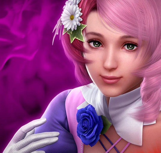
TK6 is where the designs started becoming more complex and unrealistic. Lars & Alisa were once (and still are) heavily criticized for their "too anime" designs, Lars' hair being a little too wild and Alisa resembling a magical girl. This criticism is usually met with "but Tek was ALWAYS anime-" but like... there is evidence to show that they indeed made these more "anime" than they could've. I mean, look at ALL of Alisa's concept art, for example.

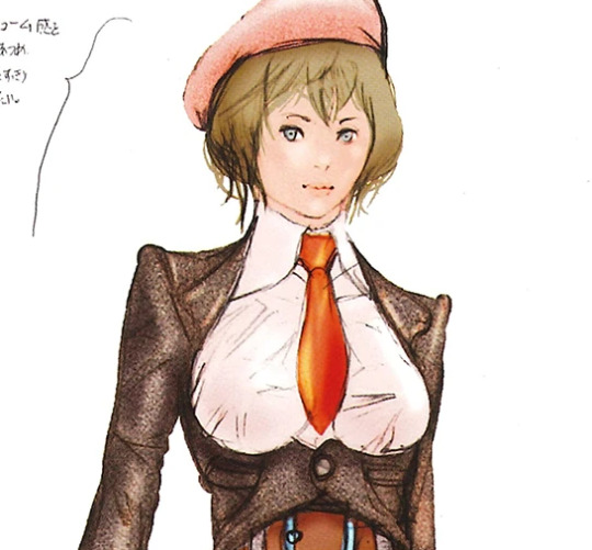


Even with her more robotic designs, you can still see where she still resembled a more Normal Girl. Her hair being natural colors, sometimes being dressed in more natural, simplistic outfits.
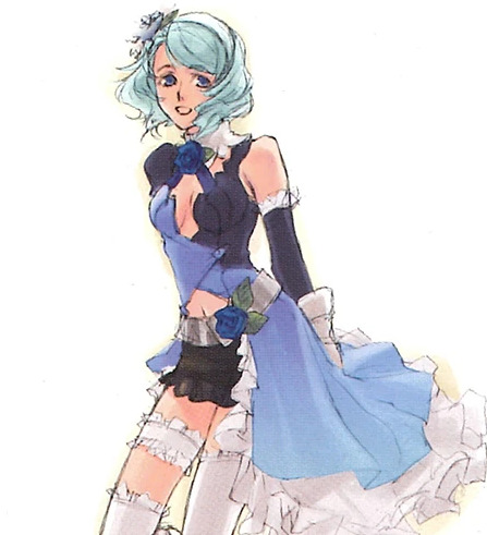


Then somewhere along the line, for some reason, they decided they wanted to do a more unique and colorful look - hence, it appearing more "anime." Alisa's clothes no longer look as realistic as her dresses or button up shirts in the concept art. It now looks more whimsical, or "magical girl" like. Alisa's concept arts made her look more like a Russian than her final design does imo.
I'm not saying this particular designs is bad, but I am pointing out how they are indeed different from what Tek's designs were like in the TK1-TK4 (even TK5) era. This was the start of the series wanting to move on to more complicated fantasy like designs. And imo? I prefer the more grounded-ness of the early TK games. Yes, they've had demons and angels and bears and space ninjas(?) but the zany parts didn't apply to everyone or everything in the world, y'know?

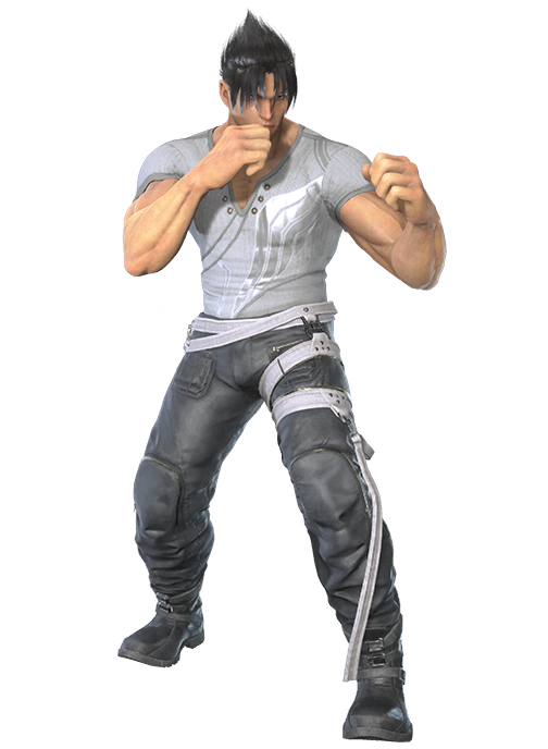
And yes, you can indeed get plenty of cool things out of keeping things simple! 😌 Like there's no reason Jin has to have 12 pockets on his outfit. There's no reason why he couldn't have had a normal tee (or muscle shirt) underneath his jacket and why it has to be this shirt with all these decals, holes, and weird v-neck shape on it. Like that really does feel like they're just throwing on details for the hell of it, because they sincerely believe a plain gray tee would look too "basic" for a next gen game.
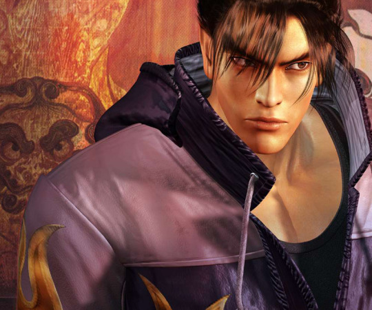
Like in TK4, Jin was just wearing a normal black tank top underneath his hoodie. Although we never saw him without the hoodie, it's quite evident that it's just a normal shirt with no extra designs on it. And to this day, most people still say TK4 was Jin's best design. So it shows that you can indeed impress with less.
Of course, there are people who may prefer the very creative designs, the characters wearing 4+ layers. And that's fine! Different strokes for different folks! But I just personally prefer the simpler, toned down designs. I think they were easier on the eyes, they didn't feel as try-hard, and in a way, it kinda felt like Tek had more of a specific style back then? If that makes sense.
3 notes
·
View notes