Text
instead of shelling out 70 dollars for the new Silent Hill 2 remake, consider playing the original masterpiece for free on PC.
installing the game is incredibly easy even for the least computer-savvy people.
no matter your PC specs, you can play it. the game was designed to run on 2002 hardware. there is a 99% chance the game will run on your build.
the original Silent Hill 2 is abandonware, so you need not worry about the ethics of piracy.
after you install the game, be sure to patch it to turn it into the Silent Hill 2: Enhanced Edition.
the Enhanced Edition will let it run on modern builds and vastly improve the framerate and graphics.
you don't need to have any prior knowledge of computers to patch the game. follow the very easy instructions on the website. the game will essentially patch itself.
Link to the Silent Hill 2: Enhanced Edition.
#OP I'm sorry so many people are being brain dead in your replies but thanks for this#Saving in case anyone I know asks me about it#Silent Hill#SH2#Resources#Video games
13K notes
·
View notes
Text
Questions/complaints I currently have about SH2 Remake:
Why does Silent Hill look like a complete shithole? It was a tourist town, for goodness' sake, they cared about their image! I mean, I do understand that Bloober Team made the decision to make it look old and dilapidated because it's abandoned, but did they understand why and how it was abandoned in the original? As far as I remember, it's not as if the town was known to be abandoned for years, it was as if all the residents just...vanished, all at once. There was evidence in the original SH games that people had very recently lived normal lives in town. That eerie feeling that something more is wrong is gone with this lack of detail.
the game is way too dark, is anyone else complaining about this? The way James is navigating and interacting with memos and items in near darkness early in the game should mean he'll have no trouble blindly inserting a key into any unlit locks he may or may not find. No need to open any cans of light bulbs this time around.
This is a general grievance with modern video games, but I hate damage effects that take up the boarders of your entire screen. The enemies are a lot more aggressive and also there are a lot more of them in this remake (like everyone has already been saying). It also takes less hits to get you to critical health, and you will take damage. But this is also a survival horror game, right? Naturally you'll want to hoarde your health items until you really need them, so get used to seeing that red vignetting and hearing James moan and groan for most of your playthrough.
Flavor texts and James' little comments about items, messages, etc. are gone! Holy shit, why? It makes me appreciate only now how important those texts are to James' character, as removing them subsequently means James has about zero personality. Beyond that, we're missing so much important context and information, such as James' alcoholism which was only mentioned in one text in the original if you happened to examine some discarded bottles.
The ability to explore different locations in town that were inaccessible before would be cute for long-time fans if the game were a faithful adaptation and it were optional, in my opinion. Instead, it's another aspect of this entire game being padded to Hell in an attempt to lengthen the play time, therefore justifying the $70 price tag that's been attached to a 23-year-old video game. In a better remastering, I would understand adding new clues, items, or puzzles to encourage exploring the new environments they worked on, and I understand this is why they did so. But Team Silent made the decision not to add any of these extra environments in the first place, and I'm sure it's because it's tedious and unnecessary and doesn't serve the plot in any meaningful way.
For Silent Hill in general but SH2 especially, I personally don't like the constantly free-moving camera. So many of these scares and set pieces were designed with the fixed camera angles in the forefront of their collective mind, so taking that away makes them a lot less effective. Watching this playthrough, for example, the hallway scream in the apartments was caught at such an awkward angle that James' big, stupid head clipped through the camera as he looked around all startled. Besides that, everything just feels very flat and a lot less cinematic. And of course they had to add annoying interact icons to everything because it all blends into the environment now.
I really don't like what they've done to Eddie. He's like a cartoon caricature of his original character. He's way more overtly pathetic, and him asking to come with James when they meet is so out of character and is such a bizarre creative change. I know it's been said before, but I don't understand why everyone who works on a remaster/remake of the Silent Hill games can't just leave well enough alone. Why do they always have to make creative changes that are unwanted and unneeded?
14 notes
·
View notes
Text
Example of why I really don't like the SH2 remake so far; because there are no fixed camera angles, they clearly didn't know how to get around the corpse sitting in front of the static television in the apartments. Obviously it would be too easy to rotate the camera and examine every detail of James' character model sitting dead in the chair, so their solution? Just drape a dirty sheet over him. So the corpse in the chair goes from subtly looking weirdly similar to James in the original game to being just another random person who died in front of a TV. Which would severely detract from the scene late in the game where you finally watch the video tape James made with Mary if this is your first introduction to Silent Hill 2. Watching a playthrough of this game is tantamount to someone with zero artistic vision telling you what they loosely remember of the original. All those important details are lost.
14 notes
·
View notes
Text
creation, oil on canvas, 24x30in
+ details
3K notes
·
View notes
Photo
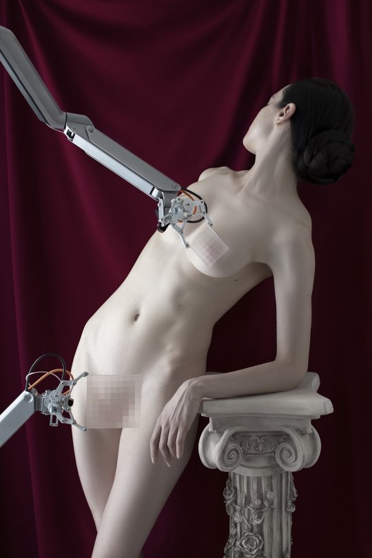
FRIEZE, Jörg Scheller
Aneta Grzeszykowska (Polish, b. 1974, Warsaw, Poland) - From Selfie series 2014 Photography: Pigment Ink on Cotton Paper
#Adding context since the caption gives the impression that the sculptures themselves are simply ink on cotton paper#Art#Sculpture#Photography
1K notes
·
View notes
Photo
Ornate welts of raised scar tissue are a mark of beauty, Mozambique, Volkmar Wentzel.
7K notes
·
View notes
Text
La bête (The Beast) | Bertrand Bonello | 2023
George MacKay, Léa Seydoux
122 notes
·
View notes
Text
Kerrie Hayes as Viv in BLUE JEAN (2022, Georgia Oakley)
3K notes
·
View notes
Text
body paintings by Karen Turner
67K notes
·
View notes
Text
Mixed Media Piece by me featuring the words of Tina Chang in her poem 'Color'. A4.
Eyeshadow, food colouring, paint pens, bookbinding thread, eyeliner, fineliner and paints made from rocks were all used in this artwork.
3 notes
·
View notes
Text
i must not kill myself . killing myself is the myself killer
80K notes
·
View notes
Text
Joël Stein (1926-2012) Variation Chromatique [acrylic on canvas 1966]
1K notes
·
View notes
Photo
Prince Rogers Nelson 1981
2K notes
·
View notes
Text
www.instagram.com/p/ChVF206uByk/
4K notes
·
View notes
Text
Laurent Millet - Les Cabanes, 2000
747 notes
·
View notes
Text
29 notes
·
View notes