Text
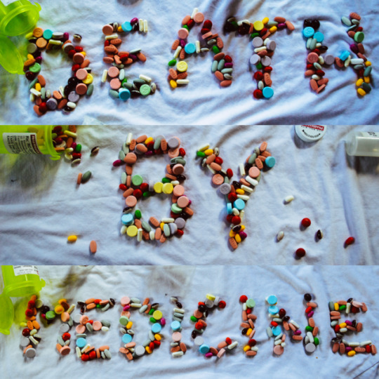
This was by far my favourite typographic assignment yet. The freedom to address social/ political issues through any type of medium really allowed me to explore different ways of allowing the connections I made flow together in more expressive ways.
I was immediately interested in the subject of “Drugs vs. Medicine”, two opposing forces that in the world of traditional medicine, appear to have no real distinctions. Pharmaceuticals in the eyes of the doctors or chemists creating these compounds see the substance as it is– a prescription drug, in the eyes of billions of patients seeking medical advice and remedies, we are lead to believe that these drugs are safe medicines that are recommended to us to improve our health and cure health issues. The amount of misleading information that the health system imposes upon us has lead me to very seriously question the moral and ethical principles behind the pharmaceutical industries and the doctors contributing to this questionable form of un-natural, un-sustainable “health” that can often lead to toxic cycles of dependency, addiction, and life-threatening substance abuse as much as, if not more than, any other form of drug. Pharmaceuticals, prescription drugs, traditional medicine– it’s all a paradox... seemingly absurd and contradicting.
Pharmasave?
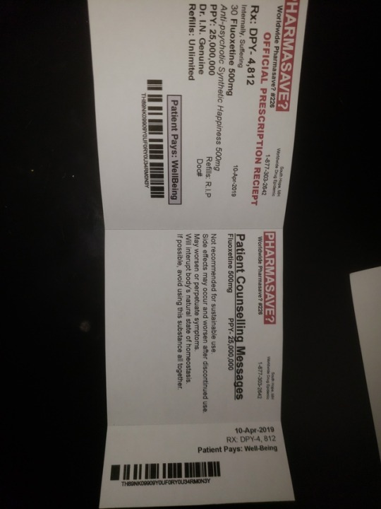
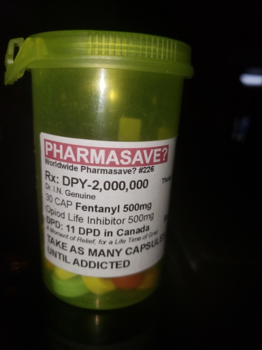
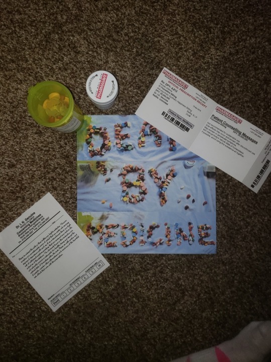
I thought of many different ways I could create thought provoking, questionable connotations that referenced to the world of medicinal drugs and I seen so much opportunity to express this through making my own prescriptions using the same layout that world-known pharmaceutical industries use for their labels. I began exploring different pre-fixes to throw in front of the word “Pharmasave” but came to find the most effective way to encourage people to question it from the “grey area” stand-point that is associated with it, was just by simply adding a question mark. I gathered statistics in relation to the amount of deaths and prescriptions handed out each year/day and applied these to the information on the labels. The phone numbers on each label are help lines that relate to the subject of each substance (Mental health, and Drug addiction). The expiry date on each bottle is R.I.P, due to the fact that so many people taking opiods and anti-psychotics develop such extreme dependencies that the use can last a life time. Dr. I. N. Genuine is to address the issue of impersonal relations that doctors and patients share. Sadly, doctors treat patients with cookie-cutter type band-aides that do not fix the issues at hand as much as they do just send them on their way with more later questions and unresolved issues.
Worldwide pharmasave #224- This number is an area code that is associated with Ontario, where I tried to find most of my statistics that I referenced on the label.
Doctors Note:
All prescriptions drugs are considered illegal unless prescribed by a doctor. This alone demonstrates the authority that doctors have over their patients and society at large. If doctors are doing their jobs effectively then why do the rates for addiction, mental illnesses, and prescription drug over-doses continue to rise? Are these substances being prescribed, really effective? Do they really “save” and resolve the issues that so many people are experiencing? Do anti-depressants alter the chemistry in the brain to synthetically produce happy-endorphins, or perhaps, are they suppressing “negative” emotions that don’t want to be felt, understood, or properly handled and dispersed of in order for true healing to occur.? Anti-psychotics have become so normalized, that people experiencing mental-illnesses, that are being prescribed these medicines are basically told that a pill will make their problems go away. This is alarming, upsetting, impersonal and an in-valuable way of approaching the sadness, anxiety, confusion and over-all feelings of disconnection in the world.
Prescription Receipt:
Many doctors receive commission for the drugs that they prescribe each day, they write their client a note and then pass them along to the pharmacy where the next service will be received as a customer rather then a client. It is for this reason that where I created the bar code/number I distorted the words “THANKYOUFORYOURMONEY” within the bar code. The price of prescription drugs is money, but the cost is well being.
Why Candy& Tylenol?
Prescription drugs often times are handed out like candies. They are given to bring temporary satisfaction for relief, are highly addictive, in-effective and impose more adverse health effects/risks then they do promote it. Both candy and drugs are taken for pain and for pleasure.
T3′s are a very commonly prescribed pain-killer, it is a mixture of acetaminophen (Tylenol) and codeine (opioid). Tylenol in it’s simplest form is readily available to almost anyone– when you take the compound of Tylenol, multiply it by 3 with the addition of other drugs you are given an opioid.
Typeface:
Selecting the typeface was an easy step in my process. I soon cam to discover upon research, that one of (if not the most) commonly used typeface in the world of medicine is Arial due to it’s illegibility and sans serif. With that being said, this is the very font that PHARMASAVE uses for their prescriptions and labels.
Layouts/Grids: Essentially the layout for my prescription labels, doctors note, and receipt were referenced off of originals prints. I began by measuring the size of the labels and logo’s for the best accuracy. I formatted everything to be almost identical with some typographic adjustments/alignments that are clearly over looked when pharmacies print off the actual labels, haha. After a few test prints to ensure the font, sizes and layouts were all accurate I decided to print the real thing. I purchased some sticker paper from staples and was impressed with how well everything turned out. Once I had my printed copies I had to cut them out and then cut off the corners of each rectangle in order to give it the rounded look that most prescription labels have. I used somewhat of a grid when creating my doctors note in order to ensure consistency and accuracy in alignment. I wanted to give the real feeling of a doctors note so I decided to tear the top side of the sheet to give it the feeling as if it had been torn right out of a note book. I thought it would be interesting to hand-write the information I wanted to include in the doctors note– my hand-writing is small and may be hard to read, just like an actual doctors note. I wrote it fairly quickly while still trying to make the information eligible because I did decide to use this piece of my project to write out the warnings that can often be over-looked. When creating my receipt, I wanted to make it feel and look like an actual receipt, to do this I printed small dotted lines were each fold/tear would be on the actual receipt and very lightly ran an exact knife along the line of it so that it gave it flexibility.
I created everything completely from scratch using in-design only. The warning label on the side of the bottle, the prescription label, the doctors note, and the receipt were all created just by referencing/ measuring for actual sizes and then tweaked with the information I gathered and a bit of my own personal twist.
My thoughts:
My perception of medicine is sustainable, naturally-sourced herbs, plant, fungi’s, foods, and compounds that promote health, well-being, balance and wellness in practical and more readily available ways. True health is a life style... not a drug. Organic forms of medicine have been used and worked for many cultures for years and years before us and have not had the same adverse effects that modern/traditional prescription drugs now do. I am not against the health industry or what doctors, nurses and the healthcare provides to their patients but I do and will forever question the system and encourage any alternative measures to prevent declining health rates. Certain belief systems have been imposed upon me that I've began questioning from a fairly young age. Please note, both of my parents work at the hospital &one of them happens to manage it. Growing up in a family where traditional medicine is so widely accepted and practiced has encouraged me to really question the system in order to find alternative ways of implementing natural& sustainable health into my experience& being able to educate myself to encourage others to do the same.
0 notes
Text
Psychedelics
This assignment was a good mix of fun and stress. Type, graphics, and design are within a field i am in the midst of discovering. If there is one thing I've taken from this class with the most grace is discovering and making connections in everything that I do.
The concept of my book:
Once you have opened my book, you will embarkon a psychedelic adventure or “trip”. Each page is intended to bring the reader the psychedelic experience of each substance through the demonstration of type.
Grid: my grid was used mainly as a reference for text placement in order to best create consistency throughout my book.
Typefaces: 90% of my typefaces were found via research. The most repeated type face, which happens to be the same one used for the introduction to each substance is “Victor Moscoso” a pop/opt artist best known for producing psychedelic posters/ads back in the 60′s. This typeface proved to be perfect to imply a psychedelic experience. During my research I was able to find the typeface's “Magical Mystery Tour”& “Bootle” from the Beatles album covers, where i was able to quote the lyrics from their song “Lucy in the Sky with Diamonds”. The majority of the other fonts used were all in relative to the psychedelics discussed in throughout the book. To name a few more, “Acid, Shrooms, and Tripping on Acid”.
LSD- Time is distorted, cross-over senses also known as “synesthesia”, bright colors, fractals, and is described to open the mind to a multitude of perceptions opposed from ordinary ways of thinking.
Shrooms- Mush of the same effects as LSD, however this substance does not last as long and is reported to have more control over you, where as LSD is said that the user has more control over how their experience goes. It has been described as “being awake in a dream” Where as you are conscious of everything happening, not a whole lot of it makes sense and your more of the “viewer” experiencing everything that going on around you, absorbing your surroundings rather then creating them consciously.
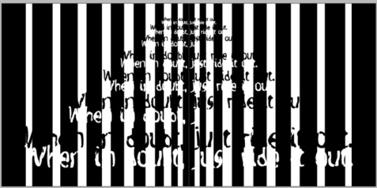
Good trip/ Bad trip- I wanted these center pages to break up the 4 substances discussed. Often the experiences of psychedelics are influenced directly by the mind state/ perceptions that the user already has. These perceptions temporarily manifest into an illusionistic reality where the mental states are brought to life and the subconscious mind is being experienced through extra sensory perceptions. This is the concept behind “good and bad trips”. I tried to demonstrate through the use of black and white fragmented lines that almost work as a tunnel towards the saying “when in doubt just ride it out” (commonly used term, once someone has embarked on their ‘trip’ their is no turning back and its better to just ride along with it then it is to fight against it). I then shared a little reminder for each perception to continue to finish experiencing the book/ trip.
- After multiple attempts at printing my book, the final copy ended up losing the text on these center pages for a reason that remains unknown.
DMT- This one was really fun and also one of the most time consuming. This psychedelic commonly known as "the spirit molecule", is known to be produced naturally within the pineal gland when experiencing death, dreams, and out of body experiences. People often report experiencing an “ego death”. This substance also known as "ayahuasca" is traditionally used in sacred ceremonial practices to purge the subconscious mind and body of any attachments to ego. Many reports say that after taking DMT you leave your physical body immediately and project into another dimension. Geometric patterns, kalaidecopes and 3D shapes appear- i spent a lot of time creating these graphics from scratch to replicate the described experience. The “out of body” page i decided to take multiple quoted experiences from differing people to form the geometric shapes in the background. Although the content isn’t very illegible i thought it was more about the experience that the type created rather then what the words said.
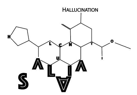
Salvia- This substance is reported to merge with or become other objects, loss of contact with reality, overall sense of uneasiness and extremely bizzare hallucinations. I used all of these descriptions and communicated them through the use of type in a variety of ways. With the use of the molecule of Salvia Divinorium, i was able to connect 3 of my ideas into one. Spelling ‘Hallucination” with the A, L, I, and A in SALVIA and then the N from the word “deleriant”.
Printing- This was the MOST stressful part of this extremely time-limited project. After a week of putting all of this together until i ran completely zapped of energy, i went to submit my book to BLURB in order to receive by next week– to discover that they were not able to process my book. This was due to transferring a lot of my designs created in illustrator, over to in-design (which i have never done before). This was a painful learning curve for me. Every attempt I made to have the book printed for me turned into a dead end and I was faced yet again to attempt something I was unfamiliar with. These inconveniences lead me to creating my own book which ended up turning out most favourable with first-hand experience of printing, cropping, and binding it myself.
1.) Expect the unexpected. It's almost inevitable to run into a few areas of inconvenience while creating something digitally (especially printing) be prepared for and accepting of Not to get too fancy on a software I am still learning. Rules are put in place for a reason. Sometimes it’s good to push and explore a bit out of the comfort zone, where other times it may prove to be beneficial to stick to a book of rules.
2.) Make sure fun is one of the main driving forces behind any project.
3.) Make more time for planning, yes time seems to always be low and that influences one to want to get started quicker... but with a set out plan, it makes initiating the process go by with a lot more ease and grace then jumping right into it. Well thought out work always reflects more strongly and can also prevent future blocks (such as my initial idea with medicinal mushrooms)
4.) This one might be the most valuable lesson learned:
Ask for help- This is a reminder to myself that things are only as difficult as i make them and that even though I'm not used to asking for help, that it is available to me any time I make the effort to reach out for it.
In order to create stronger and better work I will continue to make connections.
0 notes
Text
Irony?

I started off looking really forward to this assignment. Instantly my curiosity took off exploring the conscious and unconscious mind. I had so many ideas on this subject that I became second guessing my ability to condense such a vast topic. Part of me wishes I would have followed through with my initial ideas. I had so much to work with, so many ideas prior to doing my research and they all came through so natural and effortlessly and I do honestly believe there was a bit more wiggle room to communicate this subject through type. However...
One morning, following an evening type class where I was researching the unconscious mind, dreams etc. I actually woke from a very interesting dream that influenced a shift in topics. In this dream, a friend and I were foraging medicinal mushrooms in a forrest, a medicine woman hands me a cup of tea and tells me that the medicine in the cup is the mushroom “Chaga”. That morning, I woke with this dream imprinted in my mind. I paid a visit to the friend in my dream’s, medicinal mushroom shop and purchased some Chaga to make my own tea extractions with. This very dream is what inspired me to shift my topic towards the value of medicinal mushrooms instead.
-----------------------
Although fairly knowledgable in the field of medicinal mushrooms, (specifically the ones I decided to discuss in my book) I came to discover very quickly how challenging it actually is to communicate the medicine of mushrooms in a fun and typographic way.
Instantly I began writing down interesting information and illustrating ideas that allowed me to play with type. “Arthur Miller, Brennpunkt” had me inspired after flipping through one of Ian’s vintage books in class. What I seen that was so intriguing, was the word “brennpuunkt” written over-and-over-and-over again in a circular motion until the word it’s self made the circle. This was so fascinating to me that I decided to attempt implementing this idea in my own book with the word circulatory/ circulation. The circular motion tied directly into the word I was looking to communicate through type, and the finished piece looked similarly to that of a blood molecule.


I continued playing around and came across the idea of using the fibbonachi/ golden rectangle sequence as the layout for my book. The reasoning for this is to communicate the nature and connection that medicinal mushrooms share with humans. We are all interconnected and we all share the same nature.
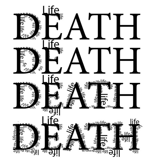
I continued playing with the concept of life/death/rebirth and the life of mushrooms being found through decomposing trees. After playing with this idea I seem to hit a bit of a wall.
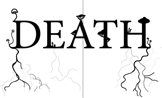
This assignment might be the death of me, ha. Get it? No seriously though... this alone took me close to 4 hours to create. The initial concept I had drawn out was simply just an under developed idea that I knew I needed to further communicate through type, it was just a matter of bringing it all to life. (Ha)
Materials:
Brown, recycled paper- apparently this material is not as mundane as one might think, or in my case, hope it to be. I travelled to London drugs, Michael's and phoned staples to discover none of these places carried brown recycled paper. Fortunately, the book store sells this paper in the form of sketch books.
I wanted this paper because it looks, feels and is organic.
0 notes
Text
Reminiscent Elements
Inspiration for creating a typeface:
Each city/town offers a different experience unique to each individual within that given environment. Everywhere you go there are words and letters around to help label the memories that are attached to those experiences. The typeface chosen for your school year book, road signs in the town or city you grew up in, local businesses that sold your favourite flavour of bubble gum ice cream. Each of these memories have words and labels attached to them that communicate a special language that connects you to those memories. In this sense, certain typefaces work as triggers of nostalgia as much as the actual taste of your favourite childhood ice cream or flipping through your 4th grade year book can.
Growing up in a small local town I've come across a variety of typefaces that have left little imprints on my memory. Flipping through my yearbooks I see every possible rule for design being broken from tacky typefaces decorated with icicle’s or made of sticks, to words in every colour from the rainbow- painfully stretched out and elongated. Suitable for a children’s school year book, however, these typefaces don’t function well in many other circumstances. With that being said, there is one type face in particular that ironically brings me back to my grade 5 “Magic Show” ... and although It’s hard not to be subjected to the typeface Helvetica at any age, rather then war or a bus station, this typeface brings me back to my grade 5 elementary days.
-------------------------------------------------------------------


Inspiration carried forth from the last assignment has influenced my decision to incorporate the elements in my typeface. I’ve decided to work with elements of Helvetica by emphasizing the counter spaces rather then the actual letters. The counter-spaces allow for interesting shapes to form that somewhat resemble children blocks or perhaps give off an elemental vibe of it’s own. (forming triangles that could perhaps resemble cliffs), but it also offers a different perspective of what lies in-between the letters to make it a whole. The colours I've selected are mainly black and white to symbolize the negative& positive spaces in a typeface with the addition of lines through each of the letters to make it seem as though they are split up into little segments, as are the memories of life experiences.

With the addition of my own twist (c, upside down i, k etc), I began by filling in the negative spaces within each of the letters. Some of the letters created triangular shapes that I rathered emphasize then leave filled in. To bring attention and differentiation to these elements, I decided to incoorperate the differing colors symbolic of the elements (fire=red, air=yellow, earth=green& water=blue) doing this allowed for the reminiscent like quality of childhood days to be felt, as these colors are representative to children blocks.
Next I added the lines to be symbolic of the different fragments that make up our memories, these fragments are similar to flipping through a book that holds many chapters in our lives.
What worked for me v.s what didn't:
What worked well was the differentiation that was achieved through the colors and fragmented lines. I really enjoyed the digital version that demonstrates the vibrancy in the colors. Unfortunately, what did not work well was that due to the fact I printed with another classmate (so as to save on the cost), the teal ink that was used on my classmates poster transferred over into my "black" that I spent so much time converting from RGB to a rich CMYK. The printed copy showed flaws on 2 letters specifically where the lines that were intended to be the same color as the background, but had printed off differently (RGB). This taught me that triple- even quadruple checking will always turn out to be most favourable so as to avoid these types of errors.
My original intention was not to print off my final copy but to cut it out and create my own letters and background with paper. I decided last minute on the printed copy over the crafted idea so as to get more of a clean&professional finish. I'm glad I went through with printing, even though it did not turn out perfectly as I had hoped, I got to experience the process of creating my own poster& was able to learn from it.
If i could do anything differently, i would have taken more time quadruple checking all of the segmented lines to match the same color as the background, this would have prevented my most regretful error when it came to printing. I would consider printing my own version separately rather than sacrificing the desired color of ink by sharing with another person and i would consider adding the name of my typeface onto my poster, “Reminiscent Elements”, along with a bit of background on the typeface. I decided to keep my poster fairly simple with enough elements to keep it interesting rather than boring but i do feel as though i could have included a bit more information to help people understand the background as there was a thought process that inspired me to make every one of my decisions while creating this typeface.


0 notes
Text
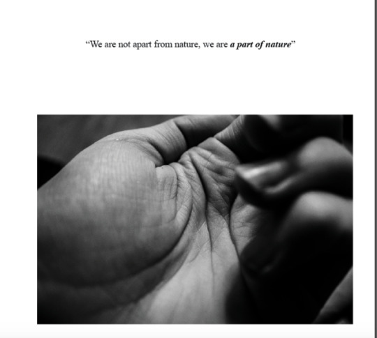
Type-Photography
Some of the great qualities of Medicine Hat that I often see over-looked happen to be the nature, geography/ elemental factors that help to define the city as it is known to be. I wanted my topic to be a blend between an objective and subjective stand point to reflect the roles nature plays within us, outside of us and the roles we play in nature. With that being said, I decided to put a little bit of a philosophical twist to encourage the reader to further seek and understand their own nature and how it reflects not only on themselves, but also on the environment.

Essay Process:
My process in developing the theme for my essay involved deep thinking that would allow for the type/ words to speak the same language as that of the photographs. To get started, I made a list of letters from A-Z that included side tabs for the letters I had already captured within nature. I jotted down whatever words came to my mind that involved these letters and began to sift through &accumulate the information that would lead me to my next idea.


MEDICINE HAT
I introduce the first page of the book with a short paragraph and type on the bottom, inner corner of the left page saying “a closer look into nature...” This is to encourage the readers to really pay attention to the letters to be found in the image on the left page and throughout the book. With MEDICINE written in a gradient effect on top of the image and the trees that form an H, teepee that forms an A, and the right tree with the crossing branch that forms a T to complete the rest of the word; MEDICINE HAT.
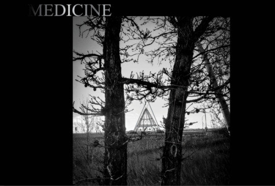
As I continued to think about the images I had acquired and the vital role nature plays, something clicked& I began to brain storm examples for each of the elements (Fire, water, earth& air). I thought of how interesting it would be to discuss the roles they play in both the geography of the city and in humans.
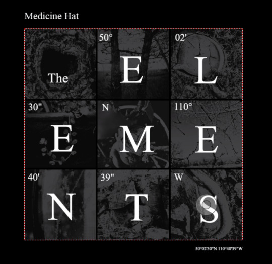
I wanted my front cover to communicate the subject of my book (elements) in a creative and original way so I decided to create my own photo grid that reflects the periodic table of elements. My title, ‘Medicine Hat, The Elements’ with the coordinates of Medicine Hat broken up inside of each square. The letters that spell ‘elements’ are depicted within the images of letters I found in nature. I found this to be a very thoughtful way to allow for the subject of my book, the photos I took, and the letters/typeface I selected to come together and speak that of the same language.

Planning page layouts:
The first half of my book I decided to make objective by discussing the elemental geography of Medicine Hat& the second portion of my book I discussed the elemental roles that take place within the human body. I then decided to create my own photo grid that mirrored each other, with the use of the word ‘reflection’. My intension behind this was to find a balance between the roles the elements play externally (objective) and internally (subjective) with the use of the center page to work as a catalyst to communicate and tie these ideas together.
With 4 different symbols to represent each element, i decided to incoorperate this symbolism to help the reader know the corresponding element with each page.
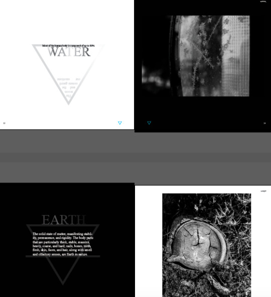
There are a few moments during the subjective half of my book where I decided to incorporate subtleties that reflect myself. For example, the only 2 elements I labelled "earth& water" are because these elements relate directly to my zodiac signs (sun&moon). My sun is capricorn, the earth element and my moon is Cancer, the water element.
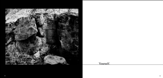
I decided to play around a bit more with how my images could further communicate with the type and so I decided to incorporate subtle moments of transparent letters to complete the word with the letter of the photo.
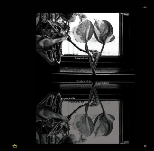
I included the saying "breathe it all in, love it all out" on the subjective portion of my book in the element of air. I chose leaves in the shape of a V because it is leaves & plant life that helps to improve our quality of oxygen/breath. The intension was for the saying to fit the theme of the particular element& photo.
--------------------------------------
Exploring typefaces:
My prior use of Helvetica has drawn me towards exploring Adrian Frutiger's sans-serif typeface Univers, that was discovered during the neo-grotesque era in the 1950's. The 2 types faces although very similar in nature, provide a different experience to the viewers due to subtle but very individualistic qualities.
"As Lars Müller puts it, Helvetica is “the perfume of the city.” In contrast, Univers is a gentle breeze from the woods."
Universe provide's a sense of space and openness. While reading this type face, each letter is complimented with a bit if room to breathe in-between one another.
Due to a limited access to Univers on my own apple software, I decided to scrap the first idea and pursue my second, more thought out choice of Times New Roman. I preferred this font because of the serif and classical/ traditional look and feel the font provides to its readers. I thought it would communicate the history of Medicine Hat and topic of my discussion.
Since my topics discuss elements (although always changing within the environment, will always remain a part of it) I thought it would be an effective use of the type face as the 2 share the similar quality of some how always withstanding the evolution and change occurring around it. The second typeface I selected was Zapfino, I had never heard of this type face prior but was seeking one that had a handwritten quality to it. This type face gave me an elemental vibe that was clean and classical and therefor I decided to pursue using it for my book. Zapfino is a calligraphic type designed for linitype by the typeface designer Hermann Zapf in 1998.
0 notes
Text
Final assignment
For my final assignment I selected Times New Roman &Helvetica as my typefaces. Ive noticed an unconscious pattern that has evolved since my first assignment in typography. Before a decent understanding of the typefaces and the history and evolution behind them, I seem to have been drawn towards the typeface Helvetica and have used it in every assignment up to this one. It's for this reason that I choose to see Helvetica as a multifunctional typeface. The theme behind this font in my own personal experience reflects one of neutrality and of balance. Through my own indifference to this font I am able to recognize the polarity through the controversy that this typeface brings. It is through this polarity of opinions and views that i believe, balance is acheived.
The theme surrounding my short book on health is brought together through the elements of mind, body, and spirit. The foundation of these elements establish the true embodiment of health& ultimately, happiness.
Although this book was made short& brief I did try my best to cover my intention through the investment of time, mindful thinking, and a lot of experimentation. I found this assignment to be a fun and interesting means of understanding and exploring the InDesign Software as well as my own capabilities.
Thoughtful moments,
There were many thoughtful moments during this assignment that helped to bring it all together.
The colors I selected are black and white, with a few gray areas through the use of transparency. The reasoning behind these colors or values rather, are because they compliment the intension of balance through the positive and negative spaces, suggesting the balance that is achieved through the polarities of "yin&yang". With this in mind, I decided to leave every other page in white with black and adversely, black with white.
I decided to incorporate a few shapes through the use of the “o” in Helvetica, and the letter “l” to give some symbolism and to add character. The use of triangles and circles were to reflect completion, balance, connection, integration, and of course Mind, Body, &Spirit.
The 6th and 7th pages I am most proud of as i saved these pages last and felt I was able to have the most fun by creating intuitively. With no coincidence, these pages were based off the element of "healthy spirit". I decided to use the shapes of hexagons to form the spirit molecule of Dimethyltriptomine. Within the molecule, I incorporated words that I felt reflected the spirit body. Including "intuition, synchronicities, serendipities, love, creation. Etc. I included on the bottom right of this page in 7point sized text, "you are the embodiment of love". On the 7th page, I used 7 circles to form the seed of life, a symbolic meaning for "universal creation". In the center of this I placed the word "love", as love is the center piece of all creation... 7 also happens to be the number of chakras that each of us beings embody, these are the energy centers that bring us into alignment through the balance of mental, physical& emotional health.
0 notes
Text
Mindful>Mind-full


Encouraging myself to communicate the message of the words through the use of the words, alone. I attempted to reflect a "full-mind" by repeating and over lapping the same word through different degrees of transparency. I feel this well demonstrates the recycling of thoughts when our minds are full. By placing "Mindful" on top of "Mind-full" with a clear and more defined, bold text I feel this shows the healthier and therefore, more favourable choice of mindfulness over a full mind. I thought it would be interesting to use the transparency for "mind-full" as transparency is another term used for "clearness and clarity" and by using this as the background I think it further demonstrates the goal that mindfulness brings forward.
The choice of a black background with white text was to again, reflect more clarity within the text while defining the purpose of the words. The black is symbolic of the emptiness and space that is necessary to make in our minds for clarity and mindfulness to appear& effectively take place.
0 notes
Text

Textures

2D Fundamentals, November 21. 2018
0 notes
Text

Balanced Typeface
After sketching a few ideas down I decided to research some fonts and play around on illustrator. It didnt take me long to discover Helvetica, Times Roman&Futura to be some of the most balanced typefaces due to the equal proportions and perfection involved to create these fonts.
My favorite ended up being Futura due to the round curves and beautiful proportions. This worked well in a wide range of ways that complimented my word choice. For this reason I felt this font to be most fitting to my word choice.

My first strong idea involved the second A to work as a center holding the mass of the letters on each side. This worked favorably as it reflects the shape of a triangle and is also the middle letter, creating balance for the letters that come before and after.

2nd.) This one included the lowercase letters in Futura. I had 2 reflecting one another as it created a mirrored image of all the letters except the l. Originally all the A's were faced the same way until I decided to play around with the second of each a to mirror the l. This further demonstrated a balanced reflection of each other by bringing the 2 mirrors together through the sharing of one of the same letters. Reflecting that each were not complete without the other.


3rd.) I continued to play and began stacking the letters on top of each other, as if each letter was balancing on one another. This created a visually appealing way of reading the text. Originally I had done this using the counter space of the capital A as the base that held all of the letters up. I took into consideration a recommendation that involved taking out one of the A's and using it as the base to hold the rest of the letters and decided to play around with this idea. This allowed the piece to be more organic and encouraged the mind to adjust to our eyes and to link the 2 together which made it more interesting. I thoroughly enjoyed this idea but due to the fact that I had already drawn out my original one, I decided not to record it onto paper but to keep it as a saved document in illustrator.

4th.) I decided to execute my 4th idea in Times Roman as I enjoyed the serif's and the sense of classiness and completion that I get from this font. Using all capital letters I centered each beside each other and used the capital "L" to form a center line by tilting it sideways. The purpose of this was for all letters to be balanced and connected through out the entire word. I removed the original stroke of the A's and allowed for the center line of the B to follow all the way through to the center line of the E. My original idea of this piece was a lot more complex and was inspired by the idea of "yin/yang". I pursued this in a much simpler way and was pleased to acknowledge that in this specific case and most cases, less is more. It is simple, yet serves the purpose of the word in a way that cant be mistakened. I feel this to be a solid piece with Times Roman selected as the typeface& the line connecting each letter it just gives a solid sense of strength and completion in the word.
5th.) My 5th idea originally included a non-illustrative yin/yang by using the counter space of the rounded a to form the circles and the c's to create the center line flowing through the yin yang. I was going to write "balance" inside, along the center line, splitting the letters in half and filling them with the opposing color of the circle that they were in. Instead of executing this idea, I realized I needed to include a version of balance in another language. After some research I thoroughly enjoyed the French version "équilibre". Hearing the word "equal" inspired me to put the word inside of 2 equal signs, resorting back to the concept that less is more, I decided to simplify it by creating the equal sign with the capital letters of the I's.

1 note
·
View note
Text
Semantic Typography
Assignment 3:

Day 1: The Evolution of my word choice.
Immediately after this assignment was reviewed and addressed in class I had a word mentally selected that evolved into a variety of different ideas I could use to implement into this assignment. Before we were given the opportunity to claim our words I had already started drawing out some ideas for the word “Evolution”. Not was I only thinking about the drawings but I had the idea that it would be really interesting to incorporate the evolution of type faces into the letters/ word. I seen a lot of potential with “evolution” and was really excited with all of the different possibilities and routes I could take to execute it. After a savage race to the front and getting the word I had been set on, I put some more consideration and thought into selecting another one due to the competitiveness that was involved to claim it. Ironically enough, the word I was second most drawn to turned out to be “Balance”. I walked up to my fellow classmate and proposed a compromise, where each of us could have our names written down for “evolution” and each select another word to see which of the 2 worked out more favorably. After proposing this compromise I was soon flooded with even more ideas for “balance” then I was “evolution”. I made the connection to how the overall scenario played out, my response to it, and the word that came to me second and I seen a bit of a message in it all. I felt that my consideration and decision to create with the word “balance” for this assignment... allowed me to create more balance with my classmate/ friend.
The original competitiveness evolved into a more balanced and harmonistic word choice as well as an ironically pleasant paradox.

0 notes
Text

Typography assignment 2:
For this assignment I chose letters Cc, Oo, Y, Vv, J, S, and the negative spaces of a& D. I selected these letters as they fit more organically into the moth concept I had selected to use for this project &at first glance of a moth these are the letters I instantly recognized.
The typeface I selected is a sans serif , Univers. This font fits nice into the moth concept as it is a creature of the universe and didnt disrupt the composition of the moth image as a font with serif's might have. The letters are more of an oblong type shape which serves to be harmonious with the desired shapes I intended to incorporate into the design of the moth.
What worked well was how naturally I was able to blend the letters into the moth without sacraficing too much of the composition. I used watercolor paints and although slightly time consuming, I really enjoyed the transparency effect I was able to achieve for the wings through thin layers.
What did not work in my favour was applying tape around the boarder to keep it clean... the paper i selected is pink and although I did take off some of the tac on the tape before applying it, it still tore off some of some of the paper even while peeling it slow and carefully. This seemed unavoidable with the given materials I used together.
If I could do anything differently I would have selected a tape with less tac, I would have erased the pencil lines I used to draw out the foundation as it was brought to my awareness after the matter that you van not erase them over any amount of water color paint, no matter how thick or thin. Some areas the pencil complimented but others it did not turn out as favorable. I would have managed my time a bit better as the printing of the letters seemed to give me a handful of complications and delayed a lot of my ability to work on the project successfully.
0 notes
Text
Inspiring words from "ABSTRACT: The Art of Design"- Paula Scher
"She makes type talk"
"Painting with words"
"Driven by the hope that I haven't made my best stuff yet"
"Weaving little bits of information to make a bigger thing"
"Allowing my subconscious to take over"
1 note
·
View note
Text
Typography:

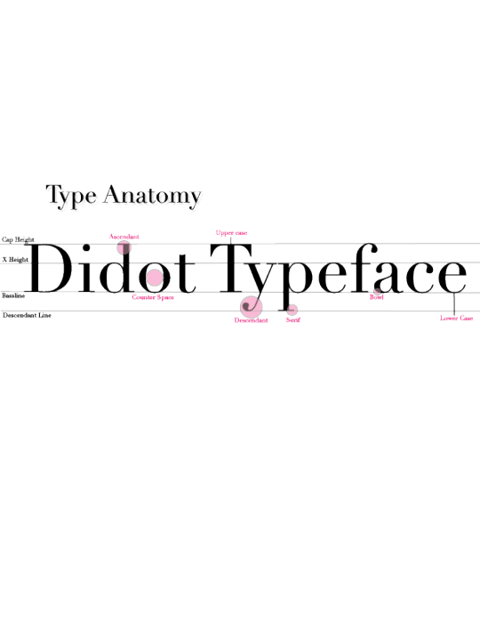
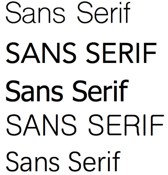
The art& technique of using differing styles and arrangements to make the written language beautiful, readable, and appealing when displayed.
• Sans is a French term meaning "without"
• The term Serif is used to describe the small line attached to a stroke in particular letter and symbol fonts.
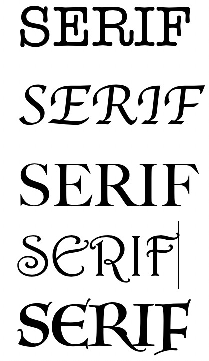


》 Sans Serif therefore means "without lines/strokes attached to letters or symbols"


0 notes


