Don't wanna be here? Send us removal request.
Text

final grid system images
when shooting this brief i stayed in the same area and just moved around it, i was trying to show the busyness of the area. i wanted the images to be a blend of the area. overall i feel the images work well together apart there just images
0 notes
Text
professional practice
What is the purpose of a photographers website?
to showcase past and present work
for people to contact you
for people looking for photographer
What makes a good photographers website?
good layout of website
easy to find
easy to work
contact section
either a range of different topics or your main focued
Find examples of at least 5 photographers website and discuss what you like about the website Focus on the design, layout and functionality of the website, and not specifically the pictures.
kevin mora-rosenkranz
nice layout
good range of topics
contact section
showing different technics
easy access to instagram
liller photos
simple front page
has different sections so you can easily find what your looking for
she has a blog section where she post pictures of her shoots and writes about them. i feel this is a nice part as you can see the connection she has with her work
she has a different section and she writes about her prices and show some more images
she has a contact section and you fillout a sheet looks very simple to do.
she has a section telling you about herself. which i feel like this helps you know them a bit more
overall i really feel this website is really good as its clear this makes it easy to use and you don’t have to spend a long time trying to find everything. the contact section looks very clear/ easy to use, this making it easy to fill out.
will bremridge http://www.willbphoto.com/
this website uses bold and vibrant colours.
The images are inviting and leave you curious as to what type of work the photographer produces.
This is important when drawing people to a website and grabbing their attention quickly, the first few seconds of opening the website are crucial.
Each image on the portfolio page is clearly labelled and directs the viewer to a particular project.
The photographer's work explores various genres, mainly commercial and editorial but it remains consistent in colour, style and creativity.
Prints are available to purchase on the site which conveys an aura of professionalism and productivity.
Overall the website is inviting and reveals a hint of the photographers personality, both in their work and the way in which they have showcased it on a public platform.
Fiona Watson
very organised and clear
easy to use
shows of work really well
has a nice blog where she writes about her shoots
easy contact part
has an part about her self so you feel more contacted
overall the website is very opened and welcome. For anyone using it they would find it really easy and would find what the needed easily
Nadine Boyd
Nice simple front page
everything is lined out nicely
contact part is very simple and easy to use
has her work on full display so you always see it
has a blog where she writes stuff
overall website is very clear and nice easy to use and showcases work nicely
What information do you think it is relevant to have on your own website?
contact infomation
i think its nice to have a bit about yourself so potential clients can feel more connected to you
your photography work either ddifferent topics or your main focus
maybe info about your images
0 notes
Text

.geometry club final canvas
When laying out my images i didn’t what to put images together that where going to clash with each other I tried to balance them together images that had more green in them (trees grass) I didn’t put right next to each other I tried adding the more metal/building image next to them for the balance.
Overall I fell the images came out really well when creating them I tried to pick lines that I could see without over thinking it. I like that my images that the lines are simple and I didn’t make them over complicated. I really like the tone of the sky of most images I feel that the blue adds more to the images. I feel the images work really well together as a collection I feel if they weren’t together they would not work as well.
0 notes
Photo

Final brand portrait
This is my final brand, overall i really like the way this image came out. i like that the sun isn’t fully in the product
0 notes
Text
photojournalist part 2
Identify where news comes from. List five sources where you would see good photojournalism.
newspapers
online websites
advertisements
social media
online newspapers
jonas Bendiksen


this photographer work most on travel work. when looking at there work i kind of looks effortless, i love the simpleness of the images they are not over the top but still beautiful.
Olivia Arthur


i loved the way this photography images
0 notes
Text

Final wait for it image
overall i feel this image came out okay i like that the forces is on the people walking around showing how busy it is, your eyes go right to the people in the image.
0 notes
Text
Wait for it research
In 1952 Henri Cartier-Bresson, a founder of modern photojournalism, proposed one of the most fascinating and highly debated concepts in the history of photography: “the decisive moment.” This moment occurs when the visual and psychological elements of people in a real life scene spontaneously and briefly come together in perfect resonance to express the essence of that situation. Some people believe that the unique purpose of photography, as compared to other visual arts, is to capture this fleeting, quintessential, and holistic instant in the flow of life. For this reason, many photographers often mention the decisive moment, or similar ideas about capturing the essence of a transitory moment, when they describe their work.
photography has changed so much from cameras to lighting to quality. you can take an image on your phone that can be just as good as the best camera around in some ways anybody can be a photographer nowadays because of the technology around now
0 notes
Text


landscape interrupted finals
overall i feel these images came out really well and i like them. For me i used the road as my main thing as i takes over lots of land. when i think about landscape images i think of nature and animals and because of motorways being build in these areas it led's to animals getting hurt which i feel is the biggest interruptions. i feel the black and white adds to the tone of the images for me i'm trying to tell the dark side of it
0 notes
Text

Sense of time final images
this is my final images. i feel overall these images came out really well. the top image i like as i love the way the sunset looks in the image i feel like it directs the image and you eyes go straight there i love how the clouds above the sunset line are also orange. the other image you can see how different it is as the almost clear blue sky and the image is so bright which is completely different from the other images. overall i feel these images work really well together and contrast well together
0 notes
Text


Grid system research
i picked these images for my research as i liked the different styles the photographers have used. the different types they have used form image one being a moving shoot with a person in perfect focus. image two in showing the busy city with all the light which i like a lot and is something i would myself. image three is a road crossing with i feel is something that always comes up in street photography. when i comes to this type of photography i feel the different styles are people, busyness, building and then there the more creative side of it which is where i feel image 6 fits
0 notes
Text


Lighting in the dark research
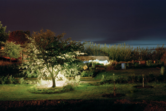
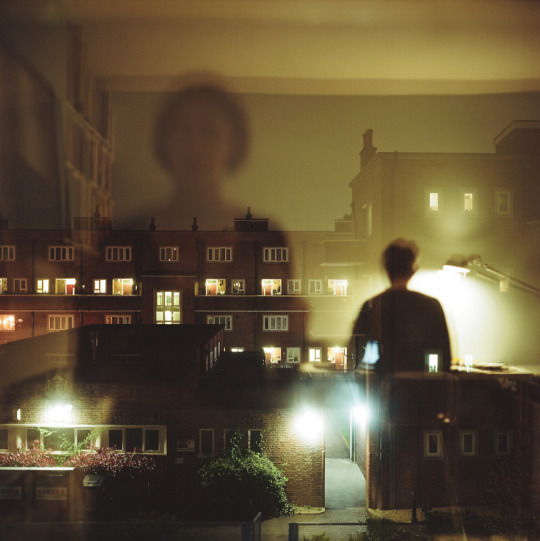
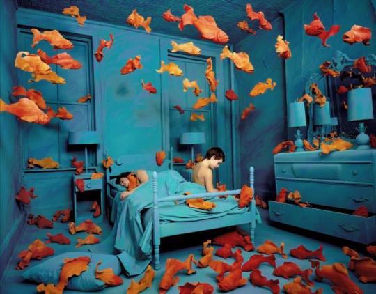
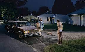
these image standout to me because of there light uses. in image one i love how the tree is lighted i feel it makes the image standout so much more because of it. the second image i loved because for me i saw pain in the image the way she is looking out the window. the last on i picked because it was just really weird and different .
0 notes
Text


Something told research
when i see historical still life they are always brown they are always weird images. i feel like they always have books or feathers. in these image i have pick one of they have broken dolls in them with i find really interesting . in the other image there is a violin which i feel tones that whole image.
the old masters
0 notes
Text


Final Doorstep portrait
overall i feel these images came out really well and i really like them. image 1 shows loving grandparents with there grandson having a funny moment and there the main forces of the image. image 2 is thought a window so i was trying to not get to much of the reflection on the glass overall i feel the way it lined up with the sky and clouds just above there heads is really nice
0 notes
Text

Fashion task
For this task i picked vogue magazine. when it comes to there website they are very simple and white but the photography is in my opinion very creative. i love there really colourful images which is something i loved to do in my own work. i feel they give everyone there own story/personality in there images and are not scared to do something so bold or even something so simple and it works. i feel in there images there lighting is never off the person is always lighting beautiful. i feel like the posing is always fitting to the person that ins it the picture.
0 notes
Text

brand portrait review
this is the final image for my brand portrait. i picked Nivea because its my favorite sick care brand and i use it all the time. when creating this images i wanted to have a very natural background this is why i picked a plant as my background, i also sprayed water over the plant and cream to add a refreshing look. when i was shooting the sun was coming over in little bits, for me i didn't mind this as i feel it added to the image. overall i loved then way this image came out
0 notes


