
A place for me to share my thoughts about UX and Web Design.
Don't wanna be here? Send us removal request.
Statistics
We looked inside some of the posts by shanesuxwebdesignblog and here's what we found interesting.
Average Info
Notes Per Post
10
Likes Per Post
10
Reblog Per Post
0
Reply Per Post
0
Time Between Posts
2 hours ago
Number of Posts By Type
Text
7
Last Seen Tumblr Blogs


Fun Fact
1,644 Tumblr posts in 1 second.
Text
Why Failure is Important in Design
Failure; the state or condition of not meeting a desirable or intended objective. One of the most important things to learn as a designer is learning how to fail. The start of every design project is daunting, especially when you’re just starting out. If tasked with a complex problem to solve it can quickly become overwhelming when you can’t visualise the final solution. Every single project a designer has undertaken has included some type of failure. Whether it be missing a vital piece of research, not carrying out adequate testing or making a mistake with a prototype. However, the final solution is always influenced by the failures throughout the project.
Learning how to fail in design can improve your workflow and lead to more successful solutions. Take sketching for example. Sketching in design is one of the most important aspects of failing. Every design project starts by sketching. It doesn’t matter whether you are a fashion designer, architect or graphic designer, learning how to sketch and iterate is vital to create robust solutions. Lets say you are a product designer tasked with creating a new product. What’s the first thing a designer does when they have an idea? Do they make the idea straight away? The answer is always no, the first thing a designer does when they get an idea is sketch. A simple pencil and paper can save you hundreds of euros because you can work your idea before you bring it to production. A product designer can not start making a chair without sketching it out first.
Sketching allows designers to work out all the different kinks of a problem. Think of sketching as a small failure every time. Although it seems like you’re failing after exploring multiple solutions and not getting anywhere, you must think back to the start of the project. Are you better off now that you know all of these ideas won’t work or would you be better off like you were at the start with a blank slate? Failing is design can be difficult, but just know the more times you fail in a project, the close you are to the final solution. Once you learn to develop persistence, you will see the benefits of failing. In fact it shouldn’t be considered failing at all. “If you’re not failing, you’re not going to innovate”.
Designers never share their failed ideas on their portfolio. It can seem like some designers have exceptional ability to complete a project with no hiccups but the reality is they are failing just as much as you, maybe even more. So next time you run into trouble during a project, remember that embracing failure leads to better designs.
2 notes
·
View notes
Text
The Importance of Making Things Look Good
Picture yourself walking through a shopping isle at a supermarket. Think about all of the food products that sit on the shelves. Some might look familiar to you, maybe you’re picturing a bottle of Coca Cola or Nespresso instant coffee. Now picture all those food products with no graphics on their packaging only small black writing with the name of the product. It would look pretty bland right? The products would all look the same and nothing would catch your eye. This is a perfect example of how important aesthetics are when you’re trying to sell a product. The packaging of food products are designed to grab your attention and get you to buy them. Your website should do the same.
In this post I’ll be discussing the importance of visual aesthetics in web design and the detrimental effects of a bad looking website. The Aesthetic-Usability Effect states that “users often perceive aesthetically pleasing design as design that’s more usable”. In simple terms, if your website does not look pleasing to the eye, users will have an unpleasant time navigating the site. Aesthetically pleasing design creates a positive response in peoples brain and leads them to think that the design of the site works better than it actually does.

Web design and graphic design work in tandem when creating a website. Colours, fonts and layout plays an integral part of the website. Of course user-research and information architecture are just as important to create a well designed website. The branding of the company or organisation should inform the style of the website. Using the same brand colours and fonts on websites creates a consistent brand voice. Take for example Apples website. Apple use a minimal layout to put their products at the forefront while also using the same brand colours and fonts across all of their products and applications to create a positive response in peoples’ brain.

One website that has caused uproar amongst web designers is Yale School of Art. Yale is regarded as one of the most prestigious colleges in America with an acceptance rates of only 6%. Their art department is also very well renowned in the art world however their website doesn’t seem to reflect that. The website is used as a place to experiment with students having full control over the style of the site. If you pictured what you think Yale School of Art website would look like before you clicked in, I’m sure you were surprised. The website is not responsive and is overloaded with information. Perhaps the college is so prestigious that they are trying to prevent prospective students from applying?

The visual aesthetics of a website should clearly reflect the business goals of the client. If you are designing a site for a child daycare centre, using dark colours and experimental fonts will not be received well by parents who visit it. The aesthetics should be consistent with the existing brands guidelines creating a higher level of trust between the company/organisation and their prospective users/buyers. Failure to create a visually aesthetic sit will give you less of a chance to attract new business.
1 note
·
View note
Text
How Do You Structure a Website?
Structuring the content of a website plays an important role in the user experience. Badly structured websites leads to frustrated users and does not help your conversion rate. Today I’m going to be talking about information architecture and sitemaps. Information architecture has roots in library science and cognitive psychology. It is the science of structuring content in a website or application. Think of yourself as a digital librarian, structuring content across a digital platform. You need to know where information is placed on the site and which elements are most important.
youtube
Take for example the FAQ page of websites. They are usually located at the bottom of the page in small writing because for some sites the page is not as important. If you are browsing on an e-commerce site, they will always have images of their products on the very first page of their website because that is the most important element of their site. Humans are temperamental, if a website is tricky to navigate we will cancel out of it. This has happened to me on a number of different occasions, for example a couple of months ago I was looking to buy a new tv. I decided to browse an electrical goods e-commerce site but quickly became frustrated and switched to their competitors site to make the purchase. If the original store had a well structured information architecture, they would’ve made another sale.
A sitemap lists all the labelled pages in entirety and shows hierarchy, structure and often page goals along with content/functionality that happens to be on that particular page. The sitemap is based on business and user needs, and is tried and tested during research to find the best way to structure content. Both the information architecture and site map inform the navigation of the interface.
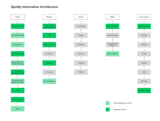
Here is a great example of a site map for the popular streaming service Spotify. This designer took it upon herself to improve the information architecture of the app since she was frustrated with the existing one. Spotify’s business goals lie in advertising, retaining users and attracting new users. Their goals are squandered however when we take a look at their sitemap. We see a lot of duplicated sections on pages such as the Daily Mix feature on the app. This frustrated the user when they are trying to carry out a certain task but are met with unnecessary content. Simply removing sections of the sitemap would prove to be a better user experience.
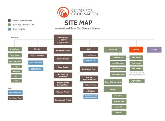
Another example of a sitemap which shows the website for a Food Safety company. The sitemap is clearly played out with examples of dynamic database pages and email templates. The websites purpose was to encourage farmers and gardeners to share different seeds of plants. The simple navigation system makes it easy for new users to sign up in two steps and find available seeds. The user is then enticed by recent news articles giving helpful tip and tricks to grow their seeds. Making the user not think too hardly when navigation a website is the key to increase more visitors.
1 note
·
View note
Text
What is Web Architecture?
Have you ever wondered when you type into google how it exactly works? These days, we take the web for granted. Today I’m going to talk about “web architecture”, or simply put, how the web gets its information and where it comes from. I use google everyday for a variety of different reasons. I could get stuck on a certain task in work and type my problem into google and get the solution in seconds (although it sadly doesn’t always work as smooth).
Lets say you type amazon.com into your Google browser. Depending on your internet connection, the web page will load in a matter of milliseconds. What exactly happens in those milliseconds?
Well, first off your browser sends a signal across the web to a google server in a data centre somewhere in the world. There are data centres in every corner of the globe and more and more need to be built to store all the data on the web. The browser is the “Front-end” of the internet. Users like you and me directly interact with the front-end by using websites and applications, even on our mobile phones. The “Backend” is the behind the scenes of the web and it does the heavy lifting for us so we can access content on the internet easily. The server and data centres is the back-end of the web.
The server gathers the requested information from a database and returns the information back to your browser. This information comes in the form of HTML code (Hypertext Markup Language). HTML is used to build web pages on your browser. Your browser will then analyse this code and download additional assets such as scripts, fonts or images. Once the browser has analysed this information, it will visualise your web page and reveal amazon.com in all its glory! This is how your browser loads pages from the web and also applies the same logic for applications on your mobile phone.
1 note
·
View note
Text
Accessibility in Web Design
One of the most overlooked aspects of web design is accessibility. When you begin your research before designing a website have you considered all users including visually impaired and physically disabled? With millions of people using the web everyday it’s more important than ever to give people equal access to information. In todays post I’ll be undertaking accessibility tests on three websites to see how they’ve considered accessibility issues regarding their website.
I wondered if the special olympics website supports users with disabilities to navigate. After running an accessibility test on webaccessibility.com I found that specialolympics.org scored an 80% in compliance with 105 violations identified.

One violation I found quite surprising was “provide alternative text for images” which scored a severity of 10. Images on websites must be given an alternative text equivalent to support users who are visually impaired. There were 8 violations identified that did not provide alternative text, some of these included icon buttons for twitter and instagram.
The website scored a low 2 in severity for ensure sub-lists are marked up properly. The website was compliant in creating ordered lists that help non-visual users navigate; “non-visual users may get lost in lists, especially in nested lists and those that do not indicate the specific nest level for each list item”.
Another violation identified was “ensure links or controls that open new windows or frames do not open without a warning”, to which the website score a severity of 6. A developer should indicate a warning box for links that open another window.

The second website I performed an accessibility test on was thejounral.ie, a popular news website in Ireland. The website scored a 78% in its compliance score with 48 violations identified. Among them included missing alternative text for images and ensure frame titles are meaningful. There was an astonishing 233 contrast errors in relation to very low contrast colours on the websites user-interface.
The last website I tested was ucd.ie, the main website for University College Dublin which scored the highest compliance score of 81% with 79 violations identified. Only 8 errors were found in the website’s code, among them were missing form label and empty button. There was also 33 contrast errors regarding the very low contrast on some pages. The website scored a low severity of 2 in ensuring sub-lists are marked up properly.

2 notes
·
View notes
Text
PayPal Website Review

PayPal is an online payment system that serves as an electronic alternative to traditional paper methods like checks and money orders. It was first established in December 1998 under the name Confinity by Max Levchin, Peter Thief and Luke Nosek. In 2000, the company merged with X.com, a similar online banking system founded by Elon Musk. Then in 2002 the company was acquired by the American e-commerce corporation, eBay. Throughout the years the company has grown exponentially and become one of the most trusted online money transfer platforms. Today, I’ll be reviewing PayPal’s website and outlining why I think it achieves exceptional web design.
When you first visit paypal.com you are greeted with a simple, straight to the point homepage. I was surprised to see such a simple page for a company as big as PayPal. This just shows you the effectiveness of simplicity. The homepage has a simple layout that shows users the features of PayPal.
Once the page loads, eye-catching illustrations animate onto the screen with clear and concise copy such as buy online or in apps, shop worldwide and pay someone fast. Above the simple illustrations we see a great tagline, with ways to shop, pay and chip in, we’re here for you, along with a call-to-action button; sign up for free. These elements focus the user’s attention.
At the top of the page we are greeted with navigation bar that has the logo placed to the left along with dropdown menus for personal, business, partners and developers and help. In the top right hand corner, there are two more CTA buttons, log in and sign up. The navigation bar accommodates for the different users visiting the site. The layout of the homepage is also in a Z pattern which is a common layout for all websites as it guides the users eye. The use of familiar patterns puts the user at ease.
As you scroll down there are more simple illustrations and easy to read text explaining the benefits of PayPal. These are spaced apart evenly running in two columns. There is lots of white space that reduces the cognitive load on the user. Theres is also great use of effective writing with simple to read text that doesn’t feel like jargon.
Another great example of good web design is the websites responsive layout. As I scale my browser to different screen sizes, the websites content changes scale depending on the size. Content that was once in two columns now becomes one when viewed on mobile size. The simple layout and less cognitive load creates a positive user-experience and doesn’t make users think. This is a vital web design principle which minimises the necessary actions for the user. There are no unnecessary steps and the website does not force the user to sign up.
A lot of websites can confuse users if they don’t layout their information clearly. PayPal guides the users with clear content and clearly shows what functions are available. For example, when you click on pay online is brings you to a page with three simple steps to buy online;
(1) Sign up quickly, and for free, with just a few details.
(2) Add your bank account, debit or credit card.
(3) Just use your PayPal login and skip entering your financial information every time.
The consistency of the content and layout makes the navigation of the site easy and rememberable. Overall, the website utilises essential web design principles to create a positive user-experience. I think the site’s simplicity is a perfect example of how great web design is unnoticeable, guiding the user effortlessly through the complex features is no easy job but PayPal has hit the nail on the head here!
1 note
·
View note
Text
The First Ever Website
In what seems like a lifetime ago, back in 1991 on August 6, Tim Berners-Lee published the first ever website. Berners is a British computer scientist who proposed an early version of the World Wide Web when working at CERN (The European Organisation for Nuclear Research). Back then, Berners idea of the web was a system to facilitate sharing and updating information among researchers. Almost 30 years later, there are around 1.83 billion websites on the Internet (as of Jan 2nd 2021) and 4.7 billion internet users.
However, today I am going to look back at the very first website ever published and review it from a user-experience standpoint. In 2013, CERN re-published the first website back on the internet. Back in 1991, Tim Berners hosted his website on his NeXT computer.

The purpose of info.cern.ch was to educate people about how to use the WorldWideWeb (W3). When you first open the website, you immediately suspect it must be an old website and might even ask yourself if this is a website? In the top left corner, there is a heading of “World Wide Web”. Below there is a series of text containing hyperlinks that open more pages in the website.
There are no images on the site and the only style added to the text is the blue underlined words that contain the hyperlinks. The first two lines of text explain the purpose of the website and includes an executive summary, mailing list, W3 news and frequently asked questions. It’s interesting to see some of this information is still shown on websites today, 30 years on
After the first two lines, there is a list of 9 hyperlinks with short descriptions one after another, that give more information about the WorldWideWeb. These hyperlinks include help, technical, bibliography, history, getting code and more. When you click into these hyperlinks, it brings you to another page on the website with more detailed information about each subject. For example when I click into “bibliography”, it brings me to a page with a series of papers and articles about the W3 initiative. At the top of the page, it is noted that “you can of course also quote any page you read with w3 by its document address”, another thing still used today as I have done even in this blog post.

The website is not as user friendly as websites today, however, it does serve its purpose of giving information about the WorldWideWeb (W3). The lack of styling to the page makes it look flat and resembles more like a text document than a modern day website. But this simple little website laid the foundation for the billion more websites we have today.
2 notes
·
View notes