
Inside this blog I will be uploading work that I am doing or going to do through out the modules while studying graphic communication
Don't wanna be here? Send us removal request.
Statistics
We looked inside some of the posts by sarojyogi and here's what we found interesting.
Average Info
Notes Per Post
18
Likes Per Post
18
Reblog Per Post
0
Reply Per Post
0
Time Between Posts
1 day
Number of Posts By Type
Text
16
Last Seen Tumblr Blogs


Fun Fact
The average Tumblr user visits about 67 pages every month.
Text
Ideation for the Content page
For the magazine I have decided that I would use 8 architecture (4 medieval, 4 Modern) images and would have a double content page with 4 images each side and for the structure of the content page I have made some sketches of how it would look but I also have some thoughts of using similar format that i used for practice content page I did before.
Idea Content page:


1 note
·
View note
Text
Idea Creation of masthead
after choosing a theme I started just sketching ideas on how my masthead would look like and here is some examples:


1 note
·
View note
Text
Research
Understanding the structure of magazine/newspaper.
For this time I took a look at some magazine I had at home and looked at the way they present their products on their magazine and I also looked at a newspaper I had at home to understand the the method they use for their content pages, masthead and the difference i saw between them was that in newspaper focuses more on writing and where as the magazine focus more on images that would attract their audience and have small size font of writing on the bottom for the information, such as how it has a hero image on the front page and follows onto to more images on the next content page to let their audience see what they provide instead of making them read a paragraph.
1 note
·
View note
Text
Contextual Studies
Love of typographic
Feedback:
This was one of the online lectures I had for the start of this module and was really something I was looking forward to since it was linked to one of the task I did at the start of the module, It showed me new of using typographic and also how Designers use typographic with negative space to make it really creative which was one of the things I really I find interesting, we were shown multiple examples of work and where we also got involved on it and one of the things we looked at was looking at the difference between type face vs fonts, typo graphic vs lettering, Legibility vs readability which helped us understand them and overall it was a really helpful presentation.
1 note
·
View note
Text
Practice on making Content page
For this we were given couple choice for the theme and were told to make a content out of it (Creative Reviews, New York times, Timeout ), after looking at the contents of all of them I decided to go with the Creative reviews and started the work by making a grid in IN-design to have a template ready for me to put all the information and for how i was going to put my contents I looked at some other magazines and how they would use the contents page and tried to make one of my own and here is how the turned out :

1 note
·
View note
Text
Mood Board on Modern Architecture

Reference :
https://www.architectureartdesigns.com/5-of-birminghams-best-modern-architectural-designs/
1 note
·
View note
Text
Mood Board on Medieval Architecture

Reference:
https://www.abacusarchitects.co.uk/blog/architecture-of-birmingham-points-of-historical-interest-2/
1 note
·
View note
Text
Research on Birmingham architectures
thought started on the topic we can choose from (Birmingham, Medieval Birmingham architecture, Georgian and Regency architecture in Birmingham, After a Billionaire Designed a Dorm, an Architect Resigned in Protest) and I decided to go with Birmingham Architecture which would allow me to look at both the medieval and modern architecture and see its development. I read through some of the research provided by my tutors on the thought starters but i went on to look at the history of Birmingham myself to understand and see how it went from a small village to one of the biggest cities.
I went on to research on the history of Birmingham and found out that all of this started from a small Saxon village that grew into a town in the early 12th century and when the lord of manor gave a the right to hold welly market in Birmingham it allowed them to open their place to all the merchants that helped them grow and now is populated with over million.
Birmingham grew rapidly because of the Industrial revolution in the 18th century since it had various advantages that helped more on the metal working, there are still some Medieval Buildings still to this day such as the 15th century Old Crown which is a pub that is believed to be build around 1450-1500.
One of the most Modern building that has the potential of being one of the most futuristic is the Selfridges, by Future Systems, which was completed around 2002 with the cost of £60 million and is one of the building's that I personally like not just the design of it but the way its build and when it was build since it was build around 2003 but looks to be like a buildings that are made this year because of the futurist look.
Websites reference I used:
Birmingham history:
https://localhistories.org/a-history-of-birmingham/
Main architecture buildings:
https://www.abacusarchitects.co.uk/blog/architecture-of-birmingham-points-of-historical-interest-2/
Research on the Old crown:
https://en.wikipedia.org/wiki/The_Old_Crown,_Birmingham
Selfridges research:
http://www.galinsky.com/buildings/selfridges/
1 note
·
View note
Text
Arkitekt
We were given a thought starters on these theme that we can work and expand towards more and after looking at some of the options (Birmingham, Medieval architecture in Birmingham, Georgian and Regency architecture in Birmingham), I decided to go with architecture on Birmingham that will include both the medieval and the modern architecture to show how Birmingham has developed through out the many years.
1 note
·
View note
Text
Introduction to the 3 magazines
Arkitekt
Gentle Lady
Filmmaker
For the magazine we were told to choose one of these themes and do research on them and use it for the magazine we want to make.
After looking at the both of them I had decided to choose between Gentle lady or Arkitekt, then after looking into it more I have decided to go with the Arkitekt.
1 note
·
View note
Text
Alphabet Street
For this task we were told to take pictures of alphabets around the place we live in, it can be any letter, on the ground, logo, posters, and For this task I went around my closest town and walked around, I also went to the main city entre and walked around there and also used some letters from the BCU building itself and made a collage of them:
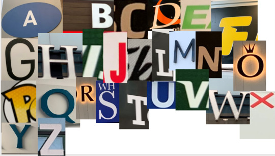
Over all this task was my favourite because it allowed to to walk around freely and look at stuff that I would normally just ignore and walk past and it showed how other designer use the terminology and use it in the real world in logos, posters, streets, building, which was a really good experience for me.
1 note
·
View note
Text
Macro and micro
Task 3:
For this task I was told to use a letter of an item or logo or anything and draw it by hand and Enlarge the letter.
For the Letter I decided to go with the logo for the M&S and I went with the M and drew the enlarge version by hand and filled it with felt tip pen and annotated what I can see:
Logo:

the drawn M:

I looked at the fonts that the logo was made of and found out it was a sans serif font made by someone and this is the reference website I used for it :
https://deltafonts.com/marks-spencer-font/
1 note
·
View note
Text
Call my name Part 2
Overview:
I really enjoyed doing this task because it allowed me to use what I learned on the first task and use it straight away, even though I had difficulties at the start I was able to come back and finish what I started and overall it was a really enjoyable experience which I will be doing more in the future.
1 note
·
View note
Text
Call my name
Task 2
For this task we were told to use our surname and choose a font and use the font to draw the fonts and it was all to help was understand the terminology behind each words and if possible see the difference in each of them, However I thought that I was suppose to do this task digitally so I did it using Photoshop but I also drew it afterwards so I will be showing both of them.
Digital surname in different fonts and annotations:

Drawing surname in different fonts and annotations, for the drawing I did both my surname and my first name to see the more outcomes i can come with:


2 notes
·
View notes
Text
Task 1
For the first week we are set to do multiple task and this is one of my task where I am to memorise the Typographic terms,
Typography terms:

Outcome:
This task allowed me to understand the depth of each letter I use and the fonts I choose and it helped understand the correct terminology of each words, even though I understand some of them I will be still looking back at this image and try to understand as much as I can off by heart.
This is one of the website I found where it talks about the terms in more detail and helps me understand the terms much more easier.
https://www.monotype.com/resources/studio/typography-terms
1 note
·
View note
Text
Module Overview
For this module we will have 2 final outcome which are:
- Making a magazine
- A Campaign to raise awareness on a social cause
It will be 8 week long module, worth 40 credit
It will last until the 7th of February 2022
I will be doing multiple lectures both online and on-site and having one to ones with the tutors.
2 notes
·
View notes