Don't wanna be here? Send us removal request.
Photo
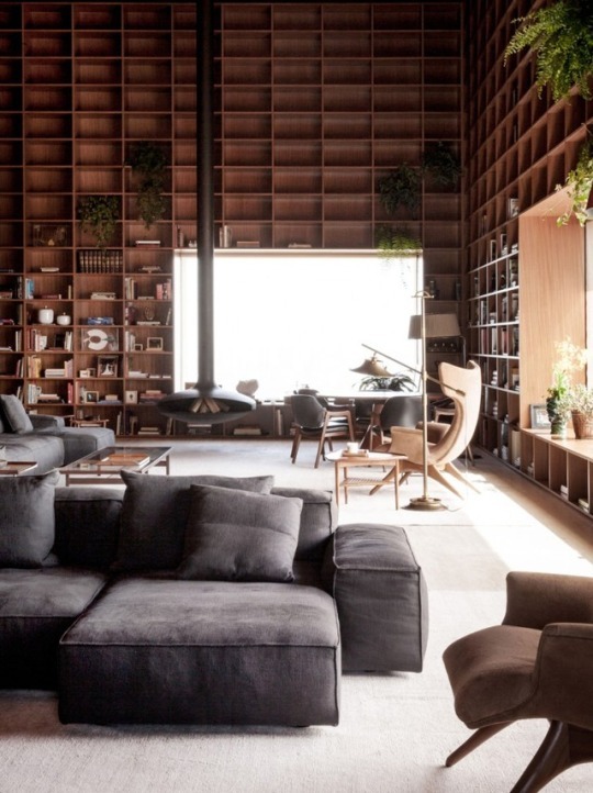
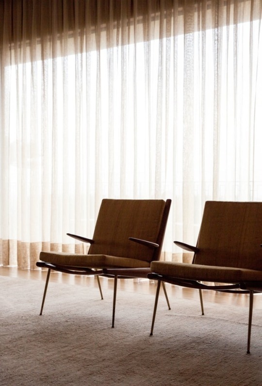
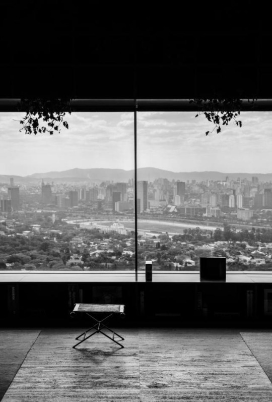
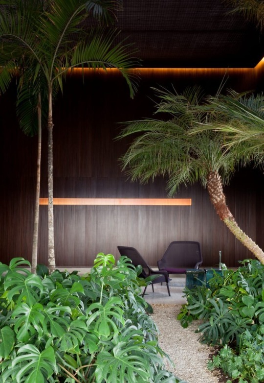
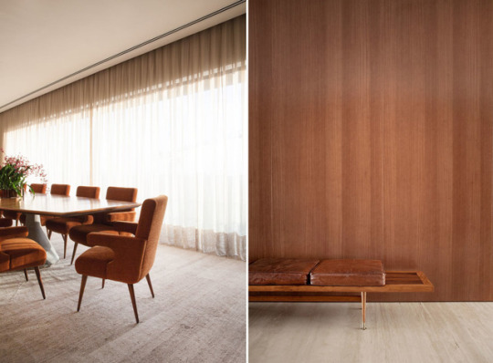
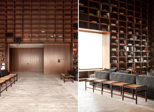
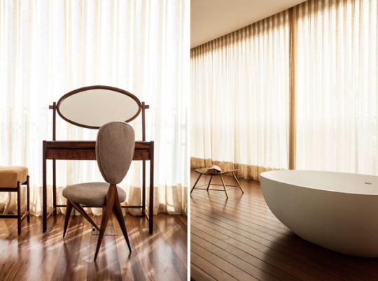
Different types of chairs in Sp Penthouse in Sao Paulo, Brazil. Project by Studio MK27.
the architectural interiors of this stunning penthouse in Sao Paulo. The goal was to create fluid open spaces with a cozy and solemn atmosphere, where the fixed custom contemporary furniture should be in perfect harmony with the design classics from the Brazialian, Scandinavian and Italian signs, such as Hans Wegner, Franco Albini and Gio Ponti.
1 note
·
View note
Photo

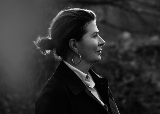
Ilse Crawford
Ilse Crawford the abstract designer who have Netflix series on the lives of designers. Bring her idea to life. Episode 9 of the series is based on Ilse Crawford
London designer Ilse Crawford who create a hub space for Maison&object’s pairs fair September after being awarded the title of Designer of the Year. In a first for a Maison&Objet Designer of the Year, Crawford will create and style the space known as the Designers' Studio, which functions as a central meeting point during the fair in Paris.
Designers of the Year – of which there are four, corresponding to Maison&Objet's four international trade fairs – usually create installations or exhibitions to be displayed in the event venues.
Crawford believes design can influence the way we behave and feel. By addressing changing times and values, as well as the things that don’t change, design can shape the way we live and work.This approach is applied at all scales, from products to buildings, private to public space and is one she is developing with the next generation of designers through her work as Head of Department at the leading Design Academy Eindhoven.
‘’The space is divided up into zone where families of furniture and lighting have been carefully grouped to encourage and support these activities’’.
0 notes
Photo
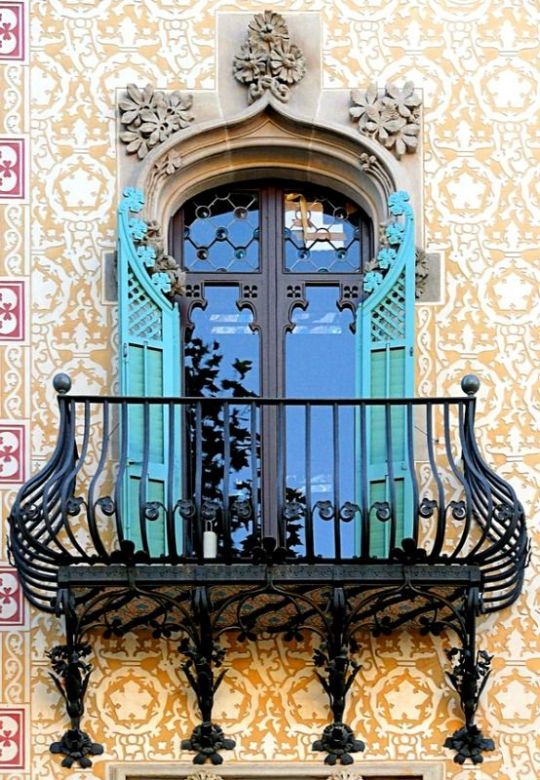
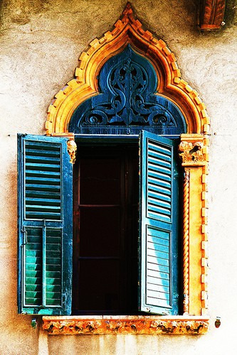
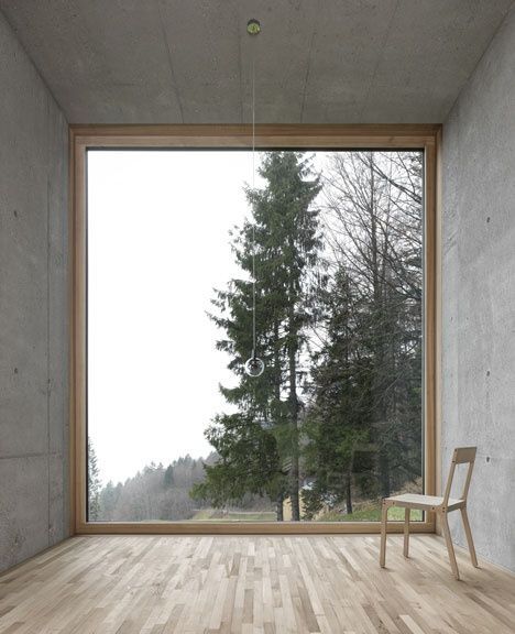
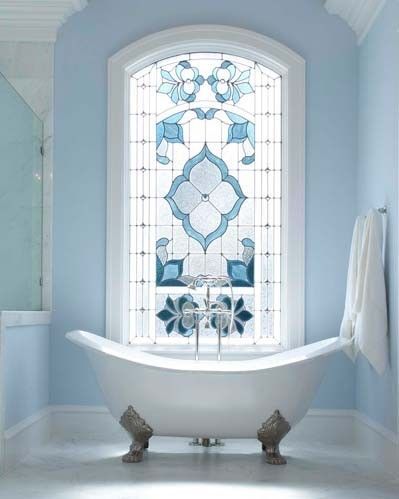
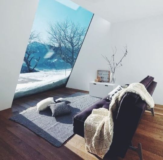
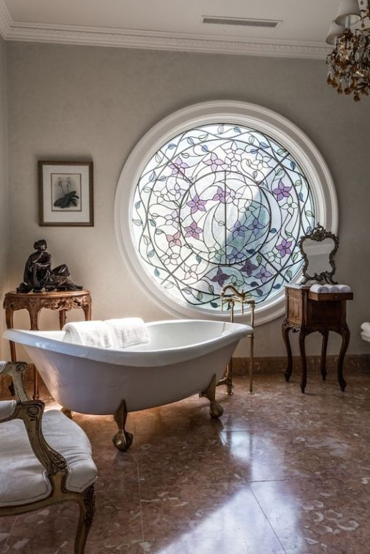
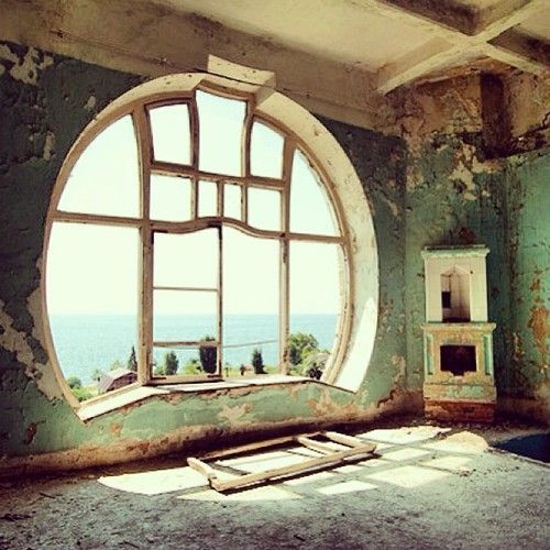
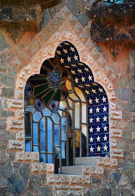
windows
Who would not fall in love with this beauty, look at thoes windows old to modern. marvelous designs
“The idea of being able to build things bottom up, atom by atom, has made [scientists] all into tinkerers. And all of a sudden scientists are seeking designers, just like designers are seeking scientists.”
1 note
·
View note
Text
Journey of my Retail Project
On the first year of my degree I was assigned to design a retail project, which is so far the biggest project, I have done since I stepped into an interior designer's world. The project is based on a brand that we have to choose on our own. We had to prepare an A3 development pack, which includes more Than forty-five pages along with a concept model, two A2 size Presentation boards, a sample board and an architecture model, with our own design inserted in it. Due to this project I have learned many things about design. This project is the hardest and most challenging project which I have done till now.
When the brief of the project was handed over to me I was very scared. Somehow I lost my confidence for doing the project for a minute. Later on I realized that I was scared because I did not quite understand the brief. After reading the brief several times I eventually got an idea about what I had to do, thus, building up my confidence.
To begin my project I had to research and choose a well-known brand. Initially, I Selected two brands but later realized that the brand did not have a showroom so went on to look for other alternatives. Finally, I decided to choose Dior brand for my project. I chose Dior because they have a long rich history behind their brand, which really amazed me.
For my development pack I included as much as information that I could get from several reliable resources. After collecting information about the brand I started doing the work roughly. The reason why I did rough was because I wanted to make sure whether the processing of my work is on the right track or not. Following a review with the lecturer I knew that I was on the right track so I was more confident about my work.
As soon as I was done with my research I started to think about a concept for my project. I struggled a bit to find a concept because the brand I chose was very luxurious and high-class. After doing some more research on brand history I got inspired by their first collection, which represented feminism. I thought of bringing Back 'feminism' as my concept for the store.
As I started developing my concept I thought it would be unique to integrate my own culture into the concept. So I took the shape of a traditional toddy (raa’ bandhi) as my main inspiration. As I was connecting both Ideas, it was not working so much. So decided to change and decided on the shape of an Hourglass.
When I started with all the technical drawings I had a lot of difficulty when it came to finalizing a floor plan with my design and scaling the furniture’s were the hardest so It took a lot of time to get done with the technical drawings. After finishing technical drawings I was finally able to work on my architectural model.
For the material board, I decided to paint the board with white paint and which took a few days to dry off. Meanwhile, I was tried my best to cover all the requirements, which was on the brief and complete the model as well.
On the day of submission, I was in a panic state and was very demotivated as well. So many negative thoughts were surrounding me but I didn’t give up and started to Finish my works that were not properly completed but Most of it was completed. I tried to submit my work on the time but I couldn’t. I was very Disappointed with myself because I knew I had the ability to do this but failed to use it effectively this time.
When I received my Feedback I was quite surprised. I thought I would fail because all my work was a late submission but luckily I got a pass. Although it did not go as planned, I learned how to deal with such a huge project. It also taught me the value of time which, I was taking for granted. If I had planned a schedule and divided my works accordingly I would have been able to submit it on time.
To conclude, I would say this experience was very challenging. This was my very First project. I was very hesitant to do it from the beginning. But this also gave me confidence to do another project. Now I know what I need to improve and use time wisely. I was literally fighting with time so it was a struggle. I learned a lot about design research and time management. For the next project I would be well Prepared. As design student this whole experience was very thrilling yet Exciting. The fact that there is lot of other stuff rather then the theory was a very challenging, as this was very new to me. I hope I would be able to get another retail project and do it much better then this.
0 notes
Photo
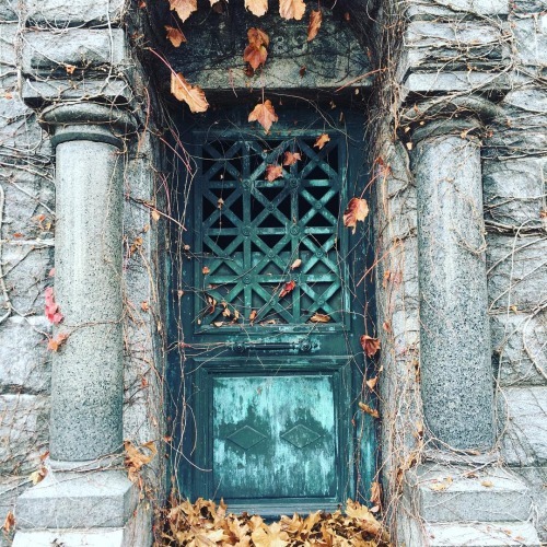
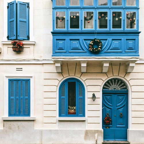
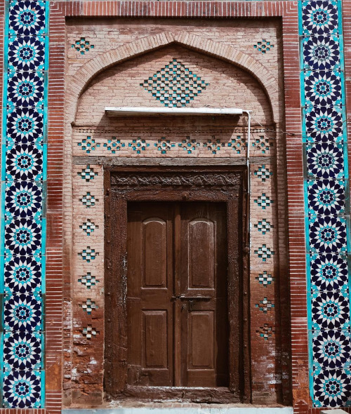
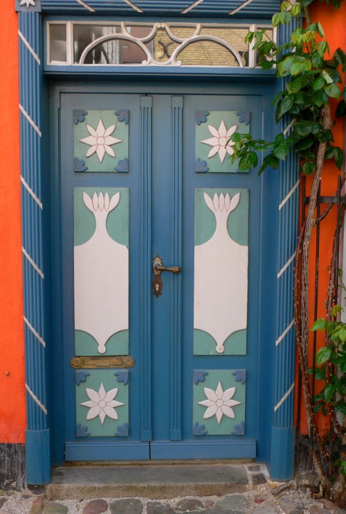
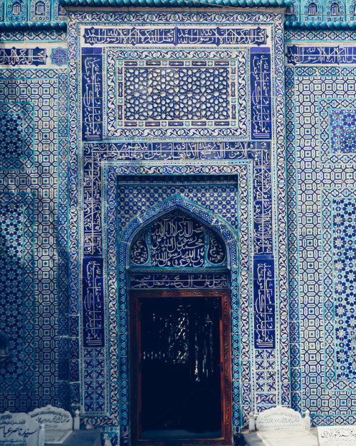
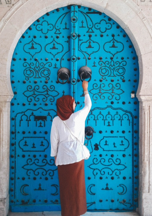
Doors.
Theirs are some of the door i’m love with. look at those colors. the patterns are incredible how they have done the cut of the patterns.
Hard work open doors and shows the world that you are serious about being one of those rare - and special- human begins who use the fullness of their talent to do their very best
0 notes
Photo
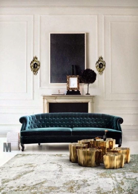
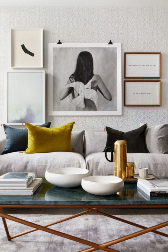
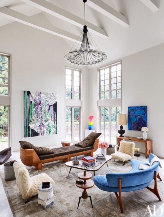
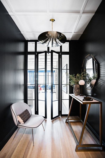
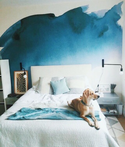
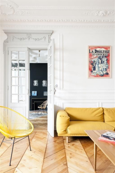
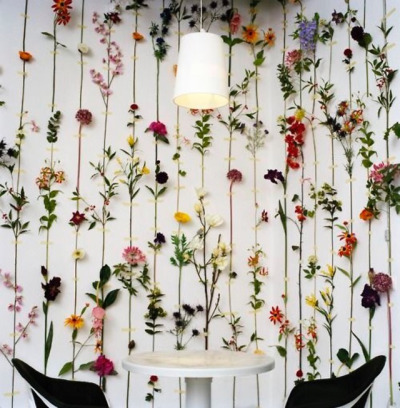
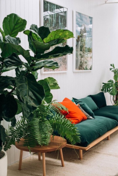

Some of the walls that i got inspirited of.
I like the idea that we build up these walls or rules or laws to maintain our reality, and when they fall away, you're left with a whole bunch of illusions. Smoke and mirrors.
1 note
·
View note
Photo
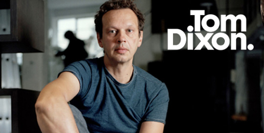
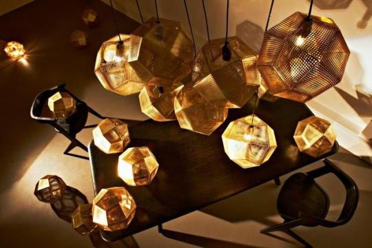
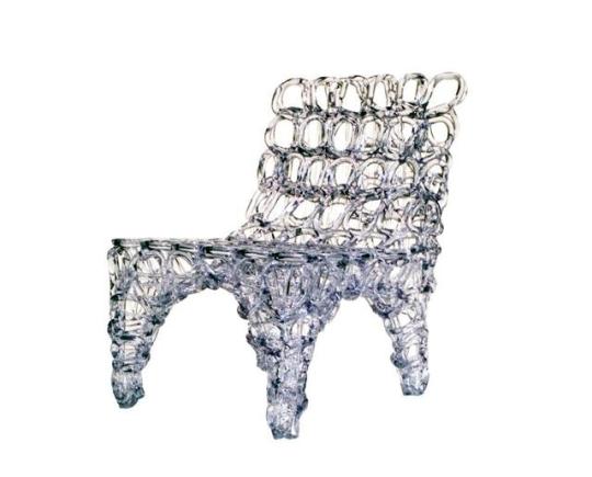
Tom Dixon
Self- Taught Designer- Businessman. He has always done things his own ways. he is one of the most successful designer in the British know for his furniture and lighting.
on design industry he always challenging for conventions. he change old - design to bit more modern. He did what other designers wouldn’t dare do like giving aways his work for free.
Fresh fat easy chair
which is made by plastic, by hand in one continuous piece in a repeated pattern live onstage.
Etch digitally shade
made with brass, using an industrial process that produces electronic products, including circuit boards, which allows for intricate detailed patterns be cut directly into metal.
“We work in an industry where it’s getting easier and easier to copy things. So we’re always looking for more difficult and personal textures, finishes, techniques, and finding secret recipes for glazes where you can’t really control the process. We’re kind of letting go of that absolute consistency, which a lot of manufacturers and a lot of designers strive for. We were looking at influences, from The Flinstones to Art Nouveau, to try and find something that’s a bit earthier, where each object is as different from the other as possible. It will be interesting to see how these take off and whether people get it, or if they find the natural variance difficult to handle.” - Tom Dixon-
He is the hope for demonstrates design industry of the future.
5 notes
·
View notes
Photo
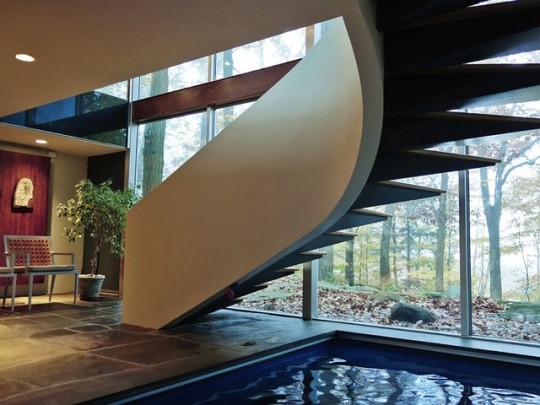
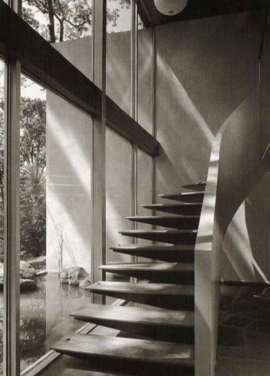
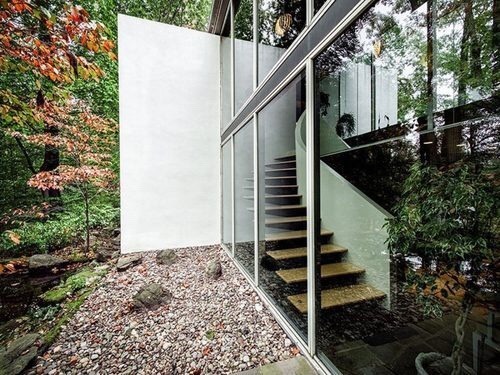
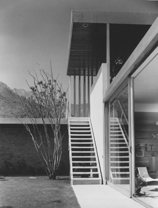
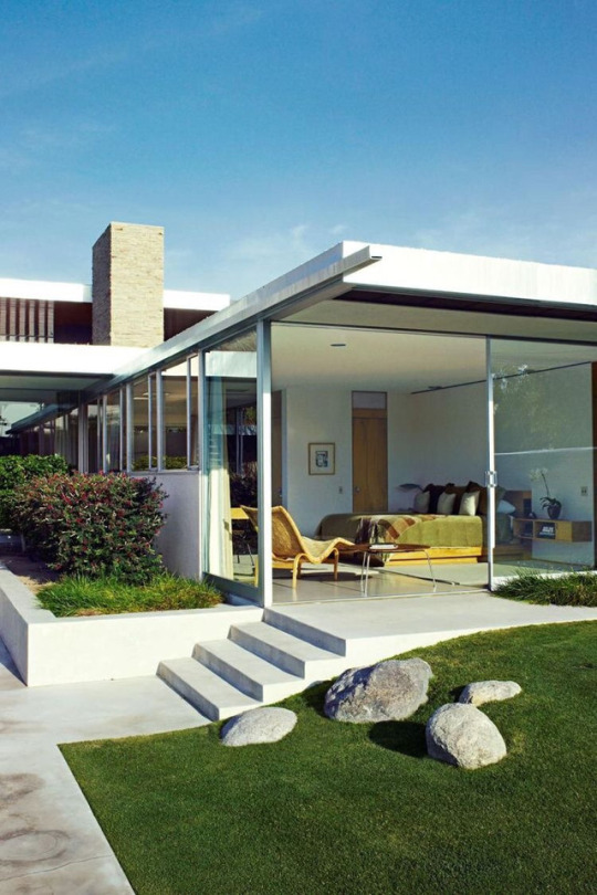
steps and stairs
The vision must be followed by the venture. it is not enough stare up the steps — we must step up the stairs
1 note
·
View note
Photo


HELVETICA
Helvetica is one of the most popular typefaces in the world. Helvetica developed in 1957 by Swiss typeface designer Max Miedinger.
some of the famous brands are in Helvetica like Dior, Chanel, American Apparel.
Helvetica is clear, good for everything. and every graphic designer’s best friend.
1 note
·
View note
Photo

DESIGN BLOGGING
Design blogging is collection of designs done by different designers that are displayed on social media.
it's a way, can increase the design knowledge and inspiration to create a something different . as well its important to refer to design books.
0 notes
Photo
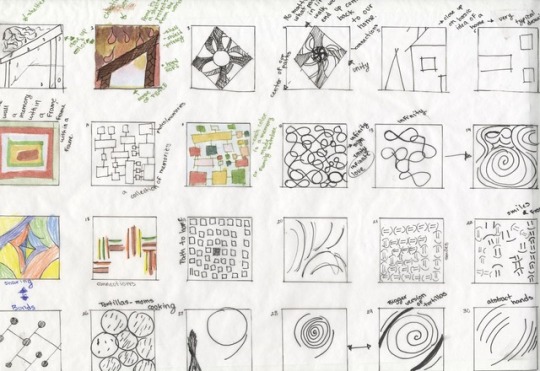
DESIGN DEVELOPMENT
In the design development, now with the concept build out with more details. Then have to stretched out in order to develop it. with the idea using sketches, plans, and design of the products.
Its important to explain the client the process of design a clear and more visual way.
0 notes
Photo
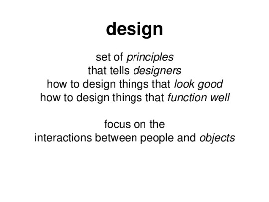
HOW TO DESIGN THINGS
From the research, collect information. then the designer need to work on concept with those information. its important to make mind maps because being fixed with one idea will limits design.
0 notes
Photo
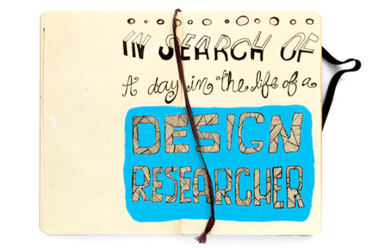
DESIGN RESEARCH
Without research we can’t create or know how to create. Design research is foundational to creating products, services and systems that respond to human needs. understanding and meeting human needs are critical for improved livelihoods and better governance.
Design research is largely overlooked but many institution important to an effective society. Purpose and role of design research is not well understood. But in collecting the important data they need to run the programs.
0 notes
Photo


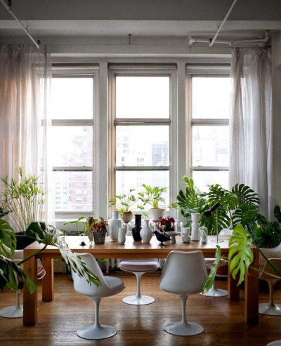
Interior Designer Charoonkit Thahong.
He is obviously a collector. he has a lot of ceramics and porcelain collection. he have used wood for the cupboard and for flooring. to bring living to the room he has used plants
0 notes
Photo
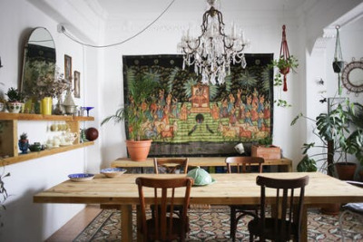
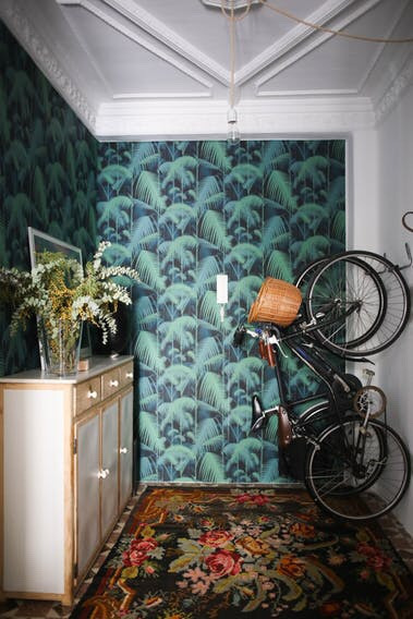
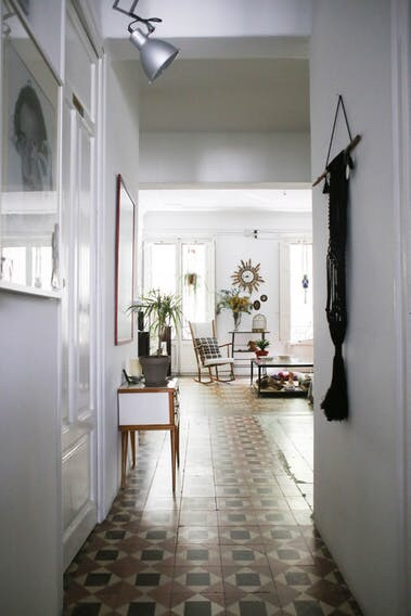
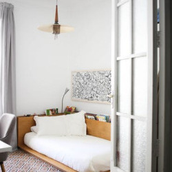
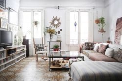
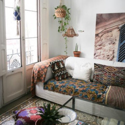
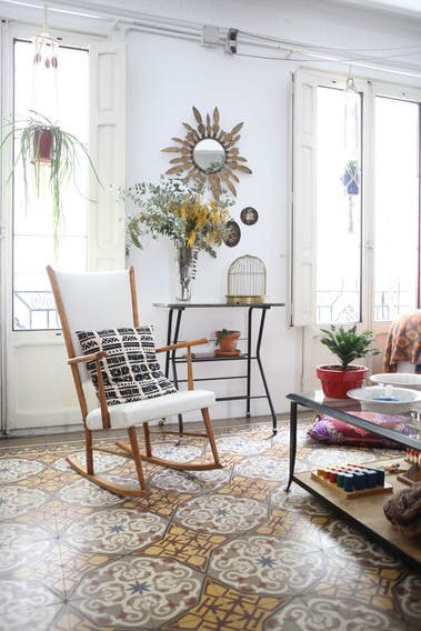
Name: Laura and Carlos
Location: Valencia, Spain
Size: 160 square meters (1722 square feet)
Years lived in: 3 years
This home is a mixture of different elements. like from patterns to textures to plants. the whole place look so relaxing.
They have inspirited by the travels they have made, the place they have been. They have put white color to the walls. Thats why the other objects and materials are highlighted . And those plants and fabrics are so beautiful.
0 notes
Photo
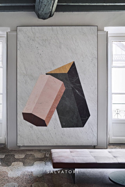
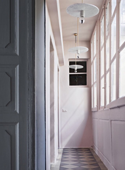
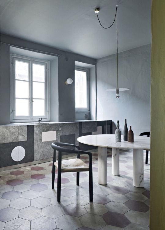
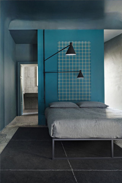
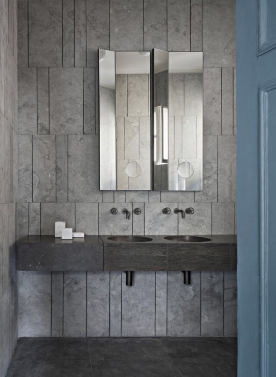
The Milan apartment of Gabriele Salvatori
This gorgeous apartment on the fourth floor of a nineteenth- century building. There have use lot of stone elements, and the bedroom wall with stone flooring completely matching. The interiors were revamped by architect Elisa Ossino, who has perfectly interpreted Salvatori’s style,
0 notes
Photo
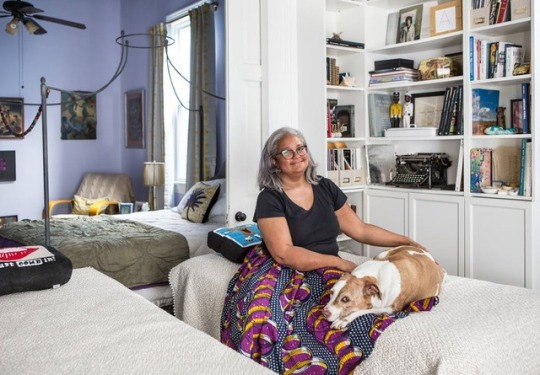
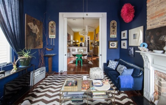
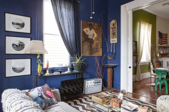
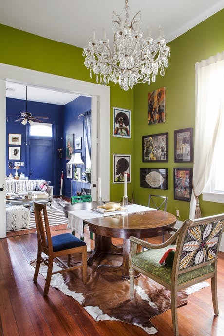
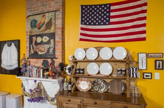
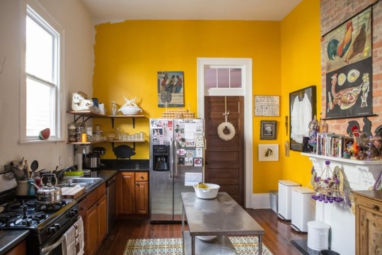
Carla Williams
She’s a shop owner, Photography historian, writer, and Editor, But all that she does her passion for art and her black roots. Her home is filled with her collection of Afro-centric art. that she has been building for decades.
she has put different color to different walls. ‘’She says of the addition of bold blue, yellow and lime green paint her home. In living room she has put Notable artwork including three paints that came with a special edition of silas finch’s orchard volume one, crime victims chronicles (2010) by Deborah Luster and Raymod Meeks. (left); Portrait of a Young Man (Painting) from eBay. A blue velvet sofa from West Elm. she has display her beloved objects in the kitchen. A french sideboard. The Pop Shop holds a display of collectible tableware by artists Jonathan
0 notes