Don't wanna be here? Send us removal request.
Text
⍰ kaomoji elements ര
create ur own kaomoji w/ me !!

⠀
eyes
ˊ ˋ ◞ ◟ .ܸ .ܸ • • › ‹ o̴̶̷᷄ o̴̶̷̥᷅ ≧ ≦
ˇ ˇ ◜◝ ◡◡ •̀ •́ ^^ ᵒ̴̶̷̥́ ᵒ̴̶̷̣̥̀ ꈍ ꈍ
⏑ ⏑ ◝ ◜ _ ̫ _ •́ •̀ ⊳⊲ o̴̶̷̤ o̴̶̷̤ ˃̶̤́ ˂̶̤̀
´ ` -᷅ -᷄ . . ߹ ߹ ՞ ՞ ಠ ಠ ᴗ͈ ᴗ͈
mouths
ᵕ ⤙ ᴖ Ⱉ △ ࿁ ꕀ ‸
༝ ‿ ⌓ ⩊ ⌑ 。 ㅁ ⇀
̫ ֊ ᎔ ᗜ Д ³ ᯅ ˬ
noses
˶ ᵜ ᆺ ˕ ܫ
˔ ᴥ ɷ ̷ ꀾ
ears
ᐢ ᐢ ᕱ ᕱ ᕬ ᕬ ᙏ ᵔ ᵔ ᐡ ᐡ
∩∩ ꪒ ꪒ ՞ ՞ ⍝ ⍝ ᥥ ᥥ ᘏᘏ
hands / arms
ก ก ٩ ۶ ⊃⊂ ᑌ ᑌ ദ്ദി ა૮
ฅ ฅ ੭ ᐣ っ ς ੭ ੭ ੭っ ∩ ∩
brackets
𝇋 𝇌 ૮ ა ૮₍ ₎ა ( ິ )ິ ໒꒰ྀི ྀི꒱७ ૮ ོ ོ𑁬
₍ ₎ ꒰ ꒱ྀི ૮꒰ ꒱ა ᧔ ᧓ ᧔ྀི ᧓ྀི ʕ ྀི ྀིʔ
꒰ ꒱ ଘ꒰ ꒱ ꒰ ��� ꒱ ᐣ 𓊆 𓊇 ᑦ꒰ྀིྀི ྀྀི꒱ᐣ ૮꒰ྀི ꒱ྀིა

⠀⠀
28K notes
·
View notes
Text
Rotating Sandwich Mood Board
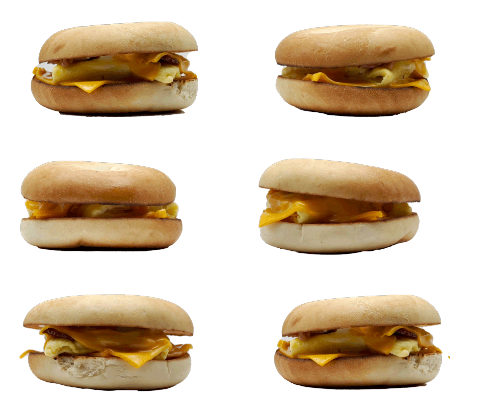
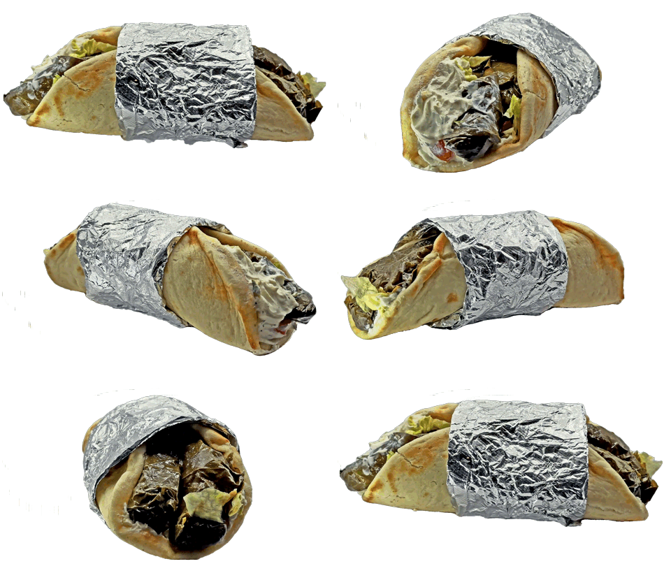
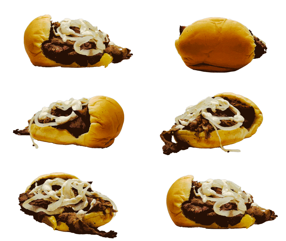
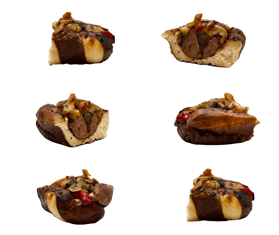
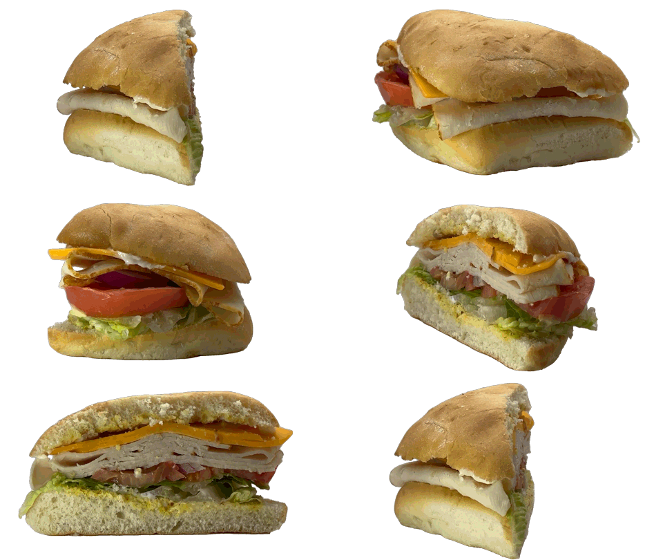


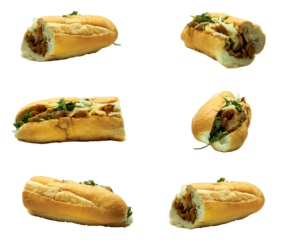
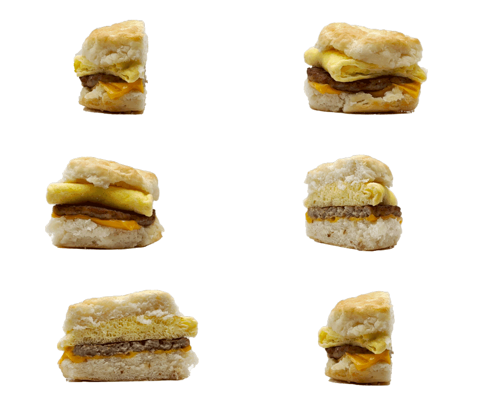
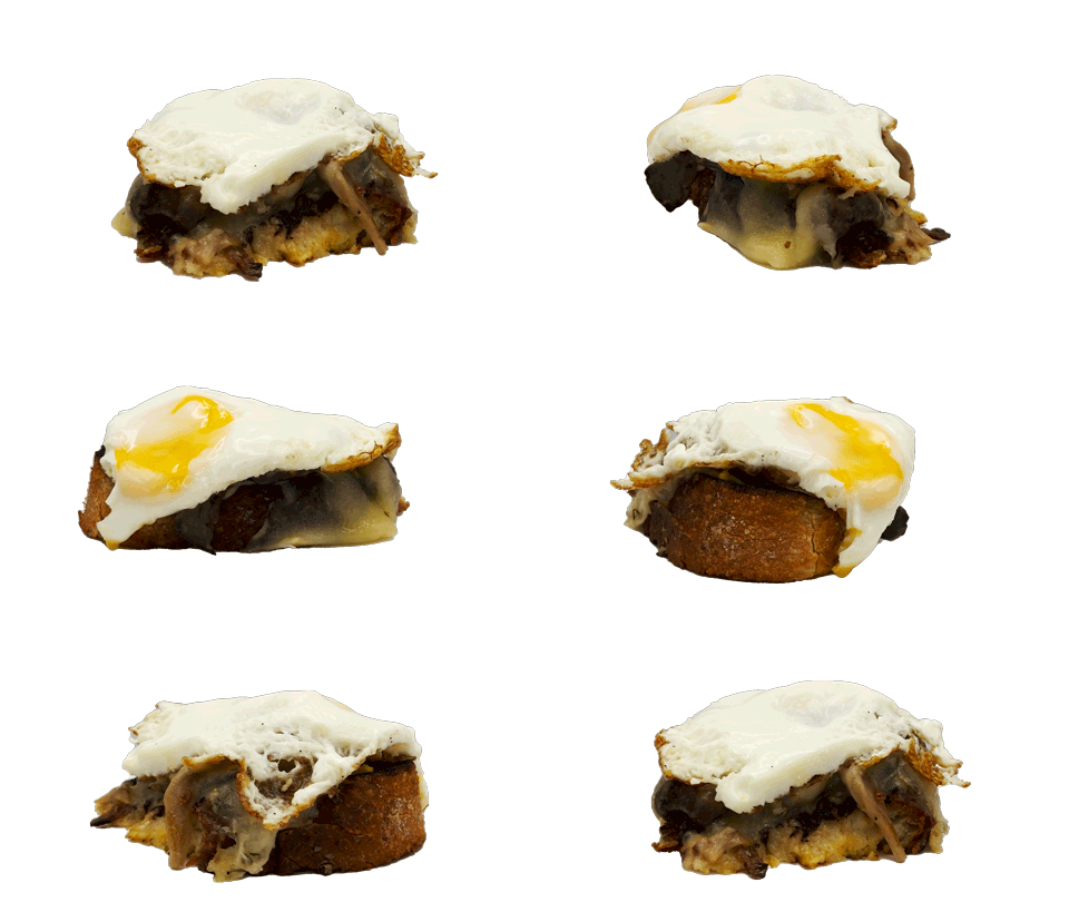
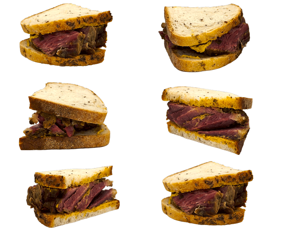

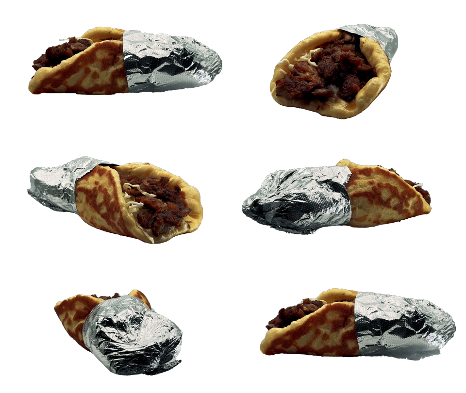


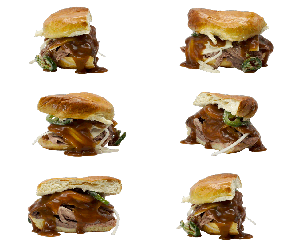
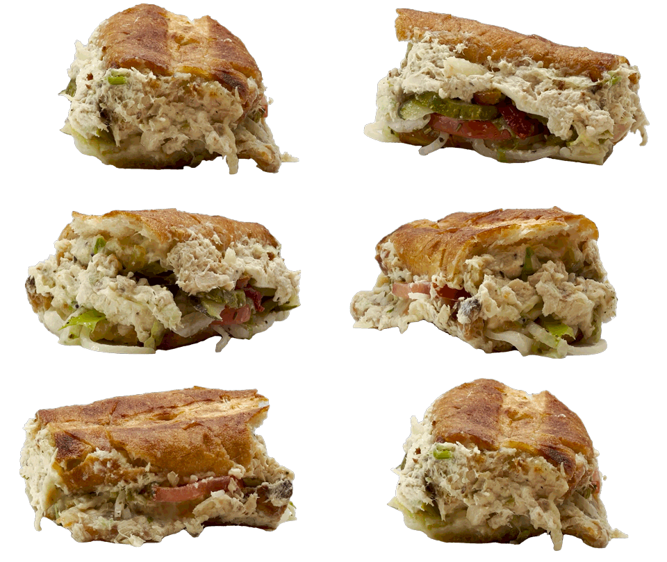

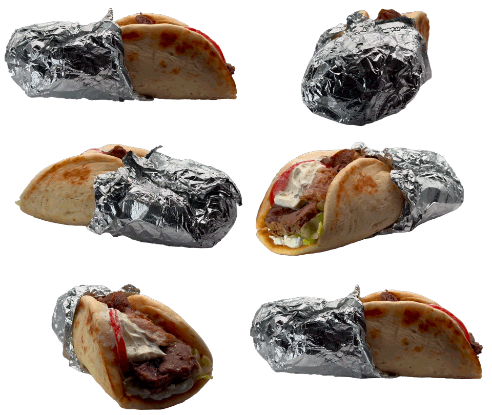


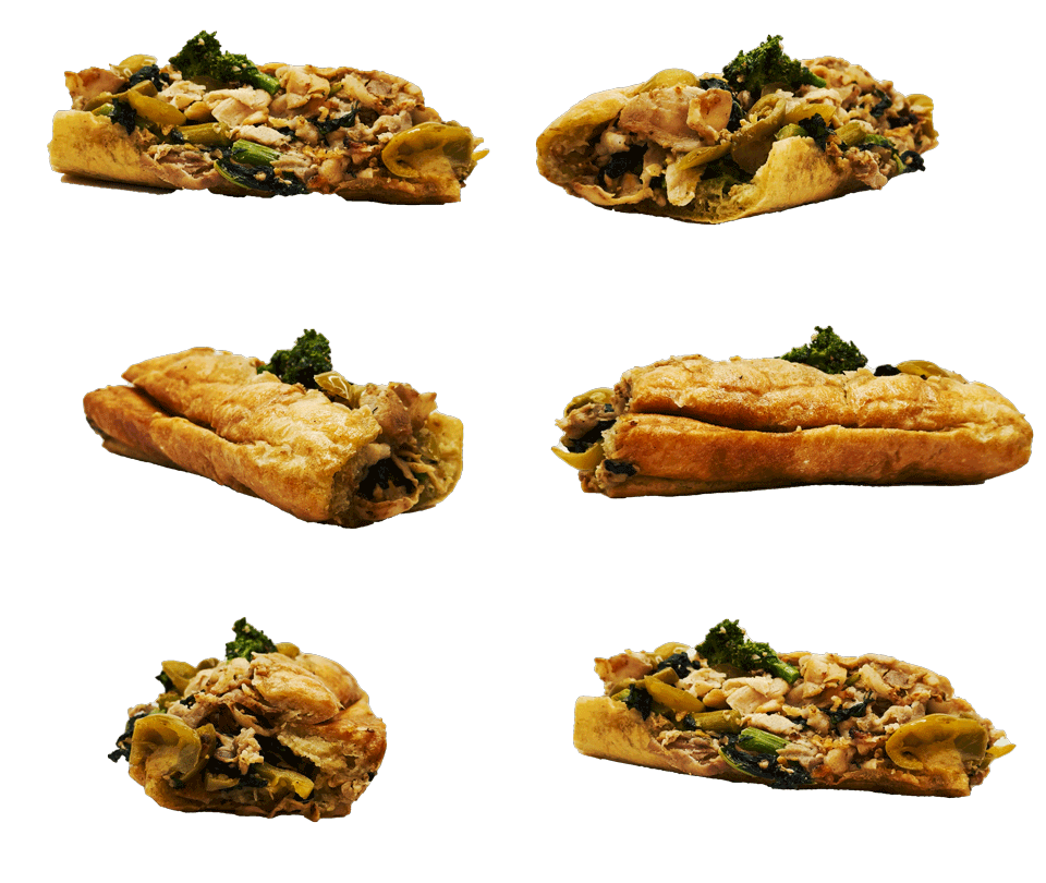
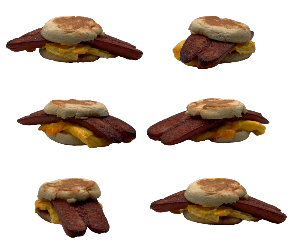
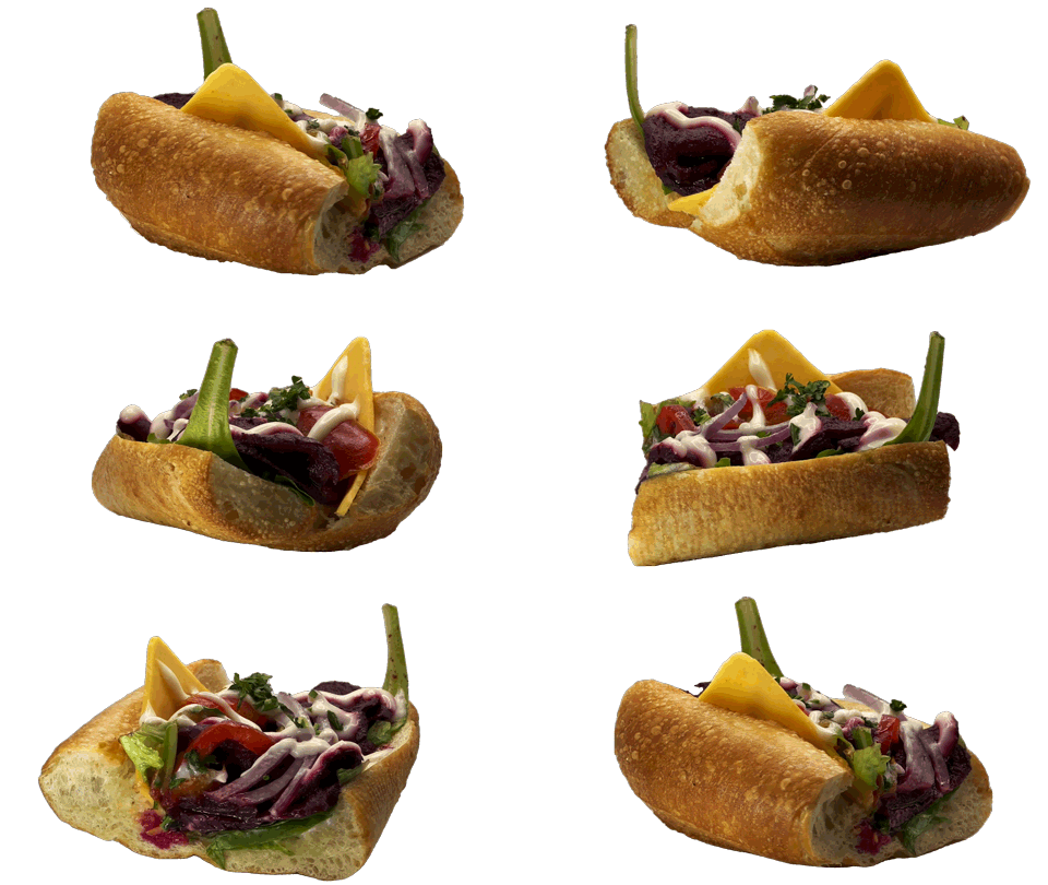

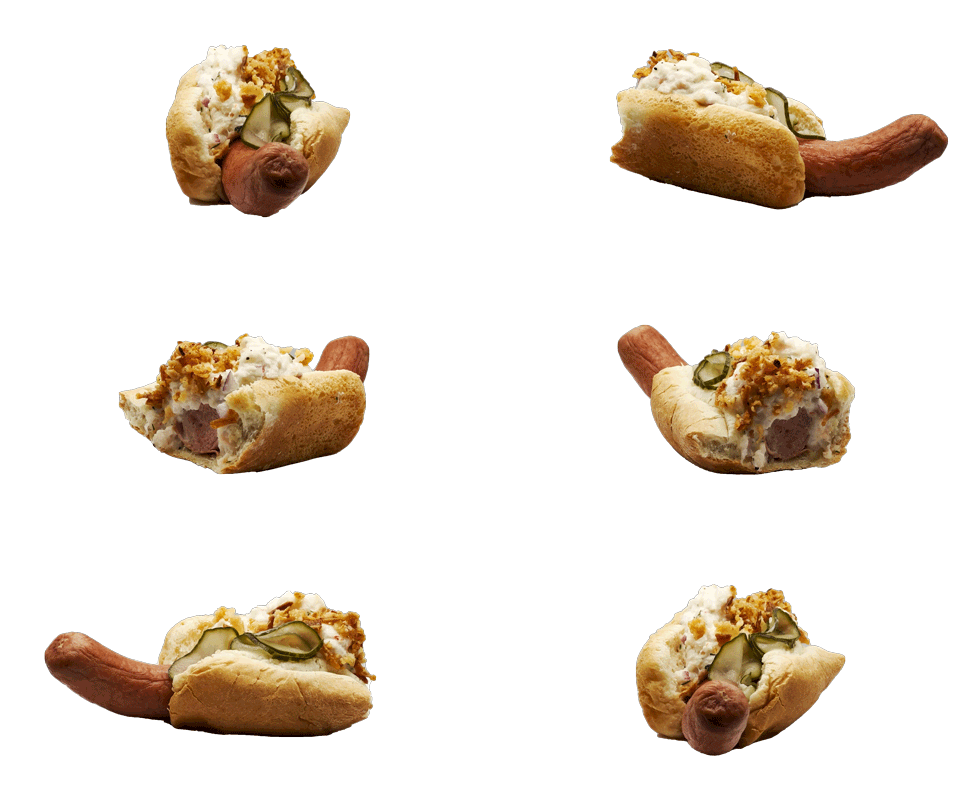
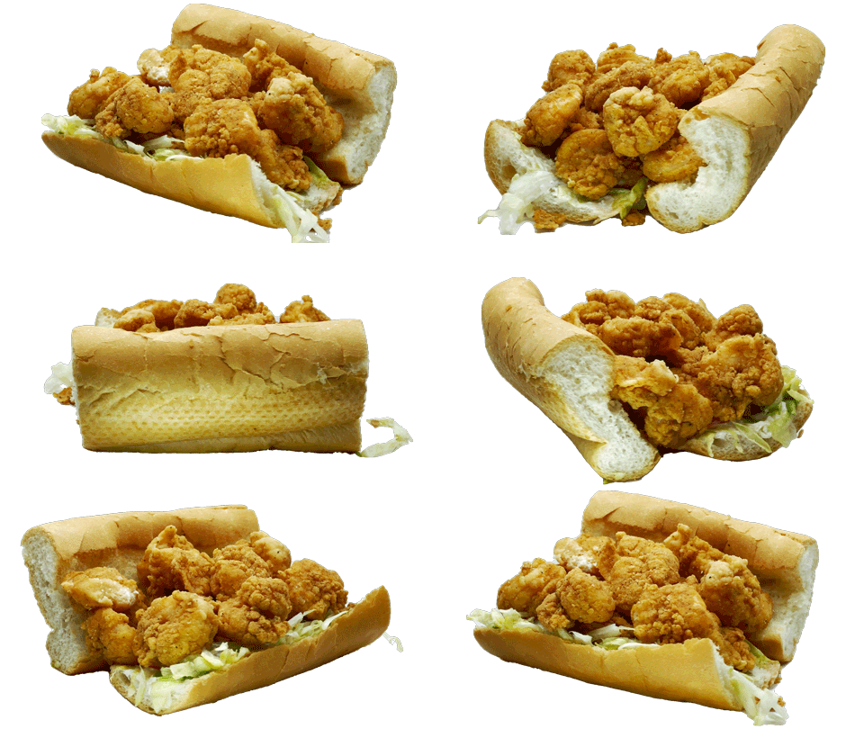
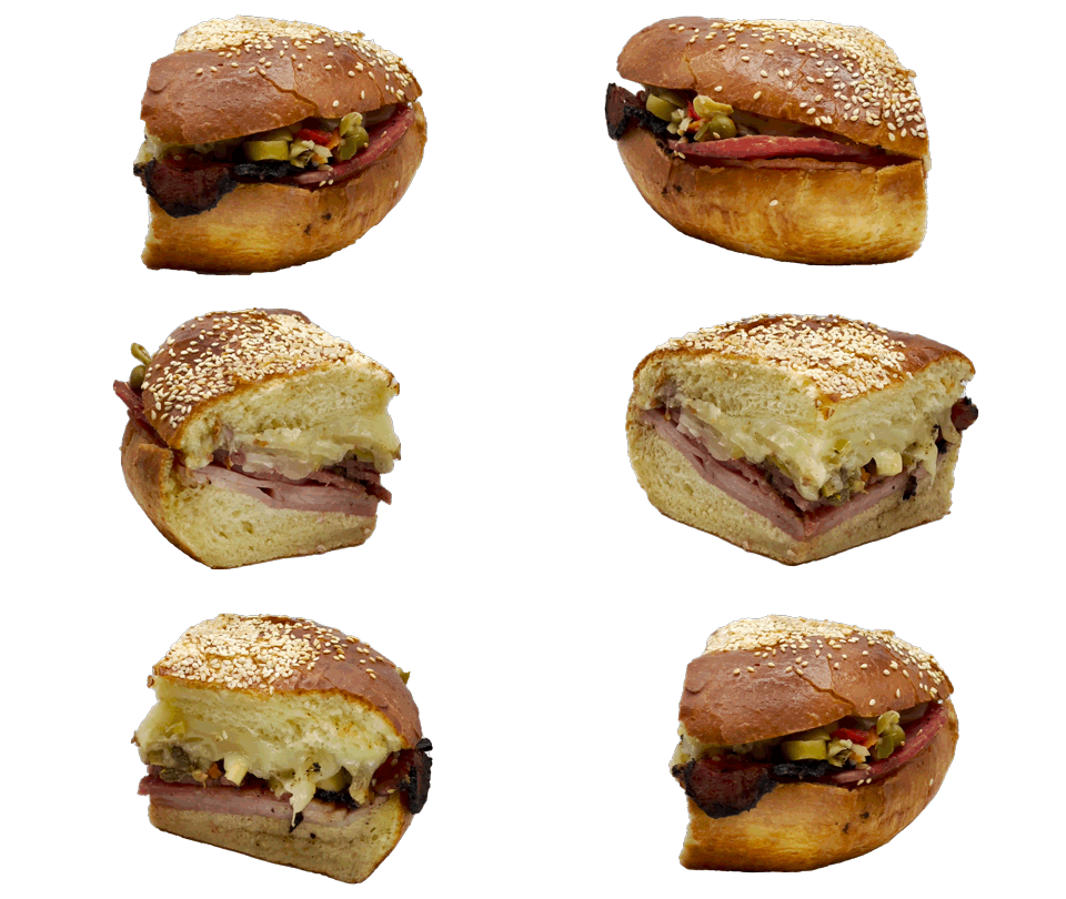
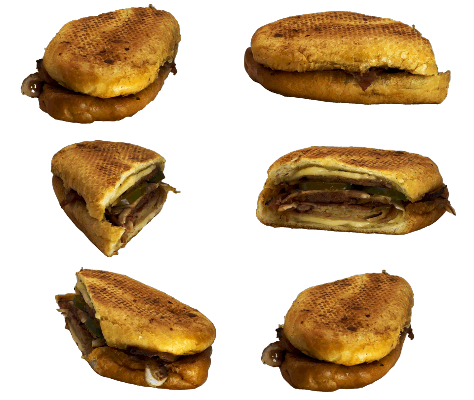
Rotating Sandwich Mood Board
84K notes
·
View notes
Photo

Grey Matter 2018 . #concrete #concreteart #brutalism #brutalist https://www.instagram.com/p/CebqU7_rWNi/?igshid=NGJjMDIxMWI=
18 notes
·
View notes
Text
“考えると不思議ではないか。この世に生をうける前、我々は塵であった。死してまた塵に返る。人であるよりも塵である方が遥かに長い。では死んでいるのが普通であって、生きているのはわずかな例外にすぎない。ならばなにゆえ、死が怖いのか”
— 夜は短し歩けよ乙女 角川文庫 / 森見 登美彦 (via ebook-q)
339 notes
·
View notes
Photo

The Shirk Report – Volume 649 » TwistedSifter
14 notes
·
View notes
Text
122K notes
·
View notes
Photo


糸(イート)インもOK https://twitter.com/tanaka_tatsuya/status/1371944369339596800
181 notes
·
View notes
Photo
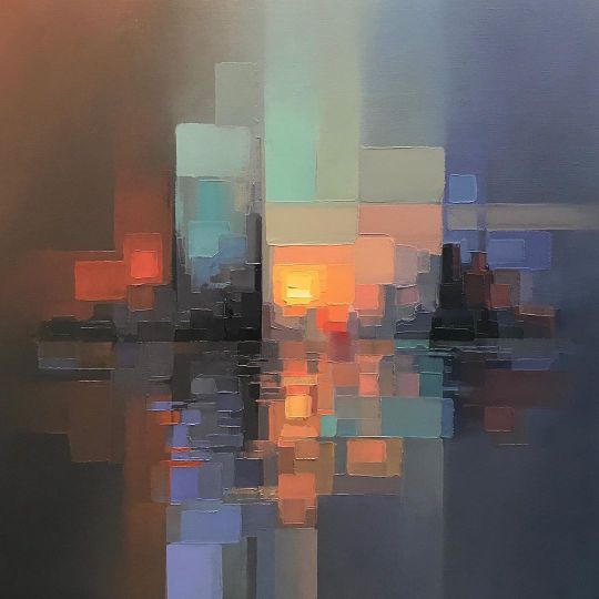
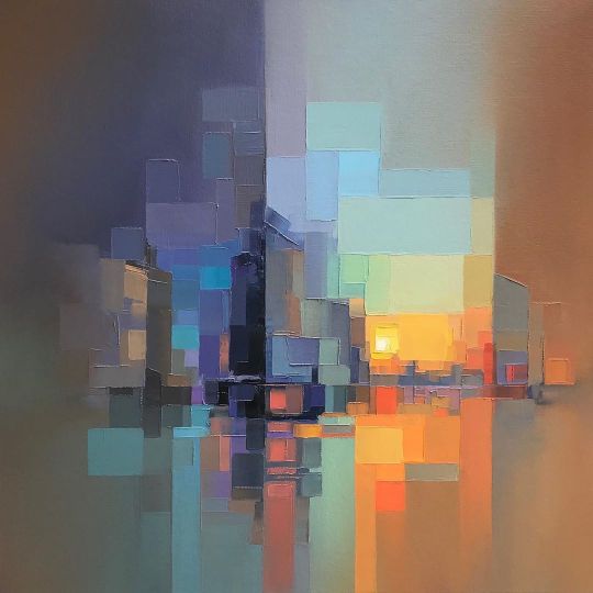
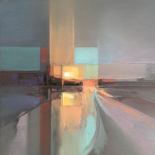
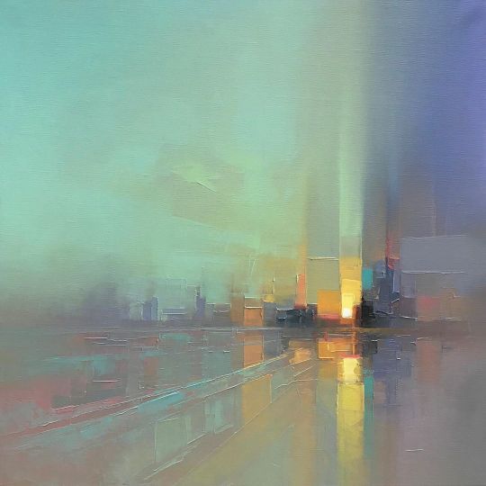
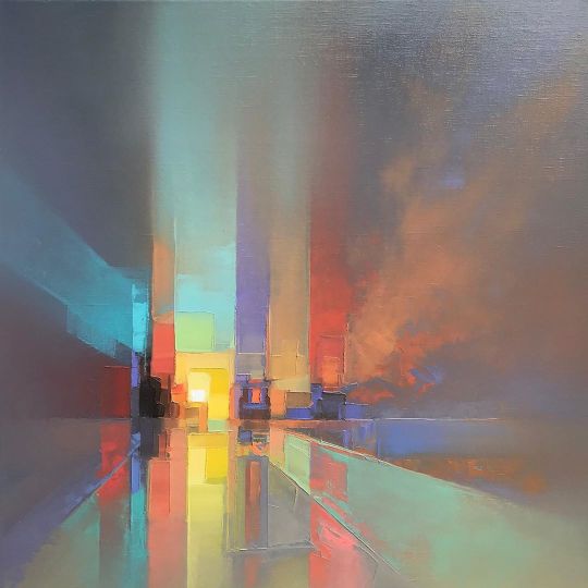
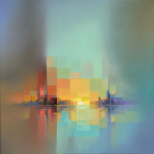
Jason Anderson
British artist Jason Anderson creates colorful abstract paintings composed of pixelated swatches of pastel-toned oil paint. Up-close, the artist’s paintings look like blocky layers of shapes and color; but, from afar, his scenes—featuring cityscapes, roads, trains, and marinas—are revealed.

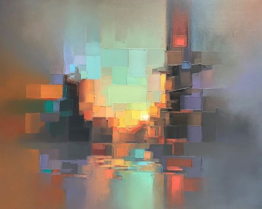
Anderson began his career as a stained glass apprentice, where he worked on restoring the windows of cathedrals. He soon progressed onto designing the glass murals himself, where he learned how to break down subject matter into “jigsaws” of colored sections. This approach still shines through in his paintings today—complex scenes are brought to life with simple shapes and careful consideration to hue and tone.


82K notes
·
View notes
Photo

modern art desserts. by caitlin freeman. mondrian cake.
153 notes
·
View notes
Video
They put the ‘cat’ in caterpillar.
(Source)
40K notes
·
View notes
Photo


Typography Tuesday
Back in August 2014, we inaugurated our Fine Press Friday series with the final publication produced by the Kelmscott Press, A Note by William Morris on his Aims in Founding the Kelmscott Press. For Typography Tuesday, we revisit this publication for its notable proprietary typefaces.
Proprietary types–typefaces designed for and utilized solely by a single publisher or printer–essentially went by the wayside by the second half of the 16th century. In the late 19th century, Arts & Crafts leader William Morris had become dissatisfied with the commercial types available through his publishers. Morris’s foray into type design began on the night of Emery Walker’s lecture on printing at the 1888 Arts and Craft Exhibition Society, especially after seeing Walker’s enlarged lantern-slide images of Jenson types. Morris’s daughter May reports that following the lecture, Morris and Walker were walking home together when Morris excitedly suggested to Walker, ”Let’s make a new fount of type.” The rest is history.
Morris went on to design three founts of type specifically for use by his Kelmscott Press, which he established in 1891. His first fount, the Golden type, was inspired by Jenson’s Venetian roman face. His next fount was the Gothic-inspired Troy type, which Morris hoped would redeem “the Gothic character from the charge of unreadableness.” His final fount, Chaucer, was also Gothic-inspired. Morris worked with punch-cutter Edward Philip Prince, and all three typefaces were designed and cut by 1892. Morris designed a fourth typeface based on the 1464 Subiaco type of Pannartz and Sweynheym, but this was never cut. It was used later, however, as the proprietary typeface of the Ashendene Press.
A Note by William Morris, printed in 1898, two years after Morris’s death, is the only Kelmscott publication to present all three of Morris’s Kelmscott Press typefaces.
335 notes
·
View notes
