Don't wanna be here? Send us removal request.
Text
Week 10 - Completing the loop
Final exercise: Preparing a 3d scan for printing
The week 10 exercise looked at the process of making final adjustments to the Olay bottle in Autodesk 3DS Max and exporting the file into CURA for printing.
The final task provided an opportunity for spatial repetition in using Autodesk 3ds Max. The exercise felt more familiar as I recalled many of the commands used in the previous activities.
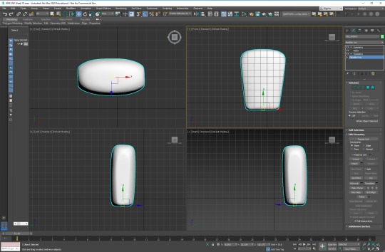
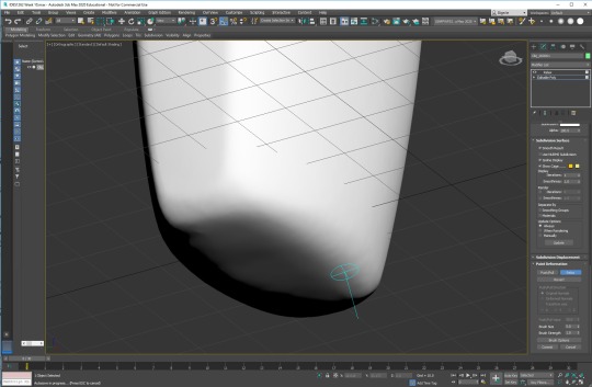
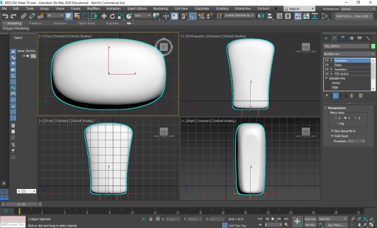
Images 1-3: Olay bottle final adjustments on Autodesk 3ds Max
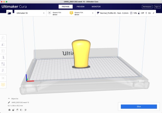
Image 4: File to CURA for 3D printing
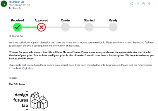
Image 5: Submission confirmation of test file
Final Reflection
The IDES1262 lectures and tutorials provided a breadth of knowledge and learning opportunities in the design techniques, communication, and iterative design process. The practical skills picked up in this course are invaluable, and I see myself regularly practising hand sketching and digital modelling for many years to come.
My three main takeaways from this course including:
1. The importance of hand sketching and drawing
Although computer-aided design techniques and programs are trending, the need for hand sketching will likely continue to play a prominent role in the design process for a long time. It’s easy for designers to pull out a pen and paper to draw out a rough idea when inspiration hits quickly. The use of used good linework, colours, and shading to explore curves and contours of various products is something that I will focus on going forward.
2. Mindset change to embrace imperfections and mistakes
There is a time and place for perfection such as technical and engineering drawings. However, drawing and designing are iterative processes. It is important to spend more time drawing and enabling creative flow and less worrying about creating perfect lines on the page. I found that changing my mindset and moving away from creating perfect measured lines on a page to creating rough drawings with mistakes has helped me focus on the importance of creating draft ideas. Design is an iterative process at the end of the day, and spending too much time on a draft/low fidelity design takes time away from your final design. Plus, mistakes are another learning opportunity.
3. Importance of reflections
Reflective thinking was not something that I spend much time doing before taking this course. However, I have come to embrace this new skill. The process of reflective thinking helped me look deeper into what, why, and how something was being created. It provides a good learning opportunity to review the process I took and find alternative ways to approach future tasks.
Lastly, I want to thank Rob, Gonz and Tom for sharing your knowledge, assisting with the engaging weekly exercises, and providing first-person accounts of your experiences in real-world applications.
Good luck and all the best everyone,
Quince
6 notes
·
View notes
Text
Week 9 - Mesh modelling Olay concept bottle
Model making case study: Andrew Simpson Cup (https://youtu.be/UrYv6pCFApg)
Andrew’s video had many similarities and some differences between the use of models in his cup project and my experiences with physical and digital models Olay concept models.
Sketch models help designers create a tangible prototype and better understand the shapes that work, or doesn’t work, with the design. I found this to ring true from the week 6 and week 7 exercise in creating Olay concept bottles. I started with defined shapes in mind when I started creating the foam bottle models. However, I noticed the two foam models did not feel right in hand as some parts were too thick or too angular. I adjusted the model by sanding off a bit more foam to adjust the shape, which decreased friction points and improved the feel of the bottle. The foam model provided feedback on how the body of the design feels in hand. However, it does not give me information on the design’s weight, materiality, and details. Creating additional prototypes using alternative materials would help provide more feedback.
Autodesk 3ds Max: Olay concept bottles
The week 9 exercise expands on the Autodesk 3ds Max lessons from week 8 to produce a digital mesh model of the Olay concept bottle designs from weeks 6 and 7.
Having an understanding of the Autodesk functions from the lessons made creating the mesh models much easier this week. I used the modifier and chamfer commands to create the bottles, then adjusted the colours to fit the existing design.
I would benefit from spending more time learning the program as the basic skills I’ve learnt so far can only produce a simple render. I will also spend time play with different materials to see how this impacts the design.
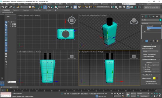
Image: Autodesk 3ds Max, creating the first Olay concept bottle
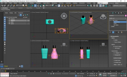
Image: Autodesk 3ds Max, creating the second Olay concept bottle
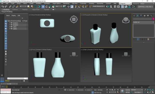
Image: Autodesk 3ds Max, final Olay concept bottles 1 and 2
8 notes
·
View notes
Text
Week 8 - Digital modelling
Model making case study: Andrew Simpson Razor (https://youtu.be/FRlvwhFhvVc)
As per Andrew's video, models inform the design process that sketches and drawings alone could not, as sketches do not consider the styling, scale, ergonomics, and materiality of the designed product.
Andrew mentioned the importance of materiality and user interaction. He gives examples of the perceived value of different materials (plastic = cheap and deposable verses metal = heavier and valuable), however, the heavier metal design would impact the ergonomics and user comfort. Andrew suggests good design requires a balance of style, comfort, value, scale, ergonomics and sustainability.
I believe "low-fidelity" design relates to creating a basic physical model, similar to the foam modelling exercise in week 7. The low fidelity model would help identify the most suitable size and scale for the product. However, it would lack the materiality, weight, ergonomics and details of a "high-fidelity" design.
Digital model making: Autodesk 3ds Max
The week 8 exercise focuses on using Autodesk 3ds Max to practice mesh modelling to create and modify digital objects. The pre-tutorial exercises and activities helped familiarise some controls to produce basic shapes and objects. I enjoyed playing with the modifiers to mould different objects. Frustratingly, the 3ds Max software repeatedly became non-responsive and crashed several times, disrupting the learning flow.
Digital modelling plays an essential role in the iterative design process and is an important skill to learn and master. Ideally, it would be great to explore a range of CAD software such as Solid Works, on-shape, Grasshopper, Fusion 360 and Blender, to get exposure to different digital modelling programs.
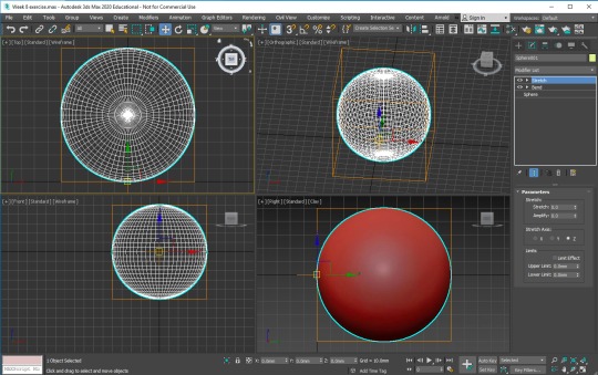
Image: Week 8 part 1, sphere object
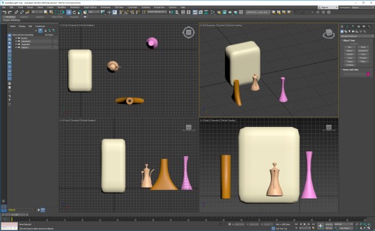
Image: Week 8 part 2, modifier objects
2 notes
·
View notes
Text
Week 7 - Model Making
The week 7 exercise explores model making.
Tom’s Hullbot case study was informative as it showed the real-life application of the iterative design process from sketching to model making. It clear that model making is an integral part of an iterative design process as it explores and defines the function and appearance of the designed object.
I created models of two Olay concept designs from the week 6 activity. The selected designs both had angles and curves, which was a good start in practising shaping foam. I had to make do with the available improvised “tools”, which was some left over yellow foam, bread knife, box cutter and small nail filer. I found the overall process in shaping foam requires A LOT of patience, and it can be quite messy. Also, it was easy to remove too much material or rip out a chunk of yellow foam when I was not careful. My models looked a bit rough as the sandpaper I ordered online did not arrive on time, and the small nail filer was not adequate for the job.
The most insightful part of the exercise was exploring how the different shaped bottles felt in hand. The ergonomics of a design cannot be appropriately represented in a sketch. The model helped me fine-tune the design to create a better overall feel.
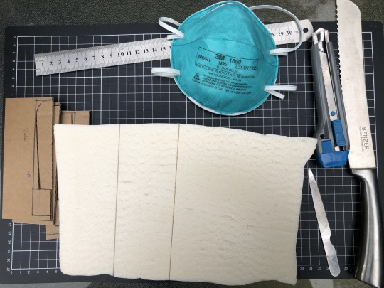
Image: Model making tools
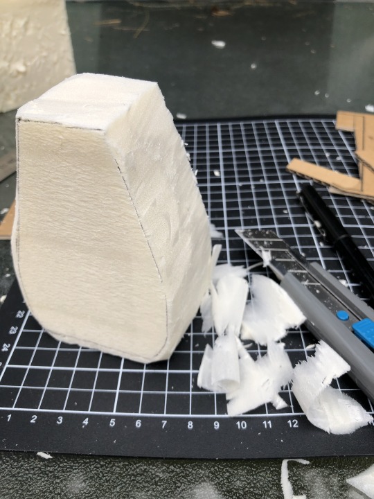
Image: Shaping the model with a box cutter
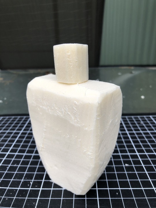
Image: Model of Olay concept 2 from week 6
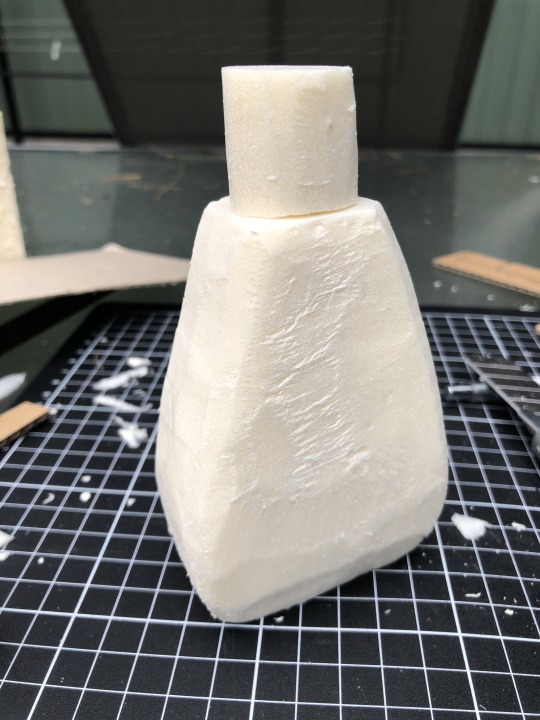
Image: Model of Olay concept 3 from week 6
2 notes
·
View notes
Text
Week 6 - Digital Sketching
Industrial design concepts and inspiration
I enjoyed exploring Pinterest, Behance and Instagram for inspirational images of industrial design concept rendering. Instagram tags such as #productsketch and #idsketches exhibited drawings from many designers. It was inspiring to see the various styles and techniques used.
Two designers that caught my attention are Filip Chaeder and Marius Kindler. Both designers used good linework, colours, and shading to explore the curves and contours of various products. Their works are simple yet beautiful, whether it was drawn with pen and paper or digital sketches.
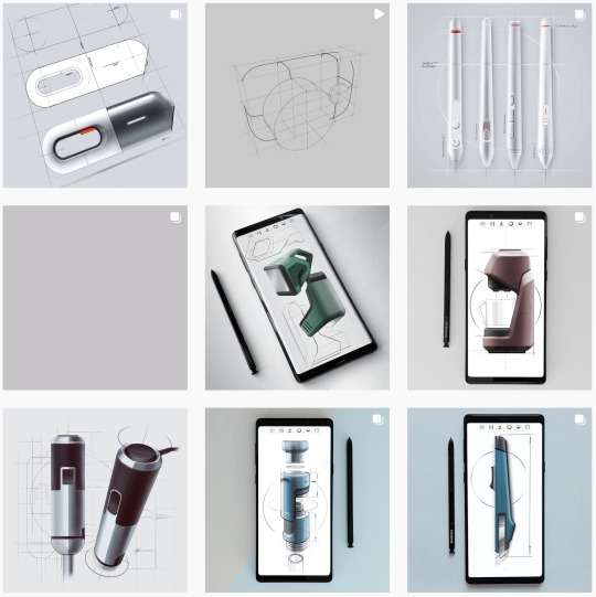
Image: Drawings by Filip Chaeder (https://www.behance.net/filipchaeder)
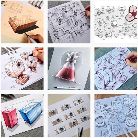
Image: Drawings by Marius Kindler (https://www.instagram.com/marius.kindler/)
Part 3 of the sketching exercise
The week 6 exercise focused on digital sketching using Photoshop.
Redesigning a product is an expensive task, so understanding the clientele and why something is being created is beneficial in creating a well-designed product. I made up a back story that Olay is looking to expand their existing market share (I assume this would be women from 20 years old upwards) and appealed to a wider target market. Drawing from the week 5 learnings, I selected 3 androgynous designs which combined strong lines, angles and curves to create my digital sketches. The gender-neutral design would keep in line with the existing customers' expectations and appeal to new customers.
The fundamental skills to create digital sketching are similar to using a pen and paper. The task requires patience, practice, eye/hand coordination, focus. I found the overall digital sketching process to be enjoyable. However, drawing with my mouse lacks precision - I can see the appeal in using a digital drawing tool like Wacom.
In future, I would make sure to use the correct layers when sketching in Photoshop. This change is critical in identifying and apply specific changes to the digital sketch.
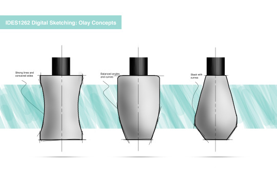
Image: Part 3 Photoshop digital sketch - Olay Concepts
9 notes
·
View notes
Text
Week 5 Studio Tutorial – Sketching
The week 5 exercise focused on sketching. I found the warm-up sketching exercises to be fun and informative. I began drawing with my wrist, and on the advice of the tutors, I switched to using my arms and shoulder. The change in technique was noticeable after a short time due to the build-up of lactic acid in my shoulder muscle rather than an improved sketch quality.
The use of a pen to sketch was mentally challenging as every mark on the paper is permanent. On a positive note, I noticed I spent more time drawing and spending less time worrying about creating perfect lines on the page.
Part 1 focuses on redesigning the Olay Moisturiser bottle and producing 12 designs. The interesting part of this task saw how design elements suggest different meanings. For example, the angular shape suggests a focus towards a masculine target market, whereas a curved and rounded shape suggests a focus towards a feminine target market.
Part 2 focused on creating 2 point perspective views for a few of the designs. The sketches were completed freehand and using a pencil to make a quick outline before moving onto pen and marker. I would benefit from more practice in creating contour lines, shading and tones.
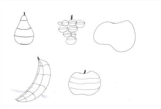
Image 1: Sketching exercise contours
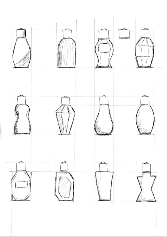
Image 2: Part 1 2D Orthographic redesign thumbnails
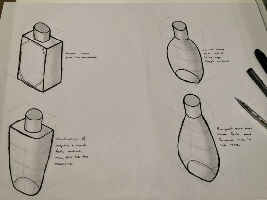
Image 3: Part 2 perspective sketch with pencil guide lines
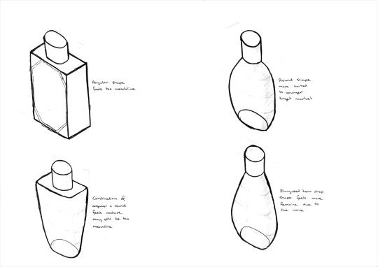
Image 4: Part 2 perspective sketch (scanned image)
10 notes
·
View notes
Text
Week 4 Studio Tutorial – Perspective Drawing
The week 4 exercise focused on drawing 2 point perspective views to help us "see in perspective". I found this week's tasks challenging on multiple occasions. The step by step guide was beneficial in creating part 1 of the exercise - if you follow it correctly. I failed to do so during my first attempt, which meant I spent more time erasing and redrawing part 1. On a side note, I found that paper quality makes a big difference in the enjoyment of drawing and for the paper to stay intact.
Part 2 utilises the same basic 2 point perspective drawing technique as part 1, which meant the overall process was easier to complete. However, I feel unsure about the accuracy of the extended box drawing. Maybe someone can let me know how I could improve it?
Part 3 was surprisingly quick to complete. In the lecture, Rob highlights the minor axis goes through the centre point to the right viewpoint, also noting that the major axis is 90 degrees to the minor axis. If I were to attempt part 3 again, I would draw a larger perspective cube on the A2 paper; drawing a larger cube would give me the opportunity to draw the major and minor axis for the top of the cube. Purchasing a French curve would create neater drawings of the ellipse.
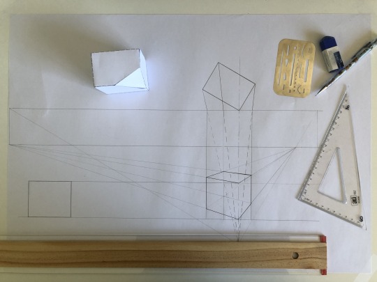
Image 1: Attempt 1 of part 1, construct a 2 point perspective view of the chamfered box
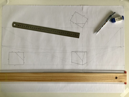
Image 2: Attempt 2 of part 1, construct a 2 point perspective view of the chamfered box
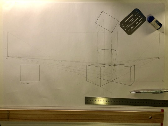
Image 3: Part 2, extending a box in perspective
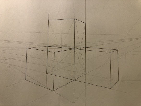
Image 4: Close up of extending a box in perspective
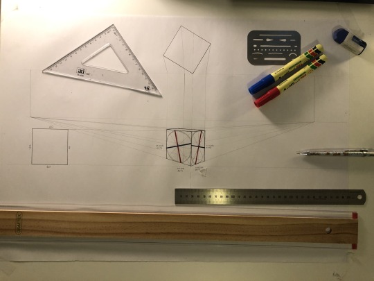
Image 5: Part 3, drawing circles in perspective
6 notes
·
View notes
Text
Week 3 - Section and Auxiliary Views
The week 3 exercises provided drafting practice for third angle orthogonal projections, section views and auxiliary views. I struggled with the concept and visualisation of the auxiliary view. It took numerous YouTube videos for me to understand the concept and importance of the auxiliary view.
Sketching out the third angle views, section A-A view, and partial auxiliary view provided a clear guide of the shapes being created. However, as I did my rough sketch on A4 paper, it was not true to the size of the final draft on A3 paper, therefore the labelling on my final sketch was misplaced.
If I was to redo the exercise, I would measure out each view's placement and also account for spacing required for the measurements and labelling to ensure they are located in the correct positions.
Another improvement I would make in the future is to create thicker and darker line work on the paper, as the scanned file does not accurately display the difference in the linework.
Overall, I am satisfied with the final draft as it provided practice for the skills learnt in the previous weeks and provided a good reminder why planning is crucial.
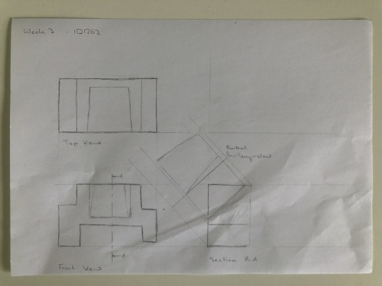
Image: A4 draft sketch
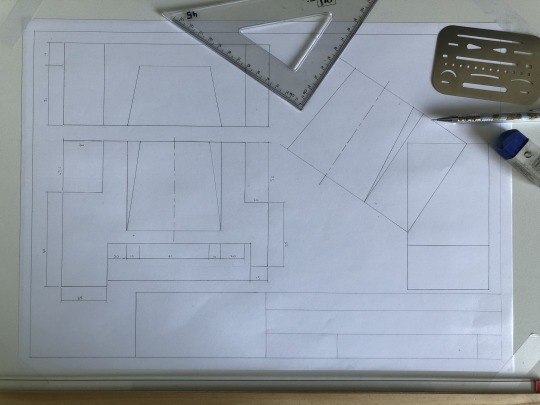
Image: A3 drafting in pencil
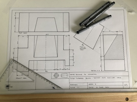
Image: A3 pen sketch
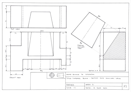
Image: A3 final sketch scanned
3 notes
·
View notes
Text
Week 2 - Orthogonal Projection & AS1100 Standards
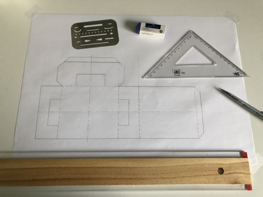
The focus of week 2 is orthogonal projection and AS1100 drafting standards. The week 2 exercise consists of 3 parts, as listed with the images below. My focus item is the Apple USB-C adaptor.
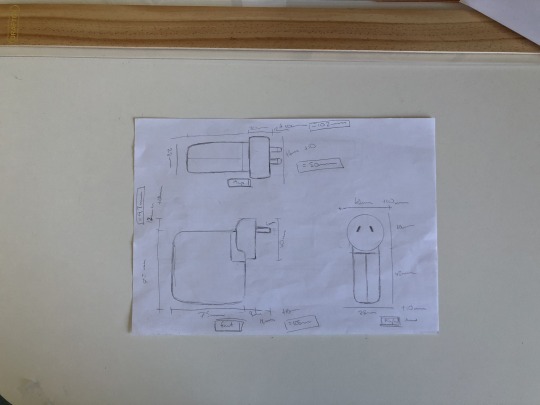
The most logical place for me to begin was part 2, so I started with sketches of the orthographic drawing of the front view, top view, and right side view. I found this step most enjoyable as it is a skill I’ve used previously.
Next, I approached Part 1 of the exercise, which required the construction of a box. Part 1 provided a good recap on the equipment and skills learnt in week 1, and it also provides practice for part 3.
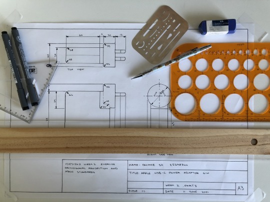
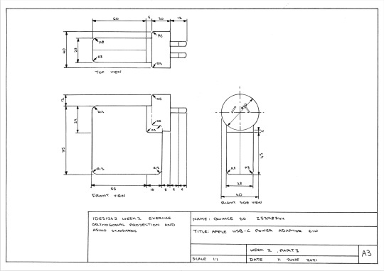
I found part 3 of the exercise challenging as it requires a lot of time and patience to complete; this is true with all newly learnt skills. I was glad I used part 2 as a draft blueprint which greatly assisted with the accuracy of my drawing. I spent the majority of time identifying and applying the engineering drafting standards, focusing on the line types, line thickness, label placement, and other nuances. I believe the drafting process will become a lot more efficient with more practice.
Part 1. Construct a 5 sided box to fit over the object
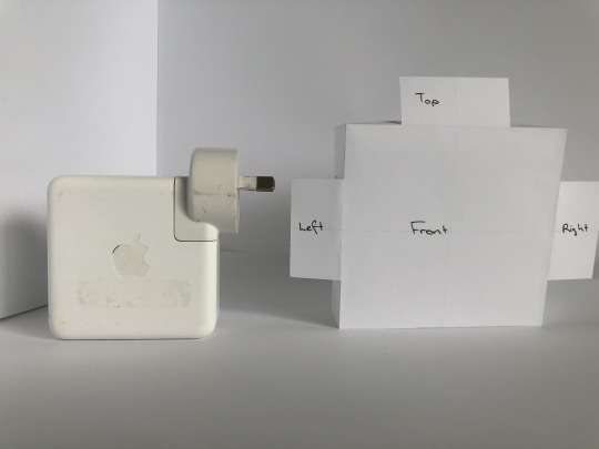
Part 2. Sketch a third angle orthographic drawing of your object (front view, top view, and right side view)
Part 3. Construct the orthogonal drawing accurately using your drafting equipment
10 notes
·
View notes
Text
Week 1 - Drawing instruments & geometric construction
I have limited exposure to technical drawings so I approached the week 1 tutorial exercise by applying information from the week 1 reading, ‘Engineering drawing’ by Albert W Boundy. The reading provided a foundational understanding of drawing instruments and techniques for engineering drawings.
Part 1
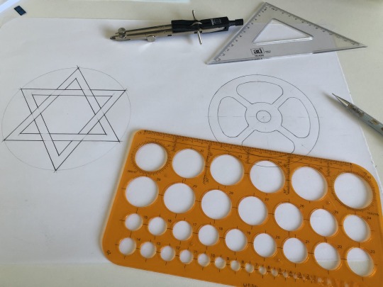
Image: Construction of part 1, figure 1 (left); and part 1, figure 2 (right)
I found it straightforward to construct the equilateral triangles using a compass in part 1, figure 1. However, I was not careful in my final drawing and drew over a draft line where it was not required. In future, I will consider erasing obsolete draft lines before beginning my final drawing, which will reduce the risk of errors.
The construction of part 1, figure 2, required a longer time to complete due to angles. Fortunately, I remembered the week 1 reading noted the two set squares have an angle of 45 degrees, and the other has angles of 30 and 60 degrees. Without this information, it would have taken much longer to draw the correct angles using a compass.
Part 2
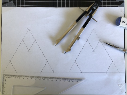
Image: Construction of part 2 tessellating pattern
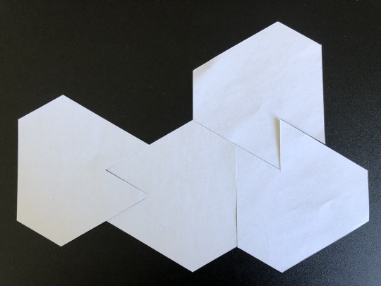
Image: Part 2 tiling pattern
The process of trial and error learnt from the previous drawings ensured that I was able to produce accurate drawings to construct the tessellating pattern without repeating the mistakes I made in part 1.
8 notes
·
View notes
Text
About me
I love coffee, dark chocolate and snowboarding. I chose to study industrial design as I believe in the potential of using new technologies and techniques to design sustainable products.
4 notes
·
View notes