Janelle "Panz" Bucud's online portfolio for artworks submitted under HUM 102 BC2L.
Don't wanna be here? Send us removal request.
Photo
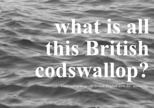
WHAT IS ALL THIS BRITISH CODSWALLOP?
A digital reflection
For this specific assignment, I originally intended to use a tongue-and-cheek meme referencing the 1995 anime smash hit Neon Genesis Evangelion, which included a caption along the lines of “my entire personality is based on a 90s mecha show”. I thought it would be fitting since I have developed an unhealthy obsession with the series since last year. More importantly, Evangelion, with its stunning visuals and weird Freudian storyline, pioneered a lot of the tropes and animation styles we see in modern Japanese anime.
Unfortunately, I lost my copy of it, and I gave up looking for it online after four days of searching. So I turned to the next best thing. Enter Cream, a short film by the English animator David Firth.
Firth became an internet sensation with the release of his Flash animation webseries Salad Fingers which ran from 2004-2019. Following his distinct style of weird animation and black comedy, he created Cream in 2016, which provided commentaries on multiple societal issues such as mental illness, false advertising, mass hysteria, and capitalism. The film featured animated characters with realistic yet distorted human features, which amplifies the dystopic horror mood.
I chose this specific digital art because it is the perfect mix of everything I like in a postmodern piece: ambiguous and thought-provoking, bizarre yet visually striking. I like things that pinpoint a specific subject yet still open to many interpretations. These characteristics are also present in my other favorite series such as Satoshi Kon’s Paranoia Agent, Chiaki J. Konaka’s Serial Experiments Lain, Charlie Brooker’s Black Mirror, and Becky Sloan and Joseph Pelling’s Don’t Hug Me I’m Scared–the last two of which are of British origin, just like Cream. Coincidentally, David Firth made cartoons for Charlie Brooker’s show Screenwipe (Firth, 2006). And with that I wonder, just like the Japanese do the English have a thing for the weird?
0 notes
Photo
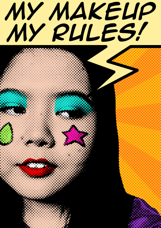
MY MAKEUP, MY RULES: Advocacy Art
I know advocacy art about women empowerment has been done multiple times over the years, but I still wanted to make my own take on it. Besides, an advocacy becomes even stronger if more voices add to the choir.
When I was young and naïve, the clashing takes on femininity somewhat skewed my own perception of it. They told me girls should not act like boys and not wear boy clothes. But girls should also not wear girly things like makeup and short skirts because they are provocative. It was confusing and, honestly, damaging. I became my own version of a ‘pick me’ girl–someone who thinks I am above other girls because I do not wear makeup just like them. Eventually my artistic senses tapped on the desire to paint on my own face. I found it fun, relieving, and empowering. I realized that makeup is not a symbol of weakness, not a mask to hide from, but rather a powerful form of expression. And it pains me to see that the cosmetic industries and online beauty spaces, founded and popularized by women, commend more men through a glass elevator. I wish women would become more recognized in this field not only as consumers but also pioneers. Makeup is our own war paint, a symbol of strength amidst norms that attempt to limit us of our abilities.
0 notes
Photo
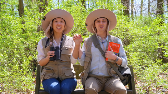
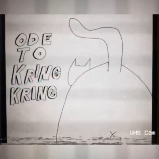
Pets rule the internet: a critique and comparison of Felipa Cheng’s Ode to Kring-Kring and Brian David Gilbert’s we like watching birds
With the constant rise of technological improvements and their growing relevance in our lives, new media art continues to thrive in both realms of art creation and appreciation. Not only are we provided with easy-to-access platforms to enjoy them; we are also given many opportunities to make our own at our fingertips. Look no further than the video sharing website Tiktok, where an average of 1 million videos are viewed daily (Mohsin, 2022).
Back in the day, short-form video content were not as appreciated as their full-feature counterparts. Full-length movies were always deemed to be the more difficult one to make–rightfully so because of their length. Quick video clips on the other hand, were considered only for gags, as in the case of the late 80s show America’s Funniest Home Videos, one of the earliest programs that gave these types of films a platform. It was not until internet access became more widespread that short viral videos became popular.
Today, short-form videos are given more credit and is seen as a legitimate medium where anyone can share whatever they want. There are clips that provide useful tutorials, news bits, and even plain entertainment. Enter two short-form videos with qualities that do not fit in just one category: we like watching birds (stylized in lowercase) and Ode to Kring Kring. Despite their vague classification and cryptic writing, these two depict a clear image of the state of internet culture today.
we like watching birds
Brian David Gilbert, also known as BDG, is an online content creator known for both short-form and hour-long videos on YouTube. BDG previously worked for Polygon, a media company that covers various areas of pop culture such as Japanese anime and video games. On his eponymous YouTube channel, however, he has created a following with his brief, witty short-form content. These films are often about random, mundane topics such as caterpillars in this song is not a metaphor and playing darts in it’s time to get good at darts. we like watching birds is not an exception. The video immediately starts with a catchy song performed and composed by Gilbert himself, but this time with the vocal accompaniment of his partner Karen Han. It is, as stated in the title, about watching birds, and is constantly reiterated in the video by directly mentioning it and naming different species of avifauna–that is, until the happy melody devolved into a chorus about praising a one-eyed horrifying bird god.
A healthy number of Gilbert’s videos follow a similar sequence; they start off with a calm and cheery atmosphere and then, at an unexpected point in the video, begin to shift to a psychological genre. we like watching birds is initially presented as a shallow melody about bird-watching, but almost halfway through the video an unexpected, absurd lore was presented. The mood shifts back to a cheerful one before the video ends, albeit now mixed with a feeling of unease, especially in the line “we like watching birds, which is good, ‘cause we have no choice”, implying the singers’ newfound fear of the bird god after their occult-like worship.
Gilbert’s body of work can be described as postmodern absurdist comedy, described by Stockwell (2016) as a type of comedy that relies on the use of absurdity, non-sequiturs, and irrational or illogical elements to create a sense of surprise and confusion in the audience. Surrealist humor often aims to challenge the audience’s preconceptions and question the way they see the world. This type of humor is also postmodern in the sense that it “rejects grand narratives and universal truths” (Lyotard, 1997).
Ode to Kring-Kring
Felipa Cheng is a communication arts student from the University of the Philippines Los Baños. During the early years of the COVID-19 pandemic, Cheng produced several pieces of short-form videos dedicated to her friends. Her creations included faux album covers depicting what kind of recording artist her friends would be and what songs they would produce.
Ode to Kring-Kring, one of the clips from Cheng’s project, is a ‘hypothetical’ song that would be produced by one of her friends who owns a plump orange cat named Kring-Kring. The video was in a 1:1 aspect ratio, with a length of exactly one minute–a format which is perfectly made to be sent on the internet, be it a social media platform such as Instagram or a messaging app like Telegram. Cheng used digital software to render handdrawn animatics of a cat which, as mentioned in the song, is “sleeping on [its owner’s] face”.
The video also creates a calm and comforting atmosphere while also being humorous. Alexander (2022) mentions that a conducted by the University of Texas showed that even people who identify as ‘dog persons’ prefer cat-related memes on the internet. The psychological explanation to this phenomenon suggests that internet users that enjoy cat memes project themselves on the personality traits of cats, which include aloofness, independence, and unpredictability. Such qualities of the feline make them a suitable subject for irony and sarcastic humor. In turn, these traits of the cat meme create a sense of comfort.
While the two short-form videos have high contrasts in their content, they have a significant common denominator, and that is their absurdity. Both cater to surrealist humor which has been the online community’s form of escape especially during the rise of multiple world crises (Matsakis, 2017). The growing acceptance of weird content on the internet, combined with the unstoppable growth of short-form content and the diminishing attention span of viewers, will not be going anywhere, and it will continue providing the solace that is much needed in this era of information overload.
References:
Alexander, L. (2022, January 4). Why the internet chose cats. Thought Catalog. Retrieved January 26, 2023, from https://thoughtcatalog.com/leigh-alexander/2011/01/why-the-internet-chose-cats/
Cheng, F. (2021). Ode to Kring-Kring.
Gilbert, B. D. (2021, May 10). We like watching birds. YouTube. Retrieved December 23, 2021, from https://www.youtube.com/watch?v=ml7bK1jg69I&t=39s
Lyotard, J. F. (1997). The postmodern condition. University of Minnesota.
Matsakis, L. (2017, July 1). Surreal memes are the last escape the internet has. VICE. Retrieved January 26, 2023, from https://www.vice.com/en/article/xwz833/surreal-memes-are-the-last-escape-the-internet-has
Mohsin, M. (2022, December 31). 10 tiktok statistics you need to know in 2022 [new data]. Oberlo. Retrieved January 10, 2023, from https://www.oberlo.com/blog/tiktok-statistics
Stockwell, P. (2016). The Language of Surrealism. p. 177. Bloombury Publishing.
0 notes
Video
tumblr
@ the moment: behind the digital canvas
An interview with Elleen, 10, the youngest participant.
0 notes
Photo

@ the moment: an interactive art project
with Clyde Naranjo and Jason Renz Barrios
At first, creating an interactive art project seemed difficult to achieve in this remote set-up. After giving it a second thought, however, we realized that the perfect, most practical venue was the digital landscape. During the group’s first meeting via Zoom, we browsed through several digital experiences that can be considered ‘interactive art’, one of which was the online game Gartic Phone, a modern variation of the classic Telephone game. Over a few practice plays, a group mate brought up the idea of an interactive digital collage, and thus @ the Moment was born.
The audiences served not only as participants but also as visual artists. The goal of the project was “to show the possibilities of human connection despite being compelled to be distant from each other.�� @ the Moment aimed to provide a venue for its audience members to freely express their feelings without any judgment.
The software used was Adobe Photoshop, which the group ensured that all of the participants have and are knowledgeable about. The blank Photoshop document (named atthemoment.psd) file coupled with the invitation and instructions (pictured on the left) was distributed via email. The final .psd files were sent back to the group members once the participants were done. Compilation process as well as an interview from one of the participants were documented in the video clips attached to this submission.
The final product was a collage that captured their rawest, most genuine emotions at that moment - that is, the time they spent creating their art pieces. All of the filled up canvases were layered on top of one another, resulting in a beautiful ensemble of colors, shapes, text, and photographs.
Our group hopes that in the near future, @ the Moment will spring forth other similar interactive art that will document human emotion through digital means which can be very helpful and inspiring especially in these trying times. Hopefully, this artwork could serve as a valuable mirror of the past for everyone who participated in the many years to come.
0 notes
Video
tumblr
PANZUGELION: Side-by-side comparison
A comparison of my parody and the original 1995 Evangelion opening sequence. All contents are made by me except for the instrumental composed by Shiro Sagisu and originally performed by Yoko Takahashi.
0 notes
Video
tumblr
PANZUGELION: A Neon Genesis Evangelion parody
All of the content used in this video are mine, except for the instrumental (composed by Shiro Sagisu and originally performed by Yoko Takahashi)
“Sometimes you need a little wishful thinking to keep on living.” —Misato Katsuragi, Neon Genesis Evangelion (1995-1996) When I was planning for this project, I carefully looked at the choices for possible topics. I originally wanted to make a skin care-related video, which I thought would be a perfect fit for personal wellbeing. I wrote a script in my Campus notebook sharing my experiences as an insecure teen struggling with acne, and how unsolicited skin care advice has done me more harm than good. I also wanted to sing a rendition of Roses/Lotus/Violet/Iris by Hayley Williams, which is a powerful uplifting anthem for women. Unfortunately, I became discouraged as I realized that my script was too long and my musical skills fell too short.
So then I went to thinking about how I can fit so much in just a short amount of time. Of course, I also wanted it to be something I will be happy to work on. The idea of a parody came to my head as I was listening to my J-Pop anisong playlist. As a hardcore Evangelion fan, what better way to show your appreciation for the show than making a parody of the iconic opening sequence? Neon Genesis Evangelion was first aired in Japan in the year 1995. The show paved way for innovative animation and directing techniques and popularized psychological, postmodern themes in anime. Eva was, and still is, a very popular franchise in its country of origin. Japan considers it an icon of their booming animation industry, and is one of the highest-selling anime in terms of cinema tickets and official merchandise. The original 1995 series also gained popularity in western countries. And with its very catchy and fast-paced opening sequence, it became the internet’s favorite plaything for creating memes.
A Cruel Angel’s Thesis, the opening theme song sung by Japanese singer Yoko Takahashi, as well as the one and a half minute-long animation that accompanied it became the most parodied anime intro sequence across the internet. With Studio Gainax’s weird animation angles, striking sci-fi visuals and fast-paced flashing images, the Evangelion opening served as the stereotypical impression of what an anime opening looks and sounds like.
Creating a parody of this animation sequence was the perfect multimedia collage project, I thought, as it was representative of both the humorous internet meme culture and the innovative Japanese media. As if Neon Genesis was not postmodern enough in all its mecha drama and symbolic ambiguity, a parody of it doubles its postmodernity.
I followed the same principle as the Digital Art project—what if I made something representative of my personality, but this time in the form of a video?
0 notes
Photo
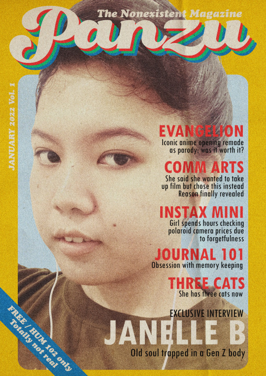
RETROZINE: A 70s-INSPIRED DIGITAL ART
“And I find it kind of funny, I find it kind of sad. The dreams in which I’m dying are the best I’ve ever had.” —Mad World, Tears for Fears
The idea for this art piece sparked when I revisited my numerous 70s and 80s hits playlists on the streaming service Spotify. I always had a soft spot for everything retro-themed as if I lived the decades myself. While I do have somewhat of an old soul in me, I still very much appreciate what we have today and how post-postmodern pop culture is now.
“Panzu” is a digital self-portrait that combines the art styles of the 70s with current meme culture humor. The picture I used was actually a selfie, which is one of the more recent trends in photography. I then took inspiration from the packaging for the UNO card 1970s as well as magazine covers from the 70s and the 80s.
The fake headlines on the magazine cover represent tidbits of my interests and favorites. I referenced another digital artwork I made, which was the Neon Genesis Evangelion parody. I also hinted about my hobbies which include journaling and memory keeping (looking at camera prices). The form of humor used involves self-deprecation, also called a self-roast by today’s generation.
Aesthetics-wise, I focused on using only a few fonts and a few colors while also maximizing their use. I stuck with system fonts such as Cooper Black which was similar to the font used in the UNO 1970s box. The color palette includes variants of the primary colors and a green to compliment the colors used on the header.
For the final touches, I decided to add a crease texture and grain effect on the final product to elevate the vintage look I was going for. Overall, I think it was an accurate representation of the part of my personality that loves art. It is humorous, self-aware and also very conscious of the art styles it is trying to replicate.
0 notes
Photo

GENERATIVE ART: AN INFOGRAPHIC
The goal of a concept map is to simplify a rather complex, difficult-to-comprehend concept. This concept map on Generative Art, based on the theory by Philip Galvanter (2016). Similar to art in general, its definition is still difficult to pinpoint. Nevertheless, generative art is still able to be defined and identified because a concept will not exist if it does not have a definition.
This concept map is styled similarly to traditional graphic organizers wherein simple shapes and arrows are used. It is entirely hand-drawn using a pen tablet as a way to prove that generative art is different from digital art; the map is an example of the latter due to the lack of direct involvement of autonomous systems during its creation. The generation of graphics were mostly made through human intervention, with technology only as the medium.
The definition of generative art on this graphic organizer is divided into two, distinguishing its misconceptions and known communities. The collective meaning then leads to the conclusion that generative art is, in some form, art that is created mostly through autonomous systems or algorithms. Defining generative art is vital to the study of new media art because it is mostly associated with digital art, the frontline of new media.
0 notes
Photo
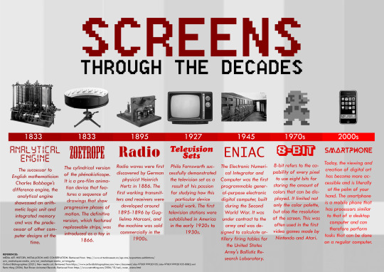
SCREENS THROUGH THE DECADES: A brief history of New Media Art
The goal of an infographic is to deliver adequate and accurate information that can be digested in a short amount of time. It is perfect for readers on-the-go and for a quick perusal of a certain topic.
“Screens Through the Decades” is an infographic in the form of a timeline. It follows the history of New Media Art and how it came to be in the present day. The title highlights the word “screen” because new media art heavily relies on digital platforms, all of which are previewed on a monitor of some sort. Although there are notably huge time skips on the timeline, the artist picked the most significant events that lead to the bigger picture which is the availability of digital art creation at one’s fingertips in the present time.
The timeline infographic made use of a two-color palette, showcasing only various shades of red and black. This is in reference to old media such as newspapers having limited color palettes due to obsolete technology. To add dimension, the reds used on the timeline bar as well as the text were given variations within the same hex family. Every decade was also represented with appropriate fonts that fit the technology of the given decade.
The artist also took inspiration from the famous Darwinist Evolutionary Chart where man eventually evolved into more upright-standing bipedal mammals. These devices, however, went from being massive (even occupying an entire room, like the ENIAC supercomputer) to being palm-sized devices. While decreasing in size, the capability of these devices has became immensely better over time.
It is interesting to see how new media art began and how it is still continuously evolving. Because of our fast-paced world, we have been introduced to short-form clips as showcased by the now-defunct video platform Vine and the now-popular Tiktok. Some of these videos can even be considered the new age infographic, now with a sound element.
0 notes
Photo

INTRODUCTION TO POSTMODERN NOSTALGIA
Greetings, and welcome to Postmodern Nostalgia—a digital portfolio where the print and digital worlds collide.
Originally intended to compile submissions for a New Media Art class, this site is home to digital artworks by Janelle “Panz” Bucud, an artist that describes herself as someone who “reeks of postmodernity”, as some may find her artworks making no sense. The value of art, however, does not rely on whether it has sense or not. The primary goal of art is to create and allow multiple possibilities. If art remains confined to tradition, new forms would not emerge.
All of the visual works contained in this portfolio employ art techniques and styles from the earlier decades, except rendered digitally. Several styles were covered, including retro, pop art, and doodle art. Modern photography and typography were frequently utilized across artworks. Software used include Adobe Photoshop, Adobe InDesign and Krita for the visual aspects, and BandLab and Cyberlink PowerDirector for the audio-visual portions.
This compilation aims to celebrate how old art styles are revisited in the modern age and improved upon by better technology. The aim is to create something new out of the old to add to the emerging art styles of today.
The artist hopes you enjoy your stay.
0 notes