Text
Eight
Changes in the self as a designer
Teamwork makes the dream work.
Looking back over my first semester at university, I feel like within this short period time I have really grown as an aspiring designer. I remember my first lecture and tutorial in DXB101 Design and Creative Thinking, I was so nervous to meet new people who are just like me and probably just as nervous. Now, I’m really comfortable introducing myself to other people in my classes because we all share a similar interest and dream. In the last studio of the semester, our tutor discussed whether our interests, beliefs, and aspirations have changed or evolved since the start of the semester. Reflecting on this, I believe I have come a long way considering how introverted I was but I still have the same aspirations in becoming a graphic and web designer. It’s interesting to listen to the stories from my classmates and being inspired.
Some skills I have acquired and developed during my studies in this class are: the ability to effectively cooperate within a team and collaborate with other designers, managing my time wisely, and being a sort of leader in a group.
What is one thing that you want to do through your design and creative thinking practices? What are specific projects that you can initiate and/or participate in to make this happen as a designer and creator?
One thing I want to do through my design and creative thinking practices is start working on my own graphical art and build upon my digital portfolio. As for projects, I could possibly start doing commission work for people who are interested in my work and clients alike. As a society, we are only moving forward in technology and seeing the change from paper to digital is faster than I ever thought it would go.
During the last studio, we were asked to look back on our tattoo that represents us as a designer and given the task to sketch wha our tattoo would be now. Thinking about the unexpected stress that came over me throughout the semester, I wanted my deer design to turn into a deer that’s fallen down from a shooting arrow. Sounds a little morbid but the message I wanted to get across is that you experience defeat when you least expect it, like an animal in nature.
0 notes
Text
Seven
Reflection on & strategies to address the tutor feedback
A week ago, we received the brief our major charrette, which is a task for us to seek new and meaning fun ways to provide care and support for people who are homeless or refugees in Brisbane. Upon first impression, our group decided to advocate for the homeless community.
Falling in love with your first idea is never a good idea. Our team took the brainstorming process very seriously and spent numerous hours in the first week coming up with the most original ideas possible and avoid concepts that already exist. Before our consultation with our tutor, we ensured that we have a few solid ideas and concepts to discuss and decide which one would be the best idea to refine.
Support Family: derived from the concept of foster homes, we thought it would be a good idea to have volunteers to pair with a homeless person that can provide emotional and financial support and increase their well-being.
Community Hub System: a system connecting community businesses together and offer services for the homeless and the poor, for example, hairdressers can provide free haircuts or food places can provide food.
Anti-Homeless/Friendly Architecture: the creation of a movement to end hostile architecture in urban environments that discriminate against homeless people and to spread awareness of this issue.
Recreation Centre: construct a recreation/leisure centre where homeless people can relax and distract themselves from their environment, focusing on mental health and well-being.
Before our consultation with our tutor, we ensured that we have a few solid ideas and concepts to discuss and decide which one would be the best idea to refine. After the helpful consultation, we decided to create anti-homeless architecture and our group had a week before we had to present our concept so all of us started working on the presentation immediately.
The feedback we received was actually really helpful because we came into the consultation with several ideas that could’ve potentially be done well but by the end, we settled on anti-hostile architecture.
0 notes
Text
Six
Reflection & evaluation of the minor charrette work
“In recognition of the growing significance of sociocultural diversity, the Brisbane City Council plans to create an iconic platform for sharing stories in the City Botanic Gardens. The garden will become a playground where the urban, natural, and sociocultural flavours come together to create a unique experience of sharing stories in the melting pot that is Brisbane!”
Our task was to come up with an innovative concept to meaningfully engage people in sharing stories, create its brand, manifestations and experiences, and plan a campaign for promotion.
My team members were Josh, Luke, Genevieve, Bridget, and Thomas.
At the end of the introduction to the task of the minor charrette, Josh and I had to form a group and at the time, we didn’t know may people in our classes but we were suddenly approached by a few other people desperate for a group. Funny how that worked out.
To understand the environment we were working in, our group decided to relocate to the Botanical Gardens to ideate and explore the area. As we were brainstorming ideas on the wet grass, we discussed the symbolism of our city, shared our own memories and stories, and talked about why people come to the gardens and what makes them an attraction in Brisbane.
Our idea of the installation to be put into the Botancial Gardens are the Memory Trees. The gardens together create a space in which both residents and travellers come to experience something. It’s a place to get away from the bustle of the skyscrapers and highways and relax with family, friends, and the annoying ibis. A place to make memories. The Memory Trees create a connection on a deeper level and people from all walks of life can share their memories and experiences and connect with strangers.
The Memory Trees consists of three central trees around the gardens and are connected by a series of lights in the ground acting as paths that direct the public to each tree. The installation asks the public to write a message on a clear bottle and decorate it in any way they want to visually express their story that they wish to share with the rest of Brisbane. The branches have strings attached to them so that the participants can suspend their bottles along with a coloured light provided. The final product will be a tree filled with hanging bottles which people can come and read the messages written on them and be directed by what kind of memory it is by the coloured tea lights inside the bottles. For example, yellow can mean happiness, red can represent love, blue can symbolise sadness, etc.
“Bring your own bottle. Create your own memories”
After we settled on our concept, we allocated roles to everyone in the team and I was in charge of drawings and sketches of the trees and the new additions for our concept to be included in the presentation. Josh and Luke were in charge of retrieving supplies for construction and Gen, Bridget, and Thomas were in charge of the presentation. Before I could start sketching, we decided to take a walk around triangulating the area and find big and shady trees to use in our project.

After about half an hour of separation, we came together to finalise our presentation, collate our efforts, and film the minute long video.
Everybody in the team contributed to the project equally and everybody put in so much effort which was amazing to see. This was a really great lesson and introduced us to what we might expect in the major charrette in a few weeks.
0 notes
Text
Five
Refine & finalise prototype
In mathematical terms, a matrix is an array of numbers and figures. To a designer, a matrix is a visual thinking tool used to organise ideas during the brainstorming process.
Today’s exercise in our tutorial class was to create a ‘food box’ to be sold/consumed in the cultural precinct of Brisbane City. The box must embody the unique image and experience of Brisbane and make the cultural precinct more attractive to visitors. In reference to the previous blog post, our exploration of the areas of South Bank’s parklands gave us a thorough understanding of where people go and what people enjoy about South Bank.

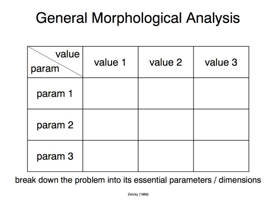
We were grouped together at our tables and immediately we started to deconstruct examples and brainstorm ideas and concepts for our own box. From what we learned from the lecture earlier in the morning and revising over the content, we decided to use a morphological analysis matrix developed to explore multiple solutions to a possibly complex problem (see below).
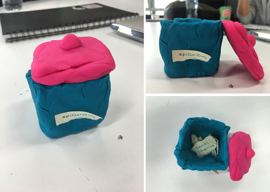
The Epicurious food box to be sold at the community garden of the name in South Bank is a healthy treat for kids to enjoy. The box includes foods such as a sandwich, a juice box, a cookie, and a muesli bar. What makes the box interactive is that its components have a decorative pattern on the packaging so that children can do a little colouring in with coloured pencils provided so parents can have a relaxing time in the garden. The Play-Doh prototype (shown above) is what the final product would look like. Our group’s original ideas were for the box to resemble a lunchbox or to look like a crate but we decided on this design due to time pressures.

0 notes
Text
Four
Documenting design research activities
During the tutorial session, we ventured into South Bank where we were assigned to take photographs of things that represent each of the seven thoughtless acts discussed in the morning lecture.
Reacting: we interact automatically with objects and spaces that we encounter
(Left) Luke tying his shoelaces.
(Right) Avoiding the dead bird on the ground featuring Josh looking disgusted.

Responding: some qualities and features prompt us to behave in particular ways
(Left) Moving out of the way for moving vehicles and not getting run over while taking the photo. Oops.
(Right) Walking around the creepy clown mosaic on the ground. Seriously, who thought this was a good idea?

Co-opting: we make use of opportunities present in our immediate surroundings
(Left) Litter in places other than a bin. Normally, there would be hidden trash everywhere but South Bank is suddenly clean? Weird.
(Right) Lying down on a seat meant for sitting.

Exploiting: we take advantage of physical and mechanical qualities we understand
(Left) Standing on structures that aren’t meant to be stood on.
(Right) Using windows to stick things on such as paper.

Adapting: we alter the purpose or context of things to meet our objectives
(Both) Door stoppers that aren’t door stoppers.

Conforming: we learn patterns of behaviour from others in our social and cultural group
(Left) Walking on the left side of the path because it’s the cultural norm.
(Right) Tourists huddling together.

Signalling: we convey messages and prompts to ourselves and other people
(Left) Signs warning pedestrians that people may be riding bikes or segways or on roller skates.
(Right) Construction beeping warning us to watch out and stay out of the area.

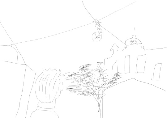
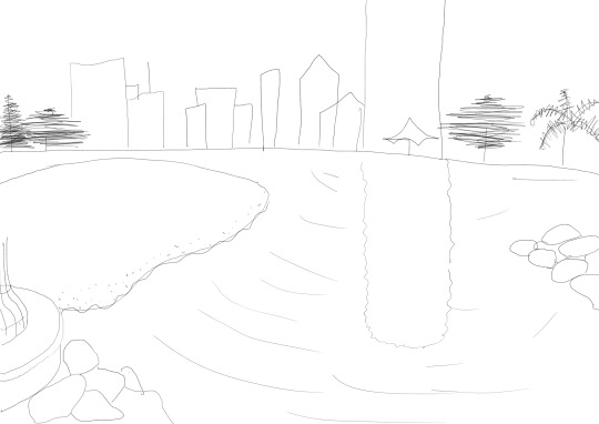
Bonus content: we were also asked to sketch two photos that we took in South Bank.
0 notes
Text
Three
An inspiring designer & their sandwich
Oki Sato is a Japanese designer, founder of Nendo, situated in Canada. He’s created hundreds of products ranging from furniture to jewellery to home decor and even to fashion for several different brands. Looking through his portfolio of work, it’s safe to say he’s very inspiring and slowly becoming one of my favourite designers, personally.
Our main focus of the tutorial was to rebrand “The Edge”, a modernised creative space located next to the State Library in South Bank, Queensland in the style of our given designer to target the younger demographic. The Edge in its current state is not very pleasing to the eye. It’s dark, uninviting, and most profoundly just not exciting enough for the youth of Brisbane.
This isn’t just any rebranding. Our task was to reconstruct The Edge’s aesthetic to fit the style of our selected designer that we drew from a pile of origami - Oki Sato. From the design research, we could deconstruct Sato’s style and fit it into South Bank and make the venue great again.

For the sandwich portion of this task, I aimed to be a little creative but I was also stumped because I had no idea what kind of food Sato likes or would eat. Then, I had a look through all of his works and he mostly designs furniture so I had the idea of making a sandwich out of couch cushions.
References
Howarth, Dan. 2015. “"I am addicted to design" says Nendo's Oki Sato” Accessed March 14, 2017. https://www.dezeen.com/2015/04/28/interview-nendo-founder-oki-sato-addicted-to-design-milan-2015/.
0 notes
Text
Two
Reflection & mindmap (on the week 2 guest lecture)
In our second lecture of the semester, we were lucky to have Dr Julie Connolly from Multicultural Development Australia (MDA) as a guest lecturer to talk to us about advocacy. She does a lot of work as an advocate on refugees and asylum seekers which was really interesting to learn about. There are two forms of advocacy in our society: individual and collective.
Individual: solving individual problems as they arise.
Collective: focus on structural inequalities and constraints on communities.
Thinking about people, but more than people, thinking also about relationships of power.
The key challenges you face as an advocate are: capture, reactivity, charisma, and obliquity. Capture is a dangerous one where you are either captured by a group or captured by government. Charisma is where you meet people in social movements with such compelling stories that capture your imagination. Obliquity by definition is the idea that goals and objectives are best achieved unexpectedly and without prior intention, according to Sir James Black and John Kay and this is the issue that Dr Connolly struggles with the most.
What really jumped out at me and captured my interest in the lecture was this diagram named the Cynefin framework, which is a framework used to help us discover not every situation is equal and each problem/issue requires a different response to solve them.
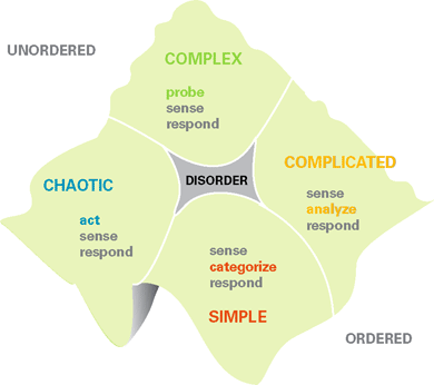
The Cynefin framework (Harvard Business Review, 2007)
A refugee, by definition, is “a person who owing to a well-founded fear of being persecuted for reasons of race, religion, nationality, membership of a particular social group, or political opinion, is outside the country of his nationality, and is unable to or, owing to such fear, is unwilling to avail himself of the protection of that country.” (The 1951 Refugee Convention, 1951)
At a glance, it was recorded in 2015 that approximately 65.3 million people around the world were forcibly displaced and a third of that number were classed as refugees.
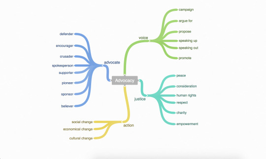
The lecture then went on to discuss the area where advocacy and design meet. Designing is not just about designing things for people but it’s also designing for people and the challenges of being advocate that come along with that. Dr Connolly posed us with these questions:
How does the design process conceptualise social justice, social inclusion and social cohesion?
How do designers deal with questions of power?
Can we use design principles to address advocacy? How?
My prediction for the semester is that one of the charrettes (either the minor, major, or even both) would be to do with the topic of advocacy and designing something that’s advocating for a group of people.
References
Boone, Mary & Snowden, David. 2007. “A Leader’s Framework for Decision Making” Accessed March 14, 2017. https://hbr.org/2007/11/a-leaders-framework-for-decision-making.
UNHCR. 2001. “UNHCR - The 1951 Refugee Convention” Accessed March 16, 2017. http://www.unhcr.org/en-au/1951-refugee-convention.html.
0 notes
Text
One
Reflection on “who am I?” as per studio activities and create your sandwich
Our first tutorial class for design and creative thinking was all about getting ourselves into a creative mindset and figure out what design means to us.
The first task was to create our own definition of design. Pretty easy, right? I started brainstorming words that related to the word and then collaborated with two other people. Together, we came up with this: design is the process of creating new and innovative products and concepts for the user which can be sustainable and interpreted in many diverse ways.
We were then asked to join another group and share our definition and combine forces to deliver one final definition. I was in a room full of budding designers like myself and it was so inspiring to learn what design means to others.
“Design is a creative process that can improve/produce a tangible or intangible object through the creation of new ideas that can interpreted in many diverse ways.”
I went further to do a little research on my own to figure out what past designers think of this term too. What really stood out for me was a definition from Paul Ralph who was preparing his Ph.D dissertation on “the nature of software design”. Him and his thesis adviser, Yair Wand, collaborated and worked together to create a more scientific definition and wrote: a specification of an object, manifested by some agent, intended to accomplish goals, in a particular environment, using a set of primitive components, satisfying a set of requirements, subject to some constraints. Looks a little intimidating but this really struck me as something so accurate in my previous tertiary studies.
Next, we were assigned to brainstorm five keywords to do with designers and how they work and come up with design solutions. Me and a couple of other students came up with: creativity, critical thinking, passion, collaboration, and resilience. I feel as if these words really define me as a designer and the word I resonate with most is ‘passion’. I see myself as really driven and motivated and I’m always striving to create something spectacular and beautiful.
Tattoo Task
One of the most interesting parts of this lesson was to sketch and design your own tattoo that represents you as a designer. For this task, I chose to have a tattoo of a deer head, located on my upper-left arm.
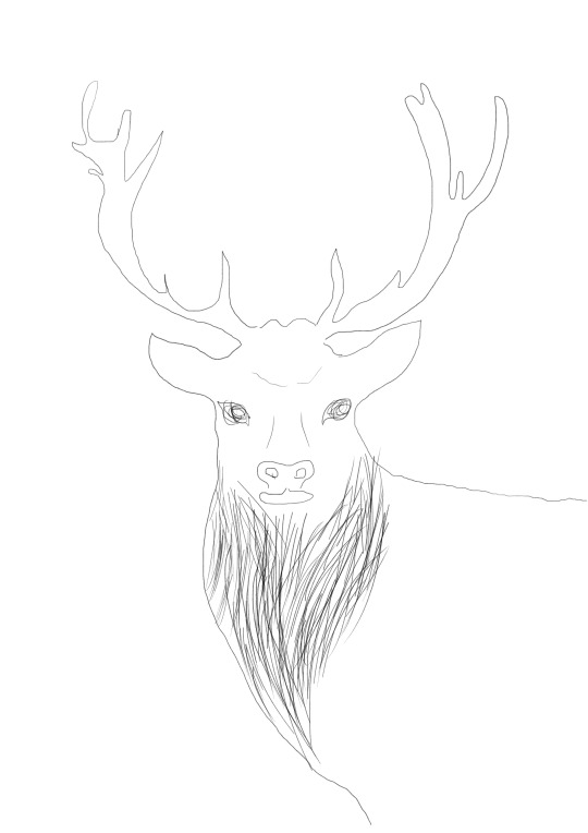
It goes without saying that the deer represents gentleness and innocence, however the deer also symbolises vigilance, sensitivity, and intuition. I decided on this placement because the left side of the body has the heart, which represents something meaningful and close to you personally. The horns of a deer can mean assertion and as a designer, I feel I have the confidence to succeed. Naturally, antlers grow back when they shed and this symbolises my ability to regenerate from failure or getting knocked down from criticism.
Sandwich Task
Our homework for the week was to make a sandwich. Not that simple. The sandwich and its ingredient had to somehow represent us a person.
To quick start my generation of ideas for this project, I started out with a quick sketch of what my sandwich would look like as well as jotting down keywords that reflect my personality in my notebook. Words like “passion” and “creative” came across my mind and sparked a lot of ideas. The elements I had more focus on than others were obviously the visual aesthetic of my sandwich, the taste, the structure, and what foods I would use. I thought about the different types of food work on sandwiches and which types would represent me. Then I thought about how I’m always thinking outside of the box and coming up with possible crazy ideas and could use objects to represent who I am.

Cheese: The Jarlsberg cheese represents my comical sense of humour and my ‘cheesy’ jokes. Get it?
Popcorn: The popcorn represents my undying love and passion for films and cinema. Pretty weird that I made the decision to include popcorn in my sandwich because I think popcorn is disgusting.
Overwatch: I owe this video game my life.
My hand: Now, this will be interesting to explain. Probably the most important thing that I has influenced me in a lot of ways is the television show Hannibal. I first watched The Silence of the Lambs when I was twelve and this really sparked my interest in film as well as thrillers. The series, however, made me fall in love with cinematography and the mass amount of creativity that goes into the making of this show. Also, I feel like . The reason why there’s a hand in my sandwich is because Hannibal Lecter eats people... I just made it awkward (I couldn’t find an artificial severed hand so I had to improvise).
When I was photographing my somewhat frightening creation, I considered the camera angle, lighting, and how I can take the photo where the viewer can see all the elements and ingredients. Overall, it tasted gross.
References
Harris, Elena. 2017. “Deer Spirit Animal | Deer Totem Meaning” Accessed March 10, 2017. http://www.spiritanimal.info/deer-spirit-animal/.
Pavlus, John. 2013. “Is There A Scientific Definition Of “Design”? Accessed March 7, 2017. https://www.fastcodesign.com/1672937/is-there-a-scientific-definition-of-design.
0 notes