Photo
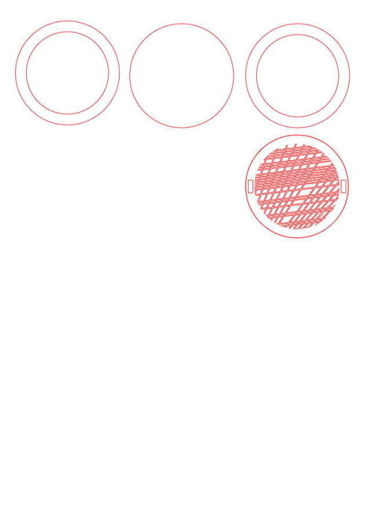
This is the template for what I will cut on the laser cutter. There are two ways in which I can cut it, either into MDF or into acrylic. Acrylic needs a solvent glue to chemically bond the different layers together, and the MDF can use glues such as PVA or other wood glues. Although the acrylic would give me more colour options with the material, the glue might be too close to the thin cut outs of the design which may melt them too. I think I’ll go with the MDF because it is slightly more forgiving.
0 notes
Text
Final Pattern
Although I may make slight changes, the code I have used to ake my final pattern is:
import processing.pdf.*;
Table table; int[] x = {0,0,0,0,0,0,0,0,0,0,0,0,0,0,0,0,0,0,0,0,0,0,0,0,0,0,0,0,0,0,0,0,0,0,0,0,0,0,0,0,0,0,0,0,0,0,0,0,0,0,0,0,0,0,0,0,0,0,0,0,0,0,0,0,0,0,0,0,0,0,0,0,0,0,0,0,0,0,0,0,0,0,0,0,0,0,0,0,0,0,0,0,0,0,0,0,0,0,0,0}; int noOfColmns = 0;
void setup() { size(1000, 1000);
table = loadTable("Coffeee.csv", "header");
println(table.getRowCount() + " total rows in table");
beginRecord(PDF, "Coolster_sketch.pdf");
for (TableRow row : table.rows()) {
int value = row.getInt("value"); x[noOfColmns] = value; noOfColmns++; println(value); }
fill(0);
}
void draw() {
for (int i = 0; i<noOfColmns; i++) {
stroke(247,i,100); line(x[i]*10, 1250, x[i]*90, -500);
stroke(255,255,100); line(x[i], x[i]*15, x[i]*90, 4* x[i]); line(x[i]-200, x[i]*15, x[i]*90, 4* x[i]);
stroke(255,200,10); line(x[i]-400, x[i]*15, x[i]*90, 4* x[i]);
stroke(255,150,10); line(x[i]-1000, x[i]*15, x[i]*90, 4* x[i]);
stroke(255,150,10); line(x[i]-1500, x[i]*15, x[i]*90, 4* x[i]);
};
endRecord();}
0 notes
Photo
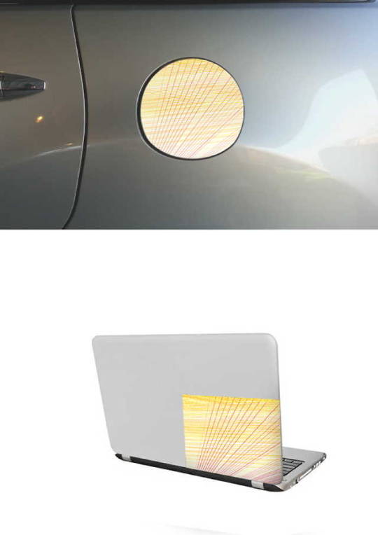
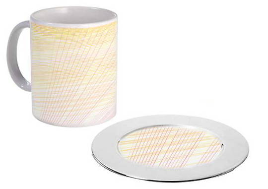
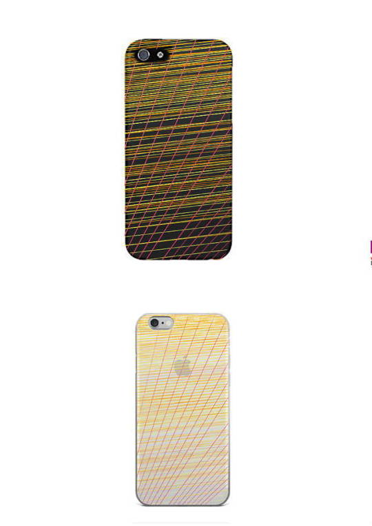
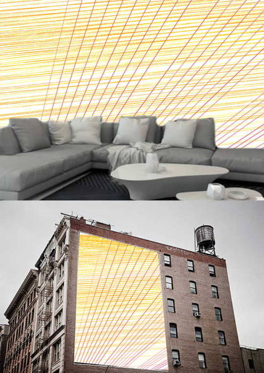
Here I have experimented with using the pattern made with the code into things other than my initial idea. I felt as though the pattern worked better when there was no background. I had the pattern on a slightly yellowish background and by simply deleting the background line in the code I had a vector line image. I think that the phone case and the mug looked cool, and better when there was no background. For a phone case I could 3D print a model where the case is the pattern and the phone clicks into it.
0 notes
Photo


Here I have changed the pattern slightly. Now the data is referenced out from the .csv file and I have used two main line functions to create the pattern. Both of the lines use a value based on the [i] value, taken from the float (.csv file). The two functions I repeated
stroke(247,i,100); line(x[i]*10, 1250, x[i]*90, -500);
and
stroke(255,255,100); line(x[i], x[i]*15, x[i]*90, 4* x[i]); line(x[i]-200, x[i]*15, x[i]*90, 4* x[i]); // in this one I increased the number that was being taken away from the first value.
In the busier sketch there are 3 sets of data for the red colours and 3 sets of the data for the yellow colours. Each the yellow stroke repeated itself I also slightly changed the colour of it. This was an interesting way to show the data because as the values taken from the csv file get smaller the lines become more bunched up, showing the sudden decrease in the amount of coffee people drink a year.
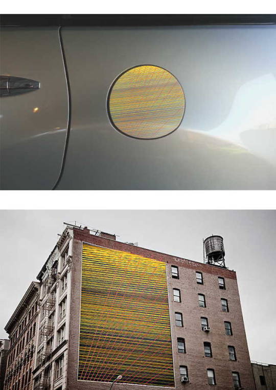
My inspiration for this design was the Rising Sun Flag that the Japanese have, which is because on my way to Uni a car drove into the back of me and it had a rising sun sticker over it’s fuel cap.
0 notes
Text
Following the interim presentation I received feedback as to what I could do to improve my project. One piece of that feedback was whether I would use the data to make a pattern that was purely aesthetic, or to make the pattern have more meaning to reflect on the data. Other feedback was more suggestions on what I could make with the pattern which consisted of ideas such as a place mat, or used for advertising.
0 notes
Photo


Once I had the pdf version of the sketch in illustrator I then up scaled it and used a red circle as an outline for the coaster. To prepare the coaster for the laser cutter I took the circle with the pattern and created another ring around it, and inverted the colour so that the gaps were red, and the lines were black so the cutter would cut out the negative area. However when I went to laser cut the shape out I found that some of the lines were too close together which was likely to cause a fire.
0 notes
Photo


I found data on the amount of coffee in kgs consumed per capita. The data was only of the top 100 countries that consumed coffee. I added the data into processing by using a float and copy and pasting the numbers in, however after I made my sketch I have realized that there is an easier way to do it.
From there I used a forloop function that uses the numbers in the float to make up the properties of a drawn line. The first sketch looked cool with the red lines, however didn’t have enough overlapping lines to make a stable platform for the coaster. After a few attempts of using different numbers for different values I ended up making this pattern with the code :
for (int i = 0; i < x.length; i++) {
line(5*i, i*15, x[i]*50, 50);
I then exported the sketch from Processing into a Pdf file so I could work on it in illustrator to get ready laser cut the demo.
0 notes
Photo

I have decided to look into making something similar to a drinks coaster or mug holder based on general tea and coffee statistics. To use code to help produce these I was thinking of making a pattern based on a graph based on how many much coffee people drink daily and possibly how the amount of tea and other beverages in a different colour. I planned to make this by using a splicing application to cut a coaster into sections thin enough to laser cut a pattern into the material and layering the parts ontop of eachother to create a 3d form.
The other way I was thinking of to make the coaster was the 3D print the whole thing after creating the coaster with the graph patterns on it. This seemed like a safe way to do it but it would use a lot of resources, plus the way it prints, I wouldn’t easily be able to have a hollow space in the middle for liquid to drip in. By laser cutting I have much more freedom with what materials I can use, and can easily make more.
>I may not necessarily make it based exactly on my initial idea, I’ll probably think of different variables I can use for my graph or patterns.
Someone who has done something similar is this Robo3D who has 3d printed a coaster.
https://www.thingiverse.com/thing:419632
Variables to consider would be:
Dimensions of the mugs that are used; diameter and depth
Data input
Colour / material
HOW DO I INCORPORATE CODE?
0 notes
Link
0 notes
Photo


FINAL 3JS PLAYGROUND
I found 3js more difficult than the others to learn because it was more copy and pasting and random experiments than actually writing the code and functions in a way that you understand them. Nonetheless I chose to develop my Purple Porcupine so that it would create a more fulfilling visual projection. To do this I first began by multiplying the mesh using the code:
for ( var i = 0; i < 300; i ++ ) {
geometry = new THREE.CubeGeometry( 25, 25, 25 );
material = new THREE.MeshBasicMaterial( { color: Math.random()*0xffffff } );
mesh = new THREE.Mesh( geometry, material);
mesh.position.x = Math.random() * 1000 - 500;
mesh.position.y = Math.random() * 1000 - 500;
mesh.position.z = Math.random() * 1000 - 500;
mesh.rotation.x = Math.random() * 2 * Math.PI;
mesh.rotation.y = Math.random() * 2 * Math.PI;
mesh.rotation.z = Math.random() * 2 * Math.PI;
scene.add( mesh );
}
As well as multiplying the numbers, this also randomized their position, otherwise they would all be floating on the same spot. I also reduced the range of copies that it would produce by changing: for ( var i = 0; i < 300; i ++ ); To for ( var i = 0; i < 5; i ++ );
So now it would only render a random of meshes that were 5 or less. I did this because the when I used larger numbers it was too crowded and you wouldn’t get to see the trail of the big spinning mesh or the patterns that the other ones left due to the trails instantly being covered again. Doing this also made the drawing run a lot smoother. To create the movement I added the added a camera function that was always changing, so it appeared that the mesh was moving towards you, then through you. Another small tweak was changing the values of the directional and ambient light to make the colour variance more intense.
the second screenshot was very interesting and it reminded me of Cocoon from Final Fantasy Xiii
Artist model for Coding Nick Britz describes himself as a new media artist / educator / organizer. He uses his art to illustrate a point, or help raise awareness about something. In particular looked into a project of his called Digital Trail Space. This was a project open to the public, where designers and coders submitted their digital designs / animations and the outcome would be projected all over the streets of Miami. After submitting the code Nick tracked the IP address of the artist and instead of showing ads they showed little messages like ‘sorry we followed you here, hope you don’t mind’ I decided to base my final 3JS creation with the thought of it being projected around the streets in mind. This was the base for my spinning torus shape, as well as the camera going through the middle of the hole. I thought that this would look cool projected onto a tunnel or on a doorway so it appeared that you were moving through the shape. Going through a tunnel with the projection would looked the best as the projection would leave trails behind you. The actual visuals created by Nick’s work also intriguing as he focuses a lot on glitches and colourful patterns left by shapes. A feature that I would like to add is similar to what Nick created for the 3js website home page, being that the cursor would be the centre point for the animation.
http://digitaltrailspace.com/
0 notes
Photo


UNITY 1.5 FINAL MIX
For my final Unity project I started by editing adding a second box to the underside of the platforms and giving it a rigidybody and a 2d box collider. I made the box so that it wasn’t tagged as ground, and, and therefore you can’t stick to the bottom anymore. To make it easier to replicate the platforms and create a bigger field for the player to move around I parented the bottom box to the platform. I had the idea to create a maze type jumping game so I duplicated the walls and the platforms, laying them out in a different way each time. I found that if you hold jump you can launch higher, and bouncing upwards off of the sides of the platform which, so to make this work better I added in wider vertical space. As simple guides I just added text which tells the player to escape the maze, that they can jump up off the platforms, the word ‘freedom’ at the end, as well as a few coding puns here and there. If I were to develop it further from here I would like to make a small RPG game in this style.
0 notes
Photo

FINAL PROCESSING
My final Processing experiment I decided to develop the coloured cursor so it was more interesting to use. I wanted to change it so when you clicked it would change colour, and so that you can easily clear the trail that was left. To do this I tried many different things, most of which I guessed at and found that they didn’t really work. My first idea was to make the colour of the background randomize when the mouse was pressed rather than just clearing back to the default colour. Instead of just having the the background asn 3RGB colour values I input: (random(1,255), (random(1,255), random (1,255), though this didn’t work. I also found that altering different values to things such as (mouseX) and (mouseY) didn’t really give me the desired effect. Finally I worked out that if I could set the location of mouse click to where the colours would change that I could controllably give myself a similar effect. I did this by using colour codes such as:
Void mousePressed (){ background (mouseX, 100, mouseY);
// I used different variations on this, like (200, mouseY, mouseX); etc.
Although this let me set colours to certain positions, there as a big dead patch in the bottom right corner because there is a limit on where the mouse will be on the screen and the cursor position will have an RGB scale. I’ve highlighted the dead patch in one of my photos and after seeing the outline of it, it makes sense that it has a very limited range. Since my window is 1000 x 1000, the available colour values would only come in a quarter of the way down on the Y axis and across on the X axis (1000 - 255 {because it’s the highest value in the colour range} = 745 which means the 745 would all just be white. To fix this I simply increased the values that the mouse position would give to make up the colours, for example instead of “mouseX”, I used something like (750 - mouseX) and gradually tweaked the numbers until I had a nice colour range.
Lastly for this I wanted to make it more interesting so I added a “mouseDragged” function. For this I input the values of the animated ellipse to negative respectively. So now when you hold the mouse, the cursor goes one way and the ellipse the other way, plus the colour change is slightly different.
0 notes
Photo


FINAL QUARTZ COMPOSER
Finally my final. I decided to develop the two rotating cubes. To create more than one boring focal point I duplicated the two cubes a few times and moved them evenly around long larger one in the middle. I did this by editing the X and Y positions inside the inspector element and changing the first none ito (0.2,0.2), then the next one (-0.2,-0.2), (-0.2,0.2),(-0.2,0.2),(0.2,-0.2). I did this with values of 0.4 and 0.6 as well. From here I went in and edited the colours back to full opacity and made each set of squares a different set of colour gradients. I found Quartz a bit of a mission to use to be honest because I had to use my friends Mac to use it, and haven’t used a mac in a very long time. I liked my final wee animation because if you pause it at random times you get to see a different colourful shape terrain. If I were to continue to develop this one I would want to add an audio input for the speed of the cube’s rotation.
0 notes


