| PSD's, Textures, Fonts, Headers, Icons, Tuts, etc. | Main: @awkwardteenwrites
Don't wanna be here? Send us removal request.
Photo

#11 Itaewon PSD Coloring.
get the link
reblog this post.
follow me ( I´ll check it ).
ask (No anon) “Itaewon psd, please”
514 notes
·
View notes
Photo
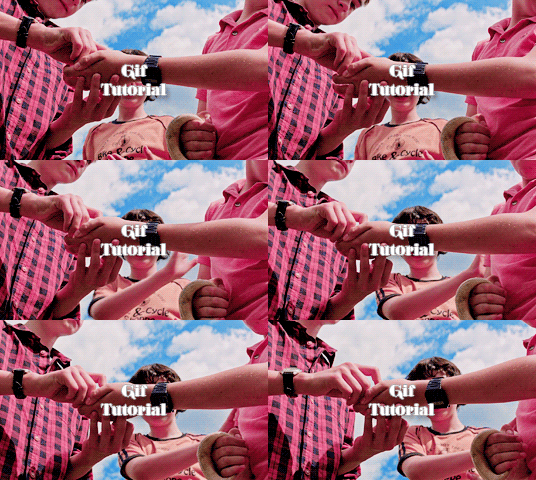
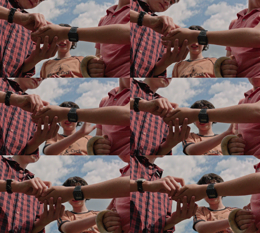
How to Make Gifs with Photoshop and KMPlayer
Please like/reblog if this is at all useful to you. Thank you so much if you do!
Hello! This is the first time i’m making a tutorial and i’ll try to be as clear as possible! I’m no expert, I simply started some time ago until i reached a point where i just like my own gifs, so this is practice!
The second gif is a basic gif without sharpening or coloring, this tutorial will teach you how to make a nice quality gif, and i’ll recommend some colorings as well!
Weiterlesen
406 notes
·
View notes
Photo
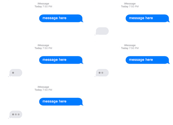

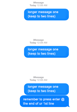
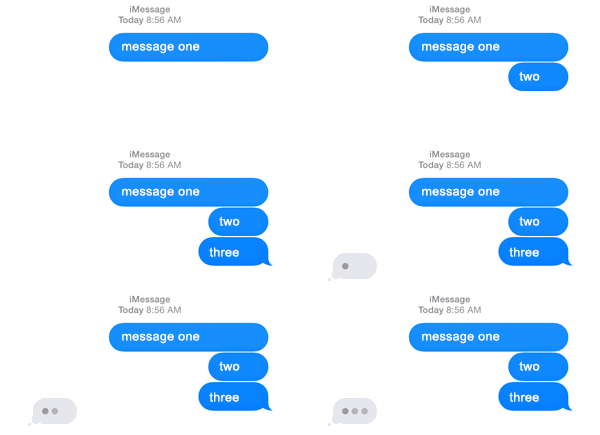
imessage gif templates ( psd set by njmphadora ) one / two / two (long + no reply) / three
please like/reblog if using dimensions: 300px x 145px export: save for web + set loop contribute?
2K notes
·
View notes
Note
idk if you do gif tutorials or anything but how do you blend two scenes into one like your peraltiago magic set?
hey nonny, sorry i didn’t answer this sooner. so, i used to make this blended scenes following these steps: (x) i think this way is very hard for ppl who are not into premiere pro, so i’m doing a quick tutorial on how i do it on photoshop on how to get this result:
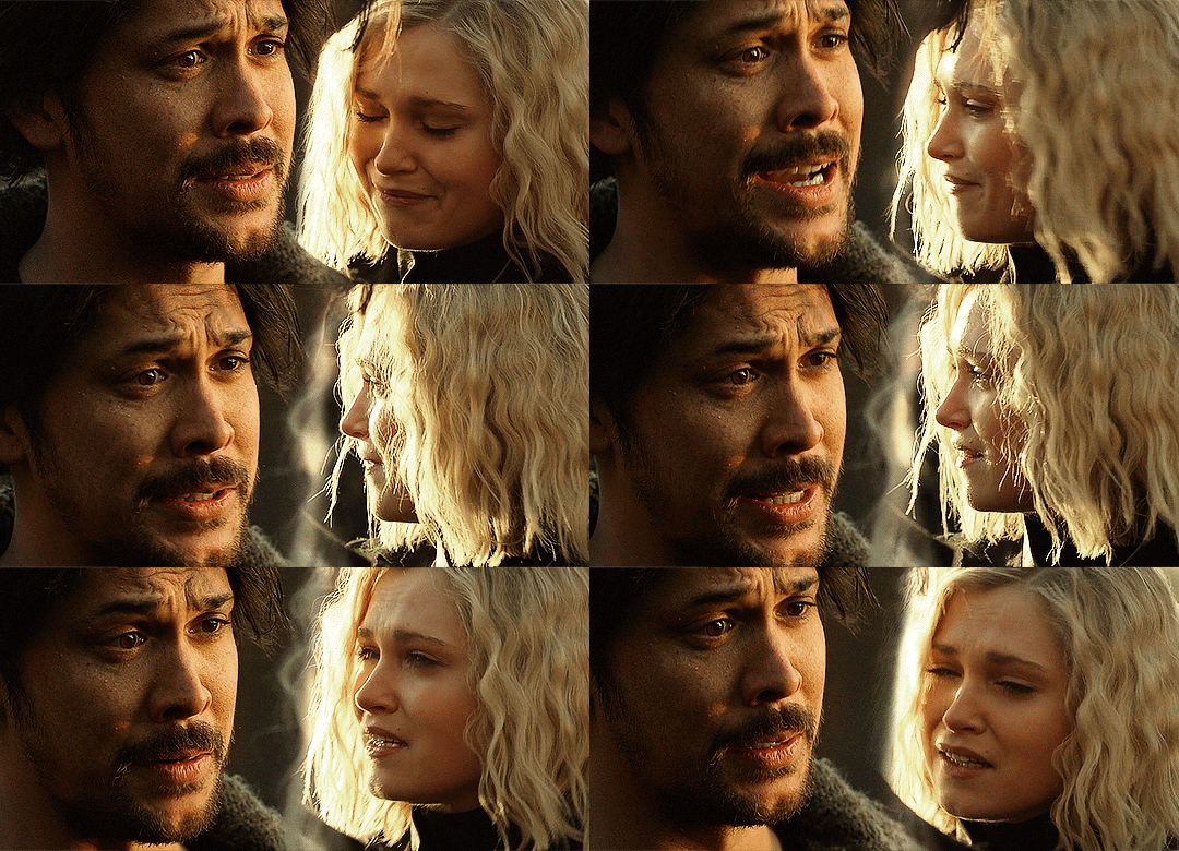
Weiterlesen
335 notes
·
View notes
Note
hi, I was wondering what sharpening settings you use for gif’s? they’re always so clear!
thanks nonnie! i’m not sure about alexa but these are my smart sharpen settings:
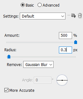
-andi :)
yeah i use the same settings :)
- alexa
23 notes
·
View notes
Note
hi! your gifs are stunning. could you maybe share with us your action or technique?
It’s about creating a balance between sharpening and blurring. I start with a smart sharpen filter, then add a blur filter @ 1.0 followed by another sharpen filter. Typically I use a sharpen mask on top. Other times I play with high pass on a soft light blending mode, which has the ability to create contrast and sharpen both gifs and pictures.
This is all on one layer btw, no duplicate layers, all of that is so unnecessary once you know that you can edit the opacity and the blending mode of individual smart filters on a single layer (hint hint!)

5 notes
·
View notes
Note
Hello, so I don't know if you've already answered that but in your tutorial on how to do a gradient in your veronica mars gifs on the 'title' gif you used the text and it looks so cool, how to do that? so it's in colours of the gif itself and sort of transparent? sorry idk how to explain that :( just the text effect is so lovely
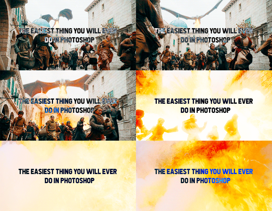
Hiiiiiiiiiiiiiii. Okay, so this is literally the easiest thing in the world, you won’t have any problems. Like, legit it’s point and click – the best kind of photoshopping.
Keep reading
28 notes
·
View notes
Note
Do you recommend any software for creating edits and mood boards? I’m new and wanted to know a good place to start
Hello! 😊 Plenty of our members use Photoshop to make their edits, but others also use and recommend Canva, Phonto, Picsart, Polarr and Superimpose. We hope that helps. ❤️
- Nickie
7 notes
·
View notes
Note
i'm the anon who asked for the dark got scenes psd... first of all thank you so so much!!!! and secondly, i'm sorry to be a pain but if you're open to making more psds for people would you mind making one for outdoor s6-s7 scenes? specifically sansa in the godswood or on the battlements? i've tried adjusting the one you already made but it doesn't seem to want to work for me?
This is very basic but it’s clean and versatile. Sorry it took ages to get to this! I tested it on several scenes and it worked without any adjustments needed. Enjoy! Like/reblog if you download please.
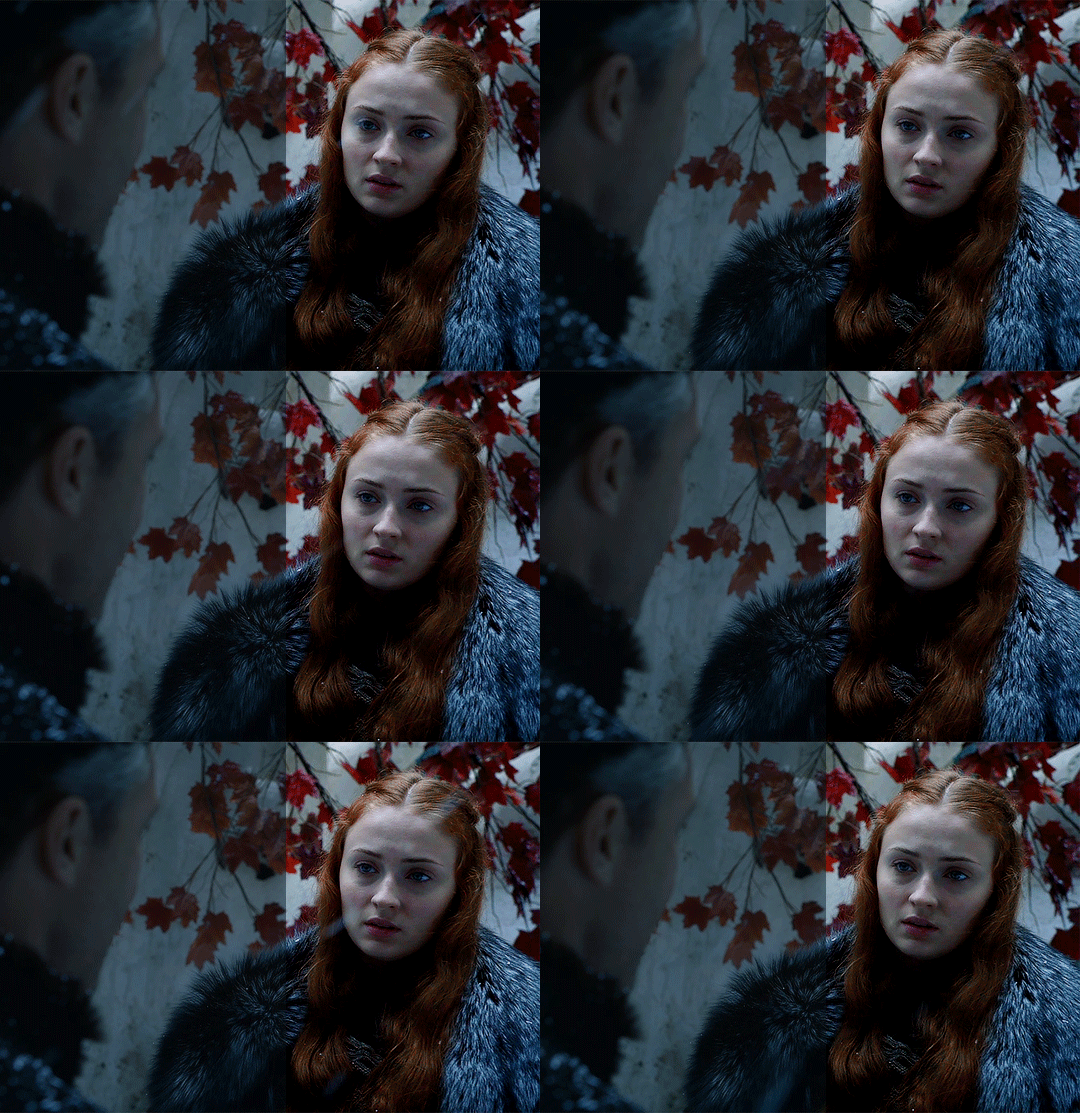
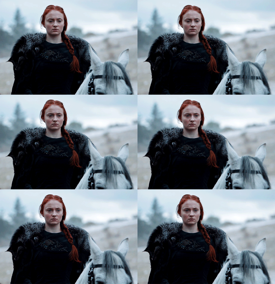
download | psd for dark scenes
624 notes
·
View notes
Note
really hate to bother you ,but can you do an *extremely* short tutorial on how you made that natasha edit (the darling dearest dead one) thank you sweety!!
oh shit, i actually made that gif set like ages ago before i went on ps so i kinda don’t remember but i’ll do my best! we’ll be doing this on photoshop because it offers better quality.
this is what we will be making:
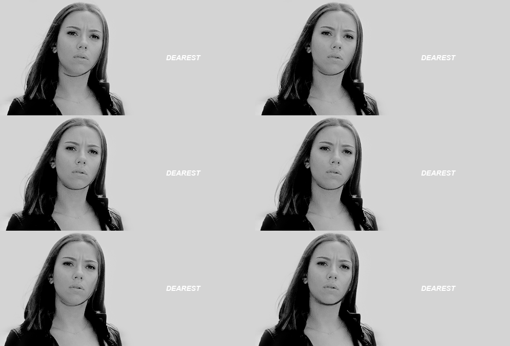
see below for the tutorial.
Weiterlesen
38 notes
·
View notes
Photo

elsa icons
requested by anon please do not claim as your own! like/reblog if you save feel free to request icons or a different color! find them under the cut or on my icons page
Keep reading
281 notes
·
View notes
Text
yall look at this shit ad*be is tryna pull now on ppl who have outdated software:

(note for context: i’m all for piracy, but in this case my copy of CS6 was downloaded years ago when they were giving it away to students. i got it totally legally.)
436K notes
·
View notes
Text
how to color black characters without washing them out or making them orange
how to go from this:
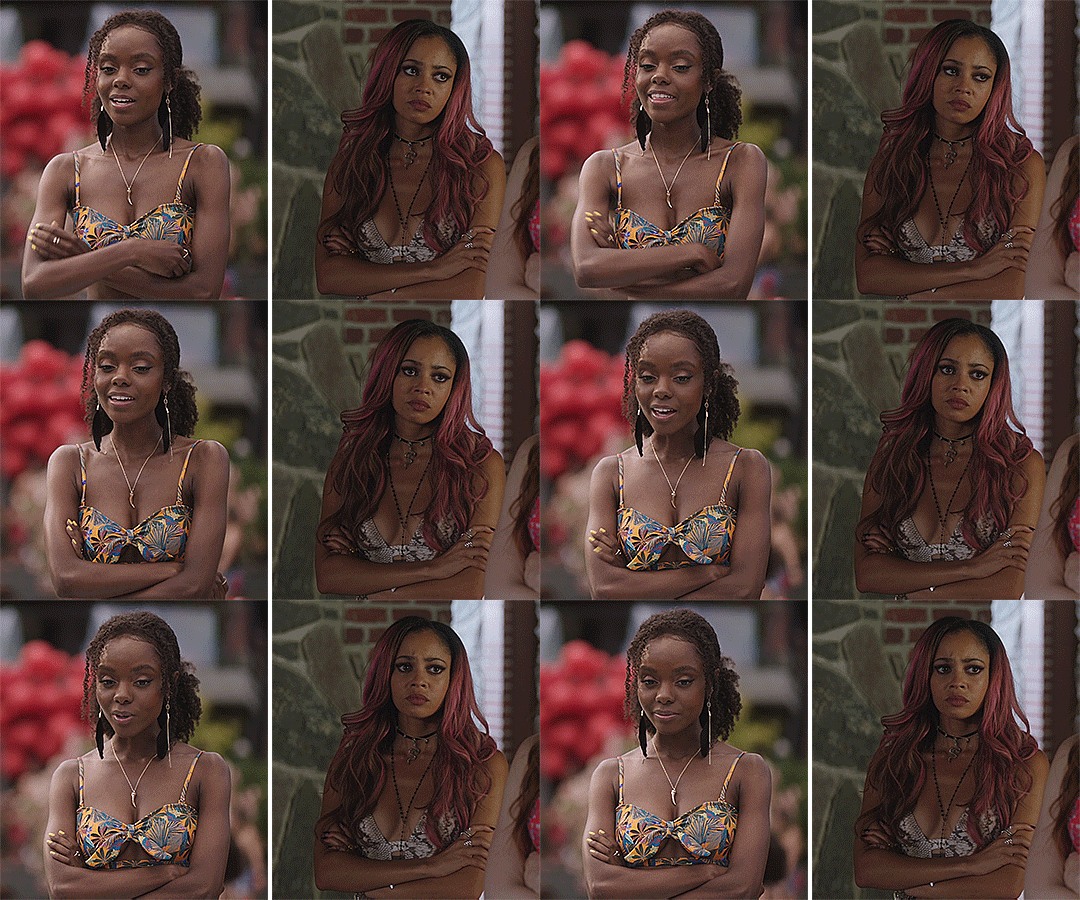
to this:
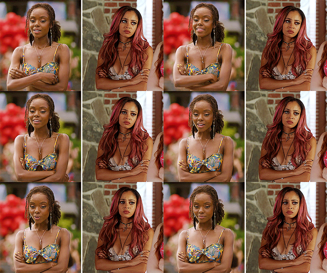
i’m back with another coloring tutorial! i’m not very good at written tutorials so bare with me, my explanations aren’t the best. anyway this is relatively simple and should only take about 5-10 minutes to achieve. if i missed anything or didn’t explain it enough, feel free to ask questions.
what you’ll need for this:
basic photoshop knowledge
how to make a gif
i will be using photoshop cc 2018
Keep reading
2K notes
·
View notes
Text
Color Reference Guide to Recognize & Avoid Whitewashing
I’ve made a tutorial on how to color adjust to fix washed out colorings, but I noticed people aren’t always sure when their coloring needs fixing in the first place. So I’ve made a bunch of colorings you can use to compare your own to. It’s designed to help avoid whitewashing, but also help avoid over-correction.
If you’re not a content creator, you can also use this guide for reblogging as well. :)
Using the Guide
Each set comes in three: cool, neutral, and warm. If your coloring is bluer/whiter than the cool tone, consider readjusting.
Examples of what might be too pale/bright are beneath each set
There are various categories (daytime, night scenes, etc) for each type of scene you might encounter
Each coloring has a color palette beneath for the highlights, midtones, and shadows of the character’s face. If you’re having trouble eyeballing it, use the eyedropper tool to double check.
NOTES 1) For the sake of simplicity, I’ve used one character per category, but characters of color are not interchangeable. Identify the skin tone for the character you’re coloring and work with that. This is only meant to give a frame of reference for what is and isn’t whitewashing 2) If any of the colorings look different than what they’ve been stated as (i.e. the cool tones look too warm or some look way too dark to be visible) calibrate your monitor. It means your screen color and gamma needs readjustment.
Guide itself is under the read more!
Keep reading
3K notes
·
View notes
Photo

Digital arts are one of the fastest rising arts these days and Photoshop plays a huge part in it. As a blog dedicated to providing design resources, we couldn’t leave the basics behind and put together a beginners tutorial for those who’d like to get to know Photoshop.
In this post, you’ll read about:
The main structure of the app
Photoshop terminology
The different menus on the app
Tools
Masking & selection
Tutorial by Sol.
Keep reading
786 notes
·
View notes
Photo
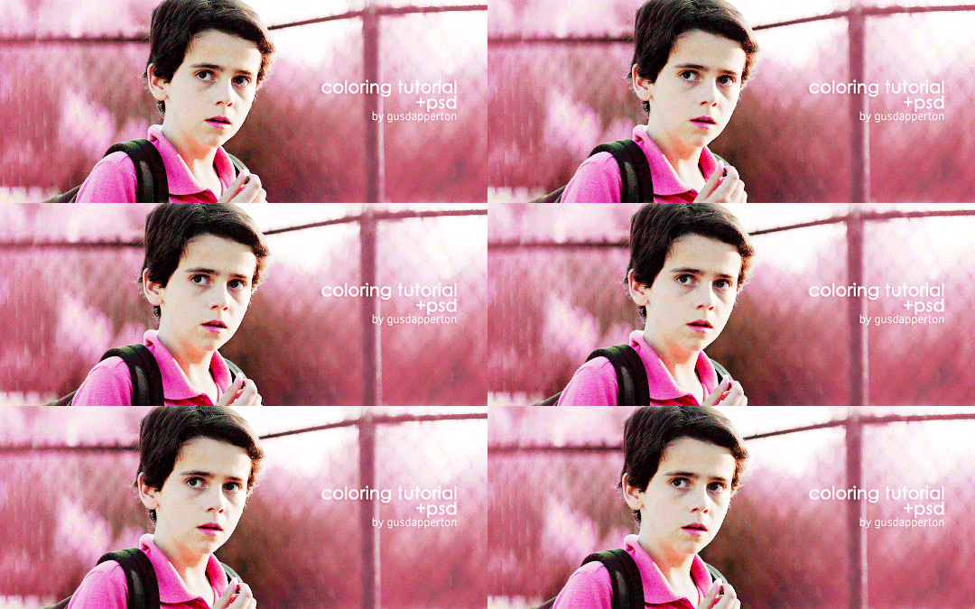
As per request, here’s a tutorial on how I colored this gifset. It’s actually a psd I made a long time ago and that’s what I’ve been using on all of my colorful sets, so if you’ve ever wondered about those too, this is how I made them!
In order to follow along to the tutorial, I made the psd available for download, and I’m just gonna show you how to use it.
Download the psd here (mediafire)
Keep reading
232 notes
·
View notes
Photo
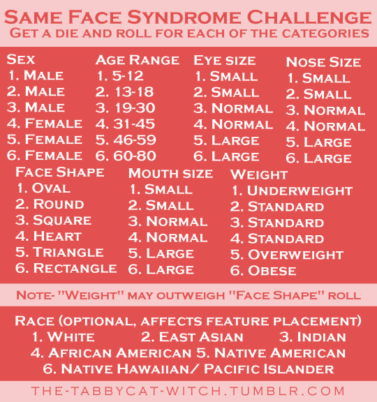
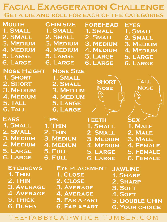
Hey, guys! I’ve noticed that there are a lot of artists who struggle with “same face syndrome,” or the tendency to draw all their characters with the same face. To help you combat this, I’ve created two different challenges!
The first (pink) one is mainly geared towards artists who are struggling with same face syndrome and want to start branching out. It covers topics that a lot of artists struggle with when drawing faces, such as age, weight, and face shapes. It’s not super specific, so you still have some wiggle room.
The second (yellow) one is a bit harder and is mainly geared towards artists who want to really challenge themselves to diversify their faces. Personally, I think this one’s the most fun to work with despite it being more difficult. Chances are with this one, you’re not going to be drawing a whole bunch of beautiful people. You don’t have to roll for every option on this one either. A certain combination of rolls from 10/13 of the options may give you a great character idea, and that’s great!
I hope you guys enjoy these! I’d love for you to send me your drawings if you do one (or both) of them.
22K notes
·
View notes