Don't wanna be here? Send us removal request.
Photo


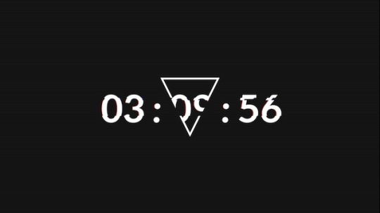
1. Not Original
What is broken: The numbers on the picture are sliced and displaced a little from where they are supposed to be.
2. Website used: Glitchatron
To make this, I set the Glitch Level to Low, and made the Mask Shape None
What is broken: The picture is sliced into pieces and the slices are misplaced
3. Website used: JPG Glitch
To make this I played a little with the Amount, Seed, Iterations and Quality to get the image
What is broken: There are certain slices where the colours are not what they are supposed to do and there also are slices that are misplaced.
4. Website used: Pixelock
To make this I entered a space bar in the place where you put text at, and just went back and forth a couple of times until I got an image that is not too broken or has too little mistakes of glitches.
What is broken: The picture has a slice at the bottom, and some of its pixels are destroyed
5. Website used: Photomosh.com
To make this I turned on the Rainbow, RGB Shift, Scanlines, InstaColor, and Hue & Saturation
What is broken: It is too colour full and changes colour constantly, and also has a little RGB separation
6. Website used: photomosh.com
To make this gif I turned on the RGB Shift, Glow, Hue & Saturation, and Brightness & Contrast
What is broken: This picture’s RGBs are separated and move on their own, has an unordinary contrast between the bright and dark parts of the picture and the bright parts are unnecessarily bright.
7. Website used: Photomosh.com
To make this I turned on the Slices tool, Melt and Wobble
What is broken: The picture is fluidy and has slices braking it as they move.
8. Website used: Photomosh
To make this I turned on the Jitter, Shake, Scanlines, Glow and Smear
What is broken: It shakes, jitters and has the lines that some old TVs have.
9. Website used: Photomosh.com
To make this I turned on the Slices, Jitter and Shake
What is broken: There is an uncontrolled shake, slices that move down the image and jitter
0 notes
Photo


happy
angry
afraid
surprised
sad
disgusted
0 notes
Photo

This is a picture of a man that is drawn using letters that have different sizes and values.
The type used in the picture is Serif.
The artist has done a great job on the shading, lighting and texture.
0 notes
Photo

uses a Sans Serif and script for the text.
changes size and type to emphasize more important words. Not to make you see them first, but to go with the feeling that you might have reading the word.
0 notes
Photo

it uses Sans Serif for the font type.
it also uses geometric forms.
I like the fact that the person used panorama to show more of the figure. and also the the text is not just a cut out from different pages (at least for the one up front).
0 notes
Photo

This picture uses the font type Script, because the text is hand written.
the fact that the background is blurry makes you focus only on the paper (helps to emphasize the paper and text).
I think the letters are photoshopped to the paper. Even the paper I think it is photoshopped to the hand as well.
0 notes
Photo

This is a picture of a font type style that you can use. It pretty much shows the “Christmas snow”. It uses display for type.
uses form for the snow that has been collected on the letters and the ground. also uses simple shape (circle) to show that is is still snowing.
0 notes
Photo

The picture (quote) uses deferent fonts and capitalization to emphesise words that are important. Script and Serif are the two fonts being used.
This picture uses a natural form and lines as a shading. The simplicity gives it a clean and elegant look.
0 notes
Photo
This picture uses Serif for the top, Sans Serif for the middle and Glyphic for the bottom part.
It uses shapes, forms and some natural lines to make it look better, and size to emphasize the different parts of it.
This is what the ad would exactly have looked like if Netflix was created in the mid 1900.

old timey netflix ad
69 notes
·
View notes
Photo

A computer art that has a lot of details. It is a computer art because it is made using a computer program.
0 notes
Photo

This is a low Polly environment that I made using a computer software called “Blender”, making it a computer art. The process of making this was fast. Except I kinda procrastinated on it making it take longer that it should.
0 notes
Photo

A nice looking computer art (an art made using computer).
It is an apocalyptic version of Mario’s universe. It seams like there still are creatures (I don’t know what the mushroom people are called) living there, because there still are lights and there are two bottles on the edge of the ledge.
0 notes
Photo

Another art made that is made using a computer. Or simply a “computer art”.
I like the vibe that the art gives. I also like the style that is used.
0 notes
Photo

This is an art made using a computer. The attention to the details(like the reflections, the dirt) is amazing. It looks to me it is a time where humans are not around and earth is roamed by little intelligent creatures or insects that still use human inventions.
0 notes
Photo

This picture is created by a computer, making a computer art. One of the reason why I this picture is because it clean and have details in it. It make a perfect background picture for a pc.
0 notes


