max-art
64 posts
Contemporary art notes from the files of Douglas F Maxwell As a contemporary art advisor, consultant, and professor, I have spent decades navigating the world of galleries, museums,international art fairs, and exhibitions. This blog shares my personal notes, thoughts and insights from my weekly journey through the contemporary scene.
Don't wanna be here? Send us removal request.
Text
The 2017 Whitney Biennial Part 1
What I like most about the 2017 Whitney Biennial is that the young curators, Christopher Y. Lew and Mia Locks, have created an exhibition that follows the grand tradition of what made the Biennial the most important contemporary show in the U.S. The tradition I am mentioning is that the work chosen was made in the last 2 years, and for the most part, that is what they have done. They have also preferenced emerging artists and almost entirely stayed away from the “mega” names who so prominently have infiltrated the shows for at least the last 20 years. This is the first Biennial in the New Whitney building and the 2 floors it occupies, are well suited for the experience.
Early assessments of the Biennial revolve around how “dark” the show is. If this is not seen as a critique, then I am, for the most part, in agreement with it. Lew and Locks, the 2 thirty something curators, reflect the melting pot that our country is and is based upon. As long as they had their eyes open over the course of the last 2 years, they could not help but create a show that reflects an anxious view of our social and cultural present. Yet much to their credit they did not choose artists or their work that sacrificed quality to assert a particular social, cultural or political end. As such the creativity apparent overall in the exhibition mitigates against the thread of nihilism which can pervade thematic shows.
One of the more prominent artists in the show, Dana Schutz, exemplifies, in her paintings, the balance between painterly aims and social and/or political iconography.

Elevator, 2017 is one of a series of elevator paintings Schutz began a couple of years ago after the reported fight between JZ and Beyonce’s sister in an elevator at the Barkley Center. This version seems more expansive in context smashing together, people, robots and bugs. The structure of the painting seems to recall cubist and dada prototypes from one hundred years ago, when another bout of world nationalism was about to degrade into WW1. Francis Picabia’s Eccliastic from 1913 has a similar chaotic structure to the elevator. In each painting there is a sense of suspended time.

In another of her works, the reference is quite direct and the intent to draw attention to racist violence and its consequences quite clear

The work, entitled, Open Casket, 2016, is based on the tragic, brutal death of Emmett Till in 1955. A fourteen year old African American, Till was accused of flirting with a white woman (apparently considered by his murderers a capitol offense). His mother decided to leave his casket open for the funeral. Schutz’s handling of the subject is humane, compassionate and compelling.

When writing about African American artists, I have commented that I do not see how any artist of color in America could avoid a confrontation with race in his/her work and in times like the present that seems acutely true. Like many of his contemporaries, Kerry James Marshall, Kara Walker, Titus Kaphar and many more, Henry Taylor does not shy away from the subject matter. In his painting, Ancestors of Ghenghis Khan and Black Man on horse, 2015-17

Taylor creates a condensed history painting with expanded implications for the present. Here he seems to be channeling a tradition fostered by the great Robert Colescott.
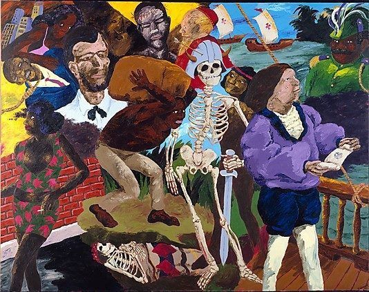
Knowledge of the past is the key to the future: Some afterthoughts on discovery, 1986.
Just as Schultz can be specific in her references, so can Taylor and each of them has the ability to enlarge the specific into the universal. In The Times They Ain’t a Changing Fast Enough,2016, Taylor references the killing of Philando Castille by a policeman in Minnesota in July of last year.

A helpless figure in a white shirt, surrounded by a yellow light. An anonymous, faceless shooter in black points his weapon…

Francisco Goya, May 3, 1800,1808.
The artist Puppies Puppies sculptural pieces on the 6th floor could almost be missed, save their power. The series called Triggers are of dismantled firing apparatus for guns just an inch or two long.

When Puppies Puppies was 11, their mother was involved in a kidnapping situation at gunpoint that solified an anti gun position for the rest of their life. As I have previously written, the Second Amendment was never intended to condone the abuse and violence fostered by positions of groups like the NRA who because of their deep pockets, control many of our political leaders.
On the 8th floor, Puppies Puppies has the piece Liberte which is a performance of an actor or a mannequin dressed as the Statue of Liberty like is done in Times Square for tourists.

The comment on our authentic democracy and what it does or doesn’t stand for is profound.
From profound to bologna, 2755 slices each affixed with a black and white photograph of a person on the inside and outside of a large room constructed by Pope.L aka William Pope.L


The numbers have something to do with the number of Jews in New York, sort of, but really symbolize how numbers can be used for nefarious reasons like discrimination or the number of “"fraudulent” votes cast in an election to influence through power. Coincidentally, the rise of anti Semitic hate crimes in New York beginning in November, 2016 has been more than significant.
Finally, anger in America could be said to be at an all time high in all four corners of the society. Jordan Wolfson has created a virtually real video, Real violence, 2016, which reflects that proposition. When you put on the headset, the attendant warns you that the video could be a bit disorienting so you should hold on to the rail at the table

I assumed this was because of the virtual visual effects. No, this is the most disturbing video I have ever seen, and I really needed to hold on because of the content I was viewing. Days later I still don’t know what to make of my feelings or what I think of it. All I could think of was the Trump statement, “"I could walk down Fifth Avenue and shoot someone in the chest, and I wouldn’t lose one vote or supporter.” For me, this video represented the darkest moment in the Biennial, and I’m sure there will be much discussion about its inclusion. I am not giving more of its content, but if you view it, you are in for unmitigated, rageful violence, and enigmatically it all takes place with a background of Hebrew chanting having to do with Hanukkah prayers.
Part 2 of this review will be published soon.
This is an addendum to the above review. In light of the incredible controversy that has arisen with respect to Dana Schutz's work Open Coffin, I don't find it necessary to write a second part to the review. Clearly, I support Dana Schutz as an artist and her creative right to paint whatever subject (matter) she chooses. The demand that the painting be destroyed is an anathema. And the charge that she couldn't possibly understand black pain and experience since she is white leads to the same kind of censorship that has been associated with political correctness. In my other career as a Psychoanalyst, it would be absurd to adhere to the notion that I could only empathize with someone if I actually was the same race or gender and had the same exact experience.
#Danaschutz#petzelgallery#henrytaylor#pope.l#puppiespuppies#jordan wolfson#contemporaryfineartsberlin#sadiecoles#mitchellinnesnash#blumandpoe#zwirner#whitneymuseum#biennial2017#christopherylew#mialocks
3 notes
·
View notes
Text
Adam Straus Retrospective at Nohra Haime and Adelson Galleries
Over the past 25 years Adam Straus has maintained a vision through landscape that has paid homage to the art historical traditions while being poignantly contemporary in pointing to concerns in a late 20th and 21st century world. Although trained in art, Straus is really a self taught painter. Rather than using a paint by numbers technique to learn, he literally painted over photographs until he felt accomplished enough to dispense with them and let his own style flourish. The essay, by Amei Wallach, in the magnificent catalogue that accompanies the exhibition, is most comprehensive. Therefore I’m going to concentrate my comments around Straus’s works that speak to the changing environment.
From the outset, he was fiercely aware of environmental concerns and employed his biting sense of humor to accentuate the issues.
In the 1991 painting “Exodus”, he epitomizes the Hudson River School notion of the sublime. Rather than reflecting the 19th century view of a miraculously potent sunset as seen on one of Albert Bierstadt’s paintings
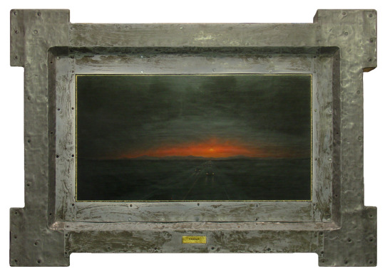

Straus does just the opposite. The nocturnal scene is mysteriously lit up as cars make their way as fast as possible away from the light. The real tipoff is that Straus frames the piece in lead as if to try to protect the viewer from the calamity inside the canvas. The irony is that lead, itself, is so toxic. For many years, almost all of Straus’ paintings were encased in lead and thus became a kind of signature element in his work that also reflected his sculptural training.
Nuclear devastation has been a concern since the inception of atomic power. Mark Rothko and the other Abstract Expressionists could not help but let their anxiety seep into their abstract paintings in the mid 1950′s when the first H bomb tests took place.

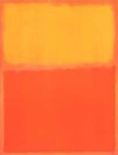
I have actually stood in a gallery space surrounded by Rothko’s red/orange and yellow paintings and felt the heat become palpable. Straus’ Exodus gives a more distant perspective where presumably the devastation hasn't yet arrived but escape appears pretty futile.
Often Straus likes to pay homage to artists who he has admired. Such was the case with the 1999 work, Toxic Runoff: Waterlillies

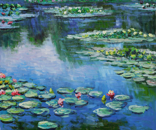
Aside for the obvious connections to Monet, Straus uses subtly darker colors indicating the change in the water quality during the last 100 years, giving pause for thought about what has happened and what we are doing to the beautiful Giverney gardens.
During the recent election, Jill Stein ran for President on the Green Party line. She managed to pull votes, most likely from Hilary Clinton in the crucial swing states including Michigan where several years ago the water supply of Flint became totally toxic. Adam’s 1994 painting, Detroit, is like an uncanny premonition.
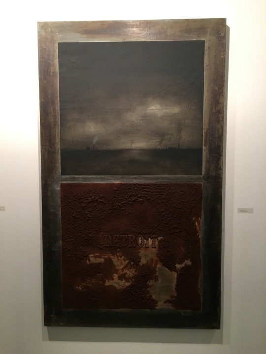
When Straus was living in Florida, he ran for the US Senate as a write in candidate because he didn't believe either of the major candidates responded sufficiently to the environment. His campaign became a performance piece where he enlisted his friends to do his only campaigning by going around and stenciling “"Straus for Senate” on individual sheets of toilet paper in public bathrooms. To his astonishment, he garnered more than 3000 votes which was more than the margin of victory for Straus’ least favorable candidate. He learned a lesson that Jill Stein could have benefited from as she received around 1% of the vote in the key battleground states which was more than the margin of victory that determined the next President. Now, like Straus in Florida, we all have to lament Trump’s choice for the Environmental Protection Agency, Scott Pruitt, a notorious anti climate changer, who might as well change the department’s name to the Environmental Destruction Agency.

As early as 1994, Adam Straus made paintings about oil leaks. By the turn of the 21st century, oil spills and leaks were feared to be among the most devestating disasters to the seas and coastlines. In his 2002 painting Oil Slick, his pun about oil paint juxtaposed with the slick portends of our surreal reality. Besides the very real hazards of off shore drilling, the vast amount of oil in Iraq and the surrounding area provided at least one motive for the ill fated war culminating in Trump’s bizarre campaign statement that “"at least we should have kept the oil”. And his administration is headed in a direction with Rex Tillerson as potential Secretary of State at the helm that might be renamed US Oil and Gas.
No area involving our changing environment has eluded the wit and painting prowess of Adam Straus. In 2001, he created a series about global warming as he had read that Mt Everest was shrinking because the snow on it was melting. Entitled Summit: Melting,

the painting shows the majestic peak leaking snow. Ironically, the title is one small letter away from being “"Summit: Meeting” which is what it has taken to move the countries of the world to respond at all. This kind of exotic look at a far off distant mountain reflects Straus’ keen understanding how artists, in the Romantic tradition, have always sought out remote images to pursue the sublime.

Casper David Friedrich’s The Polar Sea and Frederick Edwin Church’s Iceberg are 2 examples from different sides of the Atlantic. But in these examples it is the overwhelming force of nature that is visually experienced rather than nature compromised.

In his most recent work, Straus has incorporated technology, partially based on the influence of his son, while continuing to address increasing environmental concerns. In his very recent Glitch series, he takes an app that causes a “glitch” in his image and then repaints it incorporating the glitch.

In Glitch: Antarctica, he finds the ultimate remote seascape which remains remote to direct viewing, but through technology becomes accessible yet we don't seem to really get the message.
Finally, taking from an app like Instagram, he has created the image Shared Air
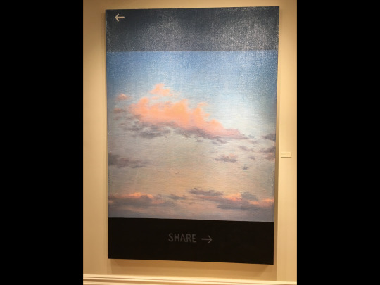
which recall the 19th century cloud studies by John Constable

But for Straus Shared Air is a way of making the deadly serious pun that sharing, in the Instagram sense, doesnt tell the story of really sharing polluted air around the planet.
For a quarter century, Adam Straus has been sharing his vision in landscape, and what has saved it from being nihilistic, is his profound painterly style in conjunction with his ever present wit.
0 notes
Text
Wade Guyton at Petzel Gallery through January 14, 2017
I had never really considered that Wade Guyton’s work contained a strong emphasis on the political, and then I saw his New York Times paintings at the Petzel Gallery on the upper east side. But then again the astoundingly tragic political events that have transpired in November of 2016 have given all Americans pause to reflect on both what has happened and what is to come. By presenting images of the front page of the New York Times, Guyton is prophetic in drawing attention to how the news presented is almost secondary to the assault on the media in the clamor around the claims of “dishonesty” and “corruption” within the news media in general and entities like The Times and the Washington Post specifically. And his manipulation of the front pages, achieved with such ease, seems to speak of the incredible amount of “"fake news” with which we have been inundated, and equally speaks to whether we can believe what we read (or see).

Employing his usual methodology of downloading the digital version of the Times and then printing (the manipulated news) the pages on an Epson 9900 printer he is alluding to how more and more people are receiving their news on line, and by inference, how easily it and they can be manipulated.
Guyton’s use of news print falls in line with a tradition that dates black to the beginning of the twentieth century. Picasso often used news print from newspapers like Le Journal in constructing his paper collage pieces beginning around 1912. What he especially liked about Journal is that it contains jour (day) and jou (game). In this way he could play with what was in the news by making musical instruments and liquor bottles out of them perhaps making the real news easier to digest.
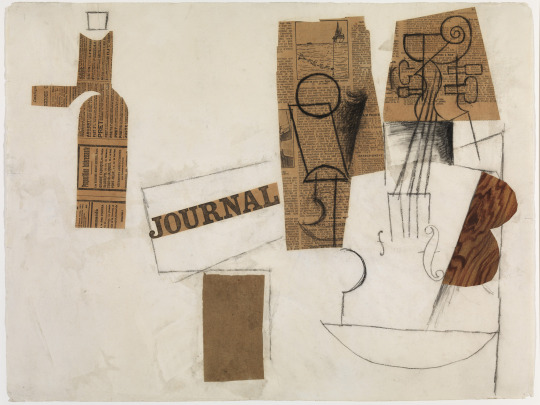
As the late, great art historian, Robert Rosenblum, discovered, any number of Picasso’s pieces including actual news print were wrongly dated by the cataloguers at the time . The pieces were so complex that they were dated according to how they formally lined up, but by reading the newsprint, Rosenblum discovered that pieces dated 1912 contained newsprint with 1914 dates. Certainly what would have been most prominent in the news was the impending First World War.
During the mid twentieth century, Jasper Johns often applied newspaper to his canvases and then painted over it. Prominent among these are his flag paintings.

Although it is impossible to read the newsprint, the dating of the pieces is very specific. So, as is the case in the flag reproduced here, it contains 48 stars which means it refers to an America prior to January 3, 1959 which was the date Alaska was officially admitted to the United States as the 49th state. The moment, of course, was momentous because the US had expanded past its contiguous, continental borders for the first time. The country had just recently concluded one of its darkest times with the end of the McCarthy era, and with hindsight we can see the John’s flags as anticipating the 1960′s and the New Frontier.
To return to the Guytons, what is he signaling in these works? For one thing, a single page can refer to an avalanche of woes: climate change, ISIS, gun madness, Trump, Cruz,turmoil in the cities etc. placed side by side with an advertisement for the arts creating a similar effect of play as described in the Picasso above.

But these works are apt to take a place in history as time goes by, and only time will tell whether they speak to a momentary glitch in American life and culture or are the beginning of a downward avalanche and the decline of the “"American Empire”.
1 note
·
View note
Text
Emily Evelyth at Danese Corey
Recently I saw a review of Emily Eveleth’s paintings in which I was put off by how the writer emphasized the light side of these paintings, the doughnut side as it were. Yes she paints pastries, beautifully, but they are quite serious and pay heed to time tested symbolic subject matter in the history of art.

And indeed they are sensually painted so that the elements of the senses are aroused and tempted. It was Eduard Manet who in the late 19th century called attention to the connection between the senses and painting. Specifically he referred to rhe relationship between the palette of paint and the palette of taste and his still life's reflected this as in his painting of a brioche, his version of the jelly doughnut.

Note the backgrounds of both the Eveleth and the Manet. They are abstract and follow the tradition of the “studio portrait”. Originally used for portraits in the Baroque, both Manet and Evelyth us the devise to imply the human presence. In fact in the past, she has painted figures (portraits) where the figures seem almost interchangeable with the doughnuts, the figure and the doughnut dispersed similarly in their space.

But there are even deeper layers in the meaning of the doughnuts. Color is used symbolically, especially those used to make up the jellies.

The red is like blood and the cream like viscous. Motherwell talked about the symbolic quality of red and its relationship to blood and wine. You can almost imagine the puncture wounds, and the scarred face. Reminds me of the painting of Jenny Sayville.
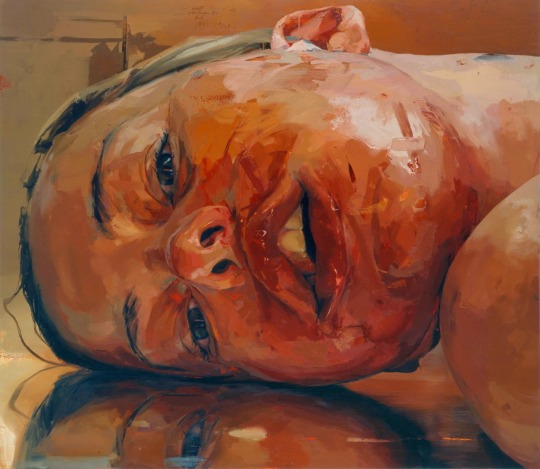
Yet these are after all stillife paintings. The way that the doughnut hangs over the table edge has its roots in 17th century Dutch painting where the artists regularly challenged the boundaries of the space.

The exotic scene reminds us both of the pleasures and precariousness of life, just like the red and the cream in the Eveleth.

Finally, just a word about the miraculous light. Once again Eveleth’s source is the Baroque. More than chiaroscuro, they are tenebroso with the doughnuts emerging from the deep, dark backgrounds. Think of the way the figure emerges in a late Rembrandt with the golden light illuminating the figure. But then again, sometimes a jelly doughnut is just that.

4 notes
·
View notes
Text
Paul Fenniak at Forum Gallery opening 2/18
This is a slightly expanded version (more images) of the essay in the exhibition catalog.
A startling aspect of the characters in Paul Fenniak's paintings is that they don't seem to have the slightest awareness that their actions are out of the ordinary or simply odd. They are so wrapped up and isolated in their own worlds that they are oblivious to anyone or anything around them.

Perhaps the paintings reflect dreams, but it is so difficult to discern the dreamer in the group images that, almost like "Rashomon", each figure can be said to have his or her own spin on what is actually happening in the painting. Still, I'm reminded of what Lucian Freud, a formidable realist painter in his own right and grandson of THE Freud, said: all painting is self portrait. No doubt this resonates with Paul Fenniak even as he paints such a wide variety of characters into his paintings.
The beginning of the tradition of dreams in painting coincided with the publication of Freud's "Interpretation of Dreams" (1900). Freud deliberately made it a product of the twentieth century. The Surrealists took up the mantle, but when Dali or Magritte painted a dream, it was unmistakable that it was a dream. Fenniak is more subtle about it which increases the enigmatic quality.

For example, Magritte's "Man with an Apple in his Face" is exactly that and totally preposterous except that we accept it as a dream image. Fenniak's "Theme Park Patron" is also just that, even though she seems suspended in a torture rack miles high.
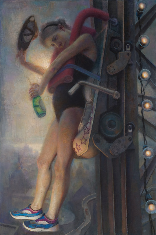
Fenniak's figures are like everyday people we may experience, but at the same time they seem ethereal or perhaps reincarnated from an earlier time.
Fenniak is a traditional painter. "The Arrival", for example, can be seen to have a subject matter centuries old. The figure sitting in the television-like coffin, or the coffin-like television (take your pick) is reminiscent of the image "Ecce Homo" or living-dead Christ.

In the Renaissance this would not have represented a dream, rather a vision or a miracle, and would not have been seen as off or odd, but instead a didactic reminder of how important religion and Christ were to the lives of the viewers. And Fenniak has constructed the painting to emphasize this relationship to the Renaissance. He could not have constructed it to look more like a Mannerist or Baroque painting, where the notion of geometry and symmetry were totally eschewed and all the action takes place to the extreme right.
Who or what is arriving? Actually, it seems almost more like a departure than an arrival, although the title itself suggests the significance of the event, but that seems to escape all of the figures. It makes sense that the television might as well be a coffin, as it is obsolete and dead for all practical purposes. This gives the painting an aura of nostalgia that adds to the pathos of the scene. For that matter, why does no one ever smile in a Fenniak painting? Maybe because they are not really people, but rather prototypical reflections of emotional states of mind.
One of Fenniak's major protagonists is isolation itself. Whether alone in a painting like "Rooftop", one of a twosome as in "Injured Woman" or a mob scene as in "A Crowd in Shadow" the figures suffer from an aloneness that chills one down to the bone. When not alone, they struggle to make contact with each other or purposely don't.

"Rooftop" scares me. How could that be? A figure standing on a rooftop, holding an extension cord, perhaps making some repairs and improvements. But I can't let go of the notion that he may be so depressed and alone that he has something else in mind and between the cord and the rooftop, there are lots of possibilities. Of course there is a church in the background. The Baroque was ushered in by the advent of the Reformation. For painting this meant that the idea of genre was introduced. All of a sudden the people in the religious paintings that, say, Caravaggio painted, were dressed in contemporary garb and the viewers understood the symbolic significance. Suicide was certainly not acceptable as subject matter for a religious painting, but Fenniak's paintings are secular and conflictual around religion and spirituality. Then there is that pole just in front of the figure reminiscent of the tree in Gauguin's "Vision after the Sermon", separating the Breton women from the vision of Jacob wrestling with the angel.
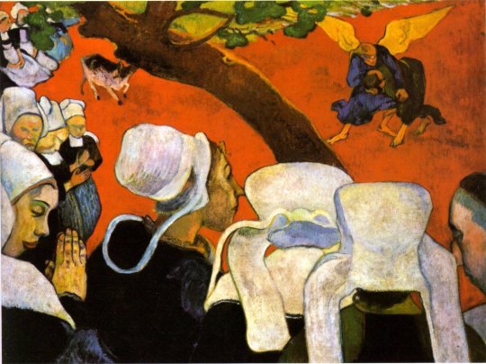
What Fenniak emphasizes is the uncanny, which, taken in terms of quantum physics, could be interpreted as, all outcomes are possible. After all, that is the power of superstition and, as Freud pointed out, why obsessive and compulsive behaviors are so absurd yet so difficult to break. Fenniak manages to push that button in the very place in us that touches on our vulnerability.

"Out of Reach" continues a longtime Romantic tradition: portraying a woman in a space (a room) from which she cannot escape. In the 19th century Casper David Friedrich's "Woman in Front of a Window" spoke of the longing to participate in a world outside ones experience symbolized by the mast of a schooner which ventured around the world.
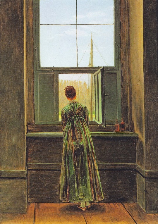
Ironically, Fenniak has placed his woman outside the door, on the terrace, but no less confined. What is out of reach? The visual implication is the laundry line, but that's Fenniak's ironic sense of humor. The answer may lie in another source for the work, like Vermeer's "Milkmaid". Each woman is portrayed alone in an architectural space doing an everyday chore which ultimately has little to do with the meaning of the painting.

Following from the Vermeer prototype, Fenniak employs a typical Baroque device where the artist creates a geometric rational space in which the portrayed figure can contemplate and emote. Out of reach are her life, her partner, her world, her goals and dreams. This is extreme, but also all of us can relate and empathize. All of us have goals and dreams we haven't attained but never give up the desire or stop reaching for, and if we do, so then do we have to face the desolation and despondency that permeates Fenniak's woman. This is such a strength in Fenniak's work, that the figures remain so deadpan and yet ooze with humanity and struggle with the human predicament.
Paul Fenniak's work is a sophisticated mixture of art historical references, psychological subtleties and implications for contemporary life. Nowhere is this more evident than in his complex composition "A Crowd in Shadow".

A beautiful day in a square (who knows where), a crowd wholly immersed in shadow. Three figures seemingly hang in effigy (crucifixion?), a central figure on a ladder (deposition?) and a crowd (a mob?). Each individual in the crowd is staring at something as if in a trance. So many unanswered possibilities. In our increasingly online world, isolation is more and more the norm. Connection for so many people is participating as part of a collective in a virtual world while sitting alone in front of a monitor. How dreamlike, but also how consistent with the temperament that Fenniak emphasizes throughout his paintings, which affords no clue as to the social or political implications, and in the case of the crowd, only that something significant seems to have happened and something else may happen in the square. Each of us is free to fill in the blanks, to empathize with the characters and the scene and to marvel at the power and potency of Fenniak's handiwork and brushwork.
#forum gallery#paul fenniak#de chirico#casper david friedrich#paul gauguin#vermeer#contemporary art#57th street
1 note
·
View note
Text
Jane Rosen at Sears Peyton gallery
One of the best shows of the new season in Chelsea is at the Sears Peyton gallery, “"Cash-Morandi”, the elegant and remarkable sculpture and drawings of Jane Rosen. Confronting and perhaps paying homage to Giorgio Morandi while maintaining ones own artistic integrity must be a daunting task. For Rosen, I believe this began any number of years ago when she started making pieces by blowing glass. When she recognized the sanctity of the objects that emerged from the process of expelling breath, she could appreciate why Morandi refused to allow his vessels ever to be dusted. Morandi was a painter, so his object muses remained in 2 dimensions
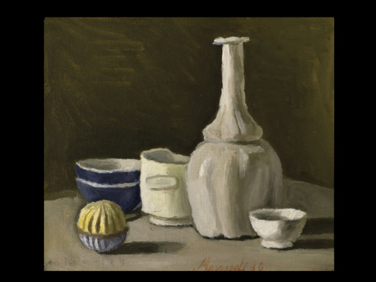
While Rosen’s artistic translations require 3 dimensions made out of kiln cast glass, limestone, marble and pigment.
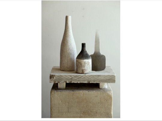
But Rosen was not finished with her journey. She needed to integrate the Morandi like objects with her own signature objects, the birds. The resulting “Morandi Installation” whose effect is bordering on the ethereal, but is as rock solid as the limestone that makes up the bases.
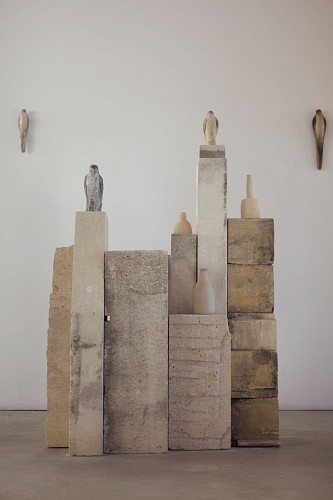
Taking as much from Egyptian prototypes of heiratic sculptures

as from the magical mixture of form and materials of Brancusi’s “"Bird in Space”,
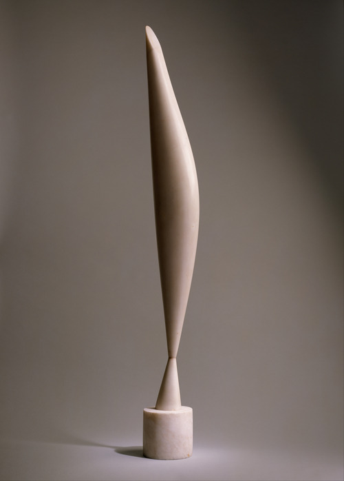
the “"Morandi Installation” amounts to a shrine. It is an “object” lesson For younger artists as to how to assimilate the work of another while maintaining ones own artistic integrity.
As the title of the show indicates, there is another component, Cash, one of Jane Rosen’s extended animal family. Cash was a magnificent horse who graced Rosen’s farm for years and recently passed on. She has memorialized him with drawings
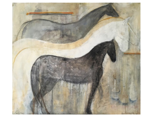
in which she equates and integrates the Morandi objects; sculptures of hooves (I swear I can picture the entire horse)

and what I can only describe as drawing in sculpture.
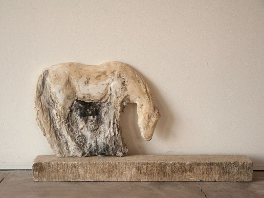
The horse has been portrayed for centuries in the history of art either as an attribute to be ridden by a hero or for purposes of personifying emotions a la George Stubbs. Rosen, rather, treats Cash as a true being with personality. The result is that the exhibition is one of portraits, Cash and Morandi, who’s essences are sifted through the alchemical creativity of Jane Rosen.
4 notes
·
View notes
Text
Some Notes on the Venice Biennale 2015: Okwui Enwezor’s “All the World’s Futures”
Two years ago, Massimilliano Gioni’s curated exhibition, “"The Encyclopedic Palace” earned enormous, deserved praise. I personally thought it was one of the best shows curated in the 21st century. That’s a hard act to follow, and I can imagine that even someone with the track record of Okwui Enwezor felt the pressure. Like Gioni, Enwezor’s exhibition is thematic and unfortunately, “"All the World’s Futures” succumbs to the pitfalls that can interfere with such an exhibition. For one, there are far too many artists and too much work even for the enormous Arsenale. The effect was that I felt bludgeoned almost immediately upon entering. It was the result of both the amount of work and the subject matter. Enwezor deliberately organized the show in terms of themes: Garden of Disorder, Liveness: On Epic Duration and Reading Capital. But my experience of the themes was slightly different: how we are destroying the world through war and environmental neglect, diaspora, refugees and immigration intolerance and how words are losing their meaning. These points were relentlessly made, over and over and over again. As my companion remarked, “"It’s like a school assignment where each student is asked to do a project that fits within the parameters of a certain theme and gets graded on how well he/she follows the rules.”
This leads the exhibition to suffer from a lack of aesthetic vision. It seems like Enwezor was so intent on making his points that he chose artists only who suited his themes (putting subject matter first and, frequently, quality and aesthetic vision after). This often happens--especially when a curator is intent on communicating political positions through art.
In the late 19th century, the ardent Socialist, artist Paul Signac was asked why, considering his political views, he didn't make political paintings but preferred landscape.
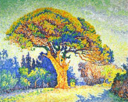
He responded, “"Because political art makes bad art.” This caveat is worth noting because the tendency becomes to make the political point the end all of the work, and the exhibition. That's not to say that political pieces cannot be good, even great and very powerful, and certainly this is true of Enwezor’s show.
Specifically, the room with work by Wangechi Mutu in the Central Pavilion at the Giardini stands out. The room consists of a video, “"The End of Carrying All”,

a sculpture

and a collage

If I had seen nothing else, I would have understood the plight of refugees, the universal and eternal struggle of diasporas and the specific plight of being a woman. In this case less is plenty. No need for room after room pressing these points.
In a room not far from Wangechi, are paintings by Kerry James Marshall. Some are paintings with the biting poignancy we have come to expect from him like “Untitled (Lovers)”.

Then there are a whole new set of abstract paintings, “Untitled (Blot)”, that are quite a beautiful surprise.
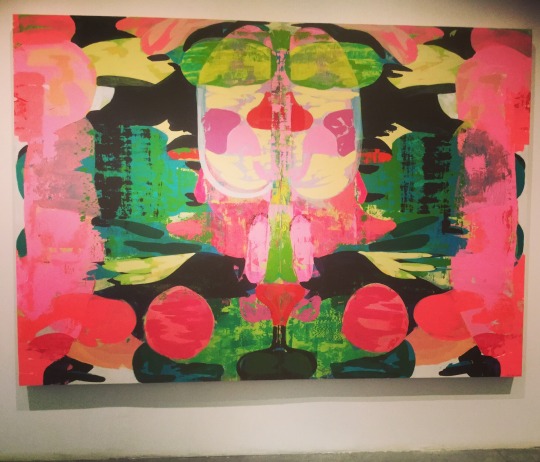
Also of note in the Central Pavilion are the totem sculptures of Huma Bhabha.
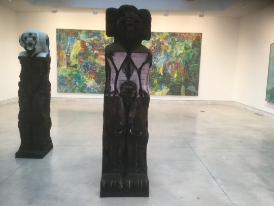
And the haunting set of skulls by Marlene Dumas.

Despite my previous remarks, I don't want to leave the impression that the Arsenale is devoid of noteworthy, and often beautiful, works. Just as Kerry James Marshall’s abstractions were a pleasant surprise, so are the paintings by Lorna Simpson so long recognized as one of the premier narrative photographers.

Another African American artist who Enwezor included, Melvin Edwards, has been overlooked in the art world for years. His metal sculptures deliver a powerful message about African American history integrated with his vast knowledge about contemporary sculpture.
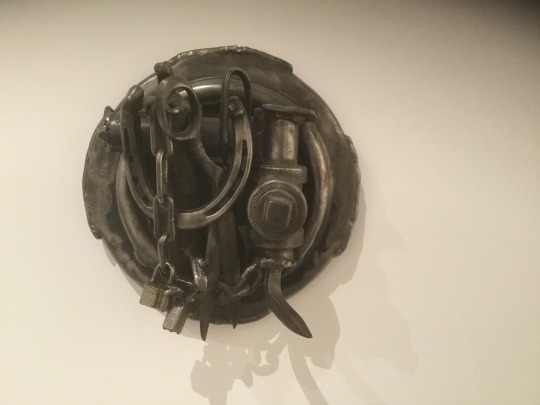
Edwards has also been enormously influential on many younger African American artists, for example Charles McGill.

One of the more moving installations is a series of tableaux, “"Every Life is a Fire”, by the Cuban artist, Ricardo Brey. The presentation is quiet but the effect is loud.
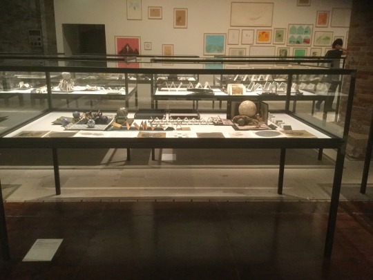
Right next to Brey’s work are the elegant, dark brooding landscapes of the Chinese artist, Ji Dachun.

Also worth a mention are the sculptures of Walead Beshty that could be found in several areas of the Arsenale.

And the collage of the Bahamian artist, Lavar Munroe

For more images please follow me on Instagram @dfmaxwell
#david zwirner#nomad gallery#barbara gladstone#Jack Shainman Gallery#Pavel Zoubok Gallery#Petzel#salon 94#56th venice biennale
3 notes
·
View notes
Text
A Day in LA: Eben Goff “Inclusions” at Diane Rosenstein
Not often that I get a chance to do a post from the West, but I had a day wandering the galleries in LA. I was duly impressed by the 10,000 square foot space of Sarah Gavlak and her summer group exhibition. I posted a couple of the images on Instagram.
At Diane Rosenstein, I was introduced to the work of a sculptor named Eben Goff, a product of UCLA. I was immediately struck by his confrontation with the sculptural traditions of the second half of the twentieth century. I do not mean that in a combative way, rather an incorporative one.
Take for example, “"Eternal City” (below), the title, a reference to the images Piranese made of Rome, but the sculpture a reference to the main protagonist of twentieth century sculpture, the cube (module) from David Smith to Donald Judd.

Much like the ruined image of the Statue of Liberty in “"Planet of the Apes”,

Goff’s sculpture reflects our disillusioned cultural past while at the same time acknowledging its importance to our artistic present.
Throughout his work there is an emphasis on our tarnished environmental landscape and the relationship to our use of natural resources, both for artistic purposes and otherwise. Many of his works are made of a combination of metal, steel or aluminum, and wood.
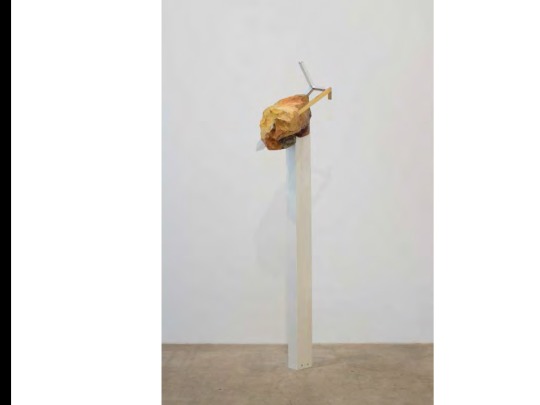
The impression is of the wood almost molding itself to the metal creating a foil to the sheen of the material and its rigorous geometric shape. There is an immediate tension between incorporation and integration.
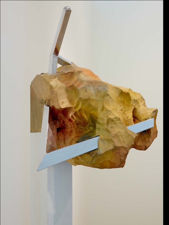
What sprang to my mind was the image of a Joel Shapiro being swallowed up and re-homogenized

“"Flood Triangle” is part of a series where Goff took the metal sculpture to the LA River after a big rain fall and placed it in the river and it accumulated detritus.
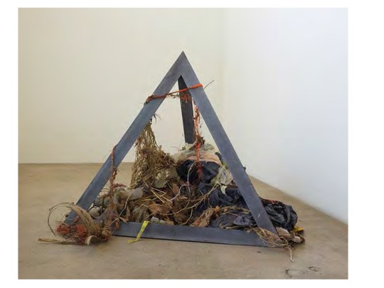
What results is both beautiful and compelling and a little bit alarming. The refuse indicates the cavalier way we dispose of it. Goff is not the first to make sculpture from the LA River. Charles Long went to the empty concrete and made sculpture out of bird droppings, yet what is common to both artists is the recognition of the geometric metallic form with the refuse emphasizing the alchemical nature of transforming shit into creative gold.

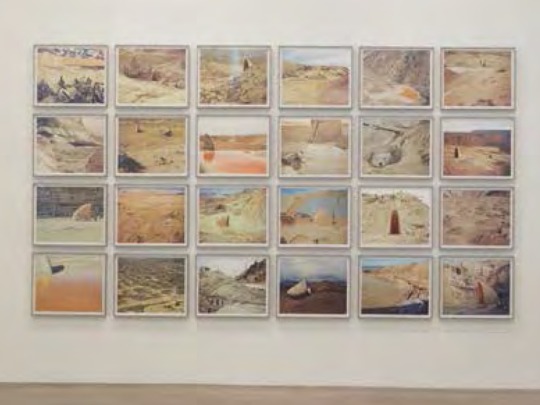
In the show, “"Inclusions” is certainly an appropriate title, Goff has a series of photographs entitled “"Butte Speculation” that incorporate “Arc”, an ark-like sculpture that he literally dragged into the landscape calling attention to the many ways humans have “intervened” into the earth for better or worse.

The ark recalls the icon forms of Martin Puryear

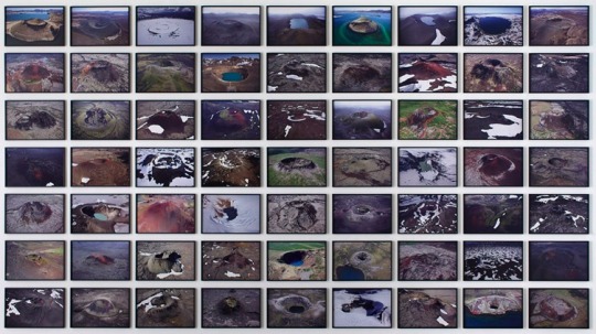
While the overall format of the grouping of the photographs aesthetically resonates with that of Olafur Eliasson
Goff
Eliasson
The sources Goff brings to mind are numerous, but he has stamped his work with his own brand and is no doubt an indication of his deep reflection into the tradition of sculpture.
#dianerosenstein#ebengoff#missgavlak#contemporaryart#charleslong#olafur eliasson#martin puryear#contemporarysculpture#laartscene
3 notes
·
View notes
Text
Frieze Art Fair 2015
The light in the tent at the Frieze Art Fair on Randel’s Island was so bright that several dealers took to their sunglasses. You know if that's the first sentence of a review, the fair had to be less than wonderful, and so it is. To be fair, Frieze is strongly contemporary so unlike the Armory show or Basel, there is no modern section and thus very little blue chip material. Yes there are blue chip contemporary work, but they were few and far between at Frieze. One exception was an extraordinary painting by Louise Fishman at Cheim and Read.

When Fishman hits her stride, as she has done in this painting, she gives the big boy Ab Exes a run for their money.

Ever since her appearance in the last Whitney Biennial, she has been on a roll.
There is no shortage of abstract painting at the fair as dealers seem to want to take advantage of the buzz. I can't imagine that this trend will last very long as more and more artists seem to be jumping on this bandwagon.
One particular painting at Lehmann Maupin, by Angel Otero, got to the art historian in me because of the string of associations that blossomed in my mind.
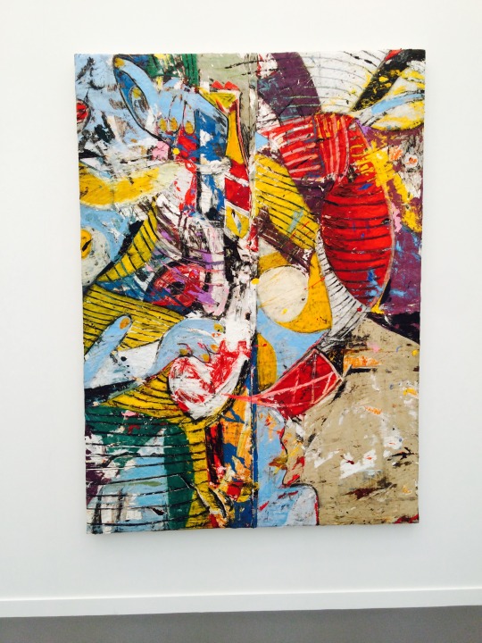
First is Picasso’s "Girl Before a Mirror”. Otero has captured the way that Picasso bisected his work to show the 2 sides of his girl. and notice how similar the palettes in the 2 paintings are.

Next is the Jackson Pollock work based on the Picasso that was done about a decade later, “"Moon Womn Cuts the Circle”.

And finally the Otero has to be seen in the context of Jasper Johns.

Whereas Picasso and Pollock have used the striations as background, more or less, and Johns has made the background the subject of the painitng, Otero has integrated the striations into the fabric of his work. I sure have placed him in good company.
I was quite taken by the painting at the Stevenson Gallery booth from S. Africa of the young Zimbabwe artist, Portia Zvavahera. Her symbolic use of color demonstrates a maturity in her work that speaks to her life experience. Her figures are painted so as to communicate an other worldly pathos.

I remember having a similar reaction when first seeing the work of Marlene Dumas

And also the paintings of Thordis Adelsteibsdottir

The way that her figures meld into one another so that their bodies become indistuishable raise associations to a famous kiss

While you are at Frieze, you will notice that there are several small, what I'll call tabletop, sculptures by Sarah Sze. Mostly Sarah has become famous for her over the top installations utilizing the most mundane everyday materials. These small works are refined and complete within themselves.

#cheimandreadgallery#louisefishman#lehmannmaupin#angelotero#stevensongallery#portiazvavahera#tanyabonakdargallery#sarahsze#friezeartfair
0 notes
Text
Charles McGill at Pavel Zoubok Gallery until April 18, 2015
Charles McGill began his investigation of the golf bag in the late 1990s when he created the pseudonym, Arthur Negro aka Art Negro and created a manifesto of Club Negro. He understood that he loved and participated in two worlds, art and golf, that were and are white on white.
When I was growing up, during the summer I played golf at my parents’ white country club. There was an African American who worked there named Leroy Peterson. Often late in the afternoon, he would play some holes (everybody had left and the course was empty) with me and my friend. We were pretty decent players, but Leroy would play against our best ball score. He always beat us and he played with only a five iron for every shot. Leroy was about the best player I ever saw. He could shoot under par with that 5 iron, no problem. If he was white, he would have been a pro for sure. Leroy cleaned golf clubs in the golf bag room in the basement of the clubhouse his whole adult life.
I have always believed that golf is a metaphor for life, and unfortunately that holds for racial relationships in America. McGill uses the material of the golf bag flaying, tearing, stretching, and constructing to bring his objects to life. In “"Horse Run Afoul”

McGill has made an object that combines the dynamic movement of the Italian Futurist, Umberto Boccioni
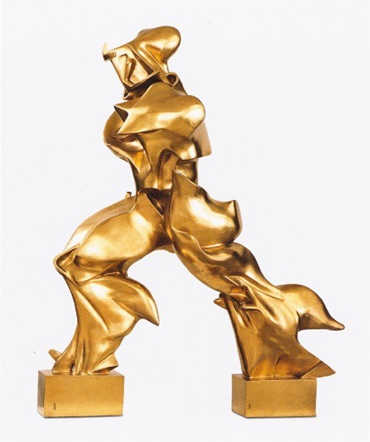
With the gestural ease of John Chamberlain
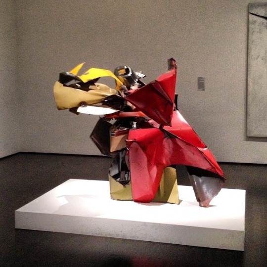
I'll repeat something I said at the time of McGill’s last show at Zoubok: McGill’s art is as much about golf as Chamberlain’s is about cars. Both utilize their materials to further their creative endeavors.
McGill never loses sight of the significance of art history in his work. In his tondo series, he employs a form that originates in the Renaissance and was so essential in the development of modernism in the work of Picasso and Braque.

One particular tondo of McGill struck me as particularly pertinent, Target Tondo 1964

Surely the reference is to the great target series of Jasper Johns

But what struck me was the reference to 1964, the year that the Civil Rights Bill was enacted. Fifty years later and yet it seems that hardly a day goes by without another incidence involving white police and black young men.
McGill fills his work with subtle references to history, yet after all the works are made from golf bags. So could they actually refer to the KKK?
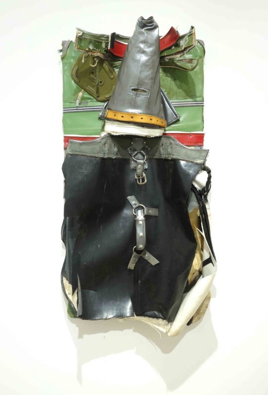
Remember the powerful series by Andreas Serrano?

For McGill there is also the symbolism of hope in his pieces. His ability to display his work in a major gallery is in itself a sign of how far the art world has come, but also a recognition of how much territory remains to be covered. As of the writing of this post, there is a report of an African American University of Virginia honor student bloodied and beaten in an arrest by white police.

For me this piece reflects both the hope and fear underlying McGill’s work. It seem so give a nod to Philip Guston who, in his late work, expressed the hope and anxiety of a late 20th century world.
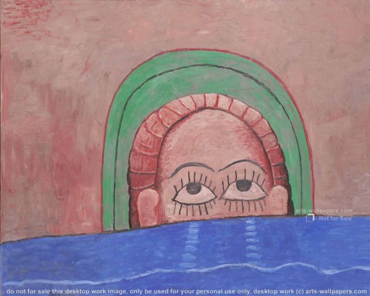
Like a growing number of African American artists, McGill is using his work as a means of promoting a significant dialogue and we, as a society and culture, can only be the better for it.
#CharlesMcGill#PavelZoubokgallery#contemporarayart#art#golf#andreaserrano#johnchamberlein#jasper johns#chelsea
1 note
·
View note
Text
Independent, a Short Note
The independent often has some of the most innovative and edgy contemporary works. This year it seemed a bit claustrophobic. Still, here are 3 that I found worth seeing.
Daniel Gordon at Wallspace makes still life photo work that would bring a smile to Matisse.

Page White has a stunning fabric, quilt like piece at Kaufmann Repetto.

And Finally, I was taken with the black enamel paintings of Gerald Ferguson at Canada.
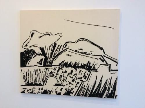
Hope everyone enjoys the rest of this art week.
0 notes
Text
Volta at Pier 90
Right down the dock at the next pier is Volta at a new venue. It's convenient if your at the Armory Show and worth a visit.The show is entirely one person exhibitions. This is becoming more and more popular with fairs. For the dealers it becomes like a gallery exhibit and probably takes the pressure off getting fresh material from all of their artists for fair after fair. Many of the exhibits hold interest, and I want to highlight 3 of them.
Notably, Haines gallery is exhibiting the Iranian artist Monir Farmanfarmaian, a 91 year old phenom who has a retrospective opening next week at the Guggenheim. For the last half century, she has been making dazzling geometric sculptures out of mirrors and glass, most of which will be seen in New York for the first time at the Museum.
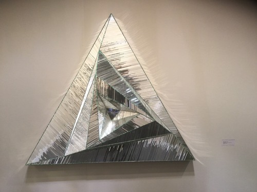
At Rena Branston, Marci Washington is showing her meticulous water colors.

Her process is to draw in the figures first and to fill in the backgrounds last. The body of the figures becomes a kind of negative space, so that she's there but not.
Speaking of there but not, Michael Foley has the works on paper of Simon Schubert.
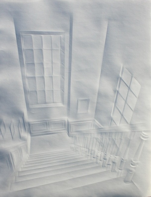
These precise architectural renderings of interiors are made by merely folding the paper to create the images. To accentuate this, Foley has made his booth entirely white including himself in a white tux.
#hainesgallery#monirfarmanfarmaian#guggenheimmuseum#renabranstongallery#marciwashington#foleygallery#simonschubert#voltaartfair
3 notes
·
View notes
Text
Pulse NY 2015
If you make the time this week to get to the Metroplitan House on 18th St. to see Pulse, there are a few exhibitions to be noted. At Rick Wister are graphite and acrylic works by Alyse Rosner. She makes the work on Yupo, a synthetic paper which she takes onto the terrace at her studio and rubs and scrapes graphite over it before applying acrylic. The result is a dynamic and fluid composition that press a tension between figure and ground.

Quite in another direction are the conceptually based paintings by the Russian-American artist Yevgeniy Fiks whose work is at the booth of Parisian gallery, Galerie Sator. The images focus on the famous Prouns of El Lissitsky in the early 1920s, one shown here.
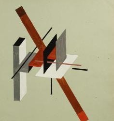
Fiks has recreated them and added the signature of Lissitsky in Yiddish calling attention to the conflict artists in the constructivist movement had between and international focus and a cultural identity.
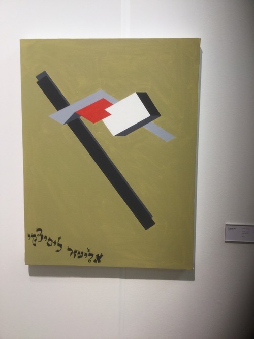
El Lissitsky had a body of work that was referred to as his Jewish work that was considered less mature.

These works he signed in Yiddish, while his Prouns remained unsigned. Fiks, no doubt, relates to Lissitsky's conflicted nature as to his identity, and his work reminds us of the tension that still exists in the world today between the universal and the ethnically particular.
The most exhilarating piece I saw at Pulse was at the Transfer Gallery by Carla Gannis, titled "The Garden of Emoji Delights",

a huge recreation of the legendary work by Hieronymous Bosch, "The Garden of Earthly Delights"

She proves, without a doubt, that emojis can be just as terrifying as any fantasies humans have come up with throughout history.
#alyserosner#rickwisterfinearts#yevgeniyfiks#galeriesatar#carlagannis#thegardenofearthlydelights#transfergallery#ellissitskyprouns
2 notes
·
View notes
Text
the Armory Show 2015
So I almost feel as if I am a broken record bemoaning the current state of mediocrity at art fairs. One of the friends who I travelled with today at the Armory Show said, "I wish it was 20 years ago when we went to an art fair, like Basel, and everything seemed so new and fresh." So what's going on? Part of the problem is that the expansion of art fairs, as I've commented in the past, is like the PGA Tour where there is a golf tournament every week all year long, and thus contributes to a dirth of great material. But that's not the whole answer, rather this kind of art market, where dealers feel they can and will sell out their booths if the work is "salable", filters throughout the art chain. I want to be very clear here that I am not faulting the dealers, there job is to sell the art. And so they put pressure on their artists to produce what is proven to be salable. And for both dealer and artist, why risk taking on anything or anyone who may not be proven salable? And the artists benefit as well from doing what is salable and not taking risks and who can blame them.
Then there's pressure from the auction market. The flavor of the year is young abstraction which at worst has been dubbed "zombie abstraction". As I have recently pointed out, in Phillips "Under the Influence" auction next week, 33 of the first 40 lots, almost all abstract paintings, were made on or after 2010. I would venture to say that for a fair number of them, this is not the first time they have been "flipped".
I do not have a solution for this. The irony is that good economic times in the art market seem to directly correlate to an inhibition of creativity. Contemporary art needs to be hated and rejected before it is assimilated and that's not good for sales. Van Gogh sold one painting during his lifetime, and Matisse was hung in effigy at the Chicago Art Institute in anticipation of the 1912 Armory Show coming there.
So the Armory was not terrible, it was white bread. Although what was notable was an absence of the premier galleries, from both sides of the Atlantic, which probably indicates how Frieze has effectively eroded this fair.
So the moments that impressed. Two of the shows at The Armory Presents section, one person show, are worth noting. At Boltelang/Soy Capitan from Zurich and Berlin were the abstract paintings of Henning Strassurger.
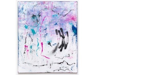
Displaying an idiosyncratic and personal mark, he extends the legacy of Cy Twombly.

The second booth is that of Nicelle Beauchene who showed her artist Chris Wiley. Wiley challenges norms about the relationship of photography to painting while at the same time, creating frames for his work that call into play their relationship to sculpture.
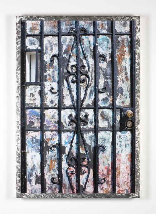
The booth that I thought was the most pulled together was the English dealer Victoria Miro. She certainly represents established artists like Eric Fischl and Chris Ofili

And Ofili's painting seems to herald a new direction. Also prominently displayed was a large figure by Chantel Joffe

And a sublime landscape by Celia Paul.

Finally, just a couple of individual works worth attention. The collage paintings of Hans Op de Beeck at Galerie Ron Mandos titled "Obscura" have a real depth and substance.

And the work of Volker Huller at 11 Rivington stood out. It's interesting that I have probably seen, but not registered, his work at the gallery, and only at the art fair notice.
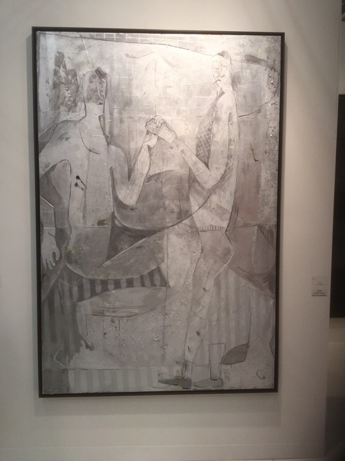
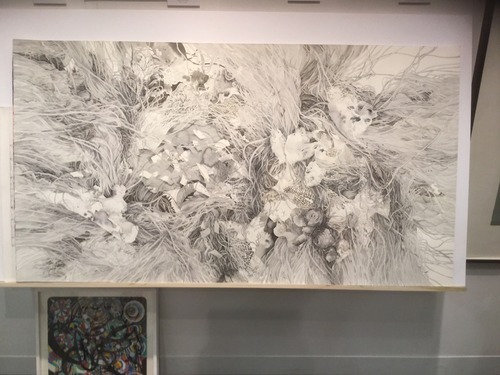
Similarly, I haven't previously notice the sumptuous work of Dorina Karpov at Pierogi although no doubt I've seen it. I won't overlook it again.
#BoltelangSoyCapitanGallery#NicelleBeauchene#Chris Wiley#HenningStrassburger#VictoriaMirogallery#11Rivington#HansOpdeBeeck#Pierogigallery#Dorina Karpov#CeliaPaul#ChrisOfili#ChantelJaffe
2 notes
·
View notes
Text
Titus Kaphar at Jack Shainman Galleries until February 21
Last Friday morning, before going to Chelsea, I saw a news story about an African American woman who is a sergeant in the Florida National Guard. She went with her unit to a rifle range. When she arrived, she discovered that a local police sniper unit who had just left had been firing at live mug shots. To her horror, she discovered that one of the mug shots was of her brother.

Whatever explanation(s) have or will come out about this will only beg the question of the pervasiveness of racism that engulfs our culture. Later, when I was looking at art in Chelsea, I entered Jack Shainman’s 24th St space, 524 W 24, to see one of two parts of Titus Kaphar’s first exhibition with the gallery. The work at this space is related to work currently on view at the Studio Museum of Harlem. I was astonished to see the composite drawings of “The Jerome Project” which Kaphar began when he went on line to research his father’s prison record and he discovered almost 100 mugshots of men with his father’s name, almost entirely African American. The composite drawings, which he named “Asphalt and Chalk”, incorporate these mug shots and have a tremendous resonance with those the sniper cops were shooting at.
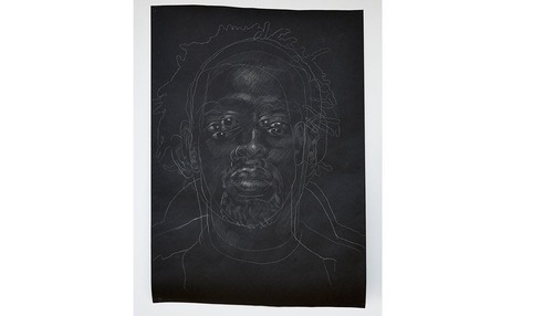

Kaphar began the Jerome Project in 2011, long before the recent incidents in Ferguson, Mo and Staten Island, NY. African Americans understand the realities of these events as a matter of living in our culture. This is why I believe that most, if not all, African American artists have issues of race or racism or their heritage as the center core of their work. It is their unavoidable reality.
Kaphar has also made a series of mug shot paintings using prototypes of religious icon images of St. Jerome

Employing gold leaf as background, he has introduced tar to cover the faces up to their mouths, both to symbolize their being silenced, but also to grant them some anonymity.

The other part of the show, “Drawing the Blinds”, is at Shainman’s 20th St space, 513 W 20, and it is as equally thought provoking. Here the paintings refer to history as seen through art. Kaphar uses art historical prototypes to uncover a different history often literally drawing the blinds and uncovering different truths.

In other works, he uses whitewash to cover over figures, sometimes fully and sometimes in part.

The fact that these exhibitions are up as we celebrate Martin Luther King day, a half century after his monumental accomplishments seems to me to be no coincidence. And these works are a reminder of how far we still need to go to truly integrate our culture. The recent Supreme Court decision eviscerating the Voting Rights Act on the grounds that it is no longer necessary, is proof certain that the blinds remain down.
#Titus Kaphar#Jack Shainman Gallery#contemporary art#chelsea art#Martin Luther King#racism in America
2 notes
·
View notes
Text
A Note about "Purity" at Pictura Gallery at Pulse
David Magnusson's show, "Purity" at Pictura Gallery is creepy compelling. He spent the better part of a year compiling portraits of fathers and daughters from, and I say this not to be disparaging, mostly the Red States. All attended an event called the Purity Ball at which the daughters proclaimed vows of chastity until their betrothals. Magnusson asked them to reflect on the commitment they had undertaken while posing and holding the pose, for at least an hour. How intimate!
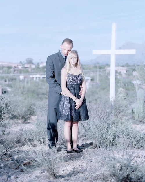
I must confess that the thought of ever standing in such an intimate pose with my mother, even for a fraction of the time, sends shivers throughout my body. Seriously, the images are beautifully composed.
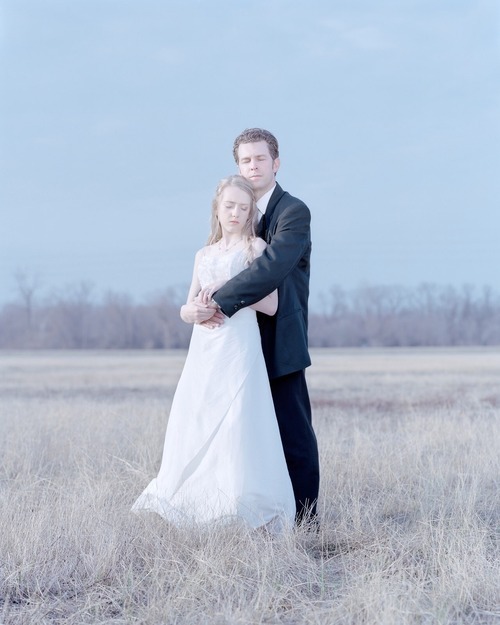
I cannot help but make the comparison to the work of Angela Strassheim, the forensic photographer turned very fine artist. She returned to her home and her born again Christian family to compose equally wonderful creepy, compelling images.

Angela is currently the subject of a controversy over her exhibition at the Jacksonville Museum over this image

The President of the City Council, one Clay Yarborough proclaimed the image to be "pornography" and demanded the city withdraw almost a quarter of a million dollars of funds from the museum. I imagine Yarborough used, as a role model, Rudy Guiliani, who as Mayor of New York, tried a similar ploy with the Brooklyn museum over a piece by Chris Ofili that included Elephant dung. It's hard to imagine that Yarborough could outdo Guiliani's ignorance, but he has managed to. Here is the art net link http://andreameislin.us6.list-manage1.com/track/click?u=0f8b9c08dad61074ac846958e&id=942b02006e&e=464cf56f3e Thank heavens for artists like Magnusson and Strassheim.
#Pictura Gallery#Andrea Meislin Gallery#David Magnusson#Angela Strassheim#pulse Art Fair#Art Basel/Miami#contemporary art#Jacksonville Museum#Brooklyn Museum#Clay Yarborough#rudolph Guiliani
0 notes
