Text
Studio VI - BlogList
(1) Another Game? Yes. https://matthewblandnz.tumblr.com/post/186512331829/another-game-yes
(2) Environmental Storytelling https://matthewblandnz.tumblr.com/post/186551057394/environmental-storytelling
(3) Unspoken Narrative https://matthewblandnz.tumblr.com/post/186673568519/unspoken-narrative
(4) Mundane Art & Playtesting https://matthewblandnz.tumblr.com/post/186928741404/mundane-art-playtesting
(5) Player Perspectives https://matthewblandnz.tumblr.com/post/187752649414/player-perspectives
(6) Player/Enemy Audio https://matthewblandnz.tumblr.com/post/187549290494/a-small-progress-update-audio-and-animation-for
(7) The Perfection Art & Concept https://matthewblandnz.tumblr.com/post/188018166024/the-perfection-art-concept
Portfolio:
https://matthewbland.myportfolio.com/work
4 notes
·
View notes
Text
Interaction & Play - BlogList
(1) Interaction & Play - The Brief https://matthewblandnz.tumblr.com/post/186390323884/interaction-play-the-brief
(2) Musical Squares https://matthewblandnz.tumblr.com/post/186581231039/musical-squares
(3) IP: Playtest 1 & 2 https://matthewblandnz.tumblr.com/post/186998277974/ip-playtest-1-2
(4) Interaction & Play: Prototype Playtest https://matthewblandnz.tumblr.com/post/188101318874/interaction-play-prototype-playtest
(5) IP: Ben Feedback https://matthewblandnz.tumblr.com/post/187892243504/ip-ben-feedback
(6) Interaction & Play: Collaborative Experience https://matthewblandnz.tumblr.com/post/187892243504/ip-ben-feedback
1 note
·
View note
Text
Space, Image & Sound #7

(Unsteady prototype, picture taken by Michael)
This week we, at last, put our components together and prepared a playtest within the studio space. We all had a play with the prototype before playtesting and from my solo perspective the sounds were great fun to experiment with and the tactile visualizers really helped the audio feel distinct as well as enjoyable to play.
Our playtest was very loose and observational, we invited people to come over and try out the installation with only basic instruction on how to ground yourself with the wrist band. The playtest quickly drew more participants as our peers began playing with the different objects, a level of intrigue was apparent and soon users began playing and experimenting collaboratively.
youtube
(Videos - Michael and myself, Edited by Bligh)
The playful and collaborative experience our users partook in greatly subverted and exceeded our expectations for the project outcome, I feel the project has shifted from the concept of space/object enhancement through adaptive audio to a more collaborative play experience through tactile objects and audio.
Fortunately for us, our set up using tape and loose wiring held remarkably well through both the playtest and our in-class show and tell with Clint. Though the experience could go many ways and the paper is ending, I am extremely happy with the unexpected outcome of our project and look forward to seeing where else Michael will take this project for Studio.
3 notes
·
View notes
Text
Interaction & Play: Prototype Playtest
Forgot to finish this one.
Throughout the break, Andrew, Sheena and I came in to build our pressure plate playtest, as we were looking to test overall engagement as well as the viability of having our installation interactable by walking on (and in many cases jumping on) the plates.
Andrew put together our test plates making clever use of a wooden platform, rubber supports which compressed when under load and separated wires that would complete a circuit when the rubber was compressed (forcing them together).
Sheena seemed to initially have trouble with coding our playtest in Processing, though she slowly found solutions to individual issues within the code she decided that it was far too tedious when instead we could simply use Unity which she had far more experience with and worked just as well if not better than Processing.
I put together several sound files for us, I made a series of high and low, long and short notes that we could use for playtesting, these sounds were made from personal recordings and edited using Adobe Premiere Pro.

I also put together a few chiptune tracks using Bosca Ceoil (Cavanagh, n.d) an open-source music software themed around 8-16bit game music. Chiptune music is far from desirable for our project theme and target audience however it was very quick and easy to put together and it immediately highlighted some technical issues with our idea of having our pressure-plates merge full audio tracks together.
Today we ran our pressure-plate playtest and received a variety of feedback. We ran 2 sets of tests, with solo users and pairs of users. Solo users tended to play around on the pads for a while and grow disinterested after exhausting the pads combinations and playing a few patterns. Pairs were far more interesting as they seemed to enjoy playing for much longer, working together to create more interesting combinations and patterns. Pairs expressed more engagement and generally responded more positively during feedback.

Bosca Ceoil
Cavanagh , T. (n.d). Bosca Ceoil. Retrieved from https://boscaceoil.net
1 note
·
View note
Text
Interaction & Play: Collaborative Experience
Andrew, Sheena and I had a discussion this week and we concluded that a tighter, more easily described project derived from a component of our playtesting would give it a proper direction, as well as help retain some relevance to our original concept. We decided to continue with the collaborative side of our playtesting, and our project finally has a definitive description:
We are designing an interactive installation that presents a statement on the benefits of collaborating with others.
We set up a game plan for the coming week and gave ourselves each a job to do, along with progress meetups to help stay on track, like before but more regularly. Andrew is looking into viable materials and construction methodology, Sheena is researching collaborative experiences and cooperation, and I am working on designing the actual installation as well as its functionality.
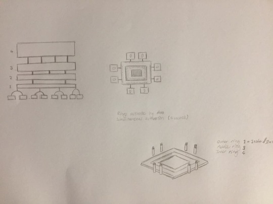
Some quick sketches I made when designing the installation that is currently untitled
To represent the benefits of collaboration, my idea was to have an installation that is impossible to experience fully without multiple users, yet can still give a partial experience to a solo user. Essentially the installation is a series of panels in several square layers that illuminate when one of the buttons is pressed, much like the Nanoleaf Light Panels (Nanoleaf, 2019). When a button is pressed individually there is an audio response and a visual response from the respective layer side (Audio output location is flexible yet unsure). However when 2 buttons from different sides are pressed simultaneously the somewhat mundane sound from each button changes into a more prolonged and intense one, with more simultaneous side activations increasing this intensity along with adding additional effects and backing audio. These enhancements last a predetermined amount of time at the moment however perhaps the length of activation could influence the duration of the enhancement. I have put together an extremely rudimentary video below to help explain the concept further.
(Something happened to the sound while exporting that created strange popping, it’s annoying but serviceable for explaining)
youtube
This means that when more users are interacting with the installations and simultaneously activating each layer as they desire, the experience enhances, which would be impossible from a single user.
Reference for more on Light Panels
Nanoleaf. (2019). Nanoleaf Light Panels. Retrieved September 29, 2019, from https://nanoleaf.me/en/consumer-led-lighting/products/smarter-series/nanoleaf-light-panels-smarter-kit/
0 notes
Text
Space, Image & Sound #6
This Wednesday we had our crit session, we presented our project and though Clint's response was positive and difficult to learn from, it was comforting to know we’re on the right path.
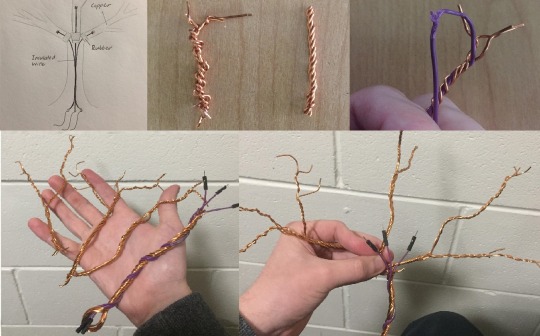
Over yesterday and today, I’ve been learning Wire Tree making for our second artifact (More on it here) and it has been an interesting challenge.
The first thing I did was make a simple diagram illustrating how each branch would connect without having the branches touching. The idea was to have the insulated wire run up the inside of the trunk, push through a layer of rubber for each branch, and connect to the branch. This became an issue as wire trees are constructed from tightly wound strands much like rope, this means that unless the insulated wire is surrounded in a vast amount of copper wiring it will almost always be visible within the strands. So why not just use more wire? Aside from the difficulty of working with possibly 20+ strands of 1mm copper wire, any rubber protecting the inner wire is almost always frayed and destroyed by the more resilient wires that cover it.
Despite the somewhat janky process, making the tree from essentially 4 different parts turned out to not be too difficult if not a bit unconventional.
In the end, it turned out to be easier and safer for the insulated wire to incorporate it into the twisted trunk rather than have it hidden inside, despite this not being the desired outcome, the purple and copper colours I find complementary considering that orange and purple were a part of our Autumn colour palette.
Though far from a masterpiece, I feel that this will at least serve as a decent prototype and a second version shouldn't be too hard to fabricate (maybe with thinner wire) should we need a better one.
1 note
·
View note
Text
Space, Image & Sound #5

Pastel Colour Palette (Autumn, Office, Unorthodox)
Last week I began putting together a colour palette for our installations, this was to reinforce the theme each artifact represents. After googling a few dozen images of streets/forests in Autumn, interiors and exteriors of Offices, and strange vistas from movies, art, and nature I put together a palette of colours for us to use which we then modified to our liking.
Today we sat down to discuss what our next moves are as well as play around with the first artifact, the unorthodox cube. The cube (made by Bligh) turned out to be incredibly playful as we played around with different sounds and instruments that Michael set up with Ableton and MakeyMakey through the cubes 5 contact points.
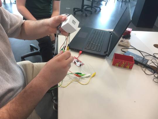
Michael working with the cube
From here my goal is to create our second artifact “The Copper-Wire Tree”. As the idea is to create a tree made from literal wire, I will need to watch tutorials on Wire Tree crafting, though there seems to be an intricate art to this, I’m looking forward to the challenge almost as much as the potential result.
Our tree will need 3 primary branches that a user can make contact with to create a unique sound for that branch, this obviously means that the base and trunk of the tree cannot be touching any of the branches if we are to keep the wires separate. This potentially could add an extra layer of complexity as most wire trees are made wound together as a unified object, however therein lies the fun of it and I’m reasonably confident it shouldn't take too long.
0 notes
Text
Space, Image & Sound #4
Forgot to finish this one.
Bligh, Michael and I have settled on just using the MakeyMakey for our interactive music installation and have ditched the idea of using a Kinect as it was putting restrictions on the project for little gain.
We did however have a conversation about the tactile visualizers discussed last week, and we have in concept converted them into instruments, albeit unusual ones. After we finished our discord call we had 3 conceptual artifacts on our list:
A Bottle of Water (Themed around an office environment)
A Copper-Wire Tree (Themed around Autumn)
An Interactive Cube (Themed around the concept of the unorthodox or strange)
With these 3 interactive artifacts, we can build our tactile music experience with interesting visual enhancers instead of potentially wasting time on a digital visualizer. I personally love the idea of a water bottle installation, how we tackle it will be interesting however we should be able to come up with something during the break.
0 notes
Text
IP: Ben Feedback
Quick Reflection.
Today each team presented what they had done, and discussed the direction of their projects. Most of them felt well defined in intention and investigation however ours was not one of them.
Our project has been centered around the concept of turning Aotea Square into a playful and collaborative space through audio installations, however, this definition is very broad. Ben pointed out that our project was lacking in direction which I feel is a fair assessment of our position, in hindsight I would say we got lost in the questions “What kind of people occupy the square?” and “Who is our target audience?” when we really should have been focusing on an area of interest rather than trying to discern it through an audience.
Going forward I can see a few paths we could take the project, I feel that the time for making has passed however the time for prototyping never ends. The area of interest within this project for me is the collaborative part of the experience, with this in mind my approach for the next week is to explore methods of interaction between people for a hypothetical experience, come up with a few designs, and set the project a proper direction.
0 notes
Text
Player Perspectives
Before starting our project, Sheena and I talked about what style and perspective we wanted to build our game in. In the past when working on other digital gaming projects, these aspects were taken into account after the concept was decided upon. This is because the art direction and player perspective can help or hinder the intended experience for your game. So why do it differently? A Smaller team and less time.
Though we did not have the concept for our game, we did want to play with the idea of environmental storytelling in the fashion games such as Journey and Half-Life 2 had done (Non-linearly). Realizing that environmental storytelling and indexical storytelling (Blogpost on that) requires a lot of visual and audible traces we decided that an Isometric player perspective would be more achievable while retaining relevance to environmental storytelling.
In his 2003 article, Saltzman describes Isometric player perspectives as “A slightly tilted view that hovers up and off to the side of the gameplay and gives the impression of 3D.” (Saltzman, 2003). He also gives us an example: Blizzard’s Diablo series.
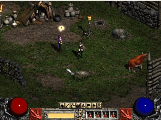
(Blizzard Entertainment, 2000)
Seeing as our objective was to build a game involving environmental storytelling, we found that this view would not only allow 2 axes of movement for the player to explore (Unlike Side-scrolling) but would also allow us to create visual depth in our environments, meaning we can give the illusion of a 3D world without needing to actually create one.

A pseudo-map I put together to indicate pathways and transitions to other areas of the world.
With this visual depth due to our choice of player perspective, we can present traces and clues to the worlds nature, history, and story in the foreground as well as the background more effectively while keeping the project achievable for a small team.
References
Blizzard Entertainment. (2000). Diablo II Demo [Online image]. Retrieved September 16, 2019 from https://archive.org/details/DiabloIiDemo
Saltzman , M. (2003). Game Playing Perspectives. PeachPit, p4.
Denisova, A. (2015). First Person vs. Third Person Perspective in Digital Games: Do Player Preferences Affect Immersion?. 10.1145/2702123.2702256.
0 notes
Video
youtube
A small progress update, audio, and animation for the new player sprite as well as some enemies.
0 notes
Text
Studio VI
Progress Report
Here’s the progress I’ve made so far. Matthew’s been sending in heaps of art work for me to work with. Firstly, I’ve been sorting out moving between areas. One area in particular needed to have the camera zoom in. The video below shows all of this. I used the same technique I used in my testing scene where the character teleported to the other side of the screen, but also had the camera move position.
youtube
Another aspect I’ve been working on is the laser attack and the UI for the health and the power of the laser. The laser stumped me for a bit, I tried a few different techniques which didn’t quite work. Turns out turning your brain off for a second helps to find a better solution for my problems. I don’t know if this is the best way for it to work, but it works so no complaining from me.
The UI I had to follow this tutorial by Alexander Zotov, just to get the basic idea of how it works. Pretty simple stuff. I probably could adjust a few things so it fills up more smoothly, but those are some minor details.
youtube
Other stuff I’ve been working on is picking items up. I almost have it working, but there are a few things that I want to try and fix up, like having the item be in front of the character at all times rather than above. We’ll see how it goes as I keep working on these things!
3 notes
·
View notes
Text
Space, Image & Sound #3
Michael had a chat with Clint about our project last week and received some interesting feedback. What was relayed was that while the addition of visualizers is an enhancing factor to the experience, it may not be necessary to achieve our goals for the project, at least not digitally.
Bligh, Michael and I had a conversation about it and came to the conclusion that we (mainly Bligh and myself) have been focusing a lot on trying to figure out how our digital visuals should react to the audio or be informed by it. In reality, anything can be a visualizer if you can see it and it interacts with the audio in some way. We decided that a tactile visualizer would not only be more achievable in a 15 point paper but could also help give context to the audio. We ran with a few ideas, tilting waterbottles that dynamically change tracks or effects, rotational cubes, reverse hand resistors and even the player themselves (via Kinect).
This switch of tactics has been a playground of ideas when thinking about UX, hopefully, this results in a far richer experience, though I feel this may come down to the quality of the artifact.
0 notes
Text
Space, Image & Sound #2
Early on while working on the programming side of the visuals and reactive nature of them, Bligh and I took a break to play around with the tactile nature of the project and test the UX.
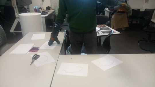
We wanted to test our conceptual space and method of interactivity, so we set up an area in the corner to test the feeling of the space we were wanting to use. After that, we tried different methods of interaction. We took turns attempting to act out movements and discuss issues we found while experimenting with new ideas, most issues usually fell into project scope, health and safety, and weak or unresearched concepts.
Some interesting topics we found were physical restriction, graspable artifacts, and broad gestures. Most importantly the input method of touching the glove to our skin (as originally intended) did not feel right.
We discussed this as a team later on and decided that the avenue of UX and interactivity methods would need to be further explored.
0 notes
Text
Space, Image & Sound #1
Before the second week, I was having trouble thinking about what I wanted to do in this paper, a mixture of a mental block and having another paper that was very similar was likely the issue. However, I asked Bligh and Michael what they were doing and their concept of adaptive audio in a physical space intrigued me.
In a 2017 blog, Velardo talks about adaptive soundtracks being a constantly changing dynamic soundtrack that reacts to a control input from the game, to the effect of “providing the player with a customized musical experience that may enhance their game experience”. (Velardo, 2017) I find this description apt in context to digital games, and relatable to our project in a physical space.
It was decided that we wanted to work with physical input and so far this has taken the form of a welding glove. We plan to have dynamic blending music tracks that can be shifted using the physical input.

The build so far is using Processing and Makey-Makey (an electronic tool that allows users to connect everyday objects to computer programs), by pressing your gloved fingers to the desired object (currently ourselves) you complete the circuit for the input to register. Bligh has managed to get audio playing through processing that has effects on the audio output when receiving the gloves input.
Since then I have been looking into the visualization aspect of our project, what we want to present and react on the screen to the visuals. Bligh and I had a session discussing the visual components and getting them to work, however, all three of us are skeptical if the visuals will enhance or complicate the project.
Reference
Velardo, V. (2017). What is Adaptive Music? [Blog post]. Retrieved from http://melodrive.com/blog/what-is-adaptive-music/
0 notes
Text
IP: Playtest 1 & 2
youtube
A video edited Andrew edited together of our first and second playtest.
Here we were testing collaborative music under different conditions, attempting to discern what works best and worst for collaboration. Relating to our project we wanted to test if participants can play together naturally with and without guidance, as many people in a public place (That don’t know each other) may or may not work together.
0 notes