Don't wanna be here? Send us removal request.
Text
Assignment two
Source: https://www.kew.org/about-us/press-media/kew-orchid-festival-celebrate-the-colour-of
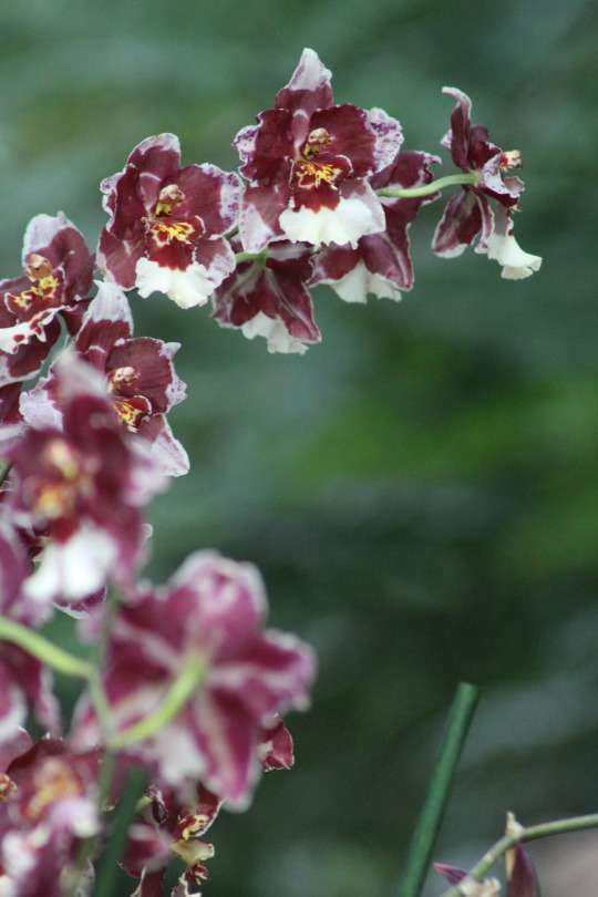
I was inspired for this assignment by my recent trip to Kew Gardens in London. They were holding what they called Kew Orchid Festival: Celebrate the colour of Colombia which was on display from the 9th of February to the 10th of March 2019. I had the pleasure of visiting on the 5th of March and I was blown away by what I saw.
In the Princess of Wales conservatory, Columbian culture was bought to life through signts and smells which were landscaped to perfection, including over 6,200 orchids, and that lead you up and down to view the arrangements from high up and bown below. The display also included a ‘carnival of animals’ to celebrate Columbia’s high wildlife biodiversity which depicting a toucan in flight, a hanging sloth and swimming turtle all composed of tropical plants.
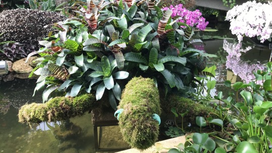
Also featured were hundreds of colourful hanging vandas which represented Colombia’s famous rainbow river, Caño Cristales, as well as an enchanting forest scene complete with life-sized jaguars.There was a display of hundreds of colourful butterflies which were suspended from the glasshouse ceiling, and an intricate, golden floating display full of bright yellow orchids in the glasshouse pond depicting the legend of El Dorado.
Some of the artists involved were Colombian artist, Vanessa Moncayo González, who transformed the glasshouse film room with colourful Boyacá-style street-art murals. Another Colombian artist, Omar Castañeda, created sculptures for a 'treasures of Colombia' display alongside Colombian orchids from Kew's collections. The festival also featured a number of traditional artisanal objects from different regions of Colombia provided by Artesanias de Colombia, Tu Taller Design, Yurupari Grupo Folclorico, in collaboration of the Embassy of Colombia in London.
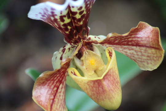
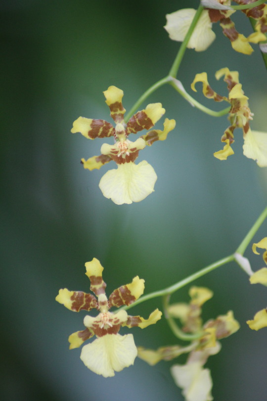
Below are some photos I took of the flowers I saw and was inspired to draw:
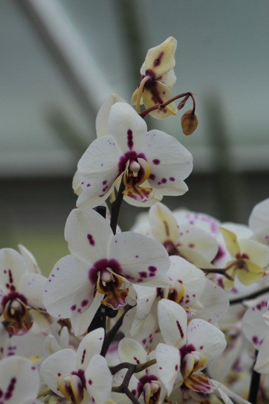
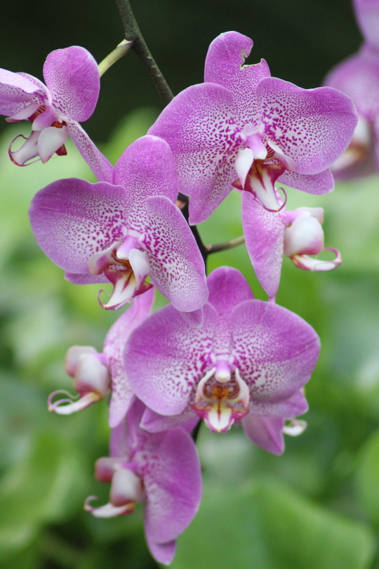
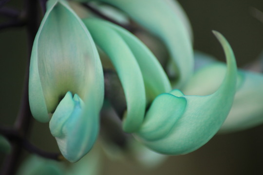
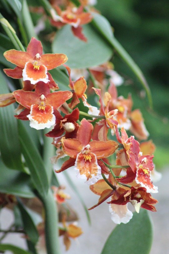
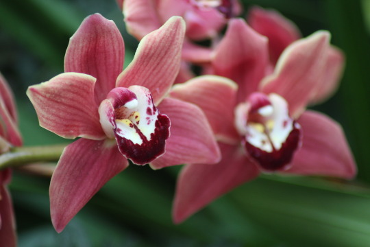
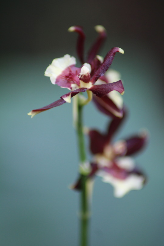
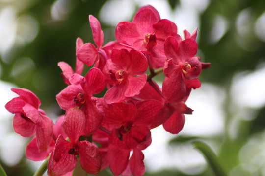
Whilst I was at Kew I had the privelage to see the work of an artist named Zuigestu Ikeda. A banker and businessman named Shotaro Kaga visited Kew as a student and fell in love with the orchids on display. Kaga designed and built Oyamazaki Villa along with a large complex of glasshouses. Along with the grower Kenkichi Goto he created a large private nursery to cultivate his imported orchids in Japan.
Ikeda, a botanical artist, was comissioned to paint Kaga’s orchid collection in the 1930′s. He completed hundreds of watercolour paintings and went on to comission the best known craftsmen of the day to make colour woodblock prints of his paintings using the finest materials. The set was completed in 1943 and named the Rankafu series of which only 300 sets were printed. The exhibition I saw is thought to be the first time the prints have been officially exhibited outside of Japan.
This information was taken from display boards at the exhibition in the Shirley Sherwood Gallery of Botanical Art at Kew Gardens.
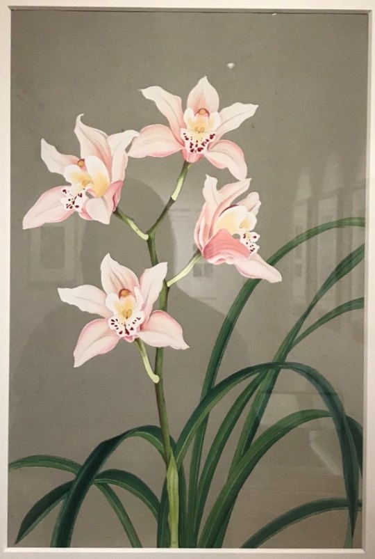
Rankafu Print no. 40 (1946) Cymbidium Katsura ‘Oyamazaki’
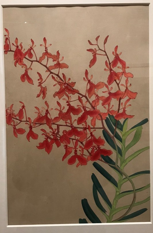
Rankafu Print no.100 (1946) Renanthera imschootiana
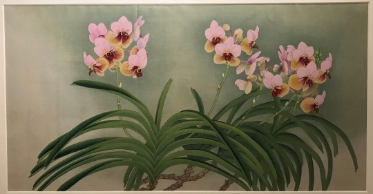
Rankafu Print no. 1 (1946) Vanda Sanderiana
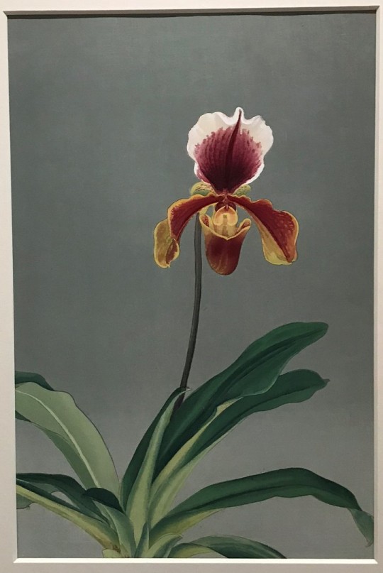
Rankafu Print no. 62 (1946) Paphiopedilum Euphrasia ‘Oyamazaki M. S. K.’
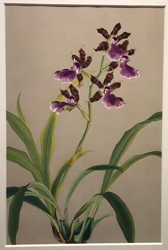
Rankafu Print no. 104 (1946) Zygopetalum maxillare Brazil and north-east Argentina
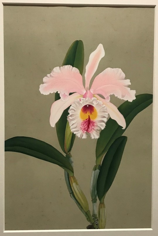
Rankafu Print no. 10 (1946) Rhyncholaelaeliocattleya (Rlc.) [Blc.] nr. No 487 ‘Oyamazaki’
I particularly love these prints for their subtle complexity. They appear to be simple paintings because of their plain coloured backgrounds but this really brings out the vivid details of the flowers and leaves. Each flower is so complex and Ikeda does a really good job of capturing every little mark and colour on these flowers accurately. His work has inspired me beacuse my mother is also a keen collector of orchids and these flowers can be found all around my house. They are such beautiful plants and they would make great subjects for my still life paintings whether I decide to create a mood, use complementary colours or paint them accurately.
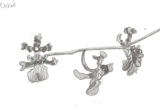
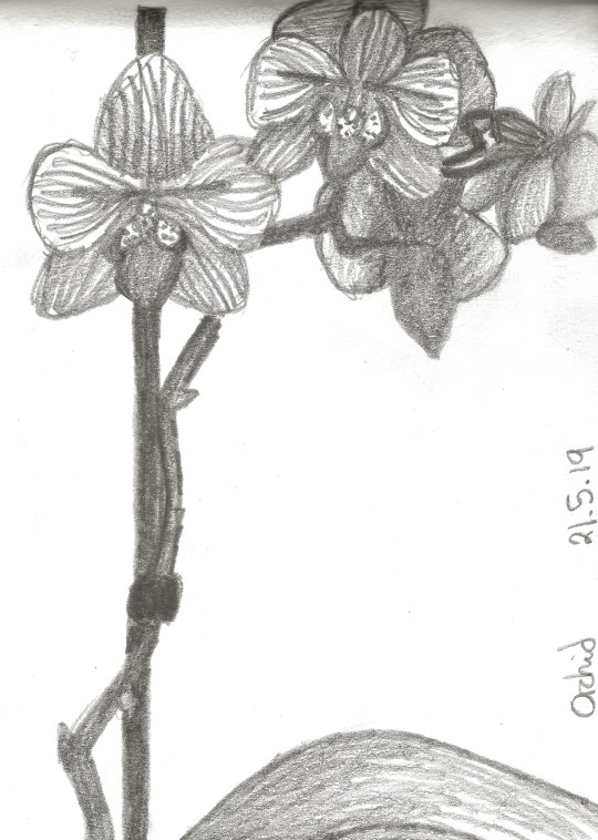
Below are a few sketches which I composed from some of the photos I took at the Orchid Festival. I have tried to focus mostly on the detailed patterns and complex shapes of the flowers:
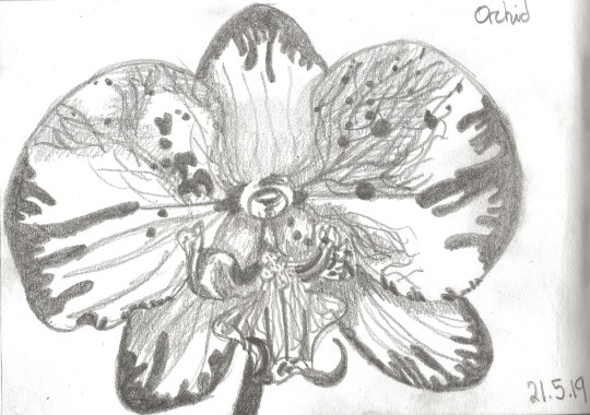
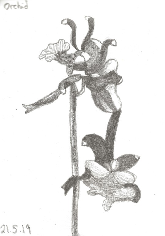
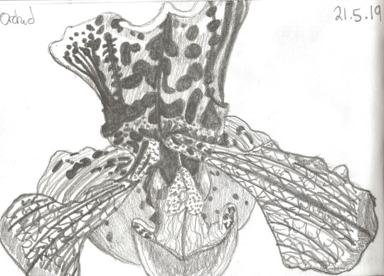
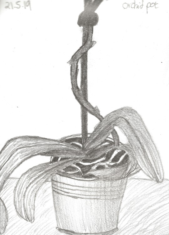
After setting up my simple still life, by placing a potted orchid on a small table, I constructed a couple of simple sketches from life of what I could see. I didn’t want to make a sketch that was too detailed or complete, so that when I come to paint my final piece I will not feel like I’m repeating myself:
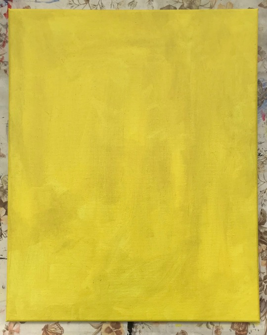
I started my painting with a base colour. I decided on yellow as I noticed this as an undertone in the peachy colour of my flowers:
Next I used soft pencil to draw the outlines of my still life onto the canvas:
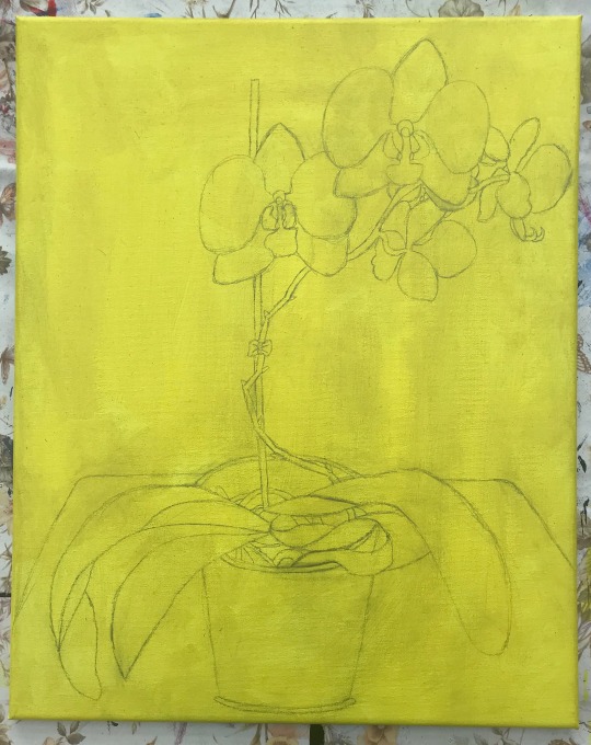
The following photos show my progress as I painted:
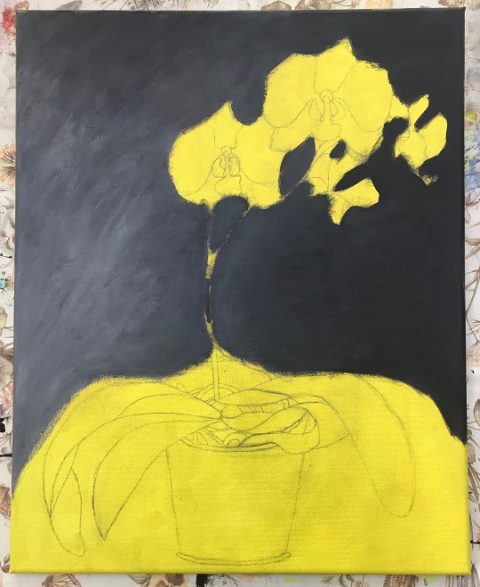
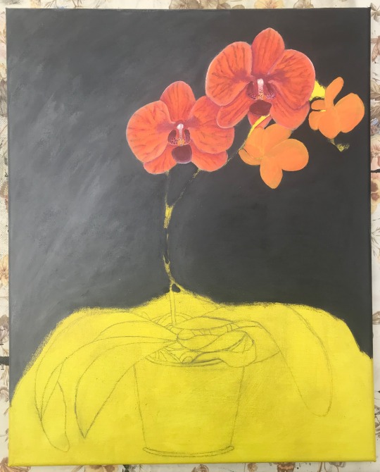
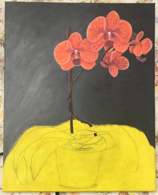
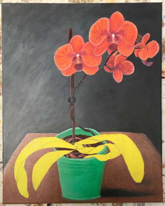
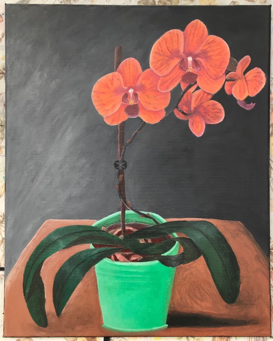
Finally, this is the finished painting with a close up of the flowers:
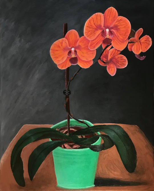
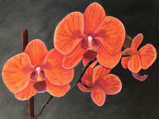
For this assignment I decided I would visit one of the exercises I didn’t previously have time for which was ‘still life with flowers’. I decided on only a single object in this composition because I thought it would make the painting quite striking and I think this is an effect I have achieved with my dark background and bright plant. I decided to give it a simple context by just placing it onto a table as again I didn’t want to overcomplicate the object.
I painted again in acrylic and I hope it is obvious that my technique and understanding of colour, tone and composition has improved since my last assignment. Based on my previous feedback, I have put a lot of time into practicing creating volume in my paintings and I hope that in this painting that is evident through my use of tone and shading. For example, before I would have probably gone for a block colour background, but in this painting I have tried to use the light to create a more intersting and painterly effect. I have also done my best to show the relationship between my background and my objects by using hard and soft edges in the appropriate places.
In terms of colour, I mostly stuck with what I saw in front of me although I chose a dark background, which is in contrast to the bright flowers, to create a sultry atmosphere, almost as if you are in a tropical location on a warm evening. I have slightly exaggurated the yellow and purple in the floral tones to give the striking effect of complementary colours. Having a fairly neutral grey background also helps to bring out these shades and cut out any unnecessary busyness.
Although I began by drawing the outline of my shapes with a pencil, I used this as a rough guide which enabled me to draw with paint. I also drew the key details of my work with paint such as the veins of the flowers. I also tried to pay attention to the perspective and the sharp angles of the table so the way it was painted was just as I saw it. I hope that in this painting I have shown a good development of my skills and incorporated techniques from the exercises in this part of the course.
#orchid#kewgardens#flowers#columbia#art#paint#painting#rankafu#ikeda#woodblock#prints#printing#watercolours#drawing#sketching#sketch
0 notes
Text
Simple perspective in interior studies
In this exercise the main focus was creating an illusion of space. I decided on the outer limits of my view and that my painting would be A4 and portrait. The area I chose to paint was fairly simple in that it was formed of mainly lines and besides the main structure there were few additional complications. The reason I chose this particular section to paint from one of my previous sketches was becasue of the research on linear perspective I had just done and my desire to execute this in my work.
I started by drawing out the basic lines and shapes I saw in pencil and then I began drawing with paint. I paid most attention to the lines which defined the structure and I assessed the relative scale of objects in my view. Almost all of my shapes were angular and unrounded which made the perspective easier to achieve and I tried to work with a degree of accuracy, measuring proportions with care.
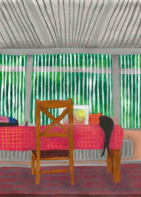
Although this was an exercise in drawing with paint, I did not use a particularly muted palette. Instead, I limited myself to using only earthy tones and tried to achieve an approximate colour accuracy. I am particularly pleased with the blinds as I feel that despite the simple white lines, you can still tell that you are looking out through a window and into a garden. I also think that the roof is fairly convincing because it shows the linear perspective as the lines head towards a vanishing point.
As I was painting the floor I realised that I had made a mistake. I had painted the lines of the tiles so that they got further away from each other as they approached the vanishing point (which I had also done in my original sketch) and this was a fatal flaw in my perspective, so I decided to paint over them and then redraw them. Looking at my completed painting now, if there was one thing I could change it would probably be the area of the chair legs. When looking directly at the chair from where I was positioned, I could only see three of the chair legs, which is what I painted, but I feel this is not successfully conveyed in my painting so I should have used my artistic license to add in the fourth leg or simply moved the chair so it was visible.
0 notes
Text
Research - linear perspective
sources: https://www.britannica.com/art/linear-perspective
https://www.artistsnetwork.com/art-techniques/beginner-artist/beginner-drawing-linear-perspective-the-basics/
Linear perspective is a way of creating the illusion of depth on a flat surface. All parallel lines in a painting or drawing converge in a single vanishing point on the horizon line.
Linear perspective is thought to have been devised about 1415 by Italian Renaissance architect Filippo Brunelleschi and later documented by architect and writer Leon Battista Alberti in 1435. It was likely also used by artists and architects of the ancient Greek and Roman periods but there is no record of this.
The three essential components of linear perspective are parallel lines, the horizon line and a vanishing point. So that they appear farther away from the viewer, objects get smaller as they approach the vanishing point and as parallel lines recede into the distance they appear to get closer.
The horizon line is a horizontal line that runs across the paper or canvas to represent the viewer’s eye level and delineate where the sky meets the ground.
The parallel lines, which distort objects by foreshortening them, create the optical illusion that objects grow smaller and closer together as they get farther away. These imaginary lines recede on the paper to meet at one point on the horizon called the vanishing point.
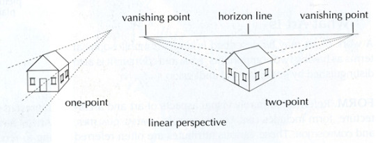
The difference between one- and two-point perspective is the number of vanishing points and where they are placed on the horizon line. The image below is an example of one-point perspective:
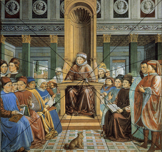
Saint Augustine Teaching in Rome (1464-65) by Benozzo Gozzoli
One-point perspective is most helpful when drawing or painting roads, railway tracks, or buildings that directly face the viewer. Two-point perspective is for use when you are facing a building or an object at an angle and the vanishing points are either side of your view.
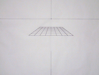
Patrick Connors is a professor at the New York Academy of Art, in Manhattan, who teaches a graduate class on linear perspective. To help his students learn the basics of linear perspective, Connors instructs them to complete the exercise which I have tried for myself shown below. It combines maths and art to form a grid:
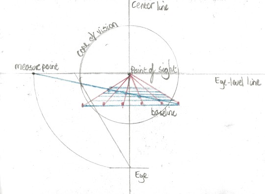
This is the completed grid shown with all the mathematical workings and notes removed from the Artists network website. You can see here that the perspective of the grid is perfect and appears like a checkered floor:
2 notes
·
View notes
Text
Quick sketches around the house
For this exercise I chose to sketch my living room as this is a space I know well and spend a lot of time in. I decided to sketch the most interesting wall of the room first and I did this from a sitting position as this is how I would normally view it. I then thought it would be most interesting to sketch each of the four walls in the room for my drawings. Instead of doing eight different drawings, four from standing and four sitting, I did four quite large, complex sketches to include a lot of detail in each one and make them as intersting as possible. I was isntructed to spend no more than an hour on this task but I got quite involved with it and really enjoyed doing it so I spent longer sketching.
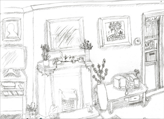
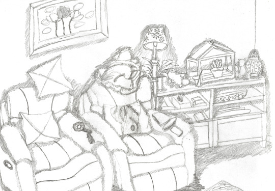
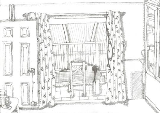
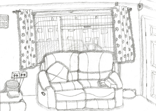
I focussed mostly on line in my drawings over anything else. I very roughly added some basic tonal shading just where there were shadows but I didn’t spend time shading every individual object. I think the most successful of my drawings were the ones featuring the fireplace and the conservatory. Although it was difficult to achieve on all my drawings, I feel the perspective is the most well executed on these two.
1 note
·
View note
Text
Research project - interiors
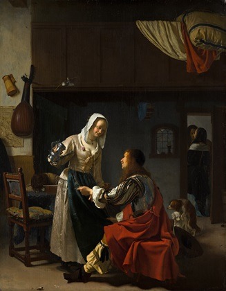
Brothel Scene (c.1658-1659) by Frans van Mieris the Elder
Sources: https://www.mauritshuis.nl/en/explore/the-collection/artworks/brothel-scene-860/detailgegevens/
http://www.essentialvermeer.com/dutch-painters/dutch_art/subject_matter.html
https://www.britannica.com/biography/Frans-van-Mieris-the-Elder
The main themes of Dutch interior paintings are those of love and the virtues of domestic life and the theme of love appears in a wide variety of ways, from romantic scenes of lovers separated by distance to scenes in brothels or of sexual love treated with a frankness that is also found in Dutch literature of the period.
The theme of seduction does not necessarily imply a financial transaction, but a sexual relationship is certainly often implicit. In many of these paintings we see wine and musical instruments. In fact, alcohol is present in such quantities in scenes of seduction that it seems to have been normally associated with the subject of love. There is a instrument and a tankard hung in this painting in the top left from the wall.
In this painting, a soldier is having his glass topped up by the barmaid and with his other hand, he tries to pull her closer. The glances they exchange and her open cleavage lead us to believe that this is a brothel.
We can also see a pair of mating dogs in the background and through an open door the couple appears to have an armorous relationship. These are the clues that lead us to believe we are viewing a brothel and even without the title of this painting, knowing the date it was painted and observing the subjects’ relationships with the environment, we could probably still easily work it out.
Mieris was a chief member of a family of Leiden (a Dutch city) painters. He painted on relatively small pannels often no bigger than 12-15 inches and he characteristically painted with a shiny brightness and metallic polish. His best painted subjects were those in which he illustrated the habits or actions of the wealthier classes although he sometimes painted homely incidents with portraiture and included allegory.
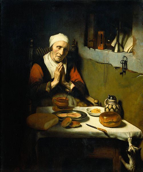
Old Woman at Prayer (1656) by Nicolaes Maes
Sources: http://www.essentialvermeer.com/dutch-painters/dutch_art/subject_matter.html
https://beautyofbaroque.wordpress.com/2015/07/11/old-woman-at-prayer-by-nicolaes-maes-1656/
In this painting we are taken to the home of what would appear to be an average Dutch woman. There is no sense of any extravagance and so we assume she is a member of the merchant class and not someone very wealthy at the time of this portrait. The work speaks of simplicity and humility.
Maes most frequently depicted this type of subject, the intention was almost always exemplary; these were representations of virtuous behavior which remind us that homes were not just physician places but also the centre of society's moral instruction.
The protagonists of most of these scenes are women of all ages who, by being located in the home, occupy the place which society considered appropriate to them, and behaved according to the models set out for each age and social situation.
It is suggested that this woman may be a widow as she has prepared her food and eats alone, the only other subject in the picture being her cat in the bottom right corner who sees the perfect opportunity to pinch something.
This type of painting reflected the profound transformations which were taking place in society. The rapid commercialization of daily life, one of the most notable features of 17th-century Holland, meant that the large number of paintings dedicated to this social space and whose quiet, meditative qualities markedly separated them from the exterior world, provided their owners with a certain degree of calm which enabled them to deal more confidently with the major changes that were affecting their lives and the resultant anxiety.
Some of the objects in this painting include a key which may indicate that the ‘key’ to a long and happy life is simple living, an open book possibly meaning there are no secrets here as she prays and an hourglass whose sand has run out potentially hinting at the woman’s old age.
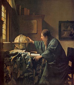
The Astronomer (1668) by Johannes Vermeer
Sources: https://vermeer0708.wordpress.com/about/
https://www.theguardian.com/artanddesign/2017/feb/21/vermeer-and-the-masters-of-genre-painting-review-louvre-paris
Portrayals of scientists were a favourite topic in 17th century Dutch paintings and this painting is believed to be coupled with and features the same subject as in Vermeer’s other painting The Geographer. He is believed to possibly be the scientist Van Leeuwenhoek who invented the microscope and was born the same year as Vermeer.
This globe in this painting presents different and complex constellations and reflects the 17th century human fascination for astronomy and science.
This painting harmonizes space, colour, and light to convey a single human activity, a unified moment in time. The composition is not narrative but rather forms the context of a sole figure, frozen in a pose of profound preoccupation.
Vermeer often painted women as his main subjects and it is only in these two paintings that men are depicted as they were believed to be the founders of science as was appropriate.
Like in this painting, Vermeer often places his subjects beside a window and the light illuminates his face to reveal his youthfulness, insight and anticipation.
His hands are also expressive and having them placed over the globe may suggest that he is exploring and opening up the eyes of people to a new and undiscovered world.
He is surrounded by books and academic illustrations which suggests that this academic has dedicated his life to learning and furthering the development of science.
source: https://www.britannica.com/art/genre-painting
Genre painting is the painting of scenes from every day life and ordinary people in work and recreation generally depicted in a realistic way. The scenes that are painted are quite intimate in content as they are painted within interiors and give us an insight into the life of the Dutch painters who created the work and the people around them. It is generally used to describe the work of some famous 17th century dutch painters but also extends to the 18th century and through to the late 19th century.
As far as realism goes, I quite like the work of the Dutch genre painters. I like the fact that we as the viewer get an insight into Dutch life at the time and that we can take some history from these paintings as well as artistic value. As Jonathan Jones writes for The Guardian, “Such paintings of everyday moments turn the drama of art inward, and make it hesitant, uncertain, complex. Right and wrong are not obvious.” I much prefer them to the Dutch still life paintings which I previously researched as they are generally far brighter and less dingy in colour. I also admire the mastery of these painters who have been able to create realistic textures and perspectives in their paintings.
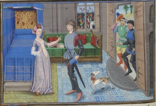
Maugis of Aigremont and Isanne in the Queen's Bedroom (15th Century) by Loyset Liédet
sources: https://gallica.bnf.fr/ark:/12148/btv1b8426778v/f270.item
https://en.wikipedia.org/wiki/Loyset_Li%C3%A9det
https://en.wikipedia.org/wiki/The_Four_Sons_of_Aymon#Dutch_version
Loyset Liédet was an early Netherlandish miniaturist and illuminator. He was very successful and patronized by many of the leading collectors of his day but today he is scarse heard of.
Liédet illustrated and painted for the Medieval manuscript of The Four Sons of Aymon, sometimes also referred to as Renaud de Montauban. It is a medieval tale spun around the four sons of Duke Aymon , his brothers Guichard, Allard and Richardet, their magical horse Bayard and their adventures and revolt against the emperor Charlemagne.
In this painting, the furniture and objects are depicted not as a central focus but instead are secondary to the human drama taking place. You can tell that the owner of this room is wealthy because of the elaborate patterns on the fabrics and the floors.
There is little volume in this piece and the painting is incredibly flat. Some of the proportions and the foreshortening are completely off such as the bed and the angle of the door. This is probably due to a lack of understanding at the time of shading and maths coming together to create a realistic illusion of depth.
The doors and windows in this painting play a critical role in the narrative. Some men have come to visit the queen at her door and the space behind them seems peaceful and expansive. However, very close by through the window we can see what appears to be an army of men marching past. This leads us to question the narrative and it foreshadows a treacherous event to come.
I personally think this is an excellent painting for its purpose as an illustration in a manuscript. It has a clear narrative and shows the progression of the story in a creative way. The setting and colours in this painting clearly illustrate the wealth of the queen and also the time period it is set in.
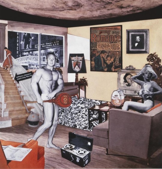
Just what was it that made yesterday’s homes so different, so appealing? (1956) by Richard Hamilton
Sources: Art Since 1900 Modernism Antimodernism Postmodernism published by Thames & Hudson
https://www.tate.org.uk/art/artworks/hamilton-just-what-was-it-that-made-yesterdays-homes-so-different-so-appealing-upgrade-p20271
http://www.bbc.com/culture/story/20150824-richard-hamilton-and-the-work-that-created-pop-art
This piece is a collage designed by Hamilton not as an art object but to reproduce as a poster and in a catalogue. It is a pop-physiological parody of postwar consumer culture made with its own ad-slogans and image-bits.
This collage features two contempories of the time depicted as being narcissistic. They are connected only by the lollipop which acts as a phallic symbol and points towards the woman’s breasts and the commodities positioned in the room around them.
A woman speaking on the telephone is on the TV and there is a poster for romance on the wall. An advert for a cleanign service comes to life on the stairs and the extra long hose reinforces the theme of ‘comodity-appliance-as-phallus.’
There is an abundance of ‘the woman’ in this collage and she seems to rule this appartment but it is implied that she too is a commodity. Although she may fantasize about the body builder, there is a portrait of a patriarch on the wall looking over her and the man of the house is implied missing by thr newspaper on the armchair.
This interior is completely overtaken by the outside world. There are hints of media through the TV, radio, advertisements and posters which test boundaries between public and private and the window indicates the room is wide open to influence from the outside world.
The imagery we associate with pop art is often American celebrities and consumer goods but pop art in fact came about in Britain from the Independant Group lead by Richard Hamilton who is now known as the progeitor of British pop. As Alastair Stooke comments as an art critic of The Daily Telegraph, “Hamilton’s collage is often described as the first work of Pop Art, perhaps even its manifesto.”
This type of college art is something that particularly intersts me. I have a fascination with the 1950′s and their lifestyle and culture in Britain and America. This collage combines these factors to present a rosy but cynical look at post-war life and I think it is successful at portraying its obserdity.
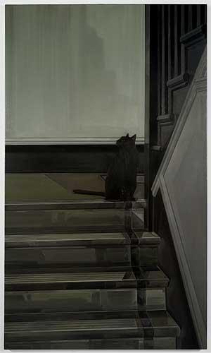
Prince (2010) by Gillian Carnegie
Sources: Colin Perry, Vitamin P2 published by Phaidon p.72
http://www.andrearosengallery.com/exhibitions/gillian-carnegie/7
Gillian Carnegie often paints in a dull pallette of greens and greys which tend to make her work appear old-fashioned. In her paintings she often paints the same motifs which can include a black cat, a vase of wilting flowers and a staircase, two of which are featured in the painting above.
Her subtle tones speak of a high contrast with mainstream media and modern art which is so full of colour and eye-catching vibrancy. As Perry says, “her works are particularly sophisticated in their ability to destabilise icons of macho modernism, whose fierce denial of representative content has been questioned since the 1970′s.” Modernism is a genre that rushed ahead of itself but Carnegie takes a slower and more relaxed approach.
Her paintings main focus is the suggestion of inhabiting space and with her use of vertical arrangements of line and form she suggests an urban environment that has been compressed. Despite the claustrophobic atmosphere, she does not imply a sense of busy city life, but rather a feeling of calm.
Her paintings could be read as arguments in favour of a way of living in a busy city yet heading towards enjoyment of space free from modern chaos as suggested by Perry.
Looking at Prince instantly gives me a feeling of relaxation and calm. The colours speak to me in a way I cannot explain which bring me into a place of rest. The title of this painting to me suggests that the main focus of this painting, the cat, rules over the stairway and is comfortable and pampered in his own space. A lack of windows or doors in this painting suggests to me that this is a comfortable environment, free from threat and devoid of destructive behaviour.
There is a lack of human drama in this painting which utters a sense of calm although the cat turns its head as if stirring to a noise somewhere else in the house. Although the foucs is on a very small space, having stairs in the composition hints at a larger, perhaps more busy place away from this cat’s safe, quiet space.
#mieris#art#paint#painting#genre#dutch#interiors#maes#vermeer#loyset liedet#richard hamilton#collage#gillian carnegie
0 notes
Text
Still life with colour used to evoke mood
For this painting I used the same arrangement of objects as with my still life with complementary colours so that I could compare the different effects when I had finished. I used the same preliminary sketch as before as well so that the angle and light that I approached my still life from was also the same.
Due to the nature of my objects I decided the mood I wanted to create was a warm, exotic atmosphere, much like the arid desert setting you might find these things in. Therefore I chose my colour palette in advance and worked only with red, yellow, orange and brown in varying shades and hues. I tried to keep my colours fairly similar in tone.
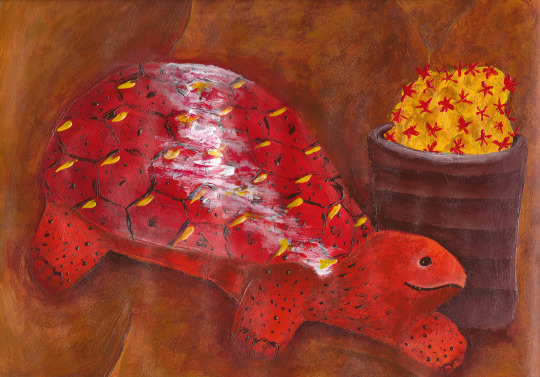
In this painting I feel like I have achieved my desired effect by using warm colours and creating a desert atmosphere. I have tried to heighten effects by making certain hues brighter than they appear and changing some colours completely, for example making my cactus yellow, which gives it a dried out feeling. After painting this still life previously, I decided it would be a more effective painting if the objects took up more of the page and so in this version I have cropped right in on them. I have also made the markings on the tortoise more abstract and slightly softened some of the edges.
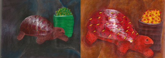
To compare both paintings side by side, you can see the obvious differences. The scale is somrthing I have already mentioned but you can see its impact properly here, one looking distant and one looking close up. Although I have used the complementary colours in my first painting, it looks very dark and cold which is at high contrast with my second painting which is bright and vibrant. By using the same group of objects placed in the same position I have managed to complete two entirely different paintings which goes to show how much of an effect colour can have on the viewer and how it can alter an object’s appearance.
2 notes
·
View notes
Text
Still life with complementary colours
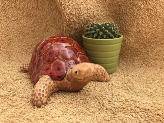
For this exercise I set up a very small still life. The objects I chose were a garden ornament of a tortoise and a small potted cactus. I set them up on a towel, which was a sandy colour, and I felt like my still life had a connection with the desert which is what linked my objects together:
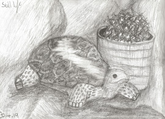
I began by doing a simple pencil sketch of my objects in soft pencil to determine a composition I was happy with and to see my objects in simple tone rather than full colour:
Following on from this I could begin to paint. I transfered the simple outlines of my sketch into my sketchbook to work with. This painting was a colour study using only a narrow range of colours. I chose two hues, one colour and its complementary and balanced them tonally using white paint. The colours I chose were red and green as these were what I naturally saw in my objects. To include a higher tonal range I mixed the complementary colours together to achieve broken colours which I used throughout the rest of my painting:
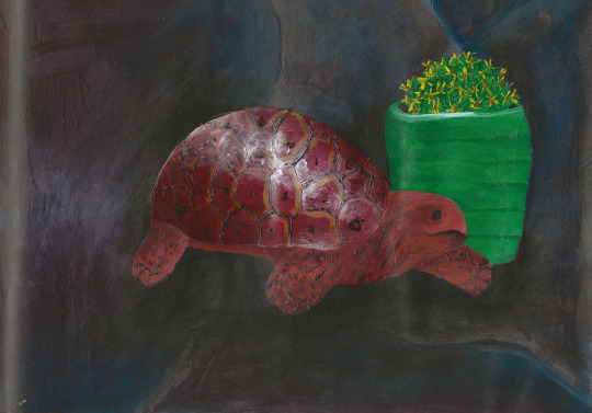
In this painting I am satisfied with my use of the complementary colours. I was able to match my dark green and red tonally and this gave them an earthy feel. I decided to use a dark background to make these colours stand out more and this was mixed with my two colours but because of the darkness, I should have made the edges of my objects softer which would have created more volume. The markings on the tortoise are quite textured which I feel makes the painting more interesting to view because it is brought to life more. The only colour I included which was not a mixture of my complementaries was yellow as I felt like this was a colour not too disimilar from them and would help to make certain elements stand out. If I were to paint this again I would make sure to sketch my objects larger so they fill the page and there is less background.
2 notes
·
View notes
Text
Research point
Impressionism
Optical effects have been exploited by many artists to create movement and depict the effects of light.
The Artist’s Handbook of Materials and Techniques by Ralph Mayer talks about impressionists:
“The followers of the French Impressionist school have been said to have utilized the additive process by substituting the juxtaposition of small spots of pure colour for mixtures of colours. When viewed from an adiquate distance the light rays reflected from these adjacent colours merge, producing upon the eye a blended hue sometimes entirely different from that which would have been produced had the colours been mixed on a palette. The effect is clear and has a particularly vibrant, luminous quality. A similar effect, as all painters know, is produced when mixed colours are not too thoroughly blended on the palette but are rather loosely scrambled on the canvas.”
This technique is known as pointilism. Two main players of this technique are Seurat and Signac. Art Since 1900 Modernism Antimodernism Postmodernism published by Thames & Hudson mentions how Matisse was inspired by the techniques of Seurat:
“There was surprisingly little emphasis on Seurat’s dream or on the optical physiology theories on which it was based - the idea that the human eye could perform something like the prismatic decomposition of light in reverse, that the ‘divided’ colours would resynthesize on the retina in order to attain the luminosity of the sun - perhaps because Signac had already admitted to himself that this was a chimera. Rather, Signac insisted on the successive ‘contributions’ of Delacroix and of the Impressionists, undrestood as having paved the way for total emancipation of pure colour performed by neo-Impressionism.”
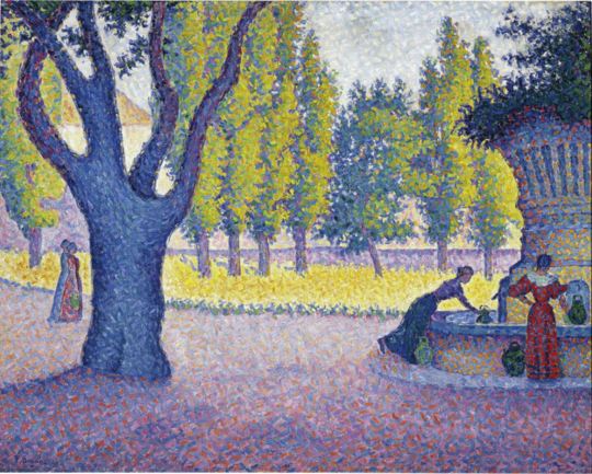
Saint-Tropez, Fontaine des Lices (1895) by Paul Signac
Source: https://www.artsy.net/artwork/paul-signac-saint-tropez-fontaine-des-lices
Art Since 1900 Modernism Antimodernism Postmodernism published by Thames & Hudson also mentions how these Impressionists exacted their colours:
“the landscape painters who emerged in the 1870s and became known as Imperssionists hunted down the effects of colour through plein air (out-of-doors) paintign in which they discovered how the actual colour of shadows cast by the golden sun is violet. Stroking such complementary colours onto the surfaces of their figures in short, fragile traces, the brushwork they practiced dissolved drawing into a shimmer of coloured light. By the 1880s, Claude Monet and Auguste Renoir, the leading Impressionists, worried about the dissolution of line and thus of form that was a consequence of their attention to colour. The emergence of neo-Impressionism, in the work of Georges Seurat and Paul Signac, was the acknowledgment of this resurgence of the rights of drawing.”
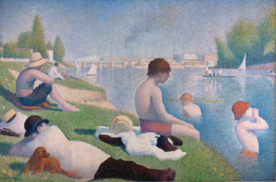
Bathers at Asnières (1884) by Georges Seurat
Source: https://www.nationalgallery.org.uk/paintings/georges-seurat-bathers-at-asnieres
Impressionism has always been a style of painting that interests me as I see it as one of the first historical steps towards abstraction. In summary, the pointilist artists such as Signac and Seurat above, have managed to capture colours in a creative and optical way that tricks the eyes. By studying colours and seeing how light and shadow affects them, they have strived for colour accuracy and they have done this in an original and interesting way. I particularly like the work of Signac becuase up close it is easy to observe his pointilist technique and each individual colour but if you try and imagine viewing his paintings at a large scale from a distance, you can see how all the colours would blend together and create the perfect mix to represent the atmosphere of the scene.
Op-art
Art Since 1900 Modernism Antimodernism Postmodernism published by Thames & Hudson describes the work of Bridget Riley; “an illusion of movement (and of volume) is engendered by the destabilization of a regular pattern and the continually confusing inversion of figure and ground.”
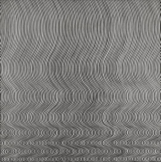
Fall (1963) by Bridget Riley
Sources: https://www.tate.org.uk/art/artists/bridget-riley-1845
https://www.tate.org.uk/art/artworks/riley-fall-t00616
Bridget Riley developed her Op-art style in 1960 where she explored the dynamic potentialities of optical phenomena and the works produce a disorienting physical effect on the eye.
The piece above (Fall) features a single perpendicular curve which is repeated to create a field of varying optical frequencies. Though in the upper part a gentle relaxed swing prevails, the curve is rapidly compressed towards the bottom of the painting. The composition verges on the edge of disintegration without the structure ever breaking.
This painting was made between 1961 to 1964 (1963) which was a period where she was concerned with working with the contrast of black and white, occasionally introducing tonal scales of grey.
A comment from Riley herself about the work is, “I try to organise a field of visual energy which accumulates until it reaches maximum tension.”
When I look at this painting I see a lot of movement. I see vertical movement in the compacting of lines and the horizontal movement of lines swaying from side to side. I find Riley’s work to be very intelligent as it features a calculated mathmatical aspect and also creative as it plays with our eyes to create a 3D moving image over a flat 2D surface. Her level of precision is also impecable as each line has been so accuratley painted in place to create this effect.
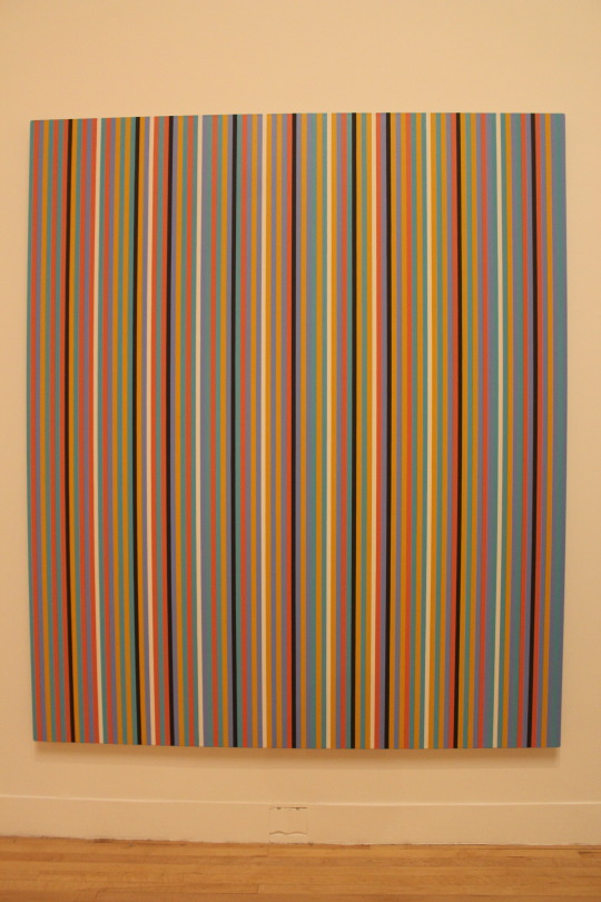
Achaean (1981) by Bridget Riley
I recently visited the Tate Britain where two of Riley’s works are on display. Above shows one of the pieces I saw. It is large in scale, which I tried to show in my photograph by including some of the background, and consists of several vertical coloured lines. When I stood in front of this painting, the first colour that leapt out at me was orange but looking at the photograph now it is black I see first. The person I was with at the gallery saw pink most prominently. It is said that the colours we notice first in an arrangement can be determined by the colour of our eyes and whether we are left or right brained. When you are close to this painting you can stare at it up close and not be distracted by things around you; all the colours start to blend together and go blurry in your vision. The colours in this painting are inspired by what Riley saw in Egyptian tomb paintings and the local landscape. The simplicity of the composition allows the colous of this painting to establish the structure.
In conclusion, both styles of Impressionism and Op-art use optical effects to bring life to their paintings. Impressionism uses vivid and life-like colours to make their paintings accurate and interactive and Op-art uses black and white monochrome shapes to add volume and movement to the work. Both techniques trick the eye, regardless of their use (or lack) of colour. What I can take from this research and apply to my own work is that colour accuracy doesn’t necessarily mean pre-mixing colours on a palette, it can mean using the nature of human vision to create a realistic effect and volume doesn’t have to be created through shading, it can be done effectively using line.
0 notes
Text
Successive Contrast
To begin exploring this concept I took a brightly coloured object and placed it in front of me. What I had to hand was a large yellow Easter egg and I stared at it for 30 seconds. When this time was up I closed my eyes and waited for an after-image to form. When focussing hard on this, a hazy shape appeared of the egg and it was a purple-ish colour. This is the complementary colour of yellow.
I then painted a square of my most vivid and intense pigment, which was a pillarbox red colour, and stared at that for 30 seconds. Then I shifted my gaze to a white piece of paper and watched the after-image appear again in the complementary colour, green.
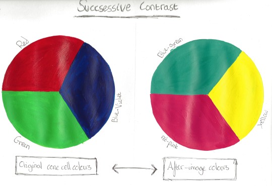
There is science behind this concept. The colour receptors in the eye are stimulated and then exhausted so in the case of my red square, the receptors for red were exhausted leaving only the remaining combinations of colours to mix and produce blue-green when turning to look at white. Newton showed that white light is made up of all the colours in the spectrum and the human eye has full colour discrimination through the rod and cone cells. The rod cells distinguish between light and dark and the cone cells respond to red, green and blue-violet which make up all colours.
To test this scientific theory further, I conducted my own experiment. I took a page in my sketchbook and divided it into two. Then I drew a circle on each side and divided these both into three equal sections. In the first circle I painted each section a colour of the cone cells; red, green and blue-violet. I then spent thirty seconds staring at the centre of my colour wheel and then looked at a piece of plain white paper. The after-image produced blue-green, red-pink and yellow so I painted these onto my second circle. To make sure I had the right shades I repeated the experiment by staring at the centre of my after-image colour wheel and when I looked at the plain white paper I saw my original three colours:
1 note
·
View note
Text
Exploring contrasts
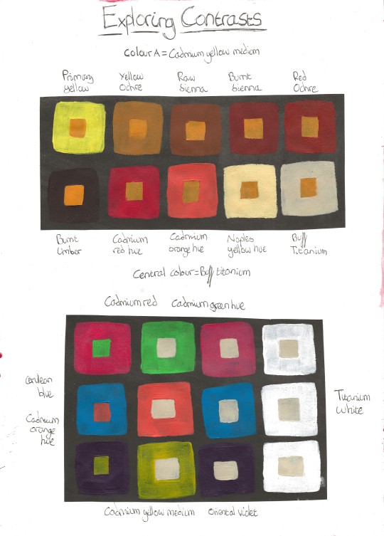
To begin I selected a colour to be my ‘colour A’ which I decided was going to be cadmium yellow medium which is a hue somewhere between primary yellow and orange. I then selected several shades which were close on the spectrum to colour A. I painted a small square of colour A in the centre and then a larger square around the outside in each different shade. Colour A alters each time in relation to its surrounding colour. For example the burnt umber makes colour A look much brighter and lighter than primary yellow. When colours that are not opposite to each other on the spectrum are seen together, they cancel each other out.
Next I did the same thing but with complememtary colours. These are the opposite colours on the colour wheel. I painted the small central colour with the brightest of the two colours and then used white to match the second colour tonally for the outer square. Doing this really brings out the colour of the other. They are both incredibly vibrant and opposite from one another.
With a neautral beige colour, I painted a small square inside a red, green and white frame to see the effects this would have. The neutral square inside of the white border appears the darkest. The beige appears lightest when inside the green and a tad darker when inside the red. To further experiment with the effects of enhancing and modifying colour intensity I looked at this same exercise with beige in each of the primary colours and their complementary opposite. I found the effect of the neutral shade to be the same with each as I had with the red and green.
0 notes
Text
Still life with natural objects
As a keen collector of rocks and gemstones, I decided I wanted to bring this into my still life painting. I chose a slice of agate geode which was blue and reminded me of the sea, and therefore I decided my second object was a dried starfish. I was considering also adding a shell but the objects I had were complex enough and I didn’t want to overcomplicate things.
My objects were quite small and reasonably subdued in colour so I decided to add in a piece of pinky-red fabric to my background. There are some quite subtle tonal variations and lines in my objects as well, which was difficult to sketch so my background offset that with its blocky and angualr shapes.
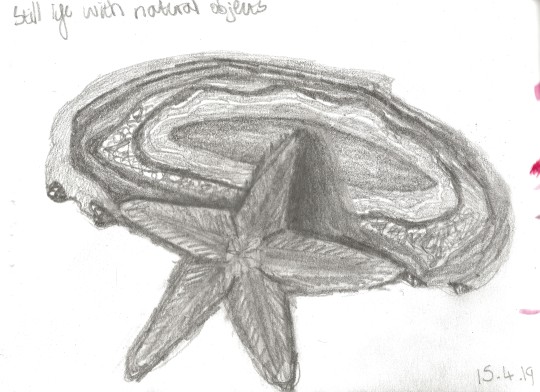
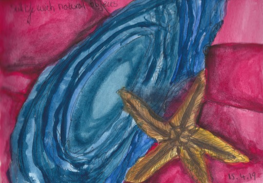
Because of the high detail on top of both objects and their flat nature, it seemed the most appropriate decision to set my viewpoint as from above. My first sketch, which I made in pencil, was done from a slight angle to create a bit of shadow and then my second sketch in biro was made from directly above and cropped-in to create a greater compositional interest.
The agate slice is a fairly shiny object and has the same lustre as glass so this had a totally different texture to my starfish which was matte and heavily textured. Becuase my sketches were made from above my composition, there was very little shade to work with, but adding a background in my second drawing added some folds and lines.
When I completed my standard pencil sketch, I then decided to work on a small colour study using watercolours. This was when I decided to really vamp up the colours of my objects to create interest using the primary colours which I worked on previously in this part of the course.
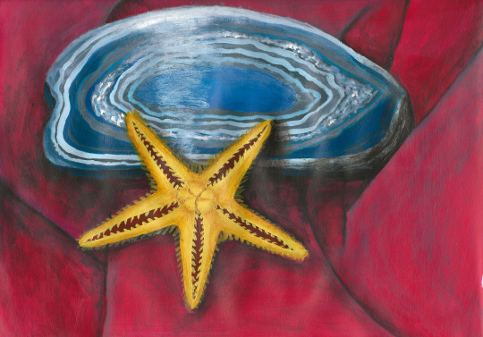
Due to the complexity of these items, I have painted this still life in a fairly stylistic way and simplified it tonally. I used simple and bold lines to give the best impression of the objects and show their detail without over simplifying them. This level of complexity was the main problem that the natural objects presetned but I feel like I overcame this well with my colourful approach.
Having the addition of the background helped to bring out the bright primaries in my objects.The way it was folded left sharp, angular lines which juxtaposed the curves of the agate and complemented the structure of the starfish. The sun had moved in the sky when I got round to painting so there were more cast shadows to add in which added more volume to the composition.
My first attempt at still life used very simple objects and was tonally quite simple. I feel like I have progressed since then with this painting as I have chosen to be more adventurous with my objects and I feel like I have made a simplistic approach to this work effectively. From this exercise I have learnt that it is okay not to include every single detail of your subject in a painting. I have seen that taking a stylistic approach and adding your own twist to a piece of work can really bring it to life.
0 notes
Text
Still life with man-made objects
For this exercise I selected three man-made objects which I put together to make an interesting still life arrangement. My three objects are linked by common use. They are all from my kitchen dresser and include a jug, a dish and a spice jar. They also have similar round forms and shiny textures.
I spent a bit of time arranging my objects first and decided on a composition. From the way I had set up my objects I decided that my painting would be portrait format. To establish this I made two sketches, one in pencil and one in pen:
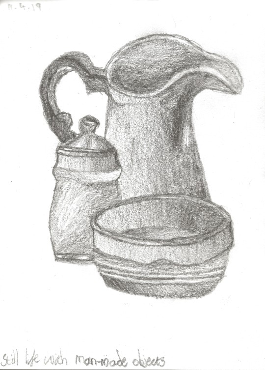
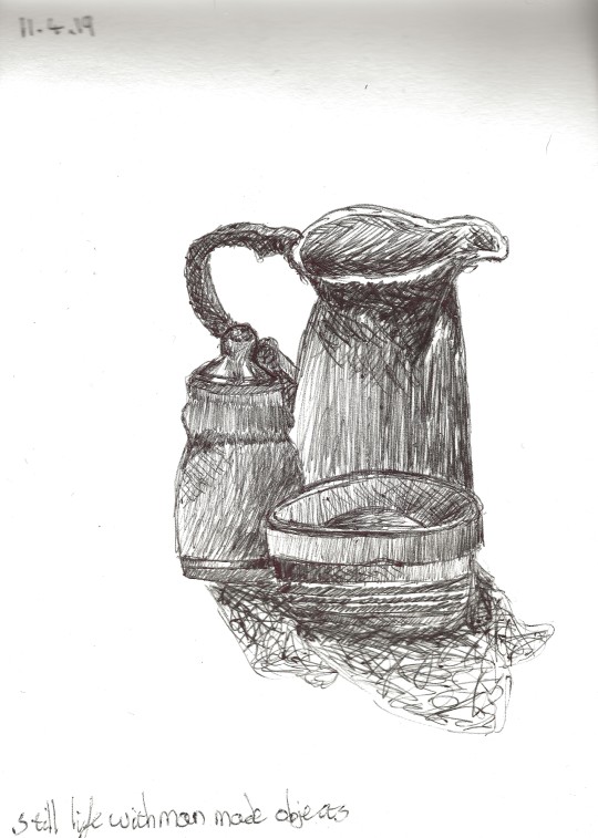
In my initial pencil sketch I was careful to evaluate the tonal variation. I also noticed the reflective qualities of the ceramics and located the lightest highlights and the darkest shadows. All three of my objects were quite similar in colour, but not the same. They are almost a tonal match, with the dish being slightly lighter than the jug and the jar.
My plan for the painting itself is to work with broad areas of colour and tone, but focus mostly on the highlights and reflections created by the ceramic surfaces to get a very light and naturally coloured painting.
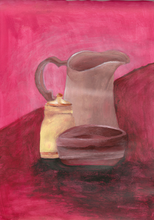
I started this painting with a layer of pink. As my objects were all similar in colour I wanted to add colour interest by having a bright background. I chose to do this painting in A4 as the objects were not highly detailed so they did not need the attention of a larger scale. I decided to paint from my original pencil sketch as this was the most detailed and all my objects were closer together which was a composition I preferred. Tonally, I originally planned to paint in block colours with basic shading, but I actually ended up being quite tonally detailed as the reflections and shadows allowed me to do so.
Looking at all three of the still lifes I’ve painted including my painting with man-made objects, with natural objects and my first one where I drew with paint I can say now that overall my first was more successful. This is because the composion as a whole was better suited to paint including both the objects and the background. However, in terms of quality of painting, the objects in my still life with man-made objects are of a better standard. The reason I do not see this as the best painting overall is because of the background where the objects were placed on a table diagonally. I feel it could be improved compositionally if it was straight.
My assignment piece from part one was a still life in a way. I had one object, a blanket which I creased up and painted in a cropped-in format so there was no background. The main thing I needed to improve on, which I discussed with my tutor, was creating volume. Since then I have done some independant study, which can be found on the ‘Sketchbooks’ page of my blog, which has helped me to improve this skill so if I were to paint it again my methods of creating volume would be different and hopefully superior.
1 note
·
View note
Text
Drawing in paint
To begin this task I looked around my house for a natural arrangement of objects to be used as a still life. I sat them down and adjusted them slightly to make my composition more interesting. My objects were not too complex in appearance so I was able to sketch a simple still life.
I made a series of drawings to explore the linear qualities of my subject. I looked at the outlines of objects and how the spaces between them create particular relationships of line. Some lines define tonal areas; some are hard edges and some are soft. Some shining surfaces, such as glass reflected or showed through other outlines and shapes.
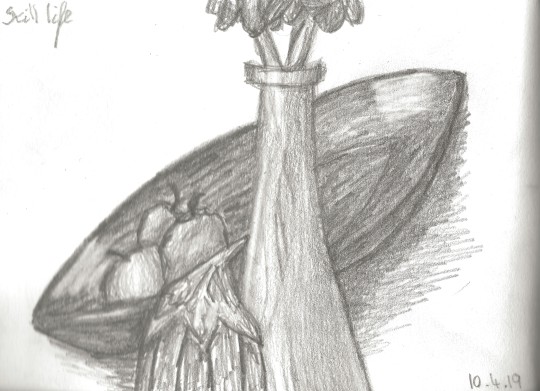
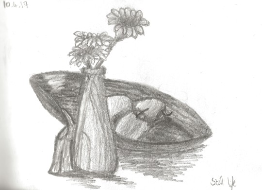
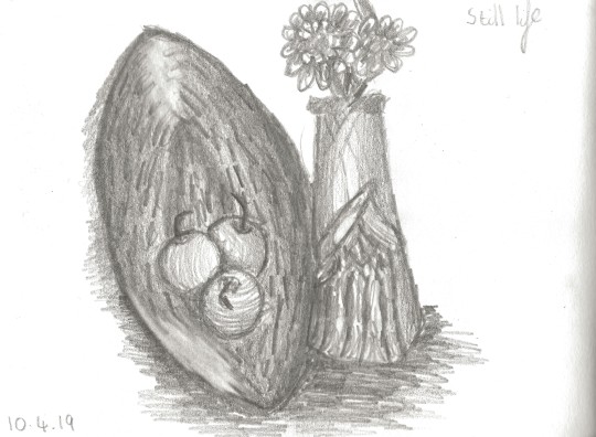
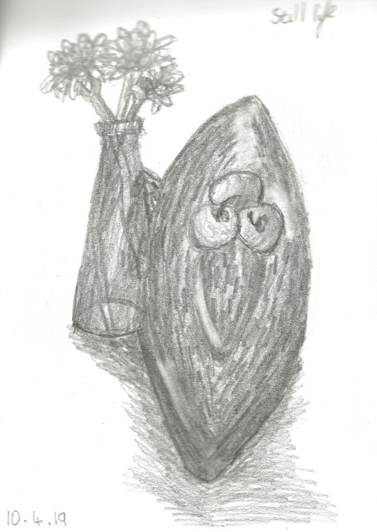
I chose to paint my second sketch because I felt like this was the best looking and most interesting. I started by blocking in a page in my sketchbook with yellow as I felt that this was the underlying tone of my still life and then I used a fairly neutral brown pigment to draw some of the main outlines with a fine brush:
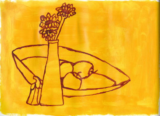
When I was satisfied with the placement of my important lines I began to work on the colour, but I made sure that line was still a prevelant feature of my painting. I revisited some of my outlines when I had completed a section and close to the completion of the piece to make them stronger and more obvious:
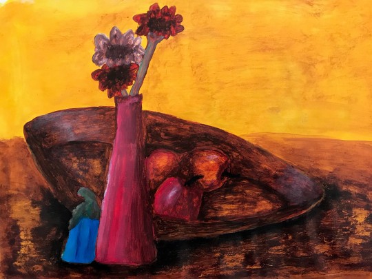
1 note
·
View note
Text
Still life
17th century Dutch still life and flower painters
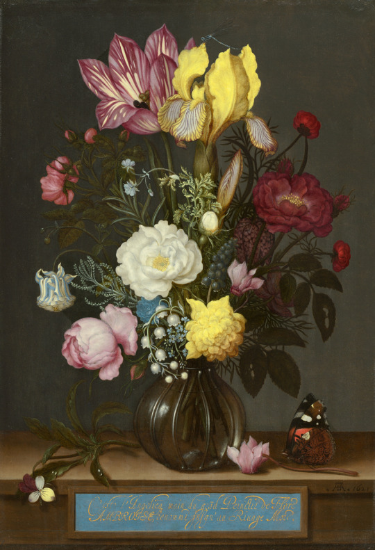
Bouquet of Flowers in a Glass Vase (1621) by Ambrosius Bosschaert
source: https://www.nga.gov/collection/art-object-page.94743.html
Bosschaert was a pioneer in the history of Dutch still lifes and a painter of joyful flower bouquets. He had an incredible awareness for composition and loved to combine flowers with a wide variety of colors and shapes to create a pleasing and uplifting visual experience.
Bosschaert generally arranged his blossoms symmetrically. In this painting he has put a yellow iris and a red and white striped tulip at the top. Among the rest of the flowers, the bouquet contains roses, a blue-and-white columbine, fritillaria, grape hyacinth, lily of the valley, and a sprig of rosemary.
There is also a damselfly perched on top of the iris and a butterfly below the vase on the stem of a flower on the table which further enhances and brings to life the composition.
Bosschaert began his career making drawings of rare and exotic flowers in botanical gardens. He used preparatory images drawn from life to compose his paintings, sometimes depicting individual flowers in reverse.
His style of flower painting became more naturalistic over time, as he developed techniques for rendering petals with soft, velvety textures. He also introduced subtle tonal gradations in the backgrounds to enhance the sensation of light flooding the image.
I love all of the floral paintings of the 17th century because they are so beautiful. The way in which the paintings are composed is so pleasing to the eye becasue there is a large variety of flowers and they have been painted in colours which go together nicely and bring the scene to life.
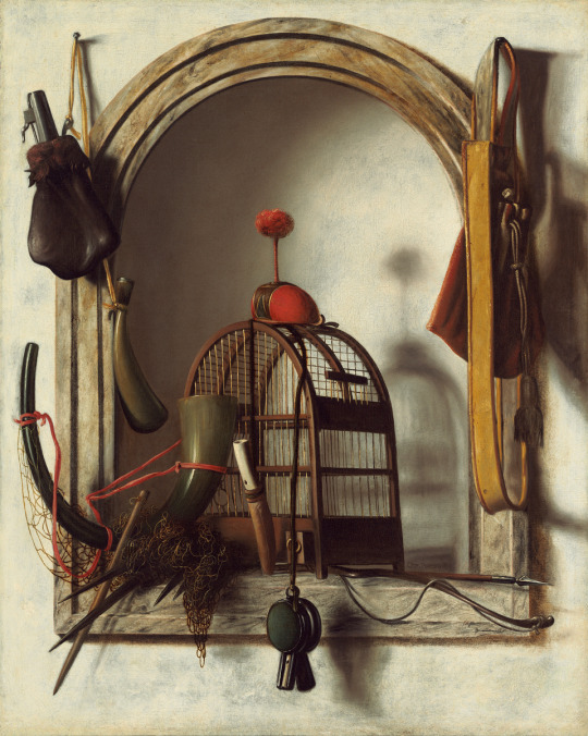
Niche with Falconry Gear (1660s) by Christoffel Pierson
Source: https://www.nga.gov/collection/art-object-page.124519.html
Pierson was born and trained in the Hague and was one of the first artists to specialize in illusory images of hunting gear.
Hunting was a popular activity for Dutch nobility throughout the seventeenth century. The Hague, where the Princes of Orange had their courtly residence and where the States General convened, became the center of a growing culture of hunting that spawned this new genre of painting around mid-century.
Pierson painted a number of trompe l'oeil hunting pieces with falconry elements and emphasized three-dimensional effects with illusionistically painted frames and niches.
In this painting Pierson has arranged various pieces of hunting equipment in and around a wooden-framed niche set into a white stucco wall. In the arched niche he has placed a hunting horn, a net, a bow and arrow, and a small birdcage surmounted by a falcon's hood with a red plume. Two different types of whistles hang from the cage. A powder bag and powder horn are suspended to the left of the niche, and a shoulder bag hangs to the right.
His strong contrasts of light and shade bring the image to life and strengthen the sense that bright daylight floods the scene.
Although I am not interested in or fond of hunting, I think this is a fantastic painting. It looks so real and so well composed down to the accuracy of the slightly hazy shadows. The lighting Pierson has achieved here is also quite remarkable as it appears so natural and flooded with sunlight.
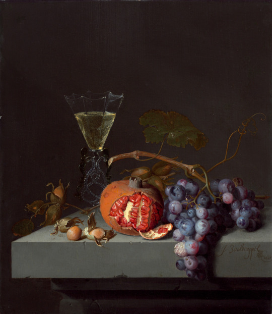
Still Life with Fruit (1675) by Jacob van Walscapelle
Source: https://www.nga.gov/collection/art-object-page.119295.html
Although this painting is small it still carries a sense of grandeur. ssembling only a few objects on a plain stone ledge, the artist has conveyed a monumentality of presence usually found in much larger and more complex still lifes.
This painting is bathed in soft light and each element is figurative and conveys its essential properties.
The Venetian style wine glass stands out and sparkles in the back against the dark background; the pommegranite is so well lit and brightly coloured that it invites the viewer in to imagine its taste and texture.
These items are also part of a long iconographic tradition within still-life painting. The grapes and wine evoke the Eucharist, while pomegranates have complex associations with Christ’s suffering and the Resurrection. Van Walscapelle's painting encourages the viewer to contemplate Christ's sacrifice and eventual rebirth.
I really admire van Walscapelle’s painting because of its elegant simplicity. He has taken such simple objects and placed them together to create a complex and evocative composition. It shows how natural, ordinary objects can be so beautiful.
18th century still life painting
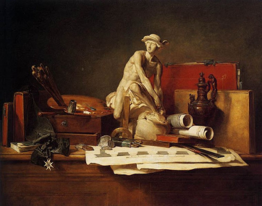
The Attributes of the Arts and their Rewards (1766) by Jean-Baptiste-Siméon Chardin
source: http://arthistoryblogger.blogspot.com/2011/10/academic-still-life-painting-in-18th.html
Excellence in French art was seen as reflecting on the magnificence of King Louis XIV. In the Royal Academy a strict hierarchy of subject matter was created, most important was history painting which helped promote the state, still-life was referred to as “dead nature” and considered a form of copying and not intellectual art.
Inspired by new ideas of rationalism and order, themes in painting shifted toward a greater simplicity in both technique and subject matter. Chardin was accepted into the Academy in 1728 and during his career he became well known for his still-lives.
He also adopted a rational approach to the use of color and paint and applied a minimalist style to his work, influenced by ideas from this time. Rather than showing every detail of objects, Chardin painted in a way such as to capture the essence of them.
The painting above reflects the importance of artists in France at the time and was painted in honour of the artist’s friend, the sculptor Pigalle, who was the first sculptor to win the highest award from the Order of St. Michael.
This work is symbollic of the fact that being an artist was a learned and noble profession which contributed to the French culture of the 18th century.
I much prefer this painting of man made objects to the equivelent paintings from the 17th century becuase the colours are far less dingy and dark. I also respect the fact that Chardin has chosen to portray the importance of art through his work, which is not frequently represented in the medium itself.
19th century still life painting
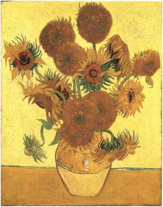
Sunflowers (1888) by Vincent van Gogh
Source: http://www.bbc.com/culture/story/20140120-van-goghs-flower-power
In this painting there are 15 sunflowers which all emerge from a similarly coloured vase. Some of them are perky and others have begun to droop.
This painting is hugely dynamic and is a colourful twist on the traditional still life paintings stretching back to the 17th century.
The painting belongs to a series of 4 that were all created in less than a week of each other in the summer of 1888 when the wind prevented van Gogh from working outdoors. Not long after these had been painted, van Gogh created 3 more variations.
Having invited the Post-Impressionist French artist Paul Gauguin to visit, van Gogh painted his Sunflowers to hang on the walls of the bedroom Gauguin was to stay in, in the Yellow House. Gauguin loved them so much, he asked for them as a gift and later painted his own sunflowers.
He had created a series of paintings which was something like an artist’s signature and commented, “the sunflower is mine”. They have become almost like a visual shorthand for the artist.
Van Gogh’s emotional, subjective use of colour would prove enormously influential on modern art, and continues to speak directly to people today.
Although I am not hugely fond of the colour yellow, I think that van Gogh has done an incredible job at using a single colour to paint an entire image. He has simply adjusted the tone, hue and chroma of his colour to create variations and interest in his paintings. This work is therefore a direct link to the work I have been doing and the colour theory I have been studying.
20th century still life
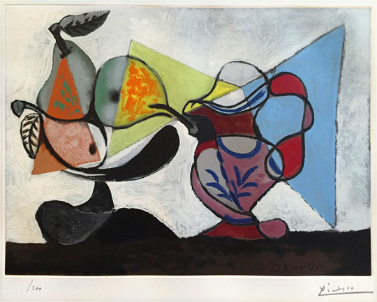
Nature Morte (Still Life) (1960) by Pablo Picasso
Source: https://www.masterworksfineart.com/artists/pablo-picasso/aquatint/nature-morte-still-life-1960/id/W-5396
Picasso is a cubist artist who has displayed here an avant-garde twist on the traditional still life composition.
This piece consists of colourful shapes and bold lines which make up not a classical painting, but an etching and aquatint.
Bold, bright colors alongside a balanced composition allows for Picasso to create a seemingly cubist piece with very organic undertones. The curved lines and sharp angles opose each other to make up the background and foreground which together contribute to the idea that still life can appear to be alive.
It has shiny matte colour and crackled detail which extend beyond the surface of the work which has allowed Picasso to create the cubist look he is so famous for.
Seven plates were used to produce this print so that all 11 colours could reverberate throughout the entirety of the impression.
I am captivated by this print because it has used similar objects to the classical still life paintings such as fruit and a jug but Picasso has managaed to revamp this and put it into his own style. The colours of this print are so vibrant and blocked in, but also broken up by lines which adds interest to the composition.
Contemporary still life
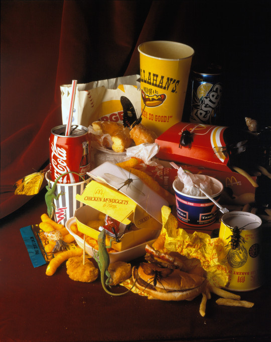
Natura Morte (1994) by Mat Collishaw
Source: https://matcollishaw.com/works/natura-morte/
After visiting New York for the first time, Collishaw was stuck by the unlimited amount of fast food on offer from the world and so he decided to photograph this.
This series of three photographs has been set up in the same way as that of a 17th century Dutch still life. These old paintings showed grandeur and they boasted of the wealth that was available to afford such fine and foreign foods.
If we apply this to the modern day in the western world, our over-indulgence of food detracts from the sense of wealth and instead focuses on waste.
It appears ludicrous and ugly and is more liekly to appear as a pile of rubbish than as a feast and show of wealth and affluence.
I am incredibly interested in the use of photography to convey a message or a meaning and I think that Collishaw has been incredibly successful in doing this by drawing parallels between the modern day and the 17th century.
You can see the diplay of food and the half eaten and torn open nature of it such as the pommegranite in Still Life with Fruit (van Walscapelle) but it also incorporates elements from the classical still lives with flowers by having the bugs.
The effect of this is that what once represented wealth and abbundance now represents greed and gluttony.
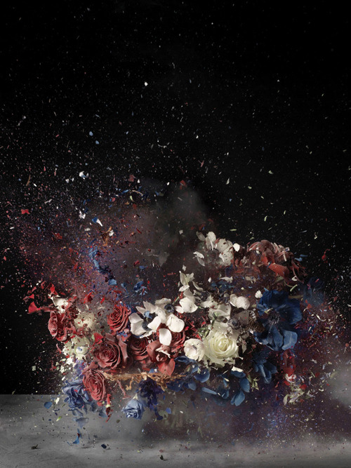
Time After Time: Blow Up No. 4 (2007) by Ori Gersht
Source: http://www.mummeryschnelle.com/pages/ori1b.htm
The series of photographs titled Time After Time and Blow Up are printed large scale and depict elaborate floral arrangements, based upon a 19th Century still-life painting by Henri Fantin-Latour, captured in the moment of exploding.
These compositions are frozen in motion which is dependant on the technology of photography to capture freeze-frames. It would be far too fast for the human eye to process and therefore the aid of photography is necessary as described by Walter Benjamin as ‘optical unconsciousness’ in his seminal essay ‘A Short History of Photography’.
Flowers are often symbolic of peace or goodwill and here that has been flipped on its head to represent the uneasy beauty of destruction. The tension that exists between violence and beauty, destruction and creation, has been enhanced by the age-old need to capture “reality” and the potential of photography to question what that actually means.
The way that photography stands in relation to truth is powerful and new possibilities to experience reality in a more complex and challenging manner have arisen.
I love this series of photographs because they show the possibility for photography to convey things which cannot be seen naturally by the human eye. Gersht has taken the traditional still life flower paintings nad put his own spin on them. He has taken the prim and proper way of displaying wealth and beauty and shattered this to represent its fragility.
#art#paint#painting#still life#bosschaert#flowers#pierson#hunting#van walscapelle#chardin#van gogh#sunflowers#picasso
2 notes
·
View notes
Text
Complementary colours
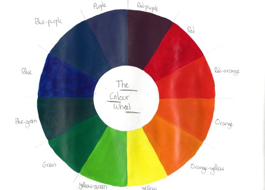
To learn about locating and mixing complementary colours I made my own colour wheel. These are the colours on opposite sides of the colour spectrum.
I first drew a circle and then divided it up into 12 segments. Looking back at my work on Chevreul I mixed the colours from his colour circle. I began with primary red followed by red-orange, then orange and so on around the wheel. I feel like I have achieved satisfactory mixes in my example above.
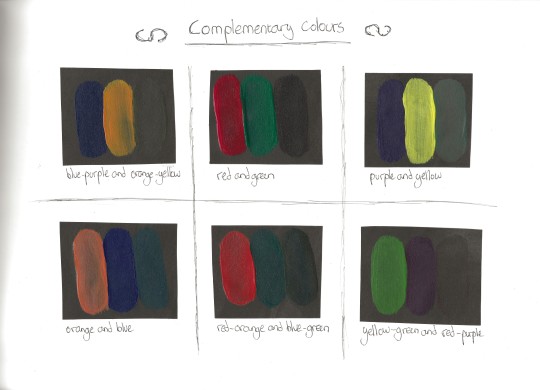
Next I considered the 12 colours from Chevreul’s colour circle and layed each colour next to its opposite or complementary and did this on my neautral grey ground.
Having them beside each other I now see that I could have added even more white to some of my colour mixes to match the darker tones to the lighter tones like my purple and yellow.
I then made mixtures of each pair of complementary colours which came out mostly as grey, brown or a murky green colour. This is another way of creating broken or tertiary colours.
Putting into words the effect that complementary colours have on each other is very difficult to do although it is easy to see. If I had to describe this I would say that complementary colours make their opposite stand out more and can bring out the intended effects of the other when used in a painting or piece of art.
1 note
·
View note
Text
Broken or tertiary colours
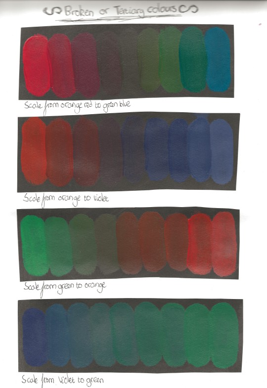
Here I have started by making a scale between an orange-red and a green-blue. Again I have made an attempt at maintaining a constant tonal value by adding some white.
At the midpoint we see a tertiary or broken colour which makes up the appearance of much of our world. In hindsight I should have added more white to my tertiary colours to get them more tonally balanced and more grey and broken.
I repeated this exercise going from orange to violet, green to orange and violet and green. You can see in each scale that the middle tone loses chroma to become broken.
Colour mixes and their effects:
Orange to red - the middle colour is quite grey and dark. This is similar to the colour of the ground or of stones.
Orange to violet - a very muddy blue is created. To me this colour comes across as quite sombre and reminds me of a rainy day.
Green to orange - The mid hue here is a murky brown. This colour is very earthy and something we often see in the outside world.
Violet to green - In the centre we see a dull and murky green. This is not disimilar to the colours of the forest and common camoflage colours.
All in all, the colours that have been made here are very evocative of the natural world and shades we often see in the rural parts of the world all around us.
1 note
·
View note
Text
Primary and secondary colour mixing
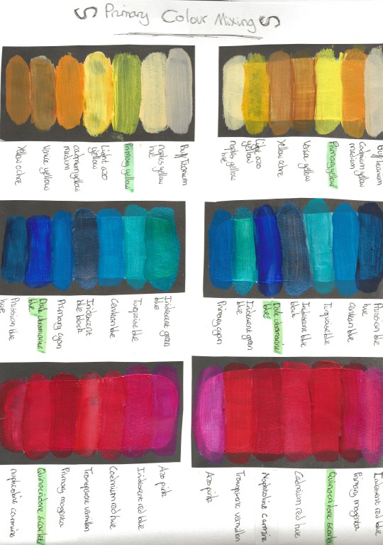
I layed out all my colours in groups of yellow blue and red, and arranged them into an order of light and dark. I then painted this scale onto my neautral grey colour and mixed them up for a second scale to show more juxtaposition beetween hues.
The most intense hues are my primary shades. They can be identified as colours that appear to have no trace of the other primaries in their hue. I have highlighted these in my work above.
Because some of my shades were quite transparent, I noticed that on the grey ground it was difficult to get each hue to show up properly so after my first experiment with yellow I painted a block of white underneath to counteract this transparency.
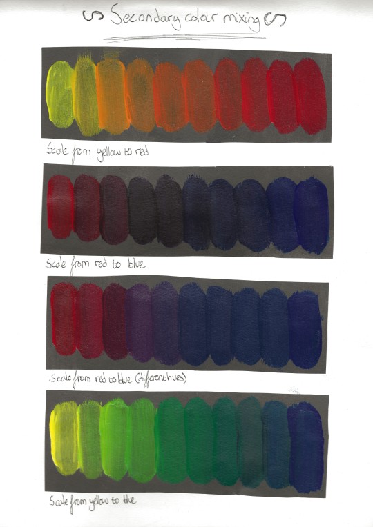
Again on a grey ground, I begun to make scales. I worked from yellow to red, red to blue and yellow to blue in a carefully graded sequence.
Midway between each primary, the secondary colours are achieved (orange, purple and green.) However a dark murky mix between blue and red is not violet. This is why I have a second scale from red to blue where I have used other hues to achieve violet.
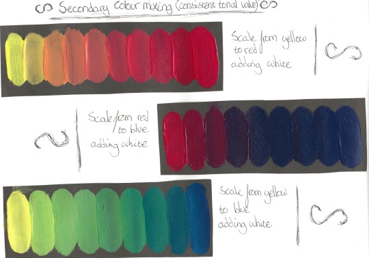
To finish this exercise I repeated my scales but this time I tried to maintain a consistent tonal value by adding a little white. You can see that within each scale, all the individual hues have the same tone as I have balanced them out with white paint.
However, you can see that tonally, the most saturated blue colour on both is different as I have matched the tone of this to the lightest colour (red/yellow). Therefore if I decided to make a scale going all the way through from yellow to red, with blue in the middle, I would have to change the amount of white paint I add to each shade to control the tones.
0 notes