An art help blog! I'll mostly be focusing on character design and theory, though I'm happy to answer any questions related to storytelling and cartoons you have! I want to help YOU create better stories and characters, whether that's through drawing or writing! Artist and webcomic illustrator since '04. Currently running Ask Techno Wizard.
Don't wanna be here? Send us removal request.
Text

zenaquaria
replied to your post
“Hey Steph! You've given me LOTS of great advice dealing with Native...”
I've been wanting to ask this kind of question so much but never got the words for it! I have a character who's half Native American (Northwestern tribe, specifics undecided) that I've always been kinda iffy about digging into his past, since I was always kinda nervous about writing a character who could end up drawing fire and negative criticism! But this helps! Thank you Neon for asking it, and thank you Steph for answering it! <3
I’m so glad I could help! If you’re going in with respect for the culture, and an awareness of the... usual roles a Native American character (and half-NA characters) are stuck in most prominently, I think you should be okay. Do your best, and try to get as much info as possible, and put in the same kind of effort you’d give a character of Scottish or Turkish or Sicilian ancestry.
Pacific Northwest though, aaaaah! The art style here has always been one of my favorites. Especially the black, white, and red color schemes.
If you’re still looking for tribes, if you give me the general area your character is from, and maybe the area their family is from if you know it, I could help you narrow down the potential tribes, if you’d like. Washington seems pretty decent about making information on the tribes available and present (as opposed to places like California which sort of likes to sweep that information under the rug).
6 notes
·
View notes
Note
Hey Steph! You've given me LOTS of great advice dealing with Native American ocs, so how about you talk about it some here~?
Hoof! Can try!
But, absolutely, I have to preface this with I am not a First Nations person. I am half Ibero-Hispanic, but this is not a culture I grew up in. I can do all of the research I can to my little heart’s desire, but the fact is that I will never be able to write a 100% authentically indigenous person. I could potentially get close! But that’s not my culture, I don’t belong to a tribe, I’m never going to know all of the ins and outs. But that said, I always try my hardest to respect the culture I am writing my character into, regardless of culture, but especially so for First Nations cultures, which already have a history of being erased, being portrayed inaccurately, and being portrayed offensively.
But in no order, here’s my tips:
Respect. First and foremost, treat these cultures with respect and understanding. Do not separate things into Us and Them, but We.
Understand that your character is not a representative of their entire culture. The burden of representation should not fall on this character’s shoulders. They are not here to serve as a tool of education. They are a person, first and foremost, who was raised within a First Nations culture. They should have their own points of view, opinions, and experiences. As with all cultures, maybe there’s parts of that culture your character agrees with. Maybe there’s parts they disagree with.
Don’t just use wikipedia. Find as many primary resources as possible--resources directly from First Nations people. Find articles written by First Nations peoples, see if the tribe has their own website, their own youtube channel, things like that. Read interviews and articles, go to First Nations periodicals.
Listen. Don’t pay lip service. Empathize and listen to what First Nations peoples have to say. Listen if someone of a tribe says “you’re doing this wrong.” Be ready to change something.
Understand that in researching different tribes, you are going to find a LOT of bogus websites. And some websites that seem legit but are written from a non-indigenous point of view. Indigenous tribes are a favorite for scammers and bullshit healers to steal from and then proclaim as their own. “Native American crystal healing cured my cancer!!!” and things like that.
Dreamcatchers are very much a heavily debated idea within many First Nations groups, especially as it has become one of the symbols of the Pan-Indian movement. Learn the history of dreamcatchers, how they have been used, and your character’s thoughts on them.
The same goes for a lot of common portrayals of Native Americans, like long hair and paint and so forth. You’re going to have a rainbow of different opinions--especially over different generations.
Don’t write what you don’t know. Really. This is incredibly important here. And understand that there may be things you will never be able to write about. Many tribes have elements that are prohibited to those not belonging to the tribe--even from other Native American tribes. And as an outsider, you will never be able to know about that or learn about it, and that’s just how things are. Respect that. Consider it much like an incredibly special, private family tradition that holds generations of importance for your family.
War bonnets are military regalia. Sacred military regalia. Having one is the same as having medals of honor. If you wouldn’t disrespect a soldier’s medals of honor, don’t disrespect the war bonnet.
You are going to need to do a LOT of research about reservations, if your character lived in one or has experience around them or people they know who live on the,. Especially there, find first-person experiences about living on them. Get ready for a lot of heart-ache.
Just buckle yourself the fuck in because you’re going to have mountains of research. Everywhere.
First Nations people are not a monolithic culture. There is no one “Native American culture.” There are 566 federally recognized tribes in the US alone. Minus federally unrecognized tribes, minus tribes of Canada and Mexico and many other countries. Every single one is unique.
Like I said, buckle the fuck in.
Just be ready to get something wrong, no matter how genuine your want is to create an accurate, sincere First Nations character. And sometimes people will get mad at you. Be ready for that, but also be ready to defend yourself--you WILL get non-indigenous peoples asking stupid questions like “why don’t they look more traditional???” and “shouldn’t they be such-and-such and this-and-that.” If you don’t think you can handle that, then don’t write a First Nations character.
Have fun? :’D But no really, it can be so much fun to find out these new things about these cultures and their histories, and if you’re big into anthropology, you will have a lot of fun breaking old ideas you had about these cultures and discovering the genuine experiences of First Nations peoples.
76 notes
·
View notes
Note
How the heck does fabric work?
Different fabrics will work in different ways! One of the most important things to keep in mind though is how heavily or lightly gravity will affect a fabric. It’ll affect all fabrics, mind, but some fabric, like tulle, may be able to hold its shape and “defy” gravity, as it were.
In general though, the most important parts of drawing cloth are understanding gather points and where cloth hangs. Gather points being places pulling on the fabric, grasping it. So for example, let’s say you hold a strip of cloth between your hands.

Your hands are where the fabric gathers, where you resist gravity.

The rest are the parts that are currently subject to gravity. It bows in the middle, where there is the least support. Kind of like a rope! You hold a rope between your two hands and let it slack, you’ll see a dip in the middle too!
The ends of the cloth aren’t being supported by anything at all, so they’re falling toward the ground.
Now comes the part of adding the folds. And how many, how large, and how complicated those folds are is the part that’s going to depend on the fabric! In general though, thicker fabric is going to have fewer folds, thinner fabric will have more.
Thick fabric, like I don’t know a canvas or something:

Thin fabric, like linen:

Notice though, that regardless of fabric, the creases are radiating out from two main points!

Look what happens when we add a third grasping point.

The material in the center, where the fabric has less slack, has smoothed out. Meanwhile new folds have appeared.

It really does operate a lot like a rope sometimes!
But there is a TON of things to talk about with fabric, and this is just sorta skimming the surface to get the basic principles down. But hope that’s kinda helpful!
9 notes
·
View notes
Photo


A quickie hair tutorial! I thought I’d show a bunch of different hair to give y’all an idea of how I go about showing different texture of hair. Mind, this is quite a lot more effort than I’d usually put into hair, but it should give you an idea of how light and texture interplay.
Tech (rough hair, naturally partly glossy)
Base color; his hair is naturally black, but the addition of white hair (what we call grey) creates the illusion of the whole of his hair being lighter.
I add a gradient since his hair is rougher, and tends to diffuse the light partially.
I took that base color to create the shadows and help define the locks of hair (the chunks you see).
Using a smaller brush, I help add tiny shadows help create a gradient effect to the shadows, a bit like making a gradient with cross-hatching.
This is where I added his li’l grey hairs, just to show that this part of his hair is a bit more salt and pepper. I didn’t leave this step for last so as to keep the grey hairs from popping too much from his hair.
Highlights! I added them where the light would be strongest. His hair is pretty rough so it diffuses the light a lot, but there’s still a little bit of shine here and there.
Pelagosa (soft, smooth, hyper-glossy hair)
Base colors; underneath is darkest, over is the middling teal. This helps to establish the foundation for the overall look we want of high contrast.
I used that darkest color from underneath to create the shadows, keeping in mind I’m going for almost a metallic look with multiple instances of shadows.
Still haven’t added any more colors! I take that middling color and add it to the center of the shadows to give the effect of reflected light.
Now we add another color! I take a lighter, more saturated teal and use a very soft airbrush to add in the highlights.
Another highlight! This time, to give the illusion of a very smooth, metallic surface, I go in with a thinner brush, and keep the line very sharp.
And here’s where I do the thing everyone tells you not to do! ‘Cause rebel princess does what she wants. I used a dodge tool and very gently went over the highlights to really make them give them a brilliant oomph.
Teabiscuits (soft, wavy, brilliant colors)
Base color: we’ll be working with two major tones in his hair, so we start off the with major, middle tone.
Shadows! I’m working with two different kinds of materials, essentially. A warm, cotton-y hair and a scarlet hair that scatters light differently than the cottony color, which tends to stay fairly monochromatic. So for the white I use a pink-y darker cream to keep the cotton-y feel, and actually a purple-ish red for the scarlet part of TB’s hair. Though, whether or not I use purples or just darker crimson often depends on the full image itself, and whether or not it’ll work with the whole color scheme (I cheat).
Lights! The grey part of TB’s hair just gets a soft pure-white color for a highlight, and it’s done for the rest of the tutorial. The scarlet part of is hair gets an orange-y color now for the highlights.
More refining! I really want a fiery feeling for his hair, so now we’ve got a little yellow in the highlights!
MORE HIGHLIGHTS. MORE YELLOW. Like with Pelagosa, I use a real sharp brush to give it a glossy feeling.
Cheater cheater pumpkin eater! Again like with Pel, I went over the highlights with just a touch of the dodge tool to really make it stand out.
Mumbles (soft, wavy/curly, voluminous, mostly diffuses the light)
Base color; darkest color his hair will be. Helps remind me not to go darker, as his hair isn’t supposed to have a lot of contrast.
Very soft highlights, a little lighter and warmer/more saturated than the base color. I’m trying to establish the form of his lumps of hair here.
More highlights, again a little lighter and more saturated. I really want a warm brown feeling to his hair.
Reflected light! I went back and grabbed that first highlight color, applying it to the undersides where backlight would be hitting.
Nothing happened here because I thought I was done!
One more set of highlight, again with a pretty soft brush. Because I decided I’m never done. I don’t want any spots of hard light to give the feeling of light being distributed pretty evenly thoughout his hair.
I hope that all was helpful! I do understand that how one shades and highlights hair is really going to depend on their style, but ultimately, your style is just about how you personally depict “reality,” as it were! There’s a lot of different ways to portray the texture and properties of Pelagosa’s hair in hard and soft shading, for example. Gotta go with what feel right to you!
11 notes
·
View notes
Note
A terrible issue faced by we artists is conveying motion and energy in a static image. Even if a character is standing still, there's methods at our disposal to make them feel more alive. Can you drop a few bars on techniques to enhance action and add energy to a scene?
Oooh, you’re talking about animating a picture! Not animating as in, giving it actual movement, but giving the illusion of life. Which is admittedly quite difficult given that motion needs time, and time is not something we have in a single 2D image. We are essentially attempting to trick our viewers into believe that time is passing in a single instance of time. Hard stuff!
But the principles of animation can actually help us there! And this is going to get very long, so I’m gonna put it under a read more. I’m gonna take some stuff directly from the wikipedia article, but frame it in regards to 2D illustration.
1. Squash and stretch
If you’re interested in animation at all, this one is the one most people can name. It’s the illusion of compression and pulling of mass within an organic object.
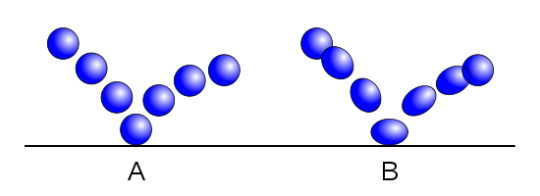
In still images, you can use squash and stretch to your advantage, to add a little more vitality to an expression or gesture. For example, look at Pinocchio here.
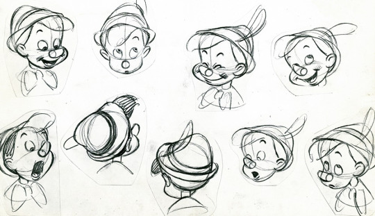
His smile in the middle there is given a little more oomph by the compression of his face, while his look of surprise on the left there is emphasized by the elongation of his face. In your own face, you an see squash and stretch at work when you make an exaggerated angry face and all of your features squish toward the middle of your face, or when you open your mouth wide and everything pulls a little.
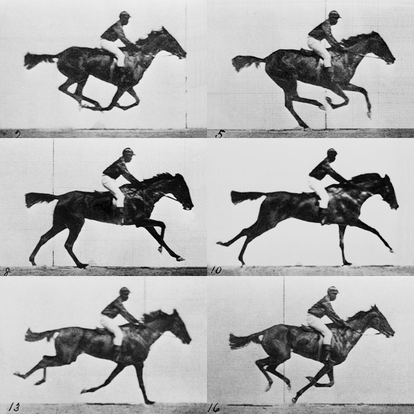
2. Antici... pation
Essentially this is preparation for a movement. For example, if you’re drawing a punch, the movement is the punch itself. But there’s an anticipatory movement of the arm drawing back and body twisting, to prepare for the primary movement of the punch itself. We can see this in the first panel of this baseball player getting ready to throw the ball.
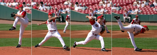
This one is a little more nuanced to use in 2D illustration, but can definitely be used to great effect. It can give a sense of potential energy within an image, of being on edge for something to happen.
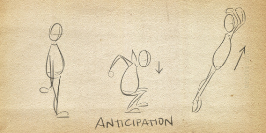
In a single image, you can also draw both the anticipatory action and primary action together, and this can also create the illusion of time, and thus, motion, happening.
3. Staging
This one can be a very subtle means of conveying animation and life in a 2D image. If you’ve ever worked theater, you know that during a scene, where you place your characters is very important. Where you place them is going to help direct the audience’s eye toward where drama is happening, or away from places you don’t want them seeing. Viewing at certain angles is going to not only look better, but allow the audience to better read the expressions on the actors. This can be done in simple things like how you position characters when they’re talking to each other, by turning them outward, slightly, rather than having them speak head-on. It’s not technically realistic, but your audience isn’t really going to pay attention, and it’s going to look better. #aesthetic.
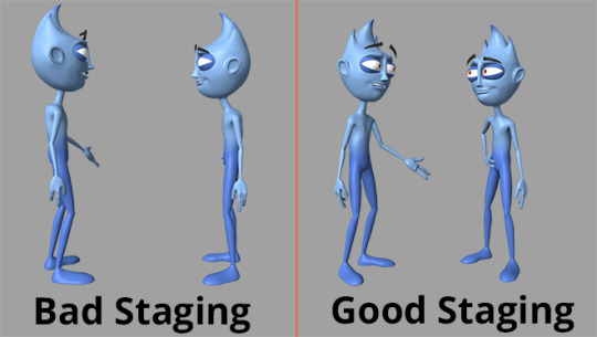
You can implement this in a single character by themselves, and their silhouette.
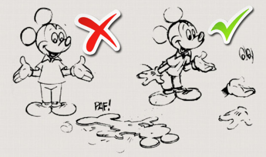
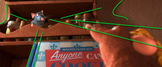
And you can do this in the composition itself, to lead the viewer’s eye toward where you want the action to be focused.
4. Straight Ahead Action vs. Pose to Pose
This one, admittedly, is a little harder to apply to 2D illustration. But it can be, if you tweak it a bit. In animation, this is referring to two different approaches to drawing a scene. Straight ahead means you go from frame 1 to frame 10, in that order. Pose to pose means you draw out the key frames, like frame 1, 3, and 7, and then draw the interval frame.
In 2D illustration, I would hearken this to drawing with guidelines, and drawing straight ahead. Drawing with guidelines, drawing the important parts first then filling in the rest, will give you consistency and help you stay on-topic for what you’re trying to do. Drawing straight ahead, such as drawing the head, then the neck, then torso, etc., is going to give the drawing a little more exaggeration and life, but it’s very easy to go off-model or make mistakes.
5. Follow Through and Overlapping Action (and mirroring)
This principle relates to giving and object the sense of obeying the laws of motion. Follow-through relates to looser parts of a character or object’s mass, that continue to move though the person or object has stopped. For example, hair, loose clothing, loose skin, will stop a little bit later than the rest of the body. A basset hound might run into the wall, and then a second later, its ears slap the wall. Follow-through is one of the BEST principles for giving a 2D image the illusion of movement. The loose elements of a character can show exactly where they just were. Even if the character isn’t moving, drawing their hair or a scarf moving around is going to very easily fool the audience into thinking the character is moving.
Overlapping action is the idea that different parts of the body have different timing. If your head is bouncing, that’ll probably have a different timing than the walk cycle. This would be starting another movement, before the first movement has terminated, continuing after it has. So, say you show a character jumping, the legs might stop, but the arms and torso continue moving for another couple of frames. So, in 2D illustration, if I’m drawing a character stopping their twirl, I can show the hair still moving and starting to slow down. Or, say I were drawing a character landing, crouching and ready to attack, I can show the hair coming down, their body station, and then their hand grabbing a dagger, ready to attack--which helps build anticipation.
And related to these two is the concept of avoiding mirroring. Symmetry in movement. For example, take a look at Pacha here:
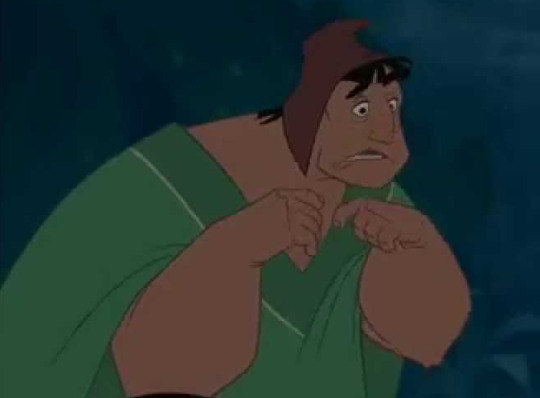
His hands are doing related actions, but not mirrored. This helps create a sense of organic life. Even if the limbs are doing the same thing, you can show minute differences, such as if you have a flying character, you can show the wings fluttering slightly differently. In expressions, you can avoid mirroring by having an expression slightly tilted or squished to one side.
(In a subversion though, mirroring can often show power in a character. Solidity, sturdiness. Inorganic-ness.)
6. Slow In and Slow Out
Again, this one’s kinda more for animation and less for 2D illustration. But can be tremendously useful in sequential art, like comics and panelling. The premise though, in animation, is devoting more time to the beginning and termination of an action, rather than the middle. There are more frames at the beginning and end of a punch, than during the middle. We can take this as emphasizing the beginning and ends of an action, rather than using the middle. Show a punch either at the beginning, or the end--rather than in the middle of the swing.
7. Arcs
Funfact: organic motion tends to move in arcs--not in straight lines! The bounce of a walk cycle follows an arc. The swing of your hand follows an arc.
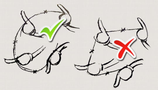
Even implementing arcs in your gestures and guidelines can help create the illusion of movement!
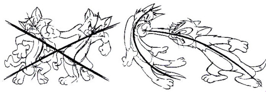
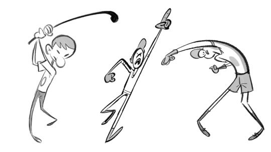
8. Secondary Action
Honestly I’d probably lump this one in with overlapping action, but try to have a secondary movement, when drawing a character. For example, having a character swinging their arms when they walk, swinging their hair, swinging a yoyo, things like that. So long as it is emphasizing the primary movement, and not drawing attention away from it.
9. Timing
Related to staging, in 2D art, how you compose an image can create a sense of time. In Western media, we read left to right. Knowing this, we can place things in certain ways in the image, so that the reader’s eyes follow a natural line that gives a sense of motion. Placing the person about to throw a baseball on the left, and then the batter on the right, then a panel following with the pitcher throwing the ball, creates the illusion of stalling. Of the camera lingering, before the pitcher throws the ball. Whereas you place the batter on the left, and the pitcher on the right, followed by a panel of the pitcher throwing the ball, this will create a different feeling of time. The first is Pitcher........ batter, throw, whereas the second is Batter.......... pitcher, throw.
You see what I mean?
10. Exaggeration
This one has a lot of subjectivity to it. Exaggeration can really help give a scene a lot of energy, Push a character from slightly falling over to heavily falling over creates a lot of dynamicism, but at the same time, can sometimes take away from a more serious tone wanted for the scene. And, of course, this can depend on the level of realism one employs in the first place. But even when drawing more realistically, don’t be afraid to push things, just a little. Sometimes knowing when and how to do that can really make things pop and grab the reader’s attention.
Personally, I try to go by Van Gogh’s philosophy: Exaggerate the essential, leave the obvious vague.
11. Solid Drawing
This is your basic know how to draw shape and form. In order to know how to animate, to bring life to an illustration, you have to be a good draughtsperson. Someone who understands the principles of drawing, of art, and how to translate 3D forms into 2D shapes. Which means doing realism studies. Sorry, no gettin’ out of that one.
12. Appeal
This is just knowing how to employee Golden Means, how to compose things in a way that is pleasing to the eye and draws the reader in. Giving characters charisma, as it were. Likability, even if they are not sympathetic. This helps engage the viewers, and get them to care about what is in the image, rather than having them skim over the image and move on. This one takes a little time to really get, but will become second nature as you go through art.
There you have it! I’d really recommend looking up various sources on the 12 Principles of Animation, as it is one of the best tools I’ve ever found for helping to give the illusion of life in a static image. c: Hope this all helped!
20 notes
·
View notes
Note
How does one properly highlight and shade hair?
That can depend a LOT on the texture and fineness of the hair itself, as well as how it’s being styled! For example with this kid:

the light is very diffuse over the hair, it’s a bit more of a gradient. There’s no spots of hard light, no catch lights. But then we have hair like this:

And there’s points of concentrated highlight. Depending on how well taken care of the hair is, you can even get metallic sort of gleams with refracted light!
So honestly, if you want to submit me a picture of someone hair that you’re looking to replicate the texture and properties of, I can show you a step-by-step of how I would go about tackling that. c:
6 notes
·
View notes
Note
I find myself having significant trouble drawing proper human proportions on the computer. Pencil and paper works just fine, but I always wind up with wonky-looking folks on my screen. I figure it'll just take practice, but do you have any tips to make it easier?
It is a lot of just practice, but it may also be how you’re working. With paper, you can see the entire paper in your field of view. On the computer, that’s a little harder. You may want to either open another window, and keep that one zoomed out enough that you can see the entire figure, or work on the general drawing down to the details later. So you zoom out, draw the general image, then zoom in and work details.
It may also be that you’re just not quite used to a tablet yet, it may be the texture of your tablet, in which case you can tape a square of paper to your tablet to simulate the feeling and texture of paper. c: It’ll wear your nibs a li’l faster, but I found it very helpful back when I used a regular tablet.
As far as just getting proportions down in general, I have two tips for you: the first is to learn the proportions in terms of “how many heads.” Learning where points of the body are in a six to eight heads tall character. Like this!

You can see nips hit about the second line, belly button at the third, groin at the fourth, knees at the sixth, etc..
The second tip I have is actually this anatomy game called Poke-a-Muscle! Every so often I will go in and play it for a few hours, and I will almost instantly notice significant improvement in my ability to draw bodies, because I can remember where muscle masses are that define the body.
17 notes
·
View notes
Text
Questions are open!
Anything is game! Digital art techniques, expression work, lineart, form, theme, etc!
2 notes
·
View notes
Note
A lot of character designs I've seen incorporate morality shorthand in things like color scheme and silhouette construction, so there are hard visual cues that point to who the 'good guys' and 'bad guys' are. Could you rap a bit on this topic, for both utilizing and subverting it?
Absolutely. Thank you so much for this, it’s a fantastic question, Red.
What Red is referring to are artistic choices in designs so as to delineate the protagonists and antagonists from each other, and you see this a lot in kids media, but also in things like the old-style cowboy movies, where the good cowboy and bad cowboy will, quite literally, wear white and black hats, so that you instantly know who is the good guy and who is the bad--as Western media commonly associates white with goodness and purity, and black with darkness and evil. You even see this in Samurai Jack.

Jack is basically shades of white, and Aku is black with touches of red and green. Red being an aggressive color, and green often associated with poison. Going into silhouettes, Jack is very human-like, and made of simple shapes like solid boxes and rectangles, which are commonly associated with traits like, well, solidness, with strength and sturdiness. Aku, meanwhile, is pointed and horned and twisting, his silhouette hearkens to demons and slithering things like snakes and dragons.
And at first this seems simplistic, and it is. But there is a reason for this. Ultimately, the entire series comes back to these two entities, who are embodiments of two forces completely opposing each other. There are absolutely other colors of the spectrum thrown in between the two. We see almost every shade of morality in the secondary characters. But at the end, everything comes back to these two forces of light and dark, selflessness and selfishness, constantly battling each other.
They also did something quite clever with this very obvious dichotomy, and that is they set up certain expectations, which, in a number of episodes, they turned these expectations on their head. Suddenly they throw this character at you:
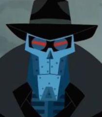
This is a character of like pure angles, of black, red, blue, evil colors. Based on the dichotomy the show presents, he’s not supposed to be good. And he wasn’t. He did a lot of bad things, but learned how to love, and tried to leave that life behind. And this, ultimately, perhaps, caused his demise. Aku took advantage of him to force him back into that life he wanted to leave behind. He was forced to operate in the greyer parts of the morality spectrum, trying to kill Jack, in order to save the person he fell in love with. And ultimately, could not escape.
And of course, they do the opposite, in which they give you these sirens of nothing but white and pastel and curvy soft silhouettes:

Who totally try to kill Jack. Because they’re hungry.
To really take advantage of these, not only to invoke but to subvert, a broad knowledge of cultural association between shape and color with morality is very important. Kids media is one of the best places to really see that in simple terms, while more adult media can give you the in-between shades. You can start though, in Western media, with this helpful cheatsheat:
Good
Colors: White, pastels, daylight, gold, spring, summer
Shapes: Circles, squares
Bad
Colors: Black, red, green, purple, night, fall, winter
Shapes: Triangles, sharp points
Even just a very very basic rundown like this can take you very far in character design. Do note though that these associations will not be the same in Eastern media, and sticking to things like “white = good” and “black = bad” can create some problematic ideas. Try to subvert them where possible.
7 notes
·
View notes