
Statistics
We looked inside some of the posts by knnnhen503 and here's what we found interesting.
Average Info
Notes Per Post
1
Likes Per Post
1
Reblog Per Post
0
Reply Per Post
0
Time Between Posts
4 days
Number of Posts By Type
Text
16
Photo
1
Last Seen Tumblr Blogs


Fun Fact
Premium Tumblr themes are available from anywhere between $9 to $49.
Text
Test Printing
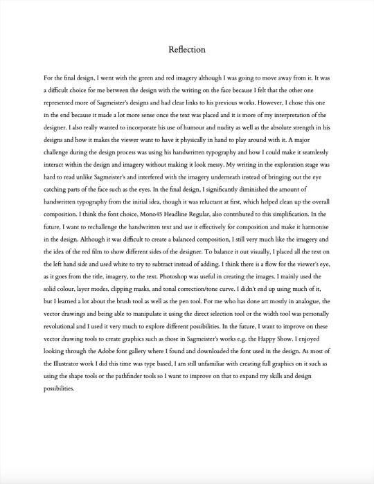
First I did a black and white test print. I was surprised at how the design looked way blander when it was black and white as colour is such a crucial part of this particular design. As I did the body copy matrix, the body text was fine and legible. I checked the sizing of the headings and the formatting, I then did a colour test print to see if the colours work. After this, I realised that the black body text actually stood out more than it should, which I never really thought about before so changed the body text colour to green or red. This helped to make the text feel a lot more of a part of the layout instead of just information.


1 note
·
View note
Text
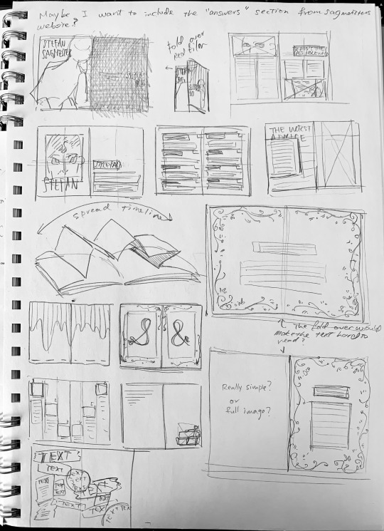
Publication Draft Process
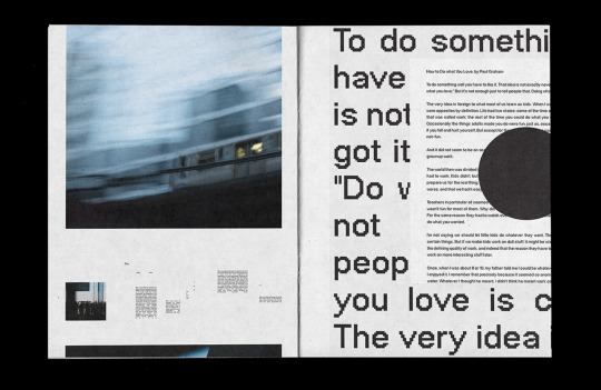
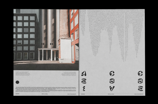
In order to keep the consistency of the page numbers and the body text size as suggested, I used the parent page. As I didn’t want the composition to look too formal, I kept the grid and parent page very simple to enable flexibility.
Converting the timeline horizontally was challenging as the image I was dealing with was quite complex and strong, while the text was simple. I tried a few compositions from the ideation sketch, then looked back at the past posts on Tumblr to find the yellow and blue image. I took this idea, overlaying the same image like so got too complex and destroyed it thus gradient fade.
With the pen tool I created a clear shape to use text wrapping on the figure to make it interact. Here, used the body text paragraph style but instead changed the font as I felt that the Baskerville font diminished the overall appearance of the timeline.
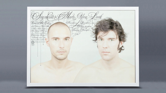
As I was unable to find high-resolution images of the designer’s works, I recreated the Made You Look book cover myself using photoshop.
Examples of how the text box has the same width.
I was a bit unsure of how I should deal with the context section as this page already has a visual flow and I didn’t want it to interrupt. In the end I just used headline/paragraph styles.
I put this page here as a break, a breathing space. As all the other pages are fairly complex, I kept this page extremely simple for balance.
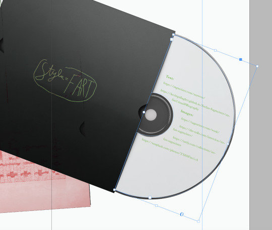
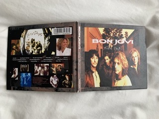
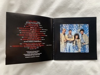
To finalise the publication, I downloaded a free CD mockup where I did simple covers and put them all together. For the references text box, I created a frame using the pen tool and adjusted the text formatting through the properties panel. Again, I used paragraph styles for consistency.
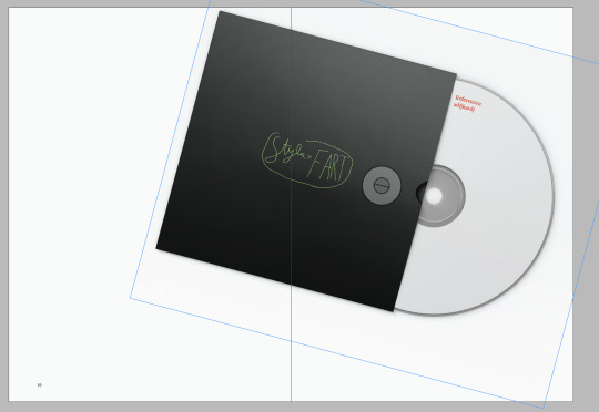
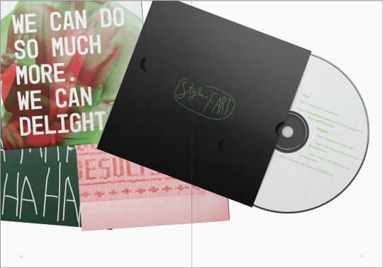
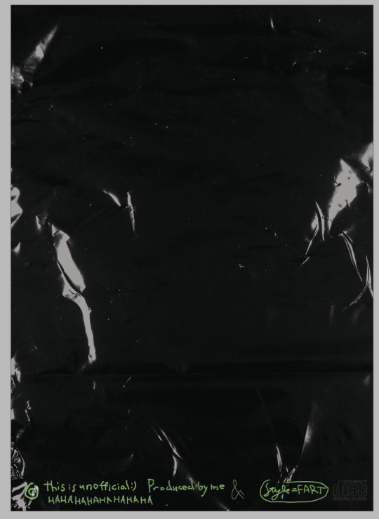
For the back cover, from what I studied through old CDs is that they tend to have some kind of logo, a copyright sign, a producer or composer, and some more information on the copyright. I did this using the brush tool and really sloppy writing with the mouse pad on my computer. I think it has a nice casual feel reflecting Sagmeister’s writing. Finally, I placed the plastic texture to match the front cover.
0 notes
Text
Publication Draft Process
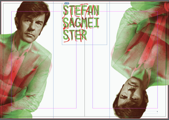
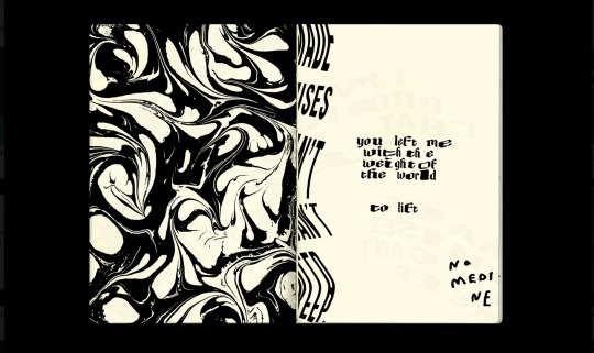
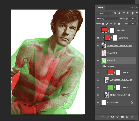
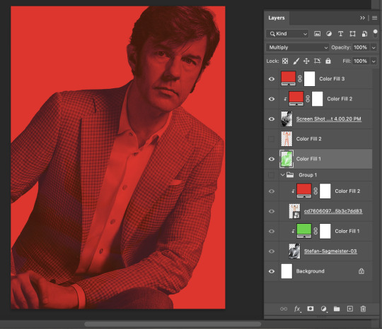
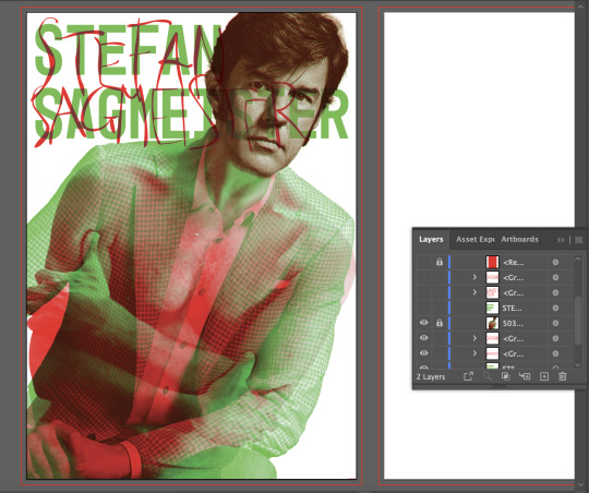
I made the asset created previously into a red and green overlaying image instead to make it flow better and have a consistent colour palette. Alongside this, I changed the hand-written text colour to a dark green because it visually wasn’t fit and it unnaturally stood out.
Here is an attempt of trying to create some image assets that could be incorporated into the publication. Because the timeline image stands out and it is a red and green image, I thought I should edit other images likewise for consistency. Sagmeister’s works have a wide range of styles and I struggled to find a way to make it flow so I aimed to overcome that by making the colours consistent. However, I’m not sure if I could use this because while placed in the composition it looks eye catching, the image resolution is not high enough.
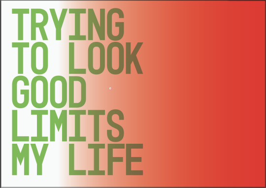
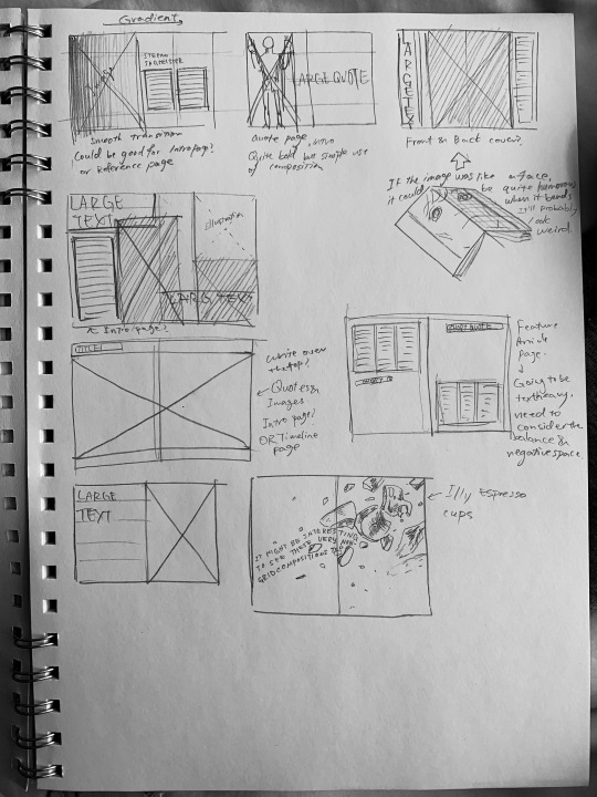
In the sketches, I had an idea of using gradients and text like the 4th image as Sagmeister tends to have an interesting use of typography and I wanted to try experimenting. I did this via illustrator by creating the gradient, text and editing the tracking, and creating an outline to use the pathfinder tool to divide the shapes. I was unsure of how it was a lot more visually subtle compared to what I had in mind. Then I tried making the 5th image by also editing the tracking as well as the leading. I like how this one has a more in-the-face kind of effect and really stands out which was something I was aiming towards.
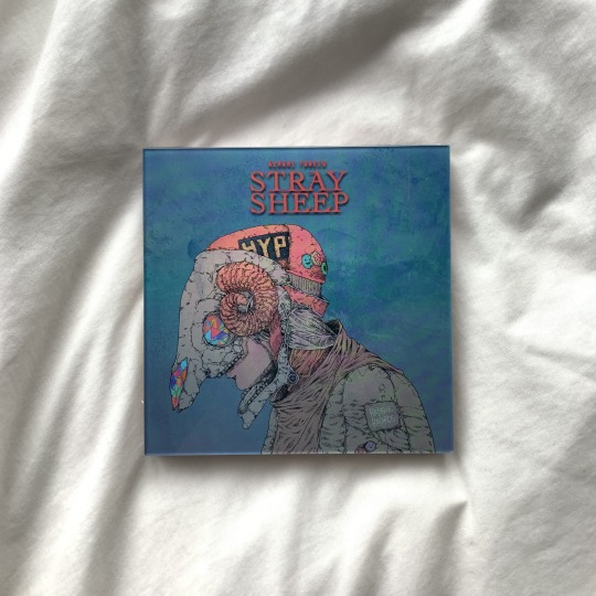
For the cover design, I wanted to emphasize the idea of CDs so I used a plastic texture over it as well as using aggressively big typography. I think it still needs editing to make it look even more like a CD.
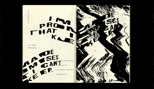
In class I did a body copy matrix. I was surprised at how 9 point text was a lot more visible on printed paper than on screen. The lecturers also said that the line length also has a strong relation to the text size, tracking, and the leading for its overall readability. I tried printing a Baskerville font and a Bodoni 73 front with different settings of point size, kerning, and leading and decided upon using the most suitable Baskerville 9 point text with 14 point leading and 20 tracking.
I got feedback on this particular page that has a dynamic composition and I struggled to use the grid. The feedback was that the text could be kept consistent not just by the paragraph styles but by using the grid and using the same width on the grid. They mentioned museums and the art descriptions that are there which really clicked in my head.
0 notes
Photo
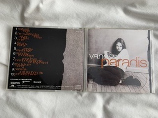
These are just a few of the many old CDs my father sent me once. It is all around the same time Sagmeitster created album covers for musicians so I thought it might be useful for research. I was surprised at how there was a lot more handwritten typography than thought. I also noticed that although the covers are unique and interesting, the lyrics sheet(the inside of the booklet in the front part of the disk frame) tends to be very simple and plain compared to the recent CDs I own. My guess is that with the change in music culture and how there are significantly fewer people actually buying CDs nowadays that designers have to create designs that really make the viewer want to have the product in hand.
What if I made the publication look like an album?
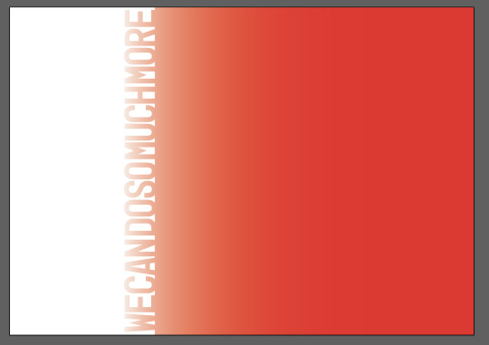
Continuing with the timeline my colour palette will be red and green desaturated just a bit to make it harmonise, and I chose a base colour that is slightly grey so it doesn’t have a screaming white tone. I noticed that Sagmeister’s works have a bit greyish background colour too although it is not directly obvious due to other bold colours.
0 notes
Text
Assets
Few more assets.
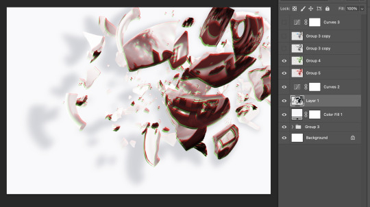
I tried making some imagery to work with one of the idea sketches from publication research by combining a few and adding a drop shadow to create reality. I tinted the shadow slightly blue to make it more natural. I’m not sure about how it looks though. It still looks quite fake, I think if I edit some pieces and create more shadows and highlights it might look better. I could even change the colour of the image like glitchy red and green to fit with the timeline, or go black and white?
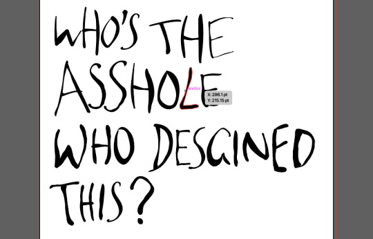
I also made some more vector hand-writing text. This time though, I used the brush tool, created an outline path, and then used either the direct selection tool or the warp tool to manipulate the letters. I found the warp tool really useful as I could just copy and paste the older letters and manipulate it a bit. I didn’t want to just copy and paste it because it would look more like a font not handwriting.
0 notes
Text
Punk
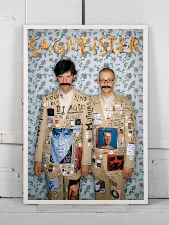
A friend mentioned that Sagmeister’s works have a very punk feel. From the Graphic Means documentary, I learned that a large part of the punk design was from the development of design components that were made available to people who didn’t have professional degrees or experience as a designer who used them for personal use or other that was not accepted in a design company. My notes while watching goes: Letraset allowed access to fonts for a huge number of people that were not familiar with design or typography. It democratised type and design. Black Panther magazine or queer publishings that had issues with access to professional printing used this equipment. This collage type of design allowed kerning, unlike hot-metal printing.
Sagmeister’s designs also often have a hand-done, DIY, collage type of style, and he worked for a lot of musicians of the era which makes total sense.
There was a study on punk album covers and typography on Behance.
https://www.behance.net/gallery/13880209/A-Study-Album-Cover-Typography-Artwork-1970s
Compare that to Sagmeister’s earlier works...


0 notes
Text
Content
Intro refinement:
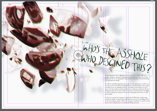
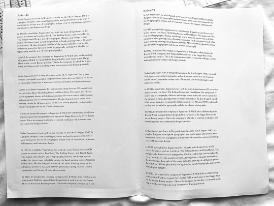
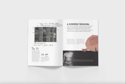
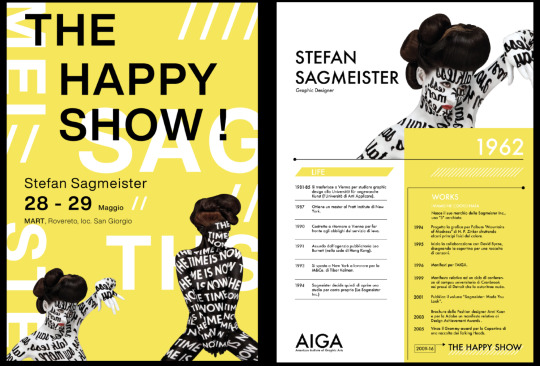
Stefan Sagmeister, born in Brendz Austria on the 6th of August 1962, is a graphic designer, conceptual typographer and performance artist who is most famous for the use of typography, unique style of somewhat controversial imagery, and humorous design.
In 1993 he establishes Sagmeister Inc. with the main design focus on CD covers for artists such as Lou Reed, The Rolling Stones, and David Byrne. The unique and effective use of typography, illusion, and design system makes the viewer want to feel the product in hand, gaining some a Grammy nomination. He also designed outside of the music industry, creating the all famous poster for AIGA in 1999 by physically cutting into his skin for typography and the use of nude photography.
In 2012, he renames his company to Sagmeister & Walsh after collaborating with Jessica Walsh to expand their design field in such ways as the Happy Show or the recent Beauty project. This is the company in which he is currently working as well as making some non-commercial designs privately.
Interviews/Articles: (This is an extract of the various information in the Answers section of Sagmeister’s website but I may exclude some depending on the final design.)
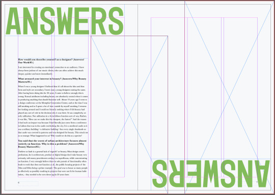
How would you describe yourself as a designer? (Answers/Our Work/05.)
I am interested in creating an emotional connection to an audience. I have always been jealous of our music clients, who can often achieve this much deeper, quicker and more immediately.
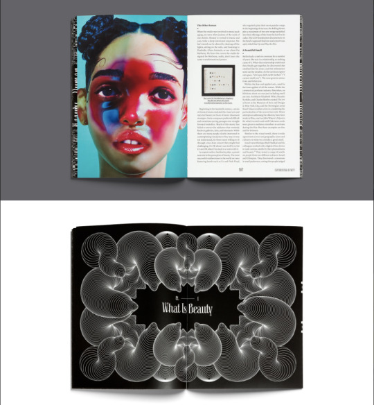
What aroused your interest in beauty? (Answers/Why Beauty Matters/01.)
When I was a young designer I believed that it's all about the idea and that form and style are secondary. I meet many young designers stating the same. After having been doing this for 30 years, I came to believe strongly this is wrong. Formal attributes including beauty are absolutely central when it comes to producing anything that should function well. About 10 years ago I went to a design conference at the Memphis Convention Center, and at the time I was still smoking and so I spent a lot of time outside by myself smoking. I remember looking around and I could see literally nothing where I felt beauty had played any sort of role in the decision why it was there. It was completely, utterly utilitarian. Not utilitarian in a form follows function sort of way. Rather, it was like, “How can we make this the cheapest, the fastest?” And the reason it had such an impact was because I had literally just come from a conference in Lisbon that was in the castle overlooking the city. It is a medieval castle so it was a military building—a defensive building—but every single doorknob on that castle was covered in patterns and was designed for beauty. This struck me as so strange: What happened to us? Why would we do this as a species?
You said that the worst of urban architecture focuses almost entirely on function. Why is this a problem? (Answers/Why Beauty Matters/02.)
I believe at fault is a general lack of regard for beauty. Most design centric professions, be it architecture, product or digital design don’t take beauty very seriously, with many practitioners seeing it as superfluous, while concentrating on function. I very strongly believe that the sole pursuit of functionality often leads to work that does not function at all, the public housing projects of the 50ies and 60ies being a prime example: The goal was to house as many people as effectively as possibly resulting in projects that were not fit for human habitation, - they needed to be torn down again 20 years later.
Does beauty play a role in preservation and sustainability? (Answers/Why Beauty Matters/04.)
Beauty is a fantastic strategy when it comes to sustainability. Just look at the Pantheon in Rome, 2000 years old and it is still there, in use, because it is so incredibly gorgeous that no generation had the heart to tear it down. The same is true for a beautiful leather bag I have received as a gift 25 years ago. I'd rather have it repaired than purchase a new one.
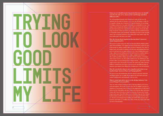
Some say art should remain impractical because art should exist for the sake of it. (Answers/Art and Design and their differences/01.)
Yes, as Donald Judd famously said: Design has to work, art does not. He separates the two neatly by function. At the very core, all design, in order for it to qualify as design, has to function. If it does not function, it is not design. If I design a chair, one of my goals will be that it is comfortable to sit on. I can design a chair and push the design so hard, until I cant sit on it anymore. But then the chair ceases to be a chair and becomes a sculpture. Art on the other hand, can just be. It does not need to do anything. And the wonderful romantic Theophile Gautier even postulated: "Something can only be truly beautiful when it has no function whatsoever. Everything that's truly useful is ugly. The most useful room is the house is the toilet".
Why did you choose to stray away from commercial projects? (Answers/Art and Design and their differences/05.)
I am still convinced that working on commercial projects is important, after all, they influence the way the world looks (and what children see when they grow up) more than most other areas of art and design. I also think that it is important for people who deeply care about the quality of their work to be part of this field. I myself have created many, many of these projects, and am more excited by things I have not tried out yet. My old mentor Tibor Kalman used to say one should only do every project twice: The first time you dont know what you’re doing, the second time you do, the third time would be boring. I plan to dedicate myself to the creation of low functioning design. In some way this is a continuation of the low functionality work we did with the album covers, the very low functionality work we did with the series 'Things I’ve Learned in my Life so far' with the goal to lower functionality even more.
How do you go about inspiration/having ideas? (Answers/About Inspiration/01.)
The process I've been using most often has been described by Maltese philosopher Edward DeBono, who suggests starting to think about an idea for a particular project by taking a random object as point of departure. Say, I have to design a pen, and instead of looking at all other pens and thinking about how pens are used and who my target audience is etc., I start thinking about pens using.....(this is me now looking around the hotel room for a random object)....bed spreads. Ok, hotel bedspreads are...sticky....contain many bacteria...., ahh, would be possible to design a pen that is thermo sensitive, so it changes colors where I touch it, yes, that could actually be nice: An all black pen, that becomes yellow on the touching points of fingers/hands...., not so bad, considering it took me all of 30 seconds. Of course, the reason this works is because DeBono's method forces the brain to start out at new and different points of departure, preventing it from falling into a familiar grove it has formed before.
How do you fight boredom in your work and is it really the greatest designer's challenge as you once said – not to get bored? (Answers/About Inspiration/05.)
Milton Glaser once told me that his proudest achievement in over 50 years of being a designer is that he is still interested and feels engaged. I myself find that sabbaticals to be the best cure.
Who inspired you when you were developing your practices as a student, and who inspires you today? (Answers/Advice for students/02.)
As an art student I was completely taken by a book about Storm Thorgerson and the work he did for Hignosis, the British design company that created all the album covers for Led Zeppelin, Pink Floyd and many others. They developed the most unusual ideas and employed impeccable craft to execute flawlessly. Right now I'm very much looking forward to the James Turrell show opening at the Guggenheim here in NYC, his exhibit at the MAK in Vienna was one of the most influential shows I had ever seen. Today I was inspired by an Ann Hamilton interview, where she was asked about creativity, and she mentioned that this is not a term she wants to talk about, that flexibility is something that is much more interesting.
How do you decide when to use a typeface and when to use handwriting? (Answers/Type and Typography/03.)
Of course we go with handwriting when the content is personal, emotional and deeply human, but we might also go against that and express personal content in deliberately cold typography. And vice versa.
What is some bad advice given in the design industry? (Answers/Things I’ve Learned/03.)
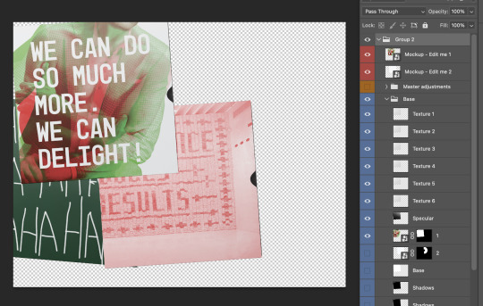
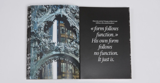
That our work is all about solving problems. Solving problems is for accountants and engineers. We can do so much more. We can delight! I can have an experience of true beauty (one of real awe at the gorgeousness of it all) when I look at the New York skyline and when I look at the Austrian Alps, both places I know well: I have lived close to either for more then 20 years each. Considering it took nature about 200 million years to build the Alps, but New Yorkers built the skyline in 200 years, I am somehow more impressed with New Yorkers. The form of the Empire State building does NOT follow function, but it functions much better as a building than all the 1970ies skyscrapers built under the term of functionalism.
Source:
https://sagmeister.com/
https://www.instagram.com/stefansagmeister/?hl=en
https://sagmeisterwalsh.com/
https://kevingallagher.github.io/Stefan-Sagmeister/stefan3.html#Biography
https://www.famousgraphicdesigners.org/stefan-sagmeister
https://the-talks.com/interview/stefan-sagmeister/
0 notes
Text
Bespoke Publication Online Research
Next, I went and researched some publications online.
https://www.behance.net/gallery/106116121/ZINE?tracking_source=search_projects%7Cbespoke%20publication
I thought the text was used very interestingly in this design. Using large text and putting a small box of text over it would allow a lot of font exploration. Sagmeister uses interesting fonts and typefaces, it would be cool to see how it would look using decorative fonts used by Sagmeister and more simple minimal fonts. Sagmeister’s design nowadays tends to be more minimalistic and elegant so I think I should try exploring these minimal designs too.
https://www.behance.net/gallery/76518347/Secret-Society-Zine?tracking_source=search_projects%7Cbespoke%20publication
This one has really experimental text, grid, and texture usage. There was some handwritten text which to me was useful as I struggled with using handwriting in the design of the timeline.
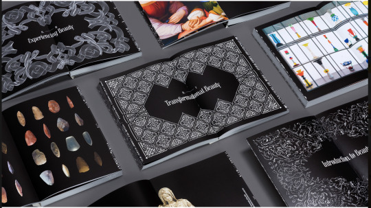
https://www.behance.net/gallery/83623981/Beauty-Book
This is the Beauty book by Sagmeister & Walsh. There were elegant framing work and fonts. They typically used linear grids and bold use of solid colours or imagery which made the information easy to process. The black and white base was also effective in tying together the fundamental style of the book as the images were very different in colour compared to one another.

0 notes
Text
Bespoke Publication Research
First, I went around looking through what I personally had. Below are a few pages out of an album by a Japanese artist I like. It was interesting to see how there were contrasting grids and colours all throughout but it makes sense considering the concept and feel of the music and each song. Some were using simple linear columns whereas some used compound grids, the cover is a solid plastic(?) thing that has a rich mystic feel. Some have bold use of type and overlapping imagery whereas some only consist of text or small imagery over a solid colour base. I think it overall establishes the feel of the album through the contrasting rhythm and flow of the design.


Next is a UK interior brand booklet. It focuses on traditional craftsmanships and the style of European interior design. As it is a catalogue, it used mainly a single column grid to focus on the imagery. It also caught my attention how there were small details like the foil press printing thing(?) of the brand name on the cover, the semi-transparent page at the beginning and the end of the catalogue, or the paper texture had a very luxurious and authentic feel.


The last is an art book of a movie called Tekkonkinkreet. Again, since this is designed to create focus on the imagery, and also because the context of the image is complex, the composition and layout were kept simple. I thought it organises the information neatly considering the amount of information.


Then, I reflected on some of these compositions for the 12-page publication ideas. I think the first album design was especially useful as it slightly had relation to Sagmeister’s designs, how it tends to be quite busy and chaotic and focuses on rhythm. I didn’t really have in mind ideas about using a gradient on imagery or placing images right in the middle of the fold, so I think this is really helpful to expand possibilities. I also like the bottom one where it has the Illy Espresso cup designs Sagmeister did, using it as a texture and using unruled text weaving through.
0 notes
Text
Formative Reflection
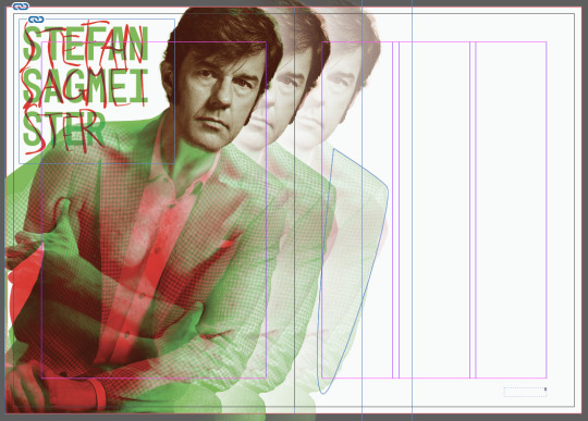
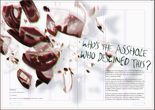
Following the formative critique, I changed a few things in the timeline design. Firstly, I edited the image to fit the bleed marks. For this, I used Photoshop to add to the ends of Sagmeister’s body. I also changed the letter spacing for the body text as it was too condensed and hard to read. I haven’t done it yet, but I could even consider changing the font on the body text. I was concerned that it might get too cluttered if I use so many fonts as the handwritten text is weighty.
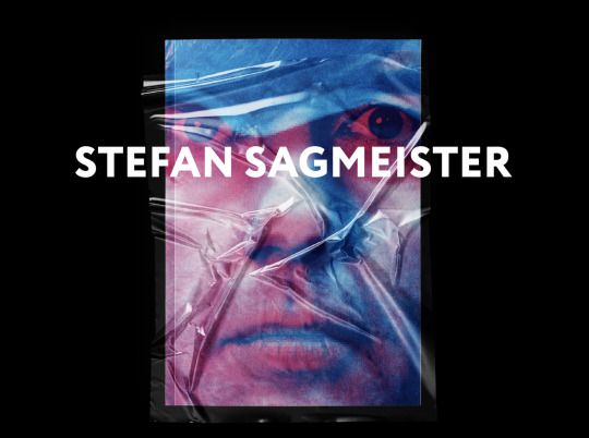
I was also critiqued on the image quality. I wasn’t able to find a high resolution image of Sagmeister and this was the best I could do, but maybe I should try making it smaller and working around the image resolution.
0 notes
Text
Timeline: Finalising
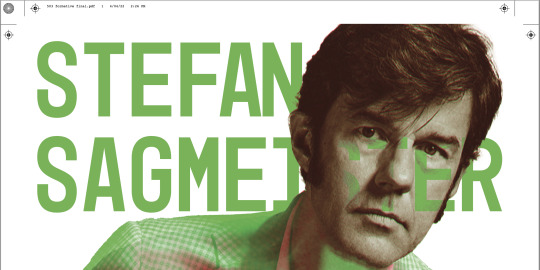
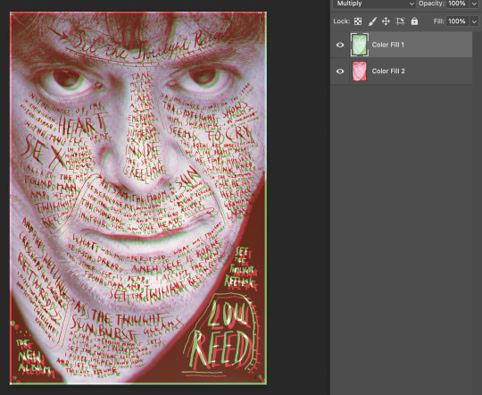
I tried exporting the poster in PDF with the specified settings. However, when I did, it changed the look of the Multiply text layer and it looked really bad on the face. I asked for some more feedback from my lecturers and they said the handwritten text is good so I tried re-applying the text as well as removing the text from the face to see if it changes the exported file.
This made the exported version look a lot better. I also slightly adjusted each individual letter of the handwritten text to make it cleaner and hopefully synchronise more with the font.
If I had more time with the amount of knowledge of the softwares or exportations etc as I do now, I would like to approach the design in the exploration stage with a wider view of styles or opportunities regarding Sagmeister’s works. I definitely feel a lot more confident with Adobe softwares and I think I can work with it more fluently now so I want to try more styles and techniques.
0 notes
Text
Timeline: Exploration
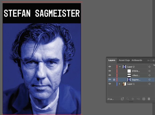
I was stuck so I got some feedback and was told that the previous design I was developing had too much. The ideas were solid but visually they didn’t represent Sagmeister’s works or work well overall compositionally. I was also critiqued that although Sagmeister does various different styles or works, I should focus on the more iconic things like handwritten text or writing on bodies with simple compositions to select out the best bits. Thus, I revisited Sagmeister’s works to see what kinds of composition he uses and noticed a lot of his works are centre oriented. The main subject matter was often right in the centre of the page so, taking from the side note blue face thing I did earlier, I laid out images of Sagmeister’s face and considered approaches.
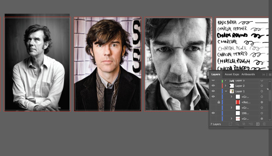
Unfortunately, the resolution of the imagery was not as high as I wanted it to be. The blue one below was still a bit blurry but I tweaked it a bit on Photoshop to try and make it look purposefully grainy like some of his older album cover works.
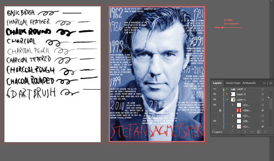
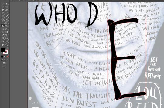
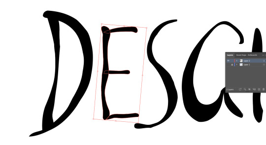
To do the handwritten text, I tried out different brushes. I was considering the Charcoal Rounded brush at first for its texture but I thought the pen pressure is vital to link to Sagmeister’s unique handwriting so I chose the 6D Art Brush. The one above was my experimental attempt at mixing handwriting and fonts, and instead of writing on the face I tried writing everywhere but the face. However, it looks aimpless and messy so I don’t think I will use this one.
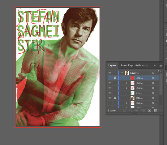
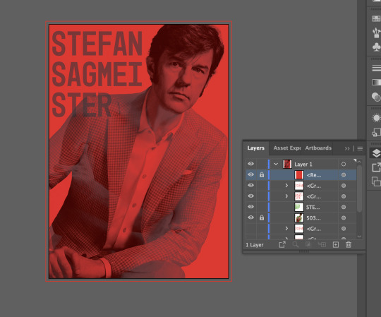
I also tried writing over his face like the Lou Reed album cover. I focused on recreating and mimicking Sagmeister’s handwriting. The face ended up being very concentrated so I left the background blank. For the red and green image, instead of handwriting on his body like the initial idea, I used Mono45 Headline Regular font inspired by the Happy Show to try and make it more simple compared to the other complex subject. By removing the handwritten red text I aimed to simplify the amount of visual information the viewer sees.
0 notes
Text
Timeline: Imagery
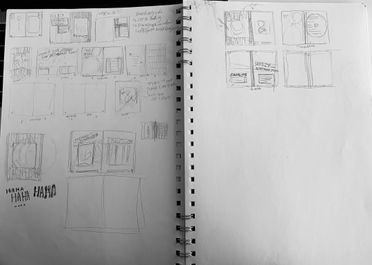
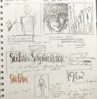
Here are the collection of sketches done so far. My starting point and keywords were human figures, handwriting, overlaying, and one or two bold colours.
Reflecting on all the research of example timelines or Dadaism, I decided that Sagmeister’s uniqueness is in his rule-breaking freedom. Therefore, I tried to keep my mind open and not be restricted within my research while also keeping the knowledge I gained in mind.
I was thinking how I could represent his designer life, or his change in perspective about design through the timeline. I decided that I will use the film overlapping technique of Sagmeister to show two different sides or stages of him as a designer. I would like to show his formal beauty oriented side and the juxtaposing controversial and humorous side of him.


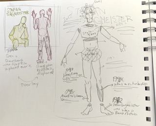
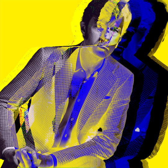
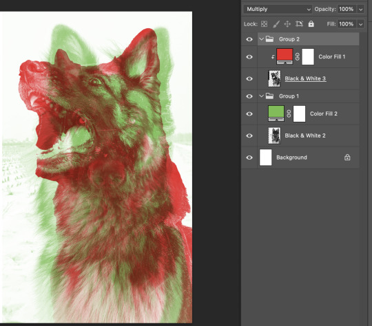
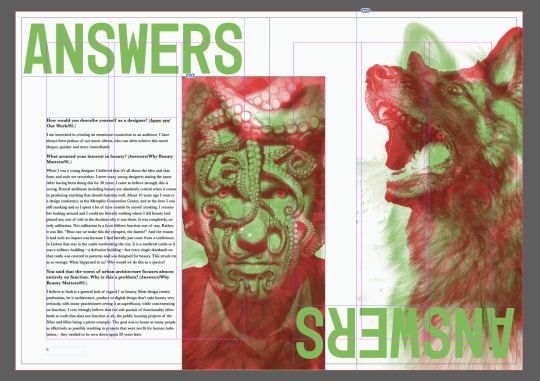
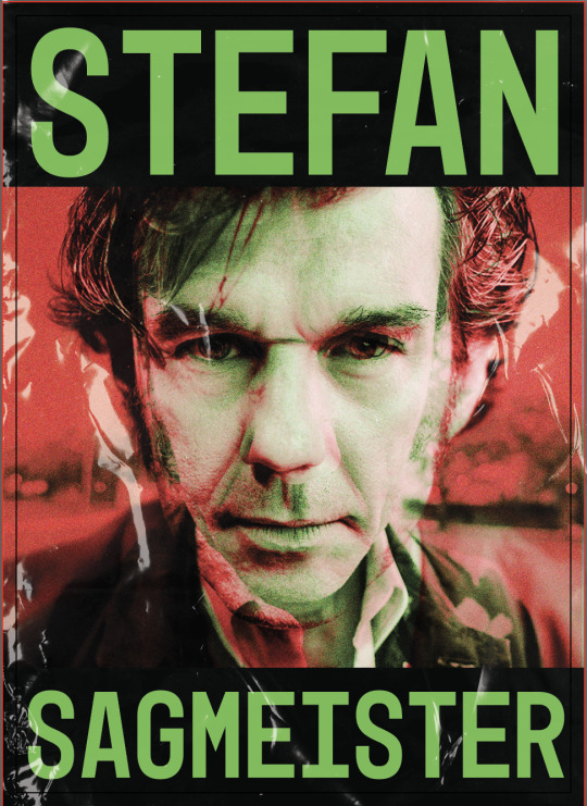
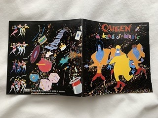
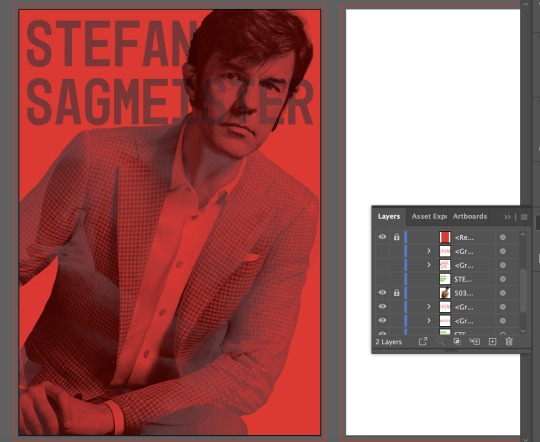
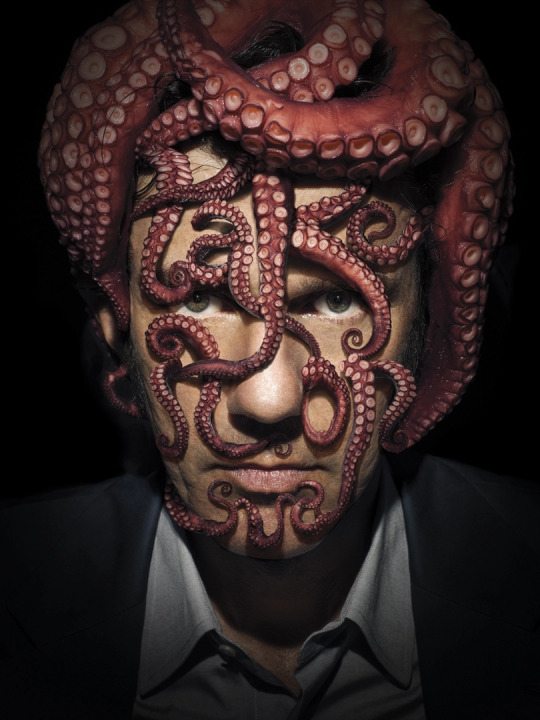
Later I finalised on the idea of using bold red and green as I found the album cover of the angry man's face and the Made You Look book design with the German Sheppard particularly stuck to mind.
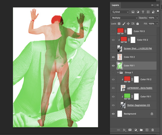
In Photoshop I edited the pictures so that the formal looking one is green and the nude one is red. As shown above, when I turn on the ‘darken’ layer of solid red colour, it disguises the nude photo. My original plan in the sketch was to use the image of Sagmeister standing as the red layer, but when I actually did it in Photoshop it looked random and unbalanced so I decided against this. I like the playfulness of peeking the nudity and messy text through the film.
I then took this to illustrator to add the typography in. Like the image, I used darken or multiply layers for the text so that it disappears when the darken red solid colour(would be a red film in real life setting) is placed over it. To be honest it does look a bit messy, though I was going for a messy untidy look. It’s hard trying to find the balance between purposeful untidiness and just a mess.
Just another quick thing I did, I would add handwritten text on his face, which would be the obvious thing to do. I was thinking more of album covers for this one, really evident links to the Lou Reed cover.
0 notes
Text
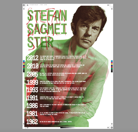
Finalised Dates & Text
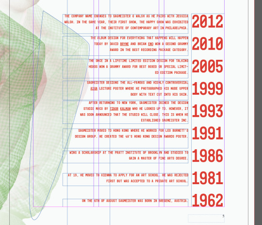
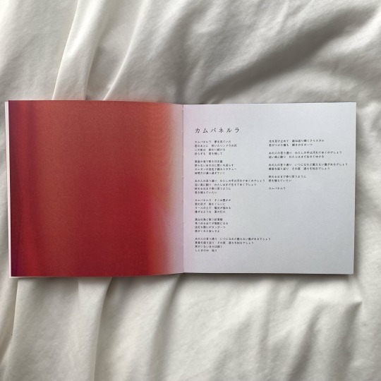
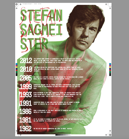
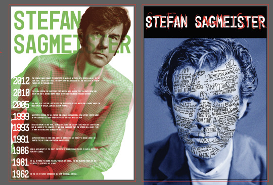
1962 - On the 6th of August Sagmeister was born in Bregenz, Austria.
1981 - At 19, he moved to Vienna to apply for an art school. He was rejected first but was accepted to a private art school.
1986 - Wins a scholarship at the Pratt Institute of Brooklyn and studied to gain a Master of Fine Arts degree.
1991 - Sagmeister moved to Hong Kong where he worked for Leo Burnett's design group. He created the 4A’s Hong Kong Design Awards poster.
1993 - After returning to New York, Sagmeister joined the design studio M&Co by Tibor Kalman who he looked up to. However, it was soon announced that the studio will close. This is when he established Sagmeister Inc.
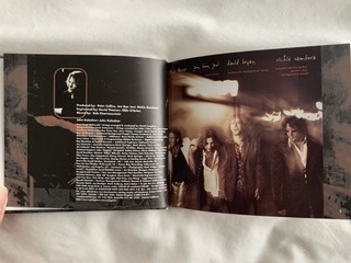
1993-2012 - Designs mainly album covers for artists such as H.P. Zinker, David Bryne(1997), Lou Reed(1996), and The Rolling Stones(1997).
1999 - Sagmeister designs the all-famous and highly controversial AIGA lecture poster where he photographed his nude upper body with text cut into his skin.
2005 - The Once in a Lifetime limited edition design for Talking Heads won a Grammy Award for Best boxed or Special Limited Edition Package.
2010 - The album design for Everything That Happens Will Happen Today by David Bryne and Brian Eno won a second Grammy award in the Best Recording Package category.
2012 - The company name changes to Sagmeister & Walsh as he pairs with Jessica Walsh. In the same year, their first show, The Happy Show was exhibited at the Institute of Contemporary Art in Philadelphia.
0 notes
Text
Timeline: Visual Research
1. I thought this was really interesting in its clever and original use of line and shape. It’s powerful how you can clearly tell what it is about at first glance. The different line weights outline the overall shape while not interrupting the logos. Some of the lines seem a bit random though?
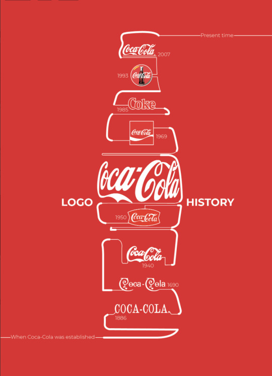
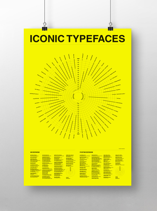
2. This design caught my eye of how it is packed with information but is balanced and clean, it’s not overwhelming considering the amount of text there is. I also liked the circle timeline as well as the colour use that adds character(reminds me of the Happy Show too).
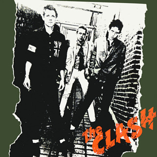
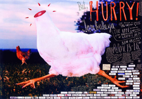
3. This kind of reminded me of Sagmeister’s use of limited range but bright bold colours. In particular, it reminded me of the first album design he did for his friends of the man’s red and green angry face.
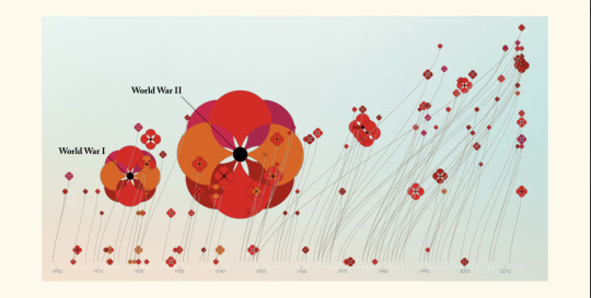
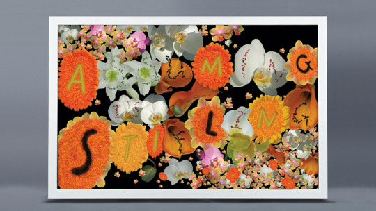
4. I thought this design was really metaphoric, atmospheric, and visually pleasing. It uses the poppy flower which already indicates war, but the size of the flowers also represents the size of each war. I like its colour use and how it balances the mass of information with a simple background that compliments the atmosphere of the design. I need to keep in mind the balance of negative space as Sagmeister’s works have chaotic subject but often uses plain background.
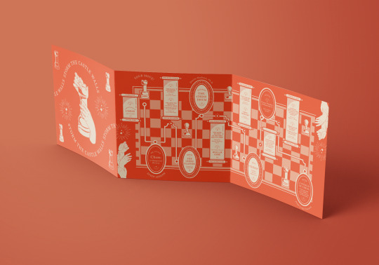
5. This one really reminded me of album covers or lyric sheets that come with it, which could be a nice link as Sagmeister did a lot of design for music. I was also conscious of the fact that we will be turning the designs into landscape designs and this could be a direction I could consider.
6. https://www.behance.net/gallery/11120019/The-History-of-Infographics-Project?tracking_source=search_projects%7Ctimeline%20infographic
A project on the history of infographics was on Behance. It was really informative and it mentioned some of the designs introduced in class too. I was particularly surprised at how these started looking very mathematical and like a graph. I think I want to try to work against this, making it look as less of a graph as Sagmeister’s works feel out of the box and free.
0 notes
Text
Further Reference: Artist’s Work
https://www.behance.net/gallery/27707959/Who-is-Stefan-Sagmeister?tracking_source=search_projects%7Cstefan%20sagmeister
Experimental, free, expressive, quirky, all seem to be central key words when it comes to Sagmerister’s design. I should be working and thinking around these, is what I was thinking when looking through his works.
Above isn’t his official work but I thought the contrast of handwritten text and simple font is nice.
https://www.behance.net/gallery/114256653/Journal-of-Stefan-Sagmeister?tracking_source=search_projects%7Cstefan%20sagmeister
Above is also not Sagmeister’s work but I thought the texture was an interesting idea as the timeline is not going to be 3D or physically textured like this, but it is still possible to create the textures through effect. It also links to his idea of “low functionality” album covers that come wrapped in plastic as a product.
0 notes
Text
Dadaism
Sagmeister’s works remind me of Dadaism. Dadaism has its origins in anti-war, anti-art, contradicting traditions or politics, challenging what is art, what is not art, what becomes art. It feels humorous and controversial similar to those of Sagmeister. The act of challenging art, the anti-grid compositions and new messier typography has its links.
Key ideas: Contradiction, challenge, antisymmetry, anti-grids, humour, controversy, anti-war, anti-art, exile, poetry, collage,
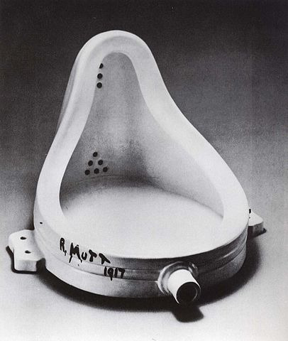
Marcel Duchamp, Fountain, 1917.
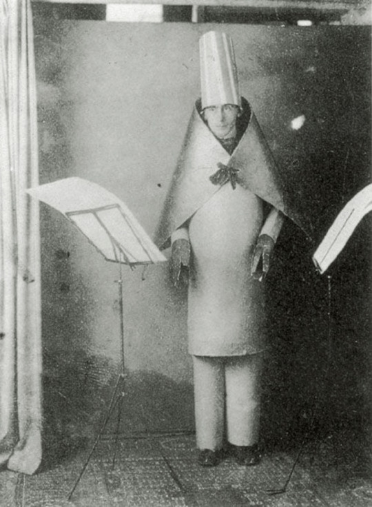
Hugo Ball, Cabaret Voltaire, 1916
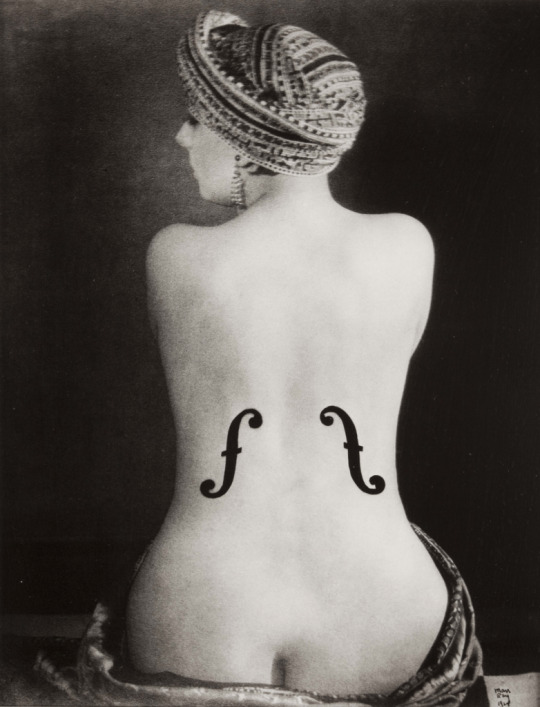
Man Ray, Ingres’s Violin, 1924
0 notes