A budding animator / storyboarder learning new things, primarily about how to get her shit together
Don't wanna be here? Send us removal request.
Photo


And there we go! Week 12, the final chapter of attack of the fruit people! Wargh.
Previously: 1 / 2 / 3 / 4 / 5 / 6 / 7 / 8 and 9 / 10 / 11 / 12
I ended it off with a high note. Not just because I’m a fan of happy endings, but because a lot of my classmates wanted Jarais to get better. (And also because I wanted Jarais and Joey to interact). I’m still amazed all of this wrapped up so cleanly, and was a structural story that I got to keep together week to week, despite the thematically bar I had to reach.
This class was so important to me, and important to my development as an artist and story creator. Not only did I enjoy my education and learn more concepts and techniques than I ever knew, but the support my class gave to me for this silly attack of the fruit people story since the very first week. It gave me so much confidence in my own abilities, and a lot of optimism for my future work. A year later, and I have started to focus my projects on storyboarding instead of strictly animation, which has been a decision that I have immensely enjoyed and has served me well so far!
I’m never gonna forget the one classmate who missed a week of class and asked me later if it had been confirmed that Jarais was the apple in the suit, and I showed him the new pages and he basically made the noise “:(”
0 notes
Photo


VISUAL DEVELOPMENT ASSIGNMENTS: 11th Week
Previously: 1 / 2 / 3 / 4 / 5 / 6 / 7 / 8 and 9 / 10 / 11 / 12
COLOR:
This week was just on coloring in our storyboards.
I was debating about whether or not Jarais was gonna be a red apple or a green apple. I decided red was too dynamic, too powerful of a color that didn’t suit Jarais at all. He doesn’t want to be a main character, he’s passive, he doesn’t want attention, etc.
Joey is purple because the joke is that she’s turning into grapes.
WARDROBE:
Contrast of Wardrobe - Contrast of wardrobe between characters can serve to differentiate them and their personalities. This one is pretty obvious, with Jarais and his coworkers always wearing stiff suits while the rebels are wearing loose, grungy clothing.
Repurposing Wardrobe - Externalizing a character’s change is a problem especially if they don’t want to rely on dialog. The use of an iconic wardrobe element can be very useful in showing change over time.
Until now, we haven’t seen Jarais without his jacket. Jarais throwing off his suit jacket to go beat up his coworkers doubles as symbolic representation of him shedding his dedication and loyalty to FruitsCorp, and freeing himself.
LOCATIONS:
Defining Character - Location can be used to represent the inner thoughts of a character. The divided society in this world expresses Jarais’s own divided self.
Location as Unifying Element - Returning to a location element multiple times in a story never lets us forget the core of the story. It can heighten drama, suggest parallels, and contract, and help define character.
The sunset coming up can also be a pretty obvious metaphor, so I won’t need to search for that one, amirite?
0 notes
Photo


VISUAL DEVELOPMENT ASSIGNMENTS: 10th Week
Previously: 1 / 2 / 3 / 4 / 5 / 6 / 7 / 8 and 9 / 10 / 11 / 12
Still catching up on all those storyboards I forgot to post! This two weeks were on Camera angles and Camera motion.
CAMERA ANGLES:
Wide angle (background, middle ground, and foreground are in all in focus. Action can thus be staged in all three)
Wide Angle (Vistas and Establishing Shots) Exterior shots
Telephoto (Brings distant objects closer to viewer. Compresses space, making objects appear in same plane.)
Fisheye (linear distortion. Kind of druggy, or for looking through in a door eyehole)
Prop Lenses with the Scene (Fisheye) (Putting reflective objects with different curvatures in the scene.)
Objects (When a camera shoots through objects like glass, water, or plastic to film what’s behind it)
Hi-Lo Combined (high and low angles used between cuts)
CAMERA MOTION:
Static Shot – Camera locked down on a tripod. Scene is fixed in one place- although there can be pans.
Pan – Camera is seated on a tripod and pivots on a horizontal plane.
Tilt-Up – Camera moves up on a vertical axis
Rotation – spins the image around (rotating the camera itself)
Tracking Shot – Camera is mounted on a dolly and glides along tracks. Camera moves smoothly along a fixed path.
Circular – Camera circles around an object/scene/character. Can be created with a hand-held camera, Steadicam, or tracks
Push In – Pull out – camera is seated on a dolly and “pushes in” or “pushes out” towards or away from an object.
Crane – Created by attaching the camera to the crane- camera can be raised or lowered. Can be stationary or moving. Often used to deliver high-angle shots that down on a scene.
Handheld – Literally handheld by the camera operator. Creates an unstable image. Suggests instability.
Steadicam – Handheld, with a stabilization device to smooth out any bumpiness. Kind of “floats.”
Aerial – Aerial shot is taken from an elevated site, such as a plane, helicopter, or mountain top. In delivering the image from a bird’s eye point of views, the graphics can more easily lend themselves to symbolic use.
1 note
·
View note
Photo


VISUAL DEVELOPMENT ASSIGNMENTS: 8th and 9th Weeks
Previously: 1 / 2 / 3 / 4 / 5 / 6 / 7 / 8 and 9 / 10 / 11 / 12
Whoopsie, I forgot to post the ending storyboards weeks!
TRANSITIONS:
Visual Match Cut (Action) - Visuals of one scene are “matched” with the visuals in the next through similarity of action.
Visual Match Cut (Idea) - Two shots are cut together, and by their juxtaposition, a third idea is suggested. This new idea is the sum of the first two, and is not inherently obvious in either image when viewed separately.
Visual Match Cut (Graphic Similarity) - An image at the end of one scene “matches” the incoming image of the next scene.
Audio Bridge - Two scenes are connected by a single audio source.
Matching Audio Segue - One source of audio fades out, while another matching audio source fades in
Disrupted Match Cut - Two matched images are separated by a single shot.
CAMERA LENSES:
Prop Lenses with the Scene - By placing reflective objects, with curvatures different than the shooting lens, in the scene, you can include more than one “lens” in a shot.
Fisheye - Characterized by their short focal lengths- the shorter the focal length, the moral linear distortion. An extreme wide angle that exaggerated linear distortion- like looking into a mirrored glass ball.
Telephoto - Brings distant objects closer to the viewer. It compresses space, and makes objects appear to be on the same horizontal plane. It’s shallow depth-of-field throws objects, both in front of and behind the focal point, out of focus. A person running toward the camera will appear to be running on the spot. Often used to increase suspense.
CAMERA POSITION
POV shot (Point of View) - This shot is intended to represent the subjective view of a specific character. By showing the audience sees what the character sees at his or her eye level. Gives audiences an exaggerated sense of intimacy with the character. Conversely, it can instill fear by forcing the same intimacy upon us with the antagonist’s point of view.
CU shot (Close-Up) - Includes the head and shoulders of the subject. The closer we get to a character, the more sympathy we are likely to feel. Alternatively, can also be used to evoke fear or revulsion when the audience is forced to be in close proximity to a character already established as hated antagonist.
Over the Shoulder Shot - The camera is placed behind the shoulder of a character. The character’s head and shoulders are seen in the foreground and are used as a framing device for the shot. Instead of separating the two characters, or two objects, the director chooses to have both characters physically present in the same shot. In this way, the two characters, share a relationship, and this physical connection can be used to convey information about the relationship.
ECU (Extreme Close-Up) - A tighter shot filming only the eyes, lips, a small detail, a tiny object, etc. Shows us objects and people differently than we see them. It calls attention to the subjects, making them more memorable visually. It also separates the scene from other scenes, underscoring the importance of the scene dramatically.
0 notes
Photo

My beautiful bud Maddy! I drew this in my notebook while I was with her and I liked it so much I scanned it and added color in Sai. She gave me permission to post it.
0 notes
Photo

I’m late, aren’t I? I wasn’t sure if I wanted to introduce myself too, or not. Hi!!
1 note
·
View note
Video
youtube
Finished animation/animatic for my Advanced Animation final!
This minute of animation for my Advanced Animation class was made in less than two weeks, somehow. The Final checklist: at least 15-20 seconds, my choice for context, but make it meaningful to you, meaningful to the audience, and try to move viewers. Focus on “Adrenaline Moment,” a moment where the audience can tell the character will remember this moment forever.
I wish I had completed the animation using all the storyboards I made for it alongside my Storyboarding class (at the same time.) But because of time, I had to settle for 2/3. Maybe I'll return someday and give it the REAL ending!
2 notes
·
View notes
Photo


Part 2 underneath


1 note
·
View note
Photo


Space is surprisingly fun to draw??? I did them all with Sai. I rewatched Steven’s episode “Bubbled” a few times for inspiration!
1 note
·
View note
Photo


More snapshots and storyboards that are fond to me from The Stars Aren’t Too Far
0 notes
Photo


VISUAL DEVELOPMENT ASSIGNMENTS- 7th week!
Previously: 1 / 2 / 3 / 4 / 5 / 6 / 7 / 8 and 9 / 10 / 11 / 12
Principles of week 7 was on music! I pulled up some metal screamo of “Take Me Out To The Ball Game” while I presented these storyboards in class. The principles were Lyrics as Narrator, Symbolic use of Music, and Music as a Moveable Prop,
Lyrics as Narrator: Lyrics of a song can act as the voice of a character. Can reveal the inner thoughts in a way that can be more interesting. Lyrics can also be used as the voice of the narrator. Can parcel out character information and thematic information.
Symbolic Use of Music: Music can be used as a turning point for a character. Can act as a catalyst for change.
Music as a Movable Prop: Music can be used as a literal story element. If it appears repeatedly, it can be used to track changes, relationships, and values over time. If it specifically links itself with an idea/character/object etc, the audience will be reminded of that object or idea. Once the symbol is set up, each subsequent reference can suggest change.
0 notes
Photo


VISUAL DEVELOPMENT ASSIGNMENTS- 6th week!
Previously: 1 / 2 / 3 / 4 / 5 / 6 / 7 / 8 and 9 / 10 / 11 / 12
Principles of week 6 were on sound effects! Realistic sound (Diegetic)(Character), Realistic Sound (Diegetic)(Emotional Response), Expressive Sound (Diegetic)(Outer World), and Surreal Sound (Meta-Diegetic)(Inner World),
Diagetic: Sound that is organic to a scene. Can be realistic or altered for effect.
Non-Diegetic: Sound that are not logically heard in the scene or part of the story’s world, that are added for dramatic value.
Realistic/Diegetic Sound: a sound that would logically exist in the audio world depicted on the screen. Can be exploited to code characters, add suspense to scenes, or tap into our subconscious. We don’t suspect that we are being manipulated since these sounds appear to be organic to the scene. Certain sounds have long been used to evoke different emotional responses in people. The sound of cracking a watermelon open with a metal may sound pretty gross since we’re imagining it as a human head!
Expressive/Diegetic Sound: a sound that is organic to the scene by has been altered for dramatic effect.
Surreal/Meta Diegetic Sound: Any sound that represents a character’s inner world, such as nightmares, dreams, hallucinations, wishes, etc. The sound and the picture do not need to match.
0 notes
Photo


VISUAL DEVELOPMENT ASSIGNMENTS- 5th week!
Previously: 1 / 2 / 3 / 4 / 5 / 6 / 7 / 8 and 9 / 10 / 11 / 12
Principles we learned week 5 were about time! Pacing, Contrast of Time, Expanding Time, Slo-motion, Fast-motion, Flashback, Flashfoward, Freeze-Frame. and Visual foreshadowing. Like before, I only chose to few a few of these principles for these storyboards.
Expanding Time Through Pacing: Audiences expect time to spool out as we experience it, so disrupting their expectations with time provides creative opportunities. This technique suggests that the world is disjointed and somehow off-kilter. Adds suspense and anxiety without dialogue. Suggests that the time alteration might just be a projection of the protagonist, and may not be real. Changing pacing within a scene serves to separate a scene into distinct parts and/or characters into distinct worlds.
Contrast of time (Pacing and intercutting): Intercutting two separate scenes with different pacing can put the characters in it into different worlds, or emphasize their differences. They can serve to draw comparisons between scenes and people. Intercutting can also be used to quicken the pace and heighten suspense.
Overlapping Action: Scenes that use lots of cutaways and reaction shots to cut to. Extends the time it takes for the moment to play out on screen. Adds to great dramatic value in a scene- it can shine a light on a particular moment or an entire scene. Often used to underscore important plot twists, climactic scenes, and pivotal emotional revelations- basically tells the audience that this scene is important. Conventionally used to evoke suspense by milking the scene.
Slo-Motion: Speaks for itself. Can create a number of heightened dramatic ideas- often used to “slow down reality” and show how a character sees the world when in the midst of a traumatic event.
Fast-Motion: Also speaks for itself. Reserved for moments that need to be especially highlighted. Fast motion compresses time and separates the scene from the rest of the film. Often used in comedy.
Flashback: Presents the past. Purpose is to fill the audience in on important backstory. Functions as a “catch-up device.”
Flashforward: Cuts to the future. Should tell us somehow that time has passed, and characterizes the passage of time for the audience.
Freeze-Frame: Created when a single frame is frozen on the screen. This separates the image from the rest of the film, and appears as a photograph. Takes on an iconic air. Used for emphasis when used in the middle of the story, or used as a way to end the film, leaving us with a single impression an freezing the character in time. The next events will never unfold, the characters are protected from them in time.
Visual Foreshadowing: When a visual symbol, planted early, suggest an action that will take place later in the film. Sets up expectations in the audience.
1 note
·
View note
Photo


VISUAL DEVELOPMENT ASSIGNMENTS- 4th Week
Previously: 1 / 2 / 3 / 4 / 5 / 6 / 7 / 8 and 9 / 10 / 11 / 12
Principles of week 4 were on editing! Montage, Assembly Editing, Mise-en-Scene, Intercutting, Split Screen, Dissolves, and Smash Cut
Montages are created through an assembly of quick cuts, disconnected in time or place, that combine to form a larger idea. Usually used to convey passage of time, coming of age, character progression, or emotional transitions. Usually without dialogue. Using it multiple times will allow the audience to make comparisons and new inferences. Can give the film a spectacular visual complement.
Assembly Editing is a kind of editing- it means the creative construction of a scene through the assembly of separate pieces of film- the result being a kind of mosiac of shots producing a larger idea. For instance, Psycho’s shower scene.
Mise-en-Scene is refers to a scene in which the action plays out in front of a continually running camera. There is no cutting, only blocking, lens zooms, and camera movements, perhaps. The scene is one uninterrupted take, shot in real time. It should stand on its own without the aid of editing.
Intercutting occurs when two scenes are shot in sequence, but presented by cutting back and forth between them. This creates a sense of two actions occurring simultaneously in different locations. Frequently used to lead up to the climax scene.
A split screen runs two shots side-by-side within a single frame. Also creates the idea of simultaneous action. Can suggest almost-physical contact between the two people/objects sharing the frame.
Dissolves blend one shot into another- fading out the first shot while the second shot fades up. Softens the cut between images. Has endless dramatic possibilities- often used in montages to indicate the passage of time.
Smash Cuts jar the audience with a sudden and unexpected change in image or sound. Jolts the audience by sabotaging their visual expectations- it creates a jarring, uncomfortable sensation for the audience. Methods include cutting a wide shot against a huge close up, or cutting a fast moving shot against a static shot.
1 note
·
View note
Photo


VISUAL DEVELOPMENT ASSIGNMENTS- 3rd Week
Previously: 1 / 2 / 3 / 4 / 5 / 6 / 7 / 8 and 9 / 10 / 11 / 12
Principles of week 3 were shapes! Circular, Linear, Rectangular, and Organic versus Geometric shapes.
Circular imagery can inherently suggest confusion, repetition, and time.
Linear imagery can externalize and communicating any number of abstract ideas, like externalizing the ideas and character choices. They can measure a character’s decision-making over time.
Rectangular imagery is often balanced, man-made, measured, and not found in nature, so it represents logic, civilization, control, modernity. Sometimes represents death, since it mimics the shape of a coffin.
Organic shapes are associated with nature while geometric shapes are associated with humans. Can be used to differentiate different kinds of people (ex. People in shots with organic imagery versus the people in shots with geometric imagery) (oppressed/oppressors, Amish/urban,
(We skipped triangular imagery because it’s fucking HARD. And none of us really knew what to do with it. The book we’re using describes triangular imagery as symbolizing a lot of relationship triads? Relationship between father, mother, child, relationship of Father, Son, Holy Ghost, relationship between girlfriend, boyfriend, unwanted third wheel, love triangles... etc.)
1 note
·
View note
Photo


VISUAL DEVELOPMENT ASSIGNMENTS- 1st Week
Next: 1 / 2 / 3 / 4 / 5 / 6 / 7 / 8 and 9 / 10 / 11 / 12
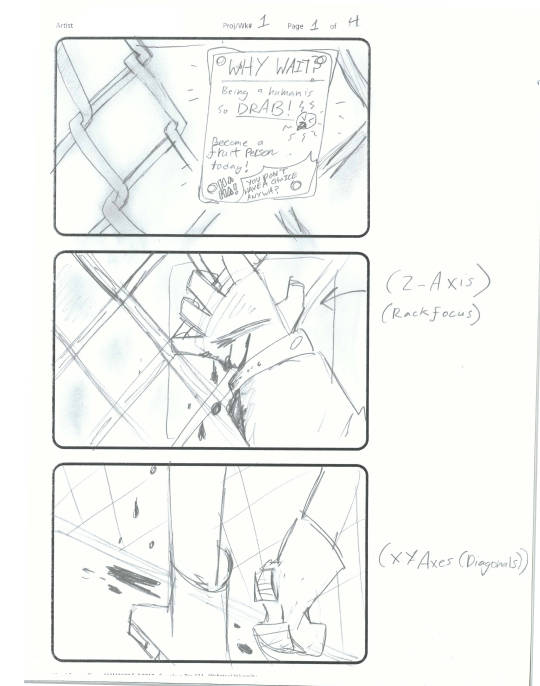
RISE OF THE UNSPEAKABLE, UNSTOPPABLE FRUIT-PEOPLE. Roughly inspired by my childhood fear of that surreal art piece, The Son of Man, a 1946 painting by Rene Magritte
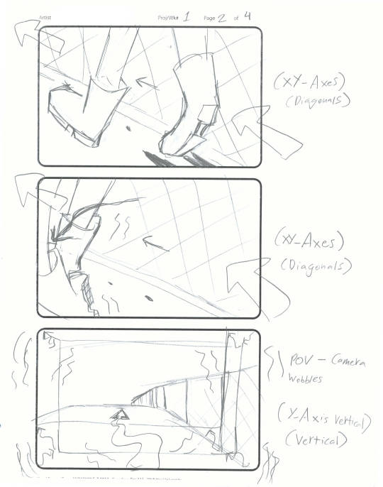
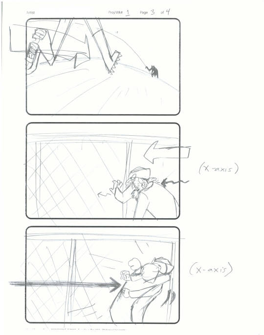
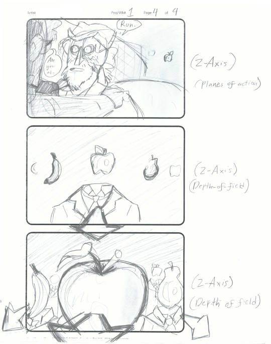
Principles of week 1 were X-Axis (Horizontal), Y-Axis (Vertical), X-Y Axis (Diagonals), Z-Axis (Depth of Field), Z-Axis (Planes of Action), Z-Axis (Rack Focus)
X-Axis (Horizontal) (Good guy comes in left to right while bad guy comes in right to left. Going left to right is strong and makes viewer feel Comfortable while going right to left look weaker and makes audience feel uncomfortable),
Y-Axis (Vertical) (Object going in straight line at fixed speed makes audience assume that the “good” destination is somewhere along their trajectory, while a more waver-y path or detouring makes audience assume bad news is ahead),
X-Y Axis (Diagonals) (Because gravity aids descent, walking down and towards the right is easy and thus implies inevitability of whatever’s ahead. Walking up and to the left, however, goes against gravity and is the most difficult of all screen directions, thus implying struggling),
Z-Axis (Depth of Field) (can represent a character’s size relative to other characters or change a character’s size as they move within the frame, implying a character’s relationship with the people in different parts of the depth of field, or the character’s inner state of mind),
Z-Axis (Planes of Action) (Using characters/objects in different foreground, middleground, and background to imply story elements and externalize the subtext in the script)
Z-Axis (Rack Focus) (Pulling the camera focus from one focal plane to another to shift the audience’s attention from objects situated on plane to objects situated on another).
1 note
·
View note


