Text
https://tusmm-my.sharepoint.com/:p:/g/personal/k00294035_student_tus_ie/ETAeXyXjxEtKuNVqH9ombLkB6VKo409Al7J7PXSaHnd7SA?e=Ht7R2g
1 note
·
View note
Text
Frames


Some more detailed frames I did for the animatic, I wanted to put these into the actual video but we ran out of time. I tried to vaguely emulate the style of the Legend of Korra, mostly by using one tone shading on the first frame and making them have expressive faces.
7 notes
·
View notes
Text
Character Designs


I picked Friday and Saturday to do character designs for, the druid and mercanary respectively. Friday is "loving and giving" so i wanted to reflect that by giving her a kind and gentle face, with an unassuming robes and tunic. I wanted to include things that were ususally seen in artworks of druids, like mistletoe and gorgets. Written texts also mention bronze sickles, bull hide cloaks and knee length tunics.
For the mercanary I wanted her to wear armour, but not so much that she would be similar to the knight, so I included a chestplate, chainmail and leather armour. I wanted her to have a warmer colour palette to contrast her cold personality. Since Saturday "works for a living" i wanted her to look grizzled and experienced, so she has scarring and a determined look on her face. She has short hair out of convenience so that it doesnt get in the way in a fight.
7 notes
·
View notes
Text
Rough character lineup

Character lineup with some of my own early character designs. I wanted to make sure each character had a unique shape that made them stand out from the others, for example Friday is thin and willowy while Wednesday is squat and fat. These are my own interpretations of the characters, other people in my group have different depictions of them. Our plan is to each of us design one or two characters, and then we'll put them all together in one big cast.
4 notes
·
View notes
Text
Character Research
Druid

Knight

Mercanary

Lord

Some research I did to better understand what sort of clothes people wore in the late medieval period. This isn't all of our characters, just some of them that I thought would be hard to think up outfits for.
2 notes
·
View notes
Text
Mood boards and timing - Thursday
my group went through some animated shows that we think would fit the theme and content that our animated series would have. We got some screen caps that look very similar to the style we had in mind.


After we did that I got to work on timing the animation, using the storyboards that we have already made and format it as a video
3 notes
·
View notes
Text
Animatic 1
Animatic I made of our storyboards. The final animatic is supposed to be only 3 minutes long, but i havent edited it, so it exceeds that. Each frame is 5 seconds long. This will not be the case for the final animatic, some frames will be shorter than others, especially during the fight scene.
3 notes
·
View notes
Text
FINAL STORYBOARD


After research, we were tasked with each making individual storyboards, and we would then merge them all together to make one storyboard.
3 notes
·
View notes
Text
RESEARCH


After script-making, I was put in charge of researching the landscaping we would be using (forest, farmlands, clearings), and architecture (castles, courtyards, villages etc.). I wanted to make sure my research was accurate, so for architecture and farmland I tried to make sure I stayed within the 1300- 1500 year range.
1 note
·
View note
Text
FINAL SCRIPT


After a good bit of brain-storming, this was the script we came up with. A lot of it is taken from mine, the last page was particularly difficult as we were finding it hard to come up with a satisfying ending. We knew that we wouldn't be able to fit the whole story due to time constraints, so we decided on keep it open-ended, like the adventure would continue in another episode, or something along those lines. We liked the contrast we made with the last two scenes, how the postive and hopeful campfire scene was ruined by the dragon destroying the village, and any hope the heroes had built.
2 notes
·
View notes
Text
Nursery rhyme project: Monday's child
We were split into groups of 4, and given 3 prompts and settings: "late medieval", "action/adventure" and the poem "Monday's child", and we were asked to make storyboards, animatics and to eventually pitch our project.
We were first told to research our prompts.


We came up of the idea of making the days of the week as 7 warriors on a journey.
1 note
·
View note
Text
Final mini-me animation
To create the final animation, we used adobe animate's lip sync feature, which syncs all the mouth shapes to the audio for you, instead of having to do it manually. I think for some parts it looks a bit awkward and janky, but it gets the job done. The background looks fuzzy in comparison to the mini-me, as i had to upscale the size. But i think it works well, i think it adds a nostalgic haze, kind of like the Yotsuba cover does. Overall i think I emulated Yotsuba's style quite well.
1 note
·
View note
Text
WEEK 3


Finished mini-me with mouths. Even though the hair doesn't match Yotsuba's style at all, I used it as inspiration for the colours and the eyes. What's missing is a pair of glasses before it actually looks like me, but I didn't think to make them. I wanted to show that the sun is shining on them at the side. I tried to use Yotsuba's style to draw the mouths, and I used watercolour to colour them to give a soft feel.
4 notes
·
View notes
Text
Cityscape background


Here is an optional background that I did in chalk pastel based off of the cityscape life drawings we did. I didn't realise until I was halfway through that it was supposed to be inspired by our chosen books, however I liked how it was going so I kept going.
It was based off of this shot that I took.

4 notes
·
View notes
Text
WEEK 2


This week we were brought out to the city again, but this time to sketch cityscapes and buildings. The first drawing on the left was sort of rough as I hadn't drawn buildings in front of me before, but I found that I was much better at drawing skylines, as seen on the right. I much preferred the clustered angles and small details.


We were told to draw quicker, and use thumbnails. I think they turned out quite well, I took inspiration from the Akira manga when drawing the little windows and railings.
Here are some references.


2 notes
·
View notes
Text
MINI ME

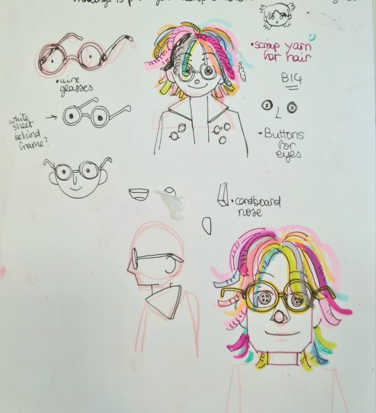
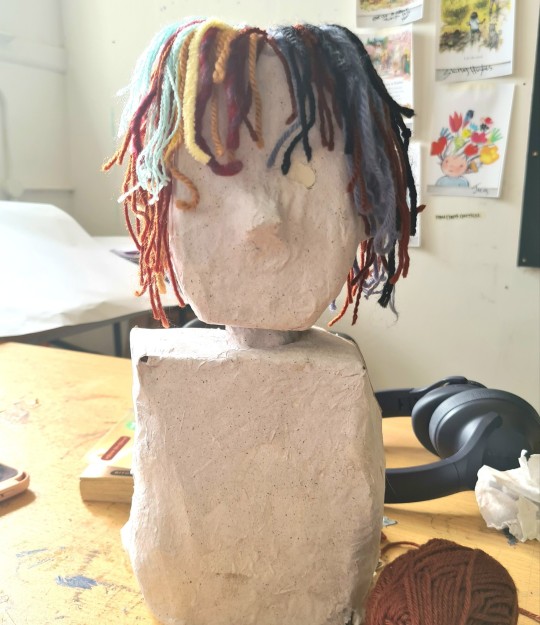
We were told to make mini sculptures of ourselves, taking inspiration from our chosen books. I wasn't quite sure how to use the books, but I did known that I wanted to use scrap yarn that I had collected for the hair.


I started building the base with Styrofoam and cardboard and then covered it with paper mache. Installing the wool hair was pretty easy, all I had to do was jab the strands in with a darning needle.
2 notes
·
View notes
Text
The day after the library visit we visited a local park for some landscape life drawings. We were told to keep in mind our inspirations from the day before and let that be seen in our work.

The weather was dreary and wet so I did a watercolour first with grey tones to see if I could capture that environment. The Yotsuba cover I had in mind looked to be a watercolour painting and I hadn't done a watercolour landscape before, so this was kind of a tester before I go into the real thing.


After that I did line drawings with a dip pen, I find that I'm way more comfortable with this method then using a liner pen or something like it. The dip pen let's me do thick lines and thin lines without having to change pens or damaging the nib, so I really like that flexibility. I had Akira in mind when doing these landscapes, so I think I managed to achieve a manga style.

I did a second watercolour when we went back to the studio where I took more of a direct inspiration from Yotsuba. I imaged the landscape at sunset like the cover is, so I used a warmer palette and more oranges and yellows. I also added more shadows so that it looked like the sun was a the bottom left.
2 notes
·
View notes