
Graphic DesignRedesigning MellonCollie & The Infinite Sadness
Don't wanna be here? Send us removal request.
Statistics
We looked inside some of the posts by k00297370 and here's what we found interesting.
Average Info
Notes Per Post
7
Likes Per Post
7
Reblog Per Post
0
Reply Per Post
0
Time Between Posts
2 days
Number of Posts By Type
Text
17
Last Seen Tumblr Blogs


Fun Fact
69% of Tumblr users are millennials.
Text
Graphic Design - Week 5
Experimenting with Photoshop
On Monday I watched a tutorial on youtube on how to edit a photo for a vintage effect, I used one of my photos of the ferris wheel to try this out.
youtube
Before: After:


On Tuesday I experimented with the typography and aesthetic of the cover, i tried a vintage carnival look.
On Thursday I tried a new aesthetic and style, with a more dreamy and melancholic look.


I liked how this looked so I played around with the typography on indesign, I liked the thin and simple font which portrays the dreaminess of the album.
I then went back to my collage I made before and added effects to it on photoshop.
original: edited: edited:


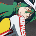
⬆️ I liked the look of this typography layout, then decided to separate the woman from the other photo and add her to the ferris wheel photo.
⬇️ I made the text bigger and coloured the word “The” to match the colour of the woman’s dress. I was recommended to keep the car in the image with the woman and make her look away from the ferris wheel implying that she’s lost, similar to the tone of the album.

I’ve ended up with this image, so far i like it.
1 note
·
View note
Text
Graphic Design - Week 4
On Thursday I looked at typography and took more photos of the ferris wheel for research.


0 notes
Text
Graphic Design - Week 4
Tuesday
While we were in town we visited a museum/gallery and took photos of paintings that we liked and inspired us.
here are a few of my favourites:


1 note
·
View note
Text
Graphic Design - Week 4
Tuesday
Photo research of painted signs
While we were in the studio we took photos of some of the signs that we liked and could take inspiration from.


0 notes
Text
Graphic Design - Week 4
Tuesday
Visit to Sign Painters studio
We went into town to visit the studio of sign painter, Tom Collins. He spoke to us about his works and we looked around his studio at his creations which was really interesting. We then experimented with typography, I wrote the letter ‘i’ for my name in a Roman type font. Then we painted in the letter using a technique that involves using your arm to rest your other arm on while painting in order to keep you from smudging the paint.


I found this really interesting and therapeutic I enjoyed trying and using sign painting techniques.
1 note
·
View note
Text
Graphic Design - Week 4
Designer Research
Henri De Toulouse-Lautrec
He was a French painter, printmaker, draughtsman, caricaturist and illustrator.
He became highly famed for his posters, influenced by Japanese styles and Impressionist Edgar Degas, and for imbuing marginalized populations with humanity in his art.


0 notes
Text
Graphic Design - Week 3
Designer Research
John Craig
John Craig is an Illustrator, Graphic Designer and Collage Artist that created the album cover for the band The Smashing Pumpkins - ‘Mellon Collie And The Infinite Sadness’.
I looked into some of his other creations and saved three favourites. His work typically has a vintage sort of psychedelic feel to them which I like a lot.


1 note
·
View note
Text
Graphic Design - Week 3
Friday
I was in an antique shop and took photos of the vintage style posters and signs that were inside that related to the aesthetic I’m going for, for my album cover redesign of ‘Melon Collie And The Infinite Sadness’. I really like their colour palette and typography.


1 note
·
View note
Text
Graphic Design - Week 3
Tuesday
On Tuesday we cut and tore images from magazines to create mood boards and collages that related to our ideas for our album covers, it was kind of hard since my cover idea is specific to a ferris wheel and there wasn’t any pictures of a ferris wheel in the magazines so i just worked off images that had a sort of retro feel to them that id like to incorporate into my album cover.

Then we created a collage piece from the pictures in the magazine that corresponded to our individual albums, I really liked the image of the woman leaning against the car that I used in my mood board so I used the printer to scale it up alongside the photo of the seascape and the people in black and white.

I wanted to portray the aimless, lost and hopeless feel of the album “Mellon Collie And The Infinite Sadness” and i think I portrayed that with this collage piece.
1 note
·
View note
Text
Graphic Design - Week 3
Monday
This morning I made more thumbnail sketches, this time I took random lyrics from some of the songs on the album and drew them in a literal form.
I then made a thumbnail sketch of one of my ideas for the album cover with the ferris wheel, I did a second one more focused on playing around with the typography and the last one is a rough sketch of an idea I came up with.
We then had a crit session within groups, we explained our albums and gave each other ideas and chose our favourites.
From my first sheet, the drawing of the galaxy was most popular.
From my second sheet. the drawing of the melancholy emotion was most popular.
And from my third sheet, my thumbnail of the ferris wheel was most popular.


0 notes
Text
Graphic Design - Week 2
Friday
After college while getting the bus I took a photo of a a sign outside of a shop that’s font and colour scheme reminded me of some of the victorian style carnival posters I was researching earlier that day.

0 notes
Text
Graphic Design - Week 2
Friday
I looked through a book that showed album covers throughout the years for research and took photos of the ones I could take inspiration from


0 notes
Text
Graphic Design - Week 2
Friday
Today I was making quick collages on Pinterest, experimenting with different aesthetics in order to see which one I might go for with the album cover.
Right now i’m looking at a sort of victorian aesthetic, specifically victorian posters and music books since i like their appearance of font and texture.
Then I started looking at victorian carnival posters and I thought they were really cool and could resonate with Mellon Collie’s theme of aimless youth.


0 notes
Text
Graphic Design - Week 2
Thursday
Today I was sick and couldn’t come in the college so I stayed at home and did some research. I came across the type designer, Jonathan Hoefler and really liked his font ‘Hoefler titling typeface’ since they are neat and fancy and remind me of an old music book.


0 notes
Text
Graphic Design - Week 2
Tuesday
Today we each did a presentation about the albums and artists we have been researching for the past weeks.
After, Maeve showed showed us a presentation on typography, then we played ‘date, ditch or friend’ on cards that displayed different fonts and chose our favourite fonts of the three and read out their descriptions on the back.

These are the three cards I got. I placed them in order as shown - date, ditch and friend.
I chose the font Baskerville italic as my favourite since it looks simple yet elegant and I think it was accurate in describing my sort of style.


0 notes
Text
Graphic Design - Week 1
Thursday
Today I made a new mind-map after listening to the rest of the album. I wrote down the key emotions and themes I noticed in the songs lyrics and wrote down some others underneath that are similar.

After doing this I got more paper and started drawing some of the themes of how I imagined them to try and visualise them. I ended up with eight sketches of the emotions: (in order) nostalgia, passion, confusion, sadness, hope/clarity/, melancholy/depression, fear/anxiety and vulnerability.


I think the sketches that best portray the emotions are: hope/clarity, melancholy/depression and vulnerability. I then spoke to Lydia and narrowed it down to hope and clarity being the most successful image.
0 notes
Text
Graphic Design - Week 1
On Tuesday we started making mind maps and wrote down words we associated with the album. I found this a bit difficult so mine were very vague since I was still getting used to the albums concept, I hadn’t yet noticed a recurring theme through each song, they seemed to all portray different themes and emotions so it was hard to pin point which words to describe the album as a whole.


At this stage I had only listened to disc one which was majority negative connotations so i assumed the whole album would be like that until later that day I listened to disc two and realised there was positive emotions involved too so I think I’ll have to redo my mind map.
After we made the mind maps we walked down to the vinyl store ‘steamboat’ in town to see if they had our vinyls, Unfortunately they didn’t have ‘Mellon Collie and The Infinite Sadness’ but they had other The Smashing Pumpkins albums such as ‘Monuments to an Elegy’, ‘Adore’ and ‘Gish’


I also looked at other albums covers and took a few pictures of my favourites that I could use for inspiration in making my own.


1 note
·
View note