Photo
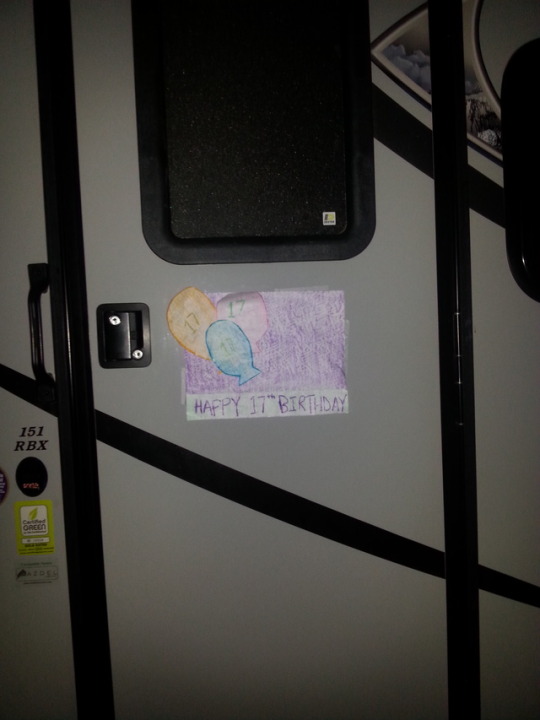
Week 11, Own Choice, March 23rd
This is a photo I took in the summer of 2015 when I went to Prince Edward Island with my family. We were staying at a campground called Cabot Beach Provincial Park, and I was left astounded by the pure friendliness of the people there. Upon getting to the campground, my parents and I were asking the owner of the campground what there was to do in the area, and she told us we should see the Ceilidh at Malpeque Hall on the following Wednesday. I very briefly mentioned that it was on the same day as my birthday. On July 8th, I celebrated my 17th birthday, and attended the Ceilidh. It was a wonderful evening filled with Scottish and Irish folk music. When we returned to our trailer that night, I found a note taped to the door with balloons on it saying “Happy 17th Birthday.” I found out later that this note was written by the same woman that told us to go to the Ceilidh, and I was utterly surprised by the fact that she remembered which day was my birthday and which campsite we were on, let alone how old I was turning. This act of kindness, though it was small, has left a huge impression on me. The fact that a complete stranger took the time out of her day to wish me a happy birthday, something that some of my own best friends completely forgot, has left my heart warm over the fact that there are still kind people left in this world. I will definitely never forget what she did for me.
0 notes
Photo
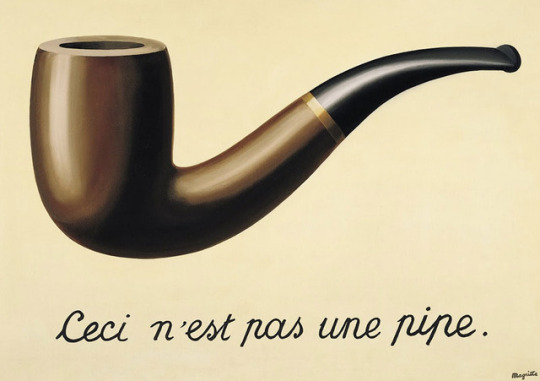
Week 11, Postmodernism, March 21st
This photo from 1929 by Rene Magrite is titled La Trahison Des Images (The Treason of Images). The phrase “ceci n’est pas une pipe” translates to “this is not a pipe.” The first time I came across this image was while watching the movie The Fault in Our Stars, where the main character, Hazel Grace, wears a t-shirt with this exact image on it. It grabbed my attention then, and to this day I still find it to be a very intriguing picture. It strikes me as very postmodern, because it is in fact “not a pipe,” it is only a picture of a pipe. In fact, the artist, Rene Magrite, likes to point out the fact that it is merely an image of a pipe, and emphasizes that if he had written “this is a pipe,” he would be lying. This picture exemplifies postmodernism in how it attempts to undo the narrative connections that make the world make sense. Whereas others would look at this picture and say it is indeed a pipe, the concept of postmodernism defies the certainty of scientific efforts to explain reality, and therefore establishes this to be solely a picture of a pipe.
Source:
On Postmodernism - Overview of Postmodern Art
0 notes
Video
tumblr
Week 10, Own Choice, March 16th
This is a video I took in Kassel, Germany in the summer of 2016. It is of the Hercules monument, built in the early 1700s, which has more than 200 steps leading to the top and is the highest point in Bergpark Wilhelmshöhe. The monument has “water features,” where water flows down the cascades, a waterfall, under devil’s bridge, and down the aqueduct, before reaching a lake where a fountain shoots the water 50 meters into the air. It was an amazing spectacle, and it has been going on for over 300 years. Unfortunately, I am unable to post more than one video, so this one only shows the cascades. However, I was left completely in awe by this stunning event, and the fact that the fountain relies solely on natural pressure from reservoirs and underground pipes whose locks are opened manually. To me, this landmark embodies the innovative and elegant architecture in Europe, as well as the deep history rooted within it.
0 notes
Photo
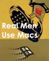
Week 10, Propaganda, March 14th
I chose this as my example of contemporary propaganda because I think it is a very real rivalry in today’s world. It is very clear that the advertisement depicts Apple to be the superior technology company to Windows. Although there is a variety of people that use Windows, this ad conveys the message that those that do are not “real men.” It definitely appeals to emotion, because Windows users may feel attacked and like they are “less than,” simply because they are not using an Apple product. Essentially, this ad is completely biased, because the type of computer you own in no way dictates how much of a “man�� you are.
Source:
Pinterest - Modern Propaganda
0 notes
Photo
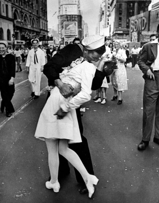
Week 9, Photojournalism, March 9th
After discussing James Nachtwey, we were asked to research another photojournalist and post one of their photos. I chose this image because I think it is impossible for anyone not to recognize it. It was captured by photojournalist Alfred Eisenstaedt, and then published in LIFE with the caption: “‘in the middle of New York's Times Square a white-clad girl clutches her purse and skirt as an uninhibited sailor plants his lips squarely on hers.’ V-J Day, 1945.” I think this is a revolutionary photo, because it was taken on the day that Japan surrendered, thus putting an end to World War II. It represents freedom and victory, and I believe it captures the true relief felt by the soldiers in 1945. They were so filled with joy and celebration that they were willing to grab a random girl and kiss her with everything in them. In my opinion, it is truly a timeless and beautiful photo from an extraordinary point in time, and I believe that the black and white filter creates an even more classic and everlasting effect.
Source:
Time.com - Alfred Eisenstaedt: 22 Unforgettable Photos by a Master
1 note
·
View note
Photo
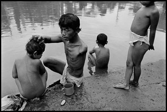
Week 9, James Nachtwey, March 7th
In class, we watched a documentary about a photojournalist named James Nachtwey called War Photographer. I found this photo on his website titled “Indonesia, 1998 - A beggar washed his children in a polluted canal.” The photo really spoke to me because you can tell that the beggar is much thinner than his children, which really captures how much he must give up in order to ensure that his children are fed. His ribs are evidently showing due to hunger, and he is missing a limb, yet he still makes caring for his children a priority. It symbolizes how, even in the midst of a third world country, family is always the most important. This photo also makes you contemplate just how difficult it must be for photojournalists to go to these third-world countries and witness scenes such as this one. We are very privileged to be living with the resources and freedoms that we have, and the work photojournalists do make the events happening across the world much more real.
Source:
Witness Photography by James Nachtwey
0 notes
Photo
Week 8, Own Choice, March 2nd
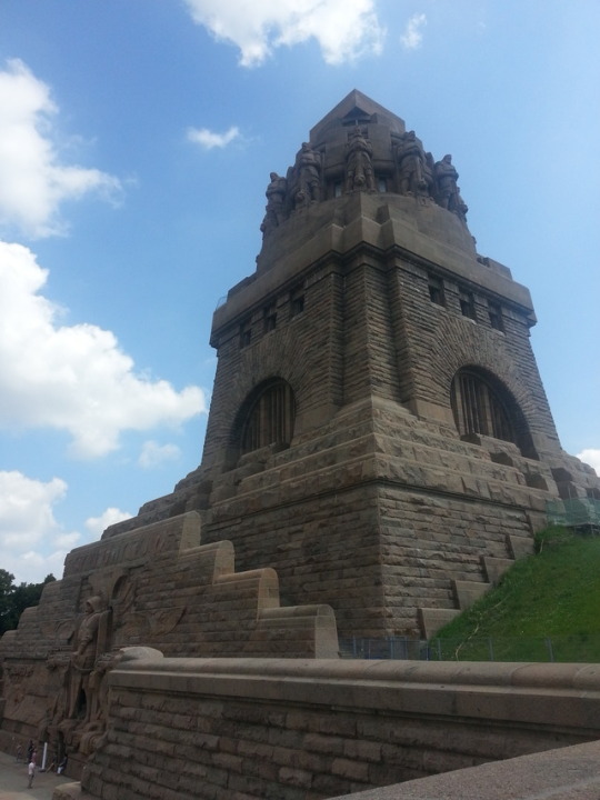
This week, we were encouraged to make another post of our own choice, so I took to my own photo library once again. This is a photo I took in the summer of 2014 of the Monument to the Battle of the Nations situated in Leipzig, Germany. It is called Völkerschlachtdenkmal in German, and it commemorates Napoleon’s defeat in the Battle of Leipzig. At the beginning of the semester, we were asked what our favourite examples of visual communication were, and this is the one I chose. I grew up in Leipzig, and from my house I had a perfect view of this amazing monument. I spent my childhood biking around the paths, hanging out on the grounds, and even climbing all the way to the top (over 500 steps!!), so this monument holds a lot of sentimental value to me. Every time I travel back to my old home town, I make a point of stopping at this monument and recollecting my childhood. Others may view the Monument to the Battle of the Nations simply as a piece of historic architecture, but to me it embodies a part of my childhood that I now miss very much.
1 note
·
View note
Photo

Week 8, Photoshop, February 28th
This week, we experimented with photoshop techniques, and were instructed to edit a particular photo of a wind surfer and then post it for our journal assignment. Therefore, for this week’s photoshop assignment, I decided to crop out the windsurfer and his kite, and place the layer over a photo of a galaxy. I think this created a super interesting image, because it looks like he is surfing through space. The colours from the galaxy also match the colour of the waves, which therefore makes it easier for the image of the windsurfer to blend with its background. I just found this to look really interesting and aesthetically appealing because of the nice colours and how the shape of the galaxy mimics waves. Others may have chosen to edit the picture as a whole, but I decided to crop out solely the man and his kite. In my opinion, changing the background allowed me to create an entirely new photo with a completely different story to tell. It’s very postmodern, because it defies all logical reasoning.
1 note
·
View note
Photo
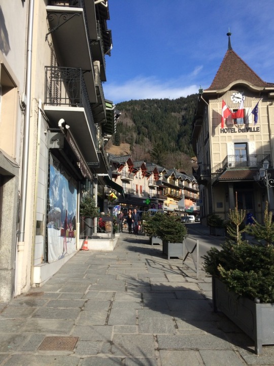
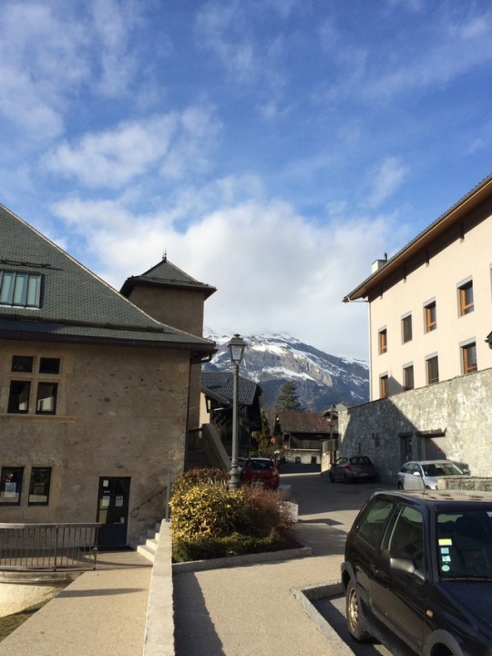
Week 7, Reading Week Own Choice Post 2, February 23rd
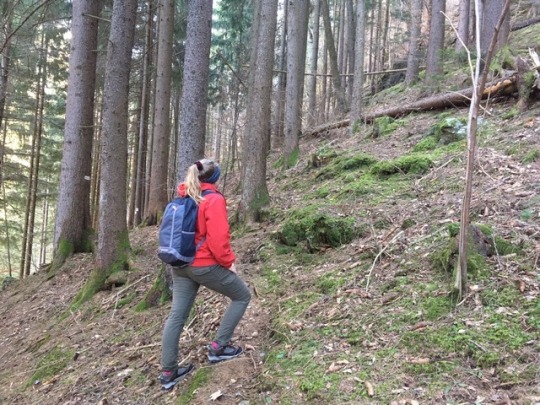
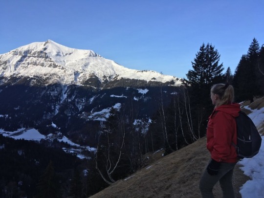
Since I spent most of my reading week in Saint Gervais-les-Bains, France, I figured I would make my second reading week post about that. It is a beautiful city hidden among the French Alps, and I immediately fell in love with its beautiful views and small city scene. Having grown up in Germany, the narrow, cobblestone streets were all too familiar to me. However, anywhere you looked you were surrounded by high-rising mountains that kissed the sky, and hiking through them, witnessing the sun rise between the peaks, revealed an entirely different perspective.
In the week that I was there, I was also able to experience an entirely different way of life. Hiking down and up a mountain everyday to get to town and back up to our cabin, having cheese, baguette, and wine with every meal, walking EVERYWHERE, and not a McDonald’s or even a donut in sight, made me feel both energetic and rejuvenated. It’s no wonder Europeans lead a much healthier lifestyle than we do in North America.
1 note
·
View note
Photo
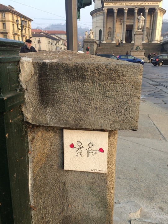
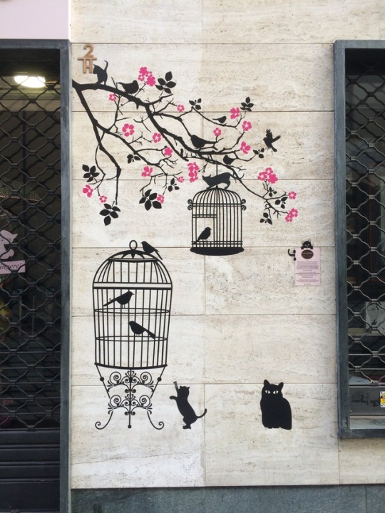
Week 7, Reading Week Own Choice Post 1, February 21st
Over reading week, I traveled to Europe where I spent one day in Turin, Italy. Turin was the first capital of Italy, and it was absolutely astounding to witness the rich culture and history the city has to offer. I was surrounded by art galleries, churches, palaces, opera houses, museums, and Turin’s beautiful Renaissance architecture. One thing that specifically caught my eye, however, was the street art. Whereas at home in Edmonton, we are surrounded by spray paint and other vandalism, the art I found along the streets in Italy was much more captivating and artistic. Rather than destroying the image of the city, the street art added another level of beauty to it. It goes to show that not all street art should be deemed as disrespectful or distasteful, because some of it can actually be very beautiful.
1 note
·
View note
Photo
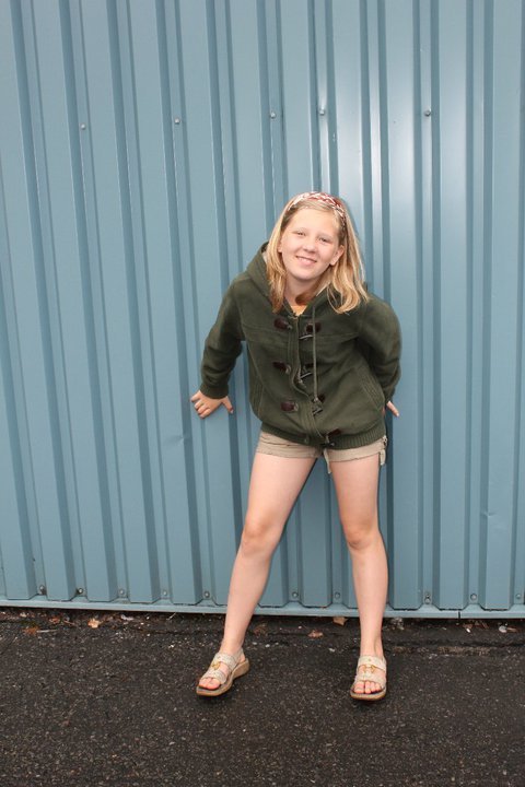

Week 6, Own Choice, February 16th
For this week’s own choice assignment, I decided to do a “Throwback Thursday” transformation post. The first photo is one from 2007 at the age of nine, and the second one was taken last semester, in 2016. I chose these two particular photos because they have very similar colours, which make the sequence appealing to the eye, and they also effectively represent the change in my appearance that took place over the span of nine years. I was kind of shocked when I examined the differences that took place, and how different and more mature I look now. It made me realize that to ourselves, we are unable to recognize that we are growing and changing over the years. However, to other people who may not see us very often, the change can be tremendous. It is very much apparent when looking at pictures of yourself even just a year or two apart. It puts into perspective that you are always growing and changing in order to become the best version of you that you could be, and makes you realize what your relatives mean when they tell you “you’ve changed so much!”
1 note
·
View note
Photo

Week 6, Effective Typography, February 14th
I chose this logo as an example of effective typology. In the logo, the steam coming off of the hot cup of coffee is represented as the two f’s in the word “coffee”. It is effective because the general shape of the steam is very similar to the letter f, and when placed between “co” and “ee”, it is widely perceived to spell the word “coffee.” In my psychology class, we discussed how if some letters in a word are misshaped or missing parts, people will often imagine the letters into what would spell out a certain word, solely based on the letters around them. Therefore, I believe this is a very effective example of typography because it does just that.
Source:
Julius Design - 20 Loghi Creativi e Comunicativi da prendere ispirazione
1 note
·
View note
Photo
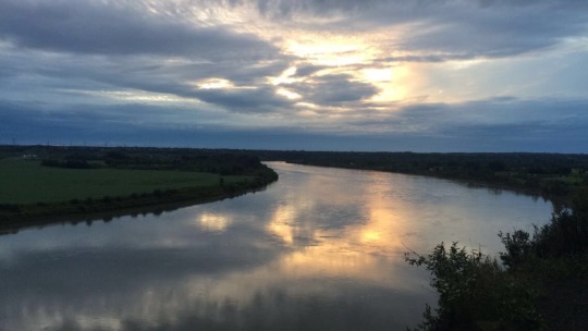
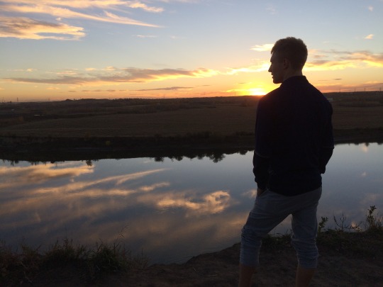
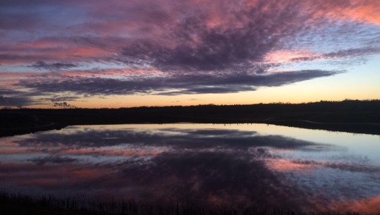
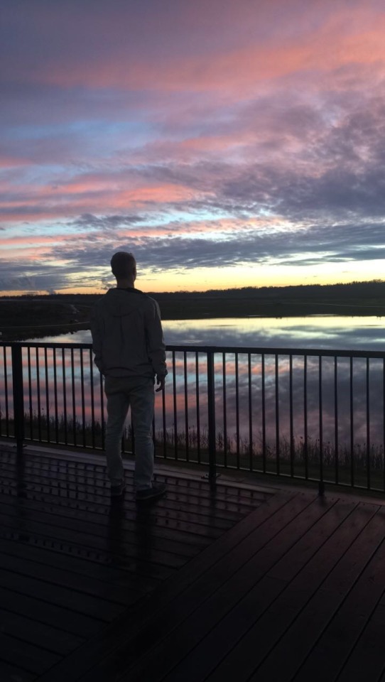
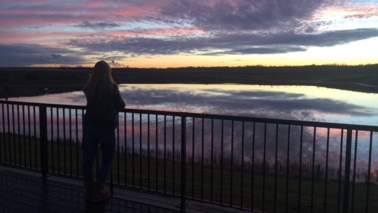
Week 5, Own Choice, February 9th
For this week’s own choice assignment, I have chosen to explore the pictures of sunsets versus the same sunsets with a silhouette in front of them. These are some photos that I have taken, and I believe adding the aspect of a silhouette adds much more depth and an extra entity to the photo that makes it much more stimulating. The viewer’s attention is drawn to the contrast between the silhouette and the sunset, rather than just the sunset alone, which, in my opinion, makes the colours appear much more brilliant and captivating. It is very hard to capture the true essence of sunsets in a photograph, but I believe putting a silhouette in front of it makes a prominent difference.
2 notes
·
View notes
Photo
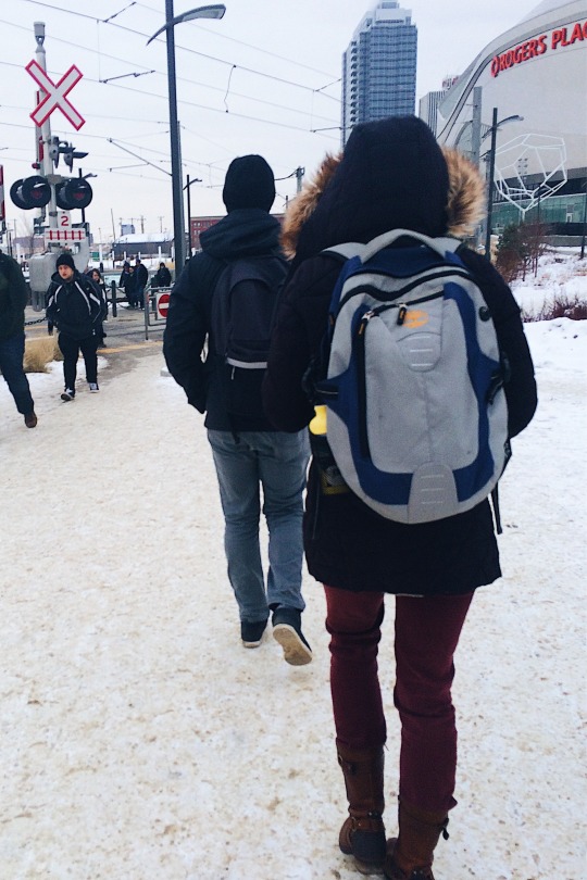
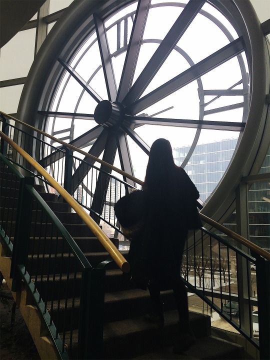

Week 5, Life at MacEwan, February 7th
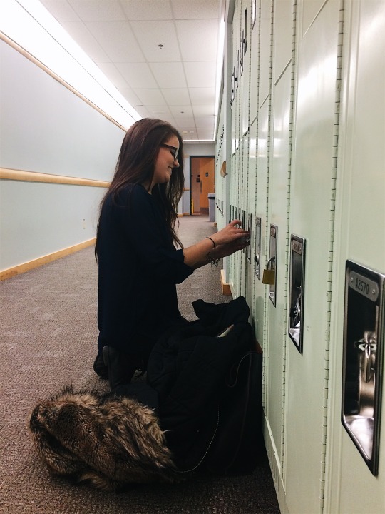
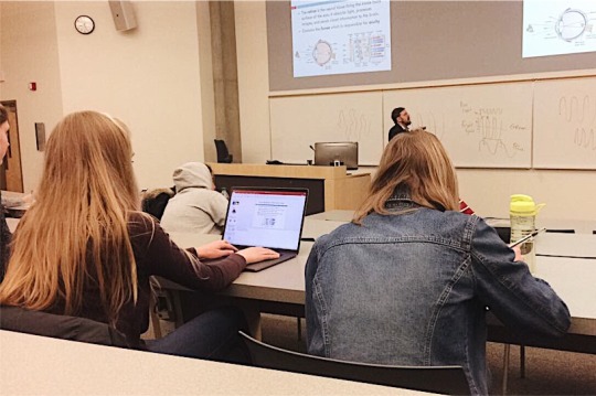
Here are some photos I took that I think represent life at Grant MacEwan University. I believe a lot of University students can relate to these photos, like the one of the LRT station, because public transportation plays a big role in a lot of their lives. The majority of students will commute to and from school in order to save money on gas and parking. Also, I believe the clocktower represents a big part of our school. It is the first thing you see when you walk in the main entrance, and has become one of the most prominant symbols of MacEwan.I also took a few pictures to represent students attending class, stopping at their locker between classes, and of the resources they can use to study for classes from the MacEwan library. I believe I was able to capture how this University is a community where students have the freedom to explore themselves, and pursue their interests.
0 notes
Photo
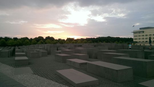
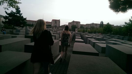
Week 4, Own Choice, February 2nd
Once again, I have chosen some photos of my own, this time from a trip to Germany in the summer of 2014. The pictures above are of the Memorial to the Murdered Jews of Europe, designed by architect Peter Eisenman and engineer Buro Happold, to which I connected on an emotional level. The 2,711 concrete structures take up around 4.7 acres, and are truly breathtaking to see. The memorial also includes a Room of Names that incorporates and gives tribute to the names of almost three million Jewish Holocaust victims. Being from Germany, the atrocities that occurred at concentration camps throughout World War II have had a large effect on my identity. Therefore, seeing this dedication to those that lost their lives in such a horrible manner was eye-opening as well as astonishing. No one could have predicting the dictating way Hitler ruled Germany, and no one deserved the punishments he imposed on them simply for being Jewish or his definition of “imperfect.”
0 notes
Video
youtube
Week 4, Own Choice, January 31st
For one of this week’s “own choice” assignments, I have chosen a commercial that has made me cry time and time again. Every time I watch this commercial, I am deeply touched by the message it sends. The father always tries his hardest to make sure that his daughter lives a happy, care-free life, without letting her know that he is jobless and struggling for money. However, the little girl is aware of the hardships he is going through, and writes him a letter to tell him that it’s okay, and that he doesn’t need to pretend. Ultimately, the message of this commercial is that having your family is the most important thing in the world, regardless of how much money you have; having someone that cares for you and loves you is the fundamental element of happiness.
Source:
YouTube - “My Father is a Liar” (MetLife Heart-touching Commercial”
0 notes
Photo
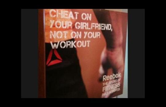
Week 3, Ineffective Advertising, January 26th
In class this week, we discussed how advertising can be very effective as well as immensely ineffective. I believe this example of advertising is absolutely awful, and it received an immense amount of negative feedback from the public. In the advertisement, the sportswear company Reebok is endorsing infidelity, implying that it is more acceptable than it is to miss out on a work out. However, infidelity is highly disgraceful, wrong, and in no way comparable to skipping a trip to the gym. Being in a relationship myself, I was very offended by this ad. I know that if my boyfriend cheated on me, and used the phrase “at least I didn’t cheat on my workout” as an excuse, I would be very enraged as well as hurt. In my opinion, this ad does not endorse fitness whatsoever, and I am more appalled by Reebok’s audacity to release such an offensive slogan than I am interested in purchasing their products.
Source:
Eunice’s Marketing Blog - Reebok Ad: “Cheat on Your Girlfriend, Not on Your Workout”
0 notes