
Statistics
We looked inside some of the posts by jennaoliver and here's what we found interesting.
Average Info
Notes Per Post
0
Likes Per Post
0
Reblog Per Post
0
Reply Per Post
0
Time Between Posts
9 days ago
Number of Posts By Type
Text
17
Last Seen Tumblr Blogs


Fun Fact
130K people were victims of a chain letter scam that affected Tumblr in May 2011.
Text
My Context:
My final photographs have been finely articulated and crafted to resemble the popular fashion and lifestyle magazine covers of Elle, Vogue and Harper Bazaar. I have been carefully working on manipulating my images to resemble these magazines styles and formate however through a more natural beauty lens. I am unhappy with the way the beauty and fashion magazine industry works around setting standards, expectations and biases requirements for their models and audience. Therefore I took it upon my self to work hard in researching how I can not replicate these same vaules/culture in my own practice, while still producing high quality images.

0 notes
Text
Printing!
I was lucky enough to get some help with printing my final images from Cornelius on the inkjet. He showed me how to check over my images highlights and shadows as well as set them up ready for printing. I have decided to go with a A4 semi gloss paper as I believe that best reflects what a magazine looks like.
Having Cornelius help me out has given me more confidence in printing in the future as it has reassure me that the process isn’t so tricky and time consuming as I had originally thought.
These prints were ment to be my test prints but I believe they came out exactly how I wanted them to despite being slightly darker. I will be using these for my final output.
A4 - semi gloss - inkjet printed


0 notes
Text
Magazine Print Research
- Coated paper adds a protective enamel coating that results in either a glossy or a matte finish. The coating prevents the paper from fully absorbing the ink, which results in a more precise image replication. Coated paper is also more resistant to moisture and tearing. If you are printing a magazine with many images, you would be best served by a glossy finish. The glossy finish provides a dynamic, shiny look that helps enhance the hues and colors of your images.
- Thicker paper is more durable and less likely to tear, but it is more difficult to fold and is heavier, which makes it more expensive to ship. Magazines typically use 80 to 90 GSM paper for the interior pages with a heavier paper for the protective cover.
"What Type of Paper Is Used for Magazine Printing?" Dollco Print Solutions Group. Last modified September 22, 2020. https://dollcoprint.com/2020/01/09/what-type-of-paper-is-used-for-magazine-printing/.
0 notes
Text
Visiting Auckland Art Gallery & Printing Research
As a class we all went over to look at the Civilization photography exhibit held in the Auckland Art Gallery. This was a great chance to see the different styles, sizes and presentations of print photography. I thoroughly enjoyed seeing such a broad selection of print forms as I've never had the chance to see this before. I was very surprised that there were so many print choices. This led me into looking up what each style was to properly understand the art works. I seemed to be really drawn to the lightjet and pigment prints as they were so soft and smooth looking, I just wanted to go up and touch them. I think I liked these types of prints the most as i've never seen anything like it before. However both of these styles won’t match my context of a magazine cover as it's not used for that sort of industry/print making. By the looks of it, it seems that inkjet print would be the best choice for my style as it is most commonly used, easier to mass produced as well as creates crisp and sharp images.
Photography Print Types seen at the Auckland Gallery:
Lightjet print
It works by instead of copying the image, the lasers write the image onto photographic paper using an internal 270 degree drum. The paper is held still in a cylinder while the lasers get to work. Laser light is reflected by a spinning mirror moving along the axis of the cylinder onto the surface of the media. ‘Uniform spot size and shape’ means that even the edges and corners of an image are as razor sharp as the centre. This uniformity is better than any other optical printing technique. This technology results in better image sharpness, uniform density and colour and the highest geometric accuracy over the whole print.
Reference: "What is a Lightjet Printer?" Professional Online Photo Printing from the UK's Top Lab – Metro-Print. Accessed October 18, 2020. https://metro-print.co.uk/what-is-a-lightjet-printer/.

Inkjet print
Inkjet printing is a type of computer printing that recreates a digital image by propelling droplets of ink onto paper and plastic substrates. Inkjet printers are the most commonly used type of printer, and range from small inexpensive consumer models to expensive professional machines.
Reference: "Inkjet Printing." Wikipedia, the Free Encyclopedia. Last modified October 14, 2020. https://en.wikipedia.org/wiki/Inkjet_printing.

C-type Print
The ultimate professional photographic archival prints; silver based Digital C-types are real photographic prints, created on light sensitive paper. This creates an analogue style print from a digital file with unparalleled depth, subtlety of tonal variation and shadow detail. We use two Chromira 50inch wide LED Printers that produce seamless (no dots) images that are beyond comparison.
Reference: "Printing — PCL Imaging." PCL Imaging. Accessed October 18, 2020. https://www.pcl.co.nz/printing.
Digital c-type prints differ from inkjet prints because inkjet prints use fine droplets of ink rather than light sources, such as a laser. The machines used for digital C-type prints can be significantly more expensive than inkjet printers and tend to be used in commercial settings. The longevity of digital C-type prints is also estimated to be shorter than pigment-based printing, and the number of materials that can be printed with this process is more limited.
Reference: Twin, Alexandra. "Digital C-Type Prints Are Color Prints Made by Digital Exposure." Investopedia. Last modified June 25, 2019. https://www.investopedia.com/terms/d/digital-ctype-print.asp.

Pigment Print
The term "pigment print" is used generally for any type of printed image that uses strictly pigments. Pigments can be either on a mineral basis or they can be an artificial product. The image stability of pigment printing is superior to that of any other method of printing.
Pigment printing processes have been utilized since the middle of the 19th century. Modern procedures have generated a surge of this technique as ink sets have been refined to be compatible with the latest in high-resolution inkjet technology.
Reference: "Pigment Print." Weng Contemporary. Accessed October 18, 2020. https://www.wengcontemporary.com/techniques/pigment-print.

Archival Pigment Print
Archival pigment prints utilize archival quality inks, which are printed onto various substrates including canvas, fine art, and photo-base paper. This technique, just as Iris prints, may also be referred to as Giclee, although it belongs to a newer generation of the printing techniques. Iris prints are an older technique and are 4-Color ink-jet prints from a printer pioneered in the late 1970s by Iris Graphics.
Reference: "Pigment Print." Weng Contemporary. Accessed October 18, 2020. https://www.wengcontemporary.com/techniques/pigment-print.

Digital Print
All five of the analog printing processes require the creation and precise alignment of separate plates for each color used in a print. Digital printing processes eliminate the time, labor, and expense of creating and mounting printing plates.
The first digital printing devices printed black ink on paper. Today, multiple digital printing processes have been developed to replicate and expand the capabilities of offset, screen, flexographic, rotogravure, and pad printing.
A key advantage of digital printing is the relatively low cost of producing just a few copies of full-color prints. While the first digital printing systems were relatively slow compared to analog methods, significant progress continues to be made.
Reference: Ordant. "An Overview of Analog Printing Processes." Ordant. Last modified June 17, 2019. https://ordant.com/an-overview-of-analog-printing-processes/.

Unique Gelatin Silver Print
The gelatin silver process is the most commonly used chemical process in black-and-white photography, and is the fundamental chemical process for modern analog color photography. As such, films and printing papers available for analog photography rarely rely on any other chemical process to record an image. A suspension of silver salts in gelatin is coated onto a support such as glass, flexible plastic or film, baryta paper, or resin-coated paper. These light-sensitive materials are stable under normal keeping conditions and are able to be exposed and processed even many years after their manufacture. This was an improvement on the collodion wet-plate process dominant from the 1850s–1880s, which had to be exposed and developed immediately after coating.
Reference: "Gelatin Silver Process." Wikipedia, the Free Encyclopedia. Last modified September 2, 2020. https://en.wikipedia.org/wiki/Gelatin_silver_process.

UV print on Canvas
One standard method for printing customized gallery-wrapped canvases involves printing digital artwork onto flat canvas material, which needs to be trimmed, stretched and secured over a wooden frame. This process allows the artwork to wrap around the sides of the canvas. If the artwork is sized and positioned correctly, the image won’t be negatively affected. In some cases, due to preference or to avoid losing portions of an image, canvas sides are painted in a solid color or elegantly framed. This process may also require the application of protective treatments to protect the print from UV exposure and dust.
Reference: "UV-Printed Canvas." Logojet. Last modified May 26, 2016. https://logojet.wordpress.com/2016/05/26/uv-printed-canvas/#:~:text=This%20process%20allows%20the%20artwork,solid%20color%20or%20elegantly%20framed.

0 notes
Text
Critical Feedback & Class Notes
Stephanie Oliver.
(Twin Sister, honest opinions, feminist Biais, Student Midwife, 20 years old, cisgender women)
I like that the model does not have over done/caked makeup or any body reshaping through photoshop like most magazines do.
I also like that when looking at the before and after there is very little change done to the model as it is mostly done to enhance the lighting quality or overall image.
All of the images seem to have a similar colour pallet, background, model and facial expression. It would be good to see a little more range in these to make the images stand out against each other more and increase the diversity.
Matthew Newton.
(Boyfriend, Car salesman and photographer for Southern Motors, 21 years Old, straight to the point honest, encourages me to do my best work, supportive, cisgender male)
A smaller aperture might be a good idea to use as it will make the model pop more from the background.
The images are very well lit, not over or under exposed or with any harsh shadows from the direct sunlight. However the colours look a little bit dull. This might be because the sand/cliff face matches the models skin colour. I would recommend enhancing some of the colours for a more summery vibrant appeal. Remember that you need to do a little bit over the top in editing on the computer because printing will make the images 10% darker.
Feedback from Cornelius when going to print with his help.
(AUT photography and printing specialist/expert)
I really like the style you are going for as they do seem realistically like magazine covers. To make this idea more realistic in your first image the writing of Vogue has a lowish opaticlity allowing the rope to come through. Brands tend to go for solid lettering so the brand name is the focal point. I’m not sure if this is something magazines do too though.
I would remove the slight highlights in the wisps of the hair in image one as it seems like it could be smudge or mark on the camera lens.
Made my day by having all the highlights and shadows between 5-250 already edited.
I also asked Steph and Matt for their opinion on which image they preferred between the below 2. I only want to use one as they are both from the same shoot and are too similar to use both. Matt and Steph both agreed they liked the first one because…
The lighting is much clearer and cleaner looking in the first image. The second image has harsher lighting with dark shadows under the eyes of the model making it slightly less flattering.
The angle of the first image adds more variety to the overall range of images. As the others are mostly front on perspectives with a slight low angle while the first image is directly looking up at the model.
The background to the second image is a little too busy making the model become slightly lost in it / blends in. While in the first image the model pops out.
The first image has really nice movement of the models hair making her seem more down to earth and human.
The models face is much clearer and detailed in the first image
Really good compositions of framing, rule of thirds, balance and leading of lines is used to carry the eye towards the models face in the first image while in the second image these become less clear and blurred into a mess.


0 notes

Text
Experimental Photoshoots 1, 2 & 3 Edited
After looking through my contacts sheet and using Bridge to sort through my images I chose 6 photos I really liked (unique, well angled, clearest, flattering for my model, with the best colouring and lighting). I then brought these through into photoshop and Photoshop RAW editing. When editing I didn’t want to make too many unusual editing changes (editing that I don’t normally fiddle with) other than removing skin blemishes and adding text of the models name and magazine publishing name. I then proceeded to focus on my normal alteration like cropping, fixing the distortion/lens correction, the RGB levels/graph, the white (highlights - maximum 250) and black (shadows - minimum 5) balances as well as exposure, contrast, vibrancy and colour saturation/luminance.


0 notes
Text
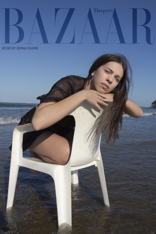
Third Experimental Photoshoot
Model: Jessie Oliver
Date: 9 October 2020
Location: Long Bay Beach
Time: 8:45am - 9:45am
For my final shoot I returned to Long Bay beach however during the morning to hopefully catch the ending of the golden hour. Unfortunately we were a little too late and the sky was a bit over casted with clouds. This was a bit of a difficult photoshoot as it was very windy and blowing straight into the beach so it was very hard to avoid. This photoshoot wasn't as successful as the others as the lighting was very diffused (dulling out any colours), and the wind made it impossible to get any decent looking shots. I did however get some images I was happy with.
I again used a gold reflector to bring in some warmer tones to the image however due to the diffused lighting the reflector didn’t work so great. I believe that this shoot had a much better focus on my model with the correct aperture.
When shooting it tried to manipulate the images by taking them at a lower angle like my research shows to make the model seem more elongated and streamline. I used the diffused lighting to my advantage as the softness is able to hide any bumps and soften the skin out a bit on my model. This stops any harsh shadowing from warp the way my model looks or highlighting any imperfections like under eye darkening or any skin blemishes. I also made sure to frame my model in a way that doesn't crop at her joints as this tends to make the image seem a little odd and ruins the visual flow.I tried my best in using different compositions of leading lines, rule of thirds and balance to manipulate the image in an aesthetical way as well as a guide for the eye to draw its towards my models face.


0 notes
Text
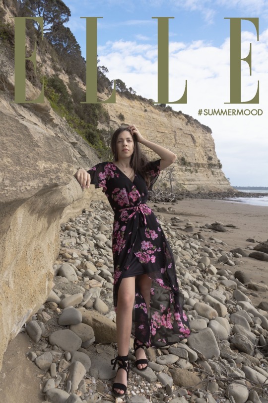
Second Experimental Photoshoot
Model: Jessie Oliver
Date: 5 October 2020
Location: Long Bay Beach & Park
Time: 4pm - 5:30pm
For my second photoshoot I went to Long Bay beach and Park. I tried to get the rest of my photos done in this session however as I decided to shoot in the late afternoon the sun got a little too strong and low in the sky. Which made it hard for my model to see and created harsh unflattering shadows. Again I had some inspirational photos I found from magazines, Instagram and pinterest. I made sure not to copy any images shot for shot instead took on ideas of what angles, model positions and props to use.
I used a gold light reflector to add a slight warm tone to my images and to fill in the darker shaded areas of my model, with the help of my mum holding it up. I really liked this photoshoot as it was a bit out of my model and I’s comfort zone being subjected to shooting in front of many other people. Over time we both warmed up to this and had a really fun time. I am more than happy with the outcome of my images as they came out better than I thought they did however I did notice that when looking at the images on my computer the focus was off and often forced on the beach waves opposed to my models face which was a shame.
When shooting it tried to manipulate the images by taking them at a lower angle like my research shows to make the model seem more elongated and streamline. I also tried to use soft lighting to hide any bumps and soften the skin out a bit on my model. However the sun was very strong at this time of day so there was a little struggle with harsh shadows being casted over my model's face. I tried to fix this by getting her to face the sun while I tried to position myself in a way that wouldn't cast my shadow into the frame. This helped in taking out harsh shadowing that could warp the way my model looks or highlight any imperfections like under eye darkening or any skin blemishes. I also made sure to frame my model in a way that doesn't crop at her joints as this tends to make the image seem a little odd and ruins the visual flow. I tried my best in using different compositions of leading lines, rule of thirds and balance to manipulate the image in an aesthetical way as well as a guide for the eye to draw it towards my models face.


0 notes
Text
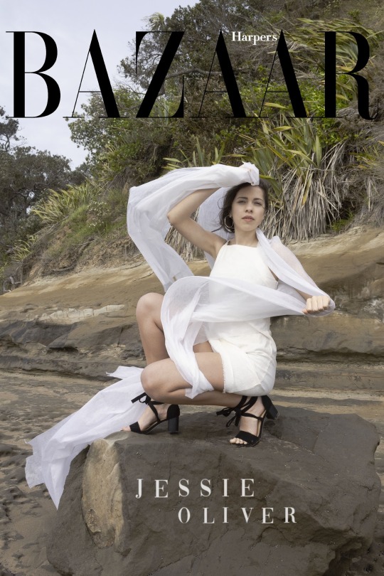
First Experimental Photoshoot!
Model: Jessie Oliver
Date: 26 September 2020
Location: Albany, North Shore (my home)
Time: 2:30pm - 3:30pm
For my first Photoshoot I am wanting to explore the idea of body and nature a little as I would like this to be my overbanching theme/idea represented in my series. I noticed that most magazine cover shoots take place in a studio with a plain backdrop or outdoors exploring natural elements such as the beach, a field, the salt lake river, garden, ocean and etc. on the odd occasion the images are taken indoors in a set up interior or inside/around a flash car. I was inspired by a few images I found pinterested that I liked and thought would go great with my overall idea.
For the set up of my photoshoot I used an offwhite bed sheet and gold reflector. I pinned the sheet corners to a branch and had the reflector lean against the house exterior walls. I then collected some fern branches and had my model pose with them topless (with her consent) covering her upper body. I then experimented with different angles and compositions until I was happy with the outcome.
I really liked this photoshoot as it took place during the late afternoon of the weekend. It gave me very much summer vibes with the gold and afternoon light. It was a very relaxed and fun shoot for both my model and I. I am very happy with the outcome of my shoot as the images were just as I had hoped and I didnt come across any major issues during the photoshoot. I did however notice after viewing my images the aperture was a little off as the focus wasn't always on my models face. This is something I need to work on getting correct during my shoots.
When shooting it tried to manipulate the images by taking them at a lower angle like my research shows to make the model seem more elongated and streamline. I also choose soft lighting to hide any bumps and soften the skin out a bit on my model. This took out any harsh shadowing that could warp the way my model looks or highlight any imperfections like under eye darkening or any skin blemishes. I also made sure to frame my model in a way that doesn't crop at her joints as this tends to make the image seem a little odd and ruins the visual flow.


0 notes
Text
Technical and Editing Notes
Camera Raw Editing process: 0 solid black and 255 solid white (5 and 250 limits) + lens aberration + sample tool + histograms + curves + clipping + sharpening.
Histogram - represents the tonal values of a digital photograph. You can tell if an image is over or underexposed just from looking at the histogram. Over or underexposure will be shown through peaking at either edge of the graph.
0 = Black / 255 = White
5 = Black Limit / 250 = white limit
Curves - When editing curves give you the ablility to remap the tones of the image. Often used to emphasise colours.
Clipping - In digital photogrpahy clipping is the result of caputring or processing an image where the intensity in a certain area falls outside the minimum and maximum intensity that can be represented. Allows you to find if an image is low or high key.
Red = Highlights / Blue = Shadows
Kelvin Scale - A unit of measurment for the colour tempeture of light sources.
0 notes
Text
Research into the bias of fashion and beauty in magazines.
By the looks of it there is most definitely many flaws and biases in the beauty and fashion industry. Below is the links to all of the articles I read around fashion and beauty bais, standards and advertisement.
Givhan, Robin. "Kerry James Marshall paints a masterful image of history and hope on the cover of Vogue." The Washington Post. Last modified August 26, 2020. https://www.washingtonpost.com/lifestyle/2020/08/25/vogue-kerry-james-marshall-jordan-casteel/.
Hirsch, Afua. "Glossies So White: the Data That Reveals the Problem with British Magazine Covers." The Guardian. Last modified April 10, 2018. https://www.theguardian.com/media/2018/apr/10/glossy-magazine-covers-too-white-models-black-ethnic-minority.
Maccarone, Dan. "The Beauty Bias." Psychology Today. Last modified June 9, 2016. https://www.psychologytoday.com/us/articles/200301/the-beauty-bias.
Sullivan, Samantha. "Vogue’s Liberal Bias is Preventing It from Featuring a Critical Fashion Moment." TheBlaze. Last modified July 26, 2019. https://www.theblaze.com/op-ed/vogues-liberal-bias-is-preventing-it-from-featuring-a-critical-fashion-moment.
Toole, Lucinda. "A Girl's World: Fashion's Hidden Bias – The Oxford Student." The Oxford Student. Last modified May 13, 2013. https://www.oxfordstudent.com/2013/05/14/a-girls-world-fashions-hidden-bias/.
"Vogue Editor Anna Wintour Exposes Her Bias Against Melania Trump." Independent Women's Forum. Last modified July 30, 2019. https://www.iwf.org/2019/07/30/vogue-editor-anna-wintour-exposes-her-bias-against-melania-trump/.
I did however want to solely focus on it in magazine covers. So I found these 2 articles very interesting to read. I decided to pull out points that I felt I agreed upon and thought was important. Most of it focused on over sexualistion of women and seeing their bodies as just a frame/object to display fashion upon rather than belonging to a person which I believe are the 2 biggest issues with in the industry. It has become so toxic that editors, designers, photographers feel the need to manipulate their art in these stereotypical unreachable standards inorder to be liked. I believe the whole industry is about manipulation. Making things appear better than they are and convincing people they need to look or dress a certain way. Its not just manipulation with in the photographs but in the messages they send too.
Looking at the first article there may be a little biases in a personal or opinated way, as she uses the words we when stating something about women feeling a particular way. I liked that the writer did this as it made her feel relatable and connected to the audience however it does give the impression she is stating all women feel or act this way which can be wrong. In the second article it was hard to find a baise point as it was very formative and covered all bases around the world. I really liked this as it gave perspectives around the world in how beauty and fashion is shown.
"Designing Women For Magazine Covers Uncovered." Network9. Last modified October 24, 2019. https://network9.biz/uncovered-designing-women-for-magazine-covers/.
“We Feature Women Like We Feature Cool Cars” It’s no secret that images of women in the media are hypersexualized, or to quote Oprah, “pornified,” but that didn’t stop the outrage this week when the editor of UK Esquire Alex Blimes told a conference “The women we feature in the magazine are ornamental,” he said. “They are objectified. I could lie to you and say we are interested in their brains as well. We are not.
Magazine covers are a lens into the way our culture thinks about gender and the things we do —and don’t want to admit—about the place of women in the media and in our world.
Many of these magazines have been staffed and run by women for decades. Glamour has had a woman editor since its inception in 1939. If these magazines are produced by women, then why do they regularly signal the message that women and girls’ value lies in their youth, beauty and sexuality?
Seventeen covers use headlines like “Flirty, Pretty, Cute and Amazing,” where the emphasis is above all else on looks. Women’s fashion magazines do break, however, from showing off the female body the same way men’s magazines do — instead, the beauty and attention are held in close-ups of the face.
So women do not look—they are there to be looked at. When laying out these magazine covers, doesn’t it seem like it is intended for male appreciation, even though both men and women read, say, Vanity Fair
It has led to a Playboy-lite culture in our printed media. When attractive women are photographed, they are meant to look sexually primed and ready for consumption. When attractive men are photographed, they usually just appear cool and not sexual enough to threaten the (presumed) straight male audience.
For men, in lifestyle magazines, a ‘‘face-ism’’ bias exists, whereby men’s heads and faces are shown in greater detail than they are for women and seem less retouched. The corresponding bias for women is ‘‘body-ism,” where the focus is on women’s bodies or body parts (sometimes their heads are eliminated altogether).
Media exposure that is high in sexual objectification can socialize women to view our own bodies the same way that magazine editors treat women’s bodies on covers.
We begin to see ourselves as objects for male desire, rather than considering our own desires. When we’re told again and again that the way women look is what defines us, the uncomfortable truth is that a part of us may begin to believe it.
Changing the culture will be a long battle. But, if we have to surrender to viewing people as sex objects, and men get to have their fun with women on magazine covers, shouldn’t we? Let the Female Gaze begin.
Givhan, Robin. "The Idea of Beauty is Always Shifting. Today, It’s More Inclusive Than Ever." National Geographic. Last modified January 7, 2020. https://www.nationalgeographic.com/magazine/2020/02/beauty-today-celebrates-all-social-media-plays-a-role-feature/.
Attitudes are shifting. But the fashion world remains uneasy with large women—no matter how famous or rich. No matter how pretty their face. Elevating them to iconic status is a complicated, psychological hurdle for the arbiters of beauty. They need sleek élan in their symbols of beauty. They need long lines and sharp edges. They need women who can fit into sample sizes.
But instead of operating in a vacuum, they now are operating in a new media environment. Average folks have taken note of whether designers have a diverse cast of models, and if they do not, critics can voice their ire on social media and an angry army of like-minded souls can rise up and demand change. Digital media has made it easier for stories about emaciated and anorexic models to reach the general public, and the public now has a way to shame and pressure the fashion industry to stop hiring these deathly thin women. The Fashion Spot website became a diversity watchdog, regularly issuing reports on the demographic breakdown on the runways. How many models of color? How many plus-size women? How many of them were transgender? How many older models?
One might think that as female designers themselves aged, they would begin to highlight older women in their work. But women in fashion are part of the same cult of youth that they created. They Botox and diet. They swear by raw food and SoulCycle. How often do you see a chubby designer? A gray-haired one? Designers still use the phrase “old lady” to describe clothes that are unattractive. A “matronly” dress is one that is unflattering or out-of-date. The language makes the bias plain. But today women don’t take it as a matter of course. They revolt. Making “old” synonymous with unattractive is simply not going to stand.
In the West: The new beauty isn’t defined by hairstyles or body shape, by age or skin color. Beauty is becoming less a matter of aesthetics and more about self-awareness, personal swagger, and individuality. It’s about chiseled arms and false eyelashes and a lineless forehead. But it’s also defined by rounded bellies, shimmering silver hair, and mundane imperfections. Beauty is a millennial strutting around town in leggings, a crop top, and her belly protruding over her waistband. It is a young man swishing down a runway in over-the-knee boots and thigh-grazing shorts. Beauty is political correctness, cultural enlightenment, and social justice.
0 notes
Text
Manipulation in pre, post and production

Skin and blemish removal and smoothening
Reshaping of the body to appear slimmer
Slight whitewashing to make the skin seem paler and less red
Eyes seemed to be enlarged
Jaw shape sharper and nose thinner
Eyebrows thinned

Eyes seemed to be enlarged
Removal of cultural and personal features
Skin smoothing
Slight colour alternation in the tone of the image (noticeable in the background)

Whitewashed both models to appear paler in skin tone
Removed marks and smoothed out their skin
References:
MessyNessy. "The Reality of Celebrity Photoshop: Before And After." Messy Nessy Chic. Last modified October 12, 2010. https://www.messynessychic.com/2010/10/12/the-reality-of-celebrity-photoshop-before-and-after/.
Shaw, Gabbi. "11 Times This Year the Internet Had a Field Day with Poorly Doctored Photos." Insider. Last modified December 18, 2018. https://www.insider.com/photoshop-fails-scandals-this-year-2018-12#vanity-fairs-2018-hollywood-issue-was-rife-with-editing-mistakes-including-reese-witherspoons-third-leg-and-oprah-winfreys-extra-hand-4.
I have noticed that most post-production editing/manipulation focuses on skin smoothening, whitewashing and body reshaping. Which personally are horrible things to change about a person. These features describe a person and tell the audience who they are. Most of these manipulations are done for the model to fit today’s beauty standards by appearing younger, slimmer more beautiful, “easy on the eyes”, desirable and more womanly (hourglass body shape, larger bust or rear). Doing these things have a great effect on the audience and model. It adds unnecessary beauty standards and shame towards them for not looking the way they are portrayed, as they will believe they weren’t good enough to stay natural.
When going into manipulating/edit my own images in post-production I am going to stay clear of any dramatic alterations of my model’s body as I believe she is beautiful the way she is. I will focus more so on removing spots and skin smoothening to a slight degree that my model has requested. I will also be post-editing the images in a way that makes the overall image better. e.g; exposure, colour correction, shadows, tone etc. In post-production, I will also be adding a slight background blur and the logo of a popular magazine title to help represent what context of photography I am working within.
manipulation aspects to think about in preproduction and prodouction:
Angles - low angle to show power and movement. elonging the legs and streamlines the body. Reduces akward shadowing and bunching of skin and clothes.
Staging -
Perspective -
Framing - Most are just headshots or mid to full body depending on the scene/environment and clothes
Blur background mid to low aperture
Clothing choices: mostly solid colours or two coloured patterns without branding labels or writing and advertisement.
0 notes
Text
Elle Magazine
Elle was founded in Paris as an immediate aftermath of World War II and first sold as a supplement to France-Soir, edited at the time by Pierre Lazareff. Hélène Gordon-Lazareff, Elle's pioneering founder, returned to Paris from New York City to create a unique publication that grappled with the many forces shaping the lives of women in France in 1945. Women won the right to vote in 1944, and Elle dived immediately into long-form "newspaper-like" features on women's role in national politics and the growing feminist movement.
The title means "she" or "her" in French.
Elle is the world's largest fashion magazine, with 46 international editions in over 60 countries.
Website is very minimal, classic with pastel toned colours. Images of political movements, femisnist and BLM movement protesters.
References:
"Front page." ELLE. Accessed October 10, 2020. https://www.elle.com/. "Elle (magazine)." Wikipedia, the Free Encyclopedia. Last modified October 8, 2020. https://en.wikipedia.org/wiki/Elle_(magazine).


I have decided to choose this magazine as it is a very well known and popular magazine with strong women's rights and power ideas tied to it. I really loved the fact that as soon as women's rights were passed in France the magazine started up in support of them.
I noticed that in most Elle magazines cover photos they use mostly medium to full body shoots with also power enhancing angles, like the low angle and straight on. I have noticed that they also do a little experimenting with their angles from above and below to add a little diversity between the covers. Most of the models on the front page are either well known headstrong celebrities or professional models. I really like this as it gives younger women and girls great role model advertisements as they are all very independent and successful in their careers.
Elle magazine cover photos tend to be placed in natural outdoors backgrounds with natural tones such as a grassy field, the clouded sky and monotoned green parashoot. This is a great technique of keeping the models in the foreground and centre of attention. With busy backgrounds it is hard for the models to not blend into the surroundings. Especially when they are wearing printed clothes it can get a little too overwhelming with all the textures and colours.
The Elle title tends to be in any complementary colour to the overall image tone so it can stand out against the model, backdrop and balance out the frame. Other smaller titles with the same or similar font are then used to address the models name and/or what is being discussed in the issue.
The models all seem to have a similar style to them with flash, tailor/designer made outfits and accessories. Most models appear to have their hair out of their face either slicked back or styled into a unique way to ensure their faces are clearly recognisable and seen. It appears that minimal makeup is applied to the models to get their very best looking natural selves, while promoting natural beauty.
Most of the lighting seems to be natural with the help of reflectors and a few studio lights to balance the scene. There are no too harsh shadows seen on the models but there are light ones. I believe this might be in the middle somewhere between harsh and diffused lighting. Having too harsh of shadows could potentially highlight bumps or skin marks as well as disform the models body appearance and hide their faces. Too soft of lighting will make the image seem a little bland with no shape or pop. I have a feeling that maybe a golden reflector has been used in these shoots as there is a slight warm glow to the images and models skin.
0 notes
Text
Vogue magazine
Vogue is an American monthly fashion and lifestyle magazine covering many topics, including fashion, beauty, culture, living, and runway, based in New York City. It began as a weekly newspaper, first published in New York City in 1892, before becoming a monthly publication years later.
Website is very formally laid out appearing as a news website. Images and articles of celebrity gossip, fashion tips, current events and current social/celebrity event details from the past and present.
The British Vogue, launched in 1916, was the first international edition.
The Italian version Vogue Italia has been called the top fashion magazine in the world.
As of today, there are 26 international editions.
In 2005, Condé Nast launched Men's Vogue. The magazine ceased publication as an independent publication in October 2008, the December/January 2009 edition being its last issue. It was intended to be published as a supplement of Vogue, the Spring 2009 edition being the last issue of the magazine altogether.
May 2013 marked the first anniversary of a healthy body initiative that was signed by the magazine's international editors—the initiative represents a commitment from the editors to promote positive body images within the content of Vogue's numerous editions. Vogue Australia editor Edwina McCann explained: “In the magazine we're moving away from those very young, very thin girls. A year down the track, we ask ourselves what can Vogue do about it? And an issue like this [June 2013 issue] is what we can do about it. If I was aware of a girl being ill on a photo shoot I wouldn't allow that shoot to go ahead, or if a girl had an eating disorder I would not shoot her.”
References:
"Vogue (magazine)." Wikipedia, the Free Encyclopedia. Last modified October 9, 2020. https://en.wikipedia.org/wiki/Vogue_(magazine). "Vogue Australia." Vogue Australia. Accessed October 10, 2020. https://www.vogue.com.au/?international.


I have decided to choose this magazine as it is a very well known and popular magazine with passionate and strong women's rights and power ties to it. I really love the fact that Vogue has encouraged natural beauty and normal bodies in their issues as to me this is a very big issue with the beauty/fashion magazine/advertisement industry.
I noticed that in most of Vogue's magazine cover photos a full range of framing is used from medium close ups to full body shoots and wide angles. Like all of the other magazines they tend to use power enhancing angles, like the low angle and straight on. Most of the models on the front page are either well known headstrong celebrities, social media influences, professional models and on the odd occasion political influences like Jacinda Ardern. I really like this as it gives younger women and girls great role model advertisements as they are all very independent and successful in their careers.
Vogue’s magazine cover photos tend to be placed in natural outdoors backgrounds with natural tones such as a grassy field with lambs, a garden and backyard. These settings do get a little busy in the sense of texture however the photographers edit the images and shoot with a low aperture to add clarity to the foreground and blur to the background. This is a great technique of keeping the models as the centre of attention. With busy backgrounds it is hard for the models to not blend into the surroundings. Especially when they are wearing printed clothes it can get a little too overwhelming with all the textures and colours happening at once.
The Vogue title tends to be in any complementary colour to the overall image tone or a colour that is used in the item of clothing. This is done so it can stand out against the model, backdrop and balance out the frame. Other smaller titles with the same or similar font are then used to address the models name and/or what is being discussed in the issue.
The models all seem to have a similar style to them with flash, tailor/designer made outfits and accessories. I find this rather funny in comparison to the locations Vogue shoots at as these are places this style of fashion would normally not be worn at. Most models appear to have their hair out and a little messy from the breeze to add movement and normality to the image. It appears that minimal makeup is applied to the models to get their very best looking natural selves, while promoting natural beauty.
Most of the lighting seems to be natural with the help of reflectors and a few studio lights to balance the scene. There are no too harsh shadows seen on the models but there are light ones. I believe this might be in the middle somewhere between harsh and diffused lighting. Having too harsh of shadows could potentially highlight bumps or skin marks as well as disform the models body appearance and hide their faces. Too soft of lighting will make the image seem a little bland with no shape or pop. I have a feeling that maybe a golden reflector has been used in these shoots as there is a slight warm glow to the images and models skin.
0 notes