503 - M&M S1 (the website view for some reason is buggy, so all my info turns up better on the blog view (www.tumblr.com/blog/jasm1ne503)
Don't wanna be here? Send us removal request.
Text
12 PAGE PUBLICATION - FINAL
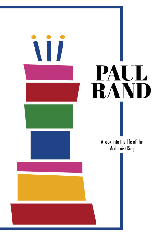
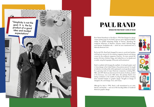
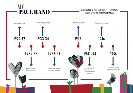
After handing in the physical copy of the booklet, I created an imposed spread and reader spread to submit, these images are from the reader spread and showcase my booklet as an entirety.



0 notes
Text
Final Print + Binding (printing, exporting, packaged files)
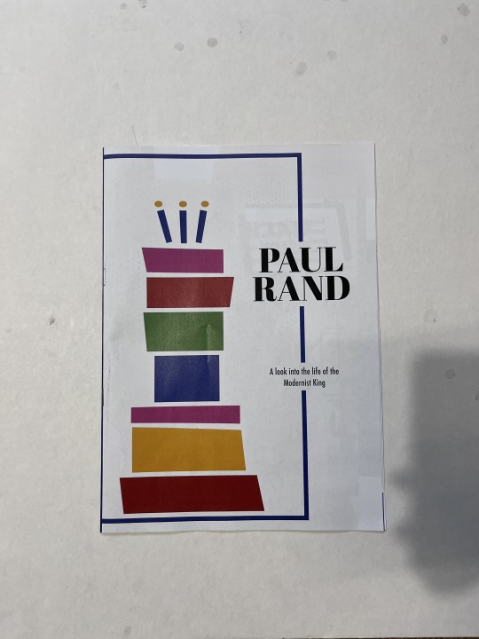
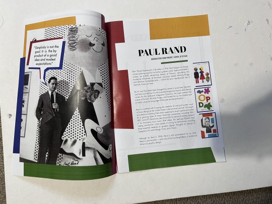
At the end of class on Thursday I printed and stapled my final booklet after I implemented all the feedback Karol had given me. Since I had already done test prints and knew how to make a post script file, printing wasn’t too difficult. On the day since so many people were printing, the printers kept having issues but luckily the one down the hall on level 4 managed to print it out for me.
I double checked all my links to see what the ppi of each image was looking like and found they all met 300dpi so the images would be fine to print. I know the typography was of an adequate size from my earlier draft print and I was able to practise stapling on some scrap paper before I did my final.
There were some ink unevenness and marks because of the printer, when I notified Karol she said this could be fixed by “slowing” down printing but we haven’t been taught that yet so I wasn’t able to implement that, But would be something I would want to learn and use for future work.
---
Packaging Files - This was the easiest method I found to transfer material and files across computers, since I was working on my booklet at home and them coming to campus to work on it in the Lab I would always create another version as a package whenever I moved from laptop to computer.
Below is an example of the Packaged Folders in my one drive that are a result of me switching between computers

Whenever I packaged my file I also ticked the option to create a pdf, this pdf is a reader spread / this way i could keep track

For all my test prints as well as this final print, I printed form the lab computers via the post script method shown in class, once I got a hang of all the settings I found it quite easy and didn't have any issues with crop marks, etc when printing my final. (I also took pictures of the final steps and reviewed all the videos Karol recorded helping us with the exporting and printing)
Below is example of one of my practise postscript filed and then the pdf it created once I ran it through distiller

0 notes
Text
Reflection
Grad 503 – Reflection
My design journey started with research, which is a step I am quite experienced with due to past projects so once I had been assigned Paul Rand, I was able to use the tools provided to me such as the internet, AUT library as well as online video sources like ‘Youtube’ and ‘Kanopy’ to learn what I could about my designer and collect materials I could work with. I analysed his work to pick up what patterns and conventions were evident across his work so I could utilise these principles and make them my own when it came time to make my timeline and booklet. Prior to Grad503 I had sufficient knowledge in Adobe Illustrator, felt most confident with Adobe Photoshop and had little to no experience/knowledge with Adobe InDesign but over the past 12 weeks through lab tutorials as well as through independent learning I have learnt how to more confidently use Indesign and Illustrator. I still have much more I can learn about the two softwares but over this design journey I have been able to advance my skills which helped me immensely with the construction of my timeline as well as 12 page publication. Some specific aspects I learnt and started to implement would be my use of grids, columns and paragraph styles. Although I did use other indesign, illustrator tools and guides, these 3 were of most help to me personally. Through using these 3 tools, I was able to make my designs and work much more consistent and visually appealing – it also made me more efficient as a designer as I wasn’t needing to go back and look at font sizes or compare column sizes across multiple double page spreads. As the timeline was a poster, I was comfortable with the conventions that went into a poster as well as the printing and exporting aspect of it. The 12 page booklet however, was a lot harder for me to construct as well as physically print. Although I was able to learn how to print out the booklet through lab tutorials, I found it quite hard to come up with ideas for double page spreads which resulted in me delaying starting. To overcome this, I decided to just ‘go for it’ and digitalised my most basic concepts and started tinkering around with them. While iterating I found myself going on ‘Behance’ and going through the ‘Paulrand.design’ website quite a bit to look at double page spreads as well as look at Paul Rand’s designs until I was able to come up assets I was happy with. However, because of this, I found myself having to rush towards the end of the journey, as the week I delayed, pushed everything following it back. This is one aspect in hindsight I consider a major disadvantage, and should I do another project similar to this again I will make sure to not let my creative blocks get the best of me and put off starting developing materials. If I were to expand upon this booklet, I would include more pages talking in depth about his designs as well as include more information on his earlier influences and include imagery to support it. I think this way the reader would be able to get a better grasp on who Paul Rand as a creator as well as someone who analyses other creators work.
0 notes
Text
Iterations (Article Page 5 &References)


I took my thumbnail and shifted the designs inside of it around a little, I kept the general premise the same just to get started with

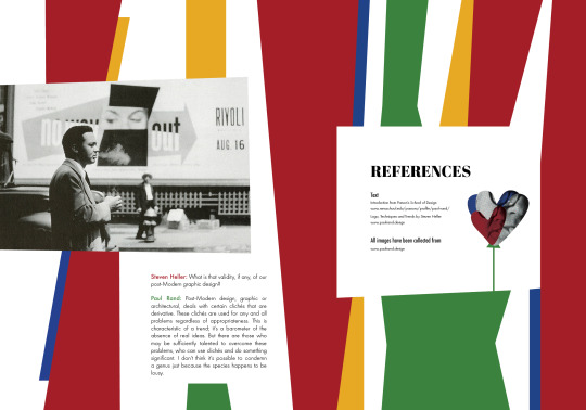
Like mentioned before I really liked the spread I was developing for the quote and intro page but it wasn’t working at that location but I think it works a lot better for the references page so I shifted it here and began to combine the two. I added all the content I wanted on the page and began to tinker around with what goes where and tried to make it more fun

I added a couple more stripes and layered them, I made them different colours so there was contrast and the design looked more fun. I liked the little squares I had on my page 5 of the article but i didn’t think it was working that well with the text and image on the page
Final
Ultimately I decided to get rid of the little squares and carried over the pattern l had on the references page. I looked through the links and saw how low the ppi was for the old image of paul rand. I knew i would need to change it so i found a bigger image. I also added little connections between the lines and the references square. Following Karol’s feedback I changed the colour of the names and double checked alignment. Karol pointed out my references were weirdly gaped inbetween sentence which i fixed. I also brought over the balloons from the timeline to keep the theme going and it reminded me of how at the party balloons are kept as a reminder.
After I fixed all my alignments and did the feedback karol gave me I think the design works for my designer and my overall booklet it all compliments my designer.
0 notes
Text
Iteration (Article)
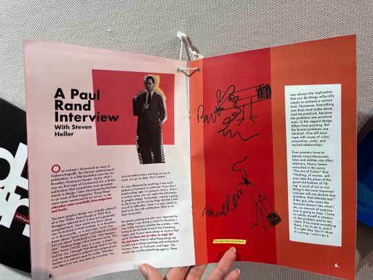
Pages 1-2


Since I didn’t love my thumbnails I used the designs I did like as stepping stones to work off of so I used this double page spread layout and digitalised it.


I played around with the shapes some and created some new ones, I also tried to add some images I had collected as a part of my content collection but they didn’t work as well and I thought that it would be better to use this current layout (the one the left) on the actual double page spread on article page 3-4 instead. And started to change this one up. I decided to replicate the cake tower of squares I had on the cover to make the booklet cohesive and continue with the theme it has going. I then added some different photos I had collected for my content and I think I will stick with my current content and design choices for now.
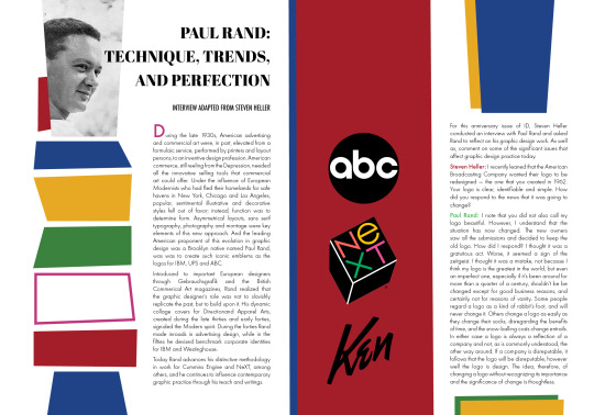
Following the feedback I got from Karol I checked all the alignment again and fixed up the random gaps I had in my typography. I also fixed up its inconsistency across the spread. Karol mentioned that you couldn’t rlly see that paul rands name had been highlighted blue while steven hellers (red) showed a lot more visibly and suggested I change the colours. I asked my peers next to me whether they think the green stands out or the red and was told to keep the green for paul and red for steven. I also decided to get rid of the IBM logo as it looked kind of lonely up there alone. I was also told to make any shapes ive got layered more obvious so i moved the underneath layers of my shapes a bit out so the layer and corner between them looked more pronounced.
Pages 3-4

As mentioned before this double page spread was used as a building block for my entire article spread section

I then took the iteration of my pages 1-2 and worked with it to create a version of it for my page 3-4 spread. I played around with the colour blocks and which way they worked better. I also included all the content I wanted to and started to figure out columns and alignments for this spread. I followed the grids I had made.

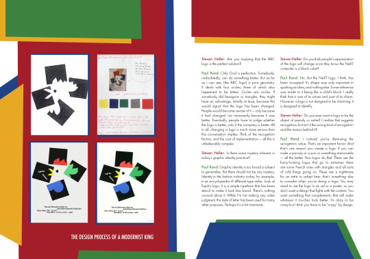
Since the layout was looking a bit bare compared to the rest of the spreads I added a couple more layered shapes underneath, I played around with the colour until I was happy with it. I also added some text under the 4 images on the left page to explain what they where. I also highlighted the names of steven heller and paul rand like I had previously.
Final
Following Karol’s feedback on the colour of the names, I changed the colour and width on the names on this spread as well. Following the advice she gave earlier I made the layer between two shapes way more obvious by dragging one out a bit. During feedback Karol noticed the weird gaps in my text so I went and looked through all my paragraph settings to fix it. I found the text didn’t end the same between the two columns. I was advised to either add or delete info to the text which I did to even it out.
I think the article spreads following Karols feedback look a lot more clearer as I used the grids to perfectly align and space everything out. The design also works with my booklet so far and my designer, I think it looks consistent.
0 notes
Text
Iterations Quote + Intro


This thumbnail wasn’t actually for my quote spread but I liked the way it looked initially so I decided to use it as a stepping stone to work off of

I reworked all the lines I had into a more stripe type of patterns, it’s uneven like all the shapes in my work. I liked the way the clothes were working but I was having trouble figuring out how to bring my quote into play as-well as my picture and heading (I would later go on to use this introduction page design for my references page)

After reworking on it for a while. I created some more uneven shapes and decided to make it look a bit more comic in the sense of the speech bubble, I thought this was a little bit fun or playful compared to what I had before, I made use of layering which is a feature Rand uses a lot within his work. I used my paragraph styles I set up and started brining in some of the other content I wanted to use like images and text.

Final
Following Feedback I received from Karol I made sure to double check all my alignment and I also made the speech bubbles shadow fall the same way Rands shadow falls on the image. Karol also sat with me and reworked the signature on the image. As I had reversed the original image it was backwards but using various tools like feathering, stamp, pattern tool etc we were able to turn it the right way around and match up the halftone dots in the image up correctly. I also used blue backgrounds on the images I put on the spread to make them stand out more. I think this spread is playful as well and works cohesively with the rest of my booklet so far, it also works well with my désigner.
0 notes
Text
Iterations (Timeline)


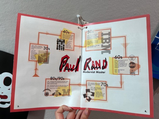
Using timeline I drew up a little thumbnail of how I could rework my timeline into a Landscape timeline that goes across a double page spread. so found this quite difficult as shifting my design onto landscape didn’t immediately work quite well and I found that putting the shapes all together like I had doesn’t translate well to a double page spread layout so I scattered the assets around the page. and broke up the outline into a zig zag but still used the idea of a line breaking out into circles. I am planning to keep all my text the same.

I got rid of the zig zag line going through the middle as I thought it made the timeline look not ‘together’ so I did a single line going across the two pages instead, with the dots being markers inbetween. I still had my scattered assets around the timeline but I couldn’t figure out where to put them without it looking out of place. I also developed uneven squares to put along the edges like I had in my timeline.

I put the assets towards the corners, I think that is where they look least awkward and then added arrows to the dates as without the arrows the dates weren’t as clear. At this stage I also got rid of the birthday date as I felt it wasn’t necessary (the date is written under his name and mentioned in intro).I added the original heading I had in the timeline in the corner as well and changed the colours of the squares to bring in the Paul Rand colour style.

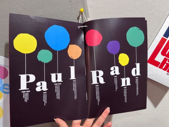
I didn’t really like where that timeline was heading so I decided to think of how I could make the timeline a little different yet still follow some of the ideas I had in my original timeline. I decided to play on the idea of Paul Rand being the ‘king’ of design as well as the birthday cake I had at the front. Since this is a timeline, its all about the dates that mattered the most in Paul Rand’s design career leading up to the IBM logo, and we tend to celebrate events like that so I decided to make little gifts and balloons out of the shapes I already have in my work. as such the timeline celebrating his life before the IBM logo - the celebration of his journey to becoming the king of modernist design. I decided to make the clippings I had of his face into little balloons but kept the circles and outline . I also decided to change the page heading to the same font and weight I have been using across my designs as I found it looked a lot more cohesive this way even though I did like the way my old heading looked.

I made the outline blank around the parts that had text to make them more readable, and then contintued the celebration idea across the spread so it filled up the bottom of the timeline. All the balloons were made using the assets I had from my timeline. I played around with the colour aswell.

For the final I added little squares between the dots and the dates to make it more legible and put the candles onto the ‘P’ of paul rand instead so he is ‘king’. My timeline spread is a reworked version of my poster, it isn’t the same timeline titled onto its side but I took elements from it and reworked them into a timeline that fit my publication - I did this by keeping the same colours and assets and simply using them a little bit more creatively and doing this meant I also expanded on the narrative I had going through the publication.
0 notes
Text
Grids, Columns, Parent Pages
I didn't utilize the column and parent pages tool while making the timeline poster as they weren't as relevant, but I did make use of the grid initially and then later used it again following the feedback I was given to clean up the placement and positioning of my assets. I used the document grid for this (visible in past screenshots). During Lab tutorials, we were taught how to customize grids using column and row tools and also how we could use parent pages as a way to create certain grids for certain types of spreads. I intend to make my 12-page publication 2 columns and maybe 3 rows for the grid. I am thinking of using parent pages to create two sets of grids, one for the covers and one for the inside of the booklet
---
Screenshots of my indesign settings while iterating


The top left screenshot is of my parent pages, the top middle is the grid i used for my cover pages (parent page 2) and the grid on the top right was for the inside of my book, I found them extremely useful in making sure that my assets were consistently positioned across the spread and to make them more aligned.

Following feedback with Karol, I went in and used a document grid to really align some of my trickier shapes. (I found working with the document grid quite useful in the timeline iteration process so I used it here again too)
0 notes
Text
Iteration Process (COVERS)
I started iterating once I started developing my design onto the computer file.


While I was digitalising my concepts, I started to make changes. I found that the three square covers looked too boring and plain so I decided to create a range of shapes that went across the pages instead. While designing they reminded me of little doors that gave us a look into Paul Rand as a designer. At this stage, I decided to try out a couple fonts just in case I found that certain fonts did look better as headings depending on the design - I am still using the same fonts I had decided on but I was playing around with which font would be what paragraph style. The funky uneven squares also work with the design I had in my timeline and work with the type of style Paul Rand has.

I decided to be a little more playful with the design, which is something Paul Rand does a lot within his work, and decided to create a cake using the same shapes I had on my cover. Since this booklet is about Paul Rand as designer, and the many years hes been in the industry I took the idea of time and related it to birthdays, the candles also look like a crown which was pointed out to me - which also is a bit playful as Paul Rand is often thought of as the King of Design. After i started to develop this ‘celebration of a king’ narrative within my booklet, I altered a lot of my text and other designs to also work within it (seen on my timeline iterations)

I added a border around the design to ‘tie’ it together. I also changed my typeface back to what I originally set out to use as it did work a lot better than the experiments I was doing. I continued using grids to help align the design across two pages.

Following the feedback with Karol, I decided to switch the uneven squares at the back to lines instead as they aligned a lot better than the squares were. As well as making the text ‘Paul Rand’ go closed together as suggested. Using the grid I finetuned all of the spacing between all the individual shapes and all text. I also changed the text ‘modernist master’ to ‘modernist king’ as it worked better with the crown/cake imagery.
This is also my Final front and back cover. Through the printing trial I did I found the size of my font to be fine and the colours all complimented each other. I think shifting from the squares to the birthday cake gave my work more personality which is an element I think all Paul Rand poster and magazine designs tend to carry, they are always colourful and a little fun. The font choices also are similar to the typefaces Paul Rand likes to use or are the ones he has used in the case of Futura and I think they compliment the visual imagery well. The contrast between the serif and sans serif also works quite well with the coloured tier of squares and outline.
0 notes
Text
DRAFT PRINTS + FEEDBACK
I did a two prints of my booklet before my final print to get an idea of what was going on in terms of colour, shape, typogroahy etc. I intially printed a a4 spread and realised I hadn’t been able to make it a two sided spread, (for which I learnt hwo to do later in class) - from this print, I knew my colours and type were working quite well and the pages flowed from one to the other, which gave me the green light to continue iterating.
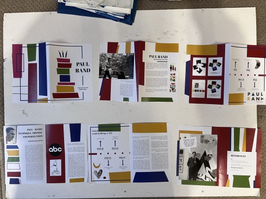
After I printed my completed booklet in the actual size it was supposed to be , to see how my printing turned out crop mark wise and to get some feedback, I folded up the booklet and gave it over to karol to take a look at. She sat down with me and hand marks my booklet and then showed me how to rework images on photoshop . After all the feedback have been given I did my last iterations which was implementing what she said (fixing up small gaps, aligning all my assets, etc)
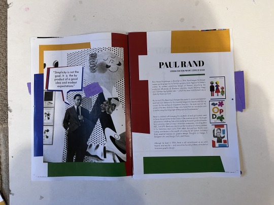
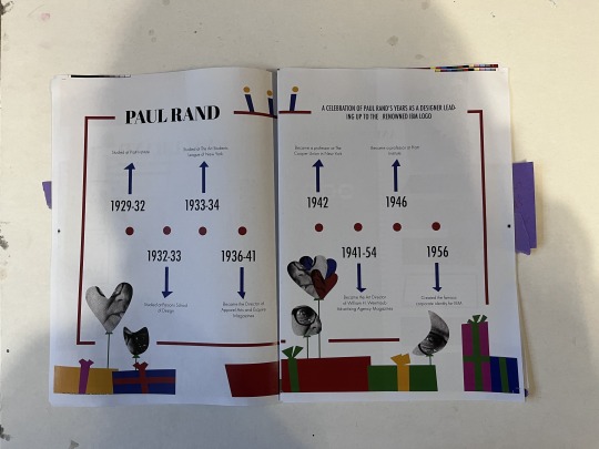
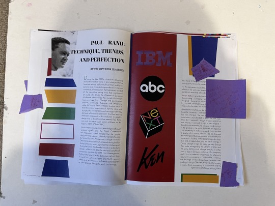
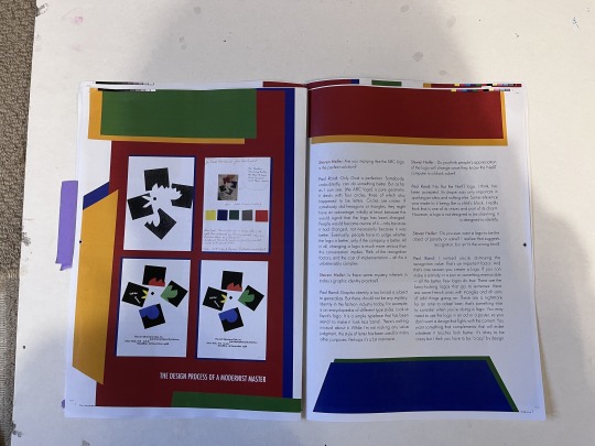
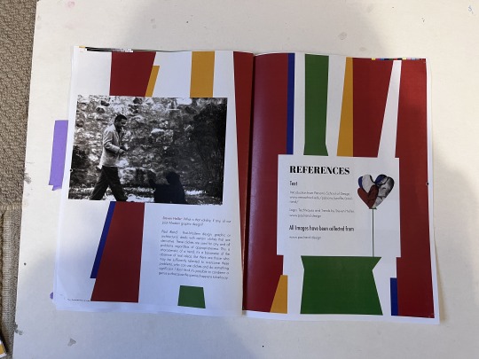
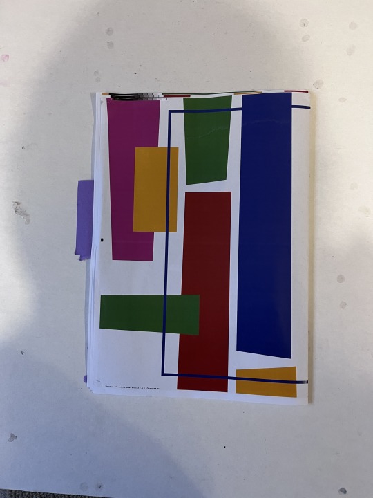
All images besides the image of Paul rand on the last article page were pretty clear and adequate for this project but I didn’t like the way that image looked in comparison to the rest of the images so during the iteration process I swapped that image of Paul Rand for one with bigger dimensions and therefore a higher ppi
0 notes
Text
Final Text Used
Quote: Simplicity is not the goal. It is the by product of a good idea and modest expectations”
Introduction:Born Peretz Rosenbaum in Brooklyn in 1914, Rand began his design career painting signs for his family’s grocery store. Against his father’s wishes, he studied advertising design at Parsons, absorbing the modernist influences of Bauhaus visionary László Moholy-Nagy and German Sachplakat ads — which he soon transformed into a distinctly American look.
By his mid-20s, Rand had changed his name to avoid anti-Semitism and had won renown for his inventive magazine layouts and daring covers for the antifascist magazine Direction. He even earned the praise of his hero Moholy-Nagy, who hailed him as “an idealist and a realist, using the language of the poet and businessman.”
Rand is credited with bringing the aesthetic of and grid system used in Swiss design to the United States in the postwar period. He taught at institutions including Yale while applying his avant-garde principles for a growing roster of major American companies, including IBM, ABC, and UPS. Rand was also known for his sense of whimsy, evident in his humorous, now iconic IBM rebus. But perhaps Rand’s most lasting contribution is the wealth of writing he left behind, including three essential treatises on graphic design: Thoughts on Design, A Designer’s Art, and Design, Form, and Chaos.
Although he died in 1996, Rand is still remembered as an artist, theorist, and teacher — and one of the founding fathers of modernist American graphic design.
Timeline:
1929 - 1932 - Studied at Pratt Institute
1932 - 1933 - Studied at Parsons School of Design
1933 - 1934 - Studied at The Art Students League of New York
1936 - 1941 - Became the Director of Apparel Arts and Esquire Magazines
1941 - 1954 - Became the Art Director of William H. Weintraub Advertising Agency
1942 - Became a professor at The Cooper Union in NY
1946 - Became a professor at Pratt institute
1956 - Created the famous corporate identify for IBM
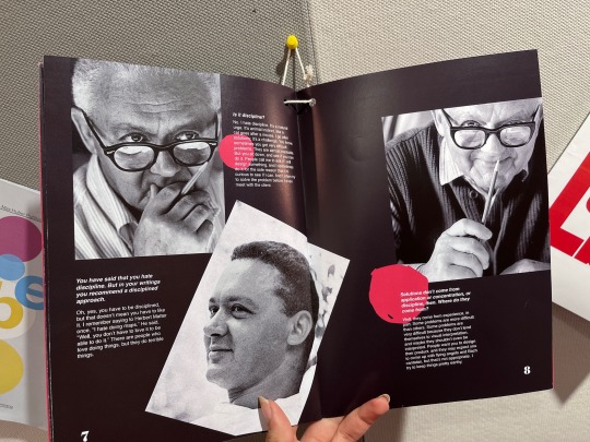
Interview: paragraphs, 1-8, 15-18, 23-24
References:
Text
Introduction from Parson’s School of Design
www.newschool.edu/parsons/profi le/paul-rand/
Logo, Techniques and Trends by Steven Heller
www.paulrand.design
All images have been collected from
www.paulrand.design
Other:
A look into the life of the Modernist King
Celebration of Paul Rand's Years as a designer leading up to the renowned IBM logo
0 notes
Text
Typography, Character Styles, Paragraph Styles
My final font choice as mentioned before, are the following:

in the order of, Heading, subheading, body
Obviously, the size of the heading on the coverage is going to be a lot bigger than the heading of an article, but I will be using the same font. I am planning to use paragraph styles when I start designing and I figure out what size font works the best, I also intend to use a drop cap for the first letter of my article interview, so I intend to play around with the character style tool as well.
-----
Photos of my settings while I was designing (Taken during Iteration Process)


Since I was only using the character style tool once, it wasn't as helpful as the paragraph style tool was, I found this tool so useful and made me more efficient as a designer, it allowed me to be consistent across the publication and made the typography aspect a lot simpler/faster. This is a tool I found one of the most useful.
0 notes
Text
Colour Pallet Choice for 12 page booklet

I decided to not change my colour pallet as it worked quite well with my timeline, unlike the fonts I don’t think it would benefit from me adding another colour as there is already an abundance of shades. Paul Rand’s design work is colourful, but it tends to have the primary colours + a few more secondary shades which I had added.
0 notes
Text
Typography (Timeline and 12 Page Publication)

Fonts used in the timeline.
The typography I used in the timeline was Futura, I used different versions of it - the original Futura was already on Indesign but through Adobe Fonts I also activated Futura PT, which allows me to use Futura fonts that are lighter and would work better for bigger bodies of text. Although I looked into Serif fonts like Bodoni in the typography research for the timeline, they didn't work as well with the designs I had created for the timeline. However, as the 12-page publication is very different from a poster timeline, I wanted to explore my options again.

All my typography trials
To introduce a new font I played around with which font could be used for which purpose. I knew I wanted the heading to be a lot bolder than the rest of my text so I felt that Futura Bold worked quite well (like it did in the timeline), but since in a lot of past Paul Rand designs, he has used serif fonts as headings, I’ve decided to as well.
The typeface and choices I decided to go with is the last one in the image above, I think that the sanserif is easier to read than the serif fonts so it would be better to make them the typefaces for the larger bodies of text (body paragraph and subheading/quotes). While the serif font will work a lot better as the heading as it stands out compared to the sanserif fonts especially when you line them up like this.
As I mentioned in my past typography research, Futura is a font that Paul Rand has utilized within his past designs, so I decided to implement it. Abril Fatface isn't a font Paul Rand has used as it was made in 2011 but its design reminded me of the type of serif fonts Paul Rand has used within his past designs, I did try out serif fonts like Bodoni that Paul Rand has used but I found (like the timeline) it's just not working for what I am thinking of doing.
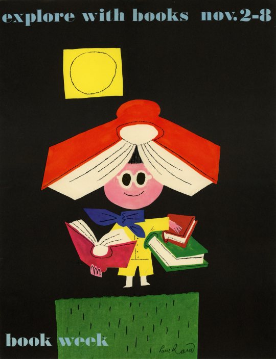
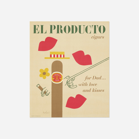
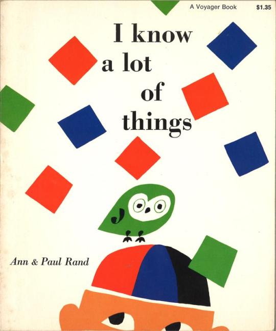
Some posters by Paul Rand that utilize Serif Fonts, that the font Abril Fatface reminded me of, they have a similar look as the serif is rounded but not too chunky, its legible and has thick + thin lines
0 notes
Text
Paper Type
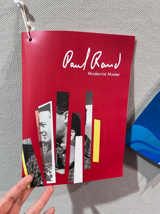
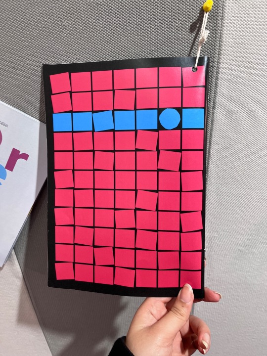
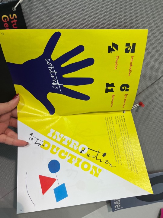
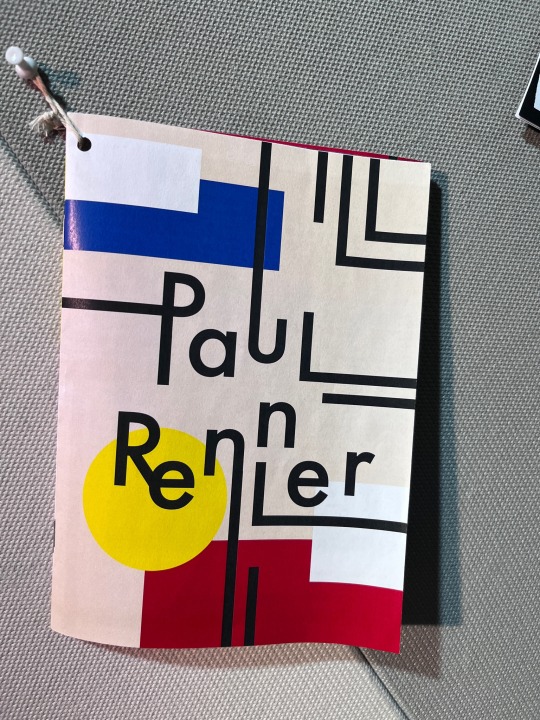
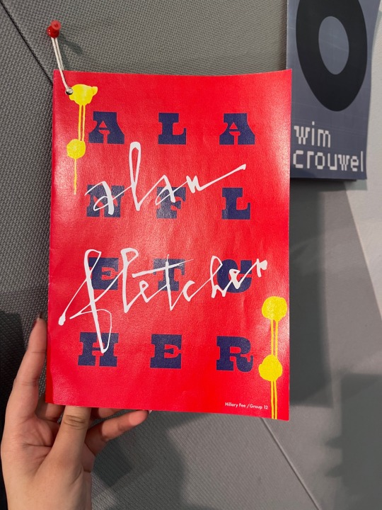
I looked through some of the example booklets hung up on campus and compared the paper, the paper for the booklet is quite thin so I wouldn’t need to use card, most standard photocopy paper is of an adequate gsm for the look I am going for with the booklet . Between glossy and matte I have decided to go with matte paper as none of the designs I have looked at while researching Paull rand were shiny if anything clear matte paper textures were noticeable for a lot of his designs so like Paul I will be sticking with matte 80-100gsm a3 paper.
Images I took of timeline examples to get some ideas on what last students have done and what I can do
0 notes


