Don't wanna be here? Send us removal request.
Text
End Of Project Evaluation
I think that within my prep work with the first and second photoshoot that they reached a good quality that i was aiming for because within the actual shoots i had many trials and errors with what i thought was working, so took attempts to get them to the standard i felt comfortable with. Then within the actual concept of the photographs for the prep work that they were effective as i feel as so they easily showed what techniques i was trying to do, for example the light trails from cars is clear that is what is shown in the images and the second photoshoot with the tea lights and fairy lights i managed to get a good bokeh effect which is what i was aiming for. One thing i would like to improve on would to have more variety like more locations because then it would of reached a wider range of what i would have been able to do with the images, and also to keep the theme of the light trails for example but in different places so it was more varied. I feel like this would have been more effective to the overall images.
Especially for my first set of images with the light trails I was definitely taking more risks and trying much more, as it felt that I was able to try more with it in the sense of the creative boundaries as the image in the first place had more of an abstract feel so because of this i felt that the experiments could easily reflect this more. However with the second photoshoot with the bokeh effects on the tea lights i wanted to try and keep the warm cozy feel to the image so trying experiments that were able to keep that was more on the difficult side, so it was challenging my creative boundaries as i couldn’t just throw anything at it, I really had to think about what i wanted the image to still convey and then experiments to keep that sense to it.
With the final outcomes I am actually quite happy with how they turned out but also the amount that i got finished as my experiments and editing for them was quite tricky, which i think was a creative risk that i had to take as i wasn’t too sure in how long they would take or if they would come out to the standard or like the original idea i had in my head. With the big geometric shapes that was filled with triangles inside was my original plan and then i also decided when doing them to take a risk and try to make some of the triangles all go into one point within the actual big shape, so it would just add that other element or level to the photograph . Overall i am glad that i tried to take that risk as i could not have been able to line them all up into to one point in the time had, but it payed of as i much happier with them.
0 notes
Text
Artist Analysis 4
What is the photographer's name ? what companies have they worked for?
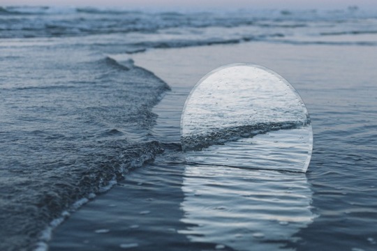
This photographer is Cody William Smith born in Nevada who does portraits to landscape which mainly focus on the scenery of california and has BFA in Cinema from Columbia College in 2012.
What is the location in this photograph?
The location of the images seems to be rural as it is taken with the shore line and using the reflection back onto another wave which makes it seem as it continues going through the mirror. As it is most likely on a beach i would assume that the location is more rural than urban as most beaches are more secluded in countryside open areas that close to big cities.
Describe and explain the techniques that the artist has used to distort the original landscape photograph?
In this image is also from a collection of others “A moment's reflection” creating this image is with a mirror placed where he wants the reflection it and how it will come across he said “My intention is to draw new connections between familiar forms by introducing specular reflections to environments where none would typically exist. The mirrors serve as a focal point within a given scene and also function as a window to provide an entirely unique perspective on the same location.” So by using the mirror also distorts the rest of landscapes as you can’t see what’s behind it as the mirror is so much in the foreground of the photograph, but also by seeing the other side of the landscape through the mirror creates anillusion of what else is around even when you can’t see behind the mirror.
Do you consider this to be a photograph or more a piece of fine art?
I think that this image is more of a photograph as it was taken there and not much manipulation seems to be done to the image afterwards. It seems to me to be leaning towards photography as it very much based upon the effect that the photograph has on you with the illusion of the circle and the techniques used to try and accomplish that.
What is your personal response to this photograph and how does this photograph inspire or relate to your own work?
I really liked this set of images when i few saw them as it’s using simple shapes so in this case the circle mirror which reflects the scene around, but personally i like how it's also taking a picture of what is being reflected by the mirror rather than it just being in the image. I think that this will inspire my work as i like the fact that just something simple creates such a different level to the photograph, but you can also tell the depth he went to create that image even though it's simple and so why i feel like it's so effective.
0 notes
Photo


6- 8 inspirational photographers
Image 1 - Robert Berdan - I like how the two images fit well together even though they have different colour levels and different subjects.
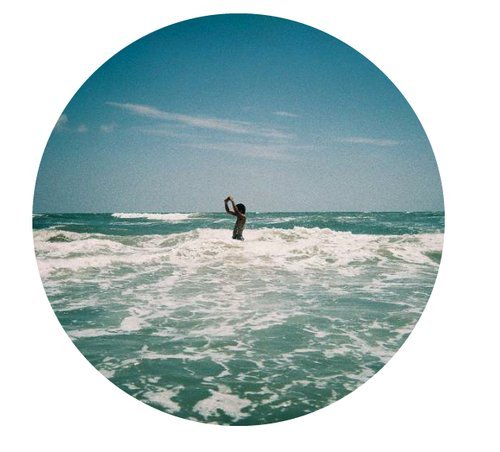
Image 2 - Marco Suarez - This is a straight forward landscape but has been pt into a circle with white background which i like as it draws more attention to the centre of the image
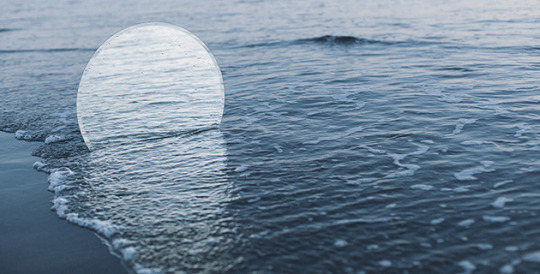
image 3 - Cody William Smith - This image also uses circles but is a mirror reflecting in front of it which gives an interesting perspective that makes you look twice at the photograph as it has some confusion.
image 4 - Millee Tibbs - I find this photograph interesting as it is the only one that has done something after the image was taken by folding the paper but only one side of it.
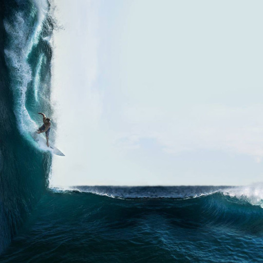
image 5 - Victoria Witchoria - With half of it being flipped it looks like a wave is that sharp and strong and i like the idea of doing something which at first makes you think that it is real.
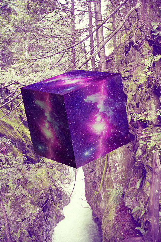
image 6 - David Copithorne - This photograph is the most edited with the 3d cube and the space effect but i like how the photograph with that much editing doesn’t take away form the actual landscape that much.
0 notes
Text
Brain storm for final outcomes and photoshoot
Some ideas that i have for the final outcomes are more based upon geometry and geometric shapes and the definite lines that you can make, as i find it interesting how simple shapes can change a image completely and that is what i want to try and achieve with the final outcomes for this photoshoot. One of my main ideas is to try and create a stencil like effect by maybe flipping the same image on top of itself and then making cutouts through it to the upside down with shapes , so the basic lines and shapes create a geometric feel but isn't;t too overpowering.
0 notes
Text
Experiments 2
Reflection of experiments
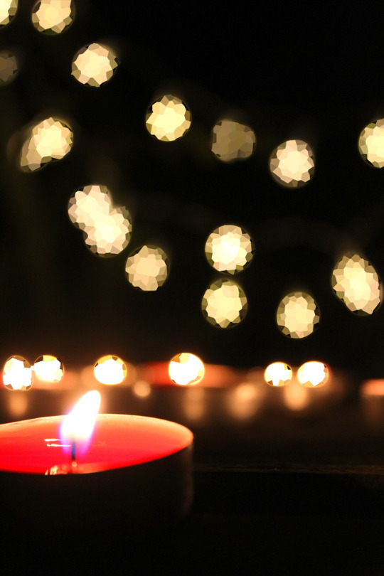
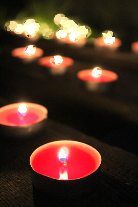
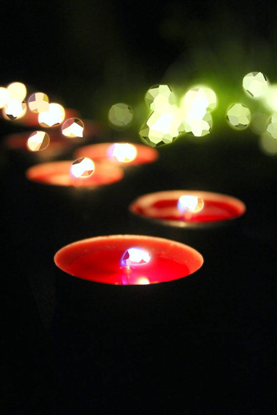
Upon reflection of the second set of experiments Im glad that they came out quite simple with a little bit of detail for example all of the light sources i had made a geometric pattern so when you first look at the image you can’t really tell than anything is off until you look closer. I think just by doing the pattern on the light sources was quite effective if i had tried on some blades of grass or something else it might have been a bit better.
Final set of images
With my final set of image that i will use for the final outcomes I want to try and focus more on the landscape of an area of houses and the land rather than closer up like the grass and tea lights in the second photoshoot but more like the first shoot as that was a wider image of the landscape, so developing on that scale for the subjects of the image. The reason that I want to get a bigger landscape as after the success of the geometric hints in the second experiments i want to try and do something like that but on a bigger scale.
0 notes
Photo
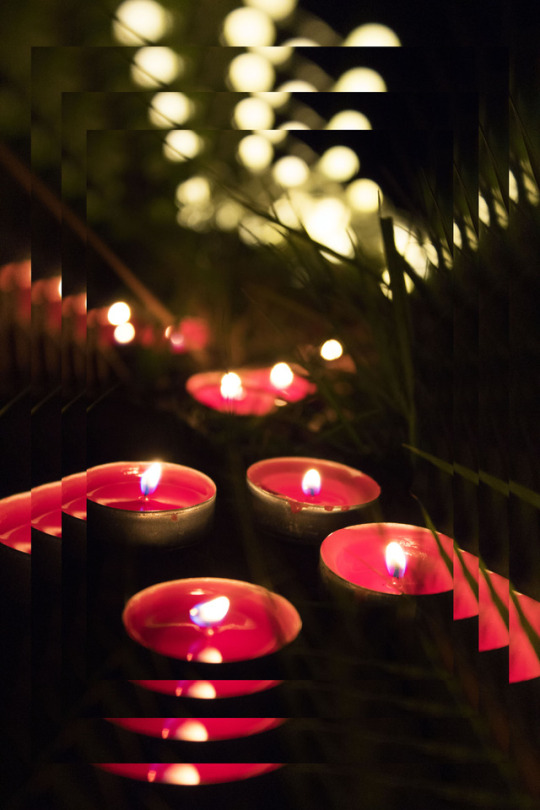
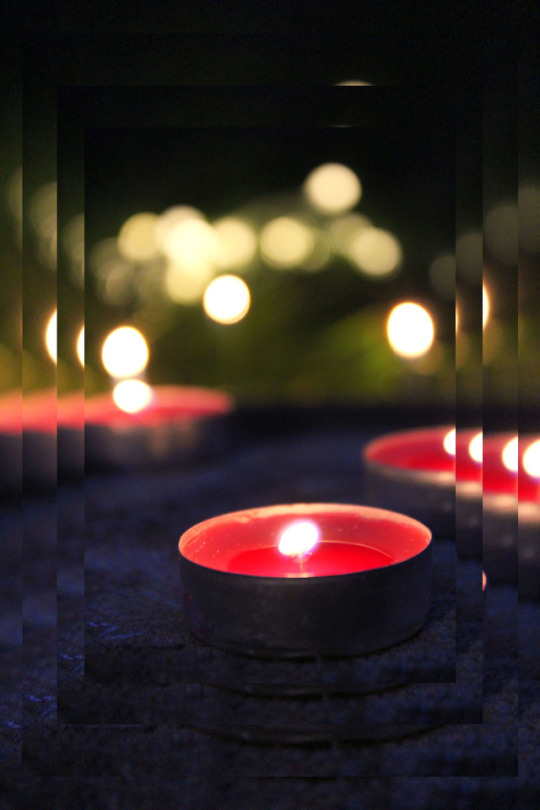
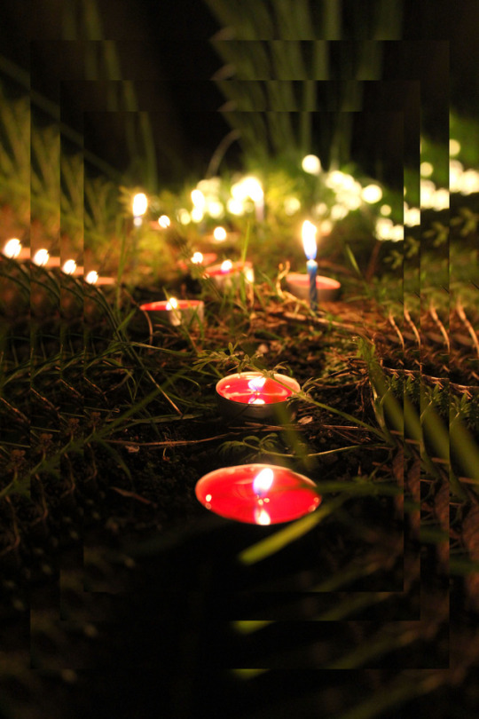
Experimental developmental photos
Moving on
With the next set of photos for photoshoot two I want to try and incorporate more sharp lines and some geometric details, just giving the images more simplistic experiments, in which you can still tell what the image is not to be to highly edited that it becomes more abstract. I have a few ideas one being that i might duplicate the image 3 or 4 times and place them on top of each other as then it will still be the same photo in the middle but around the edge will be like a photo frame or tunnelling effect to the centre.
Outcome of photoshoot 2
With the outcomes of the second photoshoot I am pleased with the variation of the different shots i managed to get with a limited location, also I am glad that I was able to keep the foreground tea light in focus while the other tea lights behind and the fairy lights created the bokeh which is what i was looking for. Once looking back on them I think that it might have been good to have put more in front of the first few tea lights to give more an effect that you are on that level and looking through.
0 notes
Text
Artist Analysis 3
What is the photographer's name ? what companies have they worked for?
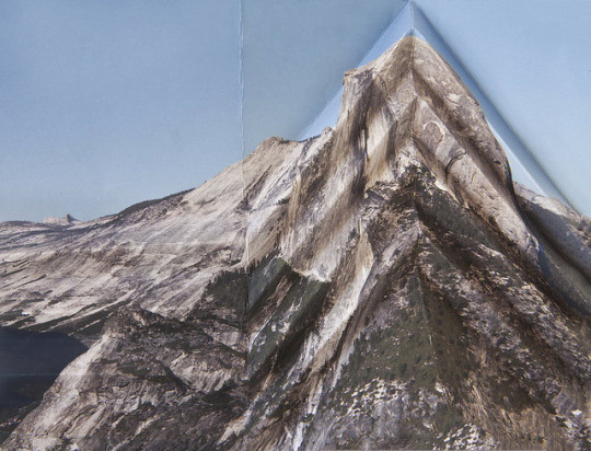
This photograph is Millee Tibbs born 1976. She has awards such as the Pawtucket Foundation Prize 2008 and the and the Award of Excellence from RISD in 2007. Some of her work is held in the Portland centre for art and photography and the Notre Dame University.
What is the photographers motivation for being a photographer? What is their motivation for taking or creating landscape images?
Tibbs is interested in the landscape and the surface and what may lie beneath it or what we might not see and gives motivation for creating landscape photography. But also on the framing of the landscape another factor to why she may be motivated in taking and creating landscape photographs. She said she is drawn to photography because , “of its ubiquitous presence in our culture and its duplicitous existence as both an indexical representation of reality and a subjective construction of it”
What is the location in this photograph?
This particular photograph seems to be in a rural setting as you can vaguely make out the squarish shape of the top of the mountain positioned on the right hand side of the image. Also it is quite a big location not just a small town as you are able to seem from quite a way down and also in comparison to a part of a lake on the bottom left of the image. It seems that the image was taken on the location during the day at some stage as there is a clear blue sky featuring in the photograph above of the mountain, creating a bit of negative space. In a interview she also says “ I use images of the American West as a starting point... through the representation of that landscape.”
Describe and explain the techniques that the artist has used to distort the original landscape photograph?
The images as a final product seem to have been first photographed which is done by herself aswell not just the distortion and then the photographing of that “Yes, I made the original photographs...I love the outdoors and long road trips, so taking the pictures is a lot of fun for me” after this printed out on some some of paper and then manipulated and distorted physically through some kind of bending and folding of the image, and then that is then photographed as the final outcome. They are definitely not done by photoshop as Tibbs says “The final pieces are photographs of physically manipulated photographs.” and also that she wants the dimensions and 3D effect to of the bends and creases to be able to be carried on through to the flat image presented at the end. “ Even so, the work seems to have dimensionality which continues this visual confusion onto the gallery wall.”
Discuss the main technical or formal elements featured in this photograph
As the photograph has been purposely creased and folded in a way of straight lines creating an overall shape like the triangle shown in this image so there are strong angles within the photograph. Within the actual image itself before being distorted there is negative space within the sky as it is a clear blue sky being a solid blue colour with no clouds which creates the negative space above the mountain, which in turn helps bring the focus to other aspects of the photograph.
Do you consider this to be a photograph or more a piece of fine art?
With this image in particular as it has been physically manipulated rather than digitally edited through photoshop it can be seen more as a piece of fine art in a sense but as it is truly a photograph in the first place, i think it still stands as a photograph as even after the manipulation it is then photographed again for the final outcome making it that image.
What is your personal response to this photograph and how does this photograph inspire or relate to your own work?
Personally i like the sharp lines and strong angles that have been able to be made in the image and that the folding is then into an overall shape. Also what is interesting to me is that for this specific image it is only done one one side of it and so even though it is only done on a section of the image you would think that it would take away from the other side but it doesn’t. This is something i want to be able to relate to in my own work that even though a specific section of the photograph may be different rather than all of the focus going on to that and not everything else in it, but it just adds a whole other level to the overall photograph.
0 notes
Text
Photoshoot 2
Within this next set of photographs I want to still try and focus on light and how it is within the night but using a different technique for the light so focusing on Bokeh to give the landscape image a magical feel, and so showing how light can change the whole appearance of a place not just the change between what it looks like during the day with the sun to at night with moonlight but also adding in other smaller sources of light likes tea lights and fairy lights.
0 notes
Text
Artist Analysis 2
Sian Bonnell is a Fine art photographer who lives in dorset and uses objects and placing them in landscapes and had an education at MA fine art. Some of her photographs are in the Victoria and Albert Museum from one of her series called “putting hills in Holland” and also the Canon photography gallery.
2. What is the photographer's motivation for being a photographer? What is the photographers motivation for taking/ creating landscape images?
In an interview with Sian Bonnell she says that ‘I’m particularly interested in the role of place how the intention of the artist and photographer can be conveyed via a still or moving image transforming an ordinary place into a sinister or obversely a place of wonder.” This shows that she may get motivation from taking normal objects and putting them in places that are also normal and then seeing what can be done with that and also how other photographers may do this themselves.
3. What is the location in the photograph?
The main location of this image is difficult to see where it may be as so much is focused on the light and the object that was placed there, however of what you can see it is a grassy area as some of the area seems to come right up close in front of the lens as if you are peeping through the grass. Something interesting was that i think it could be on a cliff or near a beach as the landscape after the grass seems to go straight to sky not giving much of a skyline if it were an urban setting and so because of this it seem to be a rural location that this photograph was taken it.
4. Describe and explain the techniques that the artists has used to distort the original landscape?
The main distortion that i see to make the landscape not as clear as a landscape would be is the use of the light and the effect that it has, you can see a small amount of a Bokeh technique at the bottom of the image which helps to give it a mystical feel as the photograph seems more delicate like the objects as its not a harsh light with a strong shadow the effect of the bokeh is very soft as there is such a small amount of it. The sky has also been blown out with the light from the sun flair and also making the landscape distorted as it gives the effect of no sky as you can see no clouds or any skyline.
5. What do you understand surreal to mean in art and photography? What are the visual elements that make it surreal?
The sky and the landscape kind of blend into each other which does create some kind of surrealness as generally when looking at landscape with the eye you are able to differentiate between the two, also the aspects of the landscape help to create this surrealness with some of the blades of grass being blurred closest to the lens but also most of the blades are not in focus meaning they don't have a harsh feel. Also from the grass the green reflects upon the whole image and up the side of the red object giving a green tint to it which helps everything blend together as it flows from each other like the green grass tint flows up the side of the red object and then the red object has the sun flare bokeh effect and so creating a very soothing smooth atmosphere.
6. Discuss the main technical elements featured in this photograph?
This image does have a unusual composition as the objects are placed in the landscape so one is in front and closer to the lens than the other and also how the stronger colour (the red) is the one that is closer aswell is interesting as you would think you would want the softer colour of the blue to be the first you see to help fit with the atmosphere of the image. Within this photograph there are not really any strong angles as everything seems smooth even where the horizon hits the grass it blends into one another, also the objects are curved creating a smooth angle rather than having something rigid and square which would change the whole aspect of the image.
7. Do you consider this image to be a photograph or more of a piece of fine art?
I think that because this photograph matches Bonnell’s style it is more a photograph for a personal collection of series of photographs they have for a fine art purpose, however the aspect of the objects that are placed there seem to be for the effect of the photograph and to make them seem like something else and not for a specific reason in why something might be done for a fine art purpose or commercial purpose.
8. What is your personal response to this photograph?
My personal response to this is that I am intrigued by the use of light that empowers the photograph as i feel without this if there were just the normal sun the image would not have as much effect or a softer magical feel. This also relates to my work to some extent as i am looking into how the light can change an image so much not only the natural light for example in this image how the sun is has created a flair but also the use of bokeh in the foreground from this.
0 notes
Text
Experiments 1
Reflection of the experiments
Upon reflection I am happy that i was able to explore the amount of options i did as i were to see what worked best and what I liked the most, for instance in for this set of experiments I found that with the lights trails go across the whole image that i was able to do a lot more and it worked really well with abstract ideas like the chopped up stripes and the kaleidoscope. I also found as the light was really bright when I was changing the colour I got the idea to make it like a rainbow for one as it is similar to what a rainbow is a ray of light, from this I did a gradient of a smaller selection of colours onto different light trails which had more of a better effect as they flowed into each other better as they were similar colours compared to the rainbow one. With this set of experiments i also tried out giving them a geometric feel which I started to really like but I think I could have done more with that.
Second set of photos
Moving on to the second set of photographs I want to stick with the night as I find the night so interesting as not many people look at the beauty in the night but focus on the day, I also want to focus a bit on the light but using a different technique not light trails maybe start to look into Bokeh as it can use the night as the light that illuminates from the night from the buildings and street lights. I have seen some of Takashi Kitajima work which includes the use of Bokeh at night and some of the images are quite powerful as the show so much light, If i am hoping to achieve Bokeh i don’t think i would want it to be as strong as Takashi Kitajima images as the bokeh effect cover the whole photograph like a sea of light, whereas i think i prefer the more simple effect with just a few here and there. I also am looking into the idea of just using the Bokeh as just a simple background techniques in a landscape image.
0 notes


