Don't wanna be here? Send us removal request.
Text
Jak the Artist - The Show Reel
For this assignment, we were tasked with creating a brand for ourselves and our show reel. To do this, we’d have to create our show reel, a logo that could be used for marketing, and also share our work online, getting interest and feedback from industry professionals. Here, I will be talking about my brand, and displaying what I have done in terms of making a presence online.
Brand:
For the branding of myself, I was quite lucky to have been already developing an idea for some time. I have a deep interest in graffiti, and I love the anonymity of having a ‘tag name’ in which all of your work is associated with this identity, yet your actual identity is not known. This was the main reason that with my branding, I decided to replicate this graffiti ‘tag name’ essence, coming up with my own creative alias called Jak the Artist.
The idea for the logo plays off of the Jak name, by using the Jack playing card as a reference point:

I thought that this would definitely be a add a element of memorability to my logo as a lot of people know about playing cards, and will immediately identify my logo as an adaptation of that, which will then make it easier to remember. Here’s the final version of my logo:

I decided to create a second logo which would be a word font so that I could use it in place of the icon if I ever needed to. Here’s it is:

Show Reel:
My aspiration in the animation & VFX industry is to work as Modeller. These are people who create the 3D assets used in films, adverts, TV shows and games. For this reason, my show reel focuses mainly on my modelling abilities, demonstrating these through a number of pieces I have created over the past couple of years:
vimeo
Feedback:
When seeking feedback for my show reel, I went down a couple of different avenues. I did not have many personal contacts in the industry, but I did meet a Lead Artist who works at Double Negative in London last year, and asked him to give me some feedback on my work. His name was Stafford Lawrence and here is his feedback:

His feedback was very positive about my reel, which I was happy about. He did suggest that I increased my poly-count when creating my models as there are some elements of pinching and stretching do show up in some pieces.
Another avenue I went down in search of feedback, was posting my work on a forum called www.polycount.com. I posted a discussion on the site, and gained feedback from one person, even though they weren’t a professional they still had some good feed back for me:

Online Exposure:
Now that I have a body of work to associate with my brand, it’s time to start getting my work out there. Social media is the best way to share anything these days, and with a number of video streaming, and photo sharing sites and forums available to anyone with an internet connection, I thought it best that I signed up to quite a few to get my work seen. I have signed up to and uploaded my work on the following social media applications:
- Artstation: https://www.artstation.com/artist/jaktheartist
- Behance: https://www.behance.net/jaktheartist
- Instagram: https://www.instagram.com/jaktheartist/
- Vimeo: https://vimeo.com/jaktheartist
- YouTube: https://www.youtube.com/user/sparkz2610
I have received some likes and comments on my work, and hopefully this goes some work in increasing my employability prospects.
Website:
This last element I have made in aid of my employability, which is a professional website for my portfolio/show reel. It can be found here: www.jaktheartist.com (not currently working atm, visit http://jaktheartist.wix.com/home)
-Jak the Artist-
0 notes
Text
Jak in the Box - Update
After a review of the final project, we tested adding music and sound to further the appeal of the film.
Here’s the film:
youtube
Thanks to all the people who gave us amazing feedback. Unfortunately, due to rendering costs, we weren’t able to implement all the changes, but hopefully it’s still an enjoyable concept.
-Jak the Artist-
0 notes
Text
A Hero’s Playground
After all the hard work, I’ve finally managed to render out the diorama
Here it is:
youtube
I’m quite pleased with the turn out, I wish I had more knowledge of V-Ray so that the materials could really enhance the character models. This project was a good learning curve for any future projects I want to do
-Jak the Artist-
0 notes
Text
A Hero’s Playground - And Some More Render Tests!
We’re nearly there! I’ve nearly completed the scene. I took the liberty in creating a few more scene assets just to make it look more interesting.
I have finished texturing Wolverine, and I’m very pleased with the turn out:

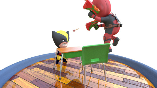
Now that the scene is complete, I’ve started doing full scene test renders. Here are some angles of the test renders I have done so far (some angles are more than once because there were errors):

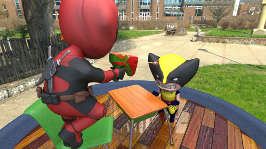
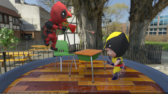
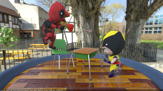
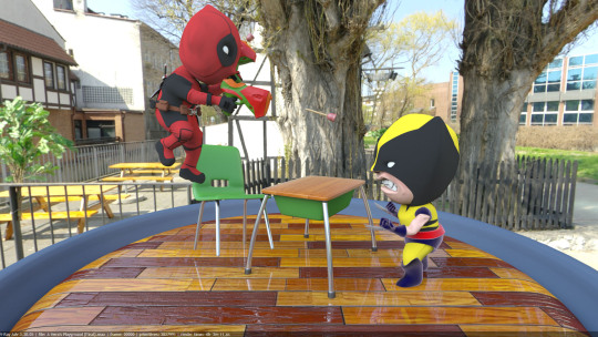
I was a little worried about the HDR map appearing in the background of my render seeing as I decided to use an online render farm to render out my scene, but then realised that it could be removed by turning the alpha to transparent. I also thought to test out whether the scene needed GI (Global Illumination) which can be seen below:
With GI:
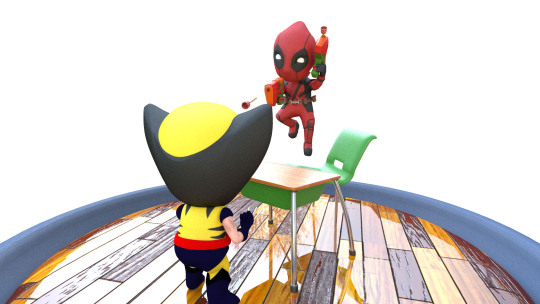
Without GI:

The only major change between the two were the render times. My rendering was already costing me 20+ minutes, with GI turned on, it was increased to 30, and all just for a little brightness. So I decided against it, and I now think I’m at the stage where I can be looking to fully render out the scene. But before I leave, here’s one more parting gift:
-Jak the Artist-
0 notes
Text
A Hero’s Playground - More Test Renders
The deadline for this module is fast approaching, and I’m continuing to push to make this look the best it can. It’s been a long process trying to get the look right, especially as I’ve never exported out of ZBrush to render in 3DS Max before. I made the mistake of forgetting to flip the maps when exporting them, so I had to go through each object and flip their UVW map:

I’ve set up the camera now for the turntable animation, and I’ve been editing the mesh of all the objects because I haven’t found a way for my displacement mapping to work. I’ve been texturing Deadpool and he’s really come along (apologies for the noise in some of the renders, they were taken from the frame buffer):


I’ve started working on Wolverine as well, so hopefully he’ll be looking as good as Deadpool is.
-Jak the Artist-
0 notes
Text
A Hero’s Playground - Scene Set-up & Test Renders
I’ve been hard at work the past few days trying to complete this scene. With both the main characters modeled, it’s now time to set up the scene. To render this scene, I’ve decided to use V-Ray inside of 3DS Max. I’m quite new to V-Ray but seeing the difference in quality renders between it and Mental Ray, I knew it would be the best option for my scene.
First thing I did when setting up the scene, was create the scenery. The idea was to go for a classroom setting, so I made a quick desk inside of ZBrush, then imported it into 3DS Max, along with the characters:


The initial idea was to have the scene as a classroom type setting, but due to time, I decided to take a little shortcut and make it into a classroom styled turntable. For lighting, I decided I wanted to use a HDR map to light the scene, as I wanted realistic lighting to show off the piece. After setting up the render settings, I quickly modeled a little base, then using some V-Ray materials that I downloaded, I started to test out the scene:


I’ve been having some issues with the displacement maps I exported from ZBrush. I’ve been trying to sort it out but I haven’t had any success yet. I’m working hard to get this done, but it’s looking good so far.
-Jak the Artist-
0 notes
Text
A Hero’s Playground - Posing & Test Renders
Now that both the character models are finished, it’s time to start posing the characters. Luckily enough ZBrush has a great posing plug-in called Transpose Master which makes a clone of all the tools merged into one, allowing the artist to manipulate the model, then it translates it back to the original mesh:

Here’s both the final poses, first up is Deadpool:


Now, Wolverine:


With that finished, I need to start thinking about the scene. Initially I was thinking about creating a classroom, similar to Luigi Monaldi’s the Indestructible’s, but due to time, I’m going to just create a turntable. I still want to add classroom elements to it so that it’s not too plain, i.e probably a desk and chair.
I wanted to get an idea of what the models would look like in a lit scene, so using the Keyshot bridge, I exported Deadpool to get a quick idea of what it would look like (P.S. I forgot to mention that I modeled his swords when I realised they were missing):


The tests were good indicators for what I could expect when I would fully render out, so with that said, ONTO THE RENDERING!
-Jak the Artist-
0 notes
Text
A Hero’s Playground - Wolverine Update
I’ve been having so much ‘fun’ modelling Deadpool, that I’ve neglected Wolverine.
Getting back to him, I’ve completed the core parts of his body, so all that was left was to accessorize and remesh the elements of the body that had bad topology/where still dynameshed:


By now, I had remeshed most of his body, so all that was left was to paint his suit then add his famous adamantium claws:


For the finishing touches, I added some actual teeth to his mouth:


Now that both characters are done, I can move onto posing them and getting things ready to render.
-Jak the Artist-
0 notes
Text
Jak in the Box - The Review
It’s been a few days now since we’ve completed the project and we’ve received some constructive feedback from each other, as well as our tutors, peers, friends and family. We have a number of points that we will focus on improving for our final evaluation:
- Parts of the video do not make sense, in particular when it cuts to Jak sitting on the box. (Explanation for this is because it was supposed to signal him waiting quite a while for the box to open, and he was also supposed to do a couple of other things before the box opened, but we ran into problems when animating that, so we had to cut out part of it)
- The ending is quite fast paced, and there isn’t much screen time for the wolf
- Jak is sometimes contorted awkwardly, and some of his movements aren’t realistic
- It could use some sound or music in the background.
- Elements of the story, happened too fast
With these points, we hope we can get a good constructive basis to improve the product, and make it even better. We’ll be back with our final version soon.
-Jak the Artist-
0 notes
Text
A Hero’s Playground - Deadpool Update
Since the last update, I ran into a bit of a situation involving the gun. I’m not the best when it comes to knowing about topology and edge flow so I was finding it difficult to draw the topology for the gun. I attempted to put it in 3DS Max then try and create geometry in there, but it was proving to be quite time consuming and hassling. In the end, I managed to get some decent topology for the gun, which allowed me to create this:


With the gun finished, all I needed to do was the bottom half of his costume, and I would be done. So using the methods I mentioned already, I created the black segments for his legs, but it did not look as clean as I wanted:

To resolve this, I decided to remesh the body suit (I needed to do it anyways). Then I used the Zmodeler brush to create indents where the black section would be, then I painted the indented section (I also done the same for the head):

With everything now modelled, and mostly painted, I was left to add some detail to what I already had. Going over the model with some brushes and paint, I distinguished more details of the mesh, making it look a lot better:

I’m incredibly excited for how this is going to turn out. I’ve pushed myself to get this looking as good as it does, and hopefully it all translates in the final show-reel.
-Jak the Artist-
0 notes
Text
The Screening - Jak in the Box
We’ve finally managed to do it! Here is the final edit of our original production project; Jak in the Box. Hope you enjoy it. Please leave feedback and comments, thanks very much.
youtube
-Jak the Artist-
0 notes
Text
Jak in the Box - The Penultimate Post (Animation)
There’s not much I can post about what we are doing at the moment, but we are working hard on trying to convey the story in the animation.
For the animation, I’ve focused on the opening section, where the box first springs open and Jak jumps out. The box animation was done simply by changing the pivot point of its elements (i.e. the lid pivot was moved to the hinges), then animated using the move and rotation tools. For the Jak, my method was to use pose to pose animation, then create the in-betweens for each significant key-frame.
We’ve run into a number of problems, one being the transfer of textures from the test rendered characters and the fully rigged characters. As you can see below, when the rigged characters were imported into the scene, they came with a Blinn material assigned, which made them really shiny and reflective:

To correct the issue, I simply reassigned the textures from the test model

Other issues faced were about sliding feet and key-framing issues which Uchenna talks about on his blog: www.uchennaubawuchi.wordpress.com
Join us next time, when we’ll be screening the premiere of Jak in the Box
-Jak the Artist)
0 notes
Text
Jak in the Box - Rendering (Update)
As we enter the last week before our deadline, we’ve both been working incredibly hard to get everything done.
With the rendering, even though I felt that all the settings were alright, I thought we might try add global illumination to test out whether it improves the look of the scene (results can be seen below):
Without GI:

With GI:

After comparing the renders, the only major difference was that there an increased render time of about 3-4 minutes, and as you may know, you don’t want that. There were slight differences in terms of softer shadows, and the scene was slightly brighter, but they are both improvements that could be made in post, without the increased render time.
Going back to the wolf, I came across a tutorial which went through how to use the V-Ray fur manipulators to create realistic fur. Basically, using the paint tool, I had to paint a number of maps, scaling from white (being 100%) to black (being 0%) which described the value of the fur density, thickness, gravity, bend & length:

The process took a bit of time because my machine kept crashing due to lack of memory, but when I eventually got to do a render test, this is what it produced:

For a first attempt, it did achieve the result of looking like fur, but it did not achieve the result of looking like a wolf. So I went through the process again, changing the length values, and got a better result:

This result was a significant improvement over what I had done before, so I decided to move forward with it. To complete it, I added a V-Ray Hair material with the diffuse set as the initial texture map of the wolf (that I had painted in ZBrush). This was the final result:

With feedback from some peers and friends, we decided to move forward with this iteration of the wolf seeing as the fur looked realistic, and it was a drastic improvement upon the original texture painted version.
Now that all the render tests, and modelling is finished, I will help Uchenna focus on the animation so that we can finish the project.
-Jak the Artist-
0 notes
Text
Jak in the Box - Wolf (Rendering & Fur)
We’ve decided to keep the set-up of the lighting and the render settings from the previous post, so now I’ve been working on getting the textures and everything set-up whilst Uchenna starts with the animation.
First thing I had to do was to set up the wolf in the scene. This was pretty much just an issue of importing him from ZBrush using the GoZ application:

As I mentioned in a previous post, I really wanted to add fur to this wolf for one main reason; In Pixar films, although characters art created in a stylistic nature, they usually have a photo-realistic look to them. Because we really wanted to emulate that style of story-telling and CGI animation, we needed to have the same element of photo-realism in our short. Due to this, I’ve been testing out the fur modifier that comes with V-Ray. Here’s what I got after applying it the first time:

As a straight-out-the-box modifier, I was pleased with the fact that it actually emulated something this could have a soft, fur like texture, but for what we needed it to be, it wasn’t doing the job. With the complexity of this modifier came a number of issues:
1) I didn’t know how to alter the parameters
2) It applied the modifier to the whole of the selected geometry, including inside the mouth
3) Most of the tutorials about V-Ray fur online, were to do with creating realistic grass
These reasons lead me to believe that we may be left with just the texture map that was exported out of ZBrush. It wasn’t a terrible option, but it would certainly detract from the quality of the production.
-Jak the Artist-
0 notes
Text
Jak in the Box - Rendering (Update)
Since my last post, I’ve been working hard on setting up the scene for our short. I have made a couple of changes to the scene by adding in a HDRI map in the form of a V-Ray Dome light, whilst also adding the textured Jak character into the scene:

Compared to the previous test that I had done, I think I cleared up the issue of brightness, whilst also softening the shadows which also makes the scene look brighter. I done this by making the infinity curve double sided, so that the light would bounce around the scene more, rather than just coming off of the one sided curve:

Moving forward, I will be importing the wolf and hat to test them out in the scene as well. Currently, we are undecided about whether or not to add the hat character into the piece because of the time we have left. Ideally, we want every aspect of the short to be perfect, and we’re not too sure if it would be so we’re thinking about removing it. We might possibly add it in for the evaluation portion, where we need to improve the product.
-Jak the Artist-
0 notes
Text
Jak in the Box - Rendering
Now that all the modelling is finished, I’ve moved onto setting up the scene for the production. For our project, we decided to work in Maya because of the benefits of animating within their software package; and render using V-Ray. Mainly because of its ability to create high resolution images with short render times, and just the overall quality of the render engine.
First thing to do, was to optimise the render settings so that we could get high quality renders with the lowest times possible. Because this wasn’t initially supposed to be my responsibility, I had to do some research into what the best optimisation settings were for animation using V-Ray. Luckily, one of my module teachers had some expertise in optimising V-Ray for photo-realistic rendering, so he gave me some advice. Here’s the V-Ray set-up I opted for:

To test out these settings, I need to set-up a scene. The idea for the scene of the project was to have the background as plain as possible for two reasons:
1) It is more work to do, and seeing that there was only two of us, we would have been spreading ourselves quite thin.
2) It could possibly detract from the story depending on the quality, and we really wanted the audience to focus on the main elements of the piece, which was the characters and plot line.
With that, we decided to set the scene up as a studio based scene. Similar to the ones seen in the minions shorts. To do this, I conducted some quick research via Google on how to set up a studio based scene and what lighting techniques to use. This was the overall result of the research:
- Create an infinity curve using a plane
-Photography studios usually use a basic 3-point lighting system; the key light, fill light and rim light
-Utilise HDRI (High Dynamic Range) maps
With this knowledge, I created the scene setup which can be seen below:

I used one volume light as my key light, and two area lights as my fill and rim lights. Now that my scene was ready to conduct its first render test, I thought it best to use one of the assets for the project; the box. Here’s what the first render looked like:

The great thing about V-Ray is the Real-Time renderer gives the user quick depictions of their scene in the view-port. It took no more than a 30 seconds for me to get an idea of what my scene would look like with the current rendering & lighting set-up I had. I do feel that the scene is a bit dark, so I plan on altering the lighting to give it some more brightness.
-Jak the Artist-
0 notes
Text
A Hero’s Playground - Deadpool Update
Following up from my last post, I’ve just been working on Deadpool, adding more elements and details from costume reference images:


To start modelling the hands, I knew I’d need to pose them with him hold his guns, so I looked for some inspiration for toys guns, then created a rough silhouette using dynamesh. Once that was done, I used ZSpheres to model his hand around the gun:


I then went onto creating some of the accessories for his suit, such as the strap that holds his utility belt, and his belt buckle. To do this, I realised a faster way to create topology rather than using a Zsphere to draw it. I drew topology from his body using the topology brush, then created a new mesh and split it into a new sub-tool. Then I edited it to my will using the ZModeler brush:


I’m really happy with how it’s looking at the moment. Let’s hope this is a masterpiece in the making.
-Jak the Artist
0 notes